As most of you know by now, I love vintage catalogs, and I want to go off-uni today and talk about one that I recently acquired.
It’s called the 1969 Consolidated Catalog of Specialty Advertising, and it’s a real doozy. It features over 600 different promotional giveaway items that could be imprinted with a business’s name, logo, phone number, and so on. Some of the items are pretty much what you’d expect — key rings, ballpoint pens, that type of thing. But a lot of the other items are, well, a bit more surprising.
There are no physical samples in the catalog — just photos. But the photos are so colorful and entertaining that they’re almost as good as having the actual objects. And a lot of the text is pretty funny to boot.
There doesn’t seem to be any rhyme or reason to how the products are sequenced within the catalog, but many of them fall into several clear categories — several of which seem quaint or amusingly nonsensical a half-century later. As I looked through the catalog, I tried to imagine the Uni Watch name or logo on the various products. I suggest that you do the same!
Because of the catalog’s unusual size and huge page count, it’s impossible to get it to lie flat. That made photography a bit challenging, as you’ll see in some of the photos that follow, but I think I managed to capture everything worth seeing. For all of the photos, you can click to enlarge.
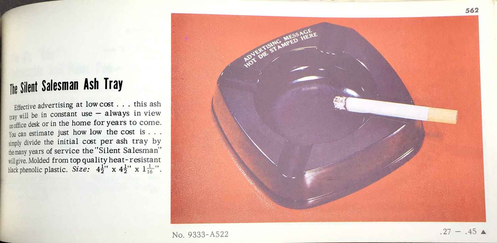
Smoking
I’m old enough to remember that people smoked a lot in the 1980s and ’90s. But I’m pretty sure they really smoked a lot in the ’60s, as evidenced by all the smoking-related products showcased in the catalog (I love how the first one is called “The Silent Salesman”):


———
Drinking
As you’d expect, there are also some cocktail accessories. I especially like the “fruitpiks”:


———
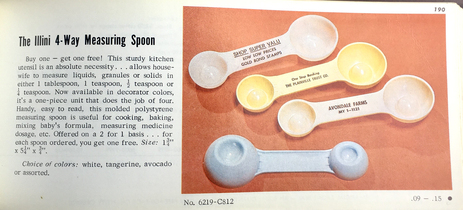
Kitchen Accessories
Ah yes, the little lady (or as one of the catalog listings calls her, “America’s number one decision maker”) will really appreciate these, won’t she?


———
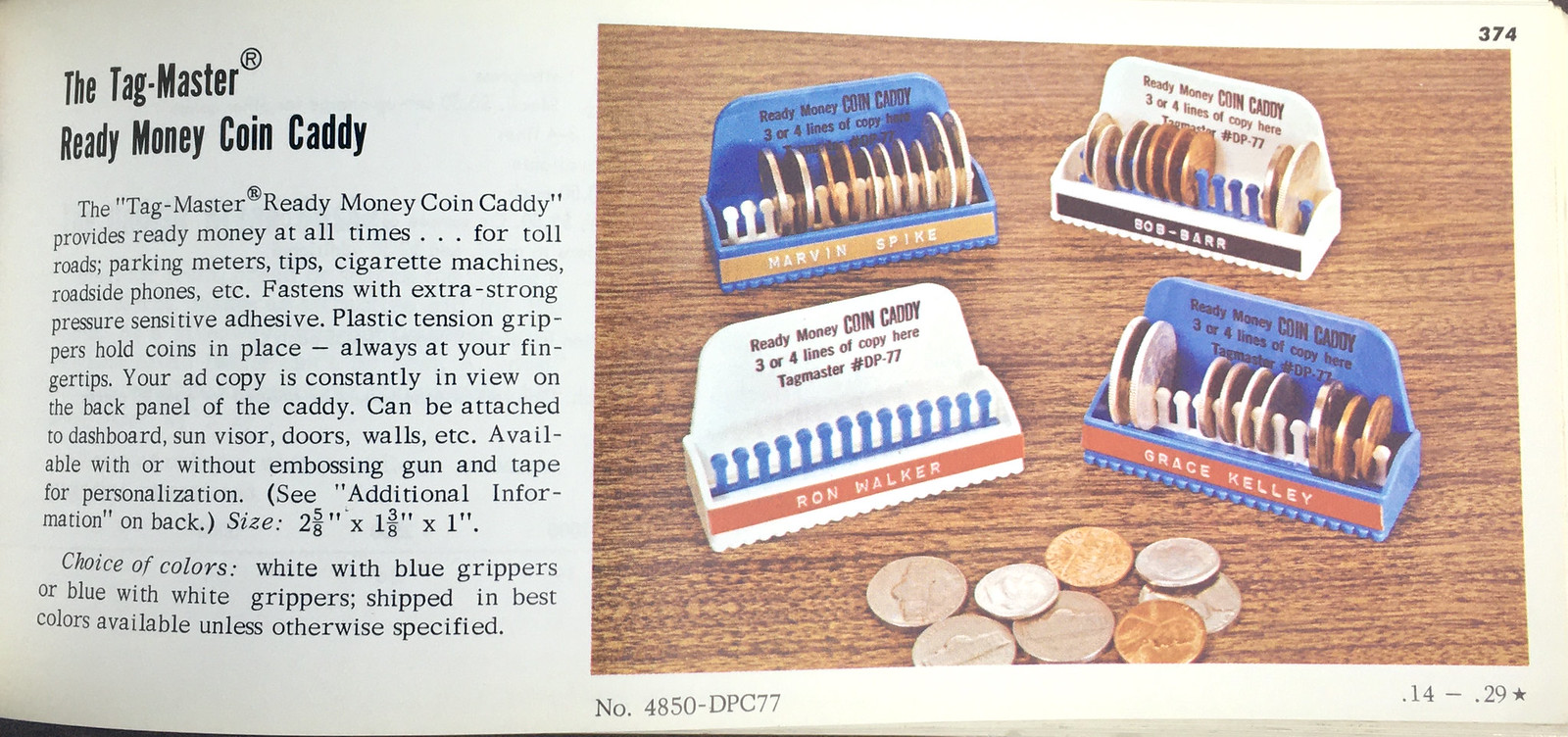
Coin Organizing and Storage
Not many people spend coins anymore. But they apparently used them quite a bit in the 1960s, at least judging by the huge number of coin-related items in the catalog:


———
Knives
If you want knives or box cutters, this catalog has you covered:


———
Screwdrivers and Tool Kits
At first I wondered why the catalog featured so many screwdrivers but not many other tools. Then I realized it’s because screwdrivers’ plastic handles make them well-suited for promo marketing.


———
Sports
Hey, look — actual sports-related content in the middle of this mostly non-sports blog entry! The instructional comic books shown in the first page look pretty awesome:


———
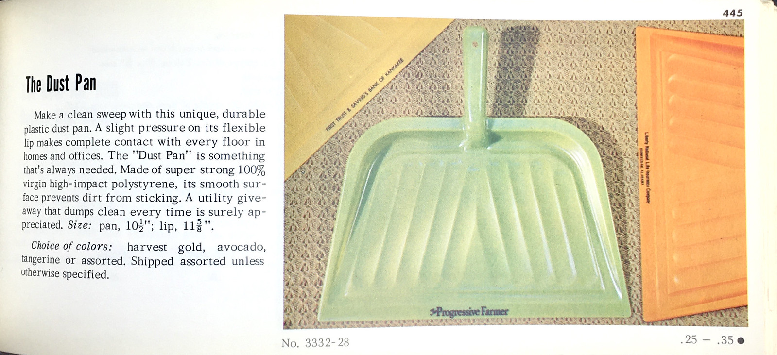
Things That Will Get Dirty or Gross
I’m not sure I’d want my business’s brand on a product that was going to be used around a lot of dirt or messiness, but I guess some people felt differently:


———
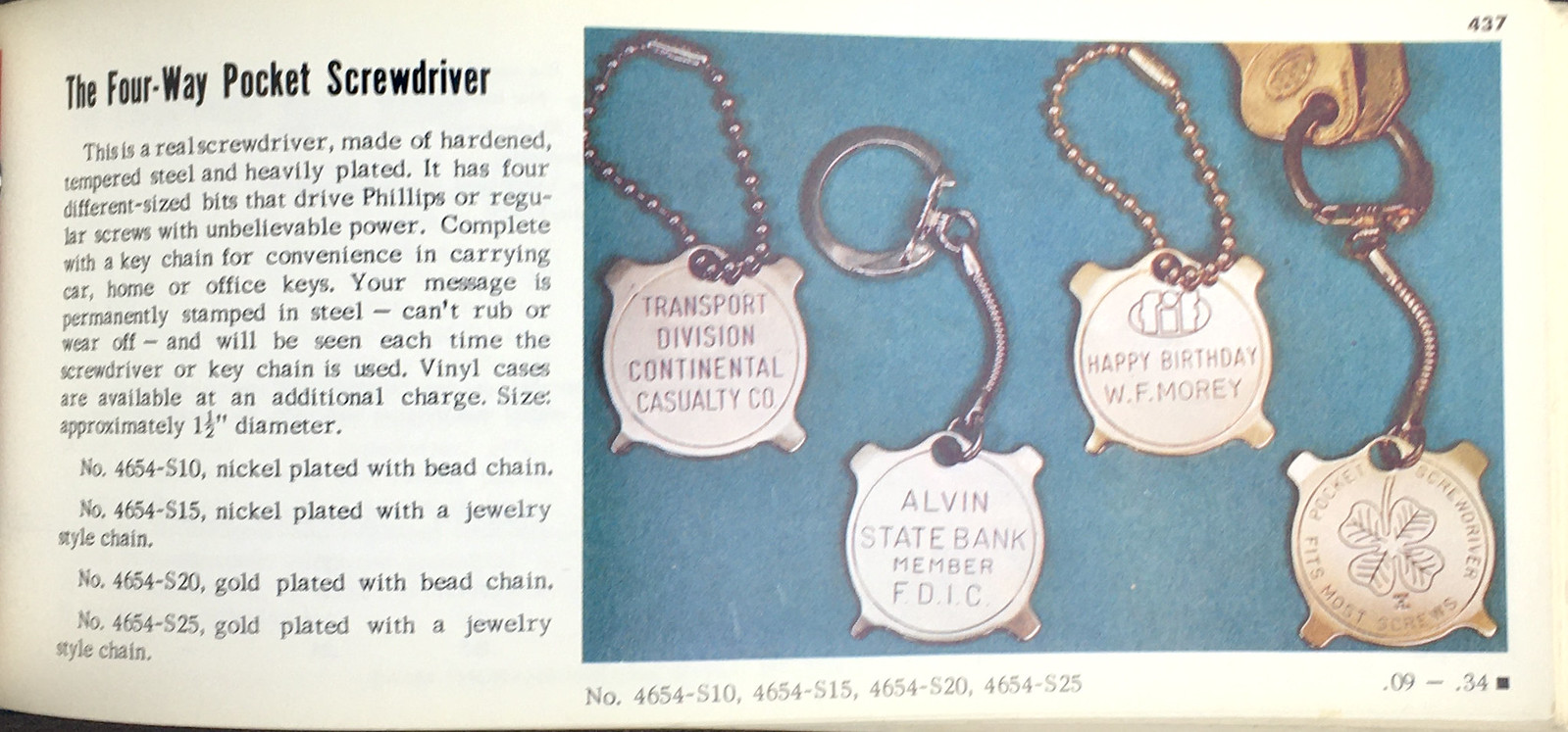
Key Rings and Chains
I have a longstanding fascination with key rings, so this category is of particular interest to me. Man, they’d put anything on a key ring!


———
Grooming Accessories
Look good, feel good, am I right?


———
Pens and Pencils
I have to say, most of these look really, really good. (If you agree, you might enjoy the post I did in 2020 about a ballpoint pen sample kit.)


———
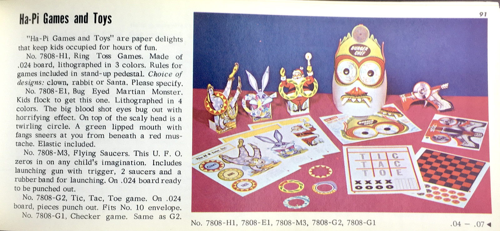
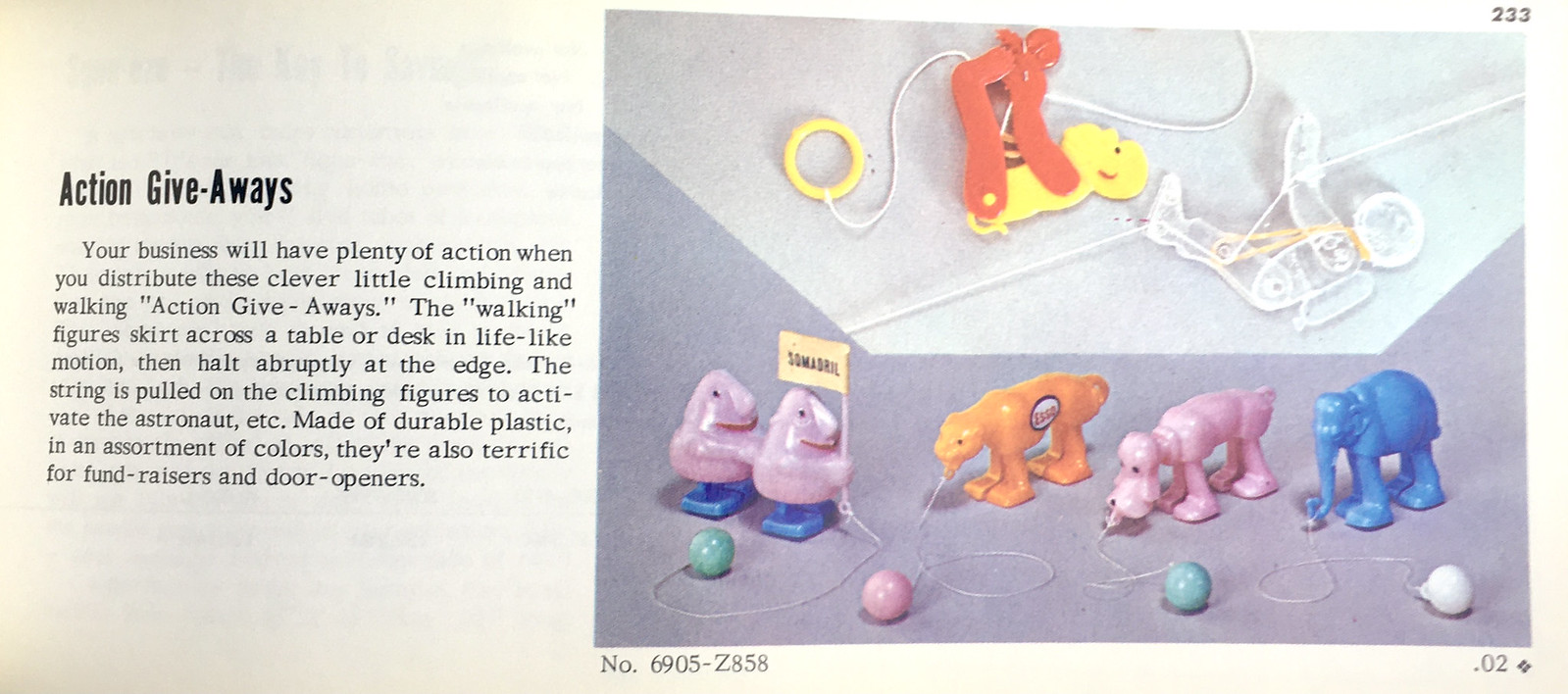
Games and Toys
Hey, start ’em young, right?


———
Volvelles
Also known as “wheel charts” or “wheel calculators,” but the proper term is volvelle. By any name, the catalog has a lot of them. Note that the first pair — one for drinking and one for first aid — form an ironic match:


———
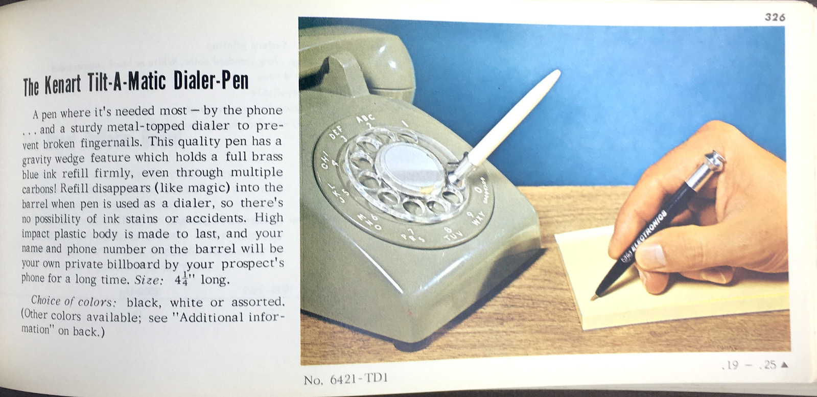
Rotary Phone Accessories
It’s amazing how many different gadgets they had just to help people dial the fucking phone — and arguably even more amazing how the first one shown below looked like male genitalia:


———
Headwear
If you’re into cheapo paper caps and visors, this catalog is a freakin’ bonanza. Check this out:


———
Native American Headdresses
Uh, so, yeah. Not the marketing industry’s proudest moment.


———
Miscellaneous
These last items don’t fit into any obvious category, but I found all of them to be interesting:


———
Phew! Okay, that’s (more than) enough.
But here’s a little story to wrap things up: Back in 2019, when I wanted to start selling Uni Watch seam rippers, I looked far and wide for a company that would produce the rippers with the Uni Watch script printed onto the plastic handle. Seriously, I chased down a lot of potential leads, but nobody was offering custom-printed rippers (at least that I could find), so I ended up purchasing plain rippers and applying clear decals onto them.
Ah, but if I had been looking for custom-branded rippers back in 1969, this catalog would’ve had me covered:

I laughed out loud when I saw that.
Bulletin reminder: In case you missed it earlier this week: With MLB uni ads very much in the air, my latest piece for Bulletin takes a close look at the eight neutral-site series that have included uniform advertising over the past two decades. The article also features an FAQ section about the potential new uni ad program for this season.
My premium subscribers can read the article here. If you haven’t yet subscribed, you can do that here (you’ll need a Facebook account in order to pay). If you want more info on what you’ll get for your money, you can find that here. And if the Facebook requirement is a dealbreaker, email me and I’ll keep you in the loop about developments regarding non-Facebook payment options and possible workarounds. Thanks!
The Ticker
By Anthony Emerson

Baseball News: The Portland Sea Dogs, the Double-A affiliates of the Red Sox and this writer’s local team, have unveiled a new food-themed promotional identity: the Maine Bean Suppahs, after Maine’s tradition of baked bean and hot dog dinners prepared for the whole community and served in churches and legion halls. The unis will be worn on Aug. 13 (from multiple readers). … New throwbacks for Louisville (from Kary Klismet). … Tulane is going BFBS this weekend. … The New Jersey Jackals of the Frontier League have revealed their 25th-anniversary logo (from John Cerone). … The Battle Creek Battle Jacks of the Northwoods League posted a Twitter video showing how their new logo evolved from prototype to final design (from @BallparkHunter).

Pro Football News: Did you know that Bears coaches wear the throwback “B” cap in honor of George Halas? It’s a fact (from Jim Howicz). … Oh man, check out this old Edmonton CFL jersey prototype, c. 1993. The ’90s were wild (from @thupka1982). … Sticking in Edmonton, after one season with antler-themed helmets, the Elks are returning to the double-E helmet logo (from multiple readers). … New uniforms for the Vegas Knight Hawks of the Indoor Football League (from Kary Klismet). … Former NFL coach Mike Ditka is chairman of a new women’s football league, called the X League. It will launch this summer with eight teams, only one of which has a name that ends in “s.”

Hockey News: New logo for the Stanley Cup Final(s) (from Tom Konecny). … Penguins D Mark Friedman, who wears No. 52, lost the “2” decal on his helmet after a puck deflected off his head during last night’s Pens/Lightning game (from multiple readers). … The WHL’s Prince Albert Raiders will be wearing one-off alternates on March 19 (from Wade Heidt).

Basketball News: Celtics C Luke Kornet got F Jayson Tatum a Moses Malone Spirits of St. Louis jersey for his birthday. Tatum is a St. Louis native. … Michigan’s men’s team wore throwbacks on Tuesday night against Michigan State (from Kary Klismet). … USA Today has a gallery of every men’s Final Four court since 2001, though some of the pictures could be better (from Johnny Garfield).

Soccer News: Napoli have used an insane 13 separate kit designs this season, the newest of which is a red jersey with Diego Maradona’s face on it (from Ed Zelaski). … Sporting Kansas City and KC Streetcar have partnered to replace some seats on streetcars with SKC jersey designs (from @ScottyBeats86). … USL Championship side San Diego Loyal have unveiled their new kits (from multiple readers). … Georgian club Dinamo Tbilisi’s captain’s armband this year will feature various Tbilisi landmarks (from Ed Zelaski). … The following are all from Kary Klismet: New home uniforms for Pittsburgh Riverhounds SC of the USL Championship. … Here’s a look at the evolution of the logos used by Argentina’s top clubs. … VfB Stuttgart of the Bundesliga will wear one-off kits made out of recycled textiles this weekend.
Ukraine News: Yesterday we mentioned that EA Sports had removed Russian teams from its FIFA 22 video game. Now they’re doing the same for FIFA Online, FIFA Mobile, and NHL 22. … U.S. flag manufacturers have been getting a flood of orders for Ukrainian flags.
And that’s a wrap for this week. Stay safe, enjoy Phil’s weekend content, and I’ll see you back here on Monday. Peace. — Paul
Mmmm. Roll that beautiful catalog footage!
Html issue in the link to your old article about ballpoint pen sample kit.
Thanks. Fixed.
Provides such a jarring flashback for me seeing those ash trays. Smoking started getting banned in public places right around when I graduated college, so my personal experience being that ash trays were everywhere in my youth, but as an adult they are basically non existent. It is an odd contrast in that if you mention ash trays I have vivid memories of them being at every restaurant table when I was a kid, but were I to see one out somewhere now it would be startling.
Reducing the rate of smoking is one of the really dramatic and inarguable public health successes of last generation.
I wonder if it would have been possible in the current social/cultural/political climate. Like, would it have become part of the culture wars? Would smokers have complained about being “cancelled” and losing their “freedom”? Would some people smoke *more* just to “own the non-smokers”? Hmmmm.
It was a gradual process, and there was some pushback along the way. The watershed moment was probably the 1970 ban on television commercials for cigarettes, but smoking was still permitted in the rear of airplane seating sections well into the ’80s.
I vividly remember the wave of smoking bans in the Boston area in the early 2000s. All the things you describe were present, the difference being that the “movement” did not align with any conventional political dichotomy. My old friend Steve from those days was probably the leading “smokers’ rights” advocate, and he seems to still be at it (sorry for the brutal link length):
link
Just to be clear, as a smoker and a good friend of Steve, at that time, I always felt his “mission” was totally bonkers.
I joined the Air Force in 1986. A lot of people that I knew that smoked said that they started in basic training because you could get out of formation to take a smoke break. You would also see those big sand-filled standing ashtrays near entry ways that gradually got moved farther and farther away from buildings until they disappeared for good.
Army 87-91. If you walked into a Supply Room, the E6 who ran the room had a heater lit up and a full ash tray. Oftentimes was the same in the CO’s office.
The excellent “This Day in Esoteric Political History” Podcast did an episode recently about the initial bans on smoking in US federal workplaces (and the path to restrictions on smoking in public in general). One topic mentioned briefly was the fact that the community of non-smokers was a bi-partisan coalition, which kept it from being an overly partisan political issue.
link
The co-host of that show, Jody Avirgan, is an old pal of mine. Great guy!
Hard to say, it may have had more pushback now, simply because non credible voices are more amplified today due to social media. But from my experience pro and anti smoking folks existed across the political spectrum so I can’t see how the pro smoking side would have gained a foothold in any camp. What I think flipped the script was the severity of risk from second hand smoke. A workplace became liable for their employees health if they allowed smoking there.
I can still recall taking a trip to NYC my senior year in college, as they rolled out one of the first smoking bans in bars. Waking up the next morning with my clothes not smelling of smoke was so strange.
Interestingly this battle isn’t quite over, casinos still permit smoking, in Atlantic City they are trying to completely ban it, and the casinos are crying foul over expected lost revenues.
I’m old enough to remember rotary phones but I don’t remember phone dialers. Probably because I wasn’t old enough to be in an office. This is a fascinating entry.
Me too! Makes sense though. I remember seeing rotary phones with pen/pencil marks around the dial from folks spinning with them.
Me too! My grandparents lived down the street, and they still had a rotary phone (on a party line!) well into the 1980s. But I’ve never seen a dialer. We could never have had ten-digit local calls back then; dialing seven digits was almost enough to bruise your finger.
But dialers aside, except for the paper products, the world of my late-1970s, early-1980s childhood was filled with exactly these promo trinkets. Especially the ashtrays. Thanks to Paul for sharing the catalog!
I grew up with rotary phones as well. We had a dialer that doubled a pen.
The phone I grew up with (1960s) didn’t have the clear plastic number ring, the ring was metal and it cut into your dialing finger. Dialing a long distance number was an ordeal.
The phone that replaced it (clear plastic ring) was a pleasure to use and we got rid of the dialer.
Yep – I remember the the metal rotor.
It was about 1/64 inch thick !
It was easy to let it slip and get a wrong number or hear the “AAK-AAK” of the busy signal or
whatever it was that told you “No Dice”.
Hilarious. Love this kind of stuff.
Those Ring-Dinger pencils are just so darn visually appealing. They remind me of these double-sided ones I had as a kid.
link
I have no musical talent whatsoever, but I am now inspired to learn an instrument and start a band so we can call ourselves… Econ-O-Pig.
I’d wear a cardboard UniWatch fez. Not sure where or when but I’d damn sure wear it!
Me too! Makes me wonder whether anyone makes green or yellow fezes for masonic use. Could be a great Uni Watch project.
Also, I had a crescent wrench on my keys for years. My grandfather had given it to me just before he passed away when I was about 6 years old. 20 years later the TSA decided it was a threat they were unwilling to allow on a flight to our honeymoon and I gave it up. Goofy world.
Re: Edmonton Eskimos prototype jersey. Thinking that would have been in 1995 looking ahead to 1996 season. 3 CFL teams adopted the logo on the front in 1995. 2 expansions teams (Memphis Mad Dogs and Birmingham Barracudas) and the Toronto Argonauts.
Edmonton did not adopt this updated EE logo and polar bear logo until 1996. The jersey with the logo on the front was a one-year thing. 1996 saw the CFL return to being a Canadian-only league. Memphis and Birmingham closed shop and the Argonauts went back to a more standard football jersey in 1996.
That there’s a 12-pack of great names for trivia or fantasy or beer league teams: Silent Salesmen, Snuff-Os, Kitchen Pals, Egghead Banks, Econ-O-Pigs, Tag Masters, Exel-O-Craft Scrapers, Magic Action Sponges, Ring-Dinger Pencils, Dial-A-Drinks, Great Put Ons and of course Arrow Seam Rippers.
Cringeworthy as it is today, the Spotco Mohawk Feather Headband was the item every kid wanted when they went to the Sheboygan County Fair. The water softener company gave them out when I was a kid in the late ’60s and it still was doing so in the late ’90s, maybe even early ’00s.
My grandpa had an ash tray from Krispy Kreme. It always seemed like such an odd choice for a marketing item for a doughnut shop.
In the era when more people smoked, there was likely considerable overlap on the Venn diagram of smokers and consumers of donuts.
Specifically late night coffee drinkers at doughnut shops, and smokers.
Thank goodness that the Edmonton Elks organization has come to their senses and returned to an EE logo. It was such a no-brainer to keep, or only slightly alter, the logo after the jarring name change from the Eskimos to the Elks.
Love the Louisville throwbacks. That cardinal on the chest is hysterical. He looks exasperated or frustrated or something. LOL.
Re the Elks: guess they could have simply said “we’re now the Elks” and nothing more when they made the change… I kind of liked the horn design on the helmet idea, though it could have been executed with a little more creativity.
I am a little surprised about the helmet change for the Elks away from the antlers so soon. They did just hire a new president who may have been the catalyst behind this. Would not be surprised if the change back to EE was farther down the road, but the antler helmet was unveiled less than a year ago. I was starting to like the antlers.
Have this feeling we could see the antlers with a third uniform. Last year the Elks had different helmet decalling with their third uniform so that would not be unprecedented.
link
I agree with you – the antler concept was good, but the execution was poor.
They could have done way better with the horns – which should have weaved throughout the helmet’s shell. Missed opportunity there.
The EE logo looks exactly the same as the E-word team brand.
I thought the whole purpose of the name change was to move past the stereotypical misappropriation. Going back to the old logo seems……cheap, at best.
Hopefully – not cynical.
Elks is a great name for any team, even if they’re not native to your location, and it would be a cool theme for a uniform.
(OK, last comment for today)
That list of Final Four courts lists the venue under each picture with the year. I noticed that they updated the venue name to the current naming rights advertisier. Is that the proper ettiquite to retroactively apply naming rights? Or should it say, “Louisiana Superdome” on the 2003 Final Four?
In re the “Buescher’s Cob Pipes” in the catalog” I went to high school two blocks from the factory that made them. The cob pipe industry in Washington, MO has consolidated from several manufacturers to a single company in the ensuing fifty years. But the old Buescher’s building still makes pipes under the Missouri Meerschaum name, although their website has a different domain name for some reason, probably legal stuff and like that there:
link
The URL looks like classic first-generation search-engine optimization.
I’m fighting the urge to check eBay for one of those magnetic coin holders.
Also, the look of confusion on these kids’ faces for the Spotco crowns and fire hats is priceless.
Part of the charm of the catalogs is that the items are so kitschy.
Promotional items are still around, but they’re not as charming anymore. I was in charge of promotional items for our company for a while and its 99% plain pens, phone stands, travel mugs, water bottles, power banks. Really dull stuff. Microfibre cloths to clean screens and glasses were huge last year.
If one of our usual suppliers put out a catalogue like this I’d probably buy everything in it. Our clients would laugh themselves stupid if we gave them a paddle ball game instead of another microfibre cloth or pop socket.
Paul,
If you could pick one of those catalog items to make Uni Watch merch now, which would you choose?
Tough call! Maybe the Ring Dinger pencils..? I also like the fishing lures!
So many tchotchkes! Those paper hats are incredibly silly but I wouldn’t say no to a magnetic coin organizer.
I’m Still Calling It The Stanley Cup FinalS
I recall receiving promo sponges in the mail often, I think as promo for local electoral candidates. That struck me as odd even as a kid.
Between Waffelbored yesterday and the promo item catalog today, this is top-flight Uni-Watch material!
The maize Michigan uniforms are technically fauxbacks. They are based on the championship uniforms of 1989, but Michigan did not wear maize at that time.
I thought the same thing, but I was not certain.
I know the common uniforms of that era were home white & road blue, I did not recall seeing a maize version like this in the 80s.
I “vividly” remember the popularity of the maize unis with the Fab 5 group, I believe that was when they first started wearing the color.
PL,
Put me down for two pair of HIS/HER UNIWATCH shower slippers as well as a Uniwatch The Gem CATCH-ALL Nail Clipper. Put the items on the Gashouse tab. Looking good, feeling good
My dad was a barber back in his day and all of his barber chairs had little ashtrays built in the arm of the chair with a flip top lid. Classic!
Man, the catalogue, is so cool!
I’d buy so much stuff.
It would be sweet to make a mosaic of all the match boxes to hang on a wall.
Still have an old rotary phone – red – and arm it with the phone dialer. Call it “The Hot Line”.
I’d also need a Bloop Bat so my mother would “appreciate this… and think warmly” of the sales rep.
Great amusement here.
I was watching an old NFL Films video about the 1976 New England Patriots, and at the beginning of one game, they showed the midfield logo at Foxboro Stadium: link
I’d never seen this stylized version of the Pat Patriot logo before. Has anyone else?
Ah yes. The corporate tchotchkes from the past. Brings us back to the good and not so good things of our youth.
Satire, Tim.
Just satire.
I was 10 years old when those tchotchkes came out and remember some of those type of products. Never saw any sales books like that, back then – so it was fun to look at an actual list of ephemera like that.
Looking at the catalogue this morning – I couldn’t help but laugh at the preposterousness
of the copy. So stupid, so wrongheaded.
Showing it the way it was published illuminates the attitude of the times – I’m guessing that’s what you mean by the not so good things of our youth. If so, I agree.
Exposing the stupidity of the past is good – so we, hopefully, don’t repeat.
I was shocked to recognize one of the example companies shown in “the Egghead Bank,” an Iowa seed company called Pioneer Hi-Bred (worked in a lab there after it was bought by DuPont). Something seemed off though, and then I realized — their logo is upside down on the Egghead Bank! Interesting quirk.