By Phil Hecken, with Kyle Evans & CJ Fleck
Follow @PhilHecken
Good Sunday Morning — hope everyone had a good Saturday. I’m back today with Kyle Evans and CJ Fleck, who are bringing you their annual MLS uniform preview, which we’ve broken down by conference. Yesterday, the lads tackled the Eastern Conference, which you can check out here, and today they’ll preview the new kit tops for the Western Conference. Let’s get started!
2022 MLS Uni Preview — Western Conference
by Kyle Evans & CJ Fleck
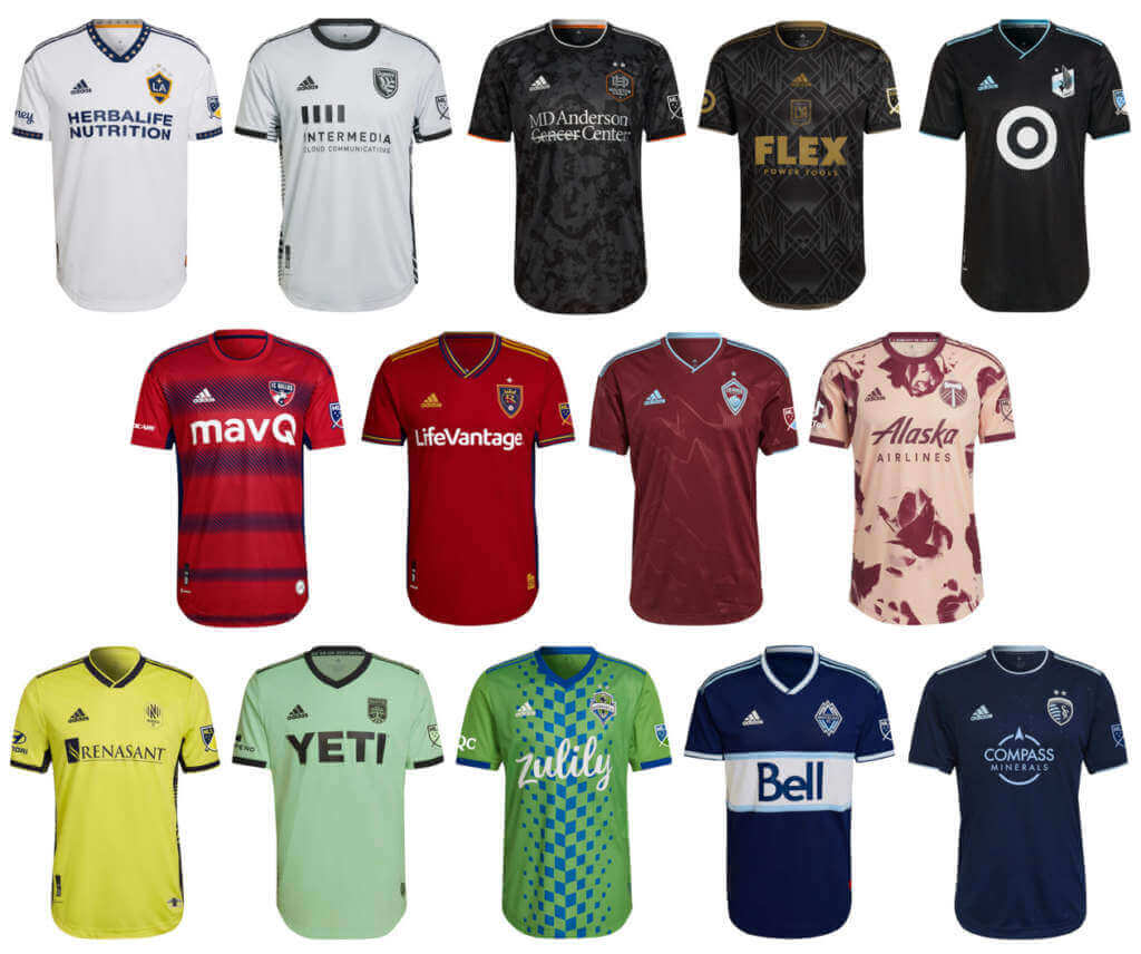
Austin FC (secondary)
Light green with black accents
Kyle: An upgrade for sure over their inaugural all-white secondary kit.
CJ: Everybody doing mint this year, I guess?
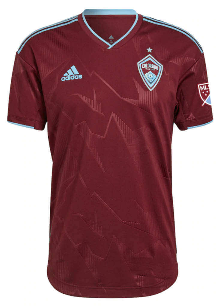
Colorado Rapids (primary)
Burgundy with light blue accents and sublimated mountain design
Kyle: Looks like the Rapids to me! And that’s a good thing.
CJ: For better or worse, they do own this look in the league.
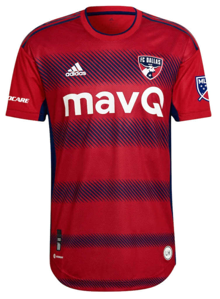
FC Dallas (primary)
Red with blue hoops formed by diagonal lines
Kyle: I like the return of the hoops but my eyes don’t like their blurry effect.
CJ: Sort-of hoops? Semi-hoops? Not sold on this one.
Houston Dynamo FC (secondary)
Black with gray sublimated “bayou system” design
Kyle: You lost me with that “water” background.
CJ: It could be worse, but it could be much better.
Los Angeles FC (primary)
Black with gold accents and sublimated geometric design, centered crest
Kyle: It’s weird seeing a centered crest and I don’t care much for the geometric design that accommodates it.
CJ: Centered crest aside, I’m not sure I’m a fan. It’s not offensive but it’s not exactly eye-catching either.
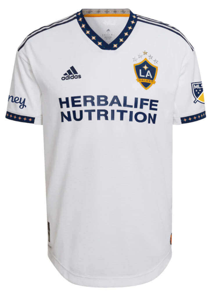
Los Angeles Galaxy (primary)
White with navy collar/sleeves with star pattern from logo
Kyle: It doesn’t feel like a Galaxy jersey without a sash. Nice star element though.
CJ: Something new! But replacing a defining element. I’m torn.
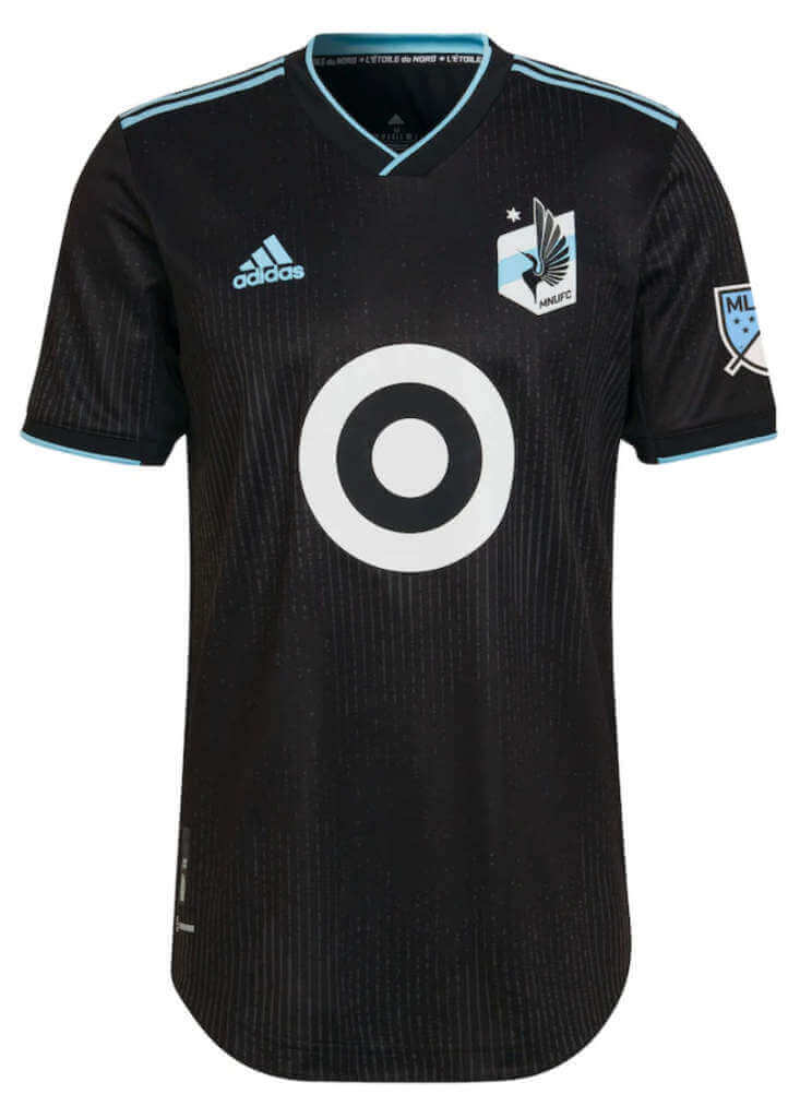
Minnesota United (primary)
Black with light blue accents and (very) subtle pinstripes
Kyle: Minnesota has traditionally worn dark gray, but I like the black.
CJ: Certainly could be worse, and though I liked the gray this is acceptable.
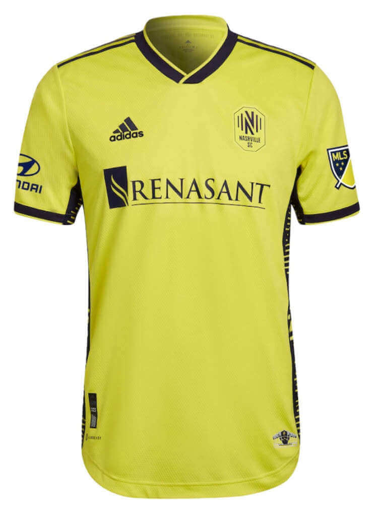
Nashville SC (primary)
Yellow with dark navy accents, side panel design based on sound wave and team logo
Kyle: The side panel design is the clear winner here, very well done.
CJ: Play the hits! I like it.
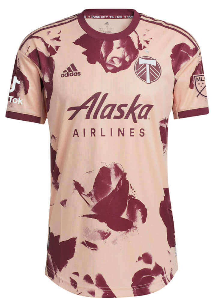
Portland Timbers (secondary)
Peach with dark red roses
Kyle: Certainly unique and I love going all out for the “Rose City” moniker.
CJ: Can I say this looks too busy? That’s my first instinct, but you will definitely know who’s playing in the game.
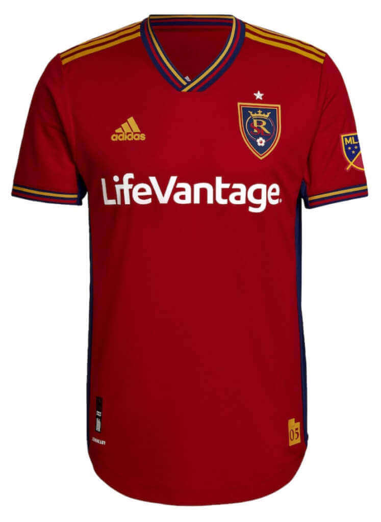
Real Salt Lake (primary)
Red with yellow/red/blue stripes on collar and sleeves
Kyle: Simple but effective. The tri-color piping is a nice touch and this jersey pairs well with the navy shorts.
CJ: I will hope the tri-color piping is just a nod to tradition and not marketing. I like it.
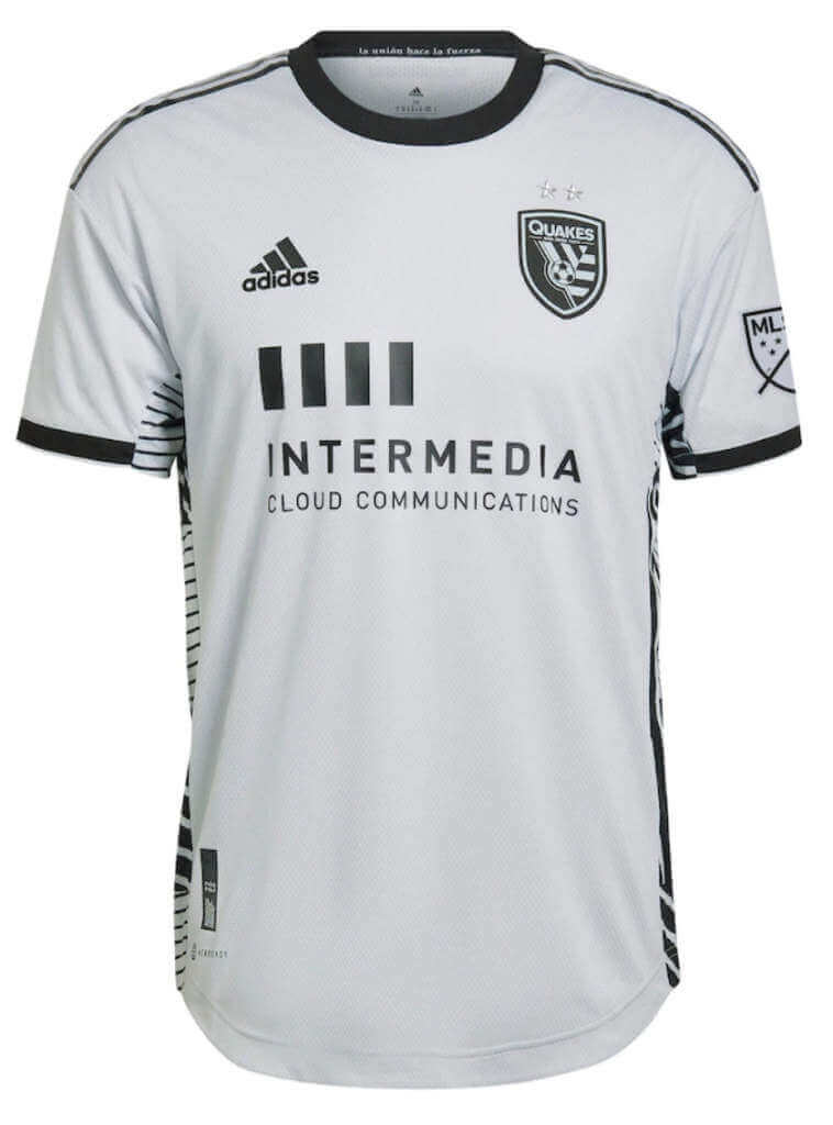
San Jose Earthquakes (secondary)
Light gray with black accents and random striping on side panels (random is literal – apparently no two jerseys are alike)
Kyle: The side panels are similar to Nashville but the overall look seems to be closest to the plain white jersey trend in MLS.
CJ: Yep, this will definitely be used in the usual practical manner of the plain white kits. Boring but functional.
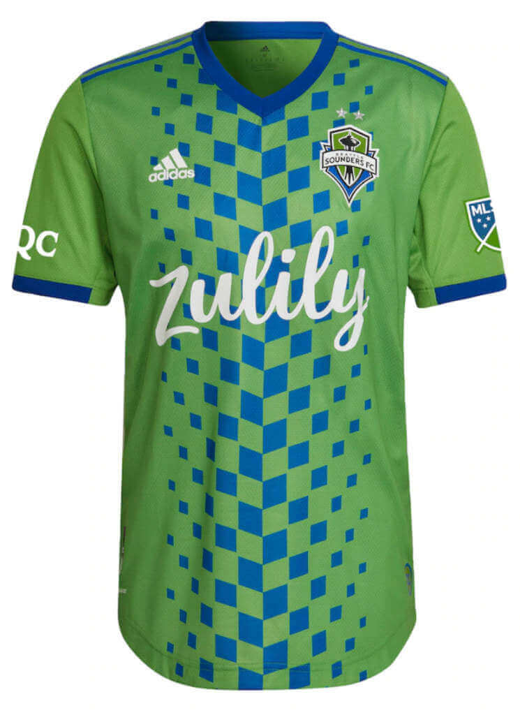
Seattle Sounders (primary)
Neon green with centered fading blue checkerboard design
Kyle: This might be the most unexpected new primary look and one that I really want to see on the field first.
CJ: Count me in! Though I agree with Kyle, it does need to be seen on the field.
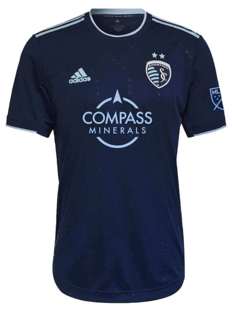
Sporting Kansas City (secondary)
Dark blue with light blue accents and subtle “state border” pinstripes made up of area codes
Kyle: I don’t care for the area codes or border-shaped stripes but the colors work well as usual for SKC.
CJ: SKC has a better creative history, but for a secondary I guess we can cut them some slack.
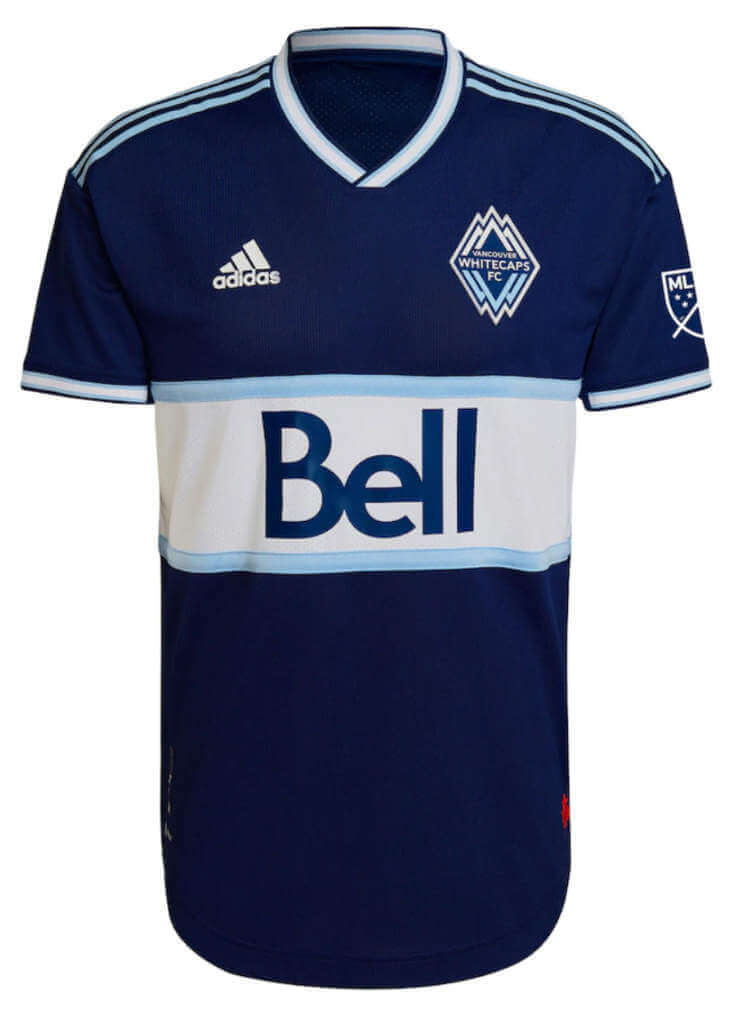
Vancouver Whitecaps (secondary)
Navy with thick white horizontal stripe and thin light blue stripes, inverted colors of their current primary jersey
Kyle: A beautiful jersey and there’s something nice about the consistency across their two kits.
CJ: Absolutely gorgeous. Nothing else to say!
Thanks, guys! Another great set of reviews. Looking forward to doing this again soon.
Smashville v. the Bolts: Your 2022 Stadium Series Matchup
Last evening, the Tampa Bay Lightning Bolts played the Nashville Predators Smashville squad in a game that involved possibly the most cringe-worthy uniforms (and backstories for one team) we’ve yet seen in a Stadium Series (SS) game. Sure, we’ve seen our fair share of pretty awful unis in these games. But Smashville vs. the Bolts may take the cake.
Let’s start with Tampa. Fans of the team may love “Bolts” but let’s face it, no one else thinks it’s a good design. So, on the big stage of a stadium, the team doubled-down an put a super-sized, diagonal “BOLTS” on their SS sweaters.
The jersey also featured what was an oversized lightning bolt color block, which was also on the sleeve ends, but did not extend around the back. The rest of the uni was actually pretty nice and straightforward: white helmets, blue breezers, and white/blue/white socks:
Buckets were mercifully ad-free and featured TV numbers on the left side…
…and a giant lightning bolt on the right side:
And, as has been the case for many years now, both teams’ uniforms featured large TV numbers, on the arm just below the shoulder:
Other than the ridiculous NNOF (nick name on front), the Lightning Bolts didn’t look too bad. I’m well aware that the squad are two-time defending NHL Champs (having knocked my Isles out of the semi’s two straight years), but if you aren’t a follower of hockey, you probably didn’t know that. What better time than to proudly display the logo in which you won two cups? Honestly, I bet casual observers who happened to put on TNT last night and saw the unis would probably have had a bit of a hard time even figuring out who was playing. But it was a good night for TB, as they literally fought to a 3-2 win.
Now for Nashville Smashville. If you didn’t know there was a backstory to these uniforms, you would probably think they’re terrible.
The jersey has a weird font, with “SMASH” stacked on top of “VILLE”, and on top of that was a guitar pick-shaped logo. OK, that’s one too many things to put on there. Either go with SMASH VILLE or use the really cool pick logo. Not both. Unless you were right up close, both the wordmark and crest disappeared into each other.
Now about that wordmark. According to this excellent article, “Tapping into the history of music city, Adidas pulled inspiration from Nashville’s legendary Hatch Show Print letterpress shop, who’ve been in the business of creating posters from their vintage type and hand-carved blocks since 1879.” I recommend reading that to learn about all the storytelling behind the use of this font (both on front and NOB).
The rest of the uniform featured yellow helmets, blue pants, and gold/blue/gold socks. This was the first time in many years Nashville has sported a blue jersey, and aside from the jersey color not quite matching the pants shade, I liked the look (other than the unfortunate mashup wordmark/logo).
Interestingly, while the uniform was entirely blue/yellow (including TV numbers), the back numbers were white. I get the need for maximum visibility, especially in a stadium setting, but I don’t understand why they didn’t go with yellow numbers (which would have been plenty visible). Visually, it was just a little jarring.
Like the “BOLTS,” Smashville’s helmets were ad-free, and they featured a blank right side, with the triangular three star logo on the left side (a feature I really liked).
I was supposed to teach curling last evening, but unfortunately an electrical issue caused it to be cancelled, so I was able to watch most of this game. Except for both teams using nicknames as crests, I thought it looked ok from a distance. The teams were easy to tell apart (as long as you know who you were watching), and numbers were easy to read. But those designs. Woof. I *get* what both teams are trying to do, and I realize, good design goes out the window for SS games. Still, at least playing as the Lightning vs. Predators would have been a major improvement. Tampa looked ok but could have looked so much better and Nashville simply overdid it. Going with just the guitar pick logo (or moving it to the shoulder) would have really made an improvement.
Lots more photos here.
Your thoughts?

Guess The Game…
from the scoreboard
Today’s scoreboard comes from ojai67.
The premise of the game (GTGFTS) is simple: I’ll post a scoreboard and you guys simply identify the game depicted. In the past, I don’t know if I’ve ever completely stumped you (some are easier than others).
Here’s the Scoreboard. In the comments below, try to identify the game (date & location, as well as final score). If anything noteworthy occurred during the game, please add that in (and if you were AT the game, well bonus points for you!):
Please continue sending these in! You’re welcome to send me any scoreboard photos (with answers please), and I’ll keep running them.

Uni Concepts & Tweaks
Time for more Uni Tweaks from the UW readership.
I hope you guys like this feature and will want to continue to submit your concepts and tweaks to me. If you do, Shoot me an E-mail (Phil (dot) Hecken (at) gmail (dot) com).
Today’s concepts come from Scott Nystrom:
Good evening —
I had a uniform concept that I thought I would pass along. This is not for an existing team but rather the St. Louis Stallions, an NFL expansion that never happened.
This concept attempts to clean up and modernize the look of the St. Louis Stallions, an NFL expansion candidate in the mid-1990s that lost out to the Jaguars and Panthers. No mono-purple at home allowed, but allows purple, gold, and white pant options on the road.
Thank you, ~Scott Nystrom
OK readers (and concepters). If you have some tweaks or concepts, shoot ’em my way with a brief description of your creation and I’ll run ’em here.
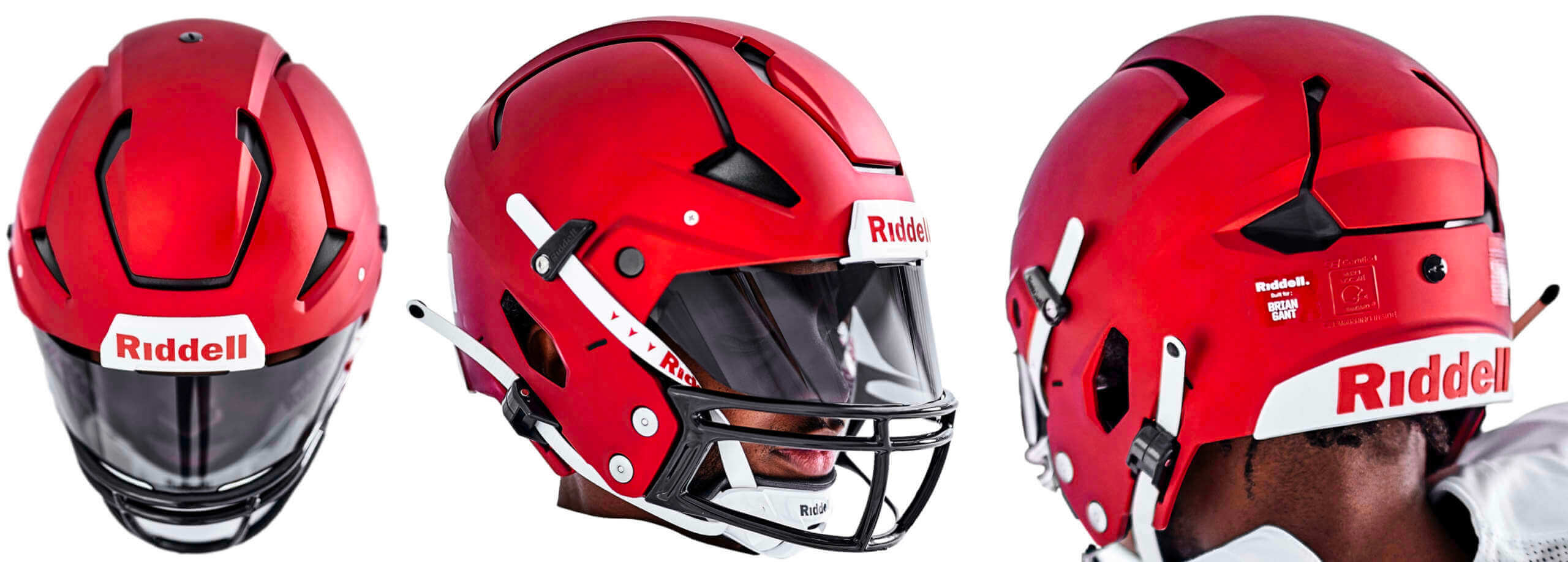
A quick reminder from Paul: Hi there. In case you missed it on Thursday, my latest Bulletin article is a deep dive on Riddell’s new Axiom helmet, which launched last month and is being touted as the latest leap in football helmet engineering. I tried to get beyond the press release hype by doing a lengthy interview with some of the higher-ups at Riddell. I learned a lot along the way and I think you will too.
My premium subscribers can read the article here. If you haven’t yet subscribed, you can do that here (you’ll need a Facebook account in order to pay). If you want more info on what you’ll get for your money, you can find that here. And if the Facebook requirement is a dealbreaker, email me and I’ll let you know about non-Facebook payment options and possible workarounds.
Now back to Phil with the rest of today’s content.
Uni Watch News Ticker
By Phil

Baseball News: We may not be watching Major League Baseball come May 6, but that’s not stopping the MiLB Omaha Storm Chasers from having their Star Wars jersey night (h/t Paul). … Whoa! Check out this tremendous colorization of late 1800s star Deacon McGuire from the great Man Cave Pictures. … Also from Man Cave, a gorgeous colorization of Grover Cleveland Alexander. … Looks like the Brooklyn Cyclones will have special jerseys for Seinfeld Night on August 6th (from MiLB Promos). … Also from MiLB — are the Wisconsin Timber Rattlers going to wear this “Udder Tuggers” jersey (or jerseys) for Udder Tuggers weekend June 2-5? … We’ve seen photos of Babe Ruth in a football uniform before, but I’m not sure we’ve seen photos of him swinging away at a football with a baseball bat while wearing a football uniform before (from Kary Klismet). … Almost every Dirt Bag on Long Beach’s baseball team is high cuffed and properly stirruped, although I’m curious why some stirrups are striped and others are plain (from Beto Durán).

Football News: Submitter Michael Worley notes that the Los Angeles Rams’ Van Jefferson was wearing University of Florida gloves in the Super Bowl, representing his alma mater. … Sports Illustrated’s Tom Brady special edition breaks down each of his Super Bowl wins, writes Garrett Heller, and it “looks like someone missed the memo 51 in Roman numerals is LI not XLI (which ironically was the game 10 years prior that Peyton Manning won his first ring after beating Brady in the AFC Championship).” … When you think Detroit Lions, purple and gold are the last thing you think of, right? Well, someone thinks the Lions should throwback to the Portsmouth Spartans, who sported purple and gold. … Michigan football number assignments have been released (from Brandon Weir). … Kenny Rogers wearing a Steelers uniform while hanging out with Terry Bradshaw and Lynn Swann might just have been the moment the ’70s hit its apex (from Kary Klismet). … From the Funky Facemasks Department, former Bengals P Lee Johnson definitely had one that qualifies (Kary, again).

Hockey News: The OHL’s Flint Firebirds dressed like the old Flint Generals last night (from Wade Heidt). Here’s a bit of backstory on that (from Brian Weingartz). … Also from Wade the OHL’s London Knights wearing throwbacks March 2. … For the first time in team history, the New JerseyDevils will wear Black History Month-themed warm-up jerseys on Monday vs. the Canucks. Here’s a preview of those jerseys, which were created in collaboration with P.K. Subban (from Wade Heidt). … USA Today has ranked every team’s away sweaters, from worst to first. … Should the Vancouver Canucks bring back the “Skate” sweater full time? … Maverick Baker, a defenseman for Bishop McCort High School and the Johnstown Warriors, tragically passed away at the age of 16. Last night, the Penguins and Rangers wore “88 MB” on their helmets to honor Mav (from Jerry Wolper). … Check out this incredible handmade scoreboard (from Dave Bertola).

NBA/College/Basketball News: Check out this awesome vintage basketball game board which John Flory saw at the at the Old Shoe Factory antique mall in Lancaster, OH. Additional photos here, here, here and here. … Everyone loves the old Warriors “The City” jerseys, and here’s a great look at some classic ones (from John Turney). … Donkey basketball? It’s a thing! (At least it is in Burlington, Wisc.). From Kary Klismet. … Major props to Art of Scorebug for this tweet. That is all. … Aside from the ridiculous number of patches, the most uni-notable thing about this photo is the ripped compression sleeve on Baylor’s Flo Thamba (from Chris Perrenot). … Gonzaga at St. Mary’s was a color vs. color game (from Andrew Cosentino).

Soccer News: American networks who broadcast soccer may be shying away from political statements, but that didn’t stop La Liga from putting a “STOP WAR” in their scorebug (from jayappletree). … Schalke has removed their Russian sponsor from their kits (from Nicholas Huba). … Manchester United and Watford posed with a homemade peace sign before yesterday’s match (from our own Anthony Emerson). … Kyle and CJ weren’t the only ones reviewing the new MLS kits — SB Nation put in their $.02. … Borussia Dortmund has unveiled nine finalists for its contest for fans to design the team’s 2023-24 home kits (from Kary Klismet). … New kits for Ecuadorian sides Guayaquil City, S.D. Aucus, and Universidad Católica (all from Kary Klismet). … Also from Kary: The Scottish Premiership’s Rangers F.C. unveiled the shirts its alumni team will wear in a game against a team of former players from the rest of the world to celebrate the club’s 150th anniversary. … New third kits for Argentine side San Lorenzo (Kary, again).

Grab Bag: Whoops! The Rutgers-Loyola men’s lacrosse game was delayed 75 minutes, and taken off ESPN+, reportedly over Scarlet Knights forgetting their jerseys. … 17-year-old gymnast Konnor McClain’s father, who passed away in December, gave her a special M.M. patch. She now wears it on her leotard in honor of him (via Paul). … The Edward Gaming team are receiving championship rings for winning the 2021 League of Legends world title (from Kary Klismet). … Organizers of the Mandan (N.D.) Rodeo Days are asking for public input to name their new mascot (Kary, again). … And one last one from Kary: Mountain Valley High School in Saguache, Colo., has chosen “Wolves” as its new team name.
Uni Tweet of the Day
Everything about this photo is awesome
1970s Scottish glam-rock band Iron Virgin wearing football uniforms (and platform heels!). pic.twitter.com/nIZvwWmqWW
— Paul Lukas (@UniWatch) February 26, 2022
And finally… that’s it for today and for the weekend. Big thanks (again) to Kyle & CJ for their MLS Western Conference kit preview. It’s hard to believe the US soccer season has already started.
Everyone have a great Sunday and a better week, and I’ll catch you guys next weekend. Until then…
Peace,
PH
“American networks who broadcast soccer may be shying away from political statements, but that didn’t stop TSN from putting a “STOP WAR” in their scorebug”
That’s not TSN’s scorebug, it’s the La Liga world feed scorebug. If you happen to watch a game on ESPN+ here, you’d see the same thing.
Also, regarding calling Portland’s shirt “certainly unique,” I would say link.
Thanks, fixed.
Why is the helmet stallion facing backwards?
I wonder if Kenny Rogers as a Steeler ever faced off against Howard Cosell and his Dolphins?
I’m confused about this. Why must the NHL have their teams wear ridiculous uniforms just because they are playing outdoors? I am fine with a one-off uniform but many recent Stadium Series looks have been really experimental and I have not been a fan.
Here is a look at the Flint Firebirds wearing the Generals jersey on the ice. Would have been great if Flint had scheduled this game against the Oshawa Generals. Could have had a Generals vs. Generals game.
link
Another great MLS kit preview this weekend!
I look forward to the day when MLS adds even more teams which it desperately needs and the preview takes three days.
More teams??? There are 27 teams, top leagues have under 20 teams. If anything MLS is getting bloated
He was being sarcastic.
D’oh! Glad we agree then!
“Top leagues have under 20 teams”
Who knew the EPl , la liga, serie A and ligue 1 with their 20 teams werent top leagues
Ok, semantics, 20 and under lol I was thinking about the Portuguese league with 18 and Dutch league has 18 as well. Point is, 27 teams is a lot for soccer
I’m not sure how one can say the Portland Timbers kit is unique when it’s nearly identical to what the Thorns have been wearing save for a color change. Thorns black with red roses vs Timbers pink/rose(?) with red roses.
Seems like a strange move for the club to put out that design.
Whatever happened to Mr. Yuck? I know this is a guest contribution to the blog, but I fear that it contributes to normalizing this atrocious advertising on uniforms.
If the Mr. Yuck treatment is too much work, Uni-Watch might wish to consider an editorial policy involving a large boilerplate disclaimer at the top of posts that include large numbers of advertising shirts that says something like, “Uni-Watch generally disapproves of all uniforms with advertisements. This article presents the relative merits of non-advertising uniform elements.” Just something that reminds readers that this isn’t acceptable.
On a related note, I know that uniform ads have already been normalized in soccer leagues around the world. Yet, those teams established identities long before the ads were put on the uniforms. As such, when I see a Barcelona or Juventus uniform, I know exactly what team I’m looking at.
Adding the advertisements to uniforms in a league that is relatively young and unknown (it’s been around for decades, but does not really compete in terms of recognition with other American sports leagues or with international soccer leagues) really make their brand recognition and visibility much weaker. None of these uniforms jump out at me and tell me who the team is or where they play or why I should care.
It feels like MLS has sold its uniforms as billboards, and therefore made them empty real estate for the placement, with the end result that they are all sterile and bland, failing to give me any reason to care about the teams or distinguish between them.
YUCK
I also noticed no mention of the thing that is most prominent on these uniforms, the ads. Sadly for future generations this will become the norm for all major sports.
Mr. Yuk has ALWAYS only been used when the story itself is about the announcement of a new sponsor. It has never been used in general reporting about the uniforms.
This comment is ridiculous. I won’t get into it too much because you clearly don’t know what you’re talking about, but removing the sponsors would not solve any of the non-issues you’ve conjured up here. If you have no understanding of team colours and are unable to look at the badge and figure out what club it is, removing the sponsor logos will not change anything.
Yeah, this whining about ads on soccer jerseys is getting old. It’s been over 50 years now, it’s not going back. No one likes them, we’d all like them to be gone (except the owners), yet people act like simply posting a picture of a jersey is an endorsement of them.
You know why soccer fans don’t really care? Because there are no TV commercials during the actual games, and we can’t read the shirt ads, and ignore the field ads, during the game anyway, so what’s the point of bitching about it?
“Kyle: Looks like the Rapids to me! And that’s a good thing.
CJ: For better or worse, they do own this look in the league.”
For worse? It’s the only kit that isn’t plastered with a giant friggin’ advertisement! This is the best look in MLS!
I don’t think the white Preds numbers looked any more jarring than it does for Steelers or Packers.
And regarding the Lions, purple and gold isn’t the last thing I think of. In the TV series Sliders (in which they travel to parallel Earths), they once landed on an Earth where San Francisco’s team was call the Lions instead of the 49ers. Guess what the color scheme was?
link
“I don’t think the white Preds numbers looked any more jarring than it does for Steelers or Packers.”
Except that 1) those are football jerseys, and the numbers on front are white as well; 2) the Preds only had white back numbers; their TV numbers were yellow; 3) the link and link, in addition to white TVs and front numbers, also have stripes with white, making the white numbers much less jarring; 4) other than the adidas ad, the Predators have link else on their sweaters.
And speaking of the Packers and Steelers, link teams showed you can have link on a jersey without losing contrast.
Sorry. I just think the presence of white back numbers on an otherwise white-less jersey is a bit jarring.
Actually, the TV numbers were blue not yellow, and I’m guessing the white back numbers were picked to sync up with the white stars in the guitar pick logo.
the nashville unis actually looked okay from a distance on tv, but that doesn’t help the silly workmark design up close.
one thing i did like about the stadium series unis were the large logos on the breezers. it looked especially cool when players from opposite teams both had them showing in the shot.
don’t want to see that as a full time thing, i don’t think, but for some teams it might be good.
Wasn’t sure how I was going to feel about that Timbers secondary kit but I thought it looked good on FOX last night.
And what a bicycle kick from Chara to salvage a draw!
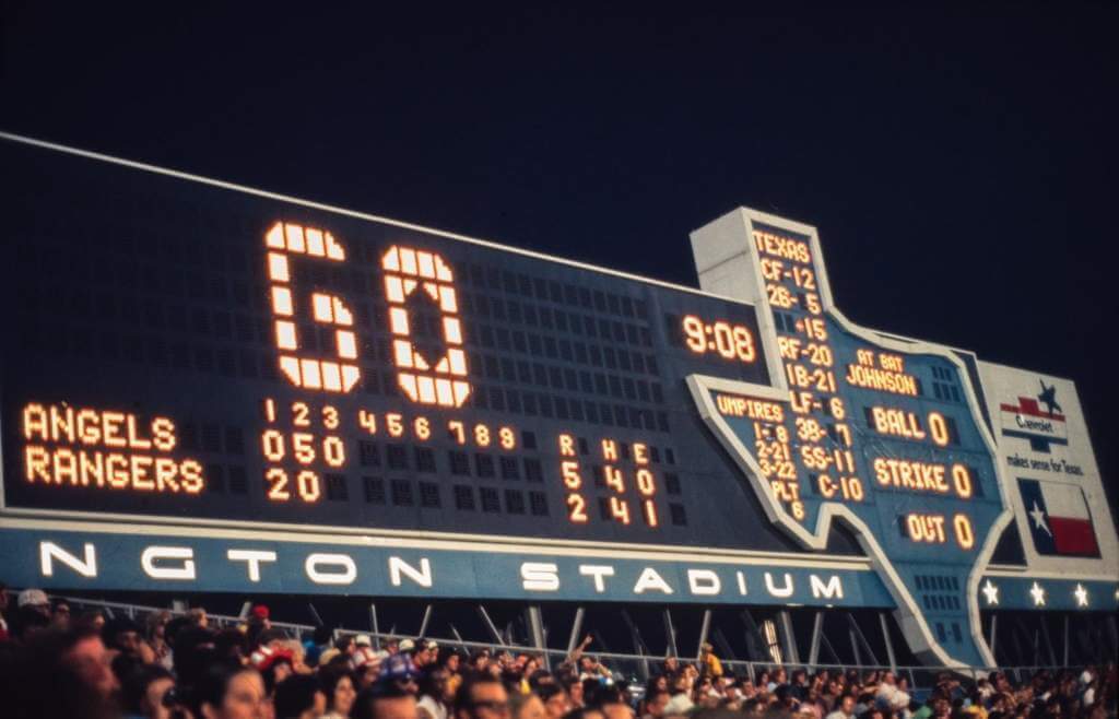
Scoreboard – June 22, 1974
link
I thought the best-looking of the soccer jerseys were Seattle’s and Dallas’. I appreciate the all-in approach to op-art patterns.
That article on the best away hockey sweaters had the tenor of an an answer to an essay question on the Regents exam. Five percent thesis and 95% filler. Do they pay their writers by the word?
I was surprised by your take on the Nashville helmets. I honestly think the yellow helmets are not great, for some reason I find them very distracting when viewing on TV.
But this time with the crazy stars I seriously thought it was a roller derby helmet. I guess that identity works better with their “Smashville” nickname…. so maybe it was by design?