For all photos, click to enlarge
Good morning, and happy Presidents Day! When this season’s NBA All-Star uniforms were unveiled a few weeks ago, the overwhelming consensus was that the designs were drab, unimaginative, and bad. When the game finally took place last night, we learned that most of those early assessments were correct — the uniforms were indeed unimaginative and bad.
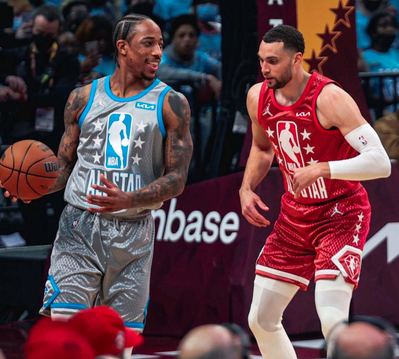
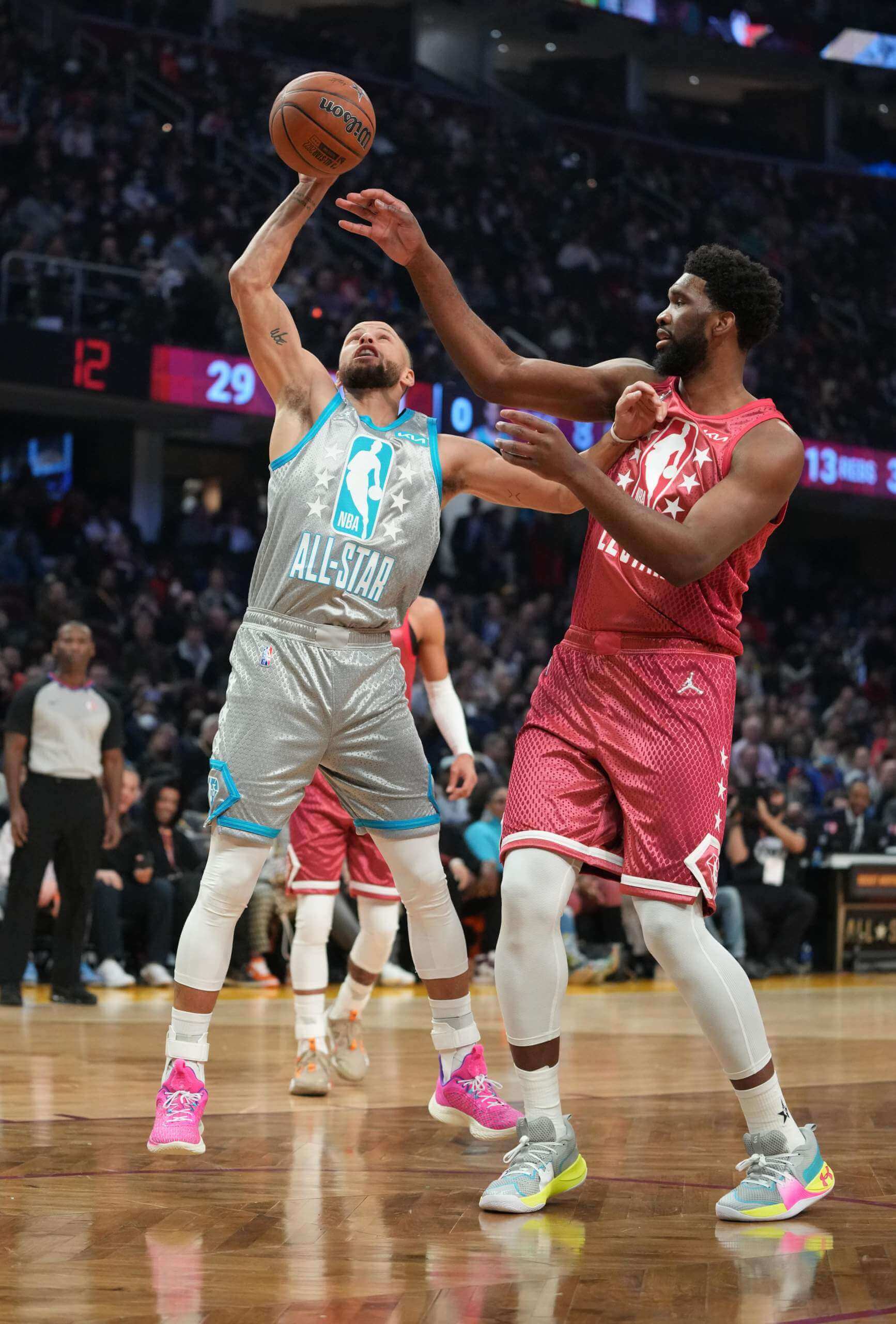
As you can see in the photo above, however, they were not drab. On the contrary, the unis were shiny and glitzy. That was a surprise, because the league’s unveiling photos didn’t show any glitz at all. Compare the photo above to this shot from the unveiling:
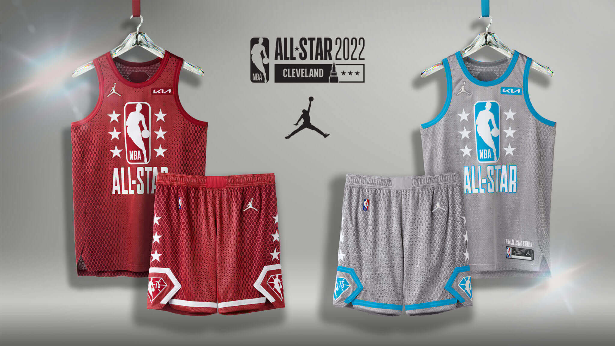
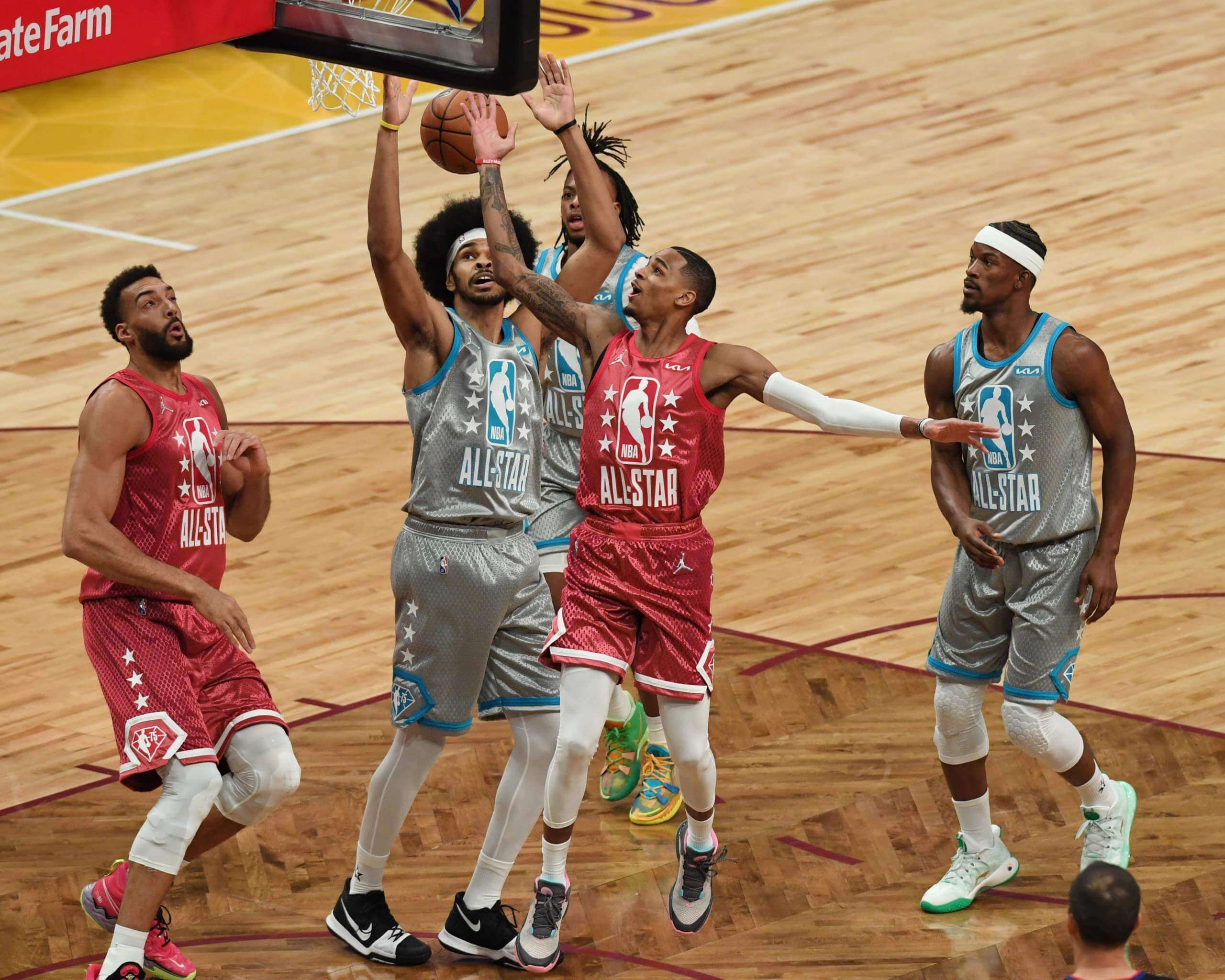
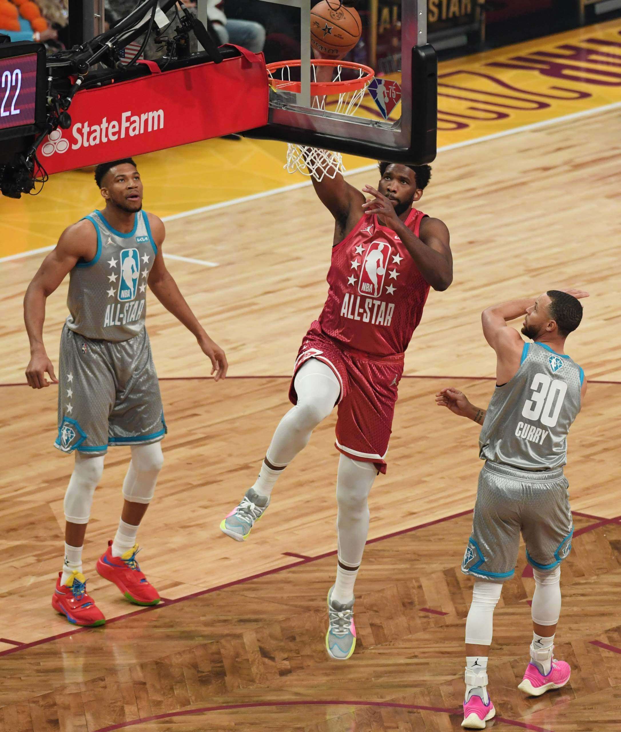
In the unveiling shot, the grey uni looks, well, grey. But on the court, it was closer to a true silver or chrome. Even the red uni had a bit of a metallic sheen. Here are some additional shots:
I want to be clear about this: The sheen didn’t change the fact that these were very bad, very uncreative All-Star designs. If anything, this just adds another layer of dysfunction to what was already a woeful package, because they didn’t even promote their own event by representing the uniforms properly. Bizarre.
A few other notes from last night’s game:
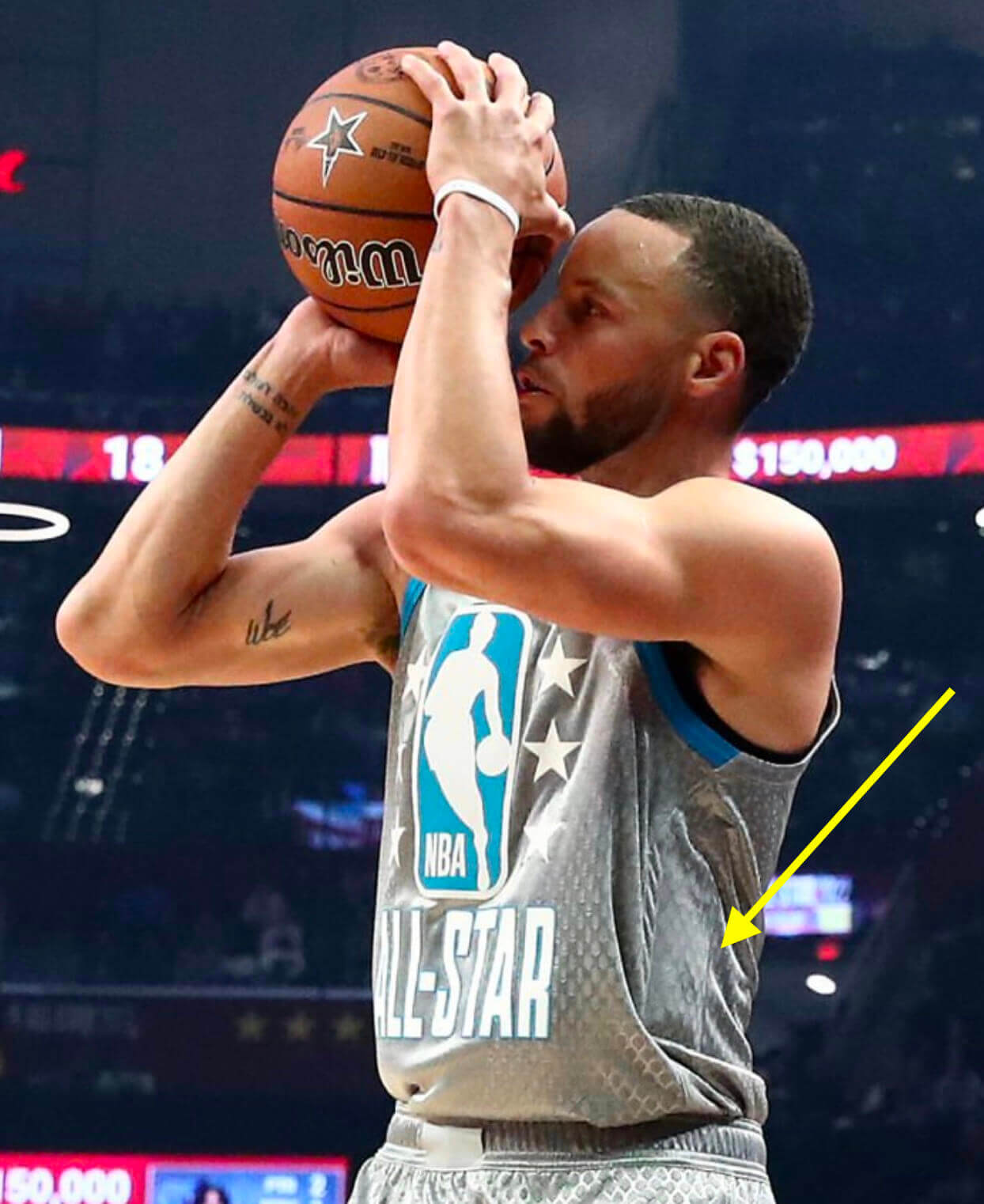
• Warriors guard Steph Curry seemed to have something sewn into his jersey. Not sure if it was a tracker, something microphone-related, or what:
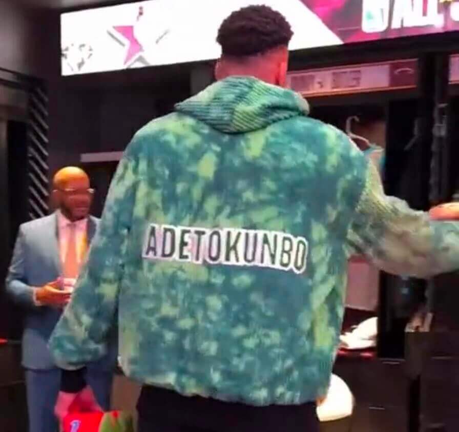
• Bucks forward Giannis Antetokounmpo wore a pregame jacket with his family’s original surname on the back:
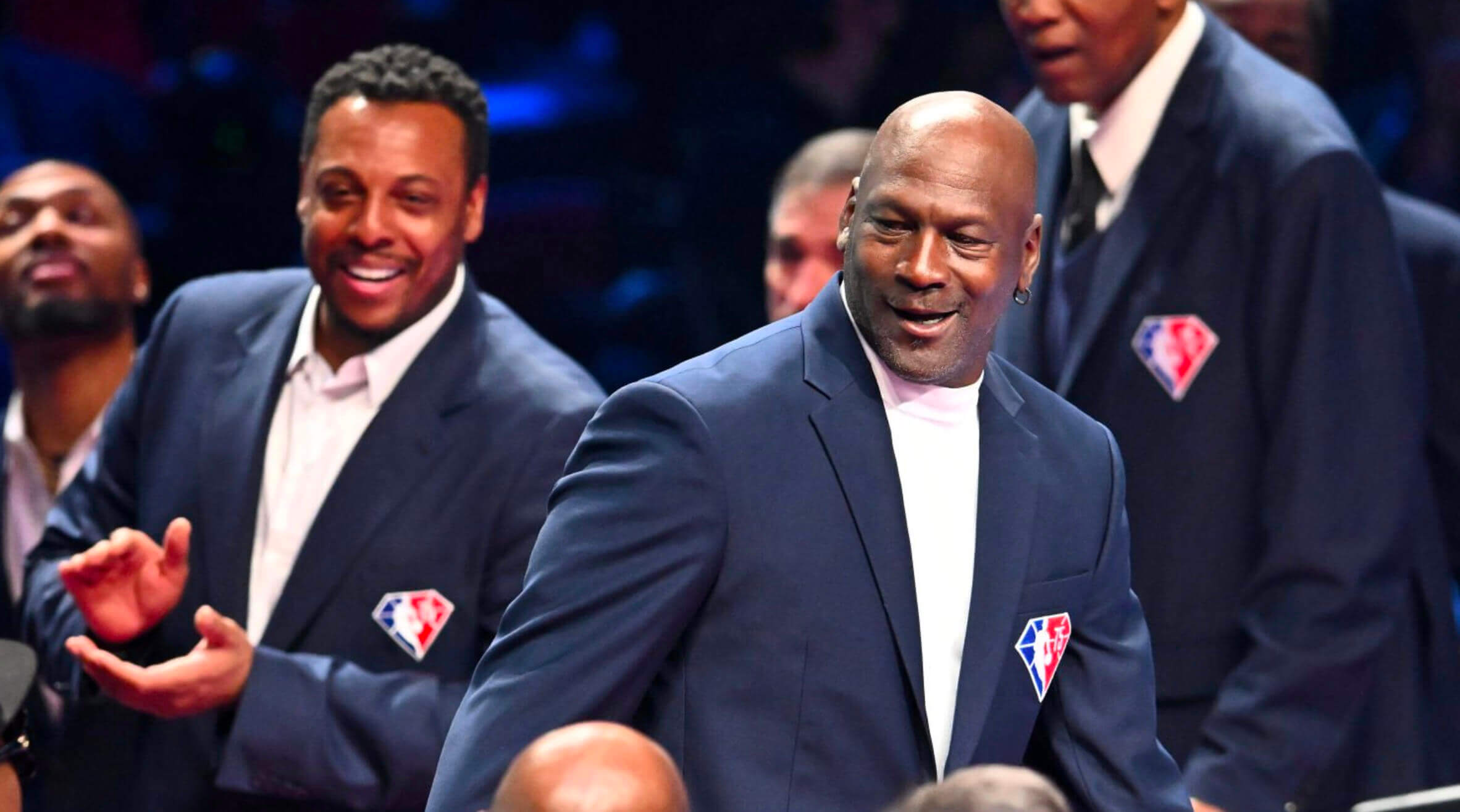
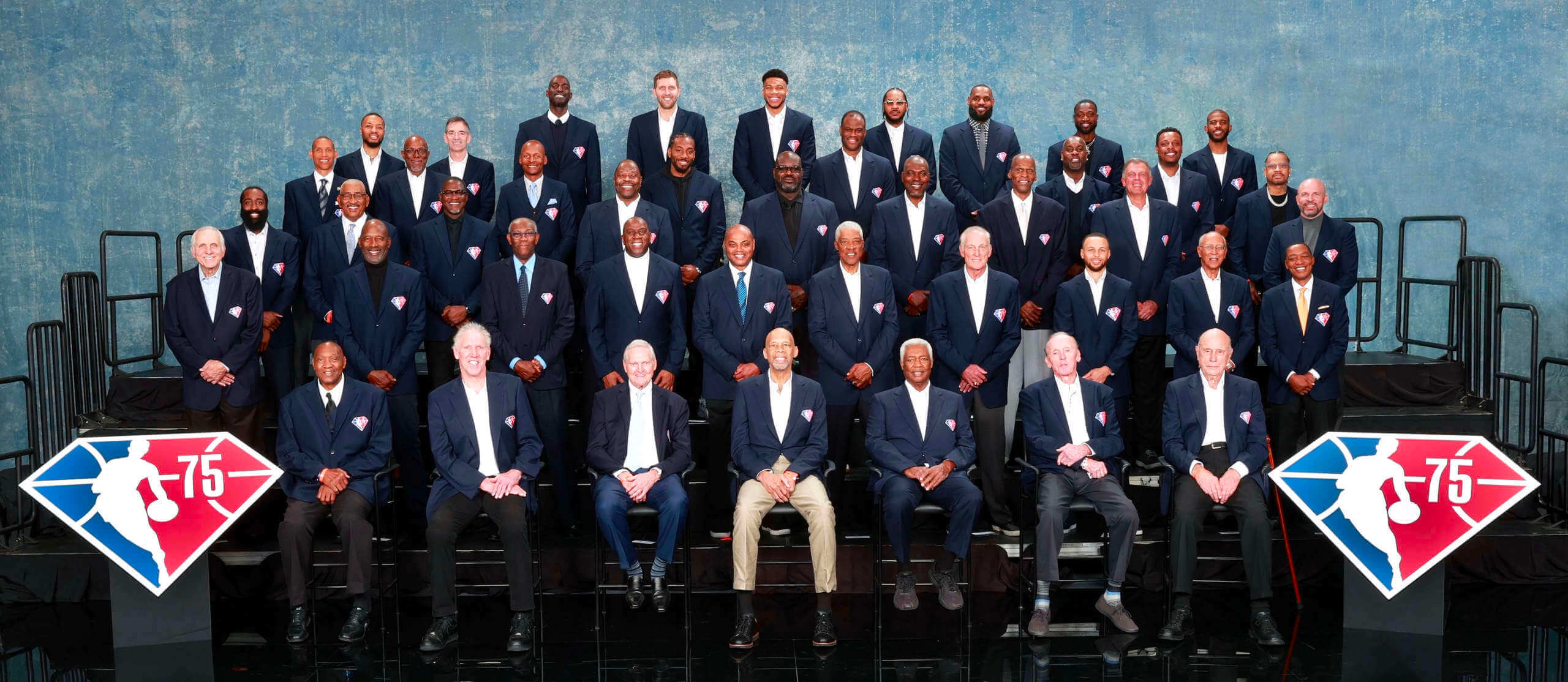
• The league’s all-time 75th-anniversary team honorees were introduced at halftime while wearing blazers with the league’s anniversary logo:
Thankfully, this concludes the annual winter All-Star season. We now get a break until this summer, when we’ll no doubt be disappointed by whatever MLB has in store for us.
(My thanks to @4031Sports and @Redsunhero for their contributions.)
Pops and Cobra talk uniforms: On Oct. 25, 1979 — eight days after the conclusion of the World Series — Pirates stars Willie Stargell and Dave Parker appeared on NBC’s The Tomorrow Show. Starting at the 2:15 mark, they spend about two minutes talking about the team’s uniforms, and then Stargell discusses his Stargell Stars at the 21:35 mark. Priceless stuff.
(Big thanks to our own Jerry Wolper for this one.)
The Ticker
By Paul

Baseball News: This is fun: a set of Kaiju-themed baseball playing cards (from Will Scheibler). … Teams don’t often unveil a new uni by having the manager wear it, but that’s what UNC did with their new Carolina blue alternate, which was modeled by skipper Scott Forbes (from James Gilbert). … More MLB spring training caps have surfaced, this time for the Cubs and White Sox (from Kyle Sasala). … New alternate uniforms for Japan’s Chiba Lotte Marines, marking the 30th anniversary of the team’s move to Chiba (from Jeremy Brahm).

Football News: Love this 1970s Giants letterhead with the disco “NY” logo (from Alan Tompas). … I had no idea that Nebraska and Hawaii went red vs. green in 1978 (from @coachmays). … A Washington Post poll has found that about half of DC residents don’t like the Commies’ name.

Hockey News: The Canadiens will wear Black History Month pregame jerseys tonight (from Wade Heidt). … Also from Wade: The WHL’s Prince Albert Raiders wore mid-1990s throwbacks on Saturday night. “This wasn’t the throwback that they originally planned to wear,” says Wade. “That one was pulled after negative public feedback on the design’s stereotyped Arab mascot character.” … Some good uni photos in this Emile Francis obit, along with some info on how Francis helped to create the modern goalie’s catching glove (thanks, Jerry).

Soccer News: All of the items in this section are from Kary Klismet: Adidas has finally supplied Brazilian side Flamengo with authentic jerseys after the club spent the last four years wearing replica versions on the pitch. … Here’s an overview of Arsenal’s uniforms from 1886 to today. … New kits for Irish side Wexford FC and Argentine side Quilmes. … 110th-anniversary kits for Italian Serie B club U.S. Alessandria.

Grab Bag: The Smithsonian has a good collection of winter sports gear, including Sonja Henie’s skates, a Shaun White snowboard, and a lot more (from Max Weintraub). … New helmets for F1 drivers Alex Albon of Williams and Mick Schumacher of Haas (from Kary Klismet). … New Mardi Gras-themed leotards for LSU gymnastics. … Interesting article on a Japanese shoemaker who made shoes and skates for many of the country’s winter Olympians (from Jeremy Brahm).
“Adidas has finally supplied Brazilian side Flamengo with authentic jerseys after the club spent the last four years wearing replica versions on the pitch.”
Um, if the players are wearing the lower-quality meant-to-be-replica versions on the field, don’t they then become “authentic”?
To confuse the issue further, the linked article says “It is not known why Flamengo did not wear the player issue kits previously. In fact, the old Flamengo 21-22 home kit was even available to buy in the authentic version in Adidas’ own store.”
Ironically replica soccer jerseys are heavier fabric with embroidered crests, and the authentics are lighter fabric with iron-on crests. To me that makes the replicas higher-quality.
I noticed that, too. The embroidered crest looks so much better, in my opinion. If I were a player, I’d prefer to wear the “replica!”
I think that if there is any college bowl game that is played on Christmas day, and if both teams have red and green home jerseys, it should be played color v color.
Sigh. Those old Hawaii uniforms were works of art.
Proofreading in the Soccer section of The Ticker: the name of the Argentine team is Quilmes. (Primera Nacional is the league they play in.)
Yup, already fixed. Thanks!
Hmmm… Not showing up as fixed on my end – on either my phone or my laptop. The text I’m seeing reads, “New kits for Irish side Wexford FC and Argentine side Primera Nacional.” It should say, “…Argentine side Quilmes” or “Argentine side Quilmes of the Primera Nacional.”
Also, the Wexford ticker item links to the Arsenal item before it.
Whoops! That one looks like my fault as I accidentally sent the same link twice. Here’s the link for the Wexford piece:
link
Fixed.
Never thought I’d see the late, great Tom Snyder referenced here on UW! “Fire up a colortini, sit back, relax, and watch the pictures, now, as they fly through the air.”
I think the Hawaii and Nebraska game was played Sept. 16, 1978, and not 1976.
Fixed.
I laughed at the Washington football team being called the Commies”.
$43.99 for a Spring Training hat? Price has almost doubled in 5 years.
Yeah, that really feels excessive for a trucker’s cap, even a well made one. I really like the White Sox design but the cost, mesh back, and that ugly ST patch on the side means i will live without one.
kareem just had to wear those awful tan pants for the 75th photo
brutal
and the photographer shouldve said something
now thier name is attached to this forever
Given their socio-political disagreements over the past few months, I’m surprised that Stockton and Abdul-Jabbar are in the same photo. Although I do notice Stockton is about as far away from Kareem as he can get.
In the “Tomorrow” clip, I was curious when Willie Stargell mentions a possible uniform change for the following season. I wonder if that ended up being the removal of the pinstripes on the white option?
Re; the Giants letterhead; I’ve never seen the disco NY done with it part red- outstanding. Please bring that one back, Giants!
That was the one-year only helmet logo for 1975. Maybe they did that letterhead in Red-White-Blue for the American Bicentennial, ala the Cowboys helmet stripe. And then they changed the helmet logo to the GIANTS underlined logo for the 1976 season so that letterhead was a rare find! On a side note, I just realized the G-men played in 4 different stadiums in 4 consecutive seasons.
Nice job of coverage on an event that, aesthetically speaking and probably in several other regards as well, didn’t deserve much of it. The clear highlight for me was the 75th Anniversary Team blazers. Simple, classic design. I’m glad they didn’t screw that up!
“Thankfully, this concludes the annual winter All-Star season. We now get a break until this summer, when we’ll no doubt be disappointed by whatever MLB has in store for us.”
Ugh! So true, sadly! I’m sure I sound like someone telling the kids to get off my lawn, but All-Star games have become parodies of themselves over the last several years.
The uniforms are bad enough, but the formats have become unwatchable to me. When teams no longer play for conference bragging rights, what little pretense of a competitive incentive to play the games has been all but obliterated. When players pick their teams, shirts-and-skins style, like they would in the schoolyard, it feels like I’m watching nothing more than a glorified scrimmage. Well, I guess at least the uniforms matched that concept…
It looks like New Era has unveiled all of the spring training caps on their website now. I just wonder when we’ll actually get to see them.
link
That Cardinals one is brutal. I had to do an image search to see what the logo was supposed to look like.