
Aside from all the patch shenanigans, I thought there were no major uni-related storylines during the Super Bowl. But as an anonymous reader pointed out to me yesterday, a uni-related issue may actually have determined the outcome of the game.
Here’s the deal: A key play in the big game was a defensive holding penalty on Bengals linebacker Logan Wilson during what turned out to be the Rams’ game-winning drive (see above). You could argue that the call was a bad one, but I’m not interested in relitigating that. I’m more interested in how Wilson clearly did himself no favors by wearing orange gloves, which made his hands stand out against Rams wideout Cooper Kupp’s white jersey. I mean, if you look at that screen shot, what do your eyes immediately zero in on? Wilson’s hands. Now imagine if he’d been wearing white gloves instead.
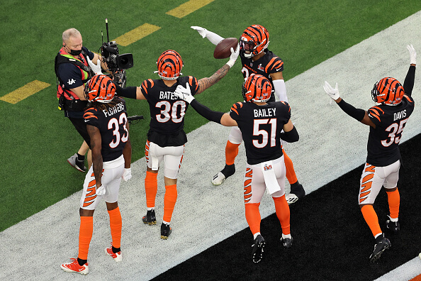
Offensive lineman often match their glove color to the opponent’s jersey in order to avoid holding penalties, so you’d think linebackers and defensive backs would do the same. And in fact, most of the Bengals’ linebackers and defensive backs did do that on Sunday. Here, for example, is a shot of (from left) cornerback Tre Flowers, safety Jessie Bates III, cornerback Eli Apple, linebacker Markus Bailey, and cornerback Jalen Davis, all wearing white gloves:
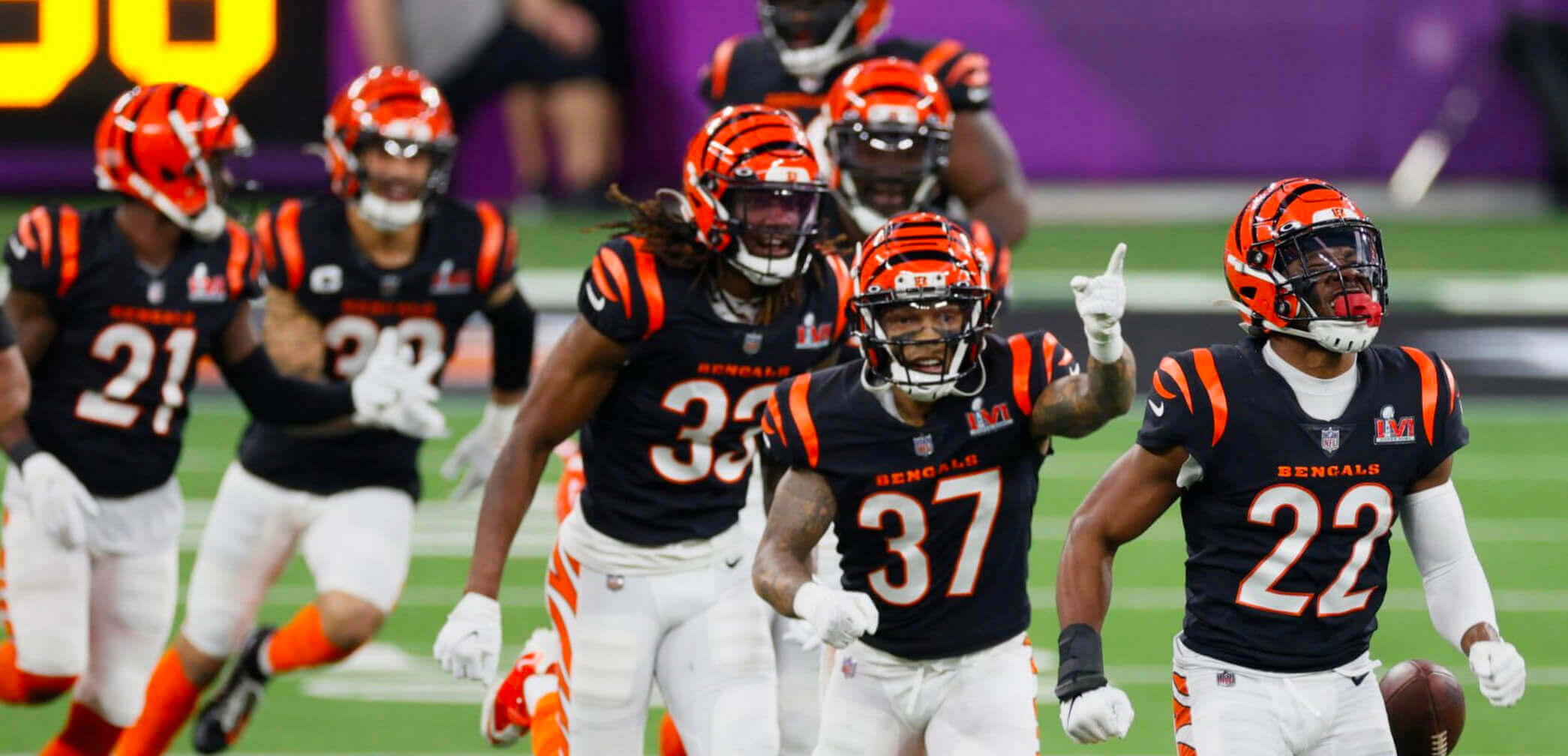
In this next shot you can see even more Cincy defensive backs wearing white gloves on Sunday, including cornerback Mike Hilton (No. 21), safety Ricardo Allen (No. 37), and cornerback Chidobe Awuzie (No. 22):
According to this box score, the Bengals had 15 linebackers and defensive backs who appeared in the game for at least one snap on Sunday. I was able to find photos of 14 of them (all except cornerback Trae Waynes, who appeared for only three snaps on special teams), and 10 of those 14 wore white gloves. The four outliers were safety Vonn Bell (who wore black), linebacker Germaine Pratt (orange), safety Michael Thomas (orange), and Wilson (the orange-gloved linebacker who drew the crucial late-game flag).
So while it wouldn’t be fair to say that Wilson was the only pass-defending Bengal who didn’t go with white gloves in the big game, he was definitely in the minority. It would take more research to determine if Sunday’s white-gloved Bengals routinely switch colors based on the opponent (wearing, say, black when they’re on the road against the Raiders, or orange on the road in Denver), but it wouldn’t surprise me.
Interestingly, this tactic of players hiding hand infractions by matching their gloves to the opponent’s jersey color led the NCAA to ban all glove colors except grey in 1999. But they rescinded the rule in 2011. To my knowledge, there’s never been any similar rule in the NFL.
Of course, we’ll never know for sure if Wilson’s orange gloves led to that yellow flag. But I think it’s fair to say they didn’t help.
Click to enlarge
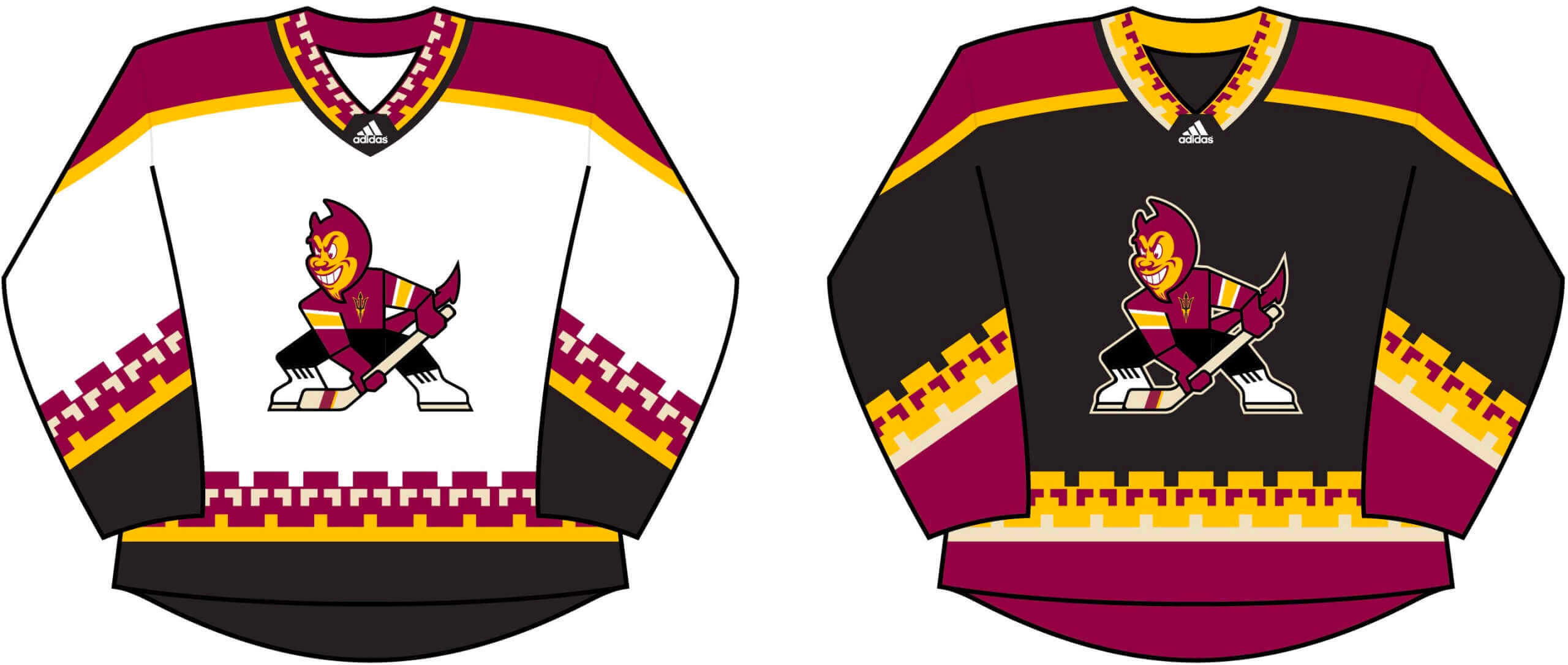
A very good idea: As you probably know by now, the Arizona Coyotes will be playing their next few seasons at Arizona State’s arena. That led Joey Artigue to create the jersey concepts you see above. I hope you’ll all join me in saying that this really needs to happen!
Collector’s Corner
By Brinke Guthrie
Follow @brinkeguthrie
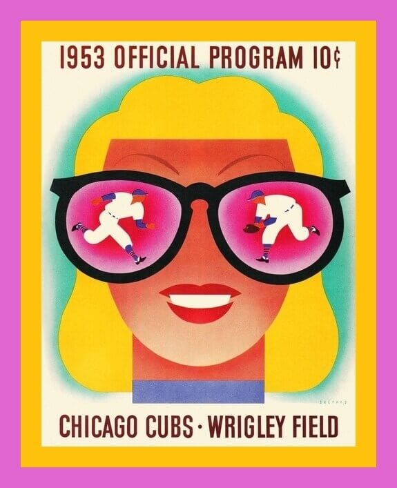
Now that the Super Bowl is behind us, we can look forward to another sports calendar milestone: pitchers and catchers reporting — er, then again, maybe not. So let’s make do for now with this terrific-looking Chicago Cubs scorecard from 1953! Sensational artwork by the great Otis Shepard.
Now for the rest of this week’s picks:
• Mickey Mantle sure seemed to plug a lot of merch back in the day. Here’s a 1953 ad from Gem Razor Blades with a cartoon drawing of the Mick saying, “Hey Baseball Fans! Here Are Three Swell Premiums for You!” Here he is again in an ad for Haggar slacks.
• Staying in that baseball era, check out this ad for Jackie (“Champion of Baseball”) Robinson polo shirts, sports shirts, and T-shirts! “They make swell uniforms for the neighborhood ball teams.” The ad makes mention of The Jackie Robinson Story, a movie that came out in 1950, so we’ll place this ad in that time frame.
• New York Football Giants star Frank Gifford was featured on the front cover of this 1958 booklet, Family Sports Fun. He covers “The Fine Points of Ball Carrying,” and the publication also hits such topics as “Family Fun with Volleyball” and “How Shoulder Pads Began.”
• Look at this! These are called “Baseball Tag-Ons” from 1960. This set is for the Pittsburgh Pirates, and they’re made of a flexible plastic so you can peel off your favorite Buc and stick it anywhere, as the package suggests. “Pep up your wall, shirt, books, mirrors, any surface!” (Why is it that nobody uses the word “pep” in ad copy anymore?)
• Here’s a Hockey Tat-oos Book from the 1950s. This little gem contains tattoos of NHL logos, equipment, and players. Instructions say just moisten your skin and press ’em on.
• Mr. Luther N. Hussey was, at one time, the proud owner of this 1963 season pass for the San Diego Padres (Pacific Coast League incarnation). “Subject to conditions on reverse side!” Looks like Mr. Hussey left us 11 seasons later.
• Need a backup Canadiens goalie for your tabletop hockey game? Look no further.
• Here we have a set of 1970-71 ABA Kentucky Colonels thermal cups from Marathon Oil, with artwork by the great Nick Volpe. They also gave away these as individual prints and as a team poster. I still have the Louie Dampier cup, and Darel Carrier was one of my fave players simply because I liked his name. Hey, I was just 10 at the time!
• Speaking of the ABA, you can almost feel Dr. J takin’ it to the rim with this 1973 New York Nets “Shot Chart Basketball” board game.
• Carnation Dairies is your sponsor of record on this 1985 Los Angeles Dodgers team poster featuring smiling manager Tommy Lasorda.
• And here’s a contribution from Paul: A pair of vintage stadium blankets, one for the Oregon Ducks, and one for your newly crowned Super Bowl champion Los Angeles Rams.
Click to enlarge
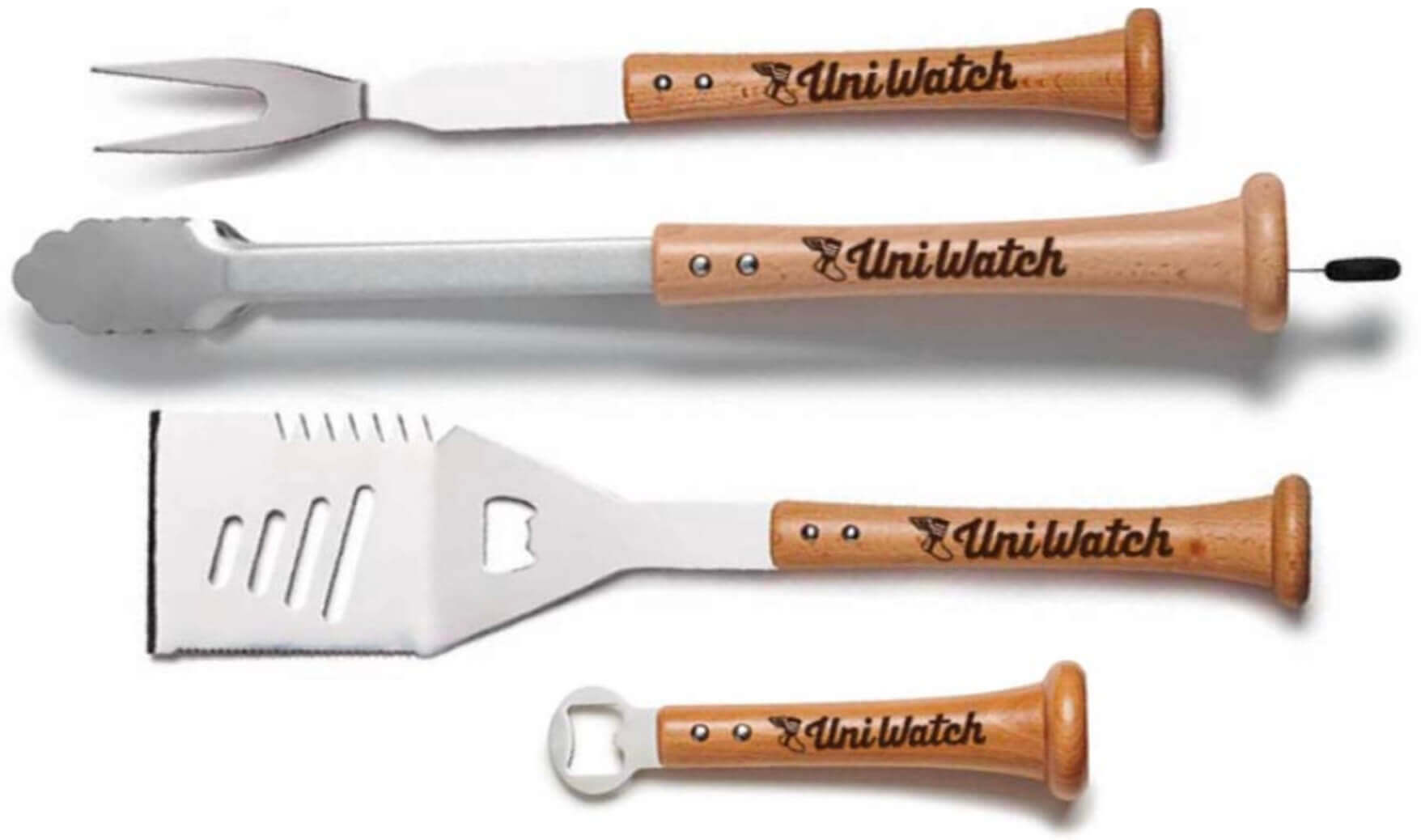
Fire up that grill: In case you missed it on Monday, the Uni Watch Grilling Tools Collection, featuring handles made from real baseball bats, is now available. Much like throwing out the first pitch at Brannock Device Night, this feels like a major life milestone. Full details here.
The Ticker
By Alex Hider

Baseball News: Hokkaido Nippon-Ham Fighters manager Tsuyoshi Shinjo is wearing his nickname, Bigboss, as his NOB (from Jeremy Brahm and @bigdaddy45_1969). … I think we’ve discussed this on the blog before, but The Kansas City Star published a piece about the familiar “KC Heart” logo made popular by local T-shirt company Charlie Hustle actually originated with the Negro Leagues’ Kansas City Monarchs.

NFL News: The logo for next year’s Super Bowl has been revealed. … Rams WR Odell Beckham Jr. wore diamond-embedded cleats during pregame activities prior to the Super Bowl on Sunday (from Brinke). … The coin used for the toss during the Super Bowl is up for auction. Last year’s toss coin went for $13,000 (from David Firestone). … Here’s an argument for ending the practice of counting Super Bowls in Roman numerals (from Jim Howicz). … After losing a bet with the Los Angeles Zoo, the Cincinnati Zoo has incorporated a ram into its Twitter avatar (from Kary Klismet).

Hockey News: The Canucks will wear their 1990s “flying skate” throwbacks on Feb. 24. … The abundance of uni ads in foreign club hockey is nothing new, but it seems even ickier when seen on a player of Jaromír Jágr’s stature. Jágr, now 49 (!), is currently playing in Czechia (from Scott Adams). … The AHL’s Springfield Thunderbirds wore Simpsons-inspired sweaters and played as the Ice-O-Topes on Saturday (from Lara Toscani Weems). … Michigan’s road blue sweaters appear not to have a maker’s mark (from Matt Rothman). … The now-defunct Oklahoma City Blazers minor league squad wore heart patches to mark Valentine’s Day back in 1996 (from @AlexMShirley). … The Sharks wore white at home last night against the Oilers
(from @slimeman_).

NBA News: The D League’s Iowa Wolves wore Black History Month uniforms last night and will auction them off to benefit local nonprofits (from @HawkeyeWeirdAl). … This Dominque Wilkins figurine from the 1990s features him wearing a striped uniform that never actually appeared on the court (from Tom O’Grady). … Newly acquired Nets C Andre Drummond is wearing No. 4, which means he’s now worn Nos. 0, 1, 2, 3, and 4 during his NBA career (from @marcomanipon).

College Hoops: Kansas men’s wore two-tone 1922 throwbacks last night to mark the 100th anniversary of their Helms Athletic Foundation national championship (thanks to all who shared). … Speaking of throwbacks, Indiana women’s wore 1982-83 unis last night (from Terry Mark). … Speaking of the Hoosiers, the Raymond Central High School (Nebraska) girls’ basketball team wears Indiana-inspired striped warmup pants (from Don Sauberan). … Virginia Tech men’s wore maroon at home yesterday, with Virginia wearing white on the road (from Andrew Cosentino and James Gilbert)..

Soccer News: Charlotte FC has officially unveiled what it’s calling its “community kit,” featuring the same mint green color that the NBA’s Charlotte Hornets used on a recent alternate uniform (from Brendan Wilhide). … The NWSL’s Challenge Cup has a new logo this season (from our own Jamie Rathjen).

Olympics: Sisters Tara and Tabitha Peterson are part of the U.S. women’s curling team. This creates issues for their NOBs, which they’ve solved by having Tara wear her middle initial in addition to her first initial. But reader Ben Humphries notes that both sisters have a middle name that starts with “S.” “Presumably they could borrow each other’s kit if something got lost in the laundry,” he says.

Grab Bag: The next two items are from Kary Klismet: Here are the rings the Hawaii men’s volleyball team will get for winning the national championship. …Formula 1 team AlphaTauri has unveiled its livery for 2022. … It was announced yesterday that 52-year-old Greg Biffle would attempt to qualify for the Daytona 500 this week. His No. 44 car has a Grambling State University-themed paint scheme (from Trevor Williams). … The Washington Post has a great piece on the rise of the apostrophe catastrophe (from Mark Wolf). … UNC is naming a media and communications building on its campus after longtime play-by-play man Woody Durham (from James Gilbert).
I played Center in H.S. many years ago right about the time Neumann receiver gloves first came out. I had a pair of white and a pair of black. I always wore the white ones at home and the dark when we were away because I felt like it helped me get away with holding.
“The abundance of uni ads in foreign club hockey nothing new, but it seems even ickier when seen on a player of Jaromír Jágr’s stature. Jágr, now 49 (!), is currently playing in Czechia.”
Of course, the owner who benefits from all those ads is Jaromir Jágr.
Today is Jagr’s birthday. He is now 50!
Excellent lede today. That never really crossed my mind before but is such an obvious thing to do, especially when your opponent is wearing white, it is easy to go white gloved.
Not sure if I missed mention of it yesterday, but the SB LVII logo is out, same template as this year but with a teal and red Arizona mountain skyline over the numerals. So seems official that this is third standard 5-year template we’ll have.
SB logo now added to the Ticker.
I agree that it is probably helpful to wear similar colored gloves as the proponents jerseys. Even if it’s only marginally helpful, NFL players are always looking for the tiniest edge, real or imagined.
As a fan watching on TV, it drives me crazy when players wear yellow gloves. The Chiefs and the Packers come to mind. I keep thinking there was a penalty flag thrown until I realize it’s just Travis Kelce’s big paws.
I feel the same way about yellow footwear — always fools me!
I’ve dealt with that watching the Chargers also.
link (from the ticker) that the link really was supposed to resemble an hockey skate.
I’ve seen that crest a hundred bajillion (yes, that’s a real number) times and never noticed. How is that possible?
There’s no bigger fan of the Flying-V uniforms than me, yet I recognize they fail at certain basic rules of good design. Chief among these, the logo is inscrutable when reduced (and, apparently, at normal sizes); It depicts a *racing* skate (look at the blade) rendered in red and yellow horizontal neon lights, against a background of parallel white contrails, and underscored by a very Art Deco rendering of the team name made to echo the shape of a skate blade. Alles klar? They would have done well to stick with a recolored version of the stick-in-rink insignia.
That’s interesting, being born in the early 80s that was their look to me, and while I didn’t like it, it was always overly apparent to me that it was a skate. But that was why I didn’t like it, their logo was a skate, it felt as lame as a basketball team calling themselves the Nets.
Regardless, the stick logo, the skate logo, the whale logo, they are all garbage as compared to either version of the Johnny Canuck logo.
The skate going downhill. Much like the fortunes of the Canucks many seasons during the time they wore the logo.
It always puzzled me that they opted to sew their crest at an angle. Sure, it makes it look like it’s going faster, but that’s skiing, not skating! Where on earth do people skate downhill?
At Fenway Park, for one place ;)
link
The sport is called Ice Cross Downhill, located at the intersection of Ice Hockey, Short Track Speedskating, and Downhill Skiing
“Hokkaido Nippon-Ham Fighters manager Tsuyoshi Shinjo is wearing his nickname, Bigboss, as his NOB”
I wonder if Uni Watch has ever discussed the phenomenon of Japanese players using Latin alphabet characters on their uniforms. I haven’t seen enough to know if it’s a mix-and-match thing, personal choice or is standardized by team or league.
The pro teams generally use Latin style lettering. Kanji (Japanese characters) have rarely been used since the end of World War II. Same goes for team names on jerseys and monograms/logos on hats. However, kanji are still widely used in high school baseball and at some colleges and company teams. A mix of Latin and kanji is used on pro baseball cards. Foreign players have their names on cards and in magazines or newspapers printed in katakana, the script for foreign language words.
Just an aside, I thought the Super Bowl LVI patch looked fantastic on the Bengals’ jerseys. Looked like a normal part of their unis…
Of course the article about getting rid of Roman Numerals replaces them with an apostrophe catastrophe. “Super Bowl `22”
Interesting lede. But if matching the opponents jersey color is a thing, it only works when you are in the dark color and your opponent is in white, right? Not sure the league would allow the Rams players to wear black gloves (though maybe so since black is a neutral color), and certainly would not have allowed a 49ers player to wear blue gloves in the NFC championship against the Rams.
Based on this lede, the home team in the Super Bowl should wear the dark jersey to allow for the white glove advantage. And yet teams have often chose to wear white. Lastly, maybe this is the one good reason for dishwater jerseys. Harder for you opponent to replicate matching gloves.
Presumably the issue is, light vs dark. Any non-white glove, aside from maybe light gray, is going to be highly visible against a white jersey.
When it comes to the team wearing the dark jersey, yes, a player on the Chargers would not have orange gloves while playing in Denver. But blue or yellow gloves on an orange jersey wouldn’t stick out as much as colored gloves do against a white jersey, nor as much as white gloves against a colored jersey.
And regarding black gloves in particular, fairly certain I have seen plenty of players on teams that don’t use black wear black equipment like gloves or undershirts.
Love the Sparky/Coyotes idea.
Continually poor officiating was primary, The optics of orange over white was secondary.
Ok, after seeing the logo for Super Bowl LVIII, I think we can confidently say the NFL has finally “seen the light” and is back to Super Bowl logos with some color and flavor of the host city again.
Yeah. Can’t say I love the designs, but can at least get behind a the concept of a template design that still allows for local flavor in it. That seems to be what they are doing.
Supposedly the switched from individual logos to the template design because they wanted the Super Bowl to have a branded logo, sort of like the Olympics rings. I can understand that, so if the idea is the logos are primarily silver and center around the Lombardi trophy, but with local elements and colors included, I think that is decent idea. But these two recent version of that leave a lot to be desired. There is too much shading, too many fines details, etc. A good logo uses basic colors so it can easily pop, and be rendered across multiple platforms in multiple sizes.
I hope they don’t start naming the Super Bowls after the year/season. The fact that the Super Bowl is so soon after the new year means that it’s hard to assign a year. This Super Bowl happened in 2022, but the vast majority of the season was in 2021. In the NHL and NBA, the seasons are split between the years, and even slightly weighted towards the second year. In that case, it makes much more sense to think of this year’s NHL champ as the “2022 Stanley Cup Champs”, even if it was technically 2021-2022. I actually have to stop and think for a minute if my Giants won Super Bowl XLII in 2008 from the ’07-’08 season, or in ’09 from the ’08-’09 season.
Also, I think the roman numerals are kinda neat, and fairly unique to the NFL in the world of American sports.
Good luck to NY Racing!
Fingers crossed that Biffle makes the field for Daytona and finishes well so the 44 can race a bit more this year.
Despite the door decal disaster which will plague the Cup cars for the foreseeable future, the font used for the car number looks really great…kinda ‘Hendrick-y’ to me. I always hated the look of Biffle’s jagged-edgey #16.
Unfortunately, with the new car, there’s plenty of news about supply chain issues hampering the availability of spare parts. One good wreck, and you might see about 10 cars racing in California the next week.
Good lede! Julian Edelman has said that Bill Belichick makes receivers and blockers wear white gloves when their opponent is wearing white. It makes it harder to spot holding calls.
link
Fascinating stuff in the ’98 NCAA release. I have no recollection of gloves only being gray from that era.
Also, it wasn’t until 1999 that the defense could advance a backward pass??? Wow, I realize there will always be some key rule differences between NFL and NCAA Football but wow.
Re: Sharks wearing white at home
I think this has to do with the Kings having white alts this season. Whenever the Kings are scheduled to wear the white alts at home and the visiting team is traveling on a back-to-back, the other home team also wears white at home. Same situation occurred earlier this season when the Ducks wore white at home.
I thought that too, esp. since the Oilers are indeed playing the Kings tonight.
But the Kings’ alt uni schedule does not show them wearing the white alts tonight:
link
Maybe they changed the sked..?
I’m surprised the curling sisters didn’t go with first names only. I remember seeing some of the beach vollyeyballers do that at the Tokyo games, and they didn’t even have a conflict with the last name.
link
When I explained to my wife about your “Apostrophe Catastrophe” moniker she suggested that quotation mark errors such as described in the Washington Post article be called “Quotation Mutations”.
Ok Vancouver, let’s throw it back a little further and bring back the Vader sweaters please.
I found it interesting on that Oklahoma City St. Valentine’s Day sweater the ads were for Love’s truck stops and KISS FM. Synergy!
P.S: Does anyone call it St. Valentine’s Day anymore? When did that go away?