By Phil Hecken, with Timmy Brulia
Follow @PhilHecken
Good Super Sunday Morning, Uni Watchers — the Big Day is here.
I’m once again rejoined by the Gridiron Uniform Database head honcho, Timmy Brulia, who yesterday brought us the uniform history of the LA Rams, and who today will give us the full rundown on the Cincinnati Bengals — who will be playing the Rams in Supe 56. As you all likely know, the Bengals got a new uniform set this past season. I had penned a “What’s Your Sign(ature)?” piece on the Cincy squad last year, but prior to the introduction of their new uni set, if you’re interested in reading that as well.
Thankfully, the Bengals uniform history isn’t nearly as deep as that of the Rams, so today’s lede is shorter — but there’s still a ton of info below. So I’ll turn it over to Timmy now as he brings you the…
Bengals Uniform History
by Timmy Brulia
The Beginning
1968: The Cincinnati Bengals arrive as the 10th team in the American Football League. The uniforms are rather conservative, as befitting owner/coach Paul Brown’s tastes. Helmet: Plain orange with “BENGALS” in thin black lettering with a micro thin white outline across the sides. Jerseys: White with black front and back numbers with sleeve stripes of black/orange/black and black names on the back (NOB). Black with white front and back numbers with sleeve stripes of white/orange/white and white NOB’s. The jerseys do NOT have TV numbers, unique in pro football at this time. Pants: white with side stripes of black/orange/black. Socks: white socks with black/orange/black stripes worn with white jerseys, black socks with white/orange/white stripes worn with black jerseys.
1969: Warm weather jerseys with the sleeve stripes slightly separated for both white and black jerseys are worn till the weather gets cold, when the team will switch to the normal jerseys.
1970: The black separated striped jerseys are not worn.
1971: Same as ’70.
1972: Both mesh (warm weather) and durene (cold weather) style jerseys in both colors are worn.
1975: New white socks with an orange/black/orange stripe combo is worn with all jerseys.
1976: Separated stripe jerseys are worn for the full season.
1977: The black durene jersey is worn for a bitter cold game late in the season.
1980: The facemasks change from gray to black and at last, TV numbers are added to the sleeves.
New Uniforms
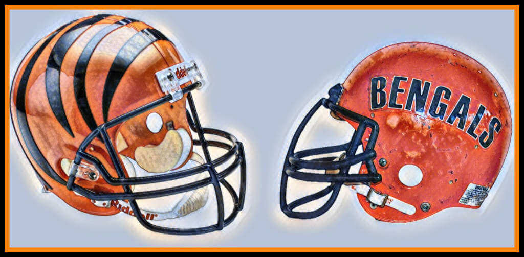
1981: A full overhaul of the Bengals uniforms transforms their look from one of the most conservative sets in the NFL to one of the more radical. Helmets stay orange but Bengals is replaced by a set of black tiger stripes. The white jerseys have orange shoulder loop on both shoulders with some black tiger stripes inset while numbers (front, back and sleeves) are black trimmed in orange. NOB’s are black. Black jerseys also have orange shoulder loop on both sleeves with some black tiger stripes inset and the numbers (front, back and sleeves) are white trimmed in orange. Pants are white with thick orange side stripes with black bengal stripes inside. Undersocks are a solid orange.
1988: Barely noticeable, but the Bengals sport a tiny white wordmark on their orange socks.
1994: For the NFL’s 75th season as with all teams, the Bengals wear the NFL75 patch on the left breast of both jerseys. The tiny wordmark disappears from the socks. Plus, for Week 3, the Bengals wear circa 1968 black uniforms with a black face mask on the BENGALS helmet.
1997: Some slight changes to the unis. Helmets are unchanged. The white jerseys have the TV numbers moved from sleeve to shoulder, the black tiger stripes are fewer and thicker on the shoulder loops, a running tiger visage is added to the sleeves, black trim is added to the collar and sleeve edges and the NOBs add orange trim to the black names. Black jerseys also move TV numbers from sleeve to shoulder, black tiger stripes are fewer and thicker on the shoulder loops, the running tiger on the sleeves are edged in white and the NOBs add orange trim to the white names. The white pants also have the inset tiger stripes thickened inside the orange side stripes. The socks change from solid orange to solid black.
1999: The black sleeve edges on the white jerseys are dropped.
2003: Black pants with the same stripe pattern on the white pants are worn with the black jerseys for the first and last weeks of the season.
Newer, More Modern Uniforms
2004: With the exception of the helmet, the uniforms undergo some major changes. Jerseys: white with rounded black front and back numbers with a slight orange drop shadow, black collar and an orange yoke, sleeves have an orange and black tiger stripe pattern, white TV numbers with black trim adorn the shoulders, with white NOBs inside the orange yoke and a tiger-striped B is located at the base of the front collar. Black with rounded white front, back and TV numbers on the shoulders with a slight orange drop shadow, sleeves have a similar orange and black tiger motif as the white jerseys, orange collar with a tiger striped B edged in white at the base of the front collar AND white side panels. Orange alternate with white front, back and TV numbers on the shoulders with a slight black drop shadow, sleeves with the black and orange tiger stripes, black collar with the B at the base of the front collar and white side panels. Pants: white with white, orange and black tiger stripes along the sides. Black with white, orange and black tiger stripes on the sides. Socks are either solid black or solid orange. All items are interchangeable. 6 different combinations are worn: black/white/black, black/black/orange, white/black/orange, white/white/black, orange/black/orange, black/black/black.
2005: 8 combos are worn: black/white/black, white/white/black, white/black/orange, white/black/black, black/black/black, orange/white/orange, white/white/orange and orange/black/black.
2006: 6 combos: black/white/black, white/white/orange, white/black/black, orange/white/orange, black/black/black, white/white/black.
2007: 5 combos: black/white/black, white/white/black, white/black/black, orange/white/orange, and black/black/black.
2008: 5 combos: black/white/black, white/white/black, white/black/black, black/black/black, orange/white/orange. For Week 1, the league wide Gene Upshaw memorial patch was worn with the black/white/black set.
2009: Same 5 combos as worn in 2008.
2010: Same as 2008-2009.
2011: Ditto as 2008-2010. A 9/11 tribute ribbon patch was worn on Week 1 on the black/white/black set.
2012: Same as 2008-2011. Nike’s flywire collars are in effect. In Weeks 14 & 15, A commemorative patch for 50 years of the Pro Football Hall of Fame was worn on the orange and white jerseys respectively.
2013: 5 combos, but white/white/orange replaces white/white/black in the rotation.
2014: Same combos as 2013.
2015: Same combos as 2013-2014.
2016: Ditto as 2013-15. Also, an all white color rush outfit was worn in Week 4 with black block numbers that featured NO orange trim on jerseys and pants, and all white socks.
2017: A 50th Anniversary patch is worn on all jerseys on the left breast. The flywire collars are ditched. 7 combos for this season: white/white/orange, white/black/black, black/white/black, orange/black/black, black/black/black, white/white/black and color rush all white (Week 2).
2018: 6 combos for this season: white/white/orange, white/black/black, black/white/black, orange/white/orange, orange/black/black, black/black/black and color rush all white (Week 1).
2019: White sanitary hose bite the dust. Combos include: all white, all black, black/white/black, orange/white/white, white/black/black, and color rush all white (Weeks 4 and 8).
2020: 7 combos: all black, all white, white/black/black, black/white/black, white/white/orange, orange/black/black and color rush all white (Weeks 8 and 12).
New, New Uniforms, Again
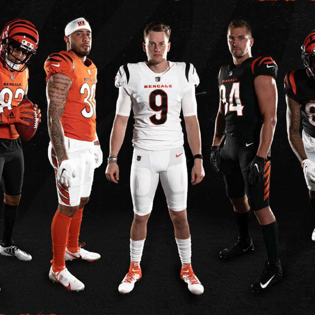
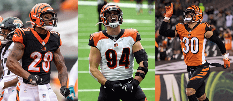
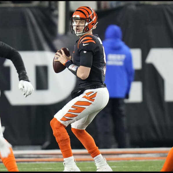
2021: The jerseys and pants get a face lift. The helmets remain untouched since 1981 (why mess with a good thing?). Jerseys: TV numbers are omitted from all jerseys. White jerseys have rounded front and back numbers with orange outline, NOBs are black, orange Bengals wordmark sits at the base of the front collar, three black tiger stripes adorn the sleeves. Black jerseys have rounded white numbers with orange outline, NOBs are white, orange wordmark at the base of front collar, three orange tiger stripes on the sleeves. Alternate orange jerseys have rounded white numbers with black outline, NOBs are white, black Bengals wordmark at the base of the front collar, three black tiger stripes are on the sleeves. Pants: 2 sets of white pants, one features black tiger stripes running down the sides and the other features orange tiger stripes on the sides. Black pants have orange tiger stripes down the sides. Socks are either all white, all black or all orange. An amazing 10 combos are worn in the regular and post season: all white with black striped pants, all black, white/white/black, white/black/white, white/black/black, black/white (black stripes)/black, black/white (orange stripes)/black, black/black/orange, orange/white (orange stripes)/orange, orange/black/orange. For the Super Bowl, the Bengals are going with the black jersey/white pants with orange stripes/orange socks set with the SBLVI patch on the left breast.
Awesome stuff Timmy! Thanks so much for (again) giving us the detailed uni history. Timmy does all the research and sends me the text, and I try to match the proper photos to his descriptions, so hopefully they all match up! Readers, please give Tim a nice round of thanks in the comments below, ok? OK!

Picking the Supe Winner … by Better Uni
If you’ve been following Uni Watch on the weekends for the past month or so, you know I’ve been attempting to pick the winners of the NFL Playoff Games by “better” uniform, against the spread. So far, through the conference championships, I’ve gone a respectable 7-5 — so no matter whether I’m right or wrong about the final game, I’ll still be above .500. Love to go 8-5 though, so here goes:
SUPER BOWL
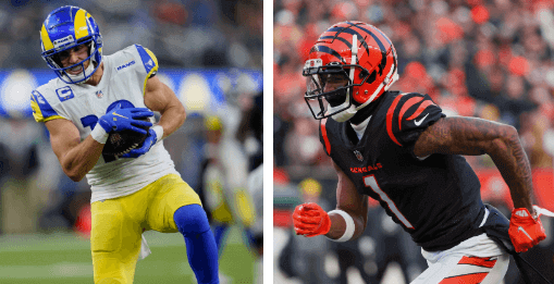
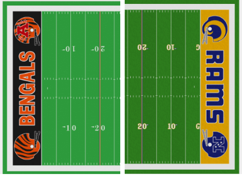
Los Angeles Rams vs Cincinnati Bengals

Time: 6:30 pm (EST)
Channel: NBC
Spread: Rams are 4 point favorites
Uniform-wise, this game had all kinds of potential to be awful (especially if the Rams had been in their dishwater jerseys), or if the Bengals had gone say, mono-black. But as it is, we probably have the best possible uni-matchup — and one I think will pleasantly surprise most of us. I’m not ready to say this will be a top-10 (or even top-20) all time best, but it does have the potential. And with that being said, it’s going to be a close call, uni-wise, as to who I feel has the better outfit for this game. I actually really like the Bengals in their black jersey/white pants/orange sock look (it’s their best kit — until they add a white helmet next season, then their “white tiger” look will be their best), and conversely, this is also the best Rams look. I’m not normally a fan of when teams have a different base color for helmet/jersey/pants — which both teams have — but in both cases it works for them. Like I said, this will be a tough call. Since I will be getting four points if I take the Bengals, in what otherwise might be a “uni tossup,” I will take Cincy. The uni matchup is close. Let’s hope the game is too!
The Pick: Bengals plus four
Jimmer Vilk’s 5 & 1
Most of you are familiar with Jimmer Vilk and his NCAAFB “5 & 1” (five good looking games, and one stinker), which I bring you every College Football Sunday, on the Sunday Morning Uni Watch. But Jim’s not exclusive to the college game, and today he returns to bring us his…
Super Bowl 5 & 1
by Jim Vilk
For those who don’t follow college football and are unfamiliar with the 5&1s, here’s a quick method to my madness. There are many games where both teams have good uniforms, but they need to go well *together* to make the Top Five. It’s about finding optimal (which isn’t always the same as maximum) contrast. Also, if anyone remembers my previous Super Bowl lists, I’ve tweaked this one yet again. Who says men can’t change?
5. Today’s game (aka Super Bowl 56)
I know, it hasn’t been played yet, but I think it’s safe to say we have a new Color Palette Special.
4. Super Bowl 31
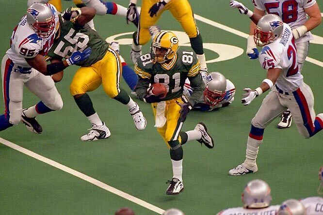
Modern vs. classic.
3. (tie) Super Bowls 13 & 30
These two beat out SB 10 because twilight grass beats sunny turf.
2. Super Bowl 20

I very easily could have done an all New Orleans Top Five, and this was the best of the Superdome era.
1. Super Bowl 4

Since KC didn’t wear red pants in the inaugural AFL/NFL championship, this slightly muddy contest is still the Super-est of the Super.
&1. Super Bowl 33
The Broncos have never looked good in blue/white/white, and the only redeeming quality of the Dirty Birds is that Glanville didn’t put them in black pants.
Now, if we could just have them fix today’s end zones to look like this…
Anyway, enjoy the game and have a Super Day!
Thanks Jimmer!
Those are some hot takes — what say you readers? Did Jim pull an Adam Vinatieri … or a Scott Norwood?

Uni Concepts & Tweaks
Time for more Uni Tweaks from the UW readership.
I hope you guys like this feature and will want to continue to submit your concepts and tweaks to me. If you do, Shoot me an E-mail (Phil (dot) Hecken (at) gmail (dot) com).
Today’s concepts come from Derek Reese:
Hi Phil!
Like many people, I think the Super Bowl logos have been really disappointing for awhile now, and I’ve had an idea in my head that I finally got around to attempting to execute. In addition to the boring, cookie cutter metallic design template they’ve been using, the 50th edition of the game using Arabic numerals instead of the traditional Roman numerals really, really irked me. I’ve always thought they could have gotten clever with the design and still used “L”, but highlighting the letter at the end of the word “Bowl”, with color and/or by adjusting the size of the letters in the design.
I did one for Super Bowl L (or “Super BowL” if you will) in the same rough style they were using at the time, as a bit of an anniversary style logo, and then another quick one for an upcoming game where you could follow on with the theme (with some local flavor put back into the design of course), as long as “L” is the first character of the numeral (up to #89, Super BowLVIII, SuperBowLXXXV etc).
Derek Reese
OK readers (and concepters). If you have some tweaks or concepts, shoot ’em my way with a brief description of your creation and I’ll run ’em here.
A Childhood DIY for the Ages!
Oh. My. God.
Got an e-mail from Joel Manuel, who took it upon himself to make his own Bengals tiger stripe helmet, shortly after it debuted.
Just so so good…
I thought you might like to see these pictures of a “DIY” Bengals helmet I made in 1981. 1980 was the first season I “watched” football; I was 8 and my dad had taught me the basics of the game. Unfortunately, I’m from south Louisiana, and that was the 1-15 “Aints” season.
Anyway, I was infatuated with the Bengals when they changed their uniforms the next season. So much so that I took my brother’s old helmet (which I had unsuccessfully tried to turn into an Eagles helmet during their Super Bowl season in ’80…see pics) and a few Sharpies, and before long I had a Bengals helmet. It still fits, though snugly.
It’s a great little reminder of that first Bengals Super Bowl team 40 years ago.
Joel Manuel
Baton Rouge
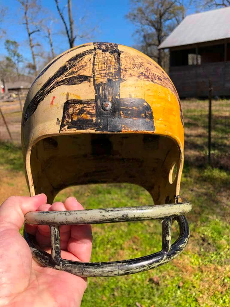
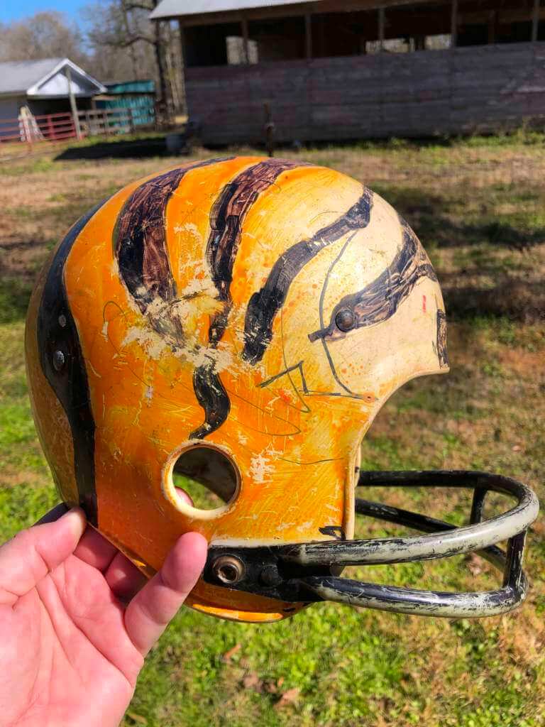
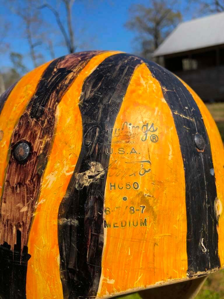
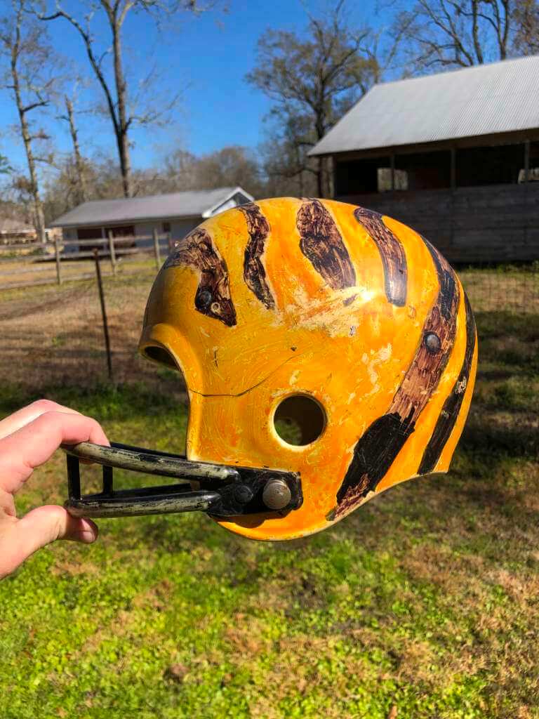
Just wow. Thanks Joel — the helmet still looks good!

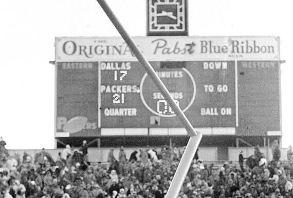
Guess The Game…
from the scoreboard
Today’s scoreboard comes from Tara Weir.
The premise of the game (GTGFTS) is simple: I’ll post a scoreboard and you guys simply identify the game depicted. In the past, I don’t know if I’ve ever completely stumped you (some are easier than others).
Here’s the Scoreboard. In the comments below, try to identify the game (date & location, as well as final score). If anything noteworthy occurred during the game, please add that in (and if you were AT the game, well bonus points for you!):
Please continue sending these in! You’re welcome to send me any scoreboard photos (with answers please), and I’ll keep running them.
Uni Watch News Ticker
By Phil

Baseball News: Obviously not much in the way of MLB uni news with the players still locked out, but we have to give a tip of the UW cap to the University of Michigan softball club for their gorgeous lower leg stylings (thanks Paul). … Here’s a really cool drawing of former Montreal Expos players in the old uniforms for a spring event to help raise money for kids with cancer (from Moe Khan). … I think this is just a trick of the eye, but it does look like the pinstripe bisects the BIG XII logo on these Okie State women’s softball jerseys (from Justin Southwell). … We’ve seen this before (or at least I have), but it’s still weird: softball inside a dome on a football field (from our own Alex Hider). Bonus points for it being called the “UNI DOME.” … FSU Softball is sporting a Bobby Bowden memorial sticker on their helmets (from King Bleedorah). … New uniforms on tap this season for Boston College, Texas A&M, and UCLA (from Kary Klismet). … Also from Kary: new uniforms for the Midland (Tex.) Rockhounds, the Oakland Athletics’ Double-A affiliate.

NFL/College/Football News: Reader Jacob Speckhard writes, “There’s a donut shop in Rochester, MN that is selling colorful Rams-and-Bengals-themed donuts this weekend. They look pretty great if you ask me.” … There is a new mascot for a combined WI/IL high school football team (from Kyle Campbell). … Mikey in the DFW asks, “Why was Steve Walsh’s nameplate so off-center in the Catholics vs. Convicts game?” … The LA Rams may have been the first pro team to paint a logo on their helmets, but they certainly weren’t the first (from Timothy P. Brown). … Mmmmm: check out the letter sweater, fur coat, and one embroidered jersey (from Devin Driscoll). … George Karmi writes, “It looks like the Commanders updated their crests with Roman Numerals.” … Here’s a neat display at East Carolina University listing the NFL players they have produced (from Brian Weingartz). … Want to know how much a Super Bowl ring costs and how it’s made? This story has you covered (from Kary Klismet). … One more from Kary: The Rams’ Super Bowl poster appears to have been modeled after the poster for an obscure Korean film from 2020. … No matter which team wins the Super Bowl, a nonprofit called Good360 is expecting a shipment next week. Since 2015, the organization has been handling the losing team’s Super Bowl merch, doing the same for the NFC and AFC finals and the World Series (via Paul). … Check out this very interesting Supe jersey for Lakisha Wesseling, a St. Louis native and diehard Rams fans and widow of Cincinnati native and NFL writer Chris Wesseling, who passed a year ago from cancer (from Luke).

Hockey News: Former Regina Pats forward Brad Hornung recently passed away way too soon due to cancer. The Pats wore a memorial decal on their helmets for him on Friday night. Hornung suffered a life-altering injury while playing for the Pats in 1987 (from Wade Heidt). … The next three submissions are also from Wade Heidt: (1) The Victoria Royals wore special uniforms for Pink in the Rink night on Friday. Black uniforms with pink trim; (2) The Prince George Spruce Kings wore special uniforms for 2000’s night on Friday. The vicious tree logo was back on this navy blue uniform. The Spruce Kings have been wearing a lot of different uniforms this year during their 50th anniversary season; and, (3) There is a look at the logo in this story on the Logan Lake Miners. The team will feature student-athletes from Thompson Rivers University in Kamloops and Nicola Valley Institute of Technology in Merritt. … Check out the weird NOBI (Name on Back Initial) for the Fort Worth Comets’ Gabriel Belley-Pelletier (from Casey Owen). … The Sacred Heart University Women’s hockey team wore green numbers & ribbons to raise awareness about mental health issues (from Ole TD. … The Columbus Blue Jackets supported their intrastate Bengals by sporting Bengals jerseys prior to yesterday’s game (from Kevin Pedigo). Interestingly, none of the jerseys have bengal stripes, so they’re NOT what the team will be wearing today. What’s up with that, Nike? … The Erie Otters wore pink uniforms last night for their Pink in the Rink night (from Wade Heidt). … Local hockey referees in the D.C. area wore their striped shirts to a Washington Capitals game last Tuesday to support their NHL counterparts (from Kary Klismet). … Also from Kary: The Utica Commets, the New Jersey Devils’ American Hockey League affiliate, unveiled alternate black jerseys they’ll wear for several games in March to support a local charity. … Speaking of the New Jersey Devils, they apparently unveiled Lunar New Year jerseys earlier this month while some of us weren’t paying attention, but some who were quickly decided they looked like the Nazi flag (Kary, again).

NBA/College/Basketball News: Yesterday the Baylor Bears and Texas Longhorns played a very citrusy-looking burnt orange vs. gold color vs. color matchup (from “BOOMER!!”). … Here’s a very cool old ad for socks featuring Reggie Theus (from retro 70s). … The Phoenix Suns are really good this season, and Suns Uni Tracker notes they have 4th separate win streak of 5+ games this season wearing a specific uniform combo. … In a game yesterday against Ohio University, Eastern Michigan’s Mo Njie wore two different colored sneakers (from our own Alex Hider). … New basketball floor for (the refreshingly non-corporate named) St. Joseph’s (Mo.) Civic Arena (from Kary Klismet). … More from Kary: Golden State Warriors star Stephen Curry and Under Armour have partnered to renovate a youth basketball court in New South Wales, Australia. He adds, “The best thing I can say about Curry’s personal logo emblazoned across both lanes is that the kids will always remember who paid for the upgrades, I guess.” … Whoa! Check out the crazy floor mops that instant ramen brand Nissin Cup Noodle is using in a high school basketball tournament it’s sponsoring in Japan (from Kary).

Soccer News: Want to avoid a sock color clash in soccer? Well, you can always break out some neon yellow ones (from Germán Cabrejo). … The ball design for the 2022 UEFA Women’s Champions League has been unveiled (from Kary Klismet). … French soccer club Paris Saint Germaine have a Chicago Bulls-inspired kit.

Olympics News: Did you ever wonder what happens to specific Olympic stadia/venues when the seasons change and they can no longer be used for their intended purpose? Wonder no more (from James Gilbert).

Grab Bag: Did you know that before Jimi Hendrix picked up the electric guitar, he played football? More than just an athlete, young Jimi was also quite the artist. Check out the convergence of talents on this “Intercepted” drawing circa 1956 (from Jerry Wolper). … The Phoenix Open often features some cool uni stylings, including Justin Thomas putting in a Sandlot Squints jersey (from wft browns). … Max Homa finally paid off his bet with fellow Tour player J.T. Poston, wearing a Braves jersey on the 16th hole. … The next four come from Kary Klismet: (1) The University of Tennesse has unveiled its newest live bluetick coonhound mascot, Smokey XI; (2) Algonquin Regional High School in Massachusetts has chosen “Titans” as its new team name; (3) New costumed mascot for Lincoln Land Community College in Springfield, Illinois; and, (4) New helmet for driver Daniel Ricciardo of the McLaren F1 Team.
Uni Tweet of the Day
Saw this on Paul’s twitter feed. Had to share…
if they still continued #colosseum pic.twitter.com/t5Dsz2T4Ar
— Archaeology & Art (@archaeologyart) February 12, 2022
And finally… that’s it for today, and for me this weekend. Once again, tremendous thanks to Timmy Brulia for the awesome Rams & Bengals uniform histories! Again, please take a few seconds to thank him down below.
If you’ve made it this far…you win a gold star!
Everyone have a great Sunday, enjoy the Supe, and have a safe week. I’ll catch you again next Saturday. Till then…
Peace,
PH
Timmy, Phil and Jim, thank you for the outstanding content today and for this weekend. Always enjoy Timmy’s Super Bowl research!
“Dirty Birds is that Glanville didn’t put them in black pants”
Glanville wasn’t head coach of the Falcons in 1998, it was Dan Reeves.
You are correct.
But, to salvage this…Glanville was the one who originally came up with those uniforms. So I still blame him. Thanks for jogging my memory banks, though.
I never noticed the Bengals white wordmark on orange socks before. Odd.
For some reason I remember some (not all) other teams doing this in that time frame. I don’t if they were available in the old NFL properties catalogs or what. Might be worth a semi-deep dive though.
I can tell you (because I was there) it’s the goal posts coming down at Lambeau Field after the Ice Bowl win over the Cowboys, Dec. 31, 1967. Packers 21, Pokes 17. I sat nine rows in front of the scoreboard.
Yes, it was cold.
Those original Bengals uniforms caught my eye as I scanned the Sears Christmas catalogue as a 10 year old in 1970. The black, orange and white was sharp and consistent and the helmet logo was singularly plain, but unique, which appealed to me at the time. I chose the Bengals as my favorite team (and received the jersey and helmet as gifts!) Soon after I collected everything Bengals. The switch to stripes in 1980 was surprising and inspired. Every change to their look since then has been painful, but the current set is definitely an improvement.
At any rate, 52 years a fan through thick and a lot of thin. Maybe today we long suffering Bengal fans will be rewarded.
Great story Jim! Hopefully you long suffering Bengal fans will be rewarded today!
Thanks, Phil!
Thanks again, Timmy, for another spectacular uniform run-down! You’re unflagging attention to detail is why the Gridiron Uniform Database is the the definitive source for pro football uniform information and the gold standard for sports uniform databases across the internet.
Absolutely seconded, Kary. I cannot tell you how often I’ve referenced that site since it was founded 10+ years ago. Best uni database there is!
On behalf of the guys at the GUD, you’re more than welcome. We are humbled by the love.
To me, the ’97-’03 look for Cincy is their best but I would say this current set is definitely an improvement over its predecessor set. However, I would really like to see a comeback of the old Bengals wordmark in a throwback fashion.
I suspect they’ll add a white/orange helmet for their alts but would love that helmet to get some modern day love… although it might be hard with the modern helmets with all the angles, holes, etc.
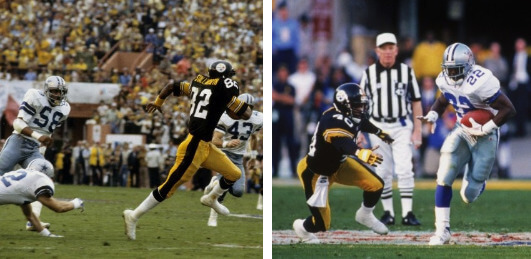
Love seeing all those Ken Anderson pics, especially the snow game against the Steelers.
Great job this weekend everyone! Enjoy the big game!
GTGFTS is the famous Ice Bowl at Lambeau Field. Dec 31, 1967.
Great post from top to bottom but am a little surprised to see the Patriots
( once w Pat and once w John Kerry) represented twice in 5+1
You almost saw them three times. Last time I did this list I had the Pats/Eagles as the &1.
I loved Flying Elvis 1.0, disliked the second version (which of course just had to be their most successful unis), and now I sorta like version 3.0.
These days Atlanta’s black bird on a black helmet bugs me more than the Eagles in midnight green, and the Broncos in blue/white/white (even back in the 70s and 80s I couldn’t stand that combo for them) bugs me more than any Pats uni.
Just wondering . . . if SB games were color vs. color, which would have been the BEST and WORST match ups of the 56 games?
Best? 12 by far. Then 16/23 and 50.
Worst? Probably still 33.
Great Bengals uni rundown today. As a fan since 1972, I always found the unis of the time just too damned plain. On those standard-definition TVs of the time, the “BENGALS” lettering just disappeared. And the helmet logos of the time displayed large letters that the team never used. Always loved the striped helmets. …. Also, the cold-weather, snowy game against the Steelers was in 1976, not ’77. Sports Illustrated even had a photo of the crowd, snow-covered only a few months after the Reds played in the World Series. I remember it very well. I was a Bengals fan and my brother loved the Steelers. But the best part of the game was the snow. We lived in West Virginia and knew the snow was coming our way and that we wouldn’t have to go to school the next day. Sweet stuff.
The Fort Wayne hockey team referred to concerning the weird NOB is actually named the Komets, often shortened to the “K’s”
The Bengals jerseys the Bluejackets are wearing are these crummy fashion jerseys sites are selling:
link
As a Rams fan back to the 1960s Roman Gabriel days, with a pause during the St Louis period, these new uniforms aren’t as bad as I originally thought. Don’t get me wrong, any use of the dishwater jersey or pants is awful, and the mono look is also not good. But the white or blue jersey looks good with the yellow pants, and the helmet has grown on me. I really like the royal blue helmet color, and the horns are no better or worst than the old horns. Now if they could get rid of the “Rams” name tag, and clean up the numbers in future years.
I think that’s a great assessment, Rick — and I agree. The Rams’ unis could approach top 10 status with the very tweaks you suggest: dump all dishwater, don’t ever go royal-mono (either royal/sol or white/sol), remove the “my name is” patch, and get rid of the rubber and gradient numbers. Those changes won’t be coming for a few years, but if they simply tweak what the have, it could be a really good look going forward.
Love the gladiator picture, but you can’t tell me that the gladiators themselves wouldn’t be sponsored like NASCAR drivers.
Great job on Rams and Bengals, thanks to TimmyB and others.
Texas A&M apparently needs 8 different baseball uniforms. When will this madness end?
Sad to see the Puppy Bowl has a better logo than the Super Bowl.
ON WHAT PLANET do those Devil Jerseys look like Nazi flags??? This isn’t an episode of “Curb Your Enthusiasm”.