By Phil Hecken
Follow @PhilHecken
Greetings and good Sunday morning, Uni Watchers. I hope everyone had a pleasant Saturday. I ended up with some kind of (what I hope is) a food poisoning situation last evening, but it seems to have cleared itself up. So, please forgive me if today’s lede is shorter and less in-depth than it might usually have been.
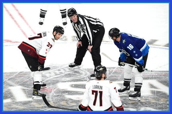
As you’re likely aware, the NHL held its annual All-Star Game yesterday, and this one was played in Sin City. Now, in the past there have been some very fine uniforms (I fondly remember the orange and black looks from the 1970s and early 1980s), and some not so great ones (especially those of recent vintage). You can look at past ASG unis here. Yesterday’s uniforms, though, I thought were quite nice.
As has been the trend in recent years, teams were divided into four groups — as determined by division (so, you had Atlantic, Metropolitan, Central and Pacific), but only two uniforms were worn. Each division had both a light and dark version, as there were three total “games” to be played. In the first “semi final,” the Metropolitan Division played the Pacific Division, and the second semi had the Central Division playing the Atlantic Division. The winners (Metropolitan and Central) then met in the “final,” where the Metropolitan Division reigned supreme.
In the first semi, the Metropolitan Division wore white sweaters vs. the Pacific in dark, while in the second semi, the Central Division also wore white ones with the Atlantic in blue– so, for the final the Metropolitan Division switched to blue jerseys.
Let’s take a look at the dark jersey.
As you can see, it’s predominately a royalish-navy blue with white/light blue stripes, and a darker, almost royal blue block on the sleeves and hem. You’ll also noe on the left shoulder, the parent team’s logo was placed. A black NHL shield/logo/crest was in the center of the jersey. NOB was rendered in block white letters, and jersey numbers were white with a light blue outline.
The right shoulder featured the All-Star Game logo:
That logo was a custom design, featuring western elements, including an outline of the famous “Welcome to Las Vegas” sign, rendered in the Vegas Gold and red of the host team, the Vegas Golden Knights.
Both the white and dark jerseys featured two stars — red for the white shirts, blue for the dark jerseys — on the sleeve. Here’s a look at the white sweaters:
As you can see, the template is the same design as the blue jersey — with white being the predominate color, stripes of black and red, with a darker red block for the sleeves and hem. NOB was black block lettering, and jersey numbers were rendered in black with a red outline.
All teams (regardless of jersey color) wore black helmets, black breezers, and socks with white on top, black/white stripes in between, and black bottoms. This looked quite good with the white jerseys, as those had black stripes on them to begin with. While they still looked good, they didn’t look quite as cohesive with the blue jerseys, as those contained only the black NHL shield logo. Still, with the black bucket & pants, the socks looked fine.
The jerseys (uniforms) looked great together on the ice.
Here’s how the uniforms looked in action:
Cam Talbot said goalies are here for a reason too 🤩
Wild saves by the @MNWild tendy #NHLAllStar pic.twitter.com/QxAD7p1pyM
— B/R Open Ice (@BR_OpenIce) February 5, 2022
And there you have it. Again, apologies for the shortish-writeup. But I particularly enjoyed how this game looked, and thought the unis were some of the best in recent vintage…and probably in the top five of all time. Well done!


Guess The Game…
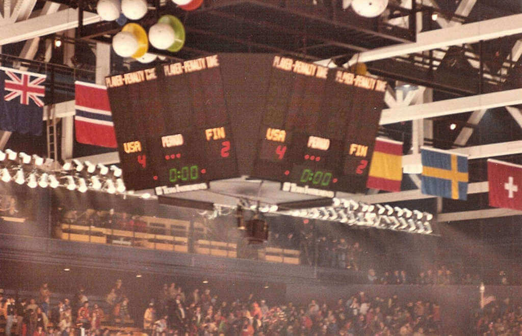
from the scoreboard
Today’s scoreboard comes from Suzyn California.
The premise of the game (GTGFTS) is simple: I’ll post a scoreboard and you guys simply identify the game depicted. In the past, I don’t know if I’ve ever completely stumped you (some are easier than others).
Here’s the Scoreboard. In the comments below, try to identify the game (date & location, as well as final score). If anything noteworthy occurred during the game, please add that in (and if you were AT the game, well bonus points for you!):
Please continue sending these in! You’re welcome to send me any scoreboard photos (with answers please), and I’ll keep running them.

Uni Concepts & Tweaks
Time for more Uni Tweaks from the UW readership.
I hope you guys like this feature and will want to continue to submit your concepts and tweaks to me. If you do, Shoot me an E-mail (Phil (dot) Hecken (at) gmail (dot) com).
Today’s concepts come from Chris Diamond:
Hi Phil,
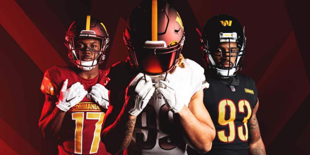
I was so thoroughly appalled by the new Commanders unis I felt I had to have a go at tweaking them. The sad irony is that the sneak peeks looked quite promising, at least for the burgundy jersey. And as you can see with not much change they could become quite a nice set with some design consistency. Anyway, I don’t know if there is room this weekend for this, but I just had to do *something*! And no black in sight 😊
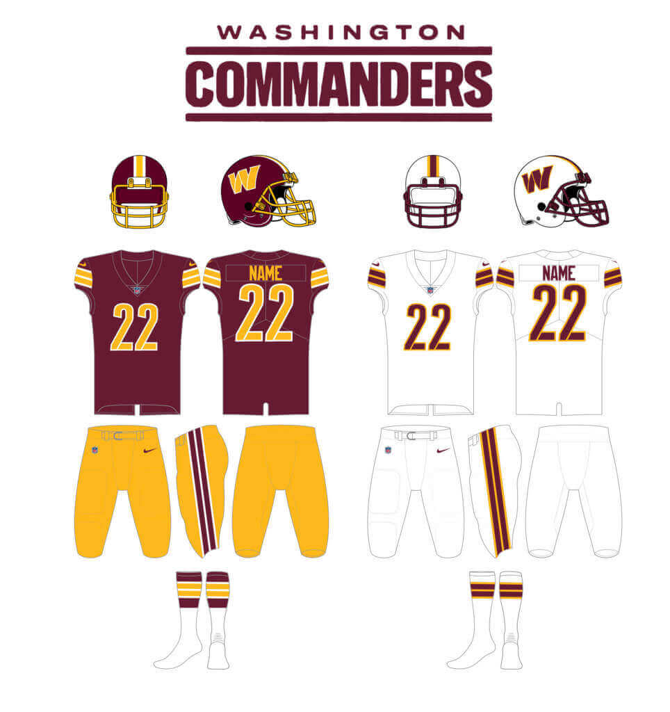
Kind regards,
Chris
OK readers (and concepters). If you have some tweaks or concepts, shoot ’em my way with a brief description of your creation and I’ll run ’em here.
The Nobody Cares Pro Bowl is today…
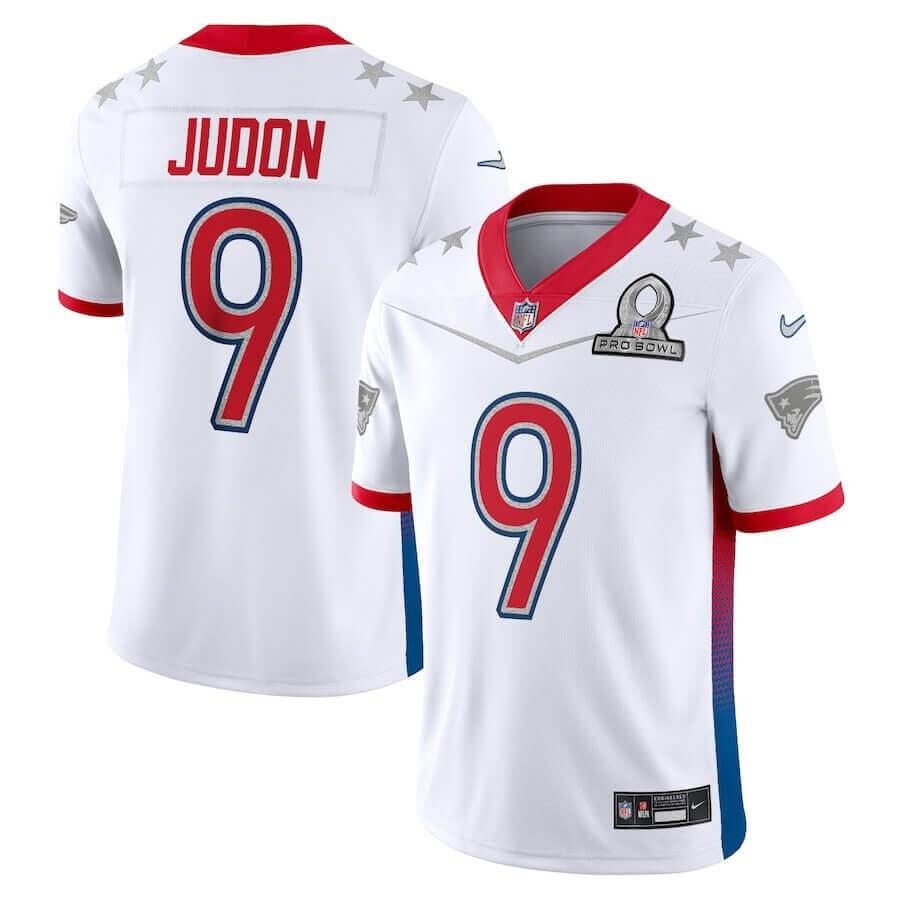
Unless you’re a die-hard NFL junkie, you’re probably not going to be watching the NFL’s Pro Bowl, which takes place today. What was once a nice, post-Supe “award” (and an all expenses paid trip to Hawai’i) for players, now has become pretty much an after-thought in the NFL season. And for the past decade or so (even more if you count the Reebok-years), Nike has trotted out some pretty uninspired uniforms, which might be one of the few reasons to tune in.
This year, we have seen the jerseys both squads will wear (but to my knowledge, not the pants). To my surprise and astonishment, they’re not that bad, and for the first time in a decade, will return to the familiar blue (NFC) and white (AFC) tops teams sported in decades past.
Here’s a closer look at each teams’ jersey:
NFC
AFC
I used to have a folder on Flickr with all the Pro Bowl uniforms throughout the years, but alas, that is no more. But this 2013 article contains many of the same images I had in that folder, arranged by year, so if you’re so inclined to take a look back at the old unis, fire away.
In the past decade, the uniforms have more or less been a trainwreck, with lots of neon or gray or gold or black, but this year’s unis have returned to the more traditional look.
Like you, I won’t be watching the game, but if I happen to stumble upon it while flipping through channels, at least I’ll be able to tell which conference has the ball. Baby steps.
Commanders reminder: Paul here. In case you missed it, I have a very detailed assessment of the Commanders’ new team name and uni set. You can read it here on Bulletin, but you’ll need a paid subscription to access the article (and you’ll need a Facebook account to pay for the subscription). The price is $4 a month or $35 a year.
If you haven’t yet subscribed to my weekly Bulletin column, you can do that here, or just click on the article link. If you want to subscribe but the Facebook requirement is a dealbreaker, I can let you know when a non-Facebook payment option is available — just shoot me a note and I’ll keep you in the loop.
Next week’s Bulletin article will be my annual Super Bowl Preview, full of fun facts about the Rams’ and Bengals’ uniforms (past and present). The week after that, I’ll likely have a deep dive on the new Riddell Axiom helmet. All of my annual Big Four season preview columns will be on Bulletin as well.
That’s it from me. Now back to Phil with the rest of today’s post.
Uni Watch News Ticker
By Phil

NFL News: It wasn’t just Chris Diamond (see Uni Tweak above) who thought the new Washington Commanders uniforms could use some tweaking. Almost everyone of those is better than what the team introduced. Or these — or even these. … In fact, the only ones who may like the new Commanders uniforms seem to be Commanders players themselves. I mean, what are they gonna say? “These suck”? … The Legoland amusement park in Carlsbad, Calif., is building a 1:50 scale model of the Los Angeles Rams and Chargers’ stadium out of Lego bricks (from Kary Klismet). … Check out this Seattle Seahawks early stationary with rare designation as “…Football Club”, from July 24th, 1975 (from Michael Princip). … Dan Kenndey notes there was a gentleman “in front of me at a basketball game has an awesome jacket with all of the old Super Bowl logos stitched up and down the sleeves.” … Whoa — check out the pants stripe strips on the 1937 Bengals (via Cam Miller).

Hockey News: The U. of Saskatchewan Huskies women’s hockey team wore special uniforms for “Play For The Cure” night on Friday. The jerseys will be auctioned to raise funds for Haven Kids’ House in Saskatoon (from Wade Heidt). … Les Lazaruk is the long-time voice of the WHL’s Saskatoon Blades. He just recently called his 2000th game for the team. The Blades provided Lazaruk this framed jersey with the number 2000 (also from Wade). … There’s a rumor that the New York Islanders could be returning the “Gorton’s Fisherman” logo for the reverse retro jerseys when they make their return for the 2022-2023 season. … The Calgary Hitmen have unveiled some, um, interesting jerseys for their “Every Child Matters” game. … This article argues it’s time for the Dallas Stars to return to their forest green and gold “Star” jerseys, first worn in 1999. … Apparently there is no requirement for players to wear different uniform numbers on ice at the same time in the NHL ASG (from Harvey Lee). … “Suitably Saskatchewan,” writes Wade Heidt: “The football stadium has been converted to include an outdoor curling rink. Mosaic Stadium hosting some high level curling competition on the ice.”


NBA/College/Hoops News: The Greenbrier Resort in West Virginia temporarily turned its ballroom into a basketball arena to host a couple of local high school games (from Kary Klismet). … Here’s a cool story about a company in Ohio that makes basketball floors used by many college and pro teams (from Kary Klismet, again). … Kary writes, “I’m sure we can all agree that THIS newest ranking of NBA logos represents the definitive, indisputable order.” … The Montreal Alliance, a team in the Canadian Elite Basketball League, have unveiled a new costumed mascot (Kary, again). … And, one more from Kary: Affirming once again that Uni Watch covers uniform unveilings at all levels, the Multy Lakers girls’ and boys’ youth teams in Multyfarnham, Ireland, debuted new uniforms this week. … Penn State hoops were wearing their throwback black and pink uniforms. … Our own Alex Hider notes the “Awful white on GFGS matchup between Ohio and WMU.” … Color v. color yesterday between Notre Dame and NC State (from Hayden Parker). … The HBU Huskies wore their tremendous throwback unis yesterday (from HBU Huskies). Here’s a look at them in action (from Andy Barlow). … Whoa! Check out the ram horn design on the Colorado State court (from Ben on Sports). … So who thought a lavender vs. purple game wouldn’t look good (from SickosCommitteeCBB).

Soccer News: Architectural renderings for Liga MX side Tigres UANL’s new stadium, announced last month, have been unveiled (from Kary Klismet).

Olympics News: Here’s one writer’s ranking of the top uniforms from Friday’s Opening Ceremonies in Beijing (from Kary Klismet). … Team GB luger Rupert Staudinger paid tribute to his former team mate AJ Rosen, who passed away in December after battling cancer, with a helmet tribute in Beijing. … Here’s a look at every Olympic medal ever made since the 1896 Games in Athens, Greece (via Paul).

Grab Bag: With the passing of three firefighters of the Baltimore Fire Department, all firehouses in Baltimore went out of service for the day for the funeral services, and fire departments from the region provided mutual aid which created a unique mixture of different fire trucks and equipment from DC, MD, and VA responding to calls in Baltimore (from Bryan Martin Firvida). … Check out these pretty sweet drawings of rock bands in styles like comic books, trading card wrappers, Hanna Barbera, movie posters, etc. That’s from Jeff Wilk who adds, “This Patti Smith Topps card pack is primo.” … The Hawkeyes of Hamilton (Mich.) High School have a new costumed mascot — who just happens to be wearing a t-shirt that rips off a vintage Iowa logo — which isn’t surprising given the identical team names, but is curious nonetheless since Hamilton already has its own distinct logo (from Kary Klismet). … Thursday’s Ticker included an item about Fort Madison and Burlington High Schools in Iowa planning to wear throwback singlets for their wrestling match that night, but didn’t show the singlets. Here’s a photo gallery of the match showing what the various singlets looked like in action (from Kary, again). … Speaking of wrestling singlets, Kearney (Neb.) High School held a “Singlet Night” in which students attending its match against Grand Island wore wrestling singlets to support the team (Kary, again). … The U.S. Navy’s top enlisted sailor was spotted wearing an unusual plain khaki uniform unlike any other regulation uniforms worn by the service (Kary, again). … The U.S. Marine Corps has a new live bulldog mascot (from Kary). … Dekalb County Technology Center, a technical school in Alabama, has chosen a mascot and logo (from Kary). … And one last one from Kary: The Indian Premier League, the country’s top Twenty20 cricket competition, has revealed new jerseys for all its clubs.
Uni Tweet of the Day
So … what’s the rule about what appears to be two fully grown men showing up to a game in their opponent’s house… in full uniform?
These Knicks fans showed up to the game in full uniforms 😂 pic.twitter.com/SCdEUXs5dq
— NBA TV (@NBATV) February 6, 2022
And finally… that’s all for today, and for me for this weekend. Next weekend is, of course, the Supe, and in a Uni Watch tradition, Gridiron Uniform Database honcho Timmy Brulia will be returning to give us the complete uniform histories of the two combatants: the Los Angeles Rams and the Cincinnati Bengals, so be sure to check back for those!
Everyone have a good week and stay safe!
Peace,
PH
GTGFTS- The picture is from the 1980 winter Olympics in Lake Placid. The score is from the gold medal hockey game between the US and Finland with the US winning gold with a 4-2 win over Finland. A few days earlier the US defeated the heavily favored Soviet Union in one of the biggest upsets in sports history.
GTGFTS – Lake Placid Olympic Fieldhouse, Feb. 24, 1980 –
This is the US – Finland match, won by the US to secure the gold medal at the 1980 Winter Olympics.
It is important to note that was not a gold medal final, the medals were awarded based on the results of the games played among the 4 teams that advanced to the medal round. Going into the last games, the US had a record of 1-0-1, USSR 1-1-0, Sweden 0-2-0, and Finland 0-1-1 – so there were scenarios where each could win gold, silver, bronze, or go home empty handed.
The Atlantic division wore white jerseys against the Central in blue, and the “Atlantic wearing blue” picture you posted is Joe Pavelski in white for Central against goal Tristan Jarry in blue for the Metropolitan. Something needs to get fixed
The Commanders concept is a total upgrade. I would go one step further – no white helmet and only gold pants. Done!
No white helmet & only gold pants wouldn’t bother me, but I also think there are no bad combinations among the elements presented. Overall, a huge upgrade to IRL. Great job, Chris!
Thanks! I was really quite down after the uniforms reveal. Thank goodness for UniWatch and those who GetIt™!
2 Saskatoon and 1 Regina item in the ticker? I guess I’m not the only one here from those parts, lol.
I also really liked those All-Star uniforms. I’d have preferred matching socks, but that’s nitpicking. Most of the recent designs have sucked, especially those lime green, silver and black abominations from 2015 with busy angled striping and a “chrome” NHL shield on the front. Yuck.
Chris Diamond, thank you for your Commanders uni ideas. They are perfection.
Thanks Paul!
Central wore blue in their first game, so both Metro and Central swapped colors in the last game (I guess to add a layer of confusion?)
Surprised this wasn’t mentioned.
There used to be 4 separate uniforms.
Bourque wore 7 and he was more senior so Coffey wore 77 when they played together in Canada Cup 84. But then Bourque switched to 77 when they retired Espo right around when Coffey was traded to Pittsburgh. 7 was taken on the Penguins so Coffey switched to 77. In ASG and Canada Cup, Bourque wore 77 and Coffey went back to 7. I always liked how players with less seniority had to make concessions, like Salic wearing 20 in the 2002 Olympics because Yzerman wore 19.
Over here, we refer to any adult wearing the full uniform of a sports team in public as a”Full-Kit Wanker”.
link
My “rule”:
No Jerseys If You’re Over Age 30.
While I do admire their pluck for going full-uni to support the visiting team, the look is immature and unsettling.
But hey, wear what you like to the game.
The Commanders concepts are a 1000% upgrade to the trash that was unveiled recently.
Thanks Jesse, on behalf of myself and the other amateur designers :)
Phil: re the ticker item about the basketball game in a hotel ballroom: That actually took place at The Greenbrier Resort in West Virginia. The resort is also known for the Greenbrier Tennis Classic, PGA golf, and NFL training camps.
Thanks for the correx. Now fixed.
Interesting problem..I went to the shop nhl website to purchase a blue for Tom Wilson jersey but it says I cannot because the blue is for the Western conference.
Interesting to note the Adidas logo on the hockey pants for the NHL All-Star uniforms.
Of course Adidas supplies jerseys and socks for the NHL, but I do not recall ever seeing Adidas branding on hockey pants or shells. The brand is not an manufacturer of hockey equipment.
Well, other than skates.
link
I definitely remember Adidas Skates.
Most of the Soviets ( and maybe eastern bloc teams) wore them in the 60’s and 70’s – it seems like USSR wore them in the ’72 Summit Series and maybe even a few holdovers in the 1980 Oly’s.
I always wondered about their quality – never saw any for sale in the U.S.
I’m sure they were well-made but, on the ice, the only thing odder looking for me would have been Puma Skates.
What made you think the basketball court in the hotel was in Greenville, S.C.? The fact that neither that city or state were anywhere in the story? That it came from a publication in West Virginia (clearly labeled)? That the Greenbrier is one of the most famous resorts in the East?…. Oops.
I blame Phil’s food poisoning.
Thanks for the correx. Now fixed.
Wasn’t Phil’s fault. It was mine. I read the article quickly and had a mental misfire on the location when I was typing up the Ticker submission. Mea culpa.
Well…it’s both — yours for sending it that way and mine for not double-checking ;). All good!
“As you’re likely aware, the NHL held its annual All-Star Game yesterday”
– I can’t be the only one who had no idea that the NHL All-Star game was yesterday.
Reading the article about the NBA logos made me appreciate the good writing I see on Uni Watch.
Interesting to see both the NHL All-Star game and the Pro Bowl being held in consecutive nights in the same city and both leagues having a blue vs. white uniform matchup. The fix is in! Whoops, shouldn’t say that about Las Vegas.
Wonder if any hockey players will make an ass of themselves at the Pro Bowl like Tyreek Hill.
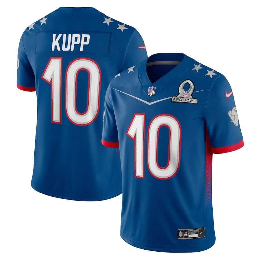
Nice to see a jersey advertising the pro bowl (Kupp) that wasn’t on the field today.
Feel better Phil
Those Commanders uni fan concepts do look better than the real ones.
Still have a soft spot for the Pro Bowl unis of the Sixties, when every year the game was played in the LA Coliseum, Eastern Conference versus Western Conference….simple, clean, timeless reminder of the “when men were men” era of football.
Can we give the NHL even more props? How good did they look the night before during the skills competition with all 4 teams lined up on the ice in their home jerseys!!!
Pair that with what they’ve done with the Winter Classic uniforms and the Reverse Retro. Think the NHL is winning the best dressed award and it’s not close!