Click to enlarge
If you heard a noise in the background yesterday, it was probably all of America breathing a huge sigh of relief. That’s because we now know that the Super Bowl will be dishwater-free — halle-freakin’-lujah!
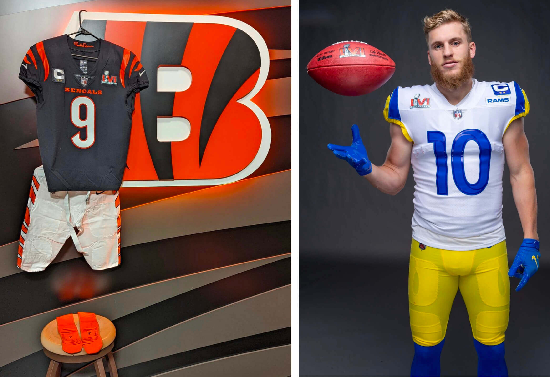
Or to put it another way, the Bengals and Rams both tweeted their Super Bowl uniform combos yesterday. Cincy, who had first choice by virtue of being this year’s designated home team, opted to go black over white, with the orange-striped white pants and orange socks. The Rams, thankfully, got whatever permission was needed to wear their white alternates (no, they’re not “modern throwbacks,” which is just a bullshit marketing term, so let’s please not call them that here on Uni Watch — thanks).
Some thoughts:
• To my mind, this is the best possible uni matchup for these two teams. Given all the other possible outcomes, some of which were truly dreadful, I feel like the slot machine just came up with three cherries. It won’t be a great-looking game (Raiders vs. Packers — that’s a great-looking game), but it’ll be aesthetically respectable and eminently watchable. Phew!
• We now know that this will be the first Super Bowl in which neither team is wearing TV numbers. (The Rams dishwater jerseys have TV numbers, but not the white or blue jerseys.)
• As you can see in the photo at the top of the page, the Rams’ pointless chest patch will create a patch pile-up for the team’s captains, similar to what KC captains dealt with two years ago.
Okay — now that that’s settled, let’s look forward to a good game! I’ll have more thoughts on both team’s uniforms (past and present) in my Super Bowl Preview next week.
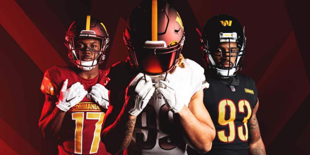
The day after: Well, that was quite a day, wasn’t it? I spent most of yesterday working on a very detailed assessment of the Commanders’ new team name and uni set. You can read it here on Bulletin, but you’ll need a paid subscription to access the article (and you’ll need a Facebook account to pay for the subscription).
If you haven’t yet subscribed, you can do that here, or just click on the article link. If you want to subscribe but the Facebook requirement is a dealbreaker, I can let you know if/when a non-Facebook payment option is available — just shoot me a note and I’ll keep you in the loop.
A few other notes on the Commanders’ unveiling:
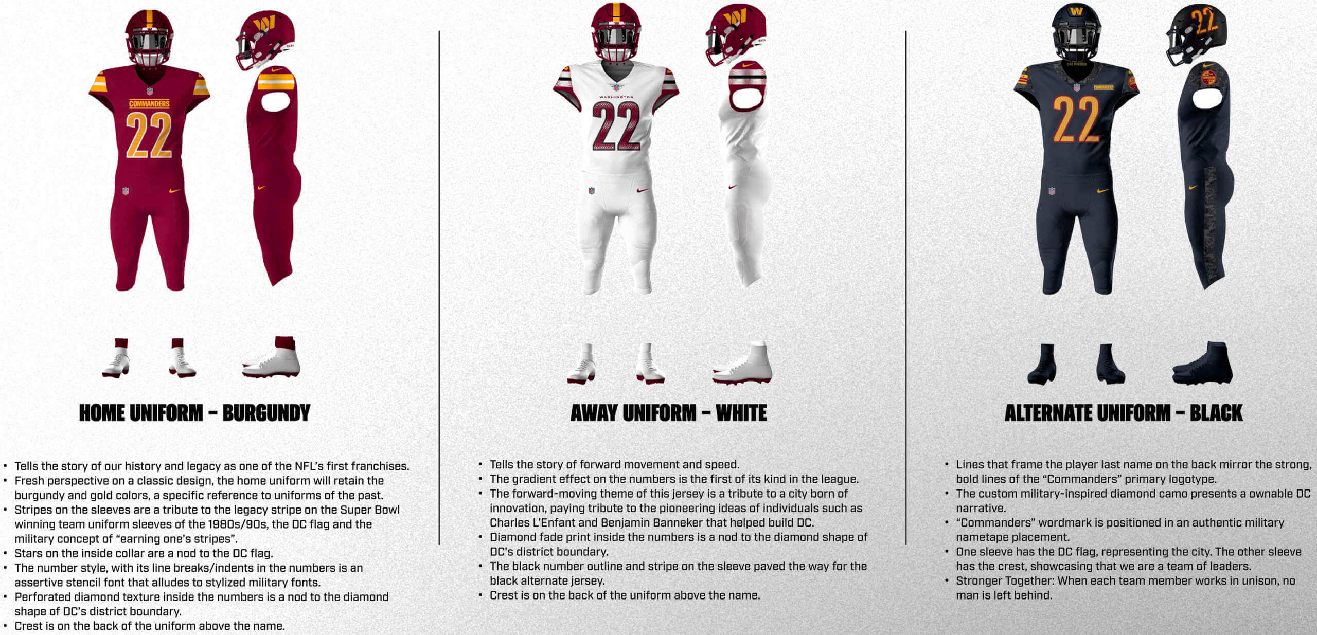
• If you want a good laugh, here’s all the “storytelling” (click to enlarge):
• The team posted these 17 photos of the new uniforms. As you can see, most of them don’t even show the helmet, plus there are no non-mono uni combos included and no full-length rear views. Not a very good way to promote your highly anticipated new uni set.
• The two best stories I’ve seen regarding the design process are this one by ESPN and this one by The Washington Post. Of particular note, the ESPN piece mentions that the team plans to add a fourth uniform in 2024.
• Here’s a good analysis of how the rebranding is “using the military as a deodorant,” to cover up the stench of the team’s assorted scandals.
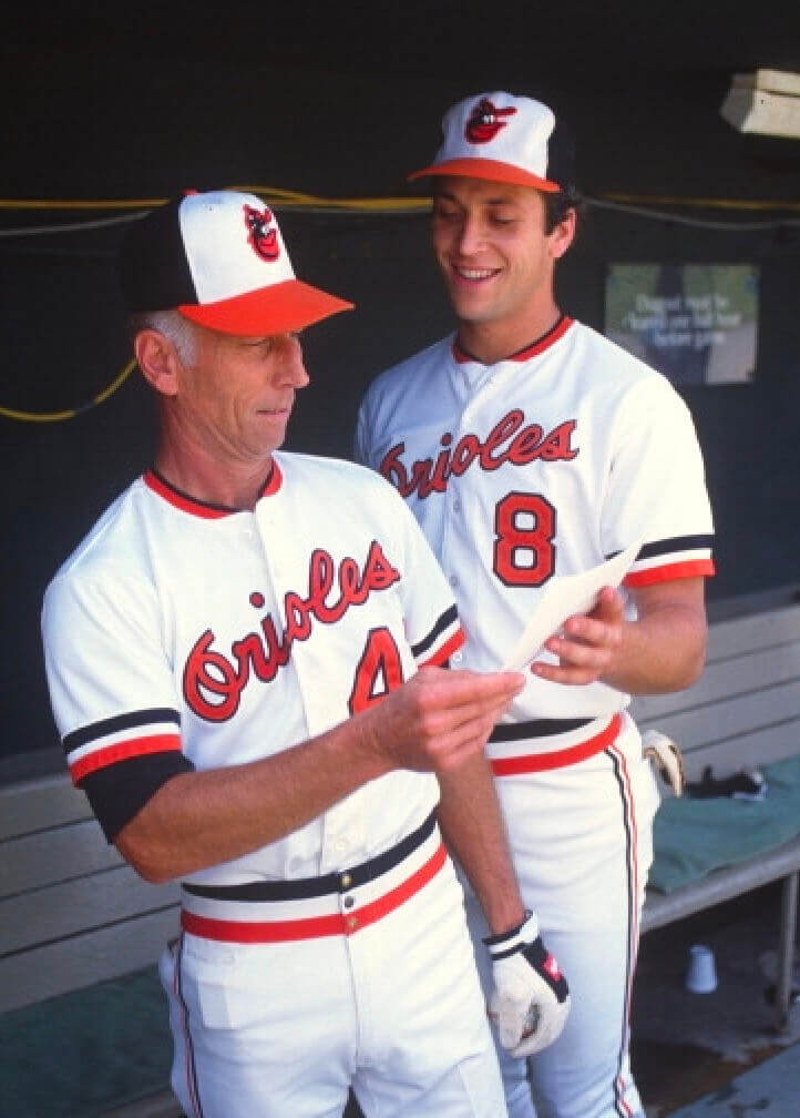
Click to enlarge
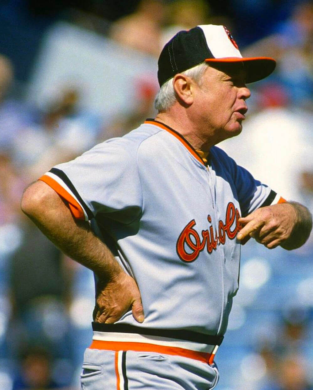
Pocket update: Reader Chris Hickey continues to be our (and, presumably, the world’s) foremost MLB pants pocket scholar. Today he’s turned up a real doozy: a photo of Orioles skipper Earl Weaver that shows his pants pocket and his jersey’s inner cigarette pocket!
Speaking of pants-pocketed O’s skippers, Chris also found a 1982 shot of Cal Ripken Sr. (with a very young Cal Jr.) with a little rectangle of something in his pocket:
Keep it up, Chris!
The Ticker
By Alex Hider

Baseball News: The Giants will retire Will Clark’s No. 22 in July (from Brinke). … In addition to playing as the “Orange Barrels” this season (as noted in yesterday’s Ticker), the High-A Peoria Chiefs will also play as the Pork Tenderloins (from Taylor Pellerin and @mrmichael21). … The Great Lakes Loons, the High-A affiliate of the Dodgers, have announced their 2022 promotional schedule, which includes a “bobblebelly” of the team’s mascot (from Alex Dewitt). … The Wisconsin Woodchucks of the Northwoods Baseball League — a collegiate summer league — have changed their name to the Wausau Woodchucks (thanks to all who shared). … New navy alternate tops for Rice (from David Pillen). … We all love a good baseball sweater, so check out this cardigan worn by Giants P Christy Mathewson (from BSmile).

NFL News: With the Commanders unveiling their new team name, ESPN has published an explainer about every NFL team name’s origin story (from Brinke). … We have our first glimpse of the Bengals’ end zone art for the Super Bowl, which will primarily be black (from Andre Perrotta). … This article breaks down the six California stadiums that have hosted (or will host) the Super Bowl (from Kary Klismet).

Hockey News: A new Chevrolet commercial features a brief shot of a man wearing a Michigan State hockey jersey. Here’s the story about how that sweater made it into the ad (from Kary Klismet). … Amazing dragon-themed leg pads for Chinese women’s Olympic goalie Zhou Jiaying (from Jennifer Hayden and Matt B.). … New badge for Swedish team Frölunda HC (from Andreas Papadopoulos).

Basketball News: These Lunar New Year shirts designed by the Canadian Chinese Youth Athletic Association make use of the old Vancouver Grizzlies logo but replace the bear’s basketball with a bubble tea (from Wade Heidt).

Soccer News: The USMNT played a World Cup qualifier in chilly Minnesota last night. Goalkeeper Matt Turner was permitted to wear a quarterback-style handwarmer given to the team by the Minnesota Vikings (from @ScottyBeats86). … The next two items are from Trevor Williams: Manchester United is allowing fans to exchange their Mason Greenwood jerseys for a replacement at the team’s official store. Greenwood, a forward, was arrested on rape charges Sunday. … New 125th-anniversary shirt for English League Two squad Northampton Town. … The NWSL has unveiled its 2022 game ball. Coincidentally, it includes the league’s 10th-anniversary logo, and our own Jamie Rathjen says it may be the first look we’ve had of that commemorative mark. … Also from Jamie: “Southampton’s teams are wearing this shirt, which is supposedly for the 20th anniversary of the club’s charity this weekend. It has both teams’ normal ads on the front, so the actual anniversary commemoration is on the back of the neck and that’s it.” … Yesterday, we Ticked that UEFA had contacted a German pizza company regarding a trademark dispute for its “Champignons League” pizza. However, UEFA said yesterday that it would no longer fight the trademark dispute (from Mark Coale).

Olympics: Cross-listed from the hockey section: Chinese women’s hockey goalie Zhou Jiaying is using an intricate dragon-themed design on her leg pads (from Jennifer Hayden and Matt B.).
.

Grab Bag: The wrestling teams for Burlington and Fort Madison High Schools (Iowa) will wear throwback singlets and wrestle for a new dog house rivalry trophy tonight. … Gloucester Rugby, an English club, is seeking fan input on their 2022-23 away shirts (from Ed Żelaski). … New lacrosse uniforms for Syracuse and Virginia (from @stevenwoj). … NASCAR has reportedly been telling teams this week that political sponsorships will not be allowed (from Trevor Williams).
Our latest raffle winner is Evan Fleming, who’s won himself a complimentary Uni Watch membership. Congrats to him, and thanks to Karl Newkirk for sponsoring this one. — Paul
Paul, with the Rams wearing their white jerseys for the super bowl, can we take this as a sign that the dishwater jerseys will be phased out and the white jerseys will be their new primary road jerseys for the 2022 season? White jerseys with yellow pants and blue socks would be their perfect road uniform set!
Yes pleasepleaseplease. I was watching the Rams in their dishwater set earlier this year on a high-def channel, and my wife passing by says, “why do the Rams’ unis look almost pink?” Is something wrong with the TV?
I hope so. It does seem like a tacit admission that the dishwater set was a mistake.
Hey I tweeted (for like the 3rd time ever) almost exactly that to you last night haha
They can redesignate without violating the 5-year rule?
Good question.
Why not? The Titans and Broncos redesignated jerseys as their primary, didn’t they? The Broncos made the navy their alternate and the orange the primary. Titans did something similar with their navy blue and sky blue jerseys.
Also, the new white Rams jersey wasn’t part of a “brand overhaul.” It’s basically the white version of their bone/blue jerseys, isn’t it? Also, when the Rams moved to LA, they made some minor changes to their uniforms, didn’t they?
My guess is the Rams will dump the bone jerseys, make the white the primary road jersey, and introduce some ugly new alternate to take the bone jersey’s place.
I get the same feeling. Which is interesting, because it is an immediate walk back. And presumably all these teams get some sort of feedback from the fans when designing new uniforms. So if they are listening to the negative response to dishwasher now, how did they miss that during the design phase (or feedback about any of the other awful parts of the new set)? And ditto for the Commies, that was an 18 month process that supposedly included loads of fan input, and yet they came up with a mess of a uniform set, a bland W logo, and a soccer crest?!?
I thought one of the funnier comments on the crest was that the championship years are strange. That is, the three SB years are the years they actually won the game vs the seasons they were associated with. They pointed out the actual seasons associated with those years were not great. Cracked me up.
Spot on. Proving the lack of football history knowledge with the designers. Or the team people approving this crest.
Even better because they put 1983, which in common football parlance the Champs of the 1983 season are the Raiders, who badly beat a favored Washington team in the Super Bowl
The Commanders will redo that uniform set for the 2027 season. It’s just like the Browns and Bucs uniforms where you just know it’s going to be an automatic redo after the 5 year window.
I just don’t get how they say they’ll stay with the colors and then have hardly any of those colors in the white uniform set.
I just wish they would have kept their old uniforms with the exception of the helmet, where they restore the stripe and have the W on the helmet instead of numbers. They are classic, beautiful uniforms and that shouldn’t have changed.
Valid point, raising the question: were these intentionally designed with the notion of a total re-design in 5 years time? Where is a time travelling machine when you need it?
I agree that some of these designs seem almost purposely temporary. The Commies, Falcons, and Rams specifically. There are classic, timeless, near universally loved designs they could have used. But rather they come up with something widely panned, and liked seemingly only by the segment that likes new or different purely because it is new or different.
Given the tail wagging the dog on merch vs actual uniforms, almost seems they made these so they could see the new sets, knowing full well they’ll be hated but still sold, and then can reset back to the traditional design, getting people to buy merch again in 5 years.
“…so they could see the new sets, knowing full well they’ll be hated but still sold, and then can reset back to the traditional design, getting people to buy merch again…”
Let’s hope the Jets are thinking the same thing.
2027…when their lease at (blank)Field expires.
It will be interesting to see what happens between ’22 and ’27.
Until then, Washington’s fans will seem to be cheering for marginal football played in unappealing uniforms at a terrible facility.
The Pork Tenderloins link takes you to a New York Post story on another topic. (Still an interesting read.)
Was looking forward to reading the breakdown of the Commanders uniforms, but don’t have a Bulletin subscription. Is the plan to move many of the highly anticipated stories over to the subscription site from now on?
Link now fixed.
I’ve said many times over the past eight days or so that the Commanders review would be on Bulletin. Many big stories, including my season previews, will also be on Bulletin. If I were still at ESPN or SI, the Commanders piece would have been on those platforms. I’m handling things the same way as in the past, except now the feature-length pieces are paywalled.
This assumes people read every day – I think the question is valid and I’m glad you answered it, thanks!
Still can’t believe the Bengals are in the Super Bowl. Who Dey!! And thank god they changed uniforms.
I agree this is essentially the best uni matchup with the Bengals in black jerseys. My only small preference would have been for them to wear the white pants with the all black stripes, rather than the orange and black stripes. I can’t quite decide why, but for some reason I just don’t think they look as good with this combo, or in general.
Maybe it’s because the stripes are not orange and black but rather orange and white, which (a.) clashes with the jersey sleeves/sleeve caps, and (b.) is not reflective of any actual Bengal tiger stripes that occur in nature (viz., orange and black, or white and black).
I REALLY dislike the Bengals pants with the orange stripes because of the wimpy and unnecessary black outlines around the strips. Feels very amateur. I like everything else about their uniforms. Feels like a bit whiff on an otherwise decent set.
The “nemo” analogy I think Paul made still resonates with me in regard to the orange stripe
The bengals using the “who dey?!” chant for this season feels awfully derivative of the saints “who dat?!” chant from their super bowl season. Which really bugs me (on top of the irritation I get from making intentionally poor use of language “official”) but I’m not a fan of either team so I don’t know which if either team really was first to this trend. Can anyone enlighten me?
A quick googling led me to stories that trace “Who dey?” back to 1981 at least. A similar googling surfaced that the Saints began chanting “Who dat?” in 1983.
Sorry Julia your reply wasn’t visible on my phone until after I posted.
Dave – the Bengals started using The Who Dey chant in 1981 during their first Super Bowl season. The Saints Who Dat appears to start in 1983.
Thanks for doing the legwork for me! I guess it’s advantage bengals then and I take back my original phrasing of it being derivative of the saints chant. And yes, I also agree with other comments here that neither is particularly appealing. But hey, I’m not a fan of either team and most team mottos sound kind of stupid from a distance.
They are both stupid.
Not if you are a fan of the Bengals or the Saints. . .
I noticed in one of the Commanders’ photos from their website it has the player with the white jersey and what appears to be black pants. You can only see the top of the pants, and they look to be shorts or sweatpants judging by the waistline, but it still gives a glimpse of what a non-mono pairing with that jersey might look like. OK, it will look like shit, but it’s not mono-shit. In the case of this uni set, going non-mono won’t help much in my view, with the exception of the maroon jersey with white pants.
Black pants with a burgundy and gold stripe are an obvious upgrade to the black uniform.
In the case of the black outfit, I don’t think that’s better. Black pants with a gold and maroon stripe would be fugly. I would agree putting stripes on the other pants would be an upgrade though.
I’d venture to say that’s a lighter in Cal Sr.’s pocket. Can’t really see it in that pic, but he also routinely had a cigarette pocket in his jersey like Earl.
Here’s an example from 1989:
link
Exactly, Cal Sr. was maybe even a heavier smoker than Earl so that has to be a zippo.
With an Orioles logo on it I hope.
As a Zippo carrier/user…I’d bet $100 that’s a Zippo.
I was not aware that Cal Sr.’s jersey also had a pocket.
Thanks for sharing that!
The Giants retirement of Will Clark’s number leaves me at a complete loss on the criteria for these matters. Clark was a Giant for eight years and played for three other teams. He was not rookie of the year, never won an MVP award, never led the league in a Triple Crown stat, had 284 home runs, 1205 RBI and a career average of .303. Those are the statistics of a perfectly creditable MLB player, not an outstanding player.
As I giants fan I can say that he was incredibly loved by fans during his time on the team and he did return as an advisor/position coach for a short time. So while he may not have been an “all time great” by the numbers, he was a very good player, and a very well respected member of the organization on the field and on the sidelines. Plus, you know, “it’s their team and they can do what they want”. There are no real hard metrics for what numbers can be retired. I won’t be specific because direct comparisons may rile people up, but there are numbers that have been retired because of the player’s life off the field more than on. So yeah. The organization and the fans like him a lot.
And that’s why Cooperstown has become the “Hall of the Very Good”
Well, hall of fame and number retired locally are not the same. But I’m getting that you don’t think will Clark deserves recognition for his career.
It’s still better than the Rock and Roll Hall of Fame, which has become the “Hall of They Released One Song That You Might Recognize.”
Well, he beat the Dodgers in important games a lot, and then even after he was a Giant, he smashed the Dodgers shot at getting to the 1985 World Series with a 9th inning HR in Game 6 of the NLCS as a St. Louis Cardinal against Tom Niedenfuer, which made Giants fans love him even more.
For most of the 70s and 80s the Giants were pretty terrible, so all it took back then was hurting the Dodgers.
That was Jack Clark, not Will Clark. Will Clark’s only season with the Cardinals was 2000. But thanks for reminding me of one of my fondest baseball memories. Thing of it was, even though Jack Clark’s home run was in the top of the ninth, everybody watching, either in person or on TV, knew that the game was just plain over.
My memory of that Jack Clark homer was leftfielder Pedro Guerrero angrily throwing his glove into the warning track!
Will Clark is a player who you needed to watch and feel his impact on the team in the time that he had. He’s a Giants legend who defined the team in his era, and as a lifelong fan I can say without hesitation that it has never felt right to see anybody else wearing number 22 in all the years since. I’m delighted that they’re finally retiring it.
I feel like I know exactly what Paul’s reaction to the Commies uniforms, logo, and name reveal is but I will miss being able to read his sweet prose describing what an absolute mess this is, and how they possibly could have spent 18 months to end up with that dreck.
I suppose the bright side to yesterday was that we got the best possible (though not a good) uniform mathcup from the options of Bengals/Rams pairings.
Agree. Makes me a little sad as well, as one of my favorite things on this site is Paul’s thoughts on new uniforms. Not only because his critiques are usually quite funny, but also because I’m often surprised not by what he doesn’t like, but elements he’s OK with or likes that I wouldn’t have guessed. I don’t have FB and that’s a deal-breaker for me, so no Bulletin access.
I’m not too sure how you could be surprised by Paul’s take on new football uniforms if you’ve been reading UW for awhile. He is quite predictable or consistent (depending on how you want to see it) on what kind of uniform elements he likes (block numbers, lots of stripes, a general classic/retro look) and what he doesn’t (BFBS, purple, unusual number fonts, other elements that seem too modern).
Not a slam on Paul since he does a good job with explaning the reasoning for his choices, and it’s all subjective at the end of the day.
Been a reader for over a decade. Generally, yes, he’s consistent, and a self-described “classicist”. But on more than one occasion I’ve read his opinion and been surprised. Not usually by the big points, but smaller details.
Maybe you touch on it on the Bulletin article, but the storytelling’s best part is how they want to point out that the alternate isn’t BFBS because the white unis “paved the way” for the existence of the black unis.
Major league bullshit alert re the black stripes “paving the way” for the black set. Gag-o-rama. I also loved the “forward moving theme” crap mentioned with the white jersey. Not sure how that jersey is exactly “forward moving”. Bowel moving is more like it.
That last line got me, man. I’m reading, alone, and I actually guffawed.
These are 3 big turds, seemingly from different animals. I mean really these could be three completely different (D2 collegiate) teams. No design cohesion across the board. The white set has color blocked sleeves, black trim, and a gradient pattern, but no yellow. The red set has the team name in 76pt font. The black set is ghost camo with two different logos on either sleeve neither of which appear on the other jerseys. All three are color rash. The “speed W” logo is sickeningly bad both because of how bland and generic it is, AND for everything they did to it in attempting to make it less generic. The “stencil-inspired” font is a fail for me (go interesting font or go stencil, don’t go interesting font with a stencil template mixed in). The front logo helmet is something I’ve often pondered maybe looking good. Seeing it here has changed my mind. The matte metallic helmet is a misfire. Just nothing about this works for me except the burgundy and yellow.
I thought they’d do well to basically use their throwbacks with a burgundy jersey with either the white (yellow outline) giant numbers or yellow (no outline) giant numbers, a white jersey with burgundy number (outline or not, just match the other jersey) a khaki pant and a yellow pant, contrast color socks, and the burgundy helmet with the number on one side and a W on the other (or the three star flag pattern, or DC, or the weird rounded logo they have now on the BFBS sleeve). Damn it when will the NFL learn that simple is better for the structure of their jerseys?
(Assuming you are referring to my bowel moving crack – no pun intended) Thanks. I get lucky occasionally. I sort of chuckled when I typed it. BTW, “three big turds from different animals” is pretty hysterical.
Overall, I’m also surprised and what seems like a de-emphasizing of yellow. I know they didn’t wear the yellow pants that much lately, so maybe it’s the lack of pants striping and the almost total lack of yellow on the white/”moving” set that’s making me feel that way. Yes, I know there’s yellow with the maroon set, but the black set is so seemingly unlike the rest, it almost doesn’t count in my mind.
From the Washington uni explainer image:
On the white uni, it says that the black stripes helped paved the way for the black uniform.
So, if they didn’t put a black stripe on the white uni, they couldn’t create a black uniform? Oh no!! How could they ever create a black uniform without having something else to go on first?
Actually I believe USMNT goalie Turner had to take off the QB style hand warmer pouch about 30 seconds into the game.
Yup. After days of discussions about what would be allowed and not allowed, the referee made Turner take the hand warmer thingy off just after kick off.
If the Rams had block numerals, and the Bengals’ pants stripes were black and orange, this would be a really good-looking game.
The Bengals need block numbers, as well. Also, eliminate the wordmark above the numbers.
I never quite get the insistence here that every football team needs to have the exact same number font. I will agree that there are some cases where customized number fonts fail (especially when they are hard to read), but do Uni-Watchers really dislike variety that much?
Uni-Watchers really dislike bad design that much.
Or maybe they dislike good design that much?
Jasper, I know you like being a gadfly, but you’re overplaying your hand here. Do UW readers complain about the Bears’ number font? No. Or the Bengals’ number font? No. Did they complain about the original Jags’ font? No. The Eagles? No.
I could go on. You’re implying that UW readers are too rigid in their thinking, but the one who’s painting with a broad brush here is actually you.
That article about the Chevrolet ad with the Michigan State hockey jersey used “corporate partner”, “partner” and “valued partnership” so much that I couldn’t even finish reading it before I vomited!
That Nike storytelling of the Commanders uniforms is so stupid it proves to me these uniforms were not designed by people who care about football or team sports in general. I see it happen time and again with ugly uniforms, especially when done by the Swoosh staff, forever stressing that the youth will like it. Yes, maybe the kids who are totally not into team sports, like the people who designed these. Which leaves most regular sports fans out in the cold, regardless of their age. So in the end most of the Washington fans will reluctantly start buying the gear anyway. Nike smiling, the NFL chuckling and the Snyders laughing out loud: we knew you would fall for it, suckers.
You, sir, are welcome on my lawn anytime. Absolutely spot on in your assessment. -C.
I was a fool… I was such a fool, I am ashamed of myself.
When they dropped that promotional video a few weeks ago it was so light on storytelling and so focused on just explaining in plain language the logistics of the rebrand process that I actually thought they’d keep this simple. The fact that they actually played as the washington football team gave me even more hope that maybe they wouldn’t pull a bullets/wizards move and absolutely barf all over themselves chasing after a theme or a trend. Part of me saw this coming but I repressed it. And then I saw this damn reveal and the storytelling graphic.
Lord forgive me, I was a fool!
It’s funny from the standpoint of teams’ marketing folks. I think on the one hand, any logo/design change they figure any “real” fan will ultimately buy/wear (gotta support the team), but I think it’s somewhat canceled out by fans who refuse and just keep wearing the prior gear (and thus buy nothing new). I’ve followed and rooted for the Jets (to my peril) my whole life. I was THRILLED when Parcells brought back what was essentially the Namath era look to the team and have lots of merch with that stuff on it. I so hate the new uniforms (other than the sweet emerald green helmet) that I will absolutely NOT purchase anything with the current wordmark/logo, etc. and have enough of the stuff I like to last me the rest of my life. I guess that’s the trick: there’s a fine line in there somewhere between updating your look and gathering enthusiasm vs cutting off us traditionalists. Or, you know, they could do what teams like the Packers, Chiefs, Steelers do: for the most part leave the shit alone.
As a life-long Pittsburgh Steelers fan, I am forever grateful.
Hoping Art Rooney II never gets that itch to mess with near perfection (unless it’s to go back permanently to the block numbers).
-C.
Something that I hate seeing with football uniforms. Teams like the Ravens, Saints, and Hamilton Tiger-Cats have been guilty of in recent years. Solid pants with no stripes and then the socks being the same colour as the pants. The yoga pants look.
Looks like Washington is subjecting us to 3 sets of yoga pants. :(
I agree entirely. As for the The Tiger-Cats, they should embrace the past… gold pants with a black stripe, either black or striped socks, and go back to colored trim on the numbers.
Ticats look good when they wear yellow pants instead of black. Glad they made the decision to do that in the Grey Cup.
Fully agree they should embrace the past. That means bringing back the tradition of the yellow helmet. The colour of their helmets prior to 1986.
I liked the Yellow helmets as well. And why not, bring back the TC as an alternate logo too!
Holy shit but that nonsense storytelling about what the Washington uniforms represent is stupid! To think, people actually get paid to come up with that dross.
I can’t stand the Bengals Finding Nemo pants. All I see is clown fish… no tiger. The black stripes on whites look better. Especially with orange socks providing a balance of color.
Finding Nemo pants. Totally stealing that. That’s perfect! (and I can’t unsee that now)
Although it was my first reaction when I saw those pants, I can’t take credit for coinage on this site. Paul referenced Nemo in his original assessment.
“Finding Nemo pants” — that works. So does “clownfish pants.”
As I’ve said repeatedly, there are orange Bengal tigers with black stripes and white Bengal tigers with black stripes, but there are no white Bengal tigers with orange stripes or orange Bengal tigers with white stripes.
It’s been clear from the roll-out that the Bengals made a mistake with the striping on both sets of white pants (and why they ‘needed’ 2 is a head-scratcher), but the Clownfish are superior to the Zebra (for now, unless they roll out a white helmet next season).
I for one would have been OK with mono-black or black-black-orange…their most cohesive combinations.
Was about to post a comment about the stupid Nemo pants, but you got it covered.
The problem I have with the Bengals’ pants overall is this… the helmet and jersey have complete stripes, where you can see both ends of each stripe. The pants just show a sliver of a striped section, kind of like filming something with your phone in vertical mode.
“Using the military as a deodorant” is a perfect way to put it. It’s cheap heat, in wrestling terms…
Not only are the Commies’ unis some of the worst in NFL history, they are taking away one of my favorite looks in the burgundy over gold.
I don’t really care if you are bothered by the term “modern throwback.” It’s not just marketing, it’s completely accurate for what that set is. It’s not a real throwback, but it’s throwback-ish. Would a cheesy portmanteau like “fauxback” be less offensive for you? That’s a fine term as well, but it’s a really stupid hill to die on.
No, actually, it’s not accurate.
What about the team’s royal jersey with yellow pants combo (the one they wore in their three postseason games) — according to your argument, isn’t that also a “modern throwback”?
A “modern throwback” would be the Jets’ 1998 redesign. Or the Giants’ 2000 redesign.
The Rams’ current set is, for lack of a better way of putting it, too “modern” to be a “throwback.” All they really did was apply a similar color scheme to the current template.
Exactly. There’s nothing throwback about it, and referring to it that way just promotes marketingspeak bullshit and uni illiteracy.
Big Rams fan here, and I agree with Paul. While the white jersey/yellow pants combo is the first time the Rams have had that color combo since the 1999 season (and I do love it), it doesn’t make it any more of a “throwback” than the royal/yellow combo. I see this Rams uni set similar to the Seahawks. Yes, there are similarities to the ’76-’01 set, but no one calls it a throwback when they wear their white/gray set.
The Rams’ uniforms are no more a “modern throwback” than the Bengals’ current set – and no one is calling the Bengals’ uniforms that. There are some similar elements to past uniform designs the teams have worn, but they’re different enough that no one’s looking at them and thinking they’re the same uniform. Besides, “modern throwback” is a non sequitur anyway (if it’s a “modern” interpretation of an old uniform, then it’s, by definition, not a “throwback”), so I find your insistence on using that term a really stupid hill to die on.
I lived in Washington, DC for 20 years and was a big fan of Washington’s football team.
Yes, I dislike everything about the name and the uniforms. But for some reason, the thing that really gets me are the multiple references to the diamond shapes in the new uniforms representing the district’s diamond shape. Its not diamond shaped. It originally was, but that ended in 1846 when Alexandria was retroceded to Virginia. Nobody has thought of DC as having a diamond shape for the past 175 years.
Thank you. I kept picturing the outline of DC in my head and thinking “Diamond shaped??? Have they ever looked at a map?”
Kupp needs to wear a cup.
Man United and Nike wasted no time in getting rid of all traces of Mason Greenwood. However, they couldn’t stop themselves from signing Christiano Ronaldo, with his two sexual assault allegations. Also, why let people trade in their Mason Greenwood jerseys? Buyer beware, I say. This is why you don’t buy jerseys of current players (or any, for that matter).
It is adidas, not Nike. Man U wore Nike kits some 10 years ago.
Question with the new Commander unis for Paul or anyone else, so the 3 uniforms were revealed as mono-unis (bleh). Are they stuck with that for this year or will they be allowed to switch the pants around (wear white pants with the maroon unis and vice versa)?
They are definitely allowed to mix and match, and I’m also fairly certain they *will* mix and match. (This is all addressed in my Bulletin piece.)
Re: The Commanders
Honestly, it’s Snyder being like “oh, this is cool” and “I like how this team uses this” and mashing it all together. There’s no cohesiveness. Each color jersey could be from a different team.
The whole process reeked and, in my mind, serves as a perfect of example of failure by committee. But when you think about it, isn’t it sorta fitting for a team representing DC?
-C.
Given what we know about how Snyder operates, it seems likely to me that the uniform design process would have produced better results if it was more committee-driven.
I’m adopting the Commies as my NFL team now that the name is sorted, but as with my longtime Twins fandom, it does get tiring rooting for a team with such ugly uniforms.
I think it’s less about Snyder thinking “Oh this is cool” and mashing together ideas from other unis that he liked and more about Snyder thinking “You want a rebrand? I got your f-ing rebrand right here.”
Looks like the Super Bowl zone art won’t have that annoying stripe of unpainted grass the Rams normally use.
Me, yesterday morning: I don’t think it’s possible for me to hate this whole rebrand debacle more than I do.
Nike Marketing Speak: Challenge accepted!
Seriously, the whole identity is military cosplay writ large. Welcome to Washington Commanders football, where every day is a Joevember day!
Can I get a t-shirt that says “I Still Call Them Football Team?”
Can I get a t-shirt that says “I Still Call Them Football Team?”
Funniest response I’ve seen yet! That shirt needs to exist.
I like the name just fine, but if the team leans too literally into the military side of it, I’ll be irked. It works best to me as a reference to the presidency and to George Washington in particular. Both of which fit, conceptually, with the names of every other DC team except the Wizards.
I want an ad during the Super Bowl where Matt Ryan steals the Rams dishwater jerseys, then he, Stone Cold, and Ice-T throw them into an industrial washer with a 5 gallon pail of Tide and they come out pristine white.
That would be 100% awesome!
I am 100% proud of the new Washington team name. They were forced for something other than that other team name. Well they now have a new face and team nickname. Regardless of what the uniforms looks like, they are not racist anymore.
I’m not one for buying jerseys or team stuff, nor am I one for subscribing to Sports Illustrated and stuff. I know where I stand.
Actually, they were not forced. Snyder could have stuck with his vow to “NEVER” change the old name — he just would have lost some money from his sponsors/partners/etc.
It turned out that he valued money more than he valued his principles. That’s his choice to make, of course. But it was just that — a choice. He was not “forced.”