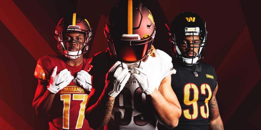
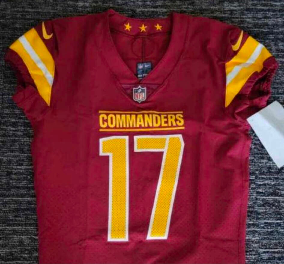
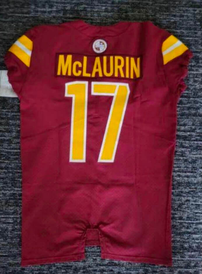
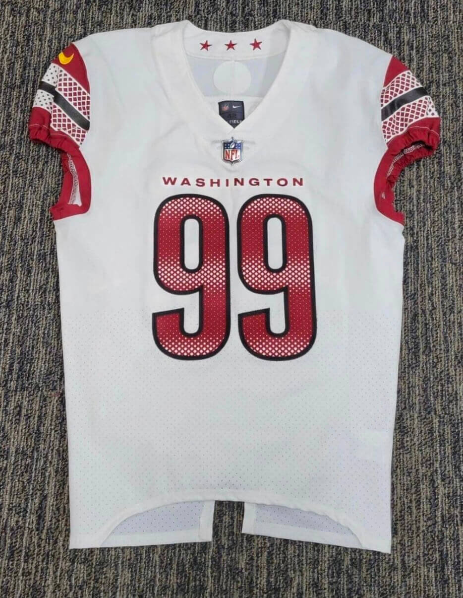
Click to enlarge
Happy Groundhog Day! It’s official — the Washington Football Team is now the Washington Commanders. There’s additional info here, and I’ll add links to more photos as they become available. For now, you can get a better look at the jerseys in these photos that leaked last night:
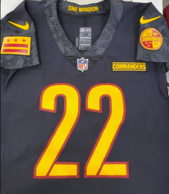
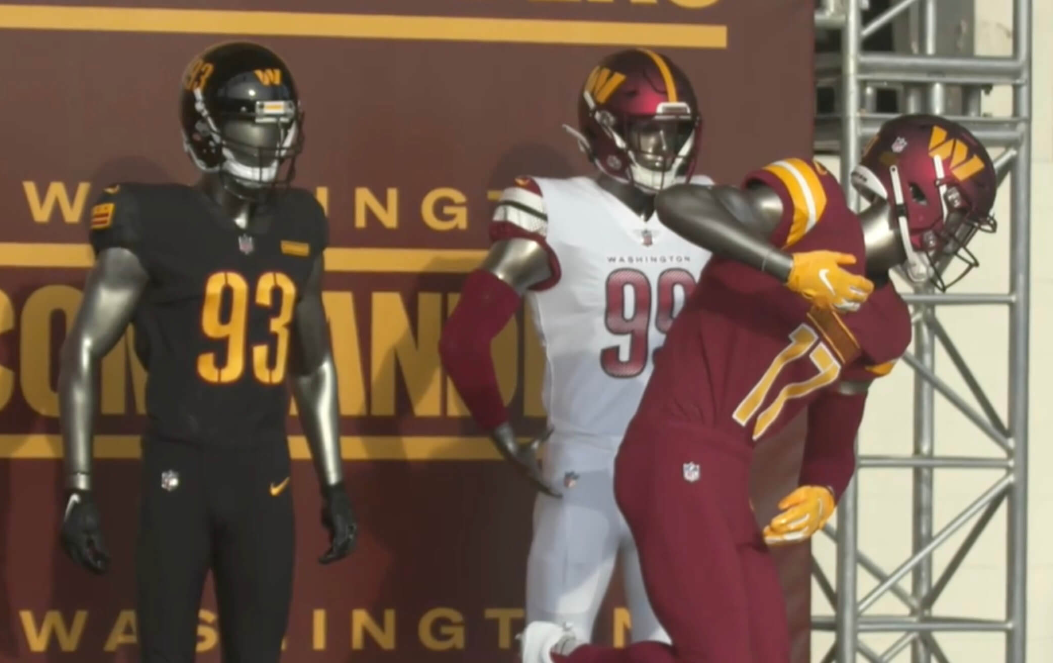
And here’s a look at the full uni set:
In case you’re wondering: I did not have any advance insider info on this one. I was waiting to see how it all played out, just like you. I hate writing about a new uniform set completely on the fly, so I’m going to take some time today to process everything and see how I feel about it. I’ll have a full assessment tomorrow on Bulletin. (You’ll need a paid subscription to access that article, and you’ll need a Facebook account to pay for it. You can subscribe here; if you’d like to be notified if a non-Facebook payment option becomes available, let me know and I’ll keep you in the loop.)
I figure everyone’s going to want to chatter about the Commanders today, so go ahead and share your thoughts in the comments. I’ll have my say tomorrow.
Click to enlarge
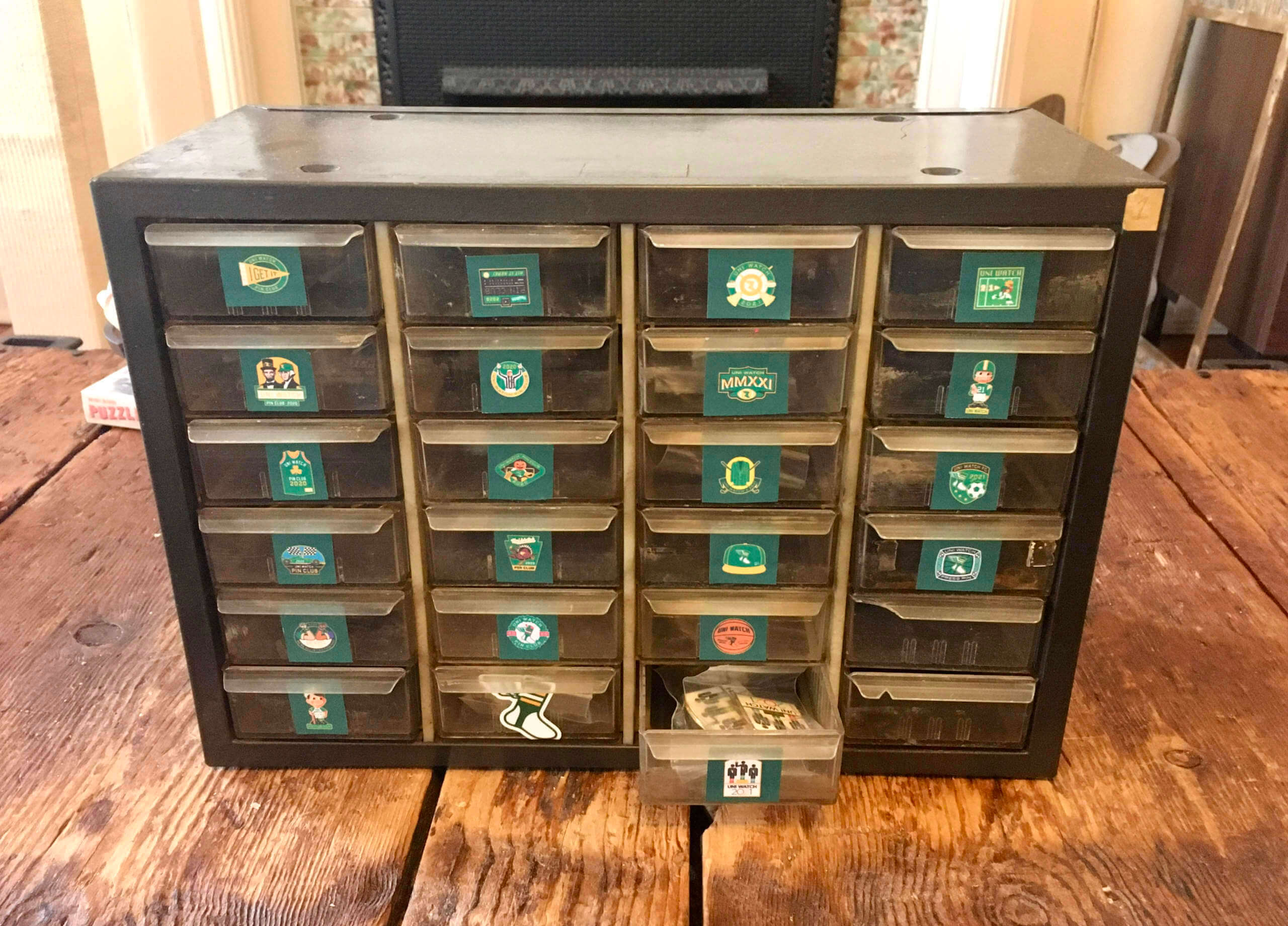
Pinventory: Remember my recent trip to the Buzz-a-Rama sell-off? As you may recall, I mentioned that I purchased “a little 24-drawer cabinet” that day. You can see above what I’ve been using it for. Perfect for our remaining pin inventory!
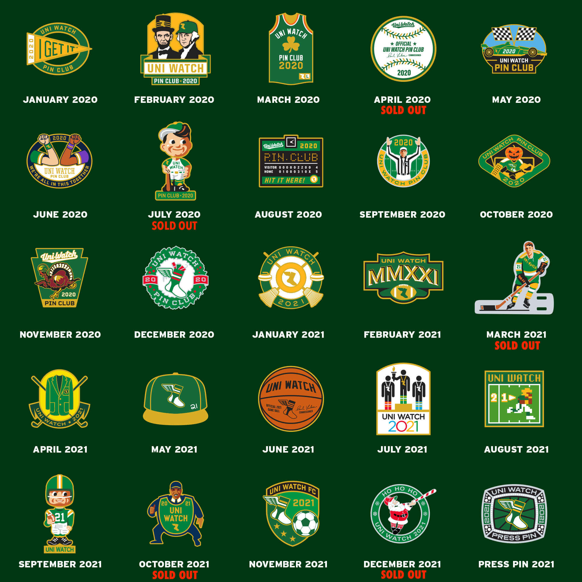
These pins are now available at deep discounts for multi-pin bundles. Full details here, or just click on the graphic below:


ITEM! Membership raffle: Reader Karl Newkirk won a Uni Watch pennant in one of last week’s raffles and has generously decided to pay it forward by donating a Uni Watch membership for me to raffle off, so that’s what we’re going to do today.
This will be a one-day raffle. No entry restrictions. To enter, send an email to the raffle in-box by 8pm Eastern tonight. One entry per person. I’ll announce the winner on Monday. Big thanks to Karl for sponsoring this one!
Meanwhile, the winner of yesterday’s Pirates batboy jersey raffle is Will Pike. Congrats to him and thanks again to Zach Hoover for that one.
The Ticker
By Lloyd Alaban

Baseball News: The SIngle-A Peoria Chiefs, affiliate of the Cardinals, have released an alternate identity they will be wearing this season — the Orange Barrels (from Scott Rogers).

Football News: Now that Tom Brady has officially retired, let’s recall our own Anthony Emerson’s deep dive on a little-known fun fact: Brady has almost certainly worn more jersey patch designs than anyone else in NFL history. … We’ve all read about where playoff loser gear goes, but here’s another article about it (from Kenneth Traisman). … The grounds crew at SoFi Stadium is starting to paint the end zones for the Super Bowl (from multiple readers).

Hockey News: The Golden Knights wore Lunar New Year-themed warm-ups last night (from our own Brinke Guthrie). … Black History Month warm-ups for the Rangers last night (from Wade Heidt). … Canada’s Minister of International Development wore a Canucks’ “flying V” sweatshirt in this video. … The Springfield Thunderbirds, affiliate of the Blues, will wear military appreciation uniforms later this month. … New sweaters for Michigan Tech (from Shane Brown). … The AHL’s Hershey Bears have added a helmet decal for Mike Nykoluk, who played with them for 14 seasons (from A. Miller).

Basketball News: On Monday, we reported Pistons G Cade Cunningham didn’t have the gold championship tab on the back of his jersey. The tab returned last night (from Jeff Sak). … At one point last night, Golden State had Nos. 0, 00, 1, 2, and 3 on the court at the same time — the lowest possible combined uni number total (thanks to all who shared). … Georgetown men’s honored the Washington Bears, a Black Fives team, with commemorative warm-up shirts last night (from @bryanwdc). … Also from @bryanwdc: There were nine different shoe colors on the starters for Georgetown and Seton Hall men’s last night.

Soccer News: Here’s a real-life look at Charlotte FC in their debut uniforms (from James Gilbert). … Also from James: UEFA is suing a German pizza company for calling one of their pizzas “Champions League.” … Scottish club Raith Rovers’ shirt advertiser is an author, Val McDermid, who is ending the arrangement after this season because the club signed striker David Goodwillie. Goodwillie was ruled to be a rapist in a civil case in 2017 but never faced a criminal trial. The captain of Raith’s affiliated women’s team also quit in protest (from our own Jamie Rathjen). … New kits for J3 team Tegevajaro Miyazaki (from Jeremy Brahm). … Also from Jeremy: A writer has ranked the 100 best shirt templates of all time.

Olympics News: You can take a quiz to find out which Olympic mascot you are (from Kary Klismet). … Nike wouldn’t answer a reporter’s questions about where Team USA’s podium uniforms were manufactured.

Grab Bag: Union Public Schools in Tulsa has chosen a new logo designed by a current student (from Kary Klismet).
For all photos click to enlarge

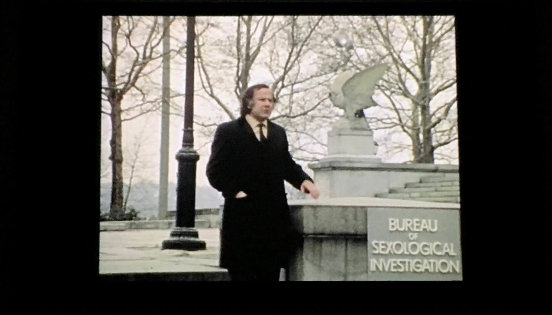
What Paul did last night: Long before there was “fake news,” there was Alan Abel, a New York-based media prankster who spent a good half-century or so creating carefully orchestrated fake stories that gullible newspapers and TV stations gleefully swallowed whole. He was probably most famous for SINA — the Society for Indecency to Naked Animals — which sought to clothe livestock on morality grounds, although that’s just one of his many hoaxes. (There’s a good overview of his hijinks in this very entertaining obituary.)
One of Abel’s early projects was a movie called Is There Sex After Death?, an X-rated absurdist erotic mockumentary (featuring a young Buck Henry!) that caused a stir when it was released in 1971. Last night the Tugboat Captain and I we got to see a rare screening of it at an art space in Brooklyn. (The photo at the top of this section is a shot from the movie, showing Abel himself standing outside the fictitious Bureau of Sexological Investigation. Most other scenes from the movie are more visually interesting but not suitable for publication.)
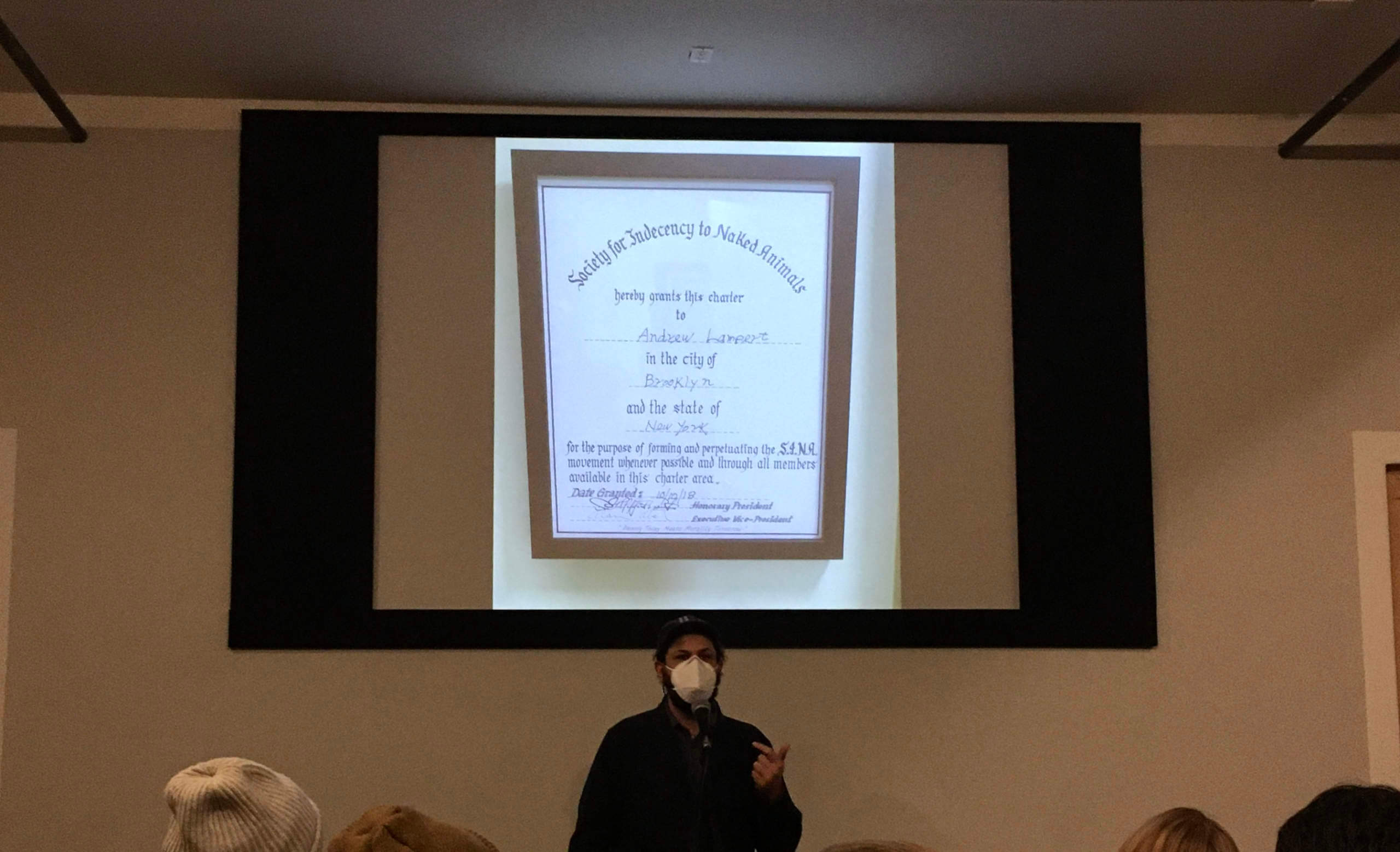
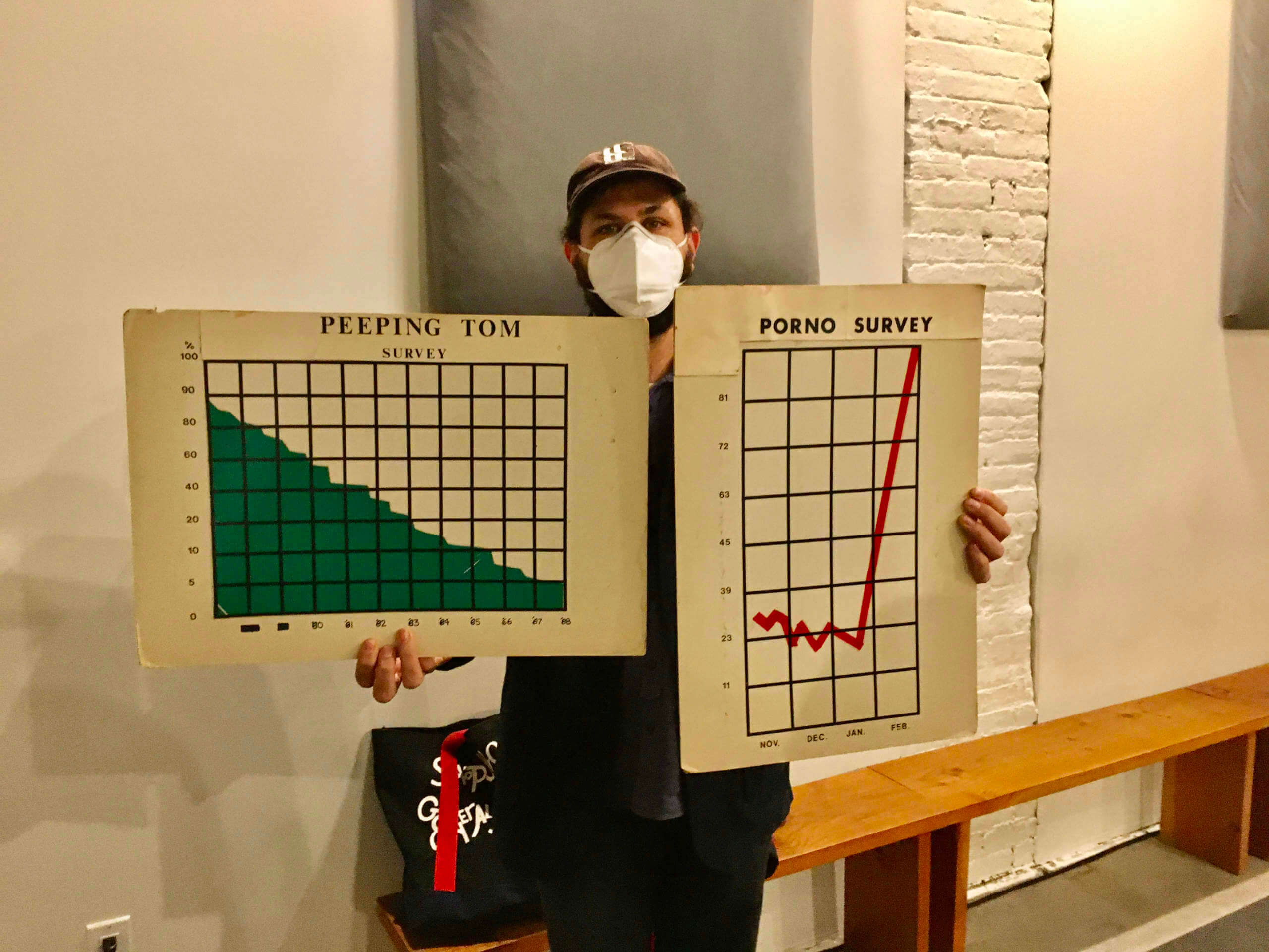
Before the screening, Abel expert/fanatic Andrew Lampert provided some good commentary and context (along with a view of his SINA membership proclamation and a few props used in the movie):
It was a hilarious night. If you want to know more about Abel, his daughter has made a documentary about him, which can be streamed for free here.
My initial reaction to the jerseys is that it looks a little Maryland Terps-y to me. Maroon instead of red, but similar feel.
I don’t know why they didn’t put the 2 stars on the helmet as the main logo – would look ver clean versus the W that looks like a folded strip of paper.
Also, how this got through without someone saying “Should we be a red and gold team with a name that can be shortened to Commies?”
Exactly, Chris. For all the lip service they’ve given about taking time to make sure they got it right, they’ve failed on pretty much every level.
Crap!!!!!!!!!!!!!! Another BFBS jersey. I’ll be glad when this fad dies. Would have been much better had they added a yellow alternate jersey.
Not only is the black completely unnecessary, if I see them wearing that on TV from a distance, say at a sports bar, I’m going to think it’s the Steelers color rush for a second.
Black-red-yellow always looks terrible
Germany and Belgium and Uganda would like a word with you. So would the Canucks
So would the entire state of Maryland.
When I saw the swatch of the road jersey with the black trim a few weeks ago, I had a bad feeling they were going to crack out an all black third.
This has actually been coming for a decade as the team has had black fan gear and coaches gear for about that long.
Totally unnecessary as black was never part of their color scheme and it shows they just wanted a cash grab.
In defense of the black one, at least the number on the front is in the right spot. The other ones have wordmarks (along with the NFL logo) shoving the number downward.
I wonder if the black jersey also has that silly logo above the NOB, which also throws off the balance. If you’re going to have two things on the back other than the number, one should be above and one below, framing the number.
Looks like the Reddit leak was spot on.
So far:
a.) I’m not a fan of the addition of black, although I do like the logo on the front of the black helmet
b,) I do like the numbers – it’s appropriate for a team named the Commanders.
c.) I’m sure there will be “military appreciation” themes woven all throughout the future of this team name.
d.) mono red? Ugh.
e.) Redtails, Redhawks, and Redhogs were all better choices in my opinion, but I think I understand the desire to move away from anything with “red” in the name
f.) Three unique sleeves – interesting. I don’t mind it.
g.) No TV numbers
h.) yellow pants would be a good addition to the mix.
for once i think Military theme really fits the team. Nation’s capital and all
Thats just because we’ve been beaten over the head with state=military might since forever. Why should the capital be associated with the military instead of any other part of government, like maybe public works, infrastructure, legislature, thw judicial system, etc.
Have we been beaten over the head with it? This is the first major league team with the DC and military connection isn’t it? We had the Senators team, which is obviously a different part of the government.
Yeah, I think I agree that the military is so romanticized that when folks think of the country and its strength, the first thing that comes to mind is military might. But I also agree with Matt – we’ve had multiple Washington Senators franchises and the Capitals NHL franchise. So in a vacuum, a military-inspired DC franchise makes sense. But the romanticization of the military makes the Washington Commanders name and theme seem forced/too much. I’m sure the merchandising department is chomping at the bit to release all sorts of military and police-themed gear.
I had secretly wanted them to go with the Washington Justices. The logo could be a gavel, the unis would be justifiably (wink wink) all black, and they could sell black robes as fan gear. At the beginning of the game they would tell the fans “ALL RISE, Court is in session”.
This would also fit the latest trend of leagues proclaiming their stance on equal rights. Then maybe the Supreme Court could be expanded to 11 justices and we would have total synergy.
A country can survive without public works, infra, judicial system, legislature (which essentially describes Cuba and other socialist countries, at least in terms of modern public works/infra and legitimate judiciary/legislature).
No country can survive without a military (or someone else’s military) to protect the borders.
Having grown up outside of DC, I really wish people understood that there’s more to the District than military and politics. Not every New York team references Wall Street. Not every Los Angeles team has to be about Hollywood.
Great point!
Horrendous, easily the worst uniforms in the NFL now.
If its not broke, don’t fix it and their uniforms didn’t need fixing outside of the helmet (and the small team name when they were the Redskins, of course Commanders is BIG on the main jersey)
Couldn’t agree more. I get the desire to completely re-brand with the new name, but the WFT uniforms were pretty nice… and that’s coming from an Eagles fan.
The “Commanders” on the front screams “bad college program” to me.
I agree. I thought the exact thing when I saw the “Commanders” on the chest- very college style. I don’t think I’m a fan of the matte helmet, but I’ll reserve judgement until I see it on the field. The gloss really made the dark red pop. The matte makes it look really flat, at least in the images we’ve seen so far. I do like the W logo though.
“bad college program” – that maybe generous, maybe more like a High School football team.
Yup. Looks like something out of South Texas.
“Bad college program” was exactly my first thought too, and as Oakville said, that may be too generous…
Totally agree, absolute disaster on so many levels.
Honestly,
What did you expect from a Daniel Snyder run operation?
I think the X-skins should be fined again for this totally “meh” design. The origami “W” is kinda appropriate though, the Washington Folders.
Agree with everyone in this thread. My first reaction to this post was “oh damn! It’s WFT reveal da… holy crap this is bad!”
I am an Eagles fan and I thought “Washington Football Team” was terrific both as a name and the way they executed. An old-timey approach for one of oldest franchises in the league, it was brilliant.
And now, this.
Massive wordmark on the maroon. Ugh
Gradient numbers on white looks really Arizona Diamndbacks. Ugh.
Black for Black Sake. UGH.
Never been a fan of matte helmets – Maybe the Steelers, otherwise, no. Perhaps if the alternate shell was olige green like a military helmet? Otherwise, ugh.
Logo looks OK on the side of the helmets.
Will like to get a better look at the black helmet – first example of relaxed one shell rule? W wordmark on fron has potential.
I fear for the pants and all the “steeped in tradition” new crap Nike could pull off.
As someone else put it, “this is not the look of a 90 year old franchise.”
There really ought to be a couple of strict design laws:
1. No black uniforms, unless you’re the Panthers, Ravens or Raiders.
2. No gradient anything.
3. No matte/satin helmets, and no shiny helmets like Notre Dame.
No black for the Steelers, but there Panthers get it? Really? Saints? Bengals? There a lot of appropriate black out there…
I’m not opposed to the matte helmets. With today’s HDTV, I think they actually are pretty nice when done well.
I wish Nike would keep things simple. All these crazy BFBS, GFGS, gradient accents are starting to look horrible. They might look good up close. But on TV, they just look cheesy. The worst in my opinion is the Titans striping on their pants. Up close, not too bad. On TV, looks ridiculous. And the Titans numerals are almost as bad on TV.
I really do like the new shade of blue for the Rams. That “bone” crap has to go. Who agreed to that is an idiot.
The best uni I think they have come out with is the Chargers. Love everything about those unis.
So far it looks like they are only showing maroon pants, no white or gold pants (other than the already crappy looking BFBS alternate). I really hope this doesn’t mean we have another team that is going to go full monochrome all the time (Seattle, Tennessee, New England).
My initial reaction is…..meh.
While the Seahawks do go monochrome at times, they have 3 pant options and mix and match them. With the home (blue) jerseys they wear the blue, white and grey pants, with the away (white) they have done blue, white and grey, and with the alternate (grey) they have done grey and blue. The only one they have not mixed up pants color with is the color rush (green) where I believe they have only done the green pants.
The GUD shows the current green jerseys with blue pants in 2019 and 2020.
First reveal that takes advantage of the one shell rule being removed.
I was thinking the same thing. Paul, do you think there will be reveals of helmets only this off season? Of course there will be reveals of the full uniform changes, but do you think teams will take time to specifically reveal new helmet shells?
Before I read Paul’s opinion, here’s mine: What an unbelievably sh*tty choice, and even sh*ttier design. “Commanders” is a terrible name for a football team; commander is a mid-level naval officer rank (above ensign and lieutenant, below captain, commodore, and admiral), and if it’s meant to mean “one who commands” then it’s just inexplicably lame; “Commanders” sounds like a bowling-league team. The logo is pathetic and the jersey graphics, particularly the numeral font, belong in high school or pee-wees, not the NFL.
Jeebus fleebing cripes; this was the result of an 18-month process? This is how they rebrand one of the league’s legacy franchises? They should have stuck with WFT for all the inspiration behind this lame-osity. Sheesh, if you’re going with a naval rank, why not “Admirals” which is also much easier to say? Just an epic fail all around.
agree wholeheartedly
Well stated.
Just a stunningly bad rebrand.
Graf —
Spot on.
Someone needs to be fired. 18 freakin’ months for this?!
Actually, scratch “someone”.
This whole mess screams of committee.
Forever Redskins.
-C.
FWIW … I was partial to the Brigade. Or Ironclads.
How could they not foresee the name shortened to “Commies”? They’re in DMV, for goodness sake. Geez …
-C.
It’s obvious to me the name “Commanders” is a take on “Commander-in-Chief”, which is the President. Using the DC flag on the alternate and the 3 stars on the collar, which are based on George Washington’s coat of arms, just solidifies that for me.
My own opinion on the uniforms are pretty much neutral at this point. They don’t excite me, but I don’t hate them either.
Agreed. They couldn’t have made worse choices if they tried.
On second thought, they probably could’ve.
“It’s obvious to me the name “Commanders” is a take on “Commander-in-Chief”, which is the President.”
If that’s true, it’s even worse than I thought.
Spot on. Utter ugly rubbish as a redesign and name and will do nothing to restore the lustre to a proud franchise.
My thoughts exactly.
I was thinking the same thing.
Maybe if they make the playoffs they’ll get promoted. They can be the Captains in the divisional round, the Commodores in the championship game, and the Admirals in the Super Bowl?
(I don’t know what’s above Admiral if anything, all of my knowledge of this comes from Star Trek)
Star Trek uses naval ranks, so there’s no shame in that.
Totally agree.
This is the response that most closely matches how I feel. These are B-A-D bad. Every single part of it. Snyder’s long-term goal of running this once good franchise into the dirt is that much closer to being achieved!
Excellent points by all. They really produced a really uninspired product. I hope no one buys any merchandise and Daniel Snyder is further revealed to be as inept as their fans have been telling us he is.
Show some respect to bowling team names. They’re more clever than this.
Ditto to all of this.
Not happy with this new identity, it feels very forced and looks not appealing at all. I get the Commanders name, the team being from DC and the owner loving military themes, but it still sounds like a cheaply made saturday morning cartoon from the 80s. As for the uniforms: too many distractions, they should have kept it clean and simple like the WFT and the team preceding that one.
Paul there is a link coding error in the Get Out More section.
Fixed.
The Commies could have added the new “W” logo to the current helmet, called it a day and would have a better uniform set than these GI Joke duds.
1000x upvote referring to them as Commies henceforth
Go Commies!
I can’t for the first game between the Commanders n’ Chiefs.
Or “Going Commando.”
Yikes, that is some hot garbage there. I mean the name itself is not particularly great, but I guess you can live with it knowing they’d go with something generic. But the uniforms are a mess, and the helmet W (which I guess is their new primary logo?) is dull and uninspired.
The BFBS, each version of the chest wordmark, the seal type logo patch, all a mess.
It feels like as much of a non-identity as the WFT was. Hopefully in a few years they rebrand Commanders with a better design.
I think you can see the wordmark on the Maroon jersey from the International Space Station. Not a fan of the BFBS the wordmark on the black jerseys or the camo. Rest of it, I want to see in action. Need gold pants.
As a fan of this team, this dismal rollout is sadly par for the course for such a miserable organization. Everything from the deluge of leaks, to the pandering name, to the meme-core uniforms is an absolute joke. This (aside from a return to the original name) represents the culmination of the worst-case scenario for the rebrand. The Franchise is once again the laughingstock of the sports world, and frankly they deserve it.
I grew up a fan of this team, and I’m with you. We shouldn’t have expected any better from this franchise and yeah, at this point, they deserve it.
The white uniform looks more appropriate for the Arizona Cardinals. The whole look is a downgrade from the WFT.
All three uniform combinations are mono? Ugh. As others have said, don’t like the big name on front of the burgundy jersey, don’t like the gradient numbers on the white jersey, don’t like the existence of the black uniform, and don’t like the lack of yellow/gold.
I really hope they’re going to mix and match the unis, because 1 mono uni is bad. Nobody needs 3 of them.
Such an absolute disaster on so many levels. No coherence on uniforms, BFBS, just absolute garbage.
I’m never saying anything bad about the Wizards again.
What an absolute travesty of a rebrand. It’s right up there with the Islanders’ fish stick sweaters. The name wasn’t going to get much traction with the fans at first (no matter what it was), so that can’t be helped. The uniforms, on the other hand… wow.
Burgundy: the best of a bad bunch, but that isn’t saying much. The faux mesh doesn’t work and I’m not at all sold on the stenciled numbers. The wordmark is far too big. Roundel on the back of the jersey is too busy. Also, Washington is something like 1-6 in all-burgundy uniforms with some very embarrassing losses, so that isn’t great.
Black: shouldn’t exist in the first place. Terrible helmets. I see they’ve decided to copy the Rams’ “welcome to Ikea” look with the name tags.
White: inappropriate colors. The shade of red on the numbers is really light and doesn’t match the helmet at all. The overall style is far too different from the other two jerseys.
How can the colors on the white jersey be “inappropriate”?
Inappropriate as in “not fitting.” Light red numbers with black trim isn’t the way for them to go.
Where is the gold on the road unis? These scream AZ Cardinals. Should have been more in line with WFT set. Maybe showing my age but, the all monochromatic trend is really awful. Thanks NIKE. This is just a big bowl of meh. Fitting for this franchise over the last 20 years.
They look… mediocre. They needed to knock this out of the park, and they hit a squib single up the middle. I have no strong feelings about the new name either way, but the set would be vastly improved with block letters (if you wanted to jazz them up, make them block stencil) and yellow pants. (Also, if you have to have a wordmark, go with the small team wordmark in the “Hello, my name is” patch spot like the black jersey, not the big wordmark right above the numbers.)
And speaking of, the entire black set should be consigned to the dustbin of history with the old name; there are only three NFC teams that should have a black jersey option, and they all play in the NFC South.
Oh, that’s right, I forgot the most damning element:
THE SAN ANTONIO COMMANDERS DID LITERALLY EVERYTHING BETTER FIRST.
If you could have bought a better rebrand off the rack from the remnants of the AAF, you dun goofed.
^Yep.
San Antonio’s maroon and red would have looked good.
Squib single? This was a backwards K. Perhaps a foul ball to the face.
I like the Commanders name, but the uni set screams “COLLEGE” to me. Oh well, they ain’t my team!
So are none of them going to have TV numbers, or is that just a prototype thing? Either way, maroon is *okay,* black and white both suck balls, but that would be a major downgrade for the whole set of there were no TV numbers.
I can understand a need to do something new to separate from the past, but the description of “mediocre” that seems prevalent among the comments is appropriate. Mono-uniforms (except for all white) usually do not work, and they don’t here.
No gold pants is a mistake.
The burgundy helmet is acceptable, but that’s it. I’d grade it as a “D-“. Start the clock on the re-design.
Lukewarm on the new name but I know in time it won’t really matter. We’ll get used to it.
I don’t think anyone had a problem with the uniform as it was currently constructed. Just the team name and the logo. But sure enough, they had to go and make changes to the uniform. Terrible number font. Terrible wordmark on the jerseys. What a mess.
But then again, did we actually expect competence from Dan Snyder?
Washington Commanders somehow feels more generic than Washington Football Team.
Agreed.
Not impressed at first blush. Commanders? We saw it coming, but are teams just using generic names now to be safe? Why not just stick with Football Team if you’re not going to try? At this rate, by the time the Braves and Chiefs fix things, they’ll give us the Atlanta Things and the Kansas City Stuff. I’d forgive a bad name if it came with a good uniform, but these are pretty bad. The home maroon jersey is okay, other than the huge COMMANDERS wordmark. Just okay. The white jersey needs more yellow. The black alternate is awful, and definitely the most collegiate of the bunch, but you could really slap “Florida State” on any of them and it would seem appropriate. These also fall in the “different but not bold” category for me. I mean, if you’re not going to go traditional, then really do something different that you can own as your identity. Again, these just feel like a pretty standard college uniforms to me. Not surprised, but not impressed.
It’d get old quick, but I could get behind “Kansas City Stuff” for a year or two.
Out at Kansas City Stuff.
The white jersey = FSU. You nailed it.
FSU another team that ruined a classic look when trying to Nike-fy a customized font & brand their own special pattern to incorporate into the striping on the sleeves. Ugh. Bring back Deion or Charlie Ward era FSU please.
the pictures they had with the white unis on black pants gives me a South Carolina Gamecocks vibe
Go Things!
Did they have to payoff the San Antonio club in the AAF?
A lot of history and lore connected to those Commanders.
Of all the things that bother me about this rebrand, the fact that they have the same name as a minor league team that started play in February 2019 and folded 2 months later is really the least of my complaints.
I’m not a Washington fan, but I think the rebrand is fine. The red set is plain, but serviceable – pays a little bit of homage to the original design with the shoulder stripes. Not a huge fan of the Commanders wordmark over the number, but whatever.
The black set is my favorite – love the military patches on the shoulders and the camo hints around the collar and sleeves. Not sure about the new black shell, but it may grown on me.
It’s the white set that I can’t understand. Not sure what the deal is with the diamond patterns on the numbers and sleeves – and the random black stripe accent on the sleeve. I feel like it needs more gold to be a Washington jersey. Agree with the others that it has more Arizona Diamondback feelings than Washington Commanders vibes.
All in all, they could have done a lot worse (think Jacksonville Jaguar two-toned gradient helmet) by trying to be too cute or trendy. I’m hopeful that they’ll interchange the tops and bottoms so they’re not monochrome each week, but we’ll have to wait and see.
Since this team has not been good, the name comes across as sarcastic. Echoes of the “Washington Admirals.” I would not have minded them sticking with WFT, seemed classic.
These are defunct modern era Spring Pro Football League level. Another team like Miami that will start working in the throwback in a few years and then realize they really should permanently change back to something that isn’t dated and honestly not worthy of an NFL Franchise.
The only thing worse than the new WFT name is their new uniforms. The old uniforms were fine. Just sticking a “W” on the helmet would have been better than this junk.
I think my thoughts are likely similar to most football fans. Plain and simple this uniform is a fail for many reasons. I am fine with the name but the uniform is a disappointment.
They had roughly three years to get this right and this is what they come up with! Firstly, “Commanders”. While not bad has three syllables. Three syllable team names sound strange for some reason. By my count the NFL has four teams as such. One of them, Tampa Bay, basically go by Bucs. Another, SF basically go by Niners, so essentially two teams. The others are the Cardinals and Patriots. Both of whom can be shortened to Cards and Pats. Can’t do that with Commanders. The uniforms are awful. BFBS is what they come up with? Also, why yellow letters and numbers on the helmet? If they were observant the last two years, they should see that it doesn’t work. They need white letter/numbers. Yikes!
This observation about syllables is spot on! “Comms” doesn’t sound right…so as others have pointed out, this team will be quickly known as the “Commies” or perhaps the “Commas”.
Team names which are words of dominance over others don’t work well for me. I understand strong fearsome animals or forces of nature. But like nearly all teams through their history, the Commanders will have stretches where they are in command of nothing and dwell in the bottom of the league.
I did see a few people in Twitter shortening it the Commies
You hit on one of my first complaints about this name. It can’t be shortened. It doesn’t lend itself to something like Bucs or Halos or “Fins. DC/Baltimore has the O’s, the Nats and the Caps. You can’t do anything with Commanders.
Aside from the general suckage of that, it doesn’t work in a regular cheer cadence. With a one-syllable name, you have an easy cheer: “Let’s! Go! Nats!”
With a two-syllable name, there’s a rhythm to “Let’s go, Wizards, let’s go!” (I know there’s not much to cheer for with the Wizards, but it makes a point)
But with 3 syllables? “Let’s Go C’manders”? Nope.
To make it worse, their site had “Hail To The Commanders” on it. Try singing that tune.
Disaster! On multiple fronts
Echoing some of the other commenters I know:
The name is weak or generic or uninspired (take your pick). I really hoped that leak wasn’t correct, but unfortunately it was.
All 3 versions shown are mono sets? I hope they will mix & match the pants to break it up. To make it worse appears all 3 pants are solid colored. No stripes on any of the pants? In my opinion the unique striping was a highlight of the classic team look.
BFBS with digital camo & 2 alternate logos… Looks like an ASU Veterans day special uniform. But somehow this one is not the WFT worst option now. Guess that tells you all you need to know.
The white jersey is a trainwreck. The patterned # and the gradient & diamond stripes. Looks more red than maroon in these pictures, so I’m feeling bad Falcons or Cardinals undertones. Did they completely eliminate gold from the white set or did I miss some trim beyond “the swoosh”?
The main home set is fine, not as good as the past 2 versions, but not terrible, pant stripes would’ve helped.
I agree 100%. Awful uniforms! From the gigantic “COMMANDERS”
on the front,to the horrible number font, to the underwhelming helmet logo, to all mono-sets. A total FAIL!
Is anyone else having trouble loading Uni-Watch.com on desktop? Mine keeps saying it can’t connect to the server, even after clearing cookies, etc. It’s been like this all week. I can only view it on my phone.
No problems here…
Are you using Safari for Mac? I had some similar issues over the weekend.
Firefox on my work Lenovo. I thought it might be because of the VPN, but the message isn’t related to our network restrictions.
So, the WFT had to change the team’s name because it was racist, and they settled on something military-adjacent, because, I don’t know, not enough G.I. Joke stuff in the NFL? (Including Kyle Shanahan making like Joe Judge and wearing a camo hat into January).
And the uniforms completely suck, so there’s that. Dan Snyder, continuing to reinforce his terrible reputation with another unforced error.
I really hoped they could find a name that didn’t fetishize the military. But nope.
The problem with the uniform set is that there is zero consistency across the board. Different stripe patterns, patches thrown in different random spots, etc. When burgundy and gold are the two main colors, they should be included on every jersey. The white jersey doesn’t have gold, and it doesn’t match the helmet. A black uniform is fine, but then black should be a secondary or trim color on the other jerseys. (It’s not included in the home uniform.)
A breakdown of the uniform colors shows how inconsistent the set is.
Home: Primary color-Burgundy, Secondary color-Gold, Trim-White
Road: Primary color-White, Secondary color-Burgundy, Trim-Black
Alternate: Primary color-Black, Secondary color-Gold, Trim-Burgundy
True. You are exactly right
I also have problems with the other inconsistencies in addition to the colors.
Why different styles between all 3 shirts, especially home & away? I would consider the burgundy/home jersey as the main jersey or focal point of the rebrand. The white uniform’s # style and arm design are completely different from the burgundy uniform. The Black or alternate jersey has more cohesiveness to the burgundy jersey. If you wanted to get “creative” I feel the alternate would be the place for it not the main home & away set.
The black Commanders jersey appeared navy on my phone and looked good! Unfortunate that it is actually black.
Seems like both Cleveland and Washington decided to swing the pendulum from “everyone hates our racist team name” to “everyone hates our bland team name.” At this rate, we will be watching the Atlanta Home Team play in 2030…
And now, in Washington’s case…”everyone hates our uniforms”.
I have nothing nice to say about these.
The way things are going, I say dump the nicknames entirely and go back to the 1870s when the Chicagos played the Bostons.
As usual Nike will need to fix this in 5 years…
Starting to think they do this on purpose to keep their designers busy.
Name – Utterly uninspiring.
Helmet – Pretty ho-hum, but I can live with that for a 90 year old franchise. While I despise the BFBS set, I will give them points for the placement of the W on the black helmet. Probably the only innovative thing I see with the entire rollout.
Maroon set – Fine. Don’t like the wordmark but otherwise acceptable.
White set – Confusing. Why no yellow, except of course for the swoosh. Message to Nike–you don’t need to make your swoosh stand out on everything you design. We all know by now you are the NFL uniform provider. This set reminds me of when the Rams changes their helmets to white horns, but we’re still saddled with gold trim in the rest of their uniform. It just didn’t fit or work. This doesn’t work for me either.
Black set – Twenty years too late. Unnecessary and lazy.
Overall grade = C-
The only redeeming element of these uniforms is the crest that appears on the back of the maroon jersey and the left sleeve of the black jersey. This is actually well designed and should be their helmet logo instead of the segmented “W”.
Everything else with these uniforms, as everyone else has stated, is an abject disaster and a massive downgrade from their previous set.
Although now that I look closer, it appears that crest design is different between the two jerseys. Either way, pick one of those and totally scrap everything else.
The crest/seal/roundel design is the same on both the maroon & black uniforms, other than alternating white & yellow.
I suspect the white jersey has the white/maroon version below the collar on the back, as you can see the circle pattern through in the image.
Ah yes, you are correct. It appeared from the pic above that the line with the word “Commanders” within the roundel on the Burgundy jersey had a diagonal orientation; however I can now see that is just because the jersey has a fold in that pic so the crest is on an angle.
That crest is seriously the one positive from this entre set so I hope they use it as much as possible.
Lots of good comments today about the new name/unis. Most well said and spot on so I’ll just leave it with ‘thumbs down’ from top to bottom.
Proofreading: At the beginning of the ticker in “The SIngle-A Peoria Chiefs”, the first ‘I’ should be lower case.
The 3 sets shown look like 3 completely different teams.
Also I’m not sure that going from full racist to full military cosplay sends the message Snyder thinks it does.
Ha. Agreed.
As if those three distinct unis were the top three and they said “Heck, lets use them all”
Agreed. Not only woefully inconsistent but incredibly uninspired and cheap looking. They would have been better served keeping the WFT uniforms and simply updating the helmet logo to something creative and inspired. But what do we expect from Snyder???
The entire thing is generic and sucks. Glad they’re not a team I pull for. A notch better than Cleveland Guardians but that’s not saying much.
Two years for this?
I actually prefer the Guardians. It’s a swing and a miss, but at least they were trying to incorporate something specifically tied to Cleveland. And yeah, I get the military connection to Washington, but having grown up there, I wish they could’ve dug a little further than the obvious military/politics themes.
Wow, not very good. How do you mess up THAT color scheme? Looks like 3 different teams. I was never opposed to a name change, but they definitely dropped the ball on the uniforms.
Perhaps they were trying to distance their look a little more from the Kansas City Stuff.
WFT-
The USFL called….they want their unis back. Jeez…
I personally would’ve gone with the Red Tails, but hey, what do I know? I’m a Reds fan. Us Ohioans are stuck on having teams with colors in their names (i.e. Blue Jackets, Reds).
That’s insulting.
To the USFL.
Truth. ^^^^^
The USFL had AMAZING uniforms. We’re talking about the USFL from the early ’80s, right?
It really did, I thought the Michigan Panthers’ unis were incredible, unique colors and graphics, still one of my favorites
No USFL team ever wore anything remotely like this.
Just…20 months and that is what you came up with?
And I cannot tell you how much I hate word marks on the fronts of jerseys. Just dumb clutter.
What is it about football uniforms? Any attempt to modernize in the last 25 years has been an enormous dud, and with the exception of Denver, have all been walked back. I imagine Washington will have these uniforms the minimum amount of time required by the league before coming out with a faux-retro design that everyone will love.
Hold on, some of these may not fall exactly within the 25 year time frame that you mention, but off the top of my head a good number of teams have “modernized” their look without rolling it back later. For example:
Seahawks
Patriots
Browns to Ravens
Oilers to Titans
Dolphins
Falcons
Rams
Chargers
Yeah, I guess I was thinking more the Nike designs of the last 7 years, since you and VSF both pointed out the 90s and early 00s uniforms that have stuck somewhat. In my head I was thinking about the Tampa, Cleveland, and Buffalo redesigns that were walked back in recent years.
Philly and Arizona haven’t walked theirs back yet either.
Pretty much an F for me:
I like the W on the front of the black helmet; kind of cool. I also kind of like the W design (although there’s no-doubt some BS story telling to be had about that design). I also like the roundel thingy.
Beyond that, puke central. All black/black elements? Ugh (Or, maybe it fits since the maroon mannequin appears to be doing the robot). No pant’s stripes? Boring and high school-ish. Mono bullshit? Stupid – when are we going to move on from this awful look league-wide? Perhaps some mixing and matching will actually be on the field, which would help some. No yellow pants? Total miss. And that white jersey? WTF? Looks like it’s for an entirely different team. The wordmark on the maroon jersey is particularly silly looking.
I think the name is fine, although as others have said, San Antonio beat them to it. Not much originality there, although it does makes sense with Washington IMHO.
Overall, bad… very bad.
The three stars inside the collar are for the DC flag?
They should have put the three stars on the outside of the collar. Maybe a little bit off to the side. Then it could represent both the DC flag and the three pips traditionally associated with the rank of Commander.
link
Ladies and Gentlemen, your Washington Sun Devils!
Pfft.
I’d love to be a fly on the wall to witness what happens in a Swoosh design committee meeting. Their uniform re-designs are a joke. Just because you can ‘Just Do It’, doesn’t mean that you should.
Thumbs down.
Putting aside the question of aesthetics, when was the last time a team name or uniform change wasn’t leaked before the official announcement? A lot of us have seen Commanders for some time now, and the leaks turned out to be accurate. We had the same issue with the Cleveland Guardians. Does anyone remember a change in recent memory that was a genuine surprise until the announcement was made?
Why would they use the calendar year vs season year for the SB titles (92 vs 91 etc)? Seems like a massive oversight.
All I can think is consistency with the 2 NFL titles?
Maybe but no one else does that and their own existing merchandise uses 91 etc. It just makes me think the people involved in these processes aren’t football people.
I would guess they tried out the combination of years and Roman numerals and it looked weird, so they went with all years. That may be giving them too much credit though.
It sure does look like they’re honoring the 1983 team that went 14-2 (but lost SB), the 1988 team that went 7-9 and the 1992 team that went 9-7.
It’s really sad when the Capitals are in the top half of Washington professional sports team uniforms.
The white jersey looks like one of my local high school’s uniform. Fitting given how terrible it is.
I’m personally pleased and relieved they went with “Commanders,” I like it a lot more than some of the trendier, edgier names I’ve heard bandied about. And I do like the helmet a lot and just wish the rest of the uniform continued in the same spirit — emphasis on the burgundy and yellow, my favorite color scheme in the NFL. No need for white on the helmet, too bad they didn’t carry that through with the burgundy jersey, where the white waters down the impact of the great color scheme. The helmet also appears to leave out the unnecessary black color, which is a big plus.
One of my biggest complaints about modern uni design is the tendency to overload a team with more colors than they really need or that can be used. So the burgundy jerseys have no black, the white jerseys have no yellow, the helmets have no black or white, and it’s looking like every version of the pants are, excluding the logos, missing three of the team’s four colors (and will likely be combined with single-color socks to complete the dreaded “leotard” look that in this case will mean three of four colors will be missing for nearly 50% of each uniform).
My first choice would be everything exclusively in burgundy and yellow except for the white of the white jersey.
I didn’t know that the XFL was releasing team names and uniforms today.
Lame, just like DC Defenders, NY Guardians, The drivel from the WLAF and the AAF, and the USFL. It’s all very minor league.
The Dan Snyder team botched this as expected. the nickname is super generic and folks in the Washington-area did not favor it.
Anyway, the home uniform is decent, but the pants could stand to add strips or some visual detail. The road uniform doesn’t really fit the color scheme. The Black alternate…it’s a hard pass. the helmet looks stupid.
I am not a hater of all black uniforms, but this seems especially lazy and unnecessary.
Lastly, I do not get the inclusion of the District of Columbia flag. The team hasn’t played or had facilities in the District for over 25 years (Stadium in Maryland and practice facilities far away in Northern Virginia). The team has lost any real connection to the District. The flag just doesn’t fit the team.
Of all the things I hate about this, including the DC flag is not on the list. They are, after all, representing Washington. Given the number of teams that don’t actually play in the city for which they’re named, I’m willing to give them a pass on this.
Re: the pizza from the ticker:
It’s called “CHAMPIGNONS League”. Champignon is German for mushroom, but for English speakers the pun possibilities are obvious. Get your non-EUFA sanctioned mushroom pizza now!
From French. Also used in Danish, Dutch and Italian (a particular type of mushroom), so it works across big chunks of Europe.
Almost not worth commenting. Take or leave Commanders. It feels like a team name Keanu Reeves would play against in a movie. It would much more palatable if those uniforms didn’t look like a team Keanu Reeves would play against in a movie. I understand completely moving away from the previous identity ; but a franchise so long in the tooth should look much better (add the Cardinals and Eagles to this list).
BFBS. I’m aghast. It’s unbelievable someone would still roll out that tired look. It screams uninspired. Who even wants it? The continued disconnect between suits and the market spanning every aspect of entertainment will never cease to amaze me.
*laughs in Shane Falco*
The patterns on the white uniform make me think of Python Patrol vehicles from the G.I. Joe toyline from 1989, like this: link
So does the Commanders team name.
The name isn’t great, but it beats all of the “non S ending” names. I feel really badly for Wild fans.
These uniforms are abysmal.
I agree with most of the comments above about the new Commander’s unis. The white looks to much like the Cardinals and less Burgundy. No need for BFBS unis. My question is, how will the fight song work now? In the old song HTTR, the name is 2 syllables which fit in nicely. A three syllable nickname will not fit the current song. Do fans lose that tradition?
“Hail to the Commies”?
I’m convinced Dan Snyder picked this name because comMANDERs includes an anagram for Red Man in it. That’s my conspiracy theory and I’m sticking to it
Everyone likes to get on Nike about where their products are manufactured, while every other major shoe maker has their products made in just about the same locations as Nike, but still gets a hard time. I know Paul dislikes Nike (the beast) but perhaps scrutinizing the other big shoe companies would be better than just singling out 1.
Those are some truly hideous uniforms for the Commanders. It would be bad enough if they’d gone to those from some mediocre uniforms, but to ditch one of the truly great classic designs is ownership malpractice.
I can just hear the “Let’s Go Commies” cheer when “Let’s Go Brandon” dies off…
The part that gets me is they hype video from last month with Wright, Rivera and Mayhew just GUSHING over the uniform design. If they thought that about the uniforms, I can’t wait to see who they draft in April.
I wonder if the Commies went with a marketing team that thought the team was a futbol team rather than a football team.
Cue the countdown, in just under 5 years the Commanders will release their new unis which will look like the team has for the past 40 years. Just like the Browns without the rebrand. This set looks like a newly opened suburban high school released them.
Is it too early to hold a “Let’s redesign the Commanders” contest?
They would have been better off throwing a bunch of random animal names in a hat. drawing one at random, then slapping it on their helmet while keeping the uniform they had.
They would have been better off throwing a bunch of animal names in a hat, drawing one at random, then slapping a new logo on their old helmet.
Yes! My vote would’ve been for Pandas (or even Red Pandas), in recognition of the giant pandas at the National Zoo. I know pandas don’t seem particularly ferocious, but neither do bear cubs or penguins.
Fans of a Bravest rename:
Love this fire! I’ve been waiting for this comment thread since WFT announced the rebrand. We all knew it would be awful and by god we were right! Lololol
Everything is very boring, plain, and inoffensive. The commanders name makes me want to go take a nap. The uniform is definitely a step back and somehow feels like even more of a placeholder than “The Washington Football Team”
I don’t have anymore energy to give to such an unlikeable organization. Sorry Washington fans, you deserve better.
I see a lot of recommendations for red wolves, red tails, warthogs, etc. I think all of these would have been much better than what was debuted here. Me personally though, I would have had WFT go down a Roman Army theme. There’s a lot of red and gold shown in Roman Army google images. You could throw back to the helmet spear (javelin), you can possibly find multiple parallels between DC/Rome, football formations/roman army formations, and look at that – you also have a military theme as well. Washington Romans, DC Hoplites, I don’t know…there are so many possibilities and this is what we get.
I don’t see how you do red and gold as a Roman Army theme without people thinking you’re ripping off the USC Trojans.
The name is fine. Most anything is better than the generic WFT placeholder…I don’t understand why some people were clamoring to keep a name that was the absence of a name….”we’re playing the football team this week.” “Oh? There’s 31 other teams, which one?” Oof. A few of the other options that were mentioned would have been more preferable to me, but it’s fine.
I absolutely HATE the monochrome look in any color…very few teams can pull it off. And this looks terrible. So hopefully the all-red and all-white will be mix-and-match at the very least. I especially dislike white-over-white for any football team…it looks so “unfinished” to me, and this all-white is no different.
The all black is stupid and completely pointless…it’s pointless for the Jets, it’s pointless for the Eagles, it’s pointless for Arizona, and it’s pointless here, not to mention about 20 years too late.
The number font is fine…I like when teams use something other than traditional block numbers, as long as they are legible. So this is okay, but nothing spectacular…has the military-stencil flavor, so it fits at least.
The “Commanders” word mark looks really generic, but on the red jersey it’s a turd in the punchbowl. I get what they were going for, to look like a nameplate on a military uniform (which, if you were going to do it at all, should have been rendered more like the black jersey), but that looks clunky and oversized and out of place, and reminiscent of Cleveland’s much-panned redo. Mimicking the word mark that’s on the white jersey would have been much better.
Other than the Nike swoosh, there seems to be no gold on the white jersey…a very odd choice. Not a fan.
All the pants desperately need a stripe of some sort down the side. Just adds to the monochrominess…bleh.
This had the potential to be SO much better. Not impressed at all. Not sure if this is worse than the Rams redo, but it’s close.
They should simply wear the pants of the old uniform; they would improve the look dramatically.
I don’t love the name, but we’ll all get used to it. Golden Knights is already perfectly normal in my brain and I HATED it when they first announced it. The uniforms are meh, but no worse than some other teams are wearing.
However, I’m gonna buck the trend and say I do really like the simple W logo. Simple enough to be easy to reproduce, but unique enough that you’ll know who it is when you see it. I’ve noticed that most of the logos that go unchanged for decades tend to be the simpliest (Packers, Bears, Colts, Cowboys), whereas more detailed logos, espescially that show animals and mascots, tend to get tweaked much more often (Lions, Falcons, Cardinals, Jags, Bucs.) I think that long term, this logo has to potential to stick unchanged for a long time.
The folded W is the only positive thing worth mentioning about this rebrand and I agree with your original durable-simple-logo theory, but especially these uniforms…unforgivable.
Over 120 comments rightfully thrashing these horrible uniforms that you would not wish on anybody and we all know that the Snyders and Nike will shrug their shoulders and say: they will buy into it eventually because as fans they will have to give in at some point. This has not been a creative endeavour at all and the Snyders and Nike know it. They just do not care about what fans like about the old or new identity of a team at all. They do as they please and get away with it, as I do not expect a huge merch boycott by the Washington fans. I can see the Snyders and Nike smile and gleefully rub their hands from across the ocean.
In other news, the Bengals’ Supe unis have been shown (black over white with orange stripes).
As for the WFT, I guess it could have been worse. At least the kept generally the same colors and it’s not over-gimmicky.
the main problem i have is that the home and way uniforms don’t seem like they’re part of the same set, both the differences in wordmark and colors.
i liked WFT a bit better, that honestly could have been a thing if they wanted to go with it. the block-W is a perfectly fine helmet logo.
Unh-uh. The WFT roundel was hasty and looked it. The “folded W” is an improvement.
Okay, I will be the one to take the leap. Seems Washington forgot they were doing a redesign until about 1/30/22… Between the Guardians in Cleveland and the Commanders in Washington, there have been some dropping of the balls.
Placement of that front W logo on most of the top recommended helmet models should be interesting. On the Speedflex, you’ll have to move it up if you don’t want to bridge the gap on the forehead. For the Vicis Zero2 (regular and Matrix), you’ve got a somewhat narrow channel to fit it in (which is otherwise perfect for stripes). On the Schutt F7, you’re pretty much gonna have to bridge the gap due to the larger nose bumpers. The Vicis Zero1 and Zero2 Trench give you the easiest placement, and the Trench might actually look especially good due to the, uh, protuberance it’s got going on up there.
Bugs me how little the logo is overall. It just looks tacked on and not thought out. If you’re going to go for it with this kind of novel design element, go for it! You might get people that really hate it, but you’ll probably get people that really love it too.
Don’t care for the name, white unis, or black helmet/unis. Burgundy helmet and jersey look pretty good. Hopefully they add some gold pants for those.
I’m glad the new Washington name ends in an “s”. None of this “Kraken” nonsense.
This was such a nice wordmark and is now just gone; replaced by the most generic, out of the box sans serif type possible. I genuinely don’t understand how these designers are employed by a juggernaut like Nike.
link
Why can’t they spell Commanders in the old Art Deco font?
Is the fact that these Washington jerseys are being released in the Nike Vapor Untouchable template an indicator that the NFL isn’t moving to the Nike Vapor Fusion template like the Seahawks had briefly teased last season? I suppose it could be done on a team-by-team basis, but I haven’t seen them show up on any other team since (Seahawks included)
Two things heard in morning radio shows:
1. Mike Florio – Why didn’t they stay WFT? Just seems like another way for Nike to get $199 for another new jersey.
2. Todd Fritz (Dan Patrick Show) – Can’t wait for the “Goin’ Commando for the Commanders” event.
First off I apologize if this has already been mentioned but didn’t have time to read the 120+ comments during my short break at work. With that being said, we all knew the NFL was transitioning into the 2 shell rule in the next seasons. Is this the first team to actually show the 2 shells? I know it’s not great with the hype video but it’s clear enough to see the different helmet sticker placements and finishes on the helmets that one seems to be a matte finish of a metallic burgundy and the other is a gloss black finish with the new W logo on the very front of the helmet. Very strange placement in my opinion but also seems to just be a ripoff of the number placement by the steelers, just like an inverted helmet sticker placement. Jersey wise not sure why all of a sudden the black trim was needed and a black jersey when you kept the same colors as the team has had its entire history this just makes it feel very cheap. Also the 2 year wait for this is very disappointing in my mind. The white jersey with the pixelated numbers or whatever fancy term Nike wants to use just looks dumb, maybe if you’re going to do that make it somewhat relatable to the team and make them a star pattern but why have them in the first place really. Overall I feel that this was a huge let down for the entire Washington fan base. At the same time any team that goes through a rebranding/ renaming standpoint is going to alienate some of its fans but I feel like this will push a lot of them to possibly go another direction with so much lack of input from them.
they aren’t terrible, just meh…but that big COMMANDERS on the Home jersey just ruins it. I thought teams/Nike had learned their lesson.
Wow, what a shocker. A team comes out with a new name and/or uniform and the overwhelming reaction is negative.
What gets me in this case is the general complaint in the above comments that the new name is too “generic” but the uniforms are not generic enough. I mean, there might be a minor league or obscure past team known as the Commanders but I can’t recall one. “Commanders” seems like the exact opposite of a generic nickname.
I think the complaints about the name are for a few reasons:
1. No connection back to the history of the franchise, which many fans wanted.
2. ‘Washington Commanders’ isn’t a thing. No one refers to the commanders of Washington, so it feels like a generic cop-out.
3. It’s too long. 3 syllable names get truncated by fans (Avs, Caps, etc) and there’s no way to do that with Commanders.
It’s because these uniforms actually suck. And almost every comment here tells you why. You can choose to disagree with those opinions, but they’re not made just to be contrary; they’re offered because the vast majority of people here look at these things and think “high school football” or “build-a-team mode in Madden”.
It’s not “generic” because no one has ever used it, and no one has ever used it because it’s terrible.
Commandos is the Washington indoor football team from 1987, so we’ve already had a bit of practice with the name.
Don’t like pants that have no vertical stripe; that’s a high school look, not the NFL.
Bring back the helmet striping from the ‘Skins.
Aaand we’re done.
You’re on Uniwatch, as a group we lean towards more “traditional” for the most part, you should’ve be surprised. But aside from the fact that the uniforms aren’t traditional, they’re a massive change from a uniform that was pretty well liked. From what I’m reading fans of the team wanted some connection to the team history, and this design isn’t providing that. I think the name would be more palatable if the uniforms maintained at least some continuity, this feels like an expansion team starting from scratch.
Even “Commandos” is a better name than “Commanders,” whether the latter means the mid-level naval officer rank or “people who command”. It’s just … dumb.
Ooof, Commanders.
Not enough yellow on the red.
BFBS. [eyeroll]
White option looks like a completely different team.
Pick a number style, stick with it.
Should have just applied the new “W” to the previous kit and called it a day.
Sigh.
I’m guessing most of us here are not part of the Washington sports fan base, and really have no horse in this race.
It would be interesting to hear from Washington fans who are invested in this move, as they are the ones who will cheer and boo this team going forward. Anyone?
I just posted below. I’ll support the team. But I’ll also be actively asking for us to change these horrible uniforms.
A Good uniform can save a bad team name. These uniforms are worse than the team name.
Go check out their subreddit for reactions. The overwhelming opinion is not good.
link
I have post all up and through that reddit, lol
I was a Washington fan from ’74 (when I met Sonny Jurgenson) to about 2 years ago when I simply couldn’t handle it any longer – the front office mess, the horrible owner, the terrible team – you name it. Nothing good will happen to this franchise until Danny boy is gone. As for the new name and uniforms? Bland on the former and horrible on the latter. The W logo is a C+ at best, but that’s the only thing I see here that isn’t a train wreck wrapped inside a plane crash in the middle of 75-car pileup. I had considered re-upping on my fandom, but this seals it. No way, no how. I hope somebody from the organization is reading this comment thread.
Former long time Redskins fan here. ’74 to about when the latest evidence of harassment and horrible front office behavior surfaced. This rebrand is terrible. I had fantasies about perhaps overlooking what a terrible human being Dan Snyder is and swallowing my pride to become a fan again, but other than the obvious reasons to hate the franchise, this 2nd grade effort of a train wreck on top of an airplane crash in the middle of a 50-car pileup of a rebrand cinches that I will never root for this team again, regardless of what they are called or what they wear.
Thankfully WFT is gone… unfortunately, it has been replaced by WTF!
These unis are so laughably shitty it almost feels like a prank. These are the uniforms you have the guy wear in the commercial when you can’t afford NFL right, no?
The jingoism on the BFBS alone is enough to mess the whole thing up, but the absolutely refusal to follow any sort of consistency from set to set almost feels more like a European soccer kit type thing than an NFL uniform.
As a Rams fan I’d like to thank Dan Snyder for taking the heat off our own mediocre rebrand. As someone who lives in Cleveland, I’d like to thank Dan Snyder for making the Guardians transition look entirely smooth and professional.
1. As a DC Native and someone who supports all DC teams, I absolutely hate the Militarizing and Patriotizing of mascots here. The Washington Football team was my favorite because it didn’t wear Red White & Blue even though the original mascot was racist.
2. The Uniforms are horrible. I just know the NikeSpeak will be filled with BS. I actually think the uniforms are worse than the name (a good uniform can save a bad name).
3. Washington D.C. now has the worst professional sports names as a market. The Capitals and DC United are the exception. Everyone else is bad.
4. I think it looks cheap to not have any striping on the pants. I hate the mono look for us. But also: I guess they need a mono look because THE COLORS DON’T MATCH ON EACH UNIFORM.
5. I never thought I’d say this, but we need Bezos to drop 5 Billion and save us. Its bad. Real Bad.Mike Jackson
To your 3rd point, The wordmarks the football and baseball teams use do have a ‘bargain-basement’ feel to them:
link
I truly feel bad for you.
Two years to arrive at this? It never ceases to amaze me how poorly Nike develops NFL and NFL team identity systems. This should have taken two weeks… not two years. SMH.
The old helmet, minus the racist decals on the sides, was nice. Think it would have been nicer just to remove the old side stickers and slap the yello W on those.
I think it is a bit ironic that the team that caused the 1 shell rule to become a thing is the first team to announce a 2nd coloured helmet…
Also no gold pants = Instant fail
This was always a missed opportunity, Instead of ”Washington Football Team”, they should have renamed themselves “Football Team Washington”, in the style of a European soccer club. No need to rebrand and force a new Identity that is also problematic (warmongering, etc). Plus, the initials “FTW” also mean “For the win”, so that would have been a fun double meaning.
Jeez, those uniforms suck.
My initial take is that the maroon jersey would look great with gold/yellow pants. The white and black uniforms are not good. Actually might be horrible.
Glad I just signed up for the Bulletin yesterday to get Paul’s takes tomorrow.
Cowboys, Eagles, and Giants fans will love referring to the former WFT as the Commies.
These unis aren’t as good as the WFT unis. The wordmarks are too big, the monochrome look doesn’t help, and BFBS should be outlawed.
I think every Uni-watcher who provided their ideas over the last year or two, had better name/uni concepts, than these.
It just amazes me how bad professional designers are at design.
Why did they not go back to three stripes on the helmet like the legacy Redskins helmets? The W is fine, but the three stripe helmets were a big part of who they were.
I will never understand why teams don’t include one of their primary team colors on their road uniforms. According to your logo, wordmarks and home uniform, your colors are burgundy, yellow and black. So why is your road uniform white, burgundy and black?
All Washington needed to do was change the name and logo. Those were the problematic elements; their uniform otherwise was classic.
Instead, they’ve paid somebody a lot of money to make them look considerably worse.
Off-the-cuff grades of more specific parts of the look:
Helmet: A. Looks fine. The logo is distinctive and the classic color combo supports itself.
Burgundy uni set: D. If this was a brand-new team I could allow this to be a C, as it is at least a coherent look, but you’ve got to take the historical context that the designers had available into account. The biggest strike is that this would look far better with the classic yellow pants that they already have available in their uniform history.
White uni set: F. Why is yellow nowhere to be seen on this set? What are we doing with a black shoulder stripe? This is incoherent with the team’s color identity.
Black uni set: F-. If black is not a primary part of your color identity, a uni set like this is utter nonsense.
I’m 100% serious here. Literally every aspect of the Washington team’s makeover was done better on link.
I’m all for historical inconsistencies, like the Cowboys and Saints having multiple shades of similar colors on their color palettes, or how the Tigers and Yankees used different logos on the same uniform. But this set is all over the map!
Helmet stripe doesn’t match any of the sleeve stripes.
Some numbers are stenciled, some are not.
Team word mark goes from tiny to “almost big enough for a baseball jersey”.
No gold pants.
Minimal gold on the white uniforms.
The existence of the BFBS set.
The gradient numbers.
No TV numbers.
It’s like Nike dared itself to take every bad innovation they have used lately and cram them all into one set, then go above that.
“Commanders”? Meh. As an Eagles fan, it’s nice to something to call them, since “WFT” always read “WFT” and “R******s” is off-limits.
OK, it seems obvious to me that the “Commanders” name does not refer to the naval officer rank, but the generic term for an officer commanding and size of martial organization. No part of the uniform design depicts anything that could be recognized as the traditional naval “Commander” rank insignia. of three identical cuff or shoulder board stripes
Was a Redskins fan from 1974 until I just couldn’t take Dan Snyder any longer a couple of years ago. New name is blah, the logo is lame and the uniforms are terrible. As much as I hate the Cleveland Guardians name change, this is worse.
Washington Football Team > Washington Commanders
Good god this is awful in every conceivable way. BFBS uniforms, horrible helmet and logo, and a complete downgrade top-to-bottom.
They really should have just stayed the Washington Football Team.
Doesn’t anyone else see this hilarious irony? You replaced the name Redskins (whose logo was designed by a Native American chief btw) with a name that honors the people who wiped them out. This is a victory for White Supremacy and I’m ashamed.
Big ups to the Guardians for reusing a perfectly fine uniform and font. Resisting the urge to do whatever, just as long as that makes the merch fans own look outdated.
Washington Commanders. Name: It’s fine. B-minus. The implicit reference to the president, and more explicit reference to General George Washington, brings the team in line with the Caps and Nats – and formerly, the Senators – among DC sports team names. If Commanders is a B-minus, RedHawks would have been an F, while Monuments would have been an A-plus that earned the student immediate graduation cum laude. But most NFL team names are in the C-plus, B-minus zone, so Commanders is fine.
Logos/Colors: For the most part, I like the visual identity a lot. Big demerit for leaning so heavily into the black, and for arranging the 3 stars from the DC flag/Washington coat of arms in a Tennessee-like bunch on the logo instead of maintaining them as a three-star line. The three-star line arrangement should be unalterable in every instance in this identity.
Uniforms: Blech. Not the worst in the NFL, either currently or recently, but bottom third of the league and a downgrade from the WFT uniform era. A lot of good or interesting details, but combined with overly Nikefied arrangements and elements. But take the black alternate uniform, turn every black element into burgundy and every burgundy element into white and it would maybe be my favorite uniform in the NFL. Not perfect, but the form of the alt is distinctive and it does everything the team claims it wants it uniforms to do, other than, you know, not being a team-color uniform. Home uni: C-plus. Road: C-minus. Alt: D-minus, but would be solid A in burgundy.
Overall grade: C-minus. But that’s still good enough for me to adopt the Commies as my team in the NFL. To date, they’ve been the only DC team I don’t root for as a home team.
I was kind of hoping for Washington Firebirds.
It’s a sad day when we have to pay to keep reading the content we’ve come to expect. The world changes. It was a good run. Thanks for everything, Paul & Co.!
Nah, stick around; I plan to, and I’m not paying for Bulletin content, either.
Why Footballs Gods? What have we done (us DC fans) to suffer 20+ years of this absolute fool of an owner? Haven’t we suffered enough? When will our sins be forgiven?
This absolute fool of an owner’s attempt to rebrand the team is such a complete and utter failure. 18 months to make these lame decisions? A high school student could have done the same job in a single afternoon. This fool is so incompetent, unskilled, amateurish and pathetic.
It has to be official now. The absolute fool has not only merely destroyed the franchise, he has sincerely destroyed the franchise. Nothing of the past team remains. All ties have been severed. He has squander EVERYTHING.
He should have named the team The Dunning-Krugers because this fool doesn’t realize how dumb he truly is. Freakin’ imbecile! Unfit idiots should not be allowed to own anything much less a once beloved sports team.
Please Football Gods, please forgive us our sins.
Hey, it could be worse; you could be a Lions’ fan.
Or a Houston “Cade McCown is a Christian gentleman and thus perfectly qualified to be an NFL head coach” Texans fan.
I think the rebrand is alright, it’s just gonna have to grow on me as time goes on. I understand them wanted to completely give themselves a new identity to further distance themselves from the Redskins. Of course, all of the old Redskins fans are not going to like this change right away, but they are going to have to get used to it.
Also, I find it a bit upsetting that they seem to have take the name and even the #TakeCommand hashtag from the San Antonio AAF team. But that league has been defunct for almost 3 years, so it’s not like they are getting into any trouble. I also heard that they registered the Commander name as earlier as July 2020 when they retire the Redskins name. So it feels that the thousands of fan submissions for a new name was for nothing.
what is wrong with strips on pants?
I think they’re on the outs with the young ‘uns.
utter trash. i’m not a fan of this team but if i was i would renounce my fandom over this. this is worse than the guardians rebrand in mlb. i want to know what it is with these execs who are tasked with coming up with team names, and why they always, ALWAYS choose the lame, corny, dumb, embarrassing, etc name option. and what is with this XFL-reject uniform set? not even the decency to put at least one stripe on the pants?. don’t understand replacing the yellow on the white set with black. they’ll wear it with the maroon hat and it won’t match because there is no yellow. absolutely atrocious. the only thing they have going for them is that the threads somehow are still not worse than the falcons or that dishwater crap the rams wear. generic ass logo too. i didn’t think it was possible but this is a major downgrade from washington football team. i bet snyder did this on purpose out of spite after years of refusing to change the old name.
First time ever here to leave a comment…only because of how bad these uniforms look. There was something classic with the burgundy, white and yellow striping and colors from their previous uniforms. No striping on the socks, they should have kept the colors from the jersey numbers like they had it. Im not even a fan of the boring W logo. Washington went from one of the best uniforms to one of the worst in a few short years. Some of the concepts that were floating around the internet would have been so much better. Ouch!
BTW im a Vikings fan and i think our current uniforms aren’t that great either. Go back to a deeper shade of purple and it will immediately improve the set we have
Since they picked Groundhog Day for the reveal, they should have rebranded as the Washington Woodchucks.
Bengals in black over white (and orange stripes on the pants), and Rams in the white modern throwbacks. Probably the best set for either team, realistically. I’m really curious to know what kind of exemption the Rams had to get to wear their throwbacks.
I beg you: They are NOT “modern throwbacks.” That’s just marketing bullshit, so let’s please not call them that! They’re just alternates. Jeez.
I mean… they are though. They are throwbacks done on a modern template and uniform style. Call them straight throwbacks if you prefer that. Or you can just call them their white alternates. I wouldn’t have a problem with any of those names.
Whatever you want to call them, they’re undeniably the best current uniform the team has, and it’s not even really close. If they re-did the home jersey without the gradient (not technically possible for another three years, I realize, and by that time I assume they’ll go back to a more traditional look), they would go from bottom five to somewhere in the middle-ish. The bone needs to go, completely. There is precedent for a “throwback” or alternate becoming the regular jersey, however, so just from that angle you should probably root for them winning the SB and wanting to keep playing in them.
Late to the party due to the weather. Six more weeks of this?! Anyway, it seems we’re all in the same range on this “upgrade” of the WFT. The burgundy is the best of the bunch except why did they have that GIANT wordmark above the numbers? Looks terrible. The white uni: the number font is different why?! The faux mesh thing looks dumb. Is there any other team that has separate fonts for home and away uni numbers? Black uni: not needed! Rates a zero. The pants need stripes please! And why no yellow pants?! That was my favorite part of the old unis. God help us if they go mono every week. The new name is fine with me. The helmet logo looks like 2 V’s to me. I guess it’s OK but would the wordmark have been a better placement here? Or maybe the roundel logo? And the biggest question here that no one has mentioned: Why was this a Today show exclusive?! Because when I want breaking sports news I think of…the Today show? I have no clue who is even on that show now. I guess Gene Shalit was the only one I remember.
The name itself is fine…not great, not bad…just ok. I’ll get used to it eventually.
Everything else flat-out sucks. The ‘W’ sucks, the unis suck (not a fan of red on red, or all black—black is not even a team color) the wordmark is boring, the seal is boring…everything is bland, bland, BLAND. They had almost two years, and THIS is the best they could come up with? Bleh
I mean … the WASHINGTON GENERALS outrank them.
The team that plays in Landover has the DC flag, okay, but why recolor it yellow? I thought it was the South Vietnam flag for a second.
The “W” on the front of the black helmet is so bad it almost seems like a stunt. It makes those gradient Jaguars helmets look good.
Do you waited until the unveiling to post today but you will waste another post tomorrow about it? And we’re supposed to pay to read your articles on bulletin? How do we know you won’t pull this stuff there where you delay things to have us pay further?