By Phil Hecken
Follow @PhilHecken
Greetings from SNOWY Lawn Guyland, located just a few miles east of UW HQ in Brooklyn. If you live anywhere near the coast on the East Coast of the US of A, you know we’re in for a big white dump today — I’m actually under a Blizzard Warning as we “speak,” — so I’m hoping that I don’t lose power today. For anyone in this storm’s path, good luck! For the rest of you, I hope you have had a good week and the remainder of the weekend is good as well.
Now then.
Yesterday, the NBA officially released the All-Star Weekend uniforms (talk about a Friday bad-news dump), and they’re as bad as we knew they would be. Paul reported on the first leak the previous Friday, and said just about all that needed to be said on Tuesday, when the leaks were confirmed as legit. Now, whether or not the leaks had anything to do with the release coming on a Friday is debatable, but in the business, “bad” news (and that extends to uniforms) is generally released on a Friday.
I’ll dispense with any critique of the actual gray and red uniforms — Paul nailed it and I’m basically 100% in agreement with his assessments. I’ll simply add that not only are these ridiculously bad (and bad looking), the NBA blew a golden platinum opportunity to play up the league’s 75th Anniversary, which they’ve been celebrating this season.
But there is more to the NBA All Star Weekend than just the actual ASG uniforms. If you’re one of the few who watches the festivities, you know that in addition to the game there are several other events that take place. Last year, due to the pandemic, not only was the game postponed till later in the year, only the ASG was played. This year, it’s back to the “full” calendar. Here’s what else is taking place: the All Star “Celebrity” Game, the “Rising Stars” event, plus the usual skills, 3-point and slam dunk challenges, the Saturday before the game. Finally, before the ASG Sunday Night, we have a G-League “Next Gen” game.
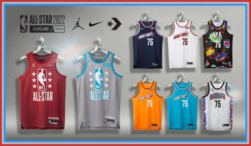
We’ve seen the leaks for the ASG uniforms…here are some higher quality official images:
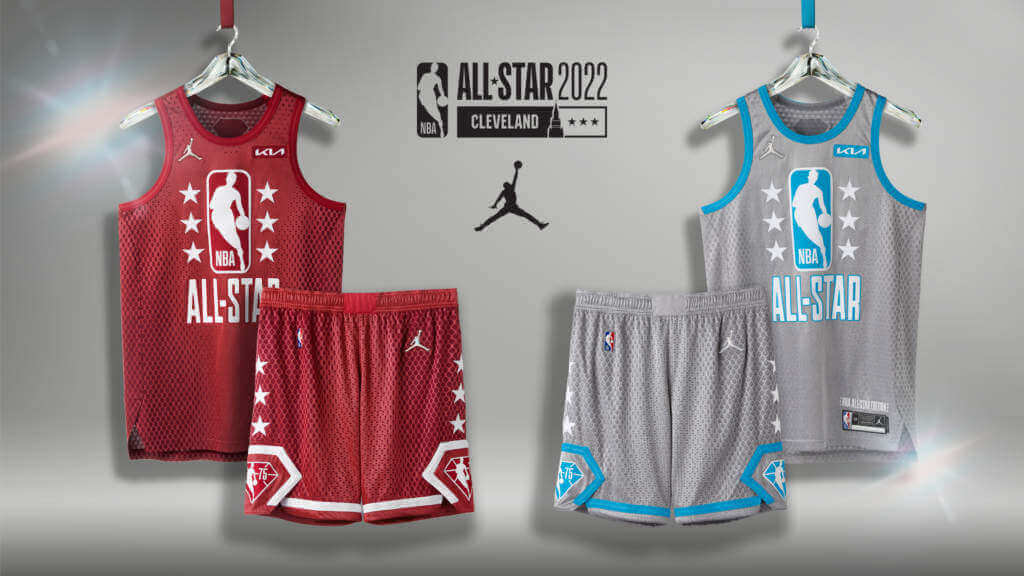
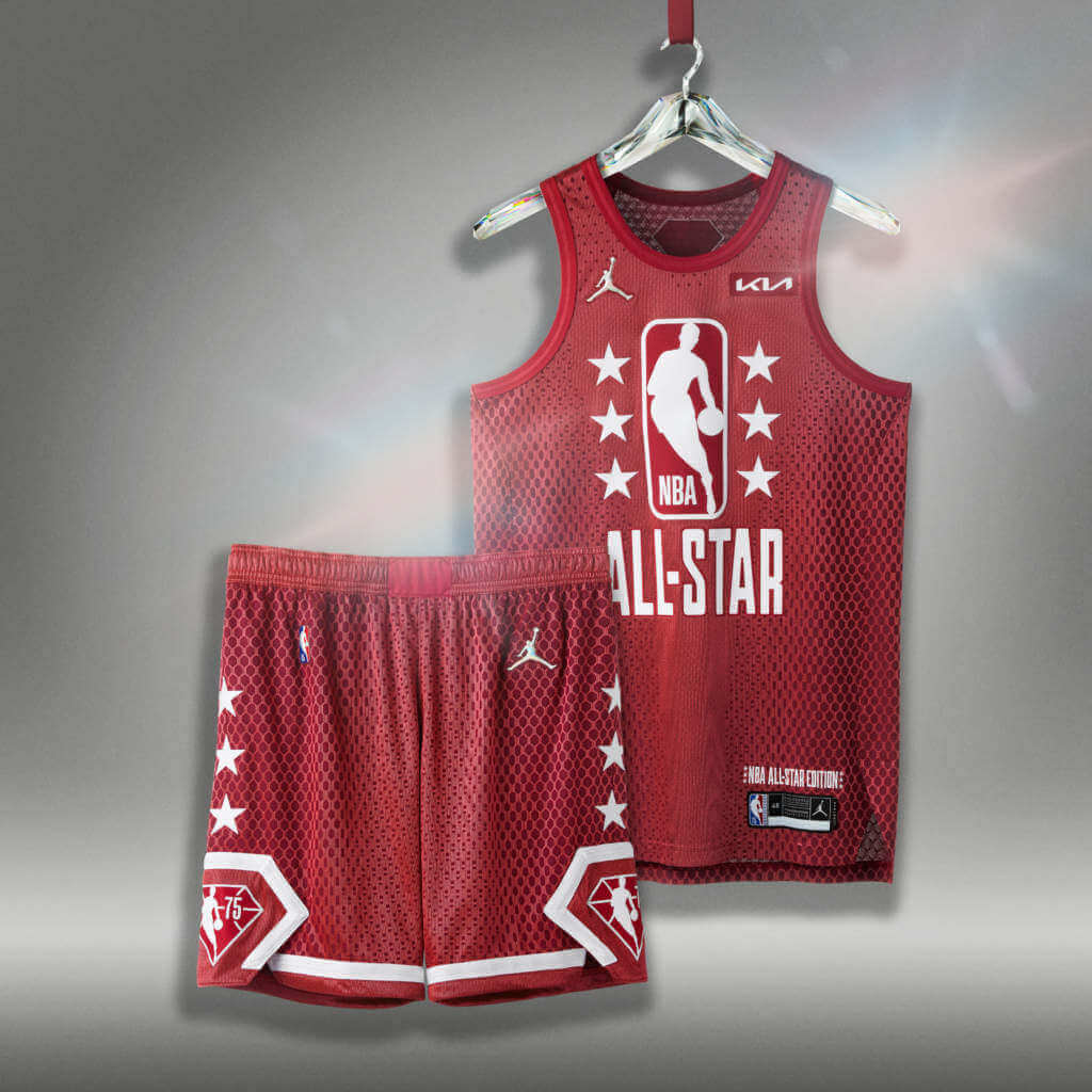
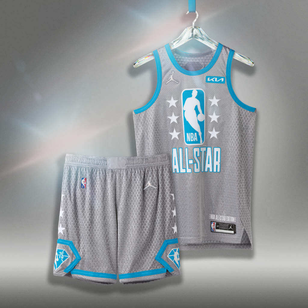
In his stellar writeup, Paul mentioned the uniforms bear little relation to the host city, Cleveland. Au contraire mon frère, and not so fast my friend… according to Nike (feel free to vomit),
“The uniform’s typography is inspired by the architecture of the city’s bridges and gives homage to classic All-Star uniforms of the late ’80s and early ’90s. The colors are drawn from the silver, prismatic shine of a diamond against the blue and red of the NBA logo in celebration of the league’s 75th anniversary season. The blue also speaks to the prominence of Lake Erie, and the red is a variation on the fiery strength and resilience of Cleveland.”
Oh, FFS. It’s not like we haven’t heard storytelling from uni designers before, but this may take the mistake on the lake cake. If it weren’t so awful, it would almost be comical. I mean, COME ON — is there a single living, breathing person who would look at those unis and say, “oh, that totally reminds me of Cleveland!” No? Of course not.
Now, there aren’t just the All Star Game unis, there are unis used for other events during the ASG weekend, and for the most part, they’re just as uninspired as the ASG kits. The ASG uniforms bare the “Jordan” logo.
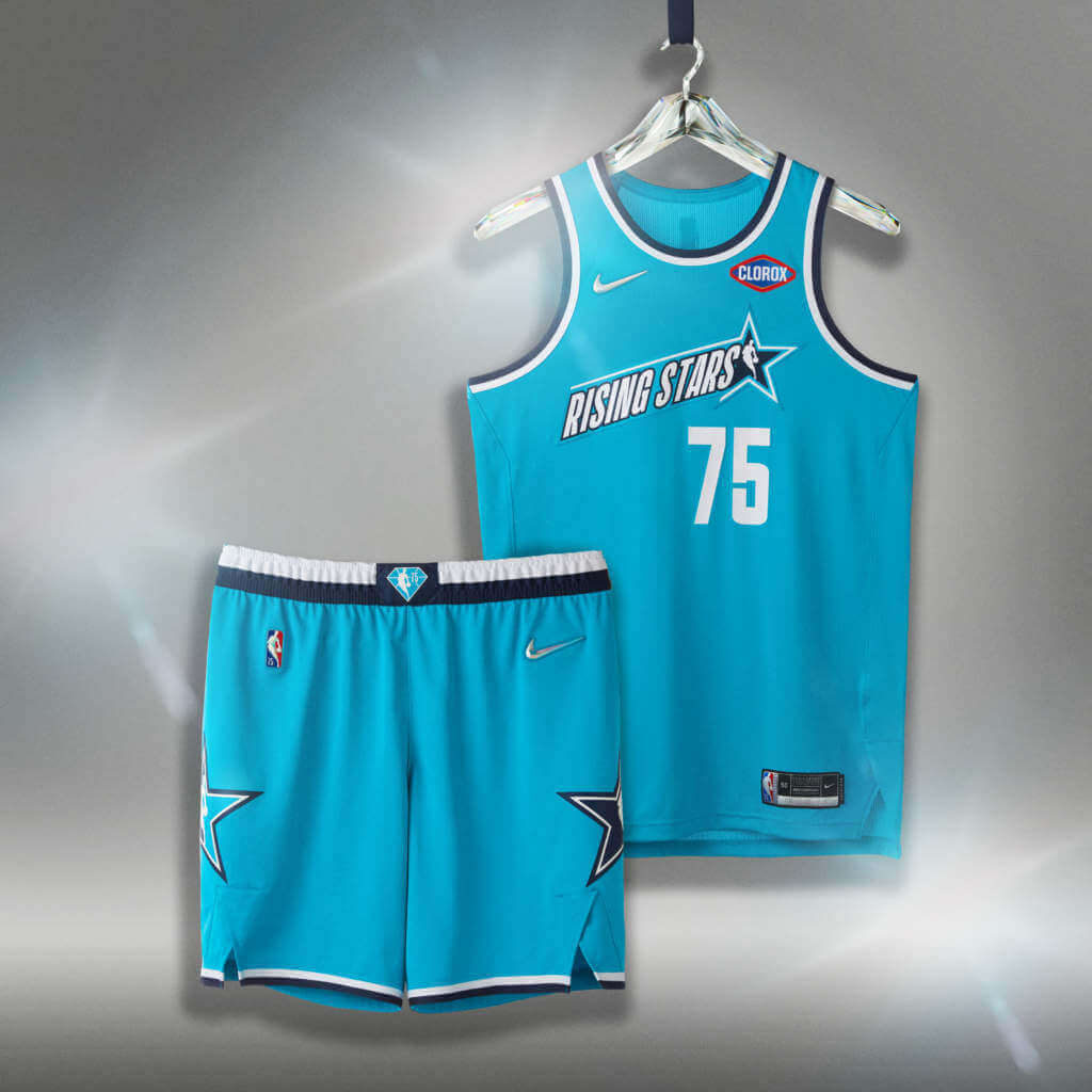
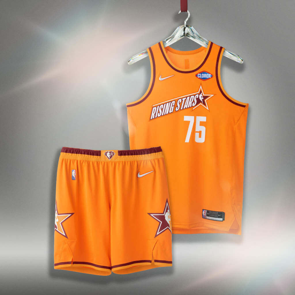
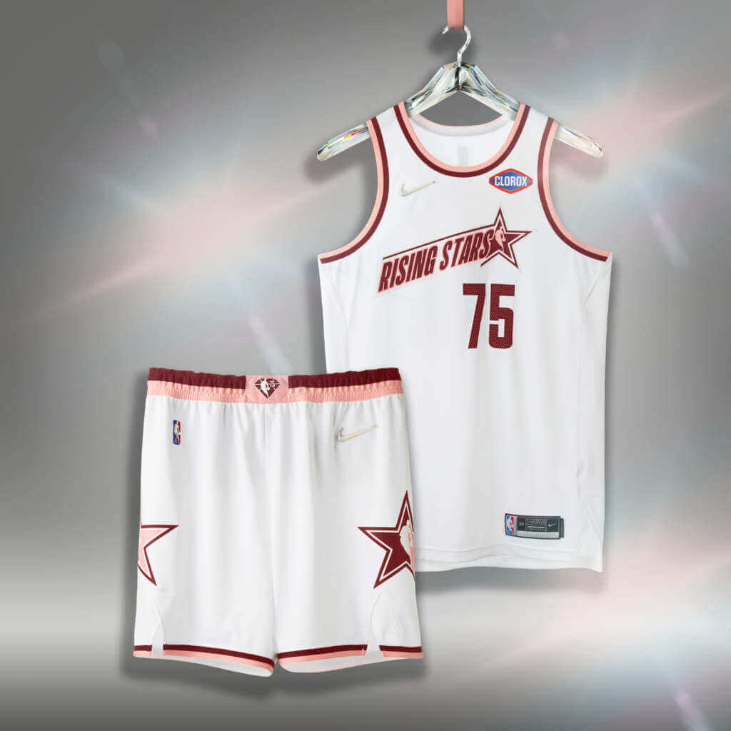
We also have four different “Rising Stars” uniform sets (featuring the Nike swoosh):
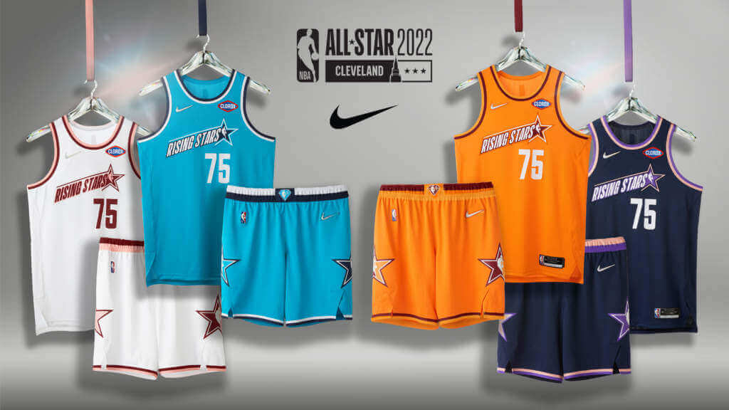
There are (in no particular order):
Turquoise Flares
Orange Flares
White Flares
Navy Flares
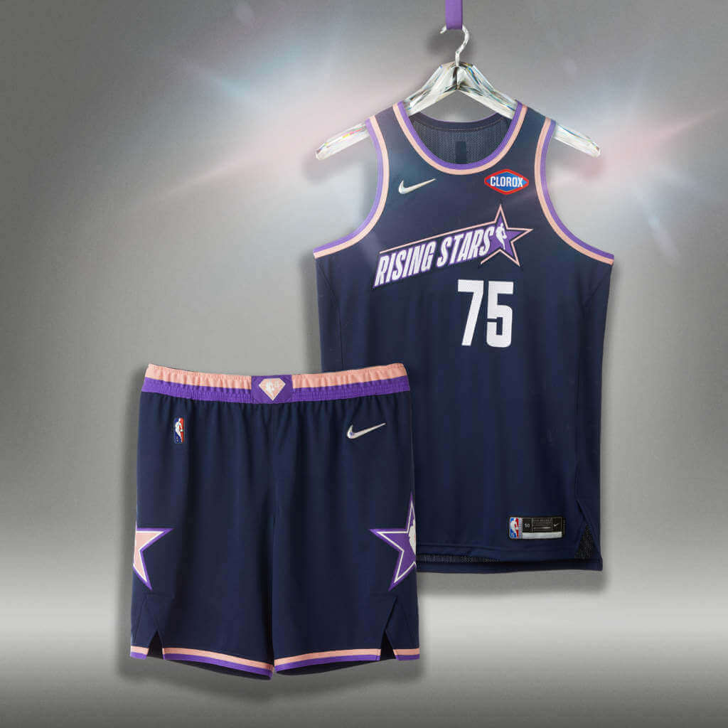
I have no idea why the uniform colors have the “Flares” modifier. However, according to swooshie, “The [advertiser omitted] Rising Stars uniforms follow a similar city-inspired direction. They feature unique colors inspired by the refraction of a diamond now showcased in four colorways to reflect the event’s updated four-team format.”
That’s the best they could do? “inspired by the refraction of a diamond“? Actually, I’d rather have the actual ASG unis be any of these four than the red/gray we’ll be seeing. The orange and blue might even make sense for Cleveland, as the team has used those in their uni color palettes before.
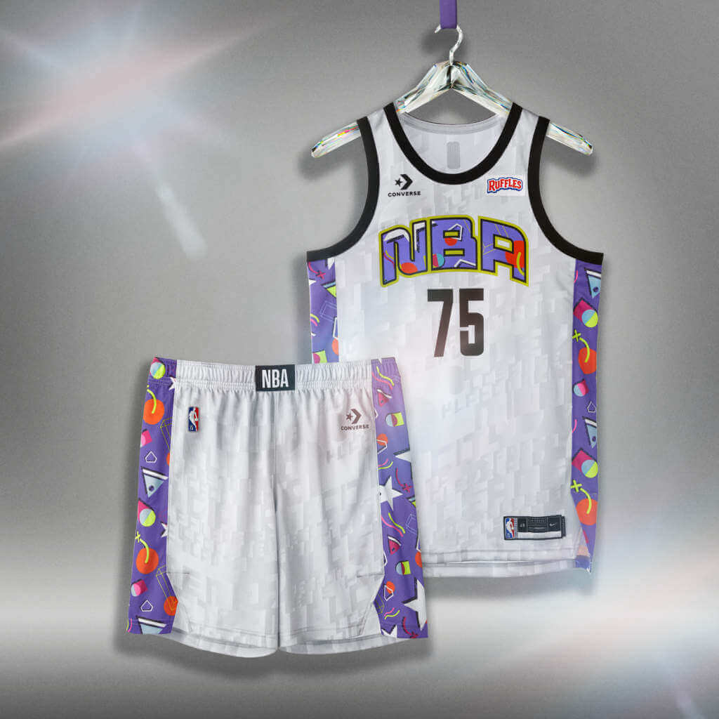
Finally, we have the All Star Celebrity Game uniforms — and these are bound to be either the best or worst uniforms introduced for the weekend. They are made by Converse (although they have been a subsidiary of Nike since 2003), which probably explains the big difference in design.
There are two distinct versions, white and dark. Here’s the white uniform:
And here’s the dark:
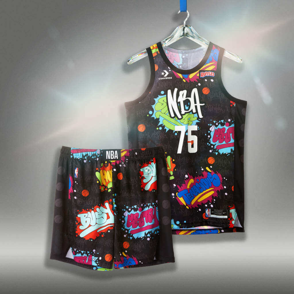
Will Smith may or may not have been available for comment.
Now, depending upon your age and/or your taste in uniforms, these are either great or terrible. But at least there was some apparent thought put into them. And these were NOT designed by Nike.
The Converse uniforms for the [advertiser deleted] NBA All-Star Celebrity Game are rooted in the brand’s effort to offer greater access to young creatives. Created by designers — some as young as 13 — from Converse’s local Boston- and Los Angeles–based Social and Community Impact partners, the uniforms are inspired by stylistic cultural differences between the East and the West. The East uniforms nod to the resilience of the cities in the region and local street art. The West uniforms incorporate ’90s pop culture, including popular movies, television and music during that time.
Honestly? I don’t hate either of these and have to say, they’d have been better used as the ASG uniforms than what has been released. Although I’m not necessarily a fan of the whole East/West dynamic, nor 90’s pop, as actual uniforms, they look alright, although the black one is a bit busy. I actually quite like the white uniform in particular, and I get where they’re going with the black uniform as well.
I realize probably few of you watch the All Star Game (it’s all about the shoes anyway), and fewer still will be watching the futures or celebrity games, and this year, for its 75 Anniversary Season, we have been presented with possibly the worst ASG uniforms ever (and there have been some BAD unis in the past few decades). If not the worst, these are certainly the least inspired. Only the uniforms designed by “young creatives” seem to show any creativity at all.
One last thing. Apparently this is another next-generation uniform (since Nike can’t seem to improve each successive uniform enough). It might help explain the pattern seen on the unis:
The knit material is new to the NIKE, Inc. NBA All-Star uniforms. New yarn combinations use proven moisture-management yarns, along with a new Trilobal “Iridescent Shine” yarn that creates a color-shift effect depending on how light hits the uniform. Dri-FIT ADV zoned-performance engineered material allows greater breathability for the athlete in high-sweat areas.
Faster, lighter, stronger? Nope, these just color shift. And maybe won’t show sweat stains as much.
Keep trying Nike. These suck.


Guess The Game…
from the scoreboard
Today’s scoreboard comes from Walter Bernard, Sr..
The premise of the game (GTGFTS) is simple: I’ll post a scoreboard and you guys simply identify the game depicted. In the past, I don’t know if I’ve ever completely stumped you (some are easier than others).
Here’s the Scoreboard. In the comments below, try to identify the game (date & location, as well as final score). If anything noteworthy occurred during the game, please add that in (and if you were AT the game, well bonus points for you!):
Please continue sending these in! You’re welcome to send me any scoreboard photos (with answers please), and I’ll keep running them.

Uni Concepts & Tweaks
Time for more Uni Tweaks from the UW readership.
I hope you guys like this feature and will want to continue to submit your concepts and tweaks to me. If you do, Shoot me an E-mail (Phil (dot) Hecken (at) gmail (dot) com).
Today’s concepts come from Will Hughes:
Hi Phil!
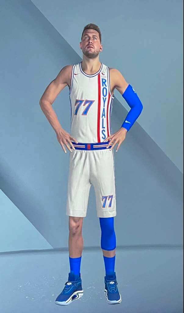
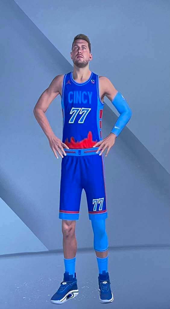
Easily my favorite feature of any sports video game is the NBA 2K series’ ability to “Create an Expansion Team”. It allows you to upload custom images, which really opens the possibilities. As a native Cincinnatian, I have created many versions of the Cincinnati Royals over the years, but I think the version I have made this year is my favorite so far.
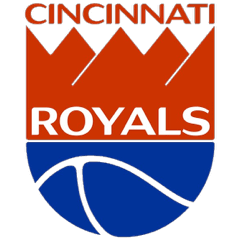
I always retain the Royals logo from 1971/72 (clearly the basis for the Kansas City/Sacramento Kings’ logo, but hey- it was ours first!). This year I have added monochromatic versions as the alternate logos:
I tried to remain realistic with the uniforms, which unfortunately meant a maker’s mark and an ad patch. As the region’s second biggest employer, a Cincinnati Children’s Hospital ad patch seemed the least objectionable.
For the Royal’s “Association” jersey, I stayed as close to their late 60’s look as possible, this time with NOB and a new number font:
I had specific plans for the alternate (2K only allows the user to create one), so I was limited to a red “Icon” look:
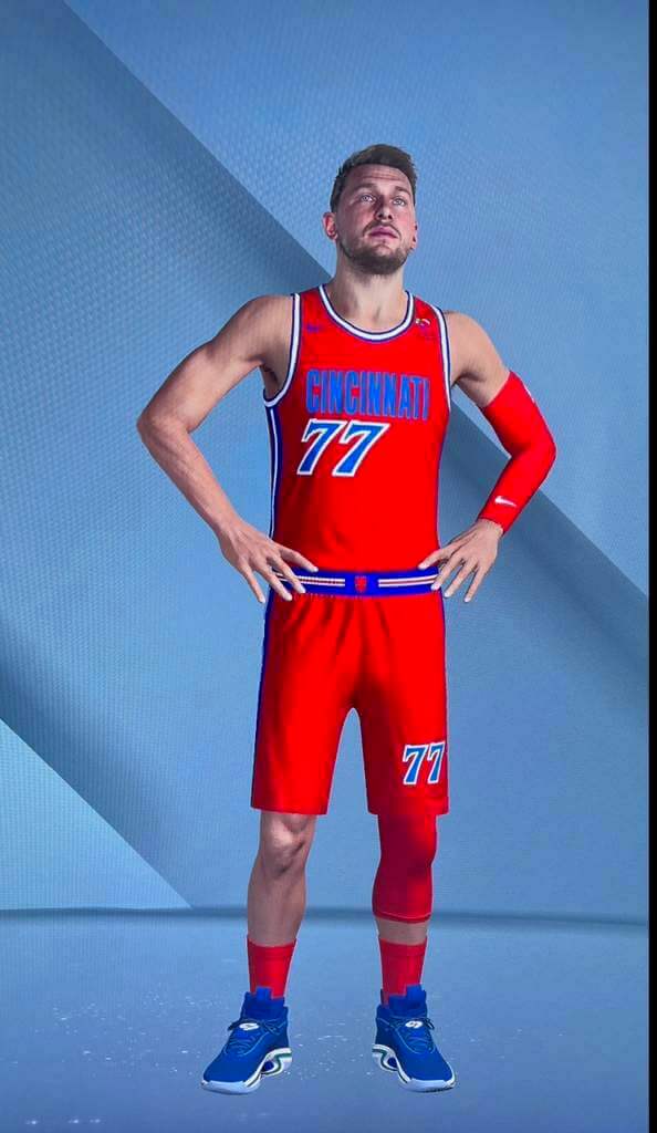
For the alternate, I attempted to embrace Cincinnati’s proud college basketball tradition. This meant a rare Cincinnati/Xavier combo. To embrace the Cincinnati side, the late 90s side panels are included, as well as a Jumpman maker’s mark. Xavier’s blue/sky blue throwback combo always (deservedly) gets lots of love, so it is the color base. An outline of the Cincinnati skyline completes the look.
As I mentioned, 2K22 only allows for one alternate uniform. This likely fits best as a “City” rather than a “Statement” look, as if it really matters…:
The fictional Royals play, of course, at a refurbished (read: resurrected), Cincinnati Gardens:
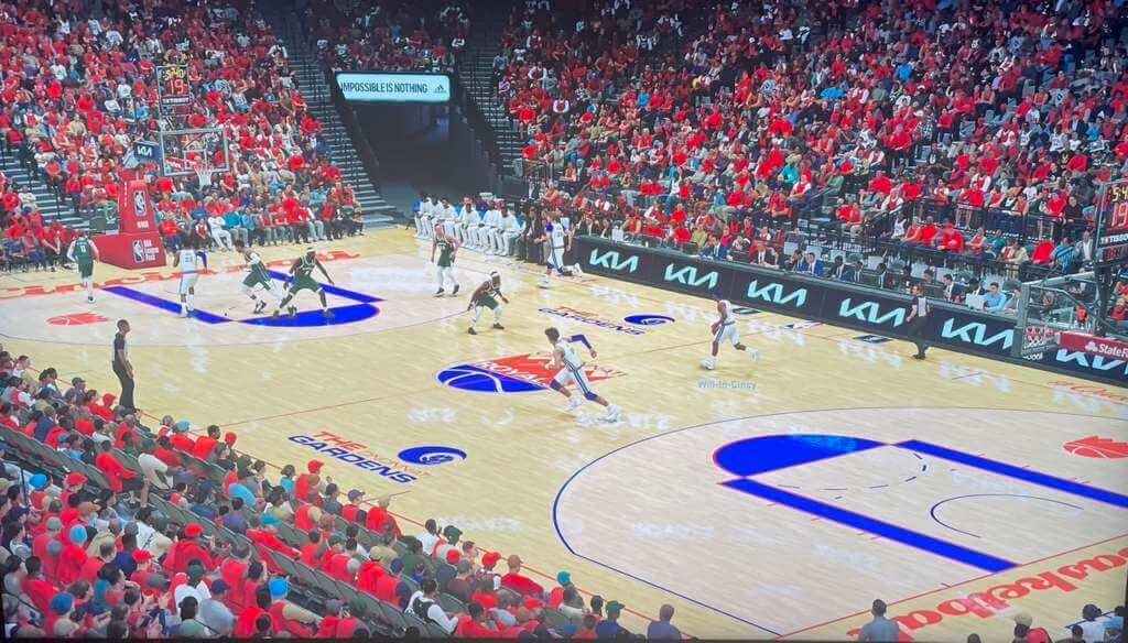
Ah, what could be.
-Will Hughes
OK readers (and concepters). If you have some tweaks or concepts, shoot ’em my way with a brief description of your creation and I’ll run ’em here.
And now some words from Paul: Hi there. In case you missed it on Thursday, my latest article on Bulletin assigns grades to teams that changed their names after moving to a new city. You can check it out here (and don’t forget my earlier Bulletin articles about teams that moved but didn’t change their names and teams that changed their names but didn’t move.)
Also: As I recently mentioned, this will be my last Bulletin article that’s publicly available to all. Starting with next week’s article, my Bulletin content (including my annual season previews for the Big Four pro leagues) will be accessible only to paying subscribers. The price is $4 a month or $35 for a full year. This revenue will also help support operations here on the blog. If you want to order a monthly or annual subscription, you’ll need a Facebook account in order to pay for it (I know, I know). You can sign up for your paid subscription here, and you can learn more about what you’ll get for your money here.
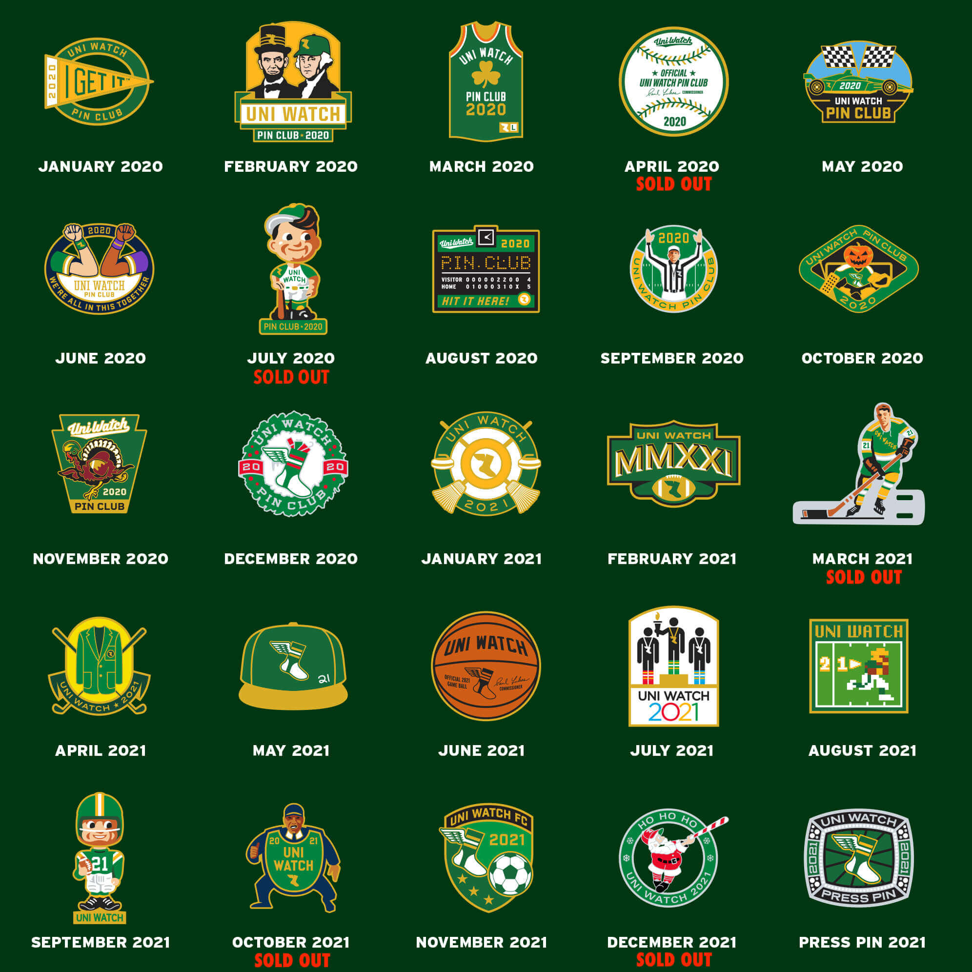
Finally, don’t forget that all Uni Watch pins are now available at a discounted price, with deeper discounts for multi-pin bundles. Full details here, or just click on this graphic:
That’s it from me. Now back to Phil. (And Go Niners!)
The Ticker
By Anthony Emerson

Baseball News: The Akron RubberDucks, Double-A affiliates of the Guardians, are the latest MiLB team to get in on the food promotion trend, becoming the Akron JoJos sometime in the summer (from @akron_blues). … OSU has posted a graphic breaking down the details of their new alternate uni (from Jay Wright). … Vandals have been attacking Black History markers throughout Georgia, including one marking Jackie Robinson’s birthplace. MLB is funding a replacement marker, and efforts to protect it (NYT link).

NFL News: Here’s a great video of Browns QB Baker Mayfield picking his uni number just after being drafted (from Paul G.) … Looks like Flying Elvis is missing his star on this Pro Bowl cap (from Garrett Heller). … Joe Burrow’s dad Jim posted a picture of Joe wearing a Chiefs helmet ahead of the Bengals’ AFC Championship Game matchup with the Chiefs (thanks, Phil). … A fan survey has ranked the WFT’s logo as the worst in all of sports (thanks, Phil). … New York Gov. Kathy Hochul is lobbying lawmakers to include Bills stadium funding in the state budget. Hochul is a Buffalo native, in case you were wondering.

Hockey News: Canes G Frederik Andersen has an amazing helmet for Whalers throwback nights (from Elena Elms). … New mask for Moose Jaw Warriors G Jackson Unger (from Wade Heidt). … Also from Wade, the OHL’s Windsor Spitfires debuted their new 75th anniversary unis on Thursday night. … More from Wade: The LA Kings wore pre game caps celebrating D Drew Doughty’s 1000th game. … Still more from Wade: the Stars celebrated Sergei Zubov night by wearing 1999-2007 era throwbacks during warmups, each with Zubov’s No. 56 on the back. … The Coyotes are in discussions to use ASU’s new multipurpose arena as their interim home after being evicted from Glendale.

Grab Bag: This article details Nebraska’s efforts to distance the Herbie Husker logo from white supremacists by changing his “OK” hand gesture (from multiple readers). … New jerseys for Kerry GAA (from Phil Santos).
Uni Tweet of the Day
Normally I’m a fan of radial arching, but these letters are just a wee bit too large…
What a find today from @BearcatsHistory! This jersey that Lloyd Batts wore in the 70s looks like it was made by the same people who made Davey Concepcion’s jersey nameplate pic.twitter.com/RXOP7PFjNA
— Cincinnati Uniform Tracker (@UCUniforms) January 28, 2022
And finally… that’s all today from snow(ed in)y Long Island. When all is said and done, where I live is expected to receive at least a foot of the white stuff, and this was coupled with tremendous winds. Fortunately, because the temperatures are pretty low (~20°) the snow is “fluffy” and light (so it will be easier to shovel) but…the winds (30 MPH+ with higher gusts) are gonna cause some serious drifting and wind chills below zero. Suffice it to say, I’m hunkered down for a while. Hope wherever you are you are all safe. My only fear is losing power due to the high winds (lets hope because it’s a light and puffy snow it just blows off trees and power lines).
Tomorrow we have the best (IMO) weekend in football: the Conference Championships. Although, some might argue last weekend was the best ever (or at least in quite a while). In the AFC, it’s KC vs. Cincy, and the NFC will have the 49ers against the Rams. Tomorrow we’ll take a fun look at classic uni games between the combatants (Bengals/KC, Rams/SF).
Everyone have a good and safe Saturday. I will catch you guys tomorrow … till then,
Peace,
PH
The dark Celebrity All Star Uniforms remind me of those cheap bed sheets with team logos. I can feel the pithing right now. Well done, Converse.
Hey Phil, I know it’s snowing very hard today, but isn’t Long Island still east of Brooklyn? ;-) Stay safe!
D’OH! Yes. I thought I *typed* East, and even when I re-read it, I swore it said east. Yeah. I’m about 15-ish miles east of Paul.
Link is missing for the new mask for Moose Jaw Warriors G Jackson Unger. Here it is:
link
Mask has a nod to the Canadian Forces Snowbirds Air Demonstration Squadron based in Moose Jaw.
Here is a fuller look at the 75th Anniversary uniforms for the Windsor Spitfires. This is the dark version. They had a white version earlier this year. Maple leaves of the socks neat. Ghosted numbers not so neat:
link
Also something notable from the Alberni Valley Bulldogs of the Junior “A” BCHL. They have put up a fifty-foot banner in their arena speaking out against racism:
link
“unique colors inspired by the refraction of a diamond”
>MASSIVE EYE ROLL<
Diamonds refract ALL the colors of the rainbow… that's what refraction IS.
And then they go and use pink trim on two of the uniform sets. Guess what color is NOT in a rainbows? PINK!
Uni-Watch has called out a lot of absolutely nonsensical uniform "storytelling" copy over the years but this "inspired by the refraction of a diamond" is the the worst ever.
Thosr all star unis and the corporate speak propaganda are a complete failure. Never thought I’d be nauseated by something so absolutely bland. But the event jerseys? WOOF. double WOOF! the rising stars jerseys look like something a local health care provider would slap together for an elementary school health fair exhibition game. And those “street art” jerseys absolutely look like what white people thought black people were into in the late 80s. And why does the “graffiti” include the word “busy”? Like give me a word that describes an all star performance… busy? Crap crap and more crap. Across the board.
The entire ASG look is a fail, and they really squandered an opportunity to do something awesome for the 75th anniversary.
Love the Royals concept EXCEPT there needs to be separation between the royal blue lettering and red jersey, it is illegible.
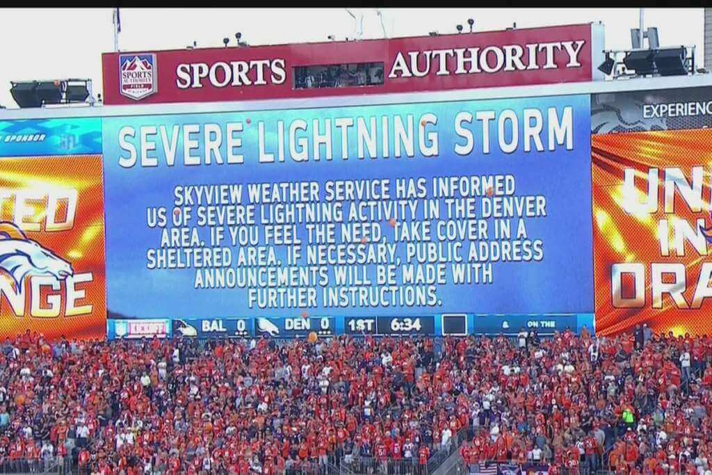
Scoreboard is from the 2013 NFL season opener, on September 5. Game was delayed 34 minutes. Denver 49, Baltimore 27. Peyton Manning had seven touchdown passes.
That’s gotta be up there as far as worst storytelling in uniform history. Good morning, I need a drink.
Thank goodness for the Clorox ad patches. Now I know what brand of bleach to put in my eyes to wash those horrific images away.
To paraphrase the great Chappelle Show character Silky Johnson: what can I say about those NBA All Star Games that already hasn’t been said about Afghanistan?
Also, FOUR rising stars uniforms? I thought that was Rookies versus Sophomores (or did the format change?) I admittedly only really pay attention to the Saturday night festivities and the game itself
They changed the format this year (will include G-league players). It was link. (Google is your friend, Douggie ;))
Let’s talk about the Cincinnati Royals.
Does anyone remember when they would have their logo and their opponent’s logo on the court? Literally painted on the wood panels? I cannot find any photos of it.
I remember after the 1970 expansion the three new team logos were a different color wood panel. Anyone remember?
“The blue pays tribute to the majestic Cuyahoga River that runs through this historic city, and the red evokes the powerful flames that blazed so brightly when that river caught fire.”
I mean, if you’re gonna tell a BS story, at least make it an interesting BS story!
It honestly feels like a retcon (or back pedaling on a bad design). The typeface isn’t evocative of anything other than the NBAs usual generic typeface that they usually use for these types of things. It’s basically the go t that they normally render the letters NBA in. And grey for diamonds, red for the NBA logo? Those are some poor quality diamonds and what about blue and white from the logo? No no, blue is for the lake, furthering Nike’s trend of “water blue, trees green, sun yellow” kindergarten color stories. Scrap it all next year. Try again with adults at the helm.
Scoreboard guess: I’m pretty sure its from the game I was at, Dallas at Denver, Sep 17, 2017, where Denver won 42-17. Here’s link of us taking refuge in the concourse.
Scoreboard: I’m pretty sure this is from a game I was at. Dallas at Denver, Sep 17 2017 where Denver won 42-17.
Oops, just saw the bottom of the scoreboard showing Baltimore at Denver. They used this same message for the Dallas game as it was delayed about an hour, so it confused me.
I was going to say perhaps the NBA isn’t taking advantage of the 75th anniversary because it’s only the 71st anniversary of the All-Star Game… But then I saw their storytelling crap about the colours referencing the logo. Weird.
Also, why are there four Rising Stars jerseys?
No buttons on OSU new alternative jersey, is this becoming a thing?
The article on Herbie Husker was interesting and the comments at the end of the piece simply predictable. A change of a hand gesture brought out 92% of the responses from riled up white supremacists decrying the “political correctness” of the change or denying the current connotation of the old gesture. All entirely what is often stereotyped for specific pockets of the country.
I’m starting to think that the whole idea behind any “All-Star” game uniforms is to be tacky and/or garish.
I mean, has there literally ever been a tasteful ASG uniform in basketball or football?
Yes. But those both happened decades ago. ASG unis for both the NFL and NBA used to be tasteful and simple. Somewhere in the late 80s or early 90s both began to go off the rails and never recovered.