For all photos, click to enlarge
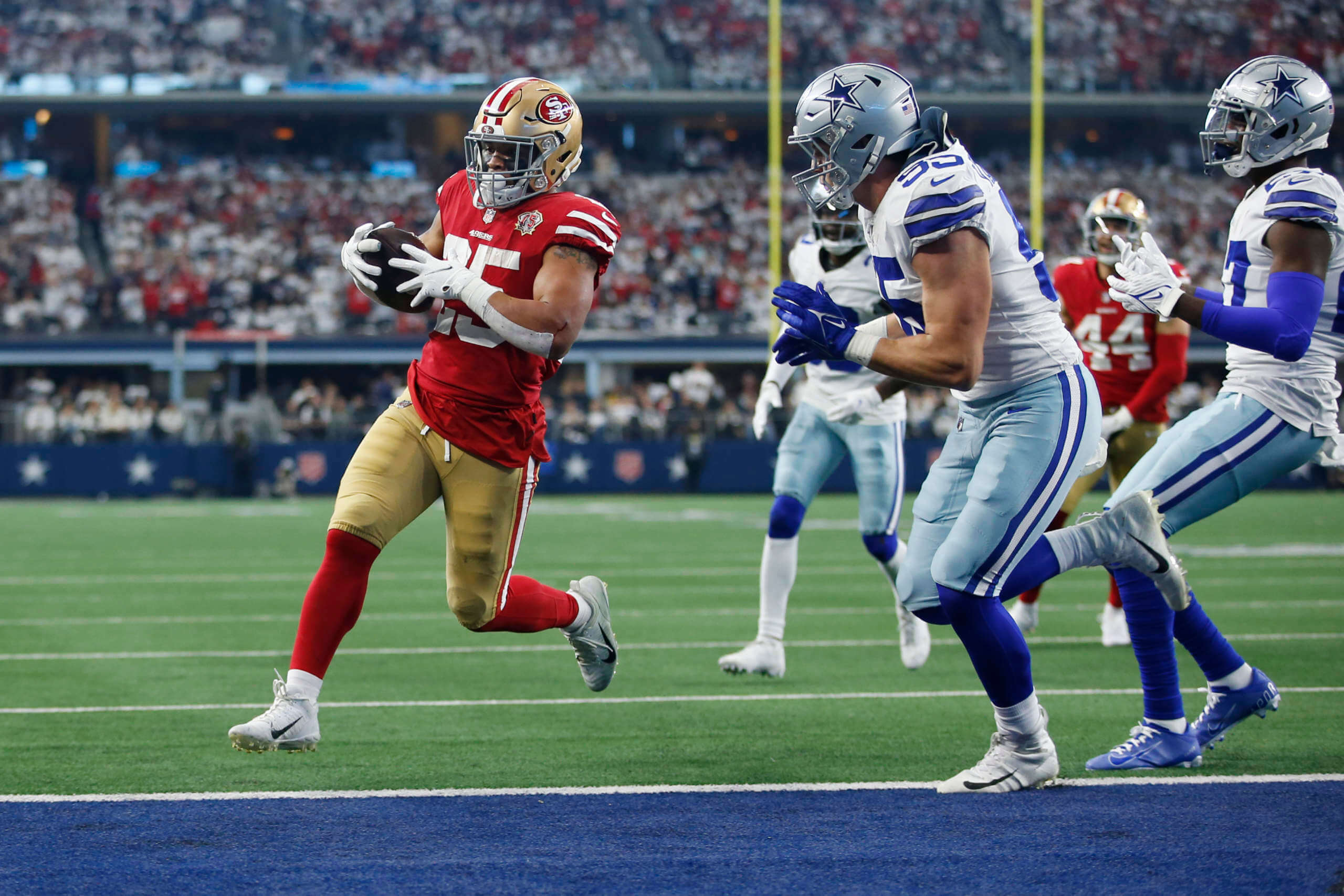
Good morning! How ’bout those 49ers?
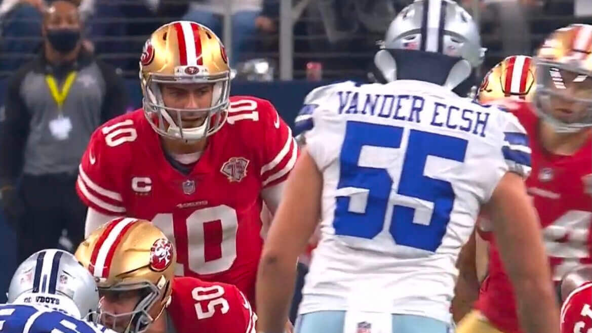
That was one sloppy game, with both teams doing their best to give it away. But as a lifelong Cowboys-hating Niners fan, I’ll take it! From a Uni Watch perspective, however, the most notable thing about the game was not the result but the fact that Dallas linebacker Leighton Vander Esch’s NOB was misspelled (see above) — yet another layer of sloppiness
In that same game, 49ers offensive lineman Laken Tomlinson, who wears No. 75, appeared to have part of his front “5” missing early in the game (although it was fixed later in the first half):

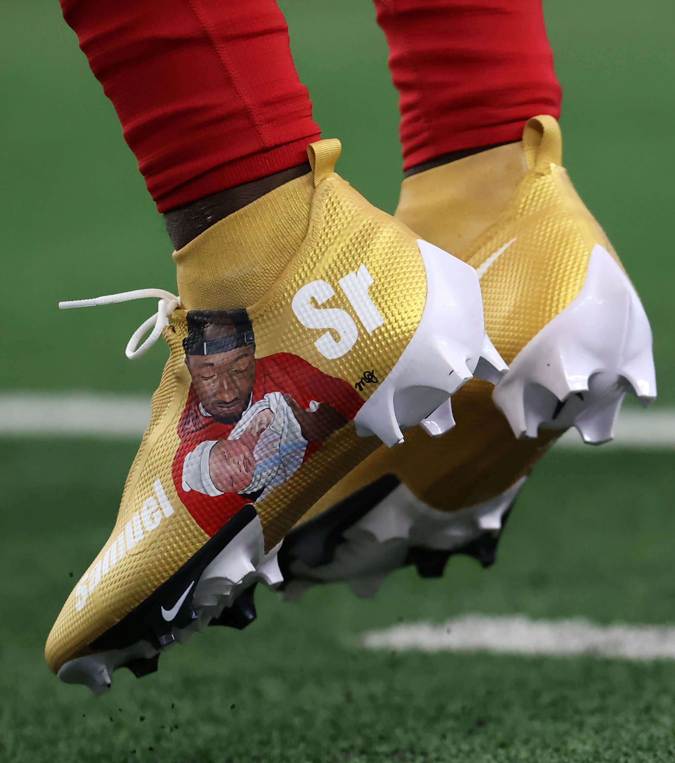
Also from that game, 49ers wideout Deebo Samuel wore cleats painted with an image of himself cradling his baby son, who was born on Dec. 27:
In other news from Wild Card Weekend (including a few notes from Saturday’s games that Phil mentioned in yesterday’s Ticker, but I’m repeating them here for the people who don’t follow the site on weekends):
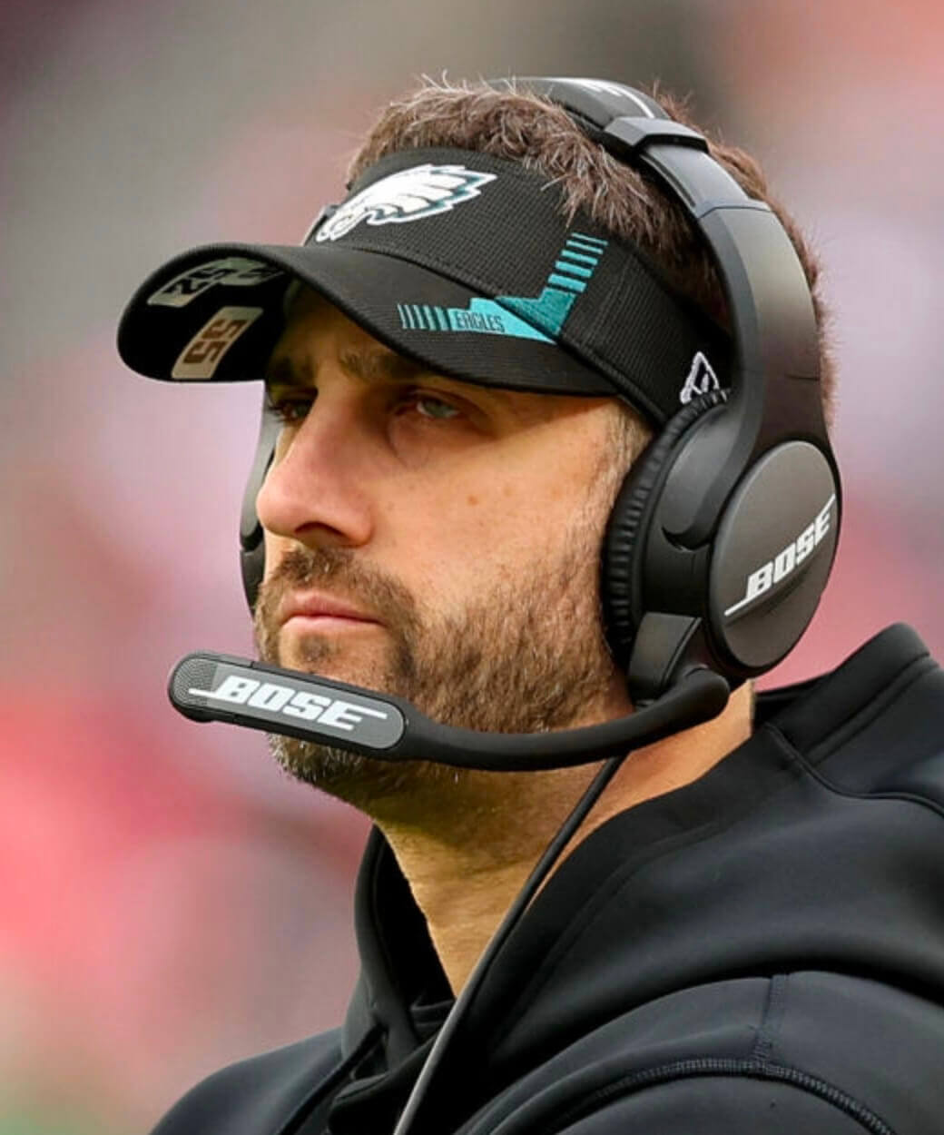
• Eagles head coach Nick Sirianni, who usually wears the numbers of injured players on his visor, had the numbers on his undervisor yesterday:
• Two of the teams that played yesterday — the Cowboys and KC — don’t wear captaincy patches during the regular season but add them for the playoffs, as you can see in these comparison photos:
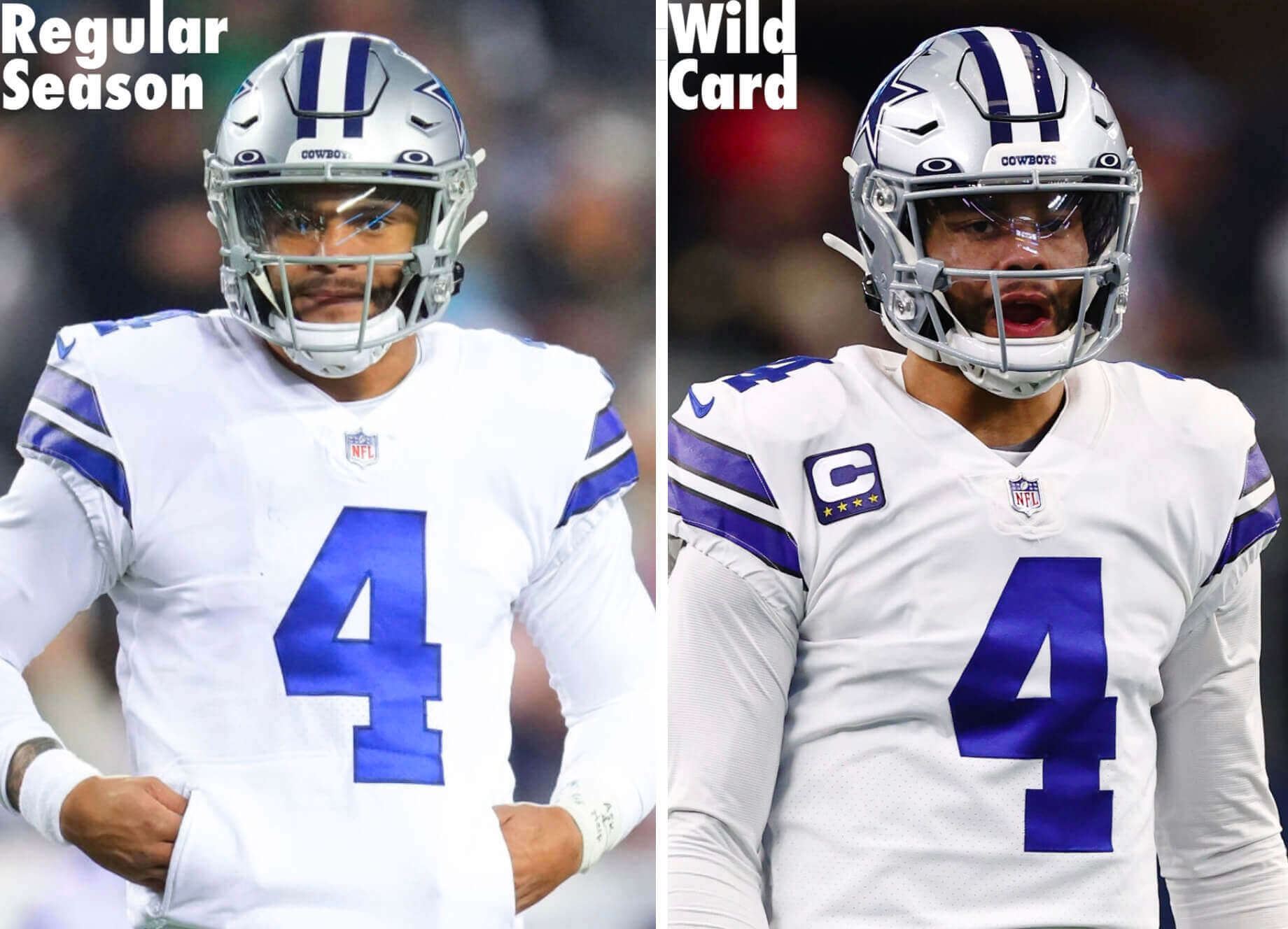
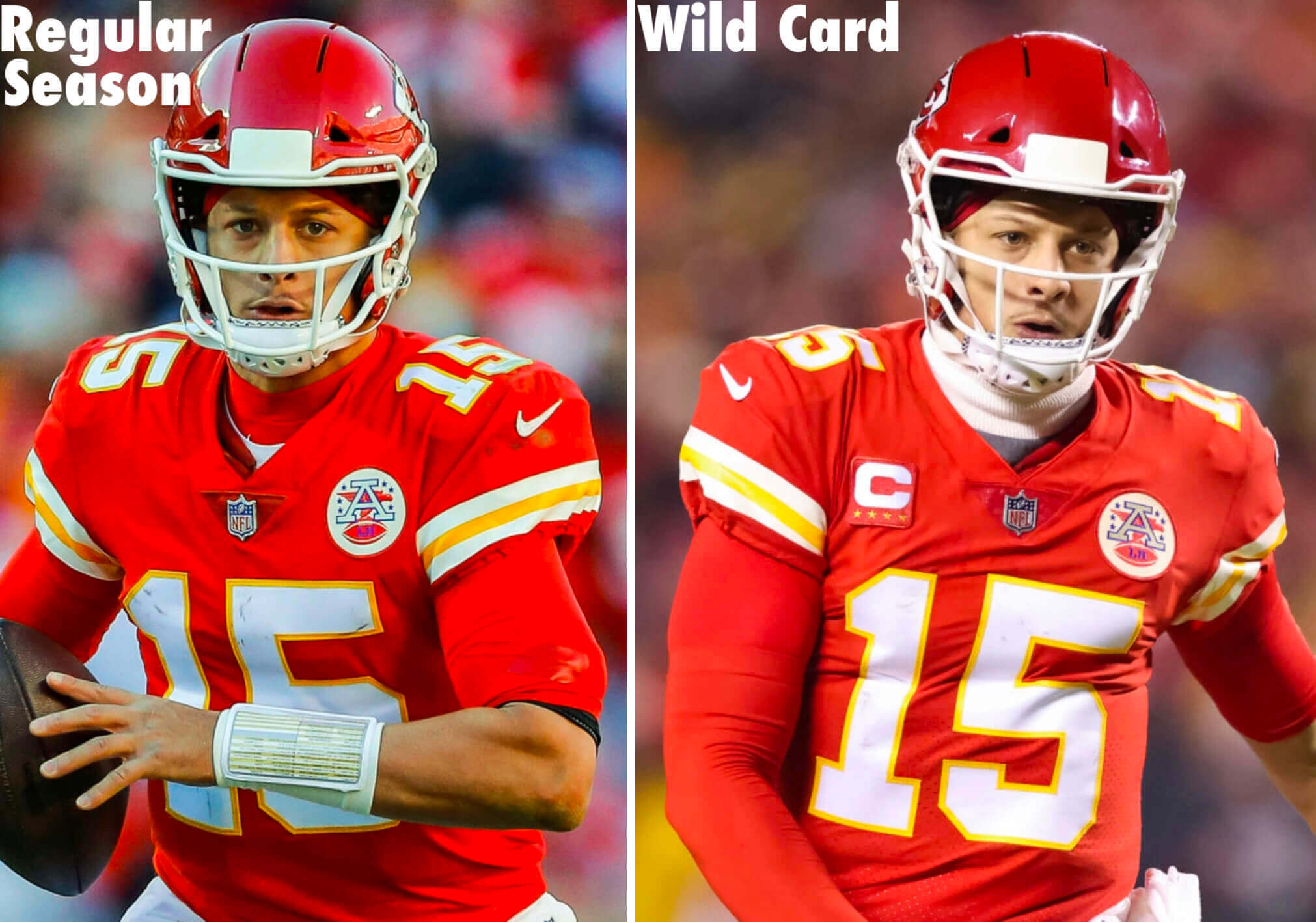
The Packers used to have that same protocol when Mike McCarthy was their coach, but they began wearing captaincy patches during the regular season after McCarthy left. (McCarthy, in turn, brought that protocol with him to Dallas, where he currently coaches.)
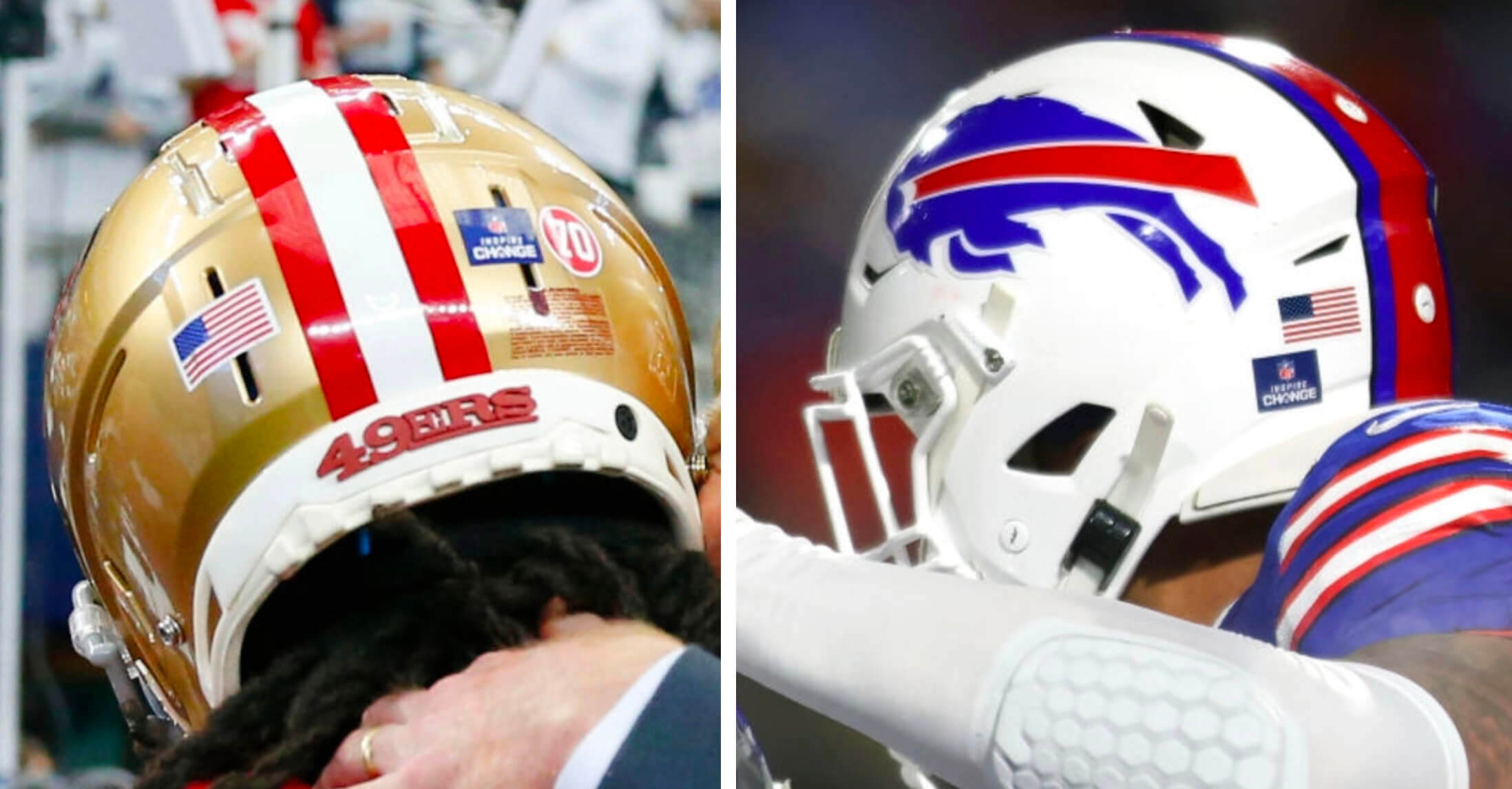
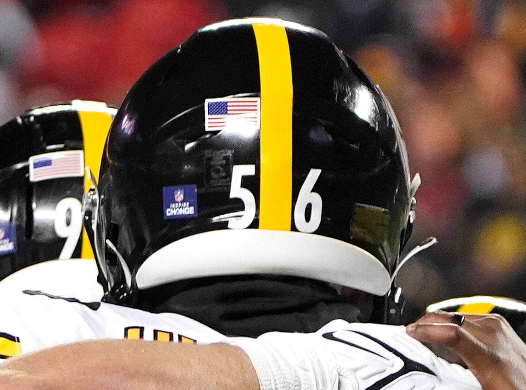
• All NFL teams wore “Inspire Change” helmet decals for the final two weeks of the regular season. From what I could see, three teams — the 49ers, Bills, and Steelers — continued wearing those decals in this past weekend, while the other Wild Card teams did not:
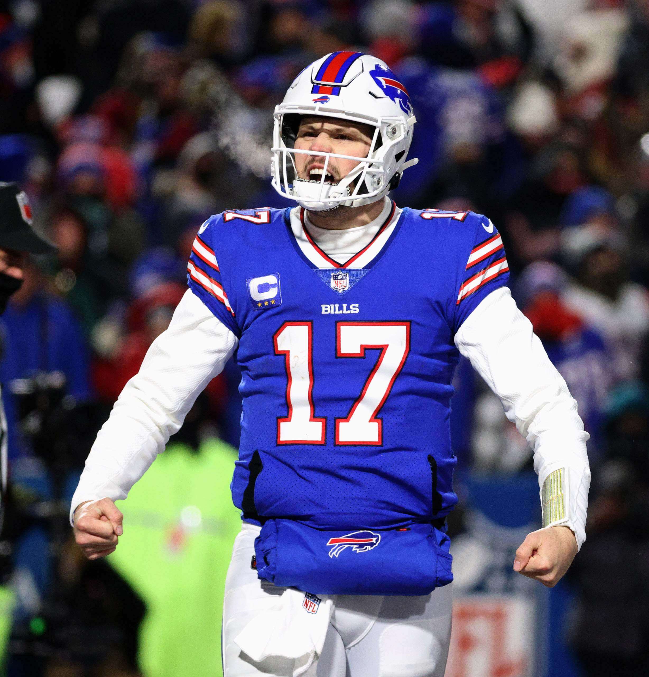
• Bills quarterback Josh Allen wore a sewn-in jersey pocket and a strap-on pouch on Saturday night — sort of the “belt and suspenders” version of hand-warming:
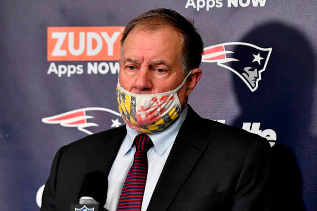
• Pats coach Bill Belichick, who attended high school in Annapolis, Md., wore a Maryland flag-themed Covid mask (and neglected to position it over his nose) during his postgame press conference on Saturday:
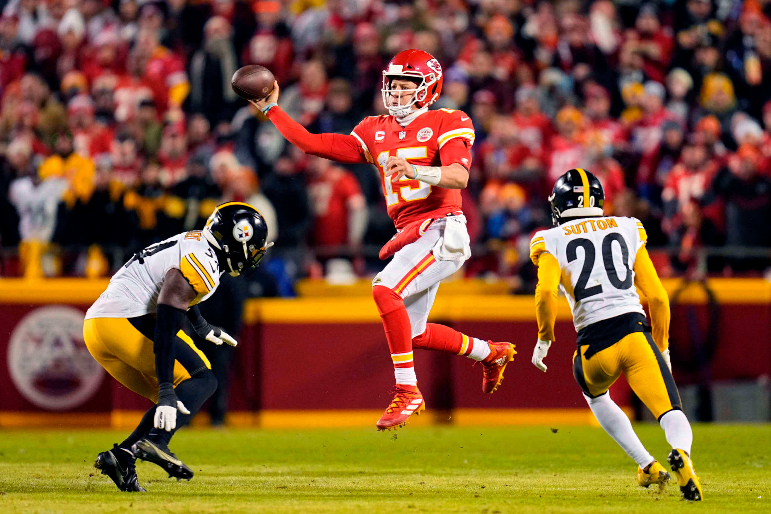
• I thought all three of yesterday’s games were very easy on the eyes. I mean, look at these uni matchups:
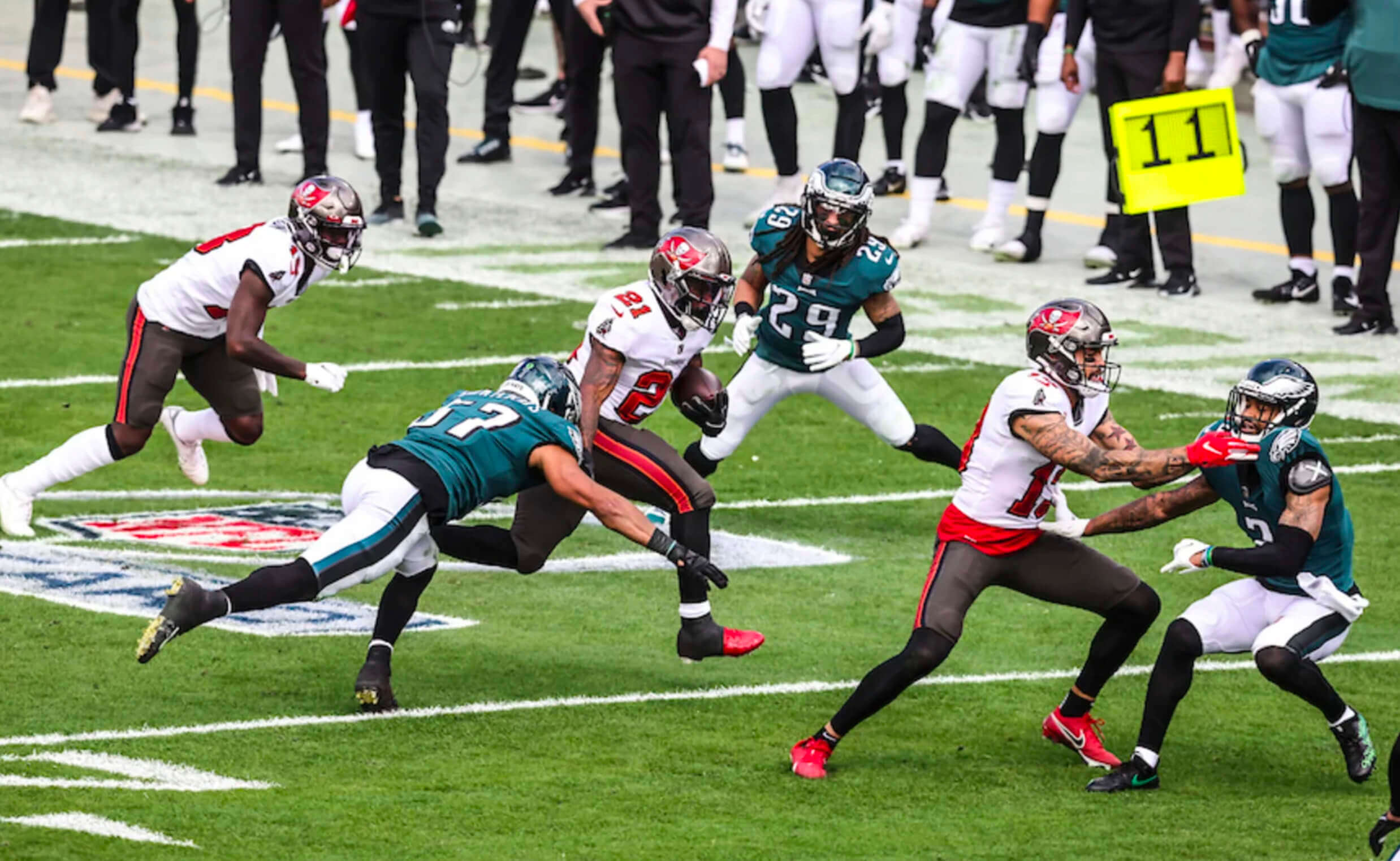
I know a lot of people don’t think the Eagles/Bucs game measured up to the other two, mainly because so many folks would rather have seen Kelly vs. Creamsicle. And sure, that would’ve been a fun matchup too. But Philly and Tampa were both wearing their best uni current uni combos yesterday. Toss in a natural grass field and a sunny day, and you have a very good-looking game, at least for me. I enjoyed watching it even though I don’t really care about either team.
Tonight’s Cardinals/Rams game will not be so visually pleasing, but whaddaya gonna do.
As a food-related aside, I saw an article the other day about lemon-pepper chicken wings, which are apparently a big thing in Atlanta (especially in titty bars, oddly). Frankly, it was hard to imagine how anything could improve on basic Buffalo wings, but the Tugboat Captain and I thought the lemon-pepper thing sounded like a fun little kitchen adventure, so we decided to make wings to go with yesterday’s football games.
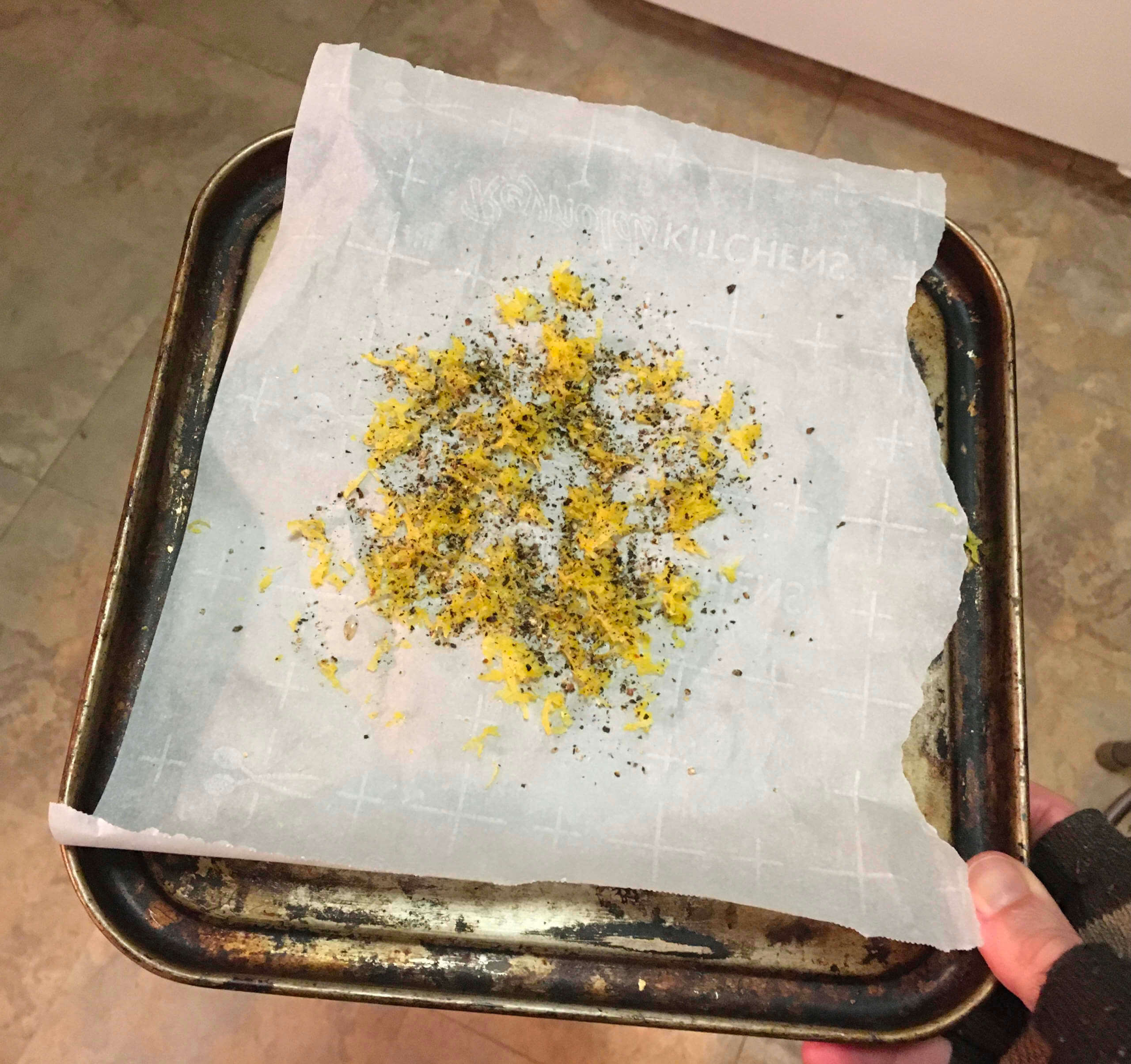
We made two separate batches — one flavored with standard retail lemon-pepper seasoning, and the other with a homemade lemon-pepper mix that we made from lemon zest, pepper (shown above, click to enlarge), garlic, brown sugar, and salt.
Both versions were fine but unremarkable. Not sorry we did it, but I don’t think we’ll ever do it again (even though the 49ers won while we were eating). If you like the lemon-pepper thing, more power to you, but we’ll stick to Buffalo-style!
(My thanks to all contributors, including Andrew Cosentino, Aaron Pinto, and our own Brinke Guthrie.)
Click to enlarge
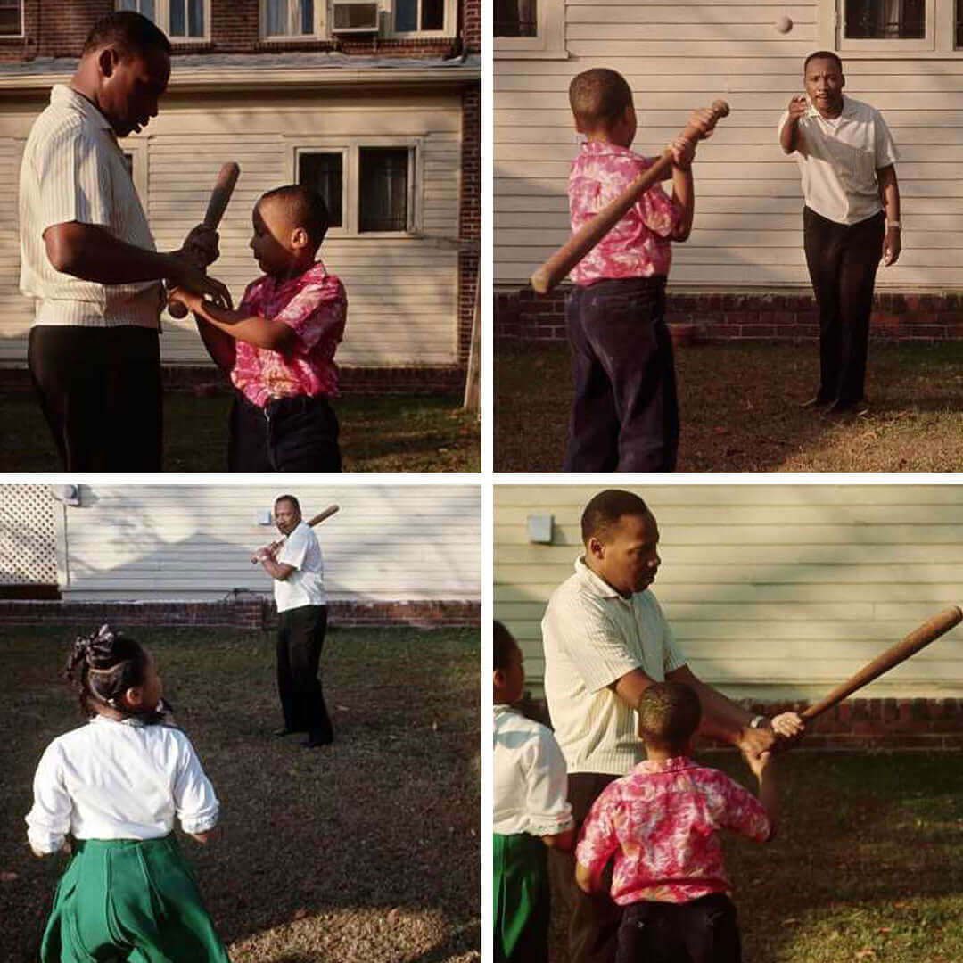
He would’ve been 93 this year: Today is Martin Luther King Jr. Day — the day when we honor history’s greatest American. I never get tired of seeing these photos of him playing baseball with his kids.
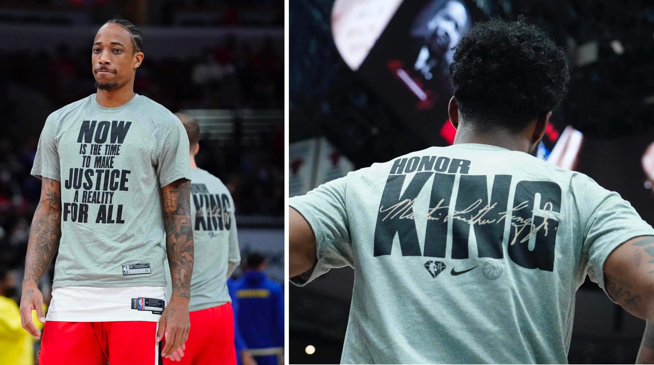
The uni-verse will acknowledge the holiday in several ways. First, NBA teams will continue to wear the MLK-themed warm-up T-shirts that they’ve been wearing for the past few days (click to enlarge):
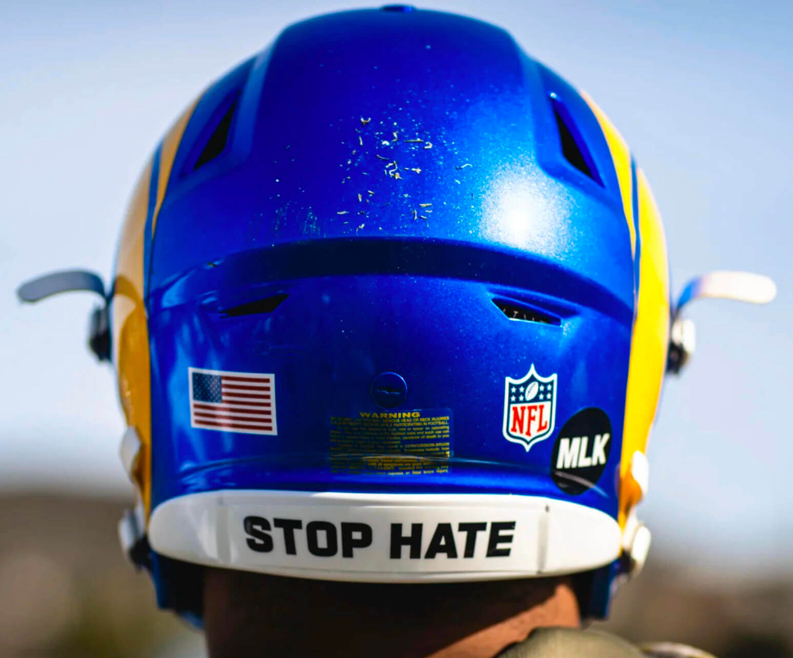
In addition, as Phil mentioned over the weekend, tonight’s NFL playoff game between the Cardinals and Rams (the first NFL game ever on MLK Day) will feature both teams wearing “MLK” memorial decals, along with two neck bumper slogans associated with King — “Be Love” and “Stop Hate”:
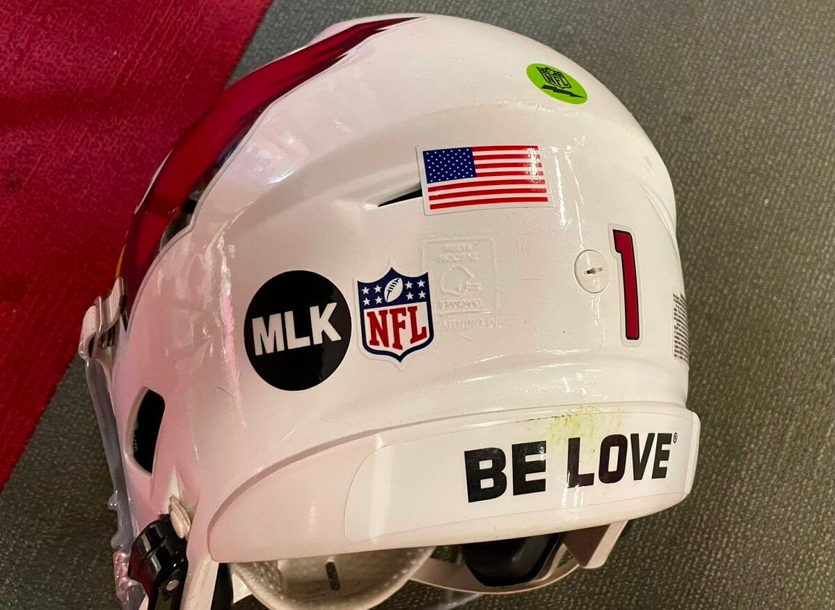
Notice anything weird thing about that photo? If you look closely, the bumper slogan appears to have a circle-R trademark symbol (or at least I think that’s what it is). Seriously?
Here’s a photo from a Rams practice on Saturday, showing that there’s definitely something at the end of the “Be Love” slogan. Again, it looks like a circle-R, but it’s hard to be sure:
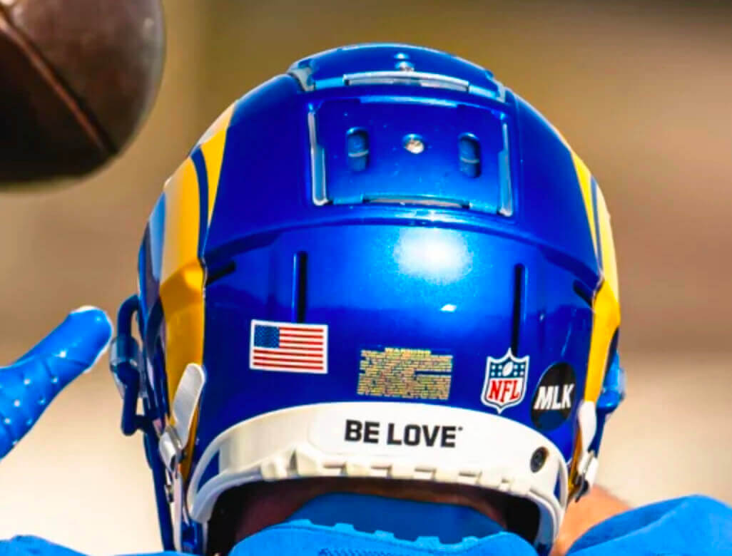
There’s no similar symbol after the “Stop Hate” slogan, however:
To my knowledge, the NHL does not have any uni-related MLK observances planned, although the Bruins plan to retire Willie O’Ree’s No. 22 tomorrow night. In addition to being one day after MLK Day, tomorrow is also the 64th anniversary of O’Ree breaking the NHL’s color barrier in 1958.
ITEM! Lots of price cuts: Inflation may be going up, but the prices of lots of Uni Watch products are going down! Take a gander at these savings, effective immediately:
• Seam rippers, originally $5, are now $3.
• Koozies, originally $5, are now $3.
• Trading cards, originally $6 and then reduced to $3, are now $2.
• Magnets, originally $3, are now $2.
• Chain-stitched patches, originally $35, are now just $20 (which is way below my $28 cost, so I’ll be losing money on them, but I want to get them sold!). are now sold out. If you want to be notified when they’re back in stock, shoot me a note.
• Memberships, normally $25, are now $20.
These items all mail out from Uni Watch HQ, so you can save on shipping charges by mixing/matching items. Email me and I can give you a combined shipping charge for the items you’re interested in. Thanks!
The Ticker
By Jamie Rathjen

Baseball News: Back in 1995, when there were plans to build a new football stadium on land owned by the Dodgers, Dodgers owner Peter O’Malley gave out coffee mugs emblazoned with a football-themed version of the team’s logo (from James Gilbert).

Hockey News: The Hockey News ranked the top five NHL all-star jerseys (thanks, Phil). … The PHF’s Connecticut Whale, besides wearing Alzheimer’s-awareness jerseys and socks, also wore a pants memorial patch for Teddy Balkind, the Connecticut high school player whose death was the occasion for this New York Times article about neck guards mentioned in Friday’s Ticker. … These two items are from Wade Heidt: The OHL’s Saginaw Spirit debuted 20th-anniversary jerseys (in white). … The Junior A British Columbia Hockey League’s Chilliwack team spontaneously debuted an alternate this weekend. “At times they look brown, but it appears like they are a dark maroon/dark burgundy,” Wade says. … Reader Ryan Bower saw somebody in New York wearing a jersey for a very Ancient Egypt-themed probable rec league team, which includes a jersey crest of the god Anubis and hieroglyph NOBs.

Basketball News: Tennessee’s women’s team supported former coach Pat Summitt’s charity, also for Alzheimer’s awareness. Players all wore “Summitt” NOBs and purple accents yesterday (from Taylor Crabtree). … The Minnesota/Iowa men’s game yesterday was color-vs.-color. … Houston’s men’s team is wearing throwbacks tomorrow (from Ignacio Salazar).

Soccer News: In Australia, Sydney FC’s men’s and women’s teams wore a new black/very dark purple third kit at home on Saturday. … England’s Sheffield United introduced a new women’s player, striker Georgia Walters, with a shirt using the men’s team’s font. On her debut yesterday she then appeared to be missing the team’s sleeve and chest patches and shorts number, at least — compared to what it should be — which is not the best uni-related start, but was very fitting for this weekend. … New kits for Japanese men’s teams Roasso Kumamoto, Tokyo Verdy, and Vissel Kobe (from Jeremy Brahm). … Also from Jeremy: A club in Georgia’s men’s fifth tier, Kvareli Duruji, plays games inside a castle or fortress.

Grab Bag: English soccer club Wolverhampton Wanderers’ esports team participated in the virtual 24 Hours of Le Mans from their Molineux Stadium this weekend, including before, during, and after their Premier League home game on Saturday. … St. Kilda’s AFL Women’s team debuted an Indigenous design this weekend, which is another one that doubles as a clash guernsey. … We can add airports to the list of places new players have been introduced and handed a jersey. That’s American volleyball player Dana Rettke, who joined Vero Volley Monza in Italy (from Jeremy Brahm).
No comment on some KC players wearing red socks and others wearing white? Or is that a normal occurrence?
Very normal, sadly. NFL sock uniformity has gone out the window.
The picture on Samuel’s cleats got me thinking… almost every hospital baby picture I have ever seen has the baby in the identical baby blanket.
Is there only one supplier for the entire country? That pink and blue pattern is identical everywhere.
link
I never knew that. Thanks!
” […] many folks would rather have seen Kelly vs. Creamsicle”
The Eagle’s Kelly green is okay, I guess, but the creamsicles are easily one of the worst uniforms ever worn in pro sports. I cannot figure out why so many people love them. I really prefer teams to wear their primary uni’s in the playoffs anyway. I want any big and memorable moments for my team to happen in the uniform they usually wear, not some one-off or throwback.
I sort-of agree. The creamsicle is great for a fun hat and one weekend home game a year when announcers use the phrase “big sombrero” but that’s enough.
I don’t agree its one of the worst of all time. Pick a random season from the Reebok era and you’ll find ten worse jerseys. (that’s just my opinion and probably reflects my bias against Reebok design and random shoulder yokes and side panels)
It is sort of interesting that if you’re old enough to remember the original Bucs uniforms, they were almost universally derided (unfortunately to the point of homophobia at times) and most people considered the switch to red/pewter to be a significant upgrade.
Now they’re “classics”, somehow.
I’m with you on this. I think the Bucs’ current look is much better than the creamsicle scheme.
I was just thinking about the distinction between “relic” and “classic” here. If I would try to define that for uniforms, I would say that classics continue to look excellent in any era; relics may be interesting and fun to look back at on occasion, but that’s enough.
In my book, teams like the 49ers and Packers wear classics. The Bucs’ creamsicle unis, on the other hand, are an example of a relic.
For visual reference:
link
Can the Cowboys please fix their uniforms? The navy blue stripe on the helmet, royal blue on the numbers, stripes and socks and silver pants that don’t match stink. Just stick with navy and use the alternate silver pants. Boom a much better uniform
“Can the Cowboys please fix their uniforms?”
They’ve been doing this crap forever. Check out (one of my favorite ever) this piece link. Ever since I read that, I’ve gone from loving the ‘boys uniforms to hating all the uni-quirks they have. Some of them are endearing (the dymo tape on the helmets, for example), others are both frustrating and maddening.
Yesterday was the first time in a long time I watched the Cowboys, and I was surprised at how the color of their pants has changed. I recall them being more of a silver; now they are almost a light blue. And they are hideous.
Paul tweeted over the weekend the Bucs’ pants are more charcoal than pewter; the Cowboys’ pants are definitely something other than silver.
Had the exact same reaction, there wasn’t a hint of silver in those pants, and the Bucs pants are a shade or two away from black at this point. Have to assume it’s Nike screwing up the colors
Right. They still haven’t found the right formula for the blue silver on the pants. It is too much on the blue side.
David (and Paul) —
It’s funny what you can remember…
So, if my memory serves, I recall seeing a game between the Cowboys and the Packers, when Lynn Dickey was Green Bay’s QB. The game was in Dallas, and I believe it was during the 1983 season. As I watched the game, I was immediately struck by how freakin’ shiny both teams pants were. To the point of distraction.
I don’t recall who was calling the game — although odds are it would’ve been Summerall and Madden on CBS — and one of the announcers commented on how the pants were indeed different in appearance.
Was ’83 the first year of new synthetic material for football pants across the league in the NFL? I have no idea.
But that game marked a seminal moment for me noticing how the fabric was different, and perhaps by association, when Dallas’s color scheme began to change markedly from what many fans of the team wish they were wearing.
-C.
Sorry, but including the NA vs World NHL All-Star jerseys immediately invalidates that “5 best list”.
The Raiders continued to the JM memorial sticker is addition to the AL perma-memorial sticker.
I agree that both the Eagles and Bucs were wearing their best uniform combos. I don’t understand why they both wear black socks? Especially the Buccaneers. These would look better with red socks.
Best guess on “Be Love” – the phrase is trademarked by The Martin Luther King, Jr. Center for Nonviolent Social Change and licensed to the NFL.
link
link
link
“Stop hate” isn’t trademarked and not licensed.
This sounds right as a practical matter, but it just seems to send the message that there’s no money in stopping hate.
Great win for the 49ers yesterday Paul! Who doesn’t appreciate seeing Jerry Jones’s facelift sag in defeat? Should be another great uni matchup Saturday at Lambeau.
Soccer ticker typo: Kunamoto should be Kumamoto.
Fixed.
Paul… surprised you didn’t mention Deebo’s pants being ripped so that the bottom half of one of his thigh pads was exposed. I tuned in at the end of the 4th quarter, so I don’t know how long it was that way.
link
I was watching the game but somehow missed that!
Quick note on MLK: He would have turned 93 this year, not 92.
Also, go Niners!
Ugh – embarrassing. Fixed!
How about all the classic uniforms in the NFL playoffs!
Chiefs, Steelers, Raiders, Packers, Cowboys, 49ers!
Even the Bills and the Bucs with clean simple looks.
Unfortunate that a Rams or Cardinals uni is going to advance and we’ll have to look at it one more week.
The Rams’ uniforms are great when they avoid the “dishwater”.
Cardinals’ are beyond hope.
I have hope the Cardinals will change their uniforms soon and they will look good. Maybe classic look with some updates like the Browns have done? I sill have hope but we have to wait.
It’s ALWAYS great to see Dr. King in color photos. It reminds me that history of his story was actually not that long ago.
Love lemon pepper chicken. My favorite way is to butterfly a whole fryer, rub it down with squeeze butter and season with lemon pepper. Bake at 350 for 1 hour and 20 minutes. Then quarter it up with my “Michael Myers” knife LOL. Normally pair with steamed broccoli and roasted red potatoes.
Paul: Lemon Pepper isn’t one kind of wings in Atlanta. It’s two. Lemon pepper wet (saucy) and lemon pepper dry (dry rub) are completely different experiences. You have to try both to have an informed opinion.
Personally, I love wet. I had some tonight at a local ATL chain (which involved no nudity).
Thanks for the primer, Neil!
Do the Cardinals and the Panthers have the worst two uniforms and ironically have the same pant design.
Actually, they do not have the same pant design. (But it’s true that both uni sets are bad.)