
By Phil Hecken
Follow @PhilHecken
Army and Navy hooked up for their annual end-of-season game yesterday, and as has been the case for the past decade-plus, the uniforms were once again the focus of our attention. Even before Nike (and then Under Armour, when they got the Navy uni-contract) began making special uniforms for this game back in 2008, both teams would occasionally alter their uniforms for this game. It’s been in hyper-drive since the late 2000s, and each year the two teams try to out-do the unis worn in matchups from the past. Yesterday was no exception.
As has been the case for several years now, every uniform worn for the Army/Navy game has a backstory. Since these two teams were basically the first teams to introduce “special” uniforms just for this rivalry game, I’m more willing to cut them some slack than much of the trite, rote rubbish that most “storytelling” unis have these days. But before we get into that, the first and most important thing is still: do the unis look good on the field (and against one another). I’ll let you be the judge, but purely as uniforms, I rather liked this matchup.

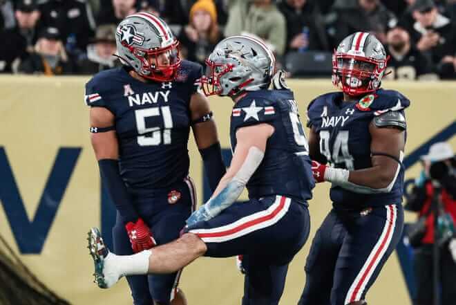
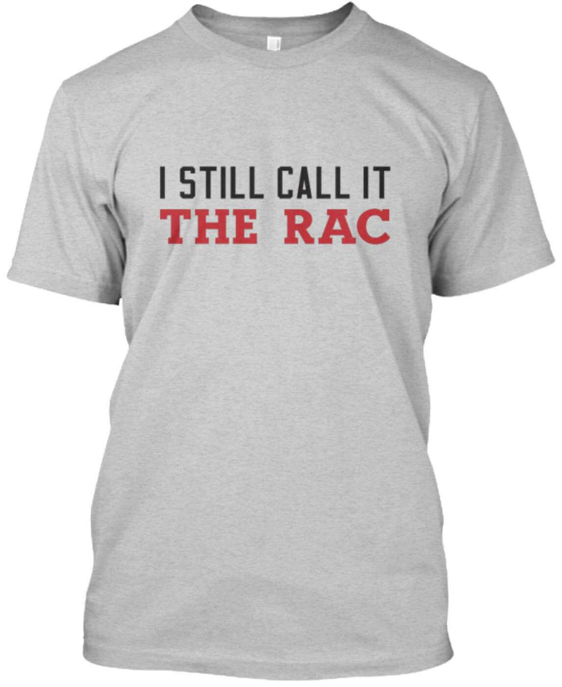
Army was in a tannish, slightly camouflaged uniform, while Navy countered with a gray helmet and solid navy uniform with excellent blue/white/red/white/blue striping. The contrast was good, the numbers were easy to read, and the overall combination was very good.

So from a purely aesthetic stand point, this one checked all the “good” boxes.
But if you enlarged any of the photos above, you’ll no doubt have noticed a number of details — let’s take a minute or three to discuss those.
We’ll start with the helmets, since both teams have been wearing custom-designs (many of which have been excellent) over the past several years. And there is no one better than the great Blaise D’Sylva to talk about those (if you’re interested in deeper histories, click the links within the tweet below).
Navy @NavyFB is wearing this "Fly Navy" helmet honoring Naval Aviators and the F/A-18 Super Hornet today vs Army. It's the 19th new helmet they've introduced in this rivalry game. Complete history at https://t.co/J5ARMQOvWQ#CFB2021NewHelmet223@UniWatch @PhilHecken @Lunedyne pic.twitter.com/8Maa98Da9Z
— Blaise D'Sylva (@wtfcoach) December 11, 2021
Each of Navy’s helmets was hand-painted to accurately represent the Super Hornet — three wings, which symbolize a specific naval aviation career field: Single Anchor, Navy Pilot; Double Anchor, Navy Flight Officer; and AC, Air Crew. The red, white and blue color stripe accented the helmet and were inspired by the U.S. military aircraft roundel.
Army @ArmyWP_Football is wearing this helmet honoring soldiers of the US Army Special Forces Command today vs Navy. It's the 11th new helmet they've introduced in this rivalry game. Complete history at https://t.co/M07KSK18Fg#CFB2021NewHelmet224@UniWatch@PhilHecken@Lunedyne pic.twitter.com/2txFH2JAl9
— Blaise D'Sylva (@wtfcoach) December 11, 2021
Here’s a closeup of the helmet
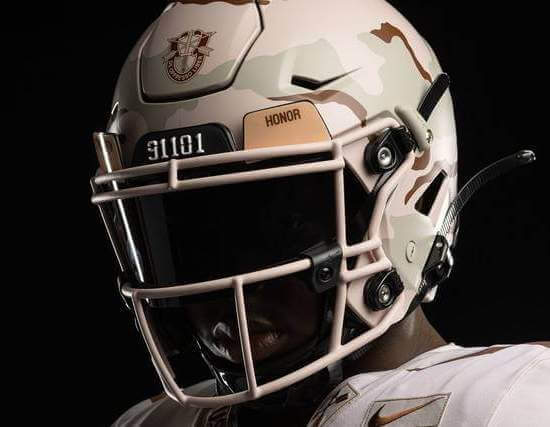
You’ll note from Blaise’s descriptions of the helmets, both teams were “honoring” different parts of their respective branches: Navy wore “Fly Navy” uniforms highlighting American symbolism and “the most utilized multirole fighter jet in air carrier aviation, the F/A-18E/F Super Hornet,” according to Under Armour. Army, in turn paid tribute to the members of Task Force Dagger and the role they played in the 2001 invasion of Afghanistan. If you’re interested in learning more about Task Force Dagger, here’s an excellent writeup.
Navy put most of their creative energies into their helmet, while their uniforms were fairly straightforward. They replicated the helmet decal on the sleeve caps, went NOB, and carried the striping pattern down the navy pants. The “NAVY” wordmark and numbers were white, and each player wore a uni patch on the left breast.

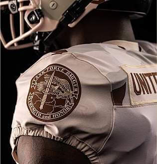
Army was a little more creative with their uniforms. As mentioned, they were a tan base, with a slight camo pattern (meant to emulate the uniforms worn by Task Force Dagger. That unit had a special patch which the football team replicated on the left sleeve cap:
Numbers were rendered in brown and every player had a NOB which read “United We Stand”:

The front of the jersey featured the Latin motto, “De Oppresso Liber,” or “To free the oppressed.” The numbers of the Army Green Beret teams involved in the task force’s mission, known as Operation Detachment Alphas, according to Army Times, were also featured on the shoulders. However, on the actual game uniforms, it appeared as though player names replaced the “De Oppresso Liber” slogan.

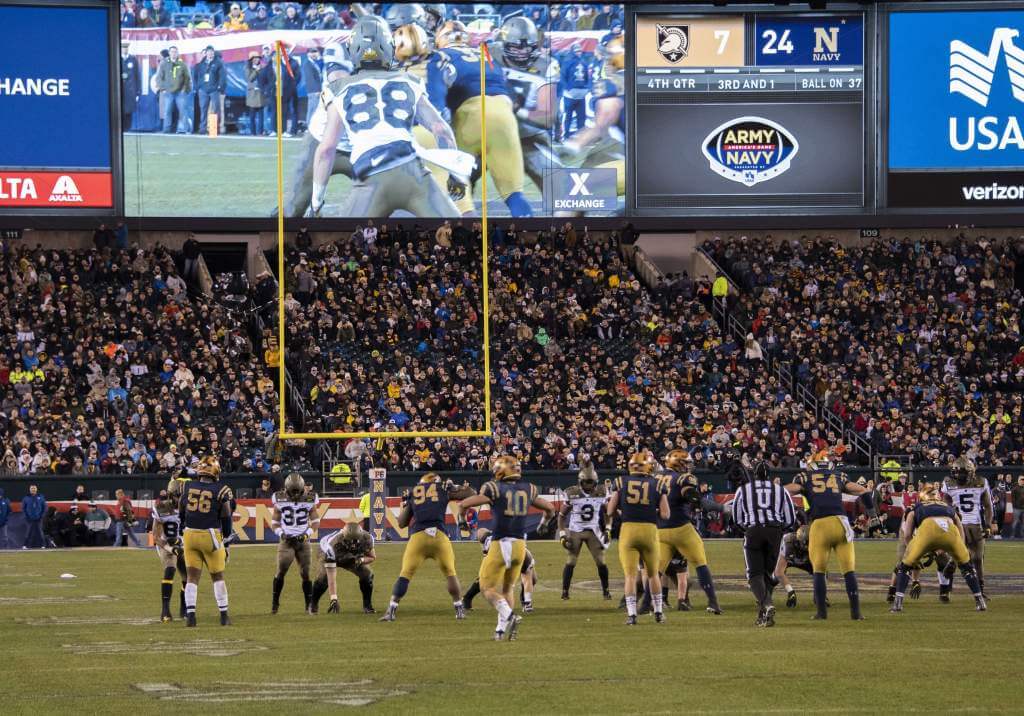
The game started with quite an offensive burst, with both teams scoring touch downs on their respective first possessions, but became more of a defensive slog after that. Army led 13-7 at half, but failed to score again, while Navy put up 10 points in the second half, winning 17-13 — and as tradition has it, they sang last. Army was favored (and bowl bound), while this was the last game of their careers for Navy’s graduating seniors — so it was a nice way for them to go out.

It wasn’t the greatest game (nor uni-matchup) in the 122 times the two academies have met, but it’s still a great way to end the season.


Guess The Game…
from the scoreboard
Today’s scoreboard comes from Charles Schick.
The premise of the game (GTGFTS) is simple: I’ll post a scoreboard and you guys simply identify the game depicted. In the past, I don’t know if I’ve ever completely stumped you (some are easier than others).
Here’s the Scoreboard. In the comments below, try to identify the game (date & location, as well as final score). If anything noteworthy occurred during the game, please add that in (and if you were AT the game, well bonus points for you!):
Please continue sending these in! You’re welcome to send me any scoreboard photos (with answers please), and I’ll keep running them.

Uni Concepts & Tweaks
Time for more Uni Tweaks from the UW readership.
I hope you guys like this feature and will want to continue to submit your concepts and tweaks to me. If you do, Shoot me an E-mail (Phil (dot) Hecken (at) gmail (dot) com).
Today’s concepts come from Greg Lamm:
Hi Phil,
I have a few drawings to share with you, if you’re interested. It’s a redesign of the Arizona Cardinals. I used the Arizona state flag colors of red, blue, yellow and copper as inspiration. The home uni is yellow-red-yellow with blue striping. I used copper for the away uniform. Copper helmet and pants with red and blue striping.
Since the NFL lifted the one-shell rule this year, the Cardinals could be the first team in a long time with different color home and away helmets. Also, when say the Packers come to Arizona, they can switch to the copper helmet/pants. When they go to Cleveland or Cincinnati, they can wear the yellow helmet/pants (for constrast).
Personally, I think that the Cardinals should use a redesign to completely change their branding. They could still use this color palette, just put a new logo on the helmet.
Thanks and Happy Thanksgiving,
Greg
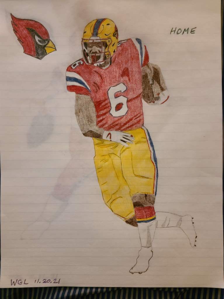
Home
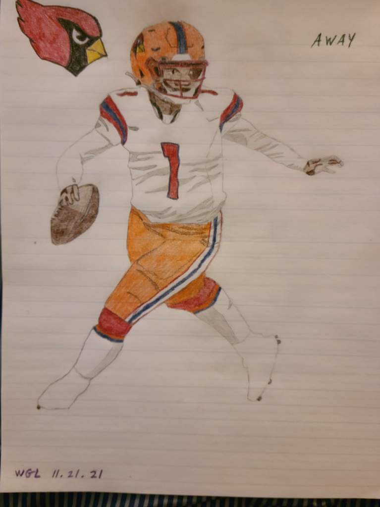
Away
OK readers (and concepters). If you have some tweaks or concepts, shoot ’em my way with a brief description of your creation and I’ll run ’em here.
Click to enlarge
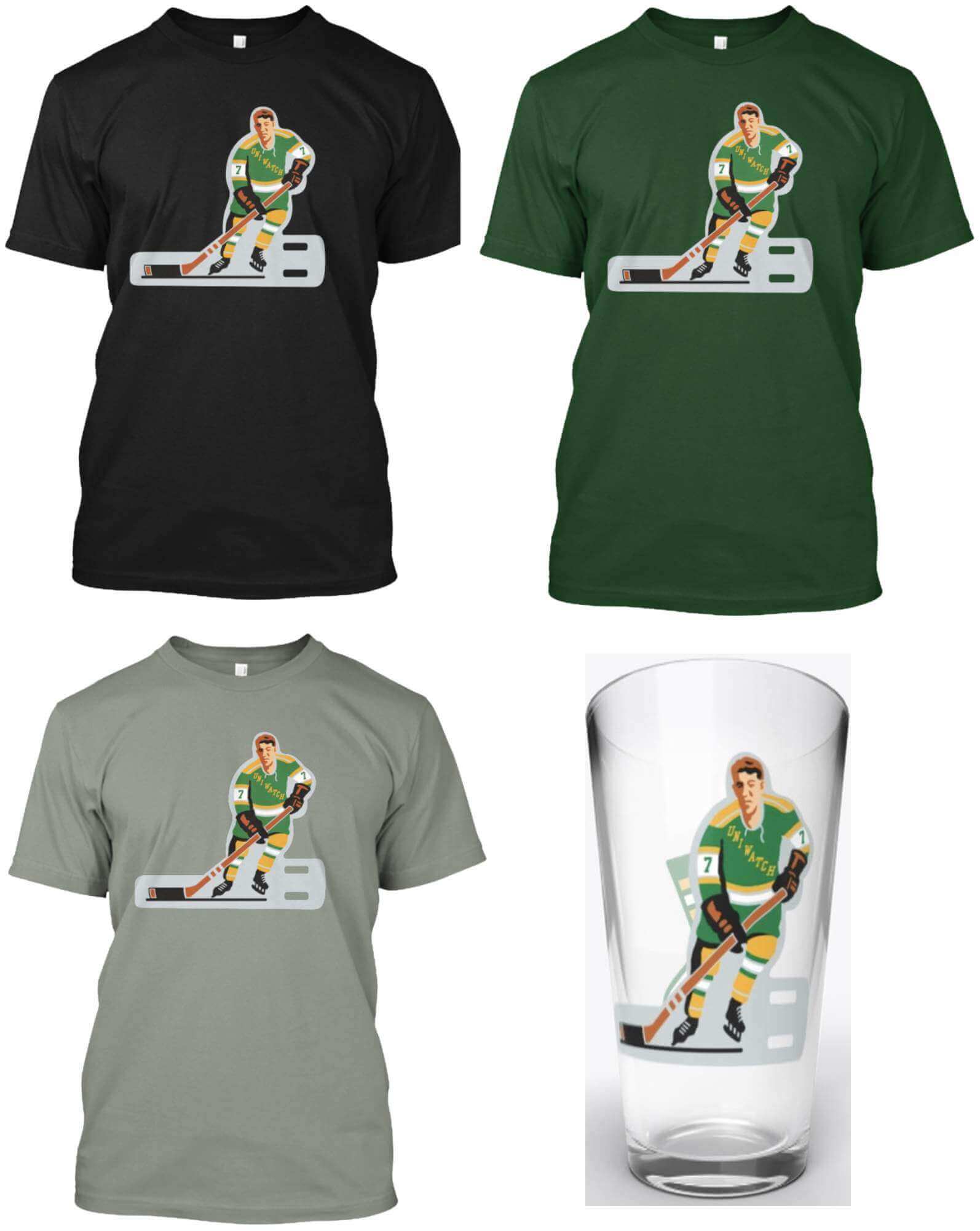
And now a few words from Paul: Hi there. In case you missed it this past week, we’ve repurposed a few more of our pin designs as T-shirts and pint glasses, beginning with our awesome table hockey design (which originally appeared as the March 2021 pin), shown above.
All of the T-shirt colors are also available as long-sleeve tees and hoodies, plus we’ve done a pint glass (with the hockey player on one side and the winged stirrup on the other). Here’s where you can order these in black, green, grey, and the pint glass.
We’ve also rolled out this same assortment of products for our baseball bobblehead design (which originally appeared as the July 2020 pin):
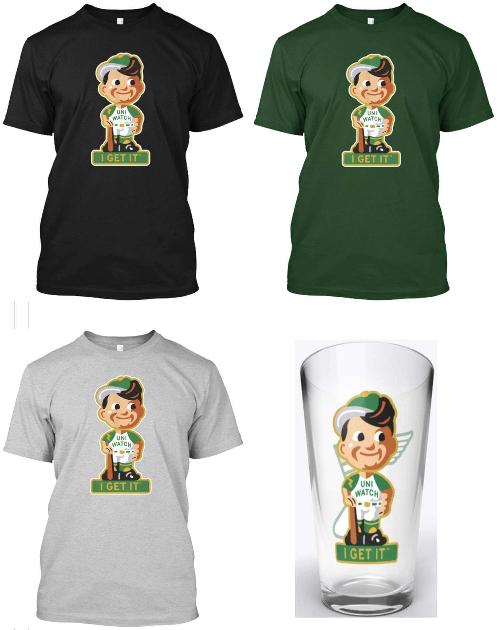
Here’s where you can get this one in black, green, grey, and the pint glass.
Finally, we’re also doing the football bobble (which originally appeared on the September 2021 pin). We changed the number from 21 to 64 — the year that both Todd and I were born:
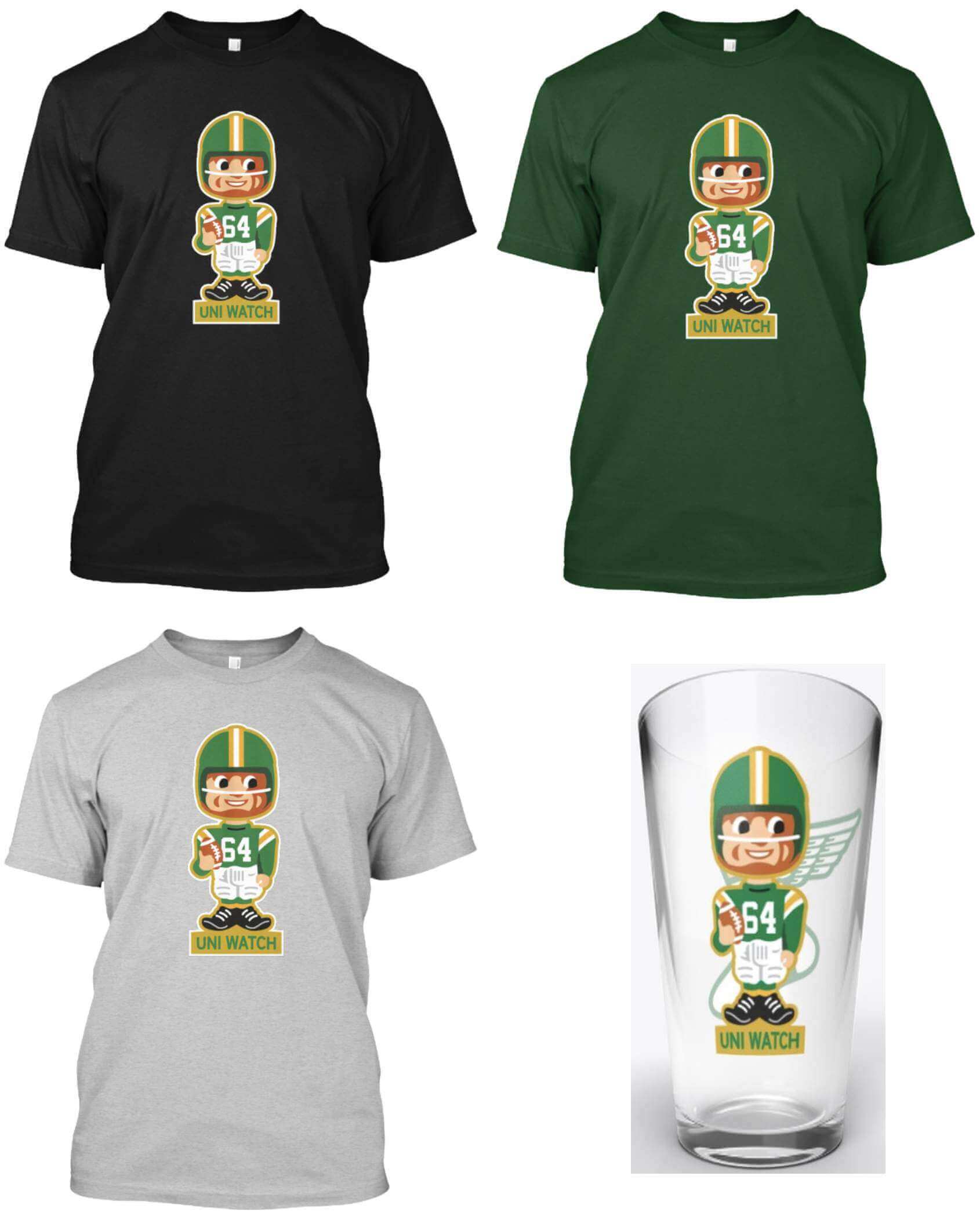
Here’s where you can get this one in black, green, grey, and the pint glass.
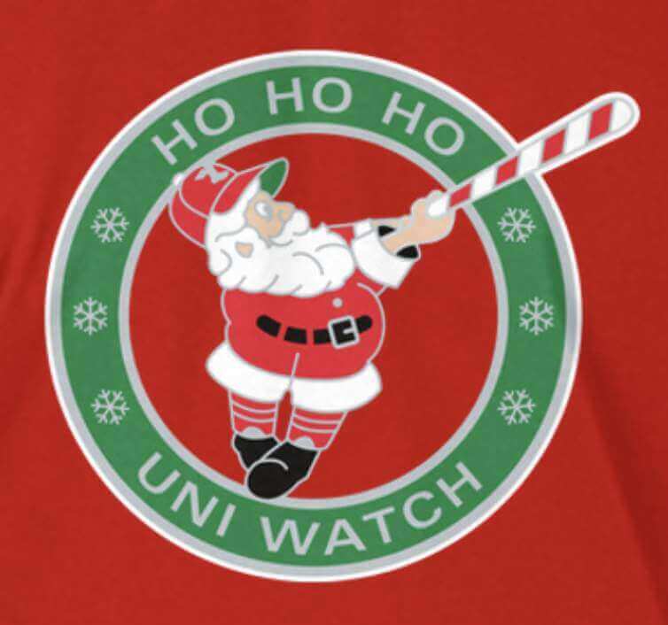
Meanwhile, our Swinging Santa shirt (based on the December 2021 pin) is still available green, red, and grey.
For all of these, if you’re interested in other shirt colors, other shirt styles (women’s, tank top, V-neck, etc.), or other products (posters, canvas prints, etc.), let me know and I’ll do my best to take care of you.
Other things to keep in mind:
• If you’re a Rutgers fan, you’ll want to check out the new Naming Wrongs shirts for the Rutgers Athletic Center:
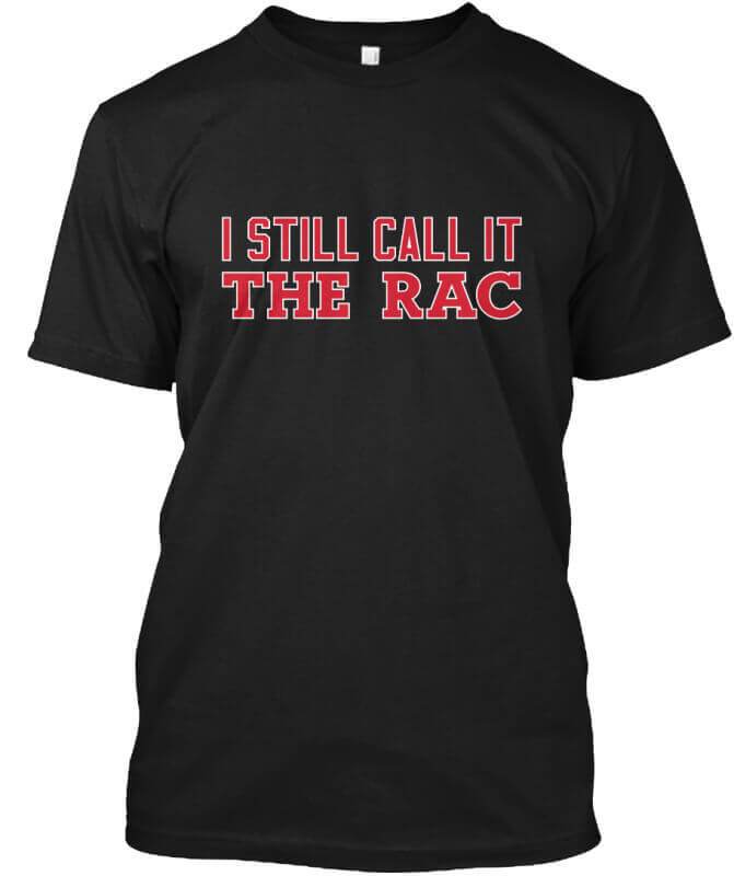
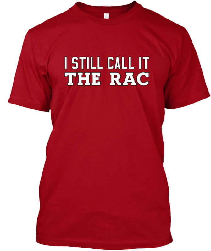
Here’s where you get get these T-shirts (which are also available in long-sleeved and hoodie versions) in black, red, and grey.
• Due to a Teespring shipping snafu, a few people received more December pins than they ordered and other people who ordered the pin received empty mailers with nothing inside. If you fall into either of those categories, please let me know ASAP so we can arrange to get the right pins to their rightful owners. Thanks!
• In case you missed it on Thursday, my latest piece for Bulletin is an “Ask Me Anything” entry, in which I answer reader-submitted questions. You can check it out here (and you can subscribe to receive my Bulletin posts via email here).
That’s it for me. Now back to Phil with the rest of today’s content.
Uni Watch News Ticker
By Phil

Baseball News: Ornithology may be hard, but telling the difference between a bird and a cat? C’mon Vineyard Vines (from Michael Diokno). Also, I hope you didn’t actually pay $85 for that. … Jeffrey Montez e-mailed UW HQ with this: “My buddy sent me the dodgers Facebook post announcement Gil Hodges induction to the HOF. Today I just noticed in the photo this ball and glove patch on what looks like his left sleeve (though there are superimposed images so it’s tough to discern). What is it?” I’m pretty sure Paul has covered this patch in depth at some point, but the patch is for the 1951 National League 75th Anniversary. … Check out this amazing footage of Babe Ruth & Lou Gehrig back in the day. Great audio too (from Bruce Menard)!

NFL News: ICYMI: The Broncos will pay tribute to the late Demaryius Thomas at Sunday’s home game against the Lions. Players will all wear “88” decals on their helmets, there will be a video tribute and a moment of silence in his memory. … In Tampa today, the Bucs will be going red over white, with the Bills going mono-white. … The Saints will wear white jerseys over gold pants today vs. the Jets. There’s also an all time “uni combo” record in that article, which you may find interesting. … Gotta support the “home” team right? Here’s NH Gov. Chris Sununu sporting a Patriots jersey (from Lance Harris). … My how times have changed: Tom Coughlin would fine players for not having their knee pads on during training camp 1995 (from Old Time Football).
College/High School Football News: Tweeter Brett Baker was “Watching some FCS Quarterfinals today & I’ve spotted a bit of a unicorn. East Tennessee State QB Tyler Riddell has, at various times, sported the incredibly rare ‘Name On Nose Bumper’, aka NONB. He also has a spectacular head of hair under that lid.” … The Alabama side of the Alabama-Mississippi All-Star Game definitely wants you to know the team is, in fact, from Alabama. Check out those shoulder pads! (from Ben Whitehead). … Matt Brown noticed this gentleman in the Army student section with a different uniform than the typical grey Army Cadet uniform. Thadvent replied, “Foreign military, looks like a commonwealth nation, they like red on the collars. I’d guess Canada or U.K.” Here’s what those look like. Stefan Schubert confirms the gentleman is “A Sergeant from the Austrian Military Academy.” … Also from the A/N game, L.J. Sparvero spotted a member of the Army band in full camo, including Kevlar bucket. Also note the camo-painted Sousaphone!

Hockey News: Here is the CHL Leave Your Mark jersey design contest winner for the Saskatoon Blades which was worn on Friday. Submitter Wade Heidt notes the “interesting drip design.” … Also from Wade, Friday night was 80s theme night for the Prince George Spruce Kings. They came out wearing similar jerseys to that of the Spruce Kings teams that played in the Peace-Cariboo Junior Hockey League at that time. … More from Wade: Ottawa 67’s going with Xmas themed look yesterday, with the Hamilton Bulldogs again wearing Ticats themed jerseys but on road. … Mystic, CT, apparently has a very cool Whalers-esque logo (from Jim Delaney).


NBA/College Hoops News: It’s commonplace in the NBA, but much rare in hoops: color vs. color for Georgetown/Cuse, as well as for Wisconsin/Ohio State yesterday (from Steely Dan Jones and wtfbrowns respectively). … Georgetown officially dedicated their John Thompson, Jr. Court (from bryanwdc). … Michigan women’s basketball honored late Oxford student Hana St. Juliana with a uniform patch (from Brad Galli).

Soccer News: Here is the 2022 uniform set for Kataller Toyama — a football club in Japan that was formed from the merger of the ALO’s Hokuriku and YKK AP SC. The club currently plays in J3 League (from Jeremy Brahm). … Also from Jeremy, here are J2 FC Machida Zelvia’s 1st uniforms for 2022. … That was quick! NYCFC had barely won its first ever MLS Championship yesterday afternoon when their jerseys already had a star (from Jeremy Brahm). He adds, “Back of the jersey said Champions, so probably pre-printed by Adidas/MLS and put into the overseas box for charity if they had lost like the Buffalo Bills.”

Olympics News: Russia’s uniform for the Beijing Winter Olympics was unveiled on Friday without Russia’s name, flag or coat of arms on it — as the uniform was at the Tokyo Games. Some clothing, however, will feature Russia’s national colors.

Grab Bag: “No idea if you’re interested but one of the hosts of Saturday’s “Obligatory PSU Pregame Show” (yes, it’s really called that) was wearing a Santa Vader holiday sweater with AT-AT’s for trim (snow battle in Empire Strikes Back reference?),” writes L.J. Sparvero. “An other sic wore a Nakatomi Christmas Party tshirt (Die Hard reference).” Here’s the full shot. … Colton McWilliams writes, “When Pro Wrestling Noah of Japan changed their logo this year, I couldn’t figured out why it looked familiar to me, then I hit me that they essentially modeled it after the XFL NY/NJ Hitmen H logo” (I’m not entirely sure about this, but it’s *close*).
Uni Tweet of the Day
Now THIS would be the mother of all throwbacks!
The New York Knickerbockers, the first baseball team to wear uniforms. They wore straw hats, white shirts and blue trousers. 1851 pic.twitter.com/MXr09yZMxl
— Baseball In Pics (@baseballinpix) December 11, 2021
And finally… that’s all for today (and for me for this weekend). Everyone have a great Sunday and a good week. Next Saturday will be the annual “Merry Vilkmas” raffle and Sunday we’ll get you up to date on all the early Bowl games, which begin this Friday. Till then…
Peace,
PH
Really like the redesign concept for the Arizona Cardinals. The team is in need of a complete reboot, not refresh. Not only are the uniforms bland, but the Cardinals nickname has always been a silly thing to use in AZ. It’s not like “Athletics” which is fine if you use it in Philly, KC, Oakland and probably Vegas. Time for a fresh identity and the AZ flag is a good thing to embrace.
Actually I see Cardinals flying around my yard in Scottsdale a lot, but yes I think they should have called themselves the Firebirds, or better yet the Arizona Phoenix. They could have kept a bird as their mascot, but had something that related to the area.
That Mystic logo does not appear to be official to the town nor any chamber of commerce organization. It isn’t appearing on any of the official websites. I guess it is something that some random person made up on their own and they plastered it roguely on that info box.
I thought the shade of brown that Army used for their numbers was very good. I could see that shade matched with say a forest green, make a very original look for a team in the future.
I’m gonna be THAT GUY: Army tradition does hold that “De Oppresso Liber” means “to free the oppressed,” but “liber” isn’t a verb meaning “to free”, it’s a masculine singular adjective that can be understood as a noun, meaning “a free man”. “Oppresso” doesn’t merely mean “oppression” as a noun, it’s more like describing the state of oppression of a person. And “De” in this instance means more like “out of”. So in all, a better translation would be the phrase “A free man out of an oppressed man”.
Thank you! Thinking that it sounded a little weird, I just went looking into my Latin dictionary to get the grammar right, and your translation is great. I was about to post something like “From [being an] oppressed [person, becoming a] free [person]”, which preserves the word order but has lots of words inserted.
When Spain won the 2010 World Cup, they had “pre-starred” shirts ready to go for the trophy presentation (skip to 4:00 to see)
link
Here’s a link to a story about the Navy helmet designer—
link
The Cincinnati Cyclones of the ECHL wore uniforms inspired by the movie Elf Friday night.
I am a huge fan of the Cardinals concept as well. The Cardinals might be in most need of a major redesign of any team in the major 4 sports and what better way to do it than by adding copper, yellow, and blue to a lifeless color scheme? I also love the idea of being able to switch out the yellow and copper depending on what team they are playing. Overall, think it looks great!
That Bengals/Orioles Tie had a price tag on it of $85. The dude who bought it really needs to shop at a different store.
My strongest preference regarding the Ariz. Cardinals would be to preserve as much of the tradition of the League’s oldest franchise as possible, and my first choice would be to go back to what the St. Louis Cards wore from the 1960s until their move to Phoenix. That said, this is an excellent re-design and one I’d much prefer over their current unis.
That Arizona Cardinals concept (apart from being hand drawn, golf clap) is strongly evocative of the USFL Wranglers, to the degree the jerseys look like those of the Chicago Blitz, the franchise they were swapped for.
While not being a *bad* uniform, we know we’re not going to get copper but rather orange for the uniform pants, because Nike doesn’t do glitter fabric any more. And the sentiment I’m sniffing out to chuck the Cardinals’ identity and colors is a solution in search of a problem. Cardinals of the Chicago/St. Louis/Phoenix/Arizona variety are one of the most venerable of professional franchises, in spite of their peregrinations. Maybe I’m a stick in the mud, but I want to see a revival of the Dan Dierdorf uniforms.
Those Knickerbocker Baseball uniforms should be required as a throwback uniform for the Knickerbocker Basketball team.