
Click to enlarge
As most of you know by now, I tend to take a pretty dim view of “storytelling” details in sports brand design. Most of them tend to feel torturously strained, a lot of it doesn’t actually work from a functional-design standpoint (basing your number font on a local architectural feature or chiseled stonemasonry or a 44-degree angle doesn’t amount to much if the font is hard to read or just unattractive), and the whole exercise usually feels like an exercise in box-checking. Like, “Okay, we have to embed three ‘stories’ in this design. I’ve got one — Bill, do you have one to add to the mix? What about you, Jean?” Moreover, a lot of that box-checking feels like it’s been reverse-engineered: “What about this stripe — does that mean anything? If not, what could we say it means?”
But while “storytelling” is often risible, that’s not to say that it never works. On the contrary, there are some good examples of it out there. Case in point: When my favorite team, the Mets, came into existence 60 years ago, their blue/orange color scheme was intended as a nod to New York City’s two recently departed National League teams — blue for the Dodgers and orange for the Giants. This worked well because (a) it told a baseball story; (b) the wounds of the Giants’ and Dodgers’ departures were still fresh; (c) it was good functional design, because blue and orange work extremely well together; and (d) blue and orange also happen to be the colors of the NYC flag.
Now another New York baseball team, albeit a much lower-profile one, has come up with a similarly effective bit of “storytelling.” That would be the new Staten Island FerryHawks, who’ll be debuting next spring in the Atlantic League. Their team identity and inaugural logo set was recently released, but that news mostly got lost in the Thanksgiving shuffle, so I want to talk about it today.
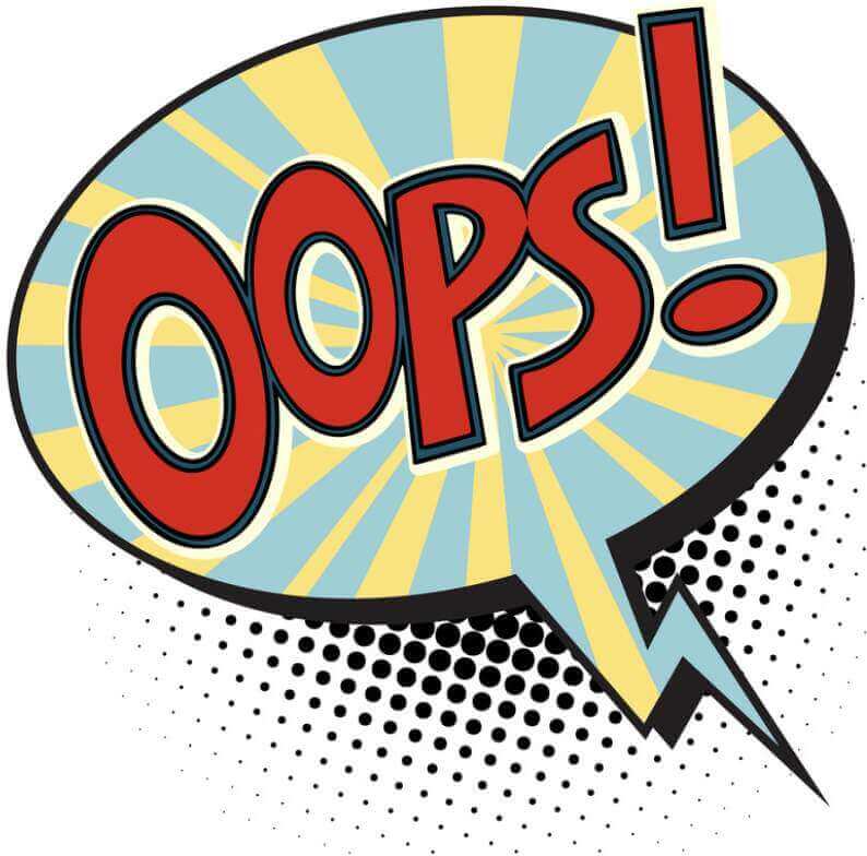
As you can see at the top of this page, the FerryHawks’ branding includes references to obvious things like the Staten Island Ferry and the Verrazzano-Narrows Bridge (which are the two primary ways to access the island and are endemic to Staten Island culture). Nothing surprising there. I don’t mean that as a criticism — on the contrary, the ferry and the bridge are very appropriate visual signifiers for a Staten Island team. So far, so good.
Now take a look at the secondary and tertiary logos shown here (click to enlarge):
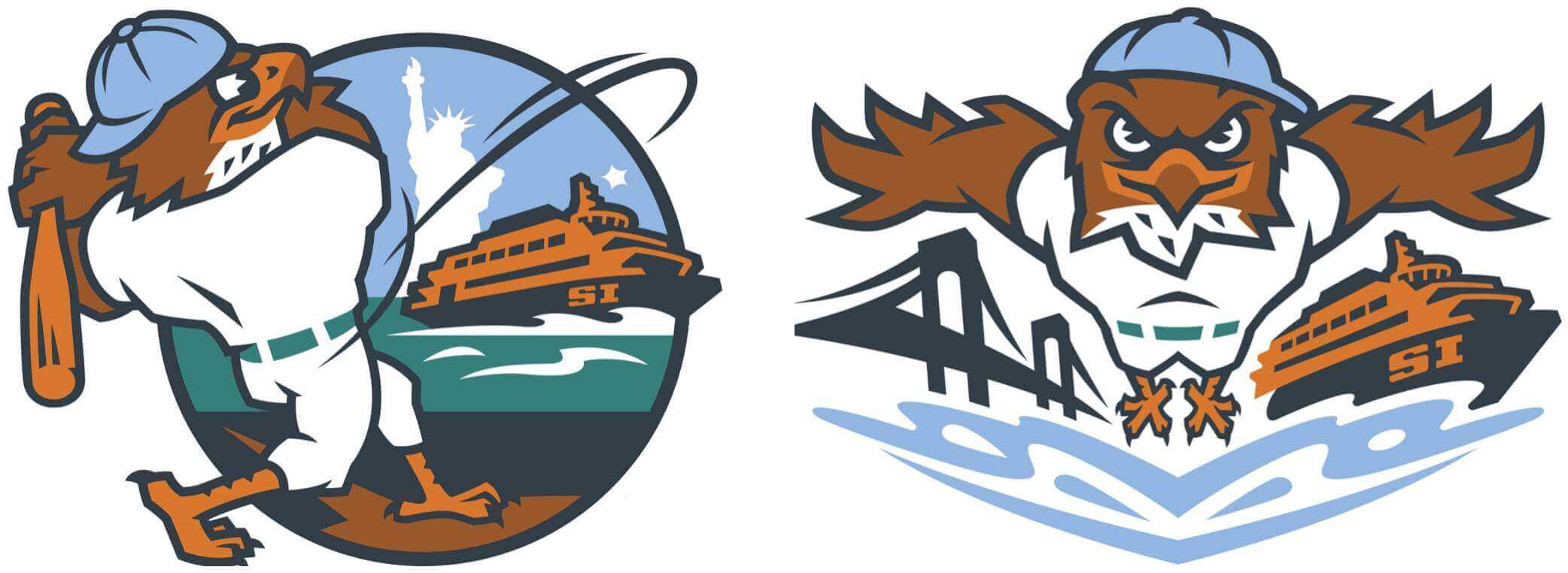
Okay, so there’s the ferry and the bridge again — but look at the hawk’s uniform. See how his pants have a green belt? That’s because Staten Island has something called the Greenbelt, a series of public parks comprising over 2,800 acres. (Just to put that in perspective, Manhattan’s Central Park is 843 acres.) So the green belt represents the Greenbelt!
I love that. If a team said, “We have a lot of lettuce farms in our county so we’re making such-and-such uniform element green,” that would be just the typical lame-o “storytelling” — too forced, too much of a reach. But taking the actual name of a local feature and recasting that name as a uni element — that’s really clever! (Of course, it helps that green is my favorite color, but I’d feel the same way about a literal repurposing of a non-green color name.)
For now, all we have are the logos. But Skye Dillon, who handled the FerryHawks’ brand design, tells me that the green belts will also be included on the team’s real-life uniforms, which are slated to be unveiled sometime in late January.
I should probably mention here that the FerryHawks’ logo package includes some other “storytelling” aspects that feel more strained. For example, the pose of the hawk hitting the ball into the river is supposedly based on Bobby Thomson’s 1951 “Shot Heard ’Round the World,”, which really seems like a stretch. But the green belt — I like that. (Also: I strongly approve of the hawk going high-cuffed!)
As it happens, my friend Rex recently moved to Staten Island and is also a huuuuge minor league baseball fan (he actually spends most of his vacation time traveling to various MiLB ballparks), plus he’s very uni-aware, so I asked him what he thought of the FerryHawks’ team name and logo release. Here’s his response:
Given the potential alternatives, I’m happy with the team name. Personally, I had lobbied for Stevedores, but at least FerryHawks emphasizes the fact that the stadium is right next to the harbor and includes “Ferry” — the most iconic element of the Island.
We went to the name launch event, where I became the first person ever to buy a FerryHawks team cap, and we put down a deposit for season tickets. Plan on an invite!
Alrighty! You can see the FerryHawks’ full logo package here.
Click to enlarge
ITEM! Naming Wrongs update: It’s rare that we have reason to add new Naming Wrongs product these days (mainly because all the new advertised stadium and arena names are just replacements for previous advertised names), but the Rutgers Athletic Center’s recent renaming prompted us to crank up the old Naming Wrongs machinery.
Here’s where you get get these T-shirts (which are also available in long-sleeved and hoodie versions) in black, red, and grey.
IMPORTANT — Teespring shipping snafu: I don’t know if the people at the Teespring warehouse have been sharing a big doobie or what, but in the past two days I’ve heard from quite a few people who either (a) received three or four of our December pins despite ordering just one, or (b) ordered a December pin and received an empty mailer with no pin inside.
The people who received the extra pins have graciously agreed to go through the hassle of mailing their extras to the people who received the empty mailers (I’ll reimburse them for the shipping costs), so my hope is that this will all get resolved in the end. But that will only work if all the affected parties check in with me, so if you received too many December pins or received an empty mailer, please let me know ASAP. Thanks!
Meanwhile, I’ve let Teespring know about the problem and asked for some of whatever they’re smoking.
Assorted reminders: A few things to keep in mind:
• In case you missed it on Thursday, my latest piece for Bulletin is an “Ask Me Anything” entry, in which I answer reader-submitted questions. You can check it out here (and you can subscribe to receive my Bulletin posts via email here).
• Our December “Swinging Santa” pin is sold out, but the design is now available on a variety of shirts and hoodies.
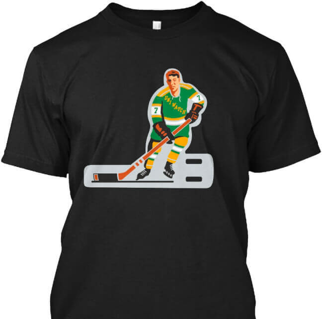
• Speaking of pin designs repurposed for apparel, we now have T-shirts and pint glasses featuring the designs for our table hockey pin and our baseball and football bobblehead pins. They’re really fun — full details here.
• We’re down to the last few Uni Watch Alternate Caps. Available sizes and full ordering details here.
• If you need other holiday shopping ideas, my annual Uni Watch Holiday Gift Guide, featuring lots of cool uni- and logo-related items, is here, and the full rundown of Uni Watch merchandise is here.
Okay, no more reminders. Thanks!
The Ticker
By Anthony Emerson

Baseball News: While doing some research on the recently deceased Richie Lewis, reader Peter (who didn’t share his last name) noticed that in this photo from Lewis’s Wikipedia page, taken during his tenure with the Jacksonville Expos, the jersey he’s wearing has “Expos” on the back. Did the J-Expos go TNOB during Lewis’s tenure, or was this a jersey used only for the photoshoot? … Nicklaus Wallmeyer sends along this story of the Brockton Rox, a team formerly in the Can-Am League, who for a time after their founding wore both “Rox” (a nod to the nearby Red Sox) and “Rocks” (a nod to Brockton native Rocky Marciano) on their jerseys, apparently even in the same game, though I could find no pictures of players wearing both jerseys during games. … Also posted in the college football section: Kinda difficult to see in this image, but that FIU Panthers’ wordmark sure looks an awful lot like the Padres’ mid-2000s-era wordmark, no? (Great spot by Mike Chaldu.)

Pro Football News: This is so great: L.J. Sparvero spotted a Vikings fan wearing a Vikings/Prince jersey — and by that I mean the fan appeared to have replaced the uni numbers with Prince’s unpronounceable glyph from his “Artist” era. I love this so much, you don’t even know. … Also posted in the hockey section: The OHL’s Hamilton Bulldogs wore Hamilton Tiger-Cats-inspired sweaters last night to honor the Ticats ahead of their Grey Cup appearance (from Wade Heidt). … Also from Wade and speaking of the Ticats, here is their Grey Cup uni combo. … The Ravens are going white-over-purple this weekend (from Andrew Cosentino).
College/High School Football News: Cross-posted from the baseball section: Kinda difficult to see in this image, but that FIU Panthers wordmark sure looks an awful lot like the Padres’ mid-2000s-era wordmark, no? (Great spot by Mike Chaldu.)

Hockey News: Here’s the latest installment in the Icethetics video series on NHL prototype designs. If you missed the first two installments, they’re here and here (from David Firestone). … Cross-posted from the pro football section: The OHL’s Hamilton Bulldogs wore Hamilton Tiger-Cats-inspired sweaters last night to honor the Ticats ahead of their Grey Cup appearance (from Wade Heidt). … An Oilers fan created a mini-hockey rink in his backyard, complete with the logo of old Northlands Coliseum at center ice (from Kary Klismet). … In a first, the NHL 22 video game will include women’s teams.

NBA News: The New Orleans Jazz apparently went with names below the numbers for at least one game in the late 1970s. Was it maybe just a preseason thing? … It’s only a brief clip in the trailer, but it appears that the costume folks working mostly nailed the unis on the new HBO miniseries Winning Time, about the Showtime-era Lakers, though that shot of the back of the Larry Bird jersey makes it look like they got the Celtics’ number font wrong (from Brett Baker).

Soccer News: Charlotte FC launched their kits yesterday. Like the rest of their identity, they’re pretty boring and safe. Here’s the hype video and some shots of some of the details. Reader Jimmy Armstrong was at the launch party and reports that there were tons of jersey-themed giveaways, though he didn’t snag a pic of any. He also reports that, naturally, the main kit ad was also all over the party, and the event even featured a speech from the advertiser’s CEO. … New throwback kit for Polish side Lech Poznań (from Ed Zelaski). … I always love videos of teams applying patches to soccer jerseys, and this one from the Portland Timbers is no exception (from Jeremy Brahm).
And that’ll do it for this week. I have fun plans for the weekend — you too, I hope! Enjoy Phil’s Saturday and Sunday content, and I’ll see you back here on Monday morning. Peace. — Paul
The FerryHawks going high cuffed = good. Barefoot though?
That’s “storytelling” — a reference to Shoeless Joe Jackson!
;)
They don’t make footwear to fit talons!
(At least not in our uni-verse. Things are probably different in the world in which “Zootopia” takes place, for example.)
The most heartwarming thing on this post: Uni-Watchers being willing to mail pins around the country to other Uni-Watchers to correct a shipping issue by a fairly faceless enterprise. I think that speaks very highly of the community that you’ve built here, Paul!
I too found this really heartening and impressive. Demonstrates that Uni Watch readers are special people who Get It™ in more ways than one.
I got my empty envelope this afternoon. If anyone reading got one of the extras I’d be happy to pay for shipping. TIA
Any link for the Hamilton Bulldogs/Ticats?
Here we go:
link
link
Re: Backyard Rink
Love the choice for the center ice logo! I miss good looking arena logos at the center ice/court. I was always a fan of the LA Forum’s logo at mid court for the Lakers.
100% agree with Paul. The green belt is a fantastic feature, and what hidden meaning design elements should be.
And it is sort of interesting that they understand how that works, but then overdesigned much of the other logos by forcing the ferry and bridge into them. The hawk is the logo, the rest is background there just to tell a story.
Regarding that Jacksonville TNOB Expos jersey, I’m betting that they were major league jerseys handed down to the minors which all had the original names stripped off and had the team name put on all of them rather than leave an ugly space above the number.
The Phillies definitely did this in the ’80s — I remember seeing Clearwater Phillies games in which the players had “PHILLIES” above the number.
The centre ice logo at Northland Coliseum was for Edmonton Northlands. Which was an exhibition ground including the Coliseum, Northlands Park horse racing track and other facilities.
When the Edmonton Northlands logo was at centre ice, the Oilers had their logo in 2 places just outside the faceoff circle. I thought this looked cool and would love to see them try again maybe for a throwback night if the league would allow it.
link
The FerryHawks logos seem too busy, to me. Even the alternates, which are usually plain and simple, have too many elements — hawk with a green belt, hitting a ball over a “SI” boat on the water in front of a star and the Statue of Liberty. Whoa.
The hawk itself would be enough for a logo. It would be more scalable too.
Way too busy – even for minor league standards
The FerryHawks’ stadium is on the waterfront, located right next to the SI Ferry terminal, and you can see the Statue of Liberty from it. The ferry also passes directly in front of the statue, so the alternate logo, while possibly appearing busy, is pretty accurate.
This is exactly why I wish that alternate was the primary logo. It’s perfect for what the team is trying to communicate about itself. Whereas the pose on the real primary is all wrong. The bird is essentially doing the Iron Man/Terminator landing pose, while sort of incidentally holding a baseball bat. It’s pretty un-baseball for a baseball team’s logo, and it’s missing the green belt.
I’m amazed that nothing was said that the Ferryhawk is wearing no pants in the primary logo.
I know!! Kind of crazy in a way especially with the green belt stuff.
Borderline inappropriate for children as well which you would think is one of their primary target audiences.
You know that actual hawks don’t wear pants, right? Is it inappropriate for children to look at hawks that aren’t wearing pants?
Came here to point out the exact same thing!
Here’s Brockton Rox team photo with assorted players wearing Rox/Rocks jerseys: link
Couldn’t find any in-game pictures so far, but did see pics of Oil Can Boyd wearing both versions while pitching for Brockton.
A few years ago, our local minor league hockey team, the Roanoke Railyard Dawgs, got voted as one of the worst logos that year. Well, thing is, the railroad and other imagery are completely appropriate. So I guess it is a matter of perspective as to what storytelling is good or not good.
link
The site Bush League Factor did a review on that team
link
Here’s his criteria for his rankings.
link
Not sure if you all see this but in the tertiary logo, the water ripples make up the appearance of a front facing hawk.
I noticed this also. I think it was nice use of the water space.
What I found strange was the differences on this vs the primary logo: What is going on in the main logo? Is the hawk “punching” the water? Maybe I am missing some connection, but to me it is neither a hawk like action nor a baseball pose. As others mentioned the no pants (which eliminates the nice greenbelt feature) and finally the punch & splash messes up the hawk face in the water, a beak shape is still there but not as clearly a hawk facing image. I am baffled as to why they would choose the primary logo over the tertiary logo?
“…where I because the first person ever to buy…”
Hmm.
Thanks. Fixed.
I don’t want to start an argument here, but borderline inappropriate for children? Seems a stretch. Last I checked, Winnie the Pooh is sans pants. Is that borderline inappropriate for children? I think not.
Not really a uniform- or logo-related comment, but I’m just delighted to see that a team will be back in that ballpark on Staten Island. Saw a game there during a visit in 2019 and thought it was a terrific place to see a game, and was really upset that it was a victim of MLB’s bulldozing of the minor-league structure. And a local identity is a big improvement over just being the Yankees.
While I always thought the Atlantic League’s Camden Riversharks were poorly branded, I really enjoyed watching games at their park…which literally got bulldozed not that long ago. Staten Island is lucky!
I also miss the Riverhsarks…although I did like their logo even though they were somewhat inconsistent in their branding.
The Bobby Thomson pose by the hawk is a little less of a stretch because Thomson grew up on the Island and played for Curtis H.S. I agree with Rex (one of my favorite DJs) that FerryHawks topped the potential first responder related names being considered and that Stevedores would have been way cooler. I submitted the Dukes because Richmond County is named after the Duke of Richmond.
I meant to send this yesterday, but this is in relation to the Q from your Q&A about why nose bumpers are always white.
For a hot minute in 1999, Jerome Bettis had both a plain black nose bumper and black chinstrap:
link
There may be a few more examples I’m forgetting, but while you could see the rubber piece on close-up shots of him, from far away it just looked like the yellow stripe on his helmet was cut too short. The striping on so many helmets of so many different teams may be a reason why it’s necessary to put a clearer demarcation of sorts between the helmet and where the stripe disappears. White helmets debunk this a LITTLE bit, but I would imagine if anybody with a white helmet had plain white bumpers without a wordmark on them, it would suffer from the same sort of issue as Bettis’ did (though darker colors like black would probably look a bit worse).
Why the NFL insists on having everyone in white chinstraps, however, I’m not really sure on. Chad Johnson experimented a bit a few times with colored chinstraps of both black or orange, and looked just fine if not better than white. So many colleges use colored chin straps, maybe the NFL should start allowing teams to do the same.
I have to disagree with you on the cathedral font for Pitt. It’s absolutely unique to that city. One would not see that in say Denver or Miami. Plus I’m glad they didn’t do a steel city font. Quite an overused trope.
Let’s not forget the Cleveland Baseball Team basing its new team name on a statue.
link
Could the New Orleans Jazz name below the number have been something only done for Joe C Meriweathwer due to the letters in his lengthy last name not fitting above the numbers? It’s admittedly a stretch but it was a different era for team uniforms when such uni-oddities weren’t as unusual.