Click to enlarge
As we all know by now, NHL uniforms will start carrying advertisements next season. But in some parts of the world, the idea of hockey teams wearing jersey ads is nothing new. Case in point: Top-level pro hockey teams in Finland began going ad-clad more than 60 years ago.
I learned that from longtime reader Will Scheibler. A Finnish friend of his had a big Finnish hockey jersey collection, so Will got interested in some of the teams and began doing a bit of online research. Along the way, he learned about the advent of ads on Finnish jerseys. Here’s his report.
The Start of Ads on Finnish Hockey Unis
By Will Scheibler
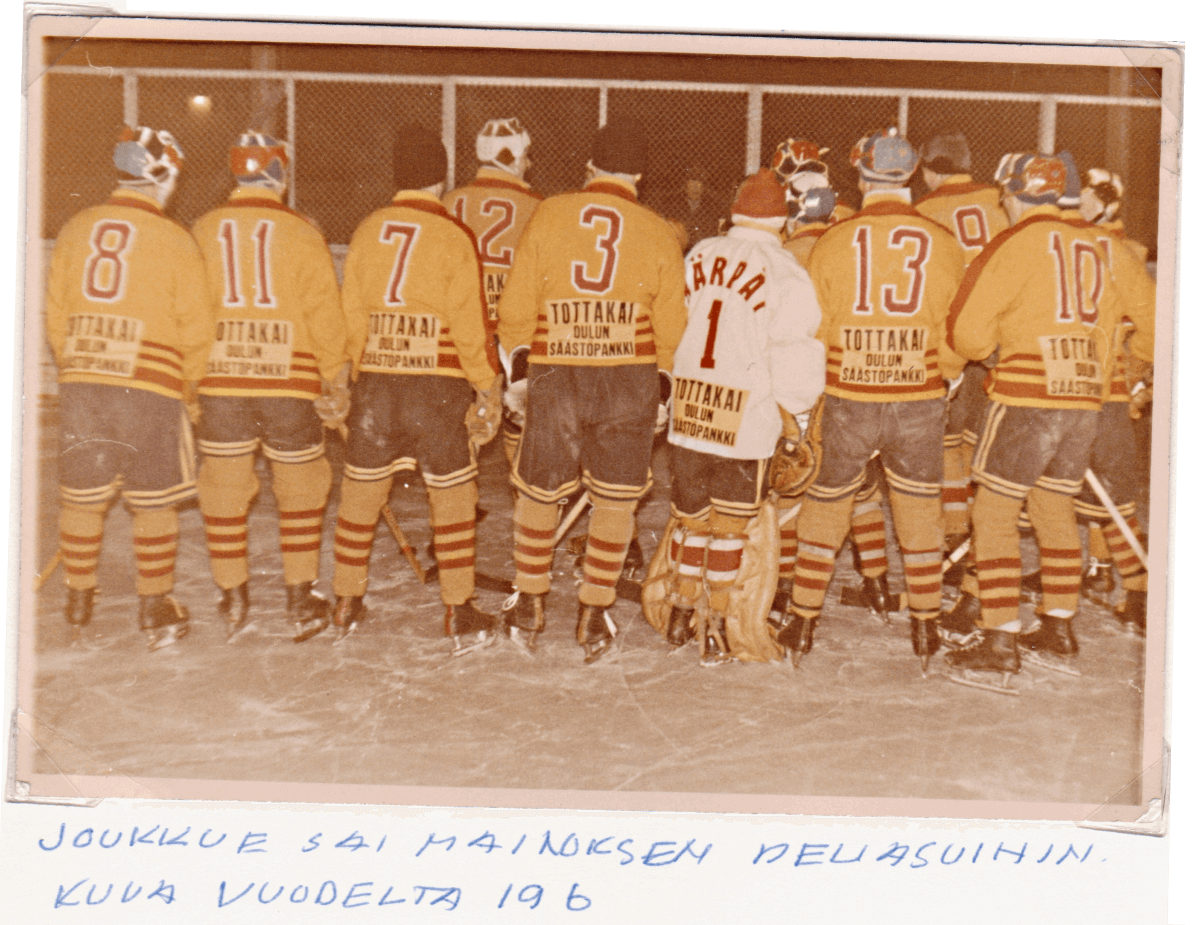
In 1957, Swedish hockey teams started selling ad space on their uniforms. The move apparently got people’s attention in neighboring country Finland, because Finnish teams began going ad-clad in 1960. Top-tier team Oulun Kärpät (shown at the top of this page) was a typical example: In 1960, they inked a three-year deal to have the Oulu Savings Bank advertise on the back of their jerseys.
The rules for ads on Finnish jerseys were spelled out in this newspaper article from Dec. 1, 1959. Thanks to a friend of my dad, I was able to get it translated, as follows:
Advertisements minuscule on hockey jerseys: They cannot hamper the referee’s sight
Finnish Hockey League has drawn up rules by which the different clubs can get ads from businesses for their jerseys, just like everywhere else in the world has been done already.
The rules are as follows:
In order for the Finnish Hockey League’s member clubs to get more funding for their operations and cover expensive equipment, we allow the advertisements on their clothing when representing their league elsewhere as follows:
1. According to the amateur rules, all compensation from advertising will come to the club and not individual players.
2. Advertising can only be used on the club’s own equipment and all ads must be uniform in nature.
3. Advertising can only show items or pictures that do not hamper or offend hockey playing and that are not in contradiction to the foundations and goals of sport (such as tobacco, alcohol, and other like substances).
4. The ads cannot be given a dominant size on the clothing and they can only be put on the shirts.
5. The club name, logo, or player number must still be the dominant size on the shirts.
6. The text of the ad or picture cannot be so large as to make it difficult for the referee to see the player’s number. (The number’s normal height is 25-28 cm.)
7. The ad must be attached to the competition shirts.
8. The ad cannot be made of such material that might injure the player, his equipment, or spectators.
9. The agreement between the club and the advertiser can be no longer than three years.
10. The club cannot finalize an agreement with the advertiser before the Finnish Hockey League has given its approval for the ad, its design, and position. A request to get an ad for the competition jersey must be given to the Finnish Hockey League.
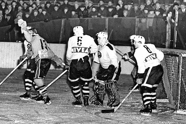
The first Finnish team to take advantage of the new opportunity was TPS, which in 1960 entered into a three-year deal with the German personal care brand Nivea:
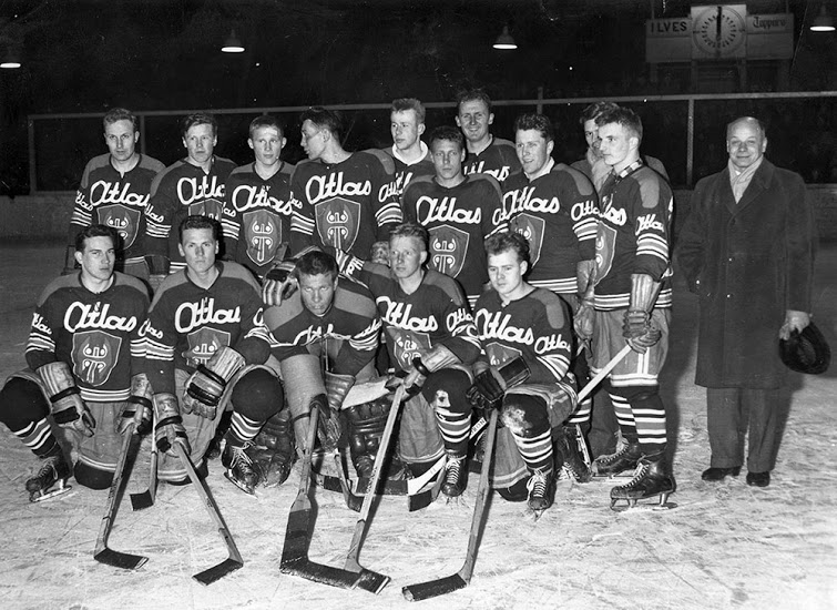
Another ad-clad team that year was Tappara, which had an Atlas ad — and on the front, not the back:
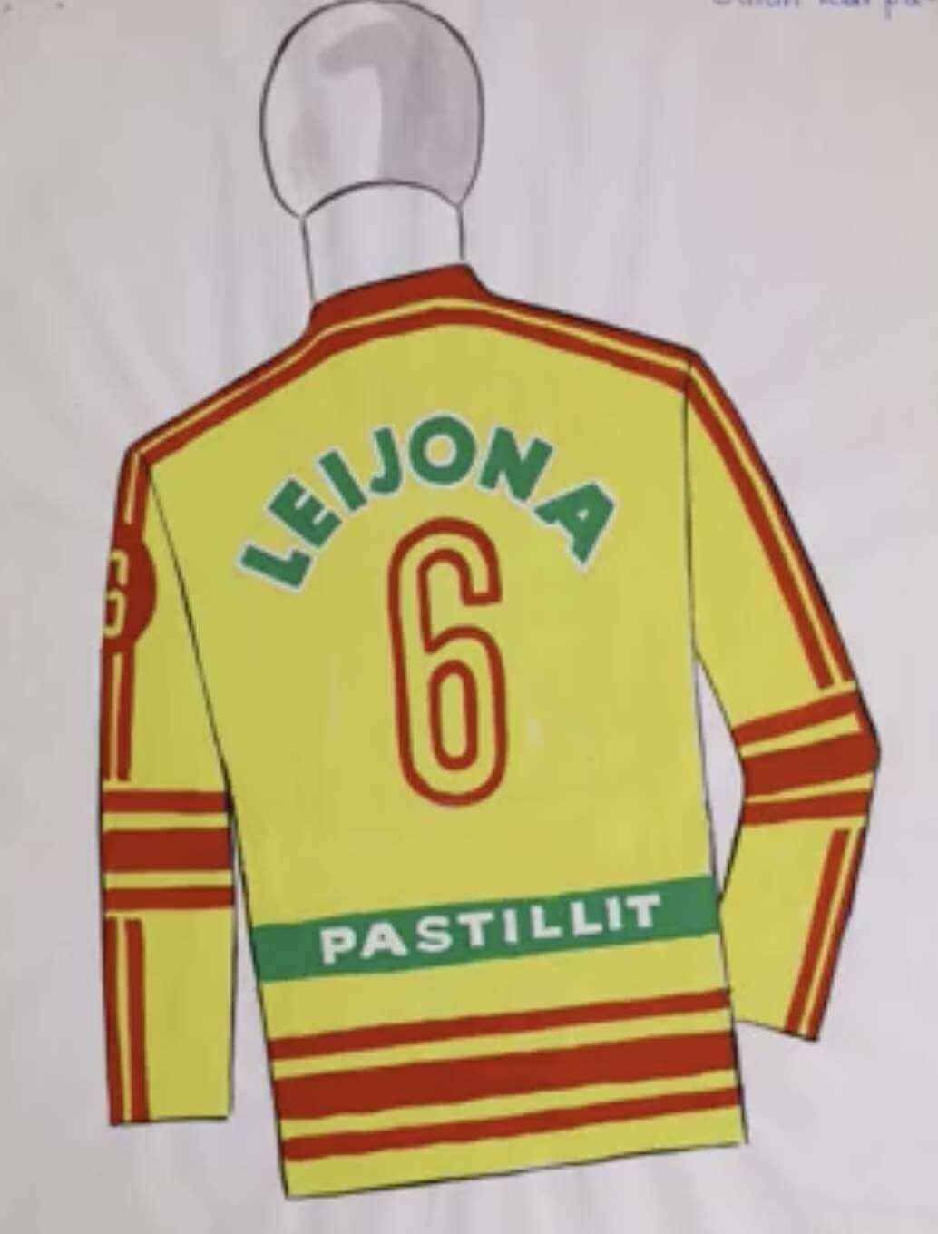
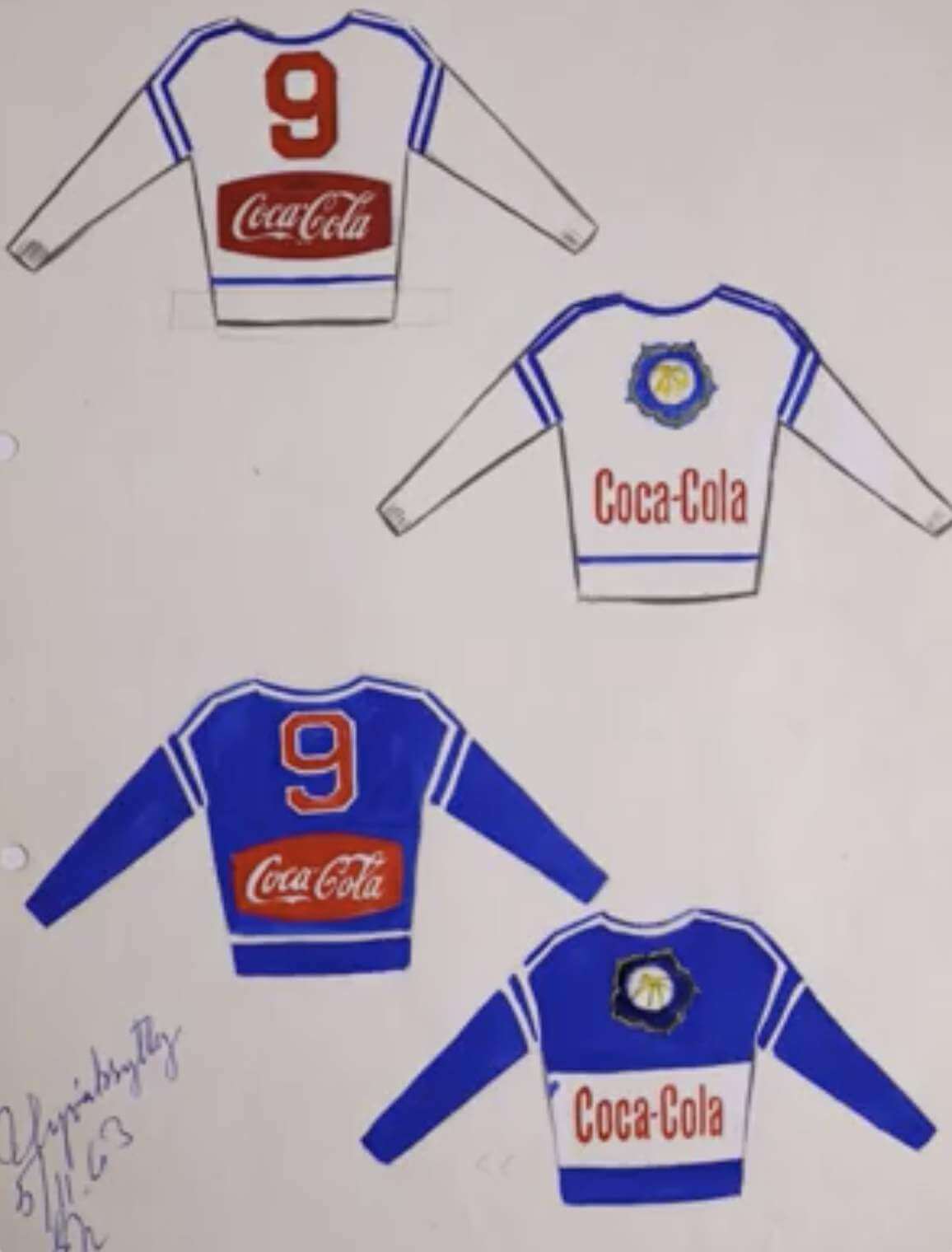
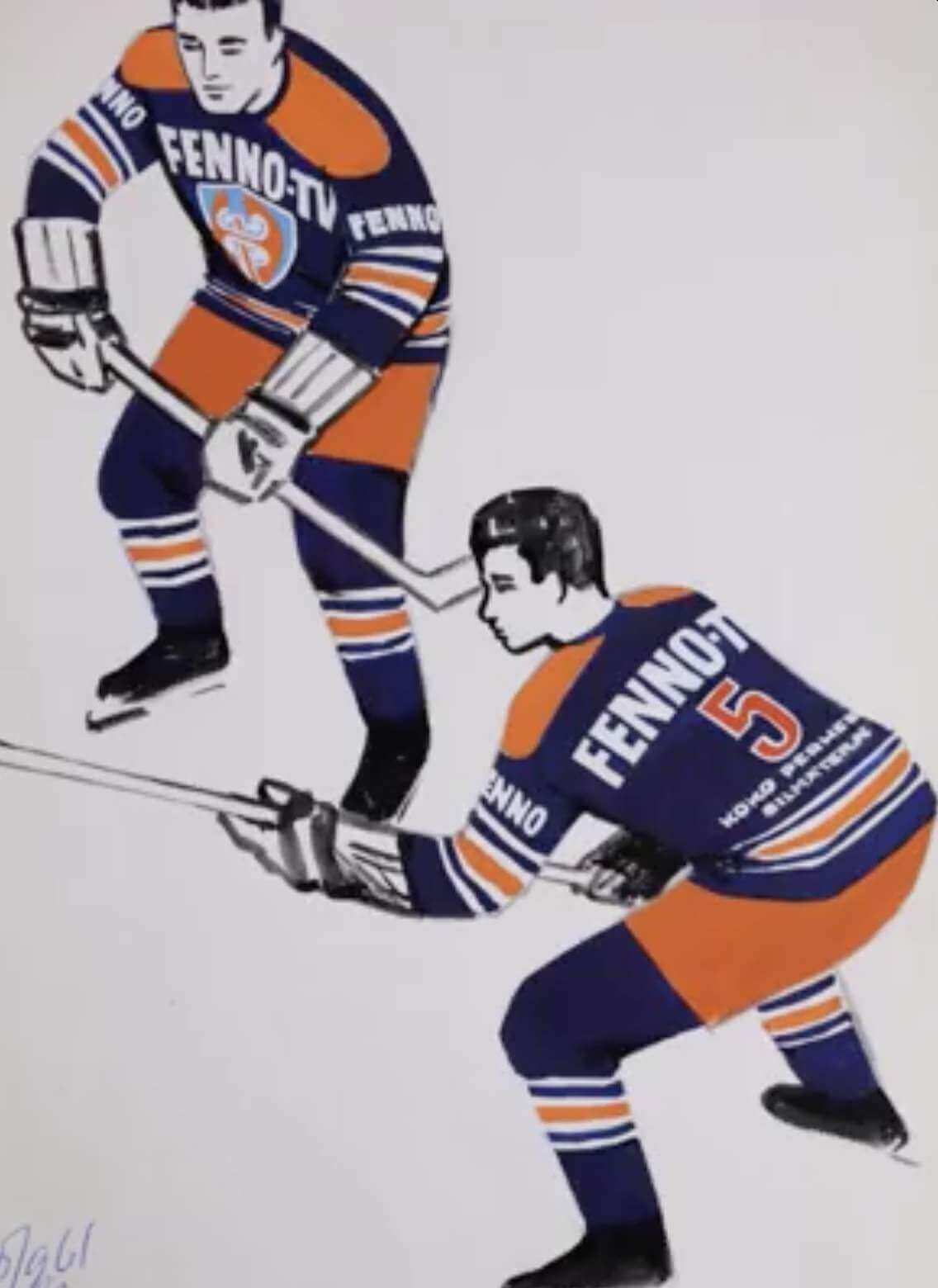
The trend caught on. Here’s an illustration of Töölö Vesa’s green jersey from 1962 with advertising for the relatively new medium of television:

That illustration was typical of the mock-ups that teams would send to the league for approval. Here are some similar examples from other teams:
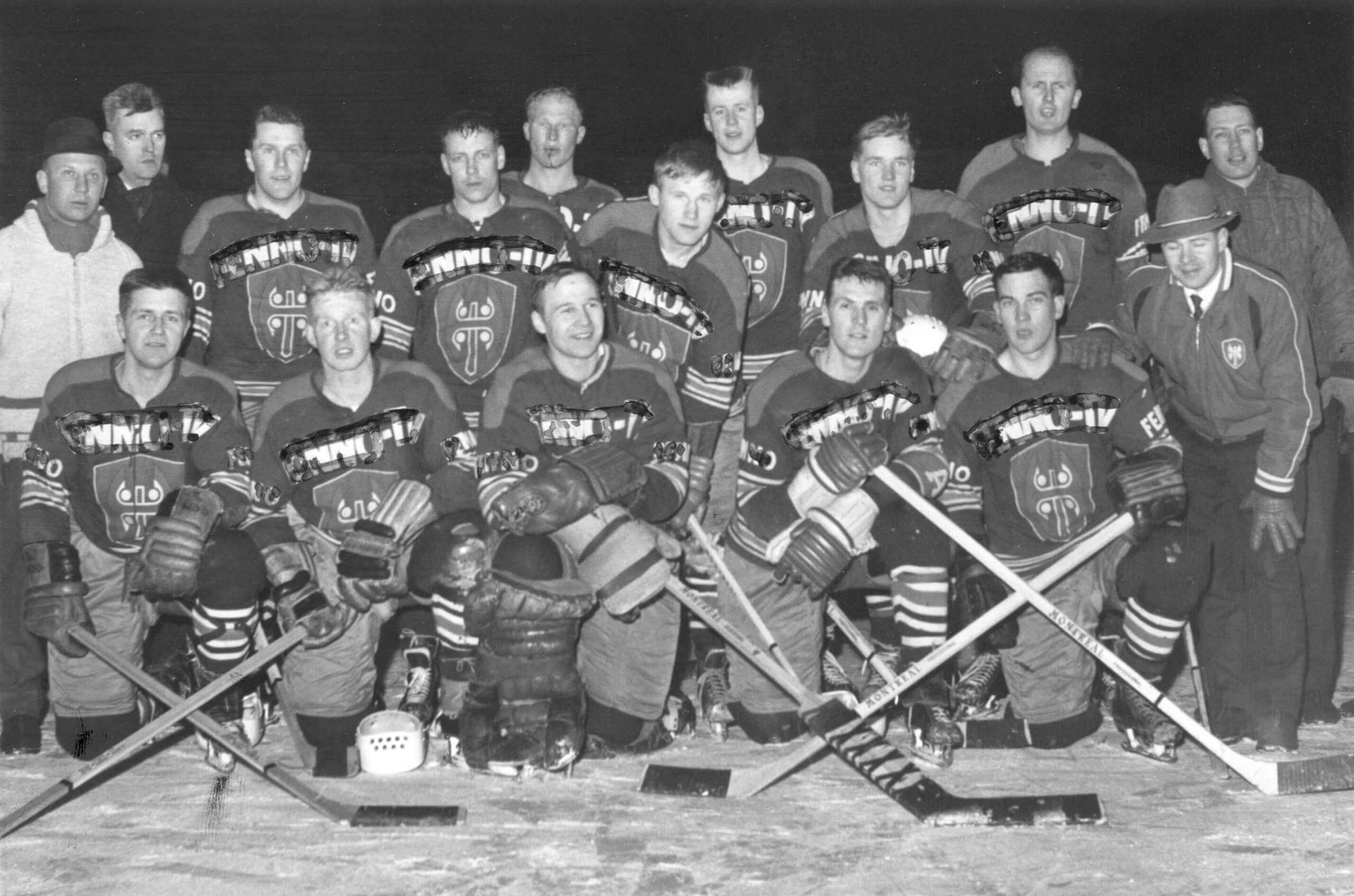
Interestingly, the jersey ads were obscured in magazine photos, because magazines didn’t want to give free ad space to the jersey advertisers (probably for fear of angering their paying advertisers):
———
Paul here. Interesting report! And how has that worked out for Finnish hockey? Here are some current photos of Oulun Kärpät, the team shown in the photo at the top of this post:
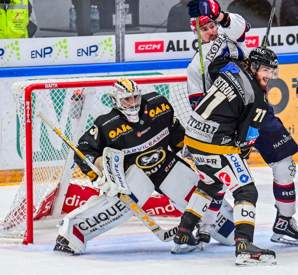
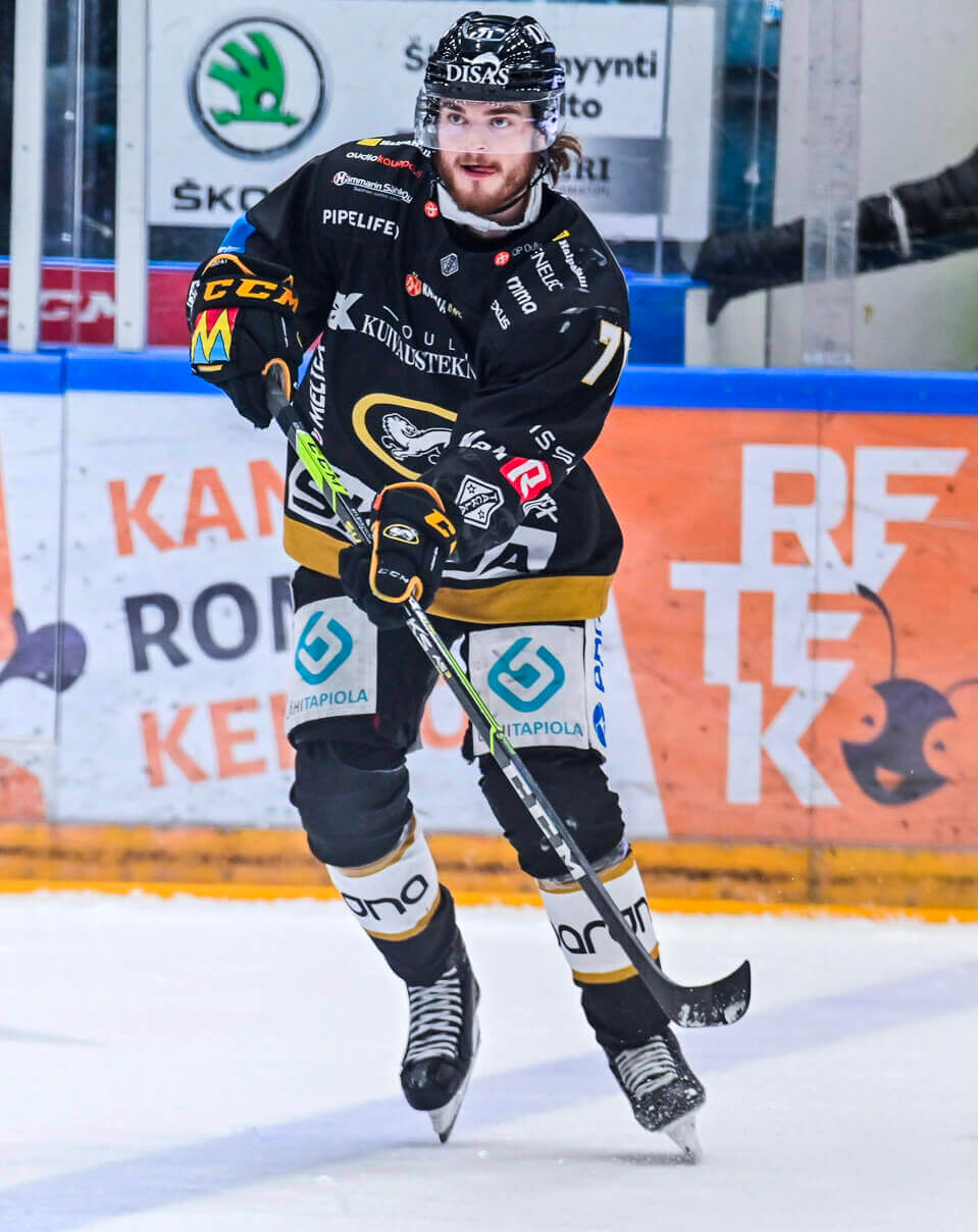
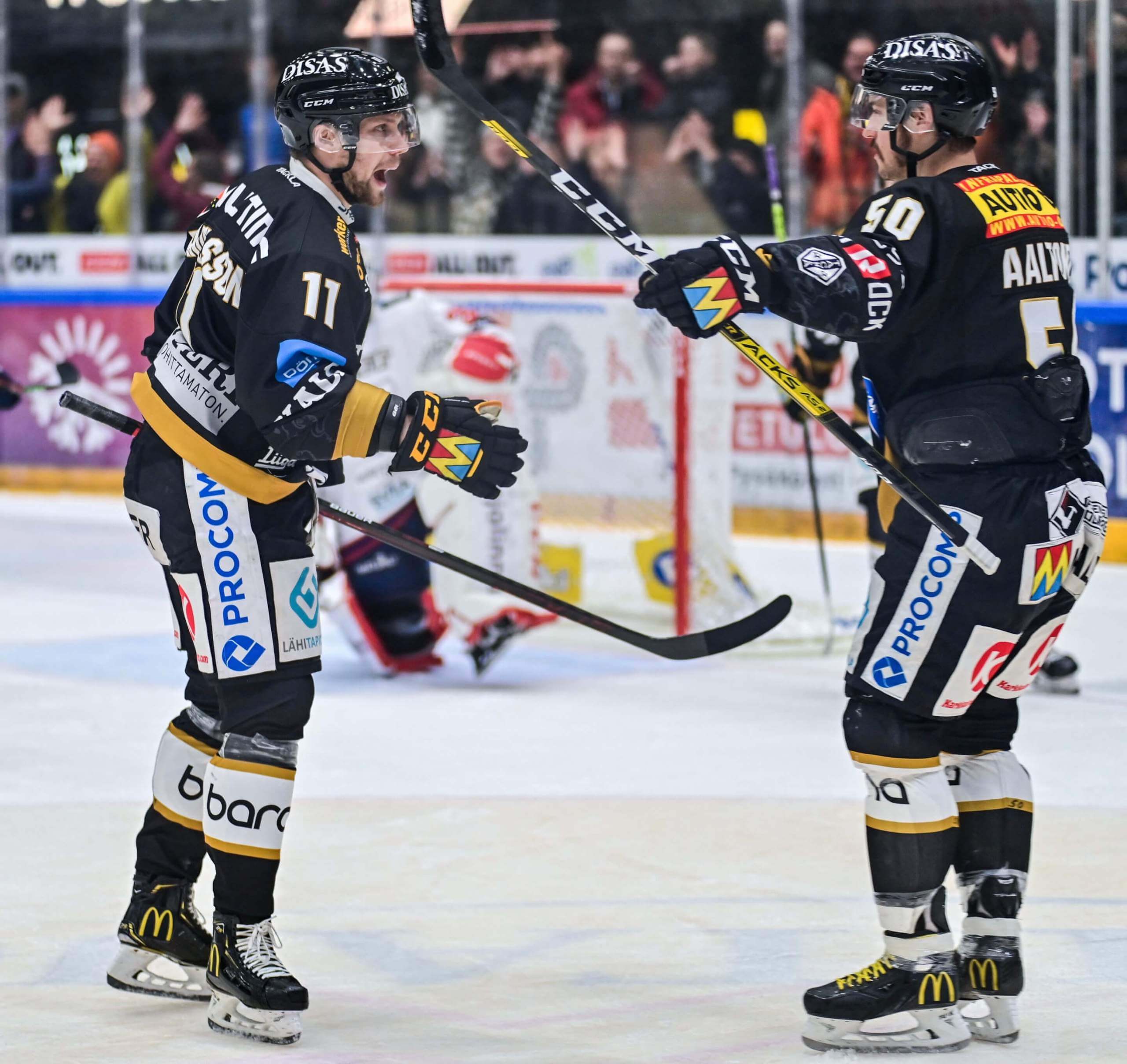
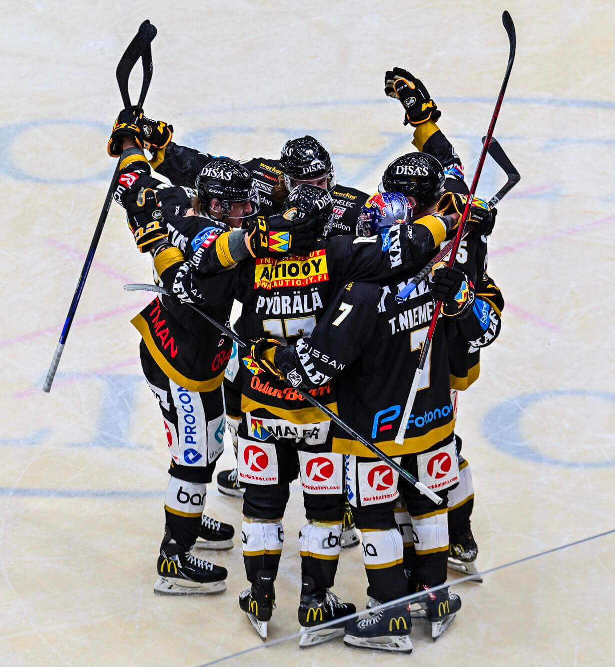
Yikes. Be careful, NHL — the slippery slope you’re on could be leading in that direction.
Click to enlarge
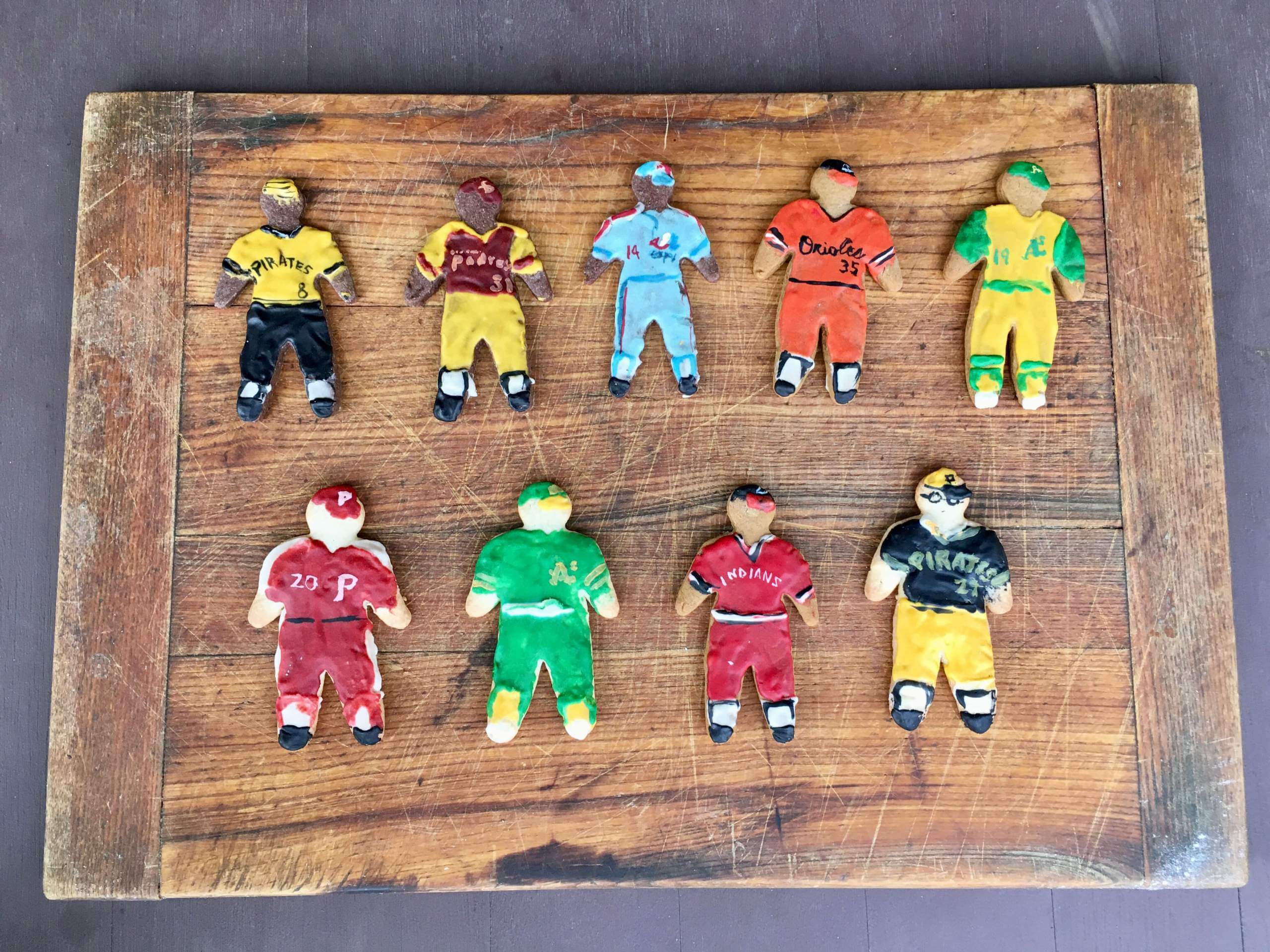
’Tis the season: As longtime readers know, the holiday season doesn’t really begin here at Uni Watch HQ until we receive a package from the great Elena Elms, who always sends me a batch of baseball uniform-themed cookies. Here’s what she has to say about this year’s batch, which arrived yesterday:
Since the Northern Hemisphere’s December holidays tend to feature lights and bright colors, to dispel the darkness of winter, I chose the gaudiest, most colorful uniforms in baseball history for this year’s theme.
In order to make an even “team” of nine, I included two different players for both Oakland and Pittsburgh, since they had so many colorful mix-and-match uniform options compared to other teams.
As you’ve probably figured out already, each cookie represents a real-world player (I love that she actually included glasses for Kent Tekulve!). Can you name them all?

IMPORTANT reminder: Tomorrow I plan to place the order for this year’s Uni Watch Pin Club bonus pin, which will be given to everyone who collected all 12 of this year’s designs. I need to know how many of the bonus pins to make, so if you’ve collected ’em all, you must email me ASAP with (a) your name and address and (b) proof that you’ve collected all of this year’s pins. The proof can include photos of the pins themselves and/or order-confirmation emails from Teespring.
The bonus pins will ship out early next year. Thanks for your support of the pin project!
Meanwhile, in case you missed the news earlier this week, our December pin’s “Swinging Santa” design has been adapted for T-shirts and hoodies. Check these out (click to enlarge):


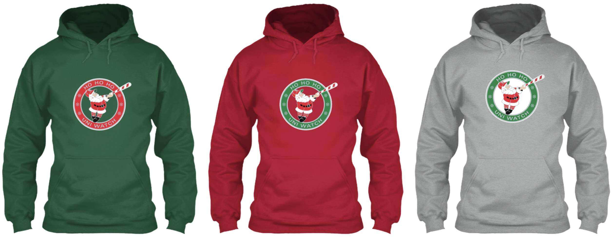
Here’s where you can order these in green, red, and grey.
While we’re at it, we’re almost sold out of the Uni Watch Alternate Cap. Here are the sizes and quantities still remaining:
7-1/8: 1 cap
7-5/8: 2
7-7/8: 1
If you want one of these, you can get one here while supplies last.
My thanks, as always, for considering our products.
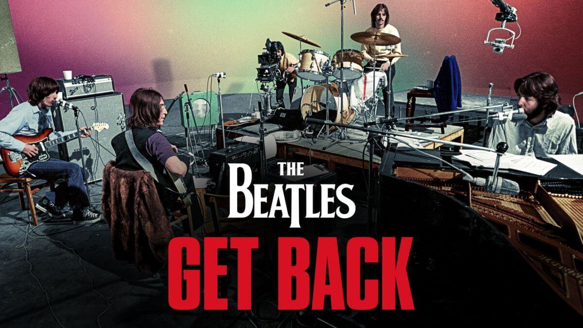

Uni Watch Screening Room: Like a lot of people, we signed up for a month of Disney+ just to watch the new eight-hour Beatles movie, The Beatles: Get Back, and really enjoyed it. If you care at all about the Beatles (as I certainly do), it’s fascinating viewing. The great WFMU DJ Dave the Spazz recently observed, “It’s not so much a documentary as a document,” and that sounds about right — there’s lots of down time, and the supposed narrative arc (i.e., the group’s impending dissolution) seems a lot more obvious in hindsight than it probably did at the time. But it’s always interesting to see gifted artists in the process of creating their art, and the Beatles remain very charming characters. Recommended.
While reading about the movie, we stumbled across a link to this ranking of all 213 Beatles songs, written in 2017 by Bill Wyman (the rock critic, not the former Rolling Stones bassist), and enjoyed that at least as much as the movie. I don’t agree with all of it (the lowest-ranked song is “Good Day Sunshine,” which I like just fine), but if you ignore the hierarchical rankings, it’s a super-engaging piece of rock literature, full of interesting musical insights, thought-provoking analyses, hilarious deadpan jokes, fun historical trivia, and a lot more, adding up to a composite Beatles manifesto. It’s a long read, clocking in at a little over 20,000 words (to put that in perspective, today’s blog post, including the Ticker, is about 1,700 words), but it’s great writing that makes you think, which is what cultural criticism is supposed to do. Highly recommended, whether you watch the movie or not.
The Ticker
By Lloyd Alaban

Baseball News: New unis for the Durham Bulls, Triple-A affiliate of the Rays (from Al Hood). … Here’s some very cool video footage of the Hiroshima Carp’s logo being silkscreened onto T-shirts (from Jeremy Brahm). … Justin Scurry, head groundskeeper at the University of South Carolina, won this year’s “Best Mowing Pattern” award from the Sports Turf Managers Association (from multiple readers).

Football News: Michigan will sell the jersey patches worn to honor the victims of the Oxford High School shooting, with proceeds going to the Oxford Strong Account (from @kpkielcz). … Pinstripe facemasks for this press photo promoting an announcement for the Pinstripe Bowl (from James Gilbert). … Here’s Jason Von Stein’s weekly illustration showing this Sunday’s NFL uni/mascot matchups. … The Canadian Football League’s Grey Cup will be played this Sunday. As part of the festivities, Tim Hortons restaurants in Hamilton are swapping out their standard red cups for grey cups (from Wade Heidt).

Hockey News: The family of Hurricanes D Ethan Bear wore Cree NOBs for the team’s game against the Jets. The Cree are one of Canada’s largest First Nations (from Elena Elms). … German team Iserlohn Roosters promoted Covid booster vaccinations yesterday by changing their name to Boosters on social media, although it’s not clear if they’ll be doing anything on-ice (from Sebastian42195). … Script sweaters for Syracuse men’s last night (from @artofscorebug).

Basketball News: Two basketball time control companies are caught in a legal battle with each other (from Dan Pfiefer). … Throwbacks for Syracuse men’s last night (from @PhillyPartTwo). … Barely legible scorebug last night for High Point in their matchup against Guilford (from @VictoryCB).

Soccer News: Napoli unveiled a statue of MF Diego Maradona, complete with a maker’s mark (from German Cabrejo). … Some observers think the patterns on Japanese side Kagoshima United’s new home shirt resemble a swastika (from Trevor Williams). … Also from Trevor: A bunch of shirt designs rendered in Adidas’s “mi License 22” template, commonly used by non-top-level teams, have leaked. … New home kit for Irish club Bohemians (from Ed Zelaski).

Grab Bag: Here’s McLaren’s livery for the upcoming Abu Dhabi Grand Prix (from Omar Jalife). … New logo for Richard Petty’s NASCAR team (from @bivlo). … Reader Steven Fidrych visited Pearl Harbor last week and saw a boxing robe, sweater, and pennant on display. … New kit for French rugby union team Racing 92 (from Sy Hart).
Does it bother anyone else that the inside of the loop on the “Y” isn’t outlined in navy like the inside of the “S” & “E”?
the hockey jersey script looks like it uses all navy for the “Y” loop.
Those Finnish players look like NASCAR cars.
What is interesting to note is that originally it seemed about help covering the costs. In that case, assuming it is true, it feels like this was originally much closer to a sponsorship than an ad. Being unfamiliar with European hockey, and Euro sports in general, perhaps back then there was little revenue and this was needed to keep the teams afloat?
Of course none of that applies to US teams in the 21st century.
I would actually argue this point in the post-COVID world. I don’t remember the exact numbers off the top of my head, but IIRC quite a few NHL teams operated in the red over the last season or two. I think an argument could be made that uni ads are a genuine necessity at the moment, at least for some of the less financially successful teams. Does that mean the ads will go away if/when the need goes away? Probably not. But nonetheless, I think it’s a valid argument right now.
It’s so interesting how people view sports teams compared to all other businesses. Did NHL teams really operate “in the red” last year? Let’s say, for the sake of argument, that that’s true. If so, that makes them no different than countless other businesses during the pandemic.
But did those other businesses (most of which, it’s worth noting, aren’t owned by deep-pocketed billionaires) do something gross, like selling off their visual heritage and ruining their visual integrity, just to preserve their profit margins? In most cases, no.
The idea that a team’s pre-pandemic profit margin is some sort of entitlement or natural state of affairs, and that the team is therefore justified in doing anything and everything to preserve it, is just that — an idea.
But here’s another idea: Tighten your belts like everyone else, ride out the rough patches, make a lower margin or maybe even take a loss for a bit (you’re a billionaire, you can afford it), and don’t do something gross.
Or, if you really don’t like that idea, sell your team. You’ll have lots of other billionaires lining up to bid against each other and you’ll make a tidy profit, even though you’re supposedly “in the red.”
Beautiful words, Paul.
I think the difference between us is that I see uni ads as purely an aesthetic annoyance, rather than an ethical one. And yes, if a team is losing money, I think they have the moral right to use uni ads as a way to recoup that money. Your mileage may vary.
That is an excellent “agree to disagree” statement, Daniel — thanks!
One of the main differences is that European teams tend to operate as a club structure where they are more independent entities than franchise teams. Because there’s more emphasis on clubs being independently financially solvent, advertising was something of a natural fit for them. Especially when costs started rising.
Yep. If you think you can’t “afford” the operation of a team and then go out and bellyache about “losing money”…sell it. Just like the billionaires would do with any other part of their portfolio. There’s been a few examples of that in NASCAR and IndyCar over the past couple of months.
Originally, I think NASCAR operated in much the same way. Sponsorship on the car was used to cover operating costs, was a direct payment to the team (not the sanctioning body?) was germane to the sport and was used sparingly and not by all race teams.
Nowadays, yes it’s more expensive to run a Cup car and costs are driven up to stay competitive, but the multitude of branding labels for any number of consumer goods/services(some are required to appear) are a giant eyesore…the cars, driver suits, the races and even some of the track surfaces are heavy with straight-up, in-your-face ads – I’m not even sure where the money goes; NASCAR is pretty tight-lipped on such matters…heck, they don’t even release attendance figures anymore!
Even with all the decals the cars still look like cars, though the decision to move the door numbers up to maximize ad space is one I hope backfires quickly…my interest hangs in the balance.
Those hockey uniforms? Not so much.
Those things make NASCAR look subdued by comparison.
Of course the only acceptable uniform advertiser is Chico’s Bail Bonds.
Hockey is pretty big in Finland, right? Do they need the revenue that badly? They look like minor league teams that have to constantly hustle to keep the lights on, which is charming in its way but not what I would expect or want from the big leagues.
It’s like this with football (soccer) across Europe. Up until recently there’d be jokes about scandanavian sides’ kits looking like cycling outfits or race driver overalls, but in recent years even clubs in larger, more financially lucrative leagues have displayed multiple adverts on their playing and training wear – this season [left] sleeve ads have been allowed in UEFA’s competitions (Champions League, Europa League, Conference League) when just 25 years ago the teams competing in the final wore unsponsored shirts. Every club is out to maximise every possible bit of income they can now.
Thanks for the article Will! Interesting to learn the origin of the ads on the uniforms. Strange to see more old-time hockey uniforms with ads.
Glad you liked it. Not the first time I’ve dropped myself down the online (or other) ‘rabbit hole’ when I’ve run across something that caught my eye.
Likely would have tried to explore the start of the Swedish ads if I or anyone I knew spoke or wrote Swedish. Very large Finnish community in my city, Swedish not so much.
Large Finnish community? You sound like a Yooper!
While Wikipedia isn’t the best source – Thunder Bay has the largest Finnish population outside of Fennoscandia
link
link
link
link
link
Many great Beatles songs. I have come to the conclusion that “I Want You (She’s So Heavy)” is my fave Beatles song. A work of art and an influencer for music moving forward from that time.
Minus the ad, that Finnish uni with the “FENNO-TV” ad patch would be pretty sharp.
Tappara (the Battle Axe) have a fantastic uniform (can’t go wrong with NY Mets colors!). I snagged a c. 1990 Tackla jersey of theirs off ebay some years ago. It features only one advertiser but with the ad repeated a few times. Sadly it was not the old TV company.
I can’t help but find it interesting/odd that the statue of Maradona inside Napoli’s stadium chose to include the NR logo (Nicola Raccuglia) of the shirt manufacturer, but not a shirt sponsor. From what I can see every Napoli shirt Maradona wore with Napoli had a shirt sponsor/advertiser. If you are going to be period correct with a manufacturer’s logo, go all the way and include the shirt sponsor’s logo too, which likely would’ve been Buitoni (based on the patch/crest arrangement on the statue).
Otherwise, a great monument to a legend.
That Beatles list is worth reading, but yikes do I disagree with the rankings for the most part. First off, Revolution #9 comes in last for me without question. It’s not even a “song”. Second, there’s no way Good Day Sunshine is worse than almost every Ringo song ever recorded, and in particular his Beatles efforts. The man simply can’t sing (although Yellow Submarine and Octo’s Garden are great). I think, though, my objections lie in my tendency to value songs based more on the music and playing than the lyrical content, and he is often focusing on the words. Not saying either is right or wrong, better or worse, but I think that’s why my thoughts are so different. Haven’t seen the film yet. Love the Beatles, but 8 hours is a really long time…
As I said, the rankings themselves don’t much matter. The writing and analysis are really good.
We’re only about halfway through “Get Back,” but it really is amazing to see The Beatles’ process and connection with each other, musically. How playful they are, but also how evident their various interpersonal issues are. They seem a lot more self-aware than I always thought.
I find Get Back to be rather boring and sad. This is coming from a huge Beatle fan and collector.
I see your boring, raise you infuriating and stack my Beatles cred right next to those chips. I watched the first hour and simply could not continue. Even in context, I didn’t see anything I didn’t know already, which is pretty much my criteria for documentaries.
I made it through half of the first episode too. I agree with what you said in total. I’m going to watch the Rolling Stones’ Rock and Roll Circus to just the the taste out of my mouth.
I also love the Beatles, watched the first two parts straight through — around 5 hours — and I was exhausted (thank God Billy Preston showed up). I’m not saying that I didn’t like it but it may be too much of a good thing so I should have watched in smaller increments. I will probably finish it off this weekend followed by the Rutles’ “All You Need is Cash.”
(Repeat post from last week – sorry)
Naming Wrongs – I Still Call It Let It Be
Re: the baseball cookies.
No Astros 1975?
I chose only the ones with colored pants.
I found it interesting that, for Mike Schmidt, you chose the uniform he wore exactly once in a 14 year MLB career. Not bad, just uni-noteworthy.
One of my favorite Uni Watch holiday traditions is seeing what this year’s cookies look like!
Fascinating read on Finland, I had no idea ads went so far back, always assumed it was a relatively newer happening.
While I’m not completely anti-ad, I do think there should be limitations. I grew up going to ECHL hockey and it was and has been done at the level with some limitations. Definitely don’t want it looking like NASCAR
I don’t think I’ve ever seen Paul comment on this, but how do the holiday cookies taste (assuming you actually eat them and don’t collect/preserve them somehow for posterity; not sure how you’d do that if you wanted to)? They always look great! Just you basic iced sugar cookie, yes?
We do indeed eat them (but not right away) and they always taste great — a major treat! They’re basically your standard iced sugar cookie (or sometimes gingerbread, depending), but after so many years I’ve learned to recognize that very specific Elena Elms cookie flavor. I’m sure I could identify it in a blindfold test with other cookies!
This is always one of my favorite holiday traditions. How long has it been going on for? I’ve lost count.
All the way back to the blog’s first year, 2006!
This year, there were vanilla and chocolate sugar cookies and gingerbread, to rep white, Black and Latino players. I don’t remember what year I began. It was back in my pre-butter days
“New logo for Richard Petty’s NASCAR team”
Take wordmark form Team A, add wordmark from Team B and there you go.
The bigger news for me is the return of the Petty-ized #42:
link
Since no one has taken a stab at identifying the players portrayed by the cookies, I’ll give it a shot.
Top row: Stargell, Winfield, Rose, Cuellar, Campaneris
Bottom row (tougher due to lack of front numbers):
Schmitt, Dick Green, Powell, Clemente
Green and Powell are just wishful guesses, trying to make up a nine member squad.
Rose was my first thought, but the skin tone makes me think it’s Andres Galarraga.
Correct on Galarraga. Others on top are correct
Bottom row: Schmidt, vanilla sugar cookie=any white player (I choose Catfish Hunter), gingerbread=Latino player– Rico Carty was their only one; Tekulve.
I see now that my error was in trying to assign nine positions to nine cookies. I’d have not gotten Carty in a bajillion years. Well done.
The modern Oulun Kärpät unis are so cluttered with ads, it’s a brutal, ugly eyesore. And they’re not even consistent! Why do some players have some ads and others have different ones?
It’s so much noise, that there’s no room left for an actual uniform design.
I’m trying to view it from an advertiser’s perspective, and while I have a hard time justifying any sports jersey ad buy, I absolutely would not even consider paying to have my logo join that jumble. What benefit can that kind of nigh-invisible placement possibly offer?
Some observers think the patterns on Japanese side Kagoshima United’s new home shirt resemble a swastika (from Trevor Williams)
You won’t get much traction trying to shame Eastern cultures from using the swastika. The opprobrium is strictly a Western conceit.
Also, the Kagoshima swastika points to the left, as the Buddhist one normally does (and the opposite direction of the Nazis’ symbol).
As a huge Beatles fan, I found myself also wondering if I needed to watch 8 hours of this. Then it hit me…I am basically sitting in the room with them as they are developing songs. How can you not want to be there for every possible moment? You would miss Paul playing Let It Be for the others for the first time. If you are not a big fan, the best use of your time would be to watch The Compleat Beatles, a two hour documentary from the early eighties. It is hard to find now as Paul wanted it to disappear so Anthology could be marketed.
I watched mostly all of Get Back, I enjoyed it for the most part but I think maybe they could have cut out a bit of the chit chat and maybe we didn’t have to see so much footage of them goofing around to get the idea that they could mess around and have some fun. But it was fascinating to just see Paul whip together get back
I haven’t seen this take anywhere and maybe folks can agree/disagree with me, but it seems like between Let it Be and Abbey Road, the Beatles really struggle to put together really complete songs. Considering the B-side of Abbey Road is largely a big medley, and a lot of the Let it Be songs aren’t super developed outside lyrically (I think a lot of verses repeat and of course the choruses repeat), I sense they were at a stage where writing full songs was tough. I mean, even with half-baked stuff they’re good, but definitely not to the level of earlier albums
The loosey-goosey approach of sitting around jamming and trying to write on the fly produced predictable results – meandering songs that lacked focus. The music that came out of these sessions is generally pretty weak (and the super stripped down arrangement and live recording didn’t help). That said, I watched the entire doc and really loved it. It’s incredible to watch them in that setting.
Most bands do their songwriting on the road, to keep loneliness and their worst impulses at bay. The new songs are rehearsed at soundchecks, where they are whittled down and polished. This is an avenue the Beatles cut off when they retired from the road in 1966. The unique conditions were responsible for the discursive quality of their later material.
I’ve never been a big Beatles fan; if anything I think they’re over-rated. Perhaps it’s my age. Still, I tried watching the doc on Thanksgiving night but could only get through 90 minutes or so. Utterly boring. At least I tried!
Forget the ads, I was more surprised to see hockey players wearing helmets back in the 60s!
Surprised to see my place of employment mentioned in a tweet today but it’s all for a good cause I suppose.
Since most of the reasons for teams having third jerseys is an opportunity to sell more merchandise, what happens to thoise people who but unis in the future. Will they need to buy a uniform with the ads or will sales decrease accordingly?
When you click on older entries to catch up on some articles i missed, it skips over some articles from last week.
Sorry, Dan, but what specifically are you referring to..?
Thank you for sharing Paul.