For all photos, click to enlarge
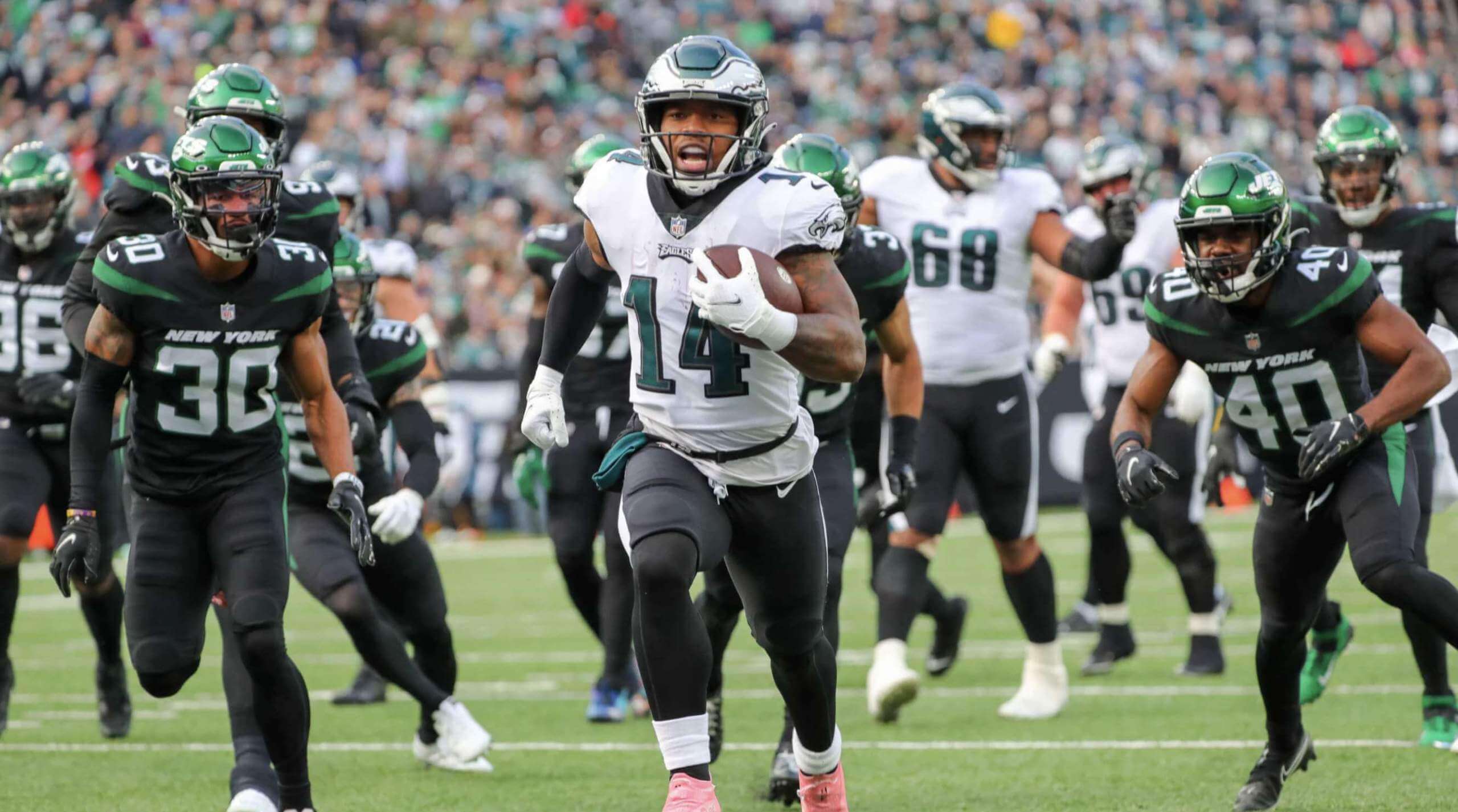
In theory, an Eagles/Jets game should be eye candy for me, since both teams’ primary color is green. But yesterday’s matchup was more of an eyesore, with both teams trotting out BFBS elements. What a mess!
Here’s how ridiculous it looked in action (with a BFBS end zone for good measure):
.@goedert33 didn't come to mess around!#PHIvsNYJ | #FlyEaglesFly pic.twitter.com/MZSkmvZOgu
— Philadelphia Eagles (@Eagles) December 5, 2021
In other news from around the league yesterday:
• For the first time ever, the Seahawks wore navy over grey at home:
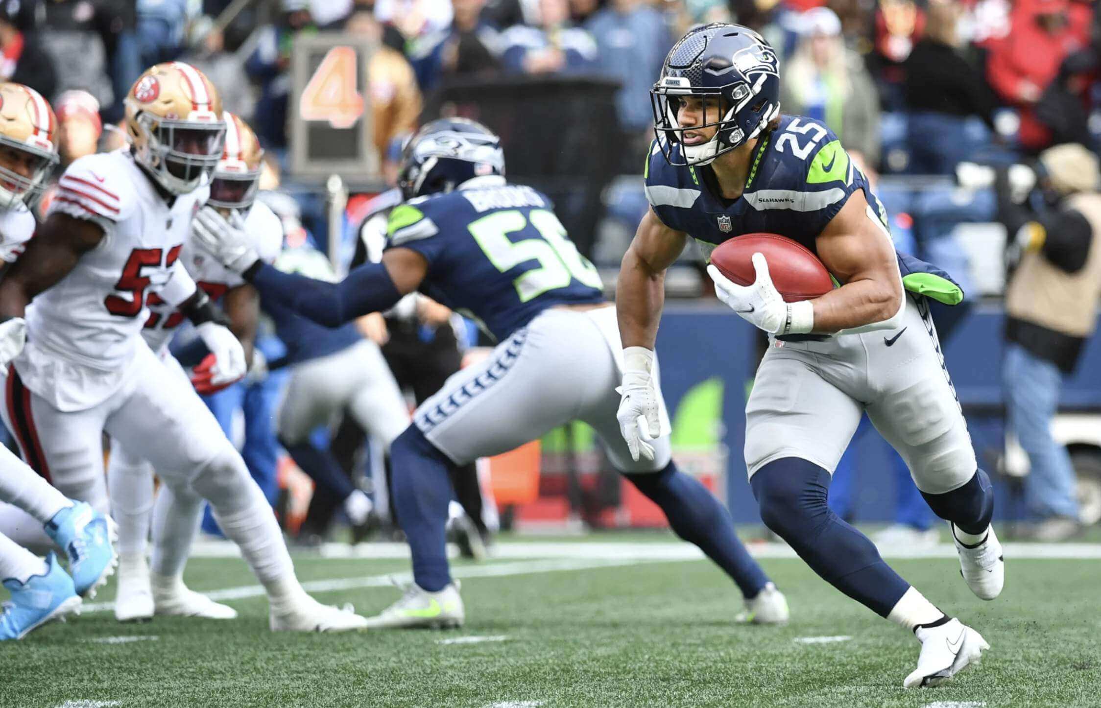
According to the Gridiron Uniform Database, the Seahawks wore this uni combo seven previous times since adopting their current uniform set in 2012, but always on the road.
• As you can also see in that Seahawks/49ers photo, the Niners wore their white throwbacks. Here’s a better look:
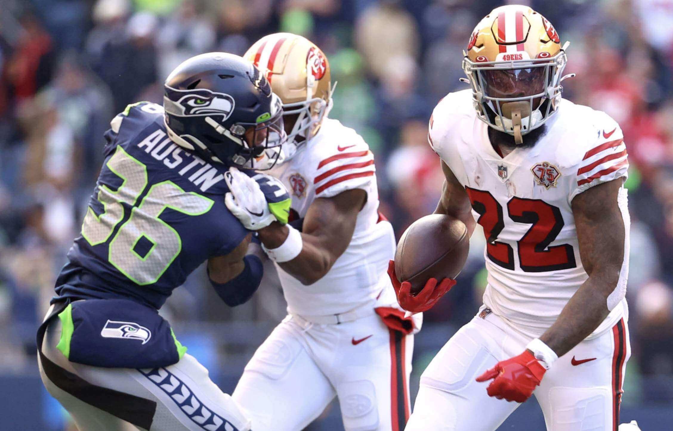
The Niners will wear these white throwbacks one more time this season (Dec. 23 against the Titans), and will also wear their home throwbacks one more time (Dec. 19 against the Falcons).
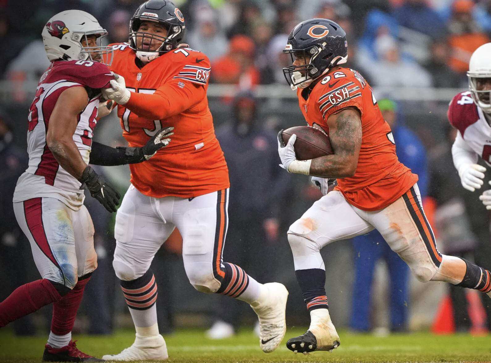
• The Bears wore their orange alternates:
• For the first time this season, the Bengals wore their black jerseys with the white pants with the black/white tiger striping:
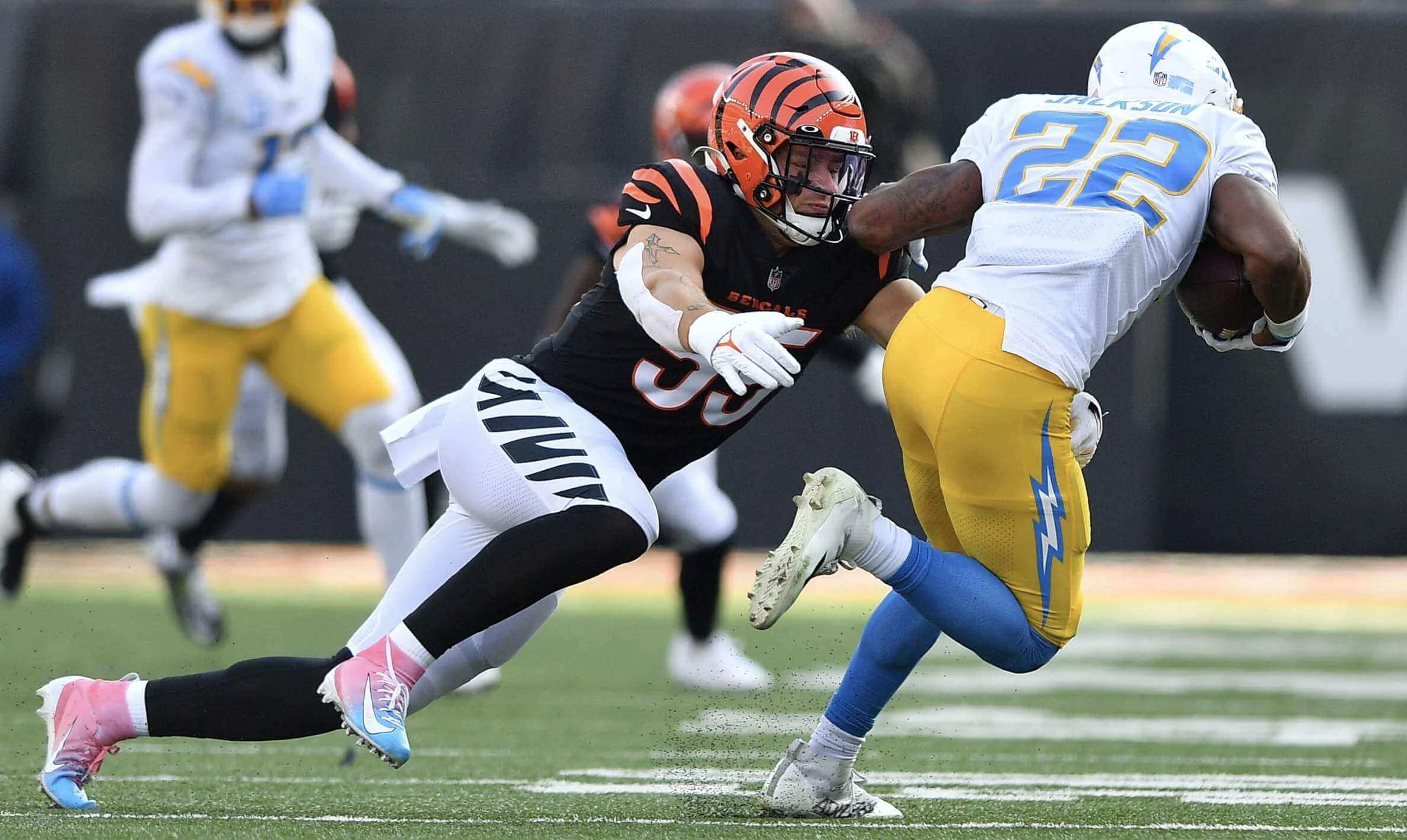
They had previously worn black over white in Week Five against Green Bay, but that was with the orange-striped pants:
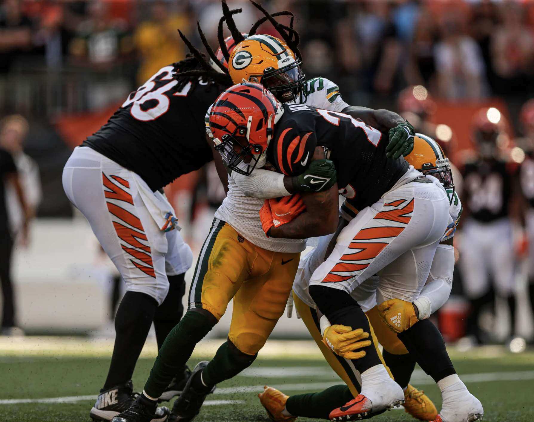
I think I prefer the version they wore yesterday.
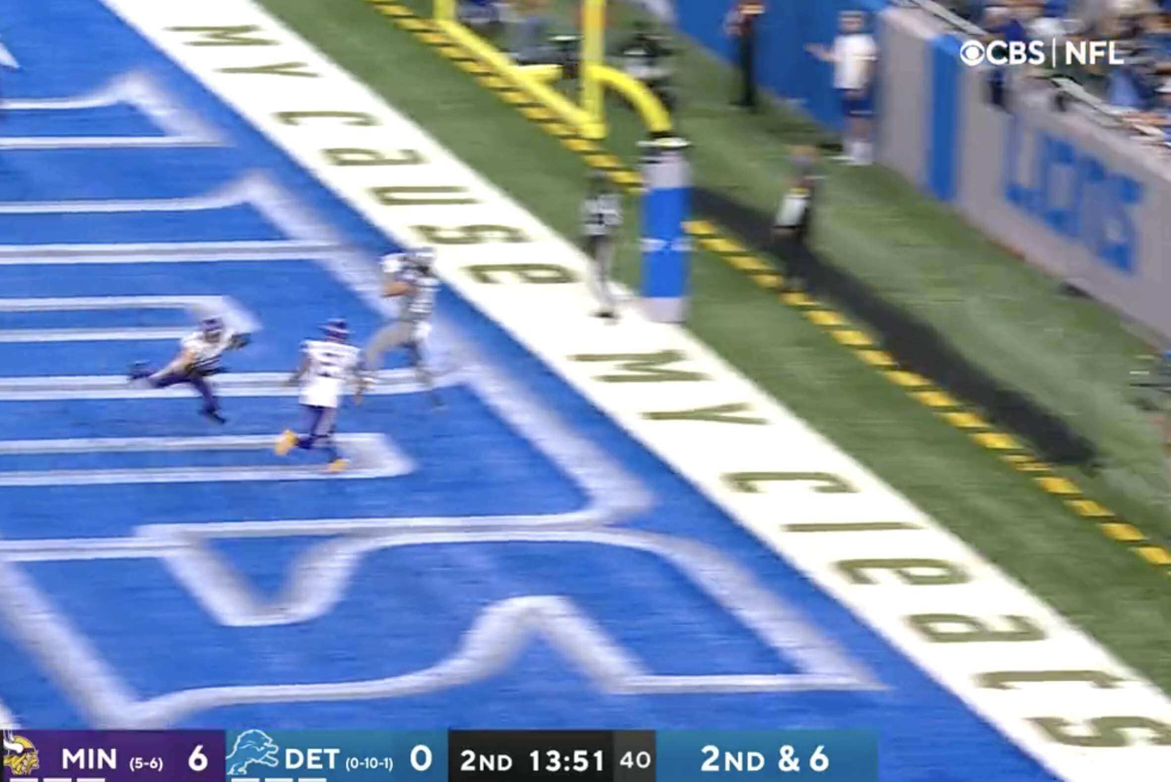
• The Lions wore their brutal mono-GFGS alternates — woof:
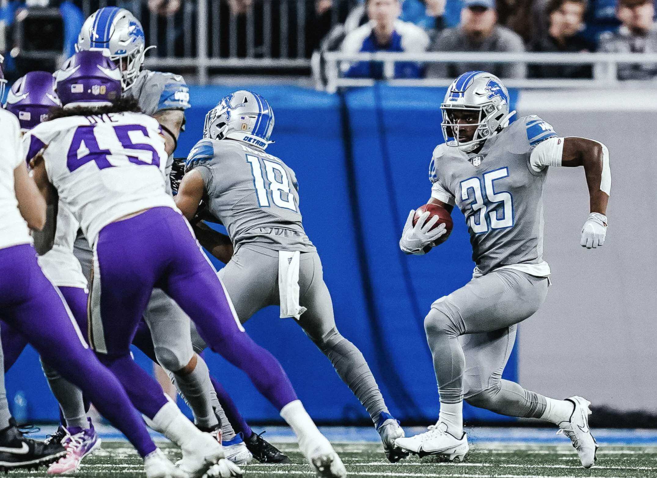
Happily, this might be the final time we see this uniform, as the team is reportedly considering a uni change for next season.
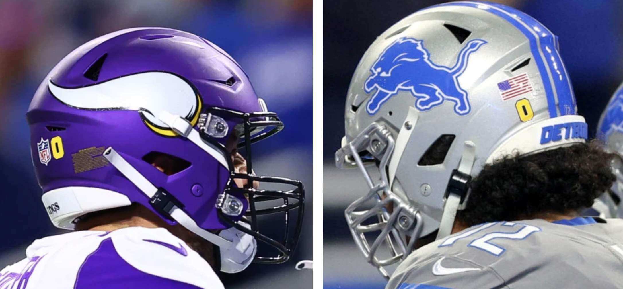
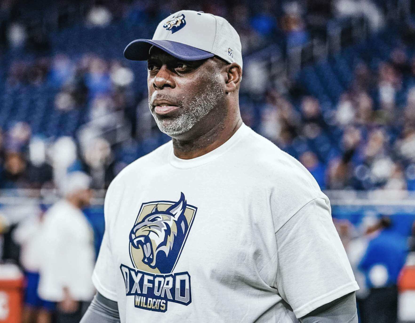
• In that Lions/Vikings game, both teams wore the logo of Oxford High School, site of our nation’s latest mass school shooting:
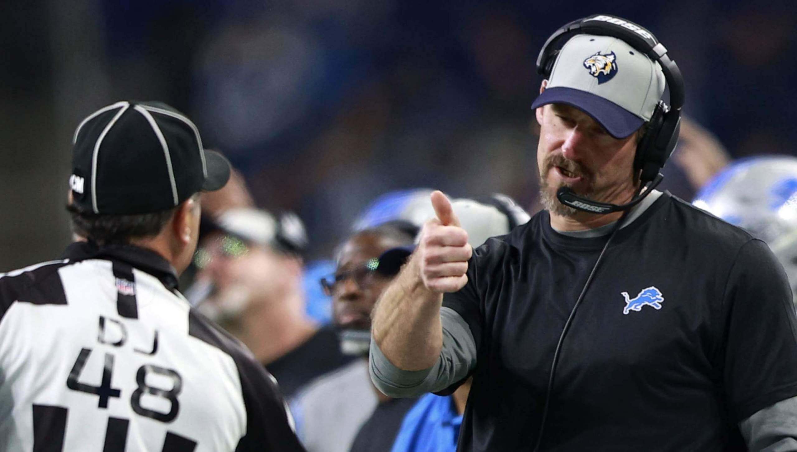
• In addition, Lions personnel wore Oxford T-shirts and caps during pregame activities, and head coach Dan Campbell wore the cap during the game:
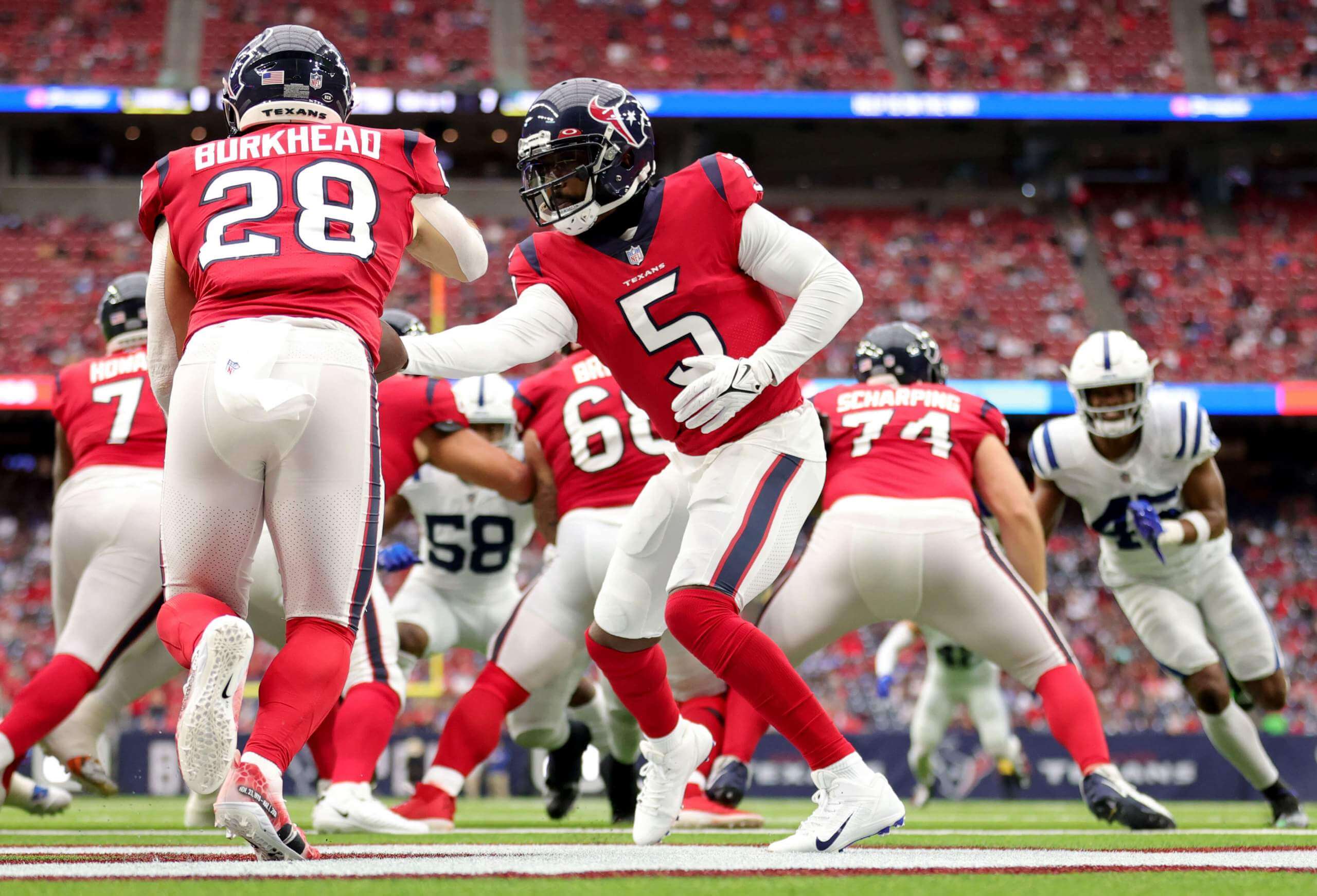
• The Texans wore their red alternates:
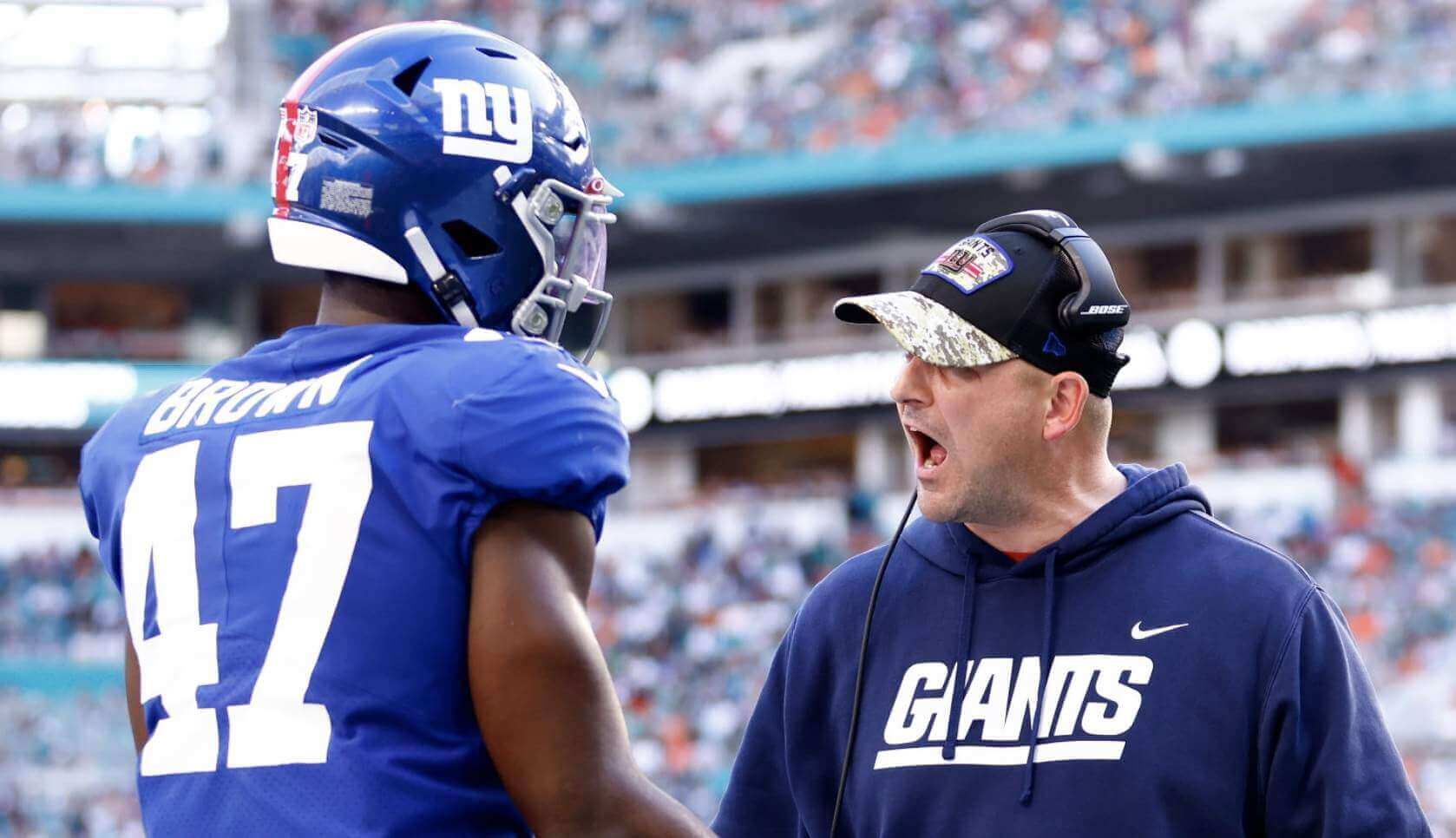
• G.I. Joevember is over, but Giants coach Joe Judge was still playing military dress-up:
• As you can see in some of the photos from today’s post, lots of players were wearing new footwear designs for the annual “My Cause, My Cleats” promotion. (There’s more info here, and most teams have photos of their players’ cleats on their websites.) Interestingly, the “My Cause, My Cleats” lettering on end zone back lines was rendered inconsistently from stadium to stadium — sometimes all-caps, sometimes a mix of upper- and lowercase; sometimes spread out, sometimes compressed:
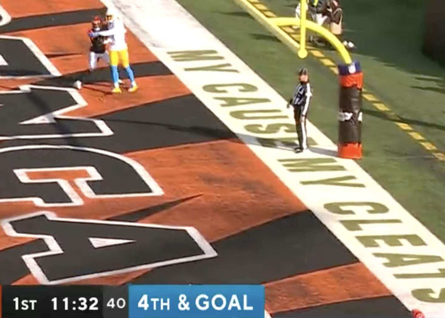
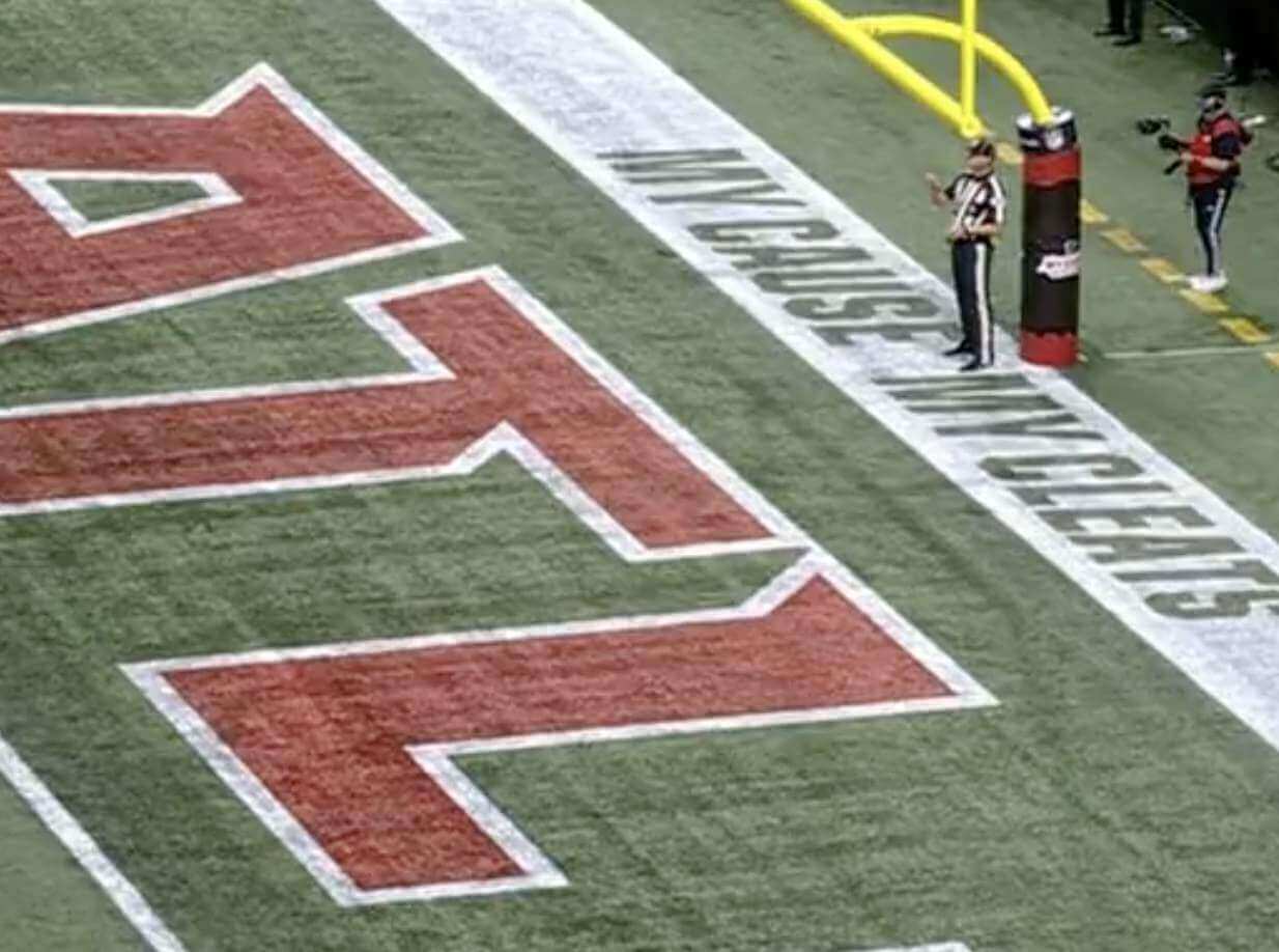
There’s nothing wrong with those inconsistencies, of course. It’s just surprising to see it in the NFL, which is usually so rigorous about consistent messaging.
• Just one team wore white at home: the Dolphins.
Looking ahead: Tonight we’ll see white over blue vs. blue over white.
(My thanks to our own Jerry Wolper for sending me down the end zone lettering rabbit hole.)
ITEM! New Bulletin article: Andrew Greenstein, who maintains the essential NHL Uniform Database, is one of the uni-verse’s unsung heroes. For my latest Bulletin piece (which was actually published midday on Friday, but too late to be mentioned/linked in that day’s blog post), I interviewed him. You can check it out here. Enjoy!
For most of these photos, you can click to enlarge
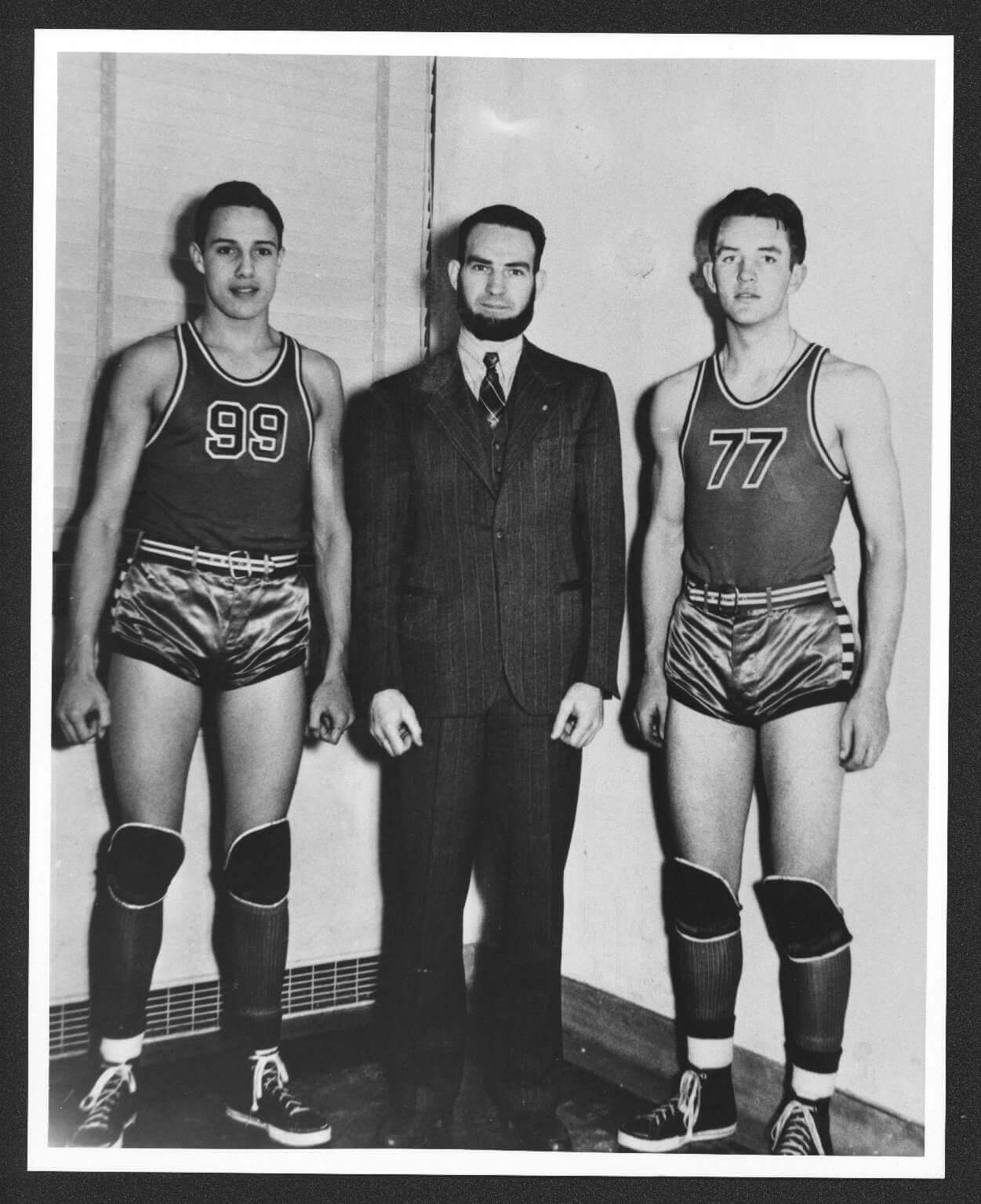
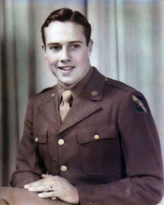
An American life: Who’s that wearing No. 99 in the photo above? None other than Bob Dole, who would go on the be the Republican Party’s nominee for Vice President (1976) and President (1996). He died yesterday at the age of 98.
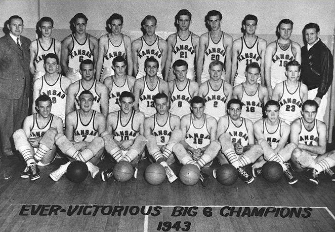
The photo above was taken when Dole was in high school. He went on to play basketball at the University of Kansas — you can see him in the back row, third from the left, in this team photo:
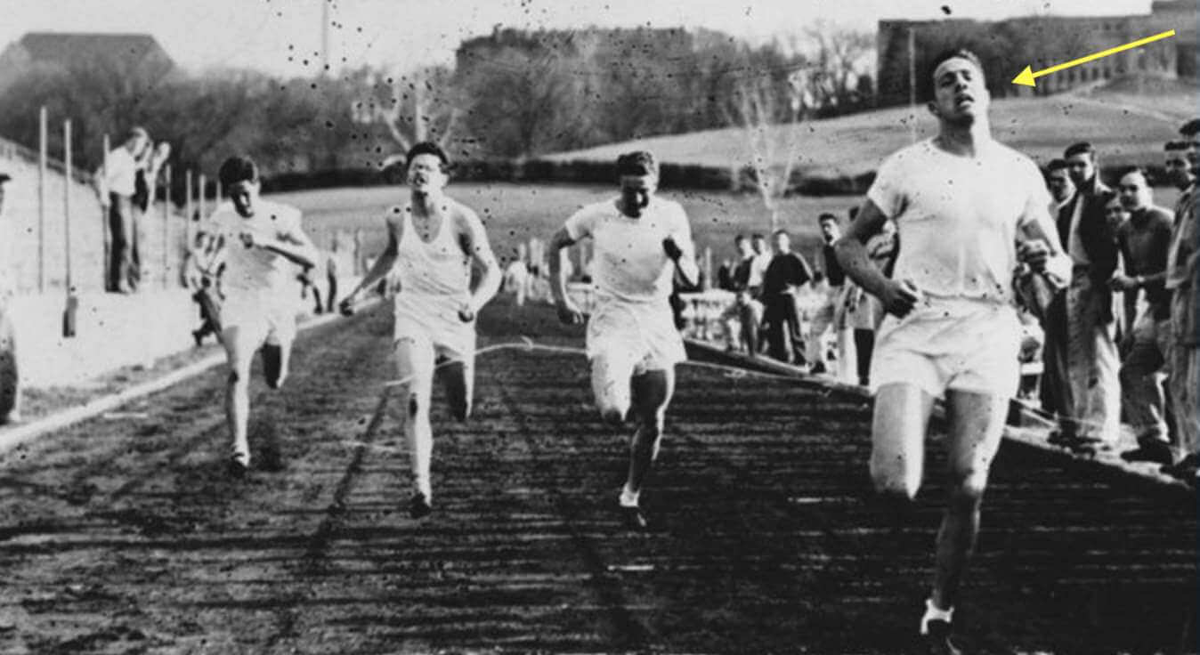
Dole also ran track at KU. That’s him on the right in this next photo:
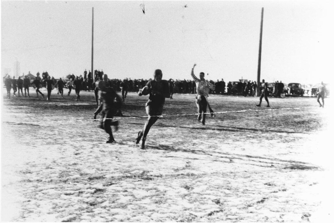
Multiple sources say this next photo shows Dole playing high school football, although you can’t make out very much:
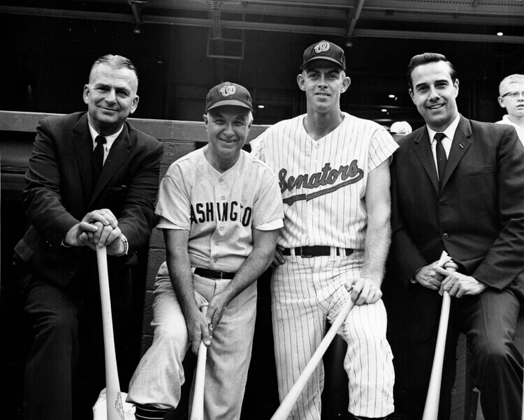
There are also plenty of photos of Dole posing with uniformed athletes. Like a lot of Washington politicians, he sometimes showed up at Washington Senators games, as shown here in 1963 (not sure why one player is in a home uni and the other is road greys):
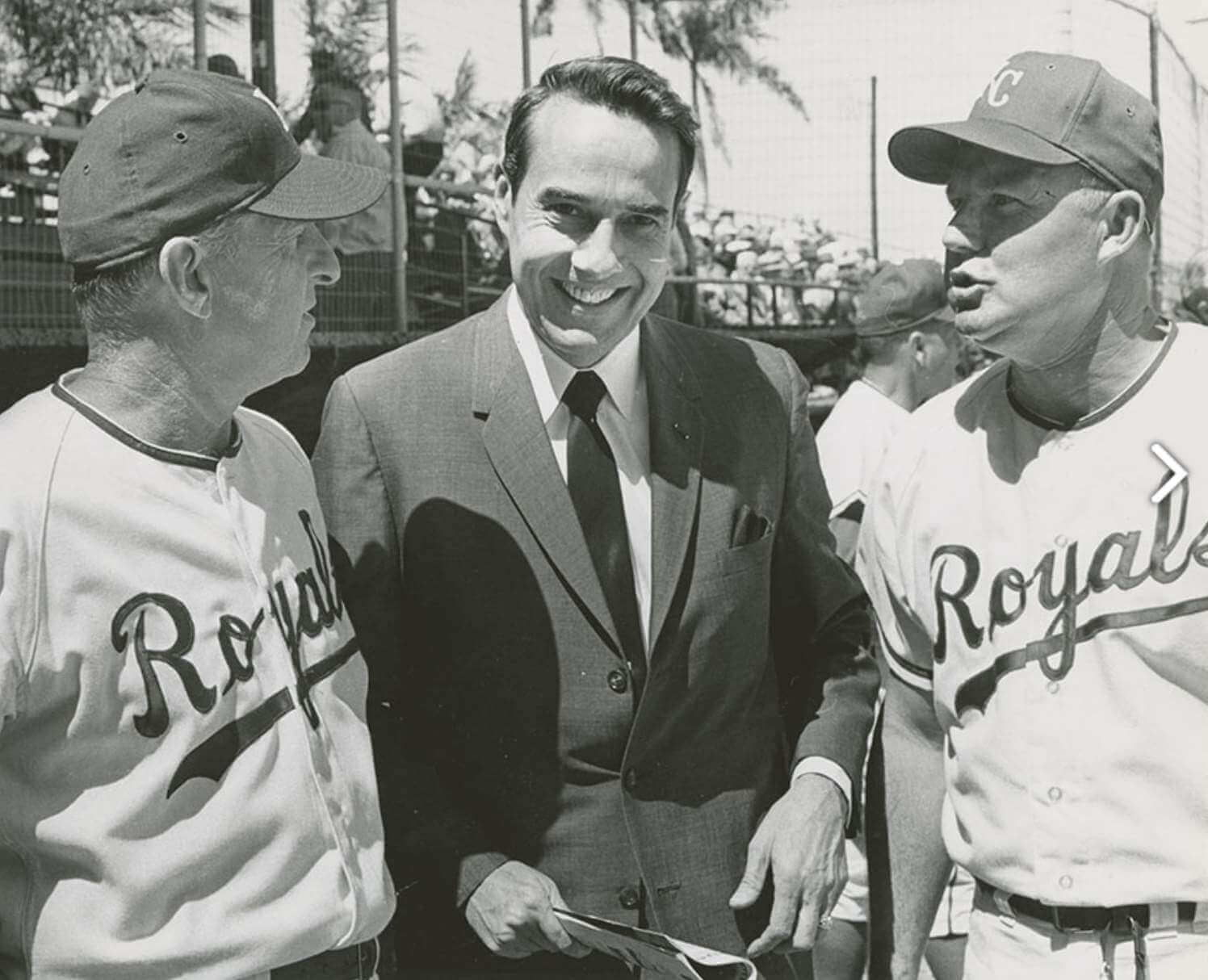
And here’s Dole with a pair of Kansas City Royals during the team’s first spring training camp in 1969:
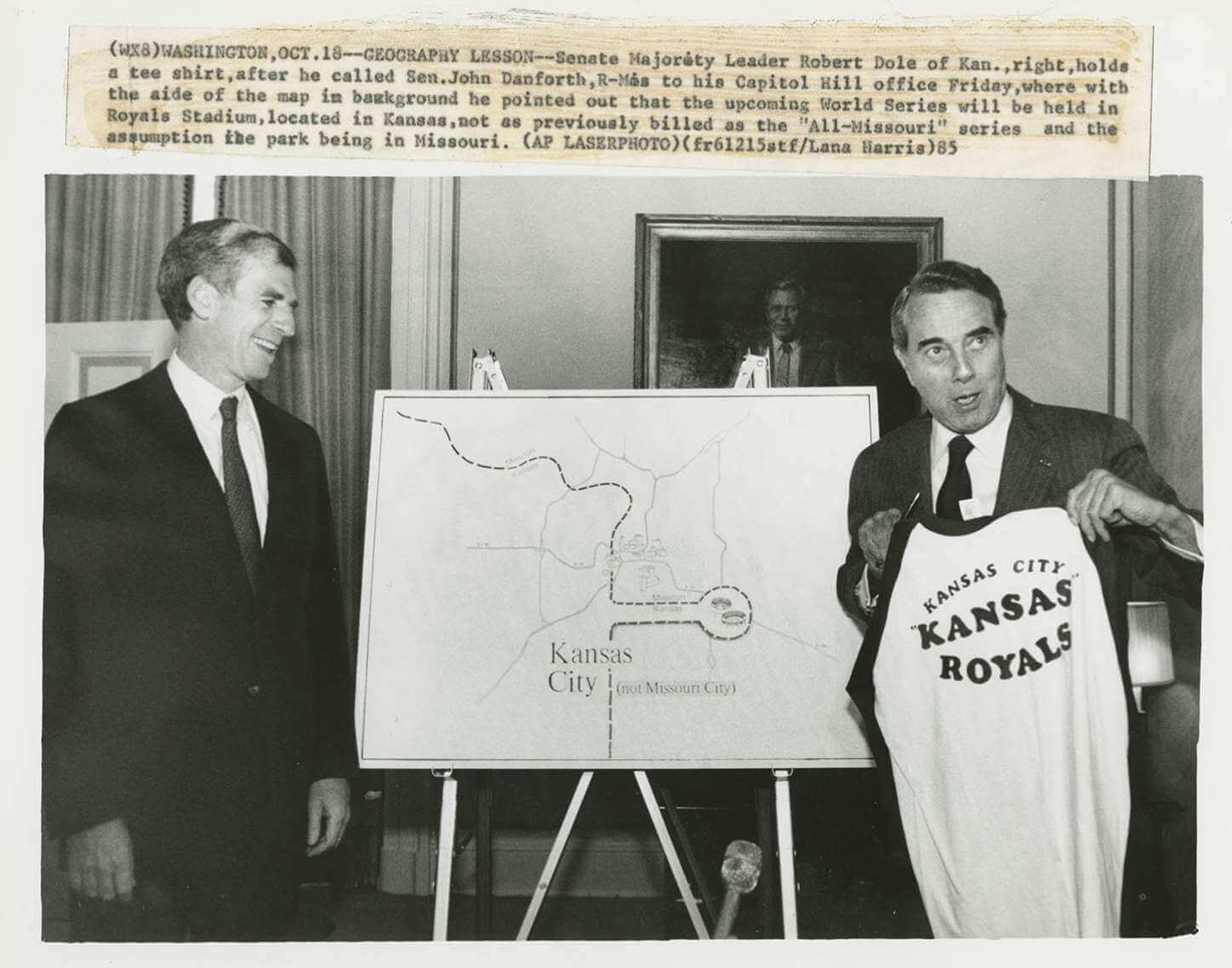
When the Royals faced the Cardinals in the 1985 World Series, setting up an all-Missouri Fall Classic, Dole, who was then a senator from Kansas, had some fun pretending — and insisting — that that the Royals’ stadium was actually in Kansas:
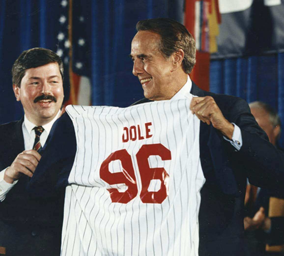
Dole occasionally incorporated uniforms into his political operations, as shown in this shot of him holding a “Dole 96” jersey during his 1996 presidential campaign:
Of course, the most notable uniform in Dole’s life was the one he wore as a member of the U.S. Army. Here he is as a second lieutenant:
Dole died in his sleep. We should all be so lucky. R.I.P.

For all photos, click to enlarge
Game of shadows: On Saturday evening, the Tugboat Captain and I were walking along a fairly desolate Brooklyn street and passed the scene shown above. I noticed that the three beams of light showing through the gate — left, center, and right — looked like the classic striping that appears on NFL helmets and pants. Here they are, from left to right:


Isn’t that cool? #Alwaysuniwatching

“Ask Me Anything” reminder: In case you missed it on Friday, I’m planning another “Ask Me Anything” post over on Bulletin. You can ask me a question about Uni Watch, about uniforms, about sports, or just about me. No question is out of bounds (it never hurts to ask!), but I reserve the right not to answer questions that I feel are too personal or otherwise inappropriate. Send your questions here (note that this is not the usual Uni Watch email address), and please stick to just one question per person. Thanks!
Click to enlarge
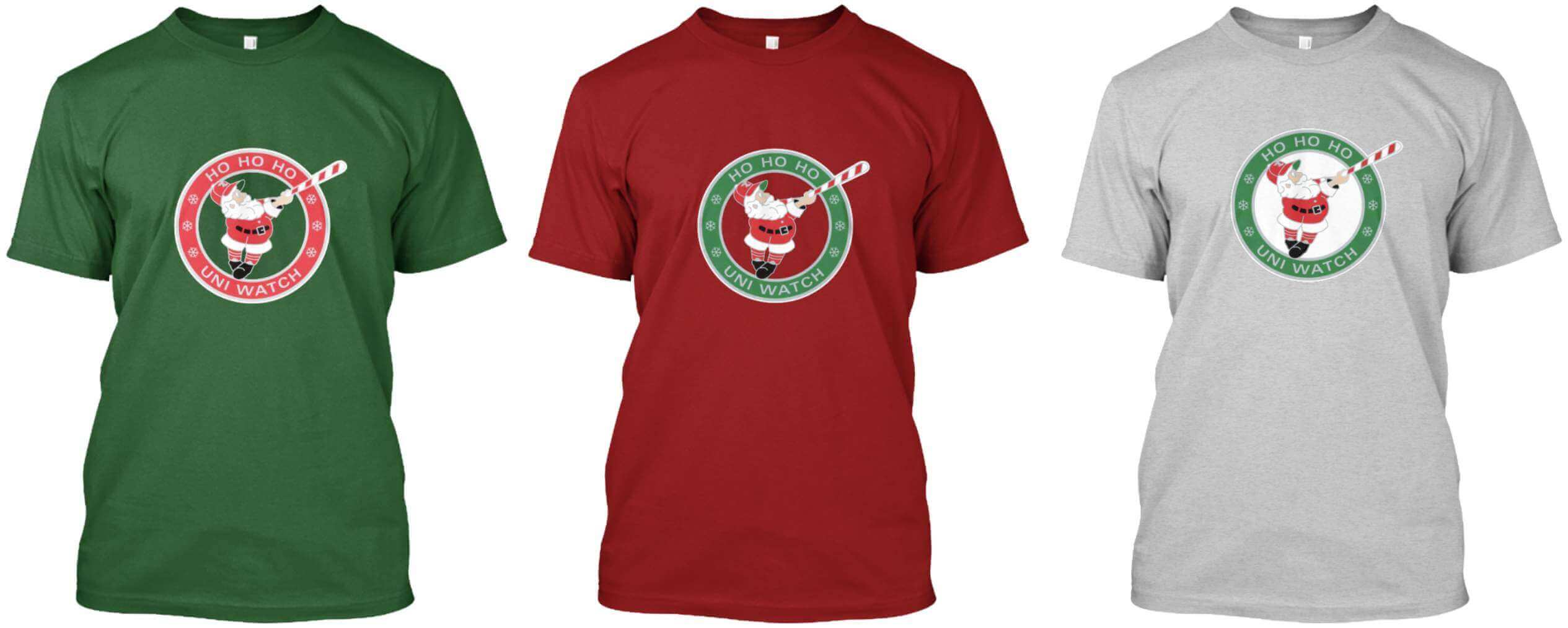
ITEM! By popular demand: Quite a few of you suggested that our December “Swinging Santa” pin, designed by Todd Radom, would look good on a T-shirt, so we’ve made it so!
In addition to the basic tees shown above, we also have long-sleeved T-shirts and hoodies (click to enlarge):
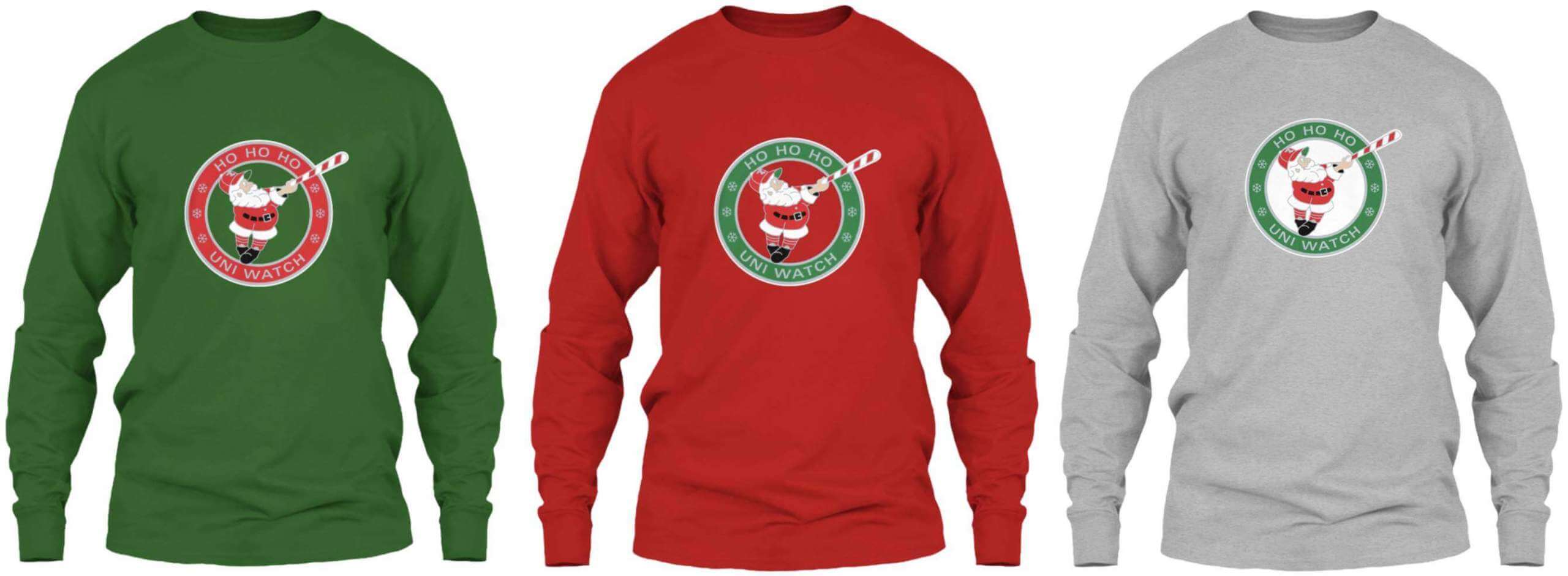
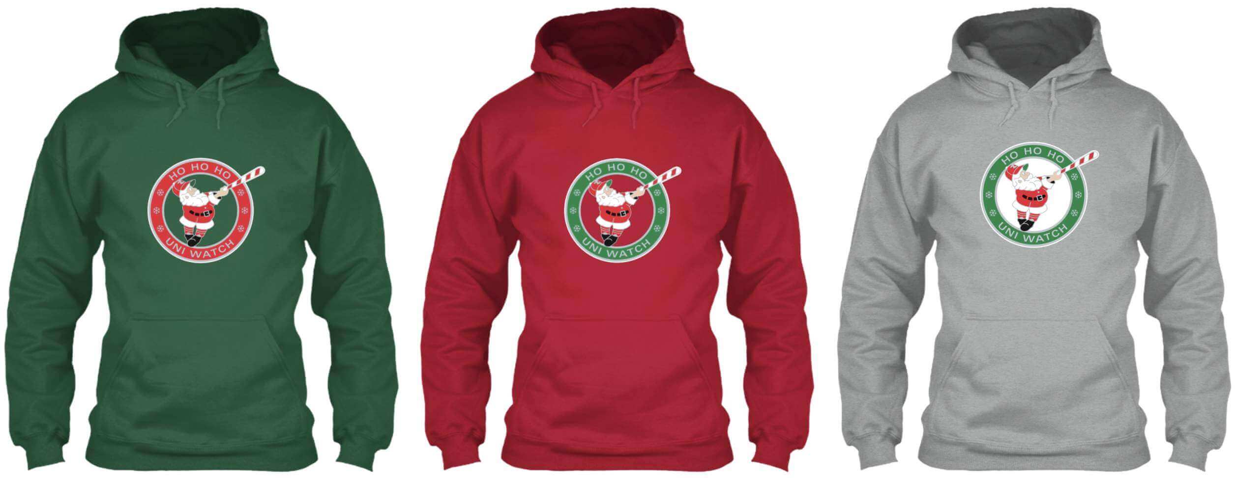
Here’s where you can order these in green, red, and grey.
If there are any other products you’d like to see with this design (pint glasses, prints, etc.), let me know.
Speaking of Swinging Santa: As of this morning, we were down the very last December pin — just one remaining! Who wants it? Now sold out!
Meanwhile, if you’re looking for Christmas-themed merch, don’t forget our ugly sweater design and our red/green Color Remix tee.
IMPORTANT — “Collected ’Em All” reminder: If you purchased all 12 of this year’s monthly pins, you’re eligible to receive the bonus pin shown here (the background will be knocked out). We need to know how many of these pins to make, so if you’ve collected ’em all, please email me ASAP with (a) your name and address, and (b) proof that you’ve collected all of this year’s pins. The proof can include photos of the pins themselves and/or order-confirmation emails from Teespring.
The bonus pins will ship out early next year. Thanks for your support of the pin project!

Click to enlarge
And there will be leftovers: As most of you know, the Tugboat Captain was still stuck in the Covid sanitarium on Thanksgiving (plus she didn’t have her full senses of taste/smell). Now that she’s back home and feeling good again, we had our own Thanksgiving (Observed) feast last night. We both prefer dark meat, so we got a pair of massive turkey thighs and also made mashed potatoes, Brussels sprouts with bacon, stuffing (Mary’s dad’s recipe, with Jimmy Dean breakfast sausage), gravy, and hard cider. It was all sooooooo good:

Later on, there was pie:

It was worth the wait. We have a lot to be thankful for.
The Ticker
By Jamie Rathjen

Baseball News: Former MLB 2B Matt Antonelli now has a YouTube channel and on Saturday posted a video on “how uniforms and numbers work” in MLB (from Mike Chamernik). … Outside the Mariners’ visitors’ locker room is a chart showing which combos of varying alternate colors can and can’t be worn together (from @PburghNo1). … Two new alternates for Japan’s Central League’s Tokyo Yakult Swallows (from Jeremy Brahm).

Football News: The Patriots’ Hall of Fame said on Friday that the team is bringing back the red throwback jerseys next season (thanks to all who shared). … The Raiders sent RB Bo Jackson’s jersey from his last NFL game to the Baseball Hall of Fame, and it was recently rediscovered by curator Tom Shieber (from Trevor Williams). … The Browns promoted their upcoming game against the Ravens with a graphic showing both teams’ helmets with old-school two-bar facemasks — even though the Ravens didn’t exist during the two-bar era (from @TorontoDawg).

Hockey News: For Jets RW Blake Wheeler’s 1000th NHL game yesterday, the team wore his NOB and No. 26 in warm-ups and also gave him a No. 1000 jersey (from multiple readers). … The Kraken are wearing Indigenous-designed warm-up jerseys prior to tonight’s game (from Moe Khan). … The Wisconsin/Minnesota women’s game on Friday was color vs. color (from Nicole Haase). … The next three items are also from Wade Heidt: The WHL’s Winnipeg Ice wore their winner of the CHL’s Leave Your Mark Design a Jersey contest. … The Junior A British Columbia Hockey League’s Chilliwack wore their “BCHL 60th-anniversary throwback-inspired uniforms” on Saturday and so did their opponents, the Langley Thunder. Separately, the Victoria Grizzlies wore their throwback-inspired uniforms for the first time. … New home jersey for St. Lawrence’s men’s team (from John Muir).

Basketball News: A marketing firm asked fans to rank the NBA’s costumed mascots. Here are the results. … Virginia men’s coach Tony Bennett gave the recently retired long-serving UVa sports writer for the Roanoke Times, Doug Doughty, a framed jersey after Friday’s game. The jersey is in the pre-2020 style, which last year’s men’s seniors also got, and was numbered 45 for Doughty’s years of service (from my brother Nate Rathjen). … This is weird: Bryant’s men’s team has numbers of varying width. … Division III Illinois Wesleyan’s men’s team has been wearing grey alternates for every home game because their white uniforms hadn’t arrived yet, but the home whites finally did arrive this weekend (from Bob Quillman).

Soccer News: USL League One’s Greenville Triumph are starting a USL W League team but want to give them a separate name and crest. They’re down to five name finalists. … German club 1. FC Nürnberg wore “Christmas shirts” in the 2. Bundesliga yesterday. Despite the designation, the shirts are not Christmas-themed and instead are based on their look from the ’60s. … New shirts for Japan’s Kyoto Sanga and Ventforet Kofu (from Jeremy Brahm). … Olympique Lyonnais midfielder Amandine Henry got a No. 200 shirt yesterday for 200 appearances in France’s Division 1 Féminine. … The Scottish Football Museum has a new exhibit on Rutherglen Ladies, a tartan-clad women’s team that played from 1921 to 1939 despite their founding year coinciding with the women’s game being banned from stadiums of Football Association and Scottish Football Association clubs. The ban started 100 years ago yesterday and lasted, at least in England, until 1971. … For yesterday’s Women’s FA Cup final, the steps up to the royal box at Wembley Stadium were decorated with the names of previous winning captains. … Norwegian side Tromsø IL has released what it claims to be the first shirt with a QR code (from Jeremy Brahm).

Grab Bag: Reprinted from Friday’s comments: Cycling’s Ineos Grenadiers released their kit for next year (from commenter Phil P). … Scotland’s netball team has a new kit. … This video has an overview of next season’s Formula E liveries. … A New York high school boys’ volleyball team, Eastport-South Manor, has shirts that are quite clearly based off of the woodblock print The Great Wave off Kanagawa, by the Japanese artist Hokusai (from Gordon Blau). … The next two are from Jeremy Brahm: The Italian men’s volleyball team Power Volley Milano wore a shirt on Saturday for the start of the opera venue La Scala’s season, which is Dec. 7. … Another Italian men’s team, Lube Civitanova, has new kits for the Men’s Club World Championship. … CBS Sunday Morning recently did a story on a Kentucky woman who found Army uniforms in a dumpster and successfully returned them to the owner’s family (from John Chapman). … The five teams in New Zealand’s upcoming Super Rugby Pacific competition have revealed their kits (from Sy Hart). … This week’s F1 race was in Saudi Arabia. Since alcohol is banned there, Scuderia Ferrari blacked out their Estrella Galicia 0.0 advertisements, even though it’s a non-alcoholic beer (from Omar Jalife).
Sorry for your 49ers loss. Do you like the Seahawks navy jersey with grey pants or mono-navy?
Grey pants are better. White pants would be better still.
Blue over green would be awesome!
“The Great Wave” woodblock masterpiece should be credited to the individual artist who created it, Hokusai, and not just to the nation of Japan. As with MoMA’s recent decision to credit the individual artists whose DC Comics work Roy Lichtenstein copied for some of his famous modern art paintings in the MoMA collection, it’s important to credit individual artists and not just corporate or mass entities where possible.
Agreed. Proper credit now added.
The gray pants (with both white and navy jerseys) is a much better look for Seattle.
Ditto for Houston’s red jersey, their typical navy set makes them look like a Chicago knock off.
Re: Bob Dole
Great anecdotal story about him that just makes like him a lot. My cousin and her family were visiting DC, and happened to run into him (wheelchair bound at this point). When asking for a quick photo he insisted they find someone else to take it and she be in the photo too, because “Too often mom’s are behind the camera in these memories.” I just love that he insisted she gets to be the photo with her family.
What a good story about Mr. Dole, thank you for sharing it. And he’s right, I try to get my wife in as many pictures with our kids as I can.
White over grey is best. The amount of green on their blue jerseys and pants does not correlate with the little bit (eyeball) on the helmet.
I also prefer the Bengals white pants with the black/white tiger striping. Matches the jersey stripes better, IMO.
Agree. If the point was to tone down the wacky flare on The Bengals duds – this was the best look of the possible combos that aren’t simply all white.
Yes, it’s strange that ultimately matching colors is less important than matching the number of colors, but that extra edging of a 3rd color really throws me off.
Re: Game of Shadows
What a find and what a great shot!
“Junior A British Columbia Hockey League’s Chilliwack wore their “BCHL 60th-anniversary throwback-inspired uniforms” on Saturday and so did their opponents, the Langley Thunder.”
Was Thunder on the jerseys for the Langley Rivermen as this uniform is paying homage to past teams in the area. Playing as the Thunder when they wear these uniforms.
Interesting to note that the previous Langley Thunder (existing from 1994-98) relocated and are the current West Kelowna Warriors in BCHL.
I turned on Eagles/Jets just in time to see the opening kick return, and honestly had no idea which team was returning the ball. (And I’m an Eagles fan.)
I thought the game looked like one of those spring football college intra-squad games.
Great tribute to Bob Dole. Very well done.
Seconded. A fine tribute for a fine man.
Regarding the photo of Bob Dole with the Senators players in 1963: Dressed to the Nines indicates that the home uniform on the right was introduced in 1963 but the road version on the left was discontinued after the 1962 season. Could this be some kind of promotional photo of the new home uniform prior to the start of the 1963 season when they hadn’t finalized the road version?
Maybe they wanted the uniforms to say “Washington senators” in the photo
This may be the first time I’ve made the ticker, and I’ve been around since the start! lol
The grab bag item about the beer brand Estrella Galicia made me look into whether Estrella Galicia is related to another Spanish brand Estrella Damm, and they are not related. I wonder how many situations arise where someone from Galiza (as they say it) goes somewhere where they serve Damm and asks for an Estrella and doesn’t get the beer they expect lol
Congrats on the ticker.
There is also a mexican beer called Estrella Jalisco, no relation to any of the Spanish Estrellas so I can see a lot of tourists in Mexico looking at menus with Estrella, ordering and getting something totally different.
The player in the 1963 Senators home uniform is Don Lock. Not sure about who is in the road uniform, but it could be coach George Susce.
Not a fan of the 49ers throwback uniform, with the gold helmet color not appearing anywhere else on the uniform. Are there any other teams with this distinction of the helmet color not appearing on the uniform? I believe the Patriots are close, except for the face of the flying Elvis on the sleeves.
NY Giants new road look…no blue on the jerseys and pants…
Forgot about that. Haha…Except the pants do have a blue nike swoosh.
The Giants have a long history of that. They used to wear red secondaries in the early ’50s, and then replaced those with white road uniforms with red numbers that clearly were from a different supplier. So no blue until stripes were added to the pants. When the throwback look was introduced in 2000 all that returned. I don’t know why they just now changed to red stripes only.
That inconsistency is due to it not being an actual throwback. That jersey and pants combo matched with a red helmet.
When they did it first for the NFL 75th season they were one of many teams to forgo throwback helmets that accurately matched the rest of the uniform. In this case it sort of makes sense as if they switched to a plain red helmet you’d really be hard pressed to recognize them as the Niners.
Panthers in white over white.
Chiefs have the reverse. No yellow on the lid.
But if Rickaz means not having the helmet color appear anywhere on the jersey or pants at all, then I’m having to go to the obscure corners of the Gridiron Uniform Database to find anything. Back to when teams first started painting their helmets silver or yellow, but didn’t necessarily have those colors on either their dark jerseys w/ white # or their canvas pants.
The closest modern example would be the USFL Arizona Wranglers’ 1st year; to match the state flag they wore bronze helmets, with the rest of the uniform all blue and yellow. Usually when teams wear metallic or yellow helmets, they wear pants that color too or at least get it in the trim.
Technically the Cowboys home whites and definitely their color rush. While the home pants are silver/blue they definitely don’t match the silver of the helmet and to boot navy isn’t anywhere on the home white set.
The Pats have ‘barely there’ silver outlines on their jersey numbers.
Ron Rivera is also still wearing a Salute to Service hat. However, given his family’s military background and his cancer history I have no problem with him wearing one of those two hats for any game.
Re: the volleyball team that honored the opera opening … Would we have seen a TNOB (tenor’s name on back)?
I can’t believe I’m defending the Eagles as a die-hard Cowboys fan but I have to disagree that their black pants are BFBS. The Jets are absolutely BFBS and it looks awful but the Eagles have had black as one of their team colors since switching to midnight green and now they are just using it more. Since there is black trim on the jersey it works. The Jets do look awful though.
Also, if you are the Bears, why the hell would you choose to wear your Orange jersey against a team wearing red? Of all the games you could trot that out for, why not against another team that wears blue or green? That game looked rough yesterday.
Any game with Arizona involved is going to look rough
The Bears literally played a home game on Halloween. No idea why they didn’t wear them then.
Why was the black added in the first place though? Because it was en vogue at the time that they made it part of their color palette. In other words, for its own sake. BFBS.
That’s an insane stretch. It’s been part of their color palette for almost 20 years. And it’s actually part of their color palette and consistently present across all of their uniform sets. The same cannot be said for the Jets. To me BFBS is when a team that doesn’t have black in their actual color palette in their traditional home and road uniform adds a black uniform.
Yea the Jets come more off as trying to be cool with their black uniforms. I will agree the eagles introduced the black jersey in the 2000s since other teams had black too, but it works since they have had black in their colors for 25 years now. Also I could see why the Eagles wanted to wear the black pants since they have started winning more since the first time they wore them a few weeks ago (then wore the black jerseys the next week, didn’t wear any black vs the giants and lost).
And the Eagles wore green w/ black trim in the late ’60s & early ’70s; and they snuck black trim back in during ’85-95. Both times in the pants stripes, the later time also the sleeve logo.
“an Eagles/Jets game should be eye candy for me, since both teams’ primary color is green. But yesterday’s matchup was more of an eyesore, with both teams trotting out BFBS elements. What a mess!”
A green football uniform lover would have been better off watching the CFL Western Final yesterday. Strictly green and white for the Saskatchewan Roughriders. No BFBS in Riderville these days!
link
The first half of the Saskatchewan/Winnipeg game had great lighting of a cold bleak winter’s day that to me enhances the esthetics of the game.
Was Abraham Lincoln Bob Dole’s high school basketball coach?
Mose Schrute.
Totes Mose
re The Eagles/Jets BFBS game: the Jets look their best when they are simply green and white (and IMO, kelly green). Their Namath era jerseys are classics. Their Richard Todd/Ken O’Brien era jerseys were fine until they added black as an accent color in 1990. Sometimes less is better.
As for the Eagles, I look forward to the day when they ditch the black for silver. I’d prefer the Jaworski era jerseys but would be fine with the Cunningham era jerseys.
Love the Seahawks in blue over grey. That should be their regular home set, IMO.
Bears owners struggle with running the team, how would you expect them to pick the right uniform? I don’t care for their orange jerseys. I prefer the ones they wore against Dallas years ago with the blue numbers
link
Why is black/black vs white/black “ridiculous” but the reverse (black/white vs white/white) never gets any such comments?
Actually, I never said those combos are ridiculous per se; I said they’re ridiculous specifically in the context of these two teams (Eagles and Jets). I can think of at least one NFL team (the Ravens) that looks good in mono-black.
Notice how many times you typed “black” in the first scenario compared to the second – that’s why. Especially when neither is truly a team color.
This reply makes no sense. I wrote white just as many times as black.
Why does white get a pass but not black? I’m trying to challenge the concept that any time black is used it counts as BFBS (a concept which I understand and appreciate).
Both teams have black listed as an official team colour. How are those not “truly” team colours?
Charlie, as I’ve already explained upthread, it’s not about the colors per se – it’s about THESE TEAMS wearing those particular colors.
If the Ravens (wearing mono-black) played the Bengals (wearing white over black) I’d have no problem with it.
Let’s please move on. Thanks.
Great to read that you and Mary had a nice, though belated, Thanksgiving!
Stay well!
I’m interested in knowing more about that Mariners alternate uni approval chart. Is that MLB or team created? Is it enforceable? I enjoy that certain colors seem to contemplate specific teams — “sedona red” for the Dbacks, “brown digital camo” for the Padres.
Regarding the Browns-Ravens matchup logo with the 2-bar facemask:
Back in May the Browns put out a schedule graphic showing all of their opponents’ helmets rendered with 2-bar facemasks. Besides the Ravens, and also the Texans, not existing during the two-bar era, there are a number of helmet designs shown that did not exist in the 2-bar era, such as the Broncos and Patriots. And even the Browns’ own helmet logo is rendered with a gray facemask, which is not what they currently wear.
I would have been OK if the Browns had opted to give each opponent’s helmet the gray facemask treatment. Why not go all-in olde timey?
As for the Ravens not ‘existing’ in the 2-bar era…we all know that in reality they did, right?
;)
I love it when the Browns play the Browns…
Ravens never played a season before 1996, right? ;)
Joe W is correct, it’s a season=long theme based on the 75th anniversary of 1946…when no one wore facemasks, so some artistic license is fine by me.
View all teams’ helmet renditions here:
link
Eight of the 14 teams that are wearing white jerseys this week also wore white pants. As I’ve stated on this site before, I’m not a fan of all of the mono-white (or mono-black) that seems to be common lately. Just too boring.
“and also made mashed potatoes, Brussels sprouts with bacon, stuffing (Mary’s dad’s recipe)”
As good as that meal looks, it doesn’t appear that the turkey thighs were actually stuffed. So I would say you made Mary’s dad’s recipe for dressing.
Fair point!
It’s like Band Aid, Kleenex, etc.
Hell, both teams lost in the Meadowlands on Sunday.
It’s an actual travesty that Seattle have been going mono-navy for all of these years when they look 700 times better with the navy over grey look from yesterday. And I actually like their uniforms after Nike redesigned them.
I saw Paul’s comment above and while I hate the unitard look as much as anyone, I disagree that white would look better – And here’s why:
It’s Seattle lol. That’s a grey-ass city and the grey looks excellent as an almost regional color. White would be too clean for them. But still better than mono-navy.
Just my thoughts.
Rats! I was out of town this weekend but planned to order the December pin as soon as I got home. Just saw that I’ve not only missed out on the pin, but also on the year-end collectible. Argh.
Kids, this is what happens when you delay!
If anybody happened to scoop up an extra pin that they’d be willing to part with…
Love the Abe Lincoln beard on the coach in the Bob Dole High School photo.
I hope the win yesterday doesn’t convince the Lions to keep those grey things around.
Thanks for interviewing Andrew Greenstein. It’s nice to see him get some recognition. His website is one of the best things on the internet.
Every single one of those BCHL throwback jerseys has been absolutely fire. That league knows how to dress.
It would appear that the “My Cause, My Cleats” lettering is based on each team’s primary or secondary fonts.
The Pistons appear to be wearing a yellow memorial band on their jerseys (left shoulder) for the Oxford tragedy. Also wearing Oxford Wildcats warm-up shirts.