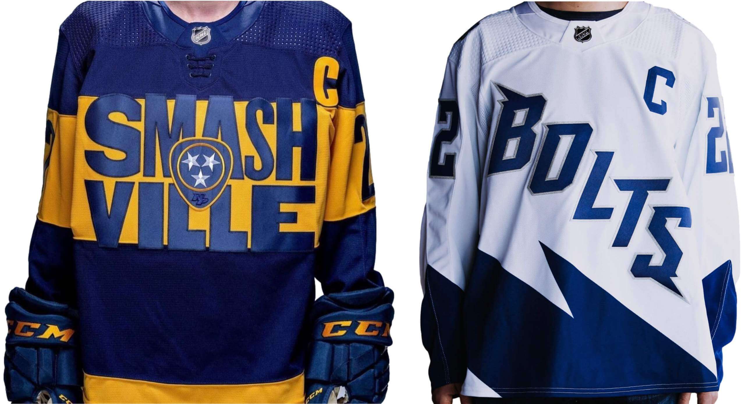
Click to enlarge
The Predators and Lightning, who’ll be facing each other in an NHL Stadium Series game on Feb. 26, both released their uniforms for that game yesterday.
I understand that Stadium Series uniforms (a) are designed to be seen from a greater distance than a usual hockey uni and (b) have a history of pushing boundaries, but these are pretty bad. The Preds design is particularly embarrassing — not just the idea of putting “Smashville” on a jersey (which is bad enough) but also the specific execution of that word. I mean, jeez, look at the two “S”es! Look at the center stroke of the “E”! And hey, let’s throw a guitar-pick logo in the center just to make sure everyone knows which team this is for, even if it disrupts the lettering! The whole thing diminishes the sport, the uni-verse, and all of us who are exposed to it. Piece o’.
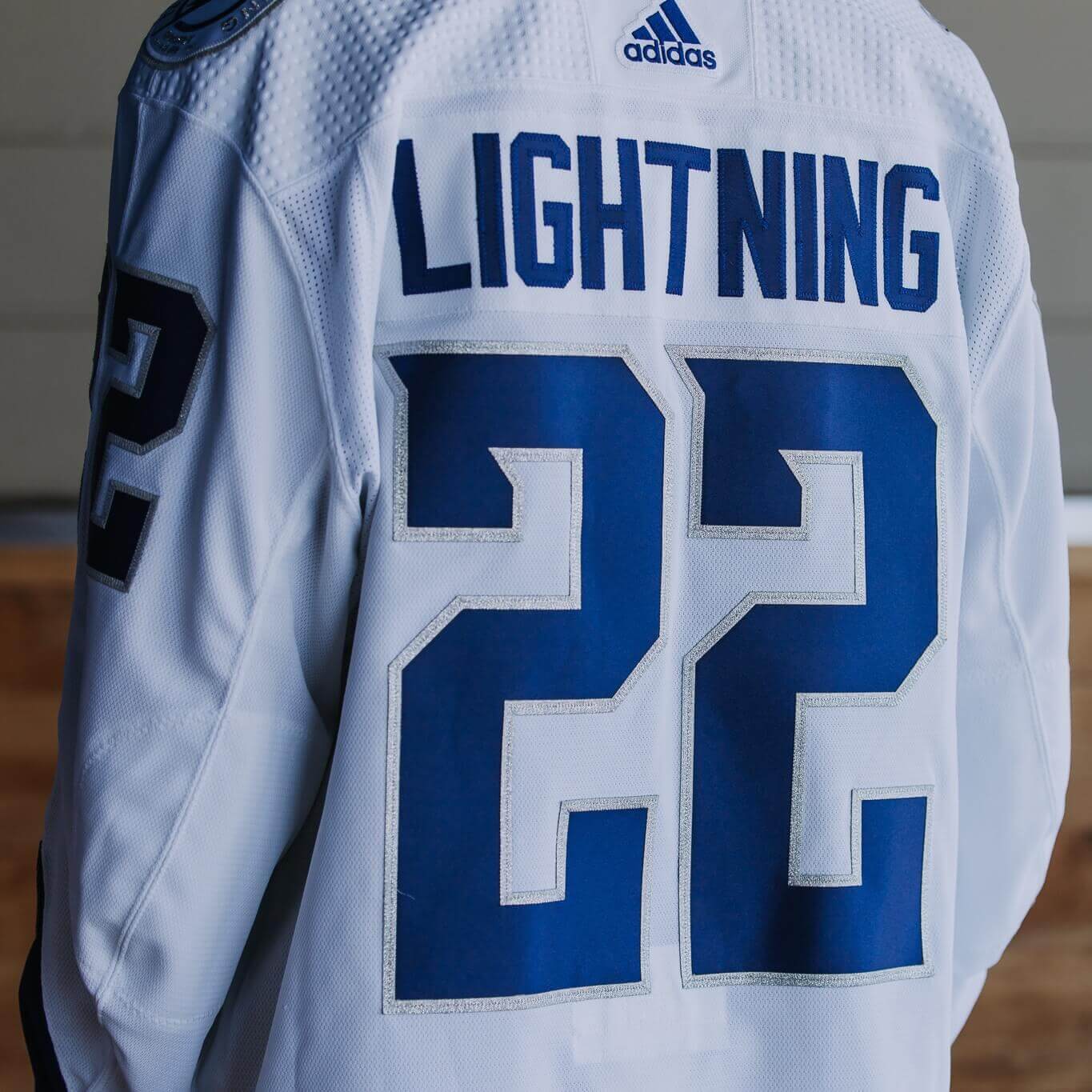
The Tampa design isn’t as bad, but that doesn’t mean it’s good. Not a fan of the nickname insignia or the font, the latter of which is also used for the numerals:
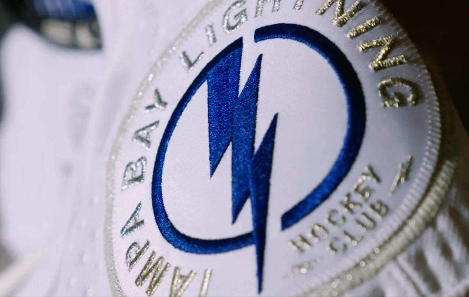
On the plus side, Tampa’s shoulder patch looks really good:
I do think the Lightning jersey might look better in the context of the full uniform, but there’s no way to know for sure because they didn’t bother to show us the full uniform. Sigh.
#NewProfilePic pic.twitter.com/YUmIhSybau
— Taijuan Walker (@tai_walker) December 2, 2021
The shadow knows: As noted in yesterday’s Ticker, all the player headshots on MLB.com roster pages were scrubbed and replaced with plain silhouettes when the MLB lockout began two nights ago (a move that the owners say was done out of legal necessity, not as a form of trolling). Lots of players responded yesterday by using the silhouettes as their new social media avatars, which is pretty funny. Additional details here.
In addition, MLB.com has stopped publishing new articles about current players and is instead leaning heavily on content about team history. This is all part of the brave new world of labor strife in the internet era. Stuff like this never came up before because there was no MLB.com back in 1994, which was the last time baseball had a labor impasse.
Interestingly, however, the official MLB retail channels are still selling jerseys with players’ NOBs. According to Cardinals beat writer Derrick Goold, that’s because merchandising is covered by licensing agreements, not by the now-expired collective bargaining agreement.
Speaking of merchandising: You can buy a plain player silhouette T-shirt, wheee!
And then there’s this, which I’ll leave as the last word on this topic (for now):
New Lockout Edition of @MLBTheShow 22 leaked pic.twitter.com/f02jP3Dgbg
— Kasabe_ (@kasabekompiles) December 2, 2021
(My thanks to Marcus Hall for that last embedded tweet and our own Anthony Emerson for the T-shirt link.)
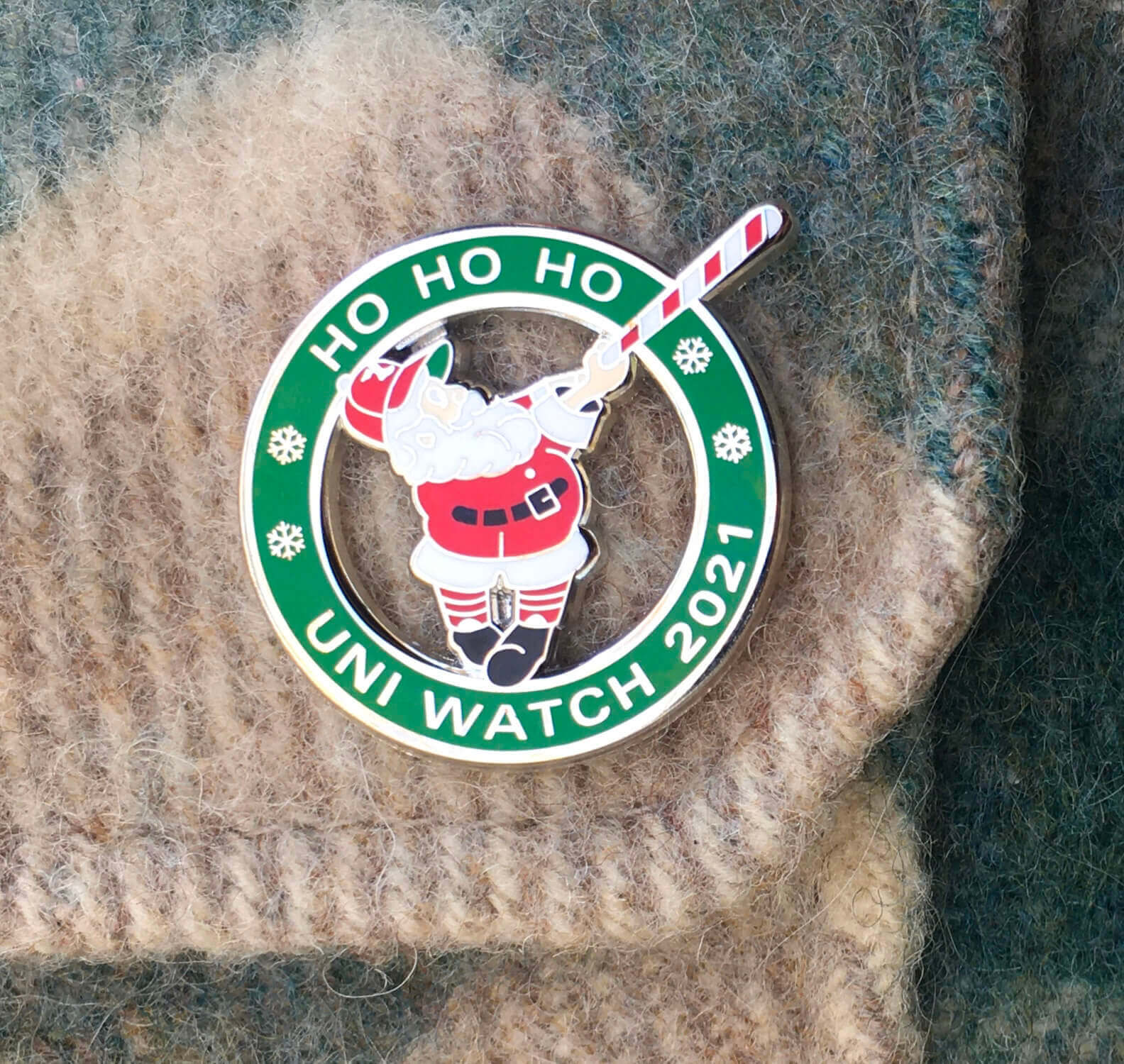
Click to enlarge
December pin almost gone: In case you missed it on Wednesday, the Uni Watch Pin Club’s December design is now available. As you can see above, it’s a swingin’ Santa with a candy cane-striped bat!
It was difficult to photograph the silver highlights while also showing Santa’s proper skin tone. Here’s another view (click to enlarge):
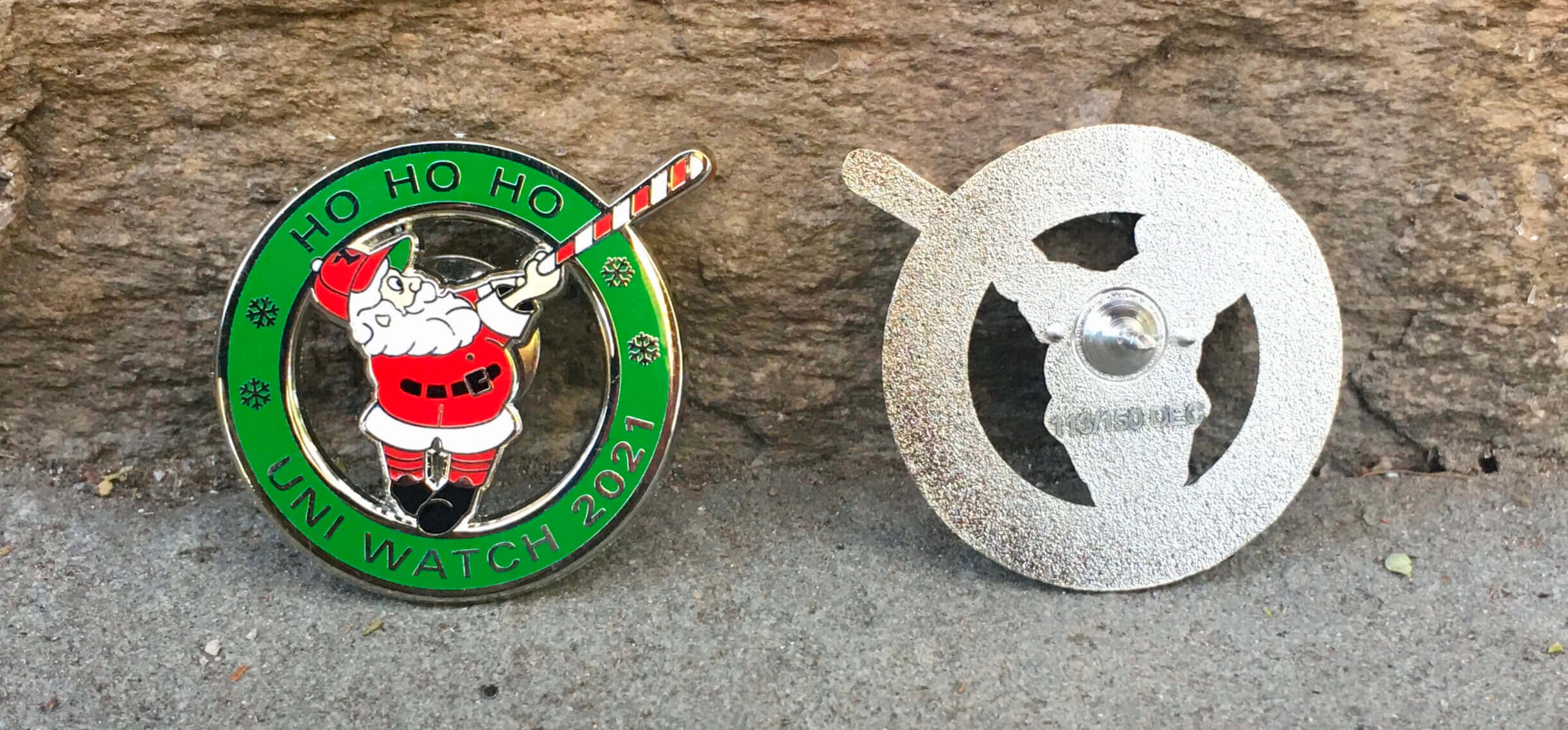
This pin was produced in a numbered edition of 150. As of this morning, there were only eight remaining, so this one will likely sell out today. Move fast if you want one!
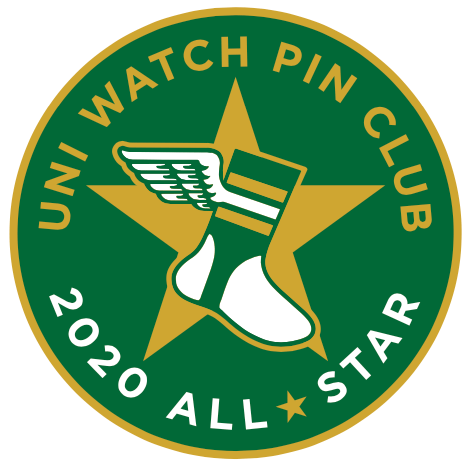
Also: As you may recall, everyone who collected all 12 of last year’s pins received a bonus “2020 All-Star” pin. We’ll be doing a “collect ’em all” bonus pin this year as well, but we need to know how many of them to make. So if you’ve collected ’em all, please email me with (a) your name and address, and (b) proof that you’ve collected all of this year’s pins. The proof can include photos of the pins themselves and/or order-confirmation emails from Teespring. The bonus pins will ship out early next year.
And speaking of things that will likely sell out, we’re down to the last few Uni Watch Alternate Caps. Here are the sizes and quantities remaining:
7-1/8: 1 cap
7-5/8: 2
7-7/8: 1
Photos and ordering details here.
ITEM! Call for new AMA questions: As you may recall, the series of posts that I used to call “Question Time” (you can see those 11 entries here) is now known simply as “Ask Me Anything.” The first entry under the new rubric ran on Bulletin a few months ago, and I plan to keep doing new AMA segments on Bulletin every three or four months, which means it’s time to ask you folks to submit new questions.
You can ask me a question about Uni Watch, about uniforms, about sports, or just about me. No question is out of bounds (it never hurts to ask!), but I reserve the right not to answer questions that I feel are too personal or otherwise inappropriate. Send your questions here (note that this is not the usual Uni Watch email address), and please stick to just one question per person. Thanks!
The Ticker
By Anthony Emerson

Baseball News: The new owners of the Springfield Sliders of the United States Prospect League are rebranding the team to a yet-to-be announced identity (from David Dahl). … Speaking of team renamings, the Highline Bears, a Seattle-area summer collegiate team, will now be known as the DubSea Fish Sticks.

NFL News: If the Broncos and Bears had a baby, it might turn out like this hat. Tyler VanDenRostyne spotted that at Ross. … I know we’ve covered this before, but it’s always weird to see Ricky Williams’s FNOB during his stint in New Orleans (from Kristian Nicosia).
College/High School Football News: Michigan will wear a patch memorializing the victims of this week’s Oxford High School mass shooting for the Big 10 Championship (from multiple readers). … New front helmet bumper for Virginia Tech (from Andrew Cosentino). … Here’s this weekend’s uni combo for Appalachian State (thanks to all who shared).

Hockey News: Kyle Konin, the emergency backup goalie for last night’s Blues/Bolts game, was assigned to the Blues but wore Lightning pads and pants (from Wade Heidt). … A New Jersey brewery is poking fun at the Devils’ new “Jersey” jersey with a “Beer” beer (from Ed Kalas). … The WHL’s Regina Pats will wear a one-off gradient jersey this Saturday (from Wade Heidt). … New BFBS unis for Quebec’s Concordia University women’s team (from Trevor “Teebz” Alexander).

College/High School Hoops News: The 2023 Men’s Final Four logo has been revealed (from Ignacio Salazar).

Soccer News: The Museum of Jerseys blog has a fascinating new post about outfield kits that looked very similar to keeper kits (thanks, Jamie). … Reader @GoDarkHorse noticed that Brentford keeper Álvaro Fernández wore spiked gloves during yesterday’s match against Tottenham. … Brazilian side Cruzeiro have had their new home kit leaked (from Trevor Williams). … New children’s hospital-inspired shirt for Italian side Parma (from Steve Kriske).
And that’s a wrap for this week. This is the part where I’d normally say, “Enjoy Phil’s weekend content,” but I can’t say that this time because Phil’s taking a well-deserved weekend off to compete in a curling bonspiel. So the site will be closed for the next two days, but I’ll be back as usual on Monday. See you then! — Paul
Good luck Phil!
I was just thinking yesterday about how I hate pretty much everything about the Predators’ identity (uniforms, colors, logo, the name itself) and this certainly doesn’t do anything to change that.
If the Predators removed the Smashville thing that would have been a decent jersey. Maybe make the Tennessee logo a bit bigger in the middle.
The funny thing is, if the NHL had actually hired Hatch Show Print (on whose iconic typography style the Preds’ jersey is OBVIOUSLY based) to design the Nashville jersey, they probably would look at 100x better.
It’s a big swing, and to some extent as a designer I can appreciate that…but still, a miss.
Plus, “Smashville”…..ugh.
Came here to make the same observation. That type just screams HATCH! See this example.. link
Great call Ron and Rob. Came here to make same point.
those spiked goalie gloves are Predator Pro Gloves by adidas. i only know because my kid plays soccer and we get many catalogs. they make Predator cleats with the spikeys on them which are supposed to help with accurate kicking somehow? seems like they did the same thing to sell some goalie gloves.
“Demonskin knit backhand. Protrusions in the punching zone interact with the ball’s surface for increased control and power.”
Probably a good thing that they don’t make boxing gloves.
We did not see the full uniform, but it looks like the Lightning will have a large version of their logo plastered on the side of the pants.
link
Lightning could have borrowed from the 1970s QMJHL Chicoutimi Sagueneens and went with the massive lightning bolt on the chest.
link
link
Yeah that Nashville sweater is probably the worst NHL sweaterI have ever seen. Brutal. Embarrassing.
Worse than the Lightning’s current black alternates? Is that even physically possible?
Those Stadium Series jerseys are a) fun, and b) less than 25 years old, so of course everybody hates them.
Some may find them “Fun”, but bad design is bad design. Has nothing to do with how new/old the designs (or those commenting) are.
Dear Predators / NHL / Adidas –
Next time try doing an internet search for “kerning for dummies” first. It’s free!
Sincerely,
Every sports fan ever
In my mind, both of these jerseys commit the rare double sin of being both too bizarre AND too simple. It’s not easy to be both garish and boring at the same time, so congratulations, I guess?
In more precise terms, the problem here is that both jerseys are quite minimalist in terms of the actual number of different design elements. But the few elements that do exist are obtuse and aesthetically unappealing (which is a nice way of saying everything is just too damn big).
I would say the Preds have the lesser of the two evils here, since theirs is at least generally symmetrical. But I have to give both of these low marks overall.
It seems like in the last 20 years that pro sports leagues, in the effort to be different and (sell merch) have sometimes forgotten that these uniforms are going to be worn by professionals at the very top of their sport.
Also, I’ve never particularly cared for the nickname of a nickname, “Bolts”. It always reminds me of the things sticking out of the neck of the Frankenstein monster. Now if you just put his head on your jersey with some little lightning bolts coming off of the neck bolts, you might have something.
Call me crazy, but I kind of like the Smashville one, as a crazy one-off uniform. It might as well say POW; it’s a punch in the face.
The bolts? Please stop using that word. It’s lousy, and looks dumb. I think they should have gone wilder, and had the top half of the jersey mirror the bottom half, so that the front is just a giant white lightning bolt through a blue background. THAT would be eye-catching, unique, and definitely not wearable more than once.
Agree with your take on lightning.
Why not use a a tri-color design. Blue-white-silver or back to their blue-white-black and creating a jagged white “bolt-like sash” diagonally across the whole thing? If it could be done properly and with caution to not turn into terrible mid-90s basketball styling like the Cavs or Kentucky or Villanova (Kerry Kittles years)
Dang, not even a mention of last nights Cowboys vs. Saints game? That was one of the better uni-matchups this year IMO. Silver and navy vs. gold and black creates great contrast and if the Saints had worn their black striped throwback socks it would have been the best uni-matchup this year in my very biased Cowboys homer opinion.
I’m not a fan of the Cowboys going blue-over-white (also, I’m not a Cowboys fan).
Love the interview with the unofficial NHL uniform database man! Don’t think I ever knew his name so I love having a name and face for the website!
I meant to have this earlier in the day but was delayed by tech issues: My latest piece for Bulletin is an interview with NHL Uniform Database founder/editor Andrew Greenstein!
Check it out here:
link
Anyone else feel like the school shooting memorial patch is only serving to normalize the horror of gun violence that continues to plague our country and especially our youth? Maybe some of those millions in football money could go to mental health or toward securing our schools. Nah, that’s no fun.
No.
Yes.
The patch seems to memorialize only one victim (the one who played football) while the others are merely given a token symbol of remembrance. A nice gesture but terrible design.
New cycling kit season, team ineos released their latest look
link
Not a Tampa resident, so I have no idea. But does anyone actually call the hockey team the “Bolts” unironically? From my outside perspective, it just reeks of trying to make Fetch happen.
But as bad as that is, the Preds somehow take it to another (worse) level. That is a laughably bad sweater.
As far as being “one offs” or tying into the Stadium Series “fun” theme, just because it’s a special occasion or even a one-time occasion doesn’t mean they have to look cringe-inducingly stupid. Try harder.
Then again, it’s the NHL. They could screw up jelly on toast.
When I think of “Bolts” I think of trying to screw something together (e.g., Nuts and Bolts). In this case, maybe trying to screw up a uniform design?
I’ve lived in the Tampa area for eight years, and yes… the team is the “Bolts” in casual conversation 90% of the time. In fact, I would say that nickname is so common, it actually feels a little weird to refer to them as the “Lightning”. I wouldn’t be surprised if there are some more casual fans out there who think “Bolts” is the team’s actual given name. It’s what nearly everyone calls them.
And let’s be honest, it’s a lot less stupid than some other nicknames I could think of. I’m a Pittsburgh guy myself, and I call my team the “Pens”… like I could write with them if I wanted to.
I think it’s endemic of our culture, to use as few syllables as possible when possible. A lot of teams get referred to by single-syllable nicknames.
[Red] Wings
[Maple] Leafs
[Golden] Knights
[Black]Hawks
[Hurri]Canes
[Ca]Nucks
[Co]Yot{e}s (e silent in “Yotes”, usually spoken in “Coyotes”)
Pen[guin]s
Pred[ator]s
Sen[ator]s
Cap[ital]s
Isl[and]e[r]s
Av[alanche]*s* (“Avs” pluralized, “Avalanche” non-pluralized)
I think there was one time where someone tried to make “Ning” happen for the Lightning, but that just doesn’t sound good at all, so I can understand going with “Bolts” as an alterative. In a way, they’re like the Canadiens, a.k.a. the Habs (though why anyone thought to use the diminutive of the nickname for French colonial farmers to represent a hockey team named for their country is beyond me).
Not sure if you’re being ironic about “Habs,” so I’ll stick my neck out. The received wisdom I got as a kid in flyover country decades ago is that it’s short for “les habitants,” or “the locals.” Heck, you could be right, though.
Thanks Daniel. Today I learned. If the locals are happy, that’s what matters. Get yer “Bolts” on!
I would say in that case that I am just not a fan of team “nicknames” on unis in general. Remember the SNES (Senators) jerseys? God those were bad.
If the Lightning had just enlarged the shoulder patch to chest-size and used that in lieu of the “Bolts” that would have been really nice. I’m kind of surprised they didn’t take the “Bolts” and turn it into “Boltz” because that would be really “cool”.
MLB.com actually did exist in 1994. Ironically, it was the website for a law firm. If one wanted to check out baseball scores and stats they would have to type out majorleaguebaseball.com
I think this changed around 2000, perhaps MLB bought the domain name.
If we’re going to obsess about which directions apostrophes face, can y’all please indulge me for a second?
It’s incorrect to refer to the Lightning (or the Bucs, or the Rays, or the Rowdies) as “Tampa” on second reference (or any reference).
You would never write the following sentence: “The Tampa Lightning will play the Nashville Predators tonight.”
More than 90 percent of the Bay Area’s population (of which I was once one) does NOT live in the city of Tampa, and our teams represent the entire Hillsborough-Pinellas-some-of-Polk-and-Pasco-and-maybe-others-if-you-squint area. Referring to them as “Tampa” is incorrect and irritating.
(The corollary is people who seem to think “Tampa Bay, Fla.” is a place, like with a ZIP code that you can actually put on an envelope, should you choose to do that twice a year. It’s not. Tampa, Fla. is a place. Tampa Bay is a body of water. The Lightning plays IN Tampa, but you should never refer to them as “Tampa.” NBC Sports did that nonsense for however many years they had the NHL and it’s just beyond lazy.)
Oh, and, yes, we call them the Bolts, in the same way that every team and every stadium in America gets somehow reduced to as few syllables as possible (preferably one). I loved the old third jerseys that said “BOLTS” on them, not so much because I cared about the actual jerseys, but because it made people’s heads explode here.
This has been a public service announcement.
So then we should start calling them the San Francisco Bay 49ers since they play 45 miles away from SF in Santa Clara.
The 49ers don’t even play in the San Francisco metropolitan area, as defined by the US Census Bureau, much less San Francisco proper. So yes, their name as it stands now is inaccurate. But they still represent San Francisco in a sense (especially with the Raiders gone), and changing their name to the Santa Clara or San Jose 49ers would take some getting used to.
Tangential to this point, a fun exercise is to list major-league sports teams who have played in multiple metropolitan areas without changing their name. The 49ers are one (San Francisco and San Jose), as are the Carolina Hurricanes (Greensboro and Raleigh), Tennessee Oilers (Memphis and Nashville), and a few others.