Good morning! Welcome to the first day of the final month of the year.
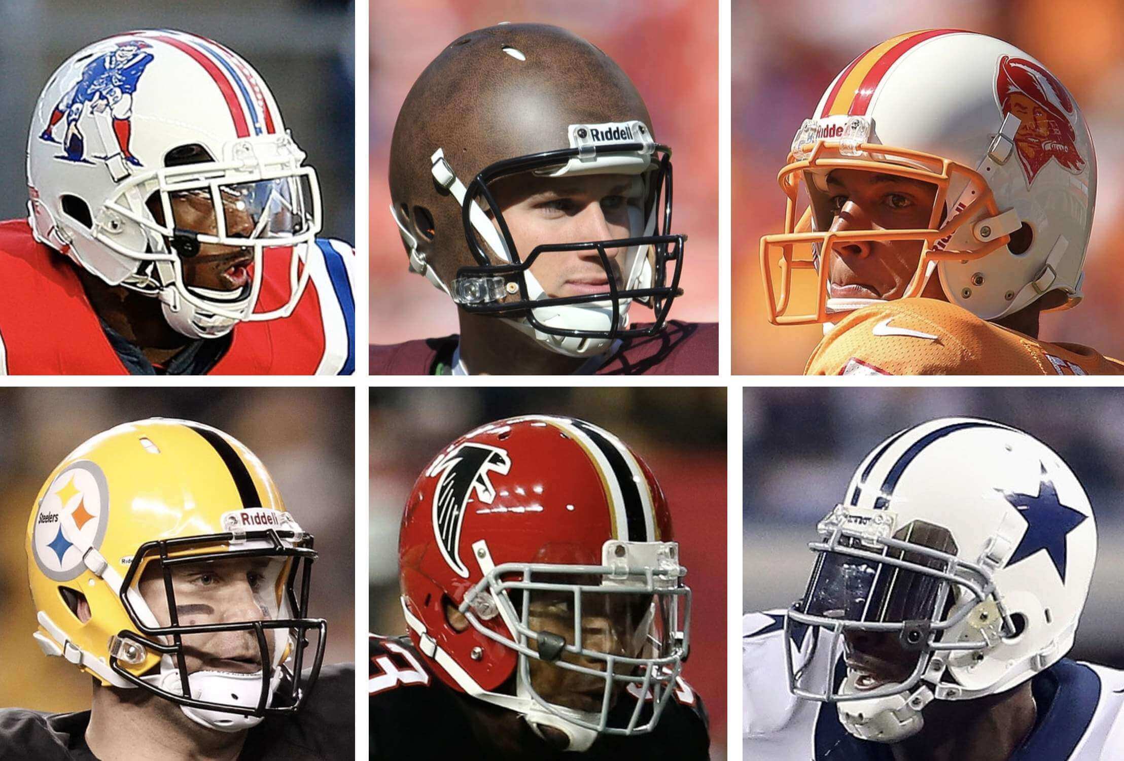
Now then: As we all know by now, the NFL will be lifting the one-shell rule next season, which means we’ll start seeing throwback and alternate uni designs that have been impossible since the rule went into effect in 2013. But how many teams will take advantage of the new state of affairs, and what sorts of designs are they thinking of adding to their helmet rotations?
The other day I got the answers to those questions — or at least some initial hints — from a source who recently had some discussions with one of the major helmet manufacturers. In the spirit of Watergate source Deep Throat, I’ll call my helmet source Deep Shell. Here’s a transcript of a short interview I recently did with him, edited for length and clarity:
Uni Watch: When you were interacting with this company, they told you some things about NFL teams adding alternate helmets, when the one-shell rule is lifted next season, is that right?
Deep Shell: Correct.
UW: Did they say how many teams would be adding a new helmet next year? And if so, did they mention any specific teams that would be on board?
DS: They said it was about 15. I tried prying at least a couple of teams out of them — I specifically mentioned the [redacted], because they’re my hometown team — but they didn’t mention any team names.
UW: Fifteen teams — so that’s about half the league, which is a little surprising, because you’d think that more teams would be on board.
DS: Teams didn’t have much time. The window from when the NFL announced that the rule would be lifted to the deadline for submitting a new design for next season was relatively small.
UW: So even if there are only about 15 teams adding a new shell color in 2022, there could be a lot more in 2023?
DS: It could work out that way, sure.
UW: Did they mention any specific teams that would not be on board?
DS: They said possibly the Raiders, just based on their previous interactions with that team. They said even for merchandise stuff, like when they do white mini-helmets for every team, the Raiders won’t do it. One guy actually said, “Mark Davis believes that he invented the color silver.”
UW: Did they mention anything about specific throwback designs like, New England bringing back Pat Patriot or Tampa bringing back Bucco Bruce?
DS: No. I would assume those are some of the ones [that we’ll see], but they didn’t specifically mention them.
UW: What about possible alternate helmets — any mention of possible designs that could be in the mix?
DS: No. Except for the Raiders, they really didn’t get into specifics.
UW: Did they say anything at all about Nike’s role in all of this?
DS: Well, some of the helmet designs may be coming from Nike, so they [the helmet company] have to be in touch with them to produce these new designs. But they didn’t say anything beyond that.
UW: You mentioned earlier that the helmet manufacturers produce mini-helmets and other helmet-related collectibles. Does that factor into the thinking regarding what the teams will wear on-field? Like, if you have a hydro-dipped design, or some crazy gradient, or whatever, is that harder to reproduce at the retail-collectible level, and then does that factor into the thinking of what gets worn on-field?
DS: Yes, absolutely. They have several levels of collectibles — first there’s the helmet version of an authentic jersey, just like the players wear. Then there’s the helmet version of a lower-priced replica jersey, so it’s the same size as the authentic but it doesn’t have the same level of padding and stuff like that. Then there’s mini-helmets, and then there’s the one like you would get out of a gumball machine.
UW: So as the designs get more complex, it’s more complicated and expensive to reproduce those?
DS: Yeah. And you’re not gonna be, like, hydro-dipping something that’s so small, right? That’s an expensive process. So the issue becomes, how do you replicate that so that all four of them [the retail collectibles] look the same in terms of color, finish, and so on.
So that factors into the process. They see all the design concepts that people are posting on the internet and submitting to your website. But a lot of those designs just aren’t feasible. Even if you could make it happen on the field, you couldn’t replicate it at scale for merchandise.
———
And there you have it. I realize it’s frustratingly short on specifics, but we do have three main takeaways:
• We should expect only about half the league to have alternate shell colors next season.
• We should not expect the Raiders to be one of those teams.
• We probably shouldn’t worry too much about wackadoodle alternate designs, because those would be difficult to reproduce at the retail level.
If anyone has more info next season’s helmets, you know what to do.
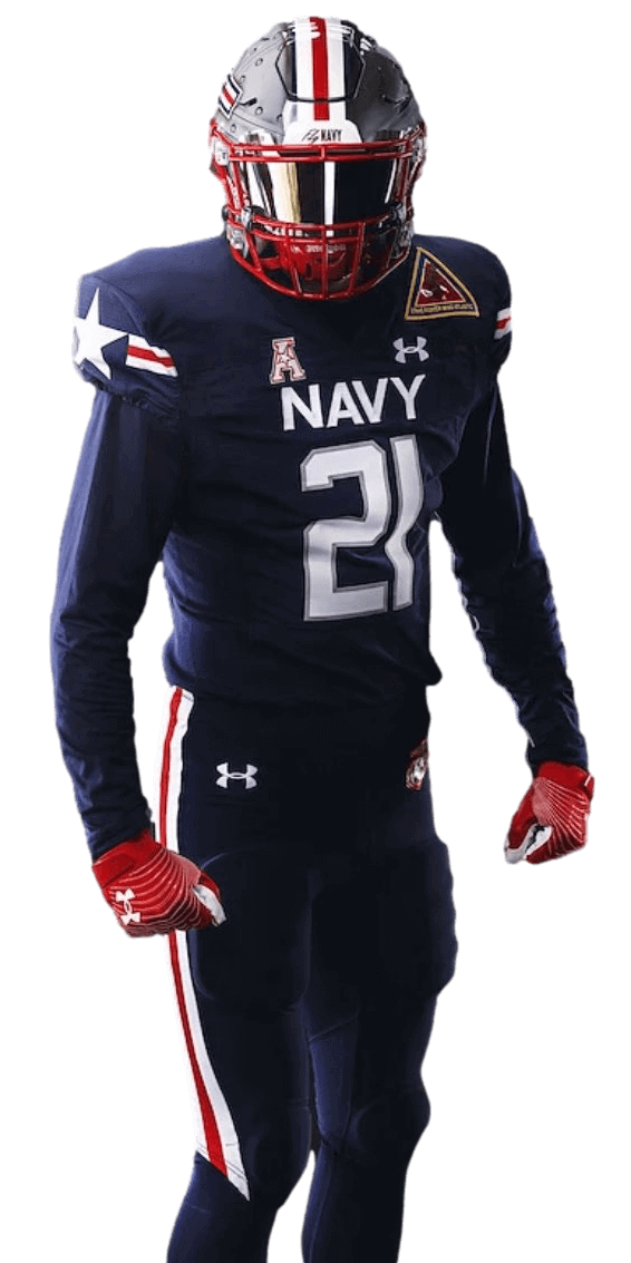
Navy uni reveal: With this year’s Army/Navy game coming up a week from this Saturday, Navy have unveiled its uniform for the big game. The design is a shout-out to the F/A-18 Super Hornet fighter plane. Additional info here.
In case you missed it in yesterday’s blog post, Army has unveiled their uni for the game as well. So that gives us the following uni matchup:
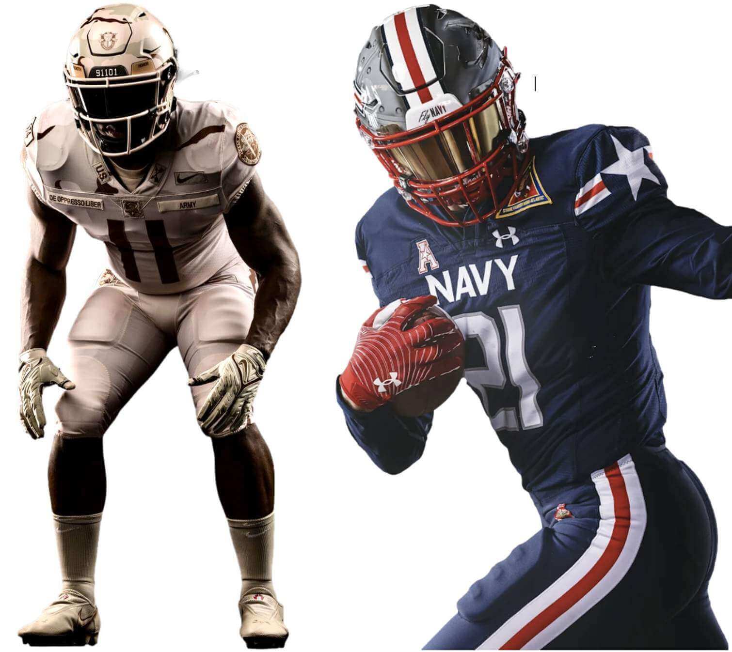
Click to enlarge
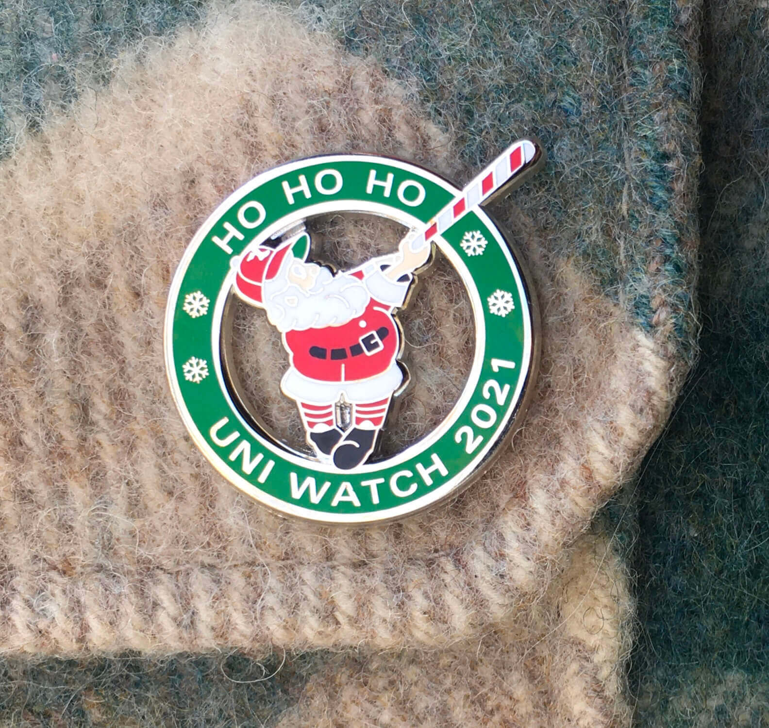
ITEM! December pin launch: Today is the first day of December, which means it’s time for our final Uni Watch Pin Club release of the year. As you can see above, it’s a swingin’ Santa with a candy cane-striped bat!
It was difficult to photograph the silver highlights while also showing Santa’s proper skin tone. Here’s another view (click to enlarge):
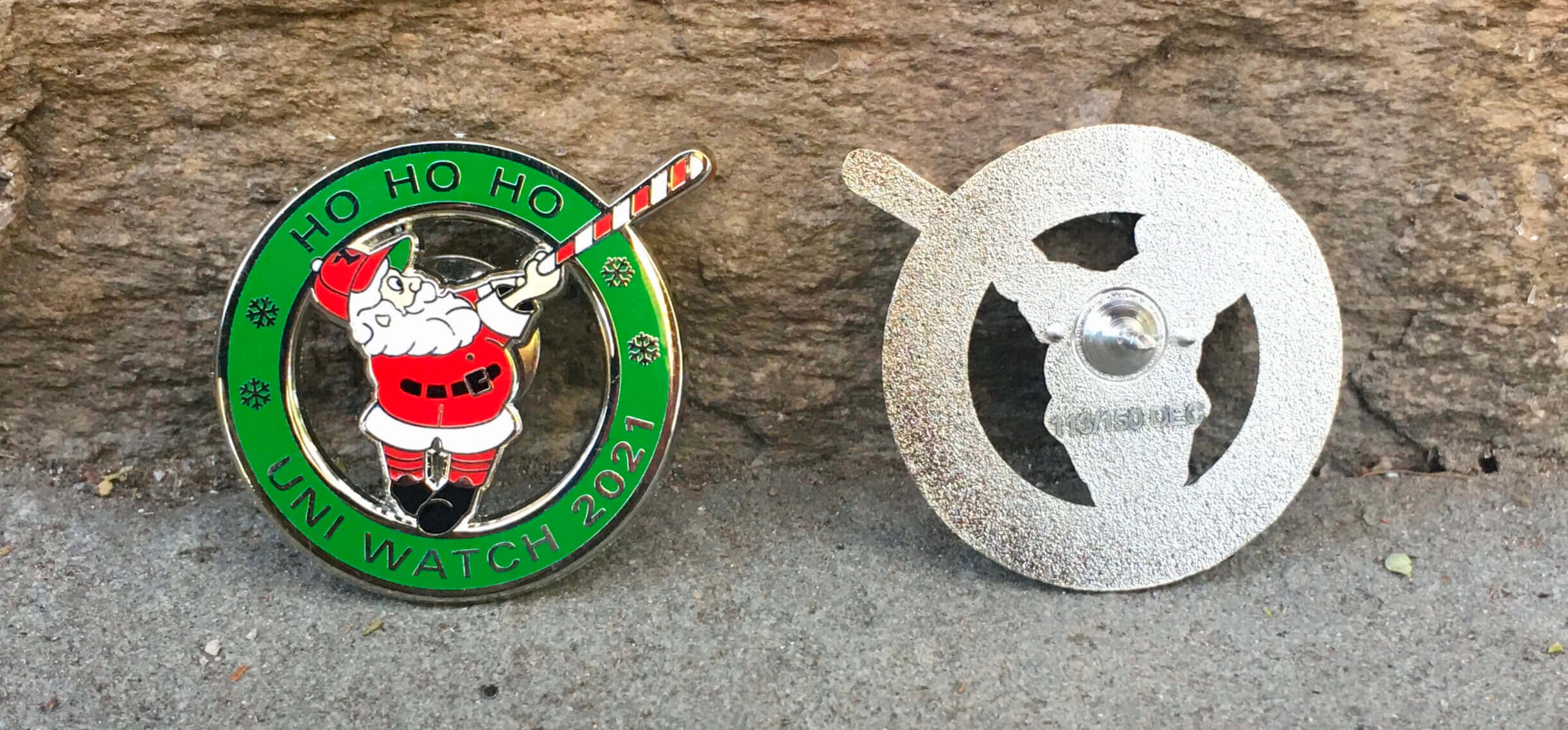
This pin was produced in a numbered edition of 150. It’s available here. (Need to get caught up? Here are our January, February, April, May, June, July, August, September, and November pins. Sorry, March and October are sold out!)
Also: As you may recall, everyone who collected all 12 of last year’s pins received a bonus “2020 All-Star” pin. We’ll be doing a “collect ’em all” bonus pin this year as well, but we need to know how many of them to make. So if you’ve collected ’em all, please email me with (a) your name and address, and (b) proof that you’ve collected all of this year’s pins. The proof can include photos of the pins themselves and/or order-confirmation emails from Teespring. The bonus pins will ship out early next year.
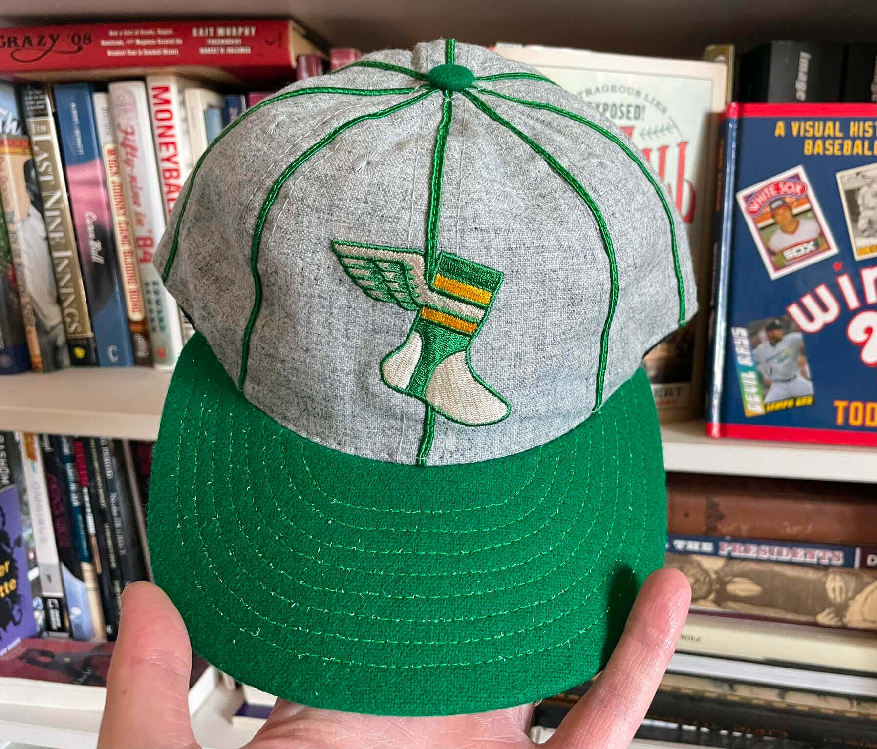
Cap inventory update: Supplies of the Uni Watch Alternate Cap continue to dwindle. Here are the sizes and quantities I have remaining:
7-1/8: 1 cap
7-5/8: 2
7-3/4: 1
7-7/8: 2
Ordering info and additional photos are available here.
Click to enlarge
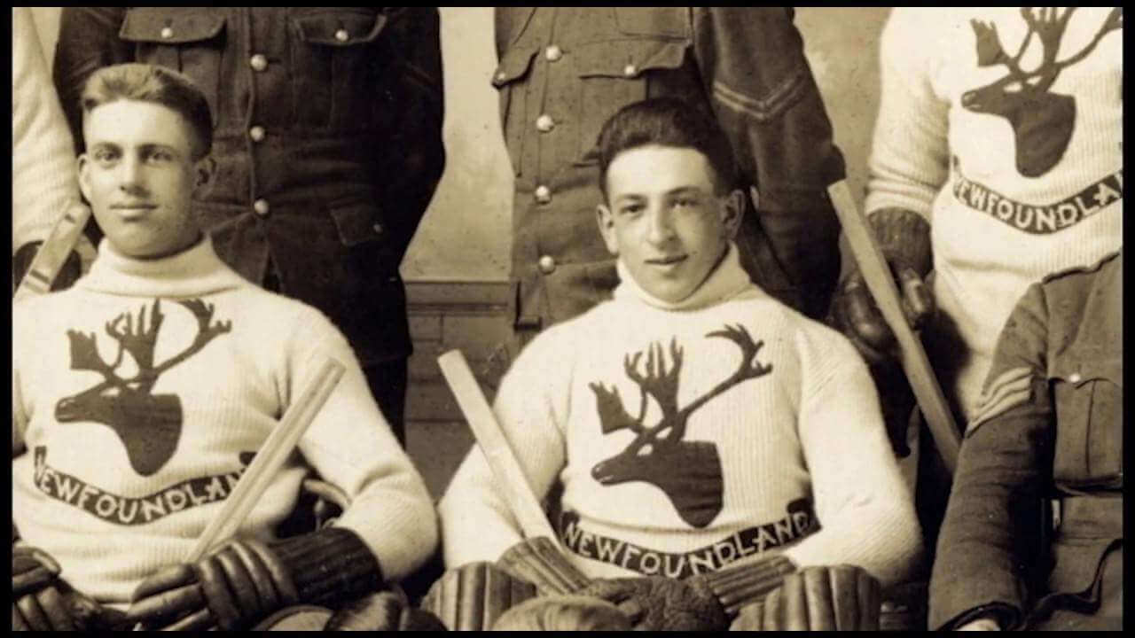
Too good for the Ticker: Oh baby, look at the amazing sweaters (literally) worn by the 1917 Royal Newfoundland Regiment hockey team. Additional info here and here.
(Big thanks to Brandon Weir for this one.)
The Ticker
By Lloyd Alaban

Baseball News: Newly signed Blue Jays P Kevin Gausman has worn No. 34 as a tribute to former Jays P Roy Halladay (from Wade Heidt). … Per the Mariners’ roster page, newly acquired P Robbie Ray and INF Adam Frazier will wear Nos. 38 and 26, respectively (from Tim Dunn).

Football News: Black jersey and white pants for the Bengals this week (from @Jacobt66). … For the state costume competition at this year’s Miss USA pageant, Miss Ohio wore a stylized Ohio State uniform that also featured a Cincinnati Bearcats logo on one side of the helmet (from Kary Klismet). … St. Francis Academy in Baltimore has managed the neat trick of poaching both the 49ers’ and San Francisco Giants’ logos (from Carlos Montalvan).

Hockey News: The Wild have announced that they will retire Mikko Koivu’s No. 9. Koivu will be the first Wild player to have his number retired (from Wade Heidt). … Might be the lighting, but do the Wild have inconsistent shades of green for their helmets? (From John Muir.) … When the Lightning are on the road, they bring along a small carpet with their team logo, which they put inside their visiting locker room (from Bobby Fenton). … A Maple Leafs mega-fan has a serious memorabilia collection (from Andreas Papadopoulos).

Basketball News: Numerologist Etienne Catalan has the latest in NBA uni number assignments. … The Texas men’s team played a “students only” home game on Monday night at Gregory Gymnasium, the program’s former home arena prior to the opening of the Erwin Center in 1977 and the current home of Texas’s women’s volleyball team (from multiple readers). … An inactive player on Ohio State’s bench was wearing an Ohio State hockey jersey last night (from Ryan Cotter).

Soccer News: New crest for Mexico’s national team (from multiple readers). … From our own Jamie Rathjen: Germany’s women’s team has players wear a small patch when they reach appearance milestones. This one is for MF Melanie Leupolz, who hit 75 caps.

Grab Bag: F1 drivers’ names have been rendered in Arabic calligraphy for the first time ahead of the Saudi Arabia Grand Prix (from @bryant_rf). … The National Lacrosse League’s Halifax Thunderbirds will wear orange jerseys at Saturday’s home opener (from Wade Heidt). … U.S. Air Force pilots might be getting new helmets for the first time since the 1980s (from Timmy Donahue). … New home jersey for the New Zealand rugby league team Vodafone Warriors (from Allan Jennings). … Nebraska AD Trev Alberts wants the school’s various sports uniforms to have more uniformity (from Gil Neumann).
Happy birthday to our own Anthony Emerson, who produces the Tickers that appear on Fridays and Saturdays. Enjoy your special day, Anthony! — Paul
Those Fly Navy helmets with the F/A-18 are the coolest helmets in football history.
No doubt. I have to root for Army (long family line) but Navy is going to make it real hard.
The Navy Uniform color scheme looks like what the Patriots should have done with the Color Rash Blue getup.
Go Army.
This Navy set is remarkably similar to the what the Patriots wore last Sunday. I’d say Navy basically improved the Patriots uniform with better stripes, stars and logos but the colors of the helmet, face mask, jersey and pants are all the same. And for the millionth time, socks need to be a different color than the pants. Why is this so difficult to understand?
If there’s one team on the planet I’m ok with pairing navy pants with navy socks…it’s Navy.
The December pin design is sweet. Would love to see it on a UW shirt next holiday season.
Santa looks like the Swinging Friar. Nice.
Yeah, excellent job (as usual) with the pin design this month.
Just off the top of my head, here’s what we might see with the added helmet colors –
Atlanta – red
Buffalo – red
Cleveland – white
Dallas – white
Green Bay – faux leather
Los Angeles C. – blue
New England – white
New York J. – white
Philadelphia – white
Pittsburgh – yellow
Seattle – silver
San Francisco – silver (a long shot I’ll admit)
Tampa Bay – white
Tennessee – white
Washington – faux leather
Eagles would probably be doing a kelly green helmet. They’ve been wanting to bring back that look due to fan demand for years. Of course they could simply ditch their drab green design and go back to it full time, but refuse that option.
I hope you are right and they go with kelly green instead of the yellow Frankford Yellow Jackets throwback.
I am definitely hoping for a silver Seahawks helmet!
Looking forward to the original blue and green uniform.
I’m holding out hope that Denver does some kind of throwback sky blue helmet. The modern navy is an eye sore
Those are all good guesses but I think Denver (royal blue) is more likely than San Francisco (silver), and agree that Philly is more likely to do kelly green than white. I also think the Rams are more likely to do a navy throwback than Tennessee is to do a white one. Cincinnati is also a candidate for a white alternate.
Seriously hoping that the Jets do a white-helmet throwback to pave the way for bringing the classic look back full-time in 2024.
Come on, Tennessee…give me the ’73-’74 Oilers throwback I long for, complete with the blue helmet!
I’m on board with seeing the Bengals occasionally in head-to-toe white.
I think the Jets have gotten enough mileage out of the “classic” (aka, SB3) uniforms. A Sack Exchange throwback is long overdue; I’d rather see those return full time than yet another go-round with the Namath-era set (or something inspired by them).
I’ve always wondered why the Houston Texans didn’t try to buy the old Oilers name and motif from the Titans who clearly don’t need or want it anymore. More like the Ravens who were the Browns but the Browns name and look remained in Cleveland.
Anyway, I’d rather see the Texans do an Oilers throwback (need a white helmet of course) from the Warren Moon or Earl Campbell Oilers era. Oilers had a great looking uniform, and the Texans do not.
They already received permission from the Chiefs to use the Texans monicker. That’s enough of that.
“I’d rather see the Texans do an Oilers throwback…”
I don’t want to debate the whole “who ‘should’ get to wear throwbacks” issue, so I’ll just say before moving on that I strongly disagree and I’m glad the Titans ownership hold tight to their Oilers history whether they need or want to acknowledge it.
PS – I like the Texans uniforms. Maybe next season they’ll go with their abandoned white helmets.
I was about to recommend a USFL-style franchise swap of the Titans for the Texans, and then it occurred to me: Who needs the Titans? Go back to calling them the Tennessee Oilers.
I could see Cincinnati wanting a plain orange helmet to do a BENGALS throwback since their current stripes are painted on.
But I wonder why teams don’t use their existing shell for alternate designs. Denver does it for their D logo. Chicago adds striping and Cleveland adds numbers. Why not Dallas with their cowboy boot logo?
Why not do that 49ERS logo for one game? You know some of those alternate designs will be just as bad.
lots of agreement on those speculations. However,…
1 too many leatherheads. Keep the Pack in yellow, let WFT ‘own’ those fauxs.
I can envision the Saints going with black helmets much better than I can seeing the 49ers in silver ones(red, maybe?)
“Well, some of the helmet designs may be coming from Nike, so they [the helmet company] have to be in touch with them to produce these new designs. But they didn’t say anything beyond that.”
Preparing now for a handful of awful, non-throwback alternate helmets that Nike comes up with.
I think the poaching high school is link rather than a school in San Francisco.
Thanks. Will fix!
Typo in the update: “Baltimiore”
Crikey. Fixed!
+100 for use of the word “Crikey.”
That’s a great reminder of why they call them “SWEATERS”. I sure would love to see what a heavy sweater like that would look like for a modern team.
These sweaters were actually worn on ice!
link
Exciting with the one-shell rule being lifted but dangerous at the same time. The great part will be the ability to wear proper throwbacks. The dangerous part would be the teams doing something out-of-the-box or going with a home and road helmet of different colours that may not be well received. A slippery slope between being a great idea or becoming something fans may not like.
Interesting to note at this time the CFL has one-shell rule and no present announcement that the league will lift it. Though would think that may happen now if NFL has decided to do so.
Yes, that’s much more likely that white. My bad!
My reply was to the Eagles wearing Kelly green, but should also apply to Denver and their royal blue.
I might be the only one, but I do really like the new Mexico crest.
That “students only” game seems a bit exclusionist. Especially for a city like Austin.
Oh, come on.
Given the fact that Texas has been so cavalier about health and safety (a low vaccine rate and a high number of people who believe in “free-dumb,”) you had to know that UT was going to have to throw a bone to actual students instead of well-heeled corporate donors with links to the Abbott Administration
That pin is incredible! Can you make that into a t shirt??
Back in 2016, the St. John’s Ice Caps did a heritage jersey inspired by the Newfoundland Regiment sweater.
link
link
“We probably shouldn’t worry too much about wackadoodle alternate designs, because those would be difficult to reproduce at the retail level.”
A rare example of the retail tail (“re-tail”) wagging the on-the-field dog in a way that works out in favor of uniform classicists.
Pittsburgh Penguins bring back their most boring sweater design:
link
I don’t know why they feel the need to remove the Golden Triangle from the shoulder logos.
Yeah, as a Pens fan, I’m not real thrilled about their current love affair with the “PITTSBURGH” wordmark. It’s definitely not their best look. (Not their worst either, to be fair.) But what really gets me is that they insist on putting the skating penguin on it. They’re clearly avoiding Robo-Penguin on purpose, and I get that it’s not the fans’ favorite logo. But I grew up with it and loved it as a kid. So, for purely selfish reasons, I want to see it again.
I also agree with Rob about the triangle. It makes sense to remove it on a yellow jersey because the yellow-on-yellow looks silly. But in any other context, removing it just makes the logo look empty and lack contrast.
I thought their best sweater of that era was Robo-Penguin on the sublimated background.
That Texas basketball game was really confusing to watch, because it was played on the volleyball court, which kept its paint and lines
link
15 is more than then obvious ones. Hopefully we see some cool alternates.
Obvious Ones are all Throwbacks
Eagles – Kelly Green (they are the ones that have been pushing for this rule change for a while so they can wear these)
Cowboys – White
Atlanta – Red
Bucs – White
Seahawks – Silver
Patriots – White
Jets – White
Titans – Navy Blue
Broncos – Royal Blue
Chargers – Navy Blue
But I hope a lot look to the future.
Alternates I want to see!
Raiders in Black (sad it’s not going to happen)
Saints in Black
Panthers in Black
Jets in Black
Cardinals in Red
Patriots in Navy
Bengals in White
Jaguars in Teal
Titans in Light Blue
Chargers in Light Blue
Some I don’t want to see!
Colts in royal blue
Jaguars in Gold
Steelers in Yellow
Washington Leather
I wouldn’t put it past the Eagles to go BFBS just because they’re great at disappointing fans
Side Note: Forgot about the Vikings plum purple throwback helmet!
I made a quick chart of teams marked with green, yellow and red spots. I’ve quickly done this to the best of my knowledge, but I’m certain I’m missing something. Green meaning we’ve seen a different color in the recent past, red meaning no significant changes (or in the jags case, no reason to relive it), yellow being historical changes, but nothing that really resonates (Silver Niners/Blue Colts.)
Not counting new “Alt” variations or faux leather treatments, exactly 15 of them come up green. If we see classic throwbacks of those teams, I’d call it a success.
link
“Deep Shell.” That’s why we come back here every day, Paul. Great stuff.
Excited to see the Bengals new combo. Black jerseys with white pants with black stripes on pants (rather than the orange and black stripes). Small detail, but I think the one-color black stripes better match the jersey stripes.
…white pants with black stripes on pants (rather than the orange and black stripes)
Maybe Cincinnati should have tried black stripes and orange stripes on a white background.
If it’s a foregone conclusion the Jets return to their classic uniforms as soon as they are eligible, are the truncated shoulder stripes we’re likely to see considered a bug or a feature nowadays?