By Phil Hecken
Follow @PhilHecken
Good morning and Happy Saturday, Uni Watchers. It’s the weekend.
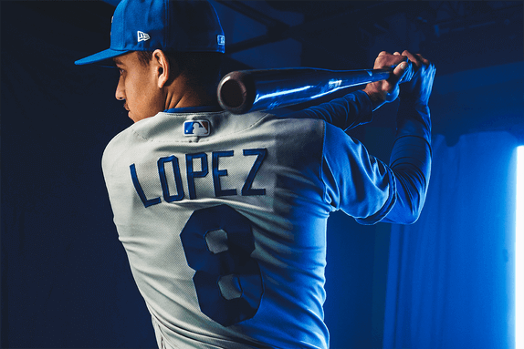
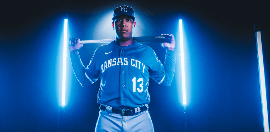
The uni hot stove is starting to heat up, and yesterday the Kansas City Royals became the first team to introduce new uniforms jerseys for the 2021 season. While they did promote the event a couple days prior on social media (“Nice Try”), I was wondering why the team would choose to drop new uniforms on a Friday, traditionally a “news dump” day, and if you guys were hoping for anything groundbreaking yesterday, like me, you were … I’m not sure “disappointed” is the right word here. Let’s just say the new uniforms look a lot like the old uniforms. And that’s not necessarily a bad thing.
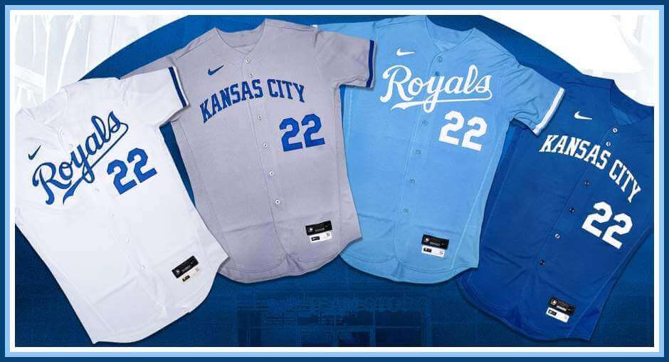
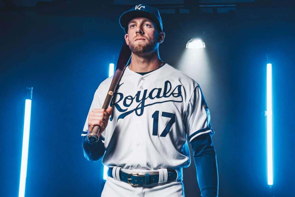
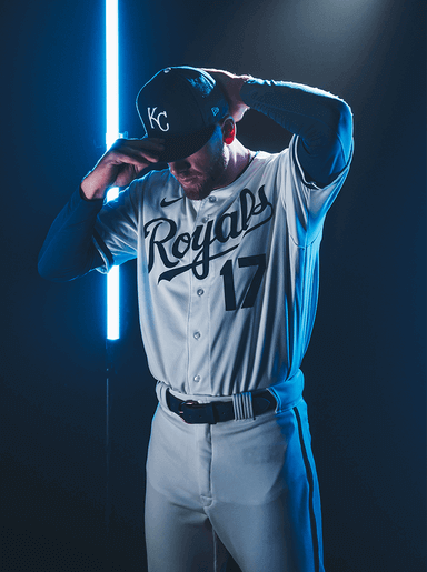
The team has not changed the caps at all (they’re still the classic royal with white interlocking “KC”) and for all intents and purposes, the pants (white and gray) are unchanged (only a slight change to the piping for 2022). Both the jerseys and pants are now on the Nike chassis. Despite the lighting on the photos below, all jerseys will retain the classic logo as a jersey patch on the left sleeve.
Four new jerseys were unveiled in all: a new “primary” home (aka “white”) jersey, an alternate home (powder blue), “primary” road (aka “gray”), and an alternate road (royal blue). That’s basically the same set of jerseys they had this past season, but each of the four has undergone at least a minor tweak, and in some cases, fairly major. Let’s look at them one at a time.
Primary Home
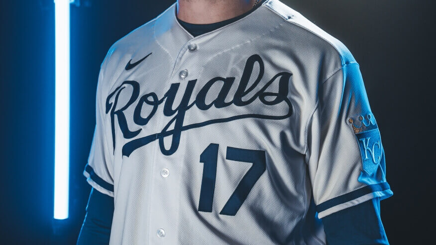
The 2022 home white jersey remains pretty much unchanged from this prior season. In fact, the only difference, and it’s barely detectable, is the royal piping on the jersey sleeve. In 2021 it was slightly smaller. For this coming season, it has been thickened a bit (and this feature will be consistent across the four 2022 jerseys).
It’s good they didn’t mess with this classic look.
Primary Road
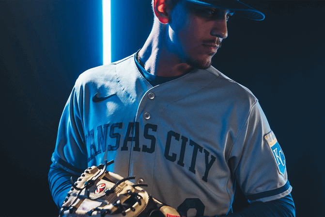
There are a few updates on the 2022 road grays. The first, and most obvious change, is the block vertically arched “KANSAS CITY” across the chest in solid blue letters (mimicing the style worn in the 1970s-80s). Their previous jerseys featured Kansas City in a script font, with the blue letters outlined in white. The white outline on the script as well as the numbers (front and back), and NOB, has been removed.
Like on the white jersey, the sleeve piping has been thickened, and the white piping has been removed (it has also been removed from the gray pants — a slight change for this upcoming season).
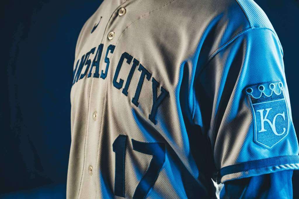
Perhaps it’s the lighting, because I’ve never been a fan of white outlining, but these new road grays look too plain without it.
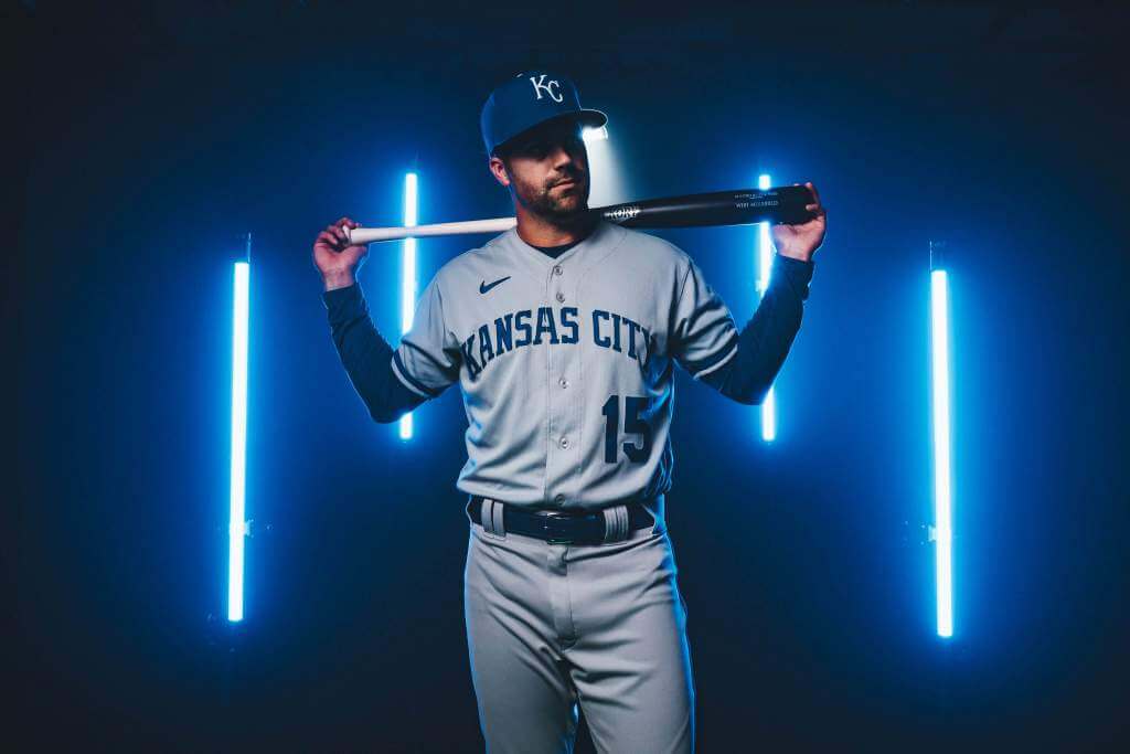
Let’s hope the Royals don’t look this drab on the field.
Primary Alternate
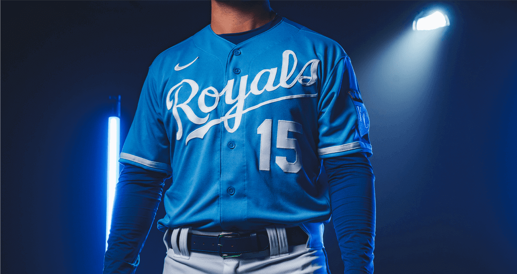
For me at least, the biggest surprise of the unveiling was the fact that the team did NOT add a pair of powder blue pants, which would have given them basically a throwback to the 1980s. Instead, the team will continue to wear the powder blue jersey with the home white pants. They have made several changes to the jersey as well.
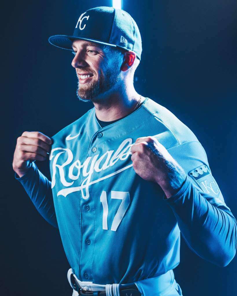
The most obvious change is the color of the front number. Where previously it was rendered in royal outlined in white, it’s now solid white. This is a welcome change reminiscent of their 1980s road jerseys. When the Royals reintroduced the powder blue jersey originally in 2008, that featured a royal blue script (outline in white) with a white number. The team updated that jersey in 2012, the colors were reversed. Now, they’re (finally) both white.
Another change is the outlining of the script and numbers. All outlining has been removed.
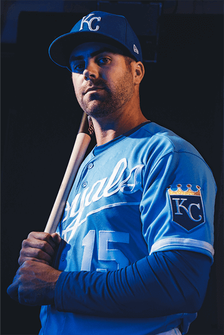
The sleeve piping is now solid white (and fits the template of the white and gray jerseys). Previously that piping was a thin white/royal braid. Unfortunately, I don’t have a photo of the back of the powder blue jersey, but NOB and numbers are both solid white. Previously they had been white outlined in royal.
I loved the Bo Jackson/George Brett look, so to me this is an upgrade, but fans of outlined numbers and letters probably will view this differently.
Road Alternate

Like the gray roadie, this jersey also features “KANSAS CITY” in vertical arching (and I can see a lot of you already cringing at how the placket bisects the “A”). This jersey has undergone the most change from the previous iteration. Not only is the KANSAS CITY mark new, it replaces the interlocking KC logo that had appeared on the left chest. Also gone is the white/powder headspoon piping (both the piping and the “KC” had powder outlining, which I never thought looked good, and wasn’t really visible except up close). Like the other jerseys, the sleeve piping has been thickened.
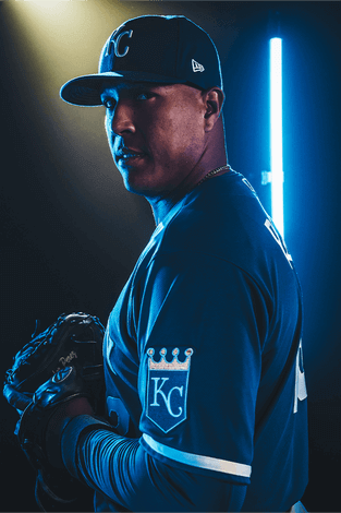
It’s tough to make out, but the back of the jersey features solid white NOB and number.
I’m not particularly fond of this one. First of all, other than being royal blue, it’s identical to the road gray in style — at least the previous jersey had the headspoon and KC logo to make it stand a bit apart. On the other hand, removing the superfluous powder outlining certainly makes everything pop enhances the contrast.
The team is calling these “An Ode to the Past — A Nod to the Future.” The obligatory hype video give some better views of the new outfits (and you can see Nike’s new fabric/material as well — it’s definitely got a “mesh” feel to it).
An ode to the past.
A nod to the future.https://t.co/ijL39IPB5j pic.twitter.com/dr2CMn82oC— Kansas City Royals (@Royals) November 19, 2021
All in all, the new Royal unis look a lot like the old Royal unis — and since the old Royals uniforms were definitely up there (I’d say Top 10), the new ones are pretty good too. I’d say the home white remains one of the finest looking unis in the game, and I think the upgrades to the powder jersey were great. On the other hand, making the road gray more staid (and basically making the royal alternate a color swap of the gray) was a minor downgrade. I actually prefer the block vertically arched “KANSAS CITY” to the previous script, but I may be in the minority there. I’m less of a fan of the royal road.
Obviously, we’ll need to see the uniforms on the field to get a true perspective on the redesigns. But what do you guys think of these? Upgrade? Downgrade? About the same? The board is yours…

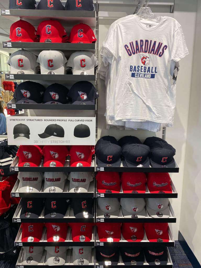
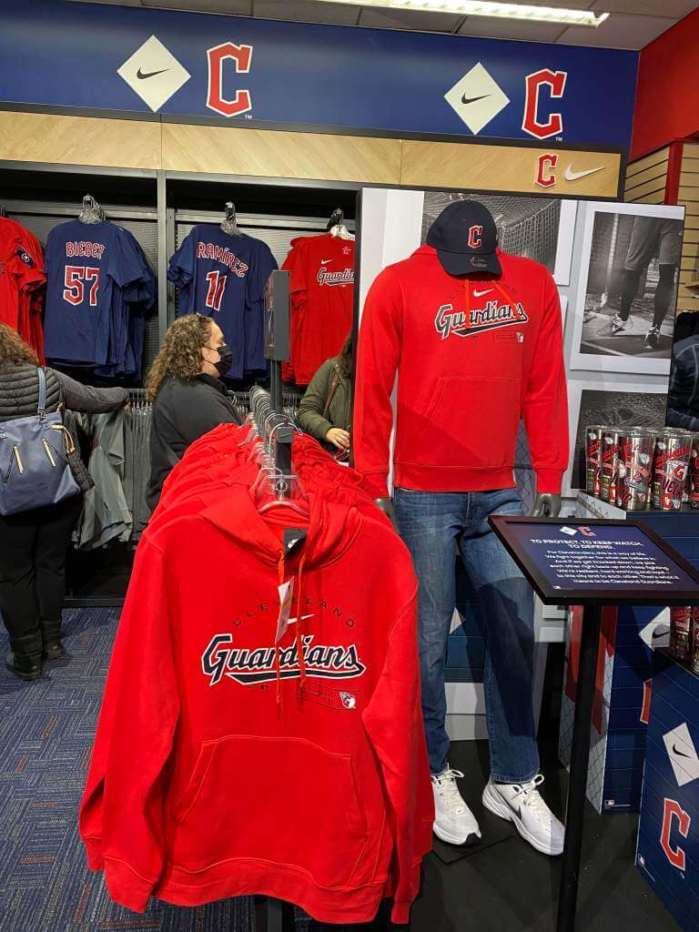
Guardians Merch Now On Sale
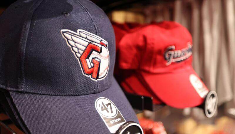
In another sign the hot stove is heating up, yesterday the Cleveland Indians Guardians merch officially went on sale. Unfortunately, nothing being offered for sale is (yet) anything which will be worn “on-field,” but it gives us some looks at how the team will be marketing itself for 2022 and beyond.
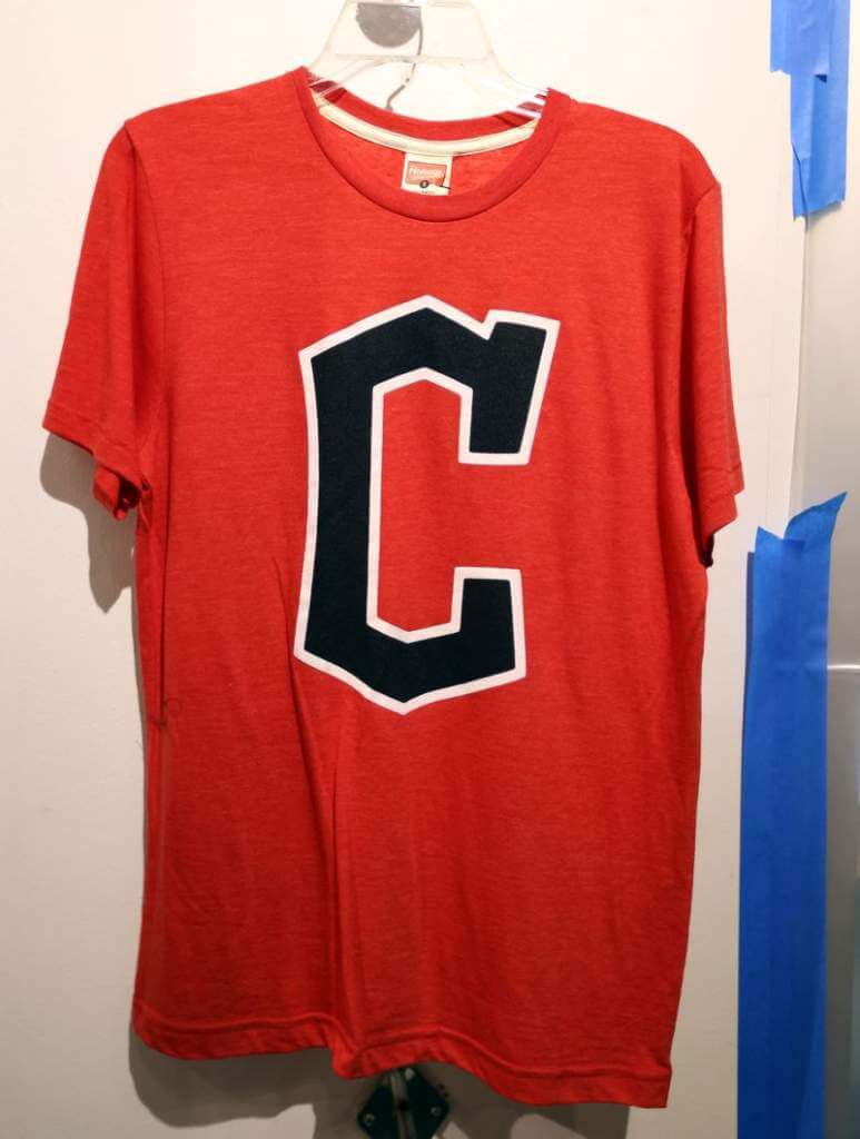
One of the items for sale is a t-shirt with the new “C” logo. I can’t say I’m in love with this yet…
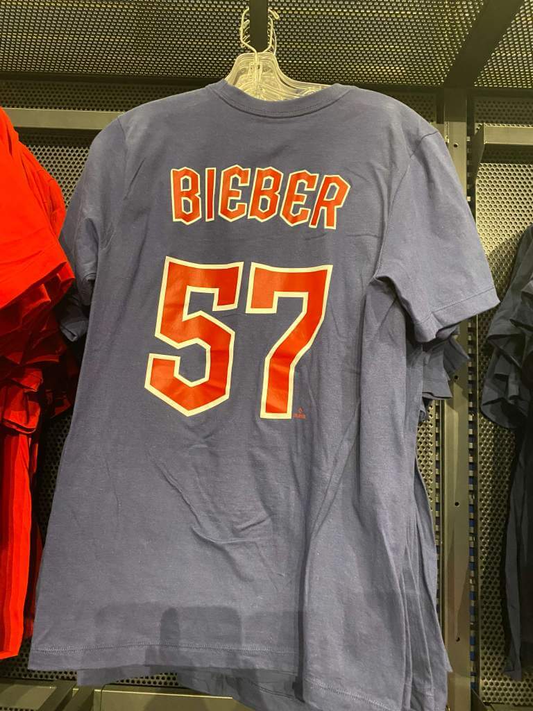
The backs of some of the shirseys also provided us with our first look at how the team will (presumably) handle NOBs (including diacritical marks):
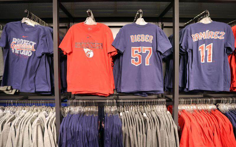
Looks a bit clunky, no? Hopefully this style will better translate on the actual on field jerseys.
Reader Josh Levy was able to make it to the store and he also took a few photos.
Hi Phil,
I got a chance to stop by the Guardians team shop today, if you’d like to use any photos in the blog or ticker. I think this was the first time they’ve released the font on an actual player’s name and number but I’m not sure.
Thanks,
Josh Levy
And here are the shots Josh took:
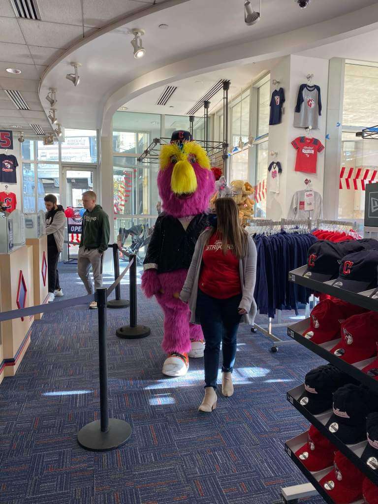
You can see a lot more photos from the opening here. Just click the image at the to of the page to see 30+ photos of the store and the opening.
Alas, not all was a smashing success (unless it was literally a smashing success) for the Guardians…
Smashing success: Cleveland Guardians team shop sign goes up and quickly comes back down.https://t.co/miiBexlf6G
— News 5 Cleveland (@WEWS) November 19, 2021
Yep. The sign outside the store fell to the ground. Or as this article notes,
As fans were buying the first available Guardians merchandise on Friday as the team officially transitioned from Indians after 106 years, a sign installed outside the team store at Progressive Field broke free from its mount and crashed to the sidewalk.
“Well, that’s an ominous sign,” yelled one onlooker.
Let’s hope the team’s new uniforms and on-field performance get off to a better start!
[H/T to Paul for the sign news]

Guess The Game…
from the scoreboard
Today’s scoreboard comes from Palmer Cuellar.
The premise of the game (GTGFTS) is simple: I’ll post a scoreboard and you guys simply identify the game depicted. In the past, I don’t know if I’ve ever completely stumped you (some are easier than others).
Here’s the Scoreboard. In the comments below, try to identify the game (date & location, as well as final score). If anything noteworthy occurred during the game, please add that in (and if you were AT the game, well bonus points for you!):
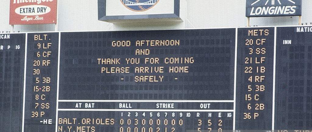
Please continue sending these in! You’re welcome to send me any scoreboard photos (with answers please), and I’ll keep running them.

Uni Concepts & Tweaks
Time for more Uni Tweaks from the UW readership.
I hope you guys like this feature and will want to continue to submit your concepts and tweaks to me. If you do, Shoot me an E-mail (Phil (dot) Hecken (at) gmail (dot) com).
Today’s concepts come from Thomas Juettner:
Hi Phil,
I’ve been tinkering with my White Sox as a thought experiment. The Sox have historically worn red in a lot of their looks, the two West Side teams both wear red and black, and the Sox have a lot of current players who are fond of red accessories.
Problem is that red doesn’t easily mix with their current set. I’ve played around with it over the years and struggled to really get it to work. The red tends to get lost against black lettering.
The inspiration is largely taken from the Bulls third jerseys, using sublimated pinstripes, red lettering, double outlined in black, then white with matching trim. The template is essentially from the City Connect uniform. I’ve used a slimmed down S-o-x to add some negative space between the two vertical of the “S.” If there was a eureka moment, it was figuring out that I could emulate the Dick Allen powder blues to make a vibrant road uniform.
Hope you enjoy.
Cheers,
Tom
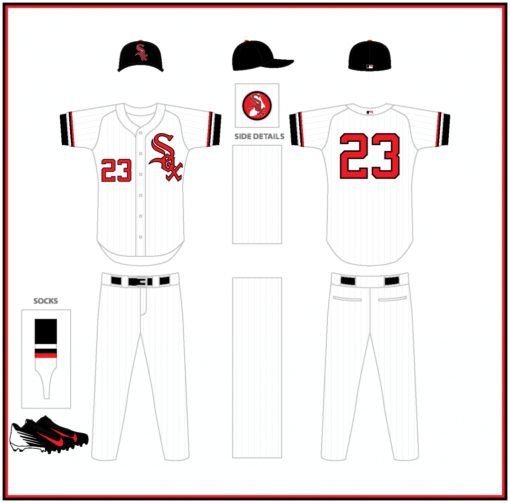
Home
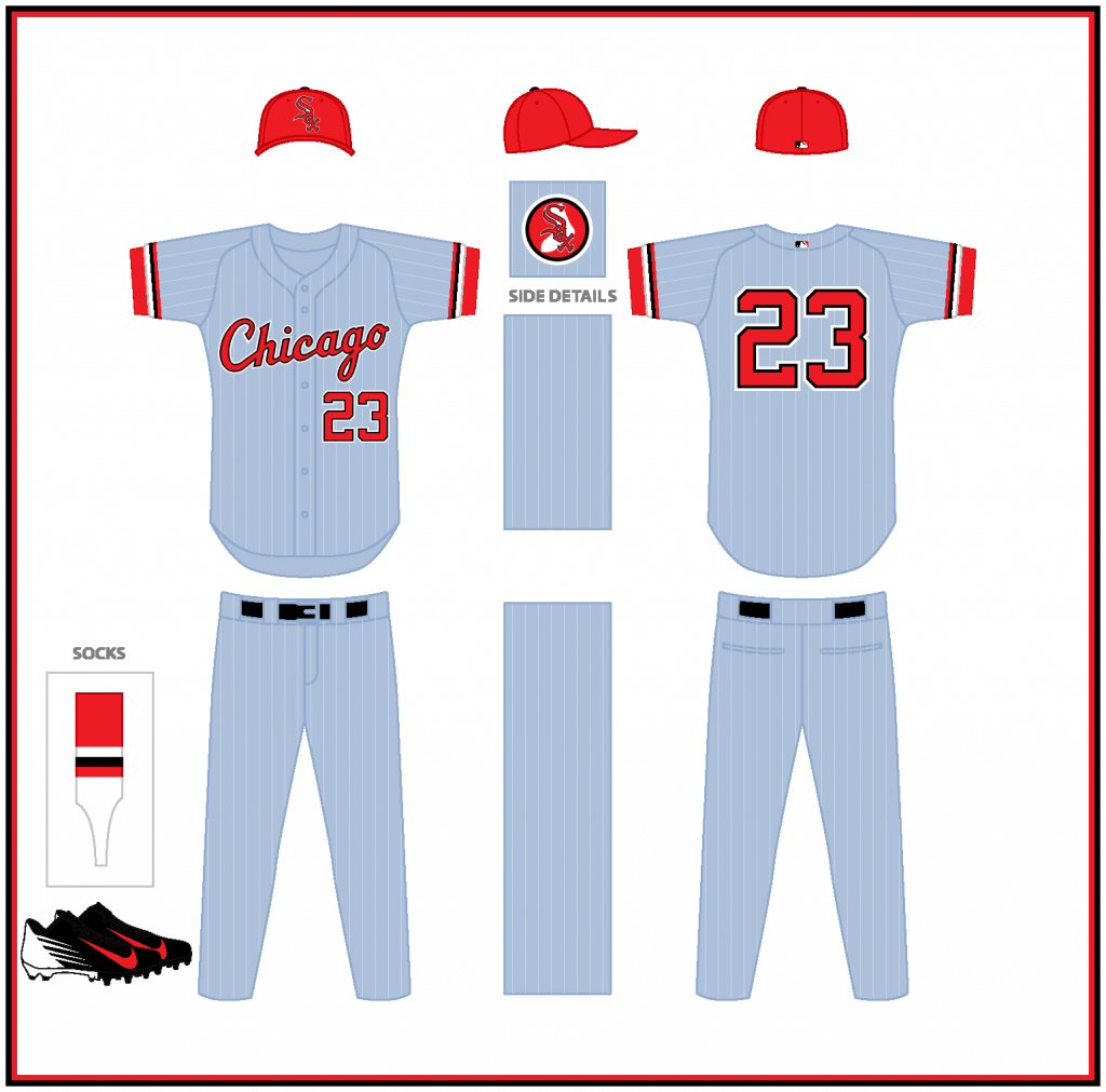
Road
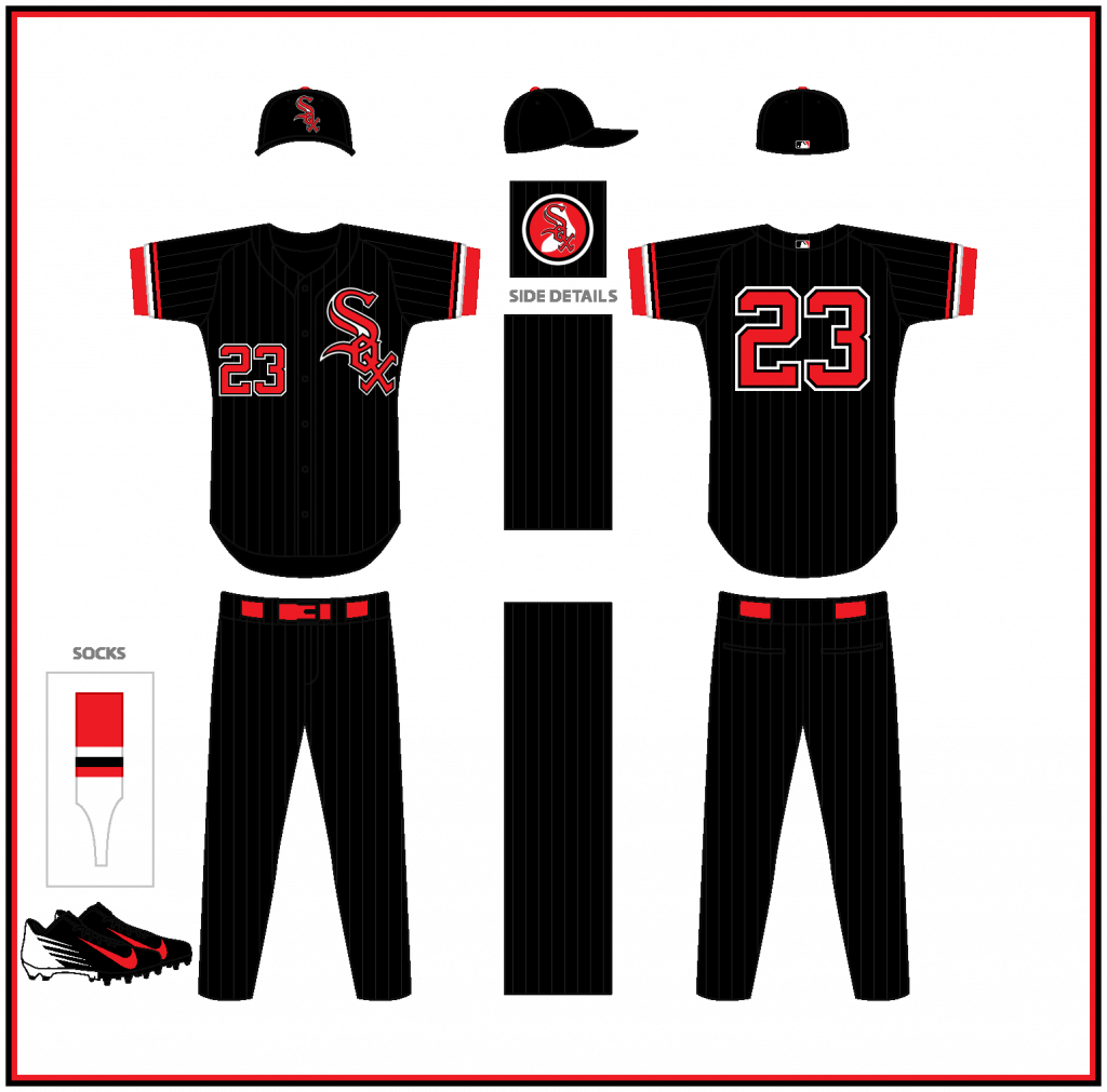
Alternate
OK readers (and concepters). If you have some tweaks or concepts, shoot ’em my way with a brief description of your creation and I’ll run ’em here.
Gift Guide reminder: Paul here. In case you missed it on Friday, my annual Uni Watch Holiday Gift Guide is now available for your enjoyment.

Also, for those of you who’ve been following the Covid drama here at Uni Watch HQ, I’m happy to report that I once again tested negative on Friday, so I’m now in the clear. Unfortunately, this means Mary has to stay at the sanitarium until the day after Thanksgiving. Not quite the holiday we were hoping for, we’re grateful that our vaccinations are keeping her symptoms mild and keeping me protected.
My continued thanks to everyone who’s sent kind words of support — it really does make a difference.
Now back to Phil with the rest of today’s content.
The Ticker
By Anthony Emerson

Baseball News: According to this Twitter thread, the Blue Jays are named after the CFL’s Winnipeg Blue Bombers, and how it happened is hugely entertaining (from multiple readers). … House Democratic Whip Jim Clyburn wore an MLB mask during a press conference yesterday. No team, just the MLB logo (from Marcus Hall).

NFL News: The Giants will wear their gorgeous 1980s throwbacks on Monday Night against the Bucs. Why are these “throwbacks” and not “current”? … The Eagles are going BFBS tomorrow (thanks, Phil).
College/High School Football News: Chris Geis sends along the entire broadcast of a 1979 Florida/Florida State game, the first time the Gators wore orange jerseys. … Frank Gore Jr.’s JrOB has a really large space, no? (from Timmy Donahue and @artofscorebug). … Here are this weekends unis for Syracuse, Tulane, Akron, Kent State, and Lehigh.

Hockey News: The Islanders are adding a patch to celebrate their inaugural season in their new arena (from @artofscorebug). … The BCHL’s Langley Rivermen wore their BCHL 60th anniversary throwbacks for the first time on Thursday night (from Wade Heidt). … Also from Wade, the BCHL is having fans vote on All-Star Game unis. … GI Joke unis for Arizona State (from Lee Margolies).

NBA/College/High School Hoops News: The Mavericks will retire Dirk Nowitzki’s No. 41 on January 5th (from Timmy Donahue). … New alternate unis for GWU men (from multiple readers).

Soccer News: The NWSL is extending its kit deal with Nike (thanks, Jamie). … EFL League One side Doncaster Rovers are adding a greyscale third kit for mental health awareness (from Ed Zelaski). … Also from Ed, new crest for Unia Tarnów. … This weekend all Ligue 1 and Ligue 2 teams will highlight domestic violence issues in France by adopting club crests drawn by children, among other measures (from @AFC_Cameron). … Staying in France, the Coupe de France has some of the strictest kit rules in the world: in the 7th and 8th rounds of the competition, home teams must wear either white or red kits, while visiting teams must wear blue, yellow or green kits (if your club doesn’t wear those colors, well, you’re shit out of luck). Other rules include no club jersey ads — jersey ads must be from one of the Coupe de France’s approved companies. In the 1990s, that last rule was enforced so strictly, Paris Saint-Germain had to wear Adidas kits in Coupe de France competition despite being a Nike team (from Kim Kolb).

Grab Bag: Formula One superstar Lewis Hamilton will wear a pride-themed helmet during the Qatar Grand Prix. Hamilton has criticized Formula One for adding races in countries with poor human rights records, like Qatar and Saudi Arabia. … New logo for Papa John’s — or is it “Papa Johns” now, because the new logo does not include the apostrophe (from @Sveillance).
Uni Tweet of the Day
FFS. This cosplay has got to stop…
We're proud to debut our first-ever military uniforms in honor of all who have served 🇺🇸 pic.twitter.com/hC6zSTzkht
— Sun Devil Hockey (@SunDevilHockey) November 19, 2021
And finally… that’s it for today. Adding to everyone’s well-wishes throughout the week: glad you’re COVID-free Paul! Sucks that you and Mary (wishing her a speedy and full recovery as well) won’t be able to spend Turkey Day together, but if that’s the worst to come of this, then I’d say you guys dodged a bullet. Hope that’s the case! Everyone else out there — stay safe! With the holidays coming up and cases — even for the fully vaccinated — on the rise, let’s all get through this together.
Catch you guys tomorrow with another edition of the SMUW. Till then,
Peace,
PH
GTGFTS: October 16, 1969, Game 5 of the World Series, clincher for the Mets.
That has to be the most tame note on scoreboard after winning 1st World Series in team history
I looked into the Coupe de France item. There is a lot on it in the link.
The requirement to wear the FFF-provided equipment starts with the fourth round, however, a club in the top five men’s tiers can opt out by telling the FFF within a certain time period they want to wear their normal kit instead. If anyone does show up in their normal colors, that’s why.
If this isn’t new for this season, it was for last season. It already was the case that everyone had to wear the FFF’s ads, and I’ve seen in the past amateur teams wearing kits with the FFF logo and not in their colors if they got far enough but nobody else.
I think the Royals did a bang-up job on the ’22 unis. I think for the road unis I would have gone with the white outline on the wordmark and the numeral as well. I think they look too plain without it. I’ve been a big fan of the white outline since the Yankees adopted it with the switchover to the double knits in the early 70’s.
I do hope that the Guardians are not going to use that font for the NOB on the actual jerseys. There is nothing (IMO) more offensive when the NOB font matches the style of a unique looking number font.
These new Royals jerseys are not using the new Nike template/uniform system they’re still made using the Flex Base template that Nike stole from Majestic when they took over. This is surprising since Nike is supposedly introducing their own uniform template for the 2022 season.
You mention in the piece that you can see the new Nike materials for the jersey. This isn’t accurate. This is the same Flex Base material that has been used since 2016 not a new Nike material. That mesh is essentially the same as the Cool Base uniform system introduced by Majestic in the mid 2000s. It’s very odd that these new uniforms aren’t Nike proprietary ones. I wonder if this means Nike scrapped their design for MLB next season.
KC baseball unis are perfect.
Surprised the Royals would scrap a road jersey in which they won a World Series title just six years ago.
The link to the Syracuse uniform setup is wrong. You used the link for the Ligue 1 and Ligue 2 teams. It happens.
I know there were some issues with the old “Kansas City” script (it looked a bit too “long” for one thing) but I’m sorry to lose it if only because the way the beginning of the underline intersected with the bottom loop of the “y” creating a pleasing diagonal pretzel shape was one of my top “oddly satisfying” tiny uniform details.
The only thing about the royals I would really change is have the KANSAS CITY on the road jerseys be a bit taller to fill out the front of the jersey a bit more. It does look a bit smallish as it is now.
Great news about Paul. Sorry Mary won’t be home for Thanksgiving, but I’m sure they will have much to be thankful for on Friday. And IMHO they didn’t “dodge a bullet, since the vaccine performed as advertised.
Yes, vaccines do perform but sometimes a mosquito does get through the screen door. I’m currently dodging two bullets as both my mom and brother-in-law are vaxxed but tested positive. Here’s hoping EVERYone has a good Thanksgiving.
I am with you on it’s a top 10 jersey, so why mess with it too much? so I’m not disappointed. I actually love the road grays, I think the fact that they don’t stand out makes them stand out lol I do wish, however, for just *one* more detail on them. maybe they put the gold crown over the top of “CITY”? or something?
While the Royals changes were small, I feel like they turned their uniforms into college uniforms, or even in the case of the road alternate, possibly high school uniforms. Can’t say I’m a fan of making a bunch of minor tweaks that downgrade the look of what was a great looking uniform.
Great job on the Sox unis, Thomas, I really like the stirrups and the powder blue.
Royals uniforms look good. Really would have liked to see that powder blue jersey be the regular road jersey and worn with powder blue pants. If any team went back to a powder blue road uniform, the Royals are a good candidate that could make it work.
As a Royals fan I like the new looks overall. I liked the script road uni in theory, but it never looked that great on the field. Seriously wish they would have brought back an all powder blue get up though.
Yea long names look too cluttered in cursive like Los Angeles, Baltimore etc.
The template maintains the Flex-base materials and construction. The lighting might make it look more “meshy” but that’s definitely dimple mesh still. Scoop bottom and Side paneling (a different mesh) all the same, too. This was the first thing I took a hard look at. I’m surprised Nike didn’t make a template change.
ROYALS: solid update, though I didn’t think there was anything wrong with what they had. I can live with the lack of a white outline. The Dodgers did the same thing a few years ago and it didn’t detract from the look. The vertical arched letters need to be a little taller though. I like the thicker striping on the sleeves.
GUARDIANS: blecch, no. That bespoke font is one thing for a team name and word mark but making it the NOB/number font as well is overkill. And it isn’t a very legible font. It’s one thing when it’s used for a single obvious item, like a team name. But to identify 26 different names? Bad idea. It doesn’t lend itself to easy reading and it looks terrible. Most teams today have some sort of bespoke font for their word mark but most use a plainer NOB font. Only the Astros and Brewers come to mind who use the same font, front and back.
Best comment I saw on the sign falling was “The sign had to decide whether to suffer for years or just end it all now.”
Yes, the pizza place removed the apostrophe from their name to continue to distance themselves from their founder and well known asshat John Schnatter. Since he is no longer associated with the company, the name of the place is no longer possessive, as it is no longer HIS pizza place.
I clearly have entirely too much time on my hands that I actually went out of my way to read into this.
From the looks of the “new” name it appears to be all one word, as in Papajohns. I have no idea where their nearest restaurant to me is though so I can’t compare in person.
It’s great that Cleveland forged ahead with a new identity. It’s not great but I can learn to like it. What I don’t care for is their two unique fonts for home and road. Pick one already.
Fine with the new name and alpha-numeric fonts, but HATE that primary logo.
The Cleveland fonts, both numbers and letters, are ridiculously bad.
I hope to see Royals sometime after spring training in ’22 coming out with announcement that powder blue pants are happening.
Not Cosplay, per Merriam Webster, but whatever floats your boat.
I much prefer the Royals going with the vertically arched lettering on the roads even if the placket was not respected. That was a tall order to fill on that but it looks like they did the best they could. I really don’t care for script lettering on roads and I anxiously await the day when the Tigers get rid of theirs.
Of all the teams in baseball, Kansas City needed least to change their uniforms.
The thread documenting Labatt’s tie-ins with the Blue Bombers and Blue Jays contained a newspaper headline saying, “Like it or Lump it- Toronto’s New Team is the Blue Jays.” There’s no accounting for taste; I think “Toronto Blue Jays” is one of the five best marriages of locator and (nick)name in professional sports.
Tom, though I basically like your riff on the Chicago White Sox, one place you went astray was making the road uniform way too fancy. A home uniform is the visual equivalent of the team’s mission statement; the road uniform should subtract something, not add. Think of it as the relation between the peacock and the peahen.
Maybe it’s just the photos, but the script “Royals” just seems way too big. I thought their previous road unis were damn near perfect, but these are still really good.