For all photos, click to enlarge
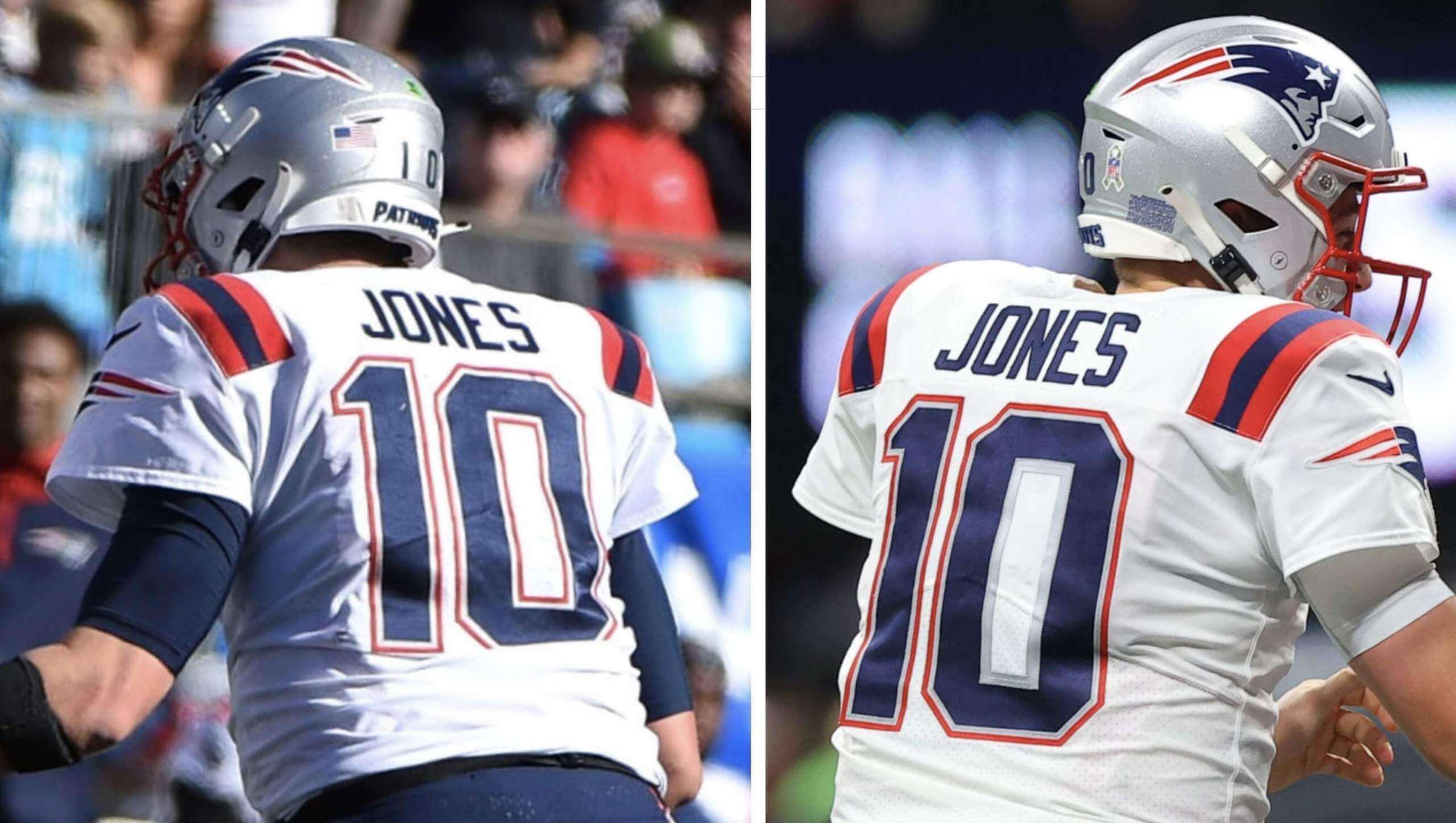
On the left is how Patriots quarterback Mac Jones’s white road jersey is supposed to look. On the right is how it looked during last night’s game against the Falcons — note the missing red inlining on the 0. (The red trim was fine on the front of the jersey.)
This is the second consecutive game in which Jones has been victimized by a jersey snafu. As you may recall from Monday’s post, on Sunday the Flying Elvis logo patch on his right sleeve was missing its star:
These glitches follow a slew of miscues last season, when several players wore the team’s old number and NOB fonts:
Or the old number font with the new NOB font (on the left):
Or the old NOB font with the new number font (on the left):
What a mess! How can one team have so many jersey errors in such a short period of time?
Side note: I was impressed by how many people alerted me to Jones’s missing red trim last night. It’s a reasonably subtle detail (not, like, super-subtle, but not Uni Watch 101 either), so it was great to see that so many folks noticed it. Good work, people!
While we’re at it: Pats offensive lineman Trent Brown chose to go bare-legged last night. If not for the lack of knee braces, you’d think he was a college player:
In addition, the Falcons wore their black fauxbacks:
(My thanks to Ben Oship for the first Trent Brown photo.)
ITEM! 2021 Gift Guide now available: With the winter holidays right around the corner (Hanukkah is on Nov. 28), I’ve decided to run my annual Uni Watch Holiday Gift Guide a bit earlier this year. It was published earlier this morning on Bulletin.
Those of you who’ve subscribed to receive my Bulletin content via email should already be seeing this piece in your in-boxes. Everyone else can read it on my Bulletin page. Enjoy!

Covid update: I’m happy to report that I once again tested negative yesterday, and I continue to feel 100% shipshape. At this point, I’m pretty sure I’m in the clear, but I’ll get tested again today, just to be safe. The downside, of course, is that this means Mary has to stay in the sanitarium, which really sucks.
Longtime readers may recall that we usually attend the annual oyster roast on Virginia’s Eastern Shore on the Saturday before Thanksgiving. Obviously, that won’t be possible this year, but I’ve arranged to have a virtual/remote oyster fest via Zoom with all our usual participants. Since Mary’s still sequestered, I’ll buy some oysters for her tomorrow morning and deliver them to the front desk of the place where she’s staying, along with shucking tools, so she can participate. Won’t be as good as being in Virginny, but we’ll make do. I’m looking forward to it!
The Ticker
By Anthony Emerson

Baseball News: And now it’s official: If you go to Indians.com, it redirects to mlb.com/guardians. … New logos for the Aberdeen IronBirds, who are the Orioles’ High-A affiliate (from Marcus Hall).
College/High School Football News: WR Tre Turner will wear Frank Beamer’s No. 25 for Virginia Tech this week. … Here are this weekend uni combos for Virginia Tech, NC State, Troy, South Carolina, Michigan State, Houston, Missouri, UNLV, LA Tech, Mississippi State, UCF, and Virginia (thanks to all who shared).

Hockey News: Back in the ’90s, a Canucks equipment manager wrote “weird” on G Kirk McLean’s skate because he felt McLean was “too normal” for a goalie (from Brandon Weir). … Following up on an item from yesterday’s blog post, David Uhrin writes in about the AHL white-on-white mixup that happened on Wednesday evening: “Syracuse in town for a two-game set. Friday, Cleveland is wearing these Top Gun-inspired jerseys, so they asked Syracuse to wear their lights. Apparently Cleveland forgot about that for the Wednesday game, which was delayed while they got into their darks.” … The Wild will mark Native American Heritage Day by wearing Native-themed pregame jerseys on Nov. 26.

Basketball News: New Lakers SG Chaundee Brown will be the first player in franchise history to wear No. 38. … New skyline-themed uniforms for Penn. Additional photos here.

Soccer News: I think this might be the first time we’ve ever seen the old Columbus Crew logo be reappropriated (from Rick Logan). … New sleeve ad for Nashville SC (from Trey Norfleet).

Grab Bag: Here’s an amazing story of a lost letterman jacket that was rediscovered many years later (from Jason Hillyer).

Click to enlarge

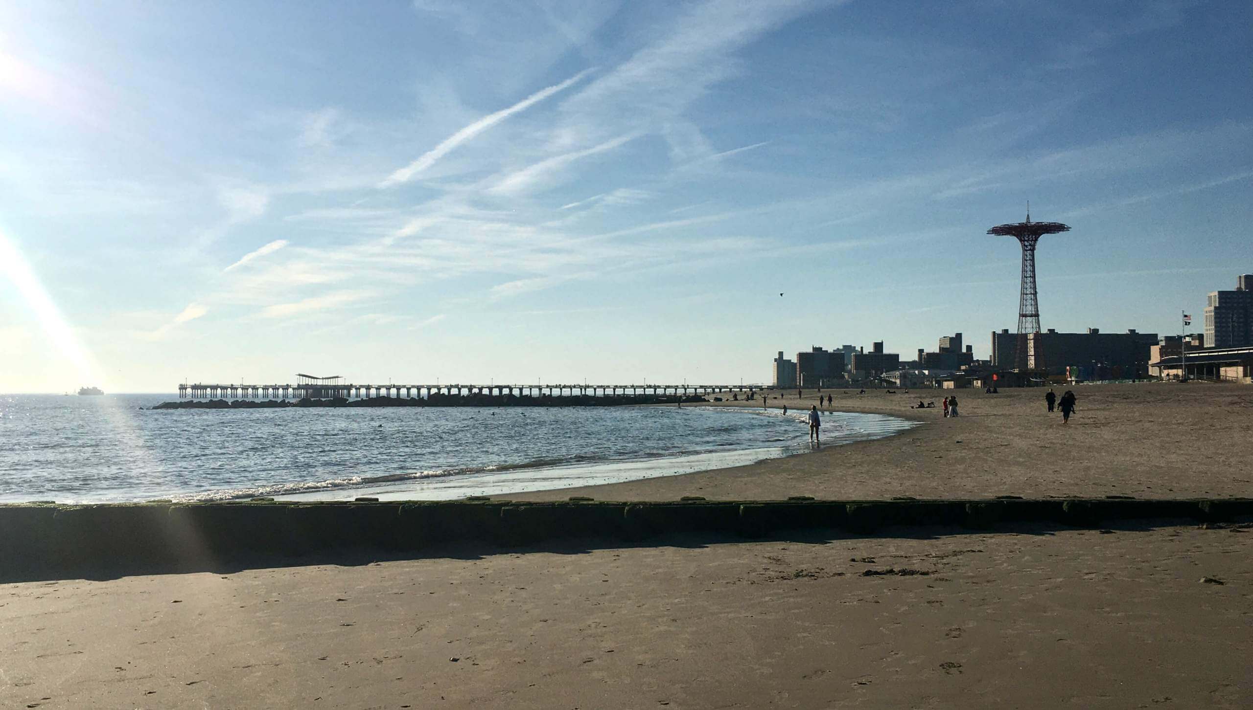
What Paul did last night yesterday afternoon: Life has been a little stressful lately. So with yesterday’s weather being unseasonably warm (mid-60s), I gave myself the afternoon off and went down to Coney Island to spend a few hours at the beach.
It was low tide and the waves were virtually non-existent. The Atlantic Ocean felt more like a calm bay:
We’ve all seen people throwing a frisbee to a dog. But I saw a woman on the beach throwing lots of frisbees to her dog. The pooch caught them (or tried to) but didn’t retrieve them. Maybe she was training him for something..? In any case, it was very nice to watch:
And that’s a wrap for this week. Thanks again for all the support and kind words over the past few days — it makes a difference, really. Enjoy Phil’s weekend content and I’ll see you back here on Monday.— Paul
I was scrolling through the new Grey Flannels auction. What NOB would we use for this jersey?
link
I’d call that a nickNOB, since “VBK” was his nickname.
Glad to hear you’re OK. Is it 2 negative tests before Mary is in the clear and can come home?
Glad to hear you’re OK, Will Mary need 2 negative tests before she comes home?
I think so..? Right now we’re just waiting to make sure that *I’m* negative. Once that’s established (hopefully later today), we’ll turn our attention to getting her home safely.
Paul,
Perhaps get in touch with David Schoenfeld, the Pats’ Head Equipment Manager?
In my experience, the Pats are consistently non-communicative about uni-related issues. I’ve contacted them countless times over the years — they simply won’t talk about this stuff.
I’m toying with just printing out this article and mailing it to Robert Kraft. If nothing else, he’ll care about getting what he’s paid for! Two uni malfunctions in two weeks with your very visible prize rookie QB just can’t be acceptable.
Patriots are blundering in the uniform department because they are ignoring something so obvious and not sure why. Why does this team not have a pair of silver pants yet with this current uniform set? At least an alternate pair of silver pants that they can sub in. Anybody with eyes can see this would look great with their white or navy jerseys.
Had the same silver pants thought for years.
Their look last night, despite its many shortcomings still looks way better than their recent road kit. That side panel was brutal, and even though I love striped socks, I felt like their stripes were disconnected form the rest of the uni. The socks also looked to Adida-fied. I believe Adidas was the original manufacturer of those.
White pants with red/blue/red stripes for games on the road would do nicely as well…though that would make the helmet appear completely out of place, like how the Panthers look when they go white-over-white.
I get what your saying…the Pats 2000 uniforms were made by Adidas but I’m not sure they wore ‘Adidas’ socks…they just happened to have 3 stripes. The Chargers and ‘Skins also had uniforms made by them at that time but both used 2-stripe white hosiery, and the 49ers didn’t add 3 stripes to their red socks when they went with Adidas, though that would have looked great.
The Mac Jones zero is not just missing the read, it has a silver inner thing that the other number doesn’t, so was it supposed to go on another jersey at some point?
Read=red lol
I think that’s just the lighting.
I think what he means is, both their home and away numbers have two outline colors. Other on-line photos support this. Home: red to silver to the big white number, and Away: red to silver to the big blue number. So yes, it looks like the red part came off, leaving the silver stripe. Given the thickness of the silver portion, it appears the red stripe is supposed to be laid over its edge. Both numbers have it, but you have to sort of squint to see it. The white jersey photo on the left above makes it appear red/white/blue, but that appears to be lighting.
Yeah, after looking at other photos, there’s def lighting at play, I thought the left picture just had red-white-blue but other away jersey pics have red-grey-blue. So I just think on the right picture it’s just a double thickness grey brand
It’s because of the kiss-cut method of lettering that it fell off. It’s just a tiny sliver of red on top of everything, so if 1 thread comes out, the whole thing goes. I wish they would still be layered like the old days and this would never happen.
Also, is it me or the JONES on the right side picture is thicker than the one on the left?
Just different camera angles.
Excellent email question on todays Effectively Wild podcast about baseball caps and uniforms. Shocked Paul wasn’t namechecked.
link
I’m so sick of my Patriots looking like clowns on the field. The half-assed stripes, the outdated and amateurish mono-blue look, they just look so sloppy and unprofessional. We’re stuck with these for a few more years, but here’s to hoping they add a decent third option next year (either the Pat Patriot throwback if they eliminate the one shell rule, or possibly a mid-90’s throwback if they have to keep using the silver helmets).
It all just kind of goes with their coach’s feelings about such things. He simply doesn’t care about those details, looking “good”, etc. Sort of a, how you play matters, not how you look, mentality. I recall the whole cut off hooding thing being his way to rebel against the league’s request for coaches to dress a certain way, in team gear, etc. He sort of said, “OK, I’ll do that and look as slovenly as possible in the process.” Or, perhaps that story is just lore.
Belichick is the only head coach who is not a member of the NFL Coaches Association although he once was. He’s never been forthcoming as to why he left it. Bill Parcells wasn’t either. Both are known for being stubborn and independent. It means Belichick doesn’t appear in the Madden game (he doesn’t need the money) and he can eschew wearing camo as he did last Sunday. The main Patriots fan website just chalks it up to his predilection for avoiding distractions as you surmised.
Excellent segment on today’s Effectively Wild podcast about caps and uniforms. Surprised Paul wasn’t namechecked.
link
(sorry if this is a dupe post, the site was being wonky when I was posting)
Hoping for continued negative tests and that Mary’s case is mild. Today is the last day for our family’s 10 day quarantine. Luckily we were all sick, but no hospital.
At any rate, I can vouch for the tokens & icons and stadium map art. I have bought from both places from this site and have been extremely happy with the quality.
The South Carolina uniforms is not for football, but rather for basketball. They debuted their garnet versions of the white throwback uniform they have been wearing the last couple seasons. They were worn last night vs. UAB.
Glad to hear you’re still negative Paul and that Mary is on the mend. Be well.
“While we’re at it: Pats offensive lineman Trent Brown chose to go bare-legged last night.”
– I watched the game last night and it was a) striking how bad he looked and b) amazing that he got past the NFL’s sideline uniform police. I knew immediately that he wouldn’t be allowed to finish the game looking like that and I was right. He had socks on to start the second half.
“We’ve all seen people throwing a frisbee to a dog. But I saw a woman…”
– Can’t tell you how much I was hoping that sentence would end with “catching frisbees FROM a dog!!!”
Taking a look through the Spiders…er…Guardians gear, I see they have yet to produce any fitted hats. All are “snapback” hats, the bane of this hatwearer’s existence. Snapbacks are AWFUL if you have a hat size north of 7 3/4.
The NOB font is going to take some getting used to..
If you have a hat size north of 8, fitted caps are no good either, because as far as I can tell, the MLB shop doesn’t sell them in those sizes. (I’d love to be wrong about this.)
As a big head guy I’d recommend the 3930 fit if you can find it. It’s a different material but is flex fit and fits like a dream.
A Cleveland.com article about the merch release said there’s no release date yet for jerseys and on-field caps – just that they’ll be available “before opening day.” From the photos I’ve seen of the physical team shop, it look like the (to my eyes) nicer merchandise isn’t available in the online MLB shop. A wider release is supposed to come on Tuesday, so I’m trying to be patient.
Have a peaceful weekend, Paul. You’ve earned it!
I’m not sure how the Patriot Elvis can miss the star-isn’t that stitched in in one computerized process when the patch is made? Or are these things made on the cheap with stick on stars from Hobby Lobby? Same thing with the numbers? Wouldn’t the whole number with all its borders be made in one process? Or is it some lacky in the basement of Gillette Stadium with rick-rack and hot glue?
FYI, on mlb.com if you hover over the ‘Teams’ spot, the name is updated to Guardians but the ‘C’ logo is still the old block ‘C’.
Here’s hoping for more negative tests in both your futures!
Paul, wishing continued health for you and a quick recovery for Mary.
The Royals have released their new uniforms.
link
Shockingly, not a full powder blue. But a return to the Bo Jackson era powder blue tops.
And a new “Kansas City” font.
And maybe a slightly different shade of blue. Hard to tell with the lighting.
The two details that popped out at me were the lack of alt blue pants and the thicker sleeve stripes. I wish they’d gone with blue pants, and maybe even made them standard on the road, but I’m a big fan of the thicker sleeve stripe and the road lettering.
I agree. I really like the return to the block font on the away jersey. Back to the Lou Pinella ROY era jerseys. I always thought the script Kansas City was too long and awkward especially with the swoop below it. (is there a name for the swoop?). Small but positive changes IMO.
I had a Kirk McLean poster and remembering seeing “weird” on his skates, but never knew the story behind that.
I meant I had the Kirk McLean poster as a kid, he was my favorite player. My wife wouldn’t like me having posters as an adult. She barely tolerates me as is…