For all photos, click to enlarge
Good morning, and greetings from Uni Watch HQ. Arrived back here yesterday afternoon. My North Carolina trip was sensational, but it’s good to be home.
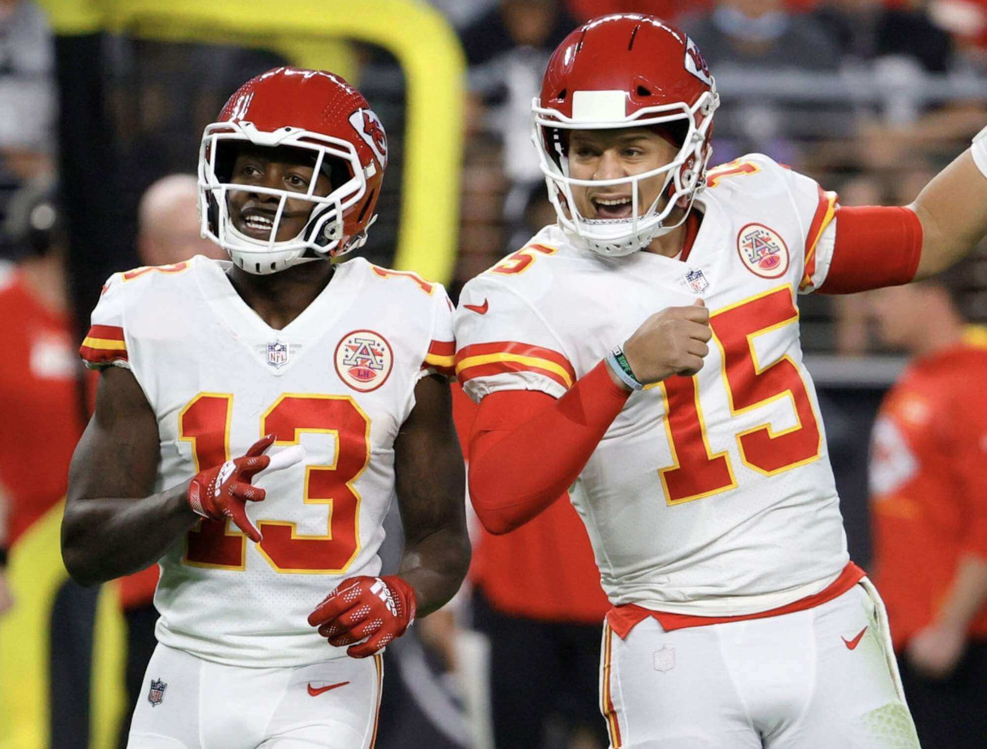
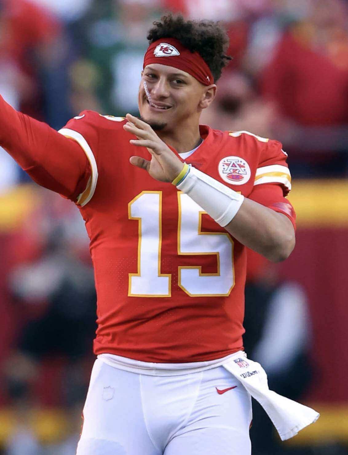
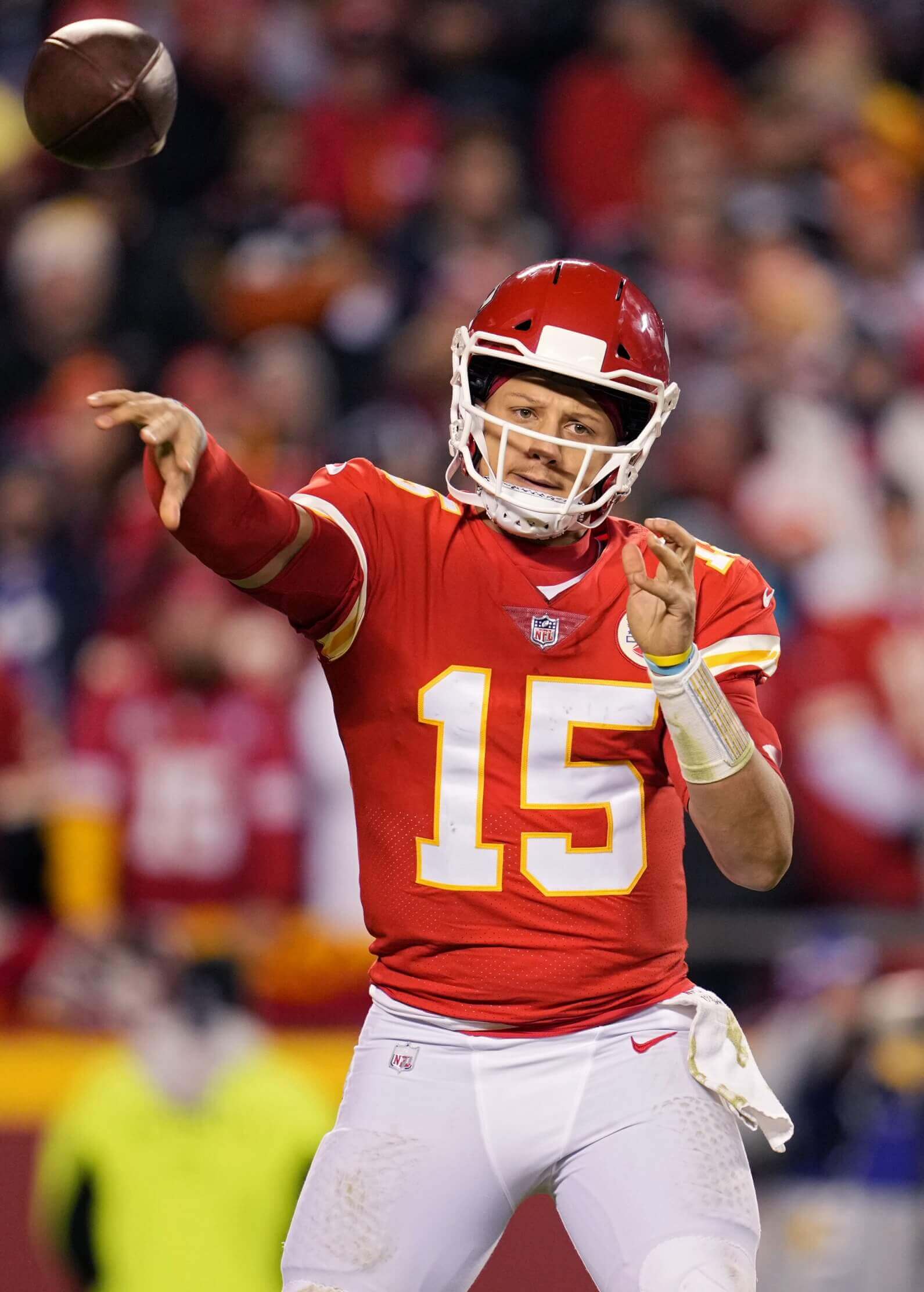
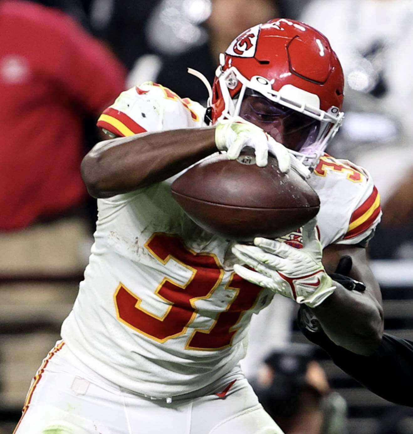
So here’s something interesting: During Sunday’s KC/Raiders game, reader/Twitter-er @shelbyrays noticed something odd about the NFL logo on KC quarterback Patrick Mahomes’s pants. You can see what I mean in the photo above, which shows Mahomes standing alongside teammate Byron Pringle. The logo on Pringle’s pants looks crisp and vibrant, while the one on Mahomes’s pants looks sort of ghosted, almost like it’s showing through from an underlying fabric layer.
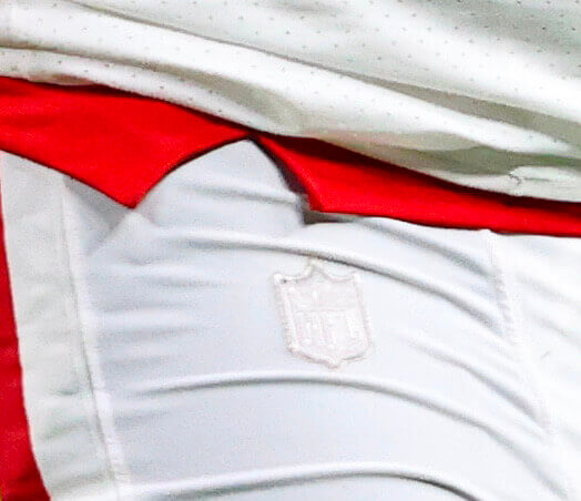
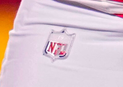
Here are some close-ups of the logo, taken from good, high-res game photos:
Weird, right?
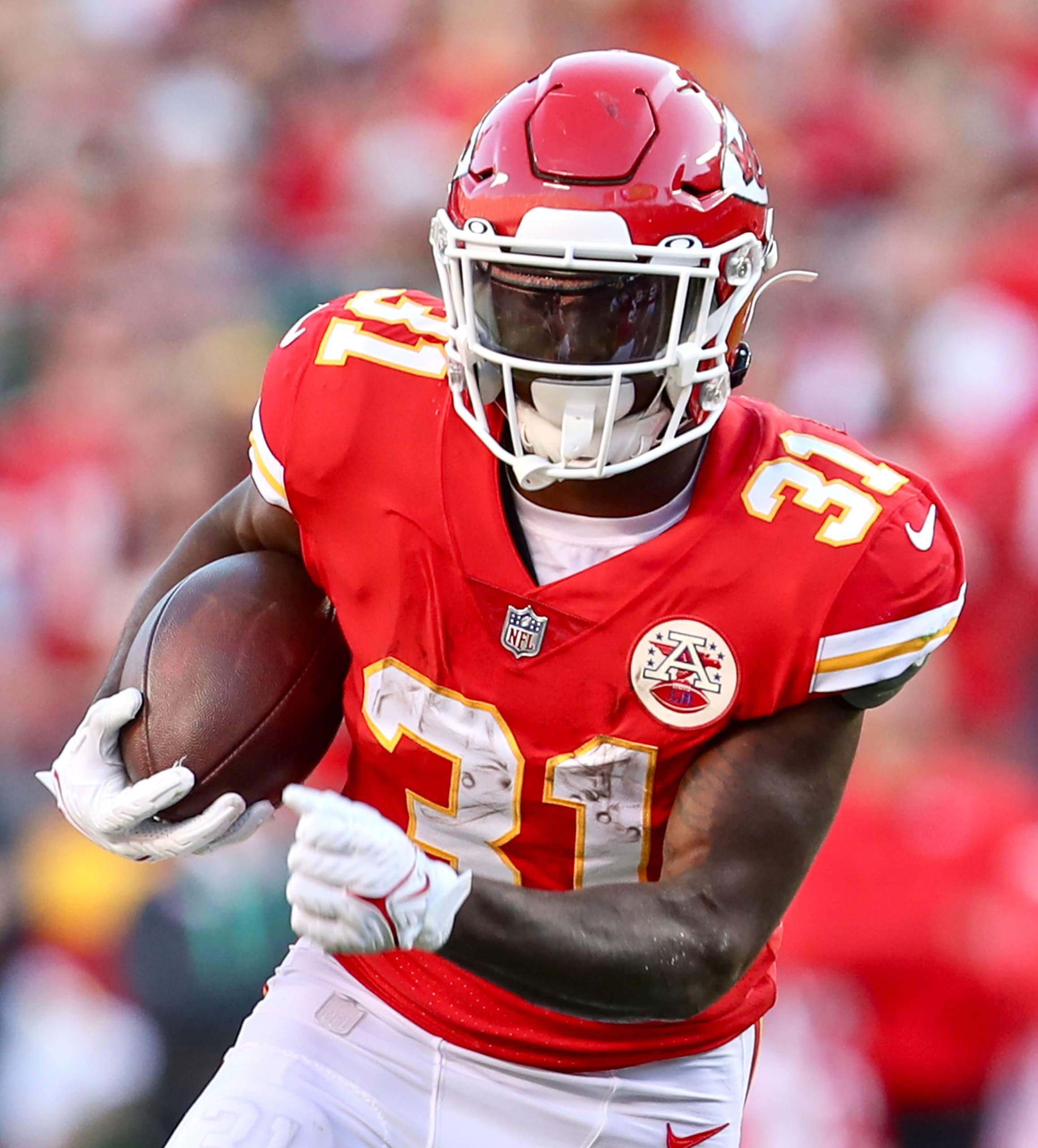
So I went back a week and looked at Mahomes photos from KC’s Nov. 7 game against the Packers. Turns out that his pants logo was ghosted in that game as well:
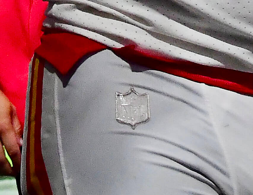
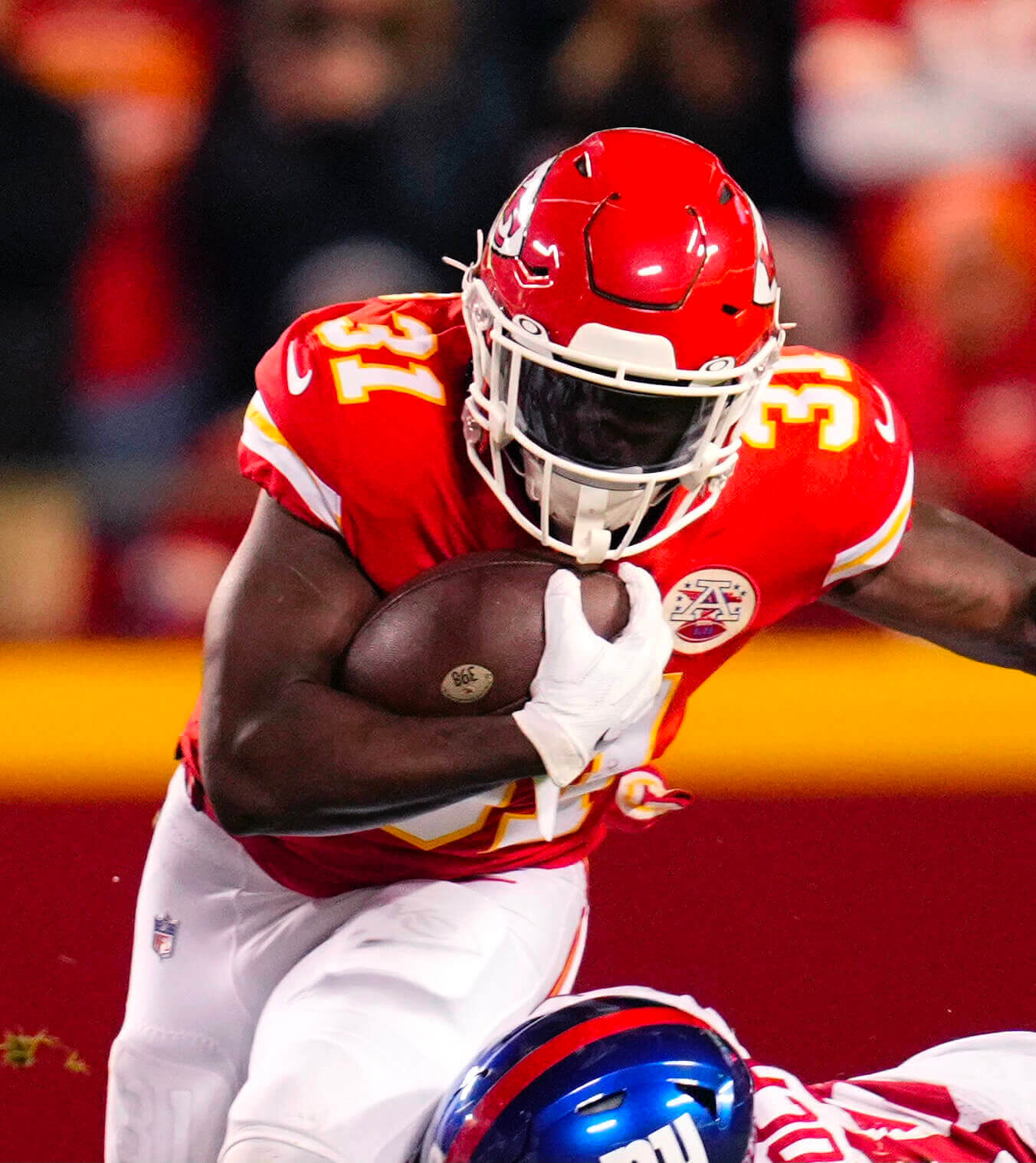
So then I went back another week and looked at Mahomes pics from KC’s Nov. 1 game against the Giants. This time the patch looked a bit different: Some of it was intact, and the rest of it appeared to be flaking away:
This seemed to explain the situation. Mahomes’s pants logo had apparently been deteriorating for a while. But when had that process started?
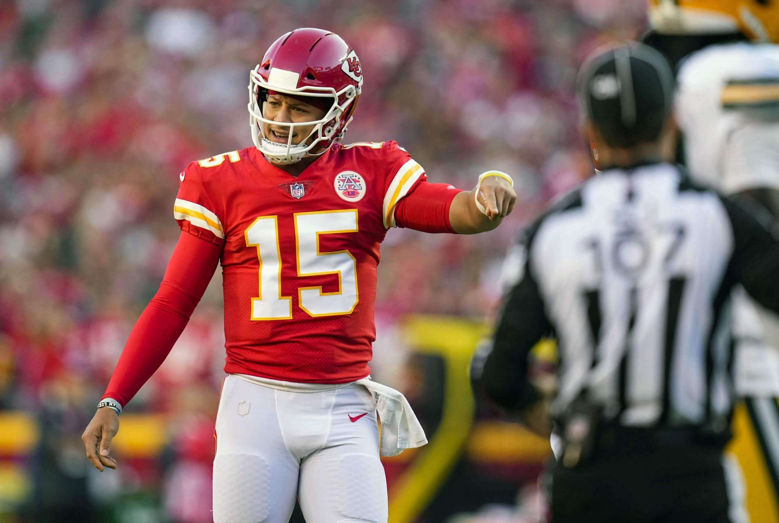
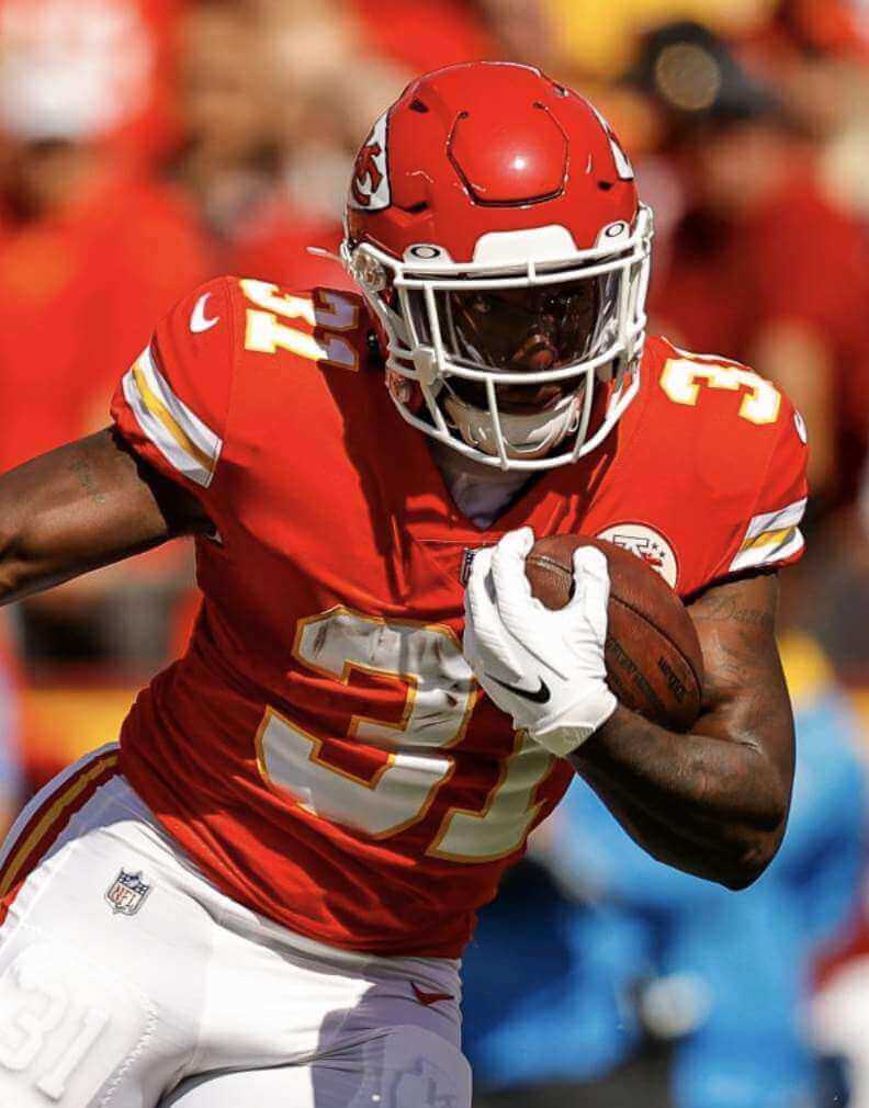
Prior to the Nov. 1 game, KC had worn red pants for four consecutive games. Their previous white-pantsed game was on Sept. 26 against the Chargers. And how did Mahomes’s pants logo look in that game? Take a look:
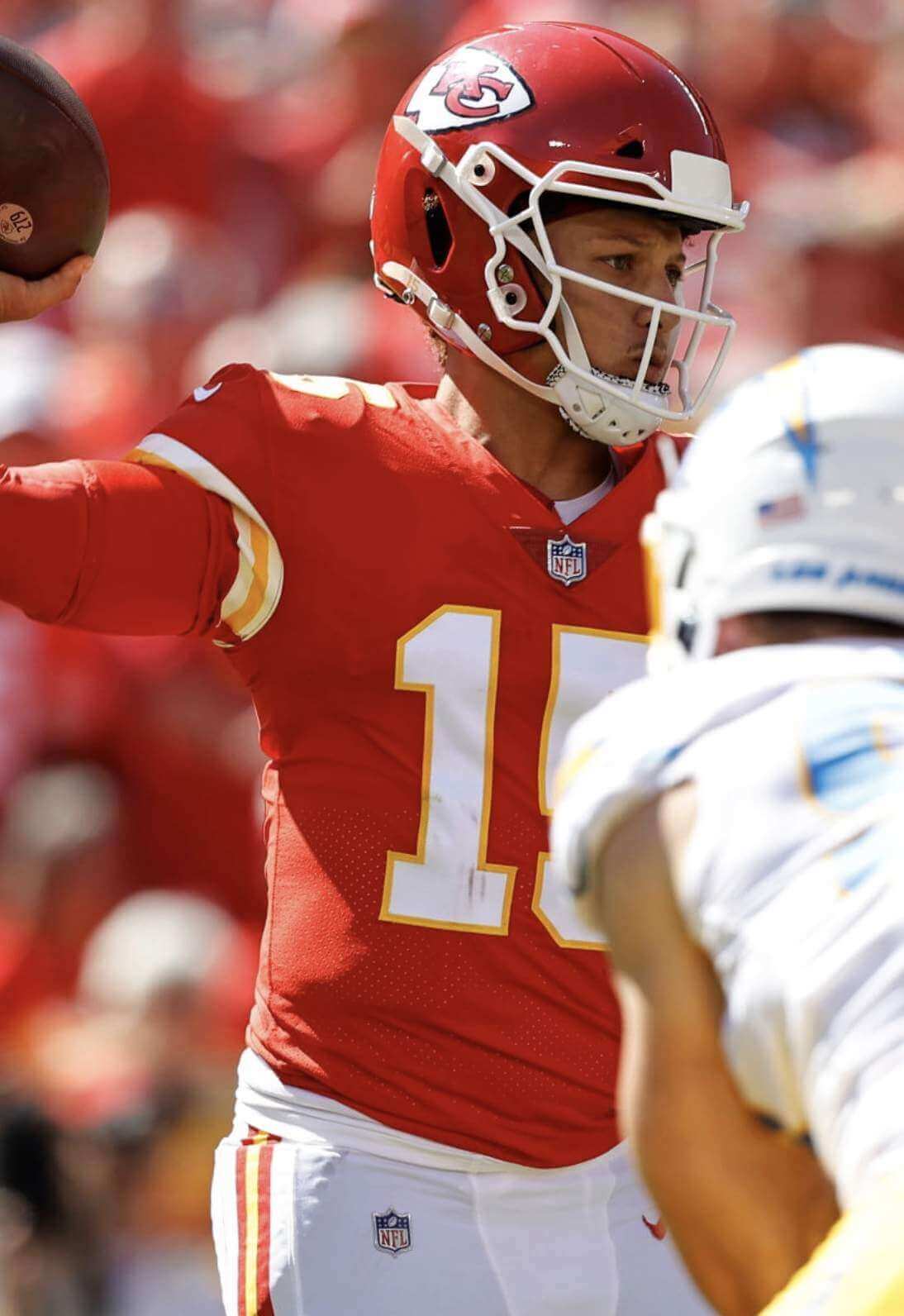
As you can see, the logo was nice and crisp for that game. But something apparently happened to the logo patch in the five weeks between Sept. 26 and Nov. 1 (even though the pants saw no game use during that stretch). Either that or Mahomes switched to a different pair of white pants with a beat-up NFL logo.
Was there anything else at work here, like maybe a “lucky pants” superstition? I asked KC media relations rep Brad Gee about that. He said it was the same pair of pants all along.
I don’t think I’ve ever seen an NFL logo fall apart like this, on either the pants or a jersey — or at least that’s what I initially thought. But as I was working on this piece, I noticed that another KC player — running back Darrel Williams — had a ghosted NFL logo on his pants during Sunday night’s game against the Raiders:
So I did the same thing I did with Mahomes. First, I looked at pics of Williams from the Nov. 7 game against the Packers. Sure enough, still ghosted:
Next up: The Nov. 1 game against the Giants. For that game, Williams’s logo, unlike Mahomes’s, appeared to be fully intact:
Then, just to be thorough, I checked Williams’s pants logo from the Sept. 26 game against the Chargers. It was fully intact:
So now we know that at least two KC players have played with ghosted NFL logos, and we also know that Williams’s logo seems to have decayed all at once, while Mahomes’s was more of a progression. Hmmmm — is the KC laundry staff using some extra-harsh bleach or something like that?
KC’s next game is this Sunday at home against Dallas, so they’ll probably be wearing their white pants (although the dreaded mono-red combo is always a possibility). I’ll definitely be fixating on Mahomes and Williams in that game!
Finally, as long as we’re talking about KC, here’s a follow-up to an item from yesterday’s MMUW post: Remember how I mentioned that a KC coach kept his play-calling charts in a pocket sewn into his pullover top? Here’s a much better look at that:
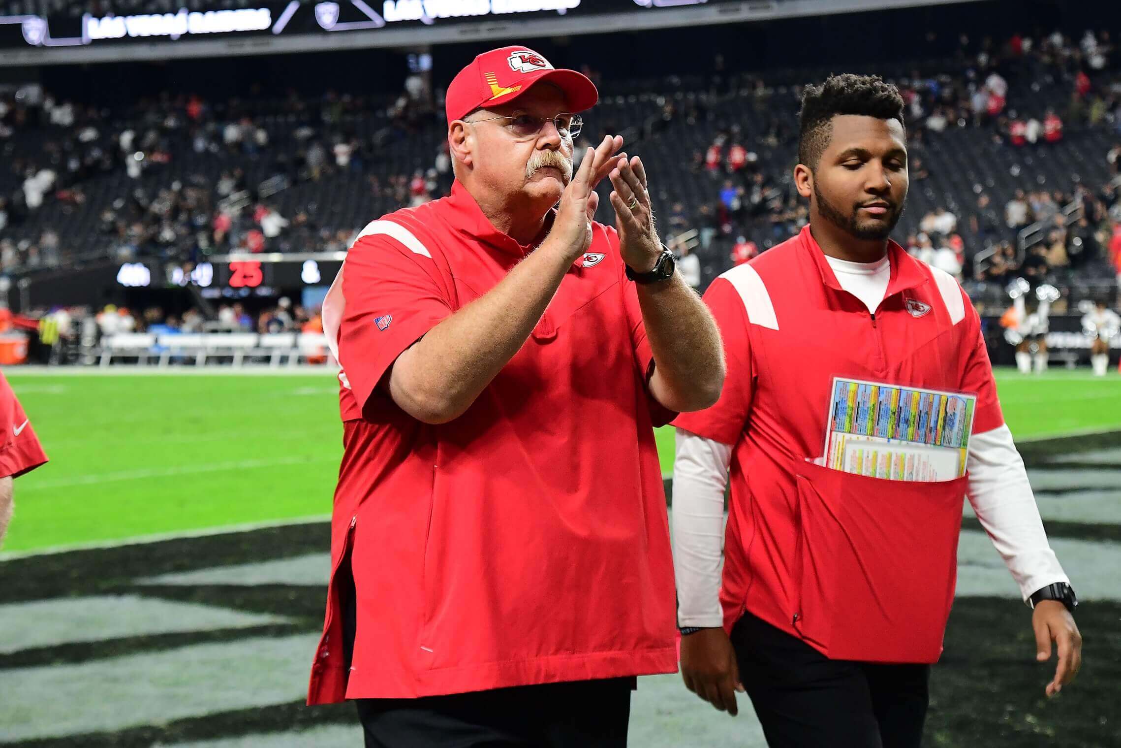
(Big thanks to @shelbyrays for sending me down this pants rabbit hole, and to Jake Estep for the pocket photo.)
For all photos, click to enlarge
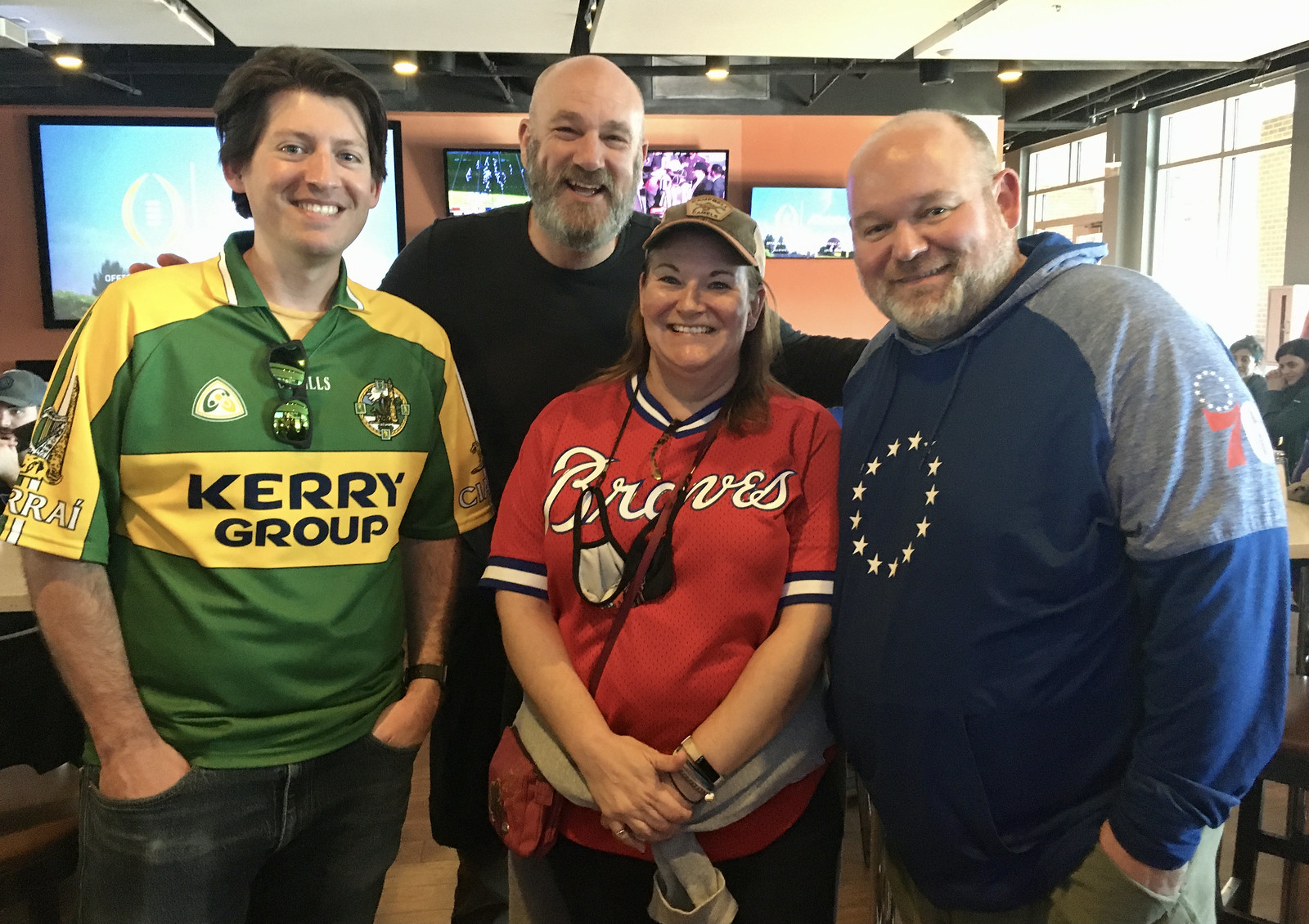
ITEM! Durham party report: About 15 excellent people (including from left, Patrick Lasseter, Chip Hessenflow, Paula Parker Fordyce, and Troy Fordyce) showed up at Saturday’s Uni Watch party at Tobacco Road in Durham, and I can honestly say I had a great time interacting with each and every one of them. Here’s a quick rundown:
• For well over a decade now, the very wonderful Elena Elms has been sending me uni-themed cookies each December. She’s truly a lovely human being, and it was a genuine thrill to have the opportunity to finally meet her in person:


That last photo was taken by fellow party attendee Tom Arnel, who I regrettably did not get a photo of. (Sorry about that, Tom — but I enjoyed meeting you as well!) Also: Note that Elena had a baseball-themed bag and mask! I would expect nothing less.
• Another big thrill was getting to meet Kevin “Gashouse” Cearfoss, whose sensational 3D logo wall art projects and vintage sports merch catalogs have made him a Uni Watch superstar. He lives in Wilmington, N.C., so he wore a UNC-Wilmington T-shirt along with our new Uni Watch Alternate Cap and — gotta love this — Uni Watch stirrups:


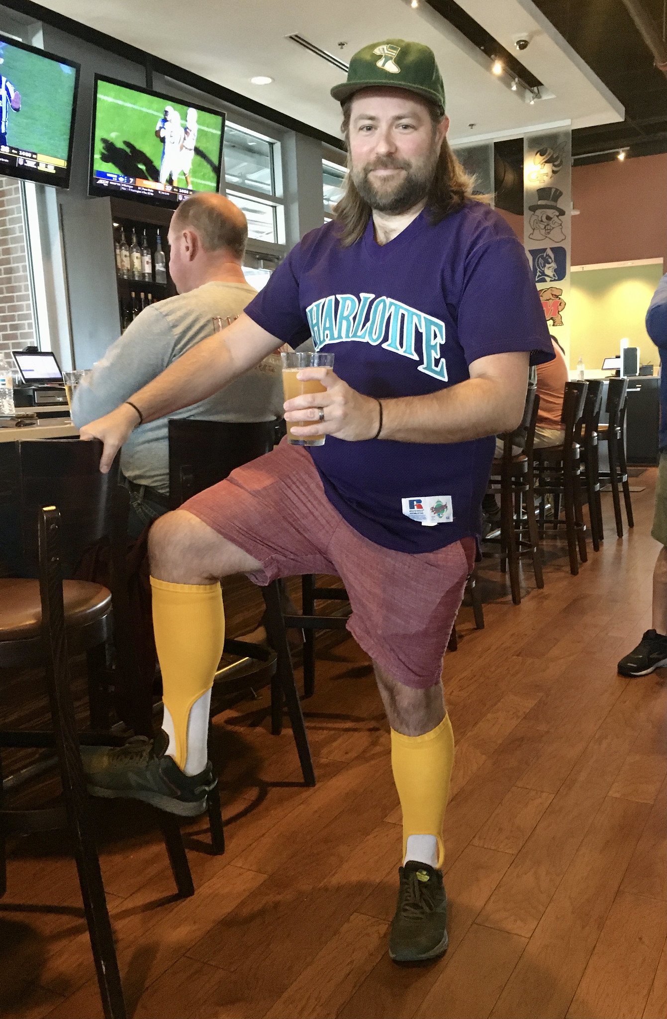
• Kevin wasn’t the only one wearing Uni Watch headgear and stirrups. Brock Towler took the very bold step of pairing gold stirrups with shorts — and also trolled me a bit by wearing a purple Charlotte Knights shirt:
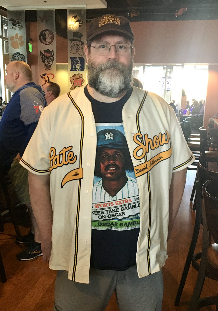
• Brian Slattery paired a Late Show with David Letterman jersey and cap with an awesome Oscar Gamble “traded card” T-shirt:
• Paula Parker Fordyce teaches sports management at Campbell University, whose teams are known as the Fighting Camels and the Lady Camels (ugh), so she repped the school on her cap and mask:

• Paula’s husband, Troy, wore a handsome 76ers hoodie:

• Patrick Lasseter wore a very nice jersey in Uni Watch colors. At first I thought it was from soccer or rugby, but he said it was from the Gaelic sport of hurling:

• Two years ago we made a Cleveland Force (MISL) membership card for Bryan Stroud. So naturally he wore a Force jersey — but not the same design that his card is based on — to the party:

• No jersey or cap for Chip Hessenflow, but that’s fine — I always respect people who simply dress as themselves for Uni Watch events. Chip was the first person to greet me when I arrived and asked me lots of interesting questions during the course of the afternoon:
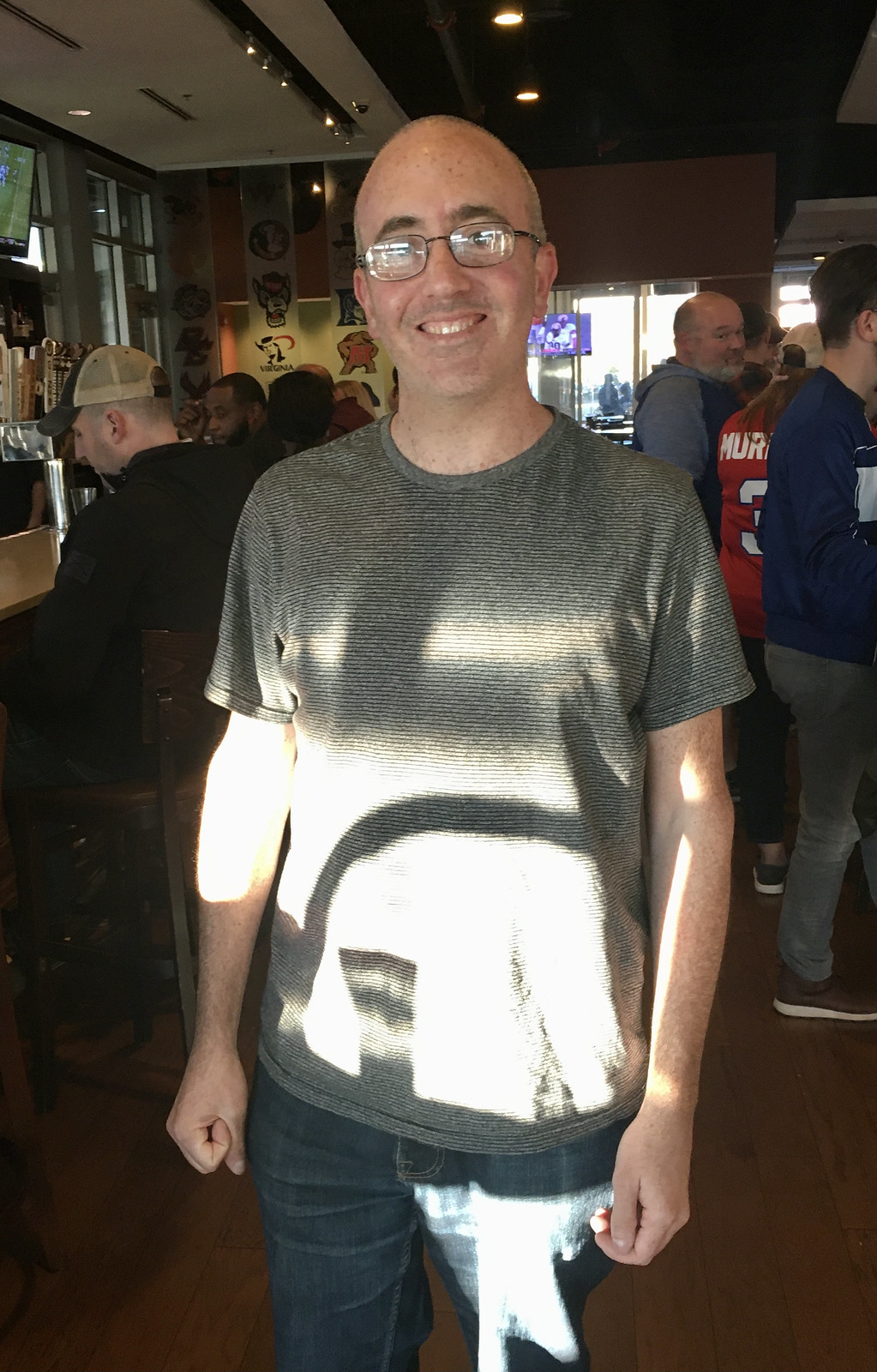
• No jersey for Eli Vineberg either, but with good reason: He had no idea that there would be a Uni Watch gathering taking place. In fact, he doesn’t even live in North Carolina! He’s a Uni Watch reader/fan but somehow missed the news that the party was happening in Durham on Saturday. He happened to be in town visiting a friend, and they happened to be having a few rounds at the bar when our event began, so he basically lucked into attending a Uni Watch party without even planning to! Naturally, he ended up being one of my favorite attendees (we had fun debating various aspects of baseball).
• Kathryn Harrawood didn’t wear a jersey either, but her partner, Drew Glover, made up for it by wearing a Korean Durham Bulls T-shirt and a retro-styled Everton FC jacket:

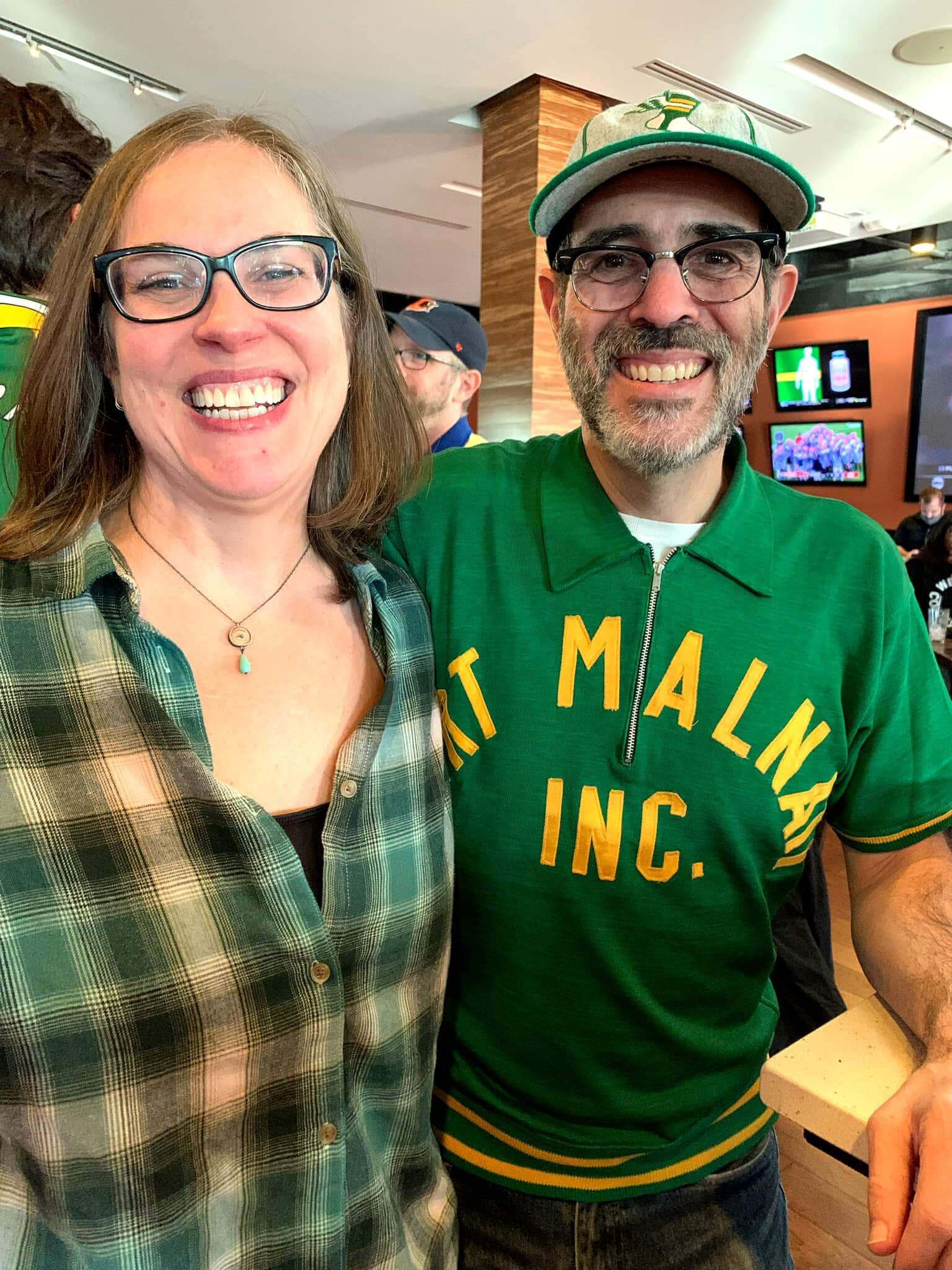
• It was great to see my old sidekick Alleen, who was my girlfriend when I created Uni Watch back in 1999. She even wore a gorgeous green plaid shirt that she knew I’d like:
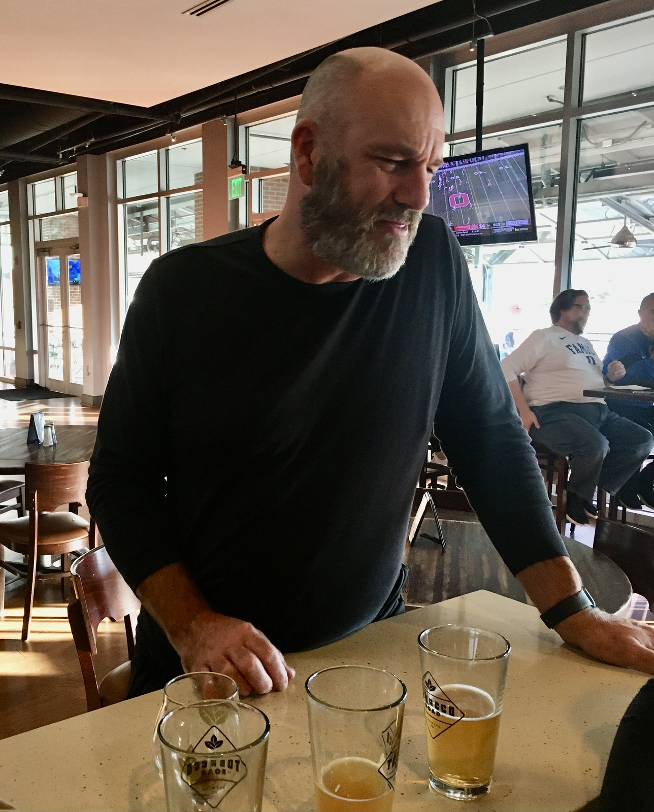
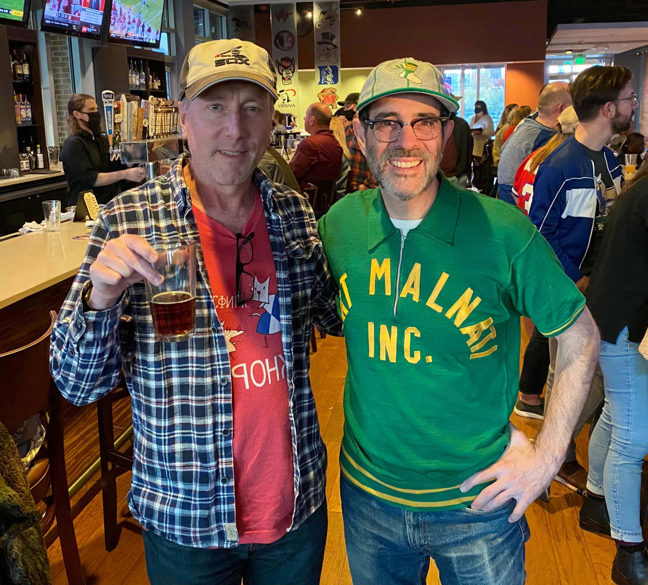
• Finally, the whole reason for my trip was to hang out with my buddy and comrade Tim, a great guy who I’ve known for over 30 years. During that time, we’ve seen each other through all sorts of good times and bad, traveled together in New Zealand and Death Valley, and formed a friendship that I know will endure as long as we’re both still alive and kicking. I hadn’t seen him since before the pandemic, so it was great to see him again — and to have him on hand at the Uni Watch party:
I’ve said this before, but it bears repeating: I know people enjoy meeting me at these gatherings, and it’s a privilege for me to meet my readers. But the biggest kick is for me to see the readers meeting each other. You can really feel that sense of shared comm-uni-ty, that palpable feeling of “Oh, you Get It™ too!” I love that.
Big thanks to everyone who attended — hope you all enjoyed it as much as I did!
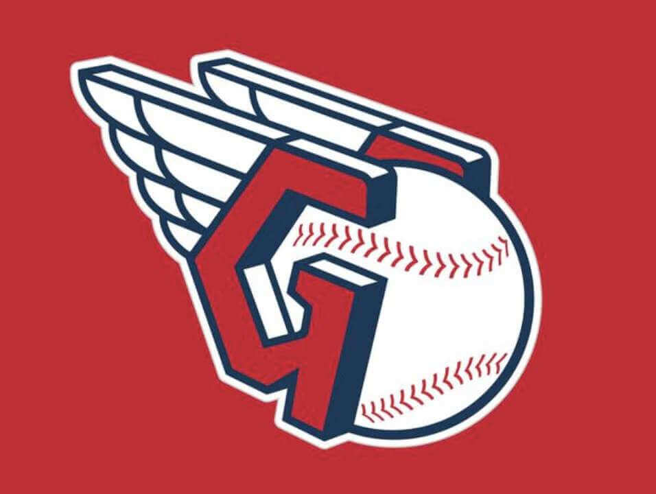
Guardian rollout continues to go swimmingly: For months now we’ve been hearing that the Cleveland MLB team didn’t engage in basic due diligence regarding the name “Cleveland Guardians,” which had already been trademarked by a roller derby team. You’ve probably been wondering, as I have, if that’s actually a serious problem for the MLB team or if it’s just a lot of fuss over nothing.
We got a hint yesterday, which was the day that Guardians merchandise was supposed to become available for retail sale. Instead, the merch launch was delayed without further explanation — a move that’s almost certainly related to the roller derby team’s lawsuit against the MLB team.
This doesn’t necessarily mean that the MLB team won’t be called Guardians, of course — the MLB team could still end up paying the roller derby team a hefty sum to go away, which still seems like the most likely outcome. For now, though, yesterday’s merch postponement is the latest reminder of what appears to be an astonishingly slipshod operation by what’s supposed to be a top-tier sports organization. Yeesh.
Update: A few minutes after I posted today’s blog entry, ESPN’s Buster Olney reported that the naming issue has now been resolved:
Cleveland's baseball team announces it has resolved the lawsuit by the Guardians Roller Derby, and moving forward, "both organizations will continue to use the Guardians name."
— Buster Olney (@Buster_ESPN) November 16, 2021
The merchandise will now presumably flow freely.
The Ticker
By Alex Hider

Baseball News: The Phillies settled with the original creators of the Philly Phanatic, which allows the team to bring back the old design of the mascot if they choose (from @PhillyPartTwo and @Jrryanlaw2). … The Marlins’ High-A affiliate, the Beloit Snappers, have changed their team name to the Beloit Sky Carp and unveiled new logos and uniforms (thanks to all who shared). … Here’s a great photo of Willie Mays in a Puerto Rican winter league uniform (from @181st_Street).

NFL News: New uni combo last night for the Rams, who wore their white alternate jersey with blue pants. Not bad, but they’d be much better off with the yellow pants. And as you can see in those photos, the 49ers wore their home throwbacks in that game. … It appears the Falcons will wear their fauxback uniforms on Thursday against the Patriots (from Phil). … Reader Trey Volk notes that the 5-5 Browns have worn five different uniform combinations — one for each of their wins. … Check out the video and photos from the “Mud Bowl” — a 1964 matchup between the Giants and the St. Louis Cardinals (from Mark Haarmann).
College/High School Football News: Florida International and its coach, Butch Davis, both confirmed yesterday that Davis would not return in 2022. Davis accused the school of “sabotaging” the football program, including “using old uniforms and equipment.” … BYU will wear royal helmets along with white jerseys and pants on Saturday (from Phil). … Someone tell Google that Pitt has changed its logos and colors (from @colinwimbles). … Utah will wear their new battleship-inspired uniforms this weekend (from floripaman74). … It must have been a tough night for spotters in Stockton, Calif., on Friday when St. Mary’s took on Edison in the high school state playoffs. Not only was the game played in dense fog, but Edison wore black jerseys with black numbers that were outlined in maroon (from Rudy Gutierrez). … More from the high school level: The Lewisville High School Fighting Farmers in Texas wear a helmet stripe that tapers down into a pitchfork (from Ty Maple). … The Nebraska Class A state championship will give off big cheesehead vibes this weekend. Gretna High School sports Green Bay’s “G” logo and Omaha Westside uses Wisconsin’s “Motion W” (from Brett Baker).

Hockey News: A referee calling last night’s Islanders/Lightning game in Tampa used a purple whistle for Hockey Fights Cancer (from John Muir). … Also from John: The University of Nebraska at Omaha introduced its new vice chancellor of athletics yesterday by giving him a hockey jersey (from John Muir). … The ECHL’s Fort Wayne Komets and Toledo Walleye will wear throwback jerseys for a Thanksgiving-night matchup (from @The_Real_Kub).

Basketball News: Syracuse women’s retired No. 33 on Sunday in honor of former player Felisha Legette-Jack. It’s the first time the school has honored a female athlete with a retired number (from Max Weintraub). … The Jazz don’t have a “mixtape” jersey this year, but this pennant does contain some historic logo mashups (from @matthewgarryfox). … Musician Dave Matthews wore a Pelicans-inspired Dumpstaphunk basketball jersey during his show at Madison Square Garden this weekend. Dumpstaphunk is a funk band that hails from New Orleans (from @waynetm41).

Soccer News: The starters for the Washington Spirit of the NWSL paid tribute to midfielder Tori Huster, who’s out with an Achilles injury, by holding up No. 23 with their fingers in the team’s starting lineup photo Sunday (from our own Jamie Rathjen). … This YouTube video recounts some of the best kits included in the FIFA 98 video game (from @ACC_Tracker).

Olympics: The IOC has given uniform approval to Russian athletes for the upcoming Olympics games. They’ll again compete as the Russian Olympic Committee with Russian colors, but they are still not permitted to compete under the Russian flag following a doping scandal (from Phil).

Grab Bag: The Wall Street Journal (hard paywall) has a story on the fashion trend of men wearing knit caps that don’t cover their ears (from Jason Hillyer). … New Japan Pro-Wrestling has a 50th-anniversary logo (from Wade Heidt). … Ty Ortega spotted some La Cueva High School (New Mexico) shirts at a Target store in Albuquerque that contained a typo that rendered them much more generic. … The Coast Guard will soon adopt new uniforms (from Timmy Donahue). … Also from Timmy: The downtown arena in Albany, N.Y., has a new corporate name.
.
Please join me in wishing the happiest of birthdays to “Collector’s Corner” columnist and Uni Watch Facebook page manager Brinke Guthrie. I’ve given him the week off from CC, but the column will return next week. Enjoy your special day, Brinke!! — Paul
As a southern Wisconsinite, I was hoping for so much better from the Beloit renaming. The Sky Carp did a few things really well – the jersey scripts with their goose-head capitals are some of my favorite marks in all of pro baseball – but mostly, I’m hard pressed to think of a MiLb identity I’d rank below Beloit. “Sky carp” is not a thing anyone will recognize as referring to geese, nor does it connect with other locally relevant phenomena like Trash Pandas or Paddleheads or other recent seemingly oddball but successful MiLB rebrands did. Then the team crafted an otherwise very nice set of goose visuals, but overwhelmed them with clunky storytelling. Some of it actually works – the aviator glasses for the historical reference to a local aviation pioneer kinda make sense. But copy/pasting a clipart wrench in the bird’s feet to honor blue-collar industrial history is just the laziest, most cynical thing. Nothing about a goose says “mechanic” or “factory laborer.” If you want to build a team identity around some kind of industrial work, great! Start with the team name, as with the Packers or Brewers, to cite two completely random examples that no sports team executive in southern Wisconsin could possibly be expected to have heard of. And then to top it all off, the Sky Carp have largely modeled their uniforms after their parent club, so Beloit is deliberately trying to look like the ugliest team in MLB. The B cap mark is a better logo than Miami’s current M, so Beloit isn’t as ugly as the Marlins, but it’s close. Black-on-black caps are great for B-list celebrities trying to look cool courtside at an NBA game, but they don’t belong on a baseball diamond. If the cap was bright blue instead of black, with that excellent black B logo, Beloit’s uniforms would jump from a low D to B-plus.
Then again, I did preorder a blue Sky Carp alt cap yesterday, so I’m a part of the problem here.
Happy birthday, Brinke!
Thank you BurghFan!
“Brock Towler took the very bold step of pairing gold stirrups with shorts — and also trolled me a bit by wearing a purple Hornets shirt”
– With the baseball diamond logo on the jock tag, I think that might be a Charlotte Knights shirt instead of the Hornets.
Good call. Fixed.
HBD to a fellow 11/16er!
Looking forward to a return of the real Phillie Phanatic next year, an early birthday gift.
Man what a fun one today! I’m going to be watching those pant logos now all the time.
It was nice to see Elena, her cookies are always so creative, I look forward to just seeing what she comes up with every year.
Happy Birthday Brinke!
Cheers.
Thank you Ted!
Re: Willie Mays.
Y’all are burying the lede. What an ABSOLUTELY ESPECTACULAR CAMISA!!!! Two crabs on a bat; awesome!
I think there was a discussion some years back on the Chris Creamer boards about teams using the Cardinals trope of a mascot(s) standing on a bat.
Amongst those I have seen are:
Stars on a bat (Vanderbilt)
Beaver “ (Portland)
Oriole “ (Baltimore AAA)
Crabs “ (Santurce)
Pelicans “ (New Orleans AAA and Tulane University)
I’m surprised, with the cutesy mascots that have been cooked up the last 30 years, that we have not seen, say, the Phillies put the Phanatic or Phil and Phyllis on a bat, or the Expos putting Youppi on a bat.
Thoughts?
Sioux Falls Canaries (Old Nebraska League)
The hockey official is using purple tape on the standard Caul whistle.
Happy birthday Brinke!
Great find for Eli to have a Uni Watch party appear around him! notice the banners behind him have a Maryland logo in with other ACC schools, must be a pretty old decoration.
Thank you Memal!
Did the bar have a bar cat? Looks like a cats lags stretched out in the Force picture.
Nope!
The gathering looked like a great time. I would love to attend one some day.
Happy birthday, Brinke! I always enjoy your column.
As a southern Wisconsinite, I’m soooo disappointed in the Beloit renaming. Design-wise, the team did some excellent work, and a few of the new marks are among my favorite in pro baseball. But overall, I’m hard pressed to think of a MiLB rebrand that I like less than the Sky Carp. Chiefly, the name. “Sky carp” is not an already existing term or nickname that means anything to anyone, nor does it connect with a locally relevant phenomenon as do such otherwise similarly silly names as Trash Pandas or Paddleheads. And because the visuals are so heavily invested in the goose imagery, the silly name doesn’t naturally shorten to Carp. And for all the quality of the visual designs and logos, they’ve badly muddled their main goose logo by slathering it with too much arbitrary and forced storytelling elements. The flight goggles to represent a local aviation pioneer, fine, that almost feels natural. But having the goose hold a copy/paste clipart wrench to represent local blue-collar stuff is just the laziest and most cynical thing. Nobody looks at a Canada Goose and thinks about mechanical tools or factory labor. If you want to build a team identity around workers/laborers, great! Start with the name. Like the Packers or Brewers, to choose two completely random examples of team names that no one would expect a southern Wisconsin sports executive to have heard of before. And then, to top it all off, the team designed its uniforms to echo its parent club, the notoriously ugly-uniformed Miami Marlins. Beloit’s uniform marks are much better-designed than Miami’s, so the Sky Carp don’t look quite as ugly as the Marlins. But they still look bad; a D instead of a D-minus. And so easily fixed! A black letter logo on a black cap with only a narrow outline is a fine look for a B-list celebrity sitting courtside at an NBA game, but such a ghosted look doesn’t belong on a baseball diamond. But put that delightful goose-head B logo on a bright blue cap, and the whole uniform instantly upgrades from D to B-plus.
Then again, I preordered a Sky Carp cap yesterday – the blue alt – so I’m not exactly part of the solution here.
Agreed. I’ve lived in Wisconsin all my life – 51 years – and never heard of SkyCarp.
And, as a colleague noted, the geese are around in the summer. SkyCarp, if they exist, would be a winter thing. So maybe for a basketball team?
That said, the other four choices were arguably worse yet.
I really hope to attend a Uni Watch party one day! Looks like so much fun. Would probably have some indecision about what jersey to wear!
It’s not too soon to plan for the 25th-universary party, which will take place here in NYC in late May of 2024 (i.e., 2.5 years from now). You should come out here for that!
I will add it to my calendar!
Agree Wafflebored. I would have a tough decision about which jerseys and hats. Though I think it would be appropriate for me to show at the party with one of the Wafflebored creations I have.
Could wear 2 jerseys and remove one halfway through. :)
Uni Watch gatherings are awesome… in any capacity.
I’ve been to two official parties in St. Louis, one unofficial in Chicago, the 20th Anniversary satellite party in St. Louis, and occasional Zoom gatherings with a handful of Uni Watch legends from around the country. It’s a very special thing.
Happy Birthday, Brinke!
Thank you ChrisH!
Thanks for posting your photos, Paul. It’s always a plus to view the faces behind the names of our uni-brethren!
I’ve been to some official Uni Watch gatherings in St. Louis, an unofficial one in Chicago, the 20th anniversary satellite party in St. Louis, and I occasionally gather on Zoom with some Uni Watch legends from around the country. It truly is special.
Is it too much to ask for the Toledo Walleye to just become the Toledo Goaldiggers full-time?
I’ve seen new hockey uniforms and concepts, but that Ft. Wayne Komets jersey really caught my eye and made me pause. So simple but so great.
Ok, how is Sky Carp better than Snappers?
Actually, it is the other way around on Omaha Westside and Wisconsin…Wisconsin ended having to get approval to use Westside’s logo and even then they had to change it. If you notice Omaha Westsides is pointed in the middle and Wisconsin’s is block in the middle. I just wanted to set the story straight.