
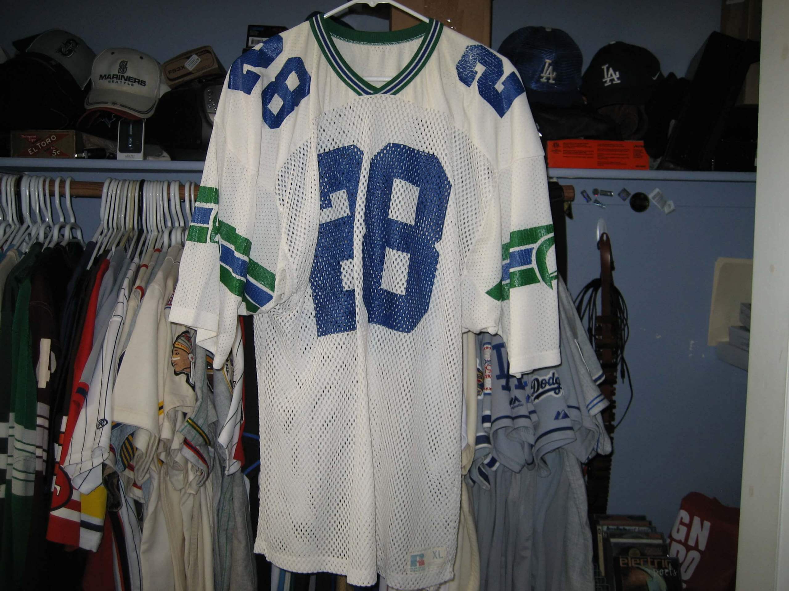
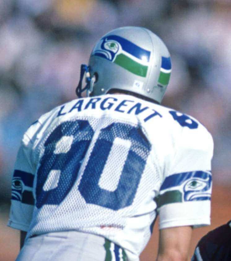
Click to enlarge
The folks at the Gridiron Uniform Database recently received a note from one of their website visitors, who wanted to tell them about an interesting Seahawks jersey he’d acquired on eBay. He included some photos (which the GUD guys then shared with me), one of which is shown above. As you can see, it looks a lot like a 1980s Seahawks jersey (they used that mesh fabric back then), except for the sleeve striping. The Seahawks had blue-green striping back in the day, not green-blue-green.
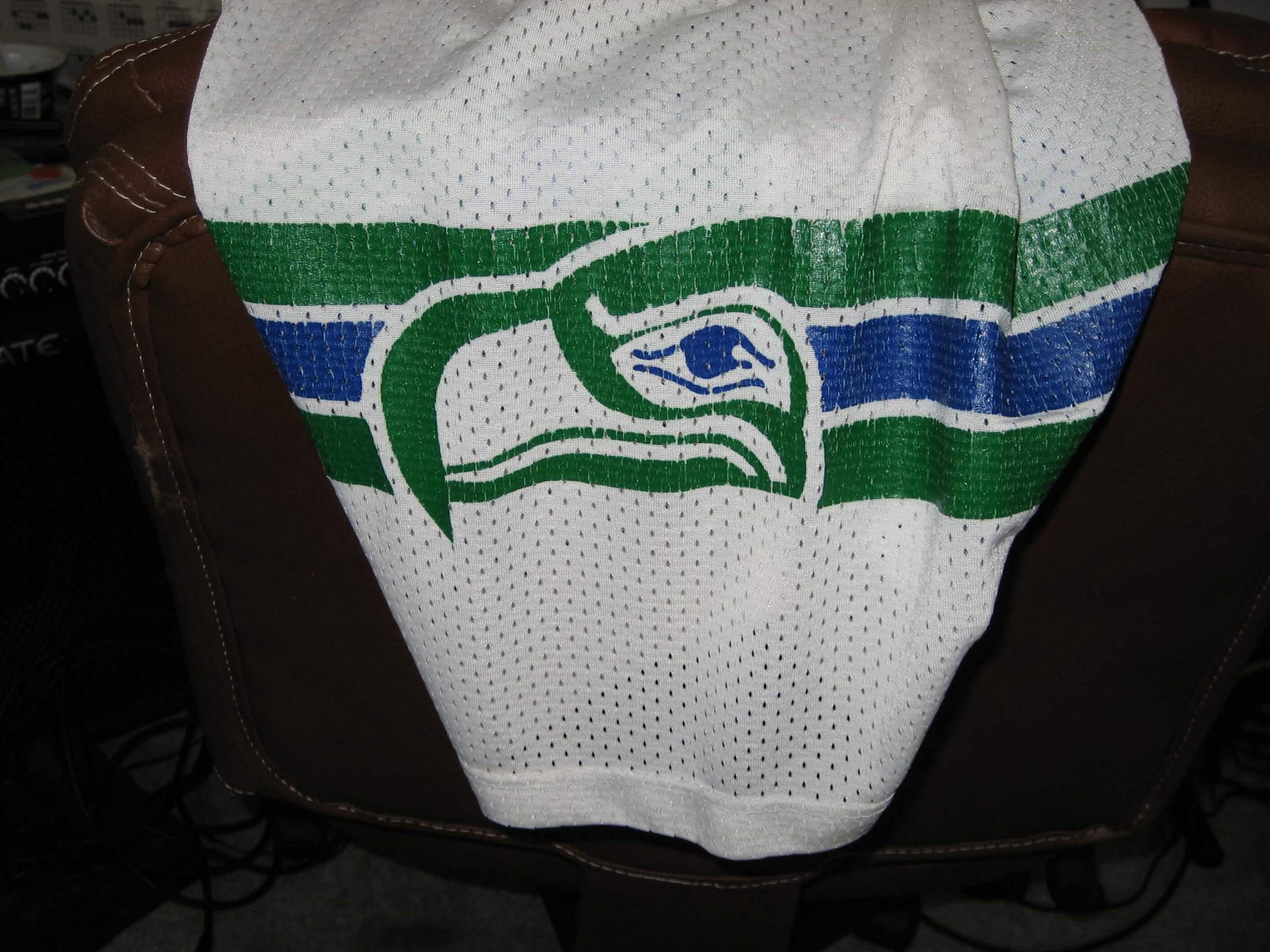
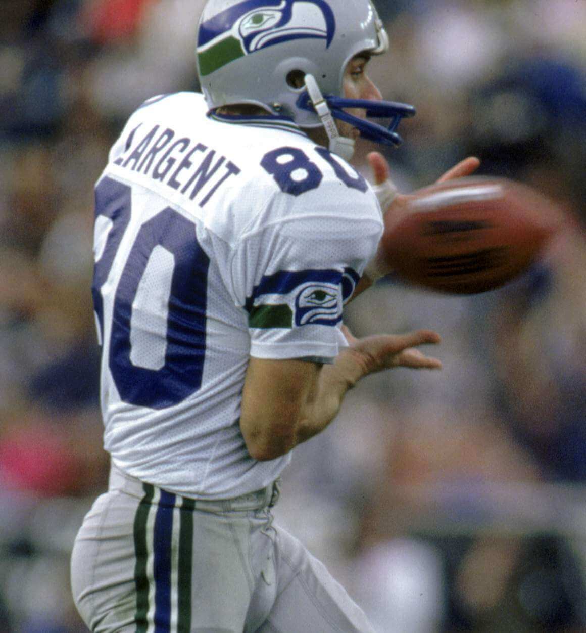
Here’s a closer look at that same jersey, this time focusing on the sleeve:
Anyway: Is the old jersey a possible prototype design that the team ultimately rejected? Or maybe a practice jersey? One of the GUD folks shared the photos with a game-used jersey expert, who wrote back with this:
I believe the jersey is legit. In the early 1990s I was set up at a sports card show in Seattle where an individual walked in with a few of those jerseys, with the Russell Athletic tagging. The story was they came directly from the Seahawks equipment manager when the team was cleaning the old stuff out of the locker rooms and that they were used as practice jerseys. I am not sure if the were prototypes or if the team was testing jerseys from a different manufacturer.
I want to say the individual had some sort of provenance, but after 30 years I can’t recall what he specifically had. I actually purchased jersey No. 80 (Steve Largent), which I still own.
Interesting! I kinda prefer the three-stripe version, but that’s because I always prefer symmetrical stripe patterns. Hmmmm.
(Huge thanks to the Gridiron Uniform Database crew for sharing the prototype story with me.)
Photo by Justin L. Fowler, The State Journal-Register; click to enlarge
Bulletin reminder: In case you missed it on Thursday, my latest piece for Bulletin is about two Illinois high schools that wear “half-and-half” two-tone helmets that are unlike anything I’ve ever seen before — and that I think could potentially rewrite the book on football helmet design. You can check it out on my Bulletin page. Enjoy!
Incidentally, one thing I learned after this article was published yesterday is that UConn wore a two-tone navy/white helmet way back in 1965! Check this out:
(My thanks to Paul Dillon for letting me know about the UConn helmet.)
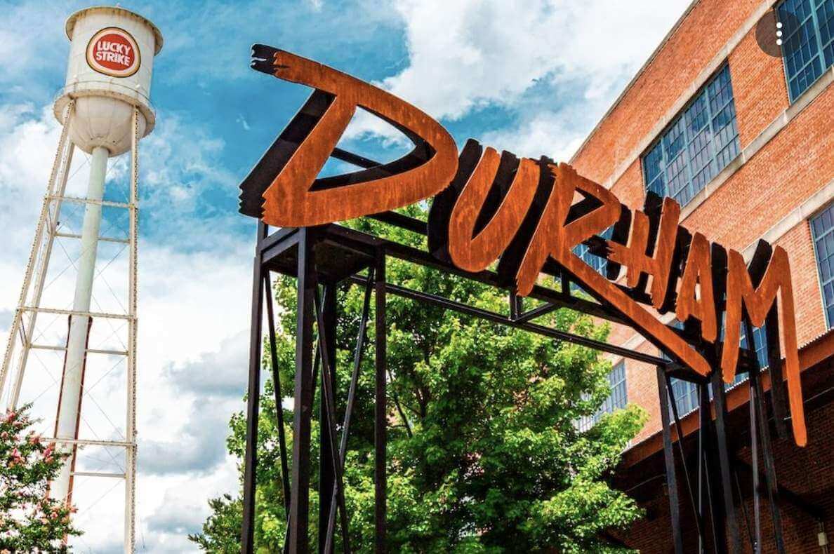
North Carolina party reminder: Remember, I’ll be convening a Uni Watch gathering in Durham, N.C., tomorrow, Nov. 13, 2:30pm, at Tobacco Road. No RSVP is necessary — just show up and look for me (or for lots of people wearing jerseys).
This will be the first Uni Watch gathering since the 20th-anniversary parties in 2019. I’m looking forward to meeting lots of you!
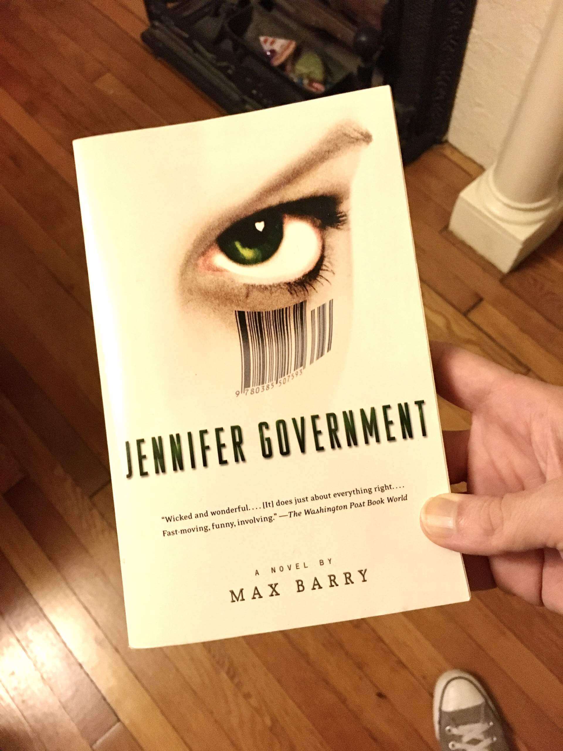
Uni Watch Bookshelf: Jennifer Government: I recently caught up with Max Barry’s 2003 novel Jennifer Government. Not sure how I missed it when it came out, but it’s right up my alley. Or to put it another way, the book’s title in Germany and Italy was Logoland; its title in Brazil roughly translates to United States, Inc.; and Barry himself considered calling it Capitalizm. Intrigued yet?
Jennifer Government is a dark satire set in a dystopian world in which taxation has been abolished, most government functions have been privatized, and corporate culture rules everyday life to such an extent that people’s surnames are simply the names of their employers, so people have names like Nathaniel ExxonMobil, Claire Sears, and Billy NRA. (The title character is a federal investigator, hence her name.) Also: Schools are run by companies like Mattel and McDonald’s; police investigate crimes only if the victims provide the funds for them to do so; if you call 911, the ambulance will only come if you provide a credit card number; and so on. It’s basically the “Hey, it’s just business” ethos taken to its logical conclusion. Eighteen years after its publication, a lot of it seems depressingly prescient.
And here’s the best part: The key character is named John Nike. He does not disappoint.
For years I’ve been saying that the spread of advertising into every nook and cranny of our lives is leading us to the world of the 2006 movie Idiocracy. But now I may have to start saying it’s leading us to the world of Jennifer Government.
Uni Watch’s highest rating — strongly recommended.
By Anthony Emerson

Baseball News: On Veterans Day, the good folks over at Baseball Reference add poppies to the profiles of players who served in the military (thanks to all who shared).

NFL News: Some members of the Denver Broncos practiced on Wednesday in helmets with the old-school “D” logo from their orange Color Rash uniforms while also wearing modern-look navy practice jerseys, which made for a very incongruous look (from Kary Klismet). … In a 1991 game, Washington QB Jeff Rutledge got hit so hard by Eagles LB Seth Joyner his facemask warped (from Johnny Garfield). … Last night’s Dolphins/Ravens game marked the 17th time the two teams have met but just the fourth time that the Ravens wore a combo other than purple-on-white (from Marcus Hall).
College/High School Football News: Tyrrell Smith has been assigned Frank Beamer’s No. 25 for Virginia Tech tomorrow. Since he’s an offensive lineman, he’ll wear his usual No. 79 for the game itself (from Andrew Cosentino). … The ACC Network has a morning show, Packer and Durham, that celebrated its 500th show yesterday. Packer and Durham got commemorative Virginia football jerseys — one is No. 5 and one is No. 00. “I have absolutely no idea why they picked us, or we volunteered, as opposed to any other ACC school,” writes our own Jamie Rathjen, a UVA alum. … Temple High in Texas wears pants that are blue in front and white in the back (from Chris Benedik). … Check out this photo of the 1893 Tulane football team. That chest crest looks like a radiation or fallout shelter logo, but according to James Gilbert, the symbol didn’t have those connotations until after World War II, more than 50 years later (original photo from Matthew Livaccari). … Here are this weekend’s unis for Virginia Tech, West Virginia, Virginia, Troy, ULM, Towson, Arizona, Vanderbilt, Michigan State, Mizzou, Tennessee, Oregon, Iowa and Duke (thanks to all who shared).

Hockey News: The WHL’s Kelowna Rockets acquired G Talyn Boyko from the Tri-City Americans recently, and when Boyko made his Rockets debut, he was still wearing his Americans mask (from Wade Heidt). … Also from Wade, the BCHL’s Coquitlam Express wore Remembrance Day uniforms on Wednesday night.


College Hoops News: UNC men’s will have camo warm-ups for today’s game in observance of Veterans Day (from James Gilbert).
Soccer News: Remarkably, Chelsea’s men’s team has worn their primary blue kits in every single one of their 20 first-team fixtures this season. That streak will end next weekend, when they visit fellow azure-clad club Leicester. … San Marino has unveiled the one-off 90th-anniversary kit they’ll wear for Monday’s match against England (from Jeremy Brahm).


Olympics News: The Swedish Olympic Committee has unveiled their uniforms for Beijing 2022 (thanks, Phil).
Grab Bag: Lauren Theisen of Defector has voiced an issue I’ve felt for a while now: score bugs are too big nowadays (paywalled, but worth a subscription, from James McNamara). … Pacific Sportswear and Emblem, a patch and emblem company, has donated 300 memorial patches for a UPS driver who was killed in a plane crash near Pacific’s corporate offices. The patches have been distributed to other UPS drivers in the area (from John Cerone). … Influential typeface designer Jonathan Hoefler was able to identify all the different fonts on the FBI jackets used in a recent episode of Succession (from @EricBinOmaha). … NASA’s Expedition 66’s mission patch is shaped like a U.S. Highway sign, even using Highway Gothic numerals (from James Gilbert).
By the time you read this, I’ll be on my way to North Carolina (or maybe will already have arrived there). My flight was just canceled. Rebooked for an afternoon flight, which is going to cause major complications to my barbecue itinerary, but whaddaya gonna do.
I almost had to scrap this trip entirely, because my mom landed in the hospital again on Monday — third time in less than a month — but she went home yesterday and seems to be okay-ish now. My brother encouraged me to go ahead and make the trip, so off I go. Crazy times, crazy times.
Anyway: Play nice while I’m away, enjoy Phil’s weekend content, and I’ll see you back here on Monday morning. And for those of you in the Tar Heel State, I look forward to meeting you tomorrow afternoon in Durham! — Paul
Really interesting that Virginia gave Packer and Durham those jerseys, since Packer went to Clemson and Durham went to Elon. Other than working for the ACC Network, they seemingly have no real connection to UVa.
I think the reason why was just Bronco being nice, but I only saw that in Twitter responses after I’d already sent in what I said.
Hi Paul,
A few times above, you describe the prototype sleeve striping as blue-green-blue. It looks green-blue-green to me, right? Just checking.
Yes, you’re right. Me = goofball. Now fixed.
Haha, I had to read it a few times. I thought I was taking crazy pills! Give me all the green!
The Seahawks uni was such a cool looking uniform when it was launched, especially the wrap around stripe on the helmet. Their stadium was another matter, gave New Orleans stadium a run for the money for the all-time dungy looking stadium award.
The stadiums looked like the former Tampa Bay Bucs and Indianapolis Colts coach?
Most of the old domed stadiums were completely awful. The turf was terrible (both texture and color), and the lighting had a horrible color. I remember going to see games in the Pontiac Silverdome when I was growing up and almost viscerally getting a headache watching the game, and not just because the Lions were bad.
At first I thought the Seahawks’ uniforms were Prussian blue owing to the Kingdome’s crappy lighting; they were royal blue when they got the opportunity to play in daylight.
That Seahawks look was their best look. Royal blue and kelly green worked for them (and the Mavericks, for that matter), it’s vastly underused. Everything since then has been incrementally worse. The comically oversized front numbers and non-Varsity Block NOB font don’t make it any worse.
Seth Joyner does a postgame show in Philadelphia. He still looks like he could go out and bend a facemask.
I’m with you, Paul, in preferring the prototype three-stripe treatment. But not because of the symmetry thing; I’m a fan of the Seahawks’ blue-green asymmetry. I prefer the three stripes because 1) It mirrors the pants stripe, and I prefer sleeve stripes to match the pants, not the helmet; 2) The g-b-g pattern forces the Seahawk logo to reverse colors from the helmet version, and to my eye that accentuates the elegance and quality of the logo itself. Sort of the equivalent of the two NY or D logos on the head/chest of certain baseball teams, except good. If I had to guess one reason the Seahawks nixed this prototype, it would be hesitance to dilute their logo by reversing colors. Normally a sound judgment, but in this case a missed opportunity.
And seconding the recommendation of Jennifer Government. I haven’t read it since it came out, and this is a good prompt to revisit it. There’s a whole genre of hypercapitalist apocalyptic fiction, a lot of it really good, but even in such company as early Neal Stephenson and Jason Pargin, Jennifer Government stands out for its vision and narrative energy.
I actually prefer the 2 broad stripes because nobody was really doing it back then. Trams did the Notthwestern stripes at the sleeve or the UCLA stripes at the shoulder (Colts, Vikings). Other than the R**s***s of the time, nobody did 2 broad stripes, and only the Seahawks added a logo within the stripes.
Heh that book concept reminds me of an old episode of the Simpsons, from the mid-90s (predicting what future 2010 would be like). “Pepsi presents Addition and Subtraction”:
link
Jennifer Government had a website where you could play at running your country. Also you could interact with other players with their country. Haven’t checked if that function is still around.
It is:
link
I also prefer the Seahawks’ three stripe sleeves vs two stripes. And the whole uni combo in general, although that’’s house money on this site. I never like the former Redskins’ two sleeve stripe look either, and always thought the same thing: when you compared the ‘Skins’ two stripe pants and sleeves to the multiple stripe look on their yellow pants, old so socks and sleeves, it just looked so much better, and was better w the helmet striping.
Envious of those of you descending on Durham. I did a barbecue tour of the Carolinas in 2014 and Durham was a highlight.
I will always be emotionally attached to the 1976 Seahawks uniform. In fact, the potential of seeing the original Seahawks uniforms is the one thing which excites me the most about the lifting of the one-shell rule!!
The green-blue-green stripes are interesting though. Perhaps the Seahawks could try it but change the helmet logo to match. Or just go with a plain silver helmet.
Paul,
When do you anticipate we’ll get a look at second helmet colors for NFL teams?
I don’t have any specific knowledge of that, but new uni designs are often released around the time of the draft.
Paul, I must ask – have you ever seen the movie Robocop? Because the corporate hellscape society portrayed in that movie released in 1987 was absolutely prescient.
Yes, of course. A little ham-handed for my tastes, but the underlying critique was a strong one.
Oh it’s brutal. But that was the point. I don’t know if Paul Verhoeven knows the definition of subtlety, but I am 100% ok with that.
Sorry to hear about your mom, Paul. Wishing her the best. Safe travels.
I don’t know if Paul Verhoeven knows the definition of subtlety…
Ha! Indeed. I do love Starship Troopers, though.
Paul, if I could make a suggestion: Raleigh/Durham is nice, but if you want the real NC BBQ experience you’ll need to head East a bit to Johnston County (maybe 15 mins from Raleigh) and go to Smithfield’s BBQ. They have a bunch of locations that should be easy to get to.
Durham is really cool and has a vibrant, diverse population (the original Black Wall Street was there) but it’s a little too hip to get authentic BBQ. Raleigh is a bit more upscale, but same problem. JoCo is where the real foodie experience is.
Have fun in my home state. You’ll love it.
Hi, Jay! I’m planning to go to Allen & Son in Pittsboro (a longtime favorite of mine) tomorrow. Will try to get to a Smithfield’s outlet on Sunday (although, really, a true self-respecting NC bbq outlet should be *closed* on Sunday, no?).
It’s a shame the (in my opinion) superior Allen & Son in Hillsborough closed. Hillsborough BBQ is pretty good if you’re looking for another place or in Durham Backyard BBQ if you make it here today. RDU is a big mess this morning. Good luck!
Paul, regarding your trip to Durham, North Carolina. Is there possibly some kind of uni-related story in the works about the 1942 Rose Bowl? Either way, the stadium where it was played is still Duke’s home field and worth checking out if you haven’t been there.
No, I’m just visiting a friend. But thanks for the tip!
That book sounds fascinating, adding to my wish list right now!
Dave Krieg and Ken Anderson: two 80s franchise quarterbacks who attended tiny Midwestern liberal arts colleges (Krieg: Milton College–which doesn’t even exist anymore! Anderson: Augustana College, which is a DIII school). I wonder when we’ll next see a QB with such a pedigree.
I’ve noticed 1970’s numbers on certain players’ photos feature an absurd gap between digits. The Bengals have a bunch of them. Ken Anderson, Sam Wyche, Virgil Carter (#11). Always wondered what the story was with that..
Tremendous post today as I love the old Seahawks uniforms. Especially the porthole mesh and giant numbers. I do prefer the two-stripe version they used over this three stripe one, but that might be nostalgia since I’m a fan.
Re: Seahawks jersey, it looks like they took the original 1976 white jerseys, without the seahawk on the sleeves, and added the seahawk to the sleeve. The original stripe pattern on the white jersey was green/blue/green.
Thanks for the Seahawks post to start. My dad was/is a big Steve Largent fan (and by default, somewhat of a Seahawks fan), so I’ve seen those uniforms a lot as I’ve grown up.
Thanks for the heads up on Jennifer Government.
Already checked out the kindle version from the library and making progress on my breaks.
Enjoy!
I’m a few days late on this, but I am a big fan of some of Max Barry’s work regarding corporate culture. “Company” is another great one. However, my recommendation would be to read “The Unicorporated Man” by Dani Kollin and Eytan Kollin.
That Seahawks jersey first jumped out at me as a 90’s Dallas jersey with Seattle trim. The numbers are the same ones worn by the late 80’s-early 90’s Cowboys. It’s easy to notice because the holes in the eights are bigger then the same location in the twos.
link
It’s always interesting to see a Dallas white jersey with the dark blue numerals, and not the royal blue ones they wear now.
I never thought I’d be getting a book recommendation from this blog but here we are. Jennifer Government sounds right up my alley! Anyway…I sure do miss those old Seahawks uniforms. I’m a sucker for a silver helmet.