By Phil Hecken
Follow @PhilHecken
Greetings and a very good Saturday morning to you all. I hope everyone has had a good week so far.
A couple days ago, knowing how much I enjoy uniform concepts, Paul shot me an e-mail with the following message: “This came in a week ago. Thought I might do something with it, but now I’m thinking it might be better for you.” He was right.
The e-mail was from reader Drew Domm, and it was actually sent on October 27th — the day before last week’s Thursday Night Football game between the Arizona Cardinals and the Green Bay Packers. Although the game was awesome (the Pack won late), it wasn’t exactly a uni-matchup for the ages, with the Cards wearing their BFBS Color Rash alternates. Sadly, one could actually make an argument that this is their least terrible uniform … which is saying a lot. Even if you’re (the one) fan of any of the Cardinals uniforms, I think few would argue they’re in need of a redesign. With the Bucs, Browns and Jags all redesigning in the past couple years, the Cardinals (IMO) have the worst uniforms in football.
So when Paul forwarded me Drew’s e-mail with new Cardinals uniform concepts, I was more than happy to share it with you. Obviously it was written before last week’s game, but no matter — the proposals below are an immense improvement over the current Cards’ kits. I’ll let Drew take it from here…
Fixing this upcoming Thursday Night Football issue
by Drew Domm
Hey all of you at Uni-Watch👋
Thanks for everything, huge fan of your site, twitter, and your attention to details.
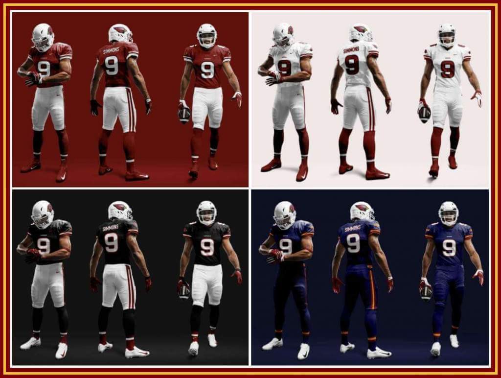
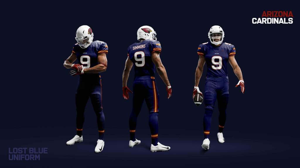
I’ve been a designer over at Apple for several years and finally got a little free time to try and fix my hometown football team’s less than stellar uni; the Arizona Cardinals. I know there’s a huge game coming up tomorrow against the Packers, of which will prominently display two legacy football franchises doing very well this year. Unfortunately I know you, myself, and all of your readers will be paying more attention to the current head-scratching uniform choices of the Cardinals. That being said, I hope you appreciate this take on simplifying the Cardinals uniforms to something more classic and simple.
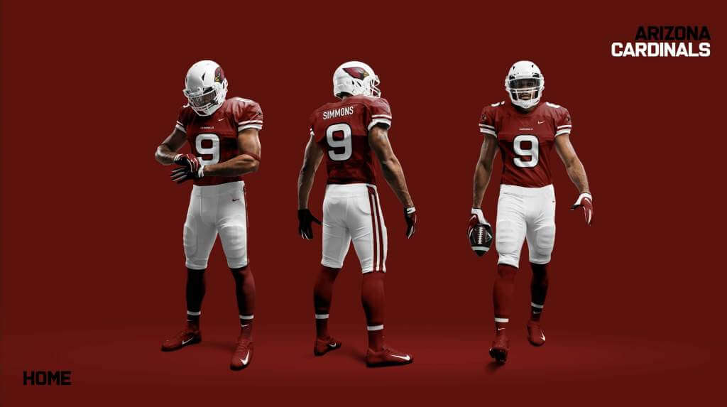
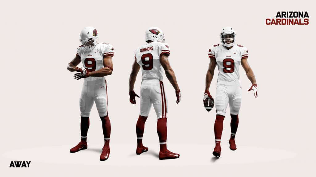
Done away with are the odd curves and pipings that scream 1999, replaced with some classic shoulder/pant stripes to harken back to their timeless history back from the Chicago and Phoenix era uniforms. The helmets are left white, keeping with their long history of having that white top, but with a simple tweak to lose the grey in the facemark for clean and focused white.
The home and away jerseys are simplified down to their respective red and white colors, where on the chest, (a la baseball jerseys) the embroidered center piece witches from “Cardinals” when home to “Arizona” when away.
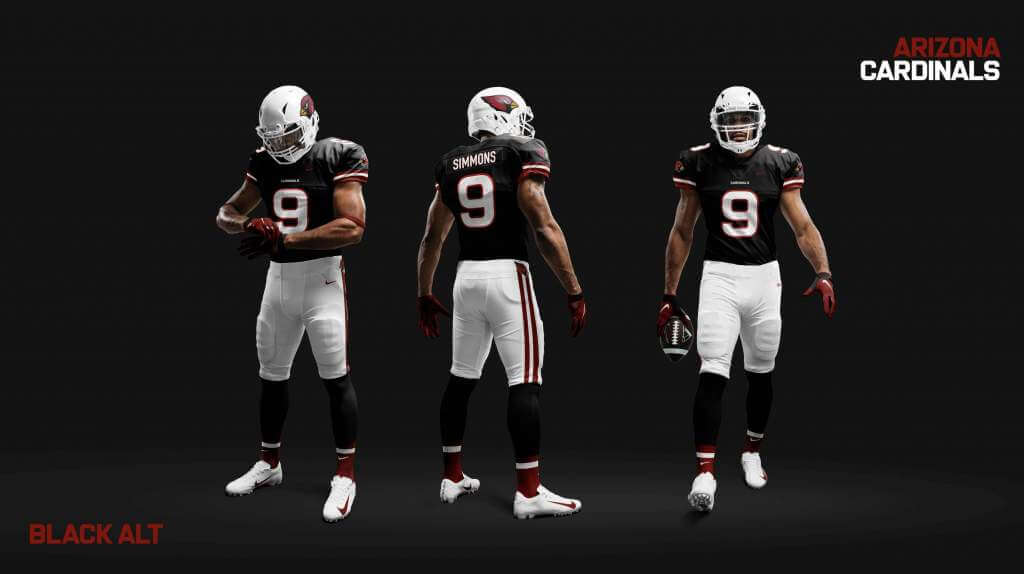
If they must keep around the black alternate jerseys, they’re now met with team-colored stripes on the shoulders to harmonize them with their home/away fits and have easy-to-read, strongly team colored numbers (that honestly kinda looks Dale Earnhardt-esque).
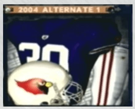
Finally, I also included a fun alternate based on the legacy of a blue jersey that was produced by Reebok for the Cardinals during their 2004 Phoenix year (before changing to “Arizona”) that was inspired by the Arizona state flag and was embroidered on the shoulders. The jersey even made its way into video games, but was never actually worn on the field. I’ve recreated it here to pull the team colors both from the gold and maroon in the Arizona state flag and the Cardinals feather and beak.
At any rate, I had a blast making them and hope you enjoy them and that we some day get some uniforms that look anything like the historical team that’s finally coming around again.
Thanks for all that you do,
Drew
Thanks, Drew! I’ve seen many Cardinals redesigns over the years, and your concepts are up there with the best of them. Interestingly enough, most (including yours) return the Cardinals uniforms to a much simpler design — simpler, but definitely NOT boring. With many teams moving back to more “classic” looks, we can only hope a Cardinals rebrand/redesign is in the, ahem, cards, in the near future and I think these designs would go a long way towards improving the team which currently wear the worst uniforms in the league. Thanks for sharing!
Readers? What do you think?


Guess The Game…
from the scoreboard
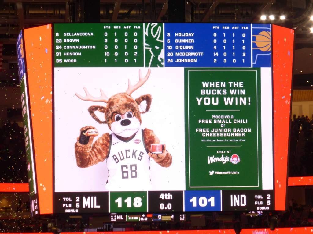
Today’s scoreboard comes from Tom Goshaw.
The premise of the game (GTGFTS) is simple: I’ll post a scoreboard and you guys simply identify the game depicted. In the past, I don’t know if I’ve ever completely stumped you (some are easier than others).
Here’s the Scoreboard. In the comments below, try to identify the game (date & location, as well as final score). If anything noteworthy occurred during the game, please add that in (and if you were AT the game, well bonus points for you!):
Please continue sending these in! You’re welcome to send me any scoreboard photos (with answers please), and I’ll keep running them.
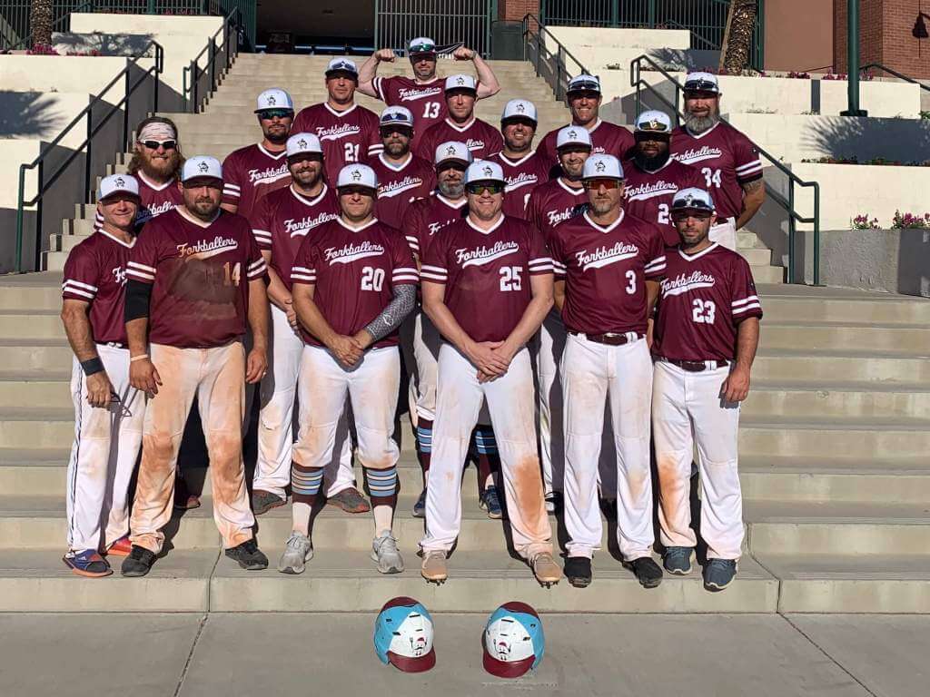
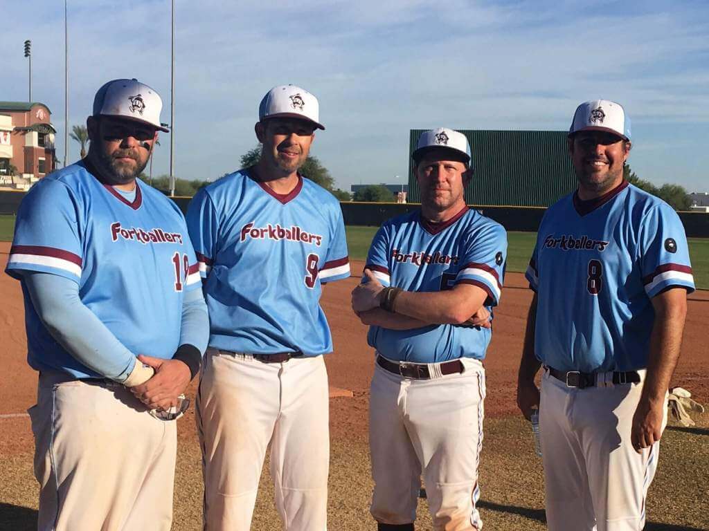
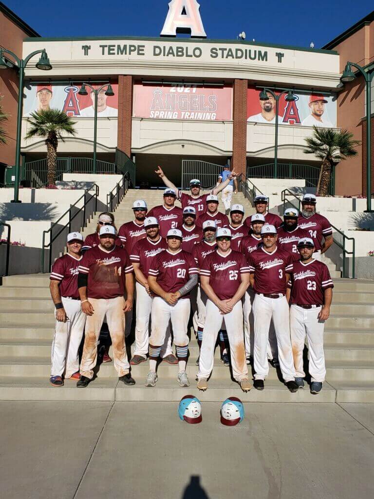
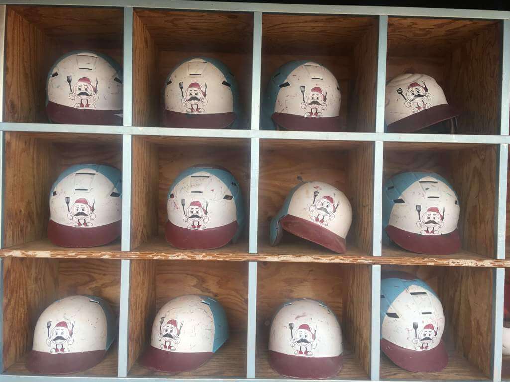
Forkballers Update
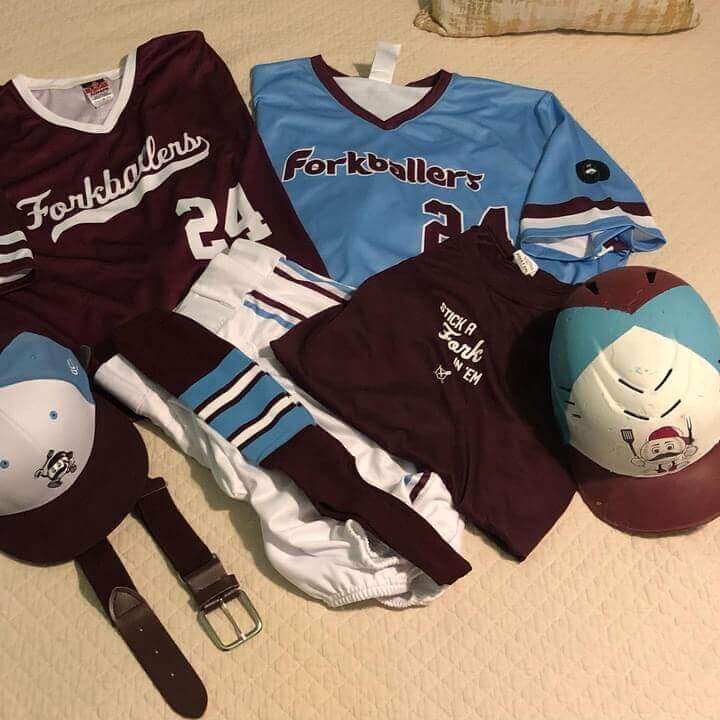
In case you missed it, this past August while I was doing the weekday ledes, I ran a neat little (sub-lede) from reader Brett Mandel on his Men’s Senior Baseball Team, the BaseballBBQ Forkballers (click here and scroll down a bit). Back then, Brett showed us some serious uniform concepts his team would be wearing, but the uniforms hadn’t yet been created. Well, not only were they created, but Brett has a nice update on how things went. Here’s Brett:
Hey Phil!
The BaseballBBQ Forkballers won the Men’s Senior Baseball League 40+ World Series and everyone loved our unis! Take a look at how they turned out…
One of our teammates even said that his buddy told him about your article BEFORE he even saw our uniform in person. You’re our lucky charm!
Thanks again.
Brett
That’s fantastic Brett! The uniforms turned out great (although I wish you could have used your influence to get everyone to go high-cuffed — those stirrups were gorgeous!). And even better, you won the whole thing. Not only were the Forkballers more than likely the best dressed team on the field, they were the best team on the field as well.
Congratulations and thanks for the update!
MLB Playoff Uni Tracking
It’s BAAAAACK.Alex Rocklein has been tracking the jerseys of all the teams involved in the MLB Post Season for the past several seasons.
Now that the World Series has concluded (congrats to Atlanta), this will be our final MLB Playoff Tracker for the year. Alex notes there is a “Little bonus easter egg for the Braves fans out there.”
So here are all three “rounds” of tracking, plus the final final tracker. Enjoy!
Wild Card & Divisional Series:
League Championship Series:
World Series:
And finally, the full tracker:
Thanks Alex! Once again, great job tracking the jerseys of the playoff teams for 2021. Everyone, please throw Alex a nice “thanks” in the comments below, and we look forward to his playoff tracking in 2022.
For all photos, click to enlarge
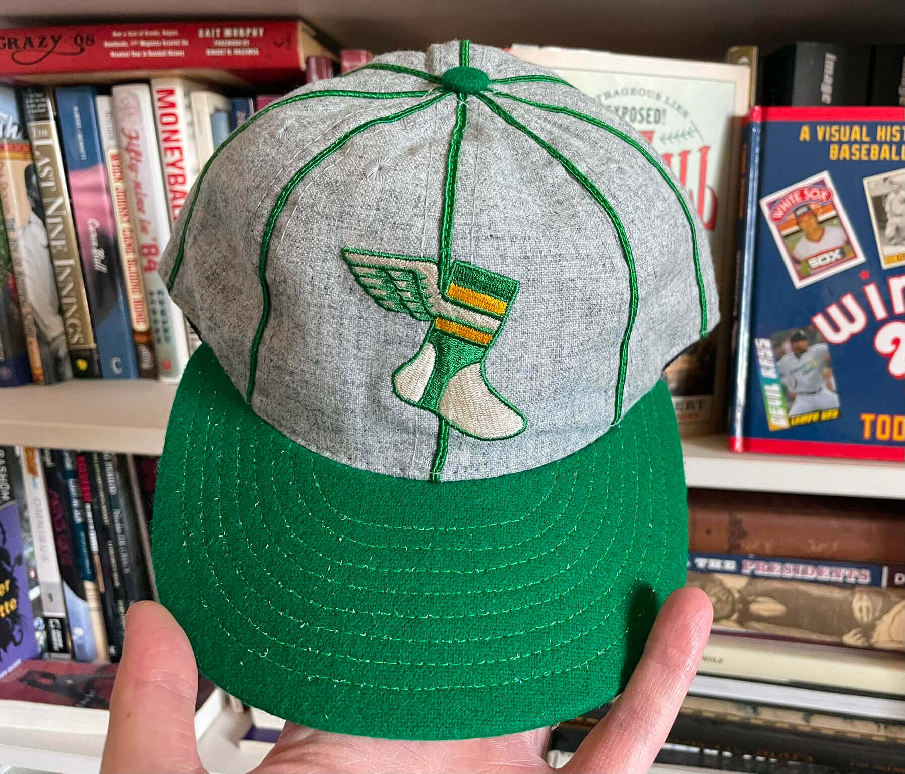
And now a few words from Paul: Hi there. In case you missed it earlier this week, I’m now taking orders on a small batch of our new Uni Watch Alternate Cap. Supplies of this one are extremely limited. Additional photos and ordering details here.
While I have you here:
• If you want some Uni Watch headwear but don’t care for the new ballcap, our Uni Watch Toque might do the trick.
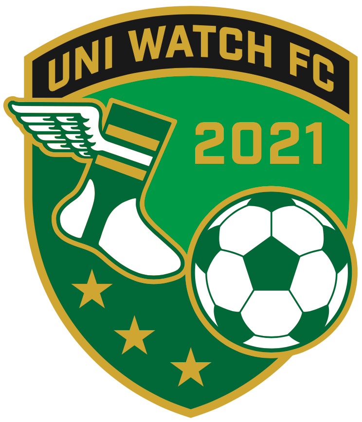
• Our soccer-themed November pin — the first soccer design we’ve done (shown at right) — launched earlier this week. It’s a numbered edition of 150, and we’re down to about 30 remaining. It’s available here while supplies last.
• Todd Radom’s awesome “Hit Sign, Win Stirrups” graphic, which was originally available on a limited-edition T-shirt in 2017, has been revived and is now available a variety of formats. You can get it as a T-shirt; as a hoodie; as a pint glass; as a poster; and as a canvas print.
• I’ll be traveling in North Carolina next weekend and will be convening a Uni Watch gathering on Saturday, Nov. 13, 2:30pm, at Tobacco Road in Durham. I look forward to seeing lots of you there!
Okay, that’s it from me. Now back to Phil with the rest of today’s content.
Your Annual Fall Back Reminder…
It’s that time of year again (sadly). But here’s my annual reminder for everyone (semi-annual, if you count the “Spring Ahead” reminder):
Don’t forget to turn your clocks BACK one hour tonight. Daylight Saving Time comes to an end at 2:00 am. There’s good news and bad news. The good news is that we get an “extra” hour of sleep. The bad news is that the sun now sets an hour earlier than it did the day before (actually it’s more like an hour and 2 minutes, give or take). I know some of you, particularly in the western ends of the time zones, probably welcome the switch (yeah, I know, it’s dark when most of us wake up), but I hate it. Official sunset where I live tomorrow will be 4:44 pm. Ugh.
Anyway, don’t forget to adjust your clocks (if you still have clocks that actually need to be manually set, anyway) tonight. I’ll remind you again next spring to push them ahead again.
The Ticker
By Anthony Emerson
College/High School Football News: Here are this weekend’s unis for Purdue, Oklahoma State, UNLV and SFA (thanks to all who shared).

Hockey News: The Kraken’s AHL affiliates, to begin play next season, will be called the Coachella Valley Firebirds (from Bridger Deschamps). … Yesterday, we ticker-linked a video of the Stars’ public address announcer wearing a jersey with “PA” where the captain’s patch would normally go. Looks like the Hurricanes’ PA announcer has the same detail on his jersey (from Michael Raskin). … The Michigan/Michigan State game last night was color-vs-color, creating a very pleasing look for the game (from L.J. Sparvero). … The Canucks wore these warmup sweaters to celebrate Diwali (from Wade Heidt).

NBA News: Pacers F Damontas Sabonis will rock these amazing sneakers honoring his father Arvydas (from Paul Simpson).

College/High School Hoops News: New unis for Richmond men.

Soccer News: Bundesliga side 1. FC Köln’s annual Carnival shirt has been unveiled (from our own Jamie Rathjen). … The Irish national team has unveiled new orange away kits. Orange is a color rarely worn by the national teams of Ireland and Northern Ireland due to its religious and political connotations (from multiple readers). … Celtic FC are wearing their charity arm’s logo on their kits this weekend against Dundee, instead of their usual shirt ad (from Ed Zelaski). … According to the official Liverpool Twitter account, Premier League matches this weekend will be using this gaudy ball (from Moe Khan). … Real Madrid have launched a sexy new video showing off their plans for the remodel of Estadio Santiago Bernabéu. Plans include the ability to host basketball games and tennis matches at the arena. There’s also a rendering of the field set up in an American football configuration, but the field is Gridiron Uniform Database’s rendering of Super Bowl XXX’s field, of all things (from @VerbDC).

Grab Bag: Allan Jennings reports that the Australian National Rugby League’s newest team, Redcliffe Dolphins, have released their “heritage” jerseys before they’ve released their primary jerseys. The Dolphins will begin play in 2023. Allan also provided us with links to the new unis for some other NRL teams: Brisbane Broncos, Canberra Raiders, Newcastle Knights, North Queensland Cowboys, and Penrith Panthers. … A new documentary is being released called 16, detailing what the uni number means to Penn State lacrosse (from Michael Zarkzewski).
Uni Tweet of the Day
I’d be on board for this…
Next year, I would love to see the nfl designate the final four games of the regular season for all teams to wear throwback uniforms (would love to see more snow games with throwback uniforms too). pic.twitter.com/g2RZ7JnNQp
— Patriots Uniforms (@PatsUnis) November 6, 2021
And finally… that’s it for today. Big thanks to Drew for the Cardinals concepts, Brett for the Forkballers update, and of course Alex for the MLB Playoff Jersey tracking the past month. Well done, gents.
Everyone have a great Saturday (and last day of Daylight Saving Time), enjoy the extra hour of sleep tonight, and I’ll catch you back here with the SMUW crew tomorrow morning.
Peace,
PH
Cardinals uniform concept is cool. I like the blue A LOT. White face mask, yes. I always find it interesting that the whole reason they’re CALLED the Cardinals is because their first owner in Chicago bought used red uniforms that had been battered and washed out and when he was asked what color it was, he souped it up and called them “Cardinal Red”. (This is from the fantastic YouTube video the NFL put out about where each team got their name, if that kind of thing is interesting to you.) Have a great day!
Love the Arizona concepts particularly the flag color combo. My problem with the team will always lie with the nickname. Cardinals are fitting for Chicago & St. Louis but will always be ridiculous in Arizona. They need a full on rebrand.
Funny story. When I moved to AZ in 1990 (2 years after they moved from St. Louis) I was listening to local sports radio and they had on the owner Bill Bidwell. Only time I remember him being interviewed like this. They even took callers, and I asked him why they didn’t change the name to something that related to Phoenix, like “Firebirds”. He said they were one of the oldest teams with a rich history, and cardinals are in the Arizona desert. I questioned that, and said even if they are, nobody thinks of them as a desert bird. About a week later I was drinking a beer on my patio, I live out by the McDowell Mountains next to the desert, and 2 beautiful cardinals flew into my tree. I laughed and kiddingly suggested to my wife that Bidwell found out where I lived and released these birds here. Ever since then I have seen them regularly, and actually appreciate the name more, though I still think “Firebirds” would have been a cool name. Or better yet, change the name to the Arizona Phoenix.
Wes Johnson of the Washington Capitals has also worn a PA jersey link
I don’t mind white or light colored helmets, but they have to have a crown stripe in my opinion. Just looks too empty otherwise. Nice concepts, though. Keep it simple, only fix what’s broken.
Terrific Cardinals redesign. Huge improvement, and it would be among my favorite unis in the NFL. But retaining the white helmet dooms any Cardinals uniform. As long as the helmet is white, the team will always feel compelled to make a bolder statement with the uniform below it. A red helmet, with a switch from the full cardinal-head logo to some kind of skeuomorphic application, like eyes or a beak or crest markings across the center, will 1) Look better on its own; and 2) Permit the team to embrace simpler, more elegant designs below the neck. Still, my wish for a less terrible helmet aside, this redesign is really excellent. Great work!
Was thinking the same thing about the helmet, working on something along those lines, slow going with my PS skills, but hopefully will get it right soon
Is it just me? I hate the college uni reveal videos. I just want to be able to see the whole uniform, to actually look at all its elements. I can’t even tell what Ok State will be wearing in that video.
Not just you, give me a 2-3 pics, I don’t need to waste 30 seconds on something that should take 3 tops
I wouldn’t mind them, if they actually revealed the uniform. They rarely do. Mostly, it’s quick cuts, dim lighting, and some kind of smoke/fog effect obscuring view.
GTGFTS: 19 October 2018. Bucks 118, Pacers 101. I believe it was the first game in the Fiserv Forum.
CARDS: love it. This works. Especially for a legacy team. And red and white is enough, especially when the name derives from the original uniform colors. A little black trim doesn’t hurt but BFBS is too much.
MICHIGAN HOCKEY: wonder why the numbers aren’t in the bespoke script that other UM teams adopted?
DAYLIGHT SAVINGS: extra hour of sleep for you, extra hour of work for me, it is a call weekend.
This Cardinals concept is so much better than what they have now, and unfortunately so much better than anything they’d probably come up with.
Bucks v Pacers was 10/19/18. Home opener for the Bucks of Fiserv Forum.
Agreed. I would take photos over video every time.
Cardinals redesign looks great to me, but I guess I am old school as my 14-year-old son who loves the NFL says the Cardinals have the best uniforms in the league…SMH.
I bet if you were to tell him you LOVE the Cards uniforms (their current set), he’d sour on them quickly.
Haha, little bit of reverse psychology? huh
Even better, call them “fire”, or whatever the kids use to mean “dope”, “fly” or “fresh” this week. It drives my kids nuts. They call me “extra”.
Really great Cardinals uniforms. Not a fan of the blue. Actually they look great, but I’m not a fan of using colors that aren’t part of their color palette. Also this is realistic, since I doubt the Bidwell family would change from a white helmet. I really like the all white look, but I might also add red pants, as long as they only wear them occasionally with the white jersey. Also would need different socks to go with the red pants, to avoid the dreaded leotard look.
Man, does the Forkballers #14 just stay filthy? Uniforms turned out great, especially the helmets. As always, less pajama pants would make everything look better.
Scoreboard is the first regular season home game in Fiserv Forum history. The game was particularly relevant because it was the same night as Brewers-Dodgers NLCS Game 6. I (along with most of the others in attendance) ran outside after to catch the end of the Brewers game on a Deer District screen.
Love the Cardinals redesign set, especially the lost, navy alternate! Great work!
Re: Football Cardinals
I was born in 1960 and grew up watching the “Football Cardinals” as they were called here in the St. Louis area. Because the real “Cardinals” played baseball – or something. Ha!
Anyway, I never appreciated the burgundy jerseys at the time, but I always loved their Home Whites – just enough stripes to offset the simplicity of the design and accent the Cardinal on the helmet.
I’m especially referencing their playoff years which were only two – maybe ’74-’75.
Great uni’s for an exciting team.
As much as I loved the Cardinal logo, in reality – a male Cardinals’ beak is red or rose colored, not yellow.
Not biologically accurate but yellow probably looked better to the designer and the team than the
reality.
Maybe someone could try to depict more accurately in one fo their future concepts.
Their red is cardinal, not burgundy like the Washington Football Team.
Congrats to the Forkballers!
As for that Cardinals concept…terrific work, Drew. So glad there’s no red pants/blood clot option (white is all they need).
While I am in the ‘facemasks should be a team color’ camp, I think the Cards should retain the gray if they were to return to a simpler design such as yours. The modernized helmet logo retains enough of the original to pass as ‘classic’ and given how old the franchise is, keeping the olde-timey helmet just feels right to me in this case. I’m no supporter of BFBS but was an Intimidator fan…is looking Dale Earnhardt-esque such a bad thing?
As a New Mexican, I could see myself becoming a Cards fan when they change their uni back to classic. The NFC West is my favorite division but it has some very problematic uni issues. There are 3 teams in that division whose organizations would greatly benefit from having Uni-watch as their uni consultant.
The Cardinals’ trademark will always be the Ohio State striping, ironically. Not a fan of the bespoke numeral font, but 1. That’s a tough genie to force back in the bottle, the Buccaneers notwithstanding, and 2. I like the Steelers’ numerals, so it’s a subjective thing. The black jerseys are fine; they add variety.
Love the suggestion for the NFL to use throwbacks for the last 4 games of the season. Actually, they could even do this in the middle of the their season.
It’d be great if the uni concepts posted here didn’t include ad patches. The concepts would still look plenty authentic and real without them. Let’s not do any favors for these companies that they wouldn’t do for us. Thanks!
Awesome MLB uni tracker! The pearls haha amazing, GO BRAVES!