Click to enlarge
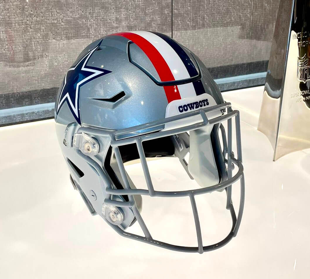
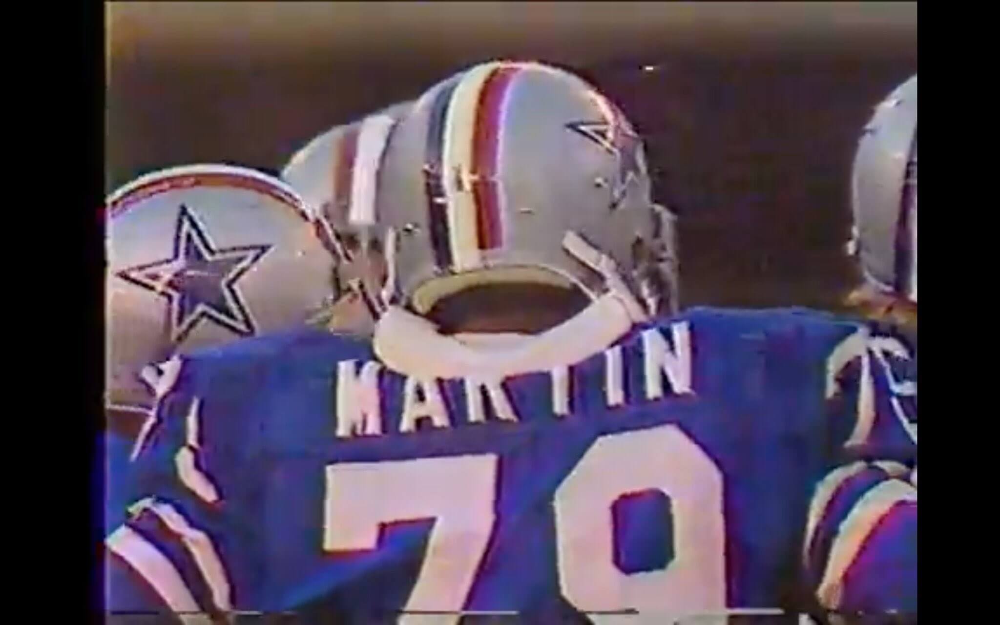
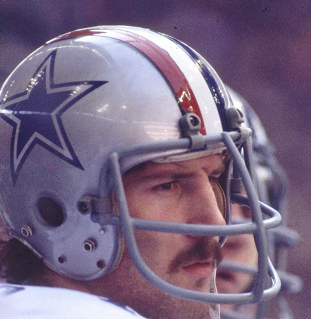
Interesting move yesterday by the Cowboys, who announced that they’re bringing back their red/white/blue helmet striping for this Sunday’s game against the Broncos. They wore that striping pattern throughout the 1976 season to commemorate America’s bicentennial. This Sunday they’ll be wearing it to honor the U.S. military (Sunday’s game will be four days before Veterans Day) and recipients of the Medal of Honor, the nation’s highest military decoration.
A few notes and details:
• In addition to the new stripe pattern (which is achieved simply by removing one strip of blue tape and replacing it with red tape), the Cowboys and the Broncos will also wear a Medal of Honor rear-helmet decal below the American flag decal:
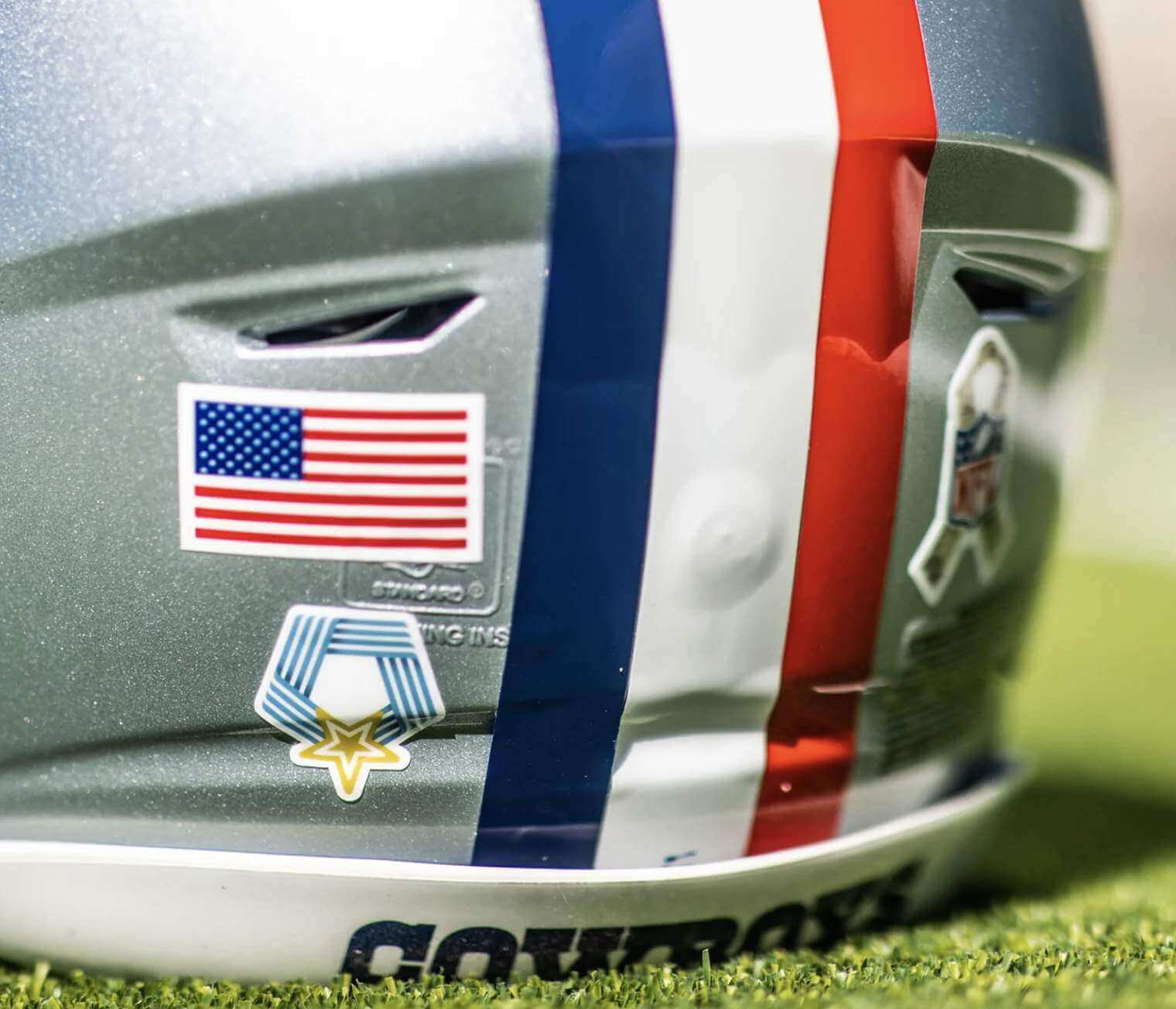
Interestingly, the decal doesn’t seem to match the look of any of the actual medals. Anyone know more about that decal design?
Update: Reader Ryan Desiderio informs me that the decal shows the logo of the National Medal of Honor Museum, which is based in Arlington, Texas.
• In yet another uni-related move, the Cowboys’ cheerleaders will have red/white/blue striping on their boots.
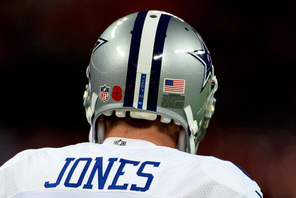
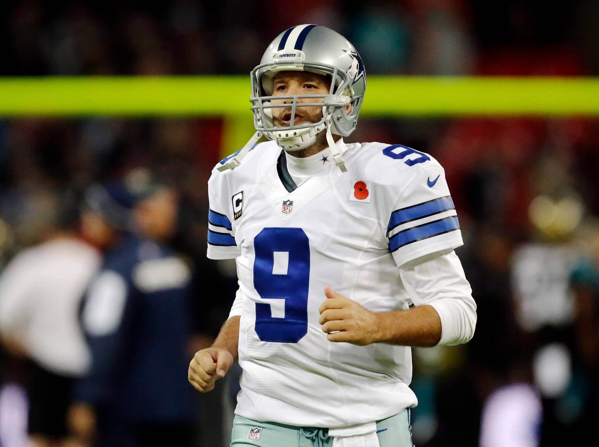
• This isn’t the first time the Cowboys have come up with a unique helmet adornment relating to Nov. 11. In 2014, they played in London on Nov. 9 and went along with the British custom of wearing poppies — on their hemets and on their jerseys — for Remembrance Day. Their opponents that day, the Jaguars, did likewise:
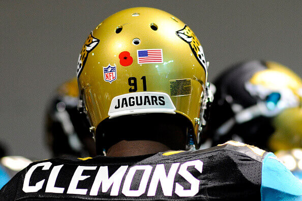
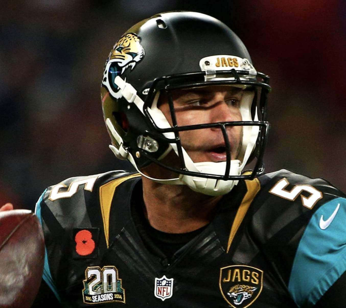
• If you’ve never seen Cowboys photos from 1976, the red stripe was a striking and brilliantly effective design device. Sure, it ruined the symmetry of the helmet striping, but that’s okay — it was such a beautifully simple bit of messaging. Here are some photos from that season:
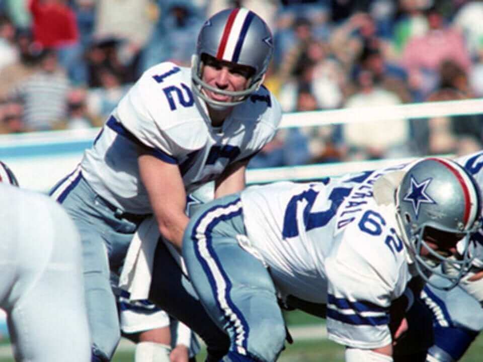
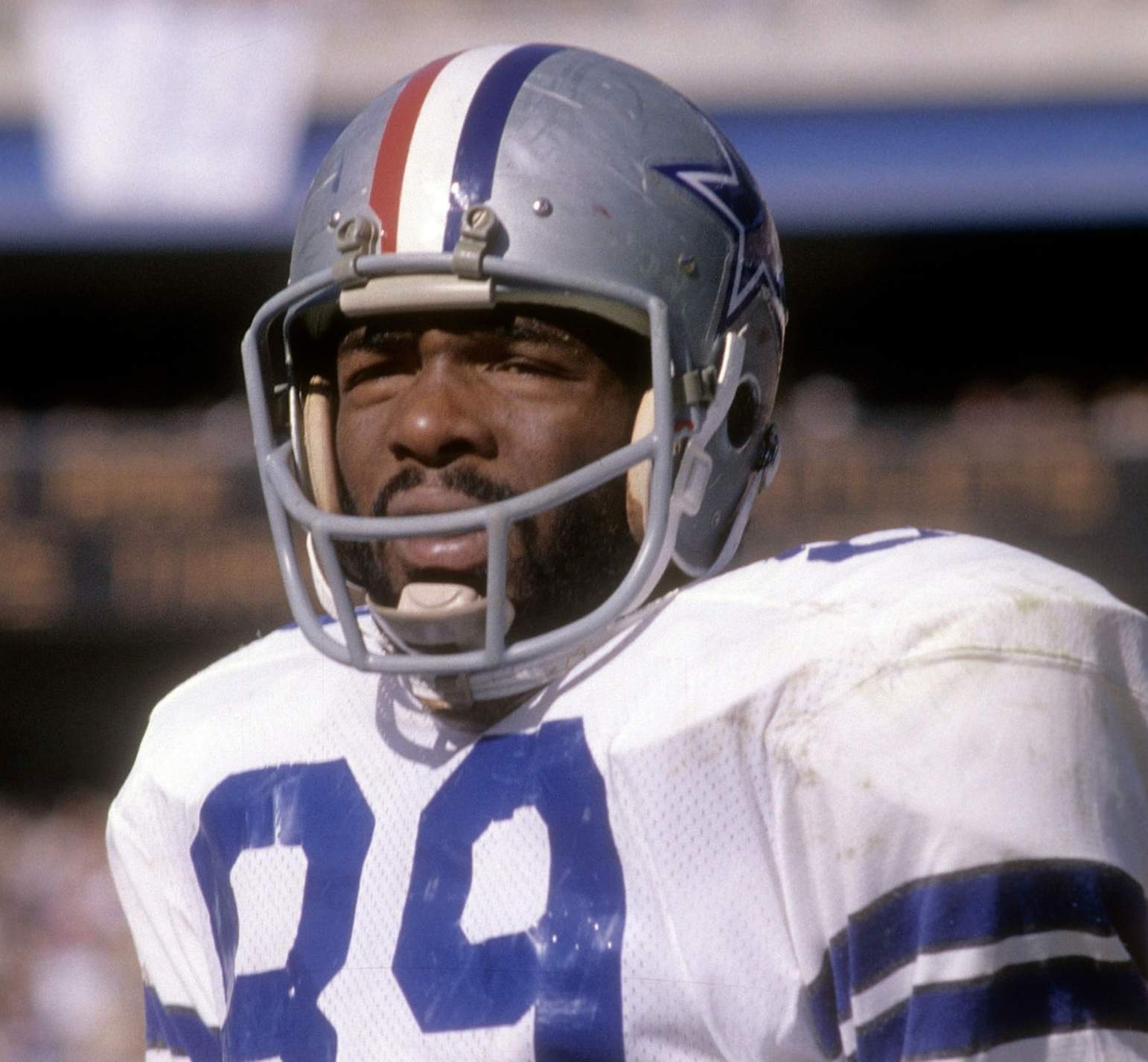
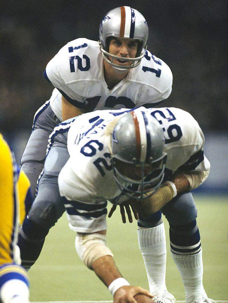
Thankfully, the team had the good sense not to duplicate the red stripe on their pants striping, which would have been overkill.
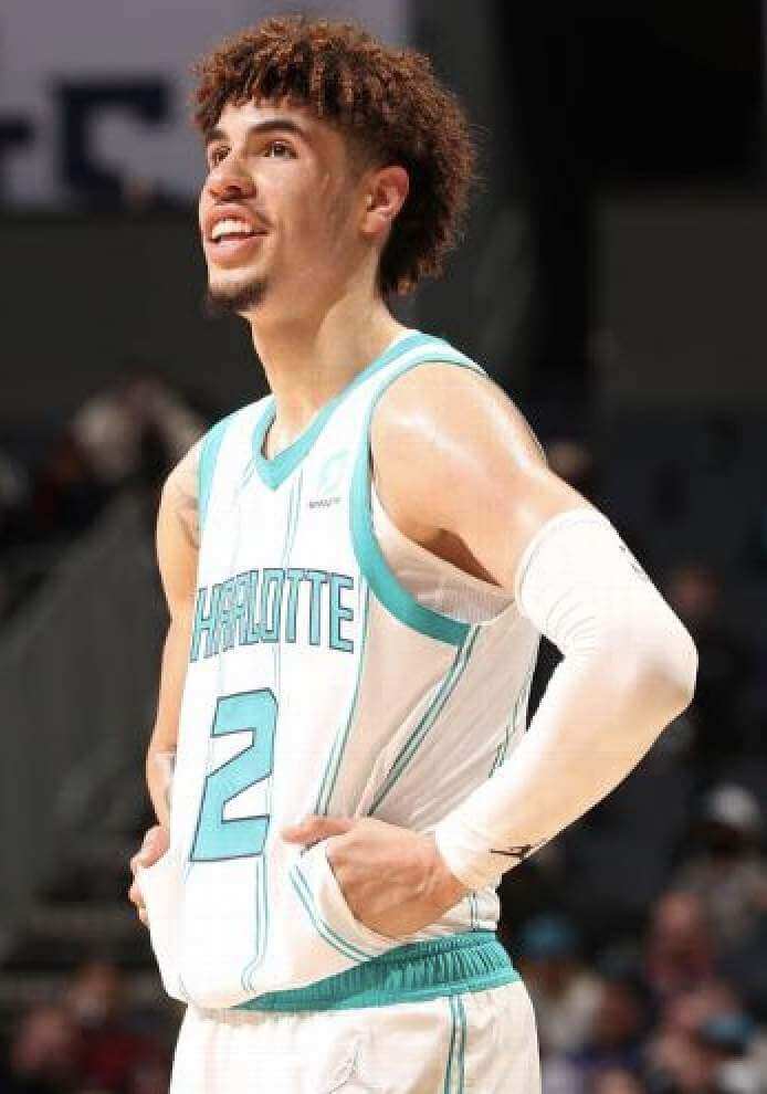
Hand job: Check out this photo of Hornets point guard Lamelo Ball — I’ve never seen a basketball jersey with pockets before!
And, as it turns out, I still haven’t, because those aren’t actually pockets. Ball has a habit of grabbing his jersey just above the waistline — depending on the angle, it can sometimes create the illusion of pockets:
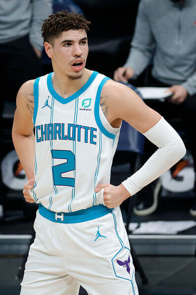
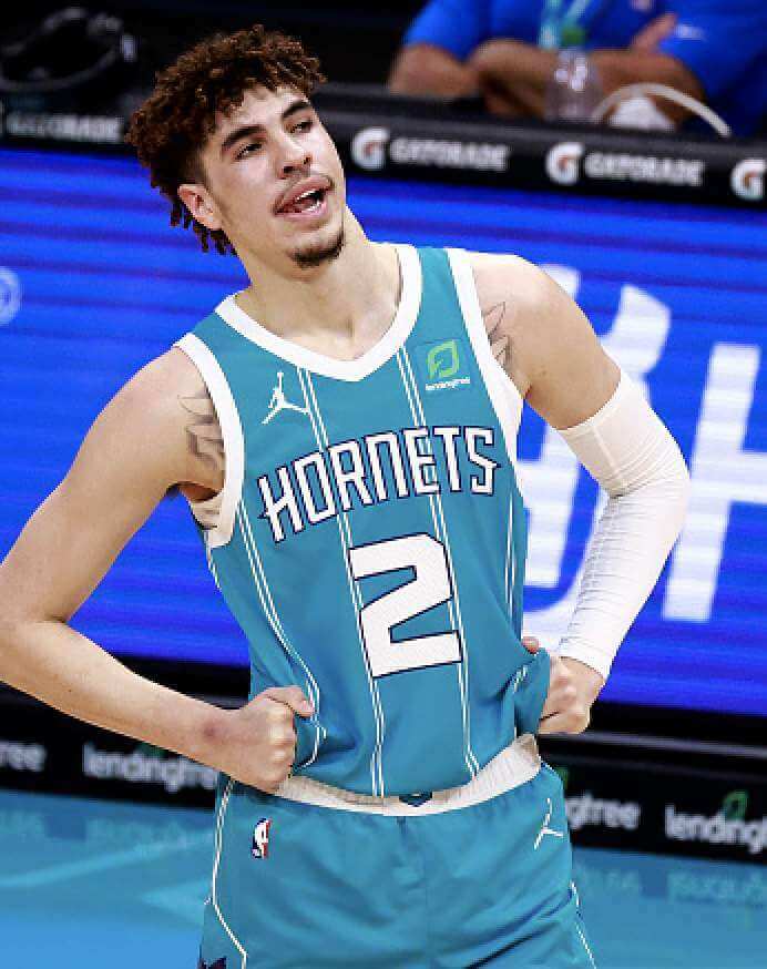
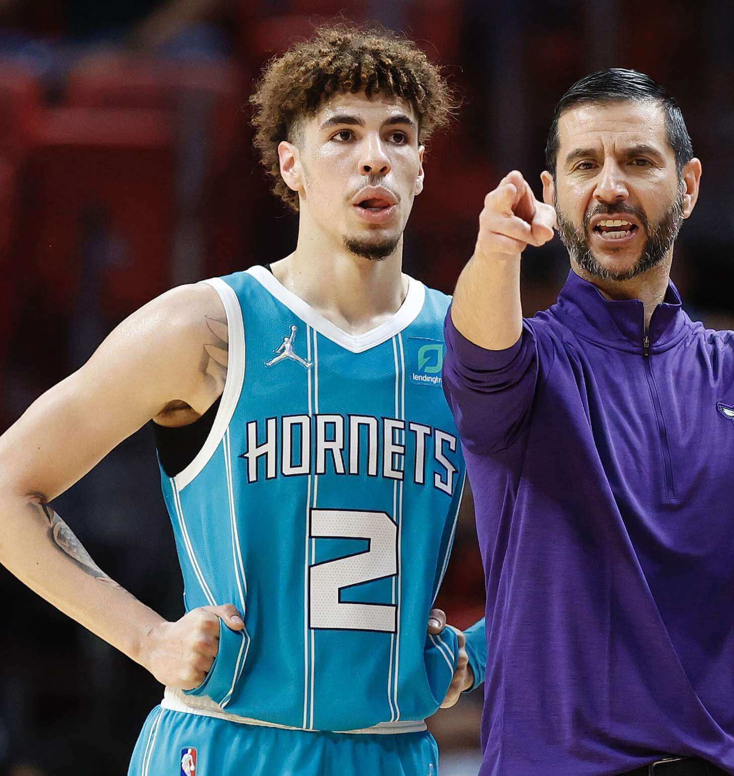
Has anyone ever seen a hoops jersey with genuine pockets?
(My thanks to Jonathan Poplack for this one.)
For all photos, click to enlarge
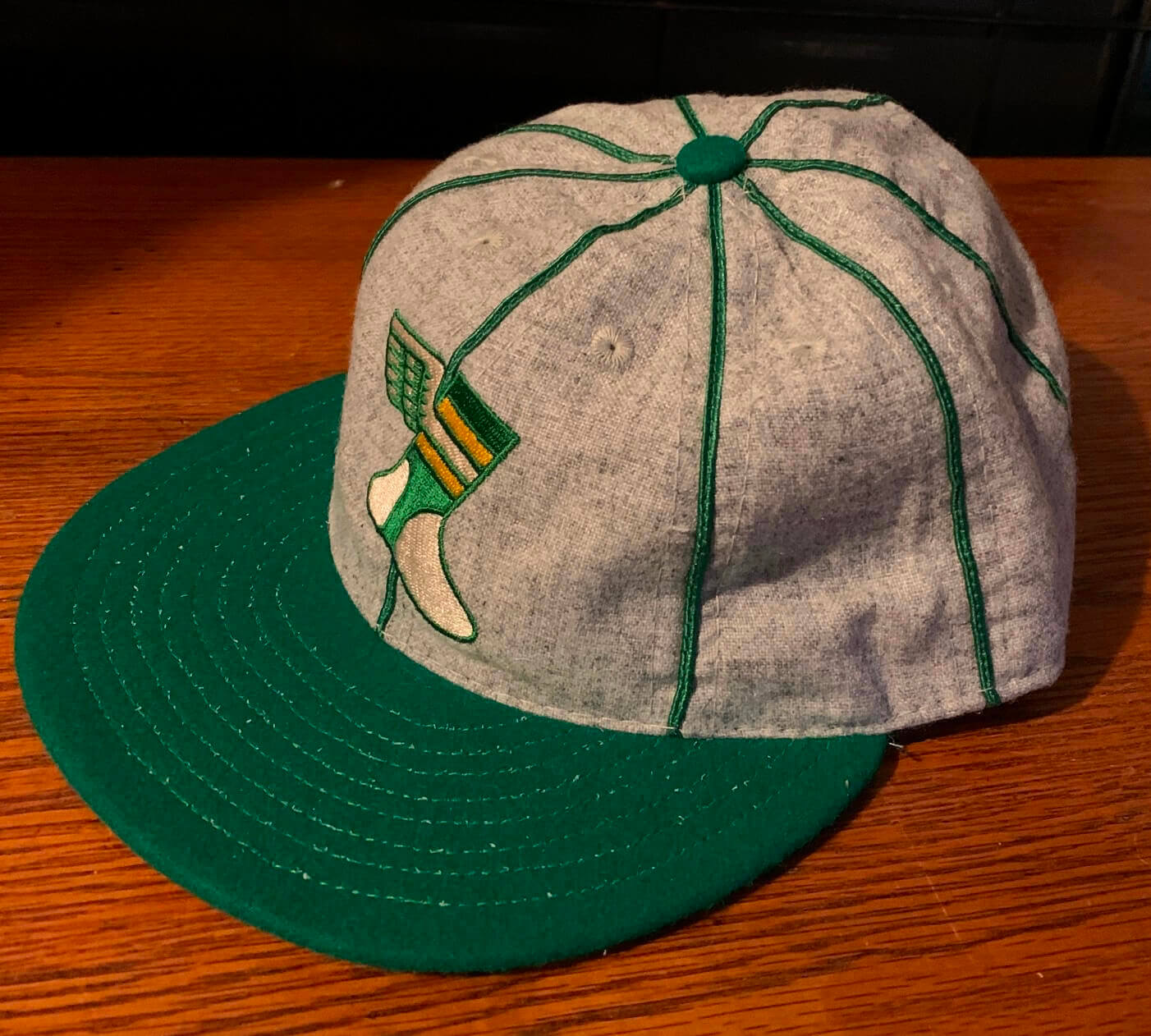
ITEM! Uni Watch Alternate Cap Launch: I’m happy to report that all the pre-orders for our new cap have now shipped out (if you placed one of those orders, watch your mailbox), which means I’m now ready to take orders on our remaining inventory.
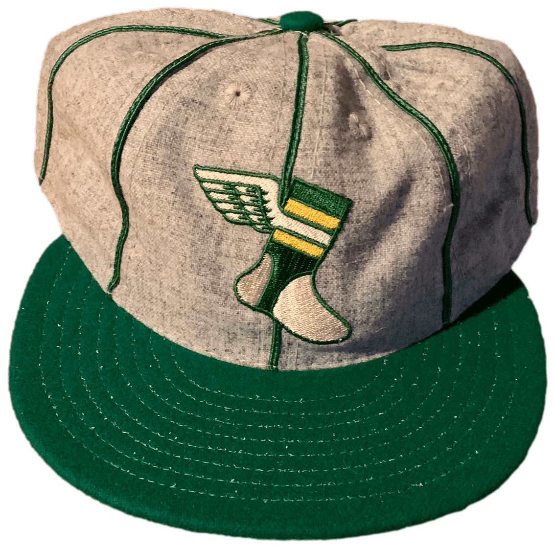
Just like our original Classic Cap, the Alternate Cap is an all-wool beauty made exclusively for us — in the USA! — by our friends at Ebbets Field Flannels.
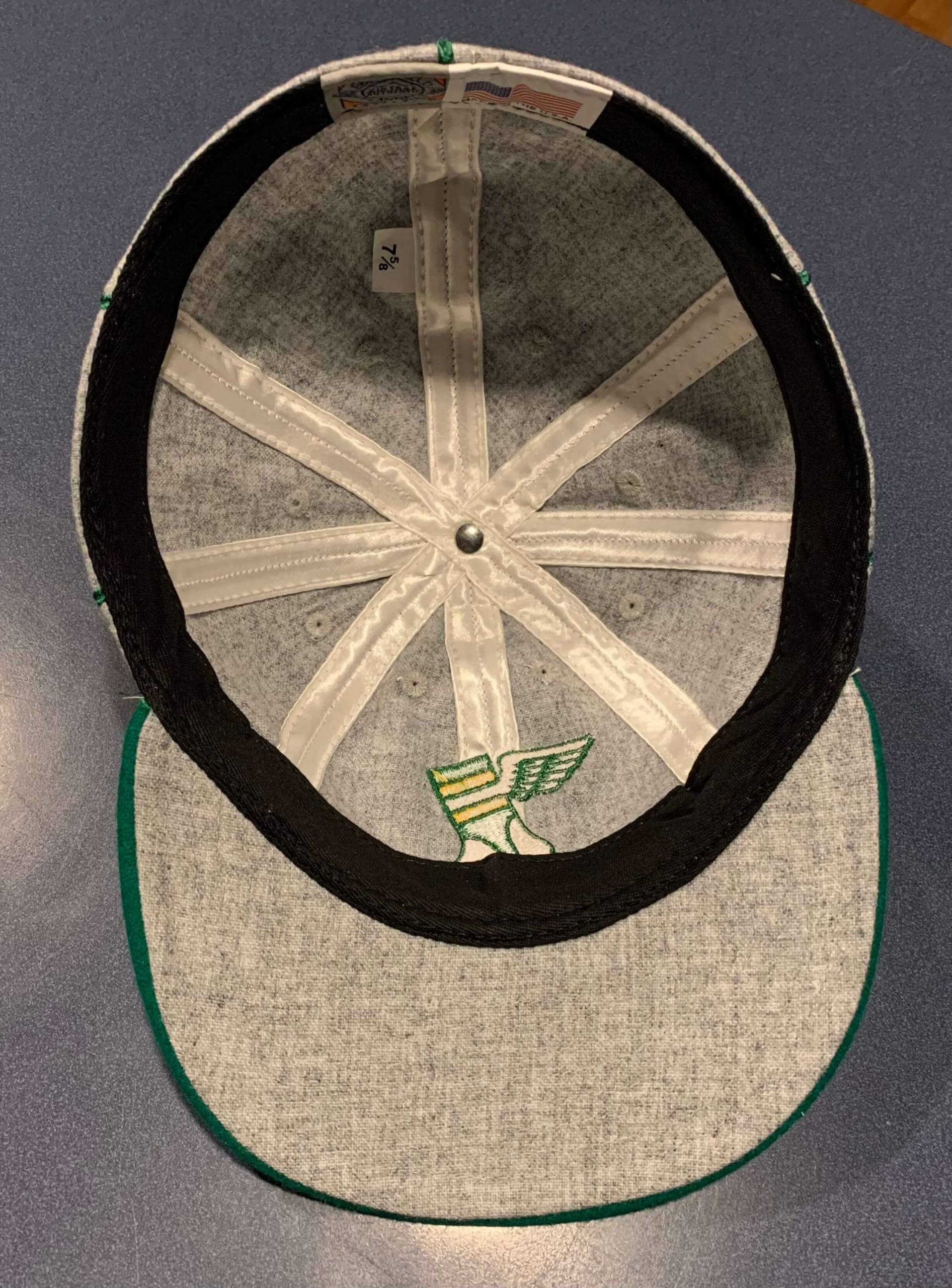
Note that this cap has an old-school eight-panel construction, instead of the more modern six-panel design. The crown is heathered grey with our classic winged stirrup logo front and center. The brim is hunter green, the seams are outlined in satin piping, and the undervisor is grey. And as is always the case with Uni Watch products, there is no annoying maker’s mark.
Here are some additional photos:
Supplies of this cap are very limited. If you want one, here’s how to order:
• At present, we have all fitted sizes from 7 through 8. (Sorry, no adjustables.) Not sure of your size? Here’s a handy size chart.
• The price is $42.99. Shipping in the USA is $7 for one cap and $8 for two caps. For more than two caps, or for non-USA orders, check with me to get the shipping charge.
• To order, start by sending the appropriate amount via Venmo (use @Paul-Lukas-2 as the payee) or Zelle (plukas64@gmail.com). If you’d rather use Apple Pay or a paper check, contact me and I’ll give you the info you need. Sorry, no PayPal. But if you live overseas and PayPal is the only feasible option for you, get in touch and I’ll explain how we can come up with a workaround.
Important: After sending payment, email me with your desired cap size and shipping address.
That’s it. Thanks for considering our headwear!
Click to enlarge
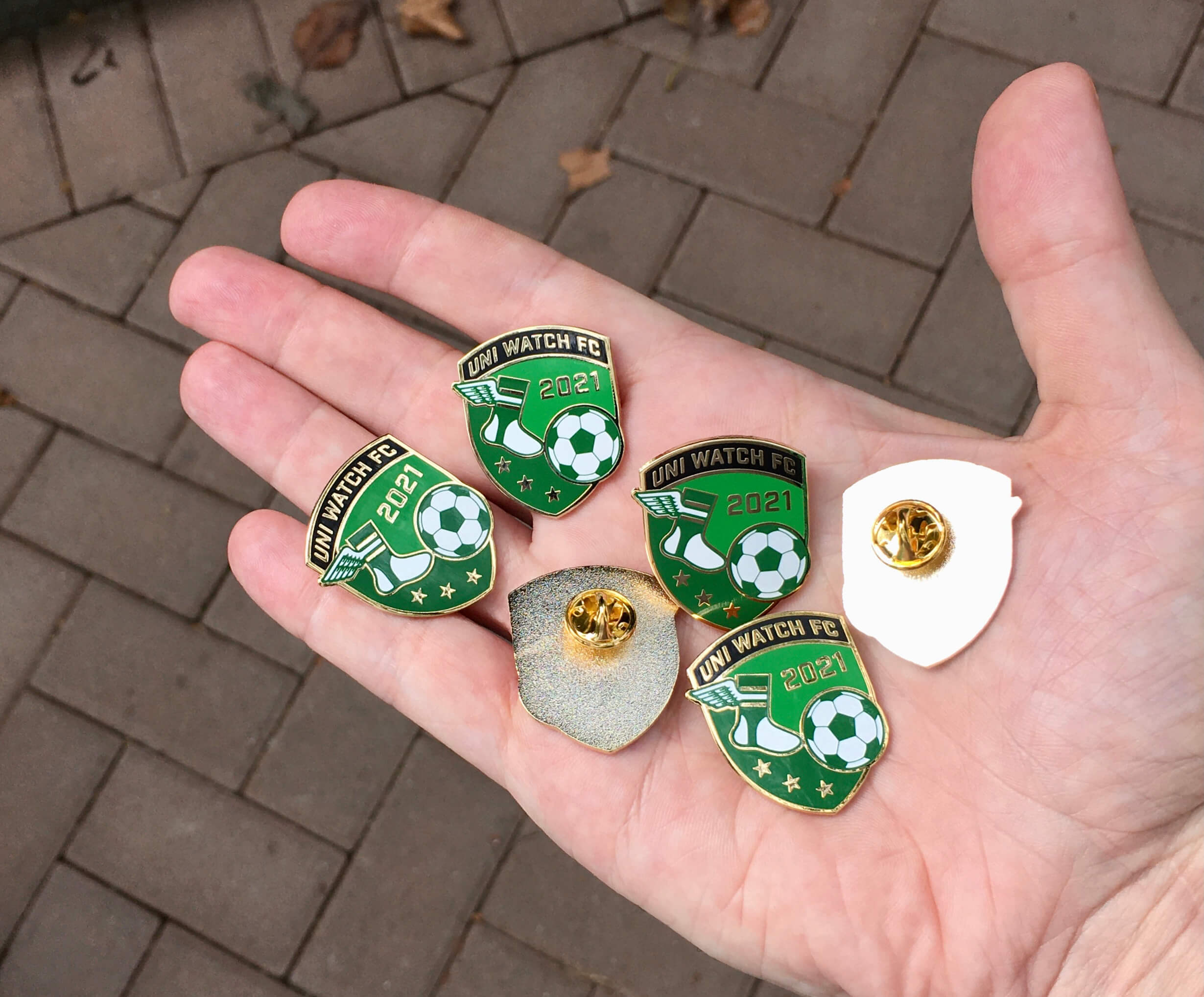
November pin reminder: In case you missed it on Monday, our latest Uni Watch Pin Club design is soccer-themed — a Pin Club first! I love how the winged stirrup is kicking the ball.
This pin was produced in a numbered edition of 150, with the number and month laser-etched onto the back. As of this morning, there were 37 remaining. You can get yours here while supplies last.
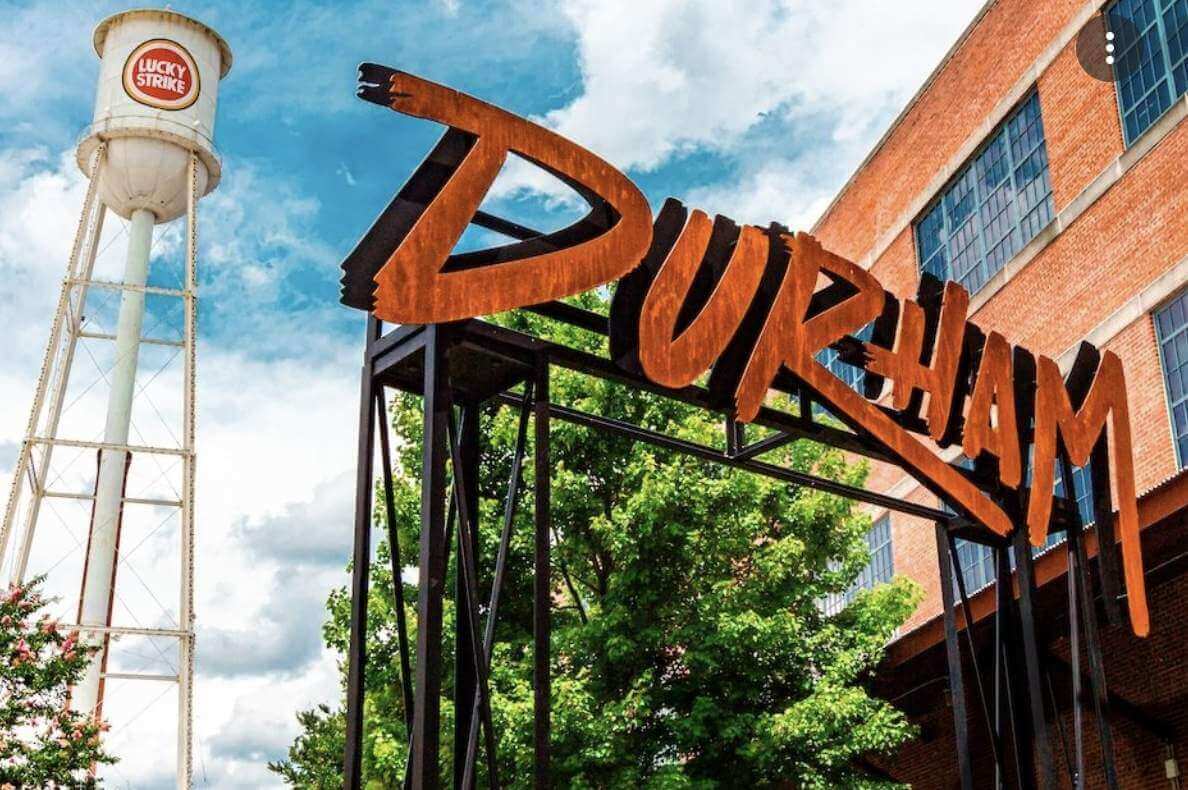
North Carolina party reminder: In case you missed the details yesterday, I’ll be convening a Uni Watch gathering Durham, N.C., on Saturday, Nov. 13, 2:30pm, at Tobacco Road. No RSVP is necessary — just show up and look for me (or for lots of people wearing jerseys).
This will be the first Uni Watch gathering since the 20th-anniversary parties in 2019. I’m looking forward to meeting lots of you!
The Ticker
By Paul
Indigenous Appropriation News: After MLB commish Rob Manfred claimed during the World Series that that local Native Americans are fine with Atlanta’s team name and the tomahawk chop, reporting by CNN, NBC News, and The New York Times all refuted that assertion. … In a related item, here’s a really interesting piece about the origins of the tomahawk chop’s music. … Local tribes have told school officials in Mason City, Iowa, that the school should change its “Mohawks” team name. … The script “Indians” logo was removed from Cleveland’s ballpark earlier this week. … Reprinted from last night’s comments: Two Michigan schools are scrapping their Native American team names: Saranac Community Schools will no longer call its teams the Redskins, and Hartford Public Schools will no longer call its teams the Indians (from Patrick in MI).

NFL News: “The Broncos inducted Peyton Manning into their Ring of Fame on Sunday,” says Kary Klismet. “He used the occasion to throw one last touchdown pass to former teammate Brandon Stokely. Stokely wore his old game jersey, so Manning borrowed a replica jersey from a fan in the stands to match him. And that orange jacket Manning doffed before putting on the jersey? That’s the Broncos’ new custom sportscoat for Ring of Fame members.” … If you’ve been waiting for NFL-themed slot machines, today’s your lucky day. … Jets owner Woody Johnson says the team will have a new uni combo for tonight’s game in Indy. White jersey and BFBS pants, perhaps? (From @TriComStormm.) … Who’s that wearing No. 20 in this 1950 team portrait of the NBA’s Minneapolis Lakers team portrait? None other than future Vikings head coach Bud Grant (from Trevor Williams). … Here’s Jason Von Stein’s illustration of this week’s NFL uni matchups.
College Football News: Virginia Tech K John Parker Romo will wear No. 25 for the Hokies this week (from Andrew Cosentino). … Here are this week’s uni combos for Iowa State and Virginia Tech, and Boston College (thanks to all who shared). … You know how some schools will ask their fans to dress in certain colors to create a stripe pattern in the stands? Penn State is going for a helmet stripe treatment for the Nov. 13 game against Michigan (from Chris Flinn). … College gridiron-themed pool tables? Sure, why not. … Western Michigan debuted an unusual new helmet design last night, and also got flagged for having two same-numbered players on the field. … West Virginia coach Neal Brown recently said he hates coming up with the team’s uni combo each week and wishes someone else would make the decision for him, so a local news outlet asked fans to weigh in on what they think the team should wear (from our own Jerry Wolper). … Very nice powder blues last night for Kent State.

Hockey News: The Ducks held a Dia de Muertos Night promotion on Tuesday. Details included a new mask for G John Gibson and pretty cool warm-up sweaters (from Wade Heidt). … Gorgeous new heritage mask for Jets G Connor Hellebuyck (from Wade Heidt). … Also from Wade: The Canucks will wear pregame sweaters celebrating the Hindu holiday Diwali tomorrow night. … Chicago has had the name of disgraced former video coach Brad Aldrich crossed out on the Stanley Cup.

Basketball News: A Deadspin writer says, “I’m old, so I made my kids help me rank this year’s NBA City Edition jerseys.” … Magic C Robin Lopez doesn’t think much of the Thunder’s uniform history (from Mike Chamerinik). … The Celtics purchased the D League’s Maine Red Claws earlier this year and renamed them as the Maine Celtics. Here are the team’s new uniforms (from Chris Wilde). … Several NBA teams debuted their new City uniforms last night, including the Pacers, Sixers, Wizards, Nets, Grizzlies, and Warriors. … Cross-listed from the NFL section: Who’s that wearing No. 20 in this 1950 Lakers team portrait? None other than future Minnesota Vikings head coach Bud Grant (from Trevor Williams). … I’m still calling it the RAC (thanks to all who shared).

Soccer News: The New York Red Bulls honored longtime kitman Padrino Ruiz, who’s retiring (from Jeremy Brahm). … New kits for Russian side FC Nizhny Novgorod and Polish powerhouse Legia Warszawa (both from Ed Zelaski). … New second shirt for Australia’s Newcastle Jets, who are in both A-Leagues (thanks, Jamie).

Grab Bag: New uniforms for the Adair County sheriff’s department in Missouri. … A British man has gotten the Rolls Royce logo tattooed onto his face, despite never having owned a Rolls. … The Greenville County (S.C.) Republican Party’s new logo shows the standard GOP elephant, but with a Donald Trump hairstyle. … Interesting article about students at Hanover (N.H.) High School choosing a new team name. “Kind of wild to see a newspaper account of a high school student council meeting, especially the part where debate had to be cut short so students could go to their next class,” says Ryan Frazer. “I also got a kick out of their use of ranked-choice voting to determine the most popular new mascot proposal.”
White jersey and BFBS pants, perhaps?
Unless the Colts wear white, I can’t fathom what else it could possibly be.
I wouldn’t mind seeing them try green or white pants with the BFBS jerseys, but I don’t think this ^^ will look good.
Colts have already announced mono-blue.
Which, if the Jets go white-over-BFBS, will make for a pretty brutal-looking game. Especially with black socks.
The only other possibility I can think of is a secret ’80s throwback that they’ve yet to unveil. But that’s probably a reach.
Had mentioned this on Twitter but this is the risk when black alternate uniforms are introduced.
I’ve seen this play out before with my fave CFL team back in the early aught. Green team gets mono-black alternates. Eventually, mix and match happens. The alternate pants get thrown in as an option with the green and white jerseys which a lot of the fan base does not like.
link
I would bet on white over black tonight. Would not be surprised to see them try green over black some time if they open this door Hoping it is a secret 80s throwback.
I don’t recall them ever trying it, but I’ve always thought, if they insist on the black jersey, the green pants might look pretty good with the green helmet. Can’t do that tonight, of course with the mono blue Colts unfortunately.
I think white pants would look even better, but I’d like to see them try either one (BFBS jersey, white pants, green socks; or, BFBS jersey, green pants, black socks). Laying aside that it’s BFBS, and the design is vastly inferior to the Jets’ traditional look, as BFBS unis go the Jets’ is really not that bad.
From the back, the Cowboys’ stripe gimmick makes them France’s team. Just sayin’.
I turned on the Kent St game for a few minutes last night (really like the light blues) and was surprised that they had the word GO on one side of their helmet. It took more time than it should have for me to realize that the kicker was #60.
That article that was linked in The Ticker with the kids and their dad ranking the new NBA City Editions was a riot! Such a fun, cute idea! And you could tell that this was at least partially the work of an eight year old and a six year old because only babes young as they would make Miami as high as they did . I agreed with most of their rankings though.
My favorite comment was from Alice about the Lakers jersey: I like the purplieness.
I can imagine that would have the set much lower on Paul’s rankings, but now all I can think of is adding more “purplieness” to Purple Amnesty Day.
For what it’s worth, the Cowboys likely didn’t remove a ‘strip’ of blue tape and replace it; most helmet stripes these days of any size and pattern are a single strip. The team likely would’ve needed to order these R-W-B stripes separately and replace the entire B-W-B stripe on the helmet altogether.
Also, even though the tweet says it and is a bit misleading, Brandon Stokely definitely isn’t wearing his game jersey in that clip of him catching a pass from Manning; he also has a replica jersey on. Not sure where he got it from, if he’s had it already for various things like this or if the team gave it to him that day, but I’m guessing it at least wasn’t borrowed from someone in the stands.
i’ll still call it the RAC, but i do love a good Jersey Mike’s sammich
No Dymo tape label on the back of that Cowboys helmet? (-;
Wow, I’ve never seen a picture of Rutger’s arena before, but it is brutal. Looks like a reinforced aircraft hanger.
link
Maybe it is just me, but it seems odd for the Cowboys to adorn their helmets with the medal of honor. It almost feels like they are bestowing that on themselves somehow rather than showing reverence those who actually earn the medal.
Perhaps instead of just the sticker they could have each player include the name of one of the 66 living medal recipients? Or any recipients from/with a connection to the state of Texas?
That said, very cool that they are bringing back the red stripe for one game.
Not sure if you saw this update, Greg, because I just added it, but the decal is actually the logo for the Medal of Honor Museum, not the medal itself.
Yeah, saw that, doesn’t really change my reaction to it. Maybe it is just me. If the museum had a logo that didn’t look like the medal itself I wouldn’t have such problem with it.
I was born and raised in West Virginia and have always been a Mountaineers fan. Add some pants stripes, lose the black face mask on the blue helmet and the plain, mono white uniforms.
Minneapolis Lakers jerseys are sana serif except the first
I noticed that also. According to a site called “NBA Jersey Database” the serifs were worn thru the 50-51 season, and the plain block text began for 51-52. Which would date the photo to 51, but I’d say take that with a grain of salt.
For the NC party, are you planning on hanging out on the patio or sticking to indoors?
Depends on the weather, I guess. Whatever seems most comfortable/sensible/etc.
Razz’f frazz’m… Been waiting forever for an NC party. Alas, a friend’s daughter is marrying a coworker of mine that day. Don’t think I’m getting out of that.
I hate the red stripe on the Cowboys helmet. It sure is nice to see some pictures from the 70s though where the Cowboys actually look like the Cowboys.
In my opinion, the red stripe is just the franchise using a forced narrative to reinforce their self-proclaimed status as America’s Team.
In my opinion, the red stripe is just the franchise using a forced narrative to reinforce their self-proclaimed status as America’s Team.
I’m a lifelong Cowboys-hater. So if there’s anyone who should agree with this, it’s me. But they rarely if ever use the “America’s Team” line these days (or if they do use it, I’m not aware of it). When I invoked that phrase in today’s headline, I did it as a joke.
And like I said, they’ve also worn the poppy. In short, I think it’s easy to caricature the Cowboys as jingoistic, but I don’t think that caricature is accurate these days. I’m OK with the red stripe.
Was anyone around here alive in 1976? The Bicentennial was a big big deal. I still remember noon on July 4, 1976 when all churches rang their bells simultaneously. It still gives me chills. The Cowboys’ simple tribute was perfectly in tune with the times, as many things, even locomotives, were repainted RWB. And the Cowboys did not get the “America’s Team” moniker until their 1978 highlight film (narrated by John Facenda) used it and CBS popularized it in a 1979 broadcast.
The last original MLS crest has been replaced.
link
That’s really nice! Biggest logo upgrade in sports history? A candidate at least. F to an A in one step. I look forward to seeing what the USL1 Revs II side does with their logo.
I dunno. I would still rate Sporting KC’s crest as a bigger upgrade over the Wiz/Wizards, but it’s a clear winner.
Now if only Kraft would pony up for a SSS…
I’d say I’d go to Revs games if they had a stadium near the city, but I lived one town over from Foxboro for a few years and went to all of one game, and only because I was invited lol But I do think anything is an upgrade from the crayon flag.
The Sporting KC thing got me thinking, I remember at the time some sort of marketing babble about their actually being a sporting club, seems weird that the women’s club is establishing their own thing as opposed to being part of the sporting kc umbrella and having multiple teams under that.
I think the Cowboys’ helmet needs more patriotism/military appreciation iconography. It’s not pandering enough.
You know, if another team did this, I’d have a similar sentiment. But the red stripe made sense in 1976, and it’s part of the team’s visual history. I’m OK with them reviving it in association with Veterans Day.
100% agree. Given the history and quirkiness of this tribute it definitely works, and is far better than GI Joe camo costumes usually associated with military tributes.
Wow those Patos de Anaheim sweaters are great! Do warm up sweaters ever get produced for the public to purchase? I don’t see them on nhl.com or adidas.com.
I think they often auction off the gamers (or, I guess, pregamers).
In case anyone is interested they are available here:
link
The variant Roger Staubach McFarlane figure from 15-20 years ago sports the red helmet stripe.
I don’t pay much attention to goalie helmets but Connor Hellebuyck’s new one is drop dead gorgeous!
Man, that is a sweet hat. Cool you are working together.
Thank you for sharing the artwork, and safe travels to NC Paul.
As a Greater Cleveland youngster in the ’70’s when the Browns were horrific, I jumped on the Cowboys bandwagon after they won the Superbowl against Miami and became a huge Roger Staubach fan. It was a huge deal in ’76 when they added the red stripe for a young uni-geek like me and my friends. I converted my Air-Flo helmet accordingly that year for our back yard pick up games. My Rawlings kit (Sears?) came with the blue “away” jersey that was rarely worn but I was ecstatic because I liked it so much better when they donned that look. I hope someday that look will return and for the metallic blue helmet to match their pants…