Tired of seeing annoying ads (like this one!) on Uni Watch? There’s a simple solution: Join Uni Watch Plus. You’ll get an ad-free site experience, plus exclusive access to our UW+ discussion forums, push notifications whenever a new blog post has been published, a special UW+ badge accompanying all your comments on the blog, and a 20% discount on our Teespring merchandise.
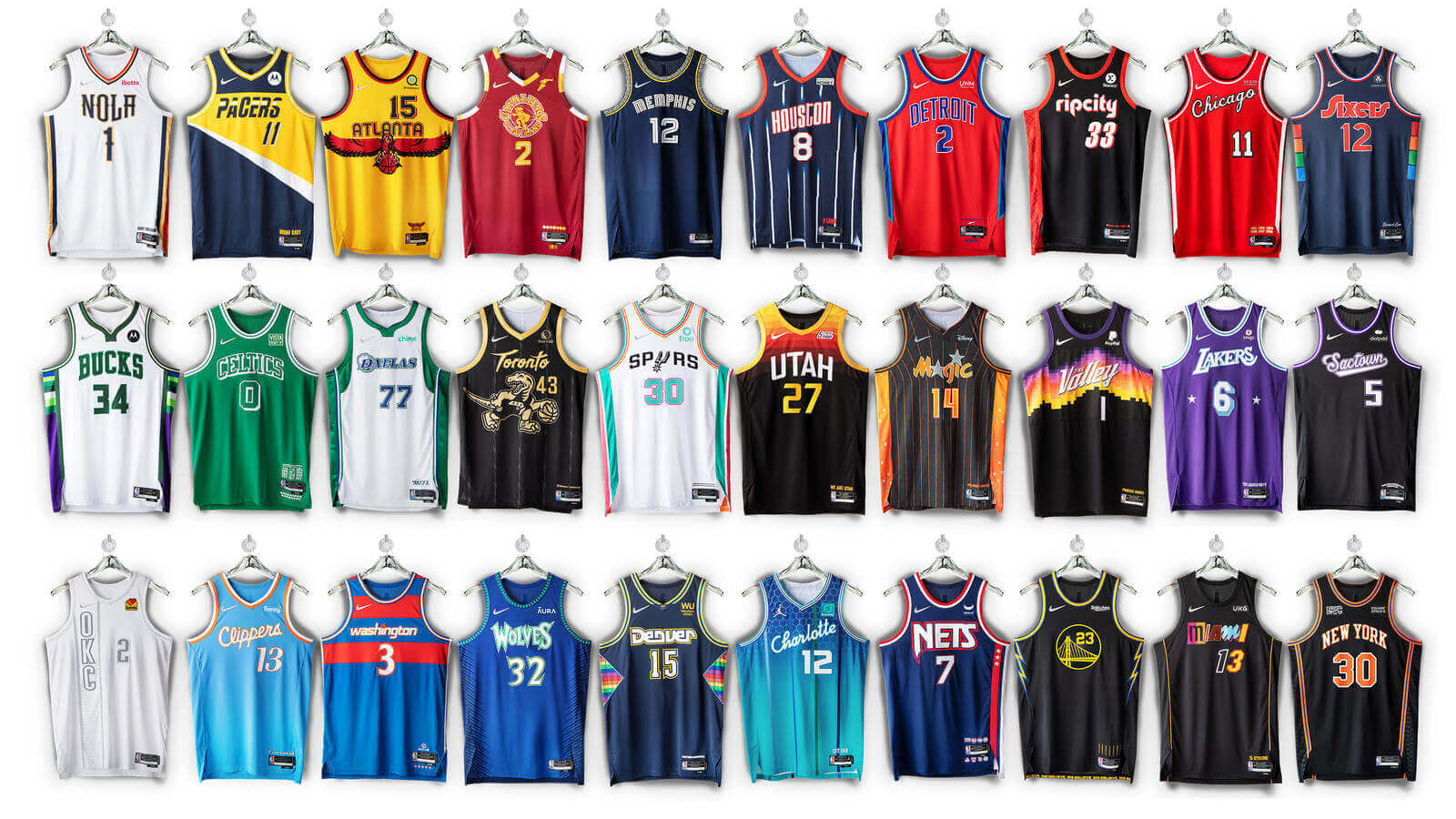
After a slew of leaks and teases, all 28 of this season’s new NBA City alternates — one for every team except the Jazz and Suns, who are reprising last season’s City designs — were finally unveiled yesterday. You can see the jerseys in the graphic shown above, and you can see many of the full uniforms in this video:
Instead of covering this huge uni drop here on the blog, I’ve decided to run today’s lede over on Bulletin. I thought the ad-free, uncluttered layout would be good for such a large post. (As most of you know by now, my weekly Bulletin posts usually run on Thursdays or Fridays, but that’s just a habit, not a rule.) Those of you who’ve subscribed to receive my Bulletin content via email should already be seeing this piece in your in-boxes. Everyone else can read it on my Bulletin page. Enjoy!
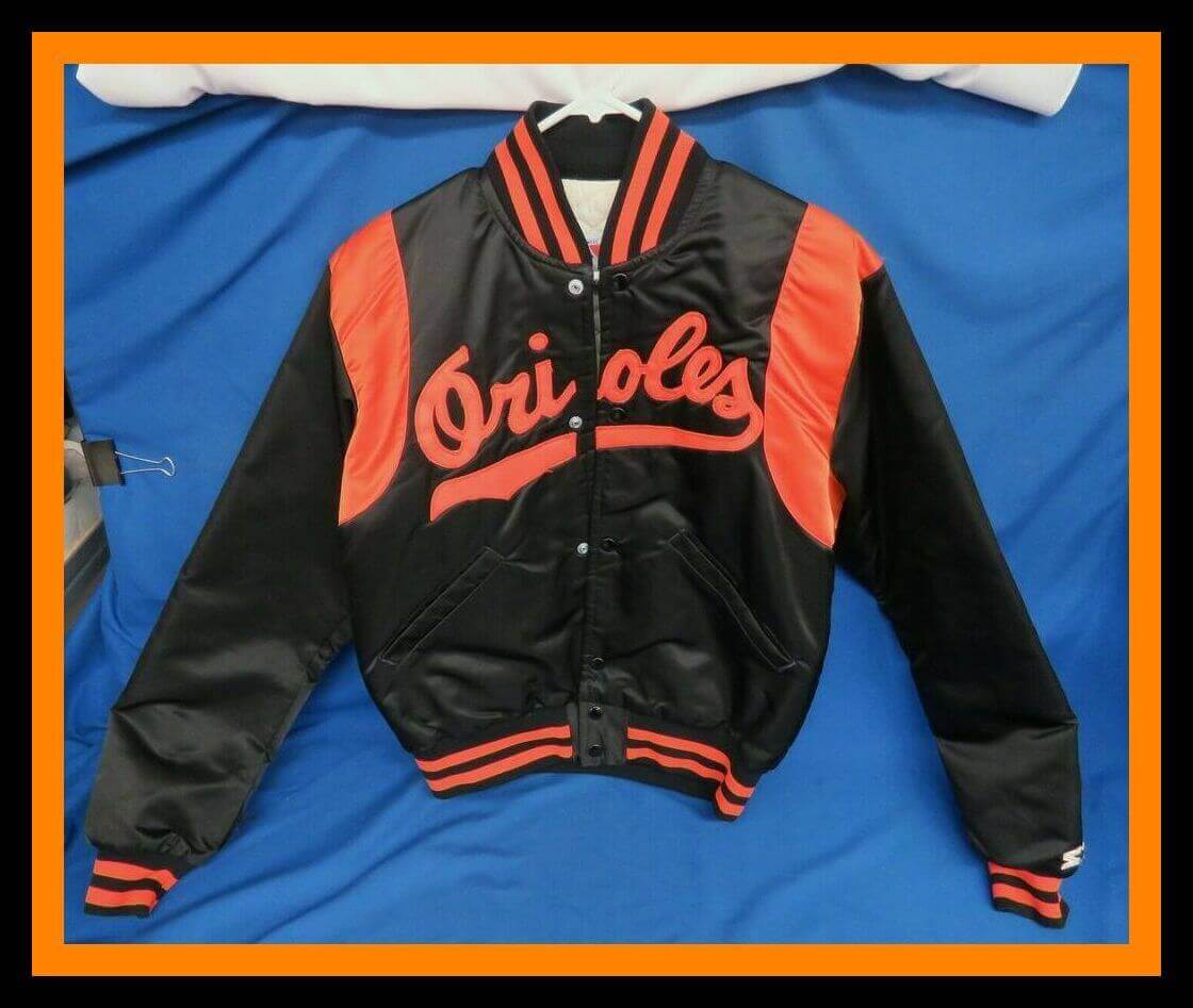
Leading off this week with this terrific-looking Baltimore Orioles Starter jacket. Don’t know the year for this one, but Earl Weaver would have looked right at home in it, right?
Now for the rest of this week’s picks:
• Here’s a home plate-shaped tray that commemorates the Chicago White Sox’s 1983 division title.
• You’re going to need to be in the Beverly Hills area if you want this next item — an actual door from Candlestick Park. The seller says local pickup only due to its weight.
• This 1989 MLB “Sportstalk Player” would play audio from cards you’d insert into it.
• Never seen one of the great Technigraph helmet plaques for the Houston Oilers until now. Luv Ya Blue!
• Great-looking set of 1970s NFL Fleer patches here. Did anyone else besides me love the gum that came with ’em?
• • • • •
• • • • •
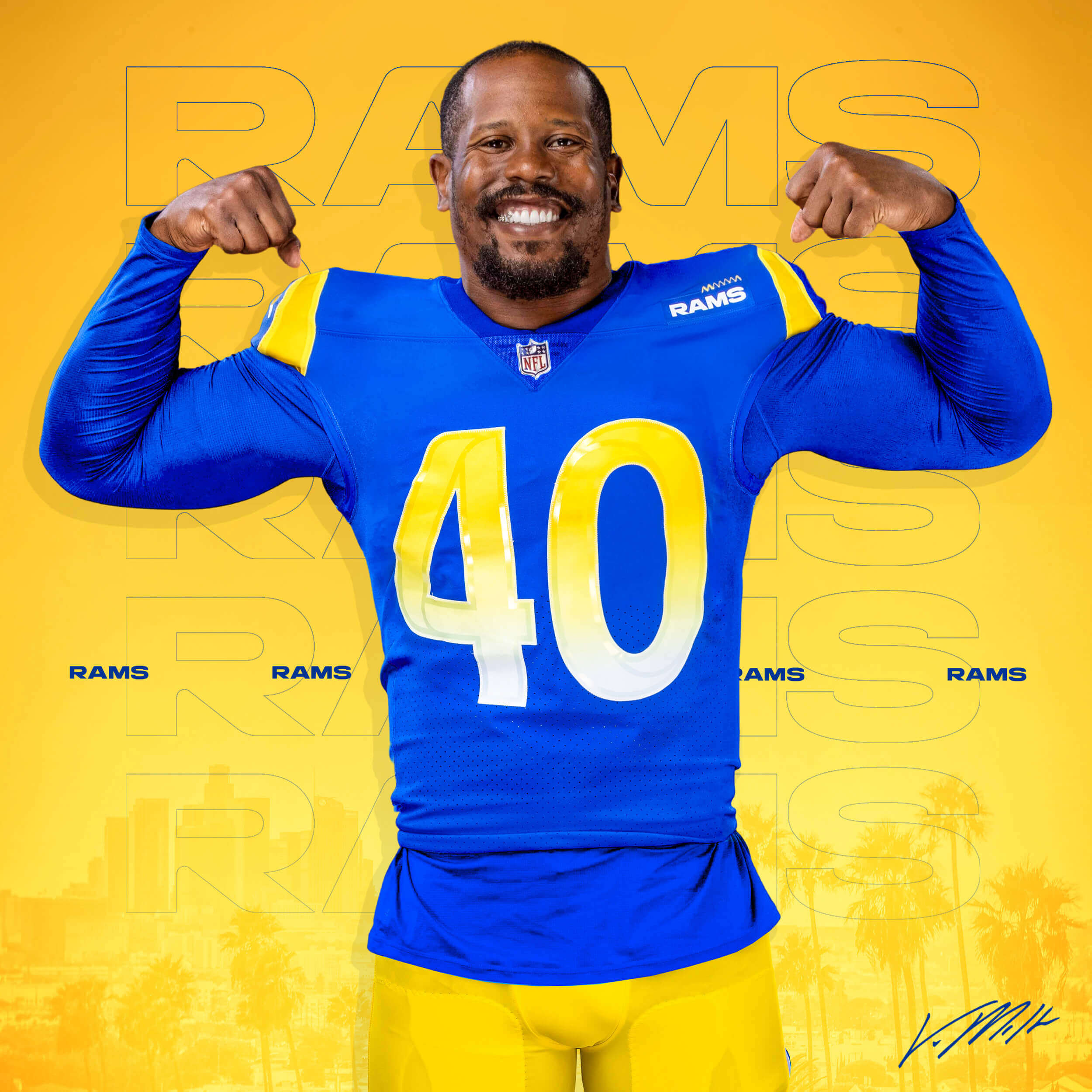
And no dishwater in the promo photo, thankfully: Longtime NFL linebacker Von Miller, who was just traded from the Broncos to the Rams, wore No. 58 with Denver as a tribute to former NFLer Derrick Thomas. But Rams linebacker Justin Hollins already wears No. 58, so Miller will wear No. 40 — the same number he wore years ago at Texas A&M. He will be the first Ram to wear that number since 1960. The number was never officially retired but has been kept out of circulation to honor former WR Elroy “Crazy Legs” Hirsch, whose family has given their blessing to Miller wearing the number.
(My thanks to our own Jerry Wolper for this one.)
• • • • •
• • • • •
Click to enlarge
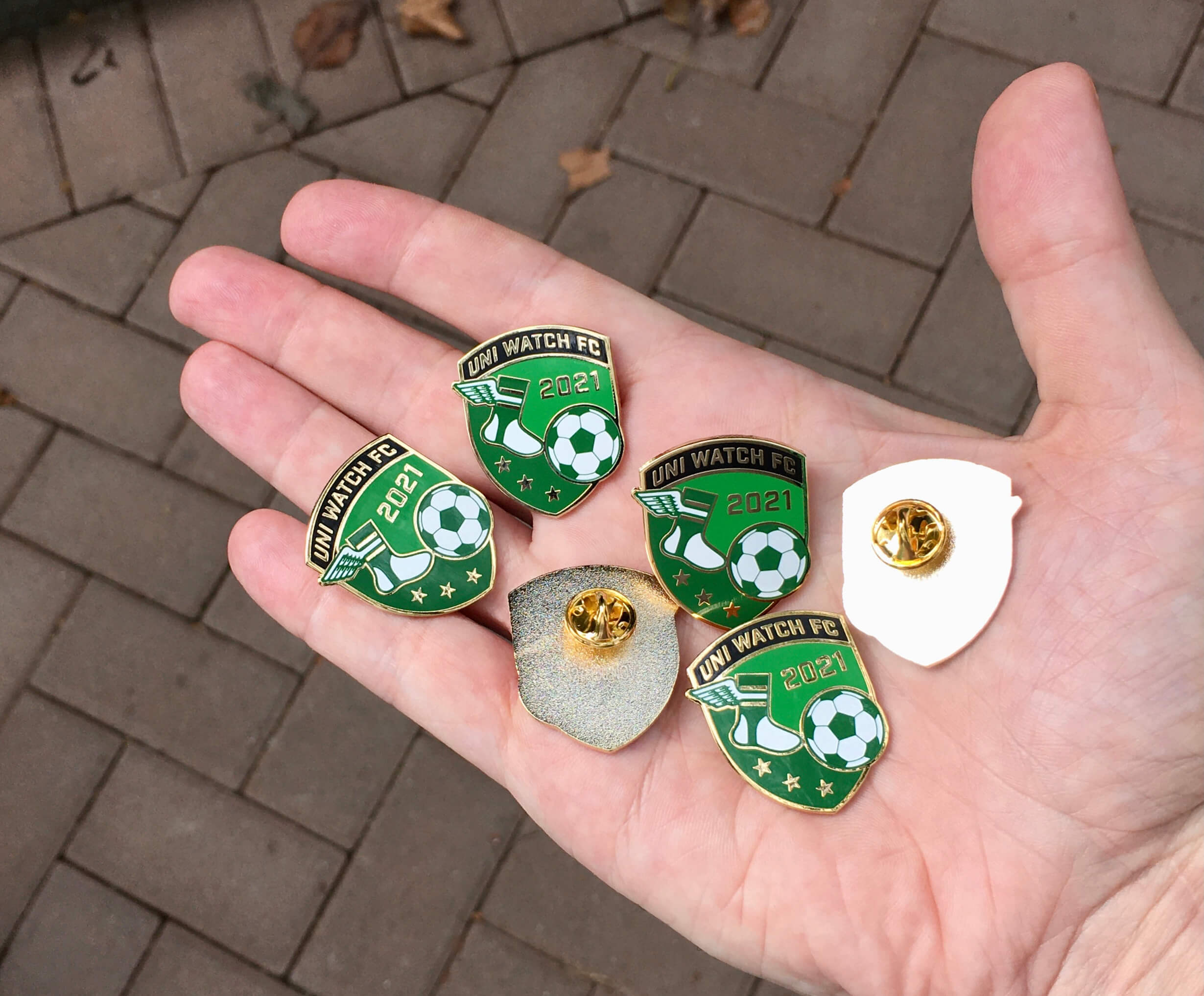
November pin reminder: In case you missed it on Monday, our latest Uni Watch Pin Club design is soccer-themed — a Pin Club first! I love how the winged stirrup is kicking the ball.
This pin was produced in a numbered edition of 150, with the number and month laser-etched onto the back. As of this morning, after our first day of sales, there were 63 remaining. You can get yours here while supplies last.
• • • • •
• • • • •
Uni Watch Screening Room: The French Dispatch: Filmmaker Wes Anderson tends to feature a lot of uniforms in his movies — police uniforms, chauffeur’s uniforms, bellhop uniforms, and more. That trend continues in his latest movie, The French Dispatch, which I saw on Saturday.
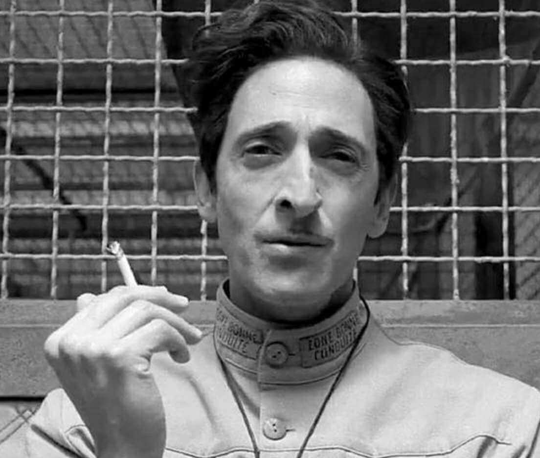
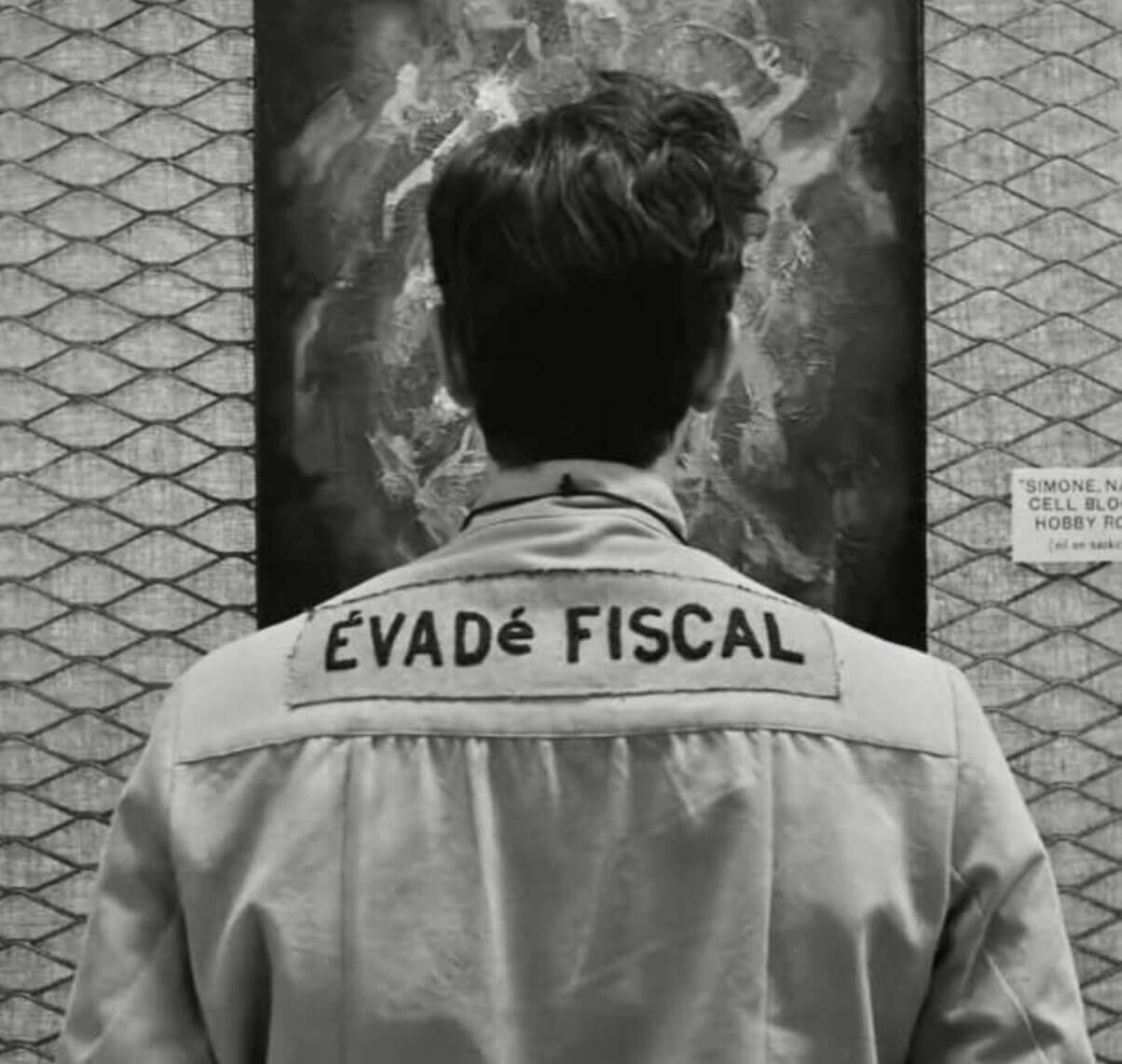
My favorite uniform in the movie, by far, was worn by Adrien Brody, playing a French prison inmate who was convicted of tax evasion. He had “Zone Bonne Conduite” (“Good Conduct Area”) on his collar, and the rear view showed that he had CIOB (that’s criminal infraction on back; click to enlarge):
The movie also features uniforms for prison guards, a police cook, a chauffeur, lots of cops, and more. Anderson clearly loves his uniforms! I need to find out if he’s also into sports uniforms. Hmmmm.
• • • • •
• • • • •
Uni Watch Hit Parade: Juniper: My friend Michael’s daughter, Juniper, is only in high school but has already made the first of what I expect will be a lot of albums. (She made it last year, in fact!) One of the songs from it, “Boys!,” is so fun and catchy that it’s been stuck in my head for the past couple of weeks. I dare you not to love it!
Baseball News: Interesting move by the Padres, who introduced new manager Bob Melvin with a social media graphic in which he’s pictured wearing the cap of his former team, the A’s (from Trevor Williams). … Years ago, while working on his kitchen, Bradley Bing found this 1986 Astros apron behind the cabinets. What a find! … The Double-A New Hampshire Fisher Cats, a Blue Jays affiliate, will play one game next season as the Manchester Chicken Tenders (from Keith Burbank). … Here’s a look at Dodgers 1B Albert Pujols, now playing winter ball in the Dominican Republic, in his new Leones del Escogido uniform. He actually had a game-winning hit in his first game (from @181st_Street).
Pro Football News: KC QB Patrick Mahomes wore a shirt for Kansas City’s newly renamed women’s soccer team, the Kansas City Current, prior to last night’s game — sans maker’s mark (from Mauricio Gómez Montoya and Cameron Schneider). … Not uni-related but still in our wheelhouse: Cowboys QB Cooper Rush’s TD pass to WR Amari Cooper marked the first TD in NFL history where the passer’s first name matched the receiver’s last name. It comes a season after Cowboys’ QB Andy Dalton threw a TD to Dalton Schultz — the first time a passer’s last name matched a receiver’s first name on a TD, although there are some near-misses for both oddities (from Orson McFeathers). … When the Jets hired Lou Holtz as coach in 1976, he was photographed holding a striped football — even though the NFL only used that ball design during the 1973 season (from Doug Keklak). … I think we may have missed this when it first happened, so just in case: The CFL’s Edmonton Elks and the Winnipeg Blue Bombers both wore orange jerseys during warmups prior to their game on Oct. 8 to mark Canada’s Truth and Reconciliation Day, which honors the lives of Indigenous people and children who were killed in residential schools decades ago (from Robert Martin).
College Football News: Kent State will wear powder blue jerseys and white helmets and pants on Wednesday night against Northern Illinois (from @thedadhat216). … Reader Sam Eaton was going through his stadium cup collection recently and found this beauty from Marshall Faulk’s near-Heisman season with San Diego State in 1993.
Basketball News: The city of Chicago is honoring the WNBA champion Sky by decorating some trains on the Green Line with commemorative wraps (from @Wilds_Lee). … The choice of scorebug colors for last night’s Sixers/Blazers game was particularly puzzling given that Philly was in red and the Blazers were in black (from @marc_brocepek). … Here are this season’s All-Star Game logo and assorted skills challenge logos for the Japanese B.League (from Jeremy Brahm).
Soccer News: During shootouts, the SEC Network’s scorebug uses a green G to indicate a successful goal instead of the traditional dot (from John Muir). … Cross-listed from the Pro Football section: Kansas City NFL QB Patrick Mahomes wore a shirt (sans maker’s mark) for the city’s newly renamed NWSL team, the Kansas City Current, prior to Monday Night Football (from Mauricio Gómez Montoya and Cameron Schneider). … New third kit for fifth-tier English men’s side Southend United (from James Welham).
Grab Bag: Paul’s discussion of New York’s famed bodega cats in yesterday’s post prompted an email from William F. Yurasko about the Brooklyn Bodega Cats broomball team and their fantastic sweaters. … Earlier this year, Norway’s women’s beach handball team was fined after they chose to wear shorts and tank tops like their male counterparts instead of traditional bikini uniforms. After the move prompted a worldwide backlash, the International Handball Federation has formally (and finally) changed the rules to allow for the use of tight shorts and tank tops for women. … The Houston Open golf tournament has a new corporate advertiser (from Ignacio Salazar). … Here’s a potentially awful situation in the making: FanDuel and DraftKings are among the bidders seeking to buy The Athletic.
That’s not a jersey on Mahomes, more like a shirsey plus it doesn’t have the front sponsor.
“Von Miller, who wore just traded” should be WAS just traded.
Thanks. Fixed.
Smart move by the Nuggets to introduce those hideous new unis on the day Von Miller got traded. No one here noticed. Also, as Miller drove off from the facilities and did a quick interview, it looked like he was wearing the same hoodie as “Tie-Dye Guy” from “Only Murders in the Building.”
You were…very generous on the ‘can you tell who’s playing on TV’ section of your city edition review haha.
I am not an NBA fan by any means so maybe that’s part of it, but I think without the benefit of a scorebug + zooming in on players during stoppages and free throws to better see the chest wordmarks/logos, and just had to figure out which team was which if both teams were wearing their city editions from the standard pay zoomed-out camera…I wouldn’t be able to get half of the ones you suggested I would. If you were basing the criteria for that section based on having the benefit of the scorebug/zoomed-in camera angles, I would hope everyone would be able to tell for every team all the time haha
It’s a very subjective assessment, obviously, and I went back and forth on a couple of them. But I welcome other people’s views on that!
The main thing I wanted to achieve there was to introduce that standard — the “Can you tell who’s playing?” standard — as a useful metric, since it’s become a real problem in the NBA.
Thanks for formalizing this. My only quibble is that I don’t think it’s become a real problem in the NBA. Rather, it’s been a real problem in the NBA for some time now, it’s a ubiquitous problem in the NCAA, and it’s creeping into MLB as well.
And I think it’s a significant, maybe _the_ significant, problem with sports uniform design today. Design isn’t art; for the product of art, it’s sufficient for a thing to just be beautiful, to look pretty. Of course, art can have other objectives, but a work of art succeeds on its own terms. A work of design, on the other hand, succeeds or fails by external standards. It’s not enough for a designed work to be beautiful; even in sports unis, some beautiful uniforms are terrible designs, and some excellent designs aren’t all that pretty to look at.
One primary functional purpose that any uniform design must accomplish is to be quickly or readily identifiable as the particular team it represents. If a uniform obscures or prevents spectators from readily identifying which team is wearing the uniform, then that uniform design has failed to achieve one of its primary functional purposes. With regard to that important and inherent objective, it is a bad design. No matter how pretty it looks.
Definitely a subjective point of reference. Sort of requires first determining what a team should look like.
Sure the Lakers are purple, but purple and teal/blue makes me think I am watching the Hornets. That Clippers design is great, better than anything they’ve had in years, and far more unique than their standard blue/red/black options, but seeing a baby blue and orange team on the court doesn’t make me think Clippers.
Oddly I do think the Cavs makes you think Cavs, the uniforms may have never been good (and this isn’t either), but the Lebron days were that franchise’s high water makers, so burgundy and yellow is Cavs to me.
Black and orange Magic jersey makes me think Miami Heat.
Though I 100% agree on Paul’s take on the Sixers uniform, whether it makes you think Sixers or not, it is a great look. As someone from the Philly area who grew up in the 80s I love the nod to the Spectrum (and also Prism Network).
Paul, from the trailers French Dispatch appears to be one of the most Wes Anderson-y Wes Anderson movies he has made. As a fan of some of his work, but not all of it, not sure if that is a good thing or not. Did you like the movie? Does it lean into the Wes Anderson tropes as much as the trailer makes it seem?
Have to say some of the visuals in the trailers are mesmerizing.
As a point of reference, Life Aquatic is my favorite of his films, fair to say I’d enjoy this one as well?
Hmmm. I *don’t* like Life Aquatic. Also dislike Darjeeling Limited.
My favorite Anderson movies (in roughly this order, although it might change according to my mood) are Moonrise Kingdom, Isle of Dogs, Grand Budapest Hotel, Rushmore, and Royal Tenenbaums.
I don’t like the new one as much as any of those. But it’s divided into four very distinct parts, almost like four separate movies, so it’s easier to assess those separately than to assess the entire movie as a whole. I liked two of those segments quite a bit, disliked one quite a bit, and was agnostic on the other. A mixed bag. But very beautiful to look at. And full of in-jokes about The New Yorker, so that will enhance your enjoyment if you’re a fan of the magazine.
I’m proudly not on Facebook (or is it Meta?), so I’ll leave my NBA comments here.
– Regarding the Cavaliers: Nike says: “The uniforms are styled in the franchise’s classic crimson and gold.” The Cavs’ classic colors are WINE and gold. I’m a lifelong Cavs fan and I have never heard anyone say they wear crimson.
– Love the Clippers in powder blue and orange.
– What a miss by the Spurs. They use the fiesta colors and manage to look like a minor league/Florida Tropics/CBA team.
– The Miami Heat jerseys are so bad, they don’t deserve a legitimate revue. So I’ll simply say they are pretty close to the dumbest basketball jerseys I’ve ever seen.
Paul, if you had to rank the Big Four N.A. sports leagues based on the average quality of each’s uniforms by franchise, where would the NBA place? For me it’s in dead last due to the neverending onslaught of alternate uniforms…
Yeah, probably. The NBA basically takes an entirely different approach to its uniforms. All of the leagues have begun to treat their uniform programs as lifestyle merch programs first and foremost, but the NBA has been doing that for much longer than the other leagues and is further “ahead” in that race to the bottom.
How fluid is your league ranking over time? For my taste, the NBA has swung since the late 1990s from a league I’d think about maybe putting at the top of my ranking to a league that easily takes last place. Whereas the NHL has swung up to probably first place for me in that time, the NFL has held pretty steady around number two, and MLB has oscillated between two and three.
I’d agree with most of that.
Probably not a coincidence that the only sport that doesn’t have Nike as their outfitter is now the most aesthetically pleasing across the board.
That song by Juniper was great. Kind of reminds me of Garfunkel and Oates.
Listened to it 5-6 times already and sent it to a bunch of friends. I needed that kind of musical jolt this morning.
Listened to it 5-6 times already and send the link to a bunch of friends. I really needed this kind of musical jolt this morning.
Really great tune. The kind of nugget that sets this site apart from so many others…..
If you zoom in on Mahomes’ shirt, you can see the maker’s mark has been taped over.
I’ve been really enjoying the Pin Club since the beginning, but this month’s design is definitely my favorite so far. Very well done!
Thank you!
On the Bulletin NBA post, the Raptors commentary says “flood design” instead of “floor design”. Great post BTW!
Thanks. Fixed!
While I’d like to think Patrick Mahomes was just supporting another KC sports franchise, the more likely reason for him wearing the KC Current shirt is because his fiancee is a part owner of the Kansas City NWSL team.
When the Clippers redesigned their uniforms, I hoped they would go to baby blue and orange, this proves that would’ve been the correct choice. So much better than what they wear now.
Also is it a coincidence that Leones del Escogido uniforms have “Angels” font?
The NFL used a striped ball for late season Sunday doubleheader games and Monday night games for more than just the 1973 season. I believe the last year they were in use was 1975.
What in the world is the logic behind having a special ball for Sunday double-headers and MNF? So bizarre.
Night games, the stripes show a bit better, but I think it was marginal at best, thus abandoned. NFL used to use a white ball for night games.
That was just plain cool featuring Juniper on the page today. Her dad set me the album to play on my show last year. She definitely has talent!
And since this is Uni Watch: It was great to see the Saints break out the Best Unis of All Time on Sunday. Not so great to see Winston go down for the season, though – and the replay was tough to watch.
You see that Clippers city edition and you simply can’t wait to put a NOB “World” – for World B Free – and grab the nearest basketball and shoot it, even if there’s no basket in sight.
Why did my adolescent mind immediately find the word “tit” on the Houston City jersey?
The Knicks fumbled away the chance to wear the 1979-80 numeral font on the City Edition uniform… unless they see that period as an era of pretty bad basketball, which it was.
Gotta say really like a lot of what the NBA teams have done here. Better than prior city editions for example because a lot of these use team colours.
Nets look better than usual black and white.
Love that Bucks look with the double green and purple.
Bulls uniform I like.
Mavs and T-Wolves in the royal blue and kelly green I like.
Clippers need to just make those their primary uniform.
Lots not to like:
Knicks in black
OKC uniforms – WTF?
I don’t think of Sacramento when I see the term Sactown.
The Miami uniform is a ridiculous joke. It has gone over the line.
Throwbacks being cool is tough with modern tailoring (football) and fabrics, but adding a maker’s mark and ad patch really kills it. Looking at you, Lakers.
The item about Von Miller wearing No. 40 with the Rams made me think of similar situations where a player has been granted permission to wear a number that was either retired or informally taken out of circulation, “with the blessing of” the retired player or his surviving family. I’ve always wondered: Has there ever been a case of a player or family refusing to give their blessing to have the number used again? Or would we just not hear about those, since the current player would just choose another number?
Really great question.
idk how you say you can’t tell that is the Cavs??? The Cavalier on the front of the jersey?? The “marquette” style stripes which only they have worn and the logos/colors as well give it a clear giveaway its Cleveland