For all photos, click to enlarge
Longtime Uni Watch reader/pal Teebz recently pointed me toward a website devoted to game-worn Blue Jackets jerseys. It’s run by a collector named Charles Cordle and is filled with really interesting information, including some stuff I hadn’t been aware of. Here are the three biggest things that jumped out at me:
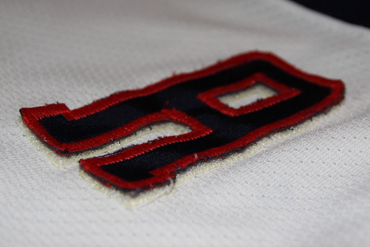
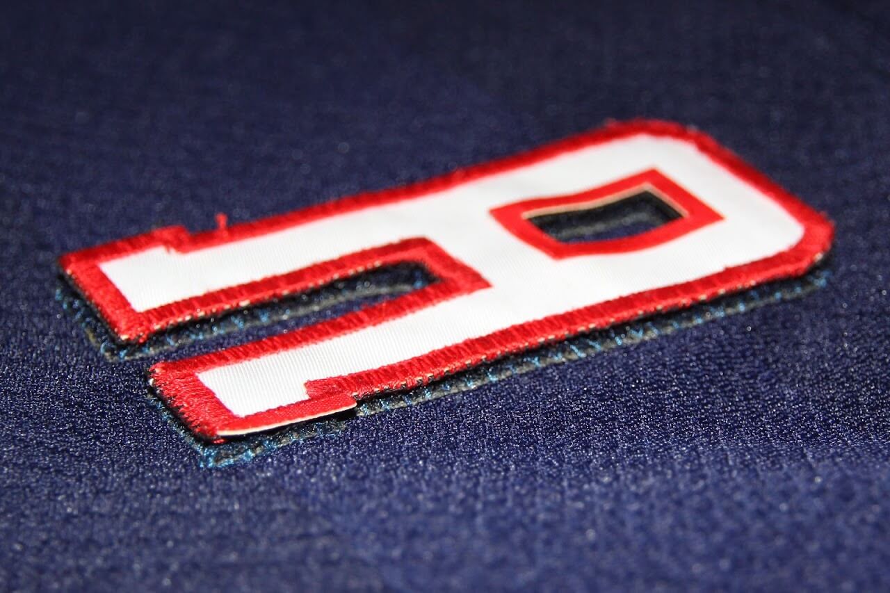
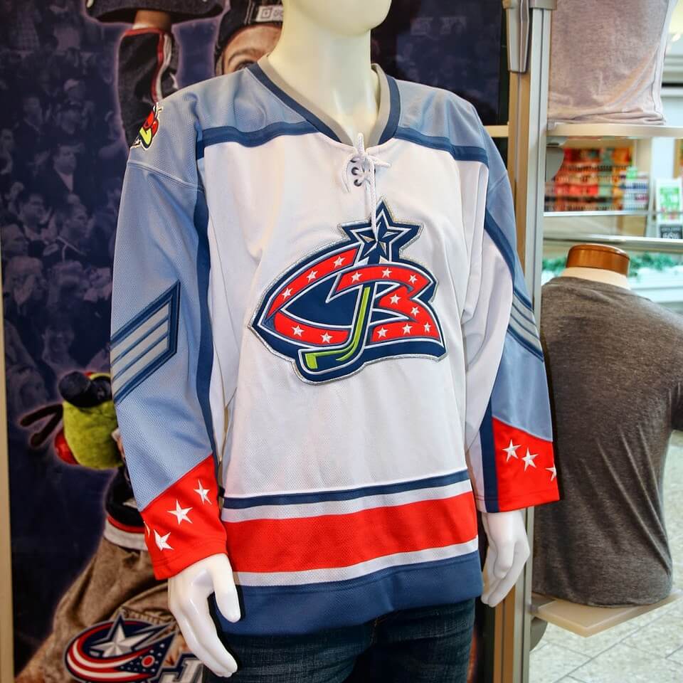
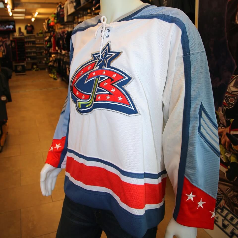
1. The phantom Pro Player jerseys: The Blue Jackets’ first season was 2000-01, which was also the first season of the NHL’s league-wide uni deal with CCM/Koho. So for Columbus’s first few years, their white home jerseys were made by CCM and their blue road jerseys by Koho (this was when NHL teams still wore white at home). But when their uniforms were unveiled at a media event on Oct. 14, 1999 (as seen in the newspaper article at the top of this page), the jerseys were made by Pro Player. Here’s a look at those jerseys, complete with the Pro Player inner-collar tagging and rear-shirttail maker’s marks:
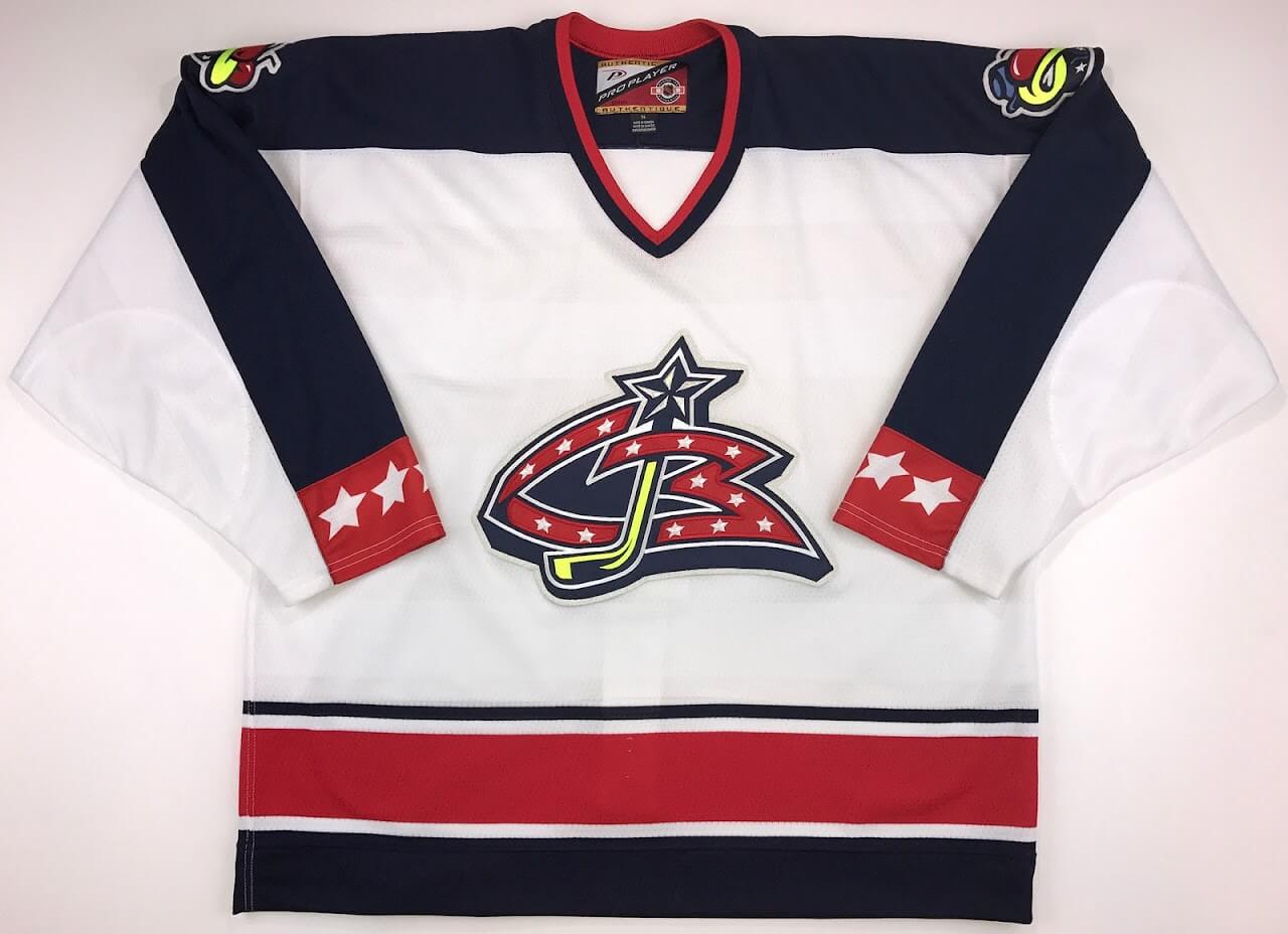
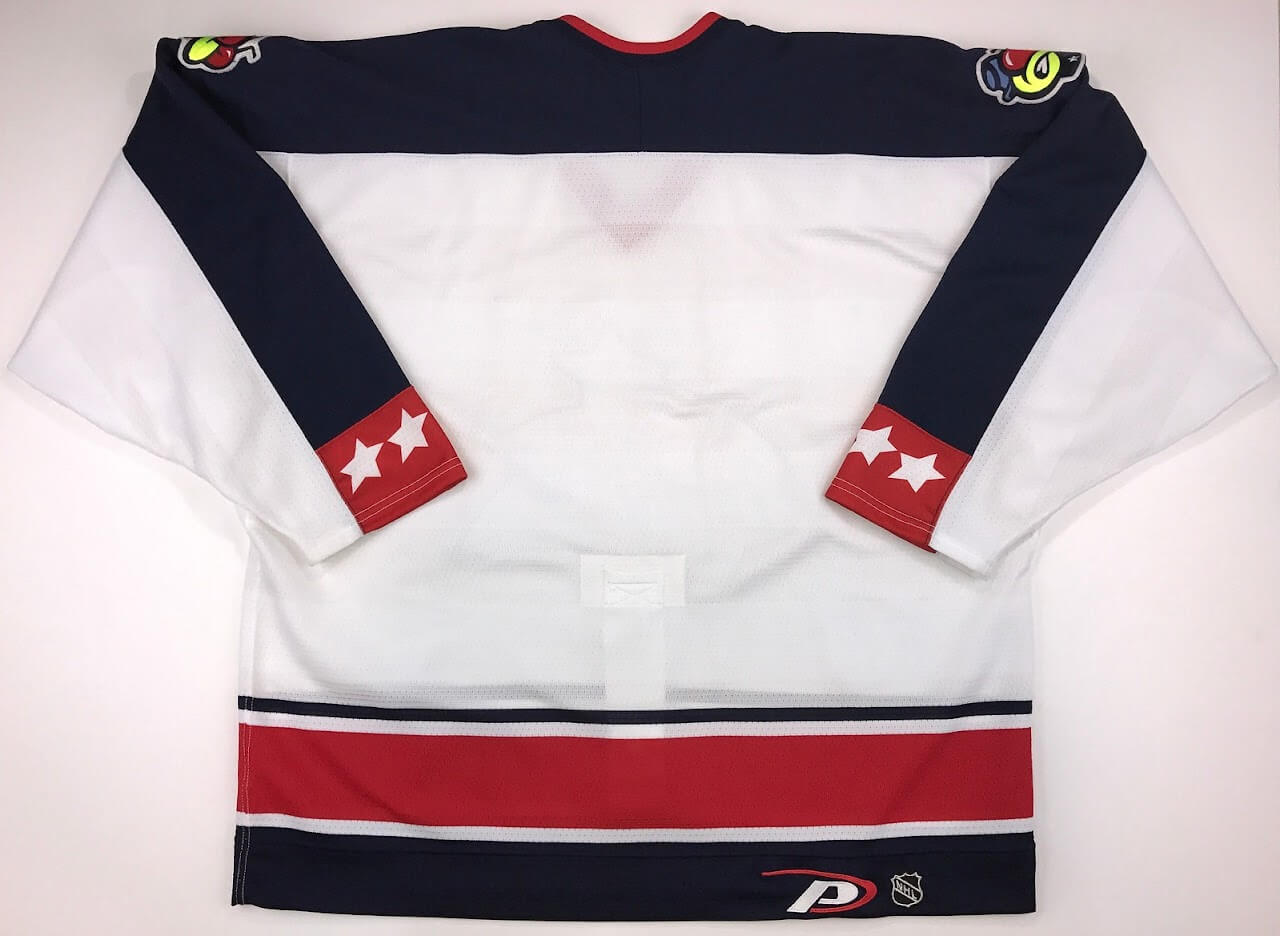
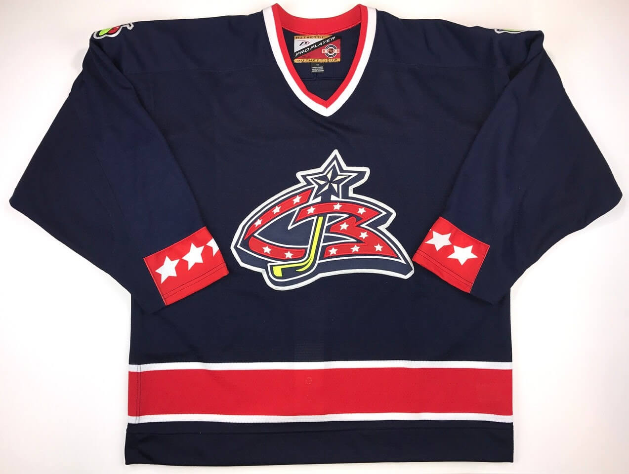
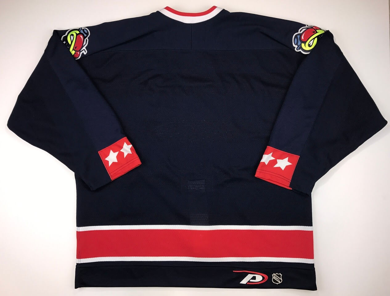
According to Cordle, the Blue Jackets collector/webmaster, these Pro Player jerseys “were used for the unveiling, press conferences for the first free agent signings and for early player and Stinger [the costumed mascot] appearances, but were never used on the ice in an NHL game.” Interesting! You can see more pics here.
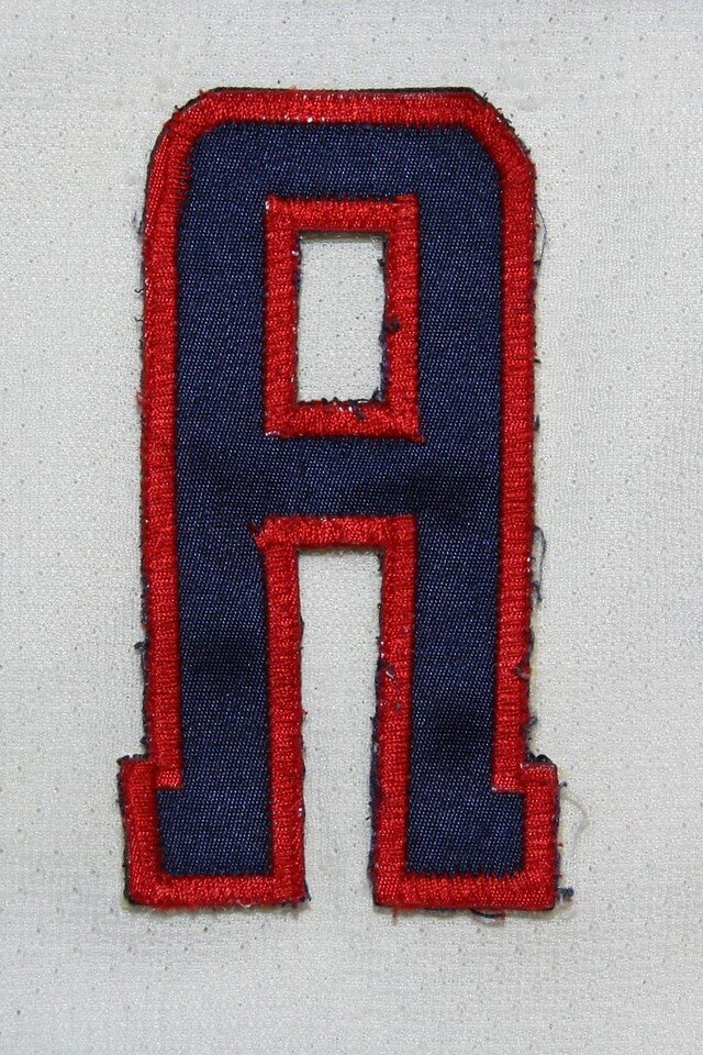
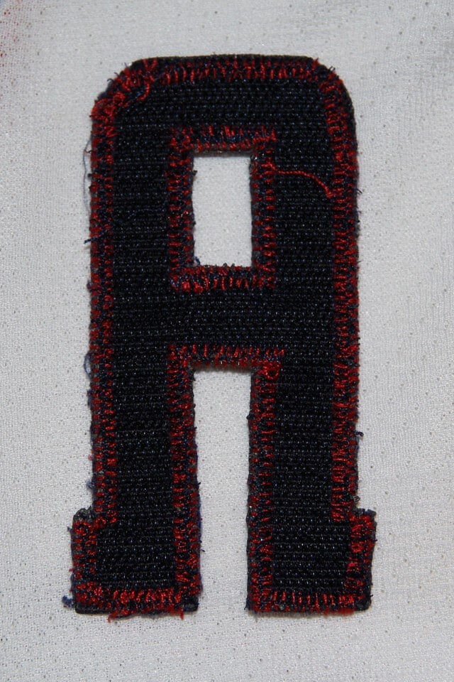
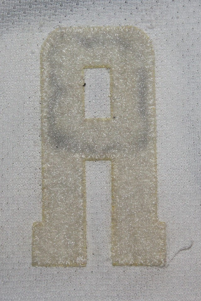
2. The Velcro captaincy designations: For the Blue Jackets’ inaugural 2000-01 season, the “C” and “A” letters for captains and alternates were applied via Velcro. Here’s a series of photos showing, in order, the front of the blue “A” that went on a white jersey; the back of the “A” with the Velcro “hooks” (i.e., the stiff bits); the “A” cutout on the jersey, showing the “loops” (i.e., the fuzzy bits); and the “A” applied onto the cutout:
And now here’s the same sequence for a white “A” that went on the team’s blue road jersey:
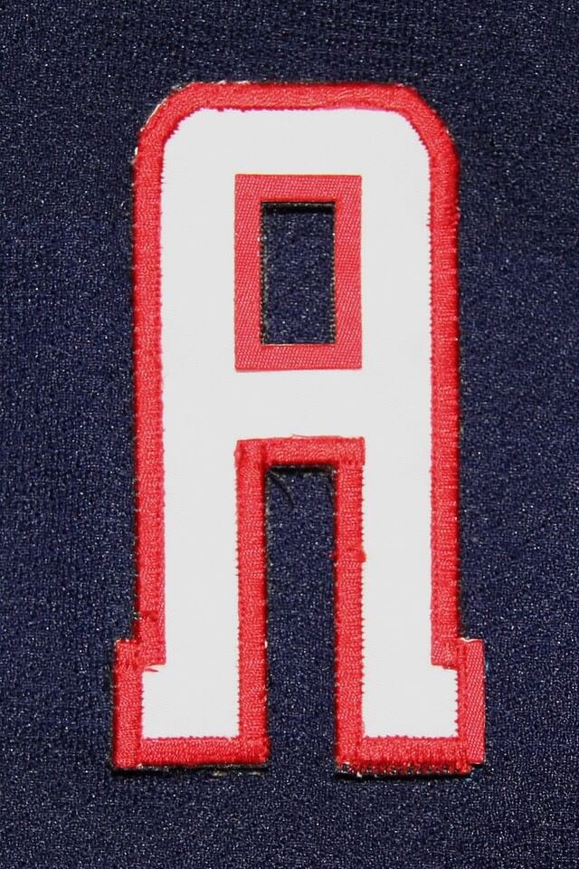
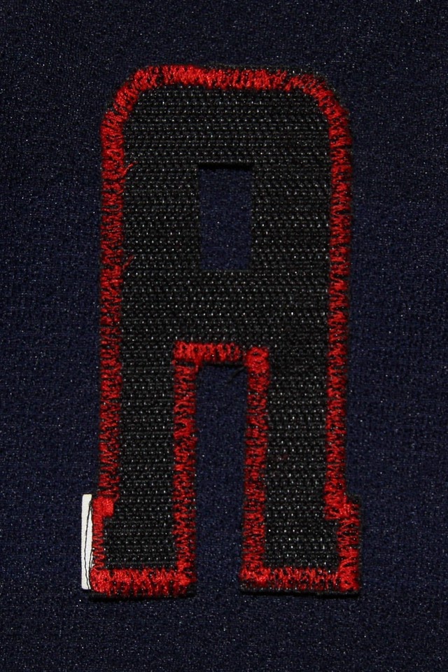
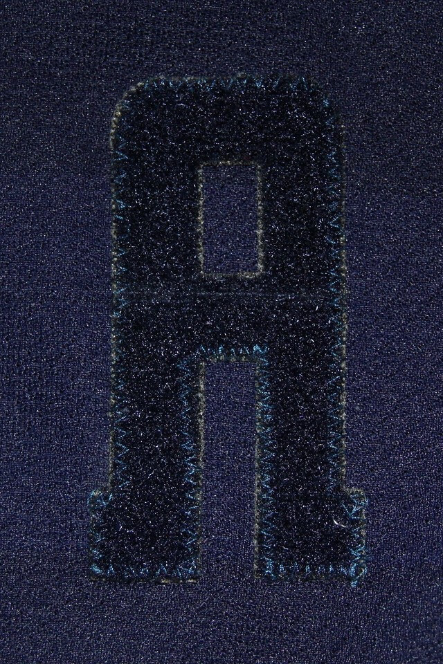
According to Cordle, the Velcro format was used “for easy removal and replacement,” but only for the 2000-01 season. I’ve never seen that on a hockey jersey before! (Or maybe it’s more common than I realize and we just can’t tell while watching a game, which I guess is the whole point..?)
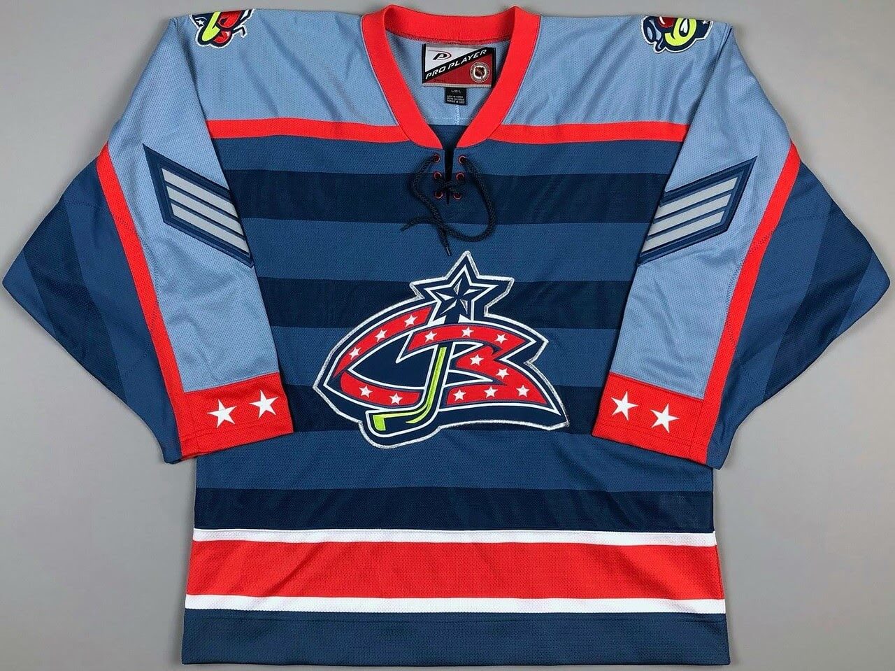
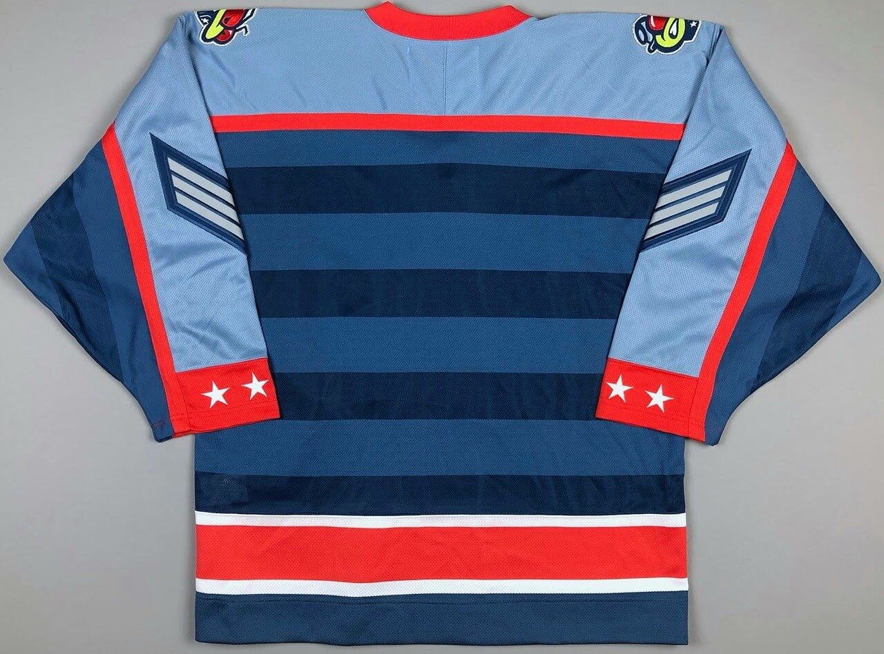
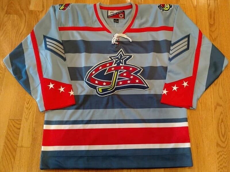
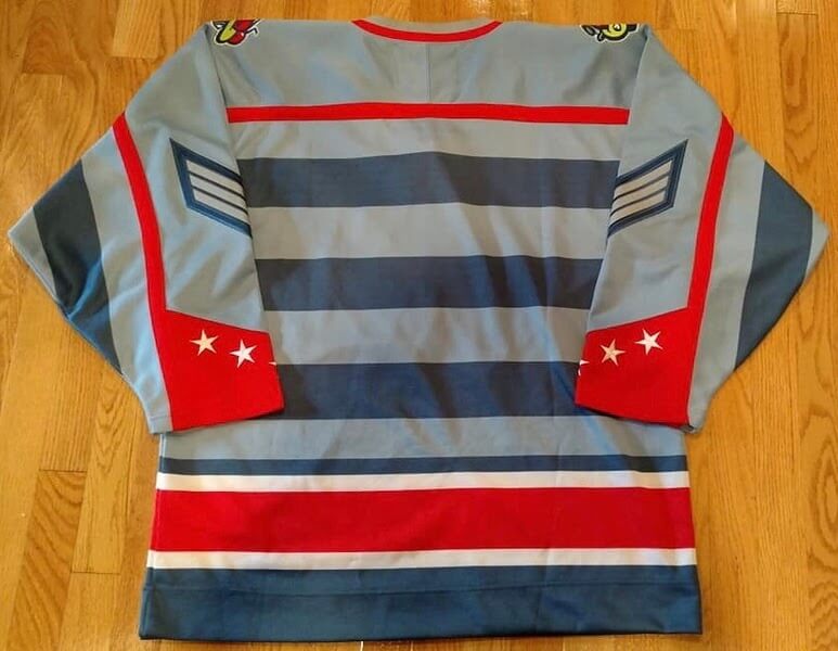
3. The prototypes: Prior to the 1999 unveiling, Pro Player produced several other design prototypes, including these (additional info on the first design can be found here):
———
Good stuff, right? Again, Charles Cordle’s site, which was the source of everything I talked about here today, is here. Have fun exploring it!
(Big thanks to Teebz for pointing me toward Cordle’s site.)
Click to enlarge
Start ’em young: Meet Jack Gillis, the six-year-old son of longtime Uni Watch reader Austin Gillis. “Unfortunately, he prefers the camo-print navy and red socks that came with his team’s uniform,” says Austin, “but he was willing to humor me and wear these stirrups after I showed him some photos of all-time greats wearing stirrups.” Kid still needs to work on his blousing, but that will come with time. Not bad!
Click to enlarge
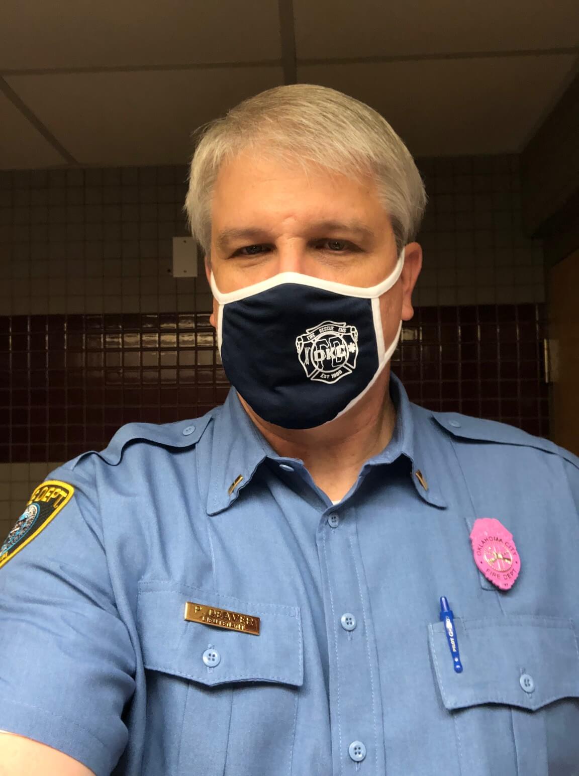
Reader serves as uni model: Who’s that in the Oklahoma City Fire Department uniform? None other than longtime Uni Watch reader Paul “Too Tall” Deaver, who’s an OKCFD lieutenant. He says the pink badge (here’s a closer look) is an October option for breast cancer awareness.
While we’re at it: Yesterday’s Ticker mentioned that police officers in Norman, Okla., had new rainbow badges for Pride Month, but Paul reports that they can also wear purple badges for domestic violence awareness.
The Ticker
By Paul
Indigenous Appropriation News: Dozens of schools are still using Native American team names and imagery in Michigan (from John Chapman). … Here’s an interesting and well-reported article on what the Bellefonte Area School District in Pennsylvania, which recently voted to eliminate the “Red” from its “Red Raiders” team name and eliminate its Native American imagery, will need to spend in order to update its gym floor and other school properties (from Gerry Dincher). … The University of Northern British Columbia has a new Indigenous-themed logo and uniforms designed by an Indigenous artist — a first for a Canadian university.

Baseball News: President Biden tweeted a photo of himself as a young boy wearing a baseball uniform (from James Gilbert). … Dodgers 1B Cody Bellinger didn’t use his own signature bat when hitting the home run that turned the tide in Game 3 of the NLCS (from Ted Taylor). … An Atlanta school has been renamed for Henry Aaron (thanks, Brinke). … I think we may have Ticked this before, but once more won’t hurt: The pattern mowed into Fenway Park’s grass looks like the Portland Trail Blazers’ logo (from Tyler Kepner and Andreas Papadopoulos). … Speaking of Fenway, here’s why a light was mysteriously flashing during last night’s ALCS game (from Trevor Williams). … Comedian Jerry Lewis played four innings for the Astros in a 1973 exhibition game — and went 1-for-1 with a walk! (From Trevor Williams.) … Also from Trevor: Here’s a great 1947 shot of Cleveland Municipal Stadium workers moving the outfield fence based on the opponent, as per team owner Bill Veeck’s instructions.

NFL/CFL News: Browns DL Myles Garrett happened to get hit with random drug tests after two games in which he wore sleeveless undershirts, so he says he won’t go sleeveless anymore (thanks, Phil). … A trade has resulted in some uni number reshuffling for the Cardinals. … In a related item, the player at the center of that trade — TE Zach Ertz — was still wearing an Eagles wristband during his first Cardinals practice (from Timmy Donahue). … Here are this week’s uni combos for the Titans, Browns, and Packers (thanks to all who shared). … Cowboys QB Dak Prescott, who has struggled with depression, has had “Ask 4 Help!” written on his wrist tape this season to support others with mental health issues. Good for him (from Trevor Williams). … New BC Lions owner Amar Doman said in an interview that some uni tweaks are in the works (from Moe Khan).
College Football News: Here are this week’s uni combos for Cincinnati, Iowa State, UCF, Memphis, and UNLV (thanks to all who shared). … Coastal Carolina wore teal helmets last night for the first time ever (thanks to all who shared). … Pinktober helmet logos last night for App State. … Pride decals this week for UConn (from Timmy Donahue).

Hockey News: The straps on Flames G Jacob Markström’s new mask have been painted with a flame pattern (from Joe Johansen). … Here’s a really good interactive piece on how the Kraken’s arena was rebuilt and designed to be carbon-free. Recommended. … The Flyers wore white at home last night against the Bruins (thanks to all who shared).

NBA News: The Bucks have the potential for what might be the all-time long-NOB lineup. … The Knicks debuted their new throwbacks last night. Lots of additional pics here. … Jefferson Penrod has spotted a small detail that was missing from my NBA Season Preview: The two City uniforms that have been rolled over from last season — Phoenix’s and Utah’s — do not have the diamond maker’s mark. … New Celtics G Brodric Thomas has become the first player in NBA history to wear No. 97. … A Houston brewery has launched a new Rockets-themed beer (from Ignacio Salazar).

College Hoops News: New uniforms for San Diego State men’s. … New uniforms for Eastern Kentucky women’s (thanks, Phil). … Kentucky plans to retire a jersey for former coach Tubby Smith in December (thanks, Phil).

Soccer News: Newcastle United is asking fans not to wear Arabic or Middle Eastern-style clothing if they would not normally do so (from Jason Criss). … New sleeve advertiser for Charlotte FC (thanks, Phil). … Top-tier Portuguese side CD Tondela is wearing Pinktober shirts on Saturday (from @mikeDfromCT). … In a recent Women’s FA Cup match between Kingfisher FC and Lichfield Ladies, Kingfisher defender Molly Gilmartin wore a sleeveless shirt — the only player on either side to do so (from Graham Clayton). … Mexico’s 2022 World Cup away kit has leaked (from Trevor Williams). … Also from Trevor: Serie A club Napoli’s “Armani” shirts appear to be just Kappa shirts with Armani branding. … New away shirt for Serbian side Red Star Belgrade (from Ed Zelaski).

Grab Bag: Here’s why Air Force Gen. Mike Minihan, the new commander of Air Mobility Command, wears only three ribbons on his uniform, instead of the usual much larger array. … After more than a decade, the Acura logo is returning to Formula One. … New logo for Canadian outdoor brand MEC (from Andreas Papadopoulos). … Here are the uniforms and logo for the Beijing Olympics torch relay (thanks, Phil). … New retro uniforms for Washington women’s volleyball (thanks, Phil). … The rap group Four-Eyed Horsemen ends each show on their current tour by wearing uni-style jackets, complete with NOBs and numbers of personal significance.
Goodness that’s a terrible headline in the newspaper clipping. There’s a lot one could say about that initial Blue Jackets uniform, but “classic look” isn’t it. They were good uniforms! But decidedly contemporary, not classic. And it’s great to see those other prototypes. Other than the sleeve chevrons – why is everyone a sergeant? – I really like them all.
I’m glad someone else saw that.
I don’t like rank insignia used as non-rank decoration. Like, I’ve owned several military-surplus US Navy pea coats in my days, but I would never have worn one with the rank insignia still on it. Just rubs me the wrong way. But adding chevrons to C or A jerseys? That I could get behind.
Sort of like the way the Lakeland Flying Tigers have added scrambled eggs to coach/manager cap bills. Do the Flying Tigers still do that?
Good point about the headline, but it makes more sense considering the context of Y2K sports uniforms. Especially after the NHL’s decade of chaos, it must have felt like anything short of pink and teal zebra stripes for an expansion team would be considered “classic.”
I’ve definitely heard of and seen Velcro captain patches before. But I didn’t think they lasted into Columbus time!
This is a jersey a famous “Chevy era” Kings collector owns, big rectangular loop field and the letter hooks on. His Dave Taylor jersey comes with a C photo matched on Dave Taylor and Wayne Gretzky!
link
Now that I’m reading confirmation that Columbus used Velcro for their captains too, it makes so much sense! I know a different Columbus collector (I wonder if Cordle knows him!), and I always wondered why his A on his Geoff Sanderson jersey looked like it was peeling off! Here’s a better view of that
link
I just circled back to “5th Line Game Used” on Instagram. Of course Cordle is a friend of his! Collectors, it’s a small world!
I seem to remember Guy Lafleur doing a TV interview where there was a white Velcro patch on his blue Nordiques jersey where an alternate captain’s “A” would have been. That would have been during the 89-90 or 90-91 season.
Lafleur’s “A” was definitely attached in a different way.
link
I believe the Minnesota Wild were going to use Pro Player too until the new league-wide contract with The Hockey Company (CCM/Koho) was reached for the 2000-01 season.
The Wild, like the Jackets, had Pro Player jerseys made up for early publicity stuff. You are correct, Rob. ;)
TEEBZ!
PHIL! :D lol
Oh my goodness. I’m from Columbus, and while I’m not a big Jackets fan, I do own one of the original-logo replica jerseys. But how I would love to own one of those blue-on-blue striped ones! That’s beautiful.
Really good decision for Mountain Equipment Company to go back to a new version of old logo. Always thought square MEC logo was trash. Such a blah plain logo. Especially for a sign outside a store.
While the classic logo is of course preferable to the square one, this is a sad rebrand in my opinion. What was once a member-owned co-op was taken over by vulture capitalists, and now they implement a retro rebrand trying to regain customers on nostalgia. What’s astonishing is that members (ie. former owners) haven’t even been paid out for the sale.
Second ben here. MEC is dead, and this is zombification. Heck, they can’t even spell out the name anymore because it’s not a co-operative :|
Those Blue Jacket concept jerseys are pretty interesting. Do a nice job of bringing the Union army uniform into the design.
Though I think just about all of Columbus’ logos, aside from the cannon, are awful. So the logos really bring down an otherwise inspired design concept.
Those Blue Jackets prototypes are way better than anything they have actually worn. Just fabulous!
Knicks uniforms looked great last night.
Loved the striped socks
I can’t believe it actually had the complete Nike logo with the word Nike on it instead of just the seoosh. I thought that maybe only the retail/swingman version would have the complete logo. ai guess I was wrong. Ditto with the Warriors (who played the Clippers tonight). I guess Nike found a loophole (or the league allowed it in exchange for more money or a favor/concession/cheaper uniforms/something else down the road). Color me disappointed.
I assumed it would be Nike spelt out all along. I like that it’s the vintage logo, but wish there was none at all.
Proofreading: Here’s a series of photos showing, in order, the front of a the blue “A” that…
Got it.
There were a good number of expansion teams in the 90’s and early 00’s that got it right the first time: San Jose Sharks, Minnesota Wild, Carolina Panthers, and Jacksonville Jaguars all come to mind.
The Blue Jackets, on the other hand, did not. The primary and secondary logos were both awful and not at all befitting an NHL team. Their whole identity was muddled and bland. But man, those prototypes. Instead of being a boring, identity-less team, the Blue Jackets could have reached the pantheon of legendarily bad uniform designs. Those striped uniforms aren’t even “so bad they’re good,” they’re bad bad. WOOF!
Unfashionable, maybe, but I was hoping the team would be called the “Columbus Discovery”.
Got that image loading problem again today, Paul. Just an FYI.
I love seeing prototypes make it out into the wild. Fascinating looks at what could have been.
Try clearing your cache.
I see this, too. Opening the comments makes everything load fine. Clearing the cache didn’t help.
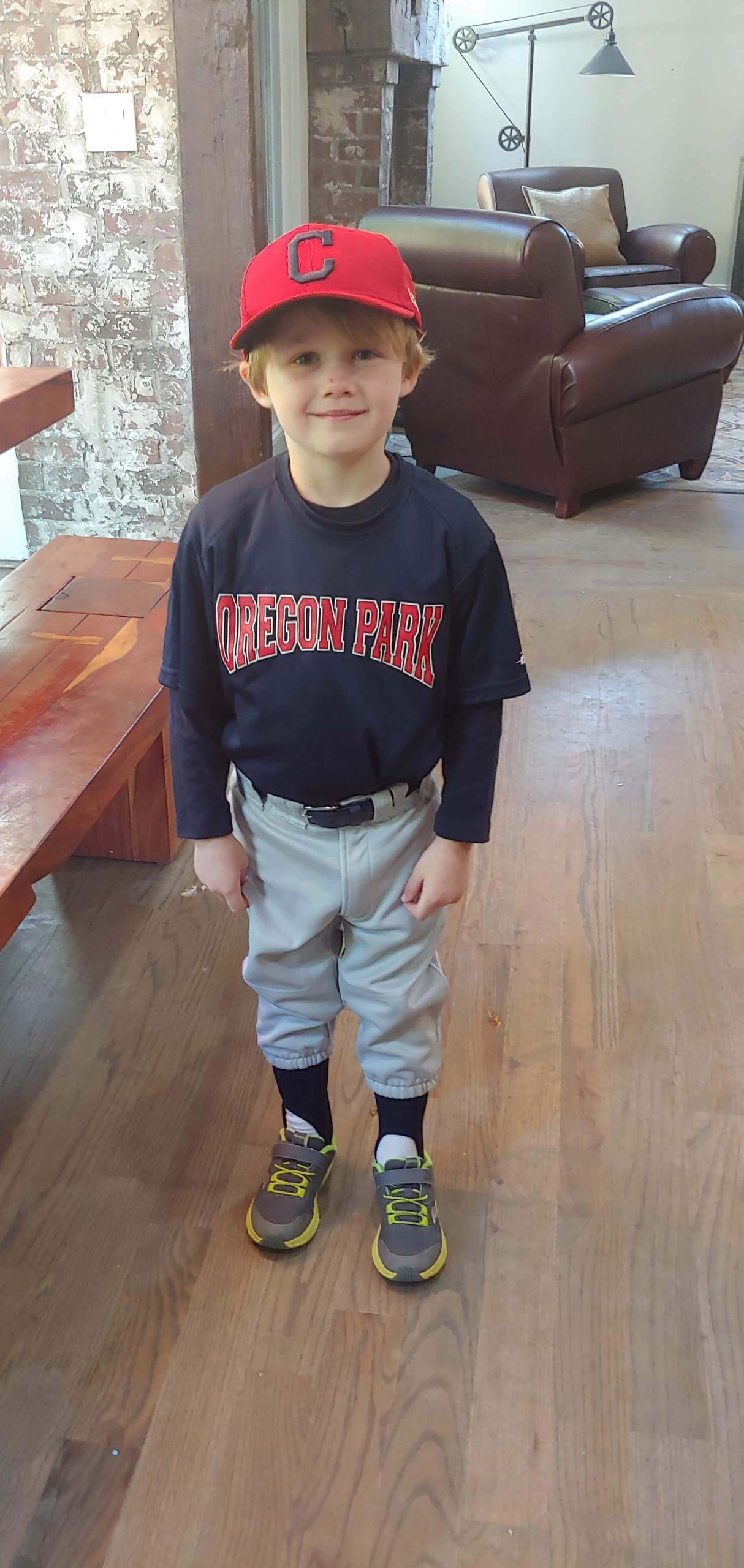
That picture of Brandon in his little league uniform was just so precious. Let’s Go Brandon!
Dear new BC Lions owner Amar Doman,
please bring back the link. We need at least one white-helmeted team in the CFL.
Man, that Cincinnati photo is terrible. Not just because the player looks sad and like he just lost. The untucked undershirt is an awful look. I know it’s what a lot of the players are doing these days, but it looks sloppy and I don’t understand why they’d include it in a PR photo that’s supposed to show off the uni combo. Bad job all around, Cincy.
I’m now realizing it’s a still from an Instagram video.
That doesn’t make the picture any less terrible or the untucked look any less sloppy.
My wife is a descendent of Weyapiersenwah (Chief Blue Jacket) but I am not a big hockey fan. I stopped paying attention when the Seals became the Cleveland Barons, but that’s a different story. When I first heard the team name I have to admit I just assumed it was named after the Shawnee Chief. Xenia, Ohio has a long history of promoting the myth he was an adopted white man because how else would he be such a smart military leader?
Even the NHL website comments on this, albeit raising as many questions as it answers.
“It was first thought that the Blue Jackets were named after the Indian chief, Blue Jacket, from Xenia, Ohio, but that was not the case.” (Thought by whom? Why did they think that? Was the Union Army angle a prescient decision that native logos were on the way out?) link
I am thankful that none of their jerseys and logos went that direction, even in the beginning.
Fascinating! Thanks largely to this blog, I’ve developed an interest in Native American history, but I wasn’t aware of Blue Jacket. That would have been pretty cool if the team had been named in honor of him (assuming his surviving descendants were OK with it). From what I’m reading, it sounds like he was quite the military commander.
I came to Uni-Watch today to see a photo of Jerry Lewis in a baseball uniform. I was not disappointed.
Imagine if Antetokounmpo brothers both had the first initials on their jerseys, as well.