Click to enlarge
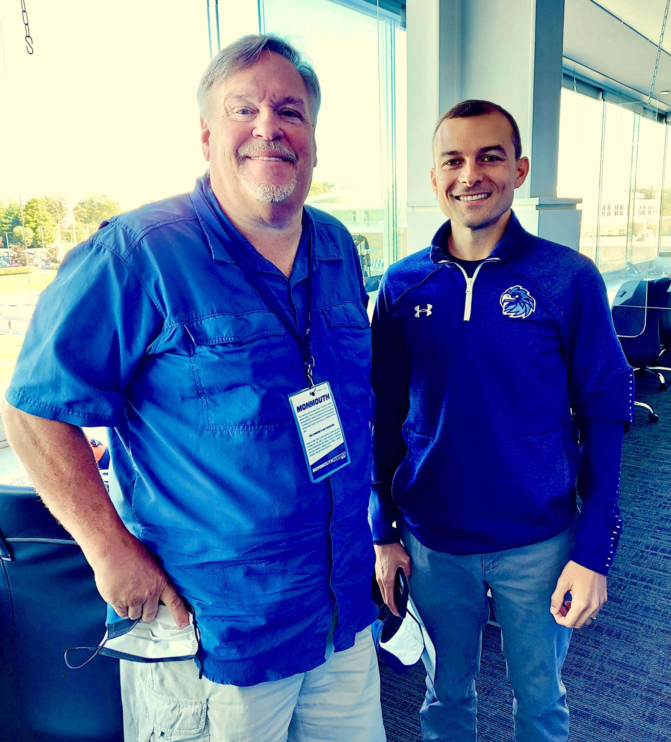
The gent on the left is Kevin Clark. If he looks familiar, it might be because I wrote about him two-and-half years ago, when he was the New Jersey Devils’ P.A. announcer. He’s no longer with the Devils, but he’s now handling P.A. duties for football games at Monmouth University, an FCS school (that photo was taken in their stadium). He recently sent me a really interesting note about that:
I was the P.A. announcer at Monmouth for four or five seasons in the 2000s, which I think gives me a unique perspective to comment on the changes that have taken place since then. I didn’t realize how much the changes in uniform styles and pace of play were going to affect my announcing. I’ve done three games, just to make sure I was witnessing real trends and not one-offs.
First, the numbers: Frankly, they are impossible to see — and I use binoculars! With the jersey being skin-tight, the different fonts, and the scrunching up in front, it’s a chore to determine that I have the right player. Yes, I’ve gotten older and my eyes aren’t perfect, but it’s still tough even with my visual assistance.
Secondly, the real pain-in-the-butt difference is the way teams are doubling up on numbers! Typically, one player will wear the number on offense, one on defense, so they don’t get penalized. But you have guys returning kicks and playing special teams, and sometimes it’s a guessing game. College football, please stop doing this!
Lastly — although not uniform-related — pace of play has increased significantly since I was last behind the mic. Everyone runs an up-tempo offense, and trying to announce the ball carrier/receiver, tackler, down, and distance between snaps can be challenging. I wasn’t prepared for this my first game back, but now I’ve learned to pick up my tempo as well.
For all the changes, I will say this: I love a college football game on a Saturday afternoon. So good to be back!
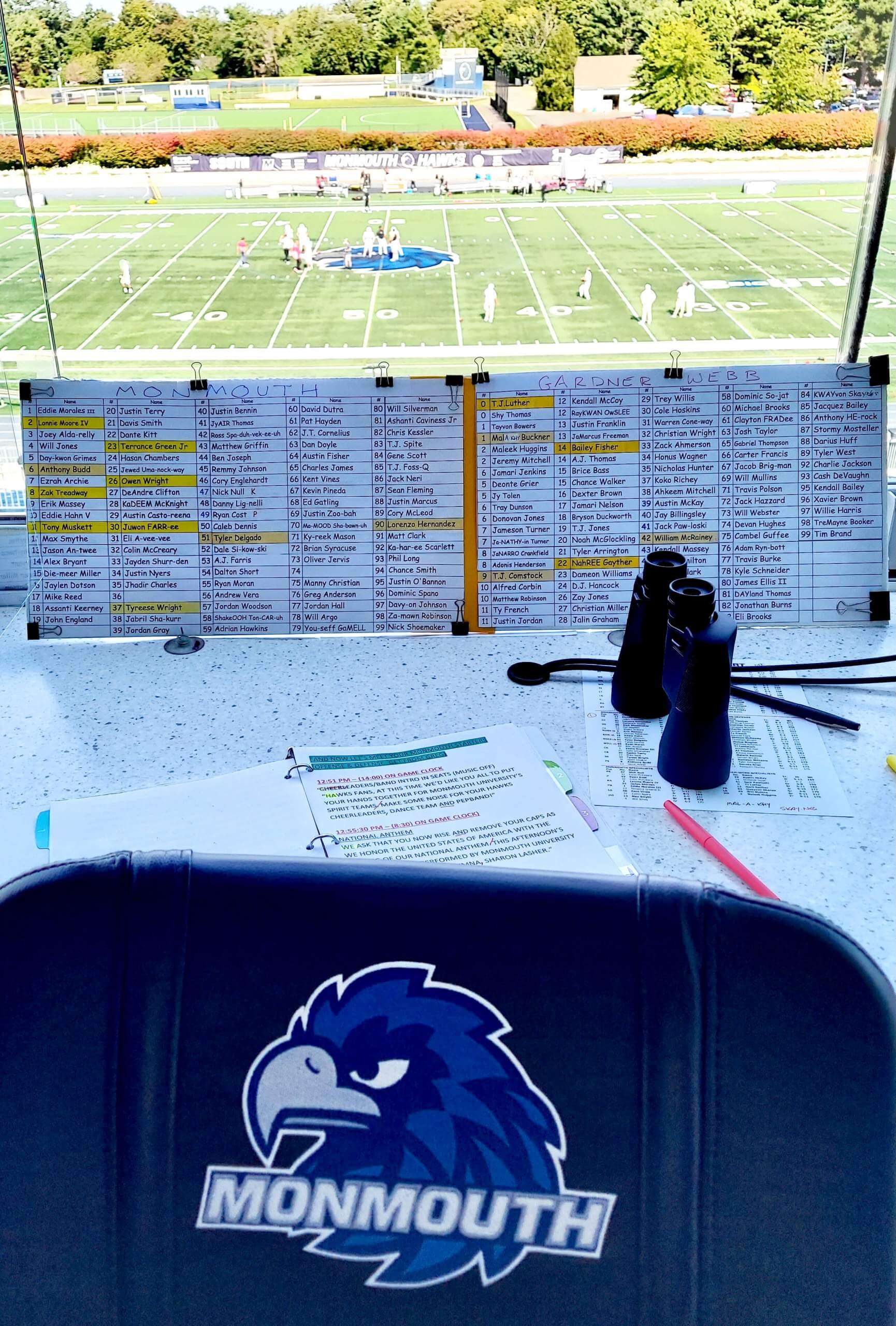
Interesting! Really love these observations. In case you’re wondering, here’s what the game looks like from Kevin’s vantage point (click to enlarge):
🚨 VAZOU!
Trago aqui as primeiras imagens do novo uniforme City Edition do GOLDEN STATE WARRIORS. #NBA75
Predominantemente preto, ele traz o logotipo tradicional no peito, com um "raio de sol" por trás da ponte.
Vou mostrar algumas referências nos próximos tweets. pic.twitter.com/aUCHgnZYw3
— Camisas da NBA (@camisasdanba) October 19, 2021
Another day, another NBA leak: The latest scoop from Brazilian leakmeister Igor Coelho is the Golden State design shown above. If you click on the tweet and use the translate function, you can scroll through Coelho’s analysis of the various design elements.
As an aside: I don’t speak Portuguese (I assume most of you don’t either), but I have definitely learned from Coelho’s tweets that “Vazou!” means “Leak!” I don’t know about you, but I think “vazou” is a much more enjoyable word — you can almost feel the implied exclamation point at the end of it. Vazou! Maybe we should just use that from now on.
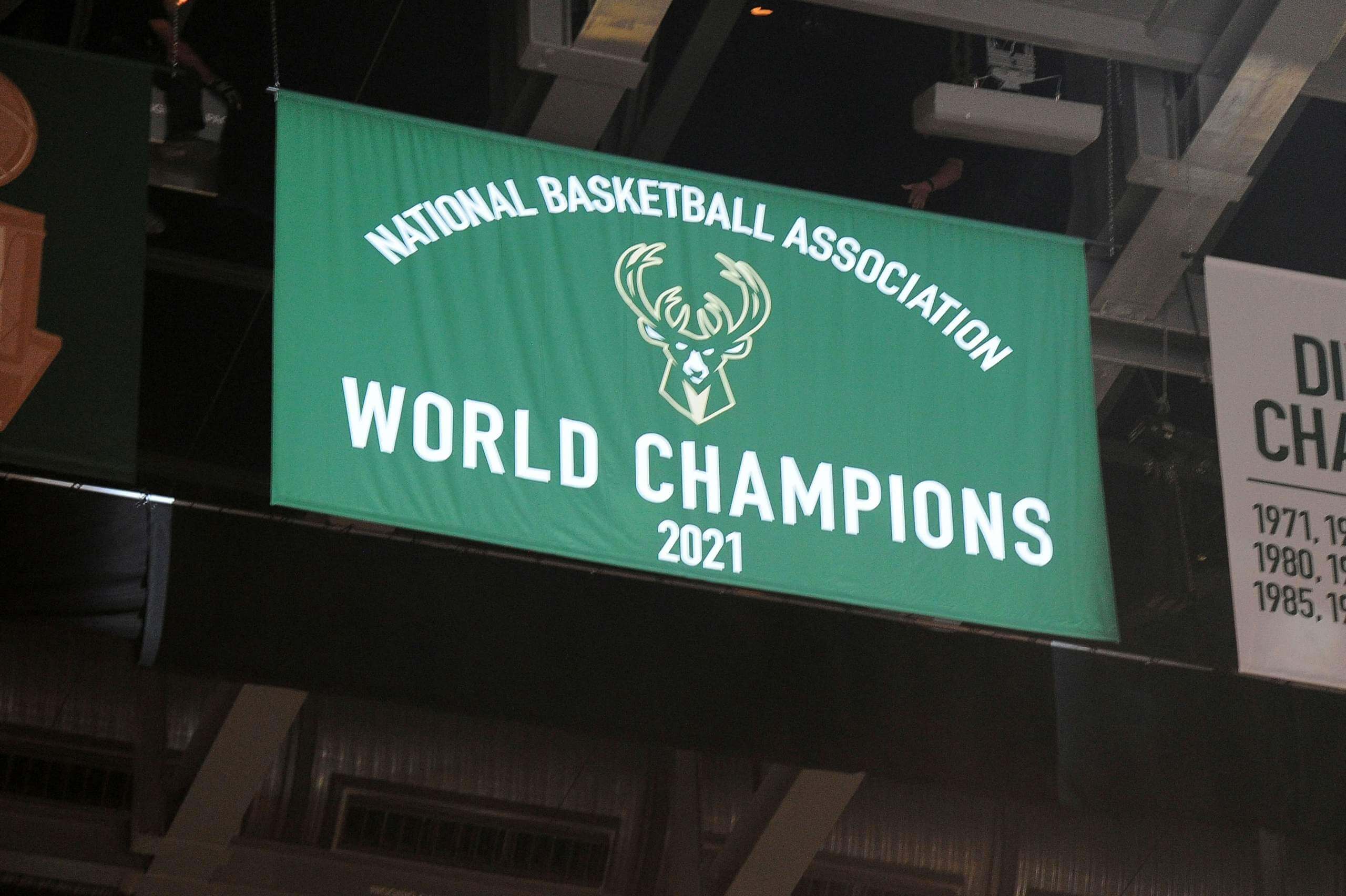
Meanwhile, as long as we’re talking about the NBA, the Bucks raised their championship banner and gave out their championship rings prior to last night’s season opener. Here’s a look (first photo by Michael McLoone-USA Today Sports; click to enlarge):
2021 Championship Ring.
💍 @JewelersMutual pic.twitter.com/O30OcMaHXq
— Milwaukee Bucks (@Bucks) October 19, 2021
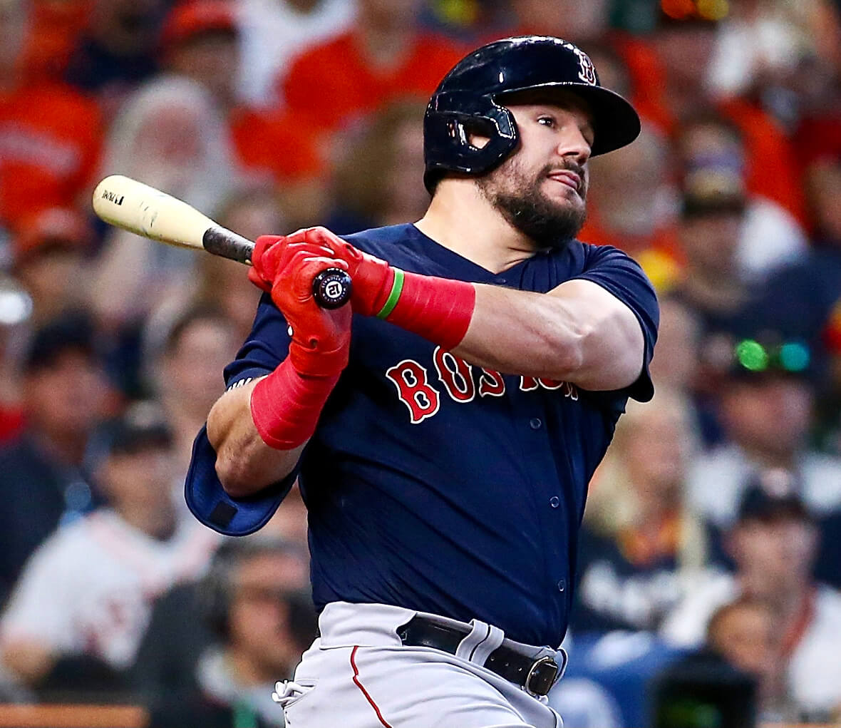
Photo by Troy Taormina-USA Today Sports; click to enlarge
Knob job: Reader Christopher Schuler sent me this photo of Red Sox first baseman Kyle Schwarber, taken during Game Two of the ALCS last Saturday. Note the “12” bat knob decal — odd for a player who wears No. 18, right?
So was Schwarber using a teammate’s bat? Nope — the Sox don’t currently have a player wearing No. 12.
So let’s take a closer look at that decal and flip it upside-down:
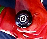
It’s a little rough-looking, but you can definitely see that it’s a Washington Nationals decal. And sure enough, Schwarber wore No. 12 for the Nats.
Schwarber was traded from the Nats to the Sox back on July 29. Interesting that he was still using his old supply of bats more than two months later.
So that was Game Two. But by Game Three, two nights ago, Schwarber had switched to a different bat — presumably a newer one — with no decal:
(Big thanks to eagle-eyed Christopher Schuler for spotting this one.)
The Ticker
By Lloyd Alaban

Baseball News: The Red Sox still have a bullpen cart (from Heath Carignan). … A new Twitter account posts a scorecard of each MLB game at the game’s conclusion (from Jon Viera).

Football News: This could have been the Browns’ new logo in 2015 (from John Sabol). … The next few items are from our own Phil Hecken: Orange/white/black for the Bengals this week. … The Lawrenceburg Tigers, a high school in Indiana, wore uniforms donated by the Bengals last week. … UAB will again wear NOBs of patients at a local children’s hospital for homecoming. … Ole Miss will honor alum Eli Manning with “Manning” end zones this week. … New personal logo for Cowboys CB Trevon Diggs (from @ThatRodneyGuy).

Hockey News: Kraken G Joey Daccord did not have the team’s inaugural patch on his sweater last night (from multiple readers). … New helmet ad for the Blue Jackets (from our own Phil Hecken). … Bally Sports Ohio misspelled the Red Wings’ team name last night (from Kevin Pedigo). … New unis for Lions de Trois-Rivières of the ECHL (from Moe Khan).

Basketball News: The 76ers sent a very cool package, featuring a View-Master, to their season ticket subscribers. The package also confirms that the team’s new City alternate will have a heavy Spectrum theme (from @CarsonFentz). … New unis for Seton Hall women’s (from @Starkman55).

Soccer News: Mexico’s World Cup shirts might have leaked (from our own Phil Hecken). … El Clásico — the Barcelona-Real Madrid rivalry — now has a logo and ball. … RB Leipzig’s youth team faced PSG’s youth team, and RB Leipzig wore different uniform sets than the main club did (from Johnny Jatt). … Some players from the Dutch club FC Emmen have their last names on the front of their shirt underneath the club badge, while others do not (from Anthony Zydzik). … Japan’s J-League won the “Good Design” award for its updated name and numbers designs. “The award is aimed at enriching society through design,” explains Jeremy Brahm.

Grab Bag: Here are the jerseys of all 16 teams in the cricket T20 World Cup (from our own Phil Hecken). … It’s Pinktober for North Carolina’s marching band (from James Gilbert). … The Norman (Oklahoma) Police Department is wearing rainbow badges in honor of LGBTQ History Month (from Timmy Donahue). … Also from Timmy: The Overland Park (Kansas) Police Department’s new Crisis Action Team will wear toned-down uniforms without the word “Police” on the back. The unit will also have unmarked cars and a therapy dog. … “The sport of netball could be ending the use of skirts in its uniforms. … The Australian Football League keeps track of new and changed player numbers for its teams. It has started its list for the upcoming AFL Women’s season, though there are only seven teams so far (from our own Jamie Rathjen).
I’m sure this been discussed before, but it is so strange NBA teams use “National Basketball Association” and “World Champions” together.
COMIC SANS on those rosters for Monmouth and Gardner Webb? Yeesh.
I’ve heard that it’s more readable for some people, especially those with dyslexia. He obviously printed that out for his own use and nobody else’s, so who cares what font he used?
I do like how he phonetically spelled some of the names! My own name would need similar consideration.
I wish I could tell why some names are highlighted
A guess from my PA days, but likely key players on defense and offense that have been making a lot of the plays in past games.
B. J., I spotted that too! Obviously Kevin can use whatever ad-hoc system he likes, because it’s for his own private use, but I often wish “official” pronunciation guides would use international phonetic characters, or at least the phonetic system of Webster’s dictionary, so that we would have more accuracy. (I tried to convince the owner of Baseball Reference to do this a few years ago, but he didn’t seem interested.)
If you haven’t learned to read the IPA, I think you’ll like it, because your surname fits really well with it, if I’m reading it right and you’re eastern European.
I like the unique orientation of the helmet on that Browns logo…I dislike the gray facemask of course (isn’t 2015 the year they switched to brown?).
Wish we could see the markings on the inset of the ring base for a longer exposure than the video.
Maybe pause the video at the appropriate spot..?
“A new Twitter account posts a scorecard of each MLB game at the game’s conclusion (from Jon Viera).”
So cool!! I hate that the MLB season is almost over. I’m looking forward to next year.
Kevin Clark says “First, the numbers: Frankly, they are impossible to see — and I use binoculars! With the jersey being skin-tight, the different fonts, and the scrunching up in front, it’s a chore to determine that I have the right player.” I’m a high school football statistician, and I second this.
The good news is that changes are coming, at least for high school football. Two years ago, the National Federation of State High School Associations clarified the size requirements for jersey numbers and outlines through the 2023 season. Starting in 2024, numbers must be a single solid color — no outlined fonts — that clearly contrasts with the body color of the jersey.
The specifics, for those interested: link
As the PA announcer for our local High School football team, I have to agree with Mr. Clark’s assessment when it comes to the jersey numbers. Some of these new fonts are really difficult to read. Two other items that can make reading difficult: (1) drop shadow effects, and (2) the use of number colors that don’t contrast the jersey colors. Many of these new jerseys look great up close but can be a nightmare for fans at games, TV audiences and PA announcers.
Seconded. I’m a PA announcer for high school basketball and it’s the same for some basketball jerseys.
Just reporting a strange site quirk today. No images located at the “dugout.uni-watch.com” and “outfield.uni-watch.com” were loading on the home page, but did load when I clicked into the comments page.
We had a site glitch for a few mins. Should be fixed now.
The same issue happened to me when I logged in around 12:45 PM Central. Had to click on the specific post to get any images to load (other than embedded tweets).
It’s one of those days where a post talk about a problem (jersey fonts are difficult to read) and another post has a solution (soccer’s J-League wins an award for number design).
link
I really like the “generous shapes” part where they open up the space around the characters. Too many times you can’t tell if 5’s are 9’s or 8’s are 6’s, especially with serifs.
And, if you can look it up, the 1997 Jaguars preseason jerseys were the worst.
Interesting uni-related implications from the announcement that Charlotte and UAB will be joining the AAC. With South Florida already in the conference that will make 3 schools with green and gold (actual gold, not yellow) as their colors. Add in Tulane and soon to be member North Texas that is also 5 schools with green as their primary color.
Quite a novelty in a landscape of teams mostly in shades of blue and red.
Unfortunately having 2 players with the same number isn’t going to change. With 85 scholarship players, and over 100 total players, the math just doesn’t add up. And of course a position group is limited to only certain numbers. I wonder in the NFL how opening up lower numbers to RBs and receivers will impact QBs getting a number? One problem now is that many top recruits want a certain number, and schools cave to accommodate them. But even without that, you’d still see many double numbers. Last year my school, USC, had a penalty the first game, first play, on the kick off with two players wearing the same number. This year they had a player returning kick offs wearing a different number jersey over his regular jersey, that was so huge it looked like he was wearing a moo moo dress. It was hilarious. I forgot to tweet that to Paul or Phil. I wonder what Alabama does for this, since they also have the numbers on their helmet? I’m guessing these players have 2 helmets, but with injuries during a game I could see this having problems.
Why can’t they just use triple digit numbers?
Can you imagine the legibility issues if a third character was added to the front and back of a modern football jersey?
Or, you rarely have more than 100 players actually getting into the game, make sure none of your starters or primary reserves have the same number. So any duplicate numbers you need if your roster is over 100 are going to players who 99% of the time won’t be getting in the game to begin with.
I will add that I have liked USC not having NOB, but it would help with this. Also with the NIL, where college players are able to monetize playing college ball, I could see where having the name on the back could become a selling point.
Maybe not allow so many freaking football players on one team? A lot of schools would welcome Alabama’s castoffs for example, and it might lead to some actual parity in college football.
Modern jerseys are too stretched out to be readable? This classic image of NY Giant Jim Burt from “THE Joe Theismann game” was the first thing that jumped into my head… link
Having been the football PA announcer at California Lutheran University in Thousand Oaks for 19 years, I completely agree with Kevin Clark regarding duplicate numbers. I have taken to designating numbers as “o” for offensive players and “d” for defensive players on my rosters (e.g., 4-o and 4-d for two players wearing No. 4). But the special-teams problems are definitely real. I appreciate seeing Kevin’s charts! I may incorporate some of those elements myself.
Hi, Paul. I’m a reader from Brazil… you are (almost) right. “Vazou” is indeed related to “Leak” but in the past tense (verb “Vazar”). So the expression would be something like “It has Leaked” or “Leaked!”. Outside its normal meaning, it is commonly used in such situations (new information that is revealed, something confidential that wasn’t supposed to be published, etc.).
Abraços,
Gustavo
Thanks so much for that information, Gustavo!
Nope — the Sox don’t currently have a player wearing No. 12.
The Sox do have a No. 12 — Jose Iglesias — but he wasn’ eligible for the post-season roster. He’s still link. You’ve got to love players like that!
Interesting comments gang. Just so you know, after over 40 seasons of sports announcing, comic says is here to stay for me…
I have also started designating my double numbered players with red or blue dots depending on offense or defense. Helps a little bit.
The yellow boxed players on my roster are for QB, leading rusher and receivers. Tan boxes are for leading tacklers. I also place a red K or P next to the kickers names. All of it really helps with quick identification.
Hope this answers some questions.
Good to hear Kevin’s assessment on jerseys matches what I see in my work as PA for my high school alma mater. Our homes games are played at the University of Toledo’s stadium and from the announcer’s box high perch, even with a spotter and binoculars it’s impossible to get the correct player identified before the next play. Also good to hear of the new contrasting numbers rule. We had three visiting teams this year wearing the visiting white jerseys with yellow or light grey numbers. It was impossible!