Click to enlarge
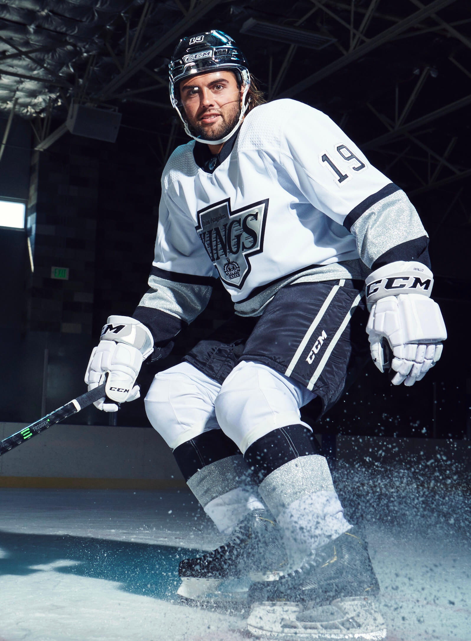
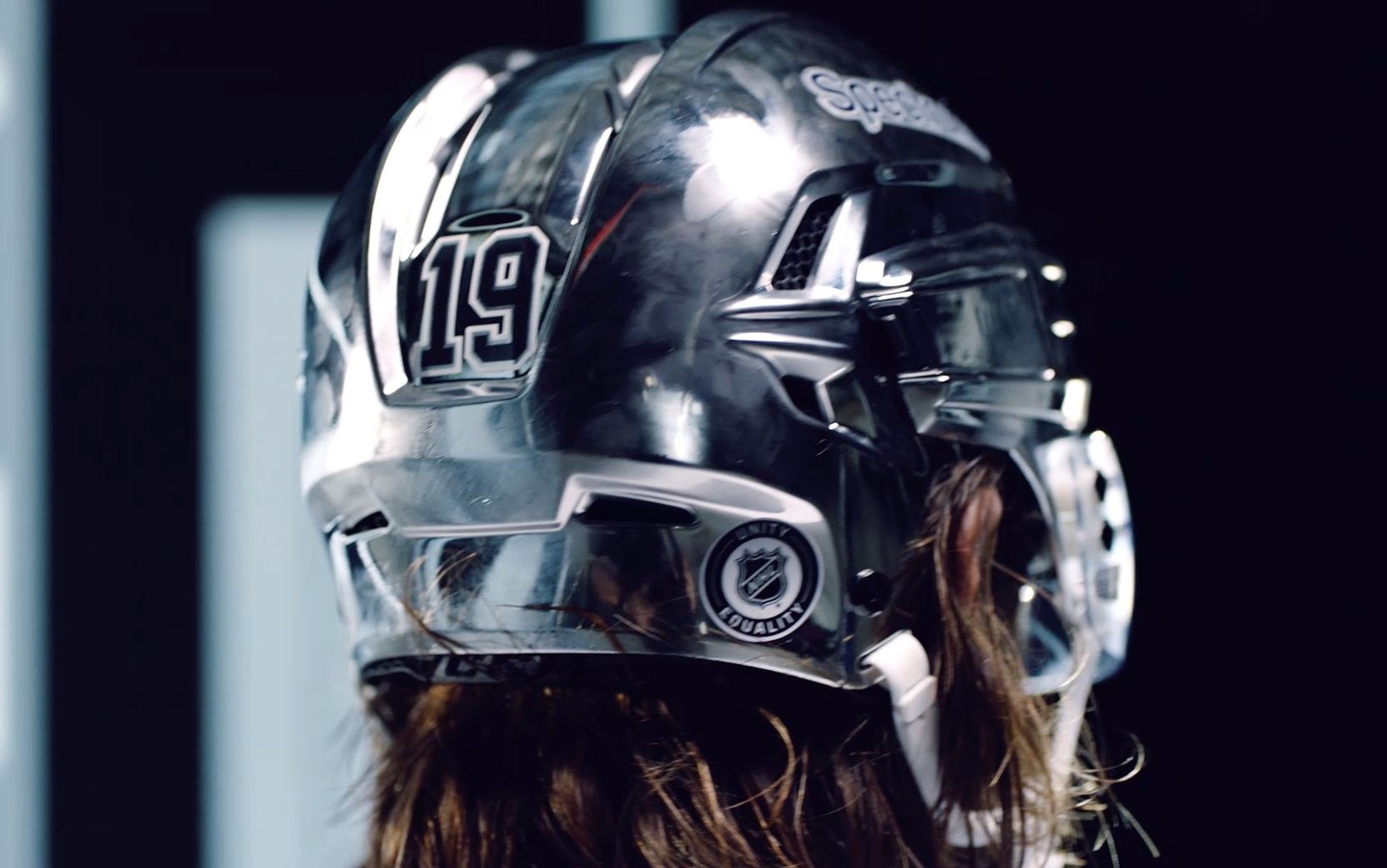
The Kings yesterday confirmed a long-running series of reports, rumors, and leaks by officially unveiling their new alternate uniform. It’s basically a 1990s throwback, but with metallic silver trim, white gloves (an NHL rarity!), and a chrome helmet.
If you’re saying, “Wait, that photo doesn’t look like it has a chrome helmet,” well, yeah. It’s apparently hard to capture in certain lighting conditions, but you can see it much more clearly in this next photo and video clip:
A new spin on your favorite throwback…the LA Kings Authentic adizero Primegreen Alternate Jersey is available this November! →https://t.co/i8QVfVgeUS @adidas | #GoKingsGo pic.twitter.com/E6HT5Xp4Dt
— LA Kings (@LAKings) October 11, 2021
(As you may recall, the Kings also went with the chrome buckets for the 2020 Stadium Series game against the Avs.)
This uniform will be worn 15 times this season, beginning on Nov. 17. Four of those games will be on the road, which means the other 11 will be old-fashioned white-at-home games (and that the visiting teams will have to pack an extra set of uniforms). You can see the full slate of dates, along with additional info and photos, here.
All that silver trim and the chrome helmet got me thinking: As we all know, the Kings changed their color scheme from gold/purple to silver/black in 1988 — the same year they acquired Wayne Gretzky. But a big part of why they chose those colors is that the NFL’s Raiders were playing in L.A. at the time. The Raiders later went back to Oakland and have since moved on to Vegas, but their brief sojourn in L.A. several decades ago continues to have ripple effects in a completely different sport. Crazy!
Meanwhile, in another late-breaking NHL development, the Golden Knights unveiled the jersey patch that they’ll be wearing as the hosts of this season’s All-Star Game:

Not bad! Should look really good on their gold alts, too.
And speaking of the NHL: In case you missed it on Monday, the annual Uni Watch NHL Season Preview, with all the uniform and logo news for the upcoming season (which begins tonight!), is now available for your reading pleasure. Enjoy!
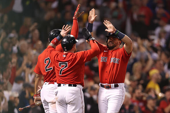
Code yellow red: The Boston Marathon was yesterday (postponed from its usual April date), so — as noted in yesterday’s Ticker — there was a widespread expectation that the Red Sox would wear their Marathon-inspired City Connect yellow/blue alternates for last night’s playoff game (especially since MLB had given them permission to do so). And if they didn’t wear those, the thinking went, they’d surely wear the “Boston Strong” uniform that they wear each April on Marathon Monday, which is also Patriots’ Day.
As you can see in the photo above, neither of those scenarios came to pass. Instead, the Sox wore their red softball tops for the second consecutive game.
Why? The question came up in Sox skipper Alex Cora’s pregame press conference, as spelled out in this article:
Though the yellow “City Connect” jerseys would have seemed to be a perfect fit for Game 4, Sox manager Alex Cora said that most of the jerseys and helmets the club had in stock had already been signed or given to charity.
“I think the yellow ones, after we used them — a lot of them — have been signed and helmets have been signed,” Cora said. “It’s memorabilia. There’s not too many of them around.”
The same thing apparently happened to the “Boston Strong” uniforms:
“From what my understanding is, we used them and then we gave them to the Red Sox Foundation so those are gone,” Cora said.
Personally, I dislike the yellow design and prefer that the Patriots’ Day uni be used only on Patriots’ Day, so I’m not too broken up about those uniforms not being worn last night. But if the Sox wanted to wear either of them (which isn’t entirely clear from Cora’s presser), it’s interesting that they weren’t able to do so. Like, it’s one thing to say that the original uni sets had been decommissioned and put into the memorabilia market (that’s not surprising, especially for the Pats’ Day set). But couldn’t the team simply have gotten a new set made in time for last night’s game, if that’s what they wanted?
Consider: The Sox beat the Yankees and advanced to the ALDS a week ago — Oct. 4. Unless they either swept the Rays or got swept by them (both of which were conceivable but unlikely), they knew they’d be hosting Game Four on the same day as the Boston Marathon. You’d think that’s enough time to get a new set of jerseys made, right? Now, the yellow/blue set has its own pants, socks, belts, and — here’s the tricky part — batting helmets. Getting new inventory on all of those uni elements might be more of a logistical challenge, especially for the helmets. But the “Boston Strong” unis don’t require anything but new jerseys. Couldn’t they have gotten those made if that’s what they wanted?
Is this a(nother) supply chain issue, like the one that reportedly prevented New Era from adding the “Postseason” cap patches this year? Maybe — or maybe it’s just superstition: The Sox wore red for their Wild Card victory against the Yankees and for their Game Three victory against Tampa. (And given how last night’s game turned out, it’s hard to argue with the results.)
Of course, it would be nice if the Sox could just take the highly radical step of, you know, wearing their beautiful home whites at home, but they haven’t done much of that this year.
Meanwhile, as long as we’re talking about the Sox, check out these two shots of Travis Shaw, who appeared last night as a pinch-hitter in the ninth inning:
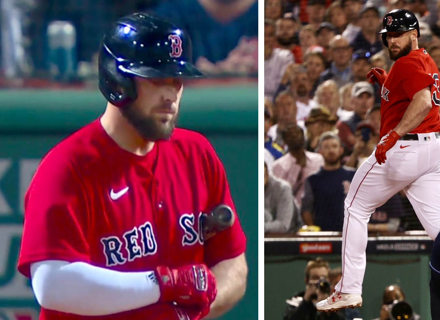
Look closely as you can see that Shaw was wearing Franklin batting gloves, an Adidas compression sleeve, and Under Armour shoes, to go along with his Nike uniform. (Also a Rawlings batting helmet, but at least that didn’t have a maker’s mark.) He’s a one-man sporting goods catalog!
(Special thanks to Phil — he knows why — and to Alex Feldman for spotting Travis Shaw’s many maker’s marks.)
Click to enlarge
Collector’s Corner
By Brinke Guthrie
Follow @brinkeguthrie
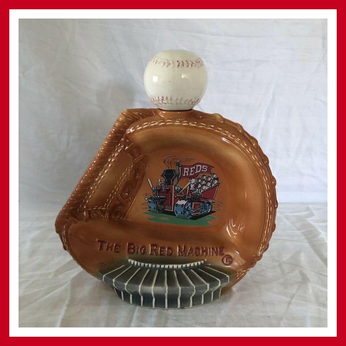
We’re well into the MLB postseason, so let’s start things off with this gem from a team that certainly distinguished themselves in the 1970s-era playoffs: a 1973
Big Red Machine catcher’s mitt whiskey decanter made by Hoffman. The seller makes no mention of dimensions here, but it looks pretty big, and includes Riverfront Stadium at the bottom and the team logo on the back. The seller adds “The cork that at one time secured the ball in place on the decanter is missing.”
Now for the rest of this week’s picks:
• Speaking of catcher’s mitts and the Redlegs, here’s a 1978 Johnny Bench calendar. Note that the cover photo is clearly from 1976, as you can tell from the National League centennial sleeve patch (one of my favorite logos).
• Check this out — a 1990 Wayne Gretzky computer hockey game. I didn’t know such things existed back then. “For IBM and compatibles; XT Turbo or faster recommended.” Uh, right (scurries to Google to see what “XT Turbo” was).
• 49ers fans used to be able to use this official Niners screensaver CD-ROM on their 2001-era computers. Needs “Windows 95 or newer”! You get “Websaver Live! Broadcast Screensaver,” an “Interactive Schedule,” “Internet Links,” and a signup for the PacBell Internet service.
• Finally, a listing with no old-school electronics required: Here’s a set of four 1970s NFC Central helmet buggies, including the Vikes, Lions, Bears and Packers.
• Speaking of helmets, this kids’ 1960s-’70s Baltimore Colts helmet appears to have been through some backyard wars.
• The San Diego Padres “Swingin’ Friar” is livin’ large and takin’ his cuts under a Southern California palm tree on this pair of 1990s canvas duffle bags.
• How about this copy of “Base Ball Rules” from 1927! “With explanatory notes on the playing rules, a marginal index, and a new series of ‘Knotty Problems.’”
• I guess “Rah! Rahs!” is the brand name for this 1969 set of New York Rangers “Win Pins.”
• I liked this 1973 Topps Franco Harris football card for two reasons — the little sash/banner design for that year’s Topps set, and it’s cool when a player wears a toque like that on the sidelines.
• Babe Ruth is featured on this 1951 Kellogg’s cereal premium ring. Fairly decent likeness, too!
• If you have a kid, you could do a lot worse than dressing them up in this early-1970s powder blue Chargers youth jersey.
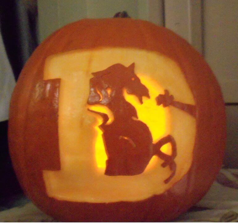
Team-logo jack-o-lantern stencils: Nobody — I mean nobody — loves holidays like our own Brinke Guthrie. So with Halloween fast approaching, he’s compiled a bunch of stencil patterns that you can use to create your own team-logo pumpkin. Here they are for MLB, the NFL, the NHL, and the NBA.
You say you want to make a Uni Watch pumpkin? We’ve got you covered for that as well. Have fun!
Click to enlarge
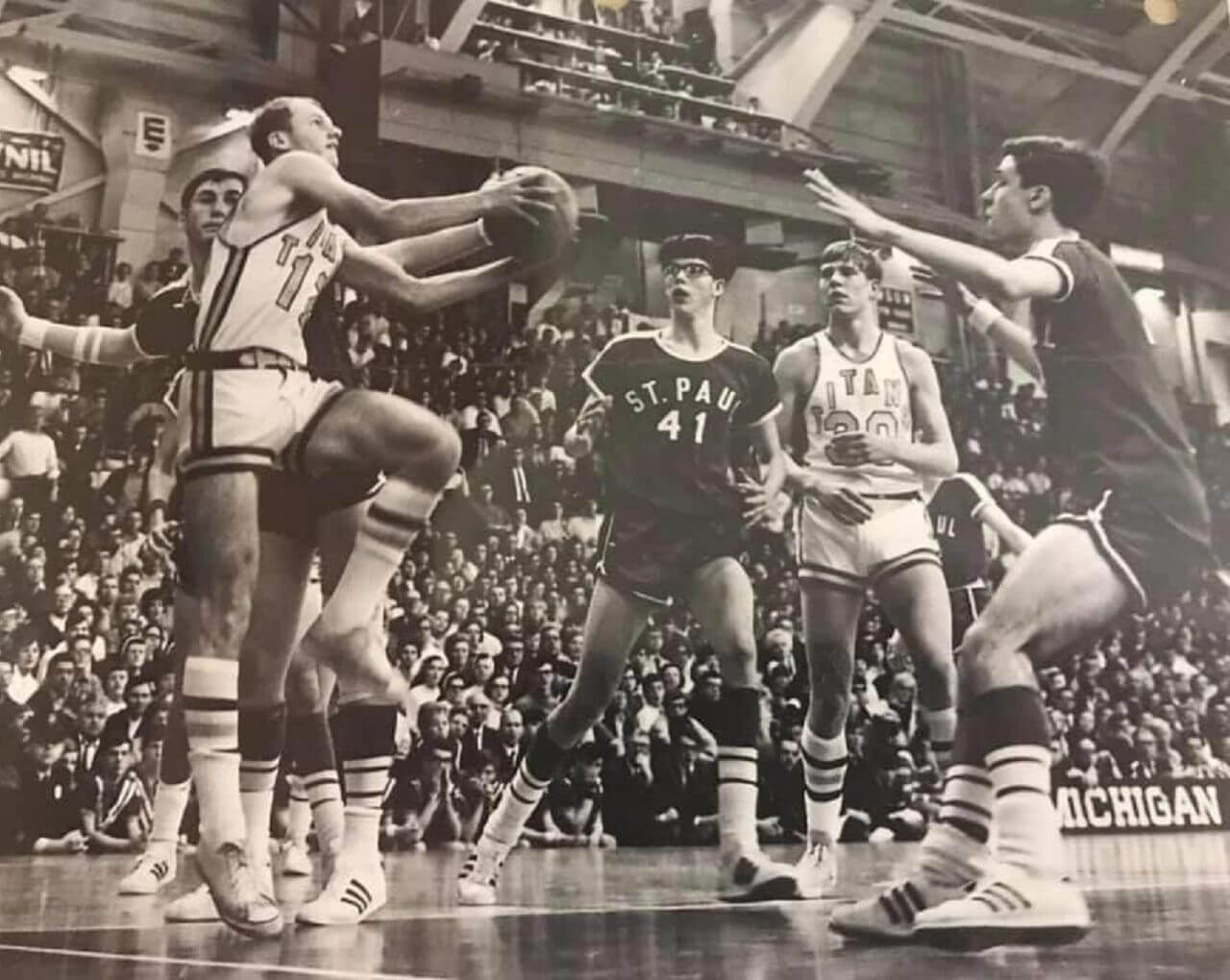
Too good for the Ticker: Oh man, so much to like in this 1969 Michigan high school hoops photo showing Saginaw St. Stephen and Grosse Pointe St. Paul. Among the highlights:
• St. Paul is wearing sleeved jerseys.
• At least one St. Paul player’s jersey is untucked.
• Spectacular stepladder-arched lettering for St. Stephen.
• St. Stephen also has belted shorts.
• Excellent striped hosiery for both teams.
• That kid in glasses!
(Big thanks to Cory Fisher for this one.)
Click to enlarge
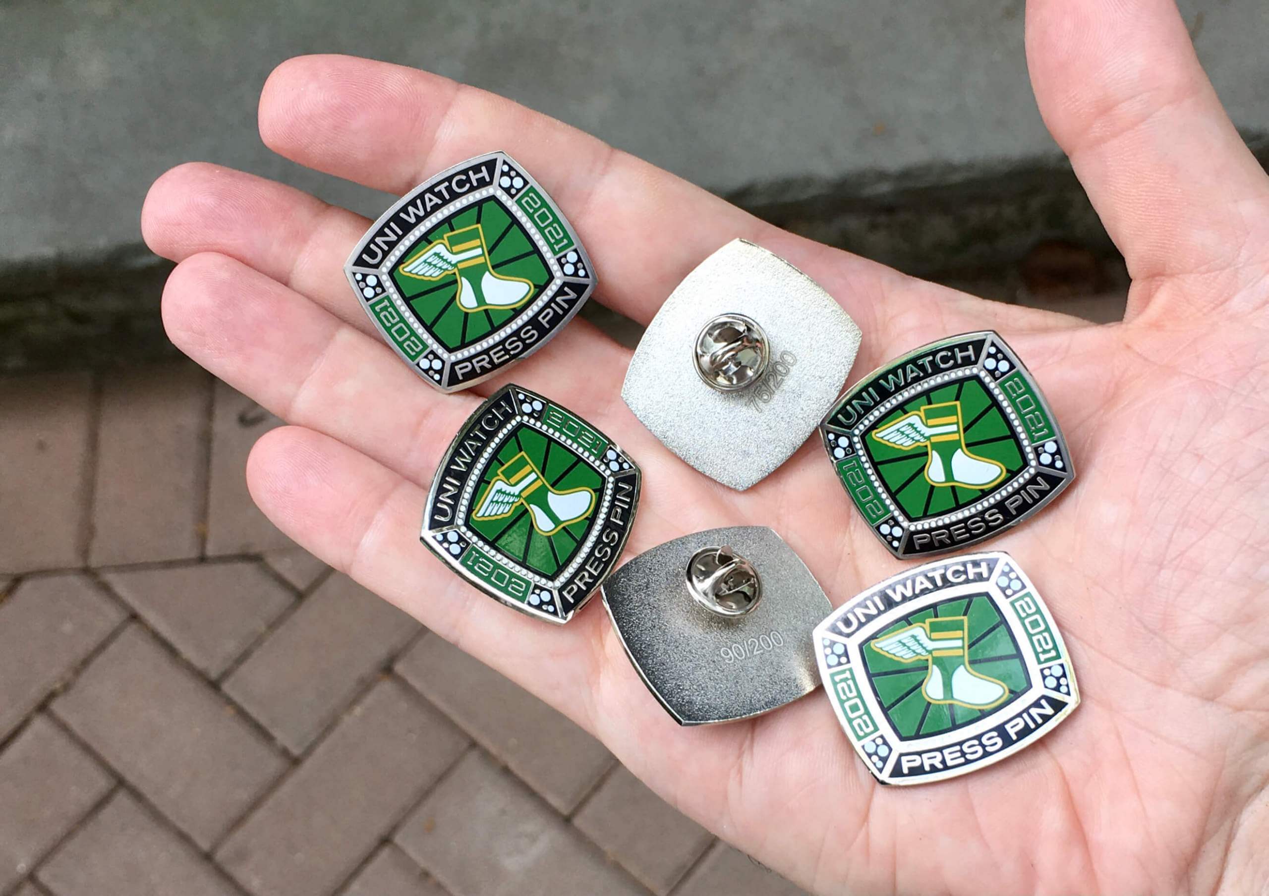
Press Pin reminder: In case you missed it last Friday, the annual Uni Watch Press Pin is now available. This pin is not part of the monthly Pin Club series (and you do not have to purchase it in order to qualify for the Pin Club’s “Collect ’Em All” bonus prize) — rather, it’s an annual pin that Todd Radom and I do each October to coincide with the MLB postseason, inspired by the rich history of World Series press pins. The idea is that everyone in the Uni Watch comm-uni-ty can legitimately wear our Press Pin, because you all contribute information, feedback, and knowledge that helps me do my job of covering the uni-verse.
As you can see above, this year’s Press Pin is based on a championship ring. It was produced in a numbered edition of 200 and is available here while supplies last. My thanks, as always, for your consideration of our products.
The Ticker
By Alex Hider

Baseball News: The first three items are from Trevor Williams: Braves OF Joc Pederson tallied the only runs of yesterday’s NLDS game against the Brewers with a three-run homer — using Yankees 1B Anthony Rizzo’s bat. After the game, Pederson admitted that he stole the bat during a trip to Chicago earlier this year when Rizzo was still with the Cubs … Speaking of Pederson, here’s more on why he wears a pearl necklace on the field. … Former MLB pitcher and coach Chuck Hartenstein died earlier this month. While coaching the Brewers pitchers in 1988, his staff committed a ton of balks because pitchers weren’t coming to a complete stop before their wind-ups, so Hartenstein tacked a stop sign to the bullpen wall as a reminder. … I don’t think I’ve ever seen the Tigers logo that’s on these commemorative placemats celebrating the team’s 1984 World Series championship (from @BeautyOfAGame). … New caps for Cal Poly (from Max G.).

NFL News: The Seahawks celebrated Indigenous Peoples’ Day by changing their Twitter avatar to a Coast Salish-inspired Seahawks logo designed by the Muckleshoot Indian Tribe (from Phil). … @TitansUni points out that Titans coach Mike Vrabel conducted an interview yesterday in front of an ad-clad backdrop — which was stationed in front of a second backdrop without ads. … As we’ve previously reported, Eagles coach Nick Sirianni has worn two numbered stickers on his visor for two players who are out with season-ending injuries. This past Sunday he added a third sticker. Here’s why he did that (from @PhillyPartTwo). … The NFL hopes to have a regular season game in Germany, possibly as soon as next season, and has narrowed the list of potential host cities to three finalists.
College Football News: BYU will wear navy helmets and pants along with white jerseys at Baylor on Saturday (from Kary Klismet). … The rest of these are from Phil: Tennessee fans will coordinate to create a checkerboard pattern in the stands for Saturday’s game against Ole Miss. … Penn State will wear their throwback mashup jerseys on Oct. 23 when they host Illinois. … Speaking of throwbacks, Washington will be wearing 1991 uniforms on Saturday. … South Florida will wear gold helmets and green helmets and pants against Tulsa on Saturday. … Oregon is asking fans to wear black to their game against Cal on Friday night.

Hockey News: Icethetics is tracking all of the special jersey schedules for NHL teams as they announce them (from Phil). … Alaska Air — which is based near Seattle — allowed fans wearing Kraken jerseys to board early for a flight bound for Las Vegas yesterday. The Kraken will play their first regular season game against the Golden Knights tonight (from David Raglin). … Speaking of the Kraken, I hadn’t noticed this before, but their logo looks an awful lot like a certain car manufacturer’s (from David Payne). … The Islanders haven’t said anything about an inaugural season patch for their new arena. Could this be it? (From Mike C..) … St. Cloud State will wear throwback uniforms featuring their famed “Skating Husky” logo on Saturday (from Ben Hagen). … Stevie Dubs notes that the San Diego Gulls of the AHL have some very intricate design details in their jersey numbers.

NBA/WNBA News: Reader Sean McSean spotted a Philly-area van rental company that’s using the “Boathouse Row” skyline illustration from the Sixers’ 2020-21 City uniforms. … Taking “dark mode” to the next level: The Jazz have blacked out a logo sculpture in front of their h0me arena. Could a BFBS uni be on the way? (From Trent Lowe.) … Members of the W25 — that’s the 25 most significant players in WNBA history were given letterman-style jackets prior to Game One of the WNBA Finals on Sunday (from Trevor Williams).

College Hoops: New Mexico State has installed a temporary court in its arena for the upcoming season because of structural defects on the old floor (from Kary Klismet). … New uniforms for Tulsa (from Phil and @UtahDust). … New uniforms for Cornell (from @tony_d14).

Soccer News: FIFA has unveiled the mascot for the 2022 U17 Women’s World Cup (from Kary Klismet). … New logo for the Black Women’s Player Collective, an organization whose members are all current or former NWSL players (from our own Jamie Rathjen). … Here’s a story on Puma’s new uniform template (from Phil).

Grab Bag: Celtic Dragons, a Welsh team in the U.K.’s Netball Superleague, has a new logo (from our own Jamie Rathjen). … Sri Lanka’s men’s national cricket team has new uniforms for the T20 World Cup (from Kary Klismet). … Here’s what NHRA Funny Car driver Ron Capps’s firesuit, overgloves, and overboots looked like after an in-car fire during an event in June (from David Firestone). … New uniforms for Italian men’s volleyball team Gas Sales Bluenergy Piacenza (from Jeremy Brahm). … Also from Jeremy: New uniforms for Brazilian women’s volleyball club Itambe/Minas Tennis Clube. … SkyUp, a Ukrainian airline, has unveiled new flight attendant uniforms that feature a loose suit and white sneakers for women, eschewing the skirts and high heels that have been worn in the past. … Minnetonka Moccasin, a footwear brand started by a White family 75 years ago, marked Indigenous Peoples’ Day yesterday by issuing an apology for decades of cultural appropriation. … This fascinating video shows every single New York Times front page since 1852 in a 55-second clip. The big change as the video progresses is the increased use of photographs (from John Muir). … Talk about an apostrophe catastrophe: A failure to use an apostrophe in a Facebook post has made an Australian man vulnerable to a defamation lawsuit. Remember, people: Punctuation counts! (From Don Silsby and Frank Ferreri.) … One more new volleyball uni from Jeremy Brahm, this time for Italian women’s team Megabox Volley Valle. … NASCAR will allow chrome numbers next season (from Trevor Williams).
Happy belated Thanksgiving to all our Canadian readers. I totally spaced on the holiday yesterday — mea culpa, and hope you all had a great harvest holiday. — Paul
Do a Ctrl-F for “which gloves.” Obviously you meant white gloves for the LA Kings
Got it. Thanks, Mike!
So, the “more” about Joc Pederson’s decision to wear pearls on the field is…. a mystery to everyone? Great reporting, that cleared it right up. Kinda feels like this doesn’t deserve Ny more retention if he wants to be unnecessarily coy about it.
That Tigers logo on the placemats was from the outro of telecasts on WDIV back in the day. A roaring tiger animated graphic after a win as seen on the placemat and a whimpering tiger after a loss
Win
link
Loss
link
Awesome! I remembered the winning animation but hadn’t realized there was another for losing.
About the LA Kings switching to black and silver. Should be noted at the time Wayne Gretzky was the owner of the QMJHL’s Hull Olympiques. Under his ownership, the Olympiques had switched from blue and yellow to black and silver years before 1988.
Based on this, feels like hardly a coincidence the Kings became black and silver when Gretzky arrives. Check out the socks worn here by the Olympiques in the 1988 Memorial Cup (when the King were still purple and yellow in 1987-88 season). Don’t those socks look familiar?
link
Interesting! Did not know that, Wade — thanks for schooling me!
Strange seeing the Ravens and the Colts sporting the old Nike jersey template against each other. Are they the only two left in the league wearing that template?
The first game the LA Kings are scheduled to wear the white alts is November 17 vs Washington. Which means the Caps will have to wear their red home jerseys with the Caesars Sportsbook ad, which is only allowed on their red home sets to avoid traveling to a state where sportsbetting is still illegal – which includes California. Will Washington have a second set of home reds without the ad logo to accommodate? Or will they have to remove and replace it?
Ceasars ad debuts next season, not this season.
Jersey ads begin next season.
Alex Cora’s response about the City Connect uniforms for the Red Sox have me wondering if the hat wasn’t the primary issue here. As Paul says, I’m sure Majestic could whip up a new set of jerseys/pants quickly. Socks/belts could possibly be reused, or new pairs found, but I wonder about the hats. First, because MLB was retailing a different City Connect Red Sox hat (link) from the one they wore on field (link). But secondly, it seems like a supply chain issue on hats would be apparent. Even though MLB on-field player hats are supposed to be USA-made, they rarely seem to be when you find team game-worn hat sales or auctions of game-worn hats. Those hats seem largely to be made overseas, like retail hats.
Have you heard any kind of update on what the Rams and Giants are wearing this weekend? According to the uniform schedule put out by the teams, the Rams are in bone jerseys (no word on pants yet) and the Giants are going white at home with gray pants as an homage to Super Bowl XLVI. That can’t possibly happen, but I haven’t heard either team say anything different. The Rams have to go with Royal, right?
link
Great point. That’s what the GUD is showing, too:
link^6
But you’re right — that’s can’t possibly be the matchup.
Paul, I’m sorry to ask an unrelated Uni question in relation to today’s post.
The NBA preseason games are pretty normal and straight forward with white uniforms at home and color on the road. That’s how it was until a few years ago. My question is, why are the Lakers wearing white at home and gold on the road? If the NBA is going “traditional” uniform wear in preseason, then why wouldn’t the Lakes wear gold at home and purple on the road?
Home team can wear whatever it wants. The fact that some of them have preferred to wear white during the preseason is just that – a preference (not a rule).
Really, a preference? That’s fascinating. I’m very surprised at how that preference is very consistent among the entire league. It’s a welcomed preference!
Those old Whiskey Decanters are known to contain lead that leeches out into the whiskey.
And dare I say, it makes it tasty. I opened one that was sold in 1980 a couple years ago. The whiskey had a darker, smoother taste. It probably wasn’t the most horrible thing I consumed that week.
“NASCAR will allow chrome numbers next season”
Anything to draw attention to them now that ‘door’ numbers have taken a backseat (figuratively) to advertising.
Silver lining(?): They’ll make for some great looking UW membership cards!
I don’t hate the change in the Door Number as much as I thought I would just seeing some early mockups. It was definitely the lesser of the evils if they were really considering some of the other options that were sent out in their survey last year. Very good point about the awesome looking Uniwatch Memberships.
Sure I can’t change your mind?:
link
Granted that’s the latest test session, but my gut tells me that the #23 as shown is going to be fairly close to how these new Cup cars will appear…and that’s a real shame. The number placement looks terribly off-balance…to the point that it doesn’t seem to belong on the car at all, especially on the ones which are unadorned/have minimal advertisement.
When the Golden Knights first showed us their uniforms, I thought the metallic gold elements were chintzy, kitschy, likely to look cheapo, and probably a short-lived faddish element. Once I saw them on the ice, though, that fabric became one of my favorite hockey innovations. Metallic gold in most other sports rarely looks good; neither the old Brewers nor the Saints have pulled it off well. Whereas the Knights look terrific. I don’t know whether it’s a hockey thing, where the very different lighting and white playing surface affect the look of uniforms, or whether it’s particular to the way the Knights use the metallic fabric within their uniform designs. Whatever, it’s a great look, and it appears that the Kings are also achieving an upgrade by adopting the equivalent.
The next link in the chain from the Kings and Raiders wearing black and silver was the Chicago White Sox who have explicitly identified those teams as inspiration for the look they’ve now worn for 31 years (longer than the Kings have worn those colors and longer than the Raiders were in LA).
Shooter for Saginaw St. Stephen is in his mid 30s, I think.
A couple of things in the Inside Hook article:
1. sorry to bring up a typo – it says the Jets wore their retro jerseys for a couple more outdoor games – that isn’t right, they wore them a couple more times but not again outdoors
2. I think I mentioned this before but the Leafs and Sabres playing at Tim Horton field is kind of perfect. Horton played for the Leafs for nearly 20 years and was playing for the Sabres when he died. The night he was killed he was driving back from Toronto to Buffalo after a game. I know the field isn’t technically named after him but its still kind of appropriate.
Never apologize for making things more accurate, Mike. Thanks!
link
To save you from googling. If you had a PC XT the clock speed was 4.77 MHz, you could “speed it up” to 8 MHz by pressing the turbo button but sometimes you had to turn the turbo off for software that wasn’t compatible with the higher clock speed.
I’m guessing that the Gretzky game was painfully slow at 4.77 MHz.
For you young’uns with your gaming computers, MHz is not a typo. Today’s computers are literally 1000 times faster than the PC compatibles 30+ years were.
I still have a PC clone from 36 years ago with a turbo button. It still boots, I still start it up once a year when the kids complain about the internet being a little slow.
Bauer, one of the leading hockey equipment companies, has released a very confusing new logo:
link
As you can see, the comments are… not kind!
I nearly choked on my lunch when I clicked the link to the new logo….it’s horrendous
I spent many hours of my youth playing Wayne Gretzky Hockey… It was the early predecessor of the sports management sims of today such as Out of the Park Baseball, Football Manager and Franchise Hockey Manager.
I think that you are thinking of a different game. The Wayne Gretzky Hockey franchise was not a sim, it was a live-action game (like EA’s).
Nope. There was also a PC game. I had it and it was very much a early, early precursor to hockey “manager” games.
link
The high school basketball photo is from the 1969 Class C championship game at Jenison Fieldhouse at Michigan State. Saginaw St Stephen won 48-43 over Grosse Pointe St Paul with Ric Lawler scoring 6 pts in the final minute.
Great photo. I’m glad Cory shared it and Paul saw fit to emphasize it.
What’s on the wall above the bleachers? A trophy case? Part of the ventilation system?
Are you sure about that? I looked at the walls, then the banner on the scorer’s table…. I’m thinking that is Yost Field House in Ann Arbor (where U-M played basketball until Crisler Arena was built in 1967). Could be wrong, I’m very familiar with Yost, but I’ve never been to Jenison.
Article says Jensison:
link
“South Florida will wear gold helmets and green helmets and pants against Tulsa on Saturday.”
– In the style of the old Match Game:
Did you know South Florida has a football team? That’s right folks, South Florida has its very own football team. They have a game this coming Saturday. And for safety reasons, the players will be wearing two helmets. You heard me right, TWO helmets. They’ll be wearing one on top of their heads and the other on their (BLANKS)?
Having similarities to both a whiskey brand and a car manufacturer, the Seattle Kraken logo is anything but unique and is massively underwhelming considering how clever they thought the name was, and the imagery it wants to invoke. Even the colors are a letdown, in my opinion.
Maybe someday Mr Lukas will weigh in with his opinion.
Fair amount of outdated/obsolete/retro(?) logos in those pumpkin stencil links.
A well-crafted free-hand Philadelphia Flyers logo on somebody’s porch pumpkin in my neck of the woods would be a real treat…the most difficult logo to render without a ‘cheat sheet’ IMO!
That Tigers placemat logo is from a cartoon treatment they used on TV a lot in the mid 80s…commercials, game intros, etc.
The item about the apostrophe catastrophe in Australia is representative of why I read this site daily. Also, perhaps the Kings will realize some day that Forum blue and gold are the colors they should be wearing.
But they have to stop calling it “forum blue” (whatever that means). It’s purple. Call it purple.
In the ticker, Joc Pederson didn’t snag the Rizzo bat on a trip to Chicago. Pederson & Rizzo were teammates on the Cubs through mid July.
Atlanta didn’t play the Cubs (home or away) after Pederson was traded to the Braves on July 15th.
The Kings’ new alternate is fine, but they will never achieve true uni greatness until they end their love affair with the “Chevy” logo. It’s easily the worst logo in their history IMO. They took their original crown (which was awesome), removed all the color, and added a bunch of faddish-looking ’90s crap to it. (Yes, I know the logo is technically from the late ’80s, but you can definitely see the signs of the era it was trending into.)
Anyway… don’t understand any of that. But the overall design of the uni (outside that logo) is decent enough.