By Phil Hecken
Follow @PhilHecken
Good Saturday morning, Uni Watchers — the weekend is here. We made it.
I’m sure many of you are too young to remember the early days of Monday Night Football — but it was some kind of event, even way back at its inception. And the booth of Giff, Dandy Don and Howard, decked out in mustard blazers, was … something. One of my first sports memories was of my pop letting me stay up to watch the opening and maybe a few plays. I barely remember the original score; most of us are more familiar with this theme, which came later:
As I got a bit older, I remember watching on my 13″ black and white tv, and I always looked forward to the game, but especially halftime, where we got to see highlights of the previous day’s games (back then, we got either the Giants or Jets game, and maybe one other national game on Sunday), mostly for the unis (no, seriously, even then I was into unis). I even learned of John Lennon’s assassination on MNF. Back in the 70s and 80s, MNF was absolutely must see TV.
Anyhoo…
one of the great things about Uni Watch is that it brings together a community of like-minded individuals, and frequently, friendships between readers are formed through UW. One of those cases is between long-time readers and contributors Jimmer Vilk and Douggie Keklak. And it was through a UW sub-lede, put together by our own Brinke, that today’s article was birthed. So when Jim told me about an item featuring Monday Night Football, which he had seen on Collector’s Corner (and acquired for him by Doug), I said…that’s a lede we can all relate to. So let me now turn this over to Jim, as he takes us through the…
1980-81 Monday Night Football Calendar
by Jim Vilk
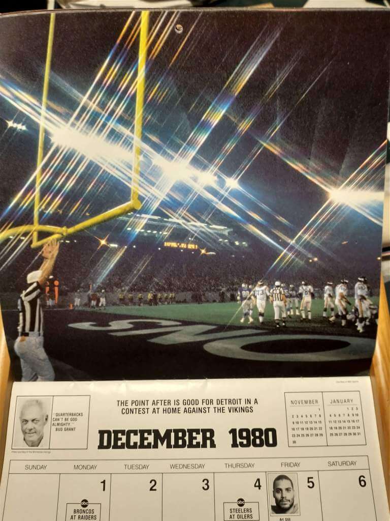
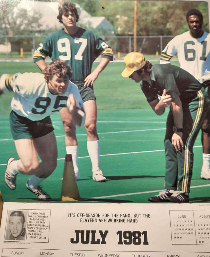
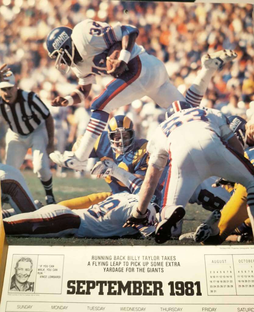
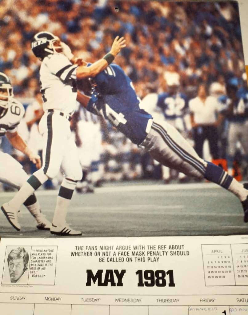
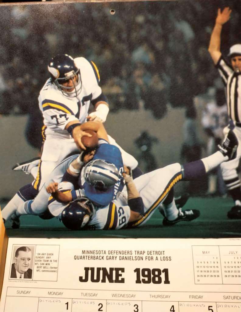
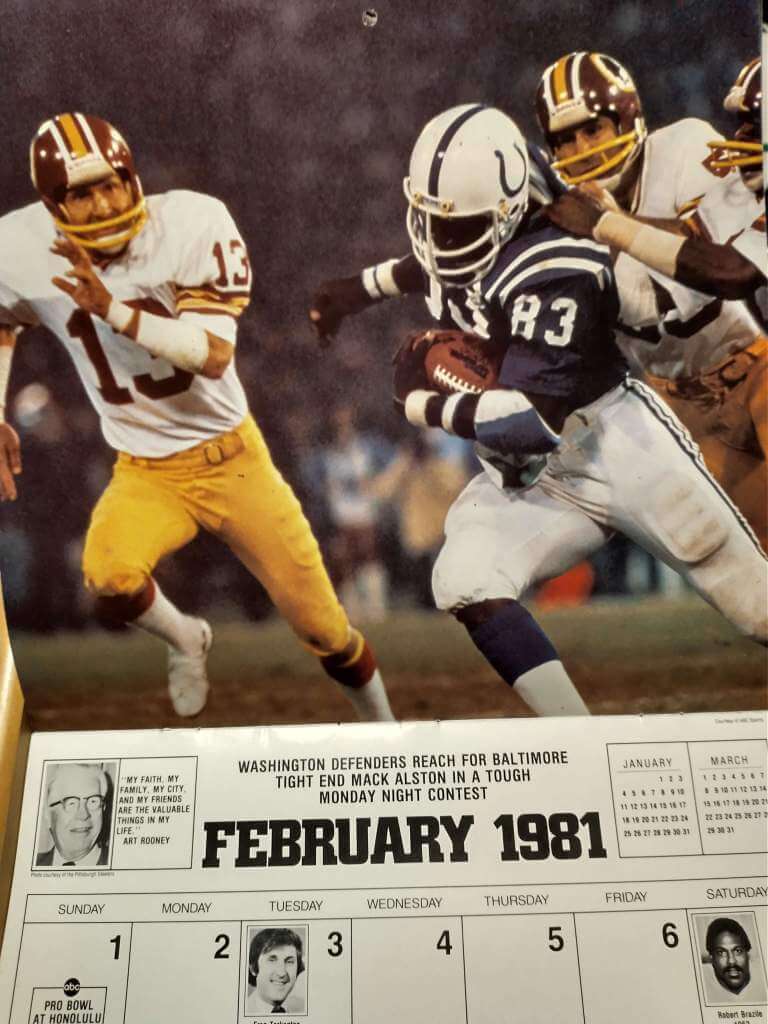
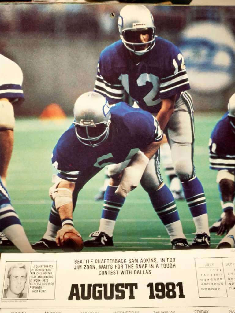
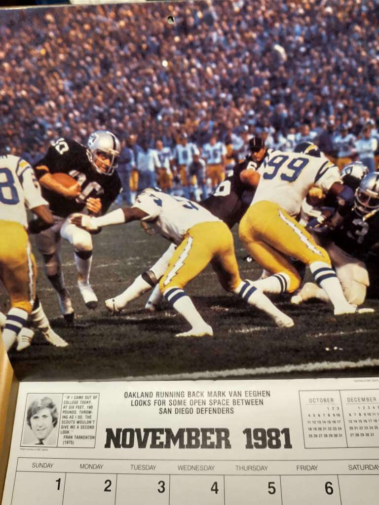
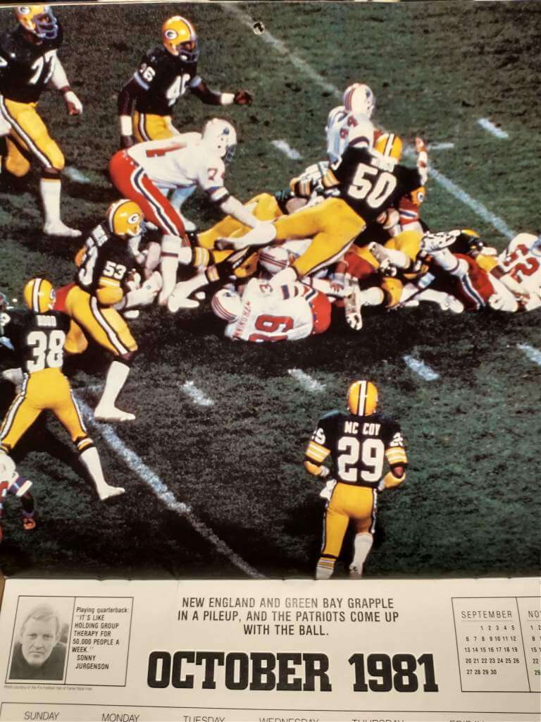
Have you ever seen something on Brinke’s Collectors Corner and bought it? I haven’t because I don’t have an eBay account, but good friend and UW reader/commenter extraordinare Doug Keklak entered into a trade agreement with me. Thanks to him I now have the 1980-81 Monday Night Football calendar. The cover photo of Pittsburgh RB Franco Harris is also the last photo, featured in December of 1981 (minus the MNF logo, of course).
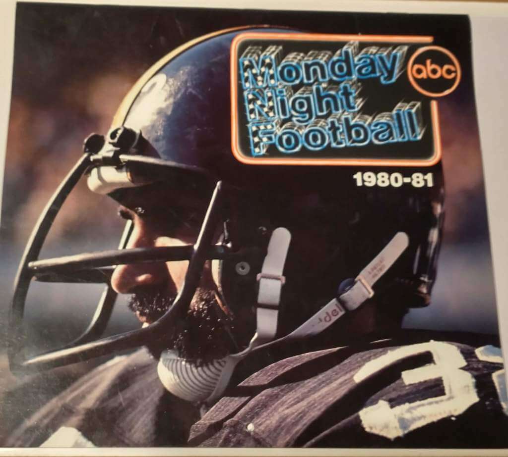
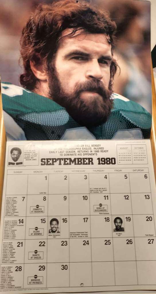
The price was just under ten dollars, and as soon as I opened to the first month, BAM! Totally worth it. I can always use another fantastic punter or kicker photo. The calendar starts with the 1980 preseason, and each month has a quote at the top, birthdays of various coaches, players and announcers, This Day in History facts, and the ABC broadcast schedule.
That’s right, kids, MNF used to be on network television! Once the regular season began, the calendar included every single game on the 1980 schedule.
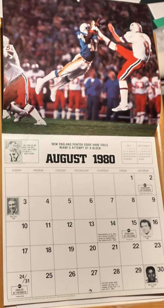
Instead of going month by month, I’m going to skip around and condense a bit. This month was a disappointment for me. I knew on the eBay listing that one of the pictures would be of a PAT… but where’s the kicker? The glare doesn’t bother me at all. I kind of like it. I’m very bothered about missing the (extra) point, though.
This shot, on the other hand, flat out angers me. I used to love a good Vikings/Bears matchup, and Minnesota at the time still had a straight-on kicker(!), Rick Danmeier. You don’t see him, and all you can see of the holder is his butt. Good thing it wasn’t snowing, or I’d be even angrier at them for ruining what could have been a perfect photo.
If you think you can make it up to me with another Vikes/Bears photo…OK, Walter Payton was one of my favorite non-kickers. You’re winning me back.
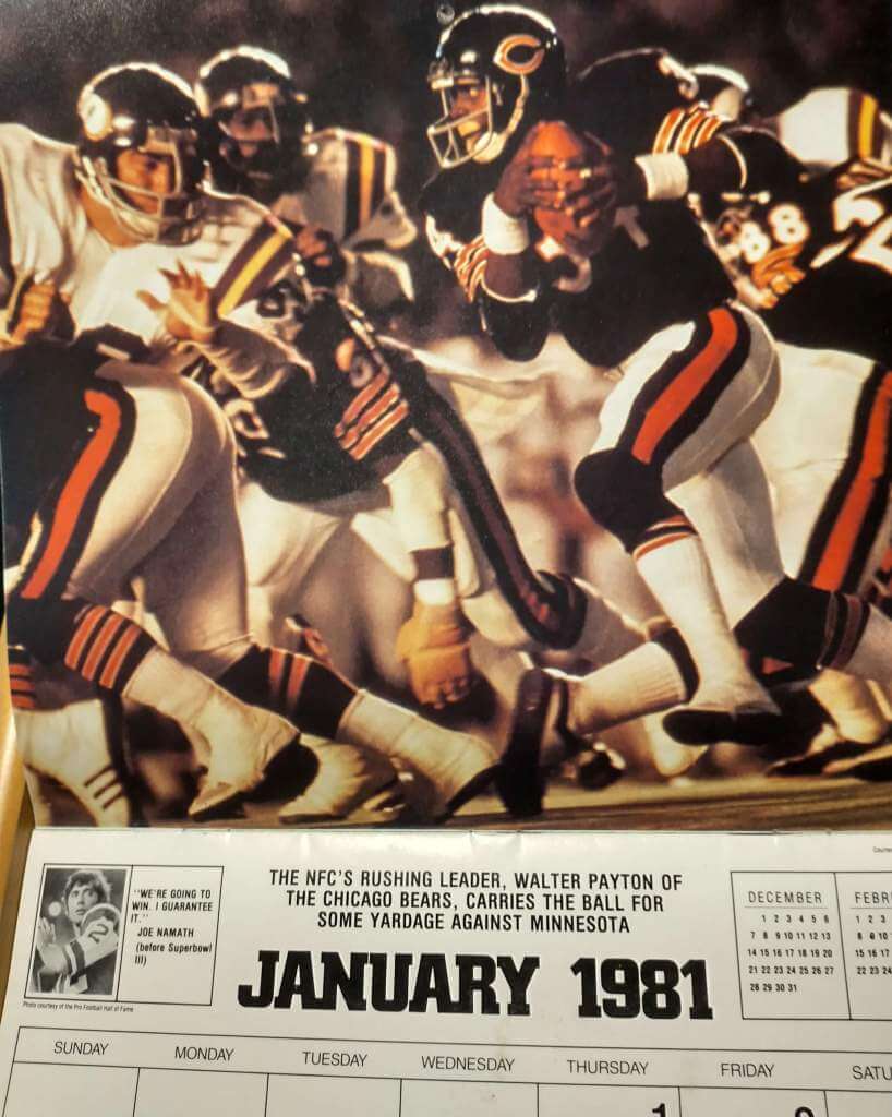
And… I’m really won back. This photo again makes me say, “Totally worth it.”
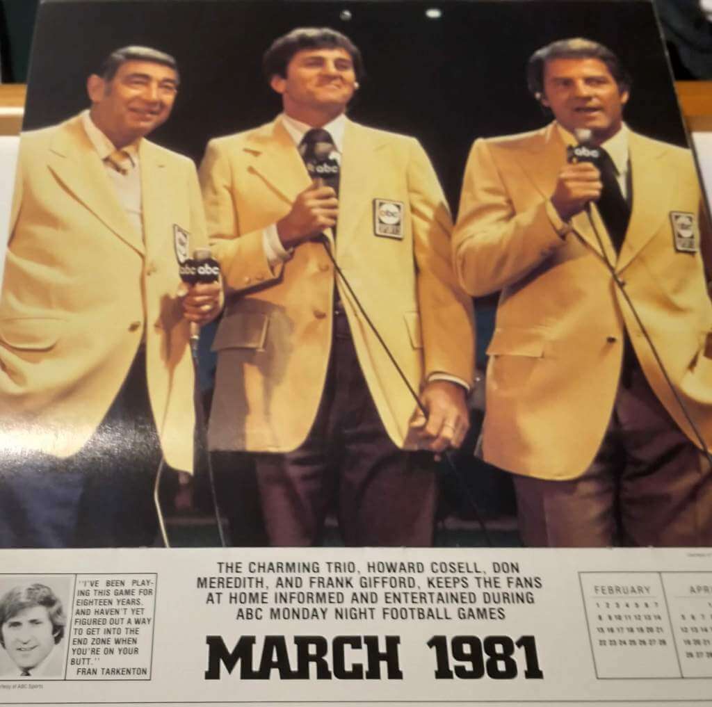
Here’s one with Paul’s favorite color scheme. I wonder if he’d wear those coach’s pants. I know I would.
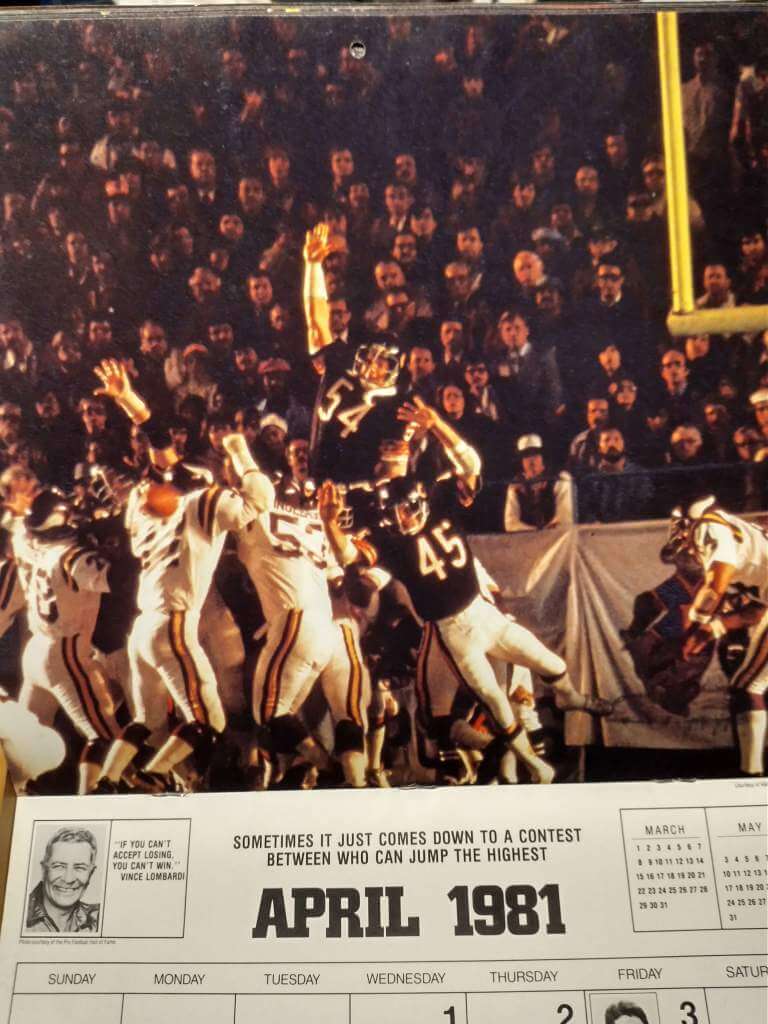
The rest of the calendar is filled with eight great colorful action photos, and one of a solitary Dolphin which I’ve captioned, “Groin!”
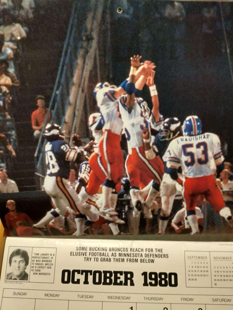
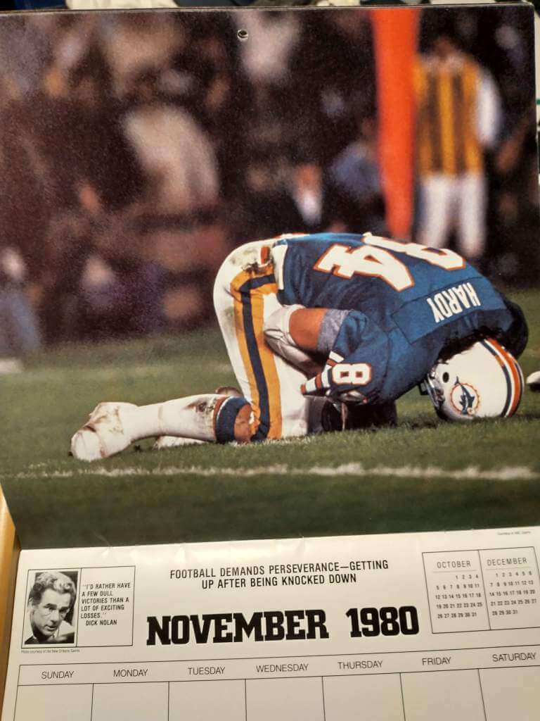
All in all, I’m very pleased. Thanks to Paul, Brinke and Doug for making it possible, and thanks to Phil for letting me share with you. Now, do I keep the calendar intact, or do I hang up some of the pictures and Vilkmas some of the others?
Awesome stuff, thanks Jim (and Doug & Brinke!). I think you should Vilkmas the whole calendar!


Guess The Game…
from the scoreboard
Today’s scoreboard comes from Ryan Howard.
The premise of the game (GTGFTS) is simple: I’ll post a scoreboard and you guys simply identify the game depicted. In the past, I don’t know if I’ve ever completely stumped you (some are easier than others).
Here’s the Scoreboard. In the comments below, try to identify the game (date & location, as well as final score). If anything noteworthy occurred during the game, please add that in (and if you were AT the game, well bonus points for you!):
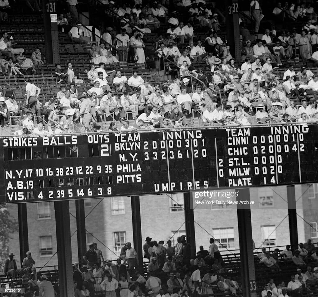
Please continue sending these in! You’re welcome to send me any scoreboard photos (with answers please), and I’ll keep running them.
MLB Playoff Uni Tracking
It’s BAAAAACK.Alex Rocklein has been tracking the jerseys of all the teams involved in the MLB Post Season for the past several seasons. He returns again in 2021. Although he sent me this graphic before all the games were completed, the graphic is correct for the jerseys worn (click to enlarge):
Here’s the full tracker (which will get filled in as we go through the NLDS/ALDS, NLCS/ALCS and World Series):
I hope you guys enjoy this annual feature and you’ll thank Alex for all his effort with a quick “Thanks” in the comments below! Look for this feature every weekend until the World Series is complete!

Uni Concepts & Tweaks
Time for more Uni Tweaks from the UW readership.
I hope you guys like this feature and will want to continue to submit your concepts and tweaks to me. If you do, Shoot me an E-mail (Phil (dot) Hecken (at) gmail (dot) com).
Today’s concepts come from John J. Woods:
One day, there may be no more Native American iconography on jerseys, so here are Blackhawks concepts.
The logo is based on the The 86th Infantry Division insignia from WWI, from which the team got its name. Black, red and gold have a German feel, which would be good in Chicago.
White jersey striping remains the same, and I did one with gold stripes. I also created a gold version.
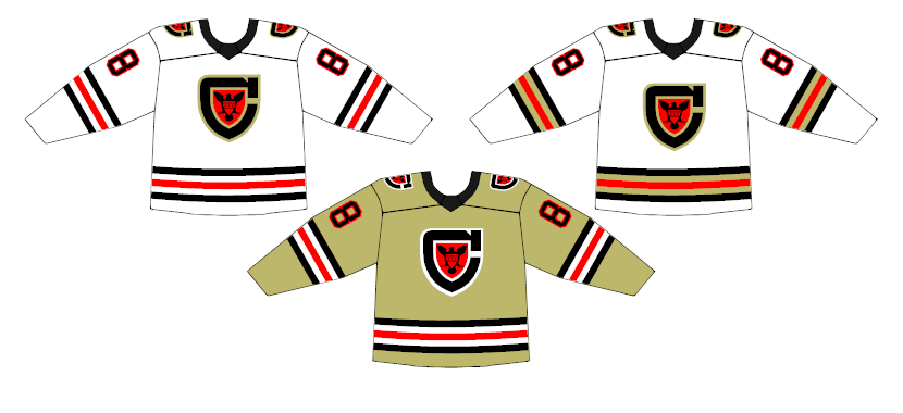
Dark jerseys keep the five-stripe pattern. Again, I created a black version with gold accents.
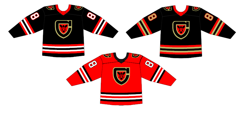
Another logo idea came from my concepts for a Chicago Hitmen team. A large C with horizontal striping.
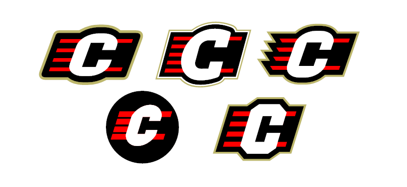
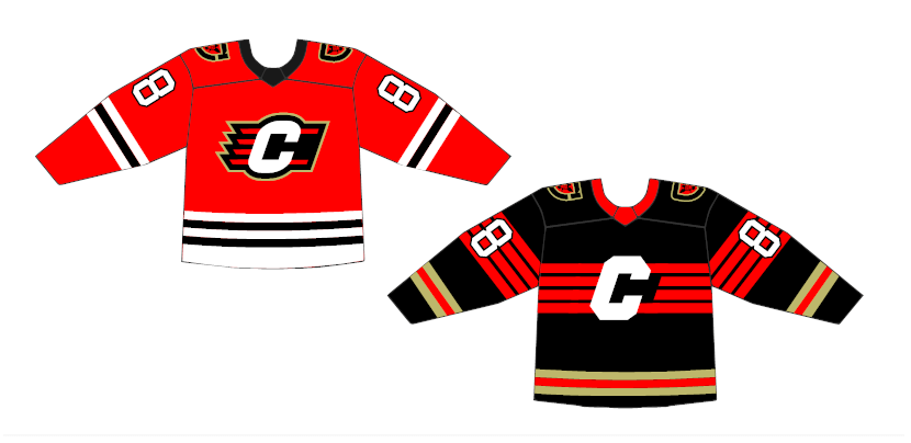
– Johnny Woods
OK readers (and concepters). If you have some tweaks or concepts, shoot ’em my way with a brief description of your creation and I’ll run ’em here.
The Colors of the PAC-12
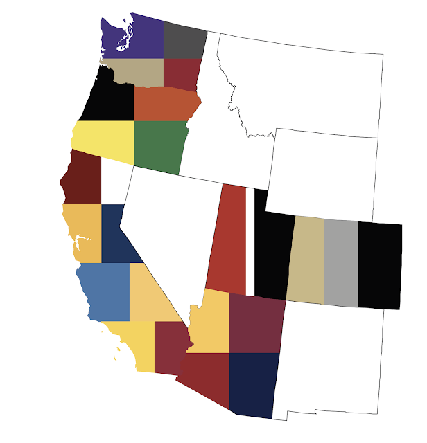
For those of us who are into such things (and let’s face it, if you’re a regular Uni Watch reader, you’re probably into this), what’s the most “common” (meaning in a color family) color for teams in the PAC-12? Unlike the SEC West, where it seems every team is red/crimson/scarlet/maroon, there is a nice variety throughout the PAC-12.
Did you guess red? blue? black/gray? Nope, it’s actually gold/yellow: seven of the 12 teams use either yellow (or athletic gold) or metallic gold. Second place is the red family, with six teams.
My pal, and our PAC/Duck Tracker Dennis Bolt, has taken a look at the colors of the PAC-12 teams and it’s pretty interesting (and a nice, short read).
Check it all out right here.
Thanks, Dennis!
Click to enlarge
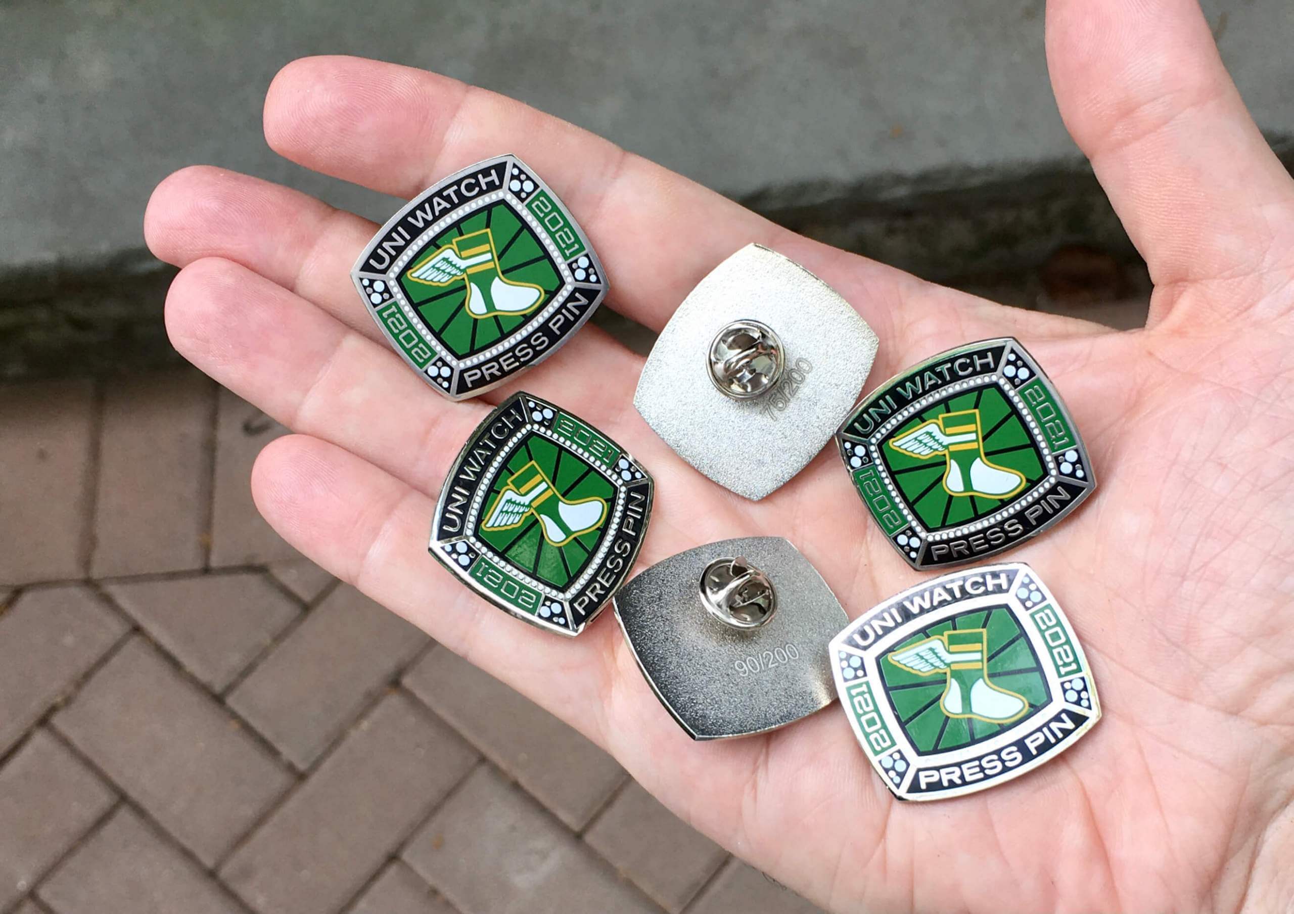
Press Pin reminder (and bobble sale): Paul here. In case you missed it on Friday, the annual Uni Watch Press Pin is now available. This pin is not part of the monthly Pin Club series (and you do not have to purchase it in order to qualify for the Pin Club’s “Collect ’Em All” bonus prize) — rather, it’s an annual pin that Todd Radom and I do each October to coincide with the MLB postseason, inspired by the rich history of World Series press pins. The idea is that everyone in the Uni Watch comm-uni-ty can legitimately wear our Press Pin, because you all contribute information, feedback, and knowledge that helps me do my job of covering the uni-verse.
As you can see above, this year’s Press Pin is based on a championship ring. Since many sports rings these days are either white gold or platinum, we went with a silver-tone finish instead of gold. Here’s a closer look (click to enlarge):
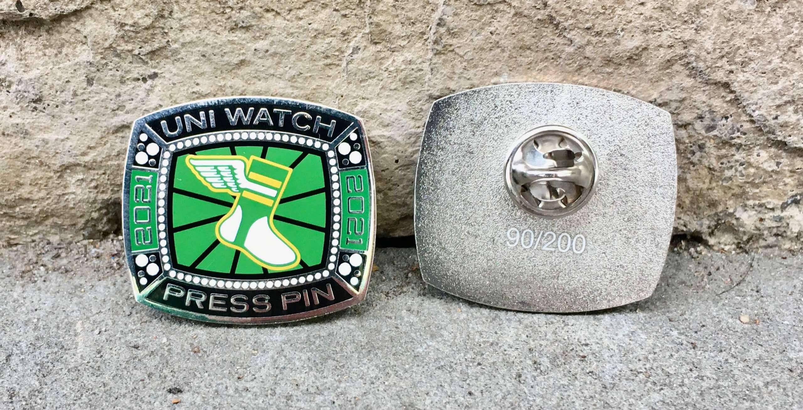
This pin was produced in a numbered edition of 200. It’s available here while supplies last. The 2019 and 2020 Press Pins both sold out quickly, so get this one while you can!
In addition, it turns out that I manufactured too many of our September bobble-pins. But my misjudgment is your gain, because I’ve now reduced the price on that pin from $13.99 to $9.99. It’s available here. My thanks, as always, for considering our products!
The Ticker
By Anthony Emerson

Baseball News: The Giants will wear their regular home unis throughout the postseason. No City Connect run for them (from @Spesh98 and @Frankie_Doodle). … New uniforms for Ecuador’s U15 national softball team (from Kary Klimset). … Fox has debuted a new score bug for the postseason that looks kinda weird (from multiple readers).

NFL News: Also posted in the soccer section: Tottenham Hotspur and EA Sports have released a pair of Spurs-inspired unis for Madden 22‘s “The Yard” game mode (from Kyle Dawson). … The Jags are going with their teal unitard look this weekend while KC goes red-unitard and the Saints go white unitard (thanks, Phil). … The Edmonton Elks and Winnipeg Blue Bombers wore special orange warmup jerseys for Orange Shirt Day, a Canadian remembrance of missing and murdered indigenous children (from Wade Heidt).
College/High School Football News: Utah has updated their helmet decal honoring Ty Jordan and Aaron Lowe (thanks, Phil). … Here are this weekends uni ensembles for Virginia Tech, Kentucky, Lehigh, Syracuse, FAMU, Northwest Missouri State (honoring soldiers killed in Afghanistan recently), and SMU.

Hockey News: This story includes a photo of Oswego State’s women’s hockey team in their new uniforms (from Kary Klismet). … Also from Kary, Augustana University in South Dakota has broken ground on a new arena as it prepares to launch a new NCAA Division I hockey program. … The Athletic‘s Sean Shapiro asks, could Reverse Retro jerseys make a comeback this coming season? I, for one, certainly hope so (thanks, Phil).

NBA/College Hoops News: The Mavs plan to unveil a new court that has the names of all 337 players who have ever played at least one game for the franchise painted into the baselines and sidelines. Ambitious, weird, but I kinda dig it (from Clint Dickinson). … New court design for UGA (from Josh Butler).

Soccer News: Cross-posted from the NFL section: Tottenham Hotspur and EA Sports have released a pair of Spurs-inspired unis for Madden 22‘s “The Yard” game mode (from Kyle Dawson).

Grab Bag: Allianz Power Volley Milano, an Italian volleyball team, have unveiled their 2021-22 kits (from Jeremy Brahm). … The City of Salida, Colo., has a new logo (from Kary Klismet). … Also from Kary, Cadillac has a new logo for use specifically on its line of electric vehicles. … New logo for FanDuel. … Here’s a fantastic high-speed video showing how a NASCAR car gets its “paintjob” (from James Gilbert).
Uni Tweet(s) of the Day
My guess is this would have been hated at the time (“90s fad”), beloved over time, and made into a Reverse Retro…had it ever seen the ice.
The uniforms were unveiled right at the end of the 1994-95 season, the team's last in Quebec. The Nordiques were late getting approval from the NHL and had to delay the new look a year until 1996-97. That never happened of course and these uniforms were never worn in an NHL game. pic.twitter.com/KOSi9QOWkM
— Chris Creamer (@sportslogosnet) October 8, 2021
And finally… that’s all for today. Big thanks to Jimmer for sharing the MNF calendar (and Brinke for finding it, and Douggie for eBaying it!). Really fun to see and a great story behind its acquisition!
You guys and gals have a great Saturday — enjoy the College games and MLB playoffs (or whatever sports you enjoy on the second weekend of October) — and I’ll catch you all tomorrow with the SMUW crew.
Peace,
PH
GTGFTS: Sunday, July 5, 1953 – NY Giants beat Brooklyn Dodgers, 20-6 at the Polo Grounds.
So curious to see how the orange warmup jerseys looked on the field with equipment for the Blue Bombers and Elks last night?
Winnipeg:
link
Edmonton:
link
Orange Every Child Matters logos were painted in the end zones:
link
Kudos, John! That first design is not just the best Black Hawks redesign I’ve seen, just just about the only good Black Hawks redesign I’ve seen. Great work, both the concept and the execution.
Big ups for honoring the military origin of the team’s name. The secondary insignias have a hidden “H” for Hitmen, but a “CH” monogram for Chicago could work. Excellent work!
The Black Hawks, Maple Leafs and Alouettes were all named for WWI divisions (in case people wonder why big football players are named after tiny birds).
The CH is for Chicago Hawks and, of course, the H is black…
Great calendar!
I do like that the Pac 12 doesn’t have multiple teams with the same nickname, and mostly different color combinations, except for ASU and USC. First off I want to say that if it wasn’t for the USC AD, ASU and Arizona wouldn’t be in the Pac 12 Conference. When they were voting on including them, Stanford and UW were going to veto it. Then the USC AD said if this didn’t happen they would leave the Pac 8. During the break, the UCLA AD joined USC. Now with that said, USC should have required the Sun Devils to modify their colors. For years their maroon was more like the cardinal red that USC has. At least lately they have darkened it. But they should have had them do something to make their colors not the same as USC. Maybe change their yellow/gold be true gold. Or make sure their maroon was actually maroon. It’s too bad when you go to a USC/ASU game the fans all look alike.
Love the Colors of the Pac-12. Would be interested to see the other D1 conferences.
One nit to pick: since Berkeley is north of Palo Alto, shouldn’t Cal’s colors be above Stanford’s?
I feel bad for the state of Nevada.
Reminds me of the time I sat directly behind Howard Cosell at a NY Rangers game. He kept shouting “give the puck to Doogie” (Ron Duguay) and was very proud of himself when Doogie got an assist. I’ll never forget his cologne…he just smelled like a guy with a lot of money.
The scoreboard is from July 5, 1953 at the Polo Grounds, the Giants beat the Brooklyn Dodgers 20-6!!
Love these old scoreboard quizzes!
Thankfully the Giants will not be wearing those awful city connect unis.
I was chagrined a few years ago to learn the Nordiques intended to abandon their great French-blue jerseys with the igloo “n” emblem and multiple fleurs de lis. My most-worn owned jersey is one of those (Michel Goulet #16). And I’m left cold by the design they intended to replace it with. I doubt I’d have ever warmed up to it — just felt like it took all the “Quebec” character out of the team.
That the team would have gone back on its patriotic, flag-inspired uniforms betrays an institutional tin ear. Mercifully, the team moved before it could happen.
By the way, whose patriotic sweaters came first: the NHL Capitals, or the WHA Nordiques?
Have you ever seen less enthusiastic models of new uniforms than those two guys wearing the proposed Quebec Nordiques ones?
It’s understandable in this case, but still…
Wow, thanks for the Nordiques flashback! At the time I was SO in love with that new uni. It was definitely a product of its time. Eventually that faded and I appreciated the igloo N logo even more. However I still wouldn’t mind owning one of those. Makes me wonder what happened to those mock-ups…
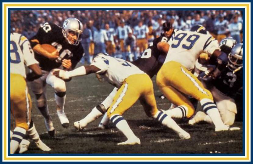
I have to laugh every time I see the blue-striped tube socks that were a part of the San Diego Chargers’ uniforms. How would that ever go over, today?
I hope Mom doesn’t see this. She’s still angry about that September 15th Oilers-Browns game. Can you believe my father wanted to watch a football while she was in labor?
Very cool car-wrap video there in Grab Bag!
Its been years since NASCAR teams actually had paint schemes…Clint Bowyer’s Darlington Buddy Baker tribute car is the last one that I can recall.
Thanks for sharing that calendar – my favorite month is February…seeing the ‘Skins in their yellow pants and the Colts donning the uni-cohesive white masks is a treat!
New court design for UGA (from Josh Butler).
Missing link?