For all photos, click to enlarge — it’s worth it!
Some of you may have been expecting me to write some sort of manifesto about last night’s Rams/Seahawks fiasco. And yeah, I’ll have a few thoughts about that game later in today’s post. But I decided against making it today’s lede for two reasons. First, making fun of that game is almost too easy. What would either you or I learn from it? A full-length takedown would mostly be empty calories. And second, this is Friday, and I’d rather end the week on a positive note instead of a negative one.
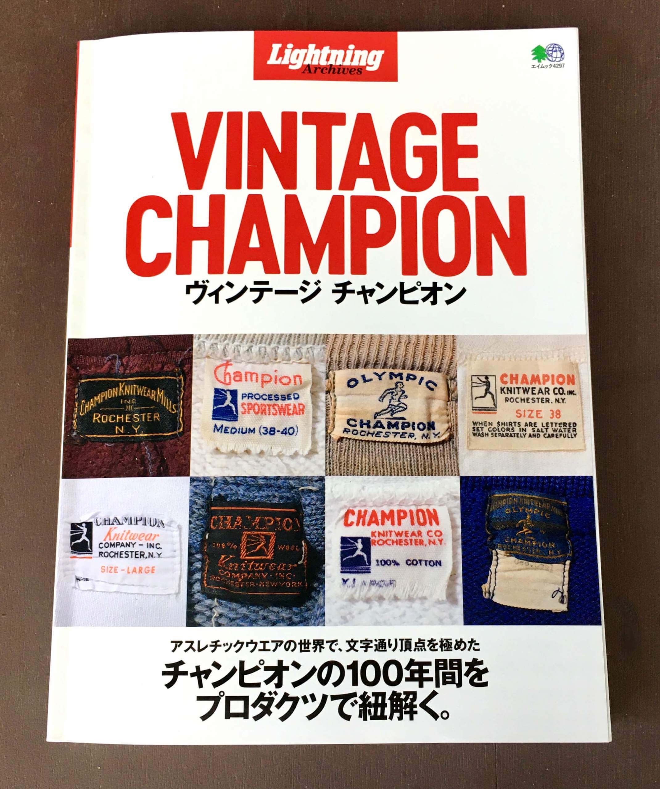
Which leads us to this: Reader Mark Lum recently donated a very nice contribution to the Uni Watch library — Vintage Champion, a Japanese book that features page after page of photos of vintage sportswear made by Champion, all apparently culled from various vintage clothing collectors’ collections.
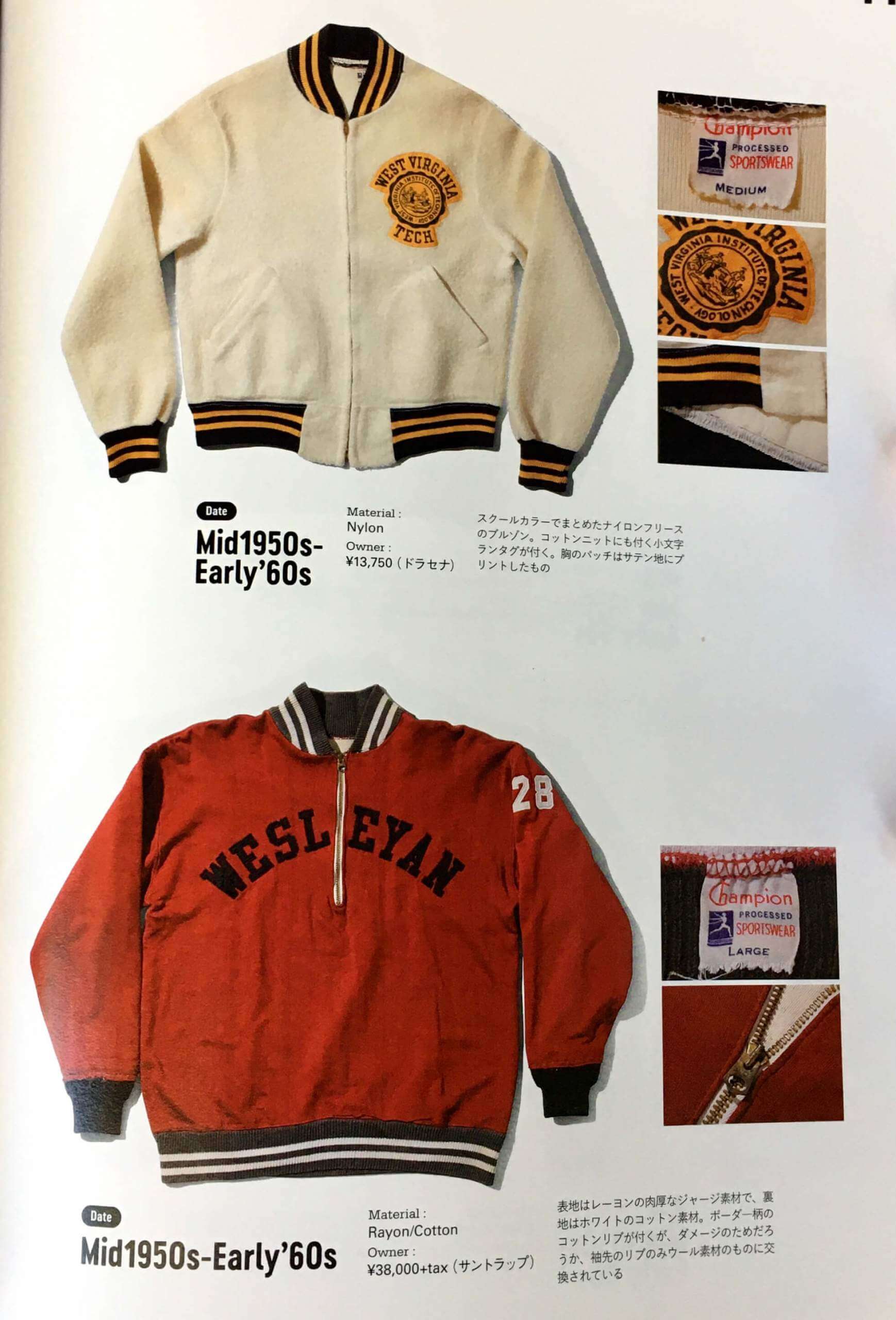
Lots of really great stuff here. Here are some of the highlights I particularly enjoyed:
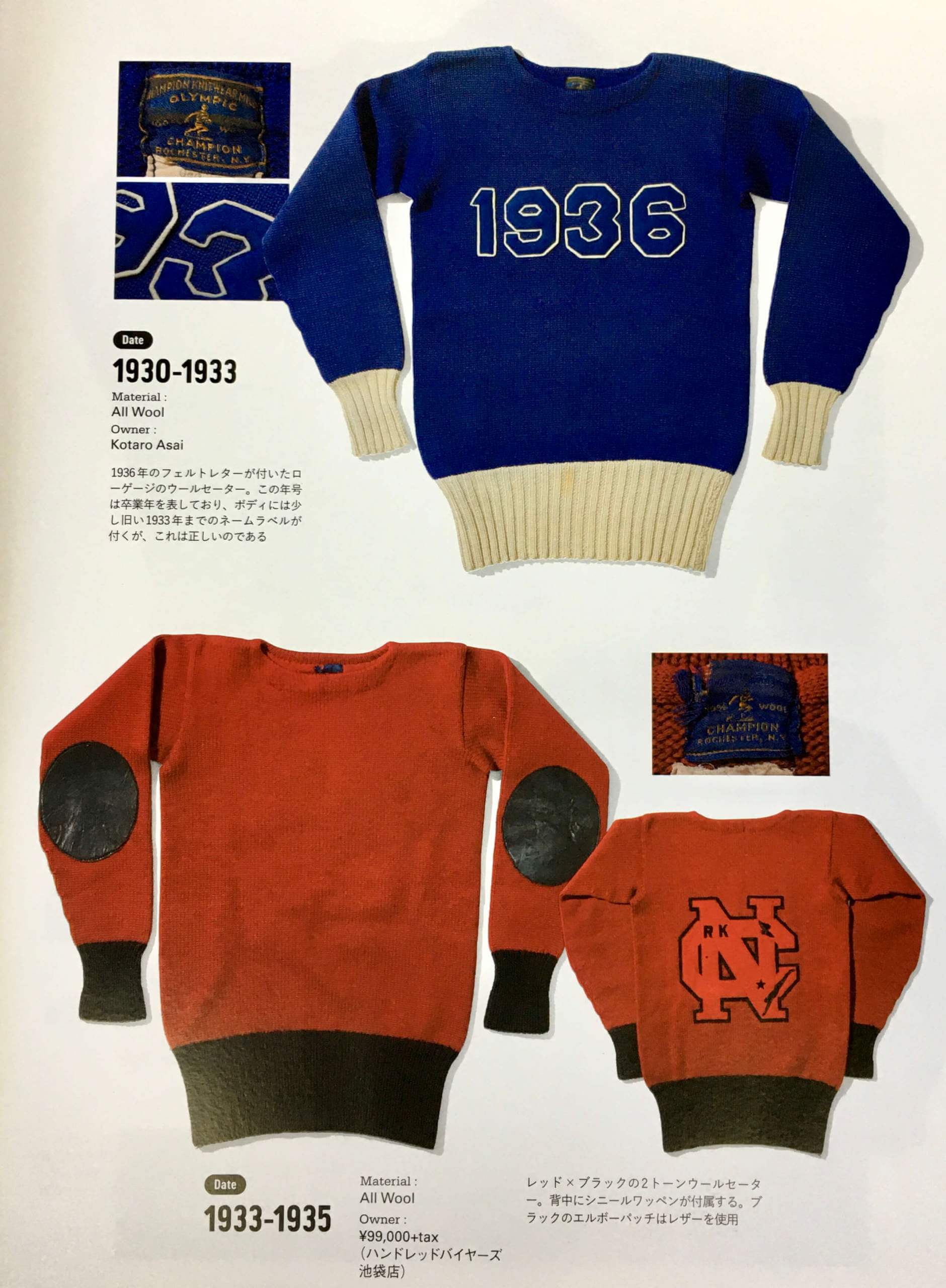
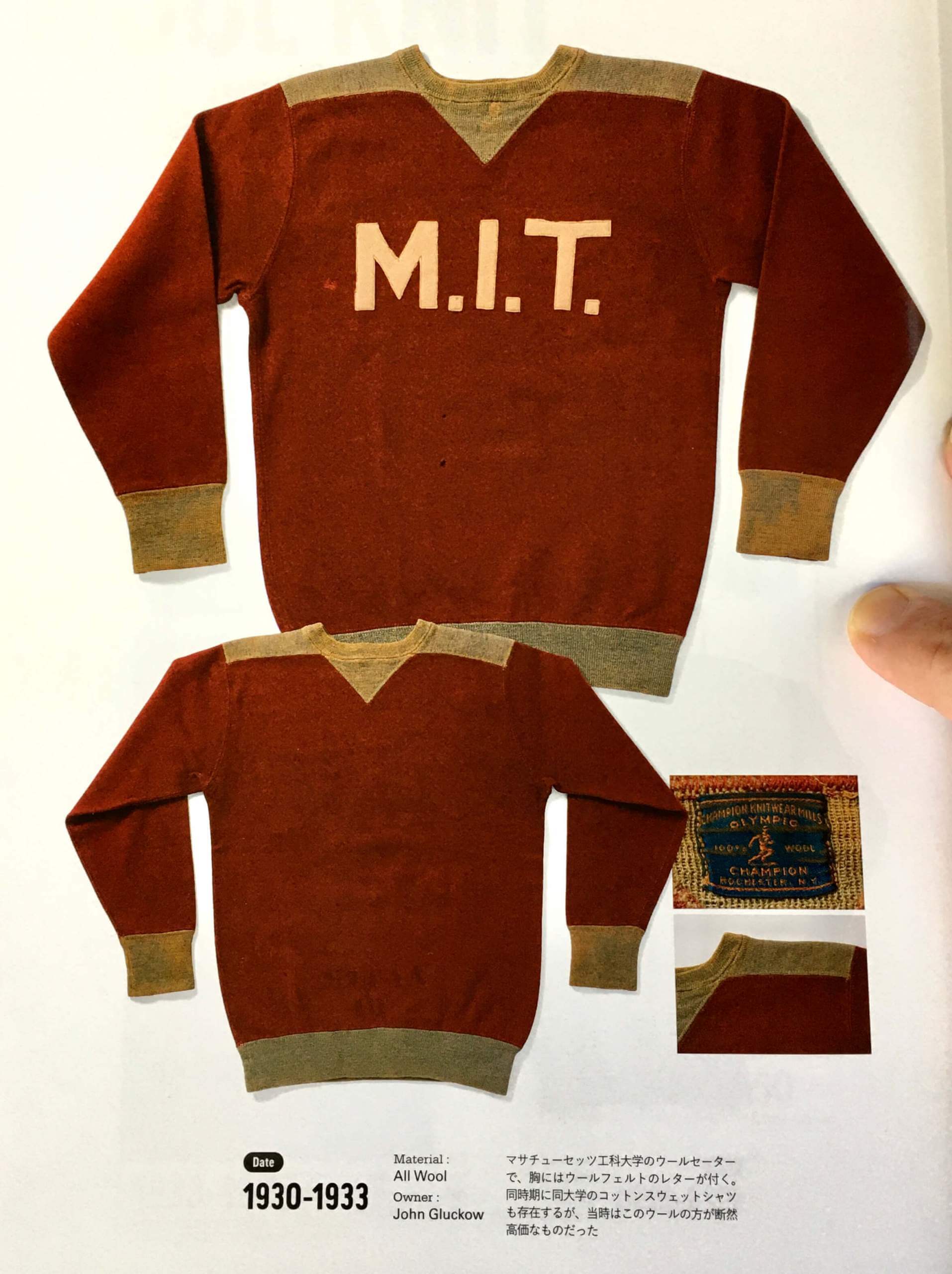
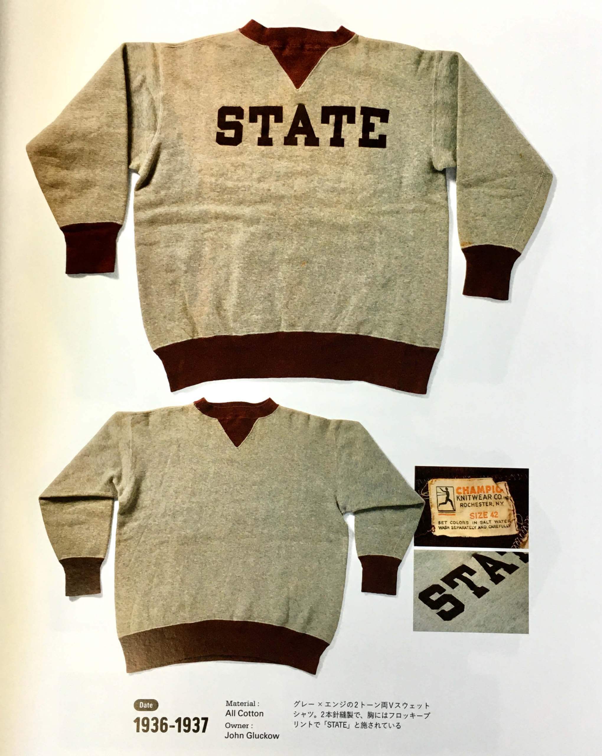
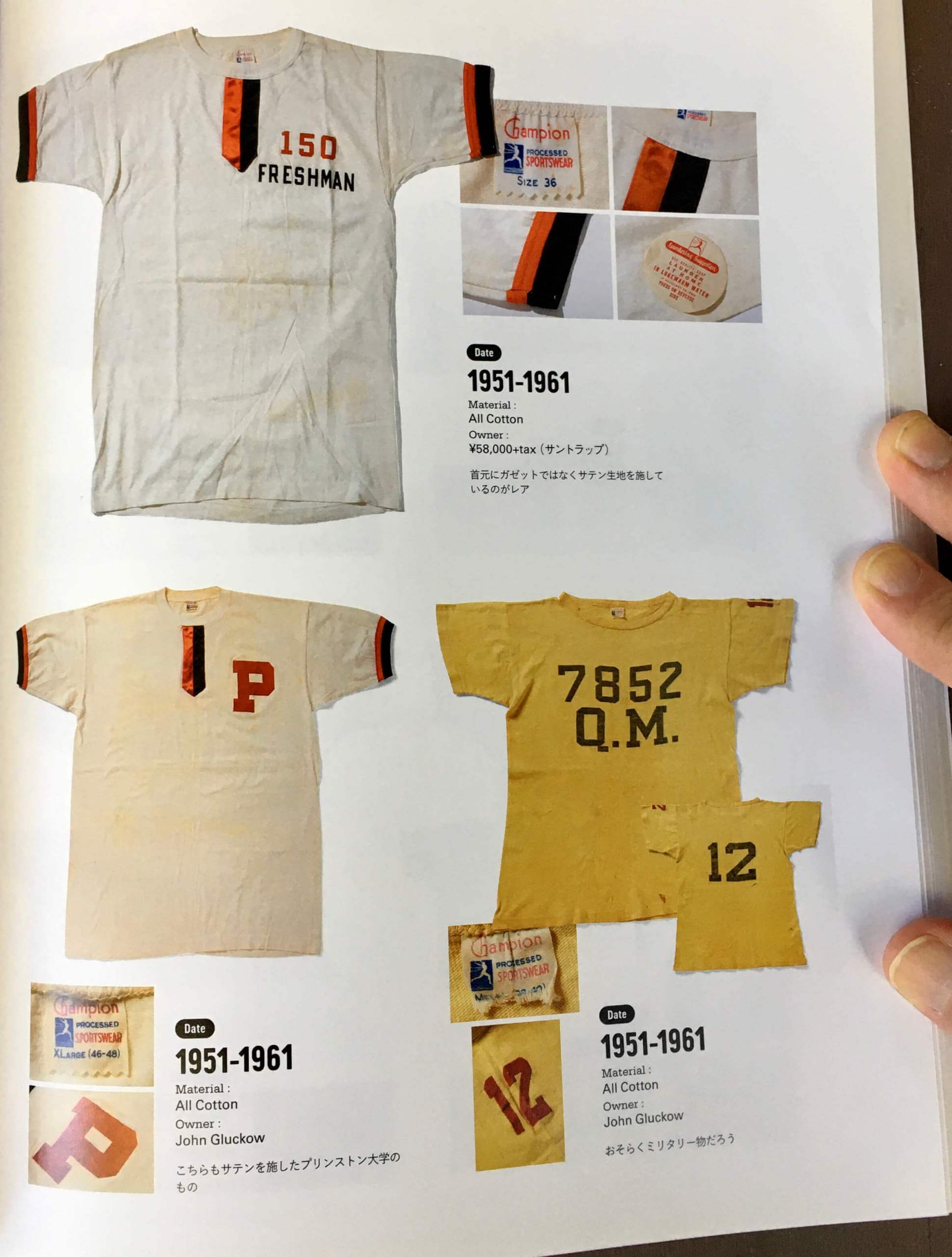
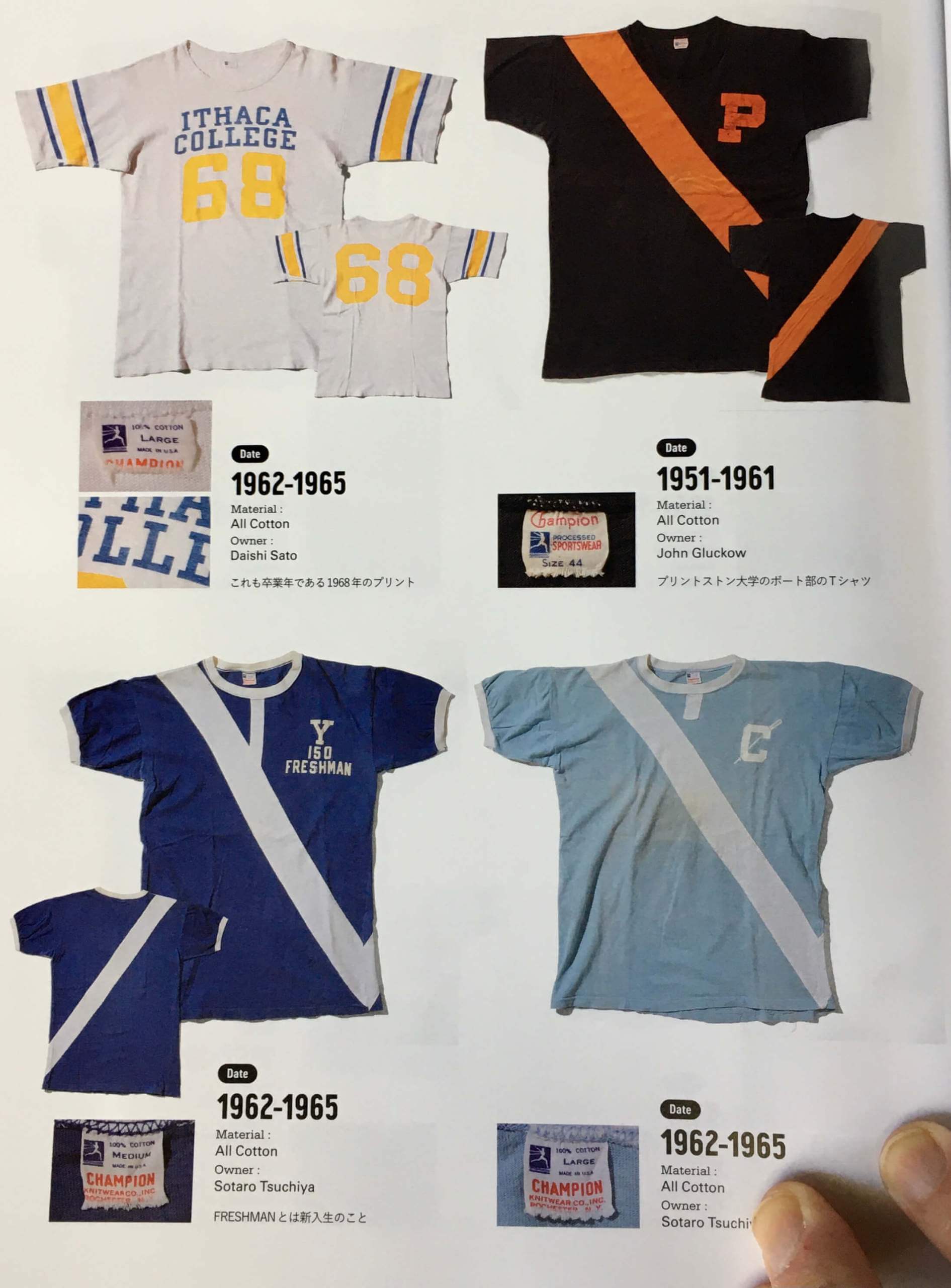
• Let’s start off with some college sweaters. The first one, I’m fairly sure, is for Princeton:
• It’s common, even today, for pullover sweatshirts to have a little triangle below the front collar. But I don’t think I’d seen the triangle appearing below the rear collar until now:
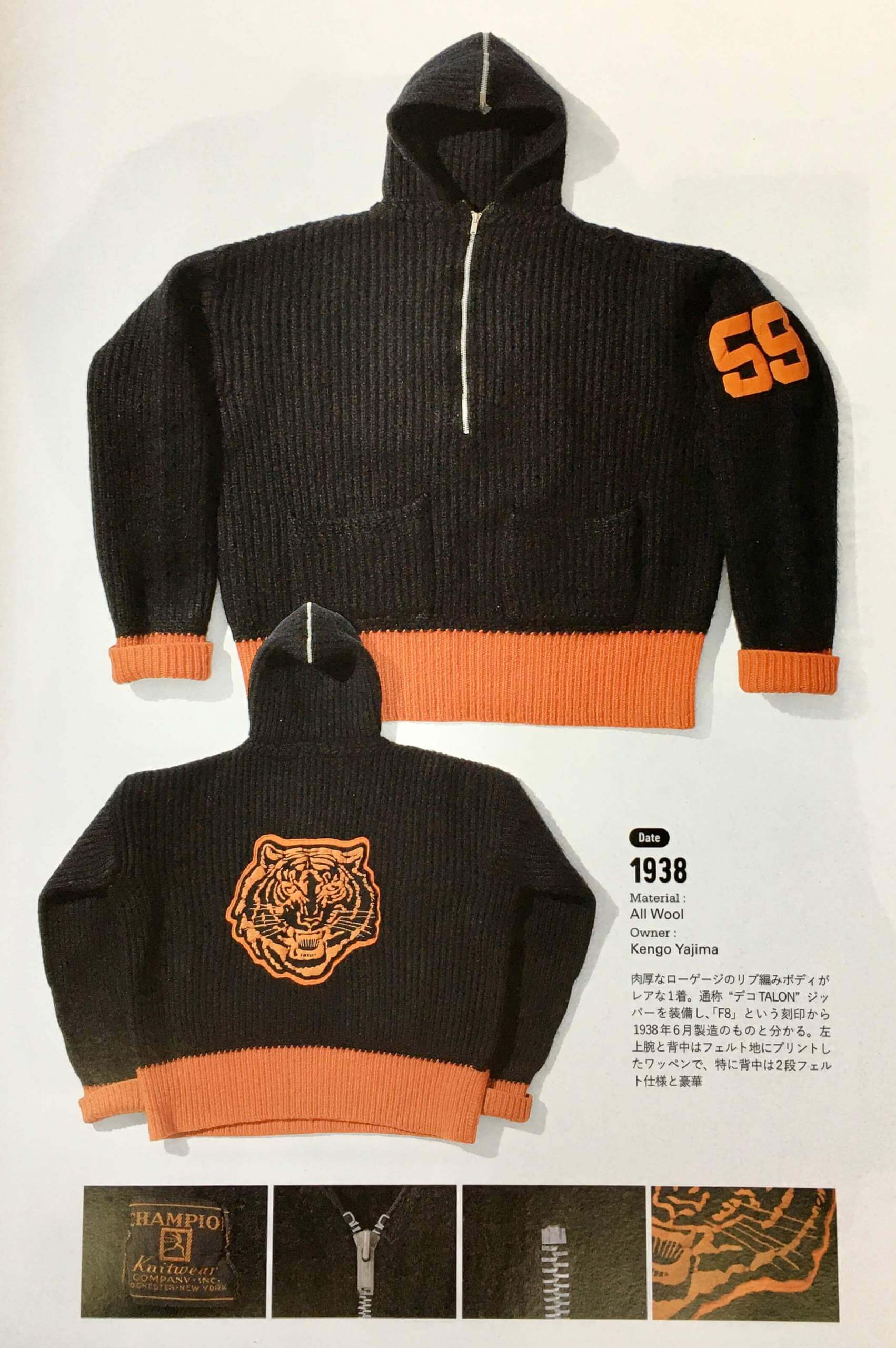
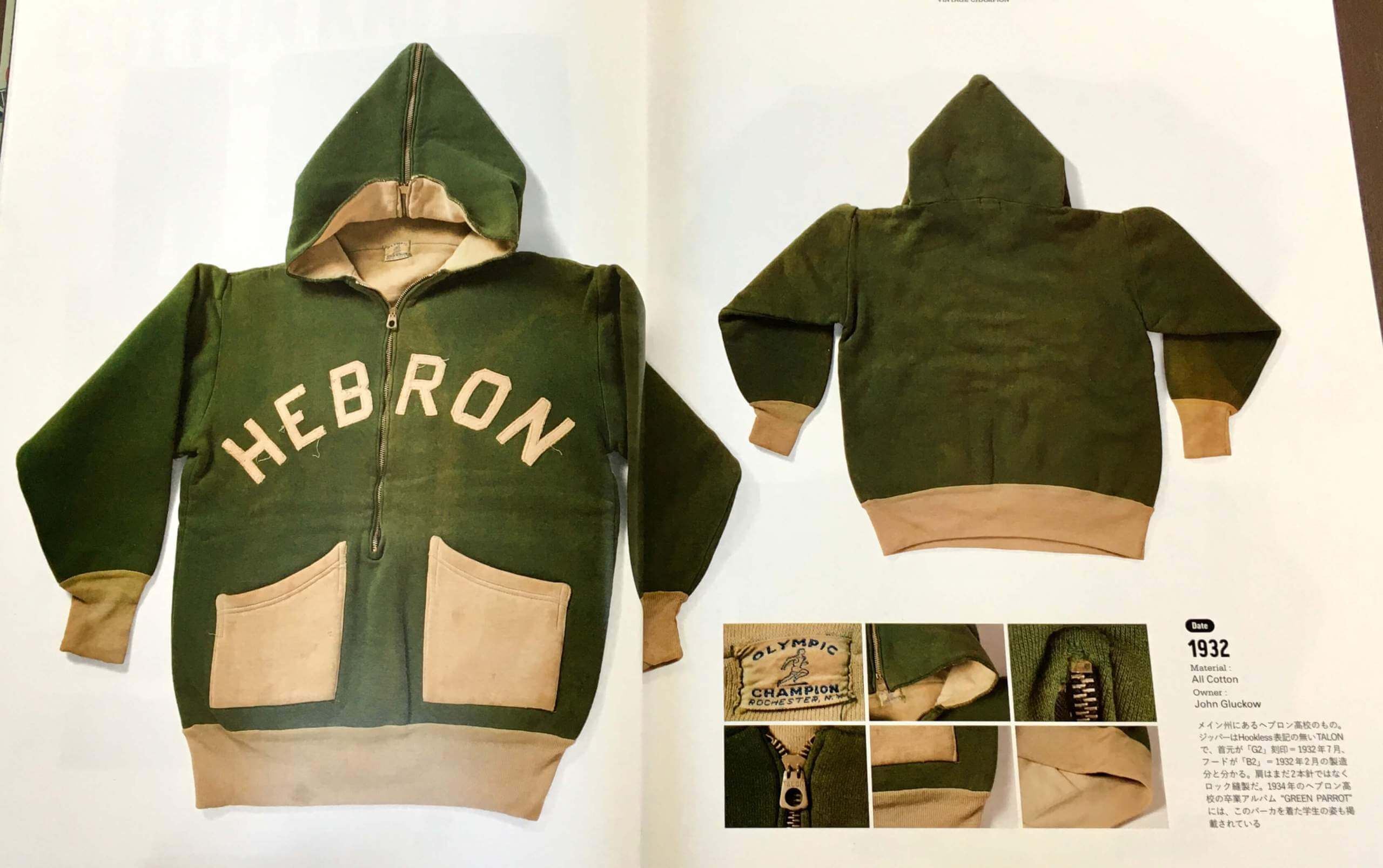
• Check out this really interesting hoodie with a half-length zipper, a zipped hood, and really interesting pockets:
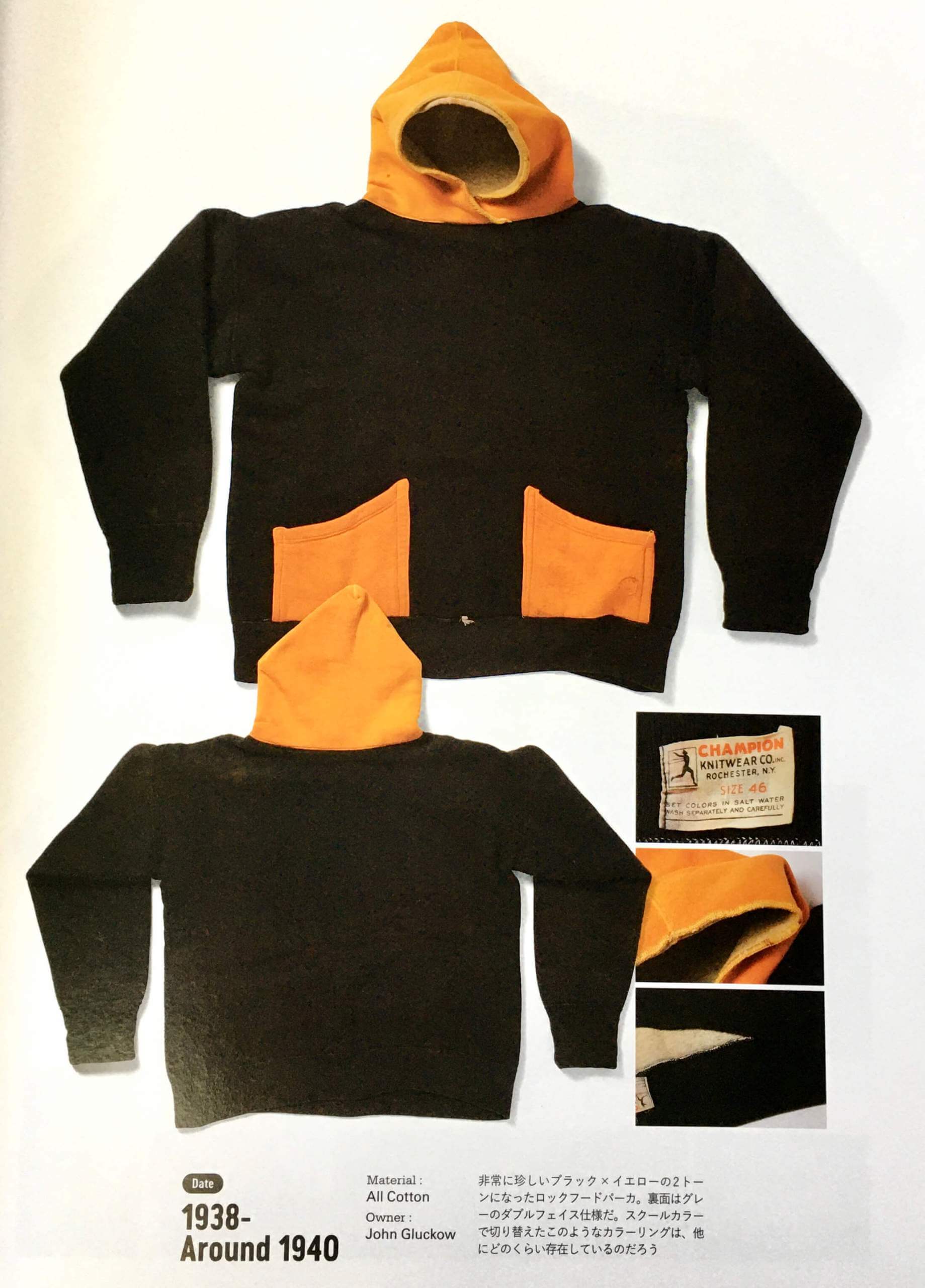
• Similar pockets on this one, but it’s a pullover. Note the wraparound/snorkel-style hood:
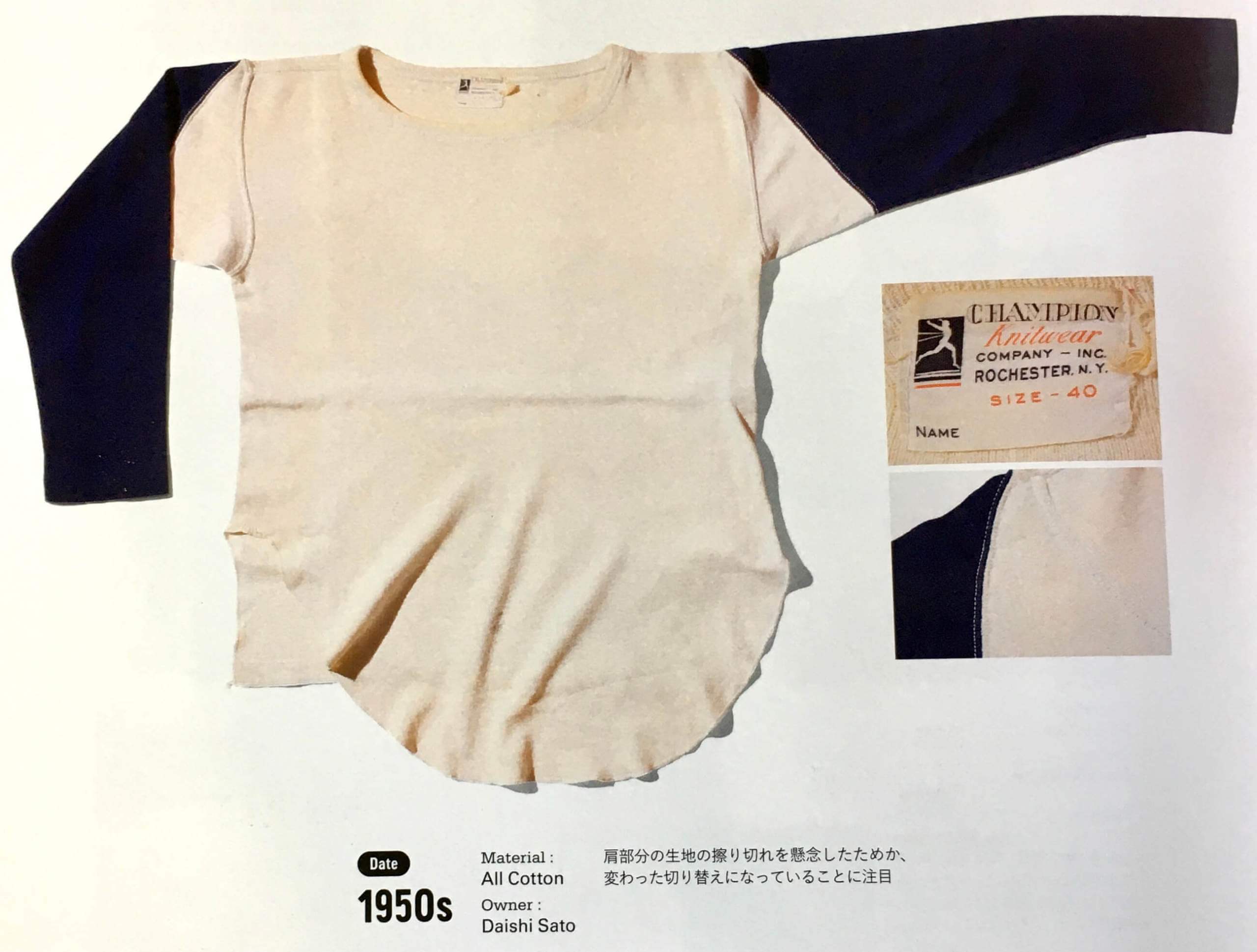
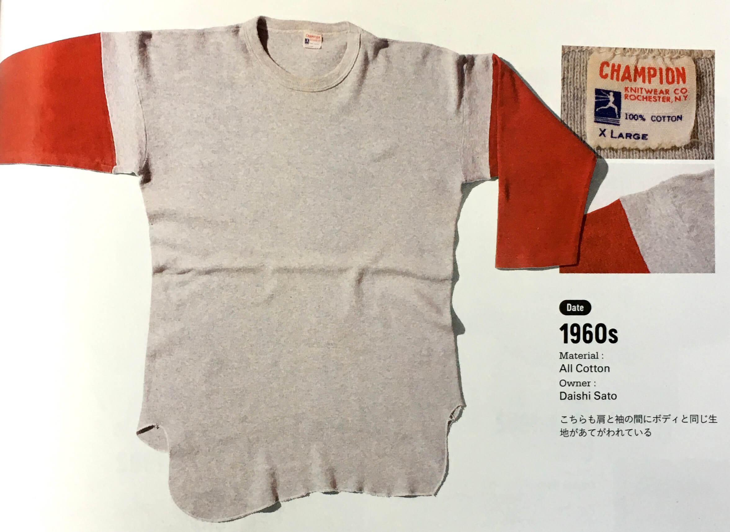
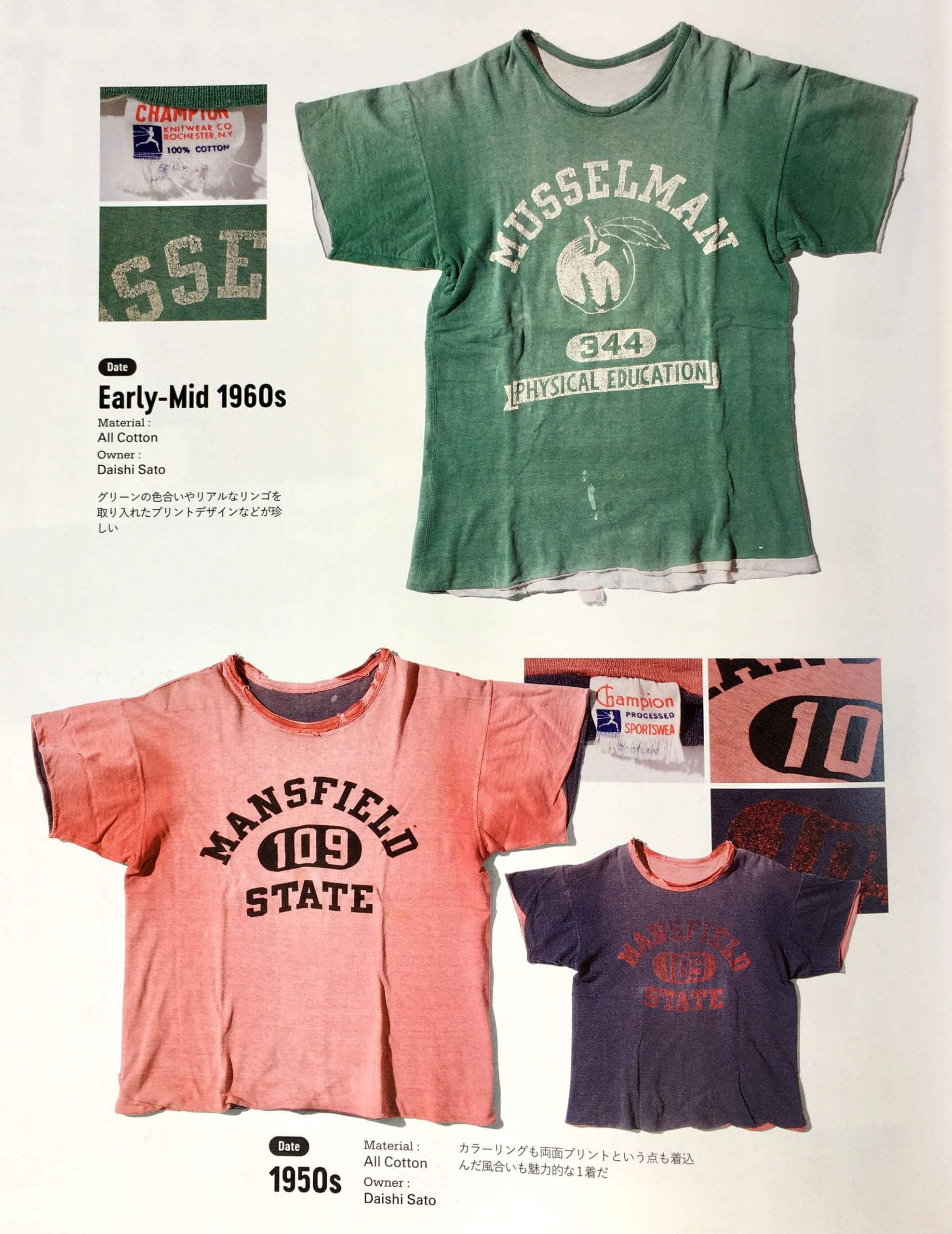
• We’ve all seen old-school baseball undershirts with a cream or grey body and colored sleeves. Sometimes the sleeves are set-in and sometimes they’re raglan. But the book has a few examples of a style I’ve never seen before, with each sleeve consisting of two separate pieces of fabric — a small set-in piece near the shoulder that matches the color of the body, and then the contrast-colored remainder of the sleeve. Weird! Check this out:
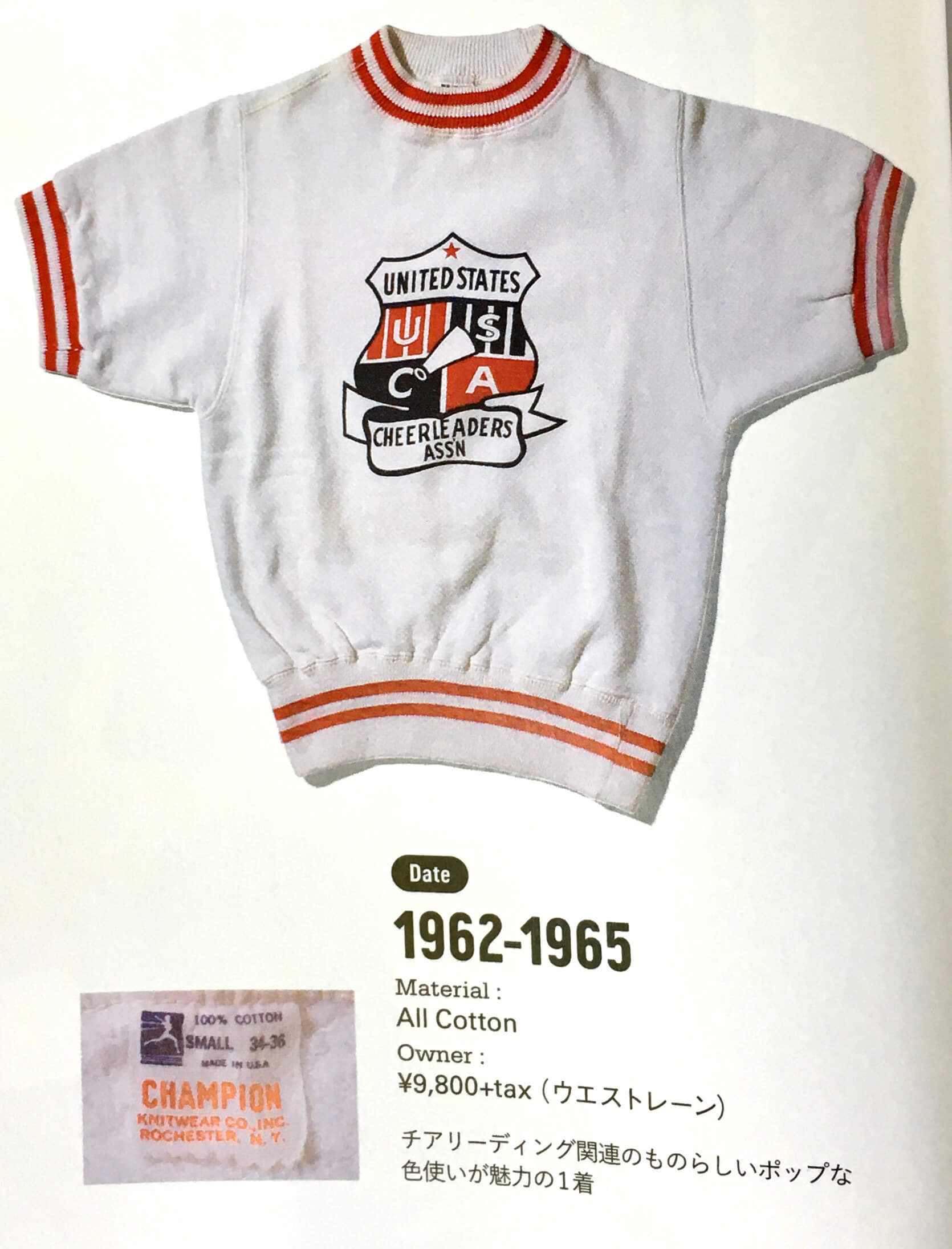
• Love the logo on this U.S. Cheerleaders Association top:
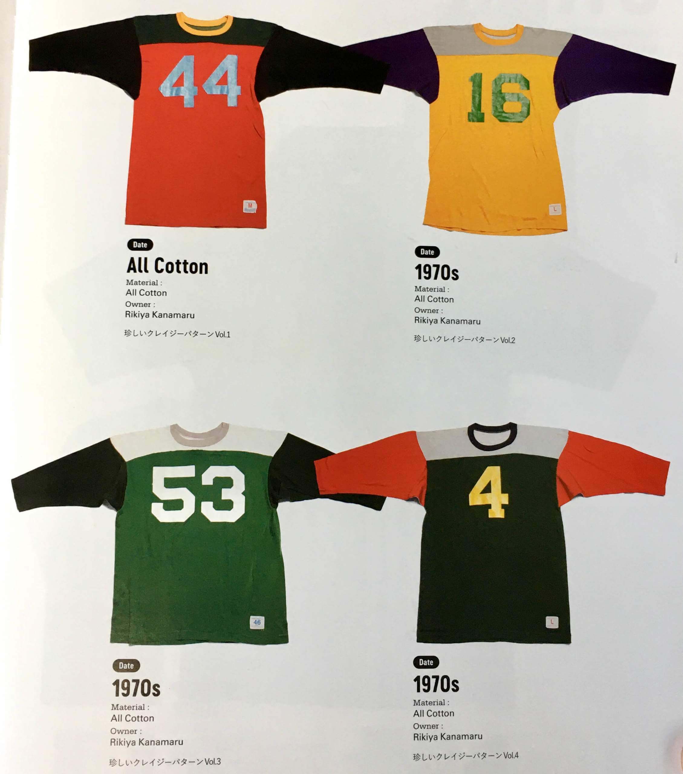
• I can safely say that I have never seen football jerseys quite like these, with the torso, sleeve, yoke, and collar all in different colors:
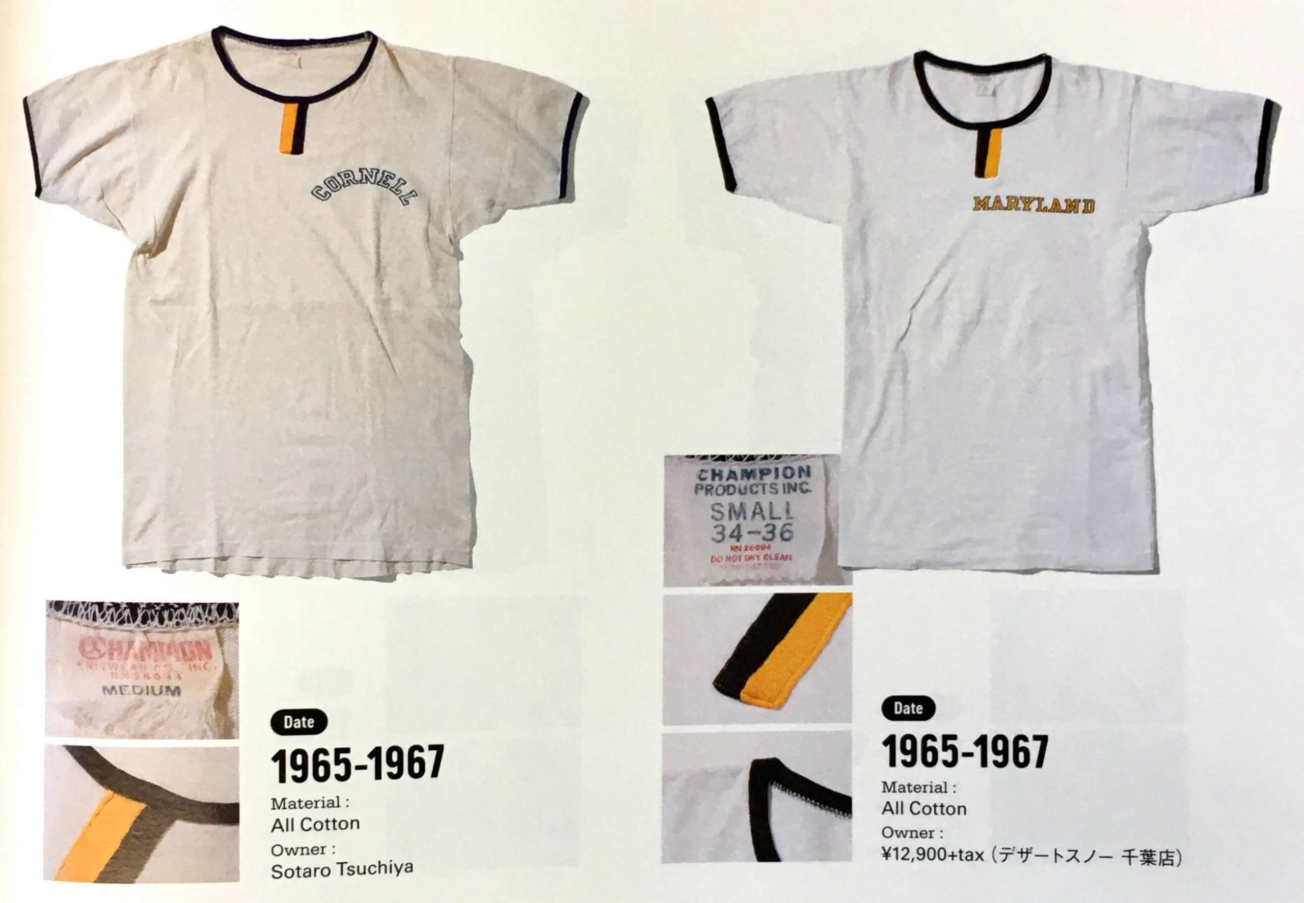
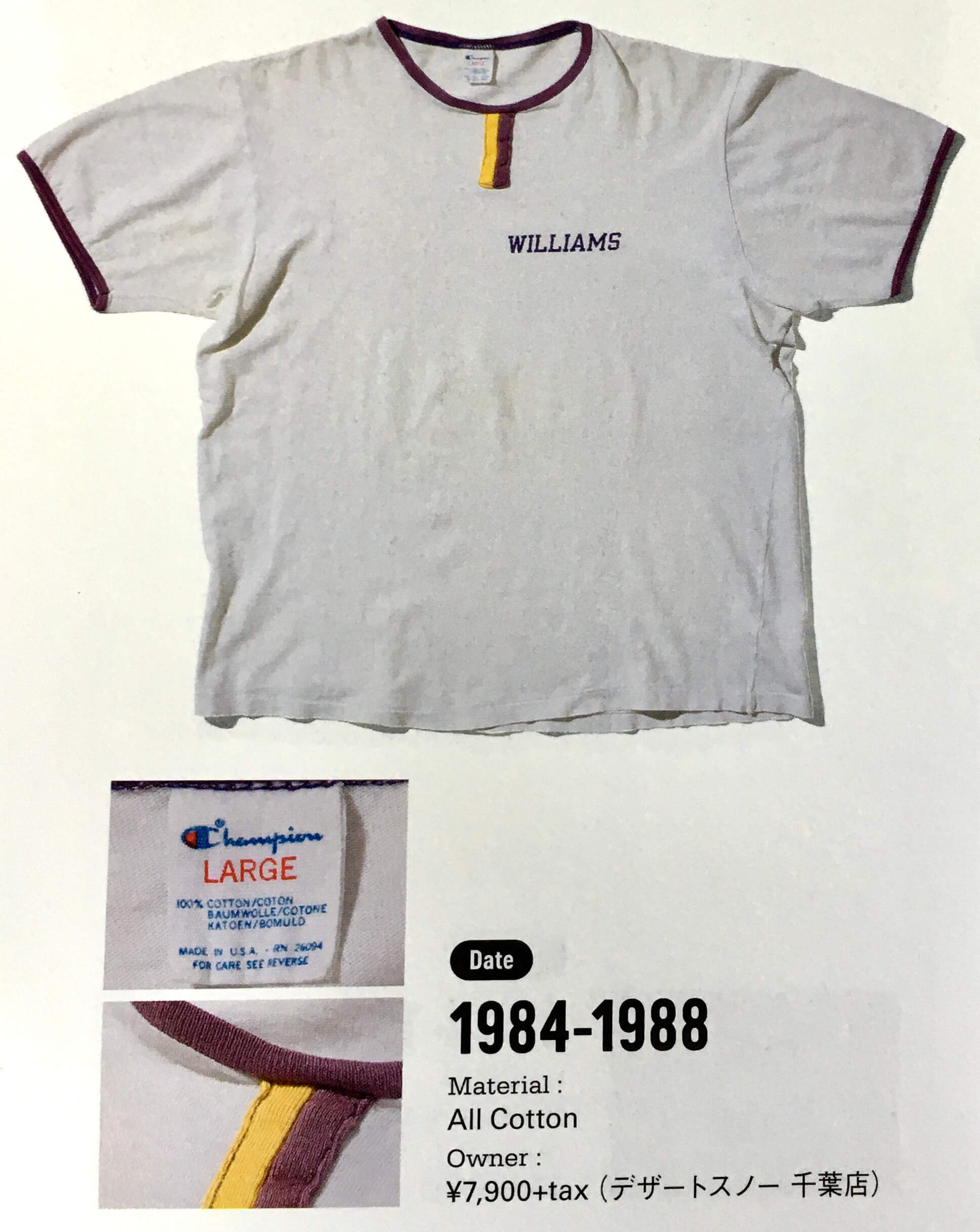
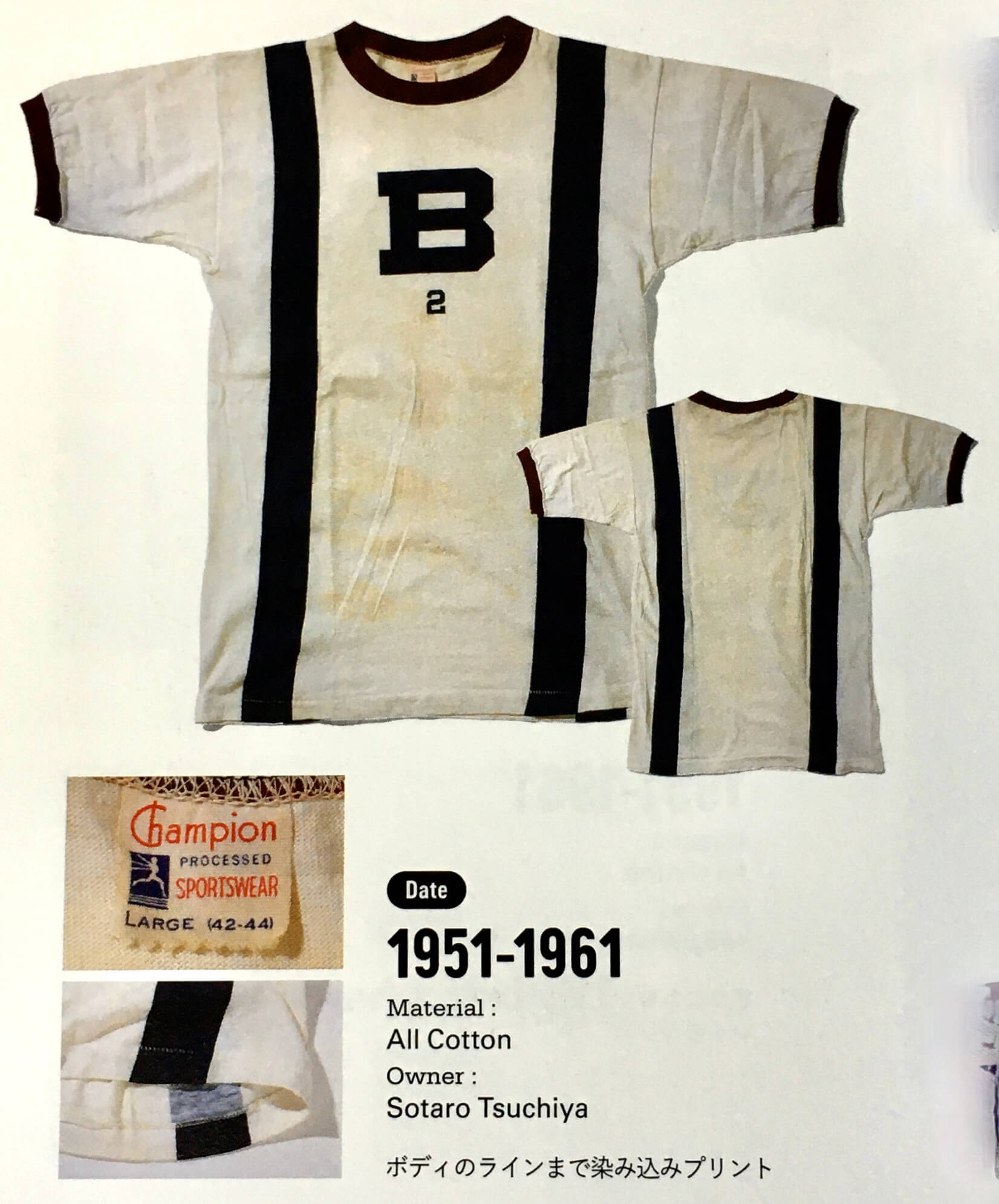
• Check out the two-tone vertical striping below the collars on these T-shirts — never seen anything quite like that before, but it was apparently a thing:
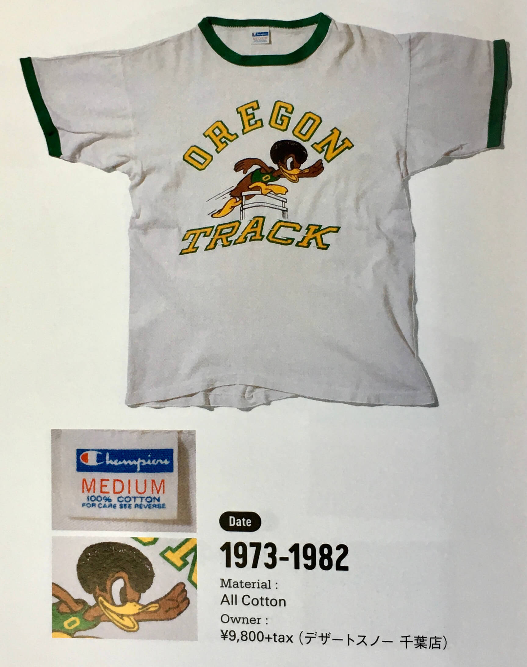
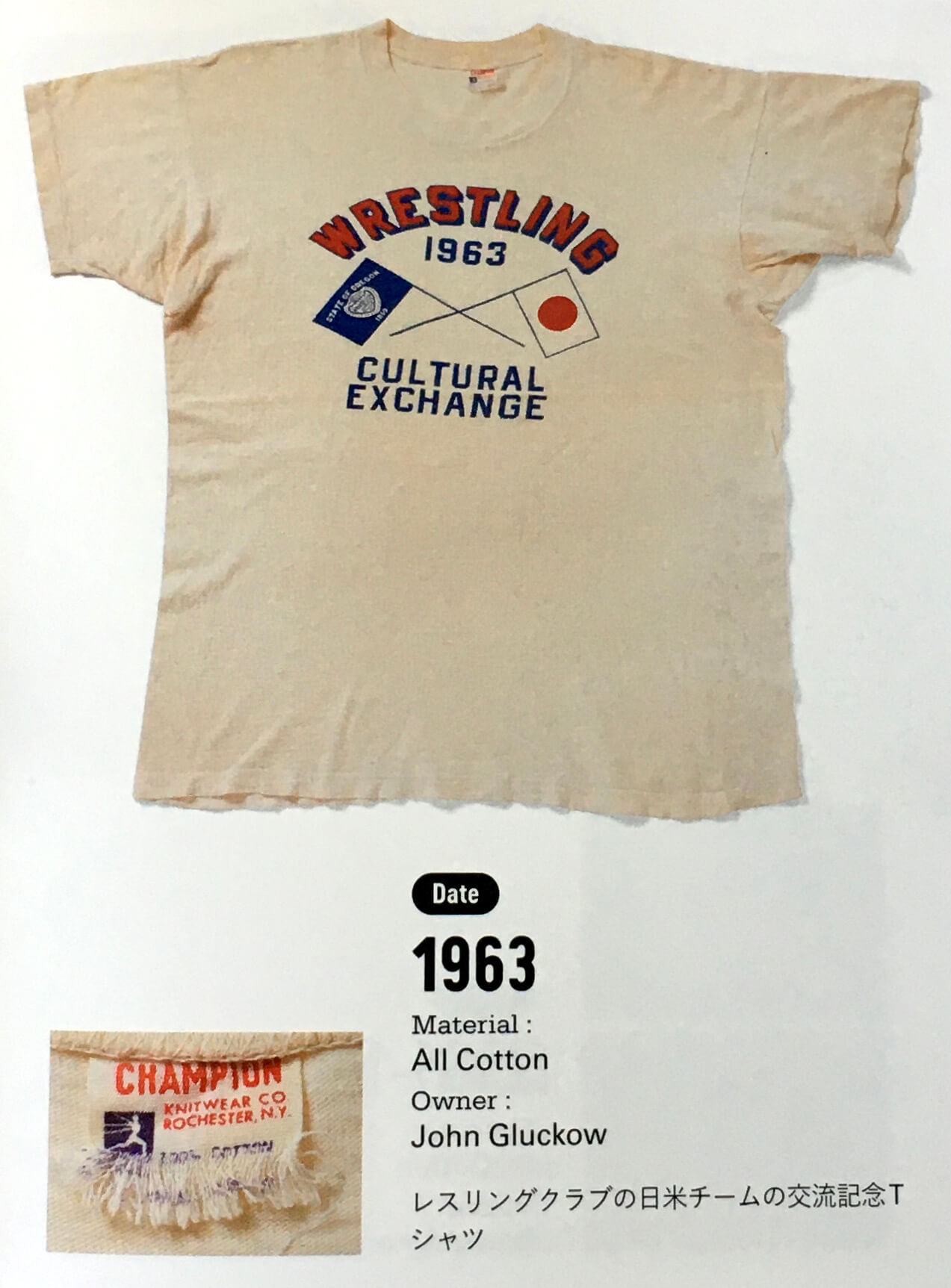
• Remember how I wrote about the Oregon track team’s old Afro-clad “soul brother” mascot last autumn? He was immortalized on this T-shirt:
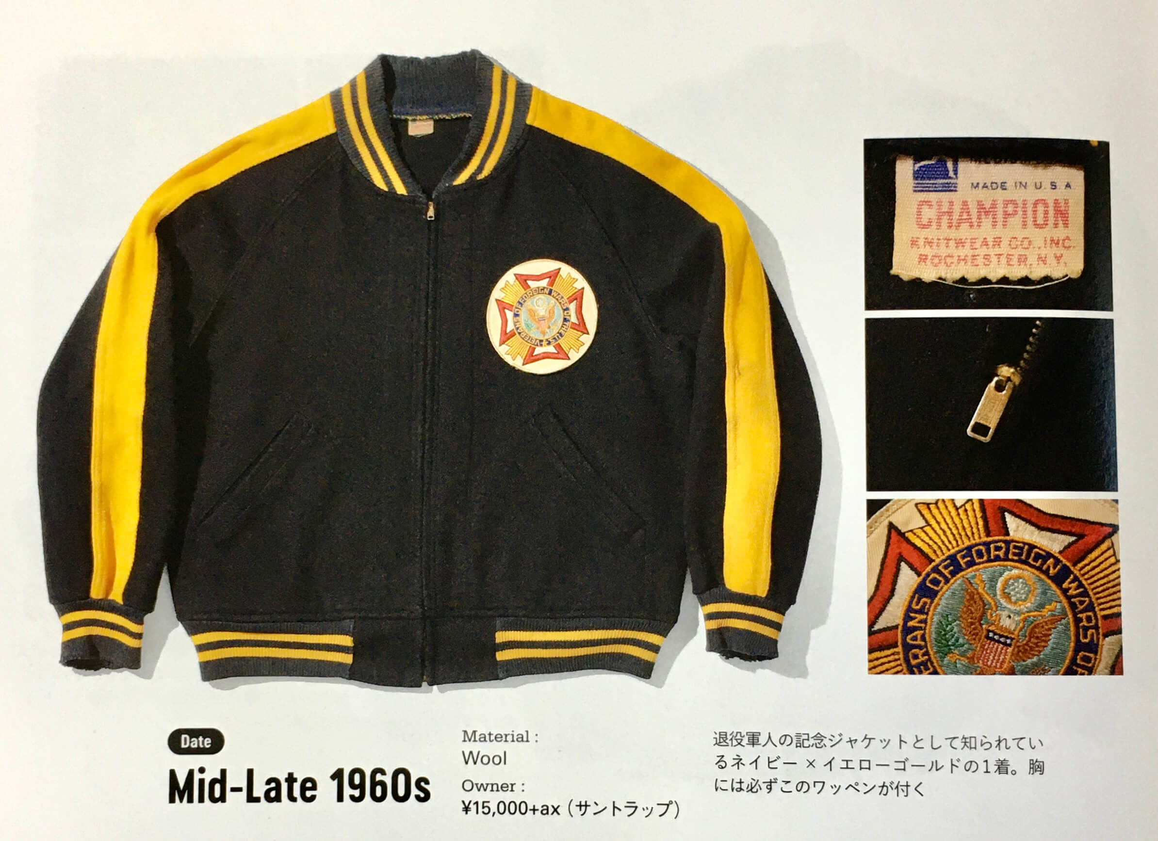
• Jackets! Let’s start with this VFW beauty:
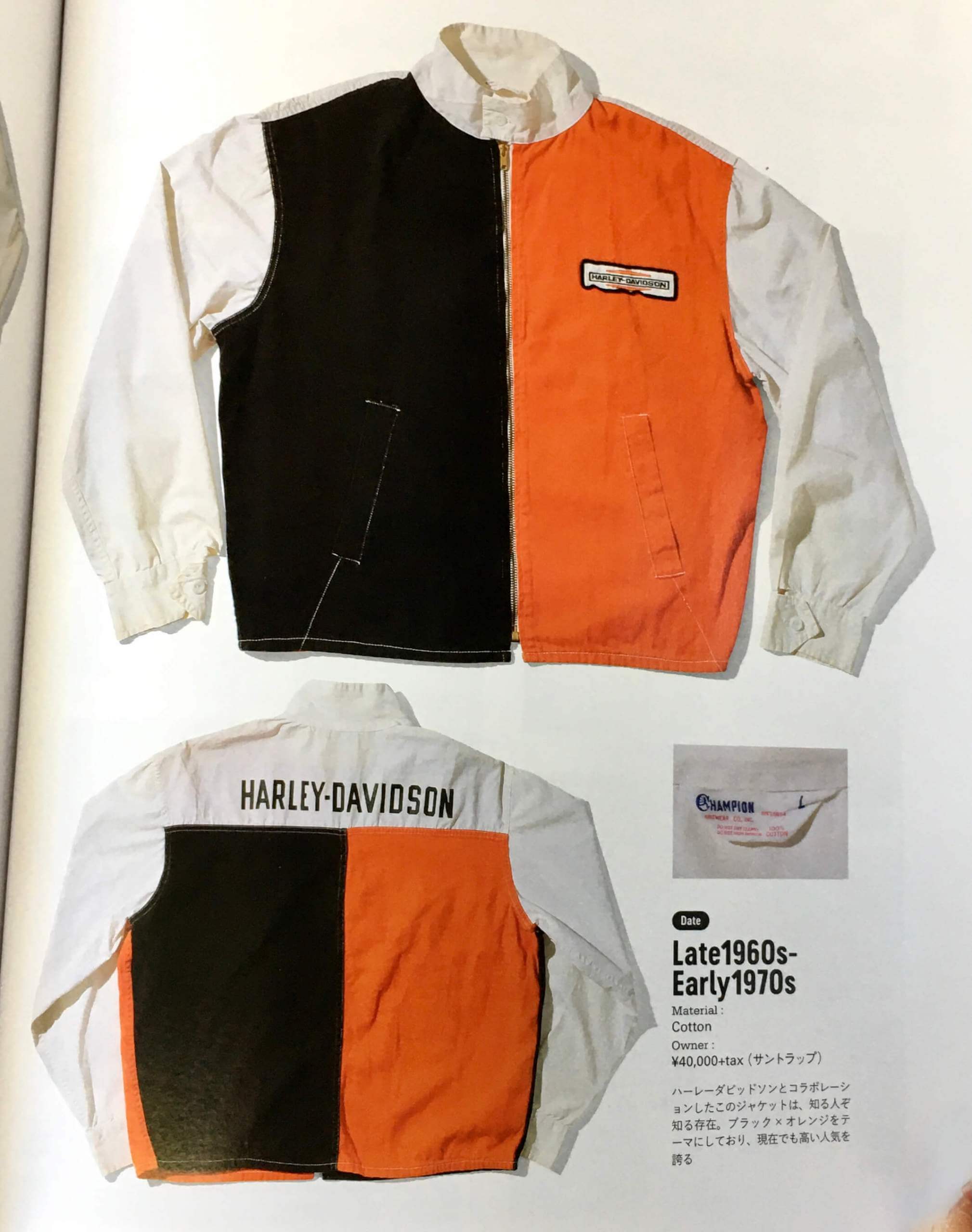
• And holy moly, I love this half-and-half Harley-Davidson jacket:
• Speaking of half-and-half, dig this diagonally patterned jersey:
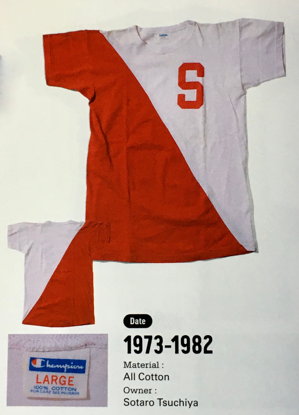
• And speaking of diagonal patterns, I’m a big fan of these sash-themed tops:
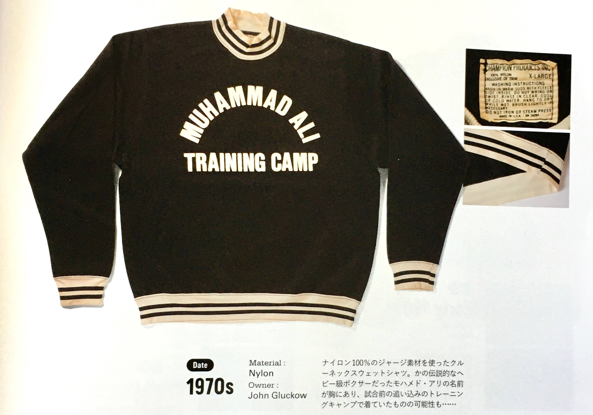
• Champion apparently made sweatshirts for one of Muhammad Ali’s training camps:
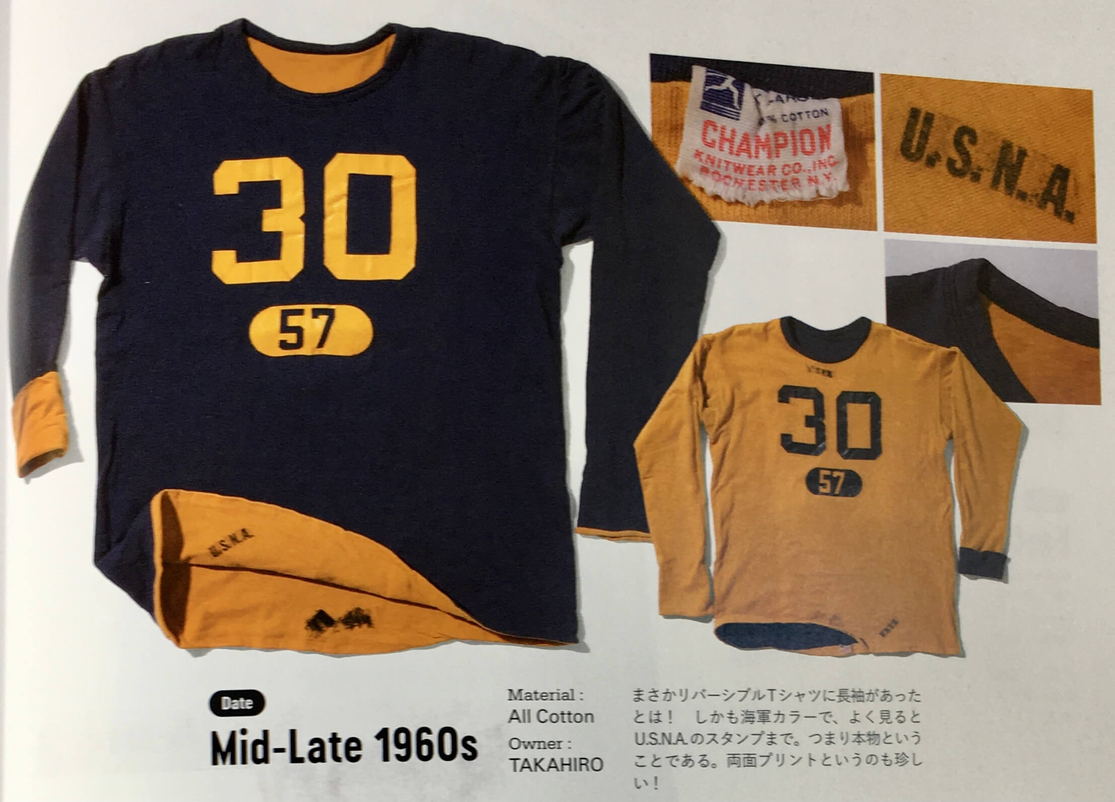
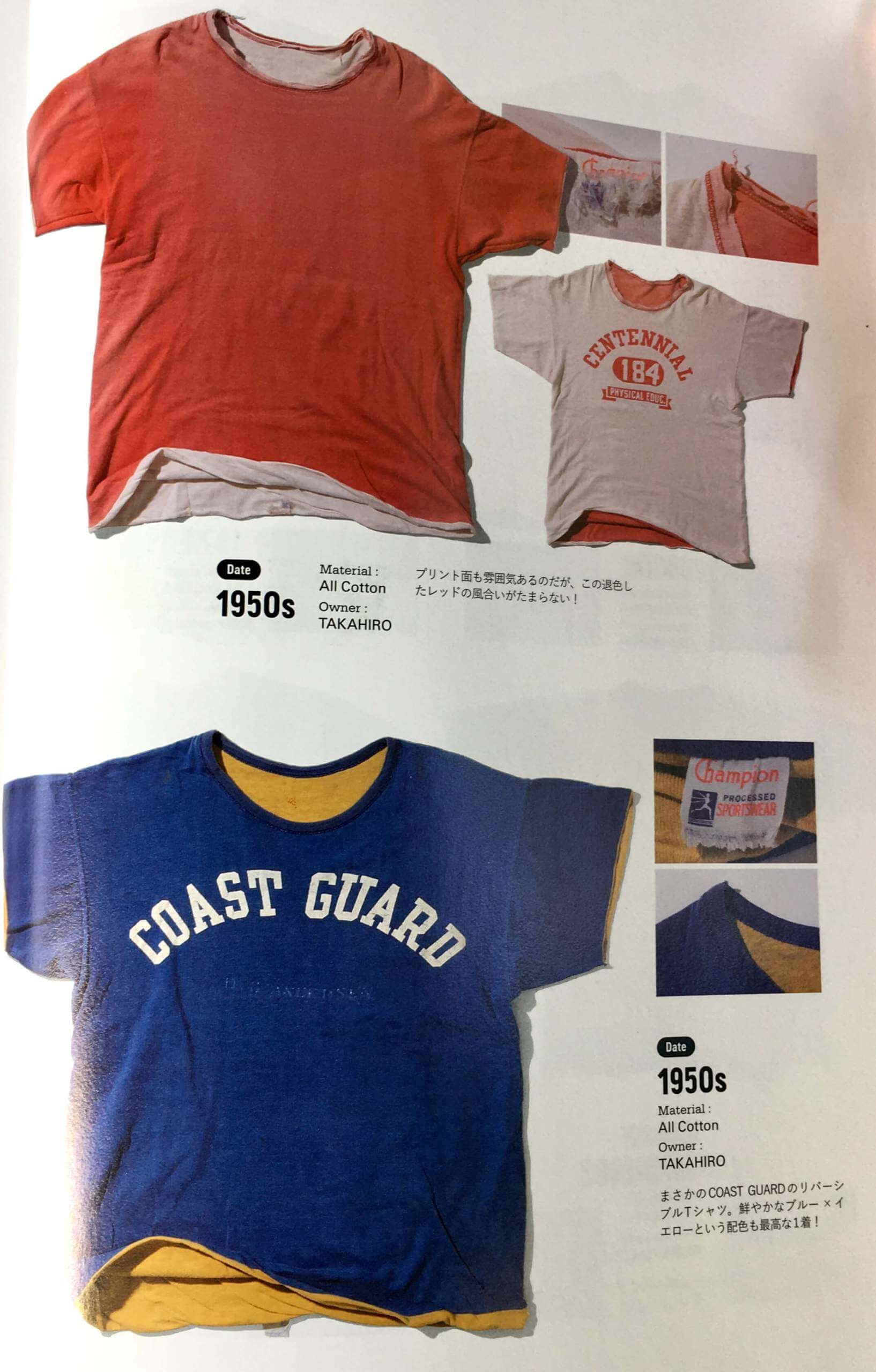
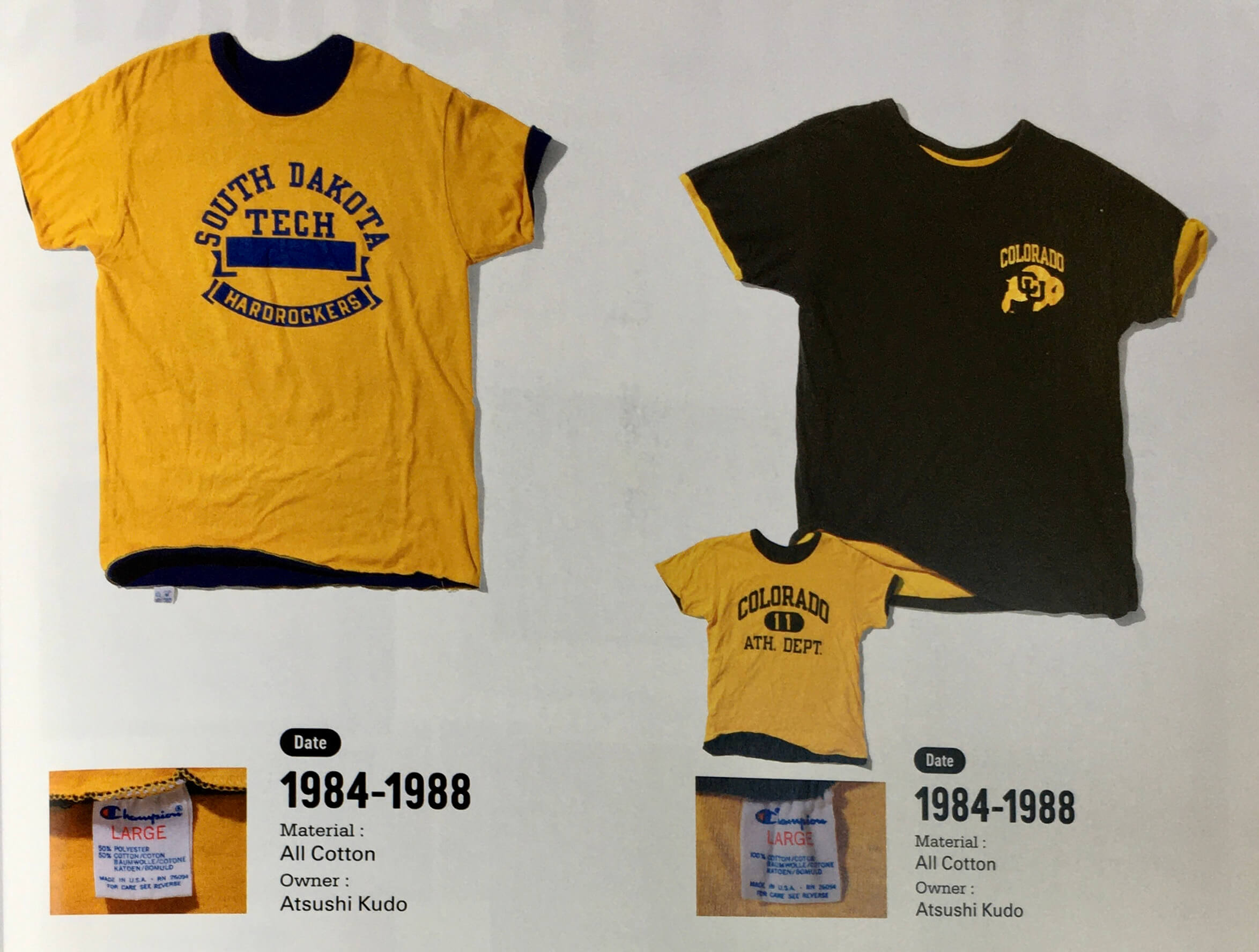
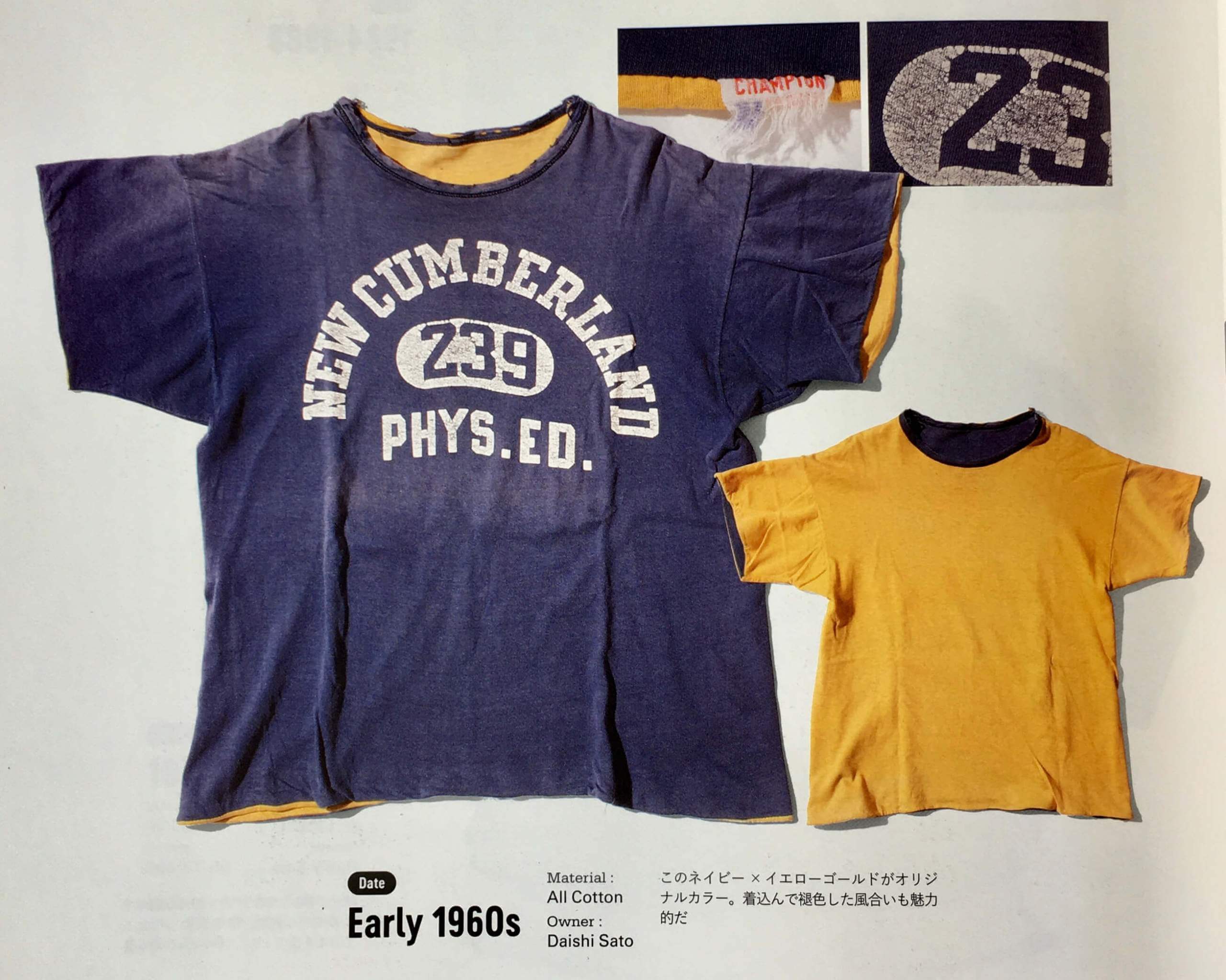
• Reversible athletic shirts were a thing back in the day — made it easy to play blue vs. gold (or red vs. grey, or whatever) in gym class. Here’s a bunch of examples:
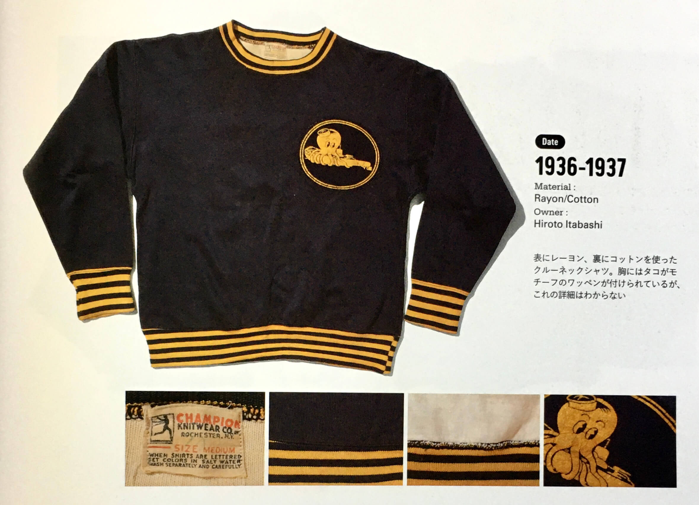
• I don’t know what this was, but man — those stripes, and that octopus mascot logo (!):
• Not sure what this one was for either, but I’m a big fan of the vertical stripes:
• And we wrap up with this one — maybe my favorite of the whole batch, because I like the simple design so much:
———
There’s even more, but you get the idea. The book is tremendous — highly recommended if you can find a copy (although it’s not exactly a budget item). Major, major thanks to Mark Lum for donating it to the Uni Watch library!
Ewwww: Mono-neon something-something, dishwater something, painful to watch, something-something, dirty laundry something, wife said, “Why are they dressed like highlighters?,” something-something, fish, barrel, something.
Okay, so that sucked. Gotta give the NFL credit — it’s not every sport that can stage two nationally televised showcase games over four days and have one of them look so awesome while the other looks so awful.
One thing that was driven home for me last night is that the the dishwater jerseys look much worse on TV than they do in still photos, in part because the ridiculous two-tone sleeves are much more apparent on TV, as you can see in this screen shot:
@UniWatch @PhilHecken the white on the back of the Rams' sleeves just accentuates just how dirty dishwater looking the rest of the "bone white" looks. Just do regular white! pic.twitter.com/swHhVV1Fml
— Nick (@irvingnick) October 8, 2021
For some reason, the contrast between the white and the dishwater isn’t as vivid in still pics, but it really pops (and not in a good way) on TV.
Click to enlarge
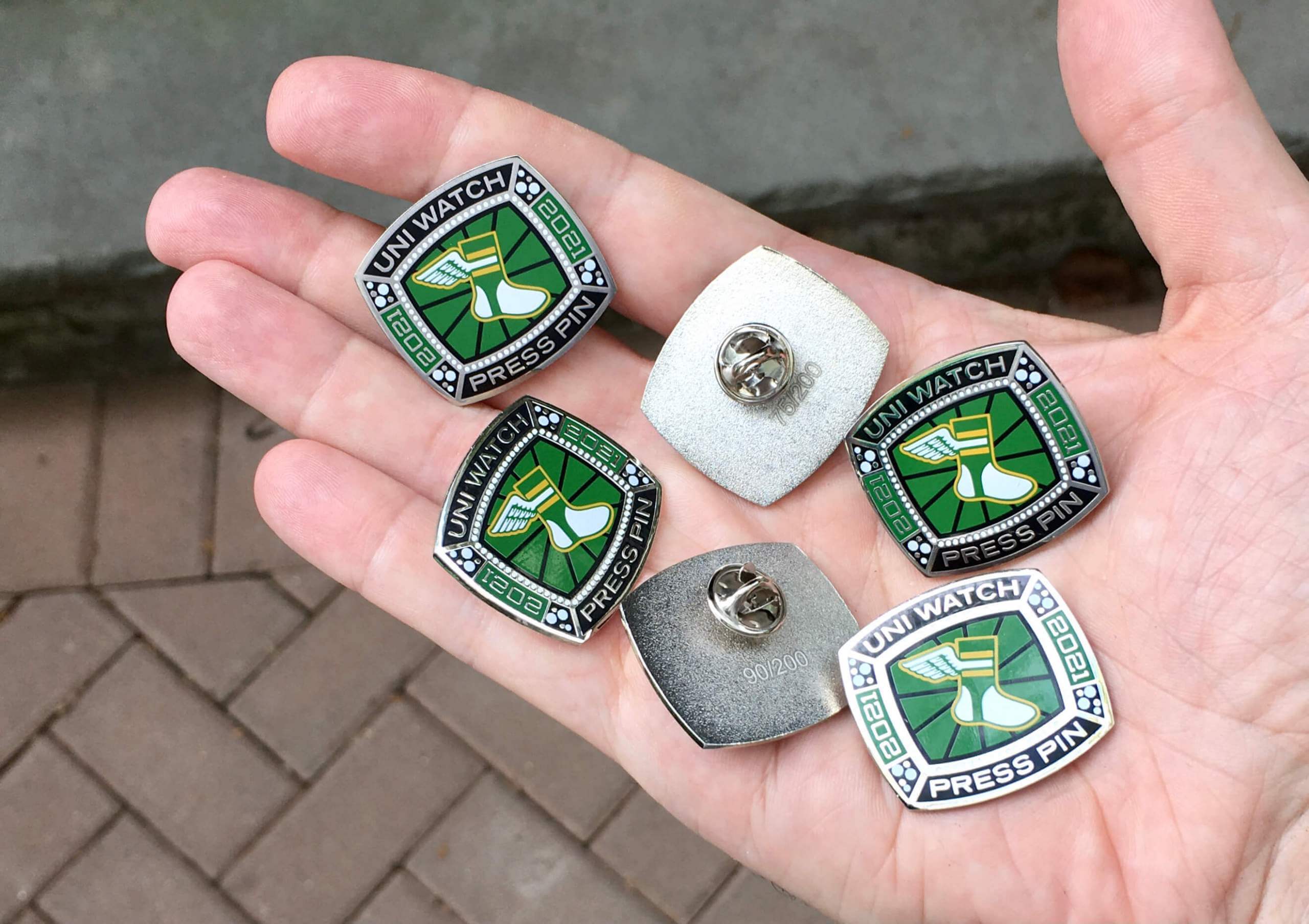
ITEM! 2021 Press Pin launch (and bobble sale): With our October pin now sold out (thank you!), it’s time for the annual Uni Watch Press Pin. This pin is not part of the monthly Pin Club series (and you do not have to purchase it in order to qualify for the Pin Club’s “Collect ’Em All” bonus prize) — rather, it’s an annual pin that Todd Radom and I do each October to coincide with the MLB postseason, inspired by the rich history of World Series press pins. The idea is that everyone in the Uni Watch comm-uni-ty can legitimately wear our Press Pin, because you all contribute information, feedback, and knowledge that helps me do my job of covering the uni-verse.
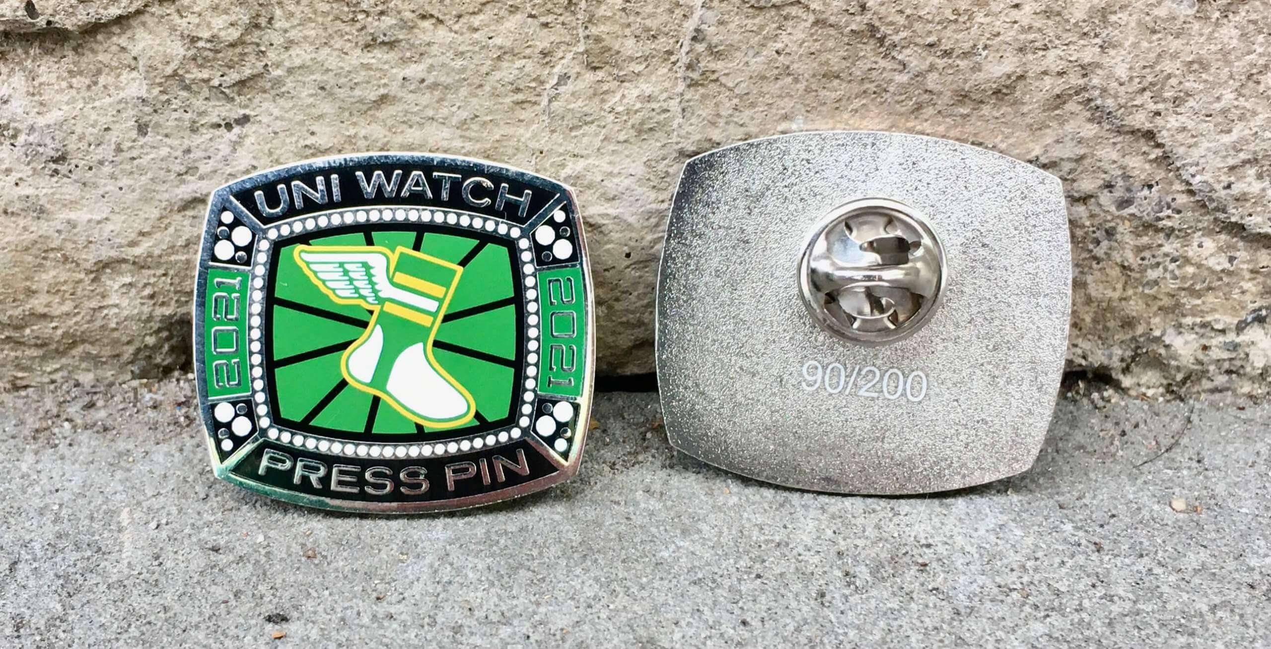
As you can see above, this year’s Press Pin is based on a championship ring. Since many sports rings these days are either white gold or platinum, we went with a silver-tone finish instead of gold. Here’s a closer look (click to enlarge):
This pin was produced in a numbered edition of 200, but I soft-launched it yesterday afternoon on social media, so we’re already down to 145 remaining. It’s available here while supplies last.
Speaking of which: The 2019 and 2020 Press Pins both sold out quickly, so you know what to do.
In addition, it turns out that I manufactured too many of our September bobble-pins. But my misjudgment is your gain, because I’ve now reduced the price on that pin from $13.99 to $9.99. In case you don’t remember how cool it is, here’s a photo:
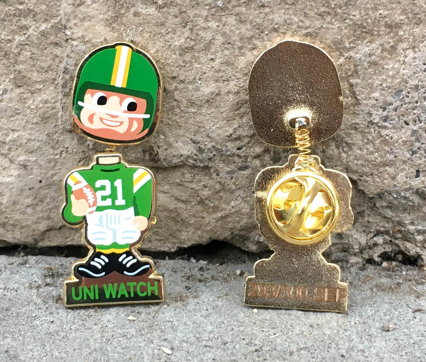
The newly discounted bobble-pin is available here. My thanks, as always, for considering our products!
Click to enlarge
Wallpaper auction reminder: In case you missed it on Wednesday, reader Kenton Bontrager is auctioning off a partial roll of vintage MLB wallpaper. Full details here.
The Ticker
By Anthony Emerson

Baseball News: As noted in yesterday’s Ticker, Nats OF Juan Soto wore his former teammate Trea Turner’s jersey during the Wild Card game between the Dodgers and Cardinals. Reader Mike Engle did some sleuthing and figured out Soto was likely wearing Turner’s jersey from this year’s Father’s Day game with the ribbon removed. … The Red Sox’s tarp normally has an ad for LL Bean on it, but a few days ago it was blank. Only MLB-wide advertisers can be used in ballparks during the postseason, so reader Brian Cheung figures that the Fenway grounds crew simply flipped the tarp over.

NFL/CFL News: The Ravens are going black over purple on Sunday (from Andrew Cosentino). … The Giants have continued their tradition of having practice squad players practice in darker jerseys with a different number font and NOBs honoring notable players from the team’s history (from Mark Gonillo). … The Winnipeg Blue Bombers have altered their helmet logo in honor of Canada’s indigenous communities.
College Football News: Jackson State coach Deion Sanders says, “Stylish uniforms reinforce a winning mindset,” (thanks, Phil). … Virginia Tech WR Tayvion Robinson will wear Frank Beamer’s No. 25 this week against Notre Dame (from Andrew Cosentino). … Here’s this week’s uni sets for Troy, Tulane, Michigan State, Georgia Tech, Louisville, WVU, Mizzou, UNC, UCF, ECU, Houston, Memphis, Illinois, Virginia, Boise State, Ole Miss, Baylor. … Check out ASU’s Hispanic Heritage endzones (thanks, Phil).

Hockey News: The Metropolitan Riveters of the Premier Hockey Federation, formerly known as the NWHL, have unveiled new sweaters (from our own Jamie Rathjen). … The WHL’s Kamloops Blazers have announced they will be wearing a memorial helmet decal for their late president Don Moores. The memorial logo will also be placed on the ice behind the nets this season (from Wade Heidt).

NBA News: The Bulls, who have been wearing red at home since the uni rules were loosened in 2017, are going back to white at home this season (from Thomas Juettner).

Soccer News: EA Sports is exploring renaming the FIFA series (from Trevor Williams).
And that’s a wrap for this week. Have a great weekend, enjoy Phil’s content, and I’ll see you back here on Monday with MMUW and the annual NHL Season Preview. — Paul
IMO the only thing really wrong with the Rams’ unis is the dishwater color. Replace it with regular white and I think you’ve got a nice-looking kit.
As you say, it’s not exactly breaking news that the Seahawks’ duds are pretty repulsive. But because they’re so striking, so dramatic, and just so absurdly weird, they strike me as a prime candidate for a uni that people will be nostalgic about in 30 years.
The solution without much effort for the Rams right now is simple. The alternate white jersey over yellow pants should be worn as much as allowed as the light uniform. The grey uniform was an experiment to try something different. Some experiments like this one just do not work.
link
I don’t mind the “dishwater” nor the contrast with the white on the sleeves. But I think most critics would be satisfied by simply swapping the color between the main jersey body and the sleeve “horns”. Make the sleeve elements subtle bone on white. Few will notice the difference, and those who care will mostly like it.
I know that “dishwater” has caught on, rightly so, but getting dressed this morning, I saw something that totally reminded me of that color – you know how the underarms look on a white undershirt after a couple of months of wear and washing? That grungy-looking off-white? That’s what I’m seeing, too.
OMG. Instead of “dishwater”, referring to it as “armpit” or “armpit/pit stain” is really fitting and satisfying to me. So, from now on I’ll be saying “this week, the Rams are going Pit-Stain over Blue” (for example); this strikes me as awesome.
Also, as much as I hate the highlighter Seahawks look, it would be much less obnoxious if they wore the blue pants instead of the mono-vomit. If anyone saw the movie Role Models, there’s a scene where one of the characters has consumed too much of an energy drink (Minotaur?) that’s sort of neon, to the point he starts peeing neon. The look last night reminded me of that.
Even getting rid of the dishwasher color, it is still a poorly, overdesigned mess. It contains various elements just because they are “innovative”, and none of them are good.
Had the Rams simply rendered their previous navy and gold set with the current blue and yellow, everyone would have been happy, and they could have still kept the classic LA Rams look as a throwback option.
1) I could not watch the Rams/Seahawks game last night. The neon uniforms made the game too hard to watch. Not b/c it’s ugly, but b/c it hurt my eyes. My wife, who doesn’t watch the NFL, saw the uniforms and commented they were so ugly and jokingly asked if I could turn down the contrast on the TV. I opted to put on the Rays/Sox game instead.
2) Good for the Chicago Bulls. Hope this is a trend. The NBA needs to get some semblance of consistency with the uniforms. They should make a white and color version of each alternate jersey. White ones at home, colored ones on the road. Not the NBA cares about the fans, but it would be much better.
I screamed “What the f—” when I turned on Rams-Seahawks last night; the less said about that game, the better. The vintage Champion stuff was a lovely palate cleanser though, thanks!
RE. press pins…when I hit “checkout” nothing happens…
Paul, did you get married?
wife said, “Why are they dressed like highlighters?,”
i’ve been traveling the past couple weeks, so maybe i missed it? or maybe i missed it a while back? either way, Congratulations!
Ha, no, that was just the typical comment that people were saying about last night’s game.
that actually is close to what my wife said. my kids on the other hand thought they were great.
That’s almost exactly what my wife and mother-in-law said about those unis, and similarly, my 15 yo son thought they were great. I weep for the future.
Ha! My daughter regularly uses a similar line to poke fun at some of the boys at school. When they wear neon sneakers or gear: “Nothing says middle school boy, quite like showing up to school dressed like a highlighter”
“[S]imilarly, my 15 yo son thought they were great. I weep for the future.”
TIm, for whatever it’s worth, I have a theory that the way most kids love all the latest garish uniform concoctions from Nike and the other big lifestyle brands is more of a phase than an indictment of the generation. I think most kids like those flashy designs because they have immature (in the literal sense of the word) brains and underdeveloped sense of aesthetic taste and style.
Many (hopefully most) will grow out of it. But sadly, many of Nike and the other brands’ contemporary designs seem to be aimed at that demographic since they think that if they can get to the kids, they’ll convince their parents to buy their merch dumps. Blech!
BvK, I think you’re right to some extent regarding the phases in fashion taste, but I also think it depends on the use of the particular piece of apparel. I’m a staunch classicist when it comes to uniform design (particularly for a 33yo), and my professional wardrobe is relatively conservative in colors. However, I love neons and bright colors for my personal athletic wear, particularly when it comes to sneakers. God forbid I end up wearing my Dad’s Nike Air Monarchs or my father-in-law’s white New Balance cross-trainers. That’s a bit of teenage rebellion that’s not going anywhere soon.
I thought the same!
Deion Sanders’ comment about “stylish” uniforms and a “winning mindset” is interesting since a great many of college football’s most successful programs wear decidedly unstylish uniforms. Alabama, Penn State, Ohio State, and Oklahoma being the first examples to come to mind. (Not saying these aren’t good-looking uniforms, but they are all pretty plain and traditional).
No matter how many uniform choices they roll out, Deion Sanders’ Jackson State teams will never look stylish as long as they continue to use that ridiculously plain and uninspired “JSU” letter mark as their main logo.
Strongly disagree: The “ice cube tray” treatment of the school’s initials is unique and instantly recognizable. It also harks back to Walter Payton’s tenure at the school. A modern classic.
Very cool stuff in that Champion book. Reminds me of stopping at the Champion Outlet in Horseheads, NY, on drives from Northeast Ohio to Cooperstown in the 90s. Obviously not as vintage as the items pictured, but it was always full of cool samples, misprints, blanks and the like.
Paul, did Spring’s shipping prices go up? Shipping cost on pins has been inconsistent, but $4.49 is the highest I’ve seen. Not a huge deal, but I wanted to check if the price really went up or if that’s a mistake. Thanks.
Honestly: I don’t know. They don’t notify us about stuff like that! But I’ll ask.
It’s really bad when you are playing the Seahawks when they are wearing mono neon and you still have the worst uniform on the field.
+1. Also, it’s not just that the pit-stain color of the Rams’ jerseys is nasty in and of itself, but every time I see it on tv, it’s so bad that it doesn’t even look like the jerseys belong with the rest of the uniform. Almost like all of their jerseys were stolen and they had to improvise with some other team’s shirts. Sooooo bad.
Oh my goodness. I would wear everything in that book.
I enjoyed watching that game very much. I enjoyed the many texts I received from my associates that are not Uni Watchers. I always love an opportunity to exert my uniform prowess. It is the only subject that allows me to confidently speak to any member of society.
The bright white “Los Angeles Rams” rectangle patch the Rams have on their left chest looked glaringly out of place on the “dishwater” jerseys. All I could think of was those “Hello my name is” nametag stickers that you get at reunions and mixers.
There was some synergy in that game though, the Ram’s jersey, which has a yellowish tint, looked like they used to be white but a Seahawks neon jersey got mixed in the laundry and the colors bled just a bit.
I was surprised how many Seattle *fans* were wearing neon green. Not overwhelmingly, but plenty of fluorescent dots in the stands. So at least some portion of the fanbase is owning the look. Or maybe they just came straight to the game from their construction gigs.
Greens we have to tolerate in Seattle
Sounders
RAVE GREEN
RGB: (101, 141, 27)
Seahawks
ACTION GREEN
RGB: (105, 190, 40)
Mariners
NORTHWEST GREEN
RGB: (0, 92, 92)
Kraken
NO GREEN!!!!
Meanwhile the Portland Timber are owning the more conventional shade of green even though they DON’T play in the Emerald City. Score one for Seattle’s neighbors to the south!
Also WHL hockey:
Thunderbirds – kelly green
Everett Silvertips – forest green.
Ther periods in the M.I.T. jersey really help with the letter spacing, although I think the T needs to snuggle up the I a bit more. So much beauty in that book.
The two-color vertical stripes on the collar are crew t-shirts/henleys. This design is pretty common for rowing apparel.
Or just single color contrast for mono-color schools like Harvard and Yale. It’s also worth noting that one reason crew used relatively cheap t-shirts is that the losing crew traditionally handed over their shirts to the winner. (Not sure if they still do. (I go back to the 80’s.)
There is a US Champion history book, originally titled It Takes A Little More but being reprinted soon under the title Guide to Vintage Champion. The author has the IG handles @tagsandthreads and @craftedwithpride
more info on the book here:
link
I keep thinking, “Paul will have to run out of awesome pin ideas at some point.” But I keep being proven wrong. I love the press pin design.
Todd gets credit for this one — his concept!
Some ideas have been mine, some his, and some the result of mutual brainstorming. But this one was all him!
First of all the items from that catalog are amazing. What a great find!
Paul – I was surprised you didn’t recognize or recall the crew shirts? A ringer tee with a vertical tab down from the center neck, was a crew team shirt. They must have been warm up or practice gear, because they raced in tank top or a singlet.
Based on the catalog I guess they may have been the uniform tops prior to that. The replica t-shirt version (like Williams shown) were very popular at colleges in the 80s. They were always in the book/souvenir stores, students not just crew guys wore them around campus for sure. I actually still have, and occasionally still wear, my Syracuse crew shirt circa 1989 or 1990.
I went to college in the 1980s and don’t recall seeing these at all!
I was in college from 1989 through 1993, and I do remember seeing those crew t-shirt designs with the two-color tabs of fabric on the front for several different schools during that era. I wonder if their revival peaked more in the late-’80s to early ’90s such that it wouldn’t have been quite as much of a thing when you were in college, Paul.
I am genuinely surprised by this. Perhaps they weren’t as popular as I thought (once again coming to find out, I’m not as cool as I remember being)
I do feel I saw them pretty frequently in the early 90s. I had an older cousin that rowed at Syracuse, hence the shirt from the 80s. Could be I went to school in Boston & visited friends at schools around New England where rowing was a bigger deal or tradition. Maybe it just was not that widespread of a trend?
Come to think of it, Mic, where I saw those shirts most frequently was in the early to mid-’90s, when I had first graduated from college and moved from the Midwest to the Washington, D.C., area for my first job. I saw them in the bookstores of several of the East Coast colleges whose campuses I visited during my travels in the region – all of which were schools where rowing seemed to be pretty well-ingrained in the culture. Maybe it was the convergence of a revivalist rowing culture and regional scene where it was most popular? But I distinctly remember seeing that shirt style during that era since it was something I hadn’t noticed before.
Wait, what??? “…wife said, “Why are they dressed like highlighters?”…”
Umm, did I miss something? Is the Tugboat Captain now Captain Lukas? Are congratulations in order over at UWHQ?
No, was just quoting what lots of other people were saying.
You old sailor, you! I thought she finally made an honest man out of you. Best of luck to you both, nonetheless.
“Pit stain” is pretty accurate for the Rams’ jerseys. It’s about the same color my white Uni Watch Jackie shirt has become after over six years of wear, to the point where I may just retire it altogether (thankfully my gray shirt still looks good).
I didn’t bother watching the game, mainly because being from Detroit I didn’t want to look at Stafford, but I did see a tweet that showed a Seattle player in the neon and I just shrugged it off.
“Ha! My daughter regularly uses a similar line to poke fun at some of the boys at school. When they wear neon sneakers or gear: ‘Nothing says middle school boy, quite like showing up to school dressed like a highlighter’”
That’s hilarious! Kudos to your daughter for Getting It(TM) already!
And I do agree that adolescent girls seem to be less susceptible to the “shiny object” (or, in many cases “neon object”) syndrome than their male counterparts. That said, they’re not immune to it.
I went to see my teenage niece compete in a club volleyball tournament in tournament a while back, and I was dumbfounded by how god-awful so many of the teams’ uniforms were – neon, BFBS, and tons of digital camo in garish color combinations. My eyes were bleeding! I’m pretty sure the uniform suppliers know who’s choosing the team’s uniforms and tailors their offerings accordingly.
Great to see a post about some of Lightning’s archives. They are one of my favorite publications from Japan. My Freedamn! books by Rin Tanaka also feature some very nice vintage sportswear, along with other vintage pieces.
Can anyone provide a company / website that sells baseball undershirts similar to ones above (without trim around the collar)?
The Vintage Champion book is a treasure trove of glorious simplicity of design. I couldn’t help but think of the horrendous junk that Nike designs and produces, in concert with clients, all to sell stuff. What a shame.
The only excuse I can think of for the Rams dishwater uniforms is that they needed something different than the Chargers. Two teams sharing the same stadium with practically the same colors. Unfortunately for them the Chargers look way better.
At the risk of opening Pandora’s box, does anyone else see the Winnipeg Blue Bombers’ helmet logo “honoring indigenous communities” as oddly reminiscent of the sort of language that is frequently used (and dismissed) to justify the use of native-themed nicknames and logos? I’m not making any judgment about the relative sincerity of the sentiments in any particular case; I just find it notable.
At the risk of oversimplifying, I bet indigenous designs are kosher when created by indigenous artists. But I didn’t see anything in the item crediting an artist.
The Seahawks looked so bad, they might as well just have had the Rams in mono-yellow and put us all out of our misery.
Context absolutely matters. No doubt.
I just wanted to add that there was nothing, absolutely nothing, in today’s article to reinforce the idea that at Uni-Watch, anything old is great, and anything new is awful.