Click to enlarge
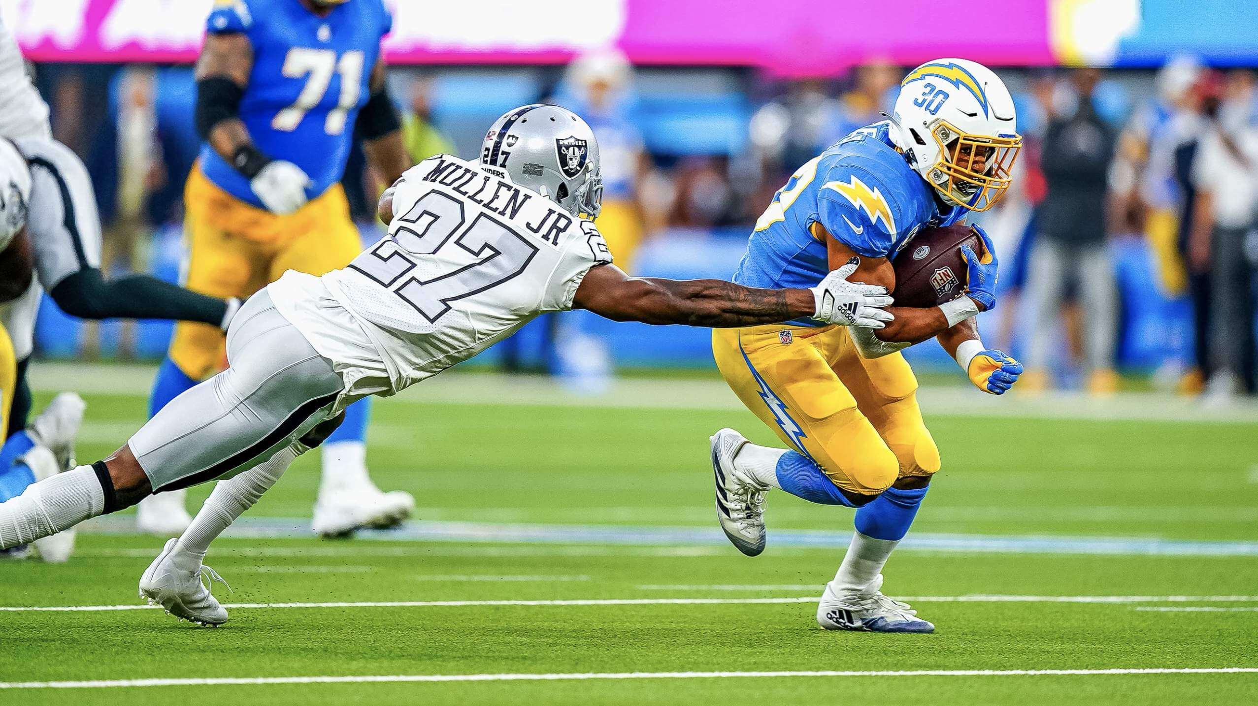
The Raiders and Chargers faced each other in L.A. last night. The Raiders wore their silver-numbered throwbacks (which I love, although I know some people think the numerals are too hard to read) and the Bolts wore powder blue over yellow, creating a reasonable simulation of an old-fashioned AFL game. Before the game even started, people on social media were gushing about the uni matchup. I was pretty stoked about it too — it wasn’t a perfect-looking game (I’ll explain why in a minute), but it was very easy on the eyes. You can see lots more photos here.
But let’s face it: From a Uni Watch perspective, this game was almost too easy. People who say I never like anything new would have a field day with this one — it was classic vs. updated classic, so of course I liked it. Of course, I wasn’t alone in that regard — like I said, lots of people on social media were totally digging the uni matchup. But that got me wondering: Were there people out there who didn’t like the look of this game? And if they didn’t like it, why didn’t they like it?
I should say here that I had a few reservations about this uni matchup myself, mainly because I think the Chargers’ uniforms, while excellent, have several small flaws. For example:
• They need TV numbers.
• They’d be better off if the jersey numbers weren’t italic. And that goes double for the NOB lettering.
• The lightning bolts on the pants need a few more points/jaggies/etc.
• I think the numbers on the helmets would look better in navy or black (yes, even though there’s no other navy or black on the uniform).
• In addition, the Raiders had some serious sock inconsistencies — would’ve been better if they’d all worn black. (I realize this is just part of the game now, but still.)
I offer all of that as a reality check, because I heard some people saying last night’s game was the best uni matchup of the year (a defensible position but not necessarily a gimme) or even the best uni matchup in NFL history (patently absurd — it wasn’t even the best retro-styled Raiders/Chargers game).
All of that said, however, I do think it was a very good-looking game. But what about those folks who felt differently? I wanted to hear from some of them, so I tweeted this:
Like so many of you, I *love* tonight's Raiders/Chargers uni matchup.
Serious question: Does anyone *not* like this uni matchup? I'd be interested in hearing from anyone who can explain what you *don't* like about it, either by tweet, DM, or email (plukas64@gmail.com). Thanks!
— Paul Lukas (@UniWatch) October 5, 2021
Here’s one of the email responses I received, from Michael Rich:
My tastes are generally similar to yours, but this is definitely not one of my favorite-looking games. It’s by no means bad, but I think both teams have better options in their locker rooms. I actually don’t share your love of the Raiders’ uniform in general. I tend to find them bland and boring, especially the road uniform (whether with the standard design or the silver throwback numbers). I love the current Chargers set, but I tend to dislike when the hemet, jersey, and pants are all different colors. (I also share your aversion to the dreaded leotard effect, so by necessity I prefer the helmet shell to match either the jersey or the pants.) The yellow pants really do pop with the power blues, but the white helmet throws the balance off for me.
And here’s a thoughtful critique I received from Chris Herman:
Raiders: I’m normally a fan of balance with the helmet matching the numbers and the pants. But in this case, I think the silver [for the numbers] is too close to the white and the black outline is the only saving grace from being unreadable. As a Bucs fan, I have a bit of nostalgic jealousy seeing the Raiders with silver numbers and the saints with gold numbers, but the Bucs had to ditch their orange numbers after their inaugural season because they were supposedly unreadable from a distance. Finally, I think having multiple same-color jerseys is redundant.
Chargers: I think they fall victim to what I call the three-color rule, meaning the helmet, jersey, and pants are three different colors. The Titans violated this rule with their last set when they wore white helmets, light blue jerseys, and navy pants. In both cases, I think white pants would make for better balance with the white lid. As far as the overall set, I think they fall into an identity crisis by being powder/yellow for some games, powder/white for others, and then the occasional royal and navy alternates.
I understand why people love these — nostalgia, bright and colorful, better than the last set, etc. And sure, they’re definitely better than Atlanta, Arizona, and Tennessee. I just don’t get the whole “this is the greatest ever” argument.
And there was this from Luke Lagattuta:
I think this game would have looked just as good if not better had the Raiders gone with their standard road look.
While I wouldn’t go so far to say I “didn’t like” either team’s uniform in a vacuum (I am in the boat that absolutely loves the Chargers’ new uniforms and generally like all the Raiders’ looks for their tradition alone), I do find it a little strange when one team goes with the throwback look while the other sticks with their current set. While the Chargers’ latest set is certainly a nod to their ’60s uniform, it is still a newer take. I just think games should either be true throwback matchups, with both teams wearing an old design, or a regular game with both teams wearing their standard home or away.
I also received this DM from Rick Grayshock:
I’m not a big fan of the Raiders’ uniforms in general. I recognize the history and even appreciate their commitment to the set, but I’ve never really loved the look.
The Chargers have the best look in all of sports, IMO.
I also received dozens and dozens of replies to my tweet. By character-count necessity, they weren’t very detailed, but here’s the gist:
• Some people don’t like the Raiders’ silver numbers.
• A few people don’t like the Chargers using three different base colors for their helmet, jersey, and pants.
• Some people said the game would look better in daylight and/or on natural grass.
You can see more of the Twitter responses by looking at the tweet.
This was an interesting exercise. I still think it was a very good-looking game, but it’s always good to challenge our own assumptions and hear what other people are thinking. I’m actually a bit disappointed that nobody said, “Booooorrring! I’d rather watch the Falcons and the Rams!!” (Of course, people who tend to think that way probably don’t follow me on Twitter or read Uni Watch to begin with.)
What about you folks? Anyone out there who thinks last night’s game was more eyesore than eye candy? I’m genuinely interested in hearing from such people, so feel free to post in today’s comments.
Click to enlarge
Collector’s Corner
By Brinke Guthrie
Follow @brinkeguthrie
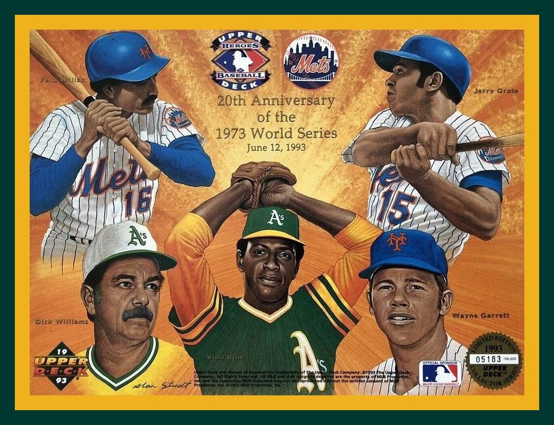
The baseball postseason is here, so let’s start off this week with a bit of MLB postseason nostalgia, this “giant” 1993 11″ by 8 ½” Upper Deck card commemorating the 20th anniversary of the 1973 A’s/Mets World Series. Really nice artwork by Alan Studt featuring Felix Millan (always choked up like that as I remember), Jerry Grote, and Wayne Garrett of the Mets, and Dick Williams and Vida Blue of the A’s, who would win the second of an absurd three straight Series titles that year.
Now for the rest of this week’s picks:
• This mid-1960s poster by the legendary Dave Boss features the Dallas Cowboys in the navy three-stripe jerseys, which were worn in 1964, ’65, and ”66.
• If Detroit Red Wings fans feel a need to trim their nails, well, we’ve got some 1970s nail clippers for ya.
• Here’s a 1969 San Francisco Giants stamp album. Looks like just 10 players are included, Mays, McCovey and Marichal among ’em.
• “Hello, Canada! Here’s the most exciting game you can play!” That’s the pitch on the front of this 1950s Foster Hewitt Hockey Game. Hewitt was the well-known announcer for Hockey Night in Canada TV broadcasts. This one is fun for the whole family, by the way.
• I want to draw your attention to the totally 1970s block-shadowed lettering on the packaging for this 1970 Stanley Cup 8mm film highlight reel.
• Drink coasters, cups, glasses, ice buckets — there’s a lot for Pittsburgh Steelers fans to love in this auction.
• Nice-looking 1980 decanter here saluting the Philadelphia Phillies’ World Series win.
• That is one fearsome-looking old-school hockey player dude on the cover of Hockey The International Sport, “the Official Rule Book of the National Hockey League.”
• Toronto Maple Leafs goalie Mike Palmateer is featured on this 1970s NHLPA-endorsed clipboard/binder, which also includes team logos of the period.
• This notepad paper cube was produced for the 50th anniversary (1933-1983) of the MLB All-Star Game at Comiskey Park.
Click to enlarge
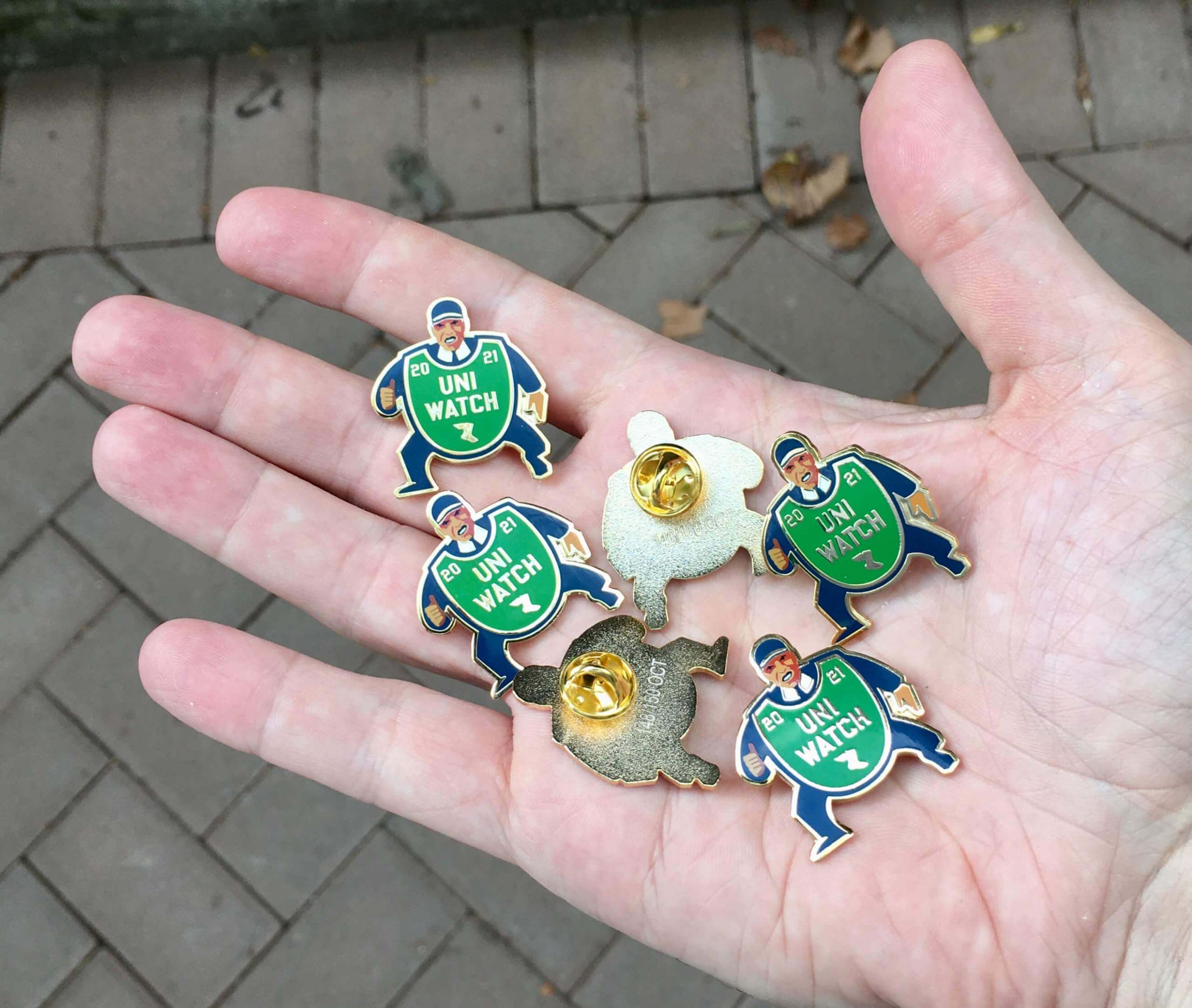
Going, going…: As of this morning, we were down to only 16 remaining pins for our October design — a fantastic depiction of a baseball ump with an old-fashioned balloon-style chest protector. You can almost hear him yelling, “Yer out!” Perfect for the playoffs and World Series.
Here’s a closer look (click to enlarge):
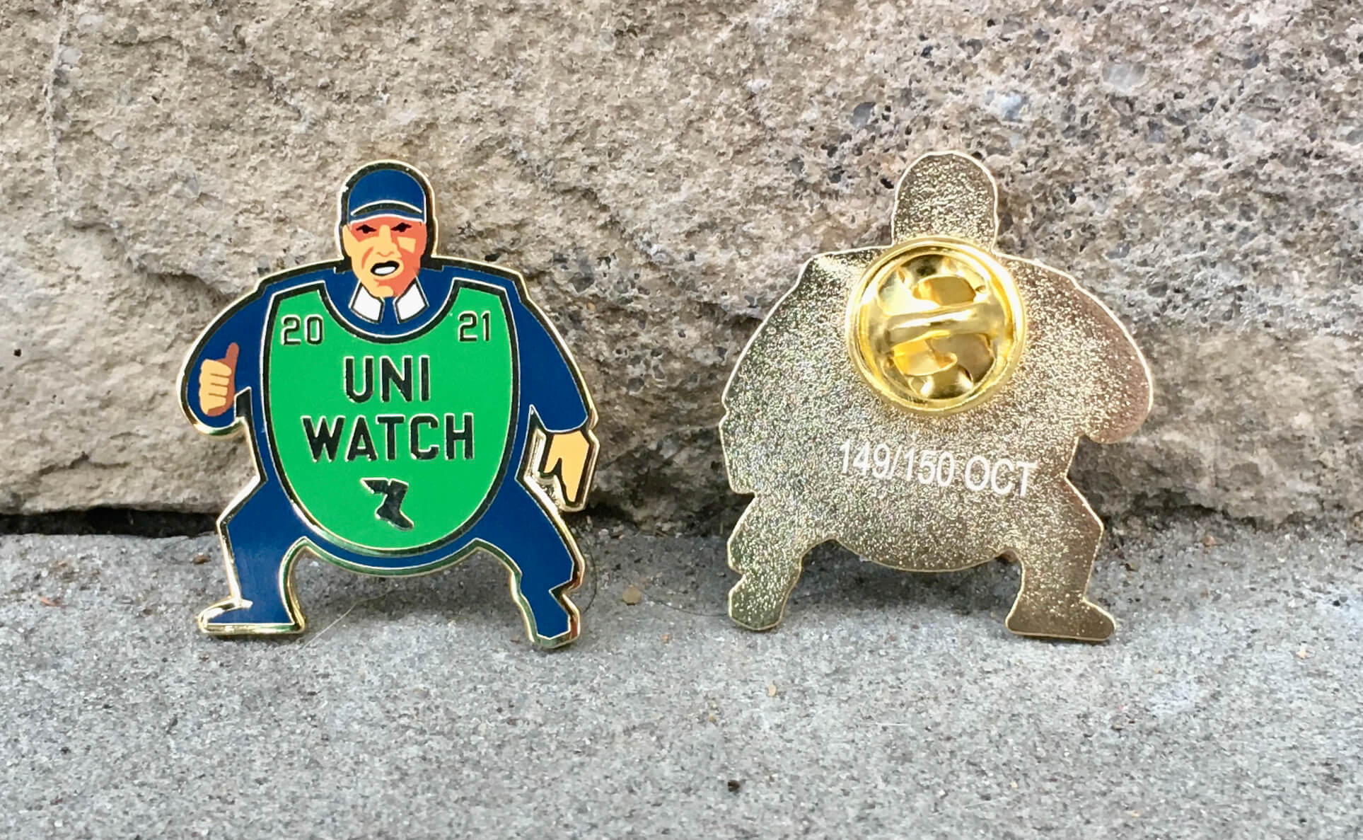
Sensational, right?
This pin was produced in a numbered edition of 150. With only 16 remaining after the first four days of availability, it will definitely sell out — maybe today. Get yours here while they last.
We’ll also have our annual Uni Watch Press Pin later this month, so stay tuned for that!
My thanks, as always, for your consideration of our products.
The Ticker
By Lloyd Alaban

Baseball News: New 20th-season logo for the Albuquerque Isotopes, affiliate of the Rockies (from @DoogieStardust). … Here’s the story of how MLB ump Jason Klein got the idea for a new mask design that’s also becoming popular with catchers (from Tom Turner). … Here’s an article that details the history of the Yankees’ short-lived costumed mascot, Dandy (from Kary Klismet). … Mayos de Navojoa of the Mexican League have new caps (from Max G.).

Pro Football News: Eagles head coach Nick Sirianni has been wearing “55” and “56” stickers on his visor for injured players Brandon Graham and Isaac Seumalo, both of whom are out for the year (from Nathan Haas). … Here’s a link to a post on reader James Griffin’s blog that includes a uni-centric review of some football Starting Lineup figures from the 1980s and ’90s. … Ever wonder what font a lot of NFL fields use? Turns out it’s called Clarendon (from our own Phil Hecken). … The Southwest Storm, a new Champions Indoor Football League team based in Dodge City, Kansas, has unveiled its name and logo (from Kary Klismet). … The CFL’s Winnipeg Blue Bombers will unveil orange jerseys today for Orange Shirt Day (from our own Phil Hecken).
College Football News: Throwback helmets for Florida this weekend (from our own Phil Hecken). … Navy blue over white for Arizona this week (from multiple readers). … BYU’s equipment director called the school’s alternates the “deepest shade of royal,” which we all know as “navy.” They will be worn this weekend against Boise State (from multiple readers). … North Carolina will honor former coach Bobby Bowden this week with a graphic of Bowden’s signature and his signature fedora on its stadium’s inner walls (from @Jrryanlaw2). … Saddleback College, which competes in the California Community College Athletic Association, has opened its new football stadium (from Kary Klismet).

Hockey News: The NHL released its logo for this season’s Stadium Series game, which will take place in Nashville on Feb. 26, with the Lightning facing the Predators at the NFL’s Tennessee Titans’ stadium.

Basketball News: The NBA will release the uniform schedules for all 30 teams on Oct. 12 (from our own Phil Hecken). … New court for the Timberwolves (from @TheRealPepman). … Also from @TheRealPepman: Although Spalding is no longer the NBA’s ball supplier, it still is the league’s backboard supplier.

College Hoops News: Indiana’s men’s team held a basketball kickoff event Saturday, and everyone on the team — coaches included — wore team warmups (from Terry Mark). … New unis for Purdue women’s (from our own Phil Hecken).

Soccer News: AC Milan and Inter Milan have reportedly chosen architectural firm Populous to design their new stadium (from Kary Klismet). … A manhole cover featuring Kawasaki Frontale FC’s mascots, Fron-ta and Cabrera, has been installed in Kawasaki City (from Jeremy Brahm).

Grab Bag: The men’s and women’s Paris-Roubaix cycling race was held over the weekend. The race, whose course is partially over cobblestones, is usually held in spring but was delayed until Sunday because of the pandemic. Conditions were rainy, which made for some great pictures (from Bernie Langer). … Reader Rick Collins found a site called Rugby Shirt Watch, which takes a look at rugby shirts from around the world. … Also from Rick: Japan’s new domestic rugby union circuit has launched, and so have their kits. … New unis for Baylor track and field (from our own Phil Hecken). … A Watergate-related series has been shooting around Washington, D.C., for a few weeks now. The props include an era-appropriate news van (from David Dahl). … The next three items are from Kary Klismet: Here’s an interesting article on the decline of Ronald McDonald as a symbol for the McDonald’s brand. … This article explores several Minnesota high schools that have recently ditched culturally insensitive team names. … Princeton Secondary School in British Columbia, Canada, has dropped “Rebels” as its team name and associated imagery related to the American Confederacy and is now the “Rapids”.
Correction: The Minnesota high school link seems to go to a gmail URL, not to the intended story.
Fixed. Here’s the proper link so you don’t have to scroll back up:
link
The link for the Starting Lineup figures goes to a Gmail trash folder.
Here’s the appropriate link: link
Fixed: link
Thanks, Paul!
The Chargers’ TV numbers are on the helmets. They certainly don’t need 2 sets.
Agree
Typo alert: Superfluous “on” in the Hockey News section of the ticker.
“…which will take place on in Nashville on Feb. 26”
Fixed.
Raiders throwback road is the best uniform in the nfl. The chargers are nice enough, even with the flaws, so a nice matchup. One thing I do NOT need is TV numbers, they have them on the helmet, and would be overkill.
I thought it was a good looking game. The one thing that jumped out at me was the NOB for the Raiders looked bigger than usual. Maybe because of the color scheme, I don’t know, but I thought that a few times with different players.
I feel like a crazy person because I hardly run into anyone else with the same complaint/critique, but not only do I dislike the Chargers uniforms, I’d go as far as saying every uniform they’ve ever had before has been better.
They look like the Walmart/Albertson’s version of whatever they were supposed to be. The one thing they got right is color; it’s fantastic that they have yellow pants again and I love the navy and royal alternate options as well. But I find the lack of the double stroked bolt really cheap looking and that extends to the numbers as well, and that’s not to mention the completely bland font which doesn’t belong on a sports uniform. Not only is it just another boring modern font (Cincinnati, Atlanta (although that’s more ugly than boring), Miami), but it’s just rare that any deviation from your standard block fonts will go well (Cincy and Atlanta’s last ones were great and bold with the drop shadow, Minnesota and Jacksonville would both be great with a drop shadow or strokes in my opinion, Tennessee’s is polarizing but I love the uniqueness and gestalt with the whole identity).
I’m generally with Paul on this one. I think it was a great-looking game, and I especially like the Raiders’ silver numbers. My one complaint would be this: The Raiders’ unis look great when placed against the Chargers’ unis for contrast, but in a vacuum they’re pretty boring. I’m a big fan of color. Any uni that only uses shades of black, white, and gray is automatically going to get some demerits from me.
One optic that diminished Raiders/Chargers to me was all of the Pink-tober accents on the numerous video and ribbon boards. The stadium in Inglewood has actually succeeded in its elements detracting from the game.
I don’t watch the Chargers very often (just like Charger fans, zing!), so this was my first time seeing them live instead of just in photos here on Uni Watch. And I was pleasantly surprised! I’m normally a traditionalist in that I believe block number fonts should be the only number fonts, but their italic numbers looked good. Not cartoonish at all, like a lot of college custom fonts, and pretty appropriate for an LA-based team. The colors, of course, help. But see? Even the most curmudgeonly of us can have our minds changed occasionally.
Paul, I know you would like to see TV numbers for the Charger’s uniforms and looking at that space above the bolt on their shoulders I would agree. Do you know if the reason they lack them is due to having numbers already on there helmets? Historically do most teams (professional, collegiate, or otherwise) that have numbers on their helmets also have TV numbers on their jerseys?
Historically do most teams (professional, collegiate, or otherwise) that have numbers on their helmets also have TV numbers on their jerseys?
That has varied over the years. The Chargers themselves, e.g., had both helmet numbers and TV numbers on their jerseys in the 1960s. Alabama, probably the most notable helmet-numbered team in recent decades, does not have TV numbers on the jerseys:
link
The thing is, the NFL is in flux now regarding TV numbers. Several teams are going without them, including teams that *don’t* have helmet numbers (Rams, Pats), so the Chargers may just be part of that trend, irrespective of their helmet numbers.
Scratching my head a bit over the BC high school name change away from Rebels. Why would a Canadian high school have chosen Confederate Rebels in the first place? Especially for a town named Princeton? The town name ought to have inspired a different set of rebels (of the tri-corner hat variety).
Came here to ask the same question. WTF?
The problem with the Chargers uniform is we all really want to love it because it is based on the uniform we really want it to be. Unfortunately, there are so many unnecessary modernizations that ruin what could be a great uniform.
It’s kind of the same thing as the Rams and Vikings where the silliness totally ruins a really nice potential uniform.
The problem with the Chargers uniform is we all really want to love it because it is based on the uniform we really want it to be.
Really well stated, Stan. I wish I had come up with that phrasing!
This might be a great “audience participation” topic.
Submit your concept of “what you want it to be”.
It could be the most popular contest ever.
Excellent point. Pair that with trying to pander to all eras of their fan base with the Navy and Royal Color Rush costumes. I do like this set, but as a Charger fan, I think part of the reason I like it so much is relief that they didn’t totally screw the pooch with the re-design as I was fearing.
I thought the Chargers’ uniforms were beautiful. The grayscale of the Raiders’ uniforms made the colors of the Chargers seem extra vibrant.
So I’m normally on board with these folks who dislike the 3-color issue the Chargers had last night, where the helmet, jersey, and pants are all different. I’m a little different in that I am happy to concede where there are certain, limited instances where it not only makes sense, but is even preferable to getting 2 of the items to match.
I think the Chargers in this instance fall into the 2nd category. White-powder-white still looks phenomenal, but adding that little bit of extra color pop, that little bit extra zest makes it feel like it’s even more of a throwback/fauxback than it otherwise would be, something I really appreciate. I didn’t think I’d like the yellow pants when they first unveiled their new uni set, but I’m beginning to think they might be the best part of the whole set.
These folks that made comments about the 3-color issue, I’m curious to know if it’s a hardline rule in their heads no matter what, or if it’s more of a case-by-case basis. Like, would they really prefer if the Steelers wore white or black pants on the road? Or if the Broncos went back to wearing navy jerseys most of the time at home?
On the “3-color issue”, it’s not a hard rule for me, I just generally don’t like it. Your Steelers example is quite good, as I wouldn’t want them to change their pants or helmet colors, but to me that’s the exception. I’m also ok with the Browns in orange/white/brown or orange/brown/white, but even those aren’t great.
I know they can’t do it at the moment, but I would much prefer the Bolts having a second helmet. Same as the white helmet, only yellow the match the pants when they wear them. Or, in my mind less optimal, a blue helmet. If I was any good at colorizing, I’d put together a shot with the helmet in matching yellow. That would look great, I think. Too Packer-esqe?
To me, 3-colour rule is really about when the team is wearing the dark uniform, not with the white jersey. If a team has different colour helmets and jerseys but white pants that is generally outside the rule.
It can be case by case. Works well for Chargers but not a lot of others.
An example of 3-colour rule to me and uni when it does not work. Baltimore Raven with the mustard pants.
link
The three color rules isn’t so much that the helmet, jersey, and pants can’t be three different colors. I mean the standard Browns look is good, as is the Steelers. I really wish the Bills and Falcons would go back to red helmets with blue and black jersey respectively, etc.
The problem I have is that I think there is a certain design element to pants in football uniforms.
I think the follow represent what football uniforms “should” look like (helmet, jersey, pants):
1A. white, primary color, white (Dolphins, etc)
1B. white, white, white
1C. white, white, primary color
2A. primary color, primary color, white (Bears, Vikings, etc)
2B. primary color, white, primary color
2C. primary color, white, white
3A. primary color, primary color, secondary color (Steelers)
3B. primary color, white, secondary color
4A. secondary color, primary color, secondary color (Packers, etc)
4B. secondary color, white, secondary color
5A. secondary color, primary color, white (Browns, etc)
5B. secondary color, white, white
5C. secondary color, white, primary color
The only instances the pants should be a third color are 3A, 3B, or 5C.
I think this is in general because if you make the pants stand out as a third color, especially if that third color is darker than the helmet, it makes the uniform look bottom heavy.
I like three colors if they go dark to light, top to bottom.
Caveat: WITH a darker jersey. White jerseys get a pass with just about everything.
“They need TV numbers.”
Curious for a little follow-up here. Are you saying this because aesthetically you think they should have something on the shoulder of the jersey or are you saying it from a functional point of view?
Because as someone already pointed out above, you have the TV numbers on the helmet, so it would be overkill
Aesthetically. I think the jersey looks too plain without them. Plenty of precedent for teams (including the Chargers) wearing both.
I was watching the game alone last night enjoying the uni-combo matchup. My wife and daughter each walked by the TV separately at different times and said, “Ooh, I like those uniforms” in reference to the Chargers. They never say those kind of things. So, if a casual observer can appreciate a football team’s look, I’d call it a success.
I thought the same thing until a few years back, my wife and daughters loved one of Oregon’s Neon green monstrosities.
Came here to ask the same question. WTF?
My morning coffee hasn’t kicked in. Posted this twice in two different places.
I really wanted to love the uni matchup last night, but it fell short for me.
The Chargers looked great. I don’t have any quarrel with their uni, despite the fact that I normally prefer a white jersey with colored britches (or vice versa).
I’m not a Raiders fan and never have been so it’s sort of painful to admit that I think their black over silver uniform is one of the best in the league. The problem I have with last night’s uniform is that there wasn’t enough contrast. When they wear their regular white over grey/silver, the black jersey numbers create contrast with the britches. If they’re going to wear the white jersey with silver numbers, they need to pair it with black pants or at least a darker shade of grey/silver pants. Otherwise everything just looks off-white and it becomes, for me, another boring monochromatic color rash uniform.
I am with you on thinking that the Chargers “pants bolt” either needs more points or needs to be wider. It just looks off. I miss the contrasting panels underneath the shoulder bolts less than I thought I would when this set was introduced. The number/NOB font has even grown on me. My main point of contention with the Chargers is the lack of a standard look. Too many combinations. It’s hard to establish an identity when you’re wearing a different uniform neatly every week. In my perfect world, they would have a a white jersey, a blue jersey and the gold pants. Period. That’s it, that’s the list. Scrap the white pants and the two color rush costumes and establish a damn identity and stick with it. Side note…Contrary to what I thought going into the game, I do think it would’ve looked better had the Raiders had their standard black numerals.
*”nearly every week”
I don’t care about the “3 color rule”, since I like the Rams, Steelers, Michigan, and USC, when they wear colored helmets, white jerseys, and yellow pants. However I do prefer the Chargers with white pants. I haven’t analyzed this, but maybe I like white helmets matching the pants. I think that may be true when wearing colored jerseys, but I do like colored pants on the Cardinals, Dolphins, and others with white helmets wearing colored pants.
Shit. After posting in more than one place about not liking teams with 3 different colors, this post reminds me that I’m not consistent. Those three examples of away sets are preferable for me also (damnit!). I think for the Rams and Michigan, because there’s so much yellow in their respective helmet logos, and the logos are really big, the fact that the helmet is primarily blue doesn’t contrast with the yellow pants as much for me. I’m not sure why it’s OK with me for the Steelers, other than the former white pants on them seem nasty and black pants would be atrocious.
I’m consistently inconsistent.
My general opinion is that Bears/Packers at Lambeau, with the Packers in green over gold and the Bears in white over navy, is the best looking game of the year, every year (an autumn forest against a winter lake front).
That having been said, last night might have surpassed it. It was shocked at how gorgeous the game was. I love color combinations that have sharp contrasts between dark and light. The Raiders in black and silver against the Chargers in bright blue and gold had exactly that. Raiders/Chiefs has a similar effect but the addition of powder blue with the Chargers added a cool (temperature) color element. I love the idea of teams have special uniform elements for important games. The idea being that an alternate design is only broken out for special occasions lending more gravitas to the game. Illinois basketball used their orange uniforms in this capacity in the 80’s and 90’s and Marquette had a similar plan with their gold jerseys in the early 00’s. So the Chargers breaking out the gold pants and the Raiders their 60’s style jerseys for a divisional game was perfect. It made it seem extra special.
Bottom line, it was super cool.
Totally agree with the first part of your post. Packers/Bears at Lambeau in the unis you mentioned is the epitome of football IMO.
Bears/Packers is classic for sure. I think several of those Norris matchups are equally great: Packers/Vikes, Bears/Lions, etc. I also think most of the AFC West matchups are great also: Chiefs/Raiders, Chiefs/Chargers, etc.
When I was a kid, my favorite uni matchup in football was Ohio State v Michigan. Blue vs Red (OK, scarlet), Yellow vs. Grey/silver, almost like each was the “opposite” of the other (at least in my young mind).
My wife hates those Raiders jerseys. She always calls the numbers duct tape anytime she sees them. Also it seems that the Broncos are miles behind the rest of the AFC West uniforms. You could get almost any Raiders, Chiefs, Chargers game looking as one of the best of the year.
Loved Chargers Raiders! This matchup will continue to provide some of the better looking games over the next several years.
The best matchup of the season might be next week Browns @ Chargers!!
I think Monday night’s game was a good looking game and I would grade it an A.
The Cardinals / Rams game was also a good looking game but I will give it a lower grade, B.
Good looking last night but could look much better:
Raiders silver numbers are a nice one off throwback, but due to visibility the normal white jersey with black numbers is better.
Chargers:
Should have TV numbers on the jersey rather than the helmet.
Yellow pants with white helmet and blue jersey make it look like a clown costume. A white helmet should never pair with dark pants when also wearing a dark jersey. It just looks bad, but it looks even worse when the pants are third different color. Like the Raiders throwback jerseys I think they yellow pants are fine for a one off throwback-like uniform, but should not be the regular. The powder blue throwbacks the Chargers wore in the early 2000s (sans helmet numbers) would be their ideal look full time.
In an ideal world, that would definitely have been the best option. Although, I’d keep the helmet numbers.
Interesting that the entire IU staff wore warmups. I guess it makes sense for Coach Woodson and Coach Fife because they’re former players who are both “coming home.” The rest seems kind of weird to me.
I agree. Even for those who are former players, it was strange for them to wear warmups. It was not a good look for Mike Woodson and only marginally so for Dane Fife.
By contrast, the women’s team coaches did not wear warmups, but rather T-shirts commemorating their Elite 8 appearance last season. Made a lot more sense to me.
I was surprised to see you say you thought the pants stripes needed more jaggies. Each of the bolts – helmet, shoulders, pants – even though they are each of different length, have two jaggies on each side. That seems pretty consistent to me.
Consistency is link. As you yourself note, the bolts are of greatly varying lengths, so why should they get consistent jaggy treatments? Doesn’t look good on the pants.
Swear I’m not trying to pick nits here. Genuinely curious.
Would we classify Bowden’s hat as a fedora? I’ve always considered it more of a Panama hat (wider, less structured brim, higher crown). Is a Panama hat a type of fedora?
From fashionablehats.com, which may or may not be a reputable authority on hats (I would not rely on it as an authority on good prose):
A Panama hat is often shaped exactly like a fedora, since it is the material the (sic) really defines what is a Panama hat, it can also be shaped like a boater, or even a porkpie hat. A fedora hat is always shaped with the low, pinched crown and brim.
Panama hats are always straw, and handmade in Ecuador
As I said on Twitter last night, the only way this could have been a better matchup is if it was Oakland-San Diego.
Wished I had been watching the St. Louis Cardinals at the LA Rams this weekend as well.
…and played on a grass field complete with a baseball diamond:
link
I agree with your opinion of the Chargers helmet number. It should be black. The outline around the bolts on the helmet should be black too. That would make it consistent with their mid-60’s look.
Chargers vs Chiefs > Chargers vs Raiders. I did really like the matchup though. I actually think the set the Chargers wore last night is their best set.
I also agree with the “three color” issue noted. As cool and AFL-ish last nights game looked, I don’t like it when any team has helmet/shirt/pants in different colors, regardless of what they are. I think the look would have been better with the Bolts in white pants, although I recognize back in the day they wore yellow pants, just like last night.
I couldn’t put my finger on it, but I agree that TV numbers would also help the bolts. Also, thanks to our favorite columnist for putting his finger on what I don’t like about the helmets: the numbers should be black or dark blue, as should the bolt outline. The way it is, it looks too light to me. For the Raiders, I like the silver numbers, but don’t have a preference either way. The issue I have always had with their road set, though, is that the silver pants are too light, or perhaps not “silver” enough. Almost looks white over white. I have similar thoughts about tOSU uniforms. The pants used to be almost shiny metalic silver looking and thus matched the helmet. LV should do the same.
My only reservation about last night’s game is the Raiders’ numbers and pants could have gone a shade darker. Otherwise, very satisfying for the eyes.
I think with tv numbers on the jerseys, we have been conditioned that 1) they should be there, they have been for years, so it looks like something is missing without them, and 2) you see bootleg, or other poor looking non official jerseys for sale as merchandise that lack tv numbers.
So not only do the lack of tv numbers automatically look like something is missing, but we also associate those missing tv numbers with knock off, cheap merchandise.
I mostly agree with the three color rule. Don’t get me wrong, the Chargers’ yellow pants are awesome, but the fact that they don’t match the helmet really bugs me. I think the three color *can* work if the helmet is darker than the pants. A good example is Florida when they wear orange helmets, blue tops, and white pants. Old school Broncos works too (blue helmets, orange tops, white pants).
I do not really care for the yellow pants with the blue jersey. It just seems like a better version of the monstrosity that the Panthers wore this weekend. I think white helmets should be paired white pants whilst wearing a darker jersey.
with
Monday was a great uni-matchup. I agree with Paul on the Chargers pants bolts and italics. For some reason, italics just look cheesy on a uniform. I prefer the readability of the black Raiders numbers, but like the look of the silver numbers.
If the Broncos went back to their old uniforms (but kept the dark blue as opposed to the old blue), there would never be a bad-looking intra-divisional matchup in the AFC West.
As long as football uniforms eschew sleeves in their fabric templates and revert to slightly looser fits, all uniform designs will continue to suffer in their execution. That said, the easiest fix to improve things would be to eliminate the leotard look. I don’t know whether it was the Ravens or the Saints who first committed this fashion sin, but it has metastasized and will always ruin otherwise decent uniform designs in the sport. Maybe it’ll improve someday, but I’m not holding my breath. -C.
My only complaint about the Chargers uni last night is the shoulder bolt. The gold bolt should be trimmed by blue on a white shoulder strip. It would then match the helmet and the old jersey design.
It was a beautiful game overall but the KC (red over white) – Chargers (white over yellow) game last weekend was absolute perfection.
I’m not a fan of the Raiders’ throwback NOB font, even if it’s historically accurate. It just doesn’t suit them. Good looking game otherwise, though.
I like uniforms parts to have contrast and the silver/white of the Raiders is too close to a monocolor to me. It also seems like an attempt at the Dallas Cowboys iconic silver/white combo.
About the Chargers, I don’t like yellow as primary on uniforms that much (not sure why) but also, pairing it with a light blue doesn’t feel like too much contrast. The contrast between the rams colors feels 10 times better than the chargers.
However, for some reason, yellow pants with white jerseys do feel like enough contrast and I don’t dislike the Packers or Steelers combos).
To me, if you’re going to use yellow, you should pair it with white or a dark color and not powder blue.
I love the yellow pants for the Chargers. The white helmet/yellow pants look works for them because of how light the blue of the jersey is. I don’t think that works as well if the jersey is royal or navy. The only real turd in the Chargers’ uni punch bowl is the italicized numbers, which look good exactly never. Slap block numbers on these, fix the bolts on the pants, and they are probably the best unis in the league.
The Raiders throwbacks are fine, but their standard road is much better. The throwbacks are poorly balanced – WAY too much silver and too little black. The black numbers on the standard roads balance that uni perfectly.
Seeing the decline of Ronald McDonald made me think of this. link
Check it out!
The fact that most fans are a lengthy distance from the field, added to the effects weather can have on the game, dictates the optimal design is white numbers against a dark jersey, or the team’s darkest-color numbers against a white jersey. Teams often stray from this formula because that’s a fairly rote and uninspired way to design a uniform. Thus, you run into brief aberrations such as Tampa Bay’s expansion-year orange numerals on the white shirt, or Cleveland’s orange numerals against brown. The designer’s best intentions clash with practical considerations.
link
Judge wearing the Field of Dreams cap tonight during warmups. He switched back to their regular cap for the game.
The Mayos de Navojoa cap reveal was posted to the UniWatch Twitter feed on 9/29.
Does the people who handle the ticker not look at the Twitter feed?
With regard to the wallpaper, which M’s logo is it? Trident only, or with star?
Excellent write up about the Raiders-Chargers game. Uni-Watch at its finest. Great observation by Paul about the Chargers’ helmet numerals. You’re 100% right that they should be in black or navy. I’d prefer they not be outlined and they would be in a Virginia football style font.
I like the italicized jersey numbers more than I thought I would, but the NOB should be regular.
I like the Raiders with silver or black numbers equally. Both look great. Last night’s game was a beaut!
Now if only the Raiders had opted for the original helmet logo too…
link