Photo by Jeff Hanisch/USA Today Sports; for all photos, click to enlarge
Good morning! Greetings from upstate New York, where I’ve been spending the last few days (driving back home later today). Had lots of fun over the weekend hanging out with the Tugboat Captain’s brother, catching up with some friends, visiting an alpaca farm, drinking lots of hard cider (it’s apple harvest season up here), a fair amount of thrift/vintage shopping (more on that in a minute), and more. Hope your weekend was a good one too!
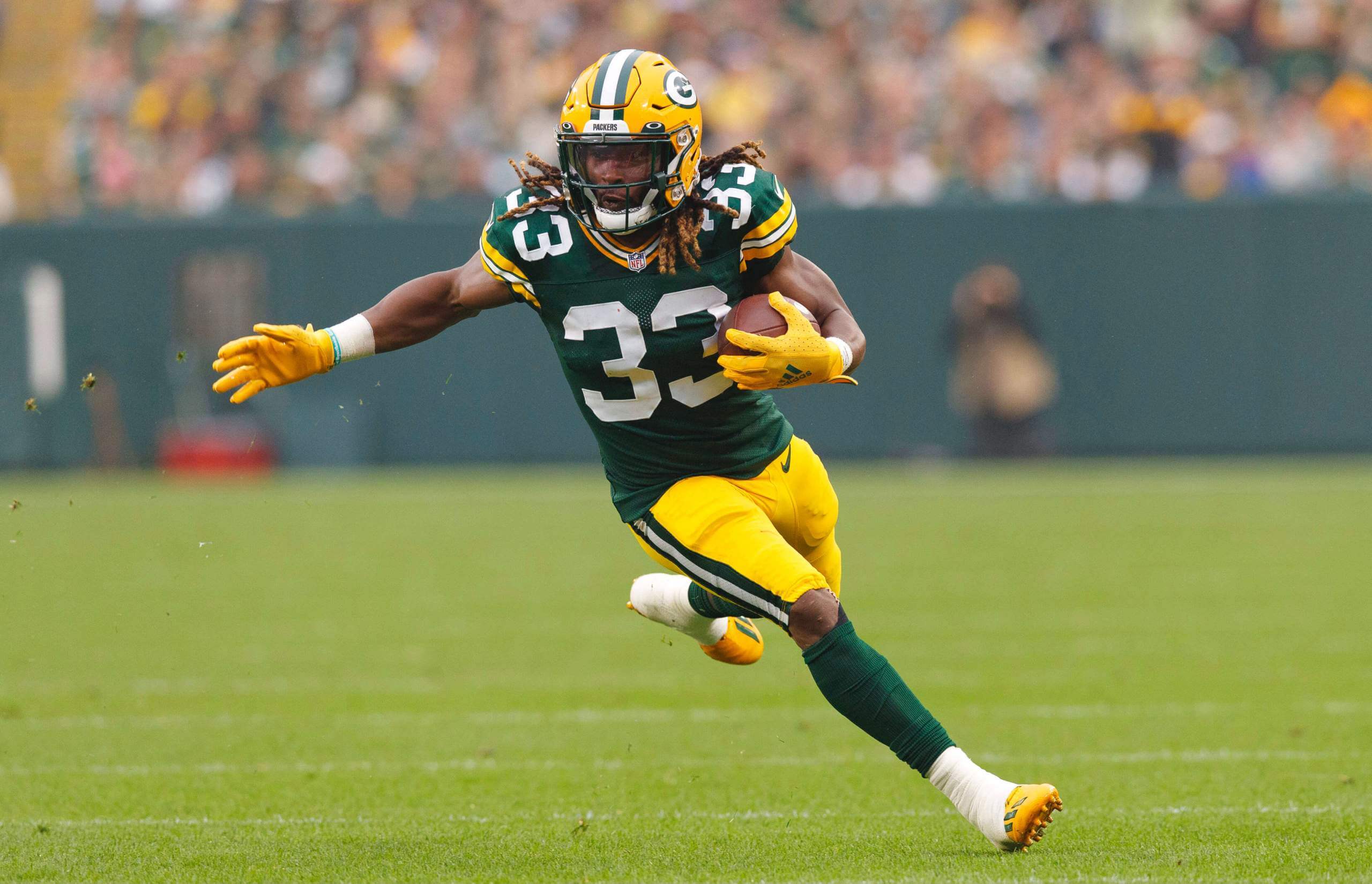
Now then: At first glance, there’s nothing unusual about the photo above of Packers running back Aaron Jones, taken during yesterday’s game against the Steelers. But if you zoom in for a closer look, you can see that a very minor, very subtle adjustment has been made to his jersey:
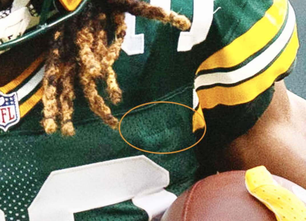
That faint zigzag stitching is where Green Bay’s equipment staff has sewn a pocket into the inside of Jones’s jersey. As you may recall, Jones lost and then found a necklace pendant containing his late father’s ashes during an earlier game this season. So Packers equipment manager Red Batty added the pocket this week so Jones could keep the ashes on his person without fear of losing them. (You can see another photo of the stitching here. Unfortunately, I’m not aware of any photos showing a view of the pocket itself.)
Jones thus joins the very elite fraternity of uniformed sports personnel who’ve had pockets added to the inside of their jerseys. The most famous member of that club is probably Orioles skipper Earl Weaver, who had an inner pocket added to his jersey for his cigarettes. (It’s even shown as part of his statue at Camden Yards.) Two other O’s managers had the same modification made to their jerseys: Cal Ripken Sr. (here’s an inner shot) and Lee Mazzilli (inner shot). Those are the only other inner pockets I can think of. Am I overlooking anyone?
In other words from around the league yesterday:
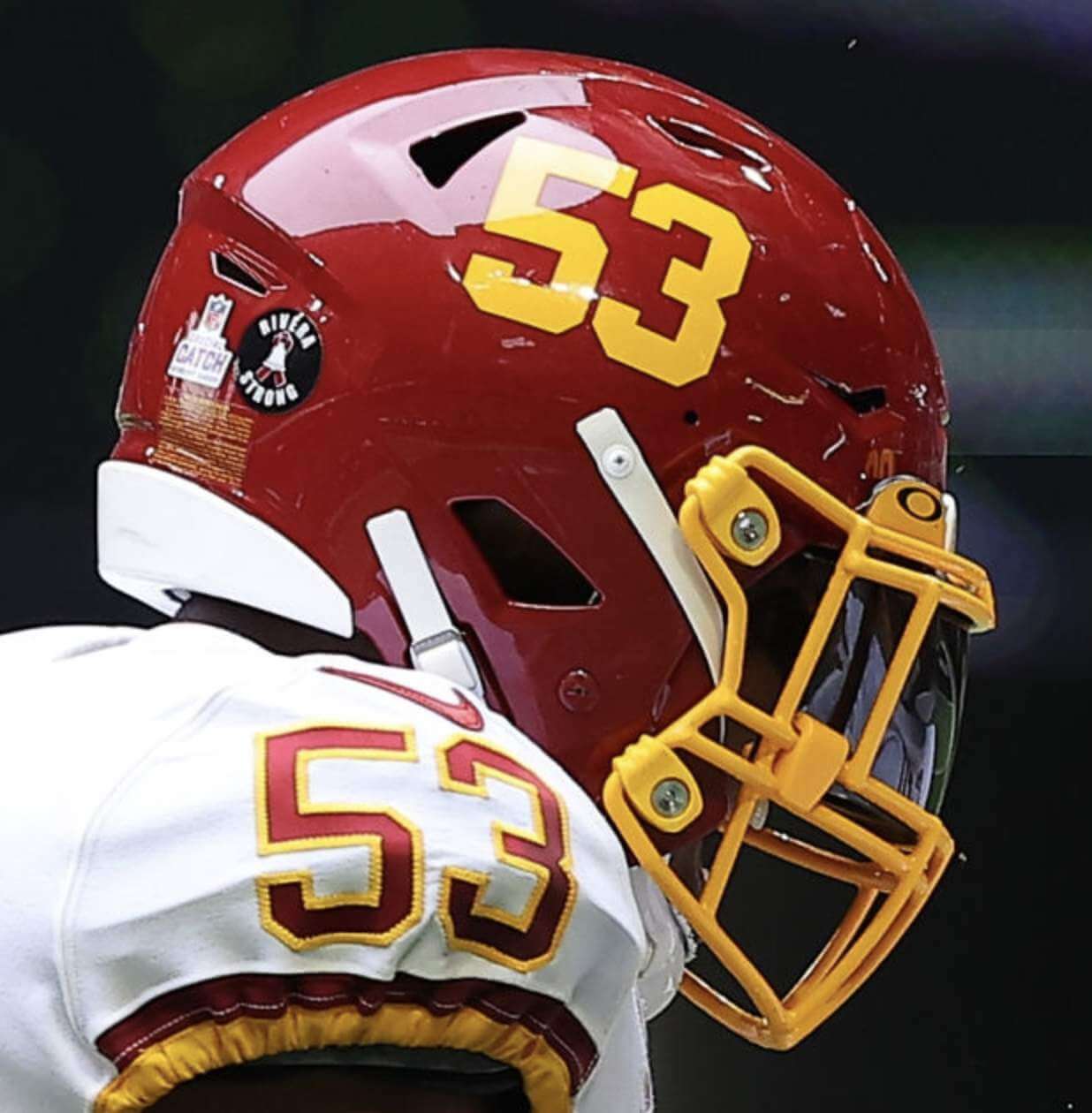
• Since this was the first October weekend of the season, several teams were wearing cancer-awareness accessories, including rear-helmet decals, captaincy patches, sideline attire, pink ribbons, and more. In addition, Washington added a “Rivera Strong” rear-helmet decal for head coach Ron Rivera, who has been battling cancer:
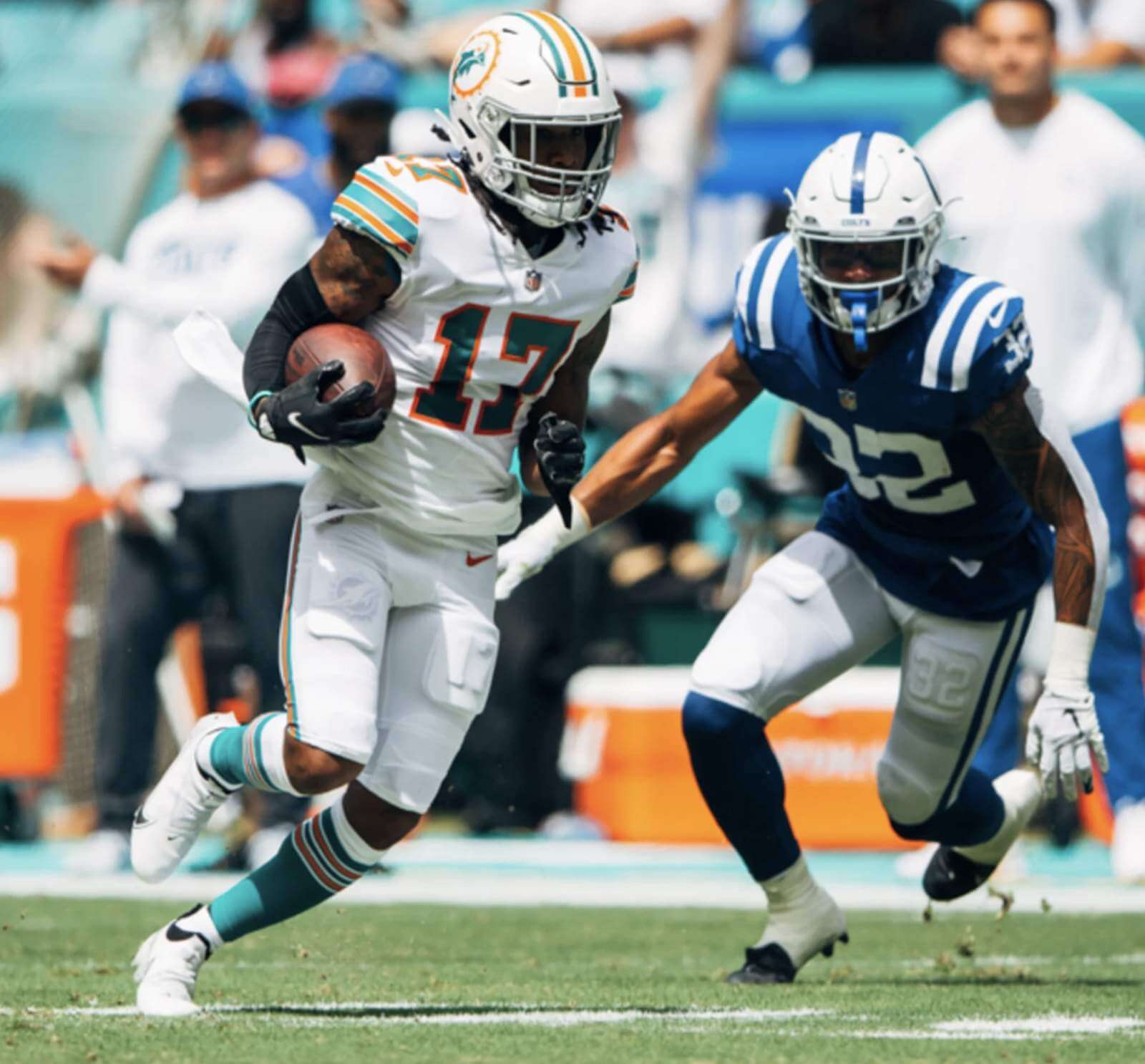
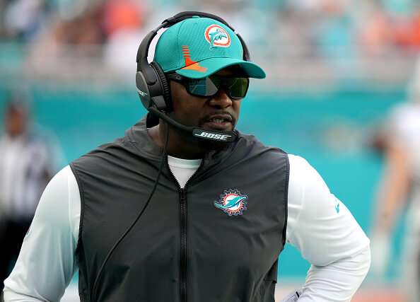
• The Dolphins wore their beautiful white throwbacks. Yes, I know, they should wear them all the time (lots of additional pics here):
• In that same game, Miami coach Brian Flores wore a throwback-logo cap with a non-throwback vest:
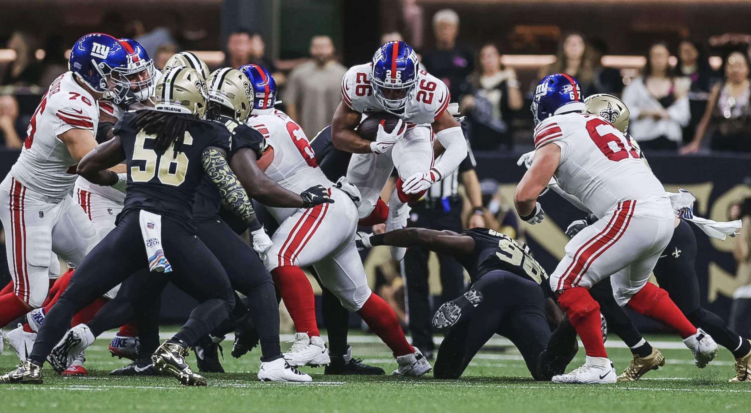
• After three preseason games and three more regular season games, the Giants finally debuted their new red-striped road pants against the Saints, who went mono-black:
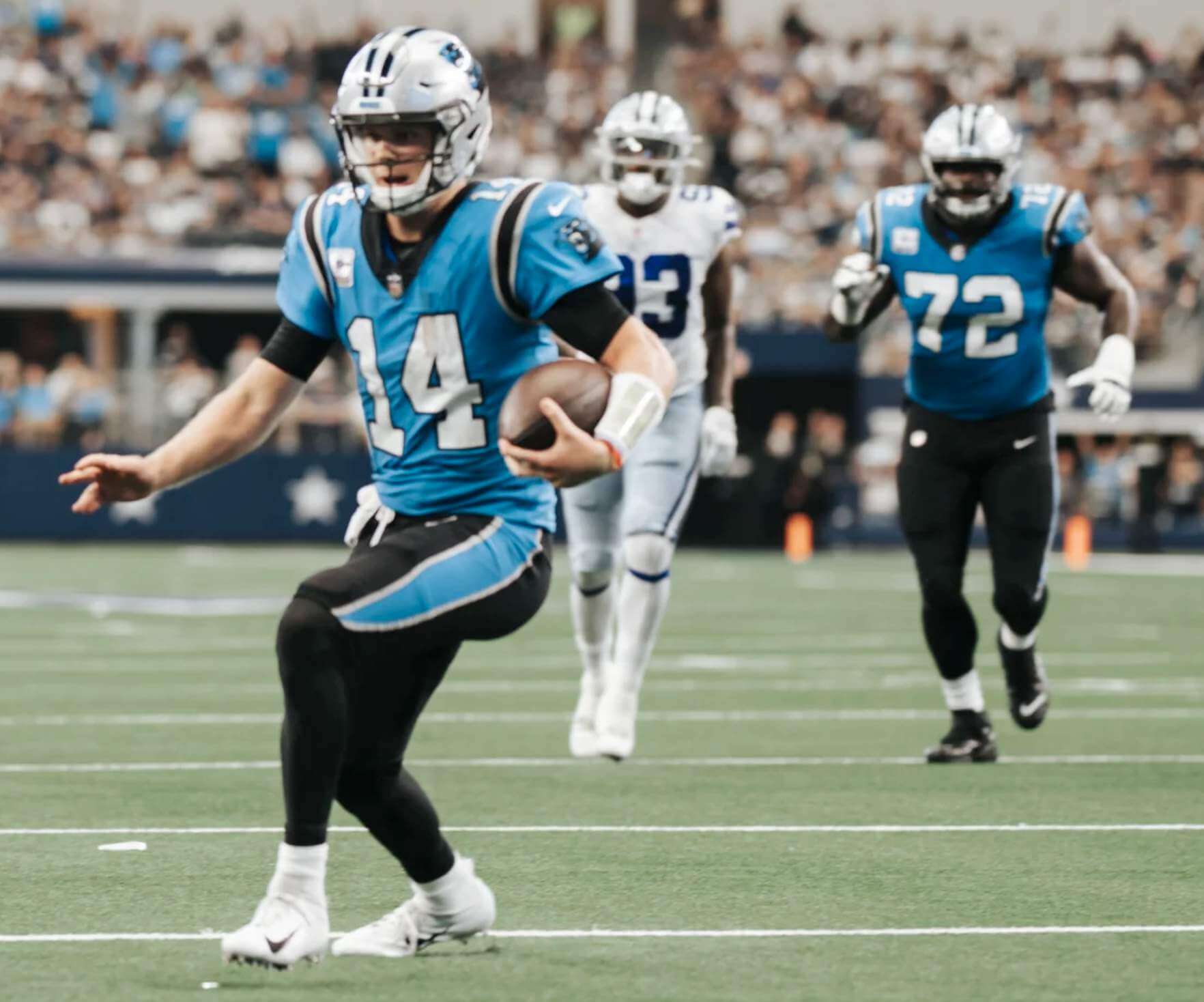
• The Panthers wore their blue alternate jerseys (paired with black pants, ugh) on the road in Dallas:
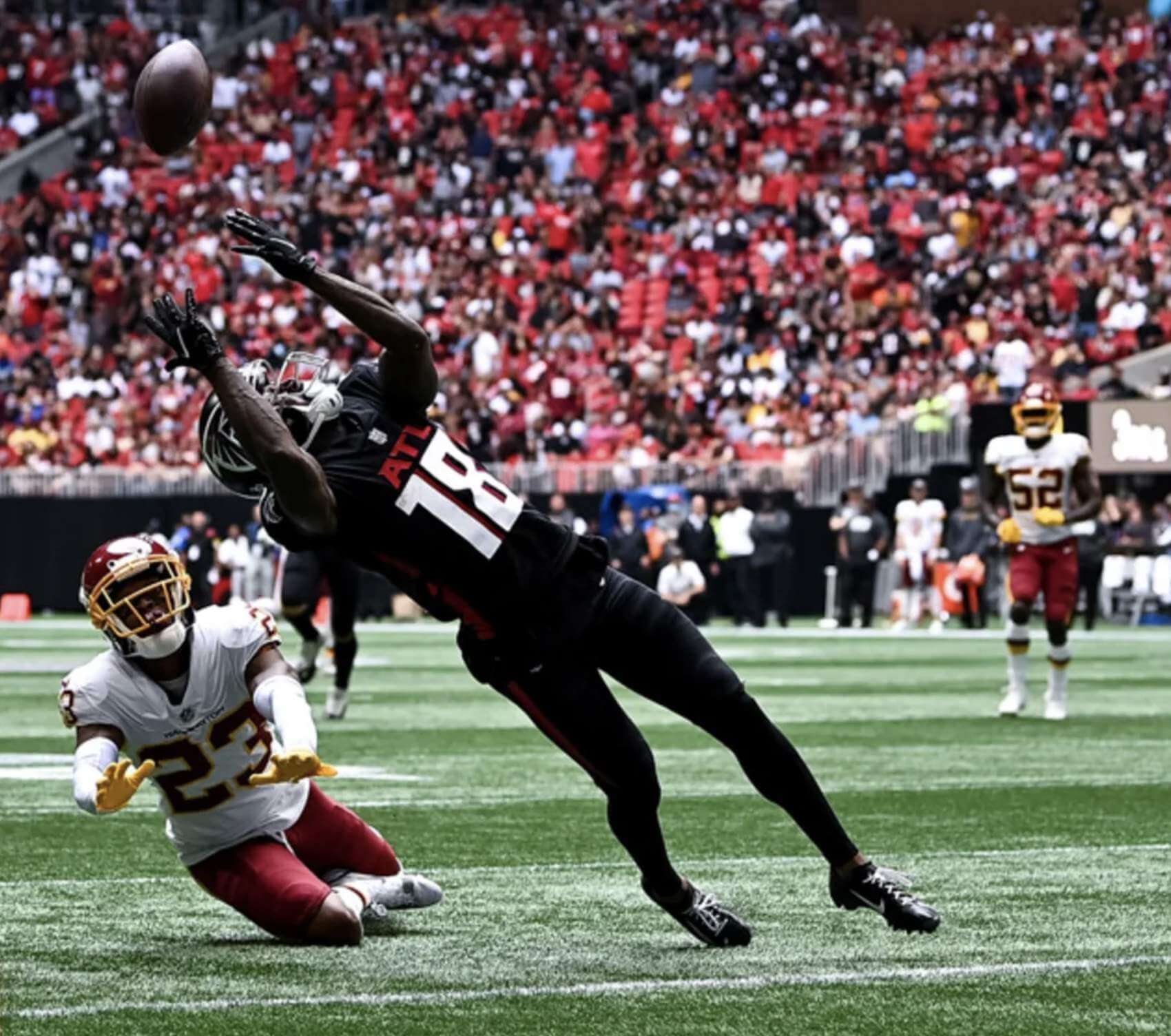
• The Falcons went mono-black:
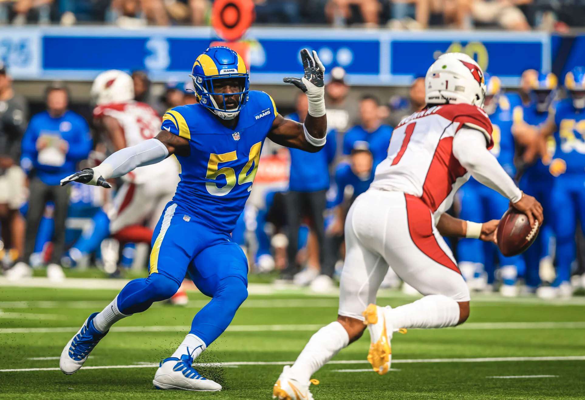
• Brutal-looking game in L.A., as the Rams went mono-blue against the Cardinals:
• During the offseason, KC hinted that they might bring back their mono-white look — a combo that they haven’t worn since 2018. Hasn’t happened yet, though. They’ve now worn white jerseys four times this year — twice in the preseason and twice in the regular season — and have gone with the red pants for all of those games, including yesterday’s game in Philly (which was not a bad-looking game):
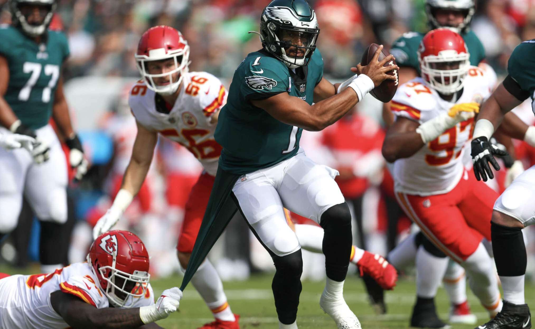
• Speaking of that KC/Philly game, tight end Travis Kelce plays for KC and his brother Jason Kelce plays center for the Eagles. Their mother wore a Frankenjersey for the occasion, and the rest of their family wore jerseys from the family’s hometown high school team:
What do you do when your two sons are playing each other? Split jersey of course!!
“I’m cheering for all the offense.” 😂 @FOX29philly
(Also check out the rest of the Kelce squad, rocking the old high school jerseys!) pic.twitter.com/xEttZubHbz
— Breland Moore (@BrelandFOX29) October 3, 2021
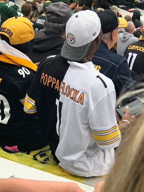
• Speaking of Frankenjerseys, check out this Steelers fan in Green Bay:
• Broncos quarterback Teddy Bridgewater began the game wearing white gloves but changed to orange in the second quarter:
From White to Orange @UniWatch @PhilHecken pic.twitter.com/nMFH7oBgD6
— Marcus Hall, SHRM-CP (MA-HRM in progress…) (@b_fianchetto) October 3, 2021
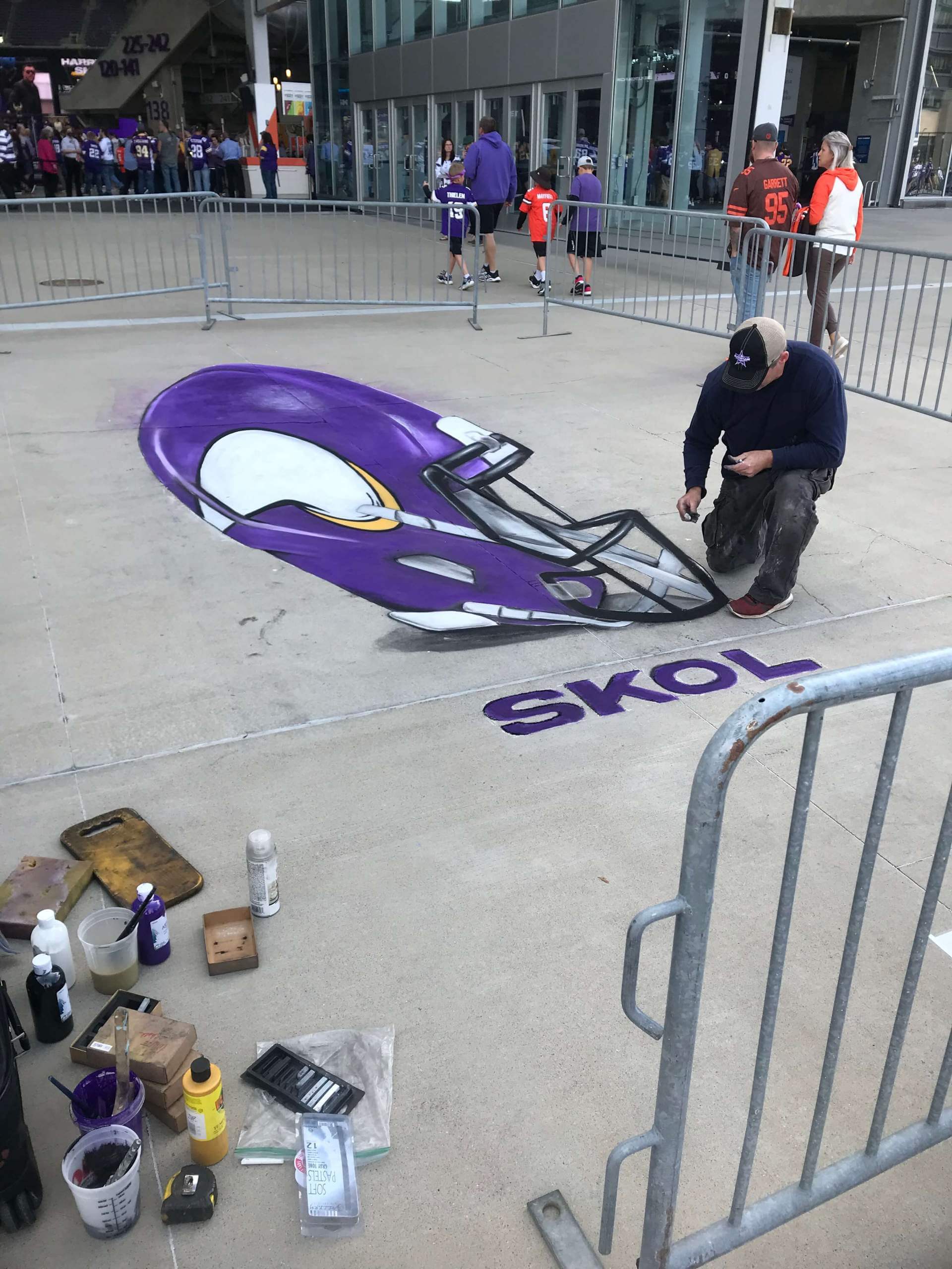
• Someone was making a very nice illustration outside the Vikings’ stadium:
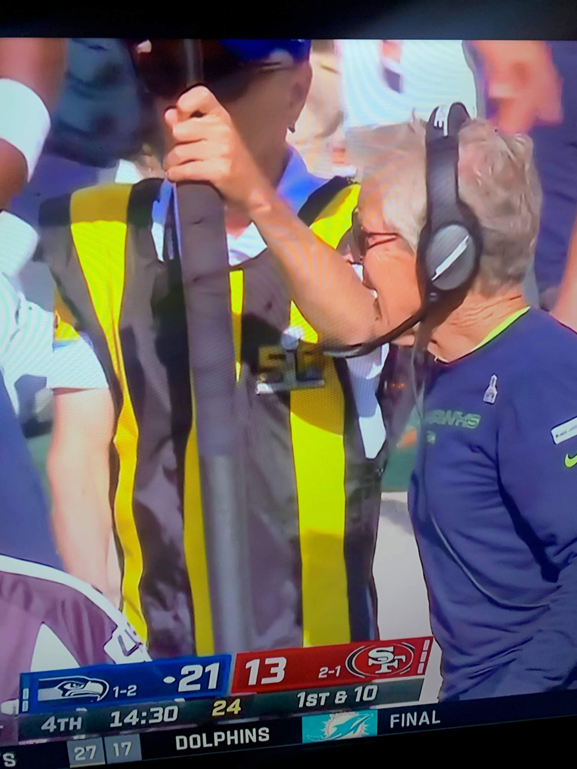
• Nearly six years after Super Bowl 50, a member of the 49ers’ chain gang is still wearing the SB 50 patch:
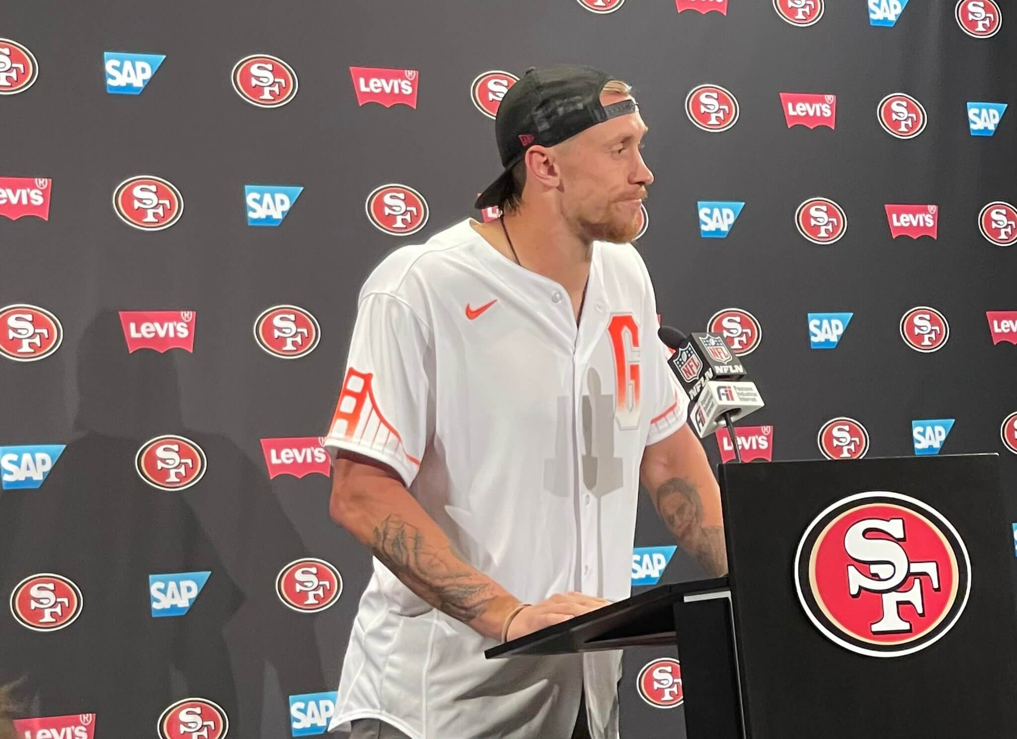
• Speaking of the Niners, tight end George Kittle wore a San Francisco Giants City Connect jersey for his postgame presser:
• Three teams wore white at home: the aforementioned Dolphins plus the Jets and, of course, the Cowboys.
(My thanks to all contributors, including Joseph Bailey, Marcus Hall, Jerry Kulig, Patrick Wieboldt, @gimmethewooby, @Spesh98, and our own Jamie Rathjen.)
Click to enlarge
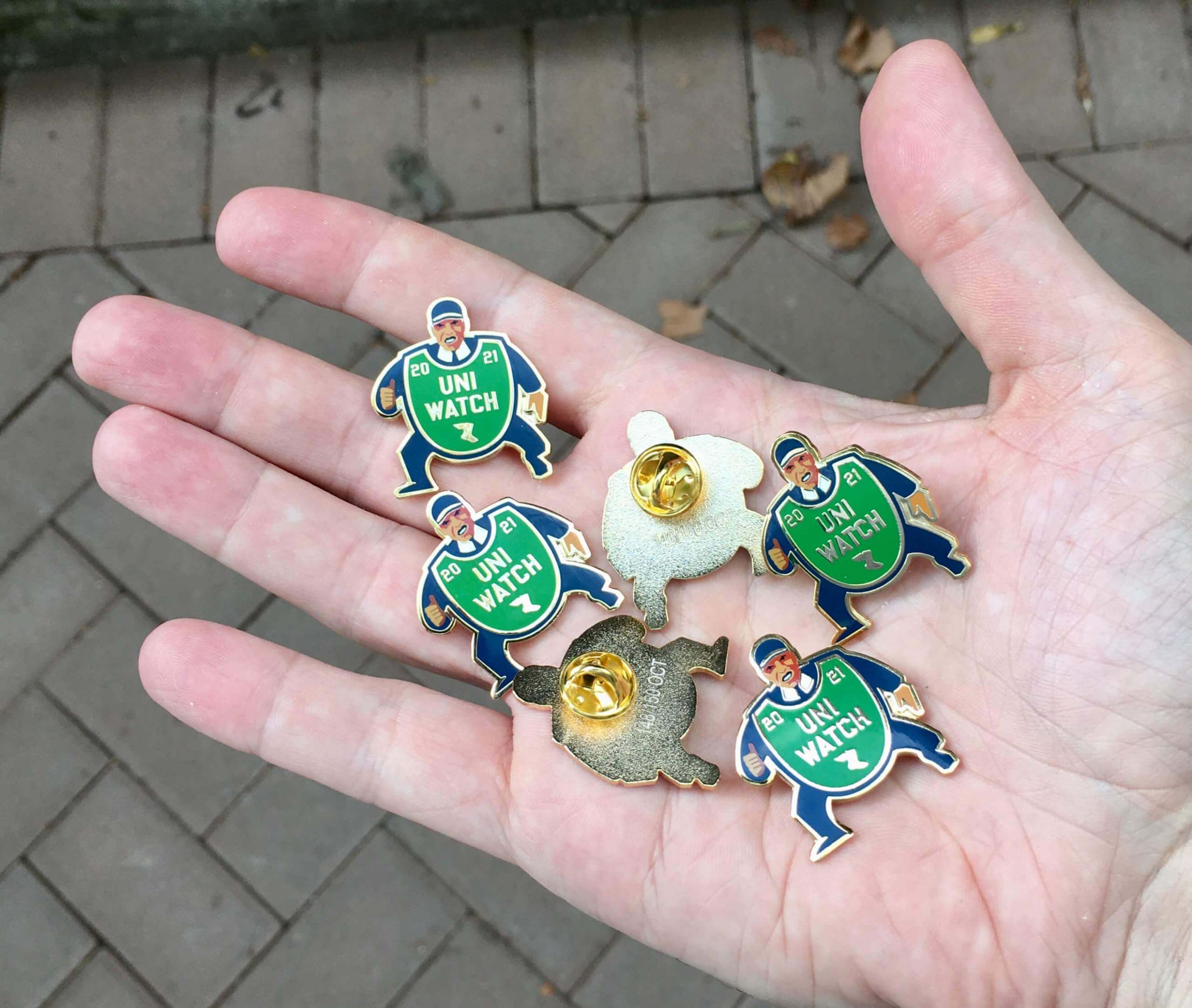
October pin reminder: In case you missed it on Friday, the Uni Watch Pin Club’s design for October is a fantastic depiction of a baseball ump with an old-fashioned balloon-style chest protector. You can almost hear him yelling, “Yer out!” Perfect for the playoffs and World Series.
Here’s a closer look (click to enlarge):
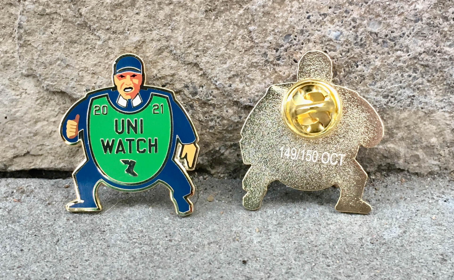
Sensational, right?
This pin was produced in a numbered edition of 150. As of this morning, there were only 40 remaining. You can order yours here while they last.
We’ll also have our annual Uni Watch Press Pin later this month, so stay tuned for that!
My thanks, as always, for your consideration of our products.

Click to enlarge
Thrift score: As I mentioned at the top of today’s entry, I did some thrift/vintage shopping over the weekend. I purchased only one item — the LP shown above, because the cover design was just too good to pass up. So perfect! I really love it.
I saw several other items that were really good examples of design. I didn’t purchase them, but I thought they were worth photographing and sharing, starting with this amazing 1970s box of laundry detergent:

I also liked this set of pilsner glasses with colored bases:

And there’s something very pleasing about this rotating snack tray, which I was sorely tempted by but managed to resist:
There was more, but that’s enough for now.
The Ticker
By Jamie Rathjen

Baseball News: Pirates SS Oneil Cruz was wearing some of his equipment from Triple-A Indianapolis yesterday (from James Kulha). … Mets 2B Javier Báez was wearing the wrong cap at his own postgame press conference (from Ravi Meibelbane).

Football News: Left over from Saturday: Colgate, Rice, and UCLA players, among others, debuted a new Riddell helmet, the Axiom. Among its quirks is that it doesn’t have the top bars of the facemask (from multiple readers). … Reader Marcus Hershberger was at the Ball State/Army game and noticed that Ball State TE Drayton Charlton-Perrin’s NOB is “C-Perrin.” … Florida is wearing throwbacks next week (thanks, Phil). … The CFL’s Toronto Argonauts recently said they’re “celebrating 1991” at an upcoming home game, so they might be wearing throwbacks as they wore the helmet decals during practice (from Wade Heidt and Moe Khan). … Wade also has Canadian college uni tracking in yesterday’s comments.

Hockey News: The AHL’s Cleveland Monsters have a 15th-anniversary logo (from Wade Heidt). … In the same league, the Charlotte Checkers have a checkered red line that probably appeared sometime in the past few years (from John Muir). … Also from Wade: The WHL’s Swift Current Broncos have a new third jersey.

Basketball News: Here is Lakers SF LeBron James’s reasoning for wearing No. 6 (thanks, Phil).

Soccer News: Premier League teams wore black armbands, I think in memory of English striker Roger Hunt, but apparently no other English men’s or women’s teams did except Liverpool’s women’s team — the club that Hunt primarily played for. … The Vancouver Whitecaps brought in a large orange shirt on Saturday for the National Day of Truth and Reconciliation, which was Sept. 30 (from Wade Heidt). … Vanderbilt wore pink shirts on Friday. … Portland Timbers fans brought banners and other items yesterday to show solidarity with NWSL players after emerging stories of player abuse essentially set American soccer on fire last week.

Grab Bag: College field hockey teams that wore pink socks or accents included James Madison, Louisville, and Maryland. … Virginia field hockey wore warm-up shirts featuring the mental health charity Morgan’s Message, which specifically focuses on NCAA athletes. … Meanwhile, Colorado volleyball had pink court lines. … The W Series, a Formula One support series, is also going to have some pink elements, but it next races Oct. 23-24. … A Ukrainian airline, SkyUp, is going to stop making its female flight attendants wear skirts and high heels (from Kenneth Traisman). … Washington’s Metropolitan Police gave “ribbons of valor” to officers who responded to the Jan. 6 Capitol insurrection (from Timmy Donahue).
I’m getting a forbidden warning on the Earl Weaver statue link.
New photo link now swapped in. Here it is, so you don’t have to scroll back up:
link
I love the Giants’ new road pants. It’s great that the stripes are now consistent across the whole uniform, and the white/red really makes the bright blue helmets pop.
I know yesterday I should have hated visually when my 2 favorite teams, the Rams (growing up) and Cardinals ( where I’ve lived for the past 31 years), played. Two of the worst uniforms, however the Rams are growing on me. I now like the helmet color and new horn design. If they would have worn yellow pants they would have been pretty good, even with the stupid yellow to white fade on the numbers. The Cardinals are beyond hope without a complete uniform redo. However the contrast of the bright royal blue vs the red looked good under the Southern California sunshine. Yeah I know Sofi has a roof, but the translucent roof really does work letting the sunlight in.
Agreed. I thought the high contrast between the two uniforms made for a great looking game with LA-AZ. I realize traditionalists won’t agree. That’s OK.
Well it looked awful, but you are 100% right it has potential to be great matchup with the contrasts involved. The Rams with bright blue and yellow, but with a sane looking jersey and yellow pants, matches up great against the Cardinals white helmet, white jersey with red trim, and red pants.
It’s been 23 years since they both looked “right”, but this could be great matchup, even more than that past because the Rams bright blue helmet is an improvement from the navy one.
link^4
So now that the Bungels have finally made a bit of upgrade, I actually thought they looked pretty good on Thursday night, which NFL team is most in the need for a change?
I’m thinking it’s the Broncos, more than the Cardinals, but I’m probably in the minority on that one.
For the Carolina Panthers. I think the blue over black would work better worn with a black helmet than a silver one.
Respect that the Panther have retained their classic look for their primary uniforms over the years and wish more teams would do that. If the Panthers ever wanted to change their primary uniforms thinking black helmet/blue jersey/black pants would be a good primary look for them.
Jerry Richardson, the Panthers’ founder who owned the team until a couple of years ago, was apparently very much against the Panthers changing uniforms, believing that keeping a consistent look helped build tradition. Over time, the blue alternate was added and the logo updated somewhat, but the basic design remains pretty much the same. The black pants have been added to the mix under new owner David Tepper but I’ve not heard any indication that he plans on messing with the uniforms further.
The Panthers’ uniforms are underrated. I think they have one of the Ten Best looks in the NFL.
About the Toronto Argonauts throwback. That gaMe is Wednesday night hosting the Ottawa Redblacks. Celebrating the 1991 Grey Cup champs.
The graphics on their social media have been early 1990s style. They have A graphic using Ottawa’s old helmet/logo that they wore in 1991. It would really be icing on the cake if Ottawa is arranging to wear 1991 Rough Riders throwbacks, which is a really awesome uniform. Probably not doing so and just wishful thinking on my part.
link
It’s weird that they’re using a modern helmet graphic fo the ‘91 shirt giveaway
Right. The “A” doesn’t look like that on the helmet either. There is no white outline.
If they were doing a true throwback they need to put the white mask on the helmet. Photos in practice show the usual blue mask on the helmet.
Hey Paul-
You ever written anything about how directional-facing helmet logos force teams to make two different versions? First thought about it watching Ravens game yesterday. I imagine there are alot of quirks here.
link
link
One of the many reasons the Ravens need a redesign.
-Purple stripe on helmet doesn’t match the purple in the uni (IMO). Ugh
-Drop shadow. Ugh.
-Purple, drop shadow numbers over black pants. Ugh
-Purple over black. Ugh.
-Black over purple. Ugh.
-Mono-purple. Ugh, but could work. Maybe.
-The once-used gold (ok, mustard) pants, if done right, could be part of a unique, classic look
The red detail in the bird’s eye really bugs me.
With a few exceptions, helmet decals fall into two categories: 1. Identical stickers on both sides, and 2. Mirror image stickers on either side. The exceptions are the Browns (duh), Seahawks (one wraparound sticker centered on the back), Bengals (six stickers centered on the median of the helmet), Chargers (whose numbers are identical, but thunderbolts are mirrored), and the Ravens and Chiefs, who combine a mirrored element (the bird, the arrowhead) with lettering. The Ravens’ “B” is slanted either to the left or the right depending on the side of the helmet. Fun fact: Pat Patriot was identical on both sides of New England’s helmet, even though he was not symmetrical. This was also true of the Broncos’ “D”, but obviously it had a typographical element.
We have the same rotating snack tray, except ours is in wonderfully 70s shades of brown and orange! We also have a few bowls and dishes from the same set.
An interesting note about the new Giants away uniforms is that the helmet color (blue) does not show up anywhere on the jerseys, pants, or socks, even in trim (except for the NFL logo, of course). I wonder if this has happened before.
Also appears on the maker’s mark for the pants:
link
I wonder how many NFL uni combos there are where the jersey and pants are the same color but the maker’s marks are different colors.
In 1983, the USFL Arizona Wranglers debuted with copper helmets, while the rest of the uniform consisted of blue, yellow and a touch of red.
While I love the Dolphins’ throwbacks, the sheer size of the NOBs has always bothered me. The letters are just too darn big. Does that bother anyone else or am l just weird?
RE: Frankenjerseys – There was a Brady in NE last night (probably more than the one shown on camera).