By Phil Hecken, with Quinn Zielonko
Follow @PhilHecken
Good Saturday Morning, Uni Watchers! I hope everyone had a good week. We made it.
A couple months ago, I began running series of “ColorTown” concepts from Quinn Zielonko — back in March, Quinn showed off his first 10 (of 40) — if you missed that (which also sets this post up), you can click here. A couple months later, Quinn showed off the second 15 concepts (click here). And, today Quinn is back with the final 15 in the series (for a total of 40).
Z89Design ColorTown Concepts
by Quinn Zielonko
The #ColorTown series seen here is actually an expansion of my main 160 jersey series. After completing that in December, I felt like I wanted to round out each team’s set with a less traditional look, so I set two rules:
1. The primary color must be different than any used in my main series. (A big challenge!)
2. Each jersey must incorporate some design element that references the team’s locale.
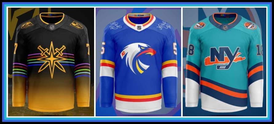
The inspiration for #ColorTown is a combination between the NFL’s Color Rush series and the NBA’s City Jersey series. The NHL has kind of done Color Rush already with the Reverse Retros, but I’d love to see the City idea at some point too. This aims to combine both! Like my main series, this features all 32 NHL Teams (including Seattle) + 7 Defunct NHL Teams (includes all cities that had an NHL team, but no longer do) + the Houston Aeros, to make an even 40 teams. Here are the final 15:
New York Islanders
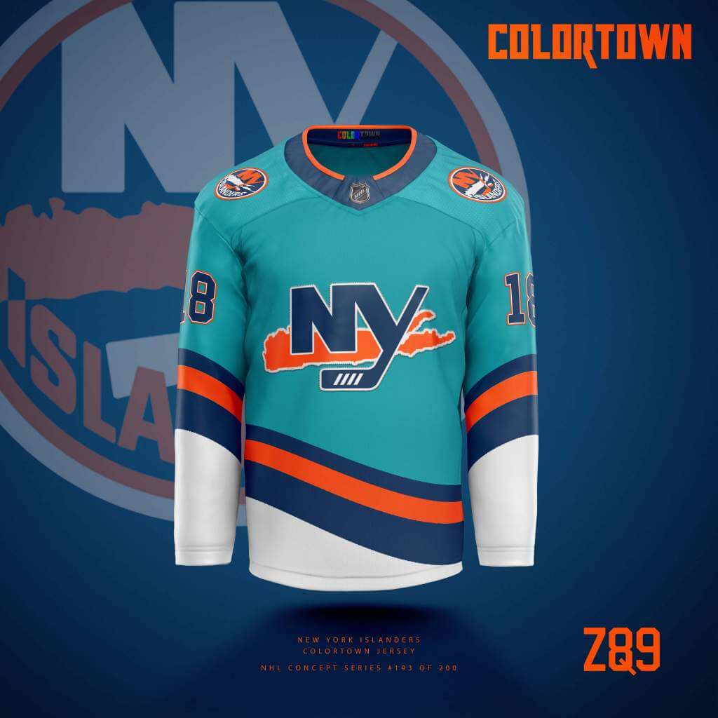
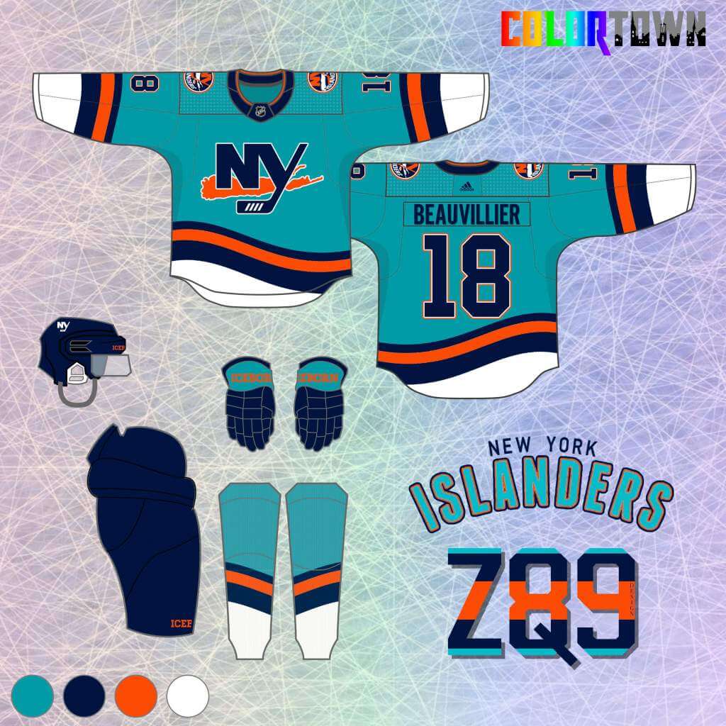
Teal was the only color that made sense, and I think it creates a “Reverse Retro” feel. I’d have loved if they’d done something like this. Also, this is the biggest the “Island” has ever been on a jersey, to complete the “town” element.
New York Rangers
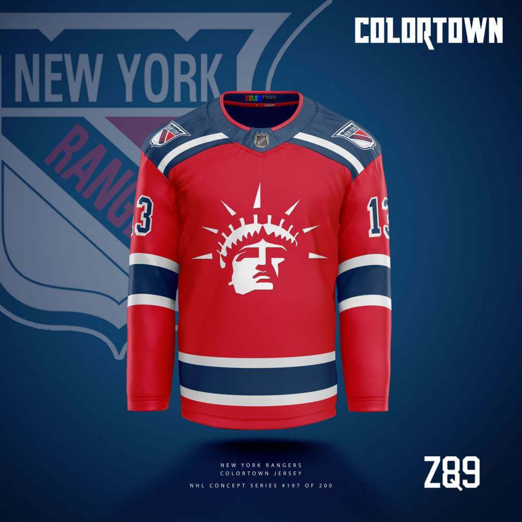
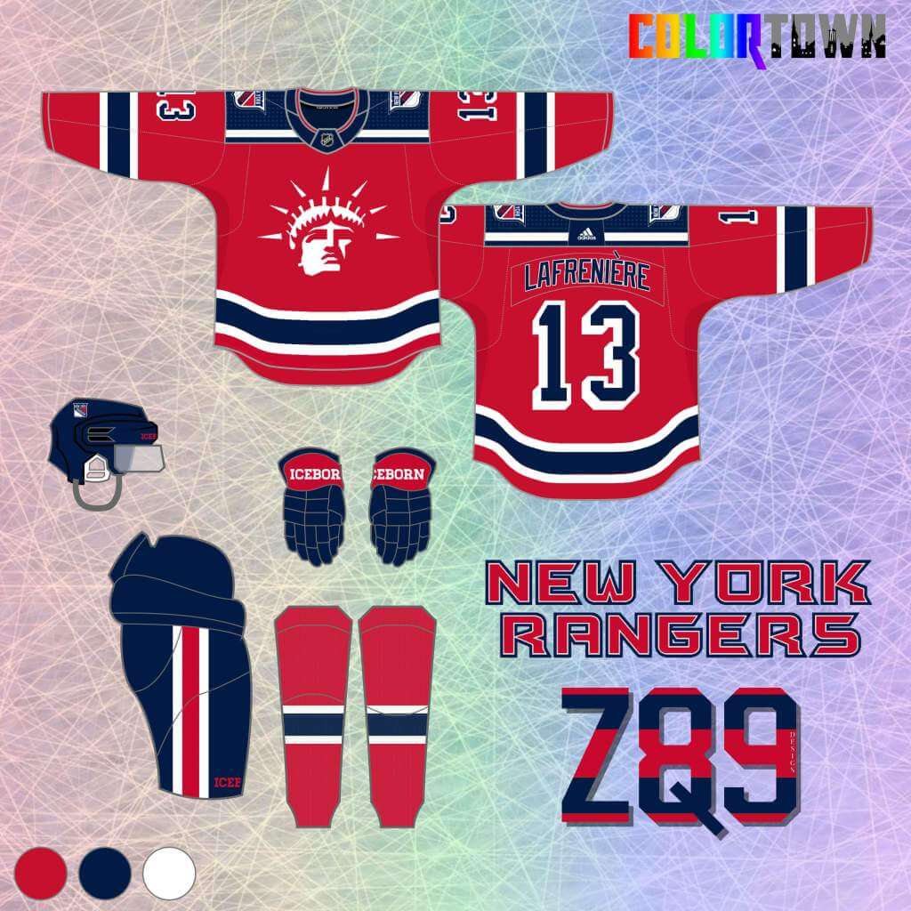
I was dreading having to put them in red, as I’d used their main blue, navy blue and off white in a previous series, but I’m pretty stoked with how it turned out! Lady Liberty is already a top tier “town” element, and I “minimalized” it here, combined with some simple, bold stripes.
Buffalo Sabres
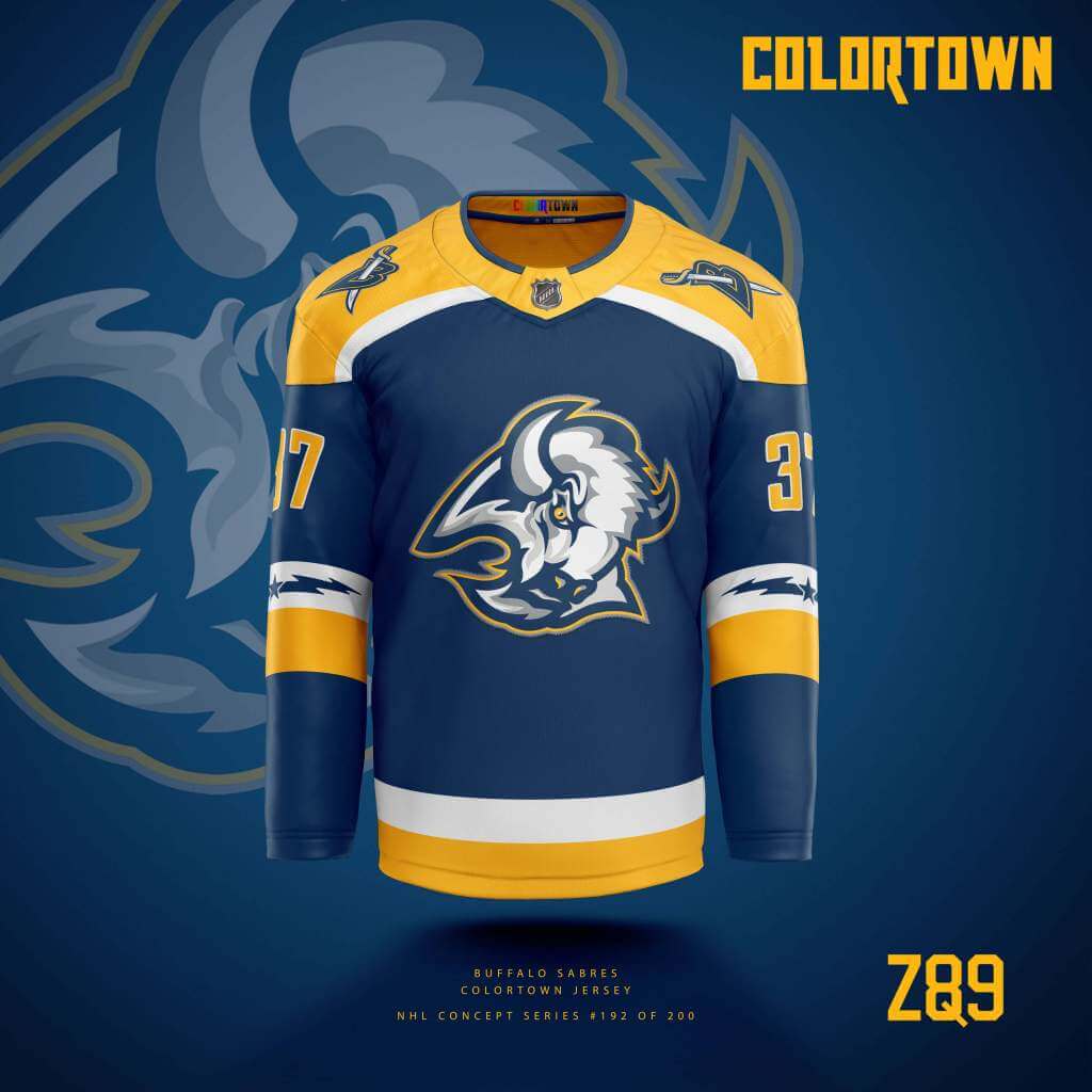
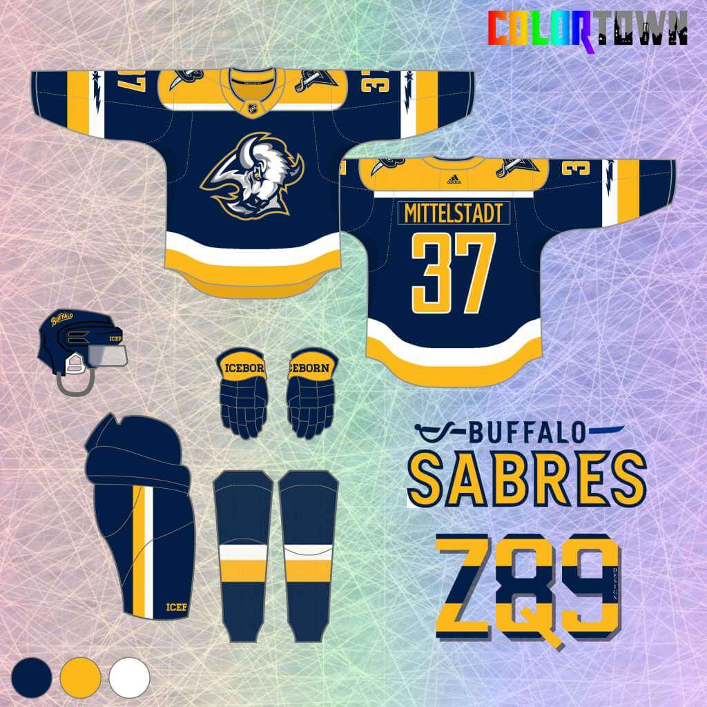
The Goat Head is back, but in navy, yellow and white. I also returned to royal with my Buffalo designs with previous concepts, so this keeps the navy around as an alternate. The flag pattern moves to the sleeves as the town element.
Cleveland Barons
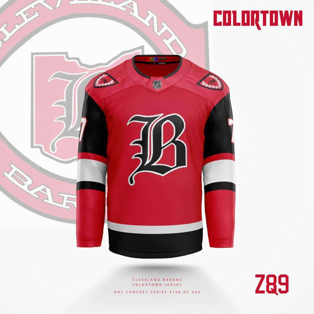
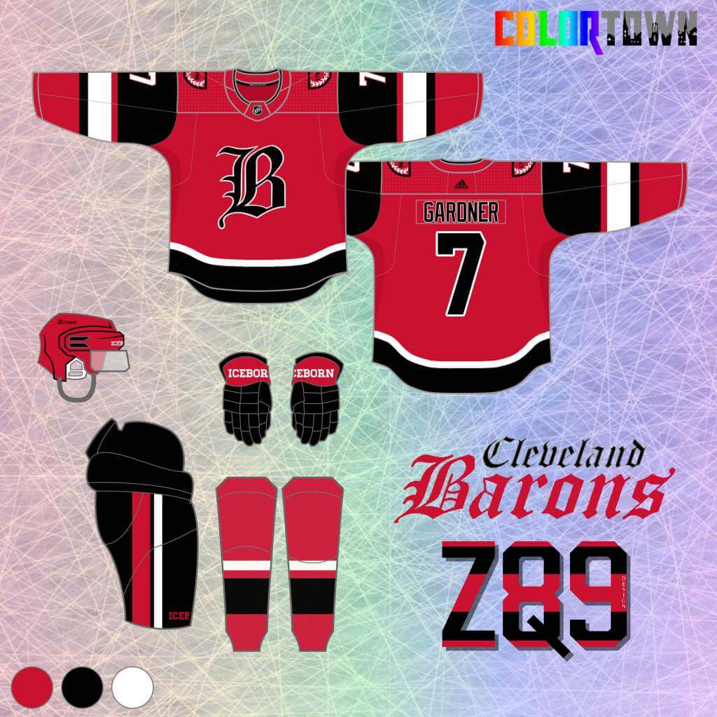
I return to the original color scheme here and an element of the city flag on the shoulders. This has a retro feel that echoes the original look, mixed with some modern touches.
Columbus Blue Jackets
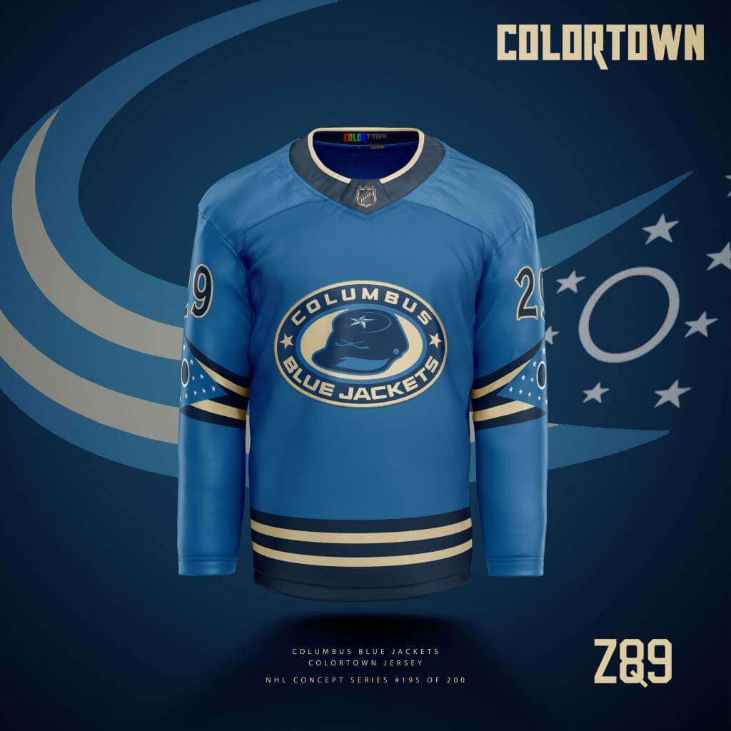
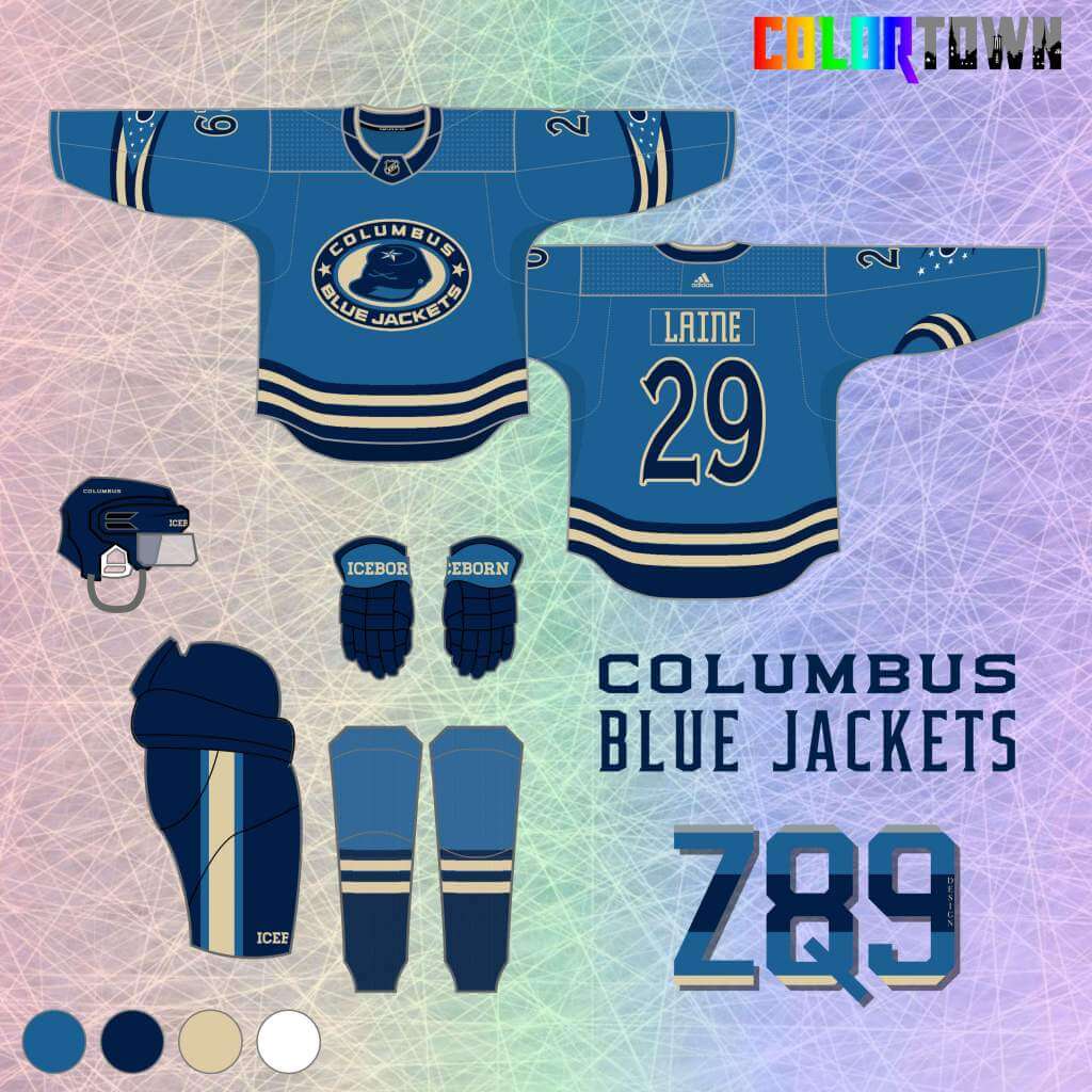
I’ve always thought their current logo was a little generic-looking, but what about as state-flag themed stripes wrapping around the arms? The under-used Union soldier cap logo is featured front and center here, and once again, NO RED!
Hamilton Tigers
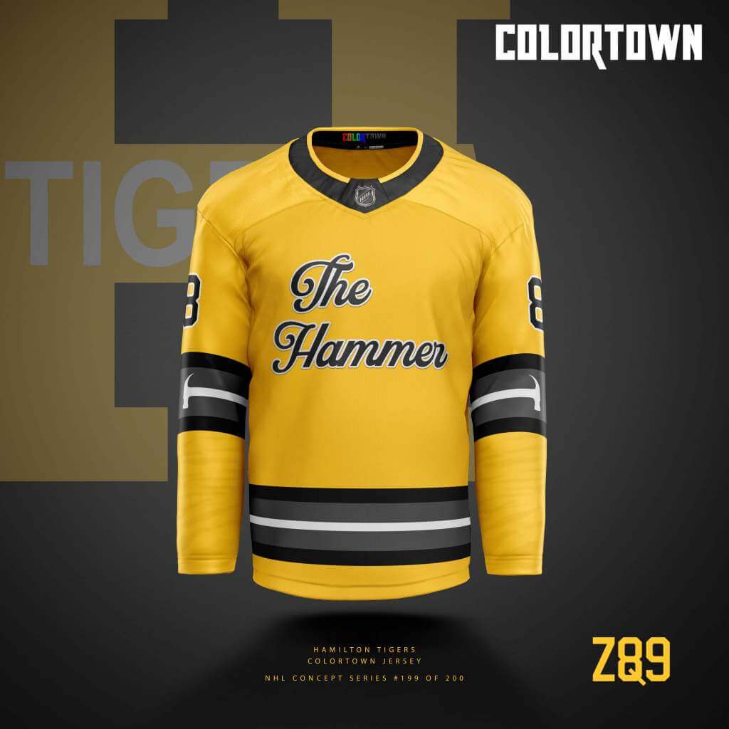
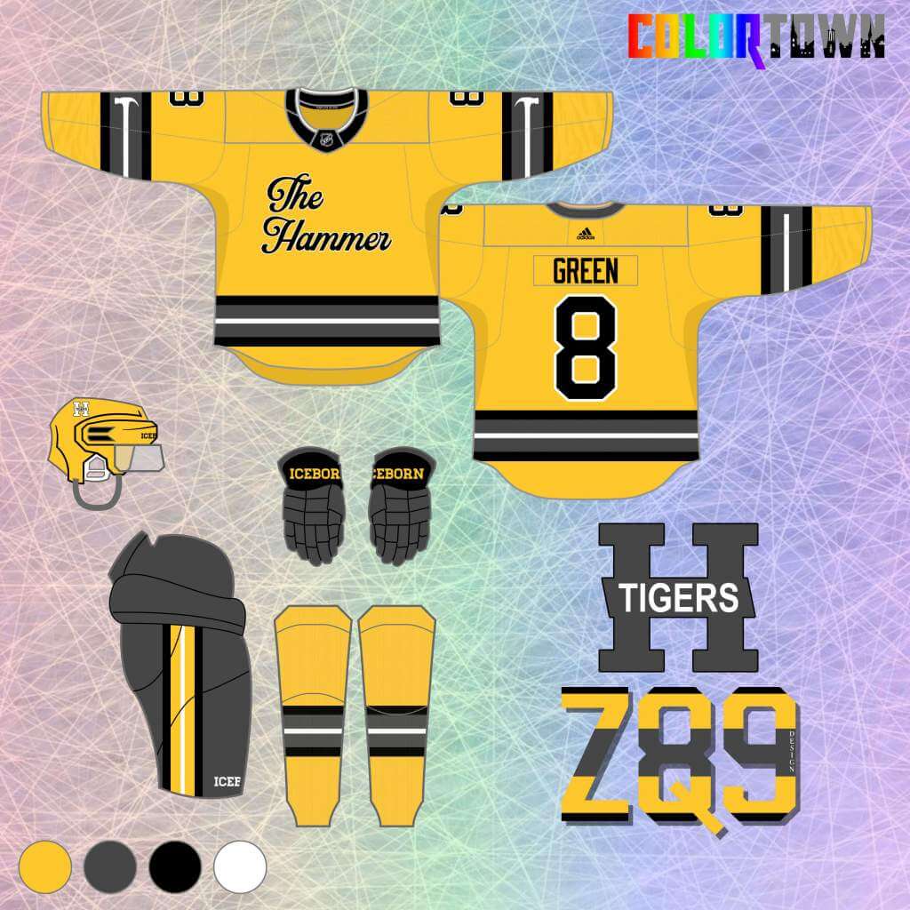
I went all out with “The Hammer” city nickname on this one, even using it in the stripes. We return to the team’s original yellow and black color scheme, along with charcoal gray.
Carolina Hurricanes
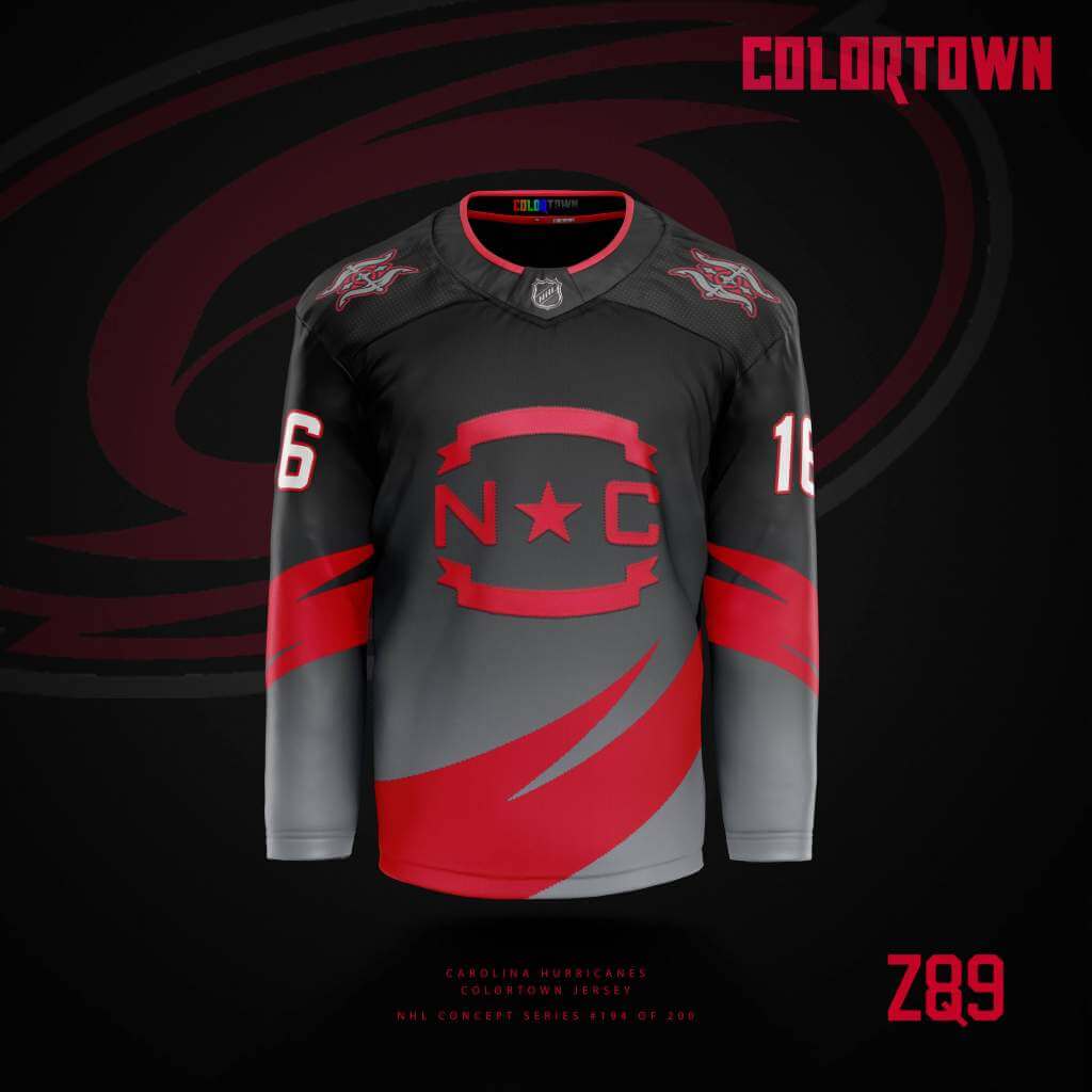
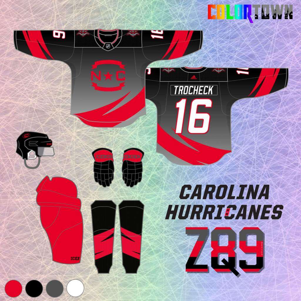
I used a cutout of the team’s primary logo as stripes here on top of a stormy gradient background. One of the never-used prototype logos is featured on the shoulders, while the state flag symbol comes front and center as the main crest.
Tampa Bay Lightning
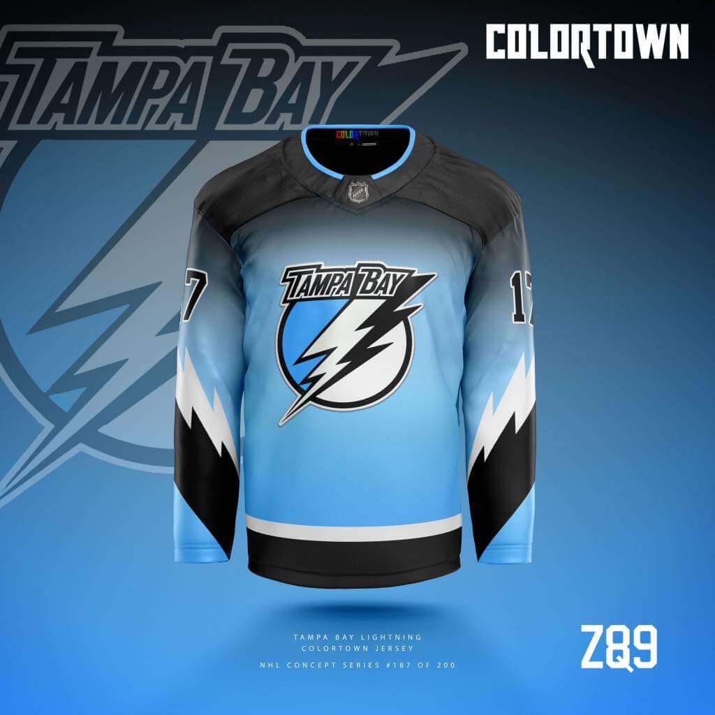
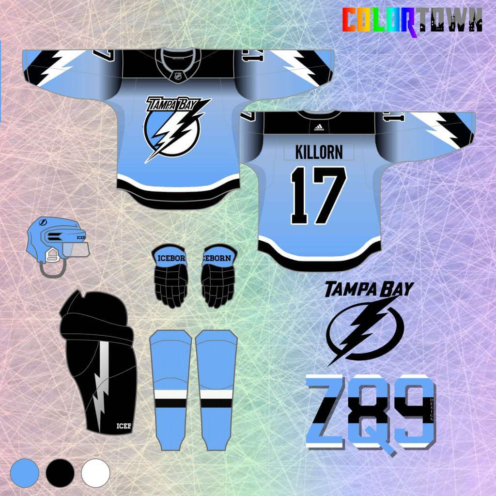
The town theme for this one is derived mostly from personal experience. I’ve been to Tampa several times, and it seems like at any given moment you can look over the ocean on a nice day and see a storm brewing. Distant Thunder is the theme!
Detroit Red Wings
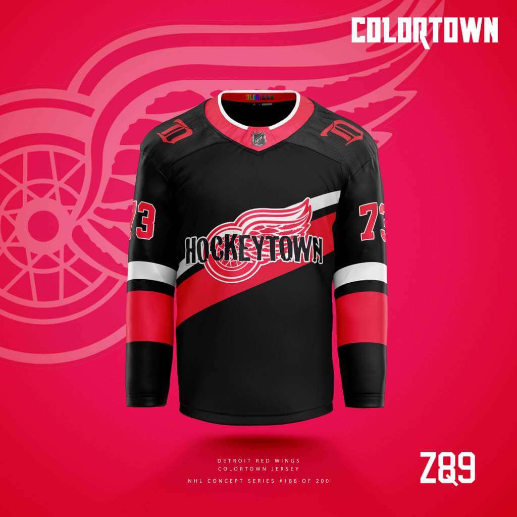
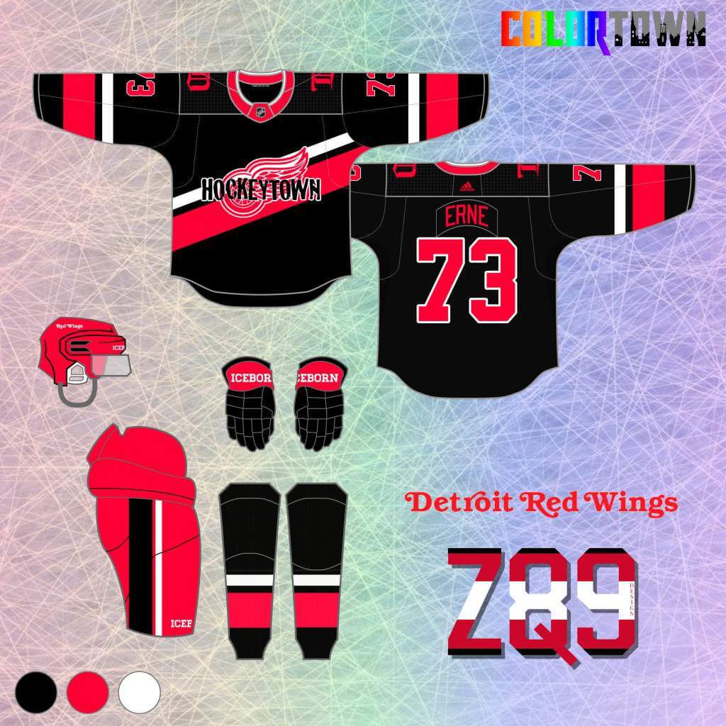
Rules of this series dictated I couldn’t use red or white as primary, so the fans voted on black! I used that classic 90’s “Hockeytown” logo, aptly, as the “town” element here. The slanted stripe aims to convey the wheel flying down the road.
Nashville Predators
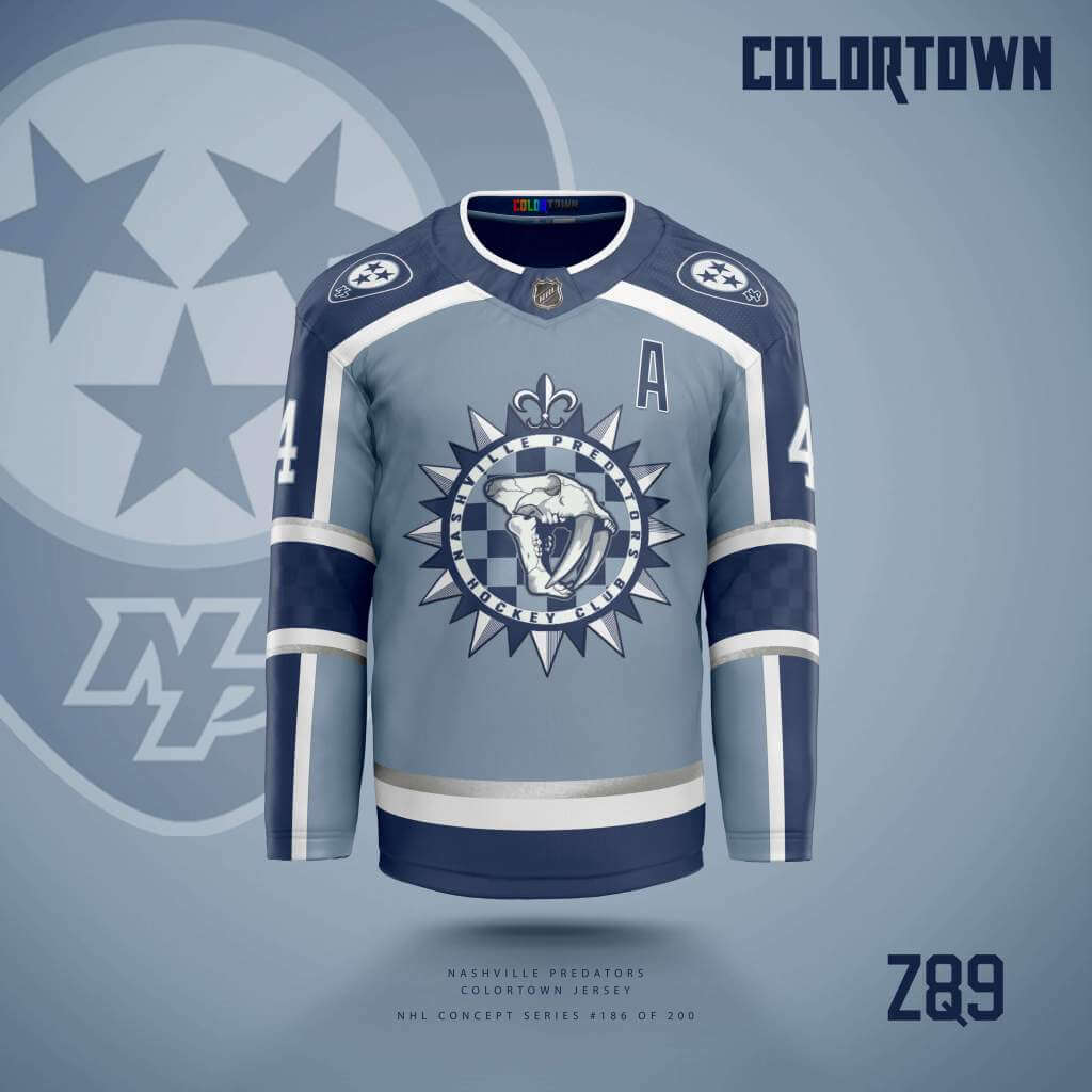
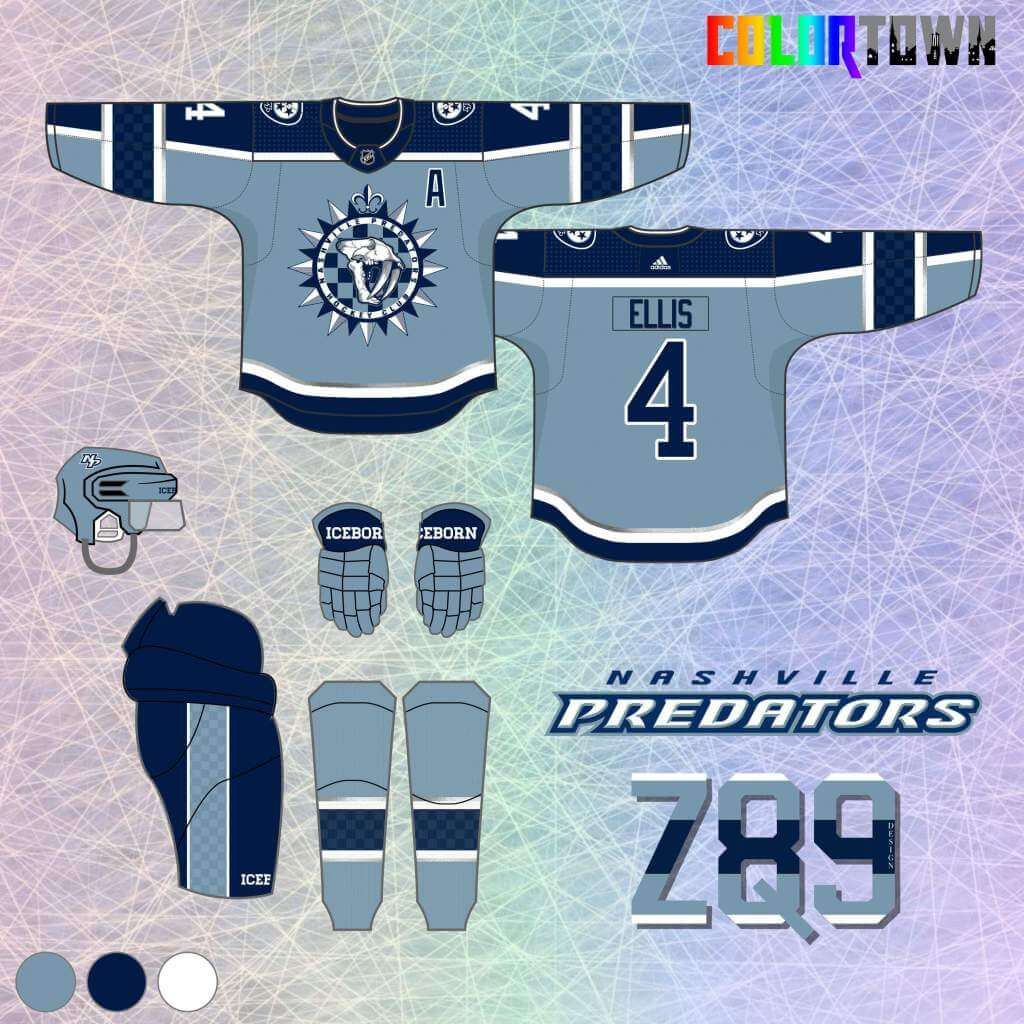
The crest is combo of the city flag and an old secondary logo. It also features an interesting steel blue color that I pulled from the original 90’s palette. Silver accents round out the scheme for a unique look!
Edmonton Oilers
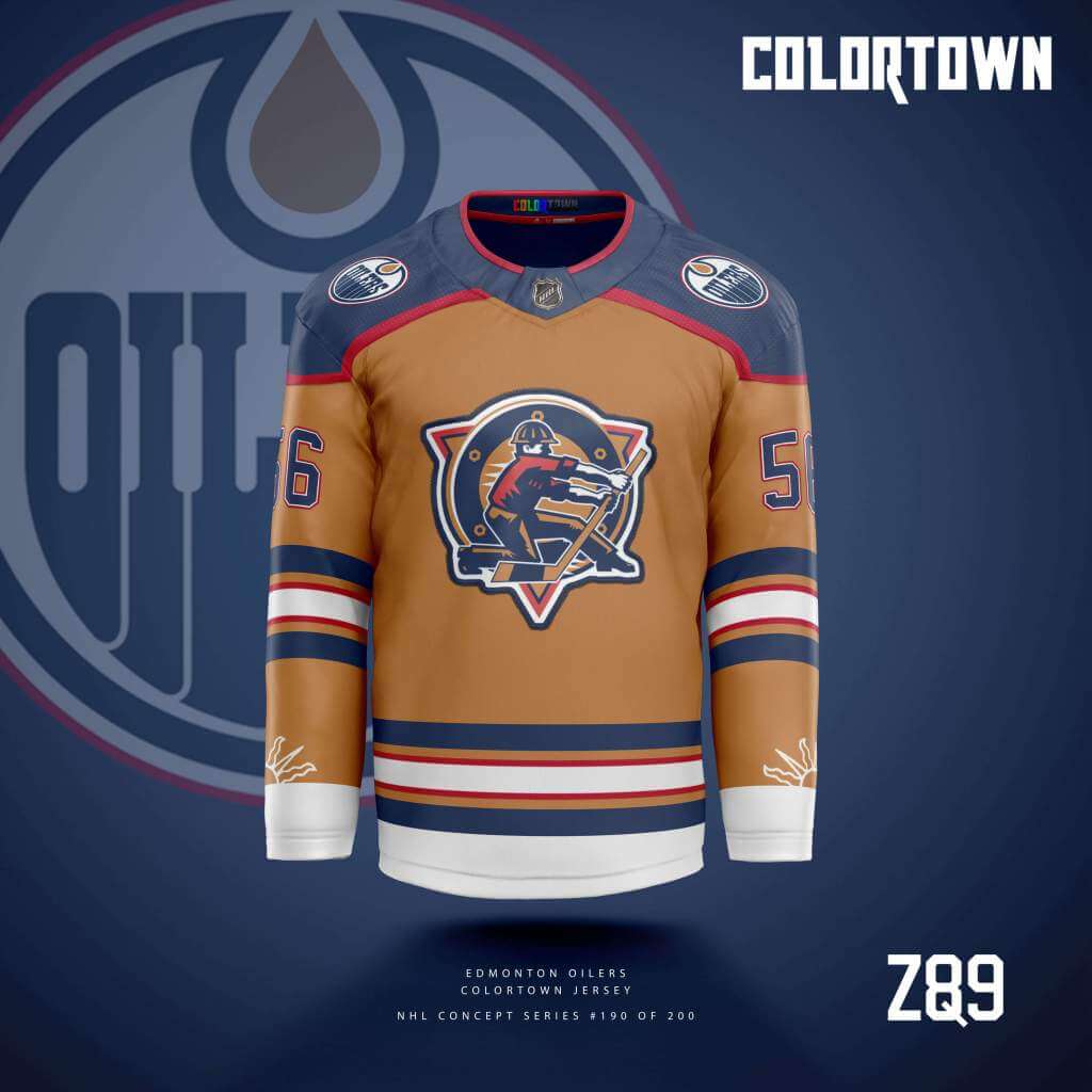
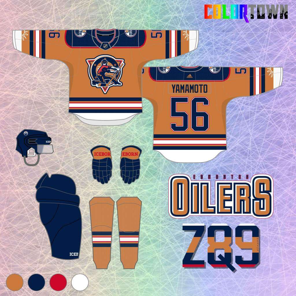
Since I had exhausted blue and orange in a previous concept series, I went with a unique copper color and mixed in the rest of the 90’s-00’s color scheme. Part of the Edmonton flag makes an appearance near the sleeve cuffs to bring in the “town” element.
Vancouver Canucks
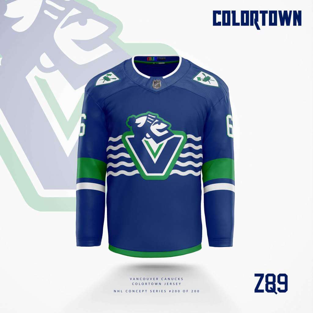
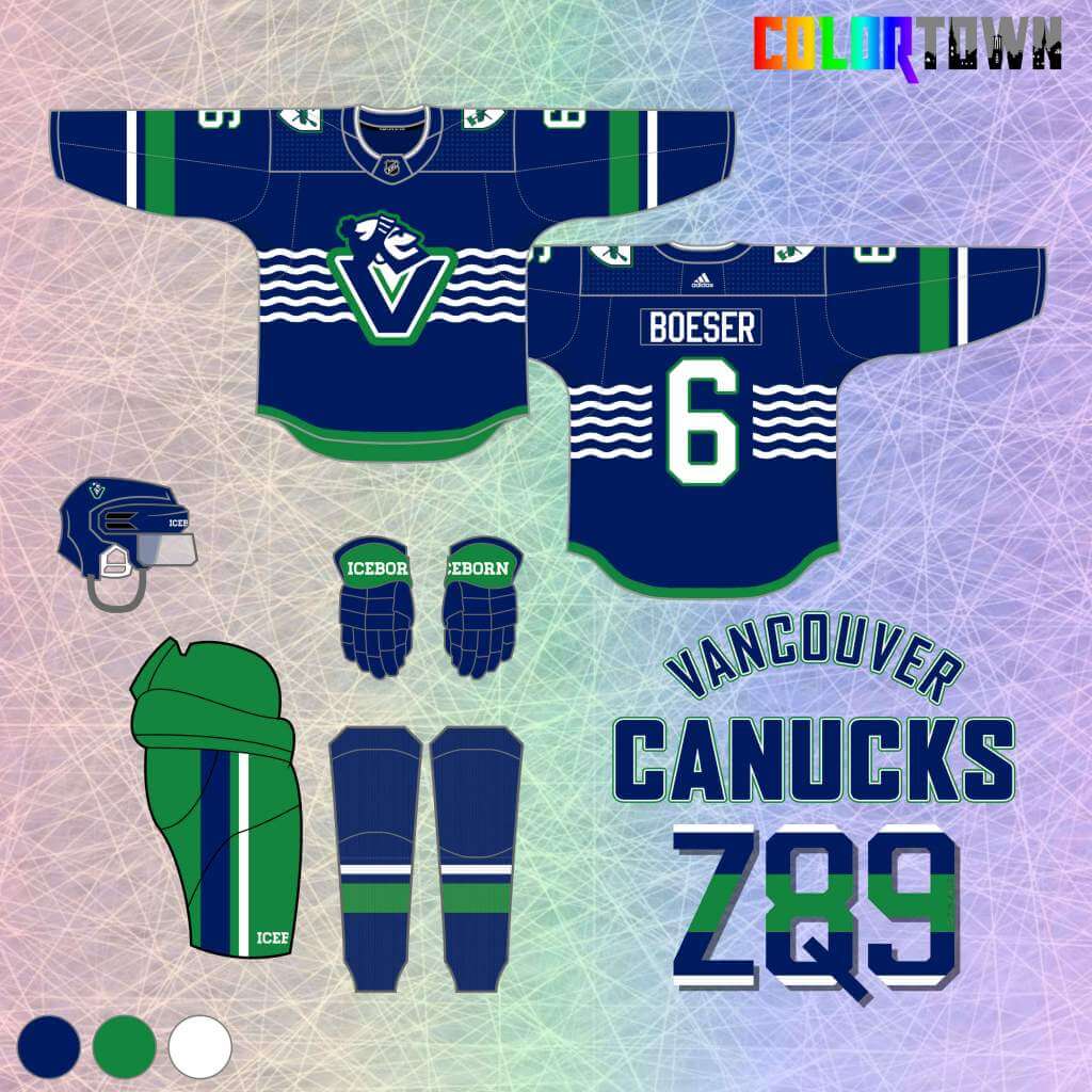
Their “Skate” jerseys are my favorite historically, but I explored that theme in a previous concept series. So, to blue and green we go! City flag themes are all over, and Johnny Canuck is front and center!
Oakland Seals
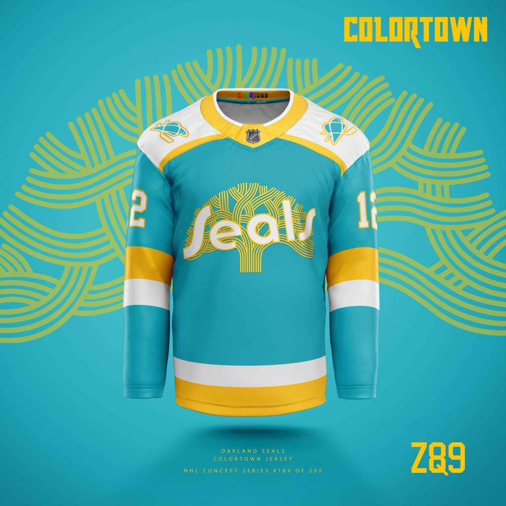
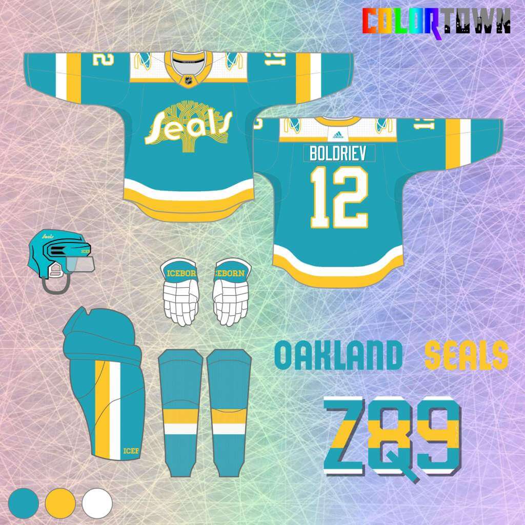
The mid-70’s color scheme is back for this one, complete with a new crest that’s part wordmark, part Oakland city logo. One of my favorites in this series!
Vegas Golden Knights
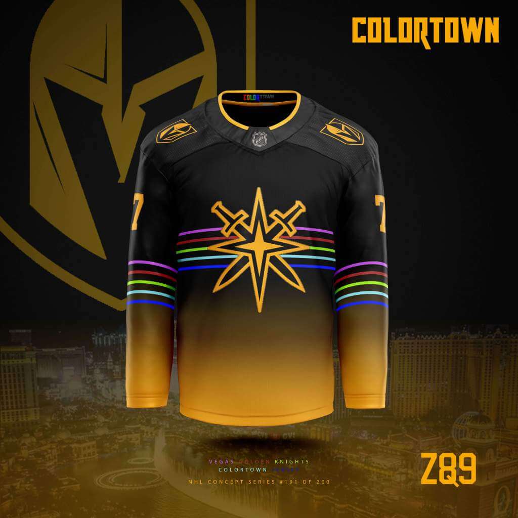
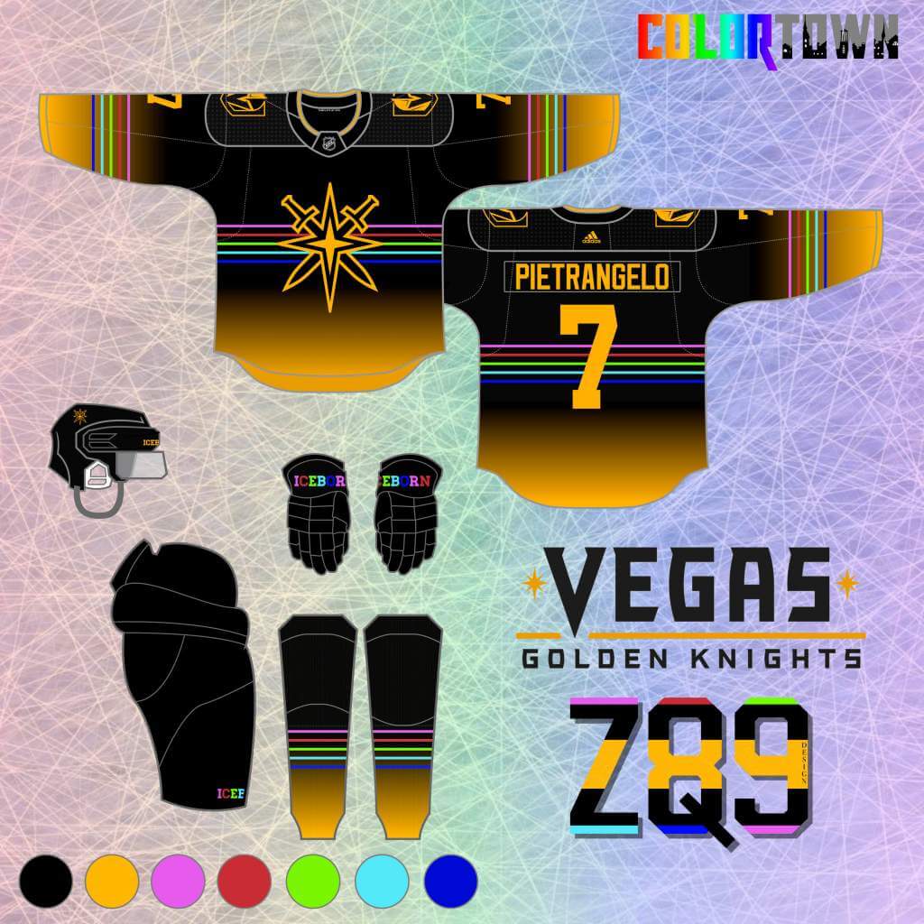
I had an idea to somehow visually represent the lights of the famous strip on a jersey… So, I used a “golden glow” that fades into black, complete with some neon stripes! Pretty wild, but I think it nails the “town” element in a really unique way!
Kansas City Scouts
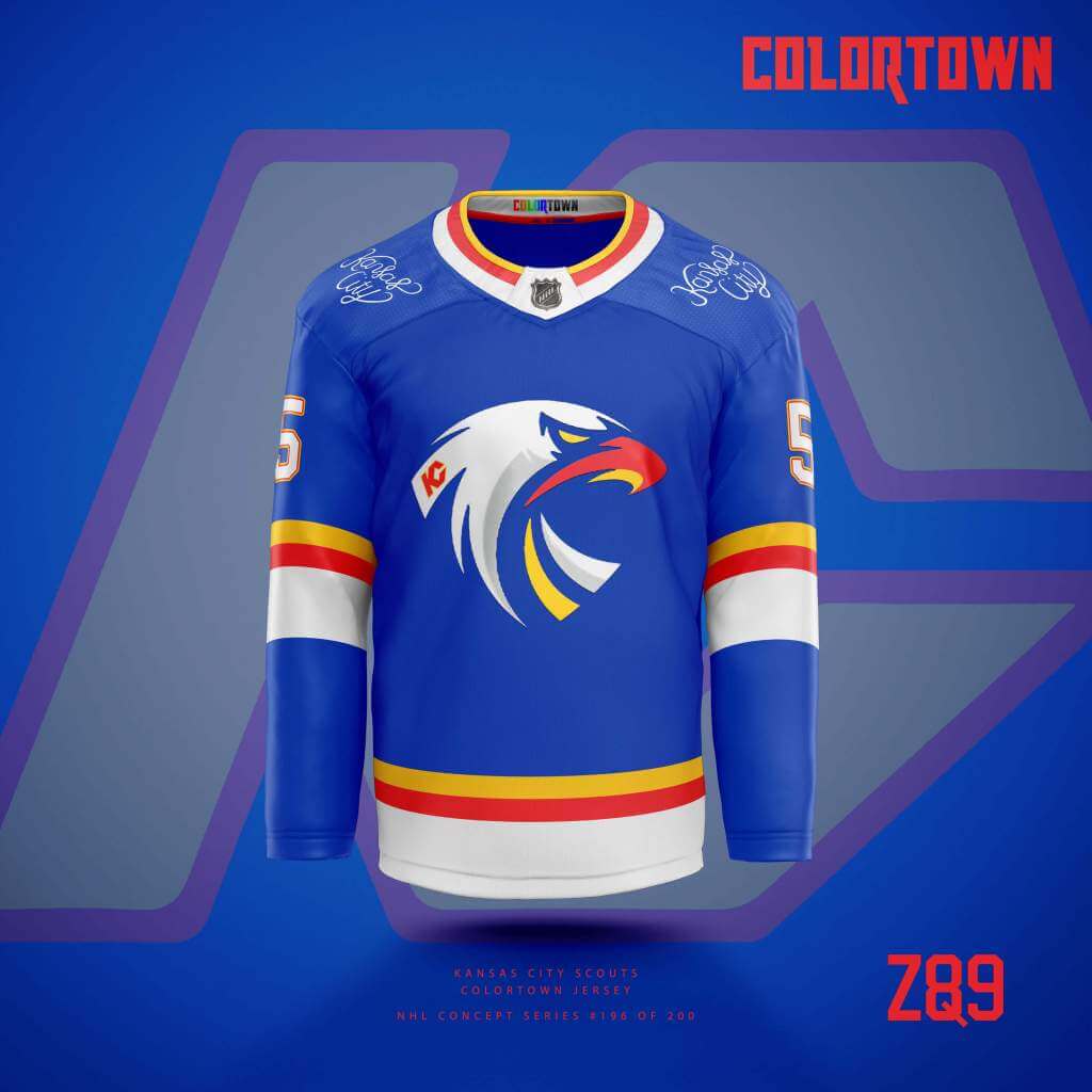
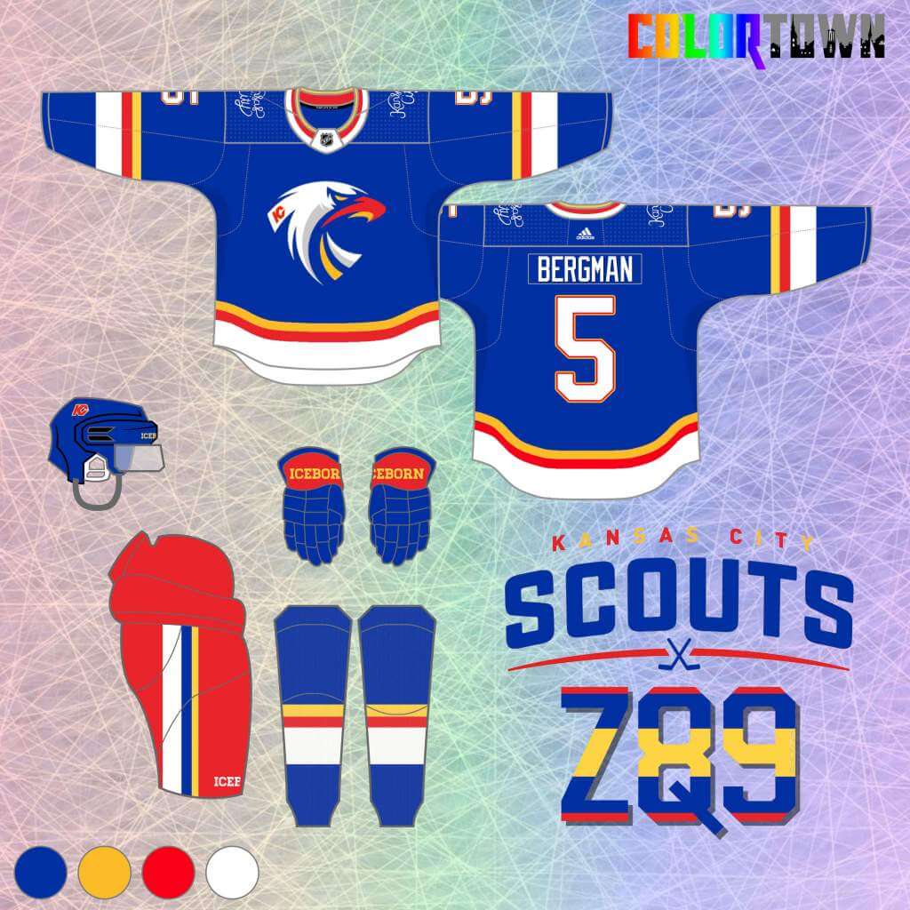
For this one, I went back to their classic color scheme, combined with the newer NAHL logo as the main crest. The “town” element here is the script on the shoulder pulled from an iconic mural in the city.
Great stuff again, Quinn, and thanks for sharing the complete set! I was originally going to run more of Quinn’s hockey designs (as he has alluded to in his writeups, he has done several sets besides these for NHL teams), but he recently embarked on a new NBA series he calls “Colorsplash,” and once he’s completed enough of those for a post, I’ll begin showing them off here.
Readers? What do you think?


Guess The Game…
from the scoreboard
Today’s scoreboard comes from Tom Goshaw.
The premise of the game (GTGFTS) is simple: I’ll post a scoreboard and you guys simply identify the game depicted. In the past, I don’t know if I’ve ever completely stumped you (some are easier than others).
Here’s the Scoreboard. In the comments below, try to identify the game (date & location, as well as final score). If anything noteworthy occurred during the game, please add that in (and if you were AT the game, well bonus points for you!):
Please continue sending these in! You’re welcome to send me any scoreboard photos (with answers please), and I’ll keep running them.
Living the NFL 1973 Catalog
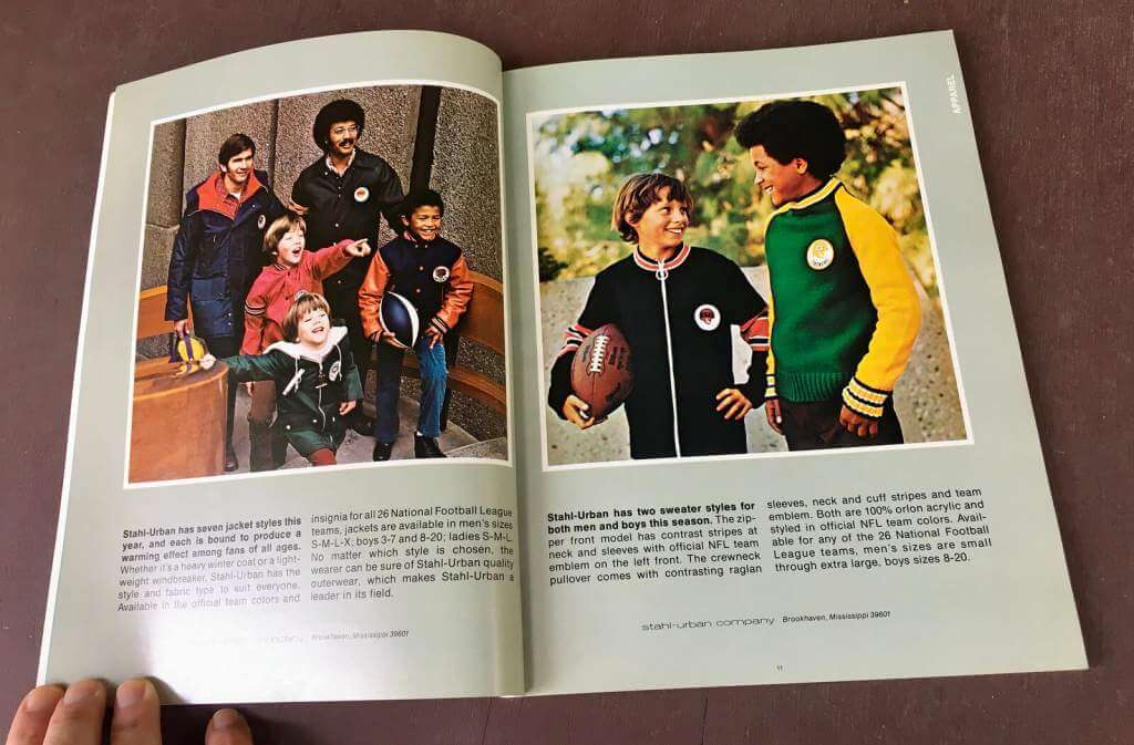
Yesterday, Paul’s lede article featured the NFL 1973 Catalog, which prompted reader (and son of former NFL and WFL quarterback “King Corcoran”) Jimmy Corcoran to share a story with me. Dig:
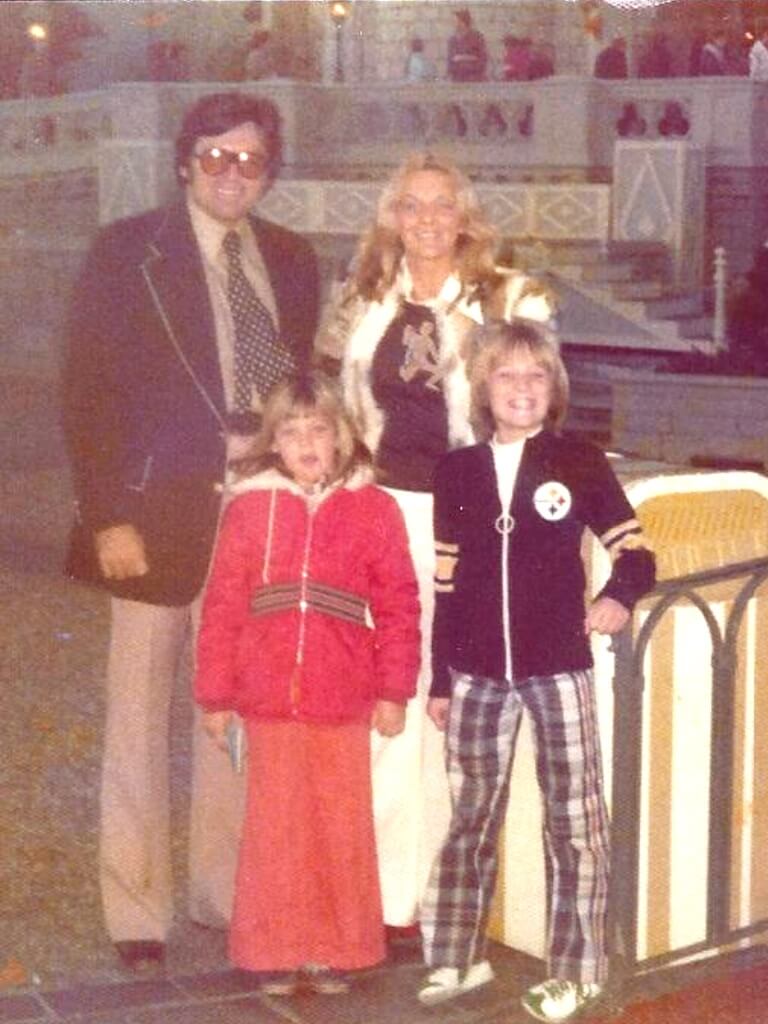
I saw the piece on the NFL catalog today Phil, as you can see in 1973-74 that catalog supplied me with not only my wardrobe but also my home décor. The family picture was taken in Dec 1973 at Disney World, I am wearing the same Steelers sweater as the kid in the catalog wearing the Bengals one I am also wearing my Puma Joe Namath swingers that I would buy at Montgomery Mall in Maryland.
My sheets are slightly different [these are the NFL sheets featured in Paul’s article — PH], I went with the Sears catalog NFL sheets, there were three other guys on my block who had the same sheets.
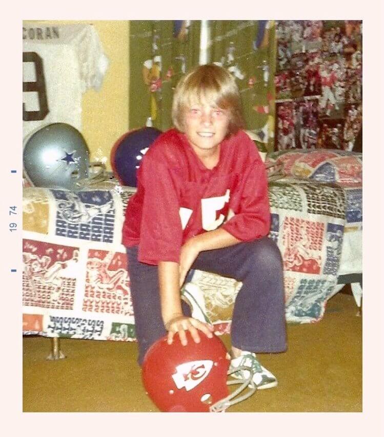
The jersey I have hanging on my wall is my father’s 1971 Norfolk Neptunes game jersey, they won the ACFL Championship that year. The jersey was ripped so badly across the number 9 in the front that they were unable to repair it so the team let him keep it. The sleeves were still rolled up with the white football tape on them because he didn’t like the sleeves that went down to the elbow.
–Jimmy
PS. There was one problem with the Disney World trip, as the King strutted around the amusement park just like he would strut around the streets of Pottstown not one person recognized him? He couldn’t understand why? In his mind he was the same as a starting NFL QB? My Mother told him he should have worn his Pottstown Firebirds jersey to the park, the King was not laughing at her joke.
Thanks for sharing Jimmy. I too (and I would imagine MANY of our readers) had those Sears NFL sheets. Interestingly, those were the ONLY sports-related sheets I owned, and they were my favorite. When I was really little, I always told my mom or dad to make my bed with those sheets, and I got upset when it was time for them to go into the laundry, since I’d be stuck with whatever lame-o 1970s “kid” sheets my parents had bought for my bed.
Great stuff. OK…who else had those Sears Catalog sheets???
Click to enlarge
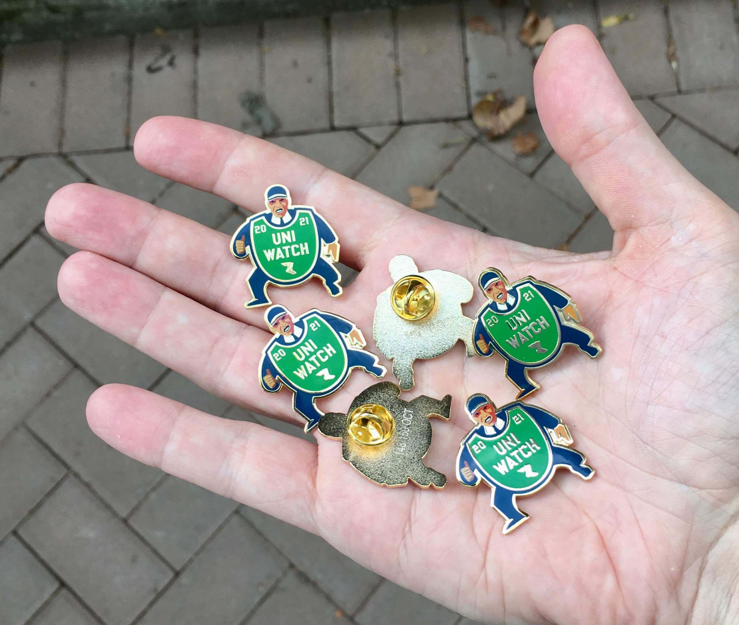
October pin reminder: Paul here. In case you missed it on Friday, our the Uni Watch Pin Club’s design for October is a fantastic depiction of a baseball ump with an old-fashioned balloon-style chest protector. You can almost hear him yelling, “Yer out!” Perfect for the playoffs and World Series.
Here’s a closer look (click to enlarge):
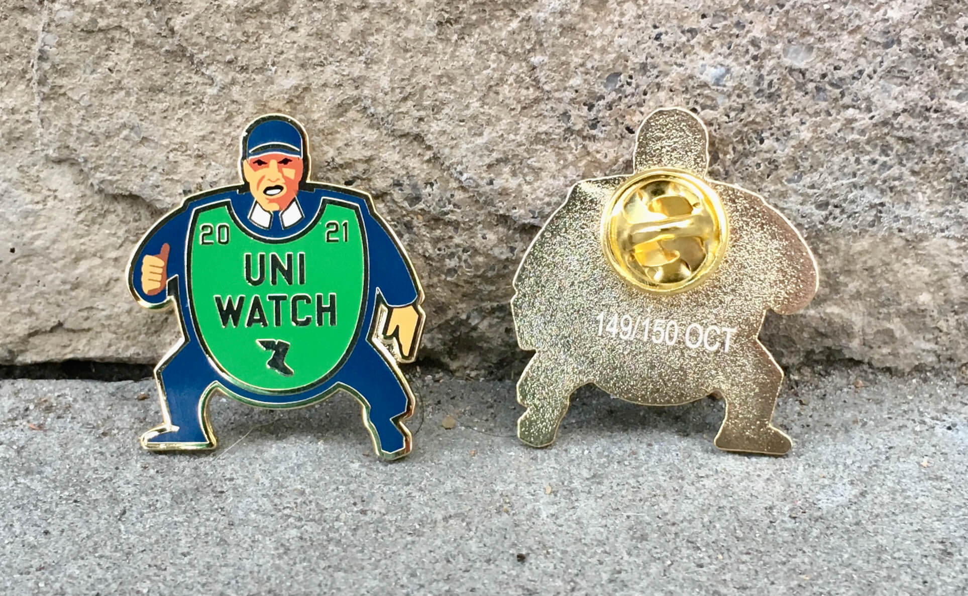
Sensational, right?
This pin was produced in a numbered edition of 150. You can order yours here.
We’ll also have our annual Uni Watch Press Pin later this month, so stay tuned for that!
My thanks, as always, for your consideration of our products. Now onto the ticker…
The Ticker
By Anthony Emerson

Baseball News: Man, did Carl Yastrzemski have the best letterhead ever? (from Kurt Blumenau). … Dodgers blog True Blue LA has broken down the team’s performance on the road by jersey this season (thanks, Phil). … Roger Clemens wore a JR Richard jersey to last night’s Astros game. … The Sugar Land Skeeters, Triple-A affiliates of the Astros, debuted their powder blue unis last night (from Ignacio Salazar).

NFL News: Packers RB Aaron Jones carries his father’s ashes in a special pocket on the inside of his jersey. He previously wore his father’s ashes around his neck, but lost the chain during week two against the Lions (from many readers). … The Bengals Ring of Honor jackets might be the coolest club jackets ever (from multiple readers). … The Saints are going black over black for their return to the Superdome (thanks, Phil). … Also from Phil, the Panthers will wear their alternate blue jerseys in Dallas tomorrow.
College/High School Football News: Stanford has created a webpage detailing the throwback unis they’re wearing today (from Kary Klismet). … Also from Kary, Oregon City High School is fighting the local school board on whether to install OCHS’s logo on the school’s football field, which is used for several schools in the area. … Iowa is adding a mental health awareness decal to its helmets (thanks, Jamie). … McGill will be honoring the late Michael Soles with a helmet decal for the remainder of the season (from Wade Heidt). … Here are today’s uni combos for Syracuse, Oklahoma, Mississippi State, Michigan State, Houston, Purdue, Tulsa, Wake Forest, and Kentucky.

Hockey News: Norris Trophy winner Adam Fox of the Rangers is wearing a “Norris” NOB during practice (from Brandon Weir). … New unis for the OHL’s Kingston Frontenacs (from Wade Heidt). … The October page of this Penguins features an abridged Pens uniform history. … Nebraska Omaha will unveil new sweaters today (from Eric Jeanneret). … The ECHL’s Lions de Trois-Rivières have unveiled their inaugural unis (from Wade Heidt). … The Prince Albert Raiders have new green, white and third sweaters (also from Wade).

NBA News: It appears the Celtics’ uni ad has been redesigned to more closely match the team’s wordmarks. … Also posted in the soccer section: the African Football Confederation is organizing its first women’s continental club competition. One of the clubs, Malabo Kings, have cribbed the old logo of the Sacramento Kings.

Soccer News: Cross-posted from the basketball section: the African Football Confederation is organizing its first women’s continental club competition. One of the clubs, Malabo Kings, have cribbed the old logo of the Sacramento Kings. … New away kits for the Ghanaian national team (from Kary Klismet). … Also from Kary: FIFA has reversed course after ordering the Uruguayan national team to remove two stars representing their 1924 and 1928 Olympic gold medals. … One more from Kary: Serie A’s Bologna has unveiled their third kit. … Chile’s new Adidas kits have been leaked (from Germán Cabrejo).

Grab Bag: Capital University in Ohio has replaced “Crusaders” as its athletic teams’ name with “Comets” while also revealing a new logo (from Kary Klismet and Jason Hillyer). … Also from Kary: The new Northwest High School in Lincoln, Neb., has unveiled its team name (“Falcons”) and athletics logo. … The Scarlets played the Lions in the United Rugby Championship last evening, with both teams in primarily red kits. I’ll leave it to you to figure out who plays for which team.
Uni Tweet of the Day
It’s amazing how differently the two expansion teams have handled their unis over the years…
Hey @JaguarsUniforms what do you say we each wear one of these for a game during our 30th anniversary season? pic.twitter.com/OeiPCkiWAa
— Panthers Uniform Tracker (@PanthersUnis) October 1, 2021
And finally… that’s going to do it for today. Big thanks (again) to Quinn for sharing his ColorTown series with us. Looking forward to his NBA ColorSplash series down the road. Let him know what you think of his concepts down in the comments below!
Everyone have a good Saturday and I’ll catch you back here with the SMUW crew tomorrow. And as always, if you see a game today you think would be a good candidate for the 5 & 1 (either good or bad), drop Jimmer Vilk a line @JVfromOhio.
Peace,
PH
About the new jerseys for the WHL’s Prince Albert Raiders. Waited until the day of their first regular-season game to show them.
They did not give us a full uniform look. Here is a look at the full uniform in action at home vs. the Regina Pats last night.
link
The Ayew designed kits are for his club team not Ghana national team.
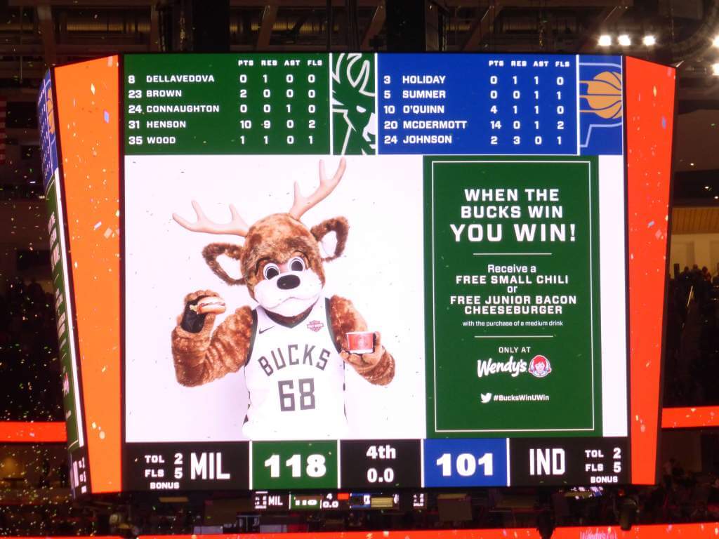
GTGFTS
October 19, 2018
Fiserv Forum, Milwaukee, Wisconsin
I really need to get me one of those Three Rivers Lions sweaters.
Great, I’ll have to make that my new letterhead too!
Big ups to Quinn, especially for his red-dominant Rangers uniforms. I know from experience the Canadiens and Rangers swap color schemes undertaking a project like this. You just have to roll with it & recognize these designs are for special events.
Thank you sir! I hope people read the disclaimer on this one. I’d obviously never put the Rangers in red full time. I had done a previous concept series – 4 jerseys for each of these teams. The challenge here was to create a 5th using a completely different primary color, so some of these are going to be wild due to that fact alone.
I love the classic Dodgers’ road uniform but I think the team should return to the uniform that had “Dodgers” and the NOB and numbers on back outlined in white piping. It really popped.
Yes, please!
The elbow striping on the Columbus jerseys is genius. Those look really great
Like the work done on these ColorTown concepts…it’s kind of a disappointing reminder that there’s probably no chance we will ever see the likes of the Scouts, Seals or Barons uniforms on the ice ever again. That blow is softened a bit by clubs like the Avs and Hurricanes, who’ve come around to the idea that celebrating their roots is a worthwhile effort (and a money grab of course!).
Yeah that was what was so fun about pretending the NHL was 40 teams… I got to breathe some new life into some long gone, but wonderful franchise identities.
That minimized Lady Liberty rocks.
Thank you!!
As an life long Islanders fan for more than 45 years … can we stay away from waves and teal as alternate jersey concepts. An orange jersey would be fun, the lighthouse logo is the only thing from that era that is worth using.
Make a Fleur-de-lis look angry… No Problem, I give you… Lion Face.
Man i LOVE those Isles and Canucks concepts! But my home team (Canes) is soooo sad looking and i kinda wish that concept logo never made the rounds on the internet it’s so heinous.