Click to enlarge
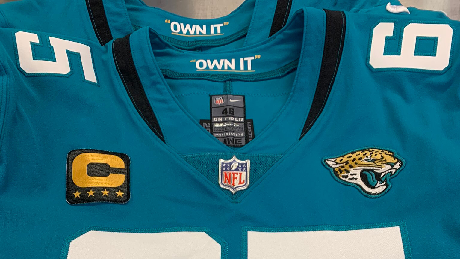
Good morning! Are you ready for a big football day? Let’s start with this: The Jags yesterday announced that center Brandon Linder is the first player in team history to wear a gold captaincy patch (which is awarded to a player once he reaches his fifth year as captain). Looks good on that Jags jersey, right? I’ve been saying for years now that the Jags need to restore more gold to their uniforms — this isn’t quite what I had in mind, but I’ll take it!
While announcing Linder’s patch, the Jags inadvertently revealed that their inner jersey collars now have an embarrassing slogan (and hey, it’s underlined, so you can tell they really mean it!). That slogan comes from new head coach Urban Meyer, who really should have left this type of silliness in the NCAA.
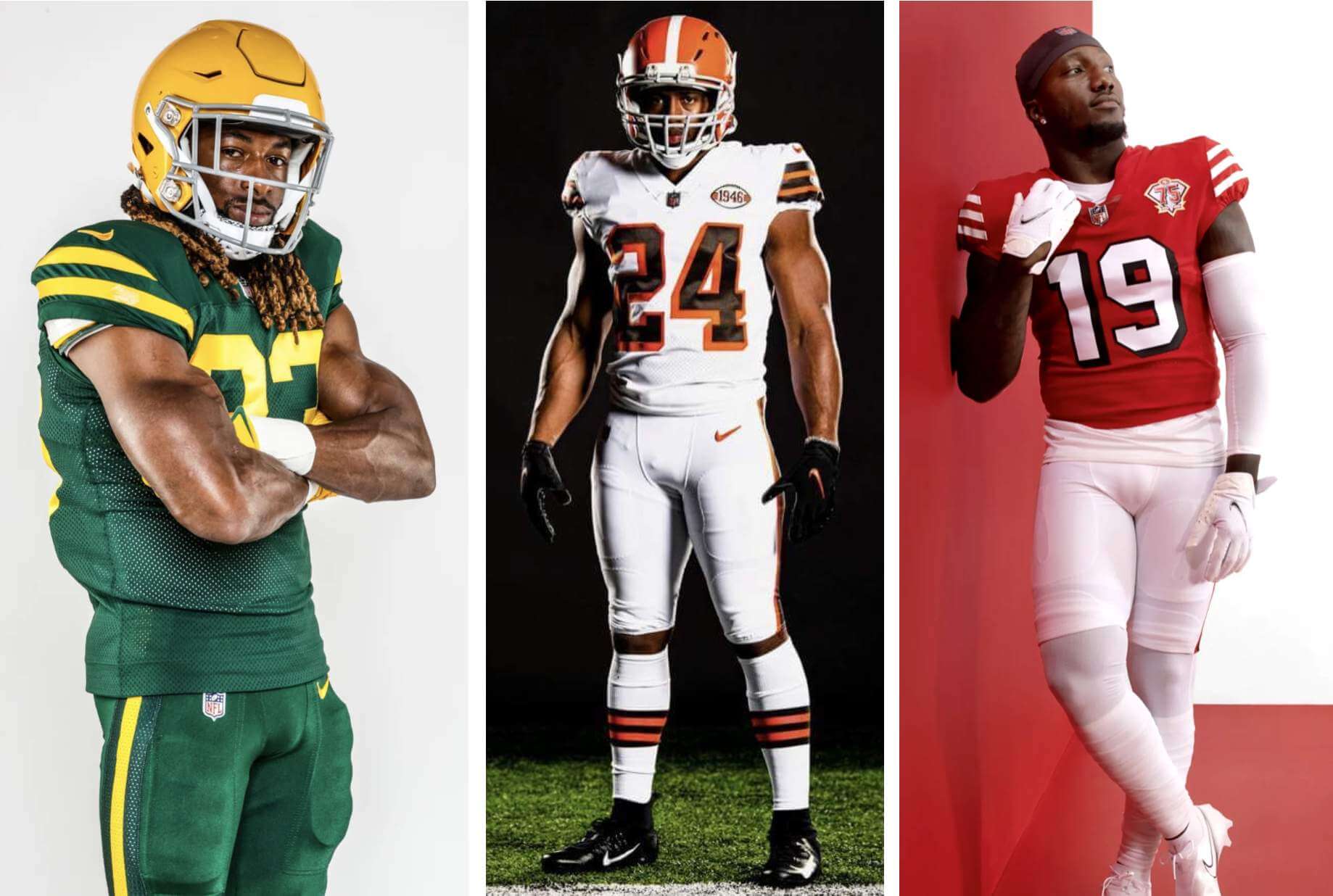
Anyway: The NFL season kicks off tonight and then shifts into high gear this Sunday, which means it’s time for the annual Uni Watch NFL Season Preview, which has the full scoop on this year’s new uniforms, logos, and related items. Some of those items are small, like the Jags items I just mentioned. Others are big, like the new throwbacks from the Packers, Browns, and 49ers:
Ready to dive in and get up to speed on all that juicy NFL uni news? The NFL Preview is now available on InsideHook. Enjoy!
Click to enlarge
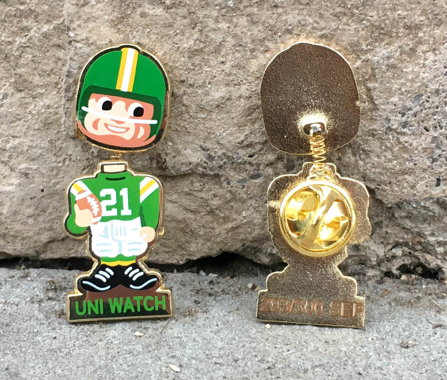
ITEM! September pin finally available: After production delays, FedEx delays, and other hassles, and just in time for the start of the NFL season, I’m happy to announce the Uni Watch Pin Club’s September Pin is finally available for ordering.
As you can see above, it’s a football bobblehead design. And it really bobbles! Dig:
This pin was produced in a numbered edition of 300 and is available here.
Now, I know many of you were hoping to use Teespring’s recent site-wide 10% discount on this item, but the shipping delays made that impossible. So here’s what we’re gonna do: For today only, I’m running a one-day sale. You can save 10% on the new pin (and everything else I sell on Teespring) by using the checkout code BOBBLE. In addition, I’ve convinced Teespring to sponsor a new sale for Friday, Saturday, and Sunday — for those days, you can save 10% with the checkout code FABMERCH10 (I know, I know).
Need to get caught up on older pins? Here are our January, February, April, May, June, July, and August pins. (Sorry, March is sold out!)
The Ticker
By Paul
Indigenous Appropriation News: Kickapoo High School in Missouri will no longer call its teams the Chiefs (from Sam Kucera). … The WHL’s Moose Jaw Warriors, who previously had a center-ice logo featuring a headdress-clad Indigenous person, are now using a new logo featuring a moose’s head (from Wade Hedit). … Reprinted from yesterday’s comments: McClymonds High School in Oakland, Calif., which has a predominantly Black student body, is keeping its “Warriors” team name, but the associated imagery is changing from Native American to African (from reader/commenter GM). … What’s worse than a team called the Braves? A team called the Lady Braves (thanks, Phil).

Baseball News: Taiwanese team Fubon Guardians are wearing uniforms made from recycled plastic bottles and coffee grounds this weekend. … Good article on MLB’s authentication program. … Reprinted from yesterday’s comments: Tigers P Derek Holland has new Kiss-themed cleats, although it’s unclear if he’ll wear them on the field (from Patrick in Michigan). … Astros 3B Alex Bregman and Angels P/DH Shohei Ohtani both wore T-shirts supporting Curt Flood’s Hall of Fame candidacy (from WB Young). … Larry Walker yesterday became the first Baseball Hall of Famer with a Rockies cap on his plaque (from @Jon_Star). … Speaking of Walker, he wore a SpongeBob pin at yesterday’s induction ceremony. … Meanwhile, Derek Jeter’s Hall plaque has some weird word spacing on the second line, apparently to avoid using a hyphen (thanks to all who shared). … The Mets will wear first responder caps for their game against the Yankees this Saturday — the 20th anniversary of 9/11. Just to clarify, they will wear the caps in the game, not just for pregame activites. … The Triple-A Louisville Bats will wear pink cancer-awareness jerseys on Friday (from Bill Fenbers). … The High-A Wisconsin Timber Rattlers will be doing the lederhosen thing tomorrow (from @mikeobs).

Pro Football News News: “Art of Words” honcho Dan Duffy, who makes amazing lettering-based artwork, has a new piece devoted to the Steelers’ stadium (from Joe Werner). … Longtime reader and all-around swell guy Jason Von Stein has created a cool illustration mapping out this week’s NFL team/uni matchups. … Topeka’s new Champions Indoor Football team will be called the Topeka Tropics (from David Street).
College and High School Football News: Jackson State coach Deion Sanders is annoyed that all SWAC teams, including his, are NNOB. … As had been expected, Boston College will wear the “red bandana” design this Saturday (from Rex Henry). … New maroon helmets for Arizona State (from @JediASU). … Here are this week’s uni combos for Iowa State, Washington State, UMass, Oregon, BYU, and Utah (thanks to all who shared). … UTSA will no longer use the rallying cry “Come and Take It” during games or on merchandise. The university president said that the phrase, originally associated with the Texas Revolutionary Battle of 1836, “has become increasingly affiliated with cultural and political issues beyond its traditional historical context” (from Ignacio Salazar). … Here’s what the wordmark for Iowa’s newly christened Duke Slater Field looks like on the turf (from Kary Klismet). … The Texas chapter of the NAACP and a group of U. of Texas students have filed a federal civil rights complaint against the university over the marching band’s continued playing of “The Eyes of Texas.” … Missouri will wear a commemorative decal to mark the 20th anniversary of 9/11 (thanks, Phil). … Also from Phil: More than a dozen high schools in Ohio are completely missing the point of 9/11 by wearing camouflage uniforms this Friday.

Hockey News: Rangers jersey-themed banners were hung outside St. Monica’s Church in Manhattan for Rod Gilbert’s funeral service earlier this week (from Alan Kreit). … Blackhawks G Malcolm Subban’s new mask is a tribute to Tony Esposito (from Wade Heidt).

Basketball News: Lots of speculation regarding the Hawks’ next alternate uniform (thanks, Phil).

Soccer News: New third kit for Liverpool (from Ben Hagen). … USL Championship side El Paso Locomotive FC is doing a sugar skull-themed bandana giveaway on Sept. 29 (from Mark Gutierrez). … Here’s a ranking of the Premier League kits that have been unveiled so far this season (from Kary Klismet).

Grab Bag: The city council in Waterloo, Iowa, has voted to remove a griffin logo from the city’s police uniforms because of the logo’s historical ties to the Ku Klux Klan. … New uniforms and teal turf for NLL’s Calgary Roughnecks. “The teal turf is obviously the result of their new naming advertiser — it’s now WestJet Field at Scotiabank Saddledome, and teal is a WestJet color,” notes Wade Heidt. … Australia’s national men’s rugby union team, the Wallabies, have new Indigenous-patterned uni numbers (thanks, Phil). … New logo for TV show The View. … Freight rail company CSX has tweaked its logo on locomotives. … If you think there’s a big market for counterfeit jerseys, check out this article about counterfeit punk clothing. … Did you know companies can put the recycling logo on their products even if the products aren’t recyclable? California is looking to prohibit that. … New rugby union kits for Scotland (from Sy Hart).
Hi Paul,
The ticker says New Zealand’s rugby team the Wallabies. They are in fact Australia’s team. The All Blacks are NZ’s Team.
Right. Fixed.
Kickapoo High School is in Springfield Missouri, not Texas.
Got it.
Wonderful article from such a kind soul.
Awesome work Paul, Thank you for sharing.
Just curious – is there going to be a bonus this year for anyone who collected all the pins?
Yes, of course!
I wish the MLB would allow the Mets to wear the first responder caps in the game itself as they did in 2001. Or the Mets just go ahead and do it and donate the fine to an appropriate 9/11 related charity…
As clearly stated in the Ticker (and in the linked article): The Mets are indeed wearing the first responder caps in the game this Saturday.
I’ve adjusted the wording to make it even clearer!
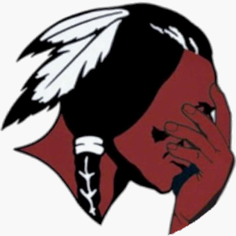
I’m honestly confused why the “Indigenous Appropriation News” has its own indigenous person logo.
And what is that person in the logo doing?
I see it, but it still seems like an inconsistency to me. Either they can be used as mascots or they can’t be used as mascots. Just my unsolicited two cents. Keep up the great work.
I think Kevin has a point, it does seem contradictory to say that it’s wrong for a team to use Native American imagery for their purposes, but it’s okay for another non-Indigenous person to use such imagery for his purposes.
Not the biggest deal in the world, but it does exhibit a bit of a double standard.
Agreed with Kevin. Whether the person in the logo is holding a sign that says “don’t appropriate Native American imagery” or is waving a tomahawk, it’s still using that image for one’s own purposes when we are saying it’s not a good look to do so.
I think you’re wrong, and that you’re even working off a faulty premise. But I’m open to change: What would you suggest as a better thumbnail image for that section?
I had to look closely to see it was a Native American doing a face palm. Upon glancing by it I have always thought it was a even more exaggerated curved nose.
Lady Braves? Why not Bravettes?
What’s even worse is “Devilettes,” used in Culpeper, Va.
Met fan here. I’ve reviewed Jeter’s HOF plaque and I would be perfectly fine with them leaving out that last line. If that helps the spacing on line 2. Just saying.
The Jeter plaque entry in the Ticker has now got me wondering if there are hyphenated words on any other Baseball Hall of Fame plaques. Seems like a weird thing to get hung up on to the point of making the text look goofy with the extra spacing, unless it’s some long-standing tradition or something. I mean, that’s still dumb but would at least have context.
I’m pretty sure they’ve always avoided hyphenation. But the results usually don’t look quite so clunky as on Jeter’s plaque. They really should have adjusted the wording!
Ted Simmons’ plaque actually looks more awkward than Jeter’s: link
Yikes!
Rutgers will be playing in 9/11 tribute uniforms this weekend at Syracuse to honor the 37 alumni lost in the attacks. The names of all 37 alumni lost will be featured on the helmet, along with the #37 on each side of the helmet. The helmets won’t feature player numbers. The two grey stripes used throughout the jersey and pants are symbolic of the Towers of Light tribute.
link
holy FUCK are those promo photos tone-deaf.
That language seemed a bit strong to me, then I clicked through the gallery, and “holy FUCK” if anything understates the tastelessness.
Also, text on the gloves rarely works. What does “NEVER FOET” even mean?
We should talk about the recent trend of teams wearing white socks and white pants with their color jerseys.
The Jaguars and throwback 49ers come to mind.
It’s such a weird look. As far as I know, only the 80’s Patriots really rocked that in the NFL. It’s so unnatural looking. It’s so off not having any color below the waist. The leotard look is bad enough but it’s especially odd when it’s a white leotard.
I wonder what’s prompted it.
NFL socks — like baseball socks/stirrups — are now a lost cause. Players wear whatever they please. No uniformity, no concern for aesthetics. Very disappointing, but that’s where we are.
It’s not individual players doing it.
The on field appearance and photo shoot looks are dictated by equipment managers.
The Jags have a whole team kitted out in teal jerseys with white pants over white socks.
Maybe teams are giving up on even trying contrasting looks because of the inconsistency. With leotards, you get more consistency since players all wear the same color tights and the socks just blend in so differences in sock heights don’t matter.
Exactly — the teams (like the league) have given up on policing what the players want to do.
What’s odd is that giving up has taken the form of taking the decision out of the players hands.
The leotard look is an effort to assert control over the on field appearance from the club by making it impossible for a player to distinguish himself with a unique hosiery style.
True enough … but what the players want to do, and why they want to do it, still puzzles me. It’s hard to interpret as anything but a perverse determination to look bad for the SAKE of looking bad.
Great point. Other than some of us here in the Uni-verse, I haven’t noticed a lot of people realizing (or, caring, sadly) that the 49ers ‘94 throwback look (home *and* road) isn’t right. The white leotard look is awful. I suppose it’s because most fans pay attention to the top, the “jersey”, because that’s what’s being sold. Sigh. Give us the red socks or even better, the triple-striped ones. What’s maddening is that in their promo pics for the uniforms, that had Jerry Rice actually wearing the proper red socks but none of the active players were. Fitting, right? When are they going realize a uniform is more than just the jersey? The pants and even socks matter just as much. No one seems to “get” that but us, which is one of the reasons I love Uni-Watch!
McClymonds High School’s Warriors mascot imagery is changing from Native American to African, not African American.
Right-o. Fixed.
Here’s a perfect “Uniform Schedule” for any sport:
Home games – home uniforms
Road games – road uniforms
Get. Offa. My. Lawn.
The story about the Waterloo police department’s griffin logo sent me down a bit of a Google rabbit hole, mainly because I was intrigued about the connection between the KKK and the mythological creature.
It turns out that there is no connection between the KKK and the griffin, so the link text is a tad misleading. The issue is that some believe that the griffin logo too closely resembles the KKK’s dragon logo. I can sorta see it, but it’s a bit of a stretch. It doesn’t appear that the logo’s adoption by the Waterloo police department had anything explicitly to do with the KKK, at least according to an earlier article that detailed the logo’s origin. Maybe the original designers had KKK connections, or knowledge of the KKK’s dragon, but that’s not stated anywhere. Frankly, the Waterloo logo looks more like the dragon in the flag of Wales.
link
I followed the original link, and the article left it at “the logo has been tied to KKK imagery.” This use of the “divine passive” seldom bodes well, and it’s unsurprising to learn that the link might be spurious.
Not really uni related but it was mentioned in the preview — the strict enforcement of the taunting rules is going to be insufferable this year. Can’t wait for games to be swung because a DB stood over a guy for just a split second too long.
Well, at least the stupid inner collar slogan on the Jags jersey has properly formatted quotation marks…
And that’s all I have to say about that.
Putting the phrase in quotations seems odd to me. Reads to me like scare quotes, which is the written equivalent of hand-gesture air quotes, which you use to indicate you don’t mean the thing being said. It’s like saying “quote-unquote” before you say something. So, what, don’t own it? Also, “Own It” strikes me more as an exhortation to someone in the face of loss or failure than winning or success. You don’t improve after a win by “owning” it, but you do get better after a loss by “owning” it. Own a mistake and you’ll be less likely to repeat it. “Own it” is great coaching advice in that context, it just doesn’t read to me as an exhortation to win.
I think Paul is correct that this sort of thing should be left to the college and high school ranks. Seems a bit insulting to think that adult professionals who have dedicated their lives to reach the highest level need such reminders.
I don’t understand the teal trim on the numbers against a teal jersey. What’s the point? Absolutely no contrast.
Agreed, makes absolutely no sense. It’s like those caps where the logo is exactly the same color as the rest of the hat. Like, what’s the point?
Further to the paint job on the ice for the Moose Jaw Warriors. One other small thing to do with the crease. New WHL rule this season. All WHL arenas will now use the same goal crease size used on NHL rinks. The crease was more like a half-circle before in majority of WHL rinks. An example:
link
There are a whole lot of changes I would like to see with current NFL uniforms. I will not ask for too much today. Just something small. Really need to see both the Vikings and the Jets switch to white masks. Especially the Jets considering their helmet otherwise has no black trim in the logo.
I just wanted to point out, because I don’t remember anyone noticing this, (perhaps Paul has, and I missed it) but the 49ers also have a memorial decal on their helmets for longtime DT Charlie Krueger who passed this year. He is one of their 12 retired numbers in franchise history and they have his #70 on the back of their helmets for him. Also interesting is that the memorial is done in red and gold, almost identical to their Dwight Clark memorial, instead of the usual black and white memorial they’ve used in the past. 2011 comes to mind when they wore two memorials for #34 Joe Perry and #35 John Henry Johnson.
I *completely* missed that — and I’m a Niners fan! Thanks for pointing it out.
Absolutely! Yeah, I don’t even think the 49ers themselves ever announced this, I only noticed myself when I saw them in the preseason. Thanks for all your work, Paul!