[Editor’s Note: Paul is on his annual August break from the site. Deputy editor Phil Hecken is in charge from now through the end of the month, although Paul may be popping up here occasionally.]
By Phil Hecken
Follow @PhilHecken
Greeting and good Monday morning Uni Watchers — I’m happy to report that Hurricane Henri somewhat miraculously took a hard right turn (and weakened when it hit cooler waters) yesterday, so I’m back at home base with full power. About 90 miles to my east (near Montauk), I am pretty positive the summer place is not only still standing, but should have full electricity as well — a worst case scenario would have knocked out power, and our power supplier saying it could take two to three weeks to restore. Fortunately, that scenario never happened. I hope everyone else is doing well today.
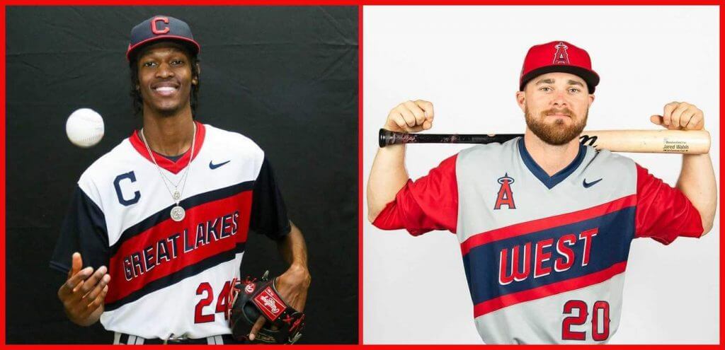
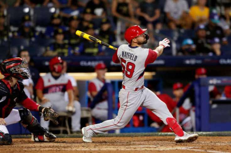
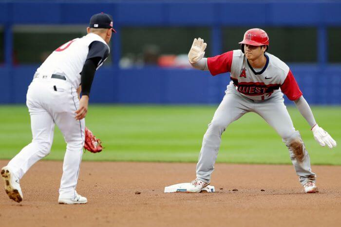
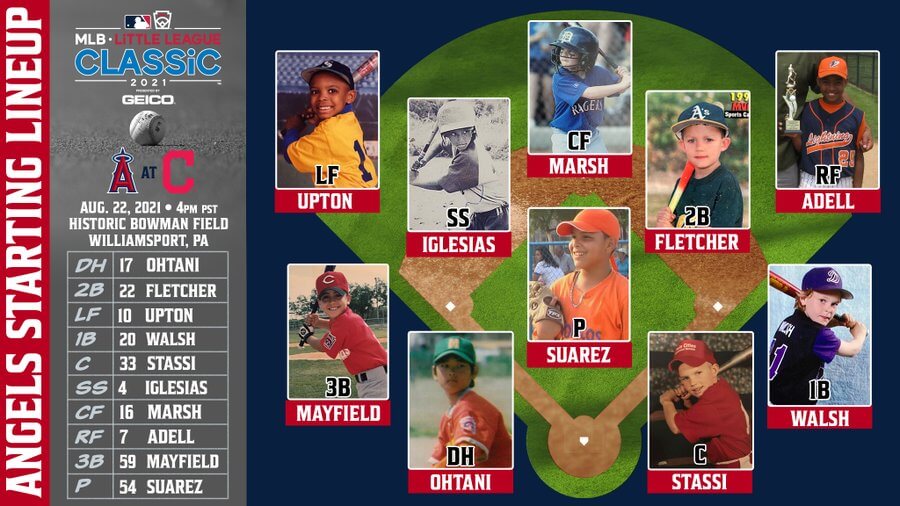
Now then. Last night, the Cleveland Indians Guardians (wait, not yet) … baseball team played host to the Los Angeles Angels in Williamsport, PA, for the annual “Little League Classic.” Lest you think they’re playing on the same fields as the kids — no, they play the game nearby on a regulation sized field. But the game still has the feel of a LLWS game, with many teams watching from the stands, and a general good-time feel. But we’re here to talk about the uniforms, and as is the custom, both teams were outfitted in v-neck pullovers that attempted to give the game a bit of a little league look. Unfortunately, both teams’ colors are blue and red, so the jerseys were somewhat mirror images of one another.
As the home team, Cleveland wore white pullovers, with a red v-neck and contrasting blue sleeves. They wore blue caps with red brims (their normal caps), and white pants.
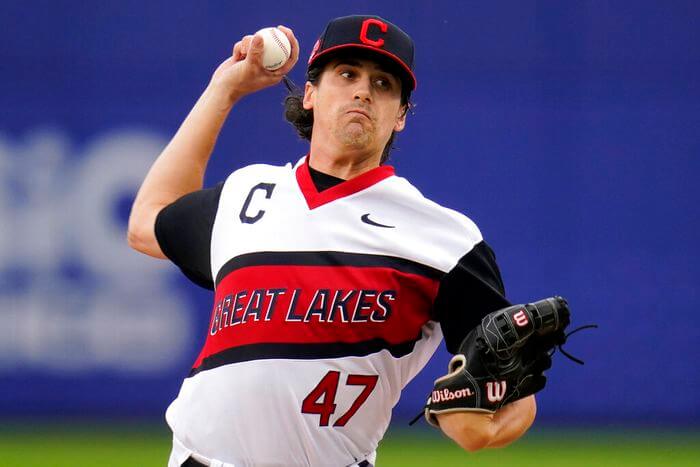
However, instead of the team name or city on the front, Cleveland sported “GREAT LAKES” (in hard to read blue on red, with a white blockshadow) — Great Lakes of course being the region the team would represent if they had reached the LLWS, which I thought was a nice twist.
The road LA team sported a similar gray pullover, with a blue v-neck and contrasting red sleeves. They wore their regular caps as well, with gray pants.
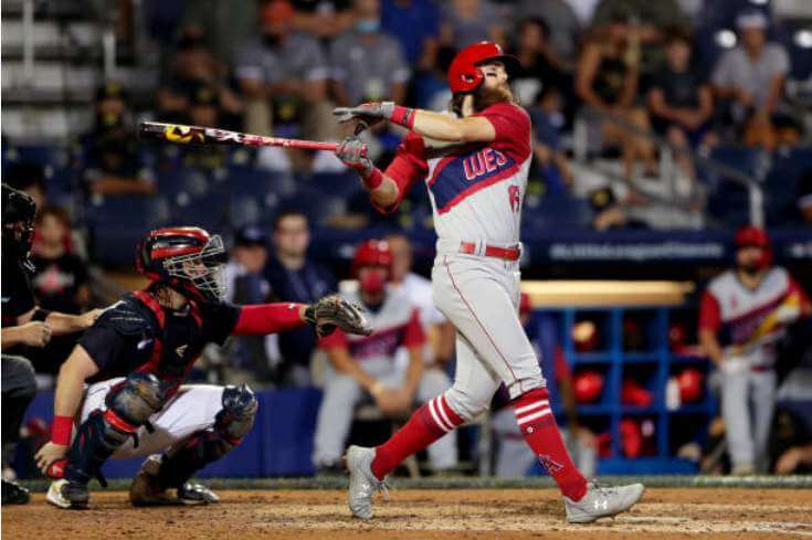
Like Cleveland, LA had “WEST” as their identifier, and suffered from similar visibility problems — WEST was in red over a blue sash, with white blockshadow.
Both teams wore red numbers outlined in blue (in their normal fonts), with blue NOBs.
There wasn’t all that much high-cuffery and sock showing…
but a few players obliged, and with the jerseys worn, looked much better.
Interestingly, at least one Angels player (and I think one coach or manager) wore what looked like Cardinals socks.
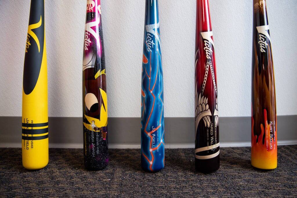
Of course a few players wore specially designed shoes, and many players used specially painted bats, some of which looked really cool.
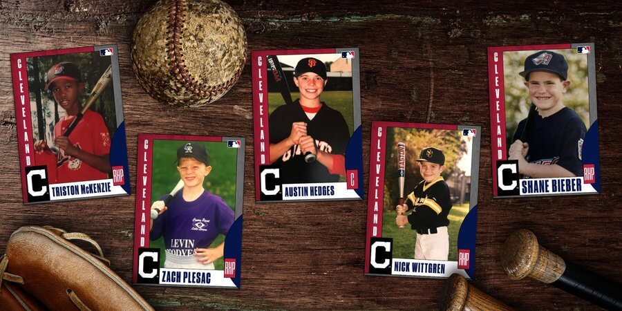
Another cool thing both teams did was to show pictures of their players as kids, in their little league uniforms, and created “baseball cards” for them.
Normally I’m not a fan of gimmicky uniforms and especially pullover v-neck jerseys, but for this once-a-year game, I’m totally fine with it (it’s only when every team gets outfitted in the same schlock that it becomes pointless and trite). You may not remember, but these unis definitely take their inspiration from the 2019 game, when the Pirates (playing as “The Burgh”) and Cubs (playing as the “Cubbies”) wore similar style uniforms. Prior to that, the LLC teams wore uniforms that would later double as their “Players Weekend” jerseys, which kinda ruined the specialness of the LLC game.
Stills don’t quite do the LLC uniforms (well, jerseys) justice, so here’s a couple videos showing the uniforms in action.
Franmil is just a big kid at heart. pic.twitter.com/O0nd1YYzBg
— Cleveland Indians (@Indians) August 22, 2021
. @JoseIglesias_SS with the no-look pass. 🤯 pic.twitter.com/489IgXIwaS
— MLB (@MLB) August 23, 2021
happy for him but my god I miss him https://t.co/CXoRuykU2b
— Christian (@neverhappychris) August 23, 2021
Good stuff! MLB plans to continue the tradition next year, and have already announced the Red Sox and Orioles will play that game.
You can see more photos here.
I enjoyed the unis (for one game only). What do you guys think?
More Reader Correspondence with Marc Okkonen
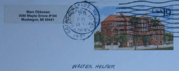
In case you missed it, on Saturday, July 31 (Paul’s final article before his annual August sabbatical), Paul shared some reader correspondence with the great Marc Okkonen (scroll down). As you’ll note, Mr. Okkonen seemed to be in, as Paul so aptly puts it, “full crankypants mode.”
Late last week, reader Walter Helfer reached out to me to share his own correspondence with Mr. Okkonen, and his tone was, shall we say, a bit less cranky. It’s tremendous stuff, so I’ll let Walter take it from here…
Dear Phil,
I may be a few years late to the party, but a summer cleaning of my attic yielded a long-lost series of letters and postcards I shared with uniform guru Marc Okkonen. When Uni Watch posted others’ correspondence with Marc, I kicked myself for not having slipped it in the dust jacket of his excellent book, ℎ 20ℎ . It sat in a dusty, unmarked crate for at least a decade (the last time I looked at it).
Unlike some of the other Uni Watchers, I found Mr. Okkonen a cheerful correspondent. I bought his book in September of 1991 at a Doubleday, and eagerly perused his archives. His postscript invited Uni know-it-alls to fact-check his illustrations with visual evidence; I found a pair of errors involving the Padres, and alerted him the 1983 Athletics wore green shoes with their road uniform. He was also loath to believe the Astros had only one set of uniforms between 1975 and 1980.
Please reply if you have any questions or follow-ups.
All the best,
-Walter
Thanks, Walter. Now, let’s take a look at those letters and replies…
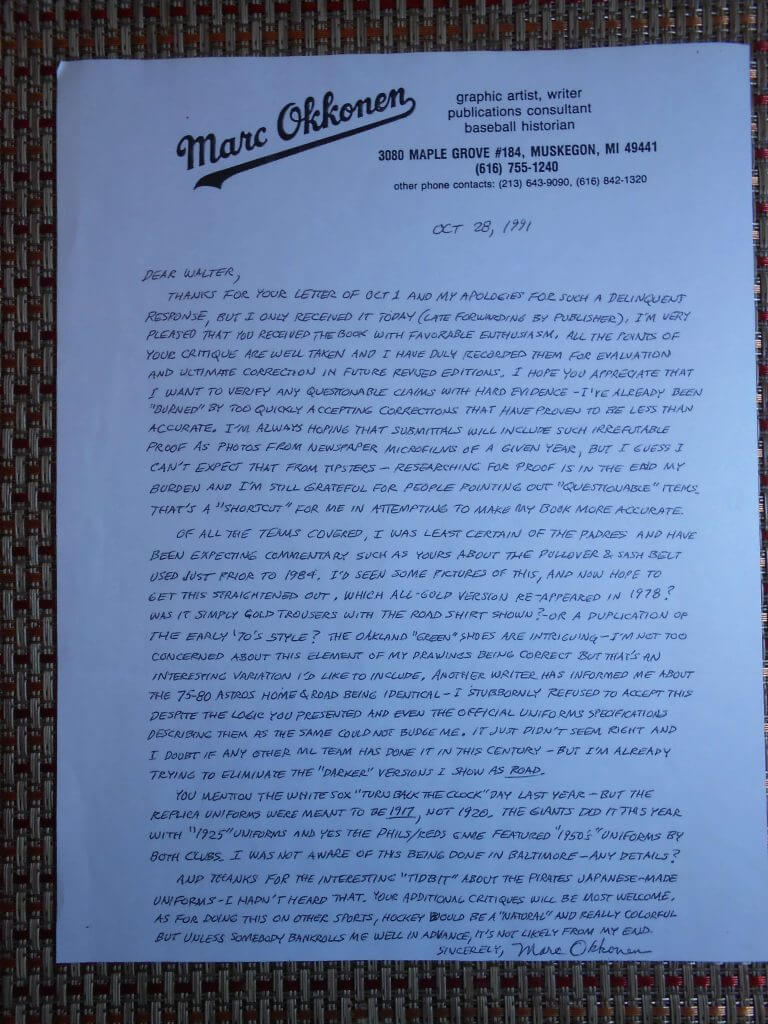
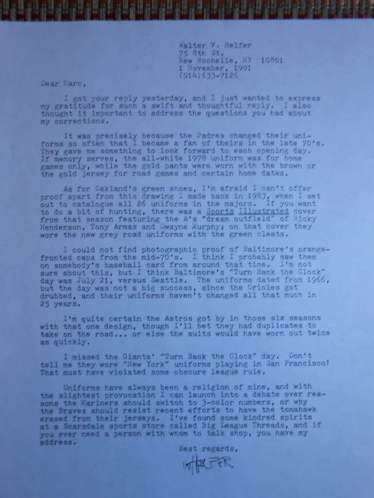
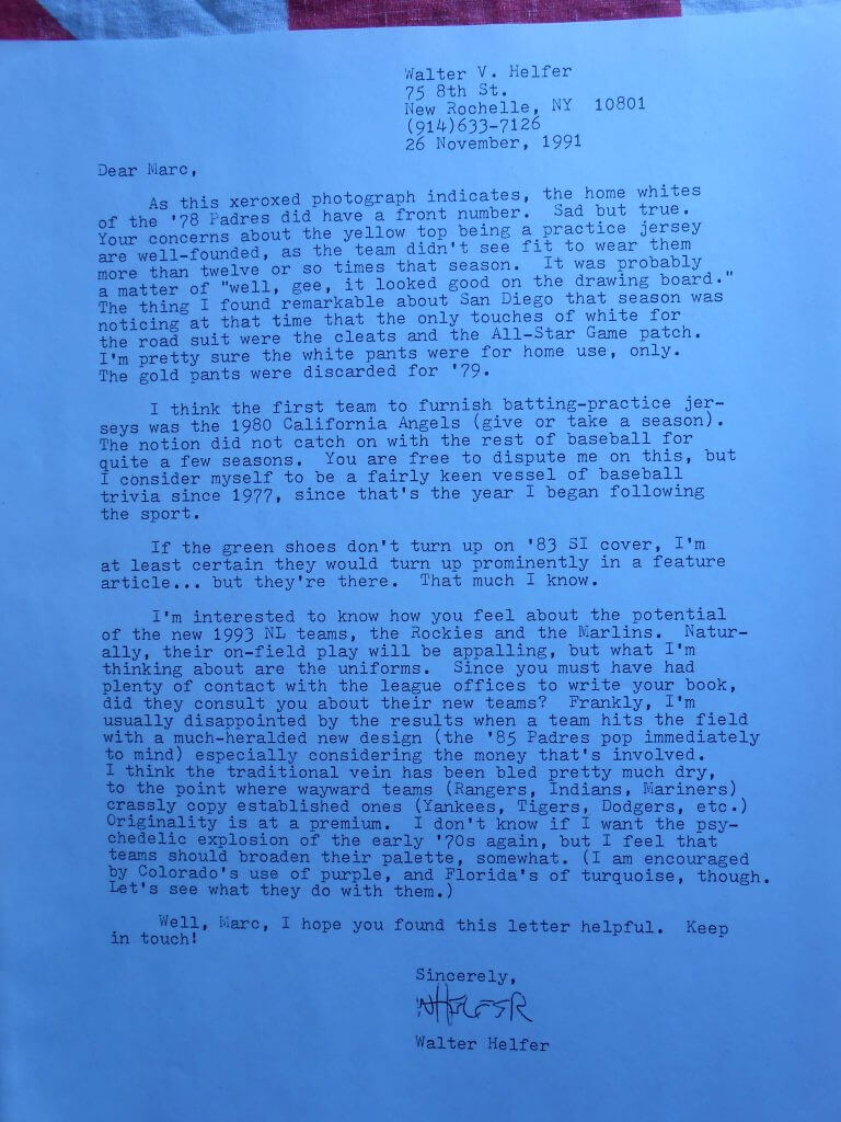
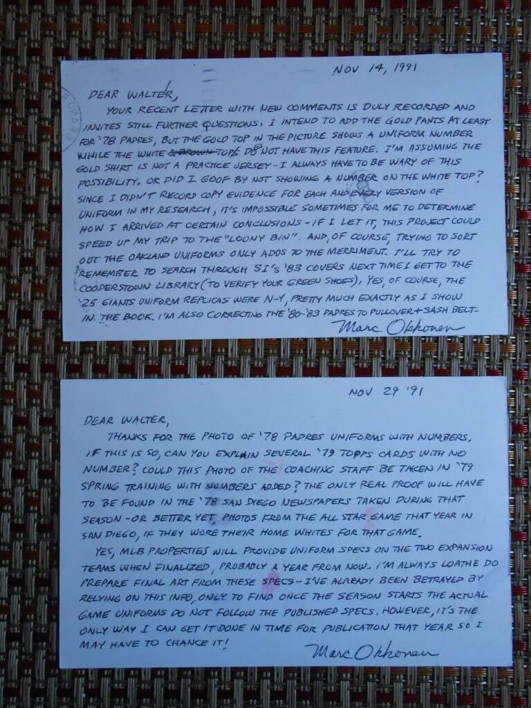
Wow, Walter — thanks so much for sharing (and for saving that correspondence for almost thirty years. Great, great stuff!
One Last Thought on the Dodgers CC Unis
I previewed the Dodgers City Connect uniforms on Friday, wherein I pretty much gave you my thoughts on them, save for one, and Johnny Ek also covered them on Saturday, but the one thing I didn’t know about beforehand is what color socks players who went high cuffed would wear. I assumed (and you know what happens when one does that) they’d wear blue socks — but alas, I was wrong, and not in a good way.
As you’re all likely aware, those who showed sock actually wore…white socks.
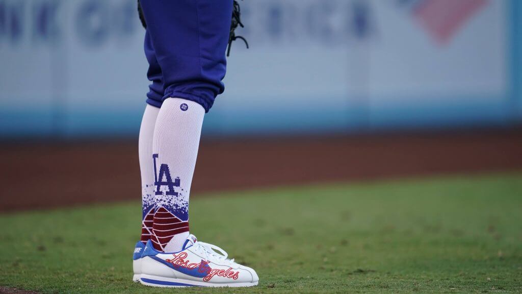
At the time, I thought it was a horrible look — blue hats/jerseys/pants and white socks? I mean shit, Stance couldn’t even give the WHITE SOX white socks (which are correct) for their Field of Dreams game, and yet…somehow they thought it would be a good look for The Los Dodgers.
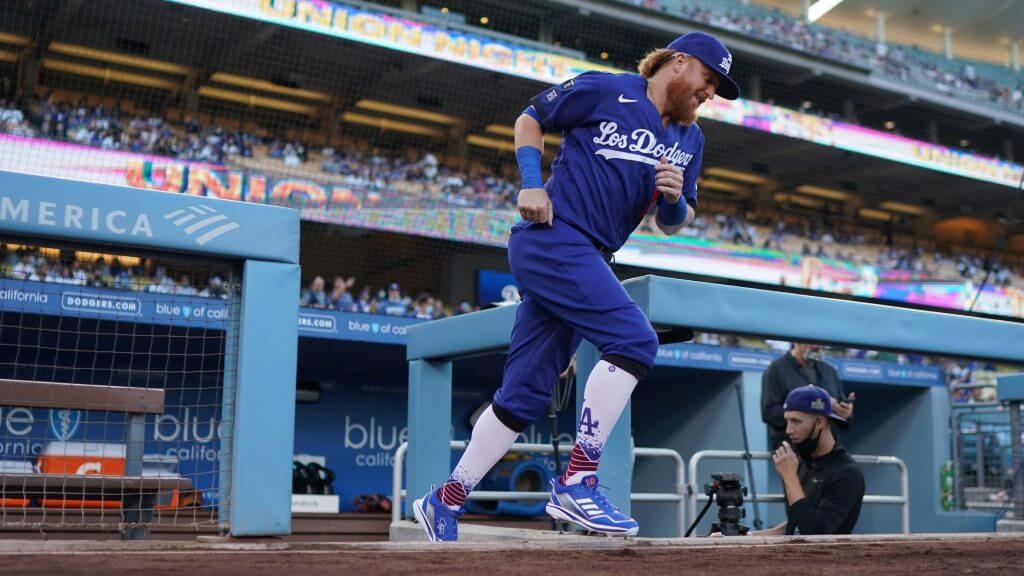
I still don’t think it’s a good look, but at least it breaks up the mono-royal a bit. But, then, in an e-mail string which includes the inimitable Comrade Robert Marshall, he mentioned it gave the team a bit of a “Chet Lemon” vibe — a look of which I was not overly fond, but still, one I’ve grown to appreciate. And hey, when’s the last time the White Sox wore white socks? Turns out…he’s right. One does kinda get a 76-81 Sox feel when comparing the two:
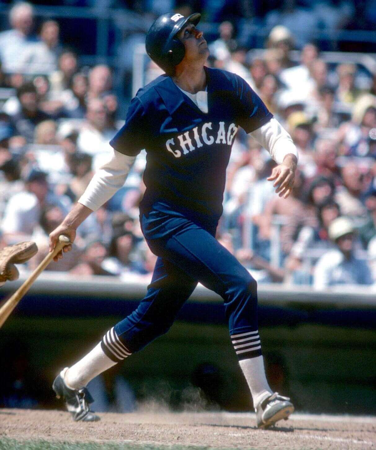
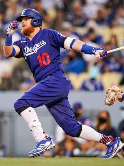
Turns out I don’t hate it as much as I originally did. I don’t however, think it will grow on me the way the ChiSox look did. But maybe it will.
A Uni-related, Non-Uni History Lesson
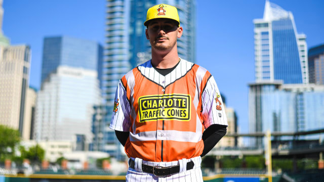
ICYMI, on Saturday, webmaster John Ekdahl included a story on the Charlotte “Traffic Cones” (scroll down), aka the Charlotte Knights, who debuted this crazy MiLB uniform on Friday. John linked to this story which detailed the thinking behind the specialty uniform.
Over the weekend, I was contacted by Wayne Krantz (the former National SLS Manager at Rodgers, who *sponsored* the evening with the Knights), who shared a bit of background:
Related to that story about the Charlotte Traffic Cones…almost 100 years ago, a Charlottean named Blumenthal was in California, and saw traffic cones, made of rubber. His own company in Charlotte, Radiator Specialty was a producer of rubber and rubber products, so he copied the idea. His twist was to change the base to a square one, since the West Coast cones had round bases and they rolled around on the highway when knocked over. The West Coast company took Blumenthal to court for patent infringement and the judge settled the case by awarding Blumenthal, all of the cone business east of the Mississippi (he stated that you can’t patent a shape and the shape made it possible to stack cones for storage). Radiator Specialty went on to make cones in PVC and became a huge seller of traffic cones. Oh yeah, by the way, they also added Gunk and Liquid Wrench to their line – huge successes.
Wayne Krantz
Faaaaaaascinating! As an undergrad History major, I love this sort of stuff — and how great is it that a “cheesy” MiLB promotion could provide such a neat history lesson for us. Thanks for sharing Wayne!

Guess The Game…
from the scoreboard
Today’s scoreboard comes from Suzyn California.
The premise of the game (GTGFTS) is simple: I’ll post a scoreboard and you guys simply identify the game depicted. In the past, I don’t know if I’ve ever completely stumped you (some are easier than others).
Here’s the Scoreboard. In the comments below, try to identify the game (date & location, as well as final score). If anything noteworthy occurred during the game, please add that in (and if you were AT the game, well bonus points for you!):
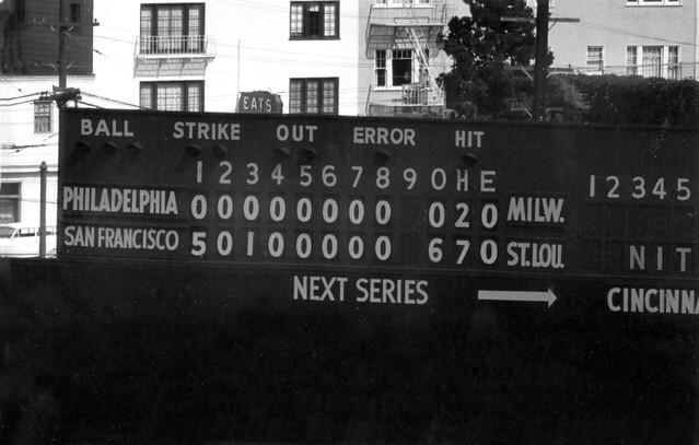
Please continue sending these in! You’re welcome to send me any scoreboard photos (with answers please), and I’ll keep running them.
The Ticker
By Jamie Rathjen

Baseball News: Rays P Chris Mazza wore the wrong hat yesterday and switched mid-game (from @Beardfahsay).

Football News: The first group of Virginia’s number selections for this season were made public on Saturday night. As usual, every player who’s not new either kept their previous number or chose a lower one. … Minnesota is getting black alternates (from multiple readers). … These two items are from Wade Heidt: The CFL’s Toronto Argonauts wore new Cambridge blue pants. … A sign outside Toronto’s city hall and the CN Tower were both lit blue for the Argos. … Here’s (another) list of the Top 10 NFL uniforms (from Phil). … Also from Phil, Mizzou has officially unveiled their new uniforms. … One more from Phil: the Minnesota Golden Gophers will wear black alternate uniforms against Ohio State on September 2.

Hockey News: These three items are from Wade Heidt: The WHL’s Calgary Hitmen have a new Sunday alternate called the “great neighbour jersey”, the idea being you can’t just buy it for yourself, but only for someone else you want to give it to. It also features patterns from two local First Nations on the sleeves and the numbers. … The ECHL’s Kalamazoo Wings are to wear the winner of a fan-designed jersey contest Dec. 31. … Here are the pads for goalie Will Dyke of the Junior A Alberta Junior Hockey League’s Blackfalds Bulldogs.

Soccer News: A Premier League numbering stat from Saturday: Burnley fielded the league’s first starting lineup numbered 1-11 since Charlton Athletic did in August 1998 and also wore their new second shirt. … Arsenal goalie Bernd Leno wore the field players’ second shirt yesterday (from multiple readers). … In the Scottish Premiership, Aberdeen wore last season’s white and black second kit as a third kit against Heart of Midlothian. They acted surprised there was a color clash with their red and dark blue shirts against maroon, which is odd because I think that’s fairly obvious. … Also in Scotland, Hibernian’s women’s team added the logo of the mental health charity Back Onside to their warm-up shirts. … The next two items are from the Netherlands: Ajax’s new third shirt is Bob Marley-themed, for a good reason because Marley’s song “Three Little Birds” is popular with fans. If that idea sounds familiar, Ireland’s Bohemians wanted to do the same thing in 2018, but ran into image rights problems. … ADO Den Haag’s women’s team got a new second kit — unusually, they have a different outfitter than the men’s team so have two different kits. … English women’s teams are continuing to wear the “Take a Stand” patch from last season to support the anti-racism charity Kick it Out, which is now also appearing on the sleeve and not just in black and white. … Italian club Palermo have a new camo third shirt in their colors of pink and black, but I’ll spare you its apparently bizarre marketingspeak (from Trevor Williams). … In Spain, Levante goalie Aitor Fernández abbreviates his last name in his NOB as “Fdez.” (from Jeremy Brahm). … CONCACAF launched women’s versions of its national team competitions last week which share “CONCACAF W” branding. … One of Boston College women’s soccer new kits made its debut last week with grey (!) socks, as the school’s non-football teams switched to New Balance from Under Armour. The other one is mono-white and also is for the men’s team. … Participants in ongoing protests in Colombia have been wearing the national teams’ shirt as a sort of uniform (from K.C. Kless).

Grab Bag: Some Division I field hockey teams have new kits, including Bellarmine, because of a switch to Nike from Adidas, and Boston College because of their aforementioned switch. … NASCAR Cup driver Bubba Wallace’s No. 23 on his roof was upside down yesterday. The bottom always faces the driver’s side (from @yancy60). … In the Australian Football League, Greater Western Sydney wore their Indigenous guernsey an extra time to honor opponents Carlton’s retiring forward Eddie Betts, one of the league’s great modern Indigenous players, and then gave him one (from Graham Clayton). … Two artists are both attempting to create the “blackest black” ink and equivalents of other colors (from Jason Hillyer).
Uni Tweet of the Day
Honestly I wouldn’t mind seeing ‘bama in a white helmet (as a legitimate throwback), but those crimson pants are no bueno…
Uniforms we want to see in 2021: @AlabamaFTBL Edition. #RollTide pic.twitter.com/K3ptOlsR4M
— The Graphic God (@TheGraphicGod_) August 21, 2021
And finally… that’s it for today. Everyone have a good Monday and I’ll catch you again tomorrow.
Peace,
PH
Cleveland should have had the red sleeves to recall the team’s early 1960s sleeveless uniforms.
I liked the blue sleeves quite a bit, actually. They reminded me of their OTHER sleeveless jersey from the early 00s from behind, which I always liked quite a bit back in the day.
GTGFTS: Seals Stadium, May 13, 1959. 6-0 was the final score, with the first three runs scoring on a Willie Mays home run.
And when the game ended, you could go across the street for some “EATS.”
GTGFTS was from May 18, 1959. The Giants beat the Phillies 6-0 at Seals Stadium. Sam Jones struck out 12 batters.
Hadn’t thought about it before, but Great Lakes Guardians is an incredible name for a team. Of course there are many teams who play in cities on or near the shores of the Great Lakes but there is precedent for such a sweeping claim. The Golden State Warriors ignores the existence of 3 other teams (I am aware of the reasons for broadening the locator, however), and the Great Lakes Loons claim the entire GL area for a minor league team, and there are many teams who claim the entire state despite other teams existing within the same state, or a team like New England that claims territory covering many states despite playing in a major metropolitan area, and having very little chance of moving to a smaller market within that larger geographical area.
Had not thought of that possibility either & I agree it totally works.
Whoops = May 13, 1959.
NASCAR still performs pre-race inspections, right?
You’d think officials would have noticed and given 23XI the chance to remedy Bubba Wallace’s roof number…the improper orientation has got to be rules violation and a potential issue(or more of an annoyance?) for spotters.
Ah yes, the Stanford Crimson Tide, the very famous team in that 2nd photo of the uni-tweet of the day
The logo placement on the Cleveland Little League Classic jersey looks like/reminds me of a captain’s “C” like you would see on a hockey jersey.
Small typo in one of my Hockey Ticker items. It is Blackfalds in Alberta.
Fixed
I was confused by the C during the pre-game show. ESPN did a kids’ broadcast preview, and the had a young lady wearing the jersey. The whole time I was wondering why the retail Jersey would have the captain C. It wasn’t until I saw the whole uniform with the hat worn by all the players that I realized it was their logo.
Yeah the C looks strange. They should have used a logo like Chief Wahoo or something more identifiable for this particular instance.
The promos for the Little League Classic originally showed Cleveland wearing white tops with gray pants and LA wearing gray tops with white pants. Anyone know why they changed to gray/gray and white/white for the game?
It was brought in an earlier posting on this site, but it seems that the players posed with just the jersey, while they were wearing their regular game pants on that day. It just so happened that the Angels were at home (white) while the player was modeling the gray jersey, and the Indians were on the road (gray) while posing in the gray LLC jersey.
*The Indians player was modeling the white LLC jersey, of course
re: the Spanish soccer goalie’s NOB, there used to be a Real Madrid player named Juan Gutierrez Hernández. His whole career, he wore either “Guti”, “Guti. H”, or “Guti Haz” on his jerseys.
terrible…..agros double blue on the cn tower looks purple
Why does NASCAR want the roof number to be upside down for the fans in the stands?
I think it’s pretty clear from rule changes over the last few years, like playoffs and stage races, that NASCAR absolutely hates the fans.
The roof numbers are there for the spotters, who act (in a sense) as the cars’ side-view mirrors.
They appear ‘right side up’ when the cars are on the backstretch, where drivers may need the most assistance navigating traffic conditions ahead or around of them, especially at larger, high-speed tracks.
Also, the NASCAR roof numbers read right-side-up when the cars are in the turns on banked tracks, which I’d say is when roof numbers are most visible. I’d also guess they appear right-side-up more often than not from the camera angles most commonly used on TV coverage.
The confusion over the Indians block C logo being a captain’s C clearly lies with the generic look of it. Fortunately, It only has about six weeks to live and then bring on the Guardians new more unique looking C logo.
The Little League Classic is one of the few things MLB has done right in the Manfred era. I like that the caps are unchanged other than just adding a patch. Seems like its less of a marketing gimmick than it would be if they used a whole new hat for one game. I like the inclusion of the team’s regional area and don’t mind the pullover. I would have preferred a pullover throwback from the team’s history but that’s just a quibble.
I thought it was pretty ironic or stupid that the major leagues team playing the Little League game wore regional names on their shirts when the actual Little League teams were not permitted to do it this year, for the first time.
“The ECHL’s Kalamazoo Wings are to wear the winner of a fan-designed jersey contest Dec. 31.”
Hopefully they will fix the apostrophe catastrophe before then.
Something delightful about the new Toronto Argonauts’ new light blue pants. It was a surprise. They had their home opener in Week 3 of the season. Game was on Saturday. The Argos released their uniform combo on social media in the morning on game day. No idea that the new pants existed or were to be unveiled until then.
If the Angels did similar Spanish language uniforms, they would say “Los Angeles.”
I rather enjoyed the sharing of the correspondence between Marc and Walter from 30 years ago. An actual conversation on paper! It was refreshing to read something that was more than 140 characters. I liked that Walter typed out his letter…or was that from a dot-matrix printer? What may seem like boring minutiae is actually historic uni-gold in my opinion.
I used to beat my correspondence out on a beautiful Smith-Corona electric typewriter. It was a gift in 1982, and was a faithful companion for 25 years. My local stationers stopped carrying typewriter ribbon around that time and I wasn’t yet ready to ink up my own used spools; planned obsolesence.
I absolutely thought the “Los Dodgers” City Connect uniforms should have had white socks, and that blue socks would have been virtually pointless, looking almost exactly like what the pajama-cut Dodgers were wearing that night. Of course, the late 1970s White Sox all-navy uniforms are among my favorite sports uniforms ever (in no small part because it’s the only modern-era White Sox uni to really showcase actual white socks that weren’t sanis), so this “Los Dodgers” design (with the white socks) is probably my favorite look ever for the Dodgers.
I was pleased by how good the Little League Classic jerseys looked last night. Good colors that presented well. There’s room for pullovers in the majors.