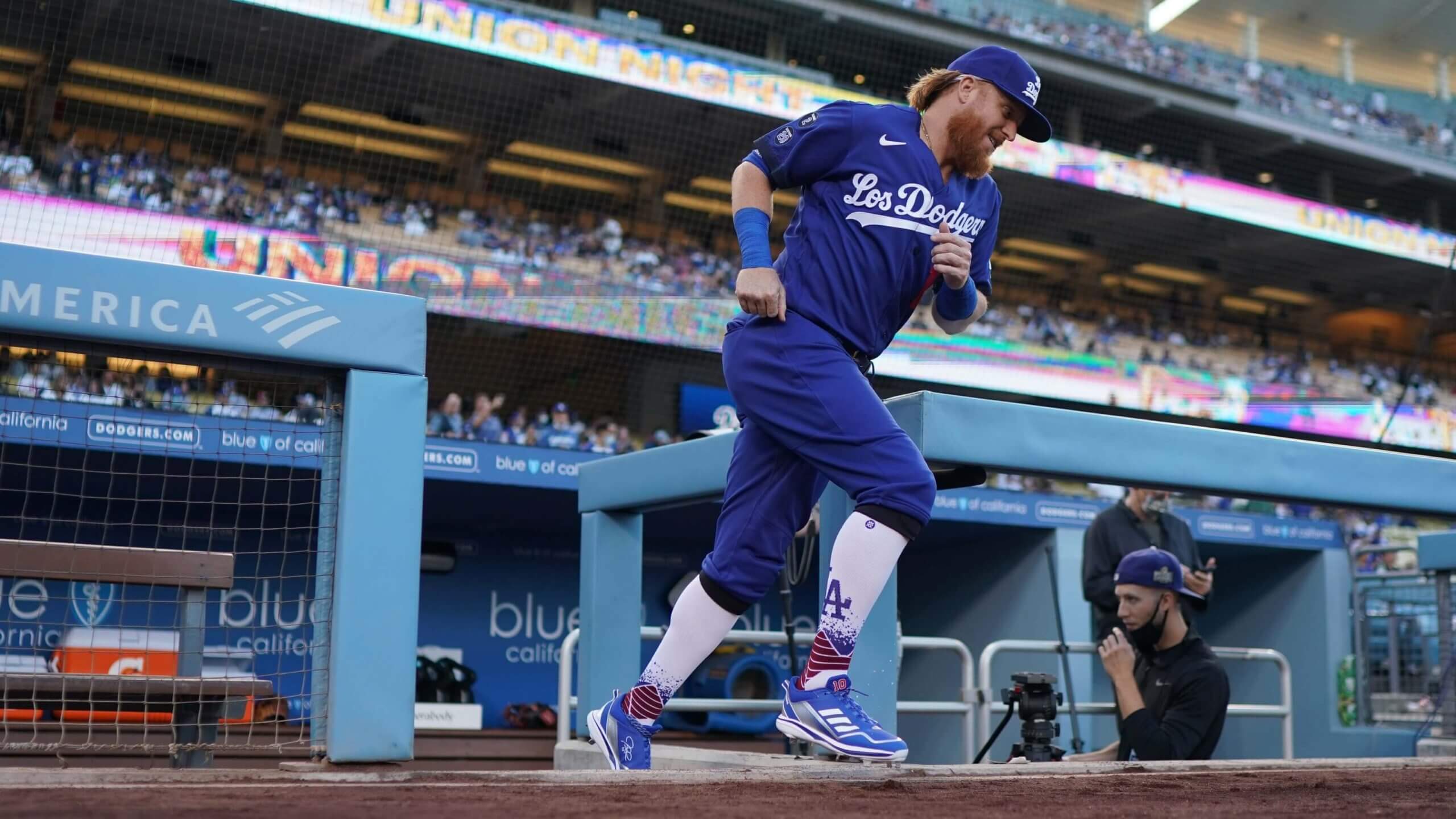
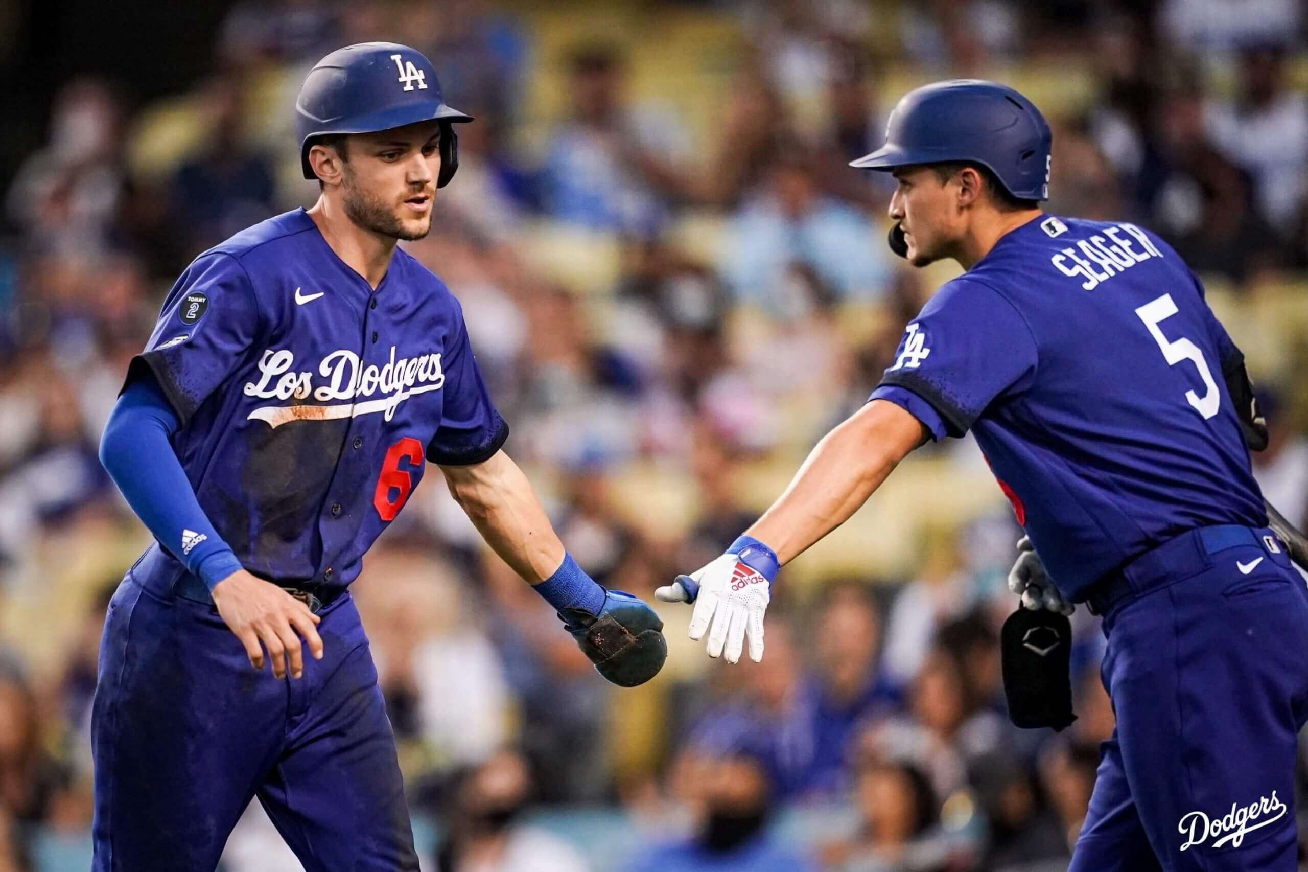
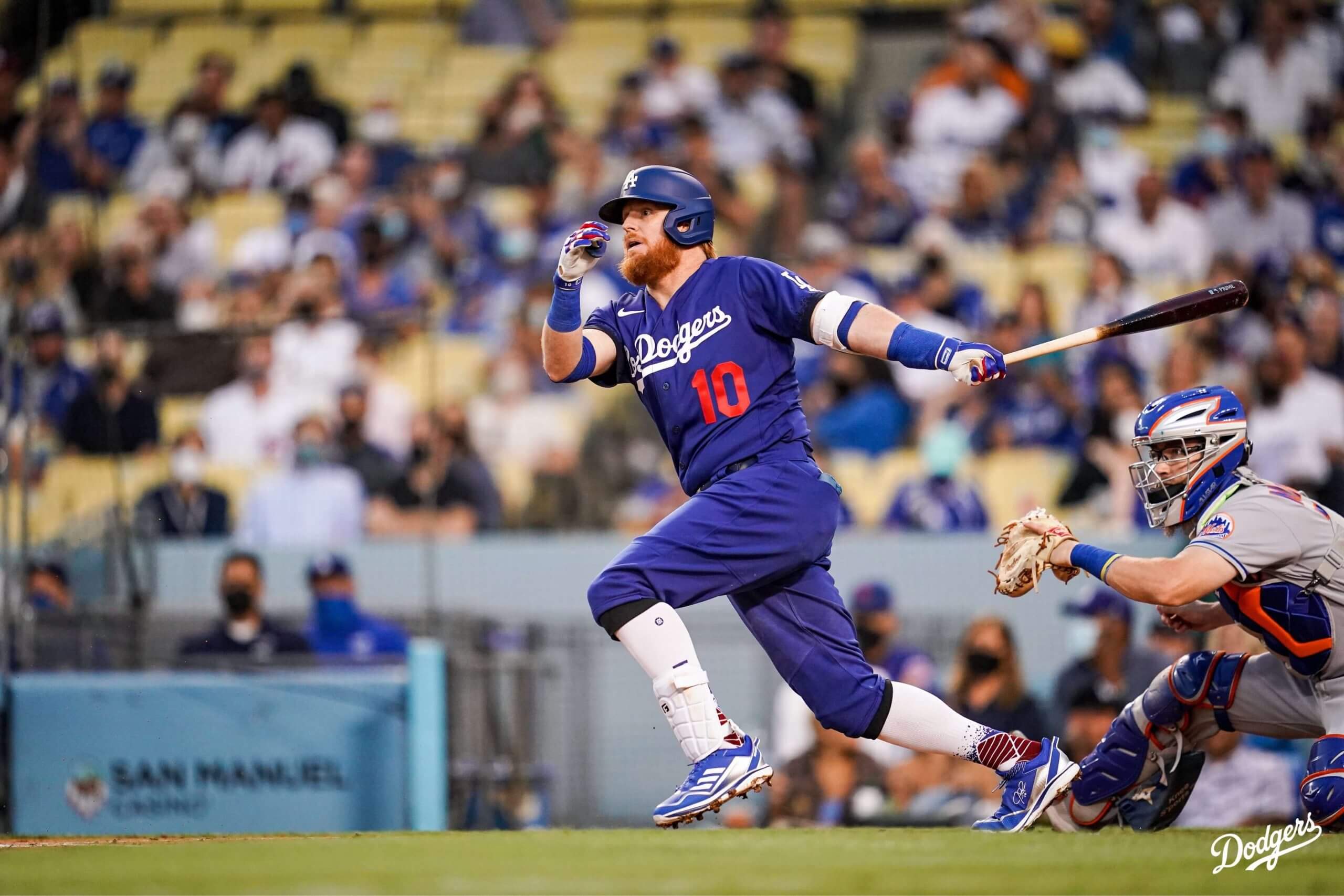
The Dodgers unveiled their “City Connect” uniforms Thursday morning, as Phil covered yesterday here. Last night, they took to the field for the first time in the mono-royal design in a game against the New York Mets. To me, there’s nothing particularly terrible about the design, but the Dodgers are just one of those franchises where seeing them in something so different from their classic look is a bit jarring. Perhaps I’m still bitter about that horrific Player’s Weekend affair from a couple years ago.
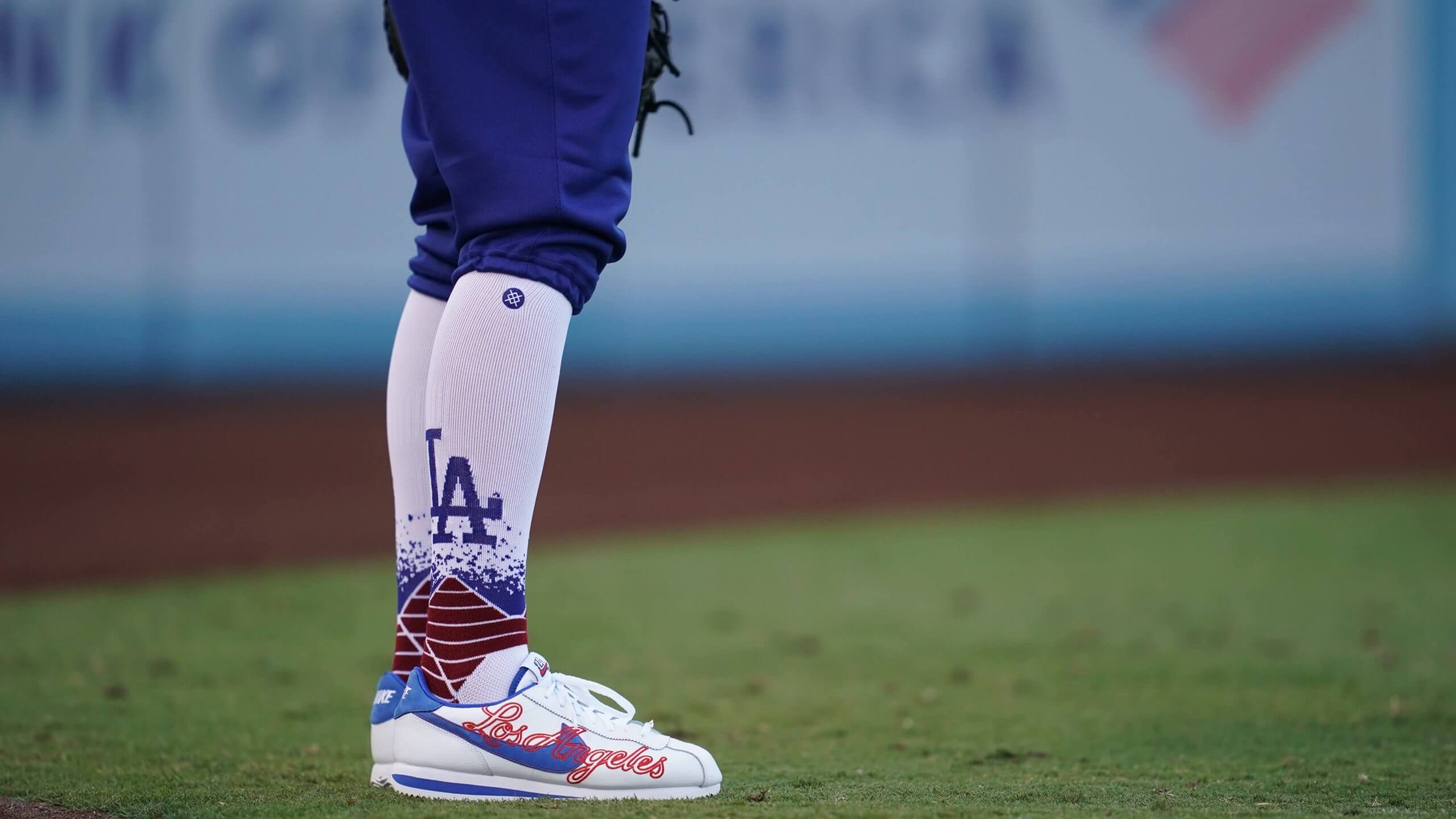
Here’s a closer look at the socks, with a bit of a faux-stirrup effect and paint splatter design.
You can see the black paint splatter on the sleeves in this shot.
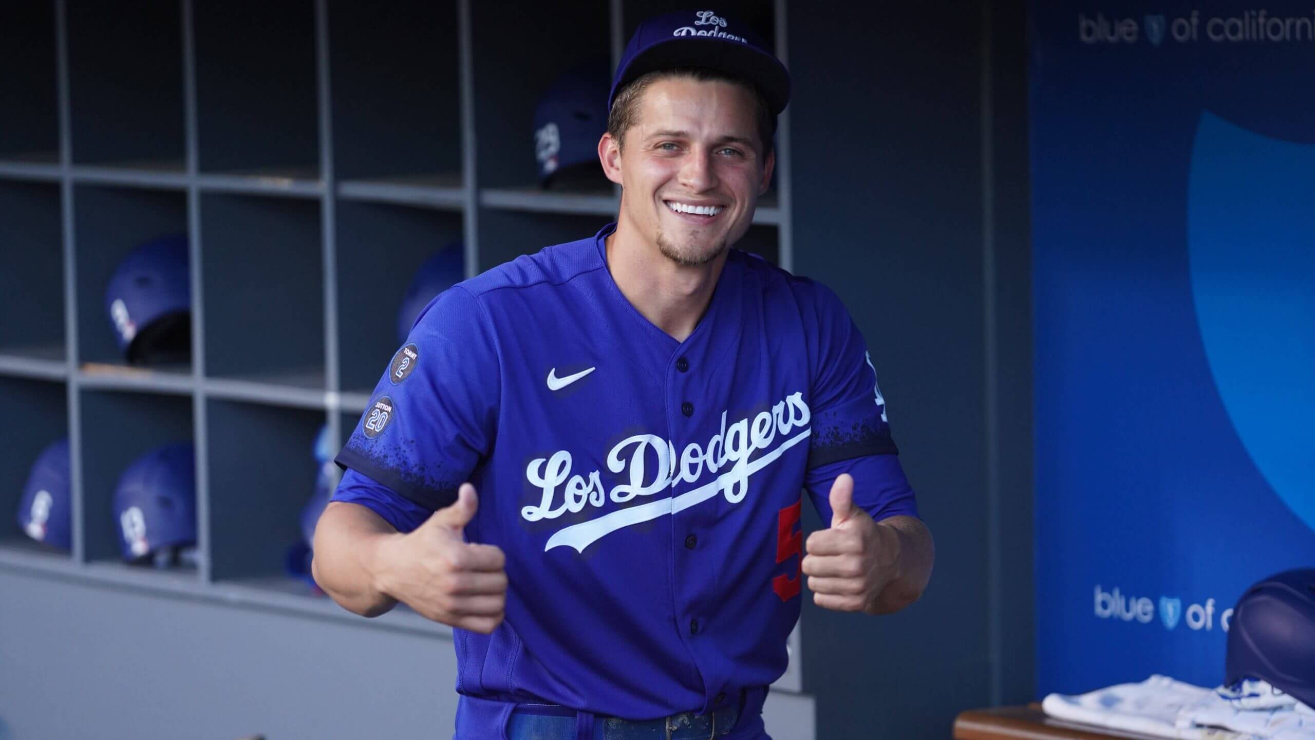
The Dodgers will wear these unis against the Mets again tonight.
• • • • •
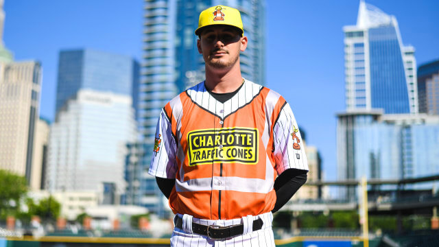
Well, this is different. The Charlotte Traffic Cones. We’ve seen plenty of Minor League marketing gimmicks over the past number of years, usually involving some sort of local food or landmark. The Charlotte Knights have decided to honor construction workers, since the city has experienced so much growth recently. Kinda goofy, but the high-visibility vest overlay on the jerseys is pretty funny.
The idea was inspired by the growth that Charlotte has experienced over the years. People who live here know how much the landscape has changed thanks to the workers whose specialty craft is at the forefront of the new buildings that seem to pop up every day. So, while traffic cones may cause drivers or pedestrians the occasional delay or rerouting around a new building’s construction, they are also a reminder of the Queen City’s rise as one of most attractive, fastest-growing cities in the world.
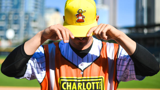
The Knights unveiled the Traffic Cones name, logo, and uniforms, designed to honor those Craftspeople who have built our city. On Friday, August 20th, the orange, yellow and white uniforms featuring a traffic cone with a hard hat will debut in a game against the Norfolk Tides.
Here’s a closer shot of the hat, featuring the traffic cone.
• • • • •
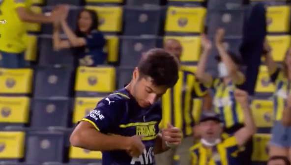
This is pretty funny. Fenerbahce’s Muhammed Gümüşkaya tries to kiss the club logo crest, but this is the Puma third kit and has the club’s name in block letters and a Puma logo instead, so he gives up. The video is available here.
• • • • •
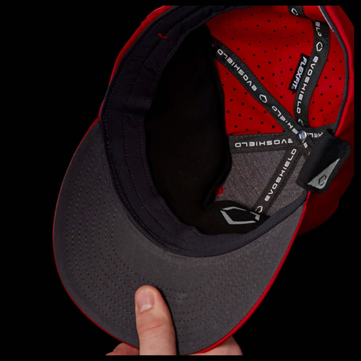
From Bryan Redemske, take a look at the new protective hat insert for pitchers on the mound from EvoShield. I’m curious how effective these would be, given how hard some of these come-backers are hit. As we saw this past week with the scary shot Chris Bassitt took to his face, this won’t be able to solve everything, though any improvement in pitcher safety in undoubtedly a good thing.
Who says EvoShield is just for hitters? With the Gel-to-Shell Protective Hat Insert, pitchers can stay locked in on racking up outs without worrying about hard-hit comebackers and screaming line drives. Crafted with the same transformative Gel-to-Shell™ Technology found in the Pro-SRZ lineup of guards, this protective hat insert delivers low-profile coverage on the mound and in the field.
EvoShield created more than five iterations of the Gel-to-Shell insert, working to streamline its size and construction while maintaining the integrity of the Gel-to-Shell material. The final product, once molded inside a cap, is lightweight, form-fitting and hardly noticeable.
If you haven’t seen the update, Bassitt is feeling better after suffering a facial fracture that will require surgery. Thankfully, his vision was not impaired.
• • • • •
I’ll wrap this up with a little hometown flavor from here in Jacksonville. Check out the teal crossover for the Jacksonville Jumbo Shrimp. Training camp for the Jaguars is right across the parking lot, so maybe they saw them!
https://twitter.com/JaxShrimp/status/1428734156045959179
What exactly is the goal of the City Connect uniforms? Undoubtedly some teams are gonna make theirs a permanent alternate, right? And that opens the doors to each team eventually having 16 uniforms, like the NBA? So you can’t identify them at a glance? But who cares as long as there’s new merch to sell? Am I getting warmer?
This is all to make money off kids who like wearing ugly designs.
The connect jerseys are $300, I can’t believe they did that just for merchandise. I think they are trying to get more viewers on a game.
The Dodgers looked terrible last night. I heard somebody refer to them as the “Blueberry” look.
Maybe could have looked better if they had used a bit more red accent than white.
It’s a good thing Bartolo Colon wasn’t with the Dodgers last night. He’d look like Violet from Willy Wonka in that dumpster fire.
Terrible look. And panders to a culture that can’t seem to assimilate.
I was watching the Dodgers/Mets on MLBN last night. I wanted to hate these uniforms at first but I don’t know, the more I watched, the more they grew on me. I think they especially looked good with guys that went with longer pants lengths and white cleats. The “Los Dodgers” cap was overkill, but I get they wanted to have a different cap than the classic “LA”.
“I think they especially looked good with guys that went with longer pants lengths and white cleats.”
I don’t even know you any more Douggie …
;)
I thought the White Sox CC was the worst.
I was mistaken.
No. That honor goes to the Giants.
We have a break until ’22 for the City Connect…now we can view the MLB/Little League jerseys, the Player Weekend, and the add ons they’ll drop on Post Season unis. Spring and Summer went by so fast..
Interesting info on the EVO shield insert. My son, a LHP in HS has been wearing one from SST for years. Its made of kevlar and nobody even knows that he has it. I need to check out the EVO shield one, looks interesting and I want to compare the 2.
Could anyone please accurately translate “Dodger” – as in “Trolley Dodger”-into colloquial Spanish? Hablo solamente un poquito de espanol, lo siento mucho.
I can’t stand “Los Mets” on my b eloved Amazins’ chests. Now,
Los Metropolitanos would be fine with me .
Yeah, the whole thing is stupid and pandering, it’s not like the regular uniforms have “The Dodgers” on them.