[Editor’s Note: Paul is on his annual August break from the site. Deputy editor Phil Hecken is in charge from now through the end of the month, although Paul may be popping up here occasionally.]
By Phil Hecken
Follow @PhilHecken
Good Friday morning, Uni Watchers. It’s Friday. We made it!
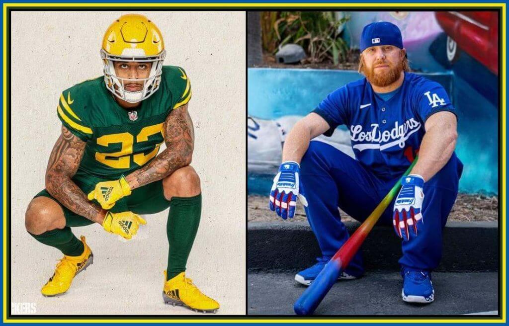
As you’re no doubt aware, yesterday morning both the Green Bay Packers and the Los Angeles Dodgers unveiled alternate uniforms. For the Packers, it was a new alternate uniform — technically a throwback, but in reality a fauxback — and for the Dodgers, it was their “City Connect” uniform. Since the Packers unveiled about an hour before the Dodgers, we’ll start with them.
PACKERS:
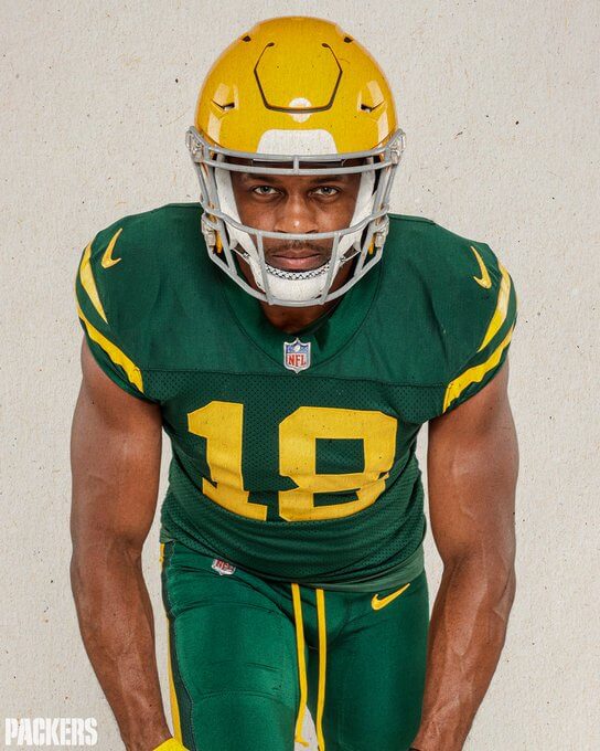
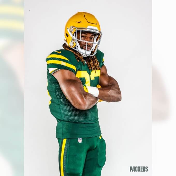
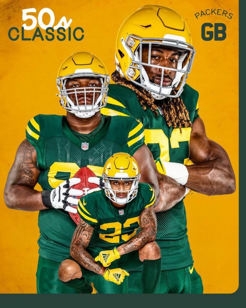
As you can see, both from the splash photo and the two photos above, the new Packers fauxback is green. Very very green. The team will sport a gold helmet (their current helmet, stripped of the “G” logo and green facemask, which they have replaced with gray). The rest of the uniform — the jersey, pants and socks, are all in their current shade of green. Did I mention the uniform has a lot of green?
I’m referring to this as a fauxback, because that’s what it is — and the Packers themselves were very up front with this. They’re calling it a “History Inspired 50s Classic” uniform (the team did wear green over green in 1950 and 1953, and had a green pants option in both 1951 and 1952), and described it thusly:
The uniforms are all green, with gold numbers and stripes similar to the jerseys worn in the 1950s. In those days, the green was a Kelly green and the team alternated between wearing it with green or gold pants. This alternate jersey, which is the Packers’ traditional green color, with gold numbers and stripes, will be worn with matching green pants with gold stripes, and matching green socks.
It’s a pretty simple look, with two gold stripes on the shoulder caps, gold numbers, and a single, solid gold stripe on the green pants.
The 50s Classic Uniform is inspired by the team’s uniforms from 1950-1953, which was the second time the team wore green and gold in its history. The Packers first wore green in the mid-to-late 1930s.
Why did the team select this era for their fauxback? “The 1950s were one of the most interesting times in our organization’s rich history, creating the bridge between two of the greatest eras in pro football,” said Packers President/CEO Mark Murphy. “With the NFL growing rapidly, this time period set the stage for the construction of Lambeau Field and for the team’s success in the 1960s and beyond.”
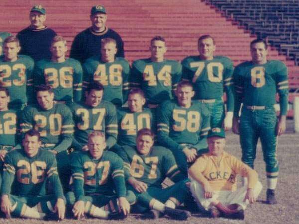
What exactly did the Packers uniforms look like back then? Here’s how it looked in 1953, one of the years the team wore mono-green:
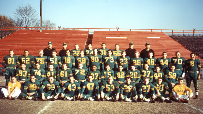
And here’s a closer view. Note back then, aside from being “kelly” green in color, the team wore green striped stirrups, with white sannies/crew socks.
And how does this new fauxback compare with the original? It’s pretty close.
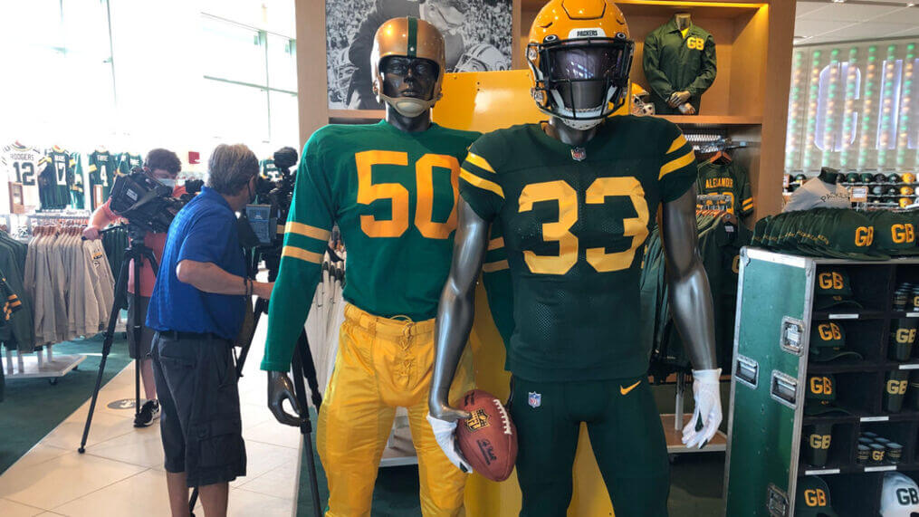
You’ll note the mannequin sporting the 1950s uniform has gold pants, but the team did sometimes pair the green jersey with the green pants. Obviously the stripes on the 1950s jersey were much lower, but that’s because uniforms back then had actual sleeves. You’ll also note the 1950s mannequin is wearing a more metallic gold helmet with green stripe. If you double-check with the GUD, you’ll see the team wore this combination (but with green pants) in 1953 only, while in 1950, the helmet was solid athletic gold. Obviously the Packers are forced to wear their current shell, so the new alternate uniform is definitely taking elements from that 1950-1953 period.
If you’re curious about the back of the jersey, the NOB (which didn’t exist in the 1950s but is required now) is athletic gold, as are the numbers, which are rendered both on front and in back in a block font.
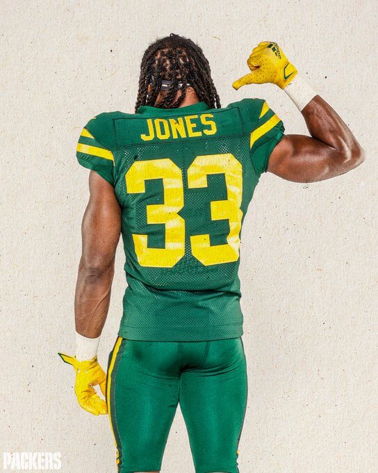
I was initially disappointed to see the team will be wearing solid green socks, as the original look featured a green stirrup with a gold stripe (and a crew sock). Since players are no longer required to wear crew socks, at least a gold stripe would break up the monochrome green, but — and I can’t believe I’m saying this — I’m glad they didn’t go with gold socks (which would break up the mono green, but be incorrect for the era). I normally hate the leotard look (even for a “throwback”), but in this case I’m actually OK with it. I’m also ok with the team not adding a green stripe to the helmet, since that was germane to the metallic gold helmet (worn 1951-53), but not to the 1950 athletic gold helmet. Those are minor quibbles, and overall I am quite excited to see these on the gridiron! Also of note is the tailoring — the Packers are the only team to still wear the old Reebok jersey, and the new throwbacks are also in that cut, not one of the Nike “elite” or “vapor” or whatever they call their template.
And of course, the with the new unis comes a hype video…
A history-inspired look with a modern vibe.
Introducing the #Packers 50s Classic Uniform 🟩🟨#GoPackGo pic.twitter.com/BOPu6U7dKC
— Green Bay Packers (@packers) August 19, 2021
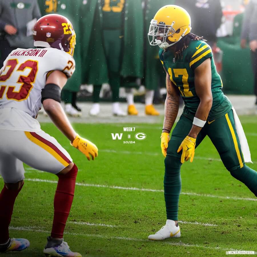
The new uniforms will debut at Lambeau Field on October 24 against Washington. The photoshoppers are already providing a “preview”:
What do you guys think?
DODGERS:
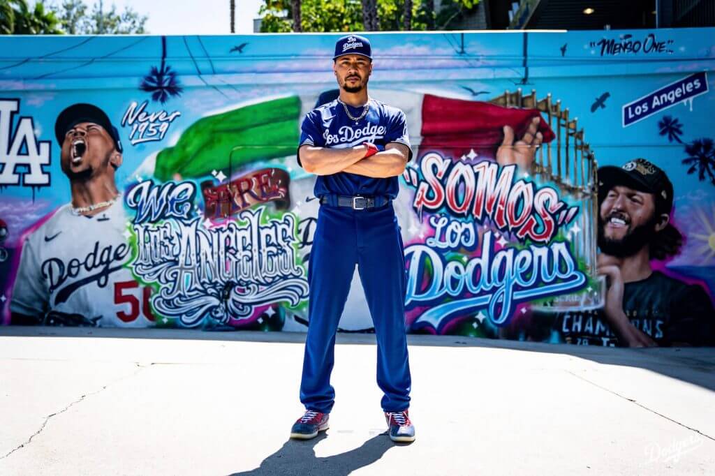
The Los Angeles Dodgers became the seventh and final team (in 2021) to debut their “City Connect” uniforms yesterday morning — and will wear them tonight and Saturday against the New York Mets. As you can see, their CC uni is head-to-toe mono-blue (well, not completely blue, which we’ll get to in a second).
Nike’s marketing-speak went into overdrive with these, but in a way it’s necessary to put the uniforms into context. If we were to look solely at these uniforms as well, just a uniform, then they’d just look silly. So, let’s first look at the two items most people who aren’t unifiles will care about: the cap and the jersey:
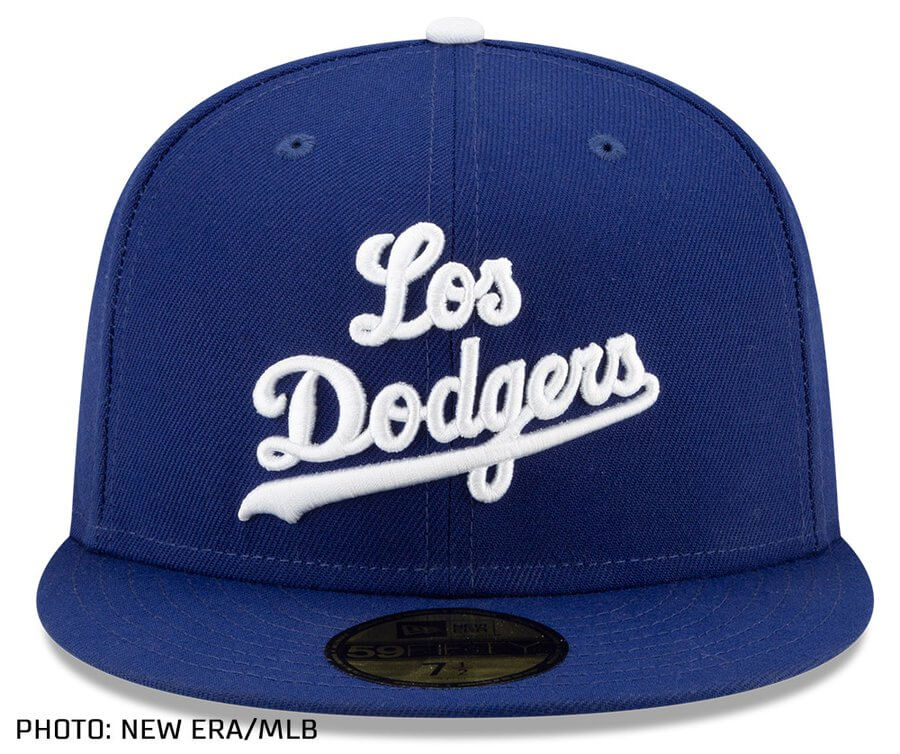
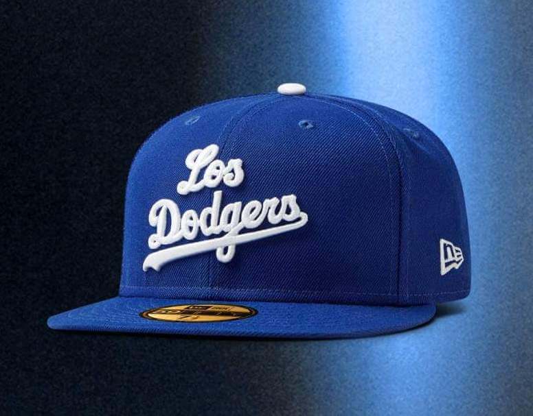
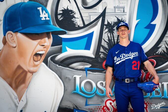
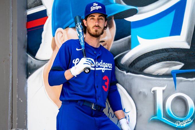
The first thing you’ll notice about the cap is the interlocking “LA” logo has been replaced with two stacked words, rendered in Dodgers script: “Los” atop “Dodgers.” Why “Los Dodgers”? I’m sure you can guess, but we’ll get to that part shortly.
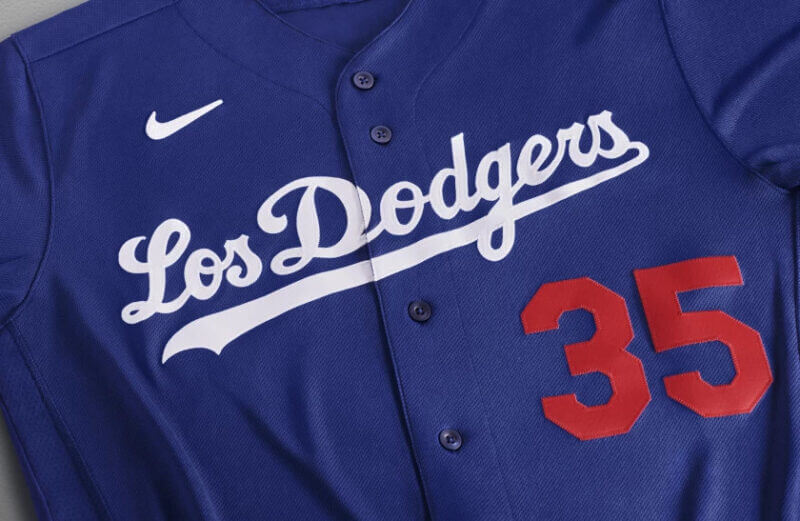
The jersey is royal blue and contains the words “Los Dodgers” in white script across the chest, with red player numbers, and the sleeves ends are black, in a splatter pattern, fading to blue.
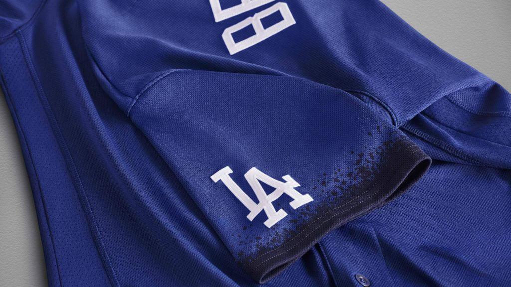
The pants are also royal blue, and unfortunately all the promotional shots I’ve seen have the players wearing their pants uncuffed (pajama style), so we cannot see the socks. I’m not sure if any of the players will go high-cuffed, but if they do, we can probably safely assume the socks will also be royal (or mostly royal — who knows what Stance will provide).
Promotional photos all show players standing in front of newly-designed murals at Dodger Stadium…
OK — there’s a look at the uniforms without the cringeworthy descriptions from Nike. But to judge the uniform without them wouldn’t quite be fair to the uniform. “Los” Dodgers, black edges on the jersey sleeve, players posing in front of murals. Here’s the “why”:
The Nike Los Angeles Dodgers City Connect Jersey celebrates the link between Los Angeles’ distinct culture and sport. The club unites all Angelenos through their passion for team, its color and a shared pursuit of greatness. The blue jersey is a tribute to a fanbase who have powered the club for over six decades.
Releasing ahead of Latino Heritage Month, the jersey features “Los Dodgers” across the chest. The graphic recognizes the club’s deep connection with the Latino community and the lasting impact of the club’s Latino fans and players, which are celebrated throughout the season at Viva Los Dodgers festivals.
On the jersey’s sleeves, a spray-paint design honors L.A.’s mural culture. Throughout the city, artists have illustrated iconic Dodgers’ moments that commemorate the legacy of the club and its players.
I’m sure the original denizens of Chavez Ravine will appreciate the gesture. Yes, I know things have changed greatly since the team built Dodger Stadium, and amends with the Hispanic community have been made, but that’s surely still a sore spot amongst some Angelenos. Perhaps the City Connect jersey (uniform) is their way of making further amends. But Nike’s CC uniforms “celebrate the bond between each club and its city. The uniform series explores the personality, values and customs that make each community and their residents unique.” As we’ve seen with the previous six CC uniforms, reaction to this “mission” statement has been mixed. But as much as we might like to, we cannot truly judge the uni solely on how it looks, but rather, we must look at it in the context of what Nike’s designers are trying to convey.
Here’s their take:
For over six decades, Angelenos have been united by a team, a dream and a color. Whether you refer to that color as blue or azul, we all share a connection and an allegiance to a team that inspires our art and story. We are Los Angeles, somos Los Dodgers. pic.twitter.com/Iba5mt12rE
— Los Angeles Dodgers (@Dodgers) August 19, 2021
“The Dodger uniform is an iconic part of the franchise’s identity. While our traditional look has and will always be worn by the franchise-great players, the City Connect program offered us the opportunity to recognize the impact and importance of our multicultural fanbase,” said Lon Rosen, Dodgers executive vice president and chief marketing officer. “We’re excited to debut these City Connect uniforms on the field and know our fans will enjoy seeing ‘Los Dodgers’ on the uniforms as well as our new murals, which bring Los Angeles’ street art culture to Dodger Stadium.”
Overall, I don’t mind the jersey, as the “spray paint” sleeve is innocuous enough, although I still dislike it when teams add “Los” in front of their name (we’ve discussed this as some length over the years on UW). It’s not that it’s incorrect (or even lazy, per se), it just seems that it’s not necessary. The cap is interesting, as the tiny “Los Dodgers” won’t really be visible at distance, and it will certainly be a unique MLB cap (and I’m sure, a hot seller, which is no doubt part of the motivation behind it).
This won’t actually be the first time the tradition-bound team has worn a royal blue jersey in a game that counts, and the club wears a royal blue bp/spring training jersey. You may recall Justin Turner pleading with management to wear those bp tops in a game — so in a way he’s getting his wish.
As far as the royal blue pants…I don’t hate these, but I think the Los Dodgers CC would look better with white pants. Especially if the royal pants are worn pajama style — although I’m hoping at least one or more of the players goes high cuffed, just so we can see what kind of hosiery will accompany the blue pants.
We’ll get to see these on the field tonight and tomorrow. I’m sure Johnny Ek will have coverage of these once they’re worn. I may have some more thoughts on Monday. Maybe.
What do you guys think?

Guess The Game…
from the scoreboard
Today’s scoreboard comes from Graham Clayton.
The premise of the game (GTGFTS) is simple: I’ll post a scoreboard and you guys simply identify the game depicted. In the past, I don’t know if I’ve ever completely stumped you (some are easier than others).
Here’s the Scoreboard. In the comments below, try to identify the game (date & location, as well as final score). If anything noteworthy occurred during the game, please add that in (and if you were AT the game, well bonus points for you!):
Please continue sending these in! You’re welcome to send me any scoreboard photos (with answers please), and I’ll keep running them.
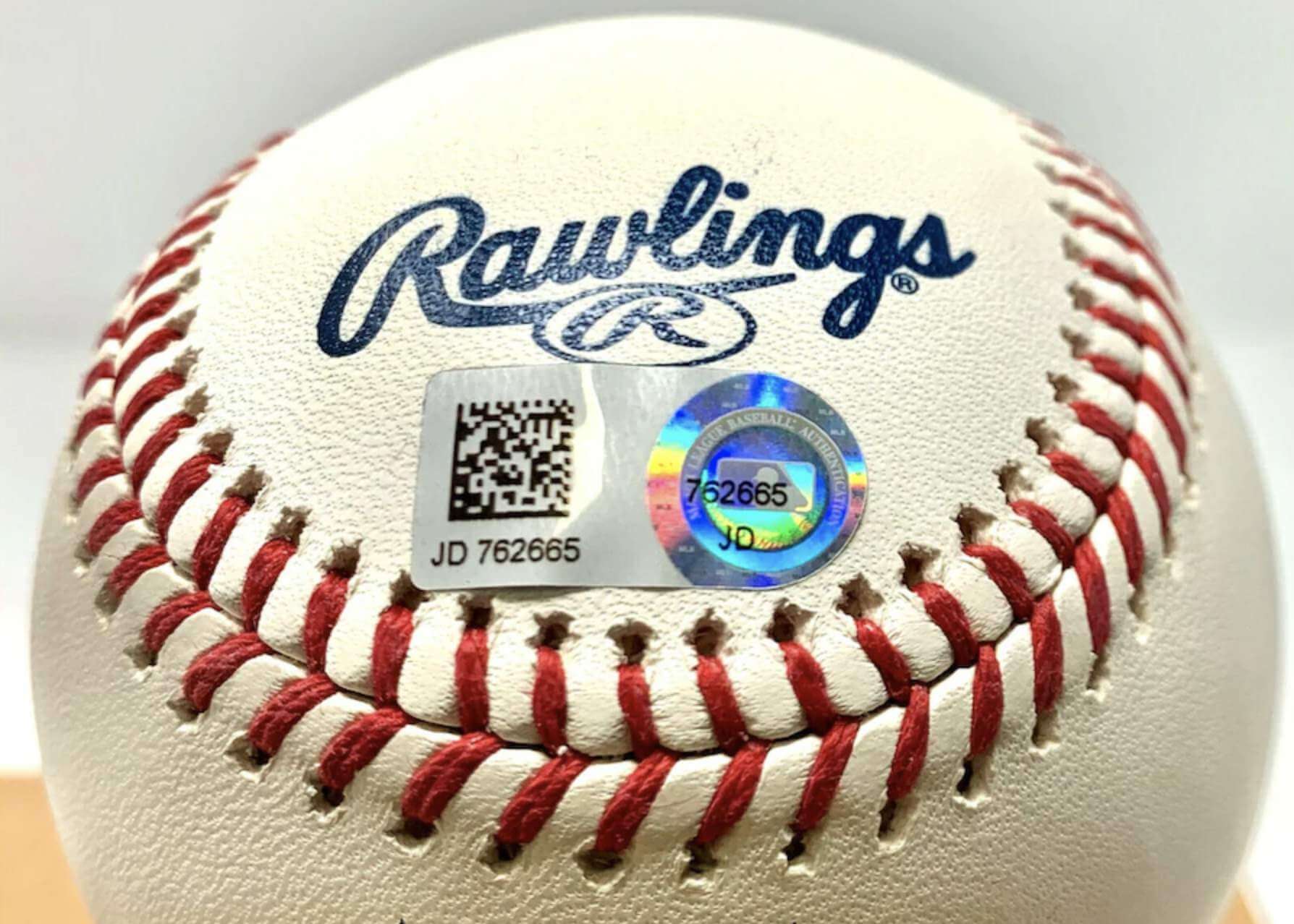
Bulletin reminder: Paul here. In case you missed it on Thursday, my latest piece for Bulletin is an in-depth interview with Mike Acosta, who served for years as the Astros’ authentication manager (which means he dealt a lot with those little hologram stickers, like the one on the baseball shown above). I learned soooo much interesting stuff in this interview, and I think you will too. You can check it out on my Bulletin page.
Also: Up until now, only people who subscribed to my Bulletin articles were able to post comments on them. But I’m happy to report that as of now, any registered Facebook user can post a comment on my Bulletin articles, even if you’re not a subscriber. I’m hoping this will lead to a more robust discussion.
Okay, now back to Phil!
The Ticker
By Anthony Emerson

Baseball News: Say goodbye to Topps: Fanatics, the MLB, and MLBPA have signed an exclusive baseball card deal to begin in 2022, continuing its quick growth in only a couple of years (from multiple readers). … Check out this 1933 pic of Red Sox players Johnny Gooch and Mel Almada. Notice how the “S” aligns with their placket stripes at different places? (from Paul Friedmann). … Gary Bratton, Chief of the Choctaw Nation, threw out the first pitch at a Rangers game recently, and he was given a jersey with “CHOCTAW” on the back (from Chance Plett). … The Memphis Redbirds, Triple-A affiliates of the Cardinals, will become the Memphis Wet Ribs tonight and the Memphis Dry Rubs tomorrow (from Ryan DeBoard). … The Vancouver Canadians, High-A affiliates of the Blue Jays, have a pretty clever “floating” backstop logo (from Aaron Wigg). … The Little League World Series started yesterday, and Nebraska’s green unis blended in with the wall too much, meaning that ads were projected onto the players (from Christopher Keese). Also, this year’s LLWS unis just say “Little League Baseball” instead of having the team’s region, a really bad choice in my opinion (from C. Fish and Emily Teachout).

Pro Football News: The Patriots unis are now entering year two, and yet they’re still having trouble getting the correct font onto the jerseys. Check out Isaiah Zuber’s “Z” in this pic, in the Pats’ old font (from Matt Monitto). … ESPN has a really good article on some of the NFL players who paid to switch to single digits following the NFL’s relaxing of the number rule (from Jason Hillyer). … BC Place was lit up orange to celebrate the BC Lions’ return to Vancouver for their first home game since the pandemic began (from Wade Heidt). … Marketplace did a piece on the NFL’s new numbering scheme (from Andrew Cosentino).
College/High School Football News: Also posted in the soccer section: FSU soccer are wearing some really nice sleeve patches honoring the late Bobby Bowden (from @TaReefKnockOut). … Air Force has unveiled a new alternate honoring the B-52 Stratofortress (thanks, Phil). … It appears UNC has removed endzone wall ads that were installed last year at Kenan Stadium.

Hockey News: Sabres G Aaron Dell has some pretty amazing new pads (from Steve Urbanski). … With jersey ads an inevitability in the NHL, The Province has taken a look back to when the Canucks sold ad space on their practice jerseys in late 1980s and then again for a season in the mid-90s (from Kris Fulton). … The City of Glendale, owners of the Coyotes’ arena, will kick the Yotes out after this season (thanks, Brinke).

NBA News: As usual, Etienne Catalan has a whole slate of NBA uni number updates available on his Twitter.

Soccer News: Our own Jamie Rathjen wrote about Puma’s, uh, unique new third kit designs yesterday. Now, multiple outlets are reporting that Borussia Dortmund have refused Puma’s design as it lacked the club’s badge. BVB are designing their own third kit, to be released. Elsewhere, the kits caused problems for Fenerbahçe’s Muhammed Gümüşkaya, who tried to kiss his badge after scoring a goal, but couldn’t because there was no badge on his jersey (from multiple readers). … Juventus unveiled their third shirt yesterday (thanks Jamie). … Tottenham wore their normal Premier League kit of white shirts with blue shorts instead of their usual European kit of all-white during yesterday’s UEFA Conference League qualifying match against Paços de Ferreira. Spurs also wore their regular Premier League font instead of their cup-specific proprietary font, and keeper Pierluigi Gollini wore a baseball cap to keep the sun from his eyes. … For some reason, Rangers FW Ryan Kent wore the correct kit but the incorrect shirt ad during yesterday’s UEFA Europa Leauge qualifying match against Alashkert FC (from Ed Żelaski). … Also from Ed: Tomorrow, Polish side Cracovia will wear a gorgeous throwback to honor the 100th anniversary of their first title. … CF Montréal has added assistant coach Jason DiTullio’s first name to their sleeves as a gesture of support as he battle brain cancer (from Moe Khan). … The Whitecaps partnered with a brewery to create a line of cans inspired by jerseys throughout their history in order to celebrate their return to Vancouver (from Wade Heidt). … English seventh-tier side Enfield Town have a new shirt advertiser: the WWE’s British “NXTUK” promotion (from Scott Whitt). … Cross-posted from the college football section: FSU soccer are wearing some really nice sleeve patches honoring the late Bobby Bowden (from @TaReefKnockOut).

Grab Bag: New identity for UNC Charlotte (from James Gilbert).
Uni Tweet of the Day
I barely remember these. Not sure I want to see them again…
I'd freakin' LOVE if the Steelers brought back the all white uniforms. #Steelers pic.twitter.com/LGUTp34sRE
— Austin K. ⚫ (@SteelersTake) August 19, 2021
And finally… that’s it for me for this week. Enjoy webmaster Johnny Ekdahl’s weekend content and I’ll catch you back here again on Monday — everyone have a good weekend.
The last vestiges of Tropical Storm Fred are visible in last night’s non-sunset. You can’t really tell from the photo, but yesterday had some of the strangest and coolest looking cloud formations I’ve seen in a while. And I’m not anxious to see again — as Tropical Storm (possibly Hurricane) Henri is expected to come very close to the east end of Long Island (where the summer place is located) on Sunday.
Peace,
PH
Little League has 2 teams from each region instead of the traditional single champion this year and also no international teams. Perhaps that had something to do with the Jersey change.
They announced that that is the reason
I feel bad for any Dodger fans that have to sit in Dodger Stadium and see those trashy uniforms over the traditional whites.
Yup, if the Dodgers aren’t in white jerseys for a home game, they’re not the Dodgers.
So many teams are going back to the powder blue, which is a color I love, except the one team that is known for wearing blue. Seems like a no-brainer. They could have made the pants powder blue instead of going mono-royal. Oh well…
I love powder blue, but I think it’s being overused at present. And even if it weren’t, royal over powder? Over my dead body. Don’t mix shades of a single color.
I’m a lifelong Steeler fan, but I’m not actually old enough to remember the all-white uniforms (have only seen pictures). I don’t get why so many people think they should bring these back. To me, they look like practice uniforms.
I agree. Honestly, I don’t think they look bad (if you think about it, both the home and road jerseys have more black that yellow, as does the helmet) and it kind of makes sense, somewhat like what U of Michigan is doing with the white pants. That said, I much prefer the yellow pants for both. Probably because that’s been both teams’ look for most of my life.
I am old enough to remember the all white uniforms. I don’t need to see them again. How can we make the road uniforms look more dull? I know, mono white with a black helmet.
I wonder if Isaiah Zuber is wearing a jersey from last year? If memory serves me correctly, he was one of the guys who had this same problem last year.
Good: Solid blue uniform. More teams should at least sometimes wear colors other than white or gray on the bottom. The black spraypaint sleeve ends are dumb, but also almost invisible, so that’s fine. Limiting the red to just the number is also a good move. Would have been easy to add red accents elsewhere; glad the Dodgers didn’t.
Meh: The jersey script. It’s not good, but it’s not bad either. It’s fine.
Bad: The cap. Stacked text instead of a logo? Ugly, unreadable, a lost opportunity to do something truly new or distinctive. I’m trying to think of other caps that have been worn on-field in a game that I like less than this and I’m honestly coming up blank. Even some recent All-Star Game chapeaux, while bad, are not this bad. Reminds me of a seed-company trucker hat from my 1980s childhood in the Midwest.
Below the neck, the CC uniform is fine. C-plus uniformery. Above the neck, it’s a record-setting cluster. We need a new grade below F for the cap.
And speaking of the Dodgers and their special connection to Latino Angelinos,
link
I know this is just a matter of taste, but I hate the solid color uniforms It feels too college/70’s to me. The jersey is an obvious downgrade, but it’d be fine if it was paired with the traditional hats and white/gray pants.
What’s more troubling is the Dodgers have arguably the best uniforms in baseball and they’ve remained largely unchanged for quite some time. I fear Nike is turning MLB into the NBA, and no team is safe
Interestingly, the CC uniform renders my least favorite feature of their workaday jerseys necessary: the “LA” on the left sleeve.
Nice Ry Cooder reference!
I was watching good morning football yesterday when the Packers uniforms were revealed and the hosts all got new jerseys from the team but with one major difference. Their jerseys had shoulder numbers! Interesting…
link
The first time I saw an NFL team wear colored numbers on a dark jersey (Bears’ Monsters of the Midway throwback), it looked unusual, but I liked it. Then the Browns color rash had orange numbers on brown. Same reaction. And now the Packers fauxback has gold on green. Not sure about others, but I really like the color-on-color numbers — as opposed to white with a colored outline.
Yes, this. I happened to catch the Canadian FB league game last night (BC vs Elks) and BC’s unis looked really cool with the black portions with solid orange numbers (talking the TV numbers here). I think Oregon State did something similar recently also, and I recall Iowa’s throwbacks had black jerseys with yellow numbers. All good looks IMHO.
I generally like this look as well. A few other examples: The Rams’ throwback blue jerseys, and also their gold color rush jerseys. The Steelers have this with their color rush jerseys, and also the throwbacks they wore from 2007-2011, and the Vikings color rush jerseys as well. Then there was the 49ers BFBS jerseys, which I didn’t care for as a 49ers uniform, but I think it would have looked great on, say, the Falcons.
RE: Nike talk
At this point, is this just designers trying to justify their jobs and have something to do?
While I appreciate a lot of thought and attention and the little stories when it concerns a complete change in a team’s uniform set, Nike designers have to know that all that chatter comes off as cheap fluff when they make another new jersey. I would have to see the numbers to believe that it helps move enough merchandise to even justify the cost to research and design all the alternates uniforms produced.
To me, less would be more and I would appreciate and think a special uniform set would be more special if they didn’t try to sell everything so hard. The past few years I find it hard to read these pieces that would make “Seinfeld’s” J. Peterman character gag, partly because I’m rolling my eyes.
“The club unites all Angelenos through their passion for team, its color and a shared pursuit of greatness”
link
The Angels will fix it.
Would have been cool to see the Packers in the lighter kelly green like the actual 1950s uniforms.
All of this Fanatics stuff is going to come to a head at some point. I don’t like anything they do.
Couldn’t agree more! Frankly, I think the DOJ should investigate Fanatics for antitrust violations. It seems every online broad-service fan apparel retailer is now an affiliate of Fanatics, and I’ve definitely noticed an uptick in prices since that’s happened.
Nike City Connect uniforms and the end of a 70 year relationship with Topps are just two more signs of how little Rob Manfred likes baseball and respects its fans. I have no opposition to color in MLB. I love the green and gold of Oakland or the brown of San Diego against the reds, blues, and grays of nearly every other team but these City Connect uniforms are just color for color sake. MiLB does a much better job with it’s Copa designs.
As a Cleveland fan I’m happy that it’s highly unlikely they’ll be impacted by these City Connect uniforms next season.
MLB makes much more sense to me if I try to assume that Commissioner Manfred is, personally, not a fan of the sport of baseball.
Dodgers fan here, and I think the team’s City Connect uniforms are a disaster. There’s so much wrong with these, I don’t even know where to begin. Maybe I’ll just start at the top and work my way down.
The cap: I don’t think there’s ever been a cap worn on a Major League diamond that was so obviously designed to be a merch dump. It will arguably be the first time in MLB history that a team’s on-field caps will look like fan apparel (and, ironically enough, certainly more like fan apparel than what most of the fans in the stands will be wearing).
The jerseys: “Los Dodgers” feels like an unimaginative retread of other leagues’ “Latin Heritage” uniforms:
link
…which themselves have always come across to me as a lazy afterthought of a way to pander to a specific fan demographic that a bunch of rich execs don’t otherwise want to spend a lot of time figuring out how to connect with.
The black gradient spray paint design on the sleeves is at least an interesting touch. In fact, I think it doesn’t go far enough. Instead of adding the “Los” in front of “Dodgers,” why not render the team’s iconic script name in a font inspired by graffiti? Not in a ridiculous Dallas Mavericks way:
link
…but rather something that still looks like that iconic Dodgers script while incorporating some of the outlining often seen in graffiti art.
And instead of adding “Los” in front of the team name to make it obvious you are pinpointing the team’s Latino fanbase, why not incorporate design elements into the uniform from any of a number of LA’s landmarks and areas of cultural significance to the Chicano community? Of course, one of the most obvious of those might be what Chavez Ravine looked like before its residents were forcibly removed to line the pockets of real estate developers and stadium builders, so maybe that wouldn’t have worked so well after all…
The pants: At this point, I don’t even care anymore. I’ve long disliked the mono-colored unitard look in baseball, but it feels like I’ve lost that battle. I think I’m somewhere between resigned acceptance and the look starting to grow on me. If you’re going to flame out this big, why not do it in pants that are the same color as your jerseys?
In sum, these uniforms are clearly designed to move merchandise. But as a fan of the team, none of it is merchandise that I will buy. The less I see of this stuff, whether on the field or on the street, the better.
I agree with all of these points.
Clicked “post” too soon.
The point I agree with most is the idea that these don’t do enough to pay homage to the fan base they’re trying to pander to.
Reading this, my main takeaway is that I want BvK to be in charge of designing special-event uniforms for the MLB account at Nike.
Thanks, Scott! I consider that high praise coming from you! Can I use you as a reference when I write in to Nike to share my proposals for completely overhauling the City Connect uniform program? :-)
Absolutely! I just hope you land the contract before the Nats or Brewers come up for the CC treatment!
Agreed on all, too (and not just because I’m a Gigantes and Padres fan)
Looking at the new Packers throwbacks and all I can think if is one thing…HOW HARD IS IT TO PUT STRIPES ON SOCKS!?!?!?!?!?! Do players not wear traditional socks anymore? Can’t Nike put stripes on the calf section of the leotard? Am I just to old and not ready for the leotard look of a solid color from neck to ankle? Stripes would add so much, and I cannot believe that it cannot be done or people do not want it. ***sigh***
I know the tights are en vogue right now, but you would think they’d be able to design them with stripes. The mono look is so awful (even if historically accurate)
I read somewhere that the solid socks were a concession to the players who like the look. I generally agree with you though.
So, it’s hard to dislike the Packers’ fauxback too much. It’s a testament to how great their everyday look is that this feels like it’s a step down. It’s still a top-10 jersey in the NFL, and would be top-20 in college. But the uniform just… doesn’t work. Not the way the Packers’ regular uniforms work. With the traditional uniforms, like the Packers or the Raiders, or Ohio State/Texas/Alabama/Penn State in college, there’s a real sense of balance and harmony. It’s not just that some equipment manager got lucky 75 years ago and hit on a uniform that looked good and they stuck with it. All those teams’ uniforms have undergone subtle changes over time. The sleeve stripes change, the helmet models change. PSU even got rid of collar and sleeve trim a few years ago, a major change for them. And yet they still maintain that balance and harmony. You get the sense that someone actually cares how they look, that it’s not good enough to just be any old jersey as long as it’s in the team’s colors. The same is true of classic unis in other sports: the Celtics, the Yankees, the Red Wings. So many uniform changes over the years, tailoring templates, entirely new gear (e.g. hockey helmets, compression sleeves), and still the classic teams find ways to adapt and still look good. The Nike basketball jersey where the stripes don’t go all the way around the armhole looks silly, but the Celtics (at least their non-gimmick jerseys) are still able to look good. The real classic uniforms are the ones who make the uniform work for their teams. Uniforms like this Packers fauxback come across as what they are: half-baked ideas to make some extra money selling merch. I think these could look good, if someone took the time that they’ve taken over the course of years with the everyday Packer unis, or the OSU/Bama/etc. unis, but they don’t yet.
I’d say it’s not really the style of the uniforms that make the classic uniforms great; it’s that they wear them as they’re consistently winning. Many of these teams’ greatest moments have happened in those jerseys, so subconsciously, we equate them with being good even if they’re just OK.
This is more of a personal thing and also explains why I think the NBA should limit teams to their primary jerseys in playoff games.
Why do they insist on calling that color “gold?” The 49ers and Saints wear gold. The Packers wear yellow. Tasty, bratwurst ready, mustard yellow. (Yes, I know it’s called “Athletic Gold” but c’mon, yellow is yellow.) They even experimented with changing the yellow to gold in the early ’90,s as we saw a couple of weeks ago right here.
Was thinking the same thing all through the post. “Athletic Gold” may be the official name (although what the hell is “athletic” about that shade exactly? Athletic Gold, not Uncoordinated Gold!), but FFS, they are green and yellow. Just call it frigging yellow!!! Actually, I’m going to refer to them and the Steelers’ yellow as “French’s” from now on, since that’s the damn color. “Green and French’s”… almost sounds exotic. Or perhaps the name of a mom and pop shop.
While I agree that athletic gold is very similar to yellow, it is supposed to be a little darker than true yellow. Scroll down a little on this page to see yellow and athletic gold side-by-side.link
In actual practice, many teams seem to use yellow but call it gold because it sounds better. Yellow has been used to mean “cowardly” while gold implies wealth and royalty.
REAL athletic gold is the shade used by the Edmonton Elks and Hamilton Tiger Cats. It’s not all that different from the mustard color of the mid-1970s Pirates’ uniforms.
I think you nailed it, it’s all about the perception of the words “yellow” and “gold”.
link
Where were you yesterday when I was complaining about this? ;-)
The whole city connect is awful. So is Nike.
link
This is depressing. Nike is going to ruin MLB just like they ruined the NBA.
Huh, the leak Pantone 294 had was right….
Nike phoned it in with these. Which is good. The Dodgers wear one of the game’s best uniforms, and I was afraid they come up with something based on the City of LA’s flag….green, gold, and red.
Stance’s socks for these are white, FYI.
Should have been “Los Doyers”
Thank you, Jack Morris.
I’ve seen plenty of those shirts worn and sold in LA. I don’t think this is the same
Packers: not bad for a mono uni. I think 2 gold stripes on the pants would make it better–would match the jersey striping. not crazy on the solid green socks but would need to see other options to determine if the green solid works best. overall i like it tho.
Dodgers–bad on nearly all levels.
Steelers–when you have great unis no need to mess around and go back to their all white look. Michigan please take note as well. Gold/Yellow pants just work in football…
The only reason I know that all white Steelers uniform with the white pants exists is because the Sunoco stamp book from 1972 which featured ’71 photos. They only wore those white pants in ’70 and ’71. So before they turned the corner as a perennial playoff team and ultimately champion. A great deep dive would be trying to find out WHY… because in ’70, it appears they wore gold pants on the road in the preseason.
I can see both sides… currently with color rush programs being popular, the “icy” look is popular. Many really enjoyed the Bengals’ version. To me though, when I see those unis, I look at the old materials and how dull they looked and yes, it was like a practice uniform. Which was exactly how I felt when the Pack wore a look similar a few years ago.
My better priorities for Steelers uni:
1. full-time return to block numbers
2. Batman throwback/alt
I sometimes think I’m the only sports fan in America that prefers the Steelers’ current number font to the old block font. I’m generally a fan of custom fonts on jerseys, as long as they are easy to read from a distance and aren’t too outlandish, like what Tampa Bay was wearing a few years back.
“I sometimes think I’m the only sports fan in America that prefers the Steelers’ current number font to the old block font.”
Yes. Yes you are ;)
No. No, you are not.
The Vancouver Canucks ad article talks about them having ad on practise sweaters in the late 80s, but the Calgary Flames had ads earlier than that. Possibly others too:
link
I’d rather see the Bears and Chiefs return to the all-white road look than the Steelers.
The Wrap had an article yesterday arguing that the Dodgers uniforms should say “Los Doyers”. link Personally I have no idea how that name is regarded in the Latino community there, so I don’t know how I feel about that, but worth mentioning.
A correction to the ticker item about Topps: The Fanatics deal does NOT begin in 2022! The linked article explains that Fanatics gets the rights to the players in 2023 and to the team logos and such in 2026. It’s not at all clear what will happen in the three years that the rights are divided like that. My guess is a deal will be worked out, and it wouldn’t surprise me at all if Fanatics ends up buying out Topps or just buying some or all of its brands and designs.
The Dodgers didn’t kick people out of Chavez Ravine. People were kicked out of Chavez Ravine as part of an ill-advised “urban renewal” project and it was intended to build public housing there. The public housing project got canceled because it was deemed socialist and bad, and *then* the Dodgers took advantage of the now unused space.
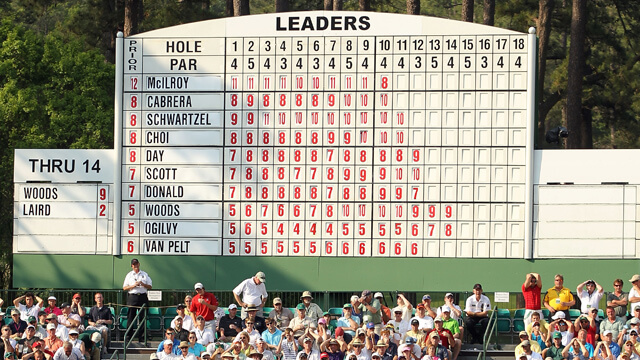
GTGFTS: 2011 Masters.
McElroy is leading, but he’s just made his epic triple bogey on 10, and things are about to go to hell. Schwartzel wins by two over Day and Scott
The day that turned me into a lifelong Rory fan. If I was leading the Masters after Saturday that’s exactly what I would do. Meltdown city.
Also the last day Charl Schwartzel was seen in public.
I think the Dodgers CC uniforms are just lazy. The black sleeve edge is barely noticeable so why have it at all? The cap just mimicks the ridiculous script on the jersey so again, what’s the point? Also, it would help if the numbers were outlined in white for legibility. The blue pajama pants just completes the high school janitor look. Thank heavens they play on the west coast where it’ll be too late for me to watch the game.
If that Packer team photo is the year they are emulating, the numbers aren’t quite right. I hate when detail isn’t paid to the number style like other aspects of the uniform, it’s just as important as the striping or colors. Not all block numbers are the same. I know it’s too much to ask, but for pure authenticity they should have conflicting number styles, like that #70 is sporting compared to the rest.
Watching the NY/LA game as we speak. The Dodgers’ CC uniform looks a full shade darker than the royal blue I associate with the team. Not unlike the Cubs’ CC getup.
I normally detest the leotard look in NFL teams, but the Green Bay alternates look awesome. I think it’s because they are a staunch traditionalist team that has resisted the urge to needlessly tinker with their uniform over the years like, say, the Vikings and Lions. Therefore seeing them in a fauxback that hops on a ‘modern’ mono-color trend that breaks from their traditional look has an extra novel appeal to it. I also appreciate seeing their alt be a green uniform instead of the navy blue. While I dug both navy alternate designs, it seems a bit of a crime to see GB play at Lambeau and NOT be in green.