[Editor’s Note: Paul is on his annual August break from the site. Deputy editor Phil Hecken is in charge from now through the end of the month, although Paul may be popping up here occasionally.]
By Phil Hecken
Follow @PhilHecken
Greetings and good Tuesday to you all — we had lots of big uniform news yesterday. On the College Football gridiron, Navy and UA released a special uniform that the Middies will wear on the 20th Anniversary of the September 11 terrorist attacks, when they take on Air Force. And on the diamond, MLB and Nike unveiled the jerseys (and caps) which will be worn for this Sunday night’s “Little League Classic” game, between Cleveland and the Los Angeles Angels, which will be played in Williamsport, PA.
There’s a lot to get to, so let’s dive right in. We’ll begin with the new uniforms for Navy.
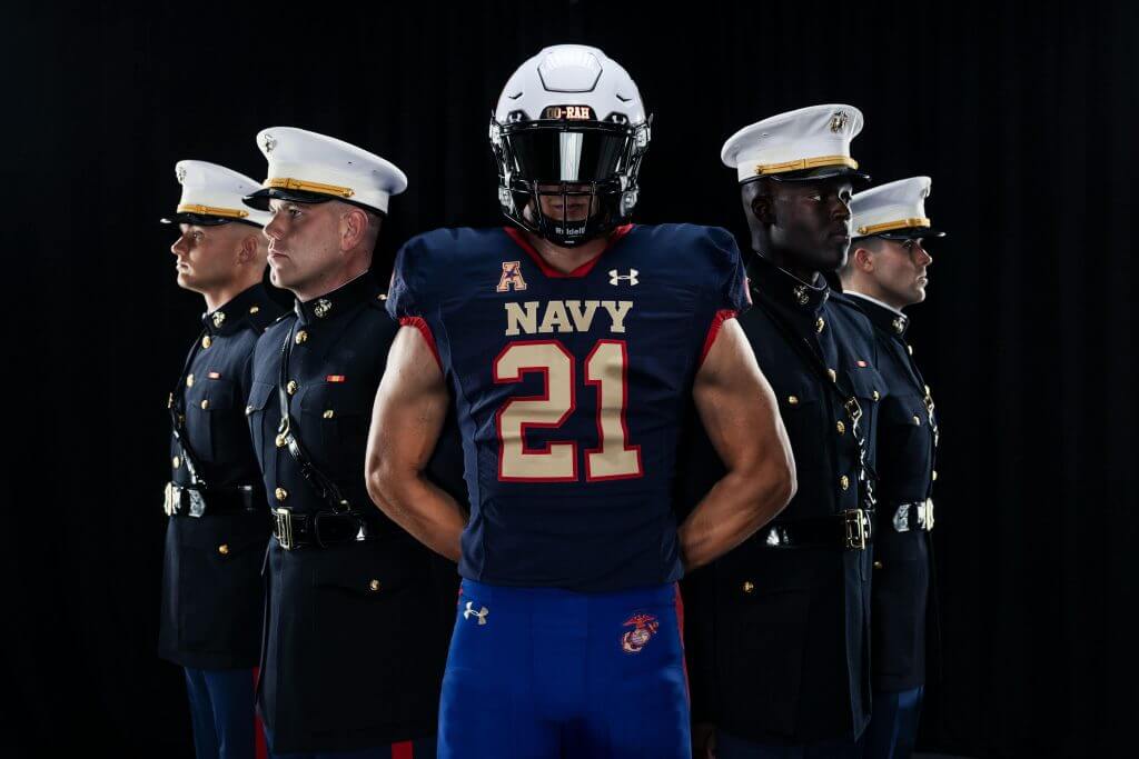
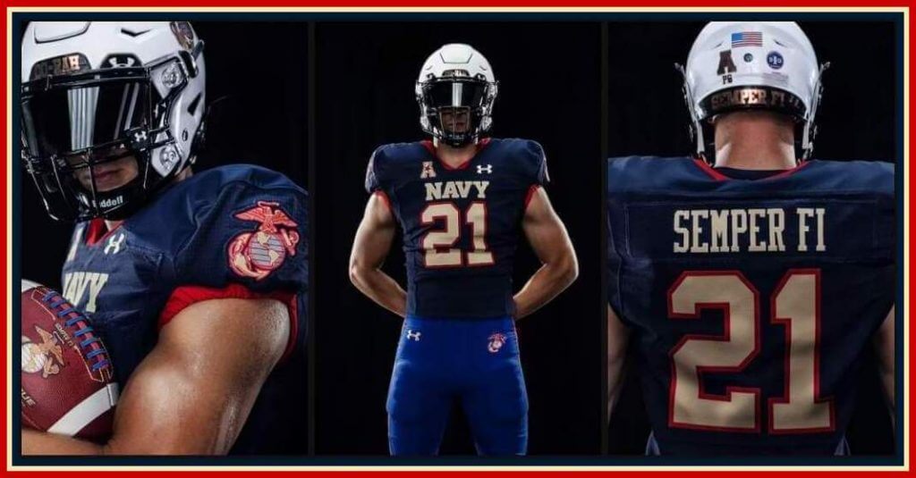
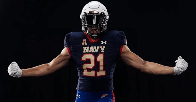
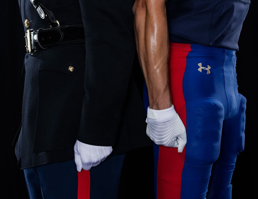
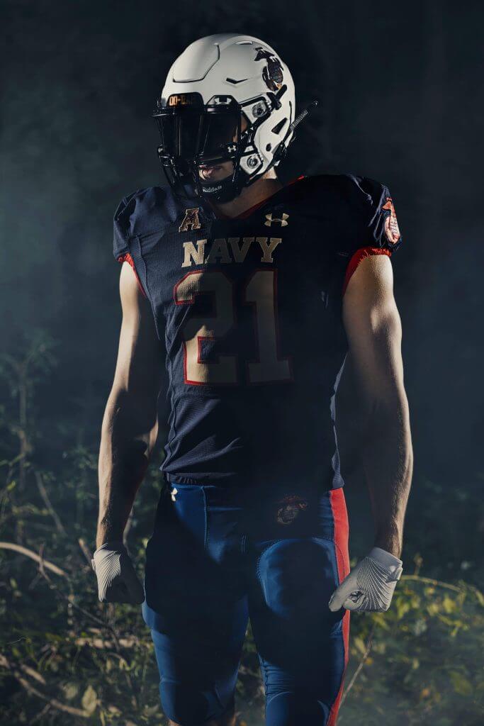
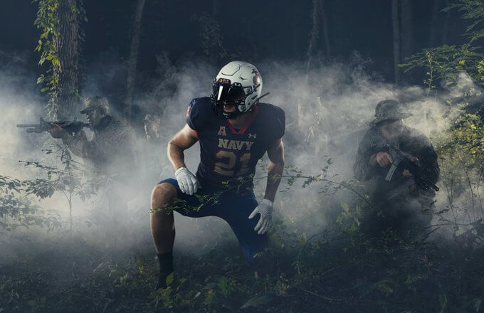
As you can see above, Navy will sport a white helmet/navy blue jersey/royal blue pant combination for their 9/11 game. And as you can probably figure out from that photo, the uniforms are meant to approximate the “‘Dress Blue A’ uniform, the 2021 USMC uniform shares symbolic elements from both enlisted and officer regalia. It draws parallels with white gloves, black cleats, red trim, and royal blue pants.”
Each of the elements carries a “story” (I know you’re all shocked), so let’s take them individually, starting with the helmets.
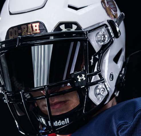
Helmets
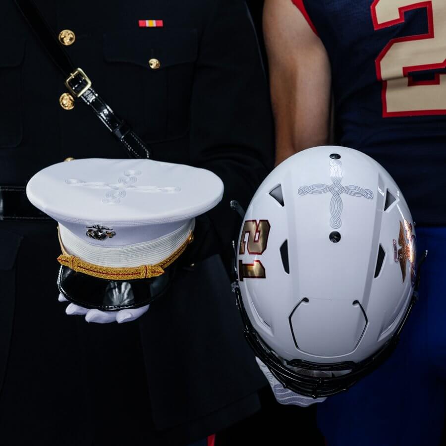
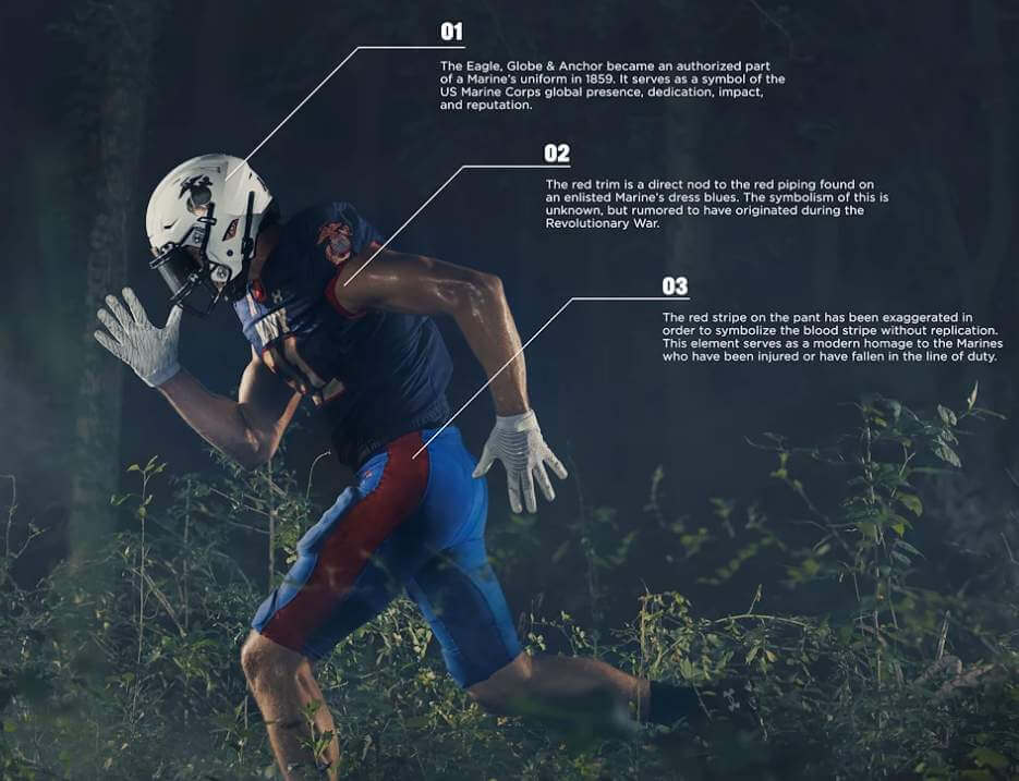
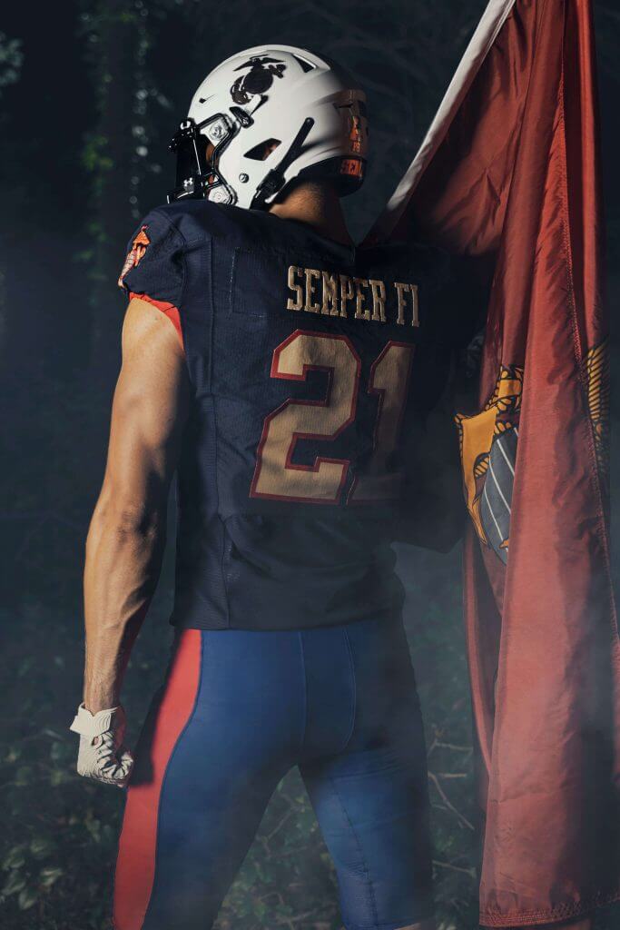
Unlike their traditional gold lids, these are white. The right side features a player number, in gold outlined in red. The opposite side contains the Eagle, Globe and Anchor (EGA). On the top of the helmet, the quatrefoil is a “cross-shaped braid that dons the top of the Marine officer barracks cover.” According to the Navy, “The EGA has represented the title every Marine has earned since 1868.”
The front bumper contains the words “OO-RAH” (the Marines battle cry)…
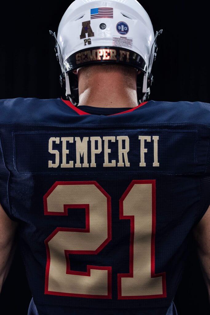
… and the neck bumper has the slogan “SEMPER FI” (short for semper fidelis), the Marine Corps motto meaning “always faithful.” There is also a 9/11 decal that reads “Never Forget” (We’ll look at those in a sec).
Jersey
The front of the navy jersey reads “NAVY” in large gold letters, while the player number is gold outlined in red.
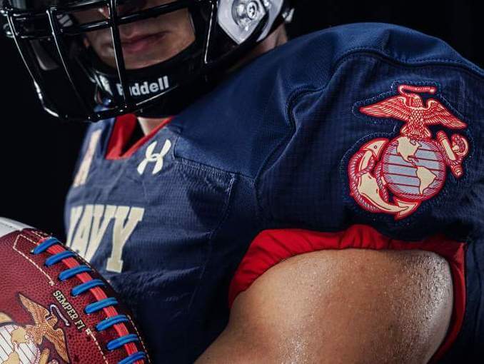
Both sleeves have the same logo as on the left side of the helmet (Eagle, Globe and Anchor).
Finally, the rear of the jersey features “SEMPER FI” in gold for NOB — and you can see this slogan also is repeated on the neck bumper of the helmet. Like the front, numbers are gold outlined in red. You can also see the rear helmet details noted previously. The sleeves have a red stripe on the hem. This is a “direct nod to the red piping found on an enlisted Marine’s dress blues.”
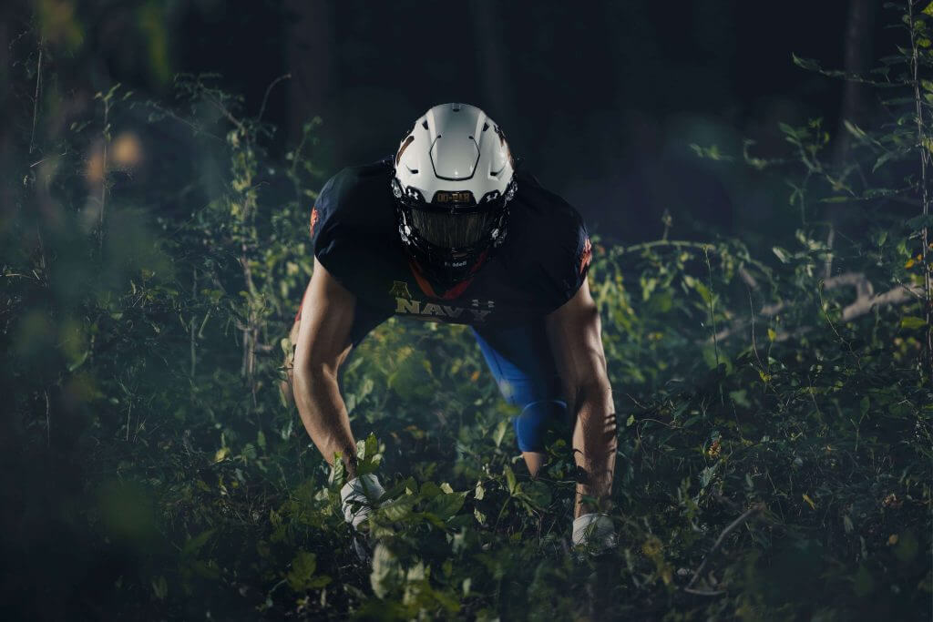
Pants
The royal blue pants have a large red stripe. This is meant to mimic the “Blood Stripe” on the Marine dress uniform.
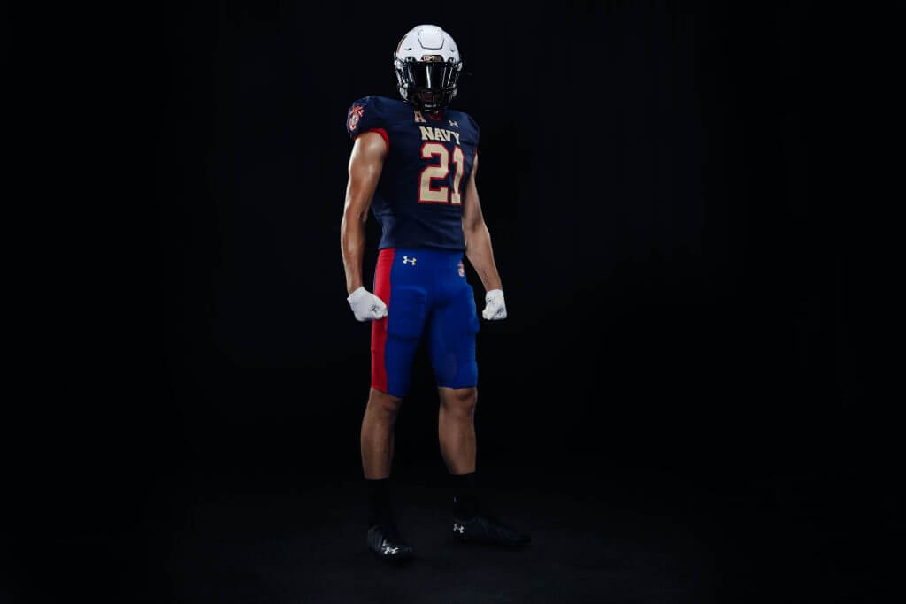
According to the Navy, “This famous element of the dress blue trousers is modernly known as a way to honor all our fallen and injured Marines.” The “blood stripe” on the pants is much wider than that of the dress uniform.
Here’s a look at the deets:
Of course, the uniform unveiling wouldn’t be complete without a hype video — but this one is mercifully short and certainly not overdone (although the scenes of football players in a jungle warfare situation has its comedic moments).
While I’m generally not a big fan of alternates (and especially one-offs), I like these a lot. That the game itself is being played on Saturday, September 11th (which as mentioned is the 20th Anniversary of the terrorist attacks) probably adds some import to the unis. At present, it’s not known whether Navy’s opponent that day (Air Force) will also have special uniforms (but I wouldn’t bet against it).
You can take an even more detailed look at the Navy uniforms here.
What do you guys and gals think?
Little League Classic Jerseys Unveiled
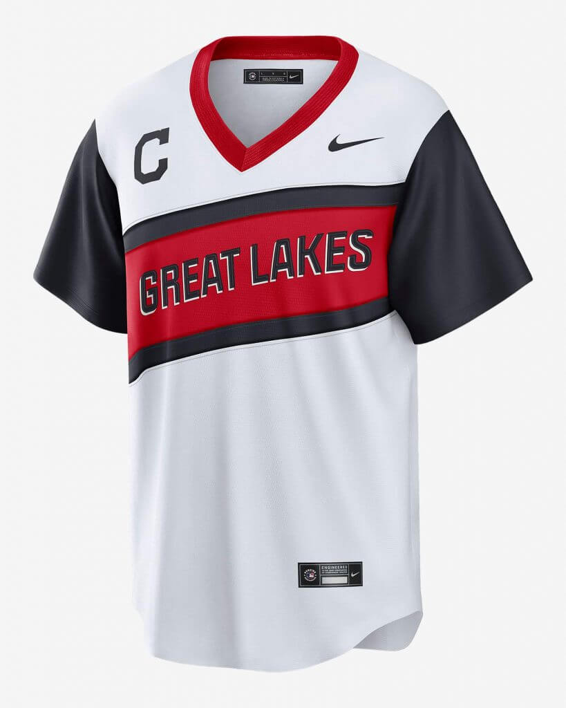
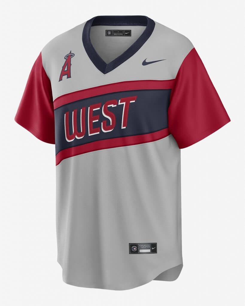
Yesterday, Nike unveiled the “Little League Classic” jerseys for the two teams playing in that game — Cleveland and Los Angeles — this coming Sunday night at Bowman Field in Williamsport, Pennsylvania. As you can see, these jerseys are pullovers (ugh), but they will be in a similar style to the uniforms worn by the Little League World Series participants in previous years.
Here’s a look at the backs:
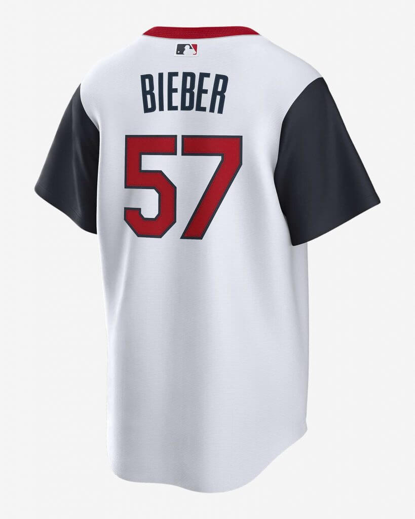
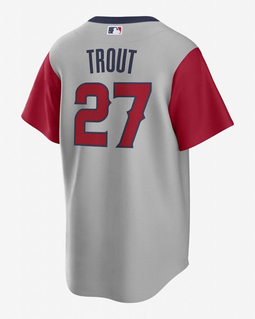
Besides being pullover jerseys, the shirts also feature color-contrasting sleeves (for the Cleveland team, it’s blue; for Los Angeles, it’s red). Collars are in opposite contrasting colors (red for Cleveland, blue for LA). The front of the jersey has the team logo on the right side of the chest (and of course the fucking swoosh), and each jersey, rather than containing the team name, features the region from which they are located (“Great Lakes” for Cleveland; “West” for LA), as teams in the LLWS have. This is rendered in a slightly diagonal, two-color stripe, with Cleveland having a blue/red/blue sash and LA having a red/blue/red sash. The region name is in the same color as the top and bottom stripe, with a white blockshadow.
Here’s how Nike describes the jerseys:
CLEVELAND:
The MLB Cleveland Baseball team 2021 Little League Classic Jersey helps deliver a comfortable fit with its polyester material. It features bold details to add authenticity to your look as your team heads to Williamsport for one of MLB’s most unique annual traditions.
LOS ANGELES:
The MLB Los Angeles Angels 2021 Little League Classic Jersey helps deliver a comfortable fit with its polyester material. It features bold details to add authenticity to your look as your team heads to Williamsport for one of MLB’s most unique annual traditions.
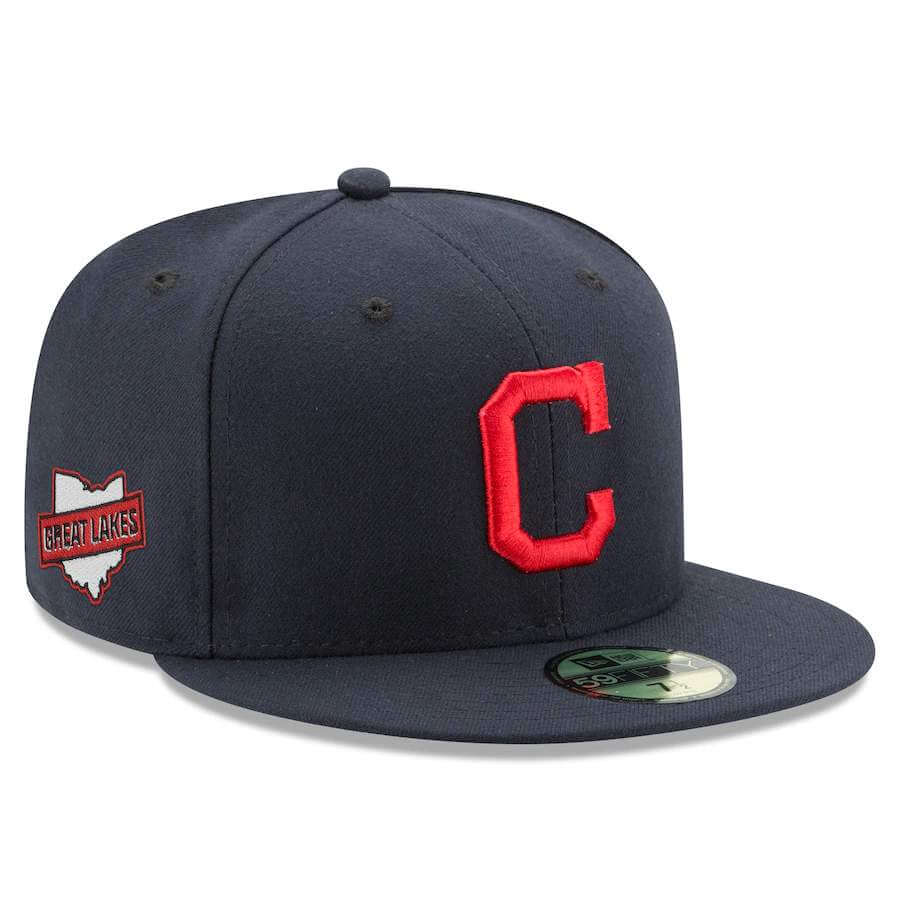
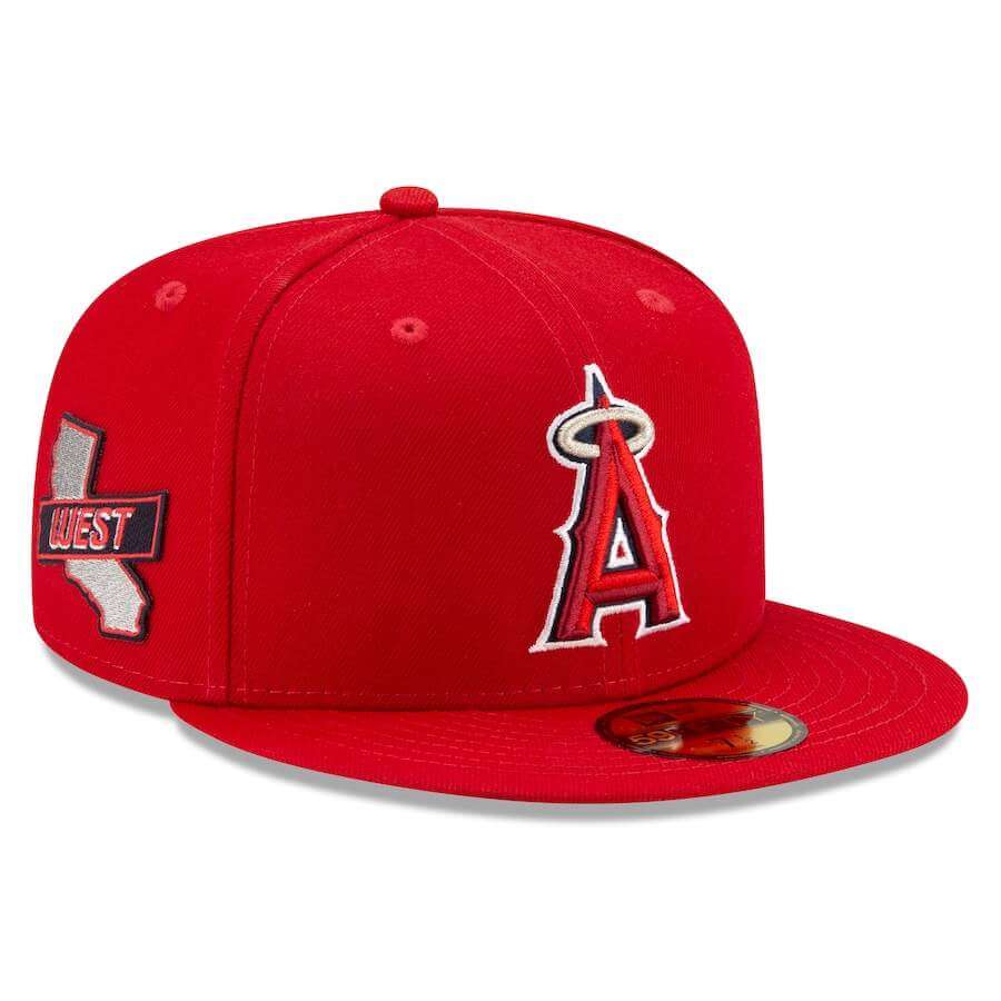
Teams will also wear special caps for the game — not too different from their normal caps, but with a special patch commemorating the event.
MLB will be celebrating “Players Weekend” at the end of this month — Friday August 27 through Sunday August 29 — so it remains to be seen if all MLB teams will be donning jerseys similar to these (as had been done in 2017 and 2018) or whether they will return to (or riff off of) the solid black/solid white uniforms worn during Players Weekend in 2019. The 2017-18 unis were similar to those worn by the participants in the LLWS. The black/white 2019 unis were…not. I guess we’ll find out soon enough (and I shudder at the thought).
The LLWS uniforms are supplied by adidas, not Swooshie, so they obviously differ from what the MLB teams are wearing. Nevertheless, Nike has obviously patterned their jerseys to resemble those worn by former LLWS teams.
Collector’s Corner
By Brinke Guthrie
Follow @brinkeguthrie
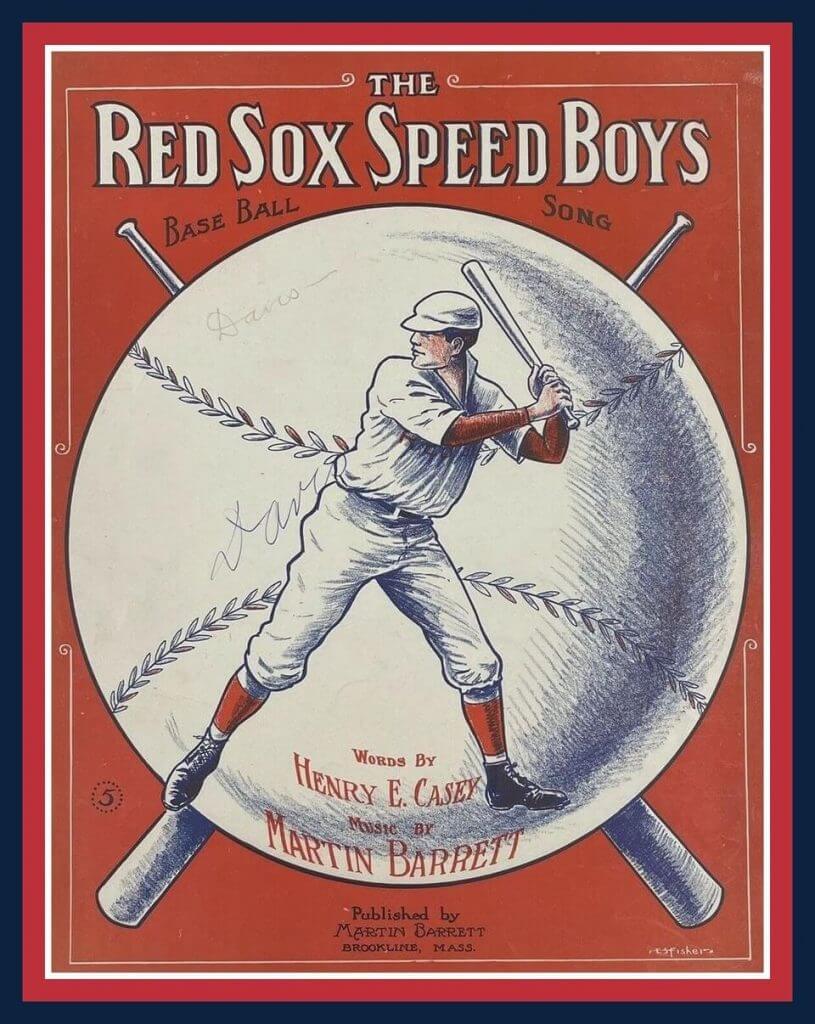
Starting off this week with sheet music titled ” Boston Red Sox Speed Boys Base Ball Song” from about 111 years ago. The seller notes, “Sheet music is in very good vintage condition. Pages are clean and legible. Inscribed by previous owner along front cover.” In case you wondered how the song went, well, hit it guys!
Now for the rest of this week’s picks:
• I’ve never seen one of these before. This is a San Francisco 49ers helmet watch. Maybe the middle 1980s for this? Seems kinda awkward to wear this big ol’ helmet on your wrist- then you have to flip the helmet back just to read that state of the art “digital” screen. But hey! This is a five function watch we’re talkin’ about here, fella- hour, minute, second, month and date!
• Also from the mid 1980s; if you didn’t know that Pete Rose was the all-time MLB hits leader, this vintage digital watch stated that fact right on the watch face. Subtlety has never been in Pete’s vocabulary.
• New York Yankees fans will go for this vintage Derek Jeter yo-yo. Note the Yankees branding was omitted here- this one is MLBPA sanctioned. (But did the players really know they were on some of this stuff?)
• Meanwhile, Chicago White Sox fans will like this nice looking Frank (The Big Hurt) Thomas jersey pin.
• One more pin if you please; here’s one featuring the famous cap of the Montreal Expos.
• Annnd another one for the Expos- this totally comfy looking pair of gray shorts with blue trim and an embroidered logo. And they look to be cotton, too- not that poly junk you see nowadays. And yes, you can also get offa my lawn.
• Mets pitcher Doc Gooden is featured on this 1984 “Hot-Lites Blinker Button.” I doubt if the two included batteries still work, though. Again- did the players really know about these things? Agent to Doc: “Hey kid. You wanna be on a Hot-Lites Blinker Button?” Doc: “A what?”
• “Merle Harmon’s Fan Fair” sponsored this Milwaukee Brewers 1982 American League Champions matchbook with the MB ball/glove logo. I had forgotten about the old sporting goods chain. Harmon was a well known sports announcer who opened a chain of stores that grew to 140 locations before he sold it in 1996.
• “Inglasco” is the maker of this set of 21 NHL team logo hockey pucks; the seller thinks these are mid-1990s.
• Check out the great cover art for this 11/16/58 Colts at Bears game program; interestingly, exactly one year before I was born.

Guess The Game…
from the scoreboard
Today’s scoreboard comes from Bea Kinde.
The premise of the game (GTGFTS) is simple: I’ll post a scoreboard and you guys simply identify the game depicted. In the past, I don’t know if I’ve ever completely stumped you (some are easier than others).
Here’s the Scoreboard. In the comments below, try to identify the game (date & location, as well as final score). If anything noteworthy occurred during the game, please add that in (and if you were AT the game, well bonus points for you!):
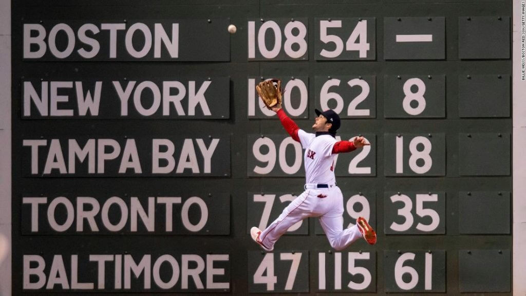
Please continue sending these in! You’re welcome to send me any scoreboard photos (with answers please), and I’ll keep running them.
The Ticker
By Anthony Emerson

Baseball News: Ed Kendrick has done yeoman’s work with a massive uni tracker, tracking 14 teams across the majors. … David Steinle came across some instances of umps wearing their old button-down shirts after umpires moved to polos in 1996. Here’s Rich Rieker in 1996 and Charlie Reliford and Jim Quick in 1997. … Atlas Obscura has a story on the rise of food-based minor league team names (from Kary Klismet). … On July 4, 1989, Yankees broadcasters Phil Rizzuto, George Grande and Tom Seaver wore throwback Yankees caps and jackets to mark the 50th anniversary of Lou Gehrig Day (from William F. Yurasko). … The Pioneer League is expanding to Flathead County, Mt. … The pitcher’s circle at the Little League Softball World Series has seams drawn on it (from Mike Givler). … Reader Robert Bacon made a video going over all the updates and changes to uniforms for the 2021 season and beyond.

NFL News: Ravens LB Patrick Queen changed his number from 48 to 6 because of “single digit swag” (from Andrew Cosentino). … Chiefs QB Patrick Mahomes has his own shoe now (thanks, Brinke).

Hockey News: The KHL’s Admiral Vladivostok has a new logo. This is their third in as many years. … Taylor Made came as close to a Bruins jersey as legally possible in this Happy Gilmore promotion (from Ted Taylor).

NBA News: Looks like the Sixers are going to have a more metallic Nike logo on their jerseys this season (from Pete Dawson). … New Knicks F Evan Fournier will wear No. 13 (from Etienne Catalan). … An energy drink sold in Afghanistan uses a shadowed version of the Bulls logo on their cans (from Tim Johnson).

Soccer News: Auburn women’s soccer has new unis.

Grab Bag: This person put together an entire identity for the 2024 Olympics…if they were being held in Wakanda (from Alan Lewis). … Kenyan President Uhuru Kenyatta welcomed Kenya’s Olympic medalists yesterday, and the medalists wore the most dapper uniform I’ve ever seen (from @cylinen). … In a lawsuit, the University of Kentucky is claiming the state of Kentucky can’t use “Team Kentucky” on clothing because the school owns the word “Kentucky” for any clothing products. I’m praying for a meteor at this point (from James Gilbert). … Not uni or graphic design-related, but old Tulsa World newspaper racks are available for purchase (from Dan Brewley).
Uni Tweet of the Day
Looks like they’re getting all the bad combos out of the way in preseason (I hope…)
GUDBill13: RT @BengalsUnis: Next up @WashingtonNFL:
White jerseys on black pants… pic.twitter.com/mfgLkOLbud— Gridiron Uniforms (@GridironUniform) August 16, 2021
And finally… that’s a wrap on a big uni/jersey/cap reveal day (why can’t they space these things out???). Hope you enjoyed the coverage.
Everyone have a great Tuesday and I’ll catch you all again tomorrow.
Peace,
PH
Hooooooooooooold up, what’s wrong with the Bengals white over black? You want them to just go white over white every single time they’re on the road?
Any uniform where the pants are darker than the helmet looks bad.
Draws the focus away from the primary uniform elements (helmet and jersey) and feels very bottom heavy.
I typically agree with this line of thinking (pants should be lighter or the same color as the helmet), but in this case, I don’t. Solely, because the white pants’ leg stripe looks so (to my eye) unmatched and out of place with the helmet and sleeve stripes. In this case, they compliment one another sooo much better. Easy fix: make the orange stripes on the white pants solid orange, or solid black.
You’re right that the stripes on this set are completely mismatched, which is a big problem. In that regard the black pants do make the stripes work better. I suppose it is a case of black works well with what is available, but that is just because uniform aspects were designed poorly.
That goes against color theory in every way. And I strongly disagree.
When I look at this uni combo, the helmet is more eye-catching to me than it is with the white pants and jersey. Black is the color least likely to draw my attention away from a brightly colored thing like an orange helmet.
Just wondering when tickets for the Wakanda Olympics are going to be available…
I really love the detail that went into that presentation.
I really like those Cleveland and California Little League uniforms. They just feel right.
I still can’t believe they are going to play a major league game in Williamsport though – there will be a ton of home runs!
The whole thing is so infantile. They should be letting the kids wear big league uniforms and play in the Astrodome. Have we learned nothing from “Bad News Bears in Breaking Training”?
To be clear, they’re playing the Little League Classic at Bowman Field, the minor league stadium, not Howard J. Lamade Stadium, where the actual Little League World Series is played.
Oh thanks for the clarification that makes more sense.
I thought the major league hitters would totally go off if they played in the regular stadium.
Correct. Bowman Stadium was the home of the Williamsport Woodcutters Rookie League affiliate of the Phillies until MLB ended that franchise this past year.
Guess the scoreboard–I believe that’s from Game 1 of the 2018 World Series between the Red Sox and Dodgers.
What a great photo, too!
It’s my desktop wallpaper!
Super close… 2018 WS, game 2, 5th inning!
Aaah! Good call.
God, that 2018 team was the best Red Sox team I think I’ll ever see. I’m sad the team was broken up, but you can never take that run away from any Sox fan.
I was at Fenway (first time in a long time) this weekend – and it seemed like the numbers on the scoreboard (at least denoting scores of other games in process) were inset and replaced from within the monster as opposed to these which are hanging outside the monster. Can someone who knows Fenway help me understand the set up at Fenway (at Wrigley, which I’m much more familiar with) they are all replaced/hung from within – no pegs outside.
Matt,
You are correct; anything that may have to be changed during the game is changed from inside the scoreboard. Division standings like this aren’t changed during the game, and subsequently mounted to the board from outside.
What are the additional clues about exactly which postseason game this is? Obviously the standings give the year away, and the stadium limits the number of games to 8 or so, but what further limits it to one game?
Matt – in response to your question:
The monster scoreboard & advertisements have spread drastically in recent years. This AL East standings section is one of the newer additions to the monster scoreboard, it is to the left towards the foul line. Some of the larger scoreboard is no longer aligned with the crawl space behind the monster where the door & scoreboard operators sit. The door is at the left of the original 9 inning scoreboard & the opening behind it only goes from there towards center field.
You are correct all other sections are changed from the back, while this section is changed in front or on the field. It makes sense to have the standings with access from the outside because they are only updated once daily & don’t need to changed from behind during the game.
What are the additional clues about exactly which postseason game this is? Obviously the standings give the year away, and the stadium limits the number of games to 8 or so, but what further limits it to one game?
Re: the Navy uniforms, it’s odd they’d put “Navy” across the front of what’s supposed to be a take on dress blues. The wide trouser stripe resembles the stripe on officers evening dresstrousers, which is wider. Also somewhat odd is that the EGA on the right shoulder faces aft instead of inboard as collar devices do on the dress blue coat.
Good spot. My *only* concern about the uniforms is that the EGA appears four times (helmet, shoulders, pants). That seems like overkill. Maybe put the insignia of grade (chevrons) on the shoulders, instead? Just a thought. Separate from that, though, I think these are GORGEOUS uniforms. I love the attention to detail. This is how you honor the military.
My take would be no rank insignia. They haven’t earned any, they’re college students. Agree with the observation re:the EGA, it’s not needed on the helmet or pants. Fix the direction on the right sleeve & remove NAVY wordmark on the jersey.
I thought the same thing about the “NAVY” on the chest. We know it’s the United States Naval Academy, which produce both Navy and Marine officers, so why not for this one game put “MARINES” on these Midshipmen.
I find the Navy football uniforms interesting because you would hardly ever see a football team go navy blue over royal blue as a combo. Does not commonly work well but it fits here because it is based on the dress uniform.
The Cleveland LL jerseys reinforce not changing colors in the Guardians rebrand is a lost opportunity. There are too many red white blue teams in the league. Those LL jerseys are practically interchangable.
Thought the same. They are awful jerseys as it is, but given that his matchup is between two teams with the same colors it makes it even worse. Sort of as if these aren’t even associated with the Angles or Gurdindians, just generic red and blue all star type jerseys.
I thought Cleveland should have gone maroon with baby blue trim when they changed up their identity.
YES!!! I wanted maroon and baby blue or maroon and navy, just something to break up the red/white/blue monopoly. Plus, people here were going to take time to accept the change, anyway, might as well go a bit more drastic and create something new.
“I thought Cleveland should have gone maroon with baby blue trim when they changed up their identity”.
Would Clevelanders support that?
The Phillies are MLB’s maroon/baby blue team…and while they far-too-infrequently trot out those Schmidt-era throwbacks they wrongfully do so at home.
The Annapolis paper is reporting that Air Force will also get new uniforms from Under Armour for the game.
link
Considering Air Force is a Nike school, I doubt Under Armour will be outfitting them.
“There is also a 9/11 decal that reads “Never Forget” (We’ll look at those in a sec).”
I see the decal in one of the later pictures, but no additional elaboration on it. Was this accidentally omitted?
No — I didn’t want to repeat the photo showing the rear of the jersey and rear of the helmet, so I used that photo under the jersey section. Sorry if this was confusing.
How nice that the music of
The Red Sox Speed Boys song was composed by future 2nd baseman Marty Barrett.
I saw this same connection.
The Nike logo as well as the Jordan logo and the NBA logoman (it will also say 75 instead of NBA) are supposed to resemble diamond surfaces and not so much metallic.
link
Wait a second…is the University of Kentucky not *part* of the state of Kentucky???
Never know the Commonwealth ripped off the school’s name.
But the use of the word “team” in the slogan makes it seem even more in the purview of the university.
A few teams have gone with a slogan on the back of the jersey. Will there come a day when a (presumably college) football team will put the player name on the neck bumper of the helmet?
The NHL takes the next step to the dark side:
link
and….I’m done with Betty Gettnothing’s sorry league. NFL is the only league left that hasn’t ruined it’s uniforms nor playing fields. The others have rendered their ‘product’ un-watchable!
…sigh…dark days for uni lovers…I’m afraid corporate greed has ruined our special little world.
Guess we weren’t just a bunch of lonely geeks after all, but an actual demographic….like it better…
I hope ‘corporate greed’ isn’t too controversial?
Bengals white over black is flat out fugly. Yes, they should go white over white full time on the road. It’s just a much better look. White over black looks like something you wear to the office. Add all the tiger elements and you looks like a total idiot at the office.
i’m going to get slaughtered for this, so be it…
i wasn’t aware that the marines went into battle, or scored an american victory, or fought valiantly in any way shape or form on 9/11, so this seems an odd thing for marines to celebrate like it was the anniversary of iwo jima. and with the negotiated withdraw of troops by 9/11, as a date, it seems even odder to celebrate. this seems, if not inappropriate, misplaced.
maybe a nice firefighter-police crossover where each of the teams celebrate the heroes on THAT day by thanking THEM for stepping up. i’m guessing it inspired many to serve, show it. they could wear a simple police or fire fighter sticker on their helmets instead of their own logos maybe? or they could just stand respectfully in silence before the game, even better. one way or another, it just feels like the more appropriate thing to honour on that day.
if i can furthermore, this is just one uniform, but it is emblematic of the ever increasing patriotism testers at sporting events we have had over the last 20 years, which is just one example of the true extent of the long term damage the attacks on civilian targets did in the minds of not only americans, but in democracies around the world.
we have lost our minds, and lost focus. 9/11 is a day of mourning for the civilians, and civil servants who lost their lives; it can still make me cry when i allow myself to feel what i did on that day.
It is a fair critique. I think if other random schools were going with a camo look on Sept 11 also it would even more emphasize your point.
There isn’t a specific reason to honor the military on Sept 11. It feels like the situation was two military academies playing on Sept 11, so they thought they must do something special. Thus, the Marine dress uniform themed design. Doesn’t really feel connected to the day in any specific way. Also wonder if it was the academy that wanted to do special uniforms that day or if under armor pitched it to them.
All that said, it is a nice looking one off uniform for Navy.
I agree 100%!!!
On the one hand, I agree entirely. On the other hand, I also think it’s good for USNA to recognize the Marine Corps as part of the Navy’s heritage and as the future service home of some of its midshipmen. Re 9/11, the Coast Guard and Air Force actually did engage in response missions that day. If we’re gonna recognize any military services on 9/11, and I tend to think we should not, we should recognize the Coast Guard and Air Force.
I am right there with you on this, RPM.
RPM,
No, I think you’re right about that. What I’m thinking is, the 9/11 sticker is there simply because of the date of the game that this uniform (and this helmet in particular) will be worn. If it wasn’t being held on 9/11/21, I don’t believe the memorial would be there. Nothing to do with the Marines.
RPM – Agree with all you said here.
R Scott – yes. Air Force was involved in 9/11 response & Navy could wear some reference to the coast guard on it’s uniforms. Would be nice as the branch & CG academy often gets overlooked (because it is smaller & has DIII athletics)
However I really like these uniforms, I would love to see Navy wear them in the Army/Navy game instead.
thought i would check in to see what happened, and i am pleasantly surprised that i wasn’t the only one who thought some of what i tried to express in limited space. and excellent counter points to my initial reaction. for the record, i love the look, that isn’t in doubt, it was the timing.
I don’t really think the uniforms are meant to honor 9/11 as it’s more just a special uniform they’re wearing against another service academy. Plus, the 9/11 sticker they have will likely be worn by many other schools on that day.
As for the Marines on 9/11, they were there at the Pentagon helping out firefighters, police, and paramedics after it was struck. While not a battle, there were many brave Marines serving and helping that day.
I see the AAC is still going with that silly P6 (Power 6) logo.
After the Big 12 collapses and it’s down to the P4 I am sure the American/Little 8 conglomeration will wear P5 stickers.
Navy uniforms are excellent. Love them.
The team names on the front of both Little League jerseys are hard to read because they violate Design 101, at least as recognized in the field of signpainting and design — THE DROP SHADOW SHOULD NEVER HAVE A GREATER CONTRAST WITH THE BACKGROUND COLOR THAN THE LETTERS! The white drop shadows are secondary to the message yet they POP more than the letters because of greater contrast! This drives me nuts!
-Jet
Re: LLWS jerseys…unless I missed a comment, I didn’t see anyone comment on the umbers on the back. It appears the number font is each team’s normal number. The Angels font has the little…whatever it is called…on the 7, while Cleveland’s appears to be their own font. Yet, there is no mention of this detail on the official “story” (unless I missed something).
Yes, I probably should have mentioned that (even though I didn’t see it anywhere) — it does look like the fonts are the teams’ normal numbers.
Just a note: “the most dapper uniform I’ve ever seen” was the Kenyan athletes’ uniform for the Opening Ceremonies and were profiled, to an extent, on these pages prior to the Olympics.