[Editor’s Note: Paul is on his annual August break from the site. Deputy editor Phil Hecken is in charge from now through the end of the month, although Paul may be popping up here occasionally.]
By Phil Hecken, with Jamie Rathjen
Follow @PhilHecken
Good Friday morning Uni Watchers. Got a LOT to get to today, starting off with our own Jamie Rathjen, who is going to give us a preview of the kits of the Premier League, which begins play today. Then, of course, there was the “Field of Dreams” game between the Yankees and White Sox, which will follow Jamie’s PL preview. Let’s get right to it. Jamie, take it away…
Premier League 2021-22
by Jamie Rathjen
The Premier League season starts tonight/this afternoon (depending on what side of the ocean you’re on) at what is usually the normal time after last season started a month late. But for my fellow English soccer watchers, the offseason may have felt very short or nonexistent because of all the tournaments going on this summer.
Not every new design is revealed before the start of the season, even though the releases have been coming for almost three months as next season’s designs can debut in the given club’s last game of the season. There should still be some third shirts to come in particular, since 19 of the 20 clubs have released at least two shirts as of this writing.
Arsenal
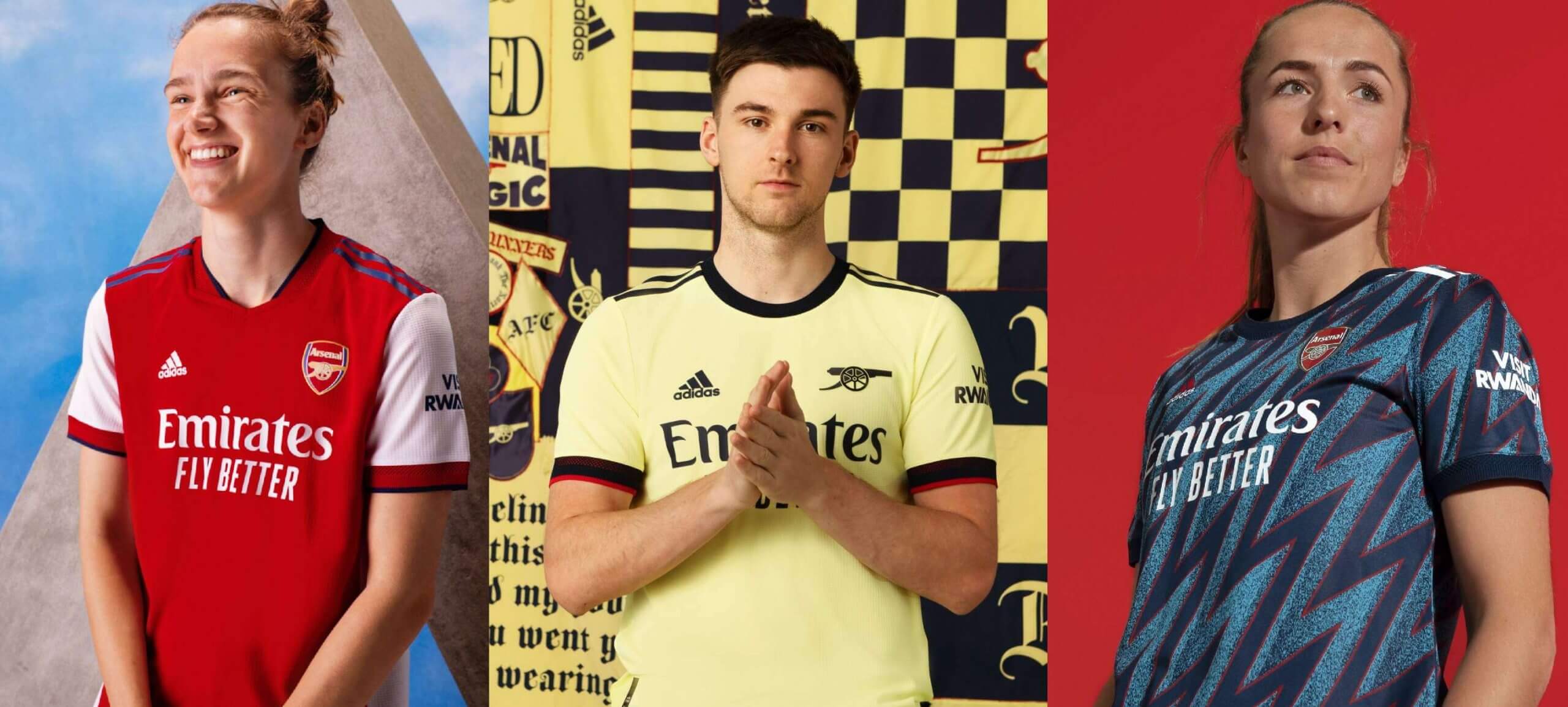
There were some blue accents added to the red and white this year, which recalls the ’90s a little bit. It’s not clear to me that was intentional. The ’90s were a period when a few red-and-white clubs, including among others Arsenal themselves, Aberdeen, and Bayern Munich, all briefly added various amounts of dark blue or black to their designs. This is paired with a second combo of yellow and blue, which is a color combination for Arsenal second kits that recurs almost every other year with rare exceptions since it first appeared in the ’60s.
The third shirt actually does intentionally throw back to the ’90s, because it seems like a combination of two blue away designs from 1994-95 and 1995-96. Also, some of you may be dismayed that the pretty terrible vaguely blackletter font for non-league games is around for another season.
Aston Villa
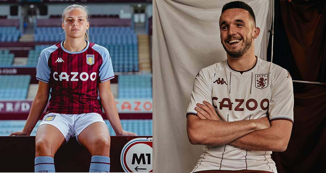
The idea for both shirts is pinstripes, but the second shirt in particular recalls the design worn when Villa won the European Cup in 1982. That’s something you’ll increasingly often see now that clubs have decades of annual or near-annual design changes to go back to: a popular design, or part of it, is resurrected to call back to the original but without attempting to exactly recreate it. There are quite a few other PL examples of that just this season — including Arsenal’s above — whether for anniversaries or just because.
Brentford
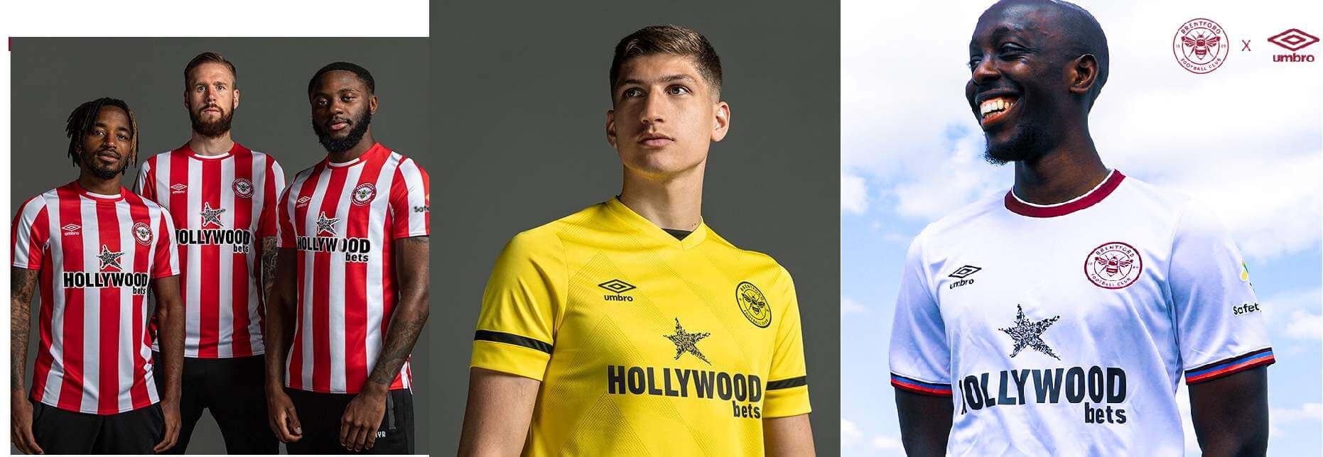
Brentford’s first season in the men’s top tier since 1946-47 sees a traditional version of the red and white stripes. It’s paired with what is intended to be mono-yellow. The third shirt is carried over from last season except for the ad, which makes it one of the rare ones to be worn in two different leagues. It’s solid white with accents in Brentford’s original color scheme of “claret, salmon, and blue.”
Brighton and Hove Albion
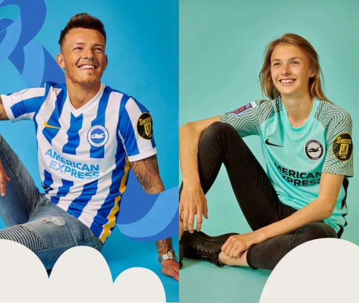
Brighton are back to the usual blue and white stripes after wearing blue with white pinstripes last season. It’s solid blue on the back, which allows them to make the second shirt turquoise.
Burnley
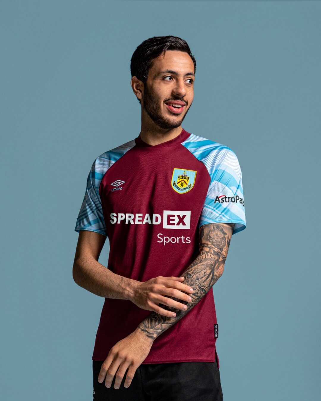
Only one shirt so far and its thing is that the blue sleeves have a pattern, but otherwise it’s not much to write home about. For preseason they’ve been wearing last season’s second kit with a new ad when necessary, but I would expect that’s just temporary.
Chelsea
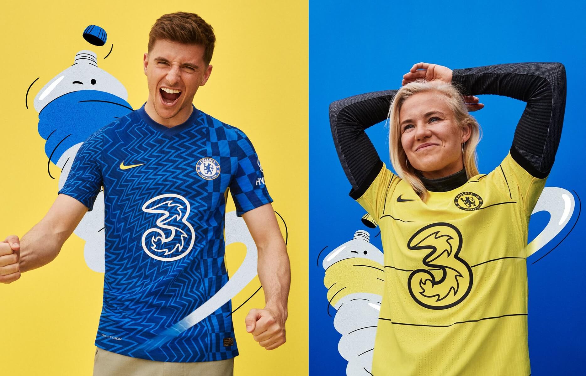
Chelsea are not the only club that was given a design described as influenced by modern art — well, “optical art” — or something like that by Nike. The second shirt is yellow, which also has appeared frequently for Chelsea but not as often as for Arsenal, and has black accents.
Crystal Palace
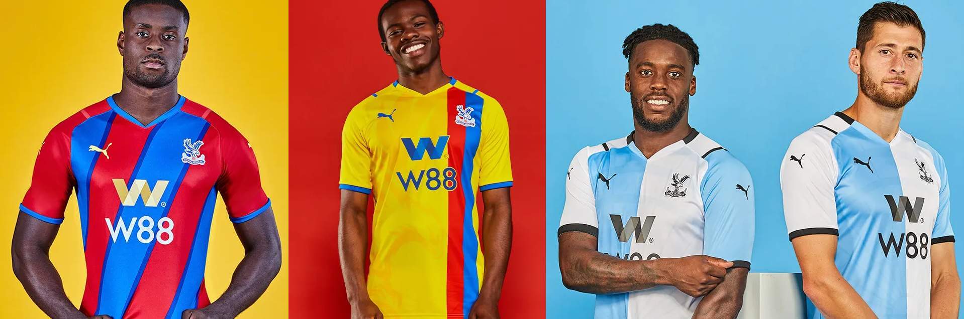
Palace’s blue and red stripes were turned diagonal this year, which is the kind of thing that seems like a gimmick for change’s sake but it’s not actually a bad idea. The second shirt is yellow, which again is a reoccuring color for Palace.
The third shirt is based on an alleged connection to the first Crystal Palace club that was one of the Football Association’s founder members in 1863 and was described as wearing blue and white. But there’s really no evidence for a connection to the modern Palace, or even that the first club wore halves as the modern club claimed they did when releasing this shirt, saying that it must have been halves because another pattern wasn’t described. You can read more about the (lack of) connection between the two clubs here.
Everton
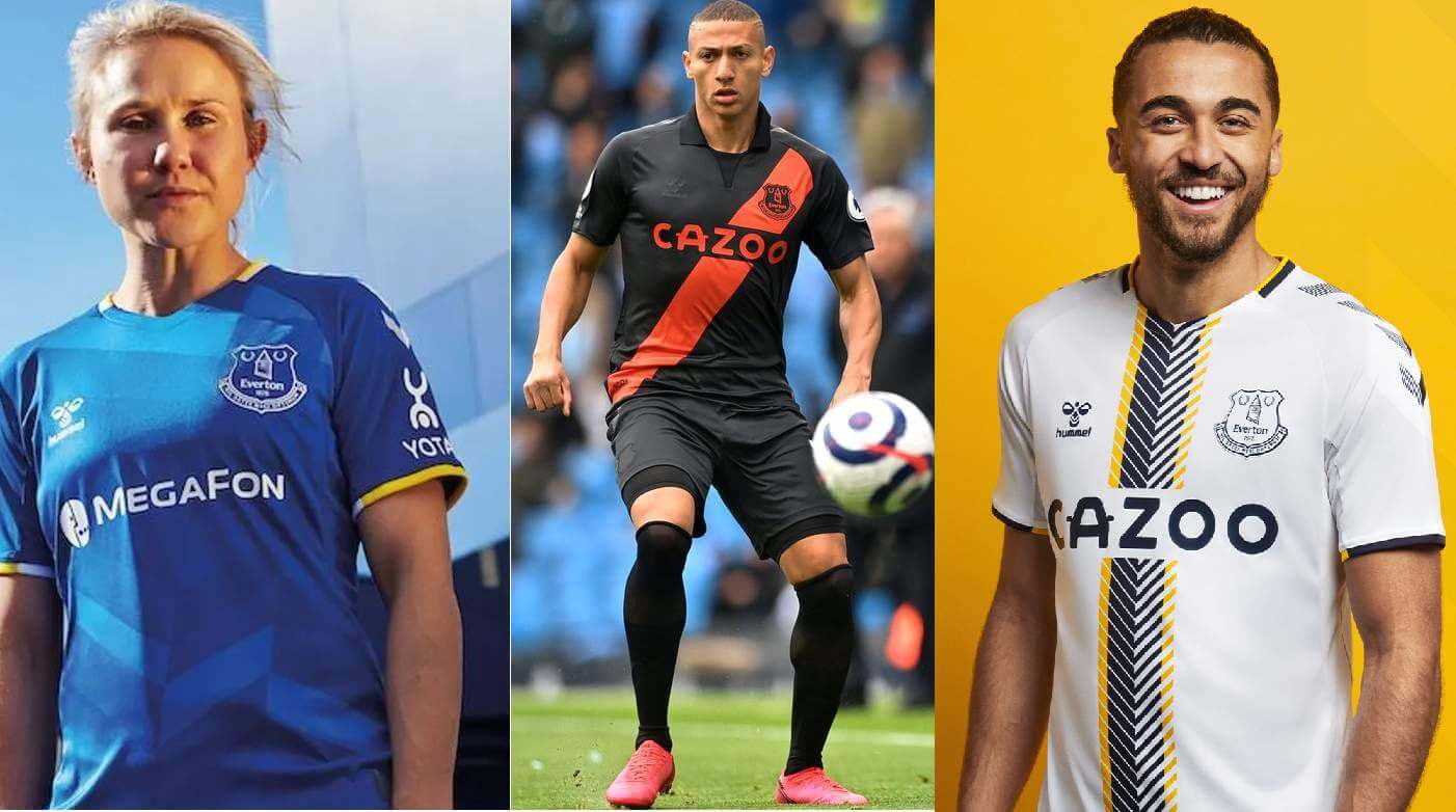
The first shirt is the standard blue with a pattern essentially there so it’s not just solid-colored. The second shirt’s black and orange is based on the design worn in 1881-82, when Everton and many other English clubs were newly forming. Few would have looked remotely familiar to a modern viewer in that period, often changing color schemes several times before landing on what they wear now.
The third shirt is also based on a design worn in the late ’50s, but which had a blue and gold horizontal band instead of the black/grey with gold vertical band here.
Leeds United
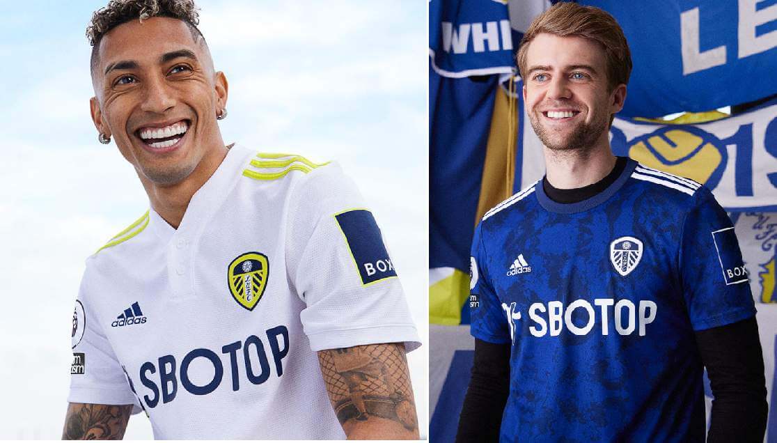
When compared to last season, the previous blue accents on the first shirt were switched to yellow, but otherwise it really is almost exactly the same as before. It’s paired with a blue option.
Leicester City
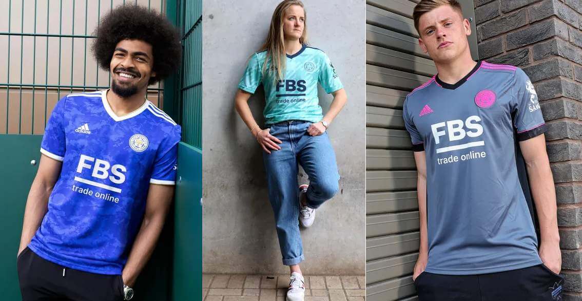
Leicester’s first shirt has a pattern that is similar to Leeds’s second shirt, but isn’t quite the same — such is life when you’re not one of Adidas’s biggest clients. In fact, all three shirts look like they’re recolors of standard Adidas designs. The second shirt is mint green and has a vaguely checkered or tartan pattern, and the third is grey with pink.
Liverpool
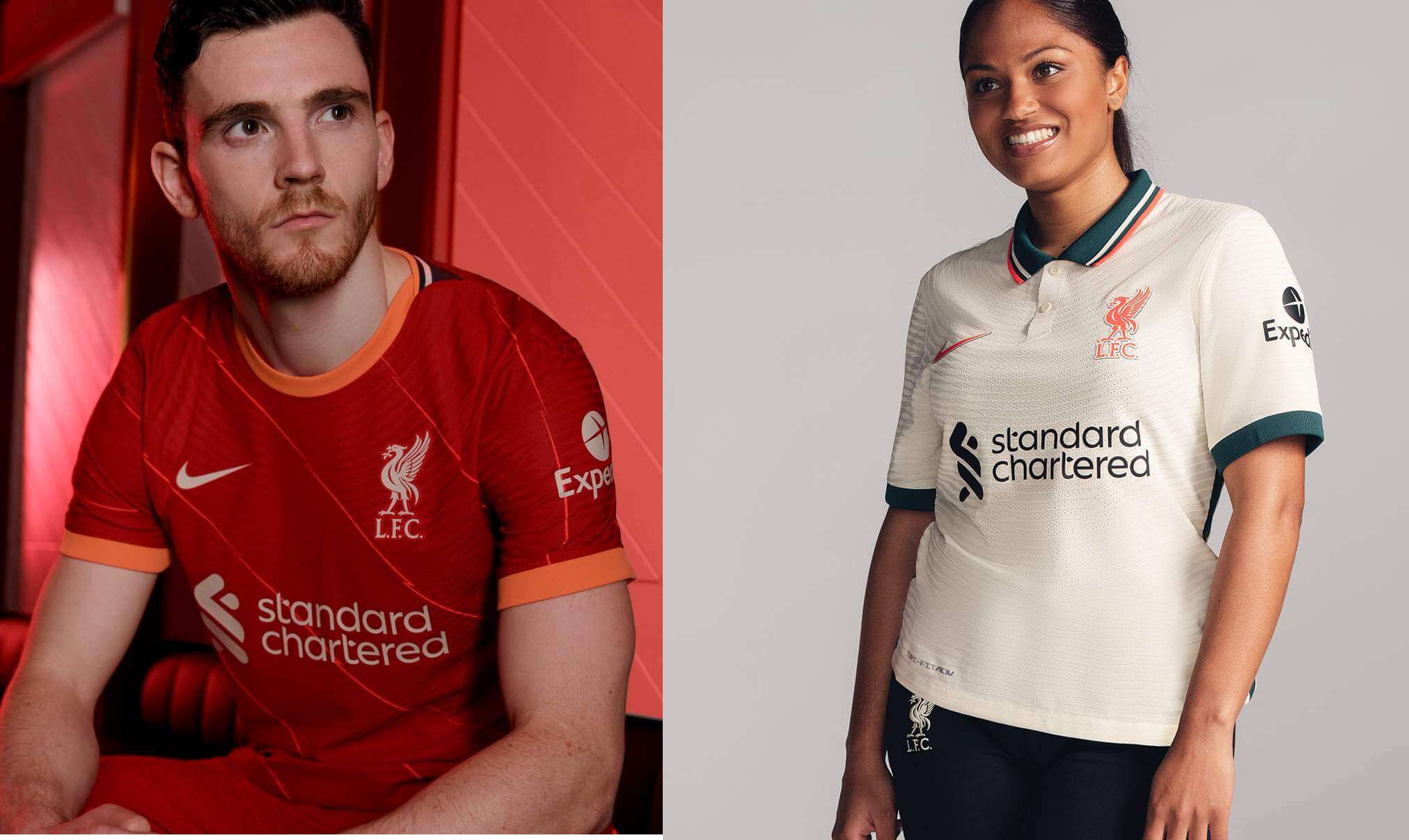
The first shirt has orange accents and small diagonal stripes this time for what seems like no real reason — it’s something even the marketing copy seems to struggle with. The second shirt is again supposed to be a reference to a previous design, worn in 1996-97, and it has the same base color but extra green accents.
Manchester City
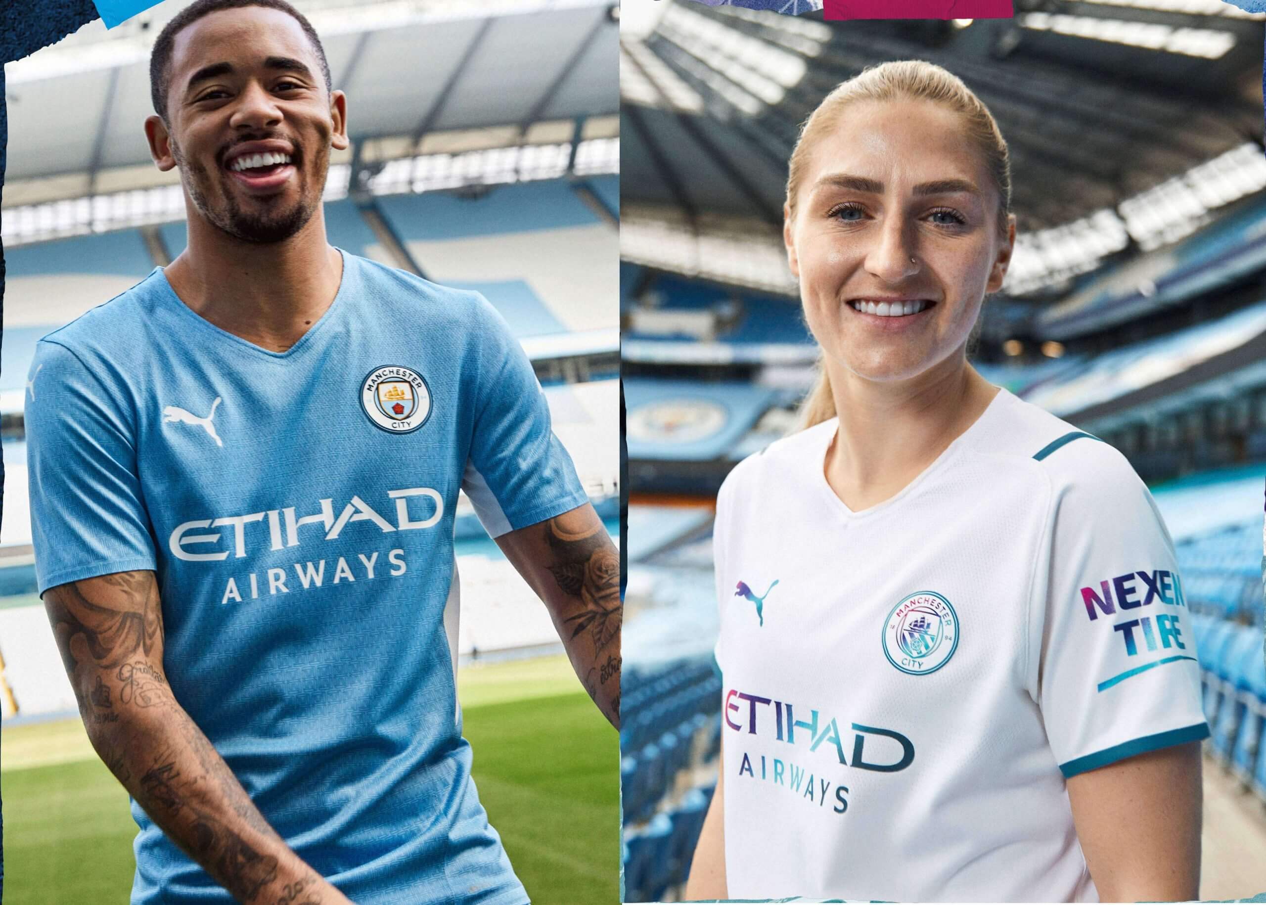
You’ll notice that both shirts are light-colored, which is not always the best idea and probably would be fixed by a third shirt. The overarching theme is the 10th anniversary of City’s 2012 final-day PL title win. More specifically, the idea was the moment when the winning goal was scored at 93 minutes 20 seconds, which I’ll mention because these designs come with a literal digital clock-like font that’s going to be used for non-league games. The graphics on the second shirt, aside from the numbers, are actually multi-colored and aren’t reflecting light or anything.
Manchester United
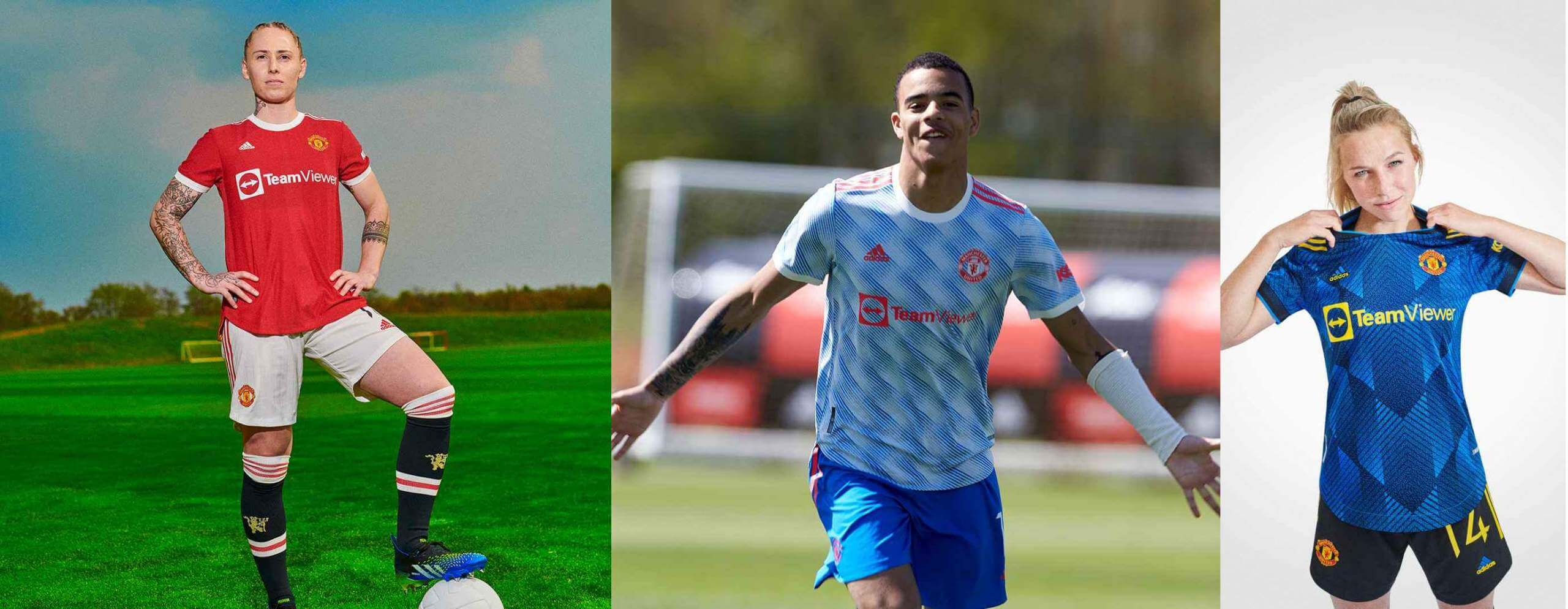
The first shirt is traditional as part of the usual red/white/black combo after last season’s shirt featured a subtle multicolor pattern. The second shirt is based on a design worn from 1990-92 but again is not exactly the same as the original, although it’s worn with blue shorts like the original.
The third shirt is blue, which is a semi-recurring color for Man United, and is claimed to also be inspired by the away design from 1993-94. That was black, so there isn’t much of a resemblance, but it is worn with black shorts and socks.
Newcastle United
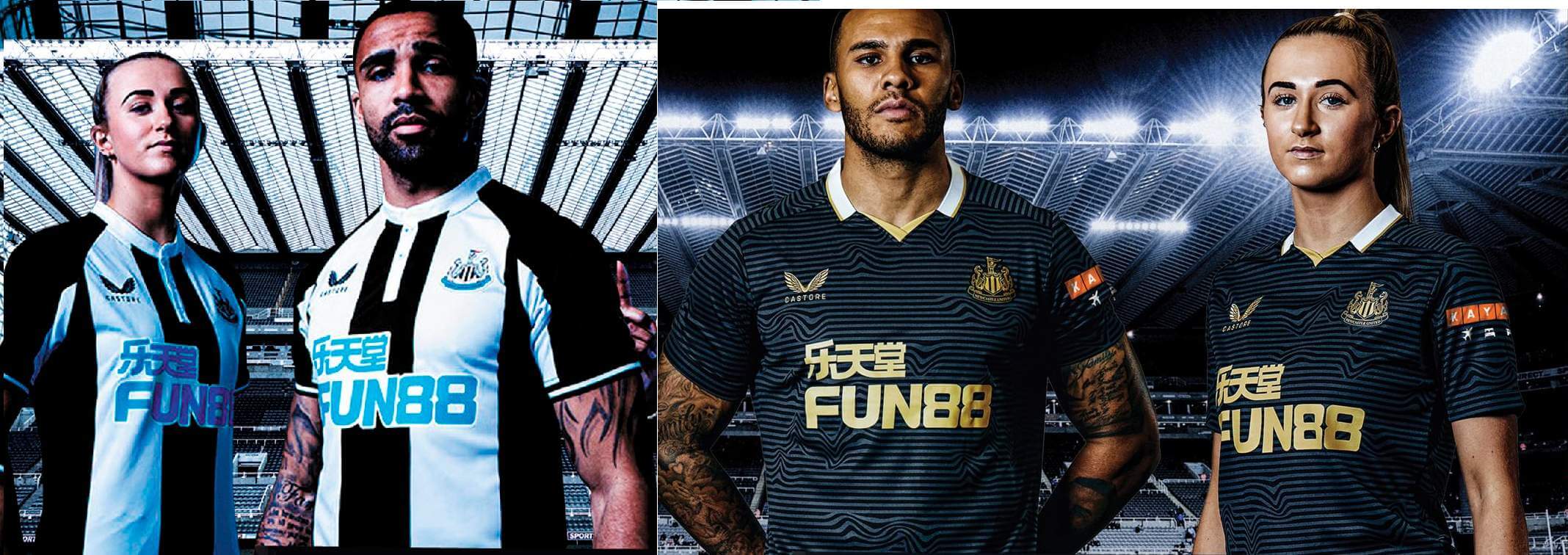
A lot has been made of the placement of the ad and the button placket on the first shirt, which creates a number four above the ad that I now can’t unsee. It is also not solid-colored on the back and has the same stripe pattern. The second kit is mono-black, which again is not the best idea when black is already a Newcastle color, but they at least attempted to account for that by providing gold shorts and socks as well. The manufacturer, Castore, is new to soccer, having started with outfitting tennis players.
Norwich City
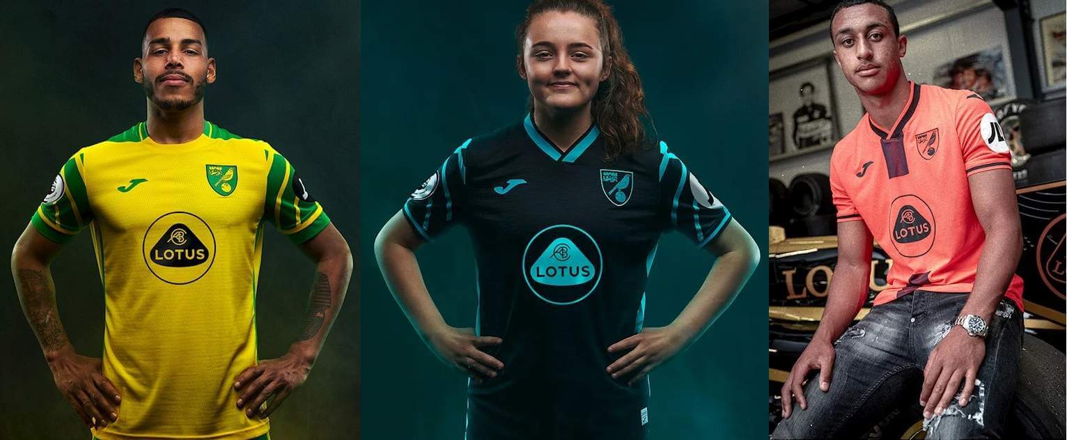
Not enough soccer teams do anything with their sleeves, so it’s good that Norwich did here. Yellow, with green sleeves, and black should really cover all their bases except maybe against Watford. But the third shirt is salmon-colored, so it’s not the best to wear against a team already in yellow. I can think of Norwich third shirts of the recent past that ended up appearing maybe once or twice in the season, and this one seems destined to be another.
Southampton
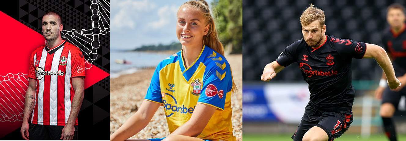
Southampton went back to the traditional red and white stripes after wearing both red with a white sash and the reverse of that last season. It’s been 20 years since they moved to their current stadium, so that’s the theme for all three shirts. The black third shirt has views of the new, St. Mary’s, and old, The Dell, stadiums as a faint pattern, while the yellow and blue second shirt has the same pattern on the inside.
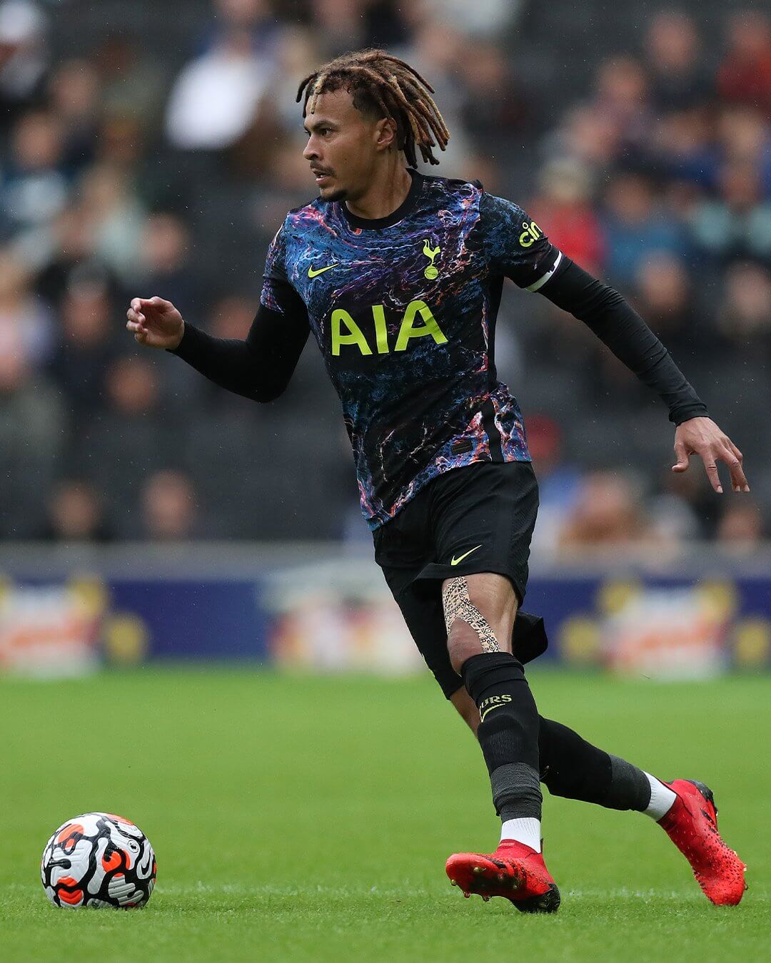
Tottenham Hotspur
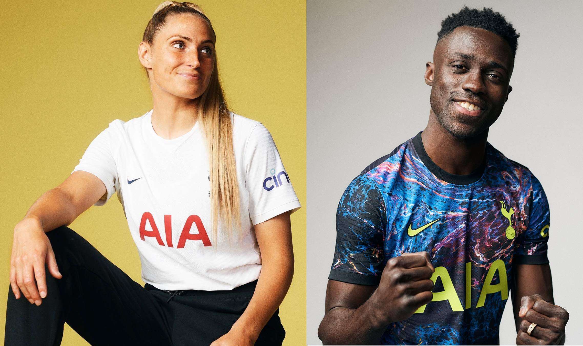
The first shirt is a plain white T-shirt, which is probably to be expected given the second shirt. This year specifically it’s also for the 100th anniversary of the first time Tottenham wore a cockerel crest.
I really like the second shirt. Those are a place for experimentation and this one is distinctive and recognizable in the way that some of the recent well-received NWSL shirts have been. The dark blue base also prevents the design from becoming garish. Despite its base color it’s worn with black shorts and socks, as you can see in the image at the top of this post, and the version worn on the field is solid black in the number and NOB location to comply with equipment rules.
Watford
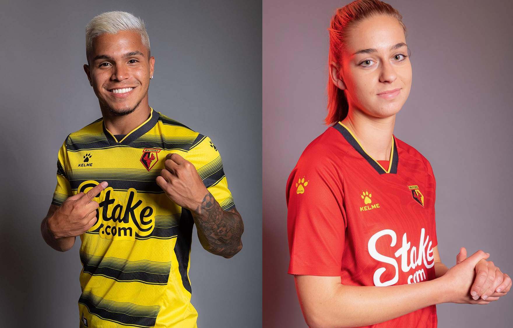
Watford have black and yellow hoops (horizontal stripes) this season and it’s the fourth time in a row that the first shirt has a pattern and isn’t just solid-colored. It is solid yellow on the back, though, and is paired with a red option, which is usually an accent color on the first shirt but is not there at all this year.
West Ham United
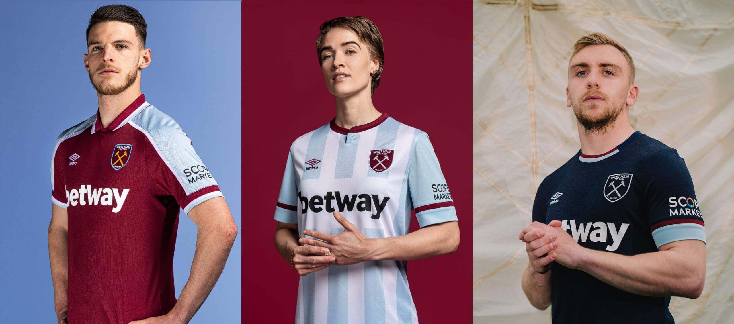
The first shirt is again based on a previous design, this time one from 1999-2001, and so is the second shirt, whose sky blue and white stripes date from 1992-93. The third shirt is usually dark-colored and it’s navy blue this year.
Wolverhampton Wanderers
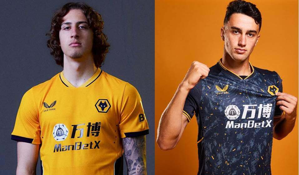
Wolves wear a distinct shade of what is usually called old gold and when releasing the first shirt they did mention their Pantone color, Pantone 130C. Despite that, the exact shade worn has varied between seasons and manufacturers and you can tell it’s different from last season. The second shirt is black, which as a club color is a common choice last used two years ago and again seems to have a pattern mostly to avoid it being solid-colored.
(The websites Historical Football Kits and Classic Kits are useful resources for the visual histories of English and Scottish clubs, especially for some of the stats around older designs mentioned here.)
Wow — thanks, Jamie! Great breakdown of the PL kits (as most of you know, I’m not a soccer guy, but I do know about the euro leagues and relegation and promotion, and it’s always fun to see who made the cut and who didn’t — maybe one day American sports leagues will look into this sort of thing. I’m not sure it would ever fly here, but it’s food for thought). Thanks for the great writeup Jamie!
The “Field of Dreams” Game
It was everything we thought it would be…and more.
As I’m sure almost all of you are aware, the White Sox and Yankees played in the 2021 “Field of Dreams” game last evening, and there was a lot to unwrap, although not all of it was uni-related. Jamie did such a thorough job on the PL preview, I’ll try to be brief here. If you watched it, it had a pretty thrilling finish too!
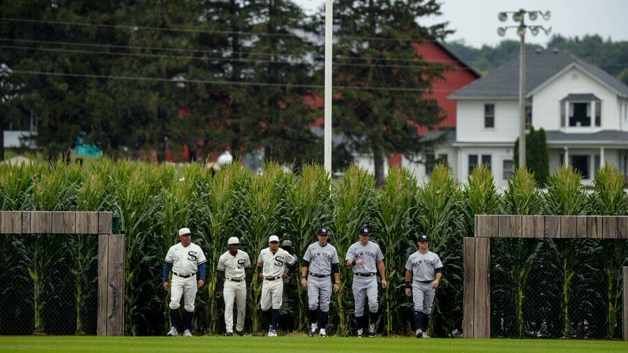
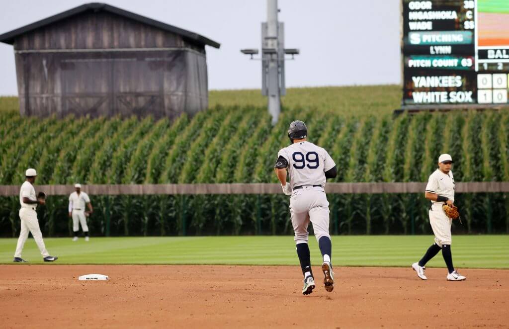
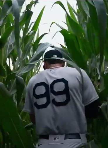
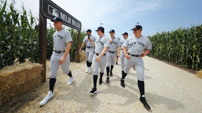
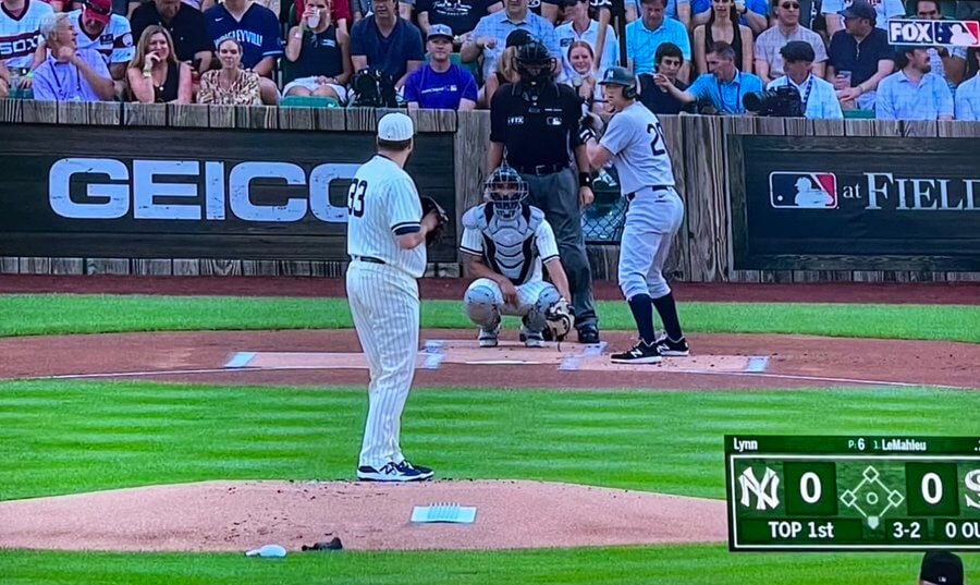
First off: the unis. They are what we thought they were. Almost. A week ago the teams previewed their jerseys and caps, and I was disappointed (as I’m sure many of you were as well) the full uni, including hosiery, wasn’t shown. If you look at the top photo, you can immediately see the two teams basically recreating a scene from the FOD movie (players entering from the corn field), and you can see something’s amiss. Not only was one of the pictured White Sox players wearing (gasp) pants in pajama style, the more jarring image was the White Sox wearing…BLUE socks. Really? I mean, c’mon — the real 1919 White Sox wore, ya know, white stirrups and sanis, and so too did the actors in the movie. If you’re going to get that one important detail wrong…
And I don’t know which is worse, in this case, players going low cuffed, or those showing hosiery wearing the wrong damn color.
But other than that, Mrs. Lincoln…
Normally I am a fan of visible hosiery (even the ridiculous Stance holiday and special event socks) over low-cuffery, but in this one instance, I think I’d have preferred it if the ChiSox had all gone long pantsed than wear the wrong color socks.
Aside from that, the uniforms weren’t really a surprise, as they’d shown off the caps and jerseys a week back, and it was pretty easy to figure out what the pants would look like.
Now for some observations (some from me, and some from others)…
I know it was pure hollywood cheese, but I still loved the cornfield entrances:
As some of you pointed out, while the font is definitely in the McAuliffe style, there are a few differences. I’m guessing Nike created a proprietary font based strongly off the McAuliffe pattern.
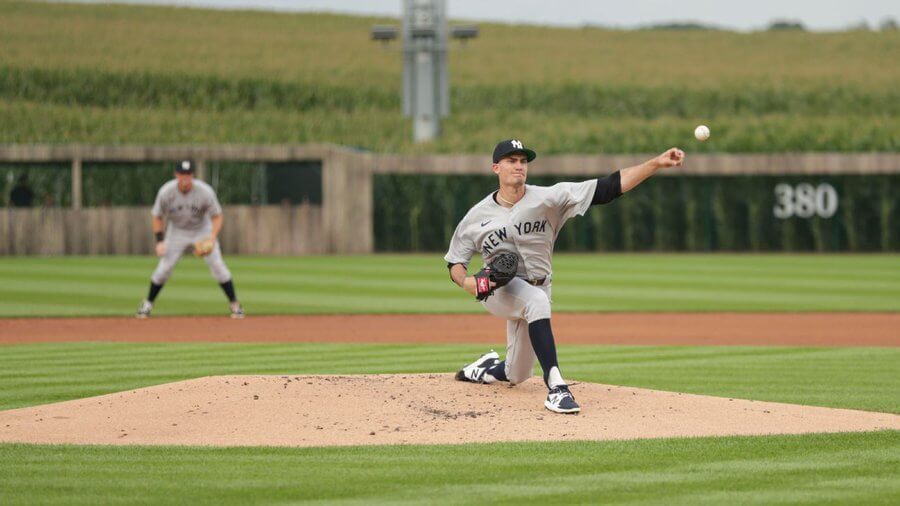
Most of the Yanks went high cuffed, and many wore actual low-cut stirrups (pretty period-appropriate), which was a nice visual:
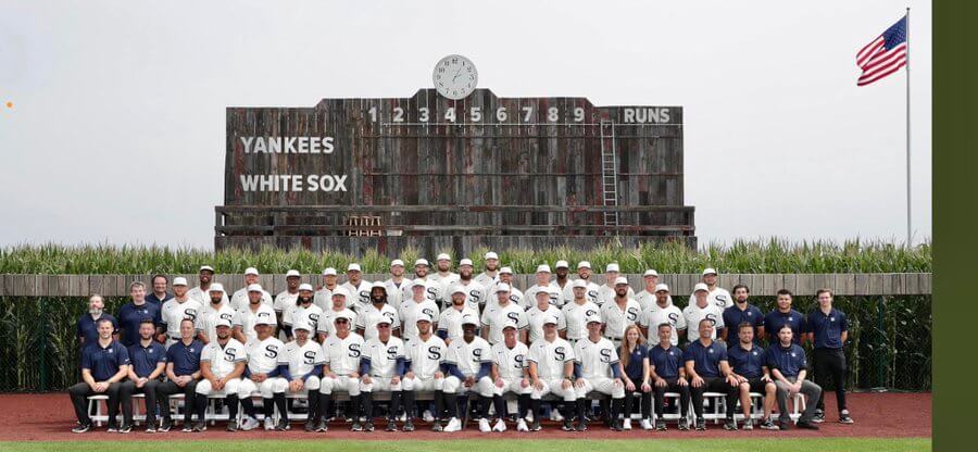
Even though they wore the wrong color socks, notice how in the team portrait the ChiSox have all high-cuffed players visible in the front row (which makes for a great visual, even if the socks should be white):
Obviously batting helmets didn’t exist in 1919, so the White Sox wore a navy blue helmet with the Sox logo featured on their jerseys (I was kinda hoping they’d create helmets that matched their pinstriped crown/blue brim caps):
The Yankess wore their normal road matte midnight navy helmets.
My mom, who I think has maybe watched one baseball game in the past 30-plus years, actually watched this one. She texted me this last night (verbatim):
Am watching the Field of Dreams game. Too bad the logos on the uniform, I think Nike, and ads on the fence, but it was a good idea and the “stadium” seems to be Full
First of all, my mom, who is a technophobe to begin with (and she’s 87), almost never texts me period. But for her to mention this was pretty extraordinary — I was like 99% certain I got all my uniwatching genes from my dad, but wow. And she’s right. The goddam swoosh and NE logo was extremely off putting.
She wasn’t alone in this…
The White Sox jerseys are perfect, except for one thing. Take the damn Nike logo off it for one night. I’m sure they will survive. pic.twitter.com/CKXrqmUq5L
— Darren Rovell (@darrenrovell) August 12, 2021
Joe Buck, John Smolz and Tom Verducci dressed in what they consider era-appropriate attire:
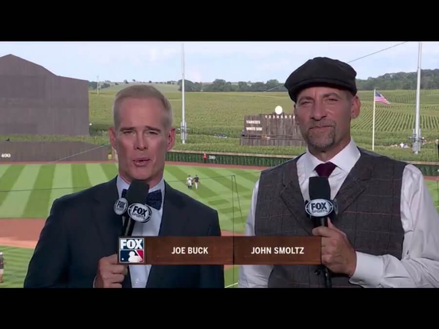
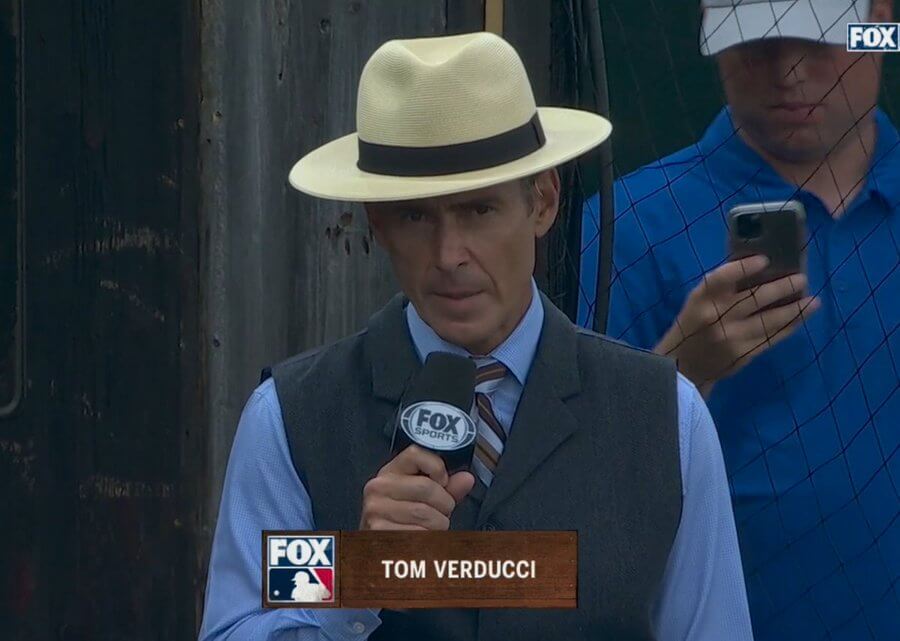
Of course, the Fox graphic and the microphone flag kinda ruin any “throwback” feel.
But let’s not kid ourselves — we’re not in Kansas Iowa anymore. Ads were almost everywhere, but particularly jarring were the ads directly behind home plate.
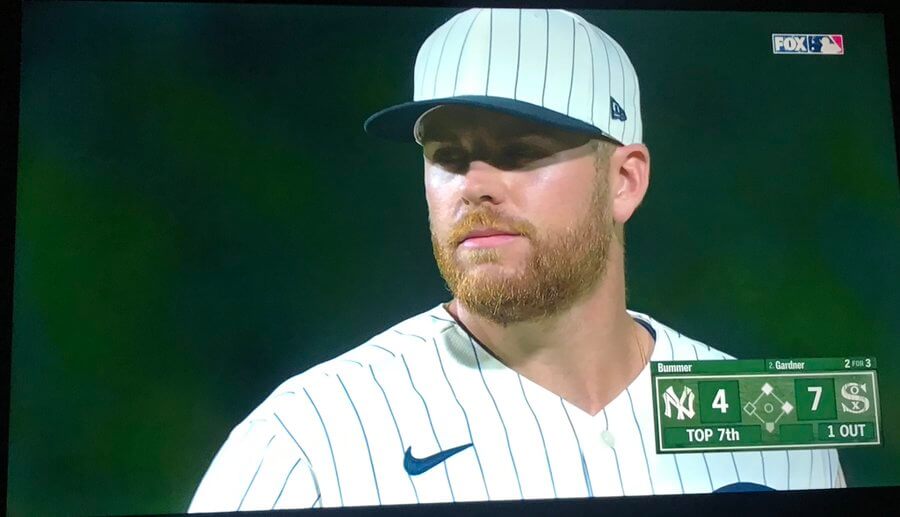
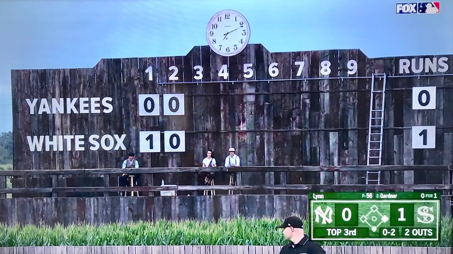
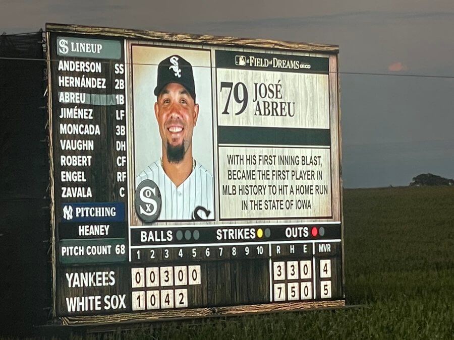
That being said, the actual scorebug did have a nice, old-timey feel to it:
love the old-timey score bug, even the animations look like someone removing a panel and replacing it! @UniWatch #FieldofDreams #MakeItMajor pic.twitter.com/Beo4H4FAeG
— Luke Vaughan (@bayarealuke) August 12, 2021
I was also kinda/sorta hoping the umpires would dress in throwback umpire suits, but alas, they wore their normal gear (complete with ad patches):
@UniWatch Nothing says "Field of Dreams" like ads on umpires and behind home plate pic.twitter.com/7cBHPvV0lu
— Texas Trev (@texastrevor) August 12, 2021
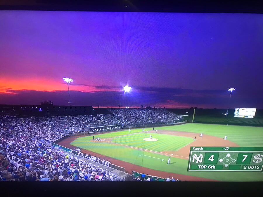
While the behind-the-pitcher shots were an ad-filled eyesore, photos and camera angles from behind the plate or the stands gave us a beautiful view…
…even if on screen graphics crowded the otherwise spectacular shots:
Rows of corn as a backdrop. How cool is that? #FieldOfDreams pic.twitter.com/rKRpiaBxRm
— ohiowa (@TrabFire) August 13, 2021
I know it was hot, but this is just not a good look.
I also loved the faux-old time, hand operated scoreboard:
You’d think players would, for this one game only, wear solid black cleats, but some guys decided to go a bit flashier. But some guys really did try to recreate the old time footwear:
@UniWatch @PhilHecken Nice touch by Michael Kopech tonight going with the polished black, long tongue cleats for tonight's field of dreams game. Sanitary white with some stirrups would have earned him an A+. Sox hats are super clean minus the awful new era side flag. pic.twitter.com/LVoQ0a5GKg
— Sal X Traction (@EvilEmpireFan) August 13, 2021
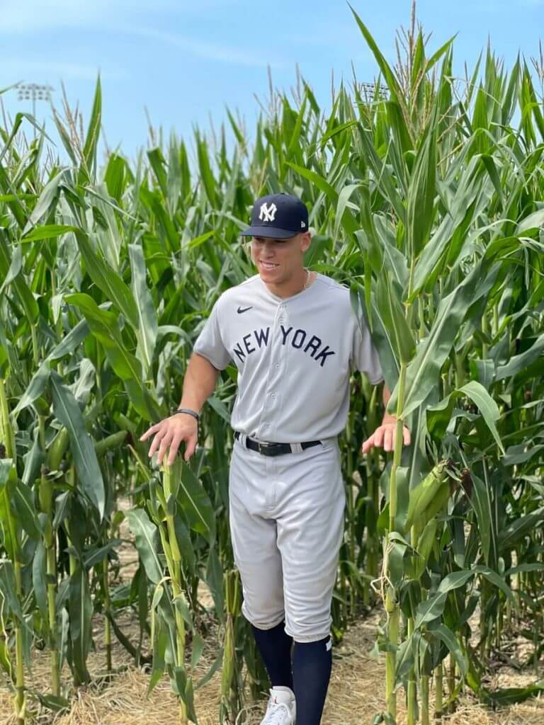
Of course, the star of the whole show was the field itself. I noted a few people thought the teams were using the actual Field of Dreams field, but last night’s field was specially created for the game. It’s literally a stones throw from the field featured in the movie.
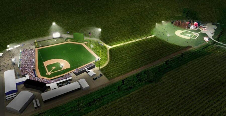
Note the MLB (logo) corn maze (maize?) located between the two fields:
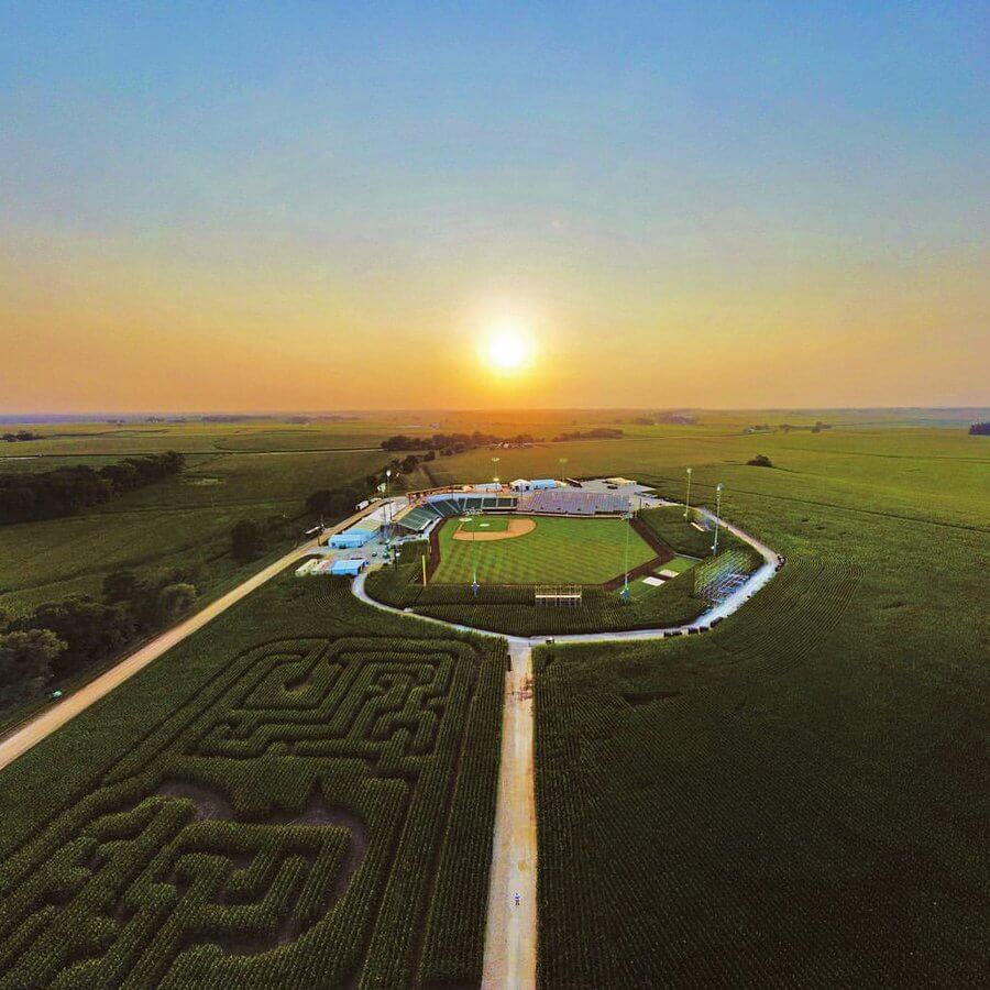
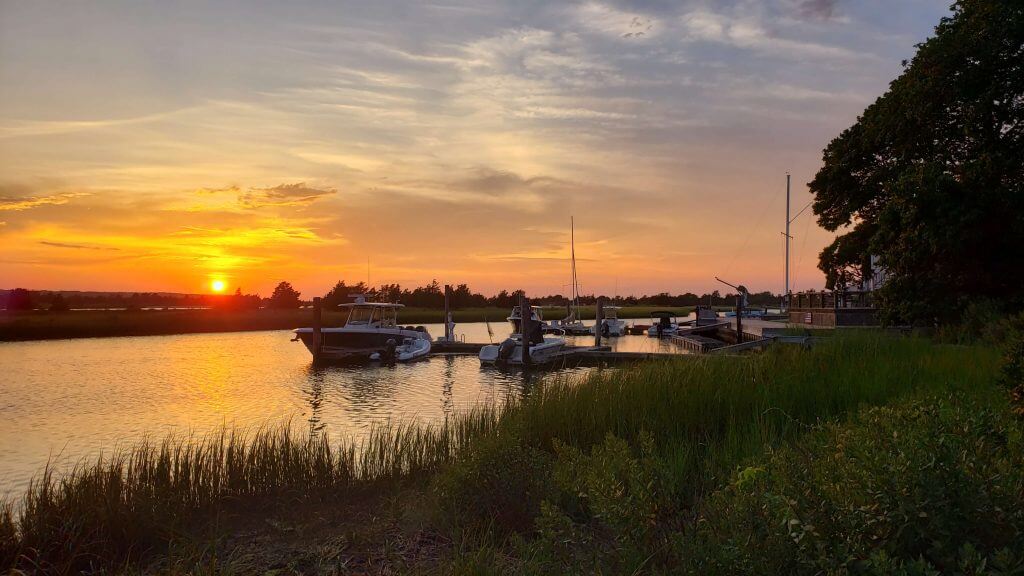
And you guys know how much I love sunsets, so the sunset (and gloaming) visuals were amazing. Reminded me a lot of the Rose Bowl.
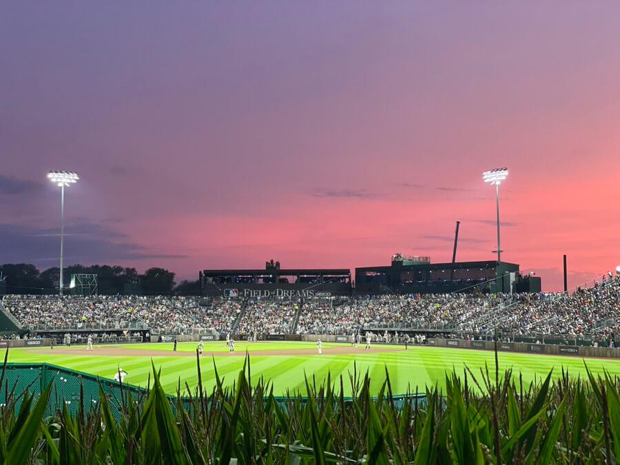
This was, of course, the first MLB game ever played in the state of Iowa, so any “first” was a record (and likely the answer to a future trivia question)…
Even though I was able to catch a good chunk of the game, I’m sure there’s something(s) I missed, so feel free to add any of your observations in the comments (I’ve gone on long enough)
I’ll just leave you with this…
The scene for baseball on Field of Dreams is unreal right now. pic.twitter.com/hk0yfGmGW9
— Kenneth (@TexasSports1015) August 13, 2021
Lots and lots of photos can be seen here.

Guess The Game…
from the scoreboard
Today’s scoreboard comes from Chris Hickey.
The premise of the game (GTGFTS) is simple: I’ll post a scoreboard and you guys simply identify the game depicted. In the past, I don’t know if I’ve ever completely stumped you (some are easier than others).
Here’s the Scoreboard. In the comments below, try to identify the game (date & location, as well as final score). If anything noteworthy occurred during the game, please add that in (and if you were AT the game, well bonus points for you!):
Please continue sending these in! You’re welcome to send me any scoreboard photos (with answers please), and I’ll keep running them.
Bulletin reminder: Paul here. In case you missed it yesterday, my latest piece for Bulletin is an interview with longtime Oakland A’s equipment manager Steve Vucinich, who’s now in his 54th year (!) with the club. It’s a really fun interview, full of stories, insights, and a dirty little secret — literally. It’s available on the web on my Bulletin page. Enjoy!
Okay, back to Phil!
The Ticker
By Anthony Emerson

Baseball News: A federal judge _blank” rel=”noopener noreferrer”>has ruled that the Philadelphia Phillies should be allowed to continue using a modified version of the Phillie Phanatic in a copyright dispute with the mascot’s designers (from Kary Klismet). … The A’s were inconsistent with their belt colors during yesterday’s game, with Chris Bassit wearing yellow and Mitch Moreland wearing green. … The Northwoods League’s Madison Mallards will become the Capital City Teetotalers in “honor” of prohibition as part of a “Roaring ’20s” promotion (from John Ewanowski). … The Richmond Flying Squirrels will be breaking out a tie dye jersey on August 21 (from Minor League Promos). … And tonight, the Fresno Grizzlies become the Fresno Growers (also from Minor League Promos).

NFL News: The Patriots issued uni numbers to their rookies ahead of last night’s preseason opener. QB Mac Jones will wear the No. 10 he wore at Alabama. … Ravens LB Justin Houston will wear No. 50 (from Andrew Cosentino). … The Giants will retire Michael Strahan’s number this season (from Kary Klismet). … Also from Kary, a Twitter user has created a mockup of the Packers’ new alternate uniform based on clues from the team. … One more from Kary: The Raiders have donated new helmets to a Vegas-area high school. .
College/High School Football News: James Madison is celebrating its 50th season of football this year, and they’ve unveiled a nice logo to mark the occasion (from Andrew Rader). … Kansas has added first names to the strips of tape identifying players by last name on their helmets during training camp (from Kary Klismet). … Check out these extra-shell helmets Oregon linemen are wearing during camps (from Nicholas Petrosky).

Hockey News: New uniforms for the Arizona State Sun Devils hockey team (from Wade Heidt).
.
.

Soccer News: Manchester United launched their third kit yesterday. … Sampdoria wingback Morten Thorsby is switching his number from 18 to 2 to raise awareness of climate change. “The number represents the internationally-adopted Paris Agreement target of keeping global temperatures ‘well below’ 2°C above pre-industrial times, in order to avoid dangerous levels of climate change,” writes the BBC (thanks, Jamie). … The Chicago Fire rendered their new crest in silver while advertising for 2022 season tickets, which will be their 25th anniversary.

Grab Bag: Twitter changed its default font for Tweets on Thursday to its proprietary font “Chirp” as part of a few UI tweaks ostensibly to improve readability and minimize visual clutter. With the update still matriculating out, not everyone has it yet. As a Twitter addict myself, I hate the change because the font doesn’t actually improve readability. It’s doesn’t look like a font that should be used for content, it looks like a font that should be used for titles only. … New town logo for Rocky Mount, VA (from Kary Klismet). … Also from Kary, here’s a story on the history of the Bitcoin logo. … One more from Kary: Last month, we ticker-linked to an item about the city of Christchurch, New Zealand, requiring a redesign of its planned new rugby stadium to reduce capacity to 25,000 because of budget concerns. Now, the city has reversed itself in the face of public pressure and construction will move forward on a 30,000-seat stadium. … Jeopardy had a category on colorful sports teams (from James Gilbert).
Uni Tweet of the Day
Ya know, it won’t actually be too long before this will be true…
The Nike swoosh has been part of the uniform for over a century. I don’t see the big deal https://t.co/L69TMDSM4A pic.twitter.com/plwYW1IF6Q
— Ollie (@olisamir) August 12, 2021
And finally… that’s all for today. Big thanks to Jamie for his PL uni preview. Great stuff.
Lucked into another spectacular sunset last evening. I can never get enough of these.
That’s not just a wrap for today, it’s a wrap for me for the week. Everyone have a great weekend — webmaster Johnny Ekdahl will take you through the weekend — and I’ll catch you back here Monday morning.
Peace,
PH
Thanks for the EPL preview, Jamie! And for the FoD recap, Phil!
On the topic of the first big-league game in the state of Iowa, I recommend a different book by WP Kinsella, The Iowa Baseball Confederacy. It’s a weirder, more distinctly Iowa, novel than Shoeless Joe, the novel that was the basis of Field of Dreams. The story revolves around a hidden-from-history game between big-league barnstormers and local Iowa all-star players. Winds up being something like if Gabriel Garcia Lopez were Iowan and tasked with writing a new book for the Old Testament about baseball. Good stuff.
Considering how well everything else was presented, the White Sox not wearing white socks was an even more egregious blunder. As was alluded to, “didn’t anyone even watch Field of Dreams??????”
A more uniform-conscious organization like the Cardinals wouldn’t have screwed up so obviously. Perhaps they’ll have their chance to play in the corn next season against the Cubs.
Cards-Cubs is an obvious matchup, but I’d rather see Royals (Monarchs) vs Twins (Senators), winner becomes every Iowan’s AL team until the next AL FoD game.
It really contrasts with the Yankees who actually had several players wearing stirrups last night, with some others going high cuffed with their pants when they usually don’t.
I turned it off as soon as I saw the White Sox socks.
Ridiculous!!!
This has to be one of the silliest comments I have ever seen on here and that is saying something. Getting so upset with socks that you turned the game off…immediately? jeezus
First Brickyard 400, August 6, 1994
I sat in the lower Paddock just north of the start finish line.
Jeff Gordon (Indiana born) won the race.
That’s the starting lineup on the tower, with Rick Mast in the #1 in the pole position. I was at that race as well, with my dad. It’s, to date, the only race I’ve seen in person. Still have the program with my ticket.
Though I would’ve seen a second race in person, as I was at Michigan International for the August 2007 race. Rain came in before it had a chance to start, though, so they scrubbed the race, and it was ultimately held that Tuesday.
Yup. The giveaway was the fact that there were more than 33 cars in the field.
Front row was 1-3-24: Rick Mast, Dale Earnhardt, Jeff Gordon.
Front row was just Rick Mast and Dale Earnhardt. NASCAR does not do the Indy 500-style 3×3 starts so Jeff Gordon was in row 2.
Jeff Gordon was not born in Indiana, but California. His family moved to Indiana when he was young to help advance his racing career.
“Brighton are back to the usual blue and white stripes after wearing blue with white pinstripes last season. It’s solid blue on the back, which allows them to make the second shirt turquoise.”
Curious about this – “allows them?” Is there some sort of rule which dictates when turquoise is allowed or not allowed? If the back of the shirt was also stripes, could they not use turquoise?
Also, the logo placement and collar for Newcastle makes it look like they are part of some sort of Fantastic Four redesign.
No, what I mean is if the back was white (as it has been before) or striped then turquoise would be less of a good idea because it’s another light color. They might then have matchups where neither one would be particularly ideal.
Since the back is blue, it takes that concern away.
Ahhh, got it. Thanks!
Jamie, thanks also for including women players for teams with women’s sides.
I can’t see that Spurs third without thinking of Forward Madison’s “Drip Kit” third last season. I really like what Spurs did with the concept, but it seems like the second time in a few years that big soccer has adopted a design innovation that first cropped up in American low-level soccer (the first being Dazzle Camo patterns).
Sure. I believe they all have women’s teams but the ones that have them at lower tiers, or even in the second tier like Palace, tend not to include them in releases, which is kind of ridiculous. Not much of an excuse for that.
I second that :) I recognise most of them as players for the respective women’s teams, but only Ellie Brazil of Brighton is actually wearing her WSL shirt. A lot of clubs these days when they launch their new shirts now include women, but quite often I think they are either models or fans, especially for the lower league teams. All good though!
Great job with the preview Jamie! I can feel the pain in my neck from shaking my head at the orange elements in Liverpool’s kit building up already.
Love reading the Premier League breakdown every year. Can help me figure out if it is West Ham, Burnley, or Aston Villa by seeing their jerseys this year. They look so similar.
The baseball game last night was amazing. The batting helmets from the White Sox looked great. They were a nice touch.
It seems to me that maroon and light blue is a very British thing — WHU, Burnley, Villa, Scunthorpe.
In America, we’re pretty much limited to Colorado Rapids and Delaware Stata University (which actually uses a cherry red).
West Ham has the yellow crossed Hammers badge, Villa the Lion, and Burnley the geometric motif
English football is full of clubs imitating other clubs kits or having a story to justify taking the colors, except that story is 100 years old. Most white and navy kits descend from imitation Preston North End. West Ham took Villa’s colors after winning them in a foot race.
BTW, there’s no such thing as “traditional third kit colors”, as third kits are new. Thusly, West Ham does not have a trditional navy third kit. West Ham has a second kit cycle: Navy, Sky and White.
The first Field of Dreams aerial shot shows a path between the mound and home plate, but it’s apparent in every other shot that there isn’t one on the field. Methinks it’s an artist’s rendering instead of an actual aerial? Either way, I’m glad they didn’t put one in though; for something that has to happen naturally over time, it always looked forced to me when they did that in MLB parks.
I’m a Yankees fan, but didn’t mind seeing the White Sox win this one, even in that fashion. One of the best baseball games I’ve ever seen, especially the intro.
Nice EPL rundown, Jamie.
As a Spurs fan, I was worried about that away top being too distracting, but after seeing it on TV, it’s not bad. The neon yellow numbers pop on the back, which helps my old eyes when watching a match. Conversely, while I like that Newcastle maintains their stripes on the back, it’s a pain to read their numbers during a game.
I’m pretty sure the ticker item about the A’s belt colors is specifically explained in Paul’s most recent Bulletin piece.
Besides the complete screw up of the WHITE Sox wearing blue socks, I just don’t understand why they let players wear pajama pants for this game, or any game for that matter that has throw-back uniforms. And the picture of Aaron Judge walking in with white shoes is ridiculous looking.
Sometimes I wonder if “Getting It” sometimes means we let the perfect become the enemy of the good.
MLB did a fantastic job with Field of Dreams game. I know, and continue to hear about, people who would normally not watch a baseball game watch that one to the glorious end. It was fun and different and a wonderful opportunity to expand the tent a little.
Anyone who turned the game off because the White Sox wore blue socks missed a fantastic game. I like looking at all the things they got right — and there were very many — than a handful of things that fell a little short.
+1 to all of this.
My sister and her husband maybe attend one baseball game per year and never watch games on TV, but they’re huge fans of baseball movies. We watched the entire game, including that incredible 9th inning, and the two of them couldn’t stop raving about how wonderful it was.
Should all of the players have gone high-cuffed? Were the logos and ads annoying? Should Chicago have worn white socks and actually buttoned their jerseys? Did Aaron Judge go overboard with his cleats? Yes to all of these things.
But what a shame for anyone who let those details prevent them from the joy of watching a home run ball disappear into a corn field under a spectacular sunset. Is this heaven?
Agreed. It’s as if there is a little bit of peer pressure here to be the one who “obsesses” the most over minor details…so nobody wants to be the one who doesn’t “get it” by coming out and saying something like, “who really cares if the socks are not the historically accurate color?”
Um. This is Uni Watch. Did you think I (we) wouldn’t notice perhaps THE most important uni detail, and that they got it wrong?
As far as the other stuff, yes, honestly, despite the overwrought commercialization and hollywood-type treatment the game got, I enjoyed it, basically loved (other than the Sox blue socks) the uniforms — in fact I wish Chicago would make these the Sunday alternate — and was impressed MLB was able to pull this off (and very well at that). But this is a uniform observation site, first and foremost, and well, details do matter here.
Don’t get me wrong, I’m not saying it shouldn’t have been noted at all, I’m just not sure it was that big a deal, especially since the blue socks no doubt looked better than plain white socks would have. And frankly it’s a bigger missed detail that the players were wearing numbers, but that has been mostly ignored.
However, as long as we’re talking details, it appears to me that nobody has mentioned that the 1919 Sox jerseys had a small bit of blue trim around the collar, while the jerseys worn last night did not…
I noted the number anachronism last week when the unis were unveiled. And I also showed a photo of the 1919 Sox, noting that even Okkonen got some of the details wrong, and mentioning the team were apparently basing their throwbacks on the FOD movie uniforms (which didn’t get the details perfect). It’s actually why I was so surprised the team didn’t wear white socks, as the actors in the movie did. Sorry if you missed that, but I didn’t think it needed repeating today.
Whether the blue socks “looked better” than plain white socks is irrelevant. The team name is literally the White Sox, and they wore plain white socks for the first 45 years of their existence. It was their distinctive, their calling card. None of the other teams in the American League wore plain white socks at that time.
I don’t know if I’d say the socks were was the most important uni details – especially if there are players going low-cuffed. I’d give the word mark more importance.
If the Sox rolled out there with white socks but the beach blanket word mark, people would be going nuts.
I don’t know if MLB promised exact replicas or modern uniforms based on the 1919 designs.
Like I said, I loved it.
The team is literally called the WHITE SOX. They wore white socks in 1919 AND in the movie. I’d say that’s a pretty damn critical uni detail. And it’s not like they were working from a crappy 100 year old black and white photo to know this (which could excuse some of the more minute uni details). WHITE SOCKS. It’s really not that difficult to give the team the proper socks. THEY WERE LITERALLY NAMED FOR THESE.
I still can’t believe anybody watched the game with those socks. I was so distraught.
Tom Verducci’s look left me with the impression he wasn’t going to put up with any chicanery or tomfoolery during the game.
Always loved Will’s response to this….
Yankees need to adopt the FoD Game # font as the permanent font for home and road unis. It’s a custom yet classic trad look that stands out more than the varsity full block #’s they’ve had since 1973.
What’s the dawn of a new Premier League season without Mark E. Smith? link
I love the contrast today. Premier League advertisements worn on clothing we pretend is a uniform, and then that’s followed up with the Field of Dreams Game where people cry about fonts, logos, colors, etc. “Actually the eye black worn in 1919 was more of a “charcoal” than an “obisidian””f…” [pushes glasses up nose]. Baseball is obviously held to the highest standard. Yes, I wish every detail could have been made right. But the contrast today is too ironic.
Really the thing that bugged me the most wasn’t uni-related but was them blaring any modern music when the players walked up to bat, they would’ve lived for one freaking night not to hear whatever song they think is cool, should’ve been 100% organ music for everything.
Also the video screen I could’ve done without, and while I know ads in general were frowned upon, I did like that at least Chevorlet’s logo was time appropriate since they were one of the few companies that was around then.
But with that said, I do want to add, the pro’s of last night game far outweigh the few con’s I listed and look forward to them hopefully doing it again!
My biggest gripe with the FOD game wasn’t even uni related but was them still blaring any modern music for the players walking up to bat, for just ONE night they could’ve lived not hearing their favorite songs they think is cool, should’ve been organ music 100% for everything. Also felt the video screen wasn’t needed, and stuck out when it got dark.
But with that said, I do want to add, the pro’s of last night game far outweigh the few con’s I listed and look forward to them hopefully doing it again!
Enjoyed the EPL preview Jamie, thanks again for including women’s footballers in your post. I didn’t realized the 2nd kit for Spurs was their 2nd, I thought it was their alt!
As for the FOD, I am not going to get hung up on specific sock colors, the game was visually beautiful minus the Nike and NE ad’s. That’s my only hold up.
I noticed the cream Sox unis were pretty ‘sheer’ under the lights you could see the base layer underneath and easily see where the fabric was thicker (pockets, seams, etc.) so if this is Nike’s new template, it is pretty sheer to me.
Non uni related, the camera work in the game bothered me a bit, particularly the main shot of pitcher/batter, just had no depth perception and often the pitcher blocked the visual of the ball crossing the plate. Then it felt as if the fans behind the plate were literally one foot away because of this zoomed in view. Fox needed to zoom out a bit, this was just a bad job on their part.
Just a question about the function of this site… Is it somehow better (just easier?) to write create entry per day and put everything under that single entry? Or, could you create 2 entries (or more) on one day? For example, today’s entry with the Premier league kits release and the discussion regarding the field of dreams game was great, huge, and also comprised of two completely different but very notable topics. The latter kind of felt secondary or lost after the premier league kit discussion. If there were two entries, maybe collapsed and clickable to expand, it seems like it would have been more streamlined and each discussion distinct. I’ve been coming here for years, so I know one entry with everything under the sun is typically just how it is laid out. But I dunno, just curious..
I’ve always thought this would be a better way to go, but Paul has been pretty clear he just wants one entry (no matter how large or how small) per day.
Did anyone else notice that Jose Abreu’s batting helmet was glossy on the front half and matte in the back half? I wonder how he did that. I prefer glossy.
It reminded me of the nightmare Jacksonville Jaguars helmets.
He puts a lot of pine tar on his helmet. Usually makes the black lid greasy/bubbly but last night it appeared as more of a thin shiny layer.
Was surprised to see the pine tar did not affect the grey SOX logo on the lid as it typically does on his regular batting helmet with the white logo looking yellow.
I loved those Yankee alt hats.
Their away uniforms without the white borders around the letters and without nay and white stripes on the sleeves and pants looked much better. The Dodgers made this change a long time ago and it looks so much cleaner.
The new Twitter font is terrible.
AT least it happened once this year!!!!! All the managers and coaches were properly attired in an actual uniform and not the pajama tops they normally wear. Yeah!!!!! Now about those socks…..
I am shocked that no one has unfurled the “Hey, you missed AFC Richmond” joke yet.
If I ever regain power (going on 3 days now… thanks Michigan power grid!) I would love to watch a replay of the FoD game. Anyone know if it will be re-broadcast?
I was a little disoriented by how much some of the digits on the White Sox jerseys resembled the Yankees’ usual home number font. From the back, Lynn pretty much was wearing a David Wells jersey.