[Editor’s Note: Paul is on his annual August break from the site. Deputy editor Phil Hecken is in charge from now through the end of the month, although Paul may be popping up here occasionally.]
By Phil Hecken
Follow @PhilHecken
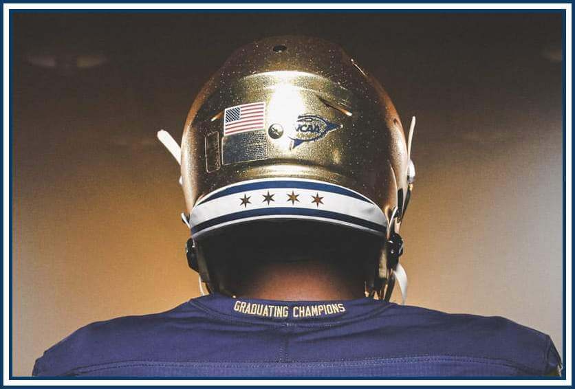
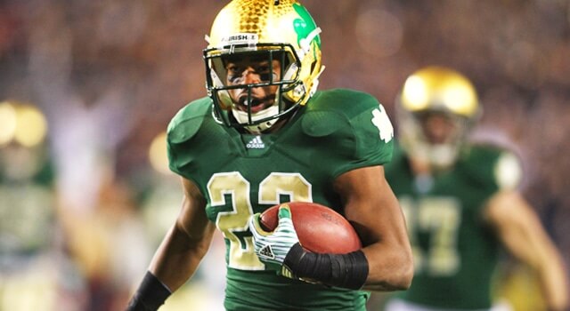
Yesterday, the Fighting Irish of Notre Dame unveiled their 2021 “Shamrock Series” uniforms, which they will be wearing at Soldier Field in Chicago, on September 25th. As you can see from the splash photo, the Irish will be working in some Chicago-flavor to their uniforms, including a neck bumper that features the four “Chicago Stars” from the Chicago flag. They’ll also have “GRADUATING CHAMPIONS” on the rear collar of their jersey (but we’ll get to that and the other uni details momentarily).
But first, the hype video. If you’re not into the chatter and Chicago-related quips, which take up about the first minute and a half of the video and want to go straight to the video with the uniform reveals, feel free to skip ahead about 90 seconds.
As you can see from the uni-unveil portion of the video, these uniforms don’t differ greatly from Notre Dame’s current uniforms, though there are differences. Unlike some of their previous Shamrock Series’ uniforms, these are fairly staid.
Notre Dame was originally scheduled to play a Stadium Series game in 2020 (at Lambeau Field), but last year’s COVID-19 outbreak forced a postponement. Because this game will be played in Chicago’s historic Soldier Field, the Irish (and uni-manufacturer Under Armour) have attempted to give the uniforms some Windy City flavor.
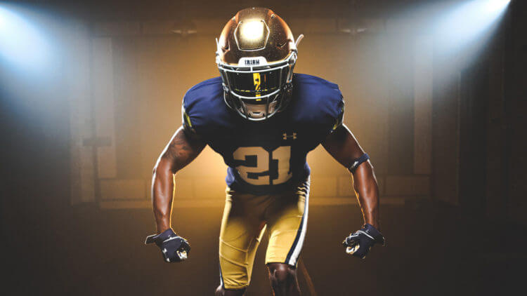
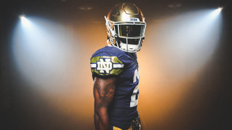
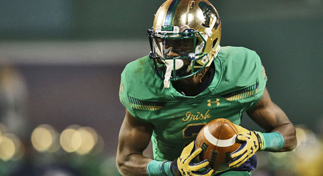
The Irish will be wearing their traditional gold helmets, navy blue jerseys and gold pants. If you just looked quickly, you might not even notice any differences from their current duds. The helmet will not feature any kind of special decal on the sides, remaining blank, but the back will have the special rear bumper as noted above (plus the annoying collar slogan). Jersey numbers are in a “block slab serif” font, meant to “represent the city of broad shoulders.”
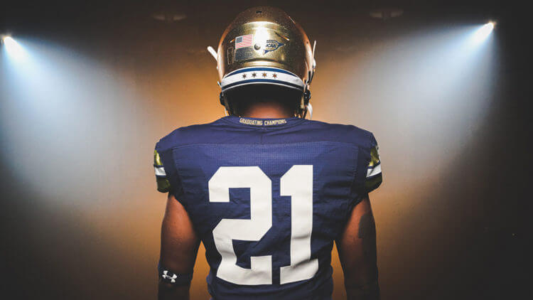
The navy blue jersey has added sleeve stripes in a wide gold/narrow navy/medium white/narrow navy/wide gold color pattern. A large interlocking “ND” logo bisects the stripe.
According to the team, the “two gold stripes resemble the rivers and waterways represented on the city of Chicago’s flag.” Seriously.
The gold pants will also have a navy/white/navy striping pattern (their pants are normally solid gold), which I think looks terrific. There’s also a large interlocking ND logo on the upper left thigh.
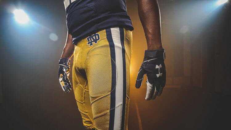
Those are, according to the team, “a direct nod to our Notre Dame team that played the first game at Soldier Field in 1924, the same year we won our first national championship.”
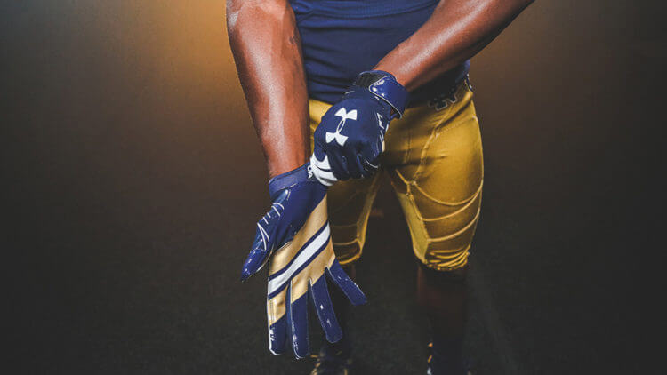
Of course, the team will also be fitted with special shoes and gloves, the latter of which will be blue with a striping pattern that mimics that on the shoulder caps. Those “echo(es) the city of Chicago’s flag by mirroring the pants stripe.”
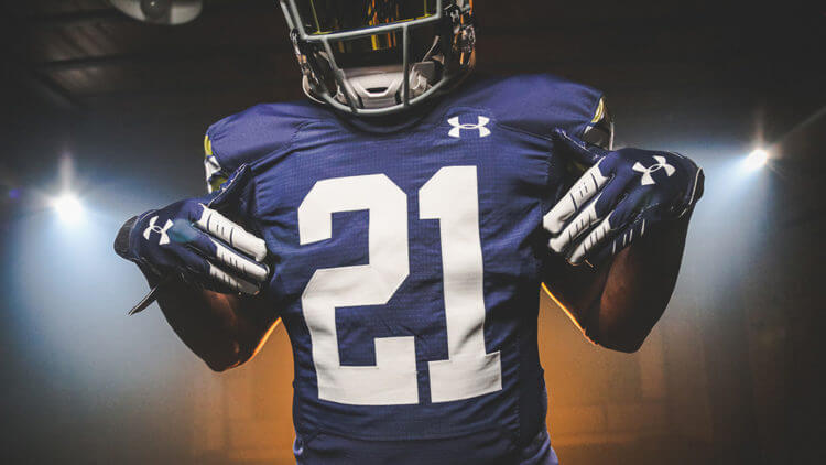
Here’s an additional look at the jersey. I’m not complaining, but those numbers are ginormous. No word on what the size represents.
If you’re somewhat aghast of those uniform detail descriptions, you’re not alone. I think the team has created a really good looking one-off uniform, and it should stand alone as such — but the marketing speak, as usual, has been turned up to 11 here. I mean seriously, the sleeve cap stripes look great, but did they really design them with the city flag’s depiction of Chicago’s “rivers and waterways”? I do rather like the neck bumper (with the four Chicago stars), and of course there’s the collar slogan, “GRADUATING CHAPMPIONS” — normally these sort of things are hidden on the inside of the collar, visible to no one on the field, but here UA has put the slogan on the outside. I’m hoping this doesn’t indicate the beginning of a trend. Oh, but that location “prominently displays our program’s mission statement.”
Think I’m kidding about these deets? Feast your eyes…
✶ ✶ ✶ ✶
Inspired by the Windy City, @NDFootball’s #ShamrockSeries uniforms are HERE.
➡️ https://t.co/L53yER6xPw#GoIrish pic.twitter.com/WBOkBy9be3
— The Fighting Irish (@FightingIrish) August 9, 2021
Notre Dame is not the only team wearing a special uniform for this matchup. Their opponent, Wisconsin, will also wear a different uni for the game (they announced their uni set earlier this year).
— Wisconsin Football (@BadgerFootball) June 23, 2021
You’ll note several differences from Wisconsin’s normal uniform, including “FORWARD” in a ribbon atop the motion W on the helmet, thin sleeve loops stripes over the shoulders, and different fonts. That’s also a really good looking uniform, so the matchup should be a Top 5 this fall.
Notre Dame played in a Shamrock Series from 2009 through 2018 (but excluding 2017), when they last hosted Syracuse at Yankee Stadium. Despite being a road game, the Irish are calling this year’s game at Soldier Field a Shamrock Series game. Last year’s game (which was scheduled to be played at Lambeau Field in Wisconsin and for which ND was the home team) was rescheduled for September 5, 2026.
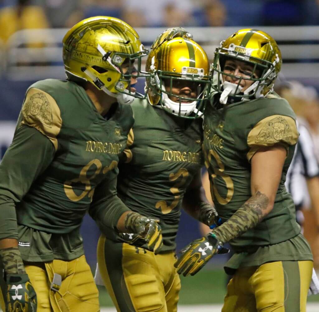
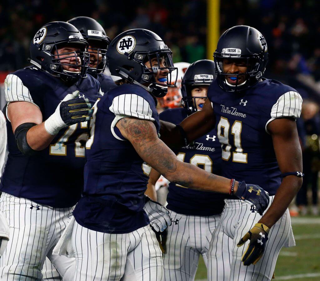
As I mentioned above, I particularly like the ND uni for the resumption of the “Shamrock Series.” In 2009, the team called their game against Washington State (and played in the Alamodome in San Antonio, TX) a “Shamrock Series” game, but they didn’t wear any kind of special uniforms. Beginning with their 2010 game against Army (played in Yankee Stadium), the team began breaking out special looks. Some have been good, some…not. You be the judge how this new Stadium Series uniform fits in with those of the past:
2010
ND vs. Army (Yankee Stadium in Bronx, NY)
2011
ND vs. Maryland (FedEx Field in Landover, MD)
2012
ND vs. Miami (Soldier Field)
2013
ND vs. Arizona State (AT&T Stadium in Arlington, TX)
2014
ND vs. Purdue (Lucas Oil Stadium in Indianapolis, IN)
2015
ND vs. Boston College (Fenway Park in Boston, MA)
2016
ND vs. Army (Alamodome in San Antonio, TX)
2018
ND vs. Syracuse (Yankee Stadium in Bronx, NY)
So there you have it. What do you guys think?
Collector’s Corner
By Brinke Guthrie
Follow @brinkeguthrie
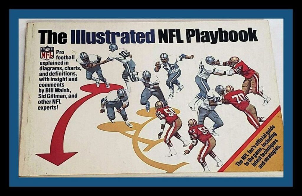
Leading off this week with this cool looking book, the “NFL Illustrated Playbook from 1982. What’s interesting about that terrific cover art is, those are the Cowboys and Niners, without the star and SF on their helmets. It’s kind of a similar looking doodle, but not the accurate logo.
Now for the rest of this week’s picks:
• Here’s another NFL playbook; this one came from the 1972 game “NFL Strategy.” Learned a lot about pro football from this game and booklet, for sure. Collector’s Corner gives this game its highest recommendation.
• This 1970s button-down shirt by Balfour features the original Bengals helmet.
• J.P. Stevens & Co. were the makers of this 1960s (judging from the NFL shield) stadium blanket.
• “Foto-Electric Baseball” from 1949 is touted as “the finest baseball game ever made.” Well, it may have been the real deal 72 years ago, but I studied the photos here and I have no idea how it works. (Helpful tip: “always turn the light off when not in use.”)
• You could go ANYWHERE IN STADIUM with this 1976 Bills @ Colts TV pass. Says so right on the pass; just display at all times!
• “Detroit Baseball Company” was the name on the front of this maybe-1950s era Briggs Stadium ticket stub. It was renamed Tigers Stadium in 1961.
• When I look at this 1950s photo of New York Football Giants players Jim Katcavage and Andy Robustelli, I think of one thing: football players. Heck, even their names sound like football player names. This 1950s Bears photo is great, too. Cue Facenda, please.
• I can’t say I’ve ever heard of “Flexkateers” as any sort of nickname associated with the New Orleans Saints, but here it is on a 1970s T-shirt. Maybe this was a name given to their defensive line, IE the “Flex” defensive scheme.
• “Dirty Dunk” is emblazoned on this 1990s over-the-door NBA basketball hoop. I saw another photo of this item where the decals were similarly plastered all over in a haphazard fashion; maybe the maker supplied the stickers for fans to apply on their own?
• How about this pair of 1960s Baltimore Colts schedules from National Beer. Look at the artistic license taken with those facemasks!

Guess The Game…
from the scoreboard
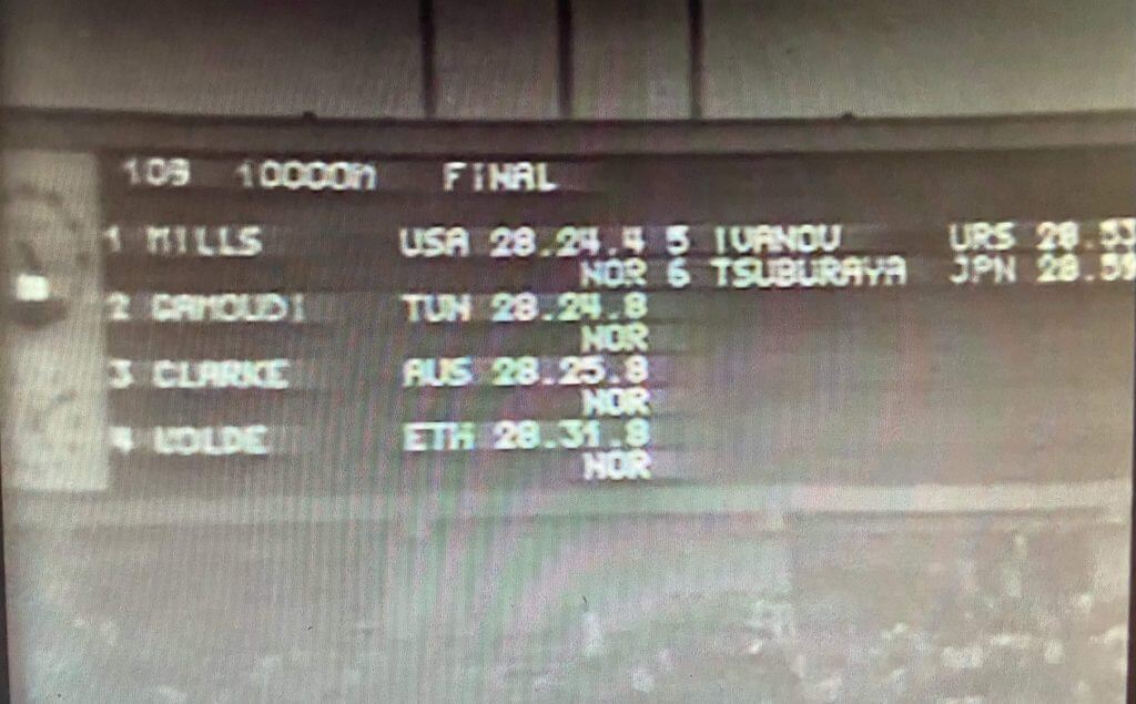
Today’s scoreboard comes from Chris Hickey.
The premise of the game (GTGFTS) is simple: I’ll post a scoreboard and you guys simply identify the game depicted. In the past, I don’t know if I’ve ever completely stumped you (some are easier than others).
Here’s the Scoreboard. In the comments below, try to identify the game (date & location, as well as final score). If anything noteworthy occurred during the game, please add that in (and if you were AT the game, well bonus points for you!):
Please continue sending these in! You’re welcome to send me any scoreboard photos (with answers please), and I’ll keep running them.
A podcast episode worth listening to: Paul here. I appeared as a guest on the latest episode of Sox Degrees, a podcast hosted by the great White Sox broadcasters Len Kasper and Jason Benetti. We spent an hour geeking out over all sorts of uni-related topics (not just Chisox stuff), and I can honestly say it was one of the most enjoyable guest appearances I’ve ever done. Len and Jason, aside from being first-rate broadcast professionals, are also great guys and very into uniforms — I think you’ll get a kick out of our discussion, which you can do here.
Meanwhile: I’ll be doing a Zoom presentation this Thursday, Aug. 12, 6pm Eastern, as part of the Worcester Museum of Art’s exhibition about baseball jerseys. It’s free for museum members and kids, $5 for everyone else. If you’re interested, you can sign up here.
Okay, back to Phil!
The Ticker
By Alex Hider

Baseball News: Seriously lame: Reader @smntcsilverfox notes that the MLB is selling advertising on their 404 page. … Reader Johnny notes that there are some subtle differences between the uniforms that will be worn during the Field of Dreams game between the Yankees and White Sox on Thursday and the uniforms displayed in MLB The Show. … The Triple-A Louisville Bats will wear their “Mashers” uniforms again on Sunday (from Josh Claywell). … Not uniform-related but an incredible story — at 81, Joe Zich is pitching for a men’s baseball league in Milwaukee. Not softball, mind you. Baseball (from Randy Koehn). … New uniforms for the Altona Angels, a youth softball team from Manitoba (from Kary Klismet).

NFL News: Big news out of New York, as the Giants announced that, for the most part, their grey pants are goners. Replacing them on the road is a new pair of white pants with red stripes that match the striping on their white road jersey. They’ll wear white pants with blue, grey and red striping at home, just as they’ve done for the past few seasons. Grey pants will only make one appearance in 2021 — Oct. 17 against the Rams, when they’ll wear white at home to celebrate the 10-year anniversary of their win in Super Bowl XLVI (thanks to all who shared). … Chiefs QB Patrick Mahomes has a new personal logo for his new line of Adidas sneakers and apparel (thanks to all who shared). … Lots of snark on social media in recent days about Peyton Manning’s Hall of Fame bust (from Kary Klismet). … Did the Bills tease a return to the red helmets?
College Football News: Vanderbilt has unveiled their uniforms for the upcoming season (from Phil). … Savor it, Florida State fans; the day is finally here. We’ve got some training camp photos of the Seminoles in their new (read: old) brighter garnet facemasks (from @VictoryCB). … UCF is close to selling the naming rights to its stadium to a new advertiser (from Timmy Donahue). … New uniforms for D-II school Northwest Missouri State (from Phil).

Hockey News: NHL.com has a great interview with Dean Barnes, a hockey fan who has an enormous collection of hockey cards featuring players of African descent (from @MMMMBLT).
.

Soccer News: Winger Gareth Bale has returned to Real Madrid after spending last season on loan with Tottenham. He’ll wear No. 50 in his first match back with the club against AC Milan — a number not typically worn in the sport — and some fans aren’t happy (from Rich Fuller). … The Athletic (hard paywall) has a comprehensive guide to Premier League team Brentford FC’s new stadium (from Kary Klismet). … Another EPL note from Kary: NBC Sports has ranked this season’s kits. … … Russian second division club FC Akron Tolyatti found a creative way to unveil their new third shirt by Photoshopping it in pieces of iconic art (from Ed Żelaski). … New jerseys for the University of Louisville (from @RJsModernLife).

Grab Bag: The New York Times (soft paywall) has a recap of the style trends from the Tokyo Olympics (from Kary Klismet). … More Olympics from Kary: Here’s a look at the mascot for the 2022 Winter Olympics in Beijing. … One more from Kary: Camanche High School in Iowa is changing its team name from Indians to Storm. … Speaking of new names, Valparaiso University will unveil its new team name today. The team decided to drop its Crusaders nickname earlier this year (from Scott Held). … A Japanese fan has created look-alike caricatures with each player for the men’s Olympic volleyball tournament from Tokyo (from Jeremy Brahm). … Teams in the Tewaaraton Lacrosse League, major junior lacrosse league in Ontario for players aged 18 to 22, unveiled new jerseys and shorts yesterday (from Michael Sullivan). … Police in Nicholasville, Kentucky, have purchased an old-school ice cream truck in an effort to connect with the community (from Timmy Donahue). … Reader John Cerone notes that two companies have debuted anniversary logos — restaurant chain Burgerville has a new logo for its 60th, and See’s Candies has a new logo for its 100th.
Uni Tweet of the Day
I love that the G-men are ditching the gray road pants (except for the Supe 46 *throwback*), I just wish they’d have gone with more (big) blue. Matching the northwestern sleeve cap stripe is an upgrade though.
These new away uniforms are CLEAN imo 🔥🔥🔥 pic.twitter.com/4217GGPSGs
— NYG/NYY/NYK COVERAGE ➐ (@NYGPD) August 9, 2021
And finally… that’s all for today. Everyone have a great Tuesday and I’ll catch you all back here tomorrow.
Peace,
PH
and of course there’s the collar slogan, “GRADUATING SENIORS”
It’s “Graduating Champions,” not seniors.
Which is funny, because its been three decades since they graduated any champions. It has been so long that there are kids who watch ND football today who’s parents haven’t seen a ND championship.
Collar should probably read; “Undeservingly being selected for the playoffs and getting smoked each time.”
That would look great encircling the entire neck hole.
Don’t care what they wear, provided they lose. “Undeservingly being selected for the playoffs and getting smoked each time.” Classic. Can anyone think of a more irrelevant (recently) team that gets so much hype? In any sport?
Everyone beside Alabama, Clemson, and Ohio State gets smoked every time, and even those teams have received some smokings. Blowouts are part and parcel with college football. Go pick on O-4klahoma.
The Dallas Cowboys.
I like the Uni Tweet of the Day feature.
The Giants may as well change their name to “2006-2011 Atlanta Thrashers”.
Big Blue*
*who feature no blue on their away jersey or pants
Change the numbers and socks to blue, and the two thin outside stripes on the jersey and pants to blue and that would be great look.
I agree, why not blue stripes on the pants and sleeves, or perhaps, red and blue? Paul did a good mock up a few years ago where he showed both in blue vs red, looked great.
The ND uni’s are fine. Windy City speak aside, between the sleeve and pants striping and number font, it looks like Under Armour repurposed a set of Packers themed uni’s meant for last year’s cancelled Lambeau Field game. Think ND was slated as the home team in Lambeau (NBC game) and is the away team at Soldier field (Fox game), so it’s odd they are wearing blue and Wisconsin is in white (coincidentally also a UA team). Slap some stars on the back of the helmet, remove whatever they originally planned for other helmet stickers, and voila…it’s all about Chicago now!
I love the number font on Wisconsin. Don’t see a lot of rounded numbers in college football.
You’re absolutely right. The numbers are huge because the Packers’ numbers are huge. The stripes on the sleeves and pants are clearly modeled after the Packers’. UA almost certainly discarded a planned alternate helmet – there’s one floating around the interwebs that’s navy with a gold shamrock on it that was probably planned.
ND’s deal with UA is up before the rescheduled Lambeau game, so they transparently just stuck with what they made last year and hoped no one would notice.
I also like the Uni Tweet of the Day.
I think the Giants going away from the gray pants is a downgrade. It works for their color scheme and it made a nice change from all white combos for away kits. That said, it does look good and I like the new stripe pattern!
I wouldn’t mind if the Bills regularly flip flopped between wearing white and red helmets regularly. I think both look solid with their current uniform set. I think they’re the only team that could get away with doing that…well, maybe the Chargers could do it too with their older dark blue helmets, depending on how they looked with their current set. I’d include the Titans, but I think they looked better with white helmets and the short blue stripe.
When the Bills switched to the red helmet (with the superior-looking blue face mask), it was one of those rare(?) occurrences where the rest of the uniforms went unchanged.
I think the Steelers might look OK rotating in the yellow helmets while keeping the uniforms the same…WFT too, if they would only return to wearing yellow pants exclusively.
The story as I recall, was that the Bills switched to red because all the other teams in AFC East had white helmets, so it was to assist QBs in identifying WRs. However I don’t know if that is actually true or just a story that has been passed down over the years. But it would make sense if it was a quick fix to that issue (in keeping the rest of the uniform the same).
The Notre Dame uniform is fine, but to my eye all of the special-event details other than the pants striping represent downgrades. Whereas the Wisconsin uniform takes an OK uniform and tweaks it for the better in every detail. I don’t hate the motion W as many do, but I don’t love it either. The Forward banner gives it a sense of scale and proportion that makes it work better on the helmet for me than the unadorned motion W. Which normally looks too big, or askew, to me. Given all the hidden or negative-space arrows that UA has slipped into Badgers uniforms of late to signify the state’s “Forward” motto, I’m kind of surprised the motion W hasn’t been given this treatment yet, and I hope it sticks around.
And in the ticker, thanks for specifying whether a paywall is hard or soft. That’s very useful.
Man, that Foto-Electric Baseball game is blowing my mind. It reminds of a Lite-Brite, where are lights in the back so certain areas light up. It looks like the base paths and bases light up based on what you do in the game. If that thing had licensed team logos (from 1950) it would be worth a fortune. As it sits now it has no bidders.
Guess the Scoreboard – The 1964 Olympic 10,000m Final in Tokyo won by the basically complete unknown Billy Mills of the Oglala Lakota. Pretty incredible story on that one.
In the case of the New York Giants, I am not a fan of the switch from the grey pants to white with this uniform design.
They shouldn’t mess with trying to alter the uniform they brought back which essentially is a throwback. At least there was a bit of blue in the grey pant striping. The big issue with the new white pants? There is no blue in the uniform at all except for the helmet. Looks like a red and white team borrowing a blue team’s helmet.
White pants look fine with the Color Rash. Basically, if the Giants are going to have their road uniform with these white pants I am starting to be in favour of returning to the 1980s/1990s look on a full-time basis.
This 1000% Plus without the gray pants, the gray facemask looks totally out of place.
Here’s a uni question, how many “white” uniforms give a different impression of what the primary color is on the team’s non-white uniforms. I’m tempted to say Home/Away – but know it doesn’t apply.
The NY Giants for one, predominant accent color on white jersey is red, but non-white uniform is blue. Others, New York Rangers, if one was to just look at their white uniform, I think red is the more prominent color, and I would argue the Montreal Canadiens in the opposite direction.
Hey Wade, I thought Calgary Stampeders look on Saturday was a huge upgrade to their normal cluttered look. What did you think? And yes, it was a bit jarring to see the Elks looks so much like the Packer, although I sort of like the helmet
Hey Oakville Celery Root. I enjoyed the look for the Stampeders on Saturday.
I have been in favour of them dropping black to go red and white or red and silver again as their primary look. I only thought I would ever see the Stamps in a red and white uniform again in my imagination but there it was. This uniform and the positive reaction from fans may be the foot in the door to have a return to a permanent just red and white uniform full-time.
I do have some criticism though. I am not a fan of the 75th season helmet with the opposite logos on each side. They should just go with a 75th jersey patch. If they need to wear it, they should wear it with the regular road and home uniforms. This helmet hurt the retro style uniform as the helmet has the black trim.
Would have much preferred they went with a specific helmet with the retro style uniform. The horse logo in white with no black trim. White mask. Similar to helmet you would have seen in 1971 Grey Cup era.
link
I may be in the minority here, but looking through all of the Notre Dame uniforms it’s pretty clear they should take a cue from the Seahawks and realize their helmet looks a lot better when it has a logo.
I see what you did there.
I don’t know why the Giants decided a few years ago to start trashing one of the best sets in the league. Their look is now just a disjointed mess. They need one pair of pants, and they should be gray. End of story.
Agreed. Those white pants are mildly tolerable at best with the blue jersey and just plain terrible with the white jersey.
Giants’ ditching the grey pants: I will never understand why a team would take a look that is unique and distinctive – and which they’ve had great success in – and change it for no reason.
I just….never will get that. “No one else did it, so neither will we”. How inspiring.
“Over-the-door NBA basketball hoop” is a funny way of describing what is clearly a Flexketeers tee shirt.
I’m fine with the Giants’ pivot from the gray pants.
Now, lose the gray face masks as well.
Going back through the Notre Dame unis, I like the 2016 set except for the pattern on the shoulder pads. I’d like the 2016 set, but the shiny helmet is totally out of place with that 1940s-ish throwback look. But then, I hate shiny helmets anyway. As for the 2018 Yankees look – I can’t believe somebody actually approved that uniform.
I don’t care that much about the Giants losing the grey pants, but I wish they’d decide to either be a blue team or a red team. I’m voting for blue. I think their home set is their best look.
The Mahomes logo is bad. Just really bad.
The Mahomes logo kind of reminds me of the Cleveland Guardians logo. None of that is meant in a good way.
I see the Guardians connection, but to me it looks like a bad Peloton knock-off. And is it supposed to be used in conjunction with the heartbeat word mark or are they separate? Pick one or the other, but using both seems overly complicated for a personal logo.
If I was an ND fan I’d probably hate the unis, but as a neutral, I like them better than their current standard unis. I’ve just never liked the “hyper-gold” (not sure what they really call them – but the super bright gold that allegedly harkens to the gold domed building on campus) helmet shells that don’t match the pants.
“I can’t say I’ve ever heard of “Flexkateers” as any sort of nickname associated with the New Orleans Saints,…”
Here’s some background…
link
“…nickname of the Saints defense, which originated in the Times-Picayune sports section.”
GTGFTS – Billy Mills winning the 10k final at the 1964 Olympics in Toyko
NY Giants should:
1. Have more blue in the road uni.
2. Get rid of all the grey.
The Bills with a red helmet: please. no. I hate the team, but love their look.
“Beacons” for Valpo
link
I like that a lot. For college nicknames, I value uniqueness and distinction more than any other values a nickname can have. Give me a Banana Slug over a Trojan or Hawk or Wildcat any day of the week. Beacons falls more on the Banana Slug side of the spectrum for me.
That 2014 ND uni was kino. Good Lord, it was beautiful.
I like the large numbers thought I don’t believe they’re as large as the Charlie Weiss era Adidas uniforms. Their primary uniform numbers are tiny and look like they used the kids replica jersey numbers.
I don’t mind the Notre Dame uniform, but it does look a lot like mid 80s Georgia Tech. I do like the oversized numbers and particularly like they removed the gold outline on them, a look they haven’t had in a long time.
I think it’s time for the Giants to give up on that “Big Blue” moniker – especially when the only blue they have, at least for the pictured away set, is on their helmets….Yes, they have a blue home jersey, but, using that same scenario, the Bears could be “Big Blue” as well.
GO IRISH!!!!