[Editor’s Note: Paul is on his annual August break from site. Deputy editor Phil Hecken is in charge from now through the end of the month, although Paul may be popping up here occasionally.]
By Phil Hecken, with David Staples
Follow @PhilHecken
Good Thursday morning all. We’re back again today to continue with our Olympic-themed look at Uni Watching. In case you missed it, on Monday we took a look at the uniforms of Volleyball and Tuesday we had a rundown of the Field Hockey unis. Today, we have a really great (and pretty in-depth) piece from correspondent David Staples, who’s going to take a look at Olympics Gymnastics attire through the years. Please welcome David!
Olympic Gymnastics Uniforms
by David Staples
After a year’s delay due to … you know … the global pandemic, the 2020 Summer Olympics finally are taking place in Tokyo, Japan. It is slightly humorous how everything is still labeled as Tokyo 2020, even though it is Tokyo 2021. Mostly, I’m just glad that the Olympics finally happened. I have watched every Summer and Winter Olympics since 1984, when I was just a wee lad. This global celebration of sport is the only time that we get to see significant coverage given to sports other than the big ones: football, baseball, basketball, and to a lesser extent hockey and soccer. Swimming! Diving! Track and field! The biggest sport of them all, though, is artistic gymnastics – specifically women’s gymnastics.
Since this is a uni-related site, we aren’t going to get into anything other than what the gymnasts wear. And there is a LOT to unpack. Things have changed quite a bit from the early years, like 1936 and 1948. What are those?!? One of the most famous gymnastics pictures ever also established the normal look for women’s gymnasts.
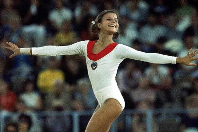
Olga Korbut was a brilliant Soviet (Russian) gymnast in the 1972 Munich and 1976 Montreal games. There we see the shape of the leotard we are still using today. Long sleeves, high cut over the legs, national symbol or color. Most countries had been using this silhouette in the 1964 Tokyo and 1968 Mexico City games, but they were still solid colors that didn’t necessarily generate a lot of connection to their home country. This Cosmopolitan slideshow is FANTASTIC as it shows the change in leotards, and it shows some of the less glamorous offerings from the 1960s and 1970s. Romanian competitor Nadia Comaneci reinforced this style in 1976 as she captured the world’s attention with her perfect ten routine. Her leotard had the added flavor of colored stripes.
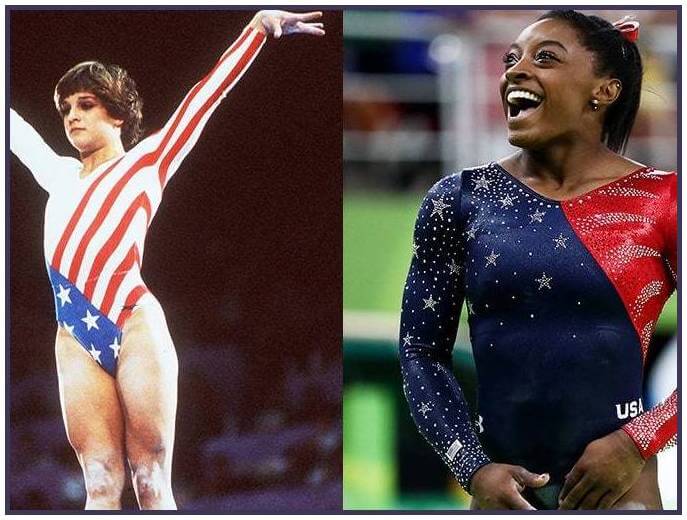
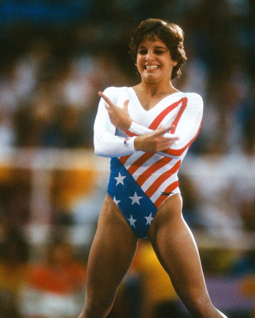
Everything changed in 1984. The United States dominated an Olympics that was boycotted by the Communist Bloc countries, and the sweethearts of the games were the women’s gymnastics teams. Mary Lou Retton broke out as the star, and her leotard drove the picture home. Check out the graphics!
This was the first time the US did anything like this with the women’s uniforms. Instead of solid colors that could or could not match national colors, now there were splashes of color and stars and stripes. Interestingly, the US went for a more subdued look in the 1988 Seoul games. This seemed appropriate after the team finished fourth in a controversial competition – one without a breakout star. The 1992 Barcelona games saw the emergence of superstar Shannon Miller. The medal ceremony outfits harkened back more to the 1984 brash look.
The leotard didn’t necessarily follow the bold colors, but they did introduce what would become a USA calling card: sparkles.
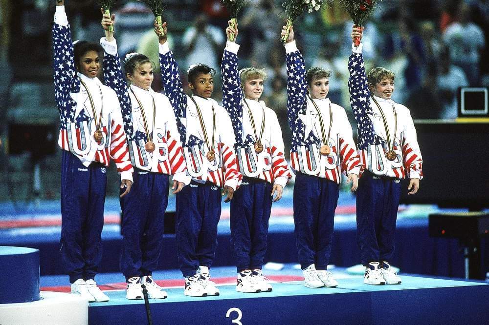
When the Olympics returned to the United States in 1996, the bold patterned leotards were back. The Magnificent Seven team dazzled the world, complete with Kerri Strug’s gutsy performance. The team also continued their eyeball assaulting medal ceremony outfits.
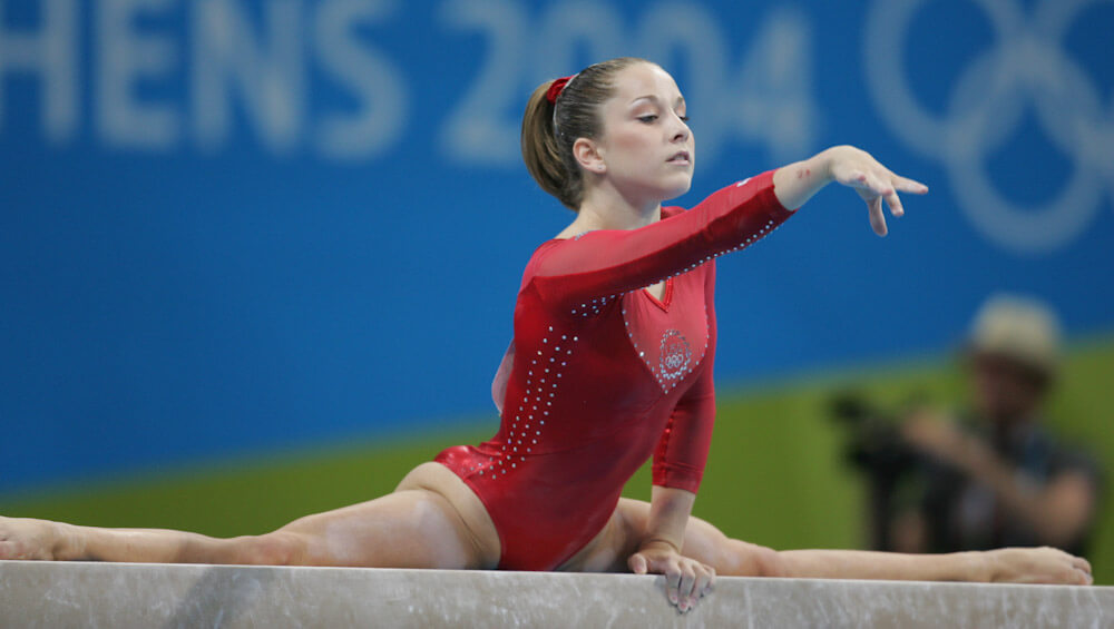
The Sydney Olympics in 2000 continued the US trend of stars and stripes. You can also see a shinier finish to the leotards, as well as multiple outfits for team and individual competitions. Admittedly, this team had the craziest medal ceremony outfits, but that was because they didn’t receive their medals for ten years after China was stripped of their medal due to an underaged competitor. In Athens in 2004, the team again utilized stars and stripes — in the same component! And, there are the sparkles again.
The 2008 Beijing team stood out when it came to their leotards. There had been somewhat of a commitment to the red, white, and blue look for the team competition for several Olympics. However, in Beijing, the team wore all red with more subtle components. Then, Nastia Liukin went so far as to wear pink instead of the traditional US colors. In the world of gymnastics fans, there has actually been quite a debate over if there is something to be read into the more subtle patriotic looks in the 2000s. Was choosing pink or purple a way to not be as aligned with the United States?
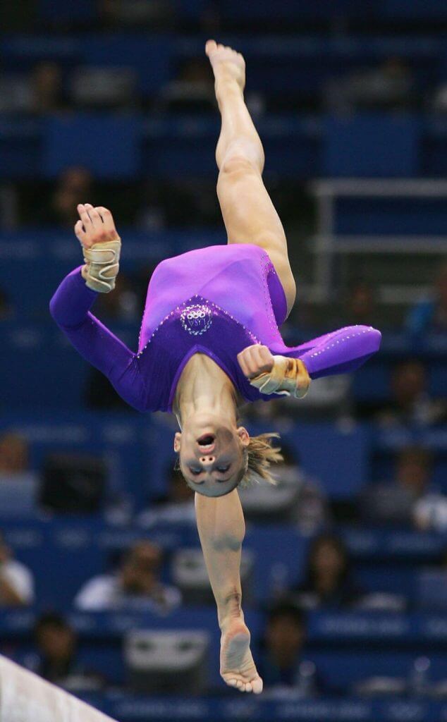
It is hard to accept that theory when you see some of the other 2008 looks. Plus, there still was plenty of red, white, and blue. Also, we are seeing the proliferation of outfits now. There are different leotards for team preliminaries and finals, individual all around, and individual event finals. This trend doesn’t go away, either. It has become like alternate uniforms in the big professional sports.
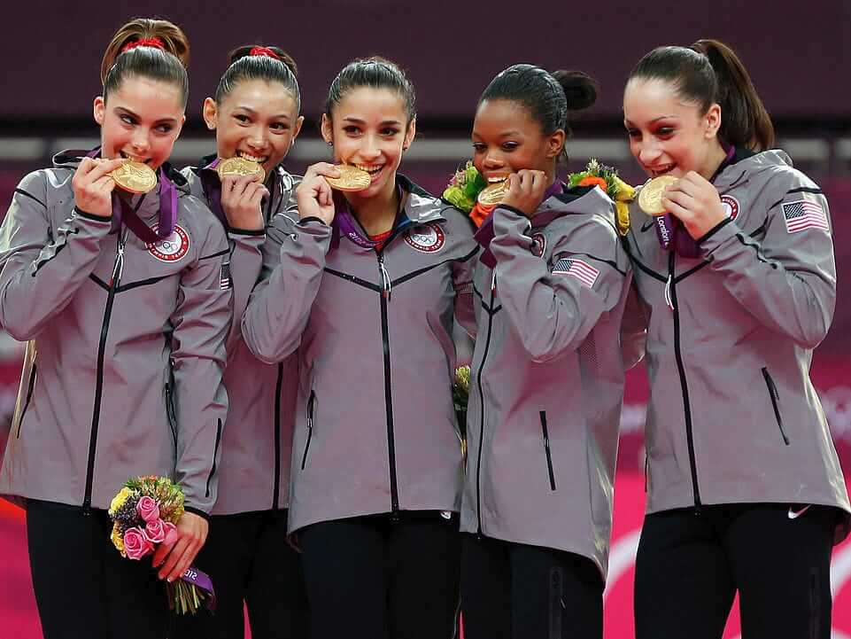
The 2012 London team continues the trends of sparkles, pink, red, white, and blue? They also incorporated a bizarre gray and black medal ceremony outfit.
Haha, kind of reminds me of the whole push by Nike to include gray outfits for their college teams. Oh wait … damn you Nike.
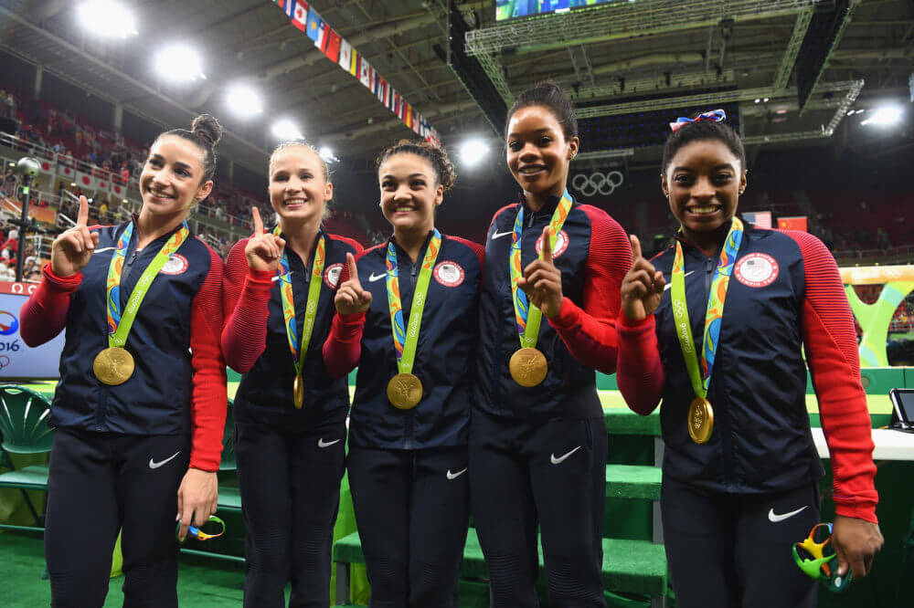
The 2016 Rio games combined all of the trends again. Bold colors and sparkles. Red outfits with sparkles. Red and blue outfits with sparkles. More bold red, white, and blue with sparkles. Even more bold red, white, and blue with sparkles. And their medal ceremony outfits returned to the red, white, and blue look.
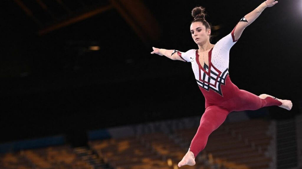
This brings us to the 2020 (2021) Tokyo games. So far, the ladies have worn a sparkly black outfit for podium training, which is supposed to reflect the Olympic flame. You’ll also notice a *gasp* purple outfit on Mykayla Skinner and Jade Carey. They were event specialists, so technically not on the team. That is why they have a different color. Then there was the sparkly blue and red leotard for the preliminary round.
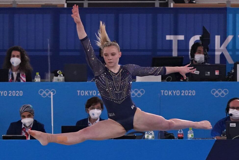
Skinner and Carey wore a solid red leotard instead. For the team finals, the ladies went with a familiar sparkly red, white, and blue theme. You can also see the all white warmup outfit. Then for the individual all-around finals, Suni Lee went with a different sparkly blue, white, and red outfit while Jade Carey went with an all blue sparkly one.
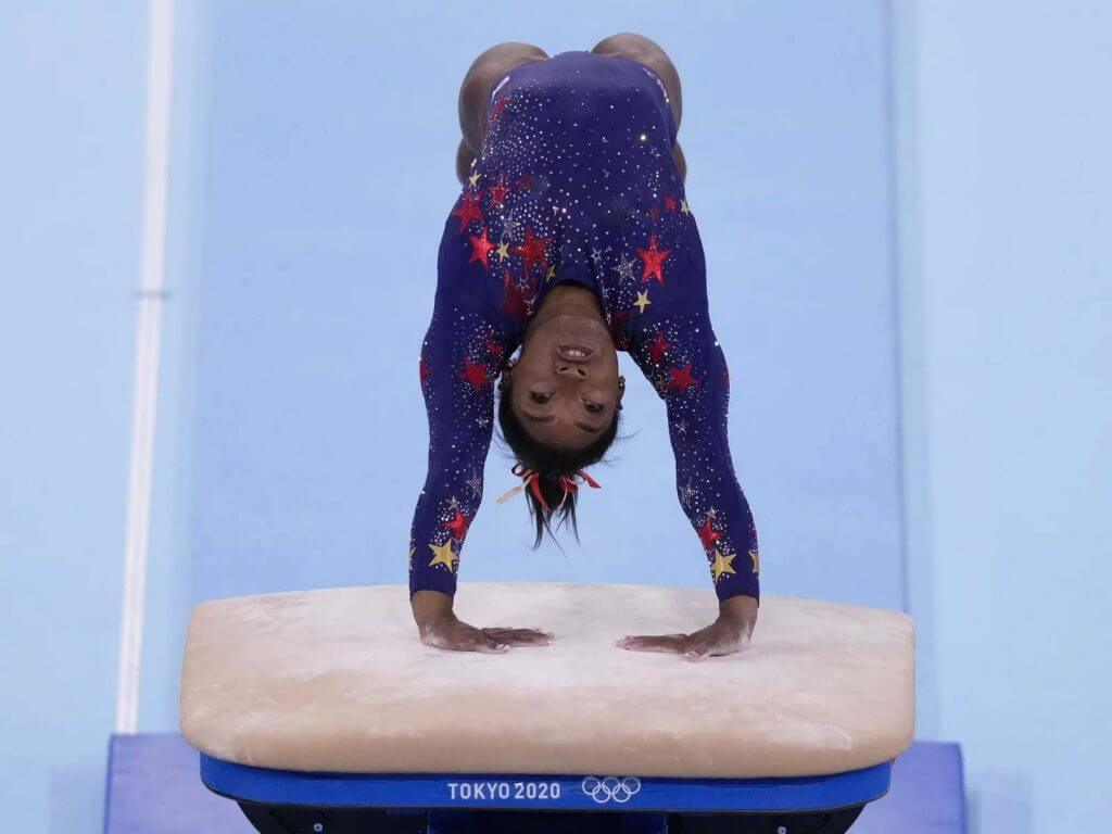
For the vault finals, Mykayla Skinner won her silver medal in the same sparkly leotard that Lee won her all around in. Jade Carey’s unfortunate vault took place in the sparkly black podium outfit. On her return to competition on the balance beam, Simone Biles went with a brand new sparkly red, white and blue leotard. You may have noticed a common word in those descriptions. SPARKLY. So, so, sparkly. It contained 76 stars and 7,600 Swarovski crystals. Because, 1776.
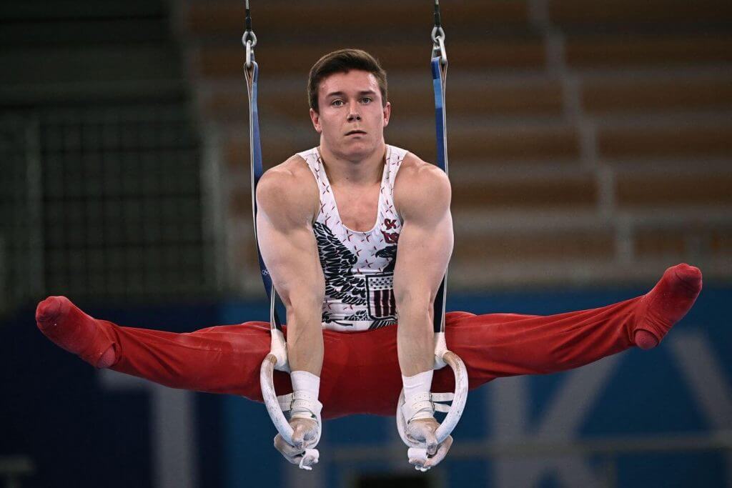
There are two other uni-related issues with gymnastics to look at. The US does have a men’s team too. Generally they are seen as second-tier because they don’t win medals. Three straight fifth place finishes isn’t going to keep them on the same plane as the women’s team, especially when the US is a medal-winning machine. Their outfits also vary by round. Instead of sparkles, their uniforms feature the typical red, white, and blue color scheme and lots of eagles. The team finals variation included an angry eagle. The individual event finals went with a more formal eagle. The men have the option of either shorts or long footie pajamas for their look, depending on the apparatus.
This leads us right into the final, but possible most groundbreaking, topics of gymnastics uniforms. There has been quite a controversy surrounding the sexualization of women in their uniforms across the Olympics. This has extended to beach volleyball and handball as well, where the Norwegian women’s team was fined for not wearing bikini bottoms. Gymnastics has been embroiled in this discussion thanks to Germany.
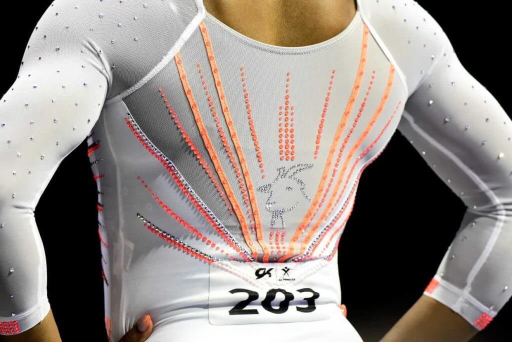
Men are allowed to wear shorts or long pants, but women are expected to wear butt-revealing leotards. The German women’s team instead performed in long bodysuits. This is the first time that a country has taken this step in the Olympics. There have been individual athletes who have worn longer uniforms, mostly for religious regions. But the German team made this decision in a direct stance against sexualization of female athletes. In light of the recent USA Gymnastics sex abuse scandal surrounding Larry Nassar, there is momentum in the gymnastics community to consider changes. Some very high profile individuals in the community have come out in support of the move, including GOAT Simone Biles — an outfit that she couldn’t wear at the Olympics.
Thanks, David! Some really nice research and historical perspective there, and I know I learned a good deal about the nuances of gymnastics uniforms over the years. Readers? What say you?
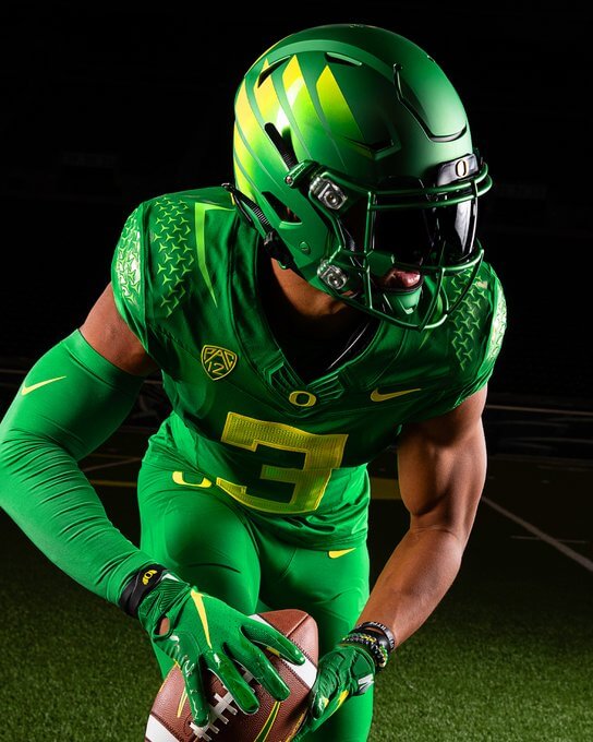
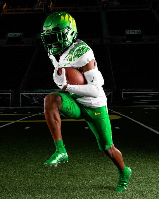
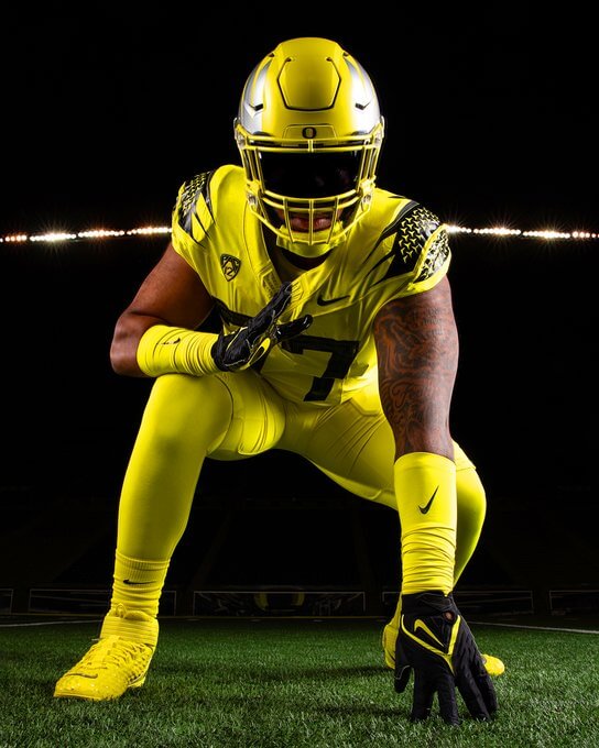
Oregon Ducks (*shock*) Unveil New Uniform Tweaks
If you’ve followed this blog over the years, you know I have a love/hate relationship with the Oregon Ducks football uniform machinations. It seems they change (or modify) their uniforms every year (despite supposedly being on a 2-3 year rotation), and had for many years (until a couple seasons ago), had the distinction of never repeating a single different uniform during the season.
Paul (in his ticker notation) on Tuesday had made a brief mention of the new unis, but I wanted to give the slightly new outfits a bit of a spotlight today. Looks like a new helmet decal has been added and the shoulder striping is now consistent on all three jerseys.
The 2021 unis, at least color-wise, appear to be the same as last season, but there are of course some modifications. They released looks of mono-green, green/white/green, and all yellow. Because 2020 was a COVID-shortened season (and the Ducks had a few one-game-only looks), you can see all the different uniform combos the team wore at Dennis Bolt’s Duck Tracker blog.
MONO GREEN
Additional looks here and here.
GREEN/WHITE/GREEN
Additional looks here and here.
MONO YELLOW
Additional looks here and here.
I’m sure the Ducks will continue with their tradition of introducing at least one special “event” (or theme) uni this season, and who knows whether they’ll throw in a throw back or two? All I know is I’m excited for a (hopefully) full season of college football this fall!

Guess The Game…
from the scoreboard
Today’s scoreboard comes from Chris Hickey.
The premise of the game (GTGFTS) is simple: I’ll post a scoreboard and you guys simply identify the game depicted. In the past, I don’t know if I’ve ever completely stumped you (some are easier than others).
Here’s the Scoreboard. In the comments below, try to identify the game (date & location, as well as final score). If anything noteworthy occurred during the game, please add that in (and if you were AT the game, well bonus points for you!):
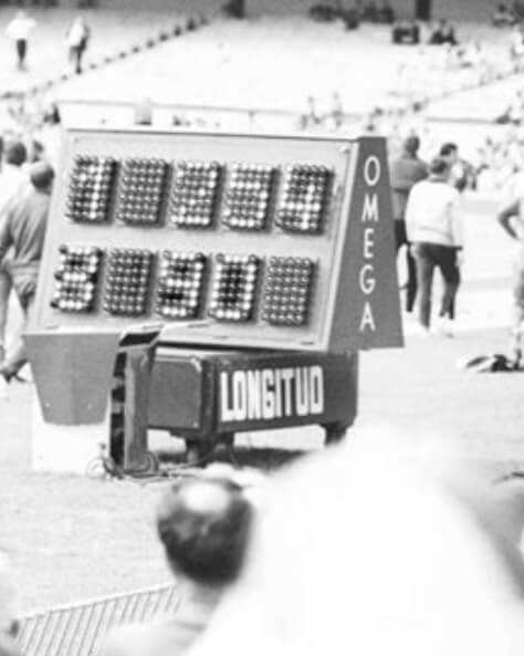
Please continue sending these in! You’re welcome to send me any scoreboard photos (with answers please), and I’ll keep running them.
The Ticker
By Anthony Emerson

Baseball News: New Era has leaked the caps the Yankees and White Sox will be wearing for the Field of Dreams game (from Tim Baker). … Add Rockies P Jon Gray to the list of players who have their jerseys sewn shut. … The drama between the baseball team that wants to be known as the Guardians and the roller derby team currently known as the Guardians continues (from Ed Żelaski). … Max Scherzer made his Dodgers debut last night, though it appears his Tommy Lasorda memorial patch was a bit crooked (from Alex Gleitz). … The Mets have a prospect named Jake Mangum playing for Double-A Binghamton, and he wears stupendously high socks (from Josh Claywell).

NFL News: The Steelers are partnering with a local printer to make unique posters for each home game this season (from Matthew Huha).
.
.
College/High School Football News: Arizona has unveiled some gorgeous new unis. More on these tomorrow from Phil. … Harvard has some very old-school new uniforms (from Adil Anyanthaya). … Reader Joshua Hanna writes in: “I was listening to Southern Miss’ new Head Coach Will Hall’s interview today, and he got into depth of why he pushed for overhauling Southern Miss’ uniforms for the upcoming season (starting at 33:28) and why he didn’t like that there was no consistency between different Southern Miss eras of winning teams. He also trashed GFGS, which was pleasant to hear since the last 10 years as a Southern Miss fan has been an eyesore.” … Boston College is removing the center stripe from their helmets (from Kary Klismet). … Here’s an article about how BYU’s players are now taking charge on deciding when to wear which uniform (thanks, Phil). … The University of Arizona has new (old) retro uniforms which are awesome. Phil will have more on these tomorrow.

Hockey News: Jets C Pierre-Luc Dubois is changing his number from to honor Blue Jackets G Matīss Kivlenieks, who was killed n July 4th, adopting Kivlenieks’s No. 80. Dubois and Kivlenieks were teammates in Columbus until Dubois was traded this past season (from Wade Heidt and Mike Engle). … Magnus Hellberg wore his old SKA St. Petersburg while playing for HC Sochi yesterday (from @SDubs35).

College/High School Hoops News: Mizzou has a new floor (thanks, Phil).
.

Soccer News: FIFA is pressuring Uruguay to remove two stars from their crest, representing their 1924 and 1928 Olympic gold medals. Stars in international soccer usually represent World Cup wins, but Uruguay claims the two golds as equivalent to World Cup wins as those gold medals predate the creation of the World Cup — a view supported by FIFA in the past. … Bundesliga side Union Berlin have signed Comedy Central as their new sleeve advertiser (link in German, from Anthony Zydzik).

Olympics News: Finnish skateboarder Lizzie Armanto designed her own uniform for the Olympics (thanks, Phil).
.

Grab Bag: New Zealand Rugby have unveiled new kits for the All Blacks and the Black Ferns (from Kary Klismet). … Munster Rugby have unveiled their new kits. … Also from Kary, St Brendan’s Board Gaelic Athletic Association club of County Kerry, Ireland, will outfit their hurling and Gaelic football teams in special commemorative jerseys to mark the 65th anniversary of former player Tom Collins playing in three Munster finals in a single day in 1956.
Uni Tweet of the Day
The man speaks the truth…but gaddam that swoosh ruins everything…
You don't realize just how perfect the Dodgers uniform is until you see someone wearing it that you're not used to seeing. Dodger Blue is life 🔥 #MaxScherzer pic.twitter.com/y6CXil2IzT
— Doug McKain (@DMAC_LA) August 5, 2021
And finally… that’ll do it for today. Big thanks to David for that really informative gymnastics unis post! Great stuff.
Everyone have a good Thursday, and I’ll catch you tomorrow.
Peace,
PH
Jonathan India of the Reds has been sporting that over-the-knee look all year. Joey Votto is almost matching him.
The scoreboard is from Bob Beamon’s epic leap in the long jump, 1968 Mexico City Olympic games. Recognized it right away. Googled only the date, October 18, 1968.
Amazing restraint to not use the McKayla Maroney face meme to highlight the 2012 Nike gymnastics warmups!
link
Oh wait … damn you Nike.
I snuck her in on one of the links, though. :)
It’s kind of funny you mention that ridiculous goat outfit Biles wore (which has nothing to do with the Olympics subject) since her career took a nosedive from that moment.
Karma.
*stares incredulously*
I’m trying to find a shred of common sense in your statement.
Nope. None found.
The proliferation of the GOAT term is annoying anyway since “goat” already had a meaning among sports fans. Someone more cynical than myself could say that it’s a bit ironic that Biles wore that goat leotard and later become the goat by quitting on her team, but that’s a position I don’t hold personally.
Greatest of all time = the greatest, no qualifier needed.
Greatest left hander, greatest pocket passer, greatest closer, greatest rebounder, greatest in the modern era, etc. These are all greatest designations with qualifiers.
The use the GOAT acronym in place of just saying “greatest” which means the same as greatest of all time, is just a dumb trend, and indicative of the butchering of the English language by mainstreaming and recognizing slang and trendy catch phrases in professional writing.
You do know her aunt died in the middle of the Olympics, right?
link
“Biles … quitting on her team”
It’s just the laziest, most disconnected from reality take.
I’ll refrain from going further on Paul’s website, but man, that’s just a poor, poor, statement.
@ThatRodneyGuy
Well said
Re: Harvard’s uniforms.
I like everything except the crimson pants. They only started wearing them in the last three years or so. Interesting that they removed all traces of black from the uniform; they have done the same for many of the school’s uniforms of late. Perhaps because of HD/4K televisions and the fact that you don’t need black outlines to make numbers more readable?
Harvard and Arizona are proof that Nike can control itself and make really nice uniforms. Oregon is proof that Nike gonna Nike. Oh well.
Nike doesn’t make uniforms that these teams don’t sign off on, right?
While I’m sure they do a fair amount of persuasion to get their designs out there, I put a lot of the onus on the programs.
It’s a joint effort.
Undoubtedly, some of the blame must fall on the programs. But Nike’s default is going to be what works best for Nike, more than what’s best fir the school. If the school gets stars in its eyes and only sees dollar signs, then nike will take full advantage.
I’m still waiting for Michigan State to go back to Green and White, instead of black, bronze, gold, highlighter line, and “Hunter” Green.
-The Oregon uniforms are a step in the right direction, doing a new uniform every freakin game has left them kind of ‘soul’-less after all these years so I’m glad to see something consistent across them. The fact that it’s a callback to the zany diamond-plate days fits Oregon’s vibe/identity nicely.
-Don’t like Harvard’s, they look like samples that fell off the back of the truck.
-Arizona looks sharp in a vacuum but at some point it will stop being fun if every single team is just doing their team colors on the ‘vintage’ template
I agree with your “soul-less” observation, and I was going to say that it seems like Nike is running out of ideas for Oregon but now that its UO’s “trademark” to come out with radical weird designs every season they’re stuck with making tweaks that don’t really distinguish this year’s offerings from the 1,000 previous combinations.
Olga Korbut competed for the USSR, but she isn’t Russian, she is Belarusian.
I just put Russia in parenthesis to indicate that the USSR/Soviet Union is known generally as Russia before and after the Communist era. I would guess Russia the country probably claims the USSR medals.
I figured. Using USSR and Russian as synonyms would get points deducted in my history classes in the 1980s but I guess that’s 30+ years in the past and we’re at the point of reminding people what the USSR was. I don’t know much about Belarus but other republics (Ukraine in particular) were very pointy about being called Russians.
I’m guessing that Oregon will mix & match with these 3 uniforms. With these combinations, they could still donn a new uniform every game.
Current Olympic unis for gymnasts are now made exclusively by Elite Sportswear in Reading, PA.
link
The “stars” on the Oregon shoulder stripes look a lot like the inside of the Mercedes-Benz logo which is in a similar grid on the back engine cover of the Mercedes AMG F1 cars. Also, I really like the new Arizona unis. As for Harvard, I saw less uniform and more future US senators, CEOs, maybe POTUS!
Ditto on the stars! Reminded me of the AMG F1 livery for sure
Now if Arizona can do the right thing and go back to good looking basketball uniforms instead of the gradient embarrassments they have now.
It’s amazing how two teams in the same state can do gradients so differently – the Suns City uniforms look amazing, while the Wildcats basketball uniforms are abhorrent.
The medal ceremony outfits are not Gymnastics specific. They are supplied by the USOC. TYhose are the same medal ceremony outfit every Olympian wears regardless of event.
Very controversial use of the word “an” in the title there.
Pet peeve: Athletes biting their gold medals. I have no idea why they do this and less of an idea why it annoys me but there it is.
They “bite” their gold medals as a joke.
Long ago, the gold-rushers would test their nuggets that way. Gold was soft enough to leave an impression of your teeth.
It’s an easy way to distinguish the real stuff from Iron Pyrite (Fool’s Gold).
Those Yankees hats weren’t leaked they’ve been for sale for months on every hat site.