For most photos in this section, you can click to enlarge
Hello! Paul here, making a rare Saturday appearance before vamoosing for my annual August break from the site.
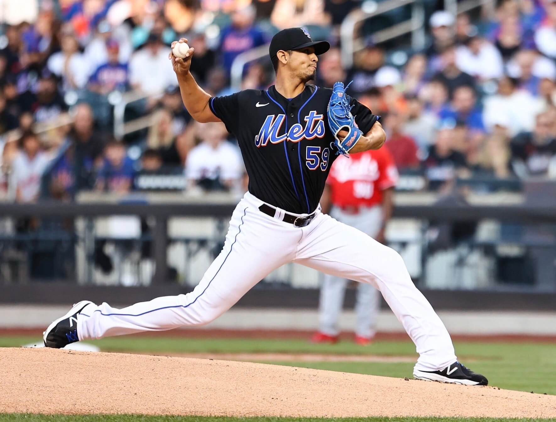
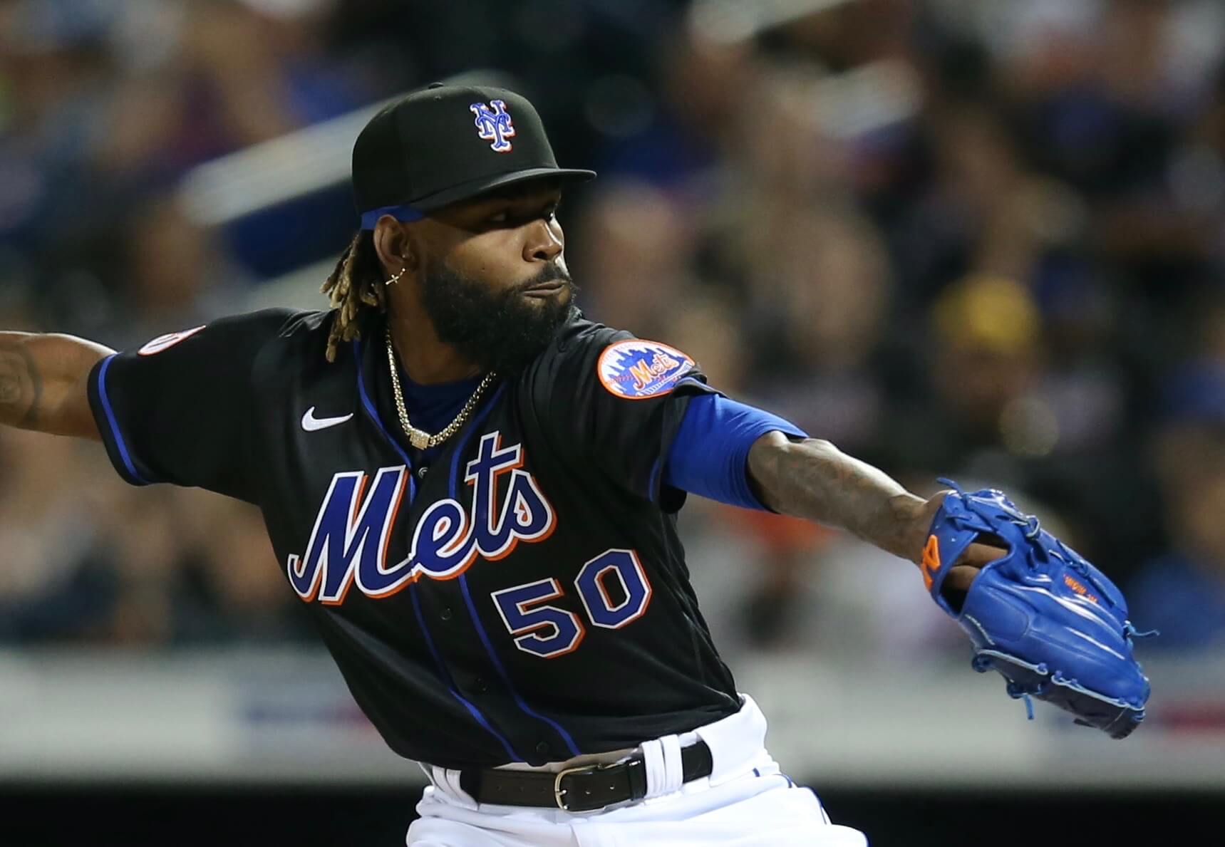
Now then: As had long been promised/threatened, the Mets brought back the black uniforms last night — the first time they’ve worn the black threads since 2012. Here’s a detailed analysis:
• It hadn’t been clear whether the Mets would wear these black jerseys and caps with their usual pinstriped pants or if they’d bring back the era-appropriate non-pinstriped pants with the blue piping down the side. As you can see in the photo above, they went the latter route — although, oddly, the team tweeted a photo shortly before gametime showing the pinstriped pants:
Tonight’s starting lineup. #BackInBlack pic.twitter.com/QGzE3M7Euo
— New York Mets (@Mets) July 30, 2021
• It’s also not clear whether these non-pinstriped pants will now be an option to be paired with the team’s blue alternate home jersey, although that may be a moot point because that jersey hasn’t been worn a single time this season.
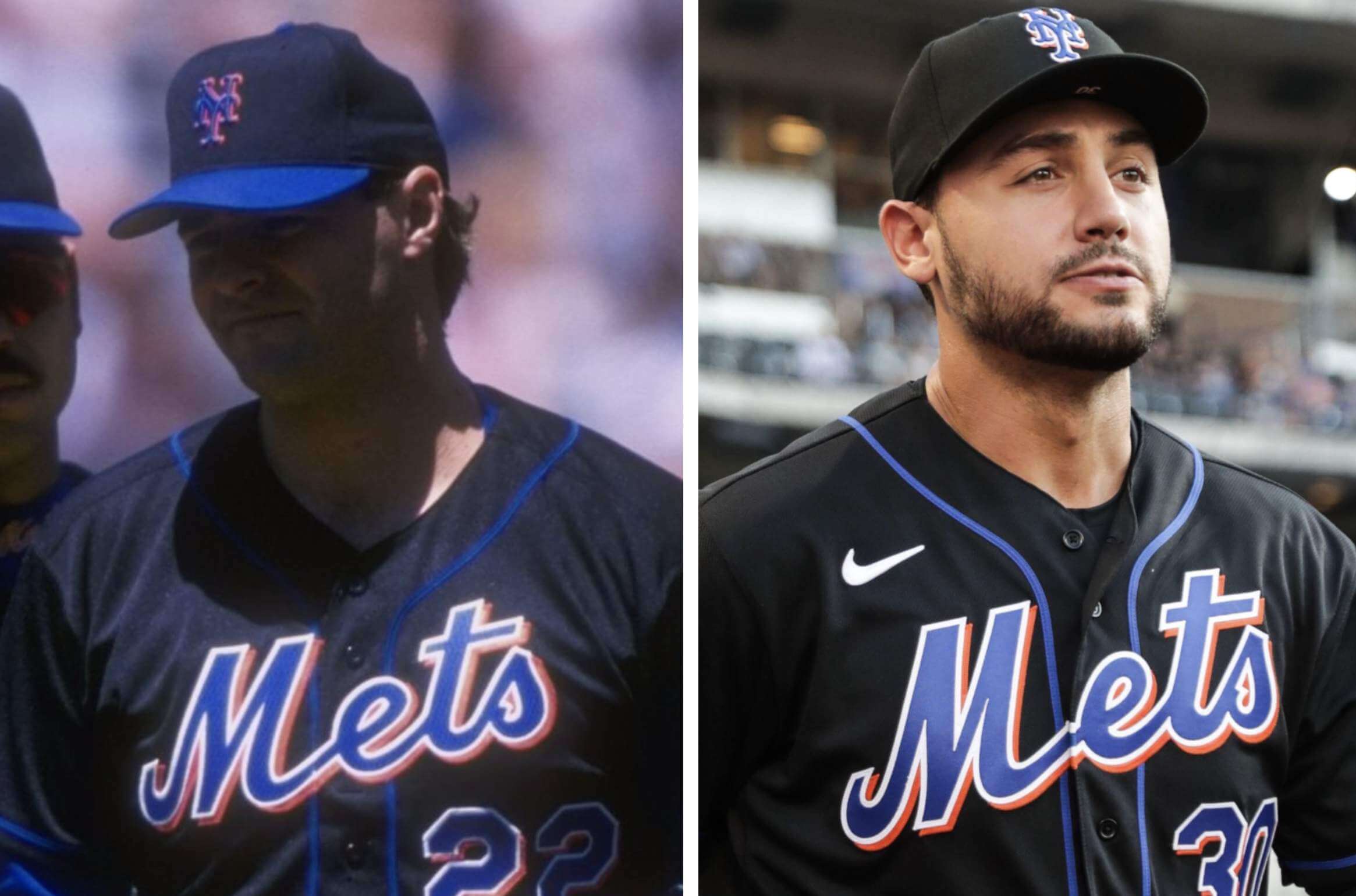
• This black jersey/cap combo is actually a weird hybrid. Give me a minute to explain: For the jersey, they went with the blue-skyline logo patch on the left sleeve:
That blue patch was worn on the black jersey only in 1998, as seen in this 1998 photo of coach Cookie Rojas from Bill Henderson’s jersey guide:
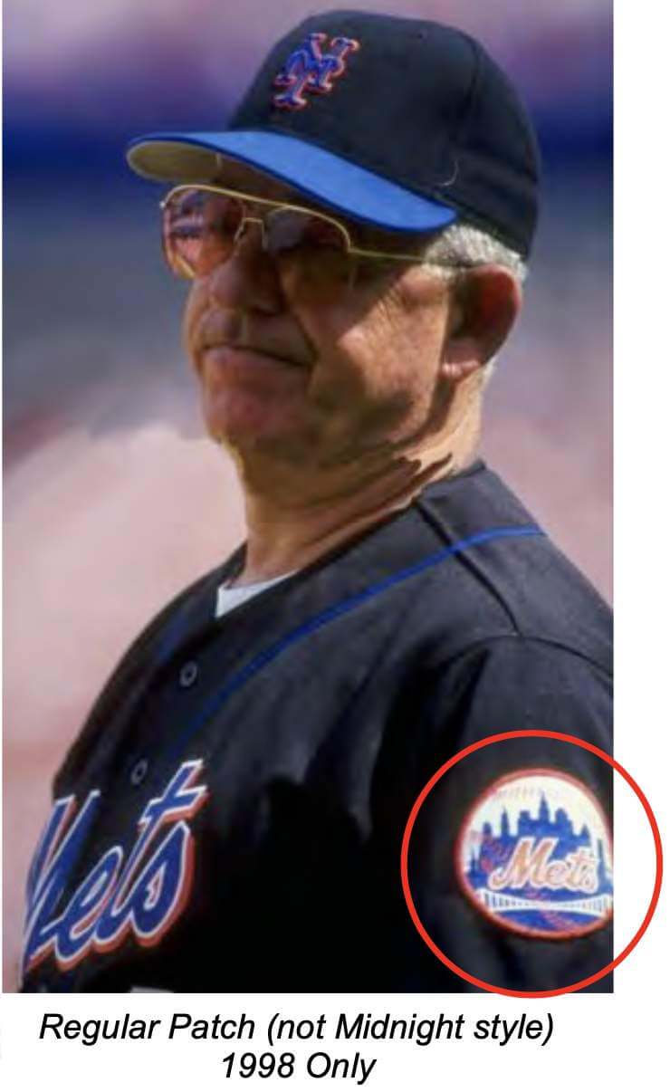
After 1998, the black jerseys always had the black-skyline patch. But! In 1998, the Mets’ only black cap was the one with the blue brim (shown in the Rojas photo) — the solid-black cap, which they wore last night, didn’t debut until 1999. So for these new BFBS throwbacks, they’ve paired a 1998 jersey with a non-’98 cap. Strange choice!
• Back in the day, the blue script, lettering, and numbering on the black jerseys were rendered in a herringbone-patterned style of tackle twill fabric called glacier twill:
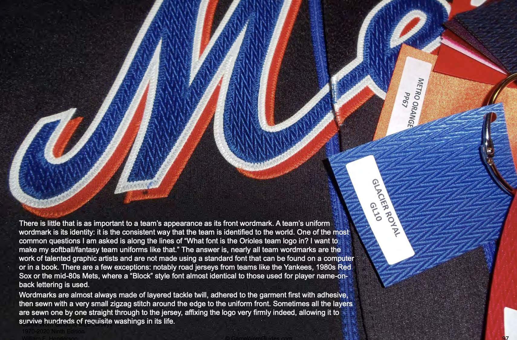
They used conventional tackle twill, not glacier twill, for last night’s throwbacks.
• In another small inaccuracy, the chest script on the throwback didn’t quite match the original version. It’s most apparent if you look at the letter “e,” although there are other subtle variations. Original version on left, throwback on right:
• This was the first time all season that the Mets didn’t wear their pinstriped primaries at home.
• The Mets had previously announced that they’ll wear the black uniforms for their remaining Friday home games — five games in total. During last night’s SNY broadcast of the game, reporter Steve Gelbs mentioned something interesting about that: He said MLB rules require a full-fledged alternate to be planned and approved two seasons in advance — a rule I was not previously aware of. Since the Mets didn’t give two years’ notice for the black uniforms (the idea for reviving the design came from new owner Steve Cohen, who acquired the team last winter), these uniforms are classified as “limited-use,” meaning they can be worn no more than five times. That’s why they they didn’t make their on-field debut until there were five Friday home games left in the season.
• And in one final note, a few folks had hypothesized that these Mets throwbacks might be executed in the new Nike tailoring template (worn by the Royals during spring training and by a few minor league teams this season). That did not turn out to be the case.
Want to learn about how the Mets started wearing black uniforms to begin with? Check out this ESPN piece that I wrote in 2011.
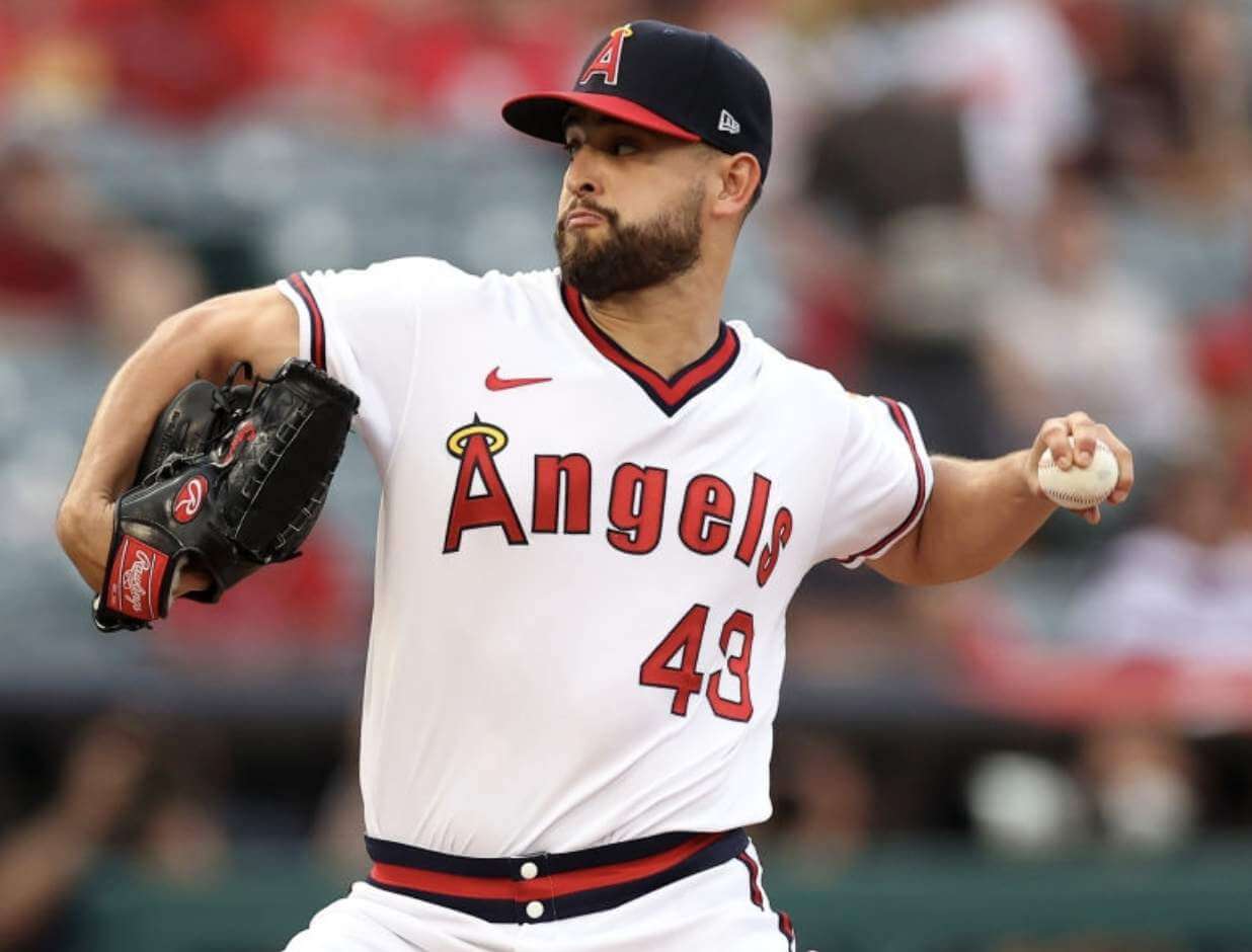
Meanwhile: The Mets weren’t the only ones debuting new throwbacks last night. Out in L.A., the Angels kicked off a “Throwback Weekend” promotion by wearing 1970s throwbacks (lots of additional pics here):
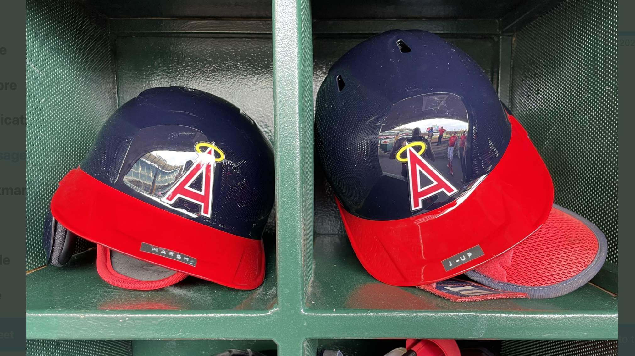
In a particularly nice touch, the Halos’ equipment staff went the extra mile by putting old-school Dymo labels on the throwback helmet brims:
In yet more retro MLB news, Atlanta also wore throwbacks last night, but those aren’t new — they wore them for their season-opening homestand back in April.
(My thanks to Patrick Carmosino, Adam Chodzko, @Batbeat2, and our own Phil Hecken for their contributions to this section.)
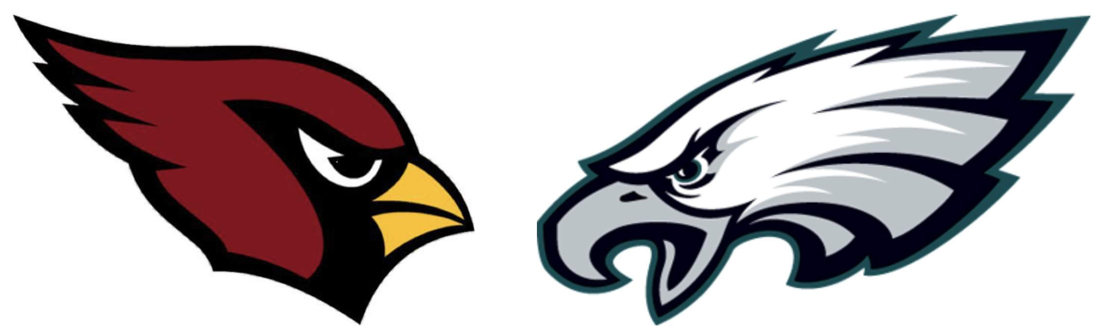
Let’s try this again: Yesterday I mentioned that my latest article over on Bulletin would be about left- and right-facing team logos in all the major pro leagues (including but not limited to the NFL, as shown above), but that there was a tech glitch that was delaying the piece’s publication.
That glitch ended up lasting all day long, but I’m happy to report that the piece has now been published. Those of you who’ve subscribed to receive my Bulletin posts by email should already be seeing this piece in your in-boxes. For everyone else, you can find this article on my Bulletin page.
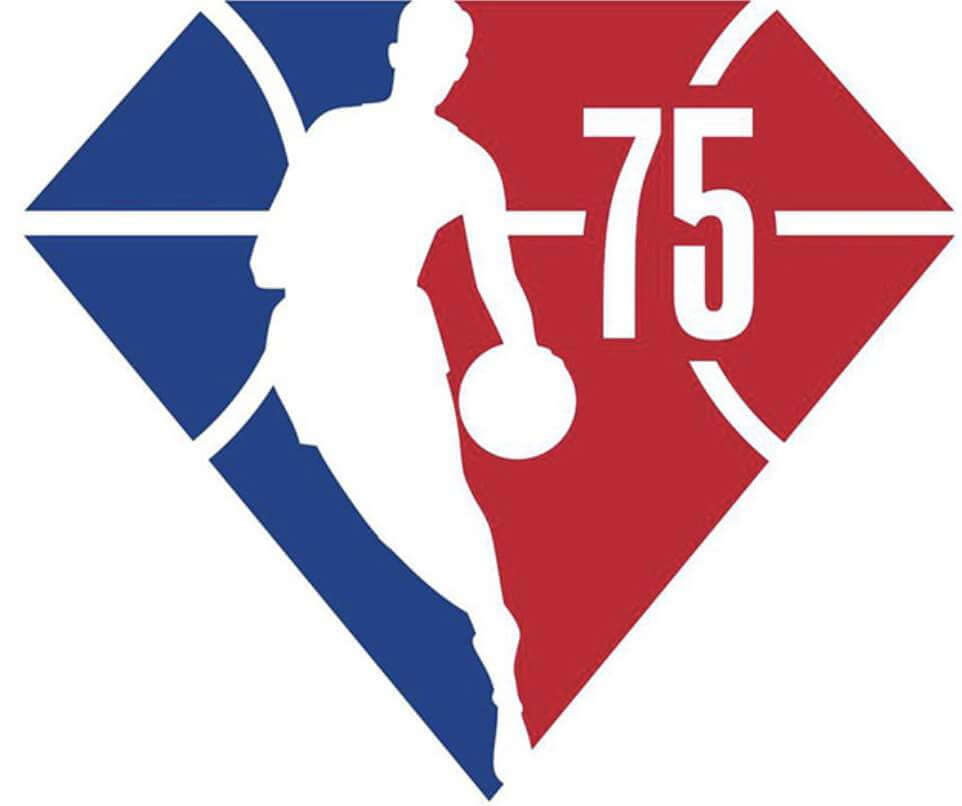
Big NBA news report: Interesting news last night from Twitter-ers @nbaunitracker and @caseyvitelli, who reported, citing “multiple trusted sources,” that all NBA teams will be retaining their Association, Icon, and Statement uniforms next season. They confirmed, as had previously been reported, that 28 of the 30 teams will wear “mash-up” uniforms consisting of various elements from their visual history — these will fill the role of the City alternates. (The two exceptions are the Suns and Jazz, who will use their existing City designs instead of going the mash-up route.) Moreover, there will be no Earned uniforms. The idea is to keep things simple — well, except for the mash-ups — and maintain the focus on the league’s 75th anniversary.
Speaking of which: The NBA announced the NBA logos and maker’s marks on next season’s uniforms will have a diamond pattern.

Click to enlarge
Okkonen Files update: Back in 2019, I ran a series of six blog posts about the pioneering baseball uniform researcher Marc Okkonen, without whom Uni Watch probably would not exist. Now a reader who prefers to remain anonymous has found a postcard he received from Okkonen in 1994 (shown above). This card was in response to a letter that the reader had sent, as follows (click to enlarge):
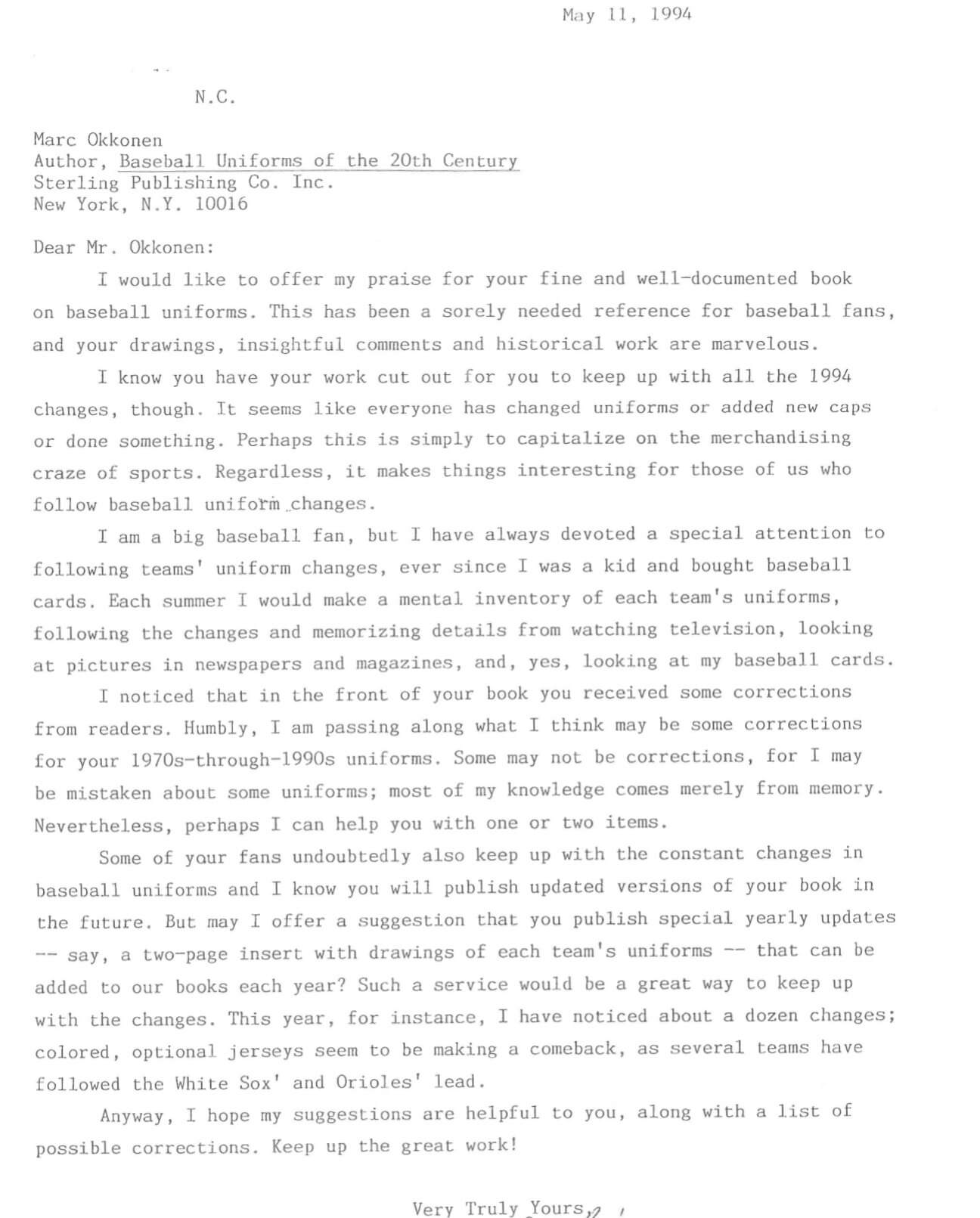
As you can see on the postcard, Okkonen was in full crankypants mode, but he still took the time to write. He never did do another edition of his book, unfortunately, but his invaluable research lives on at Dressed to the Nines.
Click to enlarge

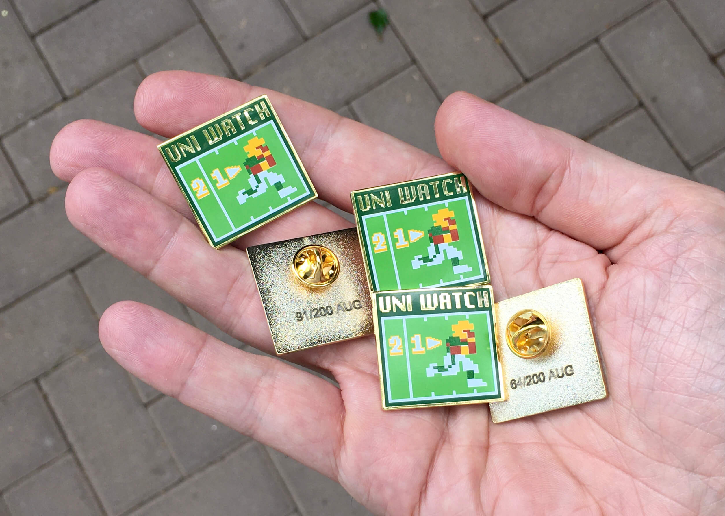
Pin/discount reminder: In case you missed it on Thursday, I’ve decided to launch the August pin a bit early because I’m about to take my annual month-long break from the site. And with football training camps gearing up, Todd Radom and I thought it would be fun to do a Tecmo Bowl-style pin, complete with 8-bit graphics. I really love how this one turned out. This is a numbered edition of 200 pins. You can order it here.
In addition, Teespring is running a site-wide sale. Now through Monday, you can get 10% off of the pin by using the checkout code BACKTOSCHOOL. (Yes, I realize school is still a ways off, but I don’t come up with these code names, folks.) This same discount applies to everything in the Uni Watch, Naming Wrongs, and Uni Rock shops.
Need to get caught up on the pins? Here are this years pins from January, February, April, May, June, and July (sorry, March is sold out!), plus all of our remaining pins from last year are available at a discounted price.
My thanks, as always, for considering our products.
Click to enlarge

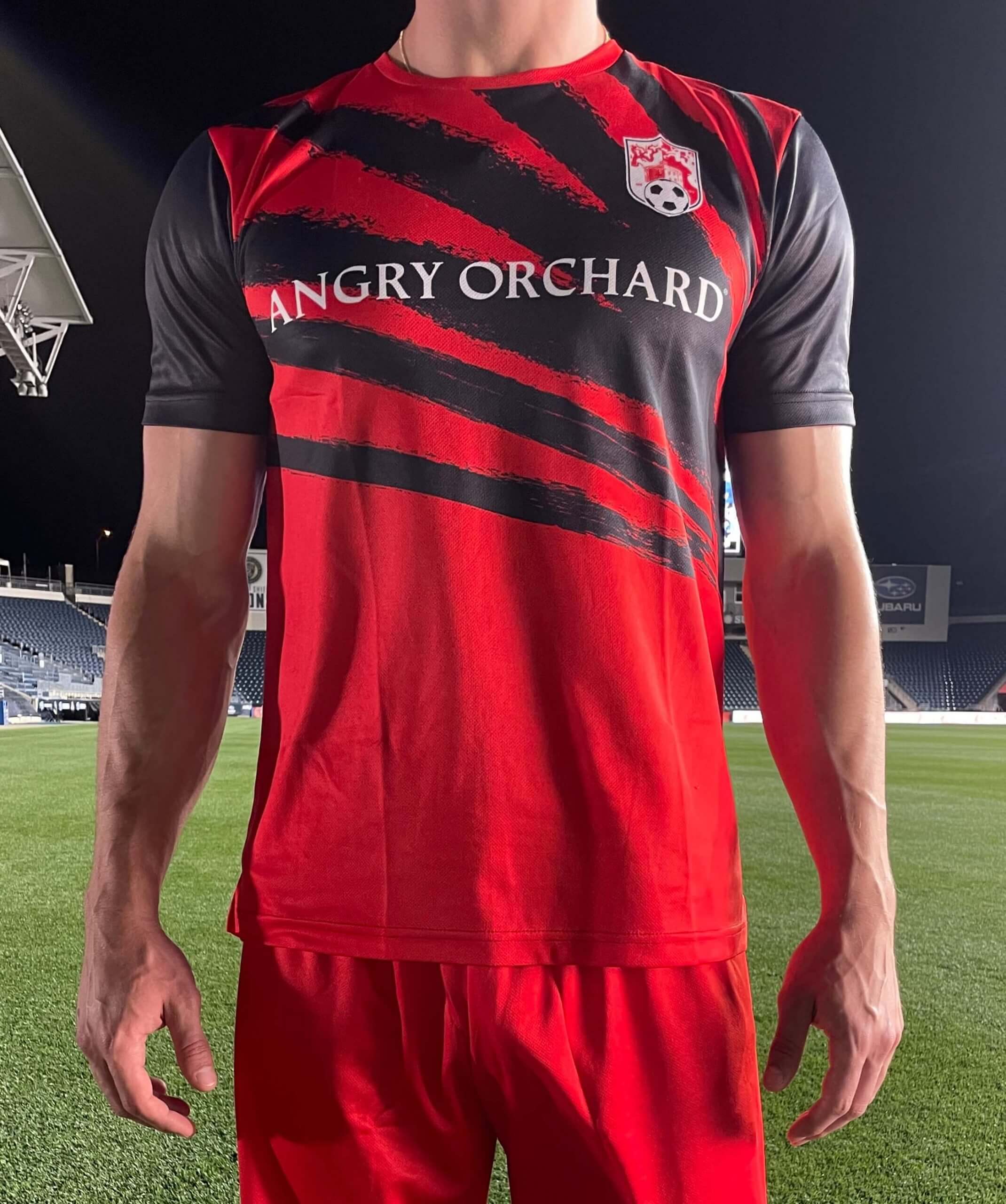
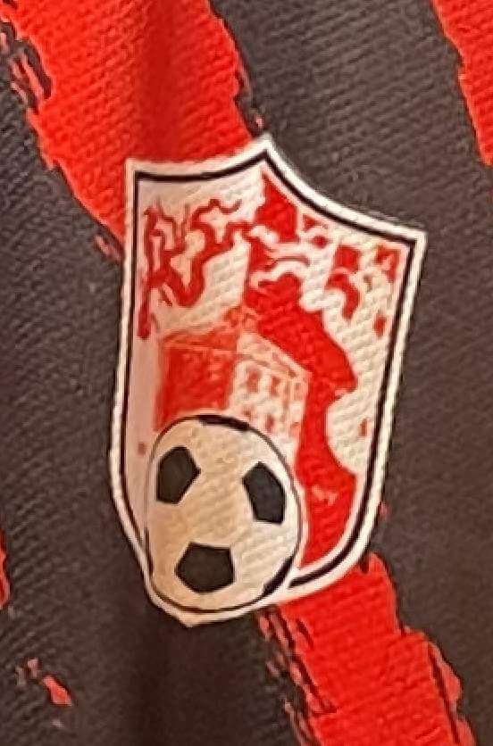
LAST CALL for the Angry Orchard raffle: With this being the “summer of soccer” (Euros, Copa Americas, Gold Cup, Olympics), the folks at Angry Orchard hard cider, who are active in soccer promotions, have now created their own soccer jersey and have generously offered to let me raffle off five of them to Uni Watch readers.
The front design is shown above. The jerseys will be blank on the back. Here’s a closer look at the crest, which, like the jersey design itself, references the branches motif in the Angry Orchard branding:
This is the last day to enter this raffle. USA residents only, and all entrants must be 21 or over. To enter, send an email address with your mailing address and size (XS through XXXL) to the raffle in-box by 8pm tomorrow, July 31. One entry per person. Phil will announce the winners on Monday. Thanks to Angry Orchard for sponsoring this one!
The Ticker
By Anthony Emerson

Baseball News: It appears new Yankee Anthony Rizzo was still wearing Chicago-themed batting gloves during his Yanks debut last night. He hit a home run so I guess it’s working for him (from Julian Garcia and Evan Coward). … New Nationals reliever Gabe Klobostis Gets It™ (from multiple readers). … Also posted in the soccer section: AFC Mobile, a soccer team from Mobile, Ala., in the National Premier Soccer League, will wear ’70s Braves-inspired warm-up jerseys to honor Mobile native Hank Aaron this season (from David, who didn’t give his last name). … Israeli DH Nick Rickles wore a World Baseball Classic undershirt during Israel’s Olympic game against the US yesterday (from Jason Bornstein). … The Round Rock Express, Triple-A affiliates of the Rangers, will wear throwback uniforms this Saturday to honor the Austin Black Senators, a segregated Black minor league team from the early 1900s (from Kary Klismet).

Football News: Niners DE Nick Bosa has been wearing the new Vicis Zero2 Trench helmet — the model designed specifically for linemen — at training camp (from Kevin Kwan and Cameron Smith). … This year’s RAGBRAI bicycle ride across Iowa comes to a close today, so Kary Klismet shared these cycling helmets designed to look like Iowa State and Iowa football helmets.

Hockey News: The Hurricanes unveiled some number assignments after some roster moves (from Wade Heidt).

NBA News: NBA numerologist Etienne Catalan has the scoop on a slew of new uni number assignments on his Twitter page. One particularly notable bit of number news is that Pistons have unretired No. 2 to give to Cade Cunningham. The number was retired for Chuck Daly, honoring the number of championships he won as Pistons head coach (from multiple readers).

Soccer News: Manchester United have unveiled a really nice new away kit, inspired by the fan favorite 1990-1992 away kits (from multiple readers). … Aston Villa and Newcastle United have unveiled their second shirts as well (thanks, Jamie). … Norwich City also have new away shirts (from @Trevor Williams). … Cross-posted from the baseball section: AFC Mobile, a soccer team from Mobile, Ala., in the National Premier Soccer League, will wear ’70s Braves-inspired warm-up jerseys to honor Mobile native Hank Aaron this season (from David, who didn’t give his last name).

Grab Bag: New kits for French rugby team Clermont Auvergne (link in French from Kenneth Fields). … Wade Heidt writes in with some lacrosse news: “Interesting happening in MSL Classic return-to-play tournament for the Ontario-based Senior ‘A’ league. The Brampton Excelsiors were founded in 1871. After 150 years, the team relocated amid some appeals to Owen Sound. Thursday night was the first game for the team playing as Owen Sound. No team name yet. Appears that they’re not taking the Excelsiors name and the burgundy and yellow colors with them. So they played wearing the orange jerseys of the Senior ‘B’ Owen Sound North Stars while they await their identity to be determined. I have marked the spot in this YouTube video with a good look at front of the jersey.” Faaaaascinating. Thanks, Wade!
Okay, that’s it for today, and that’s it for me until September! We won’t have a new post tomorrow (sorry), but Phil will be at the controls on Monday, and for the rest of August. I’ll probably make a few occasional appearances, and I’ll still be writing new Bulletin pieces each week, but for the most part I’ll try to leave things to Phil. Have a great August! — Paul
Love the Angels throwbacks. Glad they broke them out again. One thing I noticed, the helmet and cap logos are different. The strokes of the A and the halo are noticeably thicker than on the helmet logo. It wasn’t uncommon for uniforms of the ’70s and ’80s to have this happen – the Braves helmet logo was thicker and didn’t have the sharp points that the cap logo did; the Yankees helmet and cap (and jersey) didn’t match; the Reds’ helmets had much larger wishbone Cs than the caps did. Like the DYMO labels, it’s a nice touch.
Most interesting thing is they went with McAuliffe font for the numbers. I think by the late 70s, when they entered their most successful period, they’d switched to plain block.
But what’s with the white buttons (snaps?) on the belt sash?
True about the numbers.
Those unis are great, remind me of Nolan Ryan as an Angel, and the old saying “Tanana and Ryan, and two days of cryin” (derivative of “Spahn and Sain and pray for rain”).
I wish the A’s would have worn their 70’s unis, and that more teams would get in sync with the throwback uni schedules…
My favorite CALIFORNIA Angels look!
Are there too many red/blue teams? Yes.
Is there room for one more? If it’s this set…Yes.
Is it true Okkonen held the copyright to GET OFF MY LAWN™?
Paul,
Enjoy your well deserved time off.
^ THIS
Enjoy the break, PL!
Correction to The Ticker: It looks like the link to the Iowa State and Iowa bicycle helmets is missing. Here it is, if it can be inserted:
link
Fixed.
I think not fixed, yet? At least, not on mobile version.
If Tom is talking about the Iowa/ bicycle helmet item in the College Football section of The Ticker, I think he’s right. It’s not showing up for me, either, and I’ve refreshed my browser several times.
Here’s the link again:
link
And Paul, if you’re tied up with, you know, every other aspect of your life that doesn’t involve correcting technical issues with Ticker submissions on a Saturday, that’s okay, too! :^)
OK, *now* fixed!
Paul, you said yesterday you had issues posting the Bulletin piece. Has that been resolved? I still can’t seem to see the new post.
They’re still working on it, unfortunately.
See it now. Thanks!
Yes, now finally fixed!
Back in the day, my main beef with the Mets in black was not that the uniforms are hideously ugly – though they are that! – but that black is not a Mets team color. The main defense against that complaint I heard was that neither are white or gray, and the black is being used as a neutral uniform base color, not as a team color. Not true with regard to the cap, but this sort of holds for the jersey. Seeing the black jersey back from the dead yesterday, it occurs to me that I might have been on board with the black jersey if the team had reversed all blue and orange elements. So everything that’s blue on the white jersey becomes orange, and everything orange, blue. Then the black as a neutral uniform color would make sense for me.
I liked the black uniforms in the late 90s, but grew sick of it by the mid 00s. I was so happy when it went away in 2012.
However, watching the game last night, I found the black alternate uniform is so much more enjoyable/tolerable as long as the white home pinstripes and road gray is not touched by any black elements. I did not like the snow white uniforms paired with the black hats or the drop shadow. As long as the Mets keep black away from the standard home/road uniforms and wear the alternates no more than 10 times during the regular season, I think I would be ok with that. I don’t want it overused. I was very much enjoying the limited use of the alternate blues.
So happy to see the Mets back in black! Cohen listened to the fans and brought back these beloved uniforms. They looked even better than I remembered, great look for the Mets that I hope is here to stay again.
I sincerely hope they played a certain AC/DC song on the loudspeakers.
Great article and enjoy your trip Paul (and Mary)! Long overdue and definitely well earned.
Clint Farrell’s work on this website is a tremendous look at the photographic history of MLB team uniforms and caps up to 2017:
link
Further to the Owen Sound Lacrosse Club Ticker piece. It is too bad the Brampton Excelsiors brand is gone. Was thinking they should keep the name and colour scheme due to the long tradition of the team.
After seeing the game film on the YouTube link, thinking they should just go Owen Sound North Stars as their regular identity like the Senior “B” team there. The jerseys are pretty sweet. The sports world can always use more uniforms with stars.
The Wilpons kept the black jerseys around so long that younger fans relate to them unfortunately. The color combination does not work and black is not a team color. Cohen is “listening” to players like Alonso and the fans, but I’m sure loves the money grab as well.
I never thought they would try to replicate what these looked like as “throwbacks”. I expected them to use the current script and patching and they did. I am so glad Paul read my Twitter comment and showed the two scripts side by side. We always talk about how uniform design is a lost art…ignoring the ridiculous slanted M on the left, the strokes of that script look so much more artistic than on the right. The current script has that bloated “e” and generally all the strokes look too thick and the script looks too large to me. It is for lack of a better term “cartoonish.” I would love for the Mets to hire a real graphics designer, like the Dodgers did with Ross Yoshida, and restore the script from all these changes that have occurred over the years due to sloppy reproduction and unintended changes.
In response to Bulletin, Paul, I don’t think the Blue Jackets logo faces left. It looks to me to look like it’s being pulled across the logo from left to right as if mounted on a pole, much like an American flag on the starboard side of a plane fuselage or right sleeve of a military uniform will display with the canton forward to imply forward movement.
Flags don’t really have left and right sides, they have mounting sides and trailing sides (terminology my own…)
Respectfully disagree. The default flag orientation flows visually from left to right. The on the BJs logo flows from right to left.
Why Do Some Team Logos Face Right and Others Face Left?
I think the St. Louis Blues crest also counts as left-facing. But if it were turned around it would make a “b”.
Have you noticed the “Pac-Man” insignias on the shorts of the Atlanta Hawks all face right, even the ones on the players’ left sides? When these emblems were first used in the ’70s, they were *always* oriented forward.
Lastly, I have a few pennants of the USFL, one of which is the Oakland Invaders, whose logo consisted of a fist clutching a thunderbolt. Only, of all the teams, their helmet was the only one depicted facing left. AFAICT, this was done to make the fist the right (adroit) hand, and not the left (sinister) hand.
Are the cap logos on the old black Mets’ caps two-color and the logos on the new black caps three-color?
The solid-black cap always had a three-color logo (white-blue-ornage)
The black cap with a blue brim had a completely different logo (two colors — blue-orange).
Does this mean the Mets black jersey can be worn no more than 5 times next season as well? Although I’m sure Paul would have no problem with that.
That would appear to be the case (thankfully!), at least based on what Gelbs said.
I’d say a few grains of salt might be in order here, though. Like I said, I’d never heard of this rule before (which doesn’t mean it isn’t true, but it’s a little odd that it never came up in 20+ years of uni reporting), and I feel like TV guys, who aren’t always the most uni-attuned, sometimes misconstrue some of what they’re told in this area. We’ll see.
From Paul’s Bulletin article:
“I mean, really, can you even imagine the Penguins’ penguin skating in the other direction? The very notion is absurd, or maybe even upsetting!”
Hope it is not too upsetting. The Penguin facing left on helmet decals in the aughts.
link
**Penguin facing right I mean
At least the Mets going with black, along with royal blue and orange, kept their colors with the 2 teams who left NY. However of all the BFBS, black with blue just doesn’t work for me. I will say the lighter the blue, the better it looks with black, but royal for me just looks wrong.
Paul your piece on rightward/leftward logos reminded me of this Reddit comment from a while back regarding mirroring (or not mirroring)college football helmet logos so that they look like they appear to be charging “forward” on both sides of the helmet. The comment contains a bunch of links to photos in the style of UniWatch, though it is written in the “enraged rant” style of Reddit. Perhaps fodder for a future article?
link
Correction for the Ticker – Nick Bosa is not wearing the Trench model Zero2, it is just the “Standard” Zero2 model.
Interesting that the Angels went with nicknames on the Dymo labels. I’m certainly no expert, but I don’t believe that was the case when they were worn in the ’70s and ’80s.