By Phil Hecken
Follow @PhilHecken
Greetings all and I hope everyone had a good week. Pretty big post today (apologies in advance) as we have some big (new) news, as well as a p/review of the Women’s Olympic kits (which follows the lede). Also, also — the Browns 1946 “throwback” uniform was unveiled early this morning, but we’ve got so much content today, I’ll have a full rundown on those tomorrow (unlike Paul, I generally preload my posts to run before I go to bed, usually just after midnight; the Browns unveiled shortly after midnight, but that review will wail till Sunday. A few posts below is a look at the new unis and a link to many more photos (big thanks to Brinke). As fate would have it, Anthony again had computer issues so he got me the ticker much later than usual (much past my midnight “bedtime”). So on those notes, here we go…
In a (very) surprising move yesterday, the Cleveland Baseball Team (currently known as the Indians) announced their new name and some logos. The new name was expected; the timing was unexpected. Typically Friday news dumps are reserved for “bad” news — or at least news that is expected to generate as little attention as possible. We have known for some time the team would be changing its name going forward — what we didn’t know was what name the team would eventually choose. I’m sure you’ve heard all about it by now (and judging by the number of reader comments yesterday, many of you have strong opinions). If you haven’t been paying attention to such things, the team’s new name (to be used beginning in 2022) will be “Guardians.”
On Twitter, the team released a slick video, narrated by Tom Hanks, making the announcement.
Together, we are all… pic.twitter.com/R5FnT4kv1I
— Cleveland Indians (@Indians) July 23, 2021
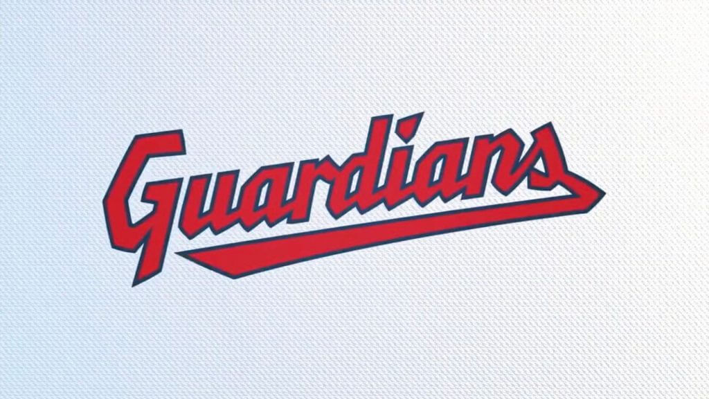
There were some strong feelings on this video posted in yesterday’s comments, so I’ll reserve judgment. As far as “hype” videos go, it wasn’t the worst nor was it the best we’ve ever seen. If you watched all the way through, you got to see the team released four images — two wordmarks and two logos, which will appear on the uniforms (which have not been released) next season.
As Paul is wont to do, let’s switch this up into his ever-popular Q & A format.
Do you have still images of those four graphics? They went by pretty quickly on the video.
Yes. One (the “winged G” as we’ll call it for now) is the splash photo. Presumably this is going to be a sleeve logo, or something similar. It’s possible it will also appear as a cap logo (perhaps an alternate cap). Anyone else getting a bit of a Van Halen vibe?
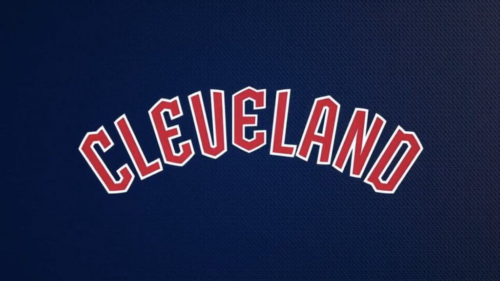
The other three are the “Guardians” wordmark…
the new “C” logo…
and the new “Cleveland” wordmark:
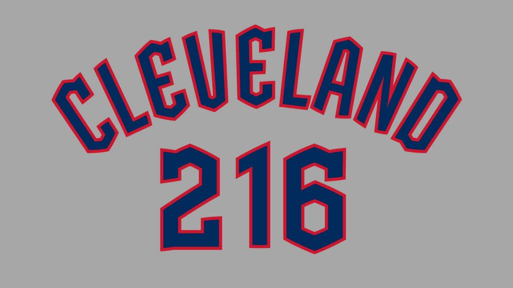
Here’s a view that likely shows NOB and what will be the number font.
Why “Guardians”?
According to team owner Paul Dolan, “‘Guardians’ reflects those attributes that define us while drawing on the iconic Guardians of Traffic just outside the ballpark on the Hope Memorial Bridge. It brings to life the pride Clevelanders take in our city and the way we fight together for all who choose to be part of the Cleveland baseball family. While ‘Indians’ will always be a part of our history, our new name will help unify our fans and city as we are all Cleveland Guardians.”
OK, but what is the “Guardians of Traffic” alluded to by the owner?
They’re the Art Deco statues above Cleveland’s Lorain-Carnegie Bridge. You can read a good story about that here. I’ll admit I was unfamiliar with this particular part of Cleveland history until yesterday.
So, they’re naming the team for some bridge statues?
It appears so. At least it wasn’t “Rockers” or something equally banal. It’s not my choice (I always liked “Municipals” or even “Spiders”), but it’s what the team is going with.
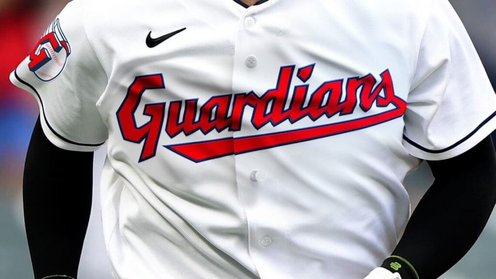
The “Guardians” script looks like the current “Indians” script — are they the same?
No, it’s a custom font, although it’s definitely derivative of the current script. Likewise the “Cleveland” wordmark/script is new too.
Something seems “off” with that “Cleveland” arched font.
Yes, I didn’t notice it at first, but designer Brandon Moore spotted it immediately. The middle “E” is smaller and seemingly not properly proportioned in relation to the remaining letters:
im ok with this Guardians name and identity as a whole. but more importantly, I think we should all acknowledge how cool it is that literally anyone can create graphic design for a pro sports team pic.twitter.com/EqnbaGMCEy
— Brandon Moore (@BMooreCreativ) July 23, 2021
What about the uniforms?
As mentioned above, those haven’t been released, but according to the team, “Our team colors will remain the same scheme that has been part of our organization for more than 80 years to honor our rich baseball heritage as well as the tradition of baseball as America’s pastime.” So the Indian…er, Guardians will remain a red, white and blue team. They’ll have “Guardians” on the homes and “Cleveland” on the roadies.
Will the “C” appear on the cap?
Yes. It’s slightly different “C” (“Diamond C”) than the C which appears on the new “Cleveland” wordmark — and the new font style is called “bridge print,” which itself is derived from the “Diamond C.” According to the team, the new “‘Diamond C'” will be an evolution of the current Block C and “respects the tradition and heritage of Cleveland Baseball. The new C stands tall — just as the Guardians of Traffic stand watch over our ballpark and city — and draws from the ascending diamond motifs at the top of each Guardian pylon. The weight of the C is bold and its tapered shape is inspired by letterforms from the 1920 and 1948 World Series clubs.”
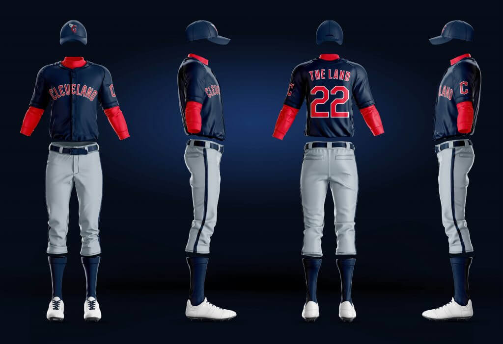
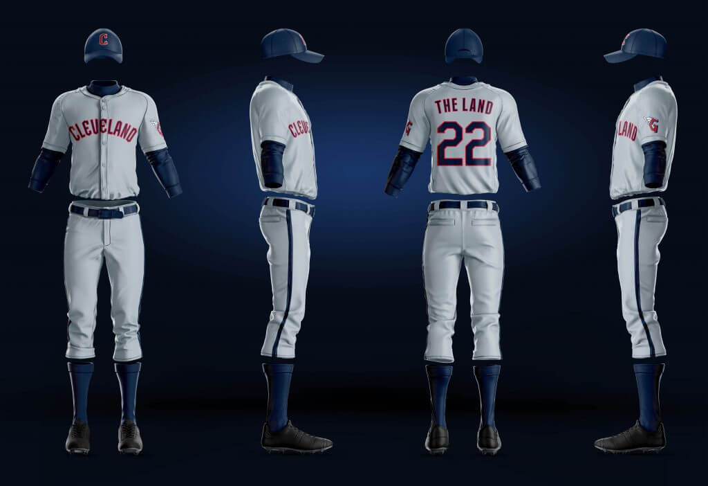
Any idea what the full unis will look like?
Funny you should ask, because I don’t — however, I asked my buddy Mike Joseph (a graphic designer) if he could just whip up a few Q&D mocks to give an idea of how they could look (assuming not much changes from their current uniforms). Obviously the finished product will most likely not look exactly like this (for example I’m pretty sure the number fonts will be different, and I think it’s wishful thinking on the red pants), but it’s just to kind of give you an idea:

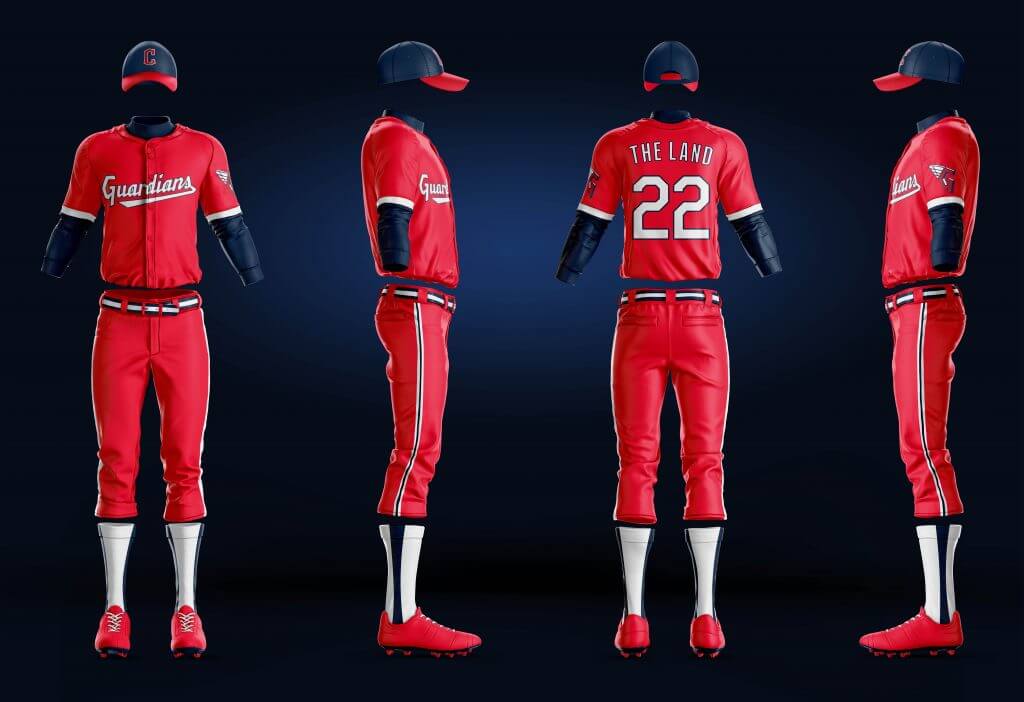
The jerseys themselves are a bit easier to ascertain.
And according to this article, the team themselves released some photoshops of how the new jersey will look:
It’s not quite an unveiling, but if those are indeed how the new jerseys will look, I’m correct about the “Winged G” logo does appear to be a shoulder patch. But we will really need to wait for the official unveiling to know for sure.
Do you know when they’ll officially unveil the uniforms?
Nope. The team hasn’t said. One might assume it could be sooner rather than later, and likely in plenty of time for the holidays.
Did the team say anything about that new “Winged G” logo?
According to Cleveland, “The Guardian’s Fastball embodies what it means to be a Cleveland Guardian in its strong, yet simple design. It is inspired by the helmets and wings of the Hope Memorial Bridge’s Guardian statues and the G purposefully wraps around and guards the baseball. The split-finger design is a tribute to our strong pitching heritage.”
Because of course it is.
How did the team pick “Guardians” over the other options?
Apparently there were more than 2,000 names considered. The team said the “Guardians” name was a top contender from fans. “Through our research and discussions, we identified a few key themes that were most important to fans – connect to the city of Cleveland, honor our rich baseball history and unite our community – and we believe Guardians upholds all three of those pillars,” said Brian Barren (President of Business Operations for Cleveland).
What’s your take?
I don’t like to really comment specifically until I see the uniforms on the field of play, and we don’t even have uniforms yet. I’m not a huge fan of the name (as I said, I preferred “Municipals”) and I don’t love either wordmark. Depending on how it’s used, I might grow to really hate that Winged G logo. But it was high time for the team to change its name, and in light of how they’ve spun things, I can definitely see how the team is trying to connect with the city and its fans.
That’s about all for now. Your thoughts?

Tokyo Olympics Women’s Kit Review
I had originally planned on this piece, featuring my soccer guys — Kyle Evans and CJ Fleck — to be today’s lede, but with the Cleveland Guardians news, it’s now become one giant sub-lede. In case you hadn’t noticed, the Olympics have already started (COVID restrictions and all), and in fact, the soccer part began even before the official opening ceremonies yesterday. (Note: the guys, with the exception of the US, are using photos from three days ago, so this section more of a recap that a preview. Kyle notes, “Other than Great Britain [who only exists at the Olympics] none of the other countries have ‘new’ uniforms so it’s more or less a continuation of what the national teams typically wear with the changing of the logos to match IOC guidelines.”)
Let’s just dive right in…
Women’s Kits Review
by Kyle Evans and CJ Fleck
Thanks Phil! We’re back to give a quick rundown of the soccer kits you’ll see in Tokyo. One important difference you’ll see in this tournament as opposed to any other international competition is that teams are not allowed to wear their federation logos (more info here) and those are generally replaced by a flag or simple team name such as “USA.” To allow for proper rest between matches, these games actually kicked off before the opening ceremonies.
In terms of the competitions themselves, the women’s tournament is a full senior event and is regarded as the second most prestigious behind the World Cup while the men’s tournament is primarily a youth tournament as all but three players on a team must be under 23 years old (technically under 24 this year due to the one-year postponement).
Group A
Japan – graphic design with shades of blue and white resembling clouds, sky, and water
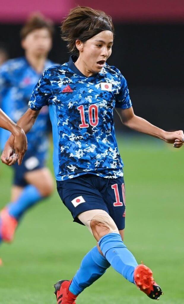
Kyle: A bold look for the hosts that is more art than jersey.
CJ: I like that it’s art, to be honest. Count me in.
Canada – all-red
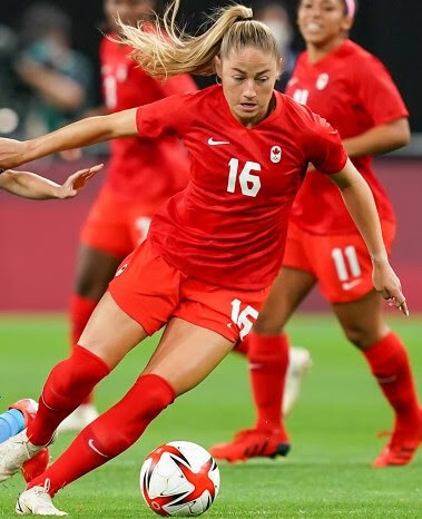
Kyle: Not much to say other than I like the number font.
CJ: It is in fact red. Alright then!
Chile – red over white with blue side panels containing white diamonds
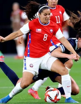
Kyle: This is a lovely flag-inspired look for me.
CJ: Love the side stripe, inspired choice.
Great Britain – navy with light blue Union Jack flag graphic
(Note: This team only exists at the Olympics as it combines England, Scotland, Wales, and Northern Ireland.)
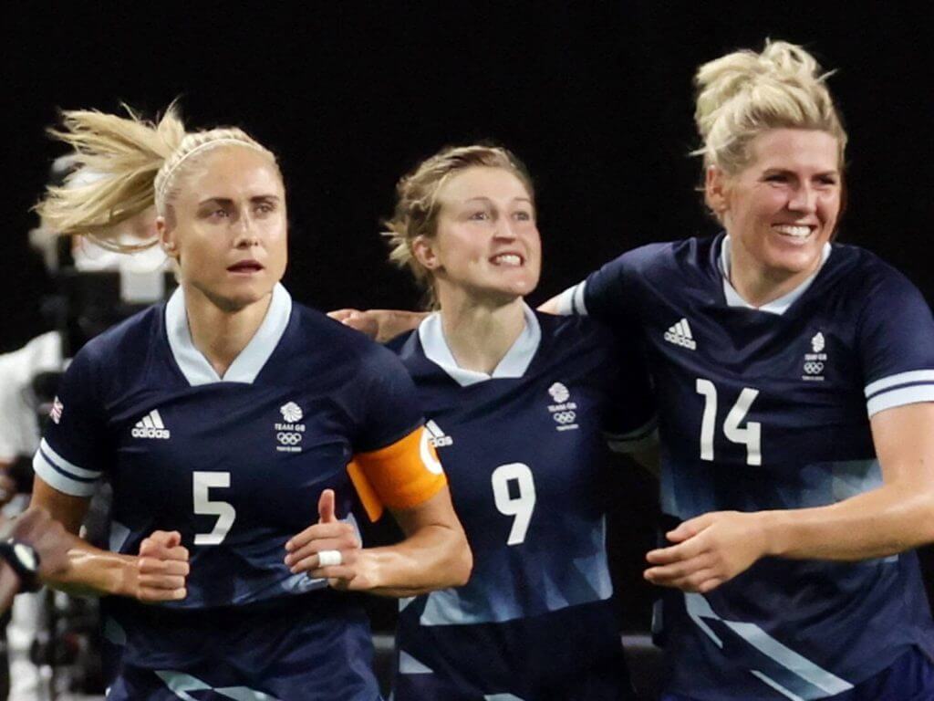
Kyle: Unique opportunity to showcase the United Kingdom flag and this works well.
CJ: I love Team GB conceptually but the flag is a bit off to me.
Group B
Brazil – yellow over blue with green accents
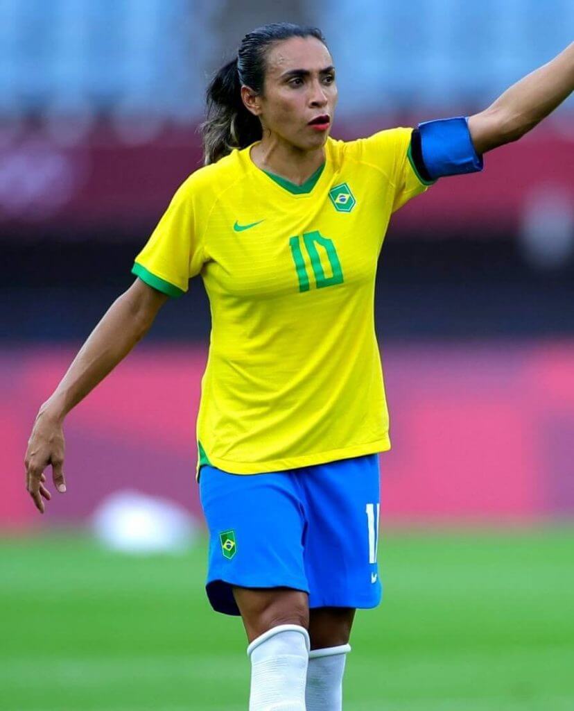
Kyle: Classic and beautiful.
CJ: Never change.
China – all-red with yellow side piping
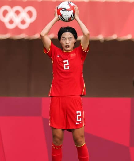
Kyle: Again no issues with a simple red kit.
CJ: Simple is good.
Netherlands – all-orange with black side panels
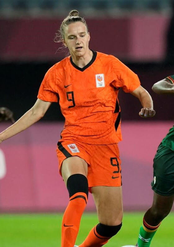
Kyle: A look that was great in the Euros and just as good in Tokyo.
CJ: The patch is a bit off, but I understand and adore the orange.
Zambia – all-dark green with red/black/orange striping on collar, sleeves, and socks
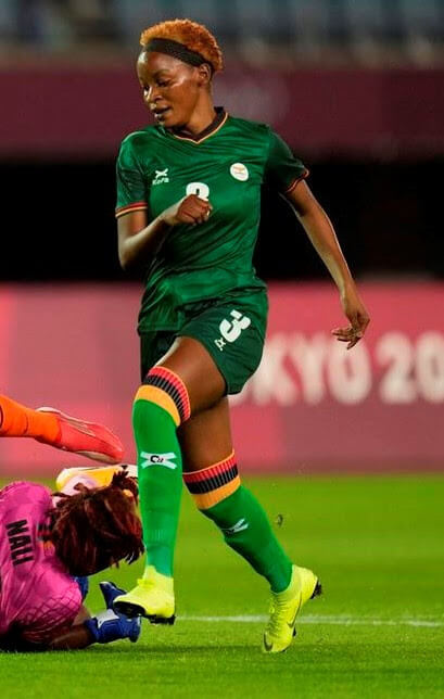
Kyle: I love the flag-inspired stripe patterns.
CJ: The socks! Love it.
Group C
Australia – all-yellow with green front diagonal panel and side design (the inverse kit exists as well)
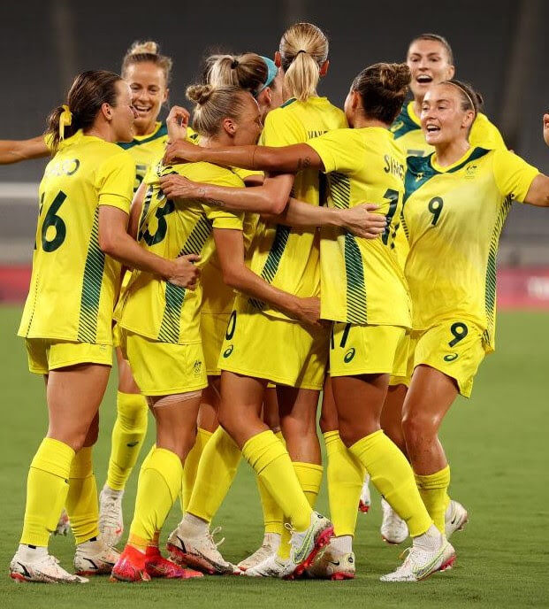
Kyle: A unique look that I immediately attribute to Australia.
CJ: It is definitely Australia but it’s a bit much for me.
New Zealand – all-black with front jagged gray pattern
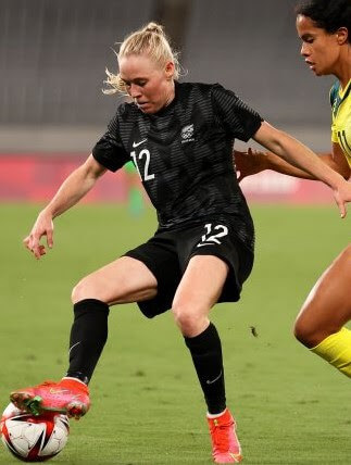
Kyle: The All-Blacks live up to their name once again.
CJ: Work with the classics as much as you can, I suppose.
Sweden – neon-yellow over blue with sublimated cross design
(Note: This is different from the Euros due to an Olympic partnership with Uniqlo.)
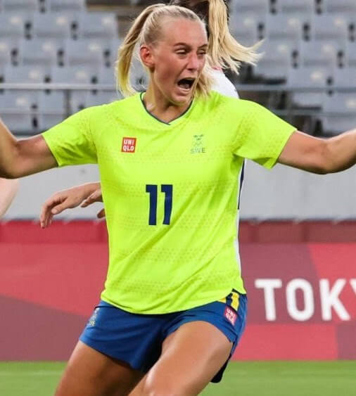
Kyle: Sweden’s Euro kits were one of my favorites so that makes this use of neon even more upsetting.
CJ: One big yikes.
United States – all-white with red/navy side stripes and red/navy “waving flag” stripes
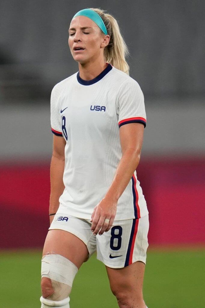
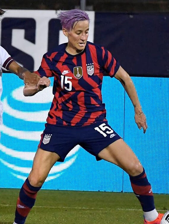
Kyle: A great pair of looks for the Americans and I really do like the random mix of red and navy stripes on the new jersey.
CJ: It’s not random, Kyle, it’s art!
Thanks, guys! I’ll have the lads back tomorrow for a look at your men’s 2020(21) Tokyo Olympic Soccer kits.
Browns Unveil 1946 Throwback Unis
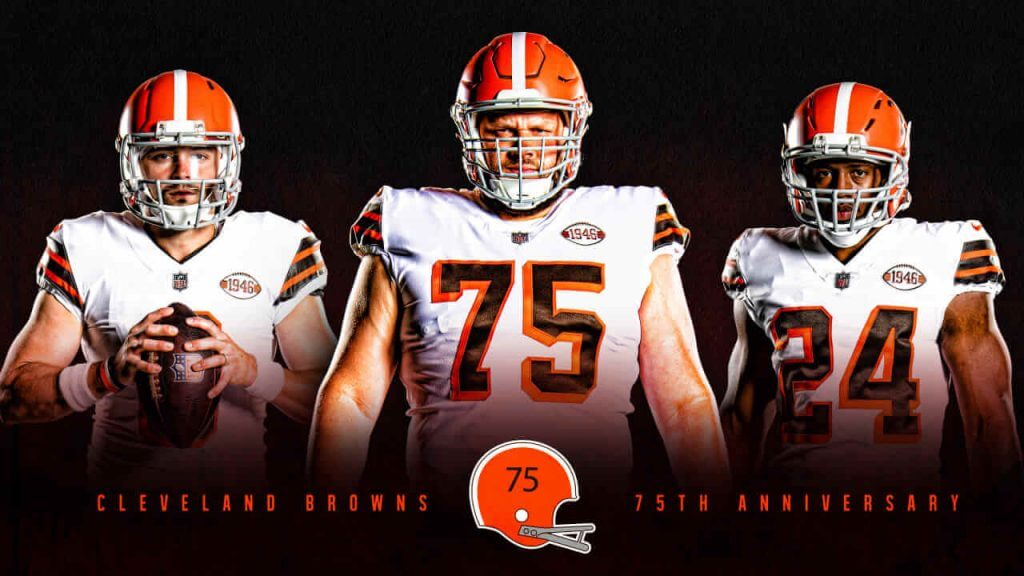
Early this morning, the Cleveland Browns unveiled — in the worst kept secret in years, due to the leak many months ago — their 1946 throwback uniforms. You can read the team’s release here, which contains the launch video plus more than two score of photos of the new uniforms. As mentioned above, with the amount of content today, and the lateness of the reveal, I’ll have more to say on these uniforms on Sunday (and Paul will be commenting about both the new Guardians look as well as the new Browns throwback, on Monday).
Feel free to comment on the unis below — but I won’t be offering any thoughts today.

Guess The Game…
from the scoreboard
Today’s scoreboard comes from ojai67.
The premise of the game (GTGFTS) is simple: I’ll post a scoreboard and you guys simply identify the game depicted. In the past, I don’t know if I’ve ever completely stumped you (some are easier than others).
Here’s the Scoreboard. In the comments below, try to identify the game (date & location, as well as final score). If anything noteworthy occurred during the game, please add that in (and if you were AT the game, well bonus points for you!):
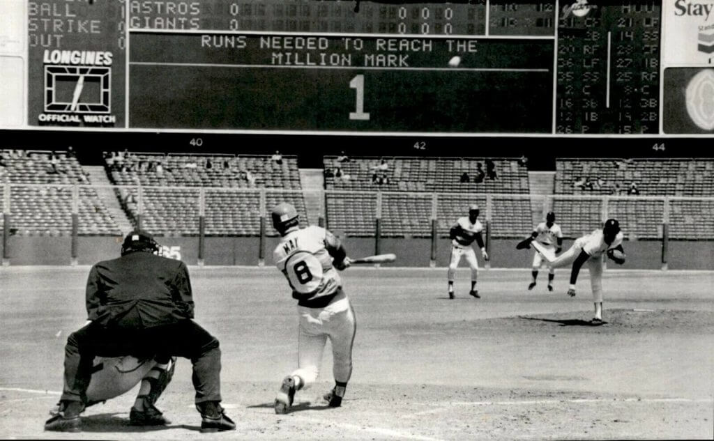
Please continue sending these in! You’re welcome to send me any scoreboard photos (with answers please), and I’ll keep running them.

Looking Ahead…
As the calendar nears the month of August, you’re probably all aware that Paul will be taking his annual sabbatical from the blog, leaving me in charge of the weekdays.
And as always, I can’t get through the whole month without a little help from the readers, so I’m putting out the call once again.
I’ve actually got enough stuff for a few “Olympics” posts, but I’m still looking for General Interest articles. If you’d like to propose and submit an article of interest to the Uni Watch readership — I’m all ears! Every summer you guys come through with some amazing research, concepts and other fantastic uniform-related materials, and I’ll be happy to feature your work on here again during the month.
So, if you’re interested in contributing something Olympics or uniform-related, please Shoot me an e-mail (Phil.Hecken@gmail.com) and let’s discuss! Looking forward to seeing what you guys have in store for 2021!
The Ticker
By Anthony Emerson

Baseball News: Here’s a really good look at Yankees P Gerrit Cole’s strategy card in his cap (from JDHokie). … Nelson Cruz will wear No. 23 with the Rays, a decision which means pitching coach Kyle Snyder is switching to No. 44.

Pro Football News: The Calgary Stampeders will have a big 75th anniversary logo on the left side of their helmets, completely replacing the team’s logo on that side. This is something I don’t recall ever seeing before (from Wade Heidt). … During John Elway’s first game against the Steelers, Pittsburgh tight end Bennie Cunningham has has name misspelled on his jersey (from Rick Deemer).
College/High School Football News: Hawai’i has unveiled new uniforms (thanks, Phil). … NC State has a new helmet (from Wyatt Howard and Kevin Parker). … Colorado State also has a new helmet (from Shawn Hairston). … Waco’s New University High School has new uniforms (from Kary Klismet).

Hockey News: Top NHL Draft prospect Owen Power had all 32 NHL draft caps lined up in his home, despite being the consensus No. 1 pick. It makes for a cool display, especially considering that NHL draft caps don’t look ridiculous like NFL and NBA draft caps (from Wade Heidt). … Luke Hughes was taken fourth overall by the Devils, and put on his brother Jack Hughes’s Devils jersey for the cameras (from @uniformnerd).

Soccer News: New Manchester United signing Jadon Sancho will wear No. 25 after rumors he would take over No. 7 from Edinson Cavani. Sancho wore 7 at Borussia Dortmund and United’s best player traditionally gets No. 7. Of course, what does two plus five equal? … Did you know that from 1970-1974 Birmingham City had players’ initials on their shorts? I didn’t and I’m one of Uni Watch’s soccer guys! (from @texastrevor). … Ukrainian side Inhulets Petrove have unveiled their new kits (from Ed Żelaski). … Also from Ed, Legia Warsaw’s new kits have been released. … PSG manager Mauricio Pochettino got a contract extension through 2023, and he was given a jersey with the year as the uniform number (from @artofscorebug).

Olympics News: Japan men’s field hockey goalie Takashi Yoshikawa looks like he has his No. 30 hand-drawn and attached to his shirt (and on the front too). It looks vaguely like the actual font but not exactly (thanks, Jamie). … The following are all from Kary Klismet: In an ongoing stand against sexualization of female athletes, German gymnasts are wearing full-length unitards for the Olympics, just like they wore earlier this year for the European Championships. … The World Anti-Doping Agency is reportedly disappointed that Russian athletes will be allowed to compete in the country’s traditional sporting colors (although without the country name) after the Agency’s recommended sanctions were softened by the Court of Arbitration for Sport late last year. … Here’s one columnist’s list of eleven “standout fashion moments” from the Opening Ceremony. … This is so cool: the USPS had special uniforms for employees assigned to the Olympic Village during the 1984 summer games in LA (from Scott Rogers). … Italy’s Opening Ceremony uniforms were not well received by the Internet. … How’s handball going at the Olympics? Well, they stopped a match due to an issue with the center court graphic and ended up just removing a piece of it.
Uni Tweet of the Day
More like the Broons City Edition, no?
A look at the Red Wings alternate uniforms for the 2024 season: pic.twitter.com/j2Jf3ZleLC
— Brad Galli (@BradGalli) July 24, 2021
And finally… that’ll do it for today. Big thanks to Kyle & CJ for the Women’s Olympic Soccer run down, and they’ll be back tomorrow with a look at the men’s kits.
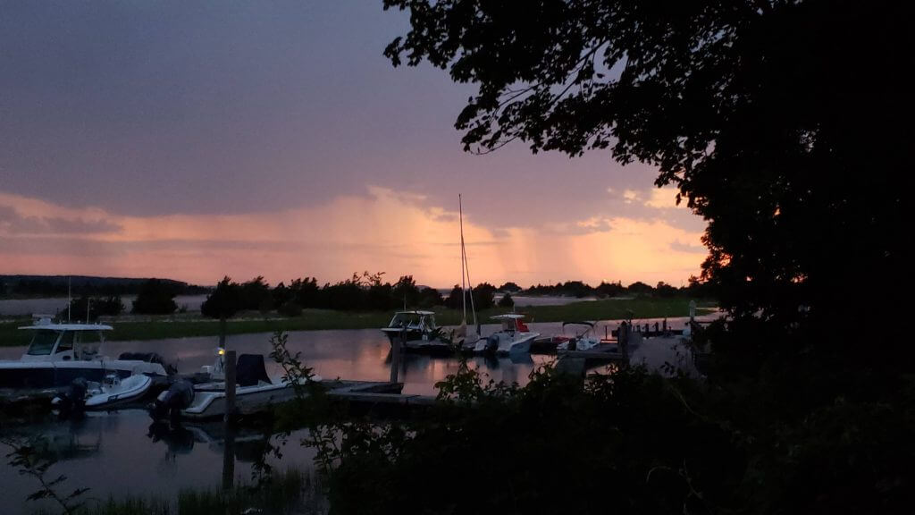
Both Thursday and yesterday, while sunny all day, clouded over at dusk, thus negating a direct sunset. We even got a few spurts of rain. I kinda like how that looks as it’s coming towards me.
Apologies for the rather large post today. But we had a lot going on. I’ll catch you guys tomorrow, so everyone have a great Saturday.
Peace,
PH
In the browns teaser for Paul you called them the 49ers
GAH! I meant Browns (obviously?). Fixed.
So, with your need for August articles, is there a Griffins design contest like there has been?
The All-Blacks live up to their name once again.
Lots of NZ teams use the black and white color scheme but the soccer teams wear white as first choice. The men’s team nickname is actually “All Whites.” Women’s teams often have some variation of “Ferns” as their nickname (Football Ferns, Black Ferns for rugby union, Silver Ferns for netball, etc.)
But the “All Blacks” name only applies to the men’s rugby union team.
And, my favorite, the basketball team goes by the Tall Blacks.
So with your need for August articles, is there still a Griffins design contest to look forward to?
Not this time around. Sorry.
Hopefully we won’t see much of those US Women’s uniforms. I hope they eliminated in short order. They are a disgrace to the country.
Scoreboard
May 4 1975? Giants win as Bob Watson scored baseball’s 1 millionth run?
Oops wrong spot
Considering the fact that you owned slaves, pot meet kettle.
Slaveholder or not, George Washington was the greatest American ever, there would no USA without him and men like him.
As do I. I truly hope they are gone first round.
Cleveland Guardians. Not only is it still red white and navy, but the fonts remind me of the “Cavemen” 1970’s look, and I see a three syllable (emphasis on the first) name that rhymes with Indians, same cadence and all. So the message I interpret is “We wish we could stay the Indians, but we can’t, so let’s literally do all we can to stay Indians and we can kind of hope our fans keep calling us the Indians.” Which for me is a bad goal for a graphic design package and identity. I guess I’m supposed to wait and see how it looks on the field, but my first impression is no good. Not liking what I’m seeing.
Agreed. Cleveland missed a chance to come up with a unique color scheme and you’re right that the font looks like something from the Flintstones.
It was interesting that the generic navy/red colors were kept to “honor” their baseball heritage of the past when presumably the name was changed to distance the team from their past identity. Oh well.
Was thinking the same as well Mike. The Cleveland wordmark and “C” feel like a nod to the Caveman font.
I like the caveman script nod. It’s a little too Art Deco angular so some of the letters are confusing though. I’d also rather see the Cleveland script in cursive also. It seems they wanted to keep a lot of things similar so they used Guardians. Not really a fan of the G logo. Looks hurried.
I think this is a lazy, outsider from Cleveland take. The vast majority of Cleveland fans didn’t want the name to change. The vocal minority and twitter / social media crowd forced this. That’s fine. People were offended (I always question how much they truly care since most like to virtue signal online) so what they wanted was taken care of.
The coincidental nature of Guardians and Indians ending in “dians” is just that. Coincident. It wasn’t a half measure. It wasn’t to entice people to keep calling them the Indians. The colors red white and blue have been their colors for decades upon decades and again- when the people who support the team buying gear and tickets don’t want the chance to happen – it’s nice to keep some elements of the previous branding.
I think some people will complain no matter what and even after retiring wahoo and changing the name you see comments like this still complaining which shows what many think – some people will complain no matter what and Even after the change they wanted has taken place they still want to criticize. That’s why it’s a dangerous game to constantly give into the vocal minority/ virtue signalers who swoop in for the cause du jour then move on to the next thing they get to act up in arms over.
I agree, though with a different opinion of it, since the caveman font is my favorite Cleveland look. If I were in charge of this renaming, continuity would have been a key goal. In order to speed acceptance of the new name, I would want to keep as many things as possible the same or similar. So no new colors, and uniform elements kept as similar as possible to the outgoing unis. Which is exactly what the team seems to have done. I don’t read it as a wink-wink to keep calling the team the Indians, but rather an attempt to make the change as smooth as possible. Also, take a look at the cover photo on the Indians Twitter page: A photo from early in the 2021 season with four players posed with their 2020 individual achievement trophies. The hardware for each player either entirely obscures the INDIANS jersey lettering or it exposes the DIANS portion of the lettering. When fans see the equivalent photo in 2022, it won’t look radically different from the current photo. I think that’s both deliberate and smart.
I was amusing myself yesterday by creating this, and since it relates to the discussion:
link
On Cleveland’s new winged G logo…the wing on the far side connects to what looks like the top of a letter that is obscured by the baseball. If we’re assuming a 3-D version of the logo would be symmetrical, does that imply the existence of a backwards facing G on the other side?
For sure. The implied backwards G represents looking back on their cherished history or something.
Scoreboard
May 4 1975? Giants win as Bob Watson scored baseball’s 1 millionth run?
I can see how Guardians won and I’m already kind of used to it. Municipals was great and might have been more beloved and distinct in the long run, but given the inevitable controversy that was coming with the name drop (most of it generated based on political/financial motives) I suspected they’d never go for it. This is a good, moderate mix of what a new identity needed to be and I learned a little about Cleveland’s architectural history, so I’m good with it.
Only thing that gets me — the Winged G-ball, I kinda like it, but it feels weirdly incomplete to me. Like it’s one tweak away from being finished. But nothing on it is sneering or snarling so perhaps that’s for the best.
I understand the 3D aspect to the Winged G logo going off of the actual statues but i think it would look much better as a pure side elevation view. Wing on the left, G, then Baseball coming out of the G to the right with no 3D angle.
Guardians…ugh! Anyway, why wouldn’t the C on the uniform match the C on the cap? Seems sloppy to me.
I’ve seen a number of people make this criticism and I don’t understand it. The same is true of many extant MLB sets (just look at, off the top of my head, the Cubs, the Red Sox, the Athletics, Pirates, etc.). It seems to me that hat logo and the same letter in the wordmark matching is more the exception than the rule.
“Guardians” is a lame nickname, sorry. Especially because the most common use of “guardian” in today’s language is usually in reference to somebody who is legally responsible for a child but is not a biological parent. And no doubt if anybody on the team gets in legal trouble there will be jokes about them being the “Court-appointed Guardians”.
With the Brittney Spears case being in the news, maybe they should have gone with “Conservators”?
I was thinking “Guardians of the Galaxy”.
Look for ballpark naming rights (after Progressive) to go to a home security/doorbell camera company.
The scoreboard is from Astros at Giants, May 4, 1975. Milt May is in the process if hitting a three run homer – Bob Watson, the runner on second, will be credited as the millionth run in MLB history, though that required some questionable math and decisions on what were major leagues.
Quick google search came up with this link regarding the calculation.
link
So bother this guy if you have a problem with the 1 millionth run. (Please don’t really bother him.)
Did anyone see the women’s 3×3 basketball today? Couldn’t tell if the unis were grey or not, but it’s the same design as the white one the mens and womens team is using. Just looked darker compared to the white knee sleeves, socks, etc
I preferred “Municipals”, too, but some of the mock-ups for uniforms with that name resembled the Nationals. Maybe that figured into the decision? Also, Municipals is kinda/sorta close to Metropolitans.
Again, trying to figure out why they went with Guardians. Here’s hoping the recent super hero movie culture did not play a part!
I never understood the fascination here with “Municipals”. Naming a team after a city-issued financial instrument seemed odd from the beginning. :)
Ha, good point. And the namesake stadium was a dump.
As Detroit fan I was looking forward to rhyming “Munis” with puny.
Municipal Stadium may have been a dump, but it’s their dump. As a fellow Detroit sports fan, I always had a lot of people telling me that Joe Louis Arena was a dump. While probably true toward the end, it doesn’t mean that I loved it any less.
Guess I’m the only one who flat-out LOVES the winged “G” logo.
Looks like it’s been around for a century or so.
When I look at the new Cleveland Guardians’ “C”, the serif reminds me of the feather:
link
Do you believe this was a subliminal way of keeping the Chief incorporated?
It’s the first thing I thought!
I noticed the general shape last night and it crossed my mind
Some further reading as to why Guardians was the correct and, in my opinion, only choice.
link
They should have used the iconic head and helmet of the Guardians statues as a logo. It’s a gimme of a cool and unique logo that’s just sitting there for the taking and they all but neglected it save for the wings on the baseball. Keeping the same color scheme and the same jerseys is another huge botch. Blow it all up and start fresh.
Will the Space Force sue the team for copyright and trademark infringement?
Flash Gordon already filed yesterday. Guess there will be multiple law suits.
The team name and winged G logo looks like someone watched one too many Marvel movies.
The Calgary Stampeders’ 75th logo. This was supposed to be worm during 2020 season when it was the team’s 75th anniversary. The top of the logo had the years 1946 and 2020. Then the CFL sat out 2020 because of the pandemic. So this is now a 75th season logo worn in 2021. They changed the top of the logo to say Est. 1946.
I’m not pleased with this helmet for the Stampeders:
-The message seems to indicate it could be worn for all games this season. The Stampeders are wearing a recently introduced retro-style uniform at home for most of its home games this year that is simply red and white. Black trim in the helmet will ruin that look.
-Not a fan of different logos on each side of the helmet. Belongs in college if it must be done. I do not like this at the pro level.
-Should have just worn a jersey patch instead.
I’ve been a fan of the Indians since the early 1980s, and Guradians is just plain stupid. The logos are all poorly designed and looked rushed, and like a comment above, the fact that the new name also ends in “dians” makes it seem like this was picked so they didn’t really have to change a whole lot. And basing your entire identity around a bridge is asinine at best. I think Paul said this a while back, that it’s difficult to rebrand correctly because you risk alienating a portion of your fan base, and well I definitely fall into that category. So sad when they literally could have picked anything.
I feel like they didn’t rock the boat too much because they don’t want to further alienate those people that are already upset about the name change. By keeping it close, they’re trying to pull those people back in
The name “Guardians” sounds pretty stupid in a vacuum (I was really hoping for Spiders) but I think they did an outstanding job with that wordmark. The angularity is just art deco enough to be evocative of the statue inspiration and unique while still in line with the aesthetics of classic baseball.
Browns = good
Cleveland baseball team? = meh but could have been worse.
The Guardians name is a home run. It’s local, and keeps their identity phonetically close to what they’ve had for over a century.
The logos and font are ok. The “C” looks like someone put a too-small belt on the original and pulled tight. I’m not a big fan of the “cursive with sharp edges” look, but it could be worse. No reason to change the colors, but it might have been interesting to revisit the more royal-blue, red, white, and silver of the early aughts.
I hope they come up with a Wahoo-esque logo of the Guardian’s face and that can become a cap logo down the road.
Is it possible that Cleveland wanted to change as little of the name as possible and chose “Guardians” because it allowed them to keep the last 5 letters of “Indians”?
I think that’s completely probable
Regarding the middle C on the jersey wordmark, could it possibly be that it was intentionally made smaller so as not to interfere with the jersey button on the placket based on the height of where they want to place the lettering?
Guardians: not as good as Spiders or Municipals or Blue Sox, better than Rockers, Rock & Rollers or 216XXXtremez
Colors: I get the history but MLB is rotten with red/white/navy
Font/word mark: they would have been better off keeping the current script. The lettering looks contrived, not classic. Go standard MLB Block Varsity instead.
Cap: I mean, the Block C was fine…
Winged G: ugh, no. The monogram should reflect the home city/state, not the nickname.
All in all: meh
SCOREBOARD: 4 May 1975, Candlestick Patk. Astros 8, Giants 4. Bob Watson is about to score the millionth run in MLB history on a Milt May dinger.
In regards to Paul’s annual August sabbatical, why is that such a NYC thing? I’ve never heard of any place else doing this. My first memory of this was from the movie “The Seven Year Itch”. The closest thing Detroiters have (or had) was when the car factories would shut down for the first two weeks of July.
It is a thing all over Europe as well. My dad was a lawyer in a solo practice and he always took off for most of August. He said that nobody pays their lawyer in August so there wasn’t much use in opening the office to pay the secretary to do nothing and most judges took off.
Not sure how you think this is a “NYC thing.” And while Paul’s not going to be doing daily blog posts on the UW site, it’s not like he’s on vacation — he’ll still be doing pieces for IH and the new Bulletin, plus he uses this time to track down all the new/changes for NCAA football in preparation for his giant column on those (plus the annual NFL preview). Believe me, I would rather stay on weekends, but PL deserves the break and, until swooshie took over the NBA, it was usually a very quiet uni-reveal month as well. We’ve been doing this for like 12 years now, so I’m not sure if you’re surprised, but I assure you, it’s not a NYC thing.
I’m fine with the Guardians name and I like the connection to a Cleveland landmark, but I’d echo others in saying I would’ve liked a more radical rebranding. I’m terrible at design myself, so I don’t know if using one of the statues’ heads as a logo would have worked at all, but everything here just seems too similar to what was. (That said, in fairness, plenty of teams have a name that isn’t incorporated into the brand at all, even if that name theoretically could be incorporated—the Warriors, for example, are probably the most obvious comparison, but the Warriors have the Bay Bridge in their logo, so there’s a city connection.) The baseball sandwiched in between two block Gs with wings doesn’t really do anything for me.
The Guardians is one of the few OK names I heard bandied about. Municipals, I don’t understand the fascination with that one. I had Spiders as a 3 to 1 favorite but hated the idea of bringing back the name of the team that holds the record for worst all-time W-L in history. Blues and Buckeyes were my preferences but I realized they were long shots.
As for the graphics presented. Highly uninspiring. The winged G is quite bad. Not sure how you name a team after these cool statues and don’t incorporate them into the logo set. They should have leaned into the art deco aesthetic which would have generated interest from outside the general fan base.
Perhaps the worst part is that they have just given us a “Great Value” brand, create a team version of the Indians. A somewhat unsatisfying aspect of their current uniform set is the use of a script “Indians” at home and mismatched block “Cleveland” on the road. Instead of rectifying this, they carry it forward! Script “Guardians”, block “Cleveland”. Only now with a silly, trite, and less legible typeface. Really disappointing from a visual perspective.
My 2 schillings:
Municipals was never a good idea, and I loved that building as much as anybody could. But it’s a backwards look at a torn down stadium whose rubble caught fire like a tire yard. And if mewe-knee? Horrible. Spiders was an obvious choice if they were going to look back at the team history.
I’m not personally a huge fan of guardians since those who consider themselves guardians are usually clowns. but it’s iconic, the alliteration to Indians, and the cavemanish font and uni-balance will make the transition smoothish.
Honestly I feel like people/critics would hate a every name.
I like the winged G. Reminded me a bit of the older marvel comics Kirby-Simonson era Thor helmet. I even recognized it as a split-finger before I read the marketing copy. Anyway, on most of the best classic uniforms, the logo is barely present. Especially at stadium distances.
The middle E in the CLEVELAND on gray looks the same as the other E. I don’t understand using an oval as a baseline for the letters when it’s probably a circle, maybe.
The pointy script does wreak havoc with the baseline though.
link
As noted, the game in question was the Bob Watson one millionth run game….but a shout out for the Tequila Sunrise jersey with the large round cutout for the number on the back….which also tells you it’s 1975, the first year of Tequila Sunrise but I believe the only year with the number cut out.
Not a huge fan of the Guardian name, but like that it’s tied to something in Cleveland. Don’t like the word marks / fonts either, would have been nice if they went with something a bit more Art Deco to match the style of the Guardian statues, would have been unique in the league, but am glad they’ve moved on.
The 5 seconds after the “Cleveland Guardians” name reveal video ended were literally the loudest deafening silence I’ve ever heard or seen following a public announcement like this.
“Guardians?” Sucks as a name. Spiders was the obvious choice, and of the five “finalists” reported, Guardians was the least interesting. It’s not a bad choice, mind you.
What really sucks is the implementation. No matter what they chose, they could’ve done something really special with it. If they wanted to maintain tradition? Go with “Cleveland Baseball Club” and keep the colors. If they wanted to take things on a new path? Go with “Spiders” break out some Halloween-like color scheme, and have fun with it. Instead they did neither, managing to look schlock while at the same time giving the impression that they put all the effort into this rebranding as your typical third-level indoor football team does.
The whole thing is just disappointing – they could’ve hit a home run, and settled for getting hit by a pitch.
Long-, long-time Indians fan here. Wish they hadn’t changed the name and dropped The Chief, but such is life.
I don’t think they could have done much better than Guardians. I don’t love it, but at least I don’t hate it like I would have hated Spiders or Blue Sox or some rock and roll theme or some hokey b.s. like Spirit.
We’re only one day into it, and it’s starting to grow on me a bit. But I’ll continue to wear my Tribe gear.
BTW, the first few seconds of the opening credits of “Major League” features one of the Guardians. YouTube it and see. How cool is that?
After reading all the comments, I’m puzzled by those who wanted a more radical rebranding. Jeez, isn’t changing a name they’ve had for 106 years radical enough? People were unhappy enough about that. You throw in some garbage new look like black, purple, and/or teal, and people would really go berserk.
No, keeping the red and blue is just fine. It softens the blow.
I suppose we’ll get used to the font, but the winged G logo looks stupid, like something a cheesy C-list super-hero would wear. And do we really need to cram a baseball into it? We know it’s baseball.
The name Guardians is a joke. Hopefully the uniforms and logo are simply place holders for a season or two until someone (anyone) possessing an ounce of creativity can come up with better.
Can see the headlines now after players commit an error “Guardians display hands of stone.” When they are no-hit (3 times already in 2021)-“Guardians look like statues at the plate.”
In a bit of irony, The Guardians are located on the Hope Bridge. The fans of this team lose hope about this time every year.
At least the Rock & Roll Hall has a new marketing statement-“The Guardians of Traffic… and Hendrix, The Beatles, Rolling Stones and Zepplin.”
Well, they’ve avoided the obligatory “Spiders get squished” headlines.
No one outside of Cleveland will ever associate the name with statues. Hell, no one inside Cleveland will after they’ve been playing awhile. A Guardian will be a ballplayer, like a Dodger or Athletic or Yankee is.
I dont know why Dolan didn’t change it to the Cleveland Traders. Dolan is always trading players with talent. I understand rebuilding but this isn’t it.
Also tired of Dolan’s complaining how he’s always losing money on the team. Well then it’s time to sell to someone who will invest the the team instead of whining all the time.
Longtime Cleveland fan (early 90s). I get the grievances about Guardians, but I think this is low-key a masterclass in rolling out a tricky rebrand. They released a series of ideas and a commitment to a name with local roots, and did so with ample time to gauge reaction and with plenty of time for graphic tinkering. The general direction is fine; I’d call it a 6/10. But Washington Football Team could take some notes here.
Also, while I am not necessarily on board with the City Connect unis for other teams so far, the ’22 season and the few after would be a great time to use City Connect to test more radical visions of the Guardians identity. You could use a sandstone color à la Padres, touches of copper accents and statue details on hats. I’m sure Nike is slobbering about this opportunity.
Guardians is a trash name… It might work for an arena football team, but not for baseball. The Flying G logo is the worst thing my eyes can remember from MLB since the Angels used the Winged A.
This reminds me of the brief life of the “new 49ers helmet” in 1991. I could totally see them scrapping this and trying again in a few months.
Does anyone see the merch side of this panning out?
I know this is a few days old so you probably won’t see this but in the high school football section, it should be “University High School” and not “New University High School”
If you want to name the team guardians, do a better job of explaining why in the actual logo, wordmark, and uniforms. Use imagery based off the statues.
Use Greek mythological imagery as is used in the statues, come up with something totally separate of anything connected to the Indians uniforms to totally turn a new leaf.
The logo, uniforms, and wordmarks drawn up embody and represent as if the team was renamed “warriors” and wanted to stick to some inkling of Native American imagery.
Sad to see they missed the mark on something unique with the Guardians name, perhaps in a few years they will do a total overhaul.