For all photos, click to enlarge
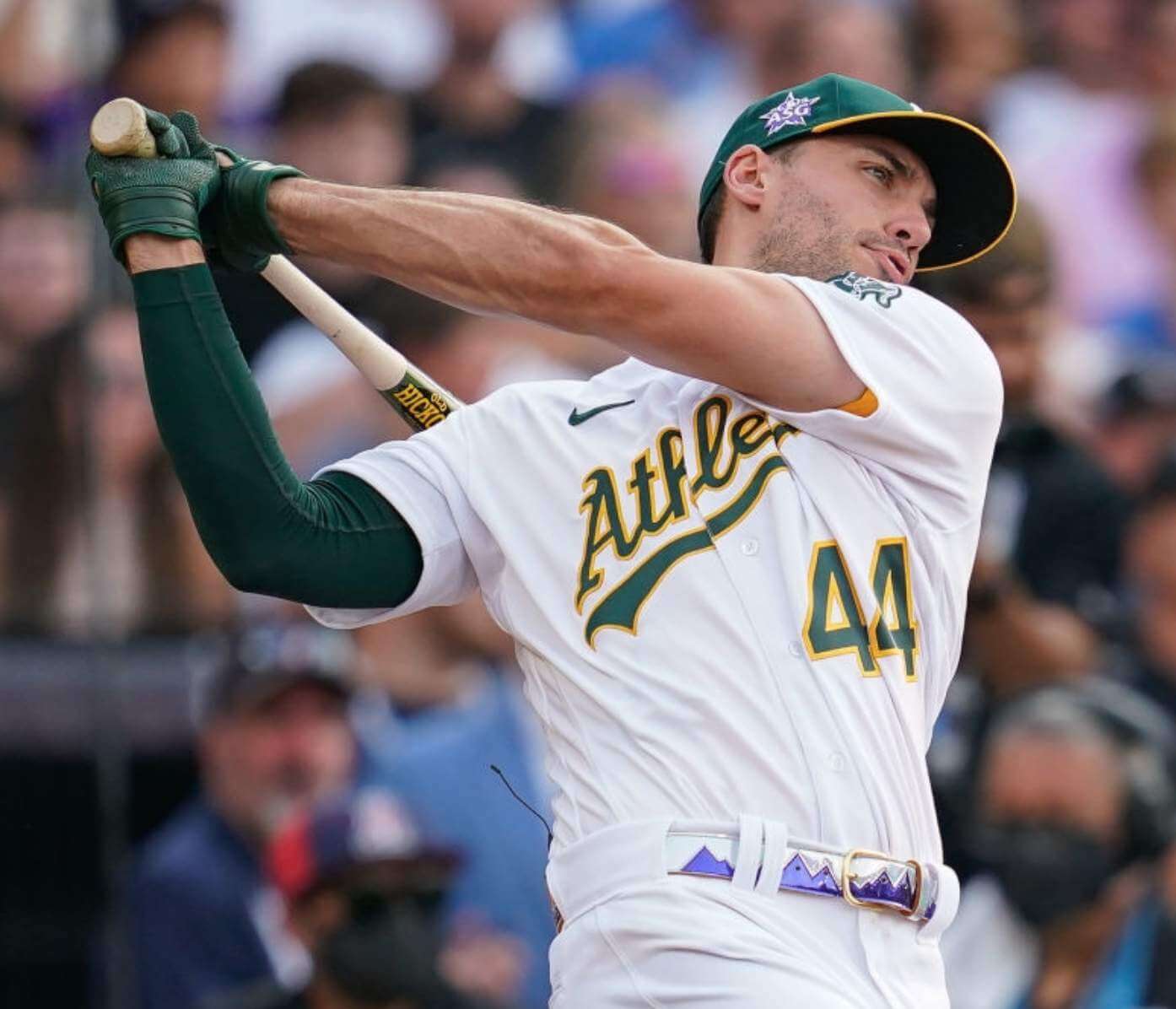
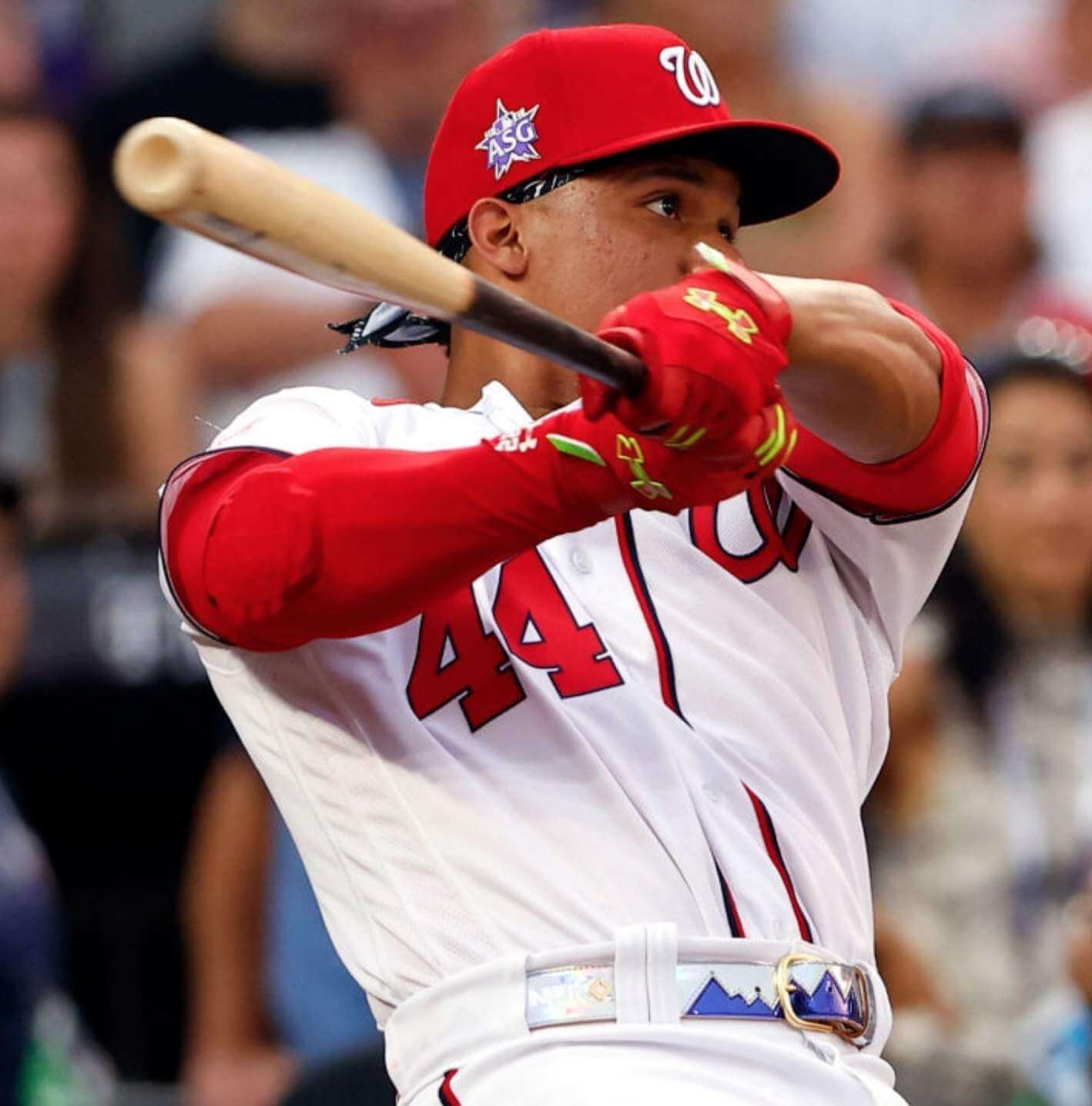
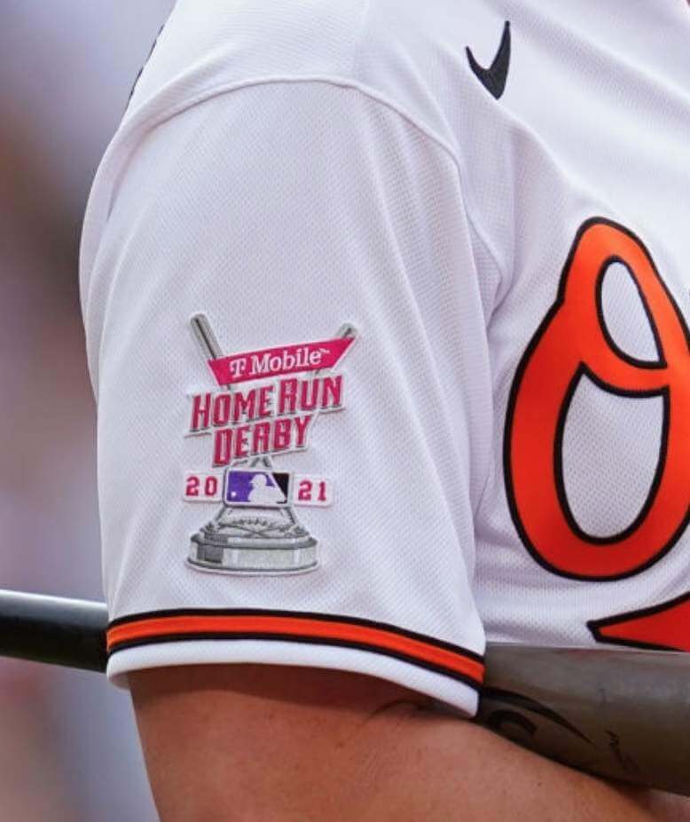
The 2021 Home Run Derby took place last night. There were lots of uni-notable aspects to it, many of which are visible in the photo above of A’s first baseman Matt Olson. Let’s go one thing at a time:
All players wore their regular home whites
This is the third consecutive time that Derby participants have worn their regular team uniforms, and they all wore their home whites — no road greys, no solid-colored alternate jerseys. That’s the same approach they used in 2019 and 2018 (there was no Derby in 2020).
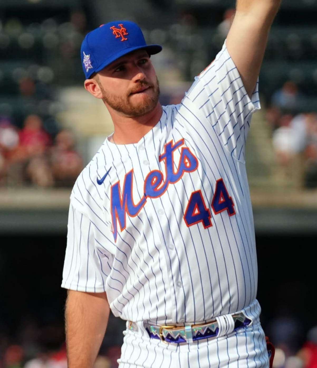
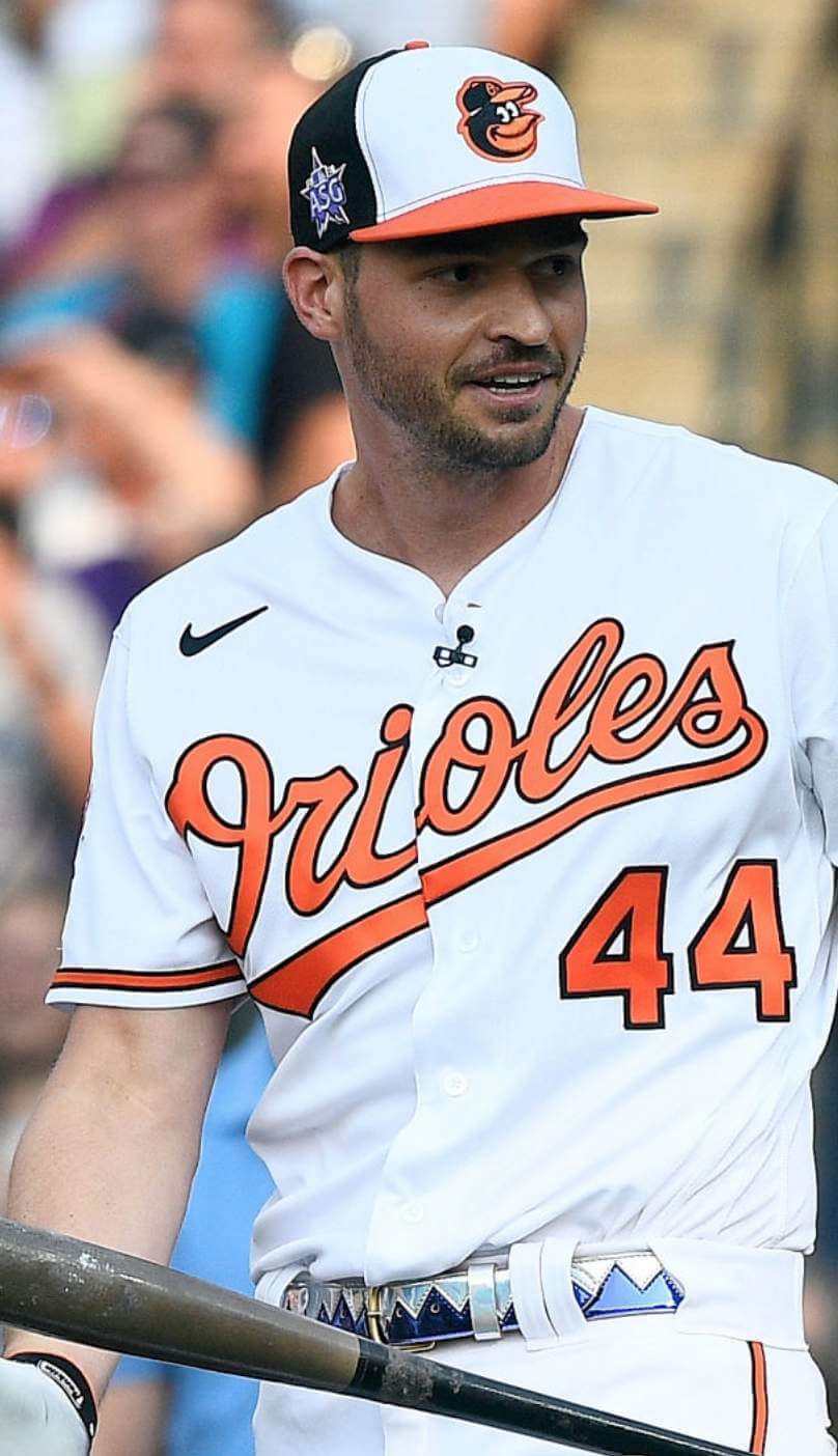
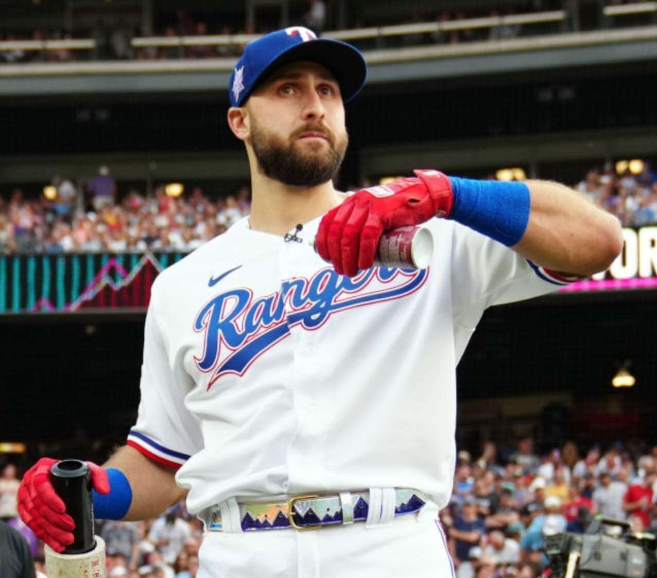
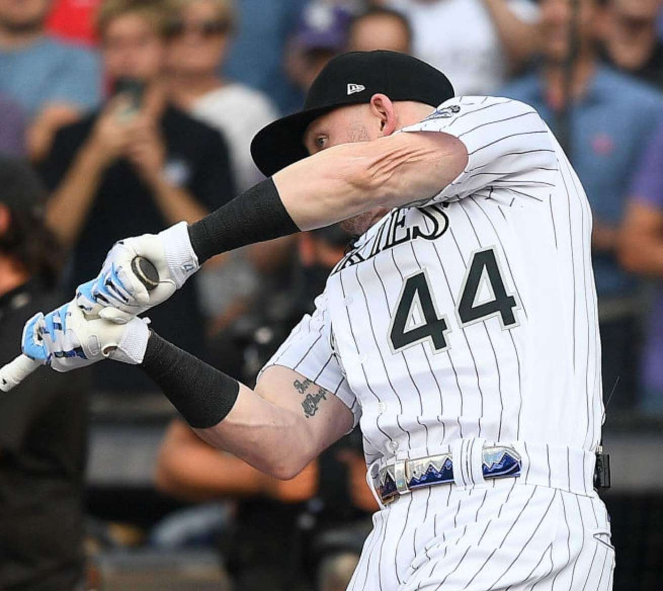
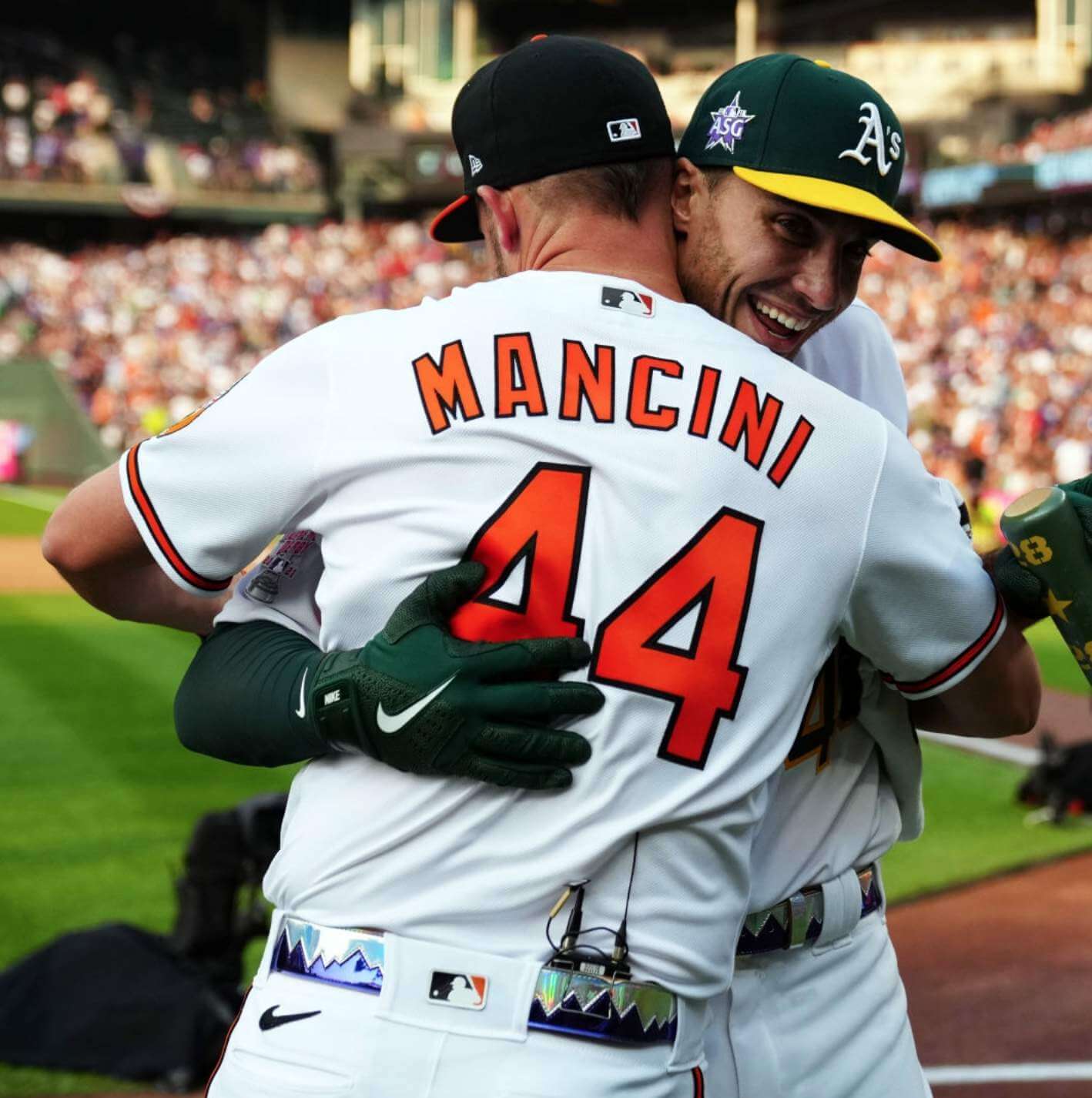
All players wore No. 44
This was a new wrinkle — all the participants wore No. 44 as a tribute to Henry Aaron. But they still had their regular NOBs:
I like this move. I suppose it would have made for better “storytelling,” or some nonsense like that, if the festivities were still being held in Atlanta, but there’s never a bad place or time to celebrate Henry Aaron. Hell, Aaron even participated in the original Home Run Derby TV show that inspired the modern Derby we now see each summer, so that’s a nice bonus tie-in. I say make the 44 thing permanent and call it the Henry Aaron Home Run Derby from now on.
Interestingly, All-Star Media Day was held yesterday afternoon, prior to the Derby, and players all wore the No. 44 home whites for that as well. They also wore those same uniforms for the team portraits — even for the American League squad, which is the visiting team! That seems weird on multiple levels — if the players aren’t wearing their regular team uniforms for tonight’s game, why wear them for the team portraits? Why not wear the dreadful uniforms they’ll actually be wearing in the game?
There were some gaudy All-Star belts
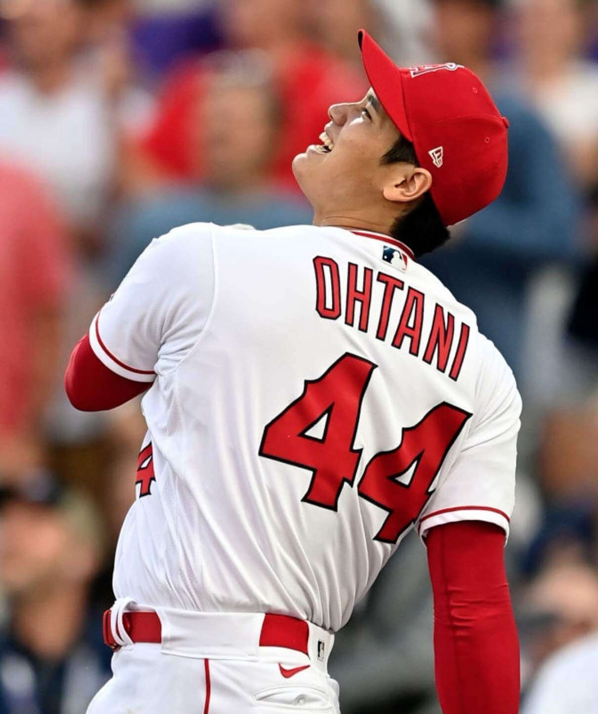
Many of the Derby-ists (all except Angels star Shohei Ohtani, I believe) wore Rockies-themed belts with a purple mountain range pattern. They were shiny and sort of iridescent on TV, although a bit less so in still photos. If you scroll back up to the top of the page, you can see that this belt looked particularly awful on Olson (the A’s always get the chromatic shaft on these MLB-wide accessories). For most of the other players, it just looked flashy. But hey, the Derby is a flashy event, so why not? Here’s a sampling:
I assume we’ll be seeing those belts during tonight’s game as well.
(Footnote: As far as I could tell, all the players wore their belts right-handed.)
Stupid uni ad
Okay, so the Derby has been doing this for a while, but it’s still jarring to see MLB players wearing stupid corporate ad patches, especially when they’re wearing their regular team unis (instead of the BP jerseys that used to be worn for the Derby):
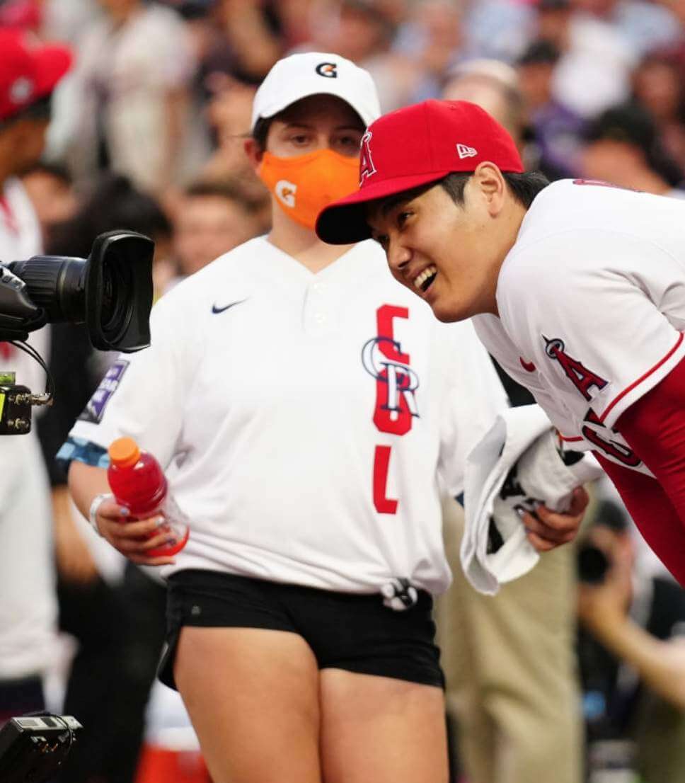
Speaking of the intersection of uniforms and advertising: When the players got winded and took a break, an attendant would rush out with a restorative electrolyte beverage. She wore a Rockies All-Star jersey — the really ugly one that the players will be wearing tonight — along with an electrolyte beverage logo mask and an electrolyte beverage logo cap:
Home Run Derby isn’t your thing? Well, there’s always the Bunt Derby:
I know now isn’t the time for this discussion, but I’m all about this Bunt Derby they doing overseas pic.twitter.com/BY6VtiKYaA
— Roy Wood Jr- Ex Jedi (@roywoodjr) July 13, 2021
And that’s that. Tonight we’ll get to see MLB history made on several levels, as players on both All-Star teams will wear lame-o All-Star costumes instead of their team unis (the LA Times has a good article about the thinking behind that), and the umpires will wear cryptocurrency ad patches. Really puts the “Classic” in “Midsummer Classic,” I tells ya!
Click to enlarge
Collector’s Corner
By Brinke Guthrie
Follow @brinkeguthrie
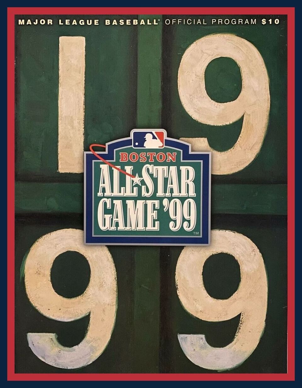
The MLB All-Star Game takes place tonight in Denver. So let’s kick off this week’s CC by going back 22 years for the Midsummer Classic in Boston, as commemorated with this game program, featuring the scoreboard of the Green Monstah at Fenway Pahk.
Now for the rest of this week’s picks:
• Here’s a set of four Chicago Cubs buttons. One even says “National League Champions.” Just one problem: The Cubs weren’t the NL champs in 1984 — they won the NL East but lost the NLCS to the Padres.
• Ever want to “Own and Operate a Major League Baseball Team?” That’s what you can do with “Pennant,” this 1970s baseball board game. This is the “Complete Game for the Sports Minded,” by the way. Classic cookie-cutter multipurpose stadium on the box, too — strong Vet/Riverfront/Three Rivers vibes.
• These MLB logo cufflinks once belonged to Tom Johnson, a former minority owner of the Pittsburgh Pirates. I love that logo and wish it would make a comeback! (And just to further this week’s All-Star Game connection, they used to use that logo on the All-Star MVP trophy.)
• Phillies Phans will like this 1970s “I’m A Phillies Phanatic” bumper sticker from Girard Bank. Speaking of the phamous mascot, here’s a great-looking Phanatic bank from Citizens Bank.
• Got a nice-lookin’ Houston Astros tequila sunrise jersey right here.
• Lookit these cute little guys: a pair of 1970s Los Angeles Dodgers cheer bears, complete with caps and pennants.
• “Council of Colts Corrals 13th Annual Convention 1979” is emblazoned on this white/blue Baltimore Colts gear bag.
• Dave Robinson of the Packers is tackling Dan Reeves of the Cowboys on the box of his 1960s Official Western Conference NFL Color by Numbers set. Includes “Nine artist-quality color pencils and 9 action sketches, plus pencil sharpener.” If I’d known about this back in the day, I would’ve been all over it, ditching the pencils and goin’ all-in with my Bic Banana markers.
• Here’s a 1960s women’s New York J-et-s sleepwear shirt.
• Check your card balance before bidding on this one (submitted by reader Matthew A.) Billie Jean King’s 1974 Philadelphia Freedoms uniform. Buy it now for almost $90K. Um, panties included.
The Ticker
By Paul, pinch-hitting for Alex Hider

Baseball News: Faaascinating story about how a Negro Leagues player helped to pioneer the modern batting helmet (thanks, Phil). … The Dodgers are raffling off a World Series ring and a World Series ring NFT (from John Cerone). … Five years ago, the great Larry Torrez made a caricature mash-up of me and Mr. Met, wearing a Meats jersey — Mr. Meats! Now that character has somehow ended up — twice! — on WFAN drive-time co-host Evan Roberts’s birthday cake. I’ve never had any interactions with Roberts, and he doesn’t even follow me on Twitter, so I suspect the bakery just googled assorted Mr. Met images to put on the cake and didn’t realize that Mr. Meats is a Uni Watch thing. Anyway: Happy Birthday to Roberts! (Thanks to @mikeDfromCT). … The St. Paul Saints will wear O’NOBs and McNOBs for Irish night this Thursday (from Timmy Donahue).

Football News: WFT president Jason Wright said yesterday that “Warriors” is not being considered for the team’s new name and that they’ll choose an identity that “unequivocally departs from any use of or approximate linkage to Native American imagery” (thanks, Jamie). … Here’s a good slideshow of Steelers uniform history (from Hans Krake). … Max Weintraub spotted these cool NFL needlepoint pillows at a bazaar in Williamsburg, Va. … Looks like Idaho State might be going GFGS on Oct. 9. “Usual uniform tops are black or white, so this is a departure,” says Jon Rango.

Hockey News: The WHL’s Portland Winterhawks are dropping their Blackhawks-style logo and will unveil a new logo tomorrow (thanks to all who shared). … New 25th-anniversary logo for the QMJHL’s Cape Breton Eagles (from Wade Heidt). … New uniforms for Duquesne University’s club team (from Gene Bromberg). … The Stanley Cup was dented yesterday during the Lightning’s celebrations in Tampa. … NHL draft caps have leaked. The Coyotes’ design appears to confirm the widespread speculation that the team will make the Kachina design its primary uniform going forward. … The governors of Iowa, South Dakota, and Nebraska were given Sioux City Musketeers G.I. Joke jerseys at a conference yesterday. “The team’s logo and name are derived from Sioux City being at the point where those three states meet — hence reference to the Three Musketeers,” explains Jay Wright.

Soccer News: New home shirt for Celtic (from Ed Zelaski). … New away kits for Bundesliga club Bochum (thanks, Phil). … Top-tier Polish side Lech Poznań’s new home shirt has leaked. … The Newcastle United women’s team wore numberless shirts during their recent preseason friendly against Middlesborough (from Graham Clayton).

Grab Bag: Whoa, check out these great paintings by Sam Smith, who specializes in artwork that tells the story of the Tour de France (from Michael Rich). … New logo for the Stevens Point, Wis., police department K9 unit (from Chris Kautza). … At The (British) Open, pro golfer Billy Horschel’s club bag will have a Florida Gators logo on one side and soccer club West Ham United’s logo on the other (from Moe Khan). … Really fun (but paywalled) Wall Street Journal article on fans who collect cycling jerseys.
Those NHL draft caps look nice! A simple design goes a long way!
Last paragraph: “Tour de Frace”. Sorry.
No need to apologize. Fixed!
These are absolutely fabulous. I think he picked the wrong image to represent Stage 4, as the single greatest moment of the whole Tour was Cavendish sitting on the ground weeping after his victory, having never expected to be able to ride in the Tour again. Love the painting of Van Aert on Mont Ventoux; there are numerous great climbs in the Tour, but I believe that is the most beautiful. Ah, what a magnificent race…
My speculation for some time is that the Portland Winterhawks would adopt their 3rd jersey logos (primary and shoulder patch) as main logos. The hawk head as primary mark. However, looks like it may be something new? Maybe a variation of that logo.
Interested to see that tomorrow. As well, new Abbotsford AHL team (Vancouver Canucks affiliate) will unveil its name, logo, and uniforms tomorrow.
link
Also, About time for a redesign for the Winterhawks. Started playing in Portland with hand-me-down Chicago Blackhawk uniforms. They’ve had 45 years to create their own design.
They have missed a marketing opportunity for years. Fans purchased a Blackhawks jersey and instead of the tomahawk shoulder patches you couldn’t tell. Now they can have something of their own. I am a hockey fan because of the Winterhawks and I like the move.
Is it too late to take up a collection to pay for Chris Sale to take a bowie knife to all of the shitty all star jerseys?
I absolutely loved seeing all of the players in 44, although I don’t think they should have been NOB.
I look forward to seeing a day during the regular season where all players wear 44, and hopefully another day when all players wear 21 for Clemente.
Unfortunately, if they’re not NOB, with the same number, many people may not know who some of them are.
Disagree.
Jackie Day is a special and well deserved tribute for a historic individual. Extra days like that only weakens that tribute.
Agreed.
If there was any time that it would be appropriate to wear colored batting practice / spring training / warm up type tops on a visible stage, one would assume it would be during the home run derby. This just seems like the perfect example of those who Get It, and those who don’t. Design aesthetics of the uniforms aside, practice or exhibition jerseys make the most sense to wear in an exhibition like last night.
And given the derby actually outperforms the all star game itself in TV ratings in the coveted 18 – 49 demographic, it would make far more sense to market those special jerseys at the derby, when the people you are trying to sell them to are more likely to see them.
I don’t know about a bunt derby, but some sort of target competition would be cool. Home Run Derby is getting boring (like NBA Dunk Contest).
Mr. Meats should be on merchandise.
Wholeheartedly agree. A grilling apron? A sticker? A PIN?!?
Yes yes and doubleyes!
Would be fun, but MLB’s legal dept. wouldn’t look kindly upon it.
Hypothetically, there could be a ransom note style mr meats?
I had the great privilege of attending the Home Run Derby last night, which was a tremendous amount of fun. As you might guess, many thousands of fans were wearing jerseys of one team or another, but I saw exactly two people wearing those new All-Star jerseys. They were so nondescript and amateurish that it took me a minute to even remember what they were. I don’t think they’re going to be the big seller that Manfred is hoping for.
Unfortunately, Accor to that LA Times article Paul mentioned, the jerseys are “essentially sold out”. So apparently someone’s buying these ugly things.
Yeah, but we don’t know how many they made. Easy to sell out when you start with a very small inventory.
We can only pray for buyers’ remorse. Hoping that once they come to their senses, they’ll relegate those things to the bottom of a drawer. -C.
Yeah essentially sold out. 2 out of the 3 they made…
I’ve always wondered how much merchandise is moved for special jerseys and caps. In the minor leagues, the “Copa” program is supposedly popular as an outreach initiative to Hispanics, yet at the parks’ gift stores the merchandise seems to sit on the shelves and racks like it has the plague.
I for some reason couldn’t post this on the Sportslogo.net forums. Can anyone identify or explain this logo being worn by UC Riverside’s head baseball coach in 2011? I can’t find it anywhere online.
link
Because that’s the logo they wore on their batting helmets?
link
Any particular reason you refer to Aaron as Henry, and not Hank? I’ve almost always heard him referred to by his nickname, though he was retired for more than 20 years before I started paying attention to baseball, so that could be it.
He’s referred to as both. I prefer to honor his given name, but it’s not a big deal either way.
Okay, I was just wondering, not complaining or condemning. It stuck out to me a little and I wanted to make sure I wasn’t missing something. It wouldn’t be the first time an athlete had a popular nickname that they didn’t actually like.
You are correct. I read recently, though cannot recall where, that he didn’t like “Hank”.
It’s been a long time since I read the Aaron memoir, “I Had A Hammer,” but I’m sure I recall him noting pretty much the sentiment Paul expresses. He preferred to be addressed as “Henry,” but wouldn’t correct people who addressed him as “Hank.”
From his Wikipedia Entry:
At this point (1954), Aaron was known to family and friends primarily as “Henry”. Braves’ public relations director Don Davidson, observing Aaron’s quiet, reserved nature, began referring to him publicly as “Hank” in order to suggest more accessibility. The nickname quickly gained currency, but “Henry” continued to be cited frequently in the media, both sometimes appearing in the same article, and Aaron would answer to either one. During his rookie year, his other well-known nicknames, “Hammerin’ Hank” (by teammates) and “Bad Henry” (by opposing pitchers) are reported to have arisen.
Those new Duquesne hockey unis are beautiful! Love the redesigned “D” logo as well.
Make an MLB Skills Challenge with 8 players in a single round competition.
1) Bunting Challenge-not only on target, but over/under obstacles.
2) Fastest inside the park home run-no hitting, just running.
3) Longest throw-you can wind up but your foot has to be standing on home plate when you release.
4) Accuracy throwing-hitting targets from home plate.
5) HR Derby – you get 20 pitches from a pitching machine.
I would watch the heck out of something like this!
Absolutely would watch it
If only we could have celebrated Hank Aaron in Atlanta, his #44, and all he meant to baseball. But no, Manfred had to step on it yet again. The ASG tonight will look awful. The best part of the game was the mix of home and road jerseys on the same field (I think of the 1971 game in Detroit).
What makes you think they wouldn’t have worn the Nike-designed uniforms in Atlanta?
Two different issues.
1. All wore 44 yesterday, which was to honor Henry Aaron. I’d assume that had already been planned with Nike when the ASG was to be in Atlanta, and continued through with that when Manfred made his personal decision to move the game.
2. I don’t think I’ve seen anything saying the “team” uniforms which are to be worn tonight will all be #44. I think it’s assumed that the common uniform shirts which will be worn were already a part of the Atlanta plan, given the color that’s been shown. I’m against a common uniform in the ASG. The uniqueness of the varying uniforms (take a look at some of the pictures from past games…you had the A’s reps wearing 3 different unis!) is what made the ASG from a sartorial perspective. Manfred and his merch hawking buddies have destroyed that.
re: HR derby
I thought the home whites looked great and the hitters seemed to like their new belts – I’ll bet they’ll be cool mementos for the trophy case.
The game unis are an abomination. When i was a kid (mid 60’s – mid 70’s) I wanted to see my guys in their Cardinal duds and all the others as well, especially the AL – since you were only guaranteed one TV game per week and very often get to see some of the great designs of the A’s, White Sox (red pinstripes), CA Angels (halo around the top of the cap), and among other the plain jane Senators.
Finally, and somewhat off-Uni topic, I found the format of the actual event broadcast to be just a Crapfest. Frantic/Schizophrenic/Seizure Inducing/Audibly Indecipherable and completely and needlessly chaotic.
In other words, a perfect example of one of the things that have helped create our current ADD/ADHD riddled society.
I agree. I’m beginning to dislike all the shouting/screaming announcers we hear today. Specifically the announcers in:
Cleveland
Cincinnati
San (Slam) Diego
Seattle
Vin Scully never screamed at the top of his lungs. He typically waxed poetic. Things like: “In a year of the improbable, the impossible has happened”
I guess I was spoiled growing up in LA and getting to listen to the best broadcaster ever…
That bunt contest clip made me think that Bunt Curling should be a thing.
I don’t know why, but the visual of Freddie Freeman and Ozzie Albies standing next to each other in the NL team photo cracks me up!
The new NHL draft hats are fire, Seattle’s hat is the best one too I wish they would use that aqua color for their main jersey instead of the bland and unoriginal navy
We will have a Kraken 3rd jersey to look forward to some time in the near future. Maybe it will be that colour.
The Stanley Cup being dented is probably one of the least wretched things that have happened to it over time.
link
Good thing it is a sturdy trophy. Much tougher than the Grey Cup and its narrow neck. Grey Cup sometimes does not survive the team celebration right after it is won:
link
I was kind of hoping that Washington would decide to simply stick with being the “Football Team”. It sets the team apart and has a certain dignity to it, as if to say that a squad of adult professionals doesn’t require a “nickname” or goofy mascot.
I can’t tell from the article if this is still a possibility, and for the life of me I can’t figure out why it would take several years to choose a new one.
These MLB logo cufflinks once belonged to Tom Johnson, a former minority owner of the Pittsburgh Pirates. I love that logo and wish it would make a comeback! (And just to further this week’s All-Star Game connection, they used to use that logo on the All-Star MVP trophy.)
While I have seen this logo before, I am almost embarrassed to say I don’t know any of its history and a quick search came up with little. Can someone fill me in on the history of this logo?
I found a little bit on it:
link
Why was this logo needed in the early 1970s if the Dior logo was just commissioned?