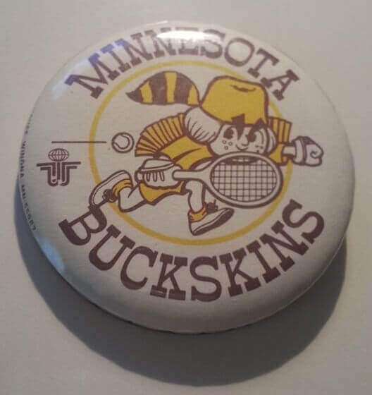
It’s been a while since we’ve heard from longtime Uni Watch Minnesota-based pal Rick “Ricko” Pearson, but it was worth the wait. He recently got in touch to let me know that he’d found this pin from the old Minnesota Buckskins rattling around in a desk drawer. If you’re not familiar with the Buckskins, they were a team in the short-lived 1970s venture known as World Team Tennis. (The NYC team was called the Sets, of course, to rhyme with the Mets, Jets, and Nets, although they later changed their name to the Apples.)
Is that pin great or what? In addition to the awesome little cartoon character, there’s there’s the stylized WTT logo. “I drew the character, and my dad did the lettering (by hand, yet),” says Ricko.
I hadn’t realized that Ricko was involved with the Buckskins, so we had a quick email back-and-forth:
Uni Watch: How did you end up with this design gig?
Ricko: I was the league’s PR director. My partner, Lee Meade, ran the Buckskins, and we owned part of the team. We’d been involved in World Team Tennis essentially since the beginning. Lee knew [WTT co-founders] Dennis Murphy and Gary Davidson through the ABA. He had become the ABA’s first PR director after covering the league’s formative days as sports editor of The Denver Post. By the time the WHA and WTT came along — also Murphy-Davidson projects — Lee and I had opened a PR agency. They hired us, and Lee was named WHA PR Director. When WTT was being formed, I was its “Media Information Director.” That’s how I ended up attending Bobby Riggs’s matches against Margaret Court and Billie Jean King.
UW: I’m assuming the Buckskins’ team colors were based on the U. of Minnesota, yes?
Ricko: Actually, the colors were brown and gold. If I could do it over again, they would have been maroon and gold. Nickname and colors were my idea. Most teams were going with Aces, Racquets, Strings, Sets, Nets, Loves, etc. Like Billie Jean, we wanted a nickname that sounded more like traditional team sports. Hence her choice of “Freedoms” for the Philadelphia franchise, and we went with “Buckskins.”
UW: Did the mascot character have a name, like Bucky or something like that?
Ricko: Nope.
UW: The character looks similar to the Minnesota Fighting Saints mascot. Was there any connection between the teams’ ownership or anything like that?
Ricko: Yes. One of our early owners was also one of the Saints’ owners. Plus, we’d been so involved with the WHA that we thought we should have a little fun doing our own non-gender-specific version of the character. So I drew the figure and my father did the lettering.
———
Ricko also shared scans of a 1974 promotional brochure showing some uniform concepts that he created for the Buckskins. “This is where we wanted to go for 1974 [the team’s first and only season], but it didn’t work out that way,” he says (I supplemented Ricko’s scans with a photo I found on eBay; click to enlarge):
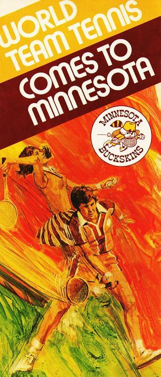
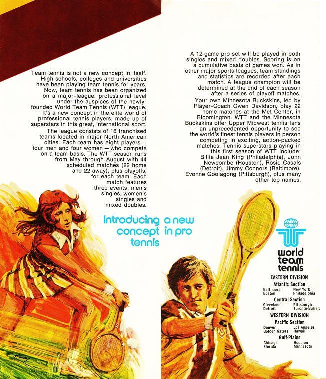
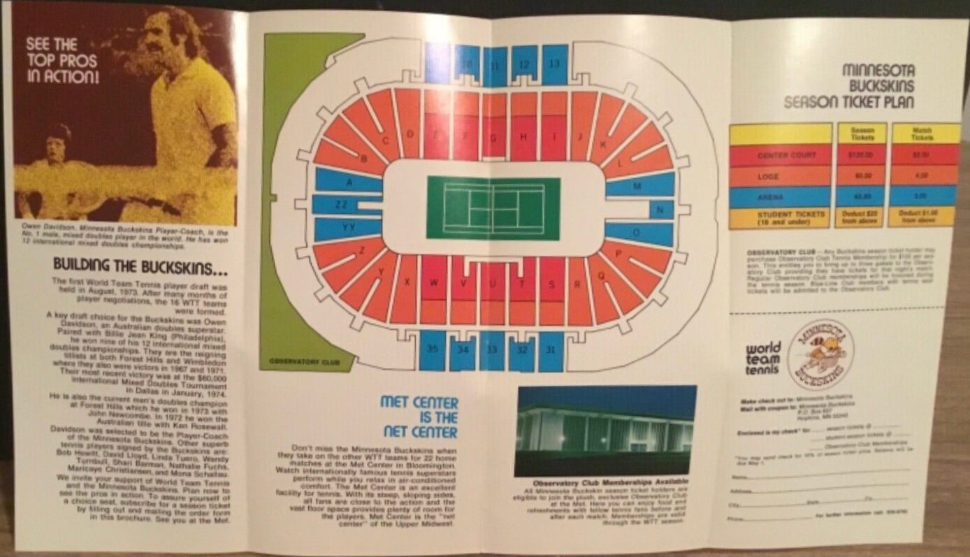
“The uni design is mine; artwork is not,” Ricko explains. “Had the league done better, the unis probably would have been used for season two.”
What a fun little history lesson! Thanks for sharing, Ricko — I love this kinda stuff.
Too good for the Ticker: The Smithsonian currently has an exhibit called “¡Pleibol!,” which is about the history of Latin-American baseball. Yesterday they posted a photo of this amazing 1936 softball uniform, worn by Carmen Lujan of the Mercury Señoritas. Click through to see a rear-view photo and an old shot of Lujan wearing the uni. Great stuff.
(Big thanks to Jason Tierney, who was the first of several readers to send this my way.)
Click to enlarge
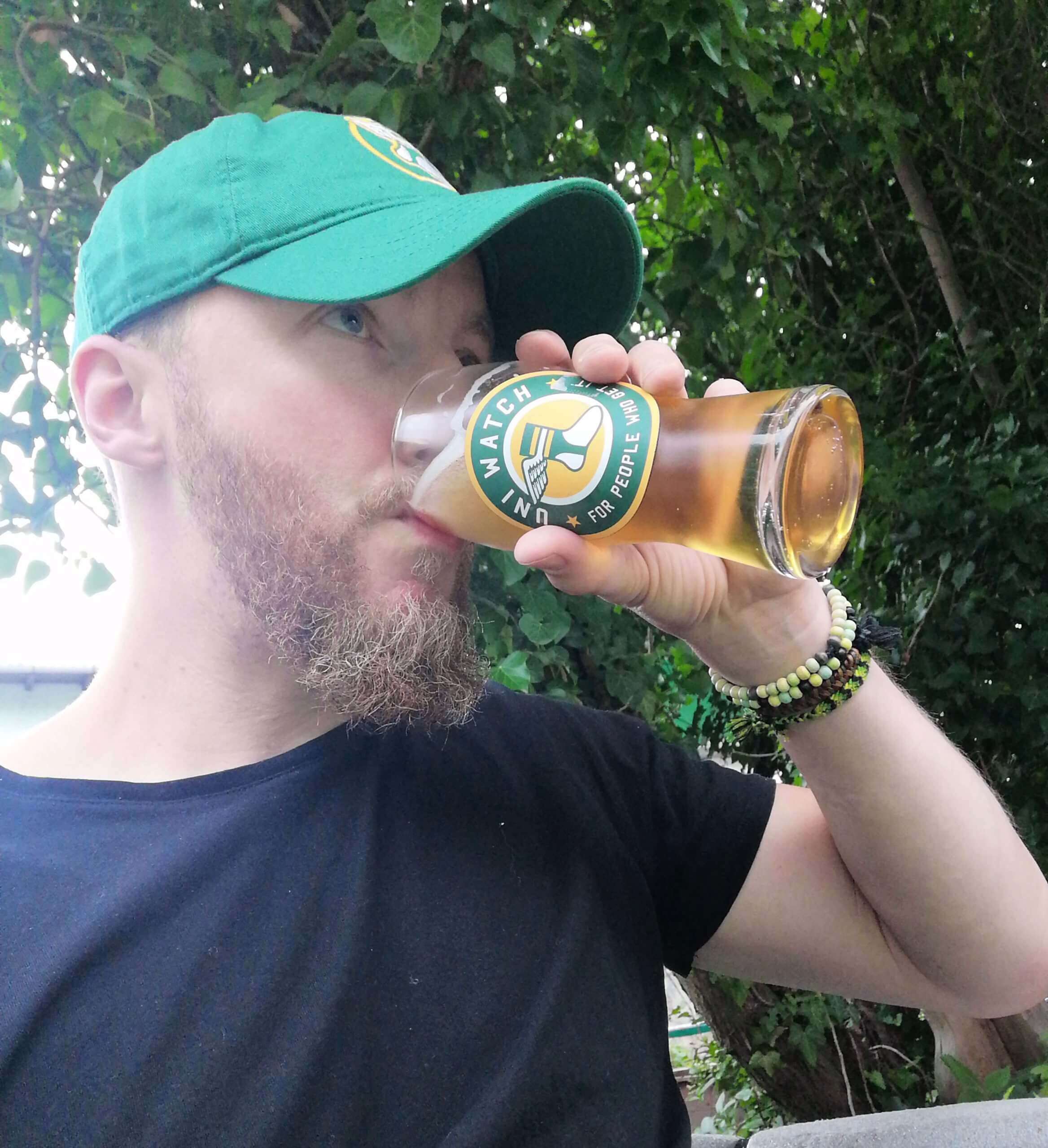
ITEM! PPPC Day pics: Meet Uni Watch reader Basti Scherer. Basti lives in Florstadt, Germany, and is almost certainly our most devoted (or only?) German reader. How devoted? So devoted that he participated in yesterday’s Post-Pandemic Porch Cocktails Day festivities, as Uni Watch readers celebrated our return to some semblance of normalcy after the long pandemic shutdown. In fact, considering the time difference, there’s a good chance that Bassti was the very first reader to take a PPPC selfie yesterday — nicely done! (Side note: Look closely and you can see that Basti wasn’t drinking from a Uni Watch pint glass. Instead, he put a sticker on a blank glass!)
I’ve emailed with Basti many times over the past few years, but I had no idea what he looked like, so it’s nice to see him as a real person instead of just an email address. That, it turns out, is one of the nicest things about yesterday’s PPPC selfies — they provide a good sense of our comm-uni-ty. Hell, reader Benjamin Engle actually participated while on his honeymoon! You can see all the photos we received — more than 50 of them (ncluding mine) — here.
Please join me in thanking reader Michael Malinowski for dealing with all the photos and uploading them to Flickr. We should probably showcase his photo here as well, yes? Here it is:

Lookin’ good, Mike! Thanks again, and my thanks also to everyone who participated in PPPC Day.
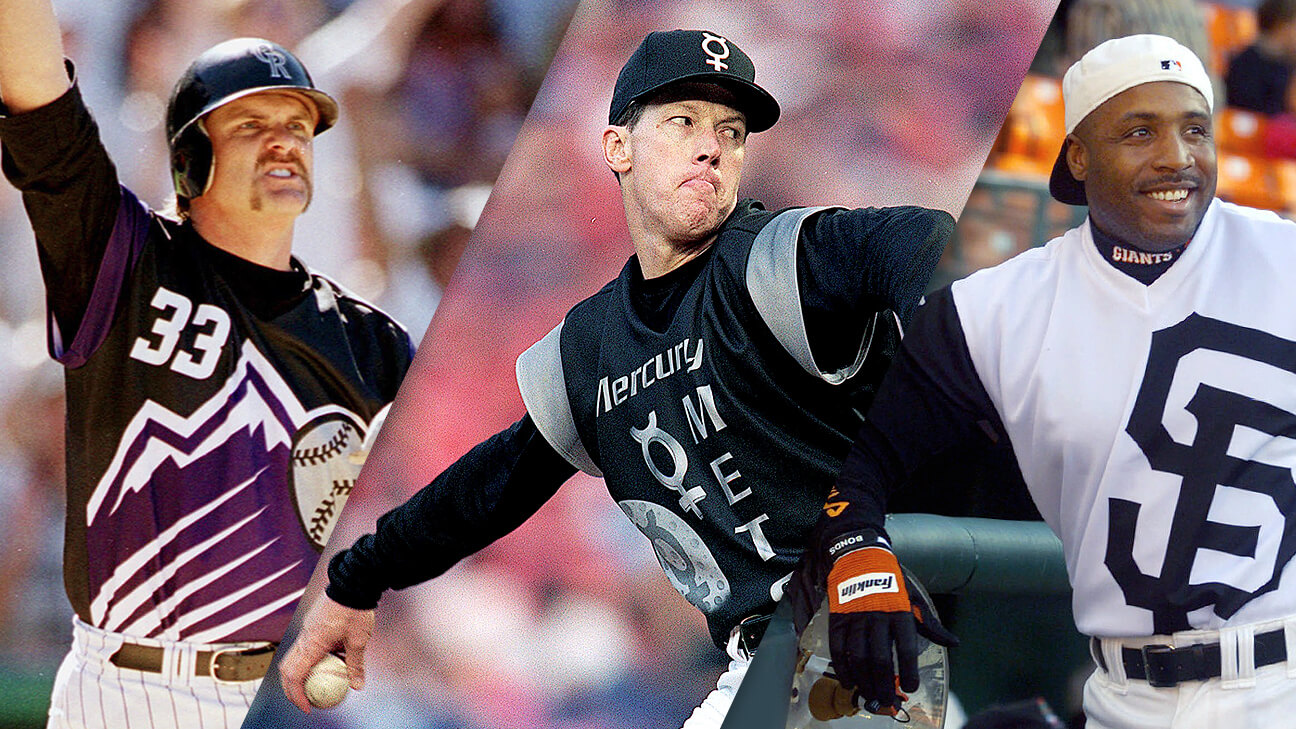
InsideHook/TATC reminder: In case you missed it earlier this week, my latest piece for InsideHook is an in-depth oral history of MLB’s “Turn Ahead the Clock” promotion from 1999. The uniforms were supposed to represent the year 2021 — the future is now! You can check it out here.
The Ticker
By Anthony Emerson

Baseball News: We can add D-backs utility man Josh VanMeter to the growing ranks of MLBers who have their jersey sewn shut (from Alfonso Ferrari). … After a rocky start against the Royals, Reds P Sonny Gray stripped nude in the clubhouse and changed every article of clothing he was wearing except for his cleats. The Reds won 5-2 (from Brice Wallace). … Here’s something I didn’t know: Mike Trout’s MLB debut came on a day when the Angels were wearing California Angels throwbacks. God, those uniforms are so much better than their current set (from @texastrevor). … The Tulsa Drillers, Double-A affiliates of the Dodgers, will become the Tulsa Noodlers for the weekend of Aug. 12-15 (from multiple readers). … The Frontier League’s New York Boulders will host the Israeli Olympic Baseball team for a pre-Olympics exhibition game. The Boulders will wear jerseys with their wordmark in Hebrew for the game (from John Cerone). … A Georgia Tech baseball jersey is currently in outer space aboard the International Space Station (thanks to all who shared).

Football News: The Eagles apparently considered a redesign in the early 2010s. The Liberty Line blog has the logos and uniforms. Fortunately, if it was real, it was nixed. … Pretty nice new uniform set for Dayton.

NBA News: Yesterday, we ticker-linked a photo of Buffalo Braves C Elmore Smith wearing a strange, numberless jersey. We noted that the jersey had never been worn during a game, but reader Paul Bailey sent us this photo of the Braves indeed wearing that same uniform, from the book Buffalo, Home of the Braves by Tim Wendel. They wore that uniform during the 1970-71 season, but also wore a more recognizable one without the underline that same season. Later that day, reader Matt Beahan sent us two more pictures of that same uniform, including one of the entire team wearing it. … Sticking with the Braves, Matt also sent us an odd Elmore Smith NOB from later in his career with the Braves.

Soccer News: The latest in Manchester United kit leaks: the official photos of the players in the kits have leaked early. Someone find the leaker at Old Trafford! … Bundesliga side Mainz 05 have unveiled their new alternate kits (from Greg Phillips).

Grab Bag: A Michigan man found 158 bowling balls buried in his concrete staircase while doing home renovations (from John Chapman).
That’s a wrap for this week. Enjoy Phil’s weekend content and I’ll see you back here on Monday. — Paul
As a 90s kid/big fan of the Angels in the Outfield film, that uni worn by Trout in his debut will always probably be my favorite Angels uni. More than the 80s look, more than the 60s halo (though not by much), more than the Disney wing, and certainly more than today’s red-on-red. Shame they got the hat logo wrong on that particular throwback iteration.
World Team Tennis still exists. You linked the Wikipedia, where you could find that.
Well, according to Wiki, World TeamTennis lasted from 1974-1978. Then a second league was formed in 1981 with the name TeamTennis. In 1992, the league changed the name to World TeamTennis. So technically the article is correct as written.
Assuming that Eagles proposal is legit, I like the logo, I don’t mind losing the black, and I don’t mind the helmet either but man the uniform itself would not have lasted long.
I had my PPPC as a shower beer after cutting the grass, does that count?
Love the PPPC pics..that Whalers glass from Tim Wood is awesome!
I was a Buckskins fan!
The fact that Ricko designed that logo–so great, by the way–is the cherry on top.
Why the hate for the Eagles proposed uniforms? I love them. I don’t like the helmet and I like their current logo better than that one. But the jersey is innovative and fitting for them. If they had swapped the pants between the sets, they would’ve been much better than their current uniforms.
Dayton FB unis look nice, but jeez, slow down with the video! I get wanting to show them “in action”, but give us a chance to really see the damn things, particularly the helmets. My old eyes can’t keep up! More coffee please!
Oh shoot, I completely forgot about Post PPC! Still setting up a house I bought but haven’t really truly moved into yet, and had to move out of an old apartment…it just completely slipped my mind. Too bad! Cheers anyway!
Can we make PPPC Day an annual thing? Of course we could drop two Ps in future years. Would be interested in small events in NYC as well. Just really enjoyed feeling that community in these photos.
That New York Boulders jersey has the Hebrew written (incorrectly) from left to right. The letters are the correct ones for the Hebrew word for “boulders”, just in the wrong direction.
REe. Pppc photos… why do some have names and others not?
Came down here to say just that. It’s like the Boulders playing in Israel and the Israeli team “honoring” them by wearing uniforms that read “Learsi”
Weird to see another Buckskins mascot. That was ours in High School at Conestoga Valley in Lancaster, PA. I thought we were original.
Glad to see so many enjoyed PPPC Day.
Cheers to the entire comm-uni-ty!
And after Sonny Gray stripped and changed his jersey, the Reds then put him on the IL with a strained ribcage…
Is it just me or do those Eagles proposed unis look a lot like what the Jets current uniforms do now?
Regarding the “proposed” Eagles uniforms: literally not one iota of confirmation that these are anything more than someone’s concept.
Personally, I have a feeling someone is being hoodwinked.
Lee
I was afraid of clicking on the “naked” Sonny Gray link. Then I clicked on the link sent in by Paul Bailey re Buffalo Braves unis and it wanted me to confirm I was 18! What a wonderful world we live in.
Lovin yesterdays photo.
Super fabulous Ricko. And such great use of the raccoon hat as hair/not hair. I absolutely love it.