For all images, click to enlarge
The Royals and Tigers played a Negro Leagues throwback game yesterday in Kansas City — the second such game since Nike took over MLB’s uniform contract. (The first time was a Royals/Cardinals game last September.) How did they do, aside from putting their annoying maker’s mark on the uniforms? Let’s take a look.
The Royals
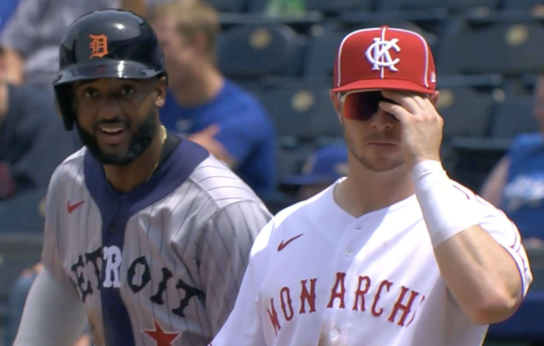
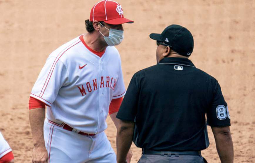
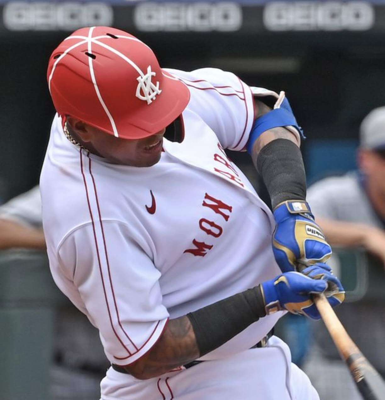
The Royals always dress up as the Kansas City Monarchs for these games, but they typically change things up by choosing different years, different uni designs, and so on. They may have run out of design options, however, because yesterday they appeared as the 1949 Monarchs — a design that they also wore twice in 2006.
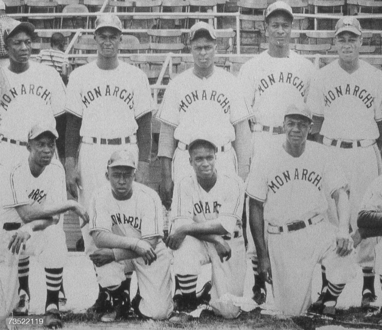
Here’s a look at the original uniform, for comparison:
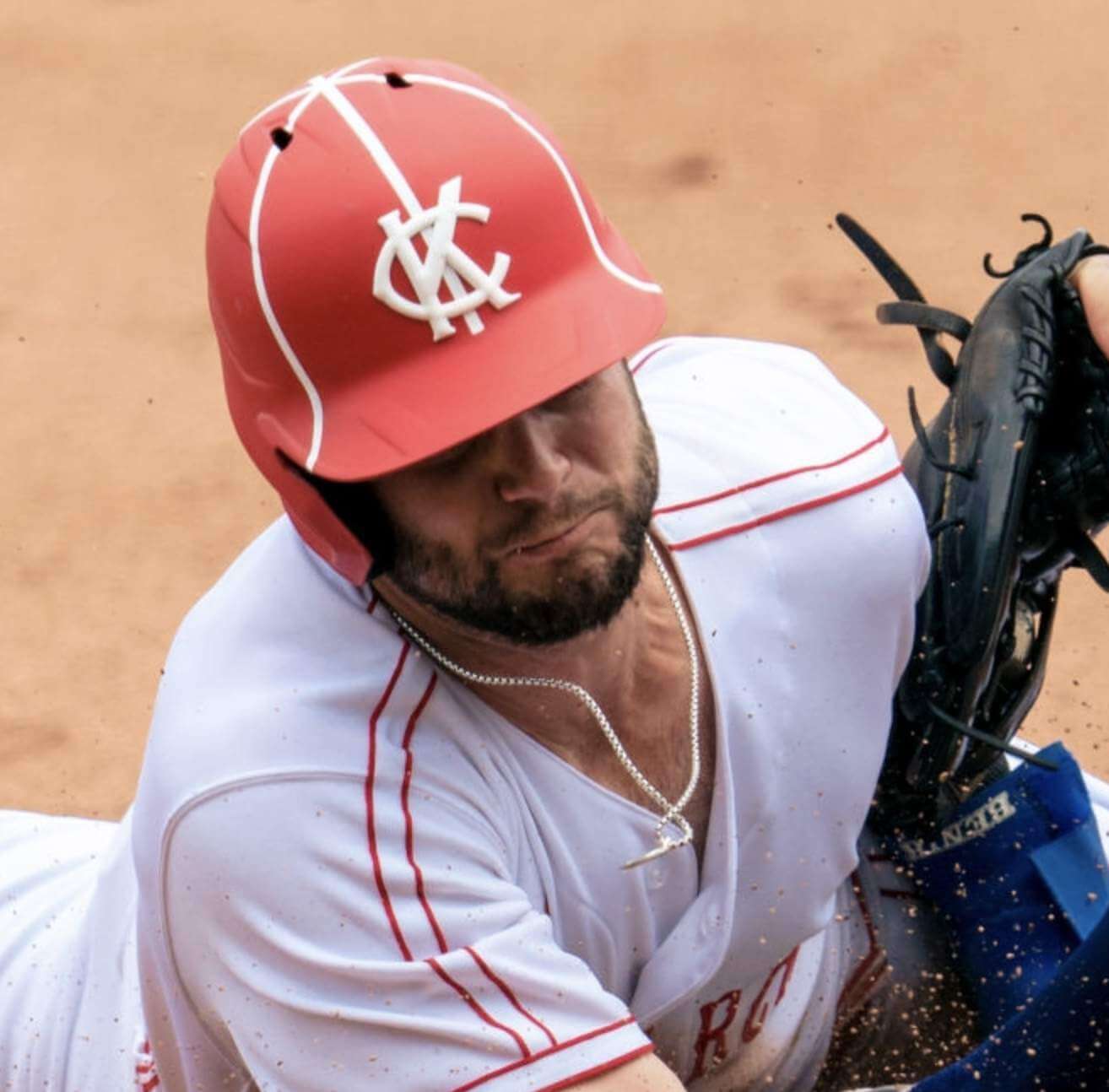
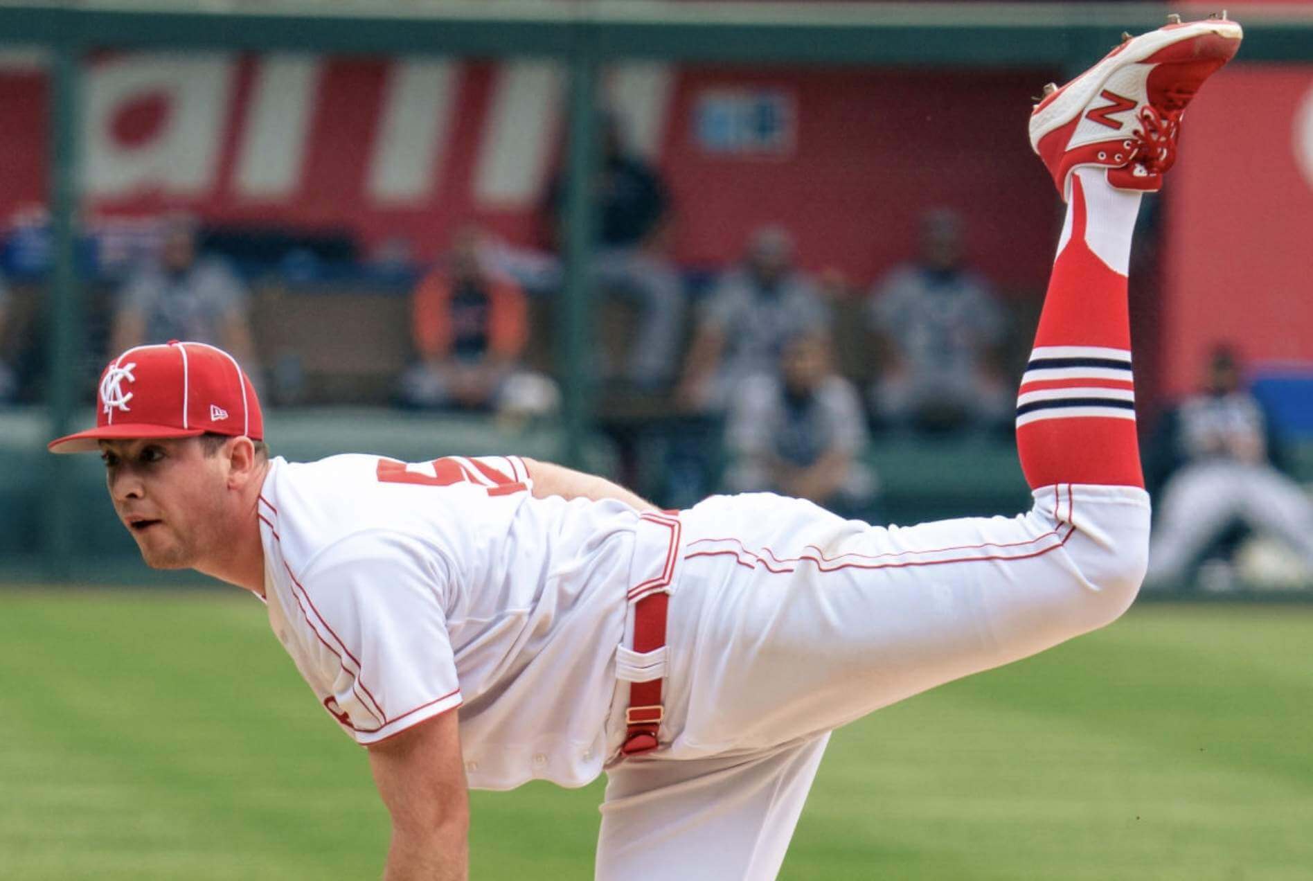
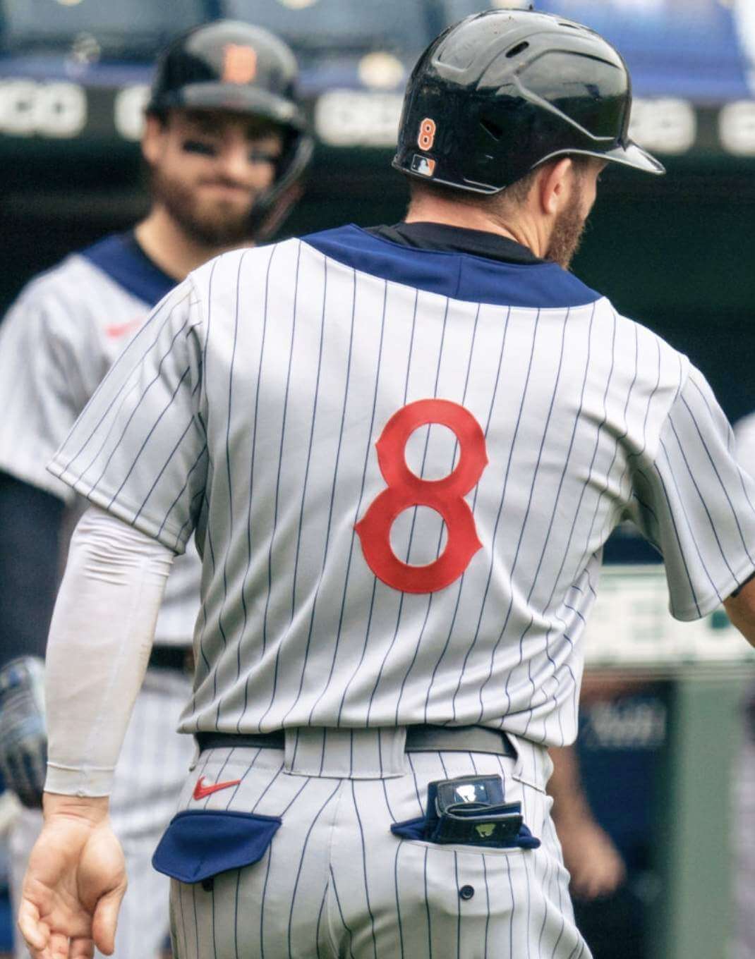
Negro Leagues teams didn’t wear batting helmets, so the Royals were free to make up their own. They chose to duplicate the cap piping on a matte helmet with a raised logo, which I thought looked really good:
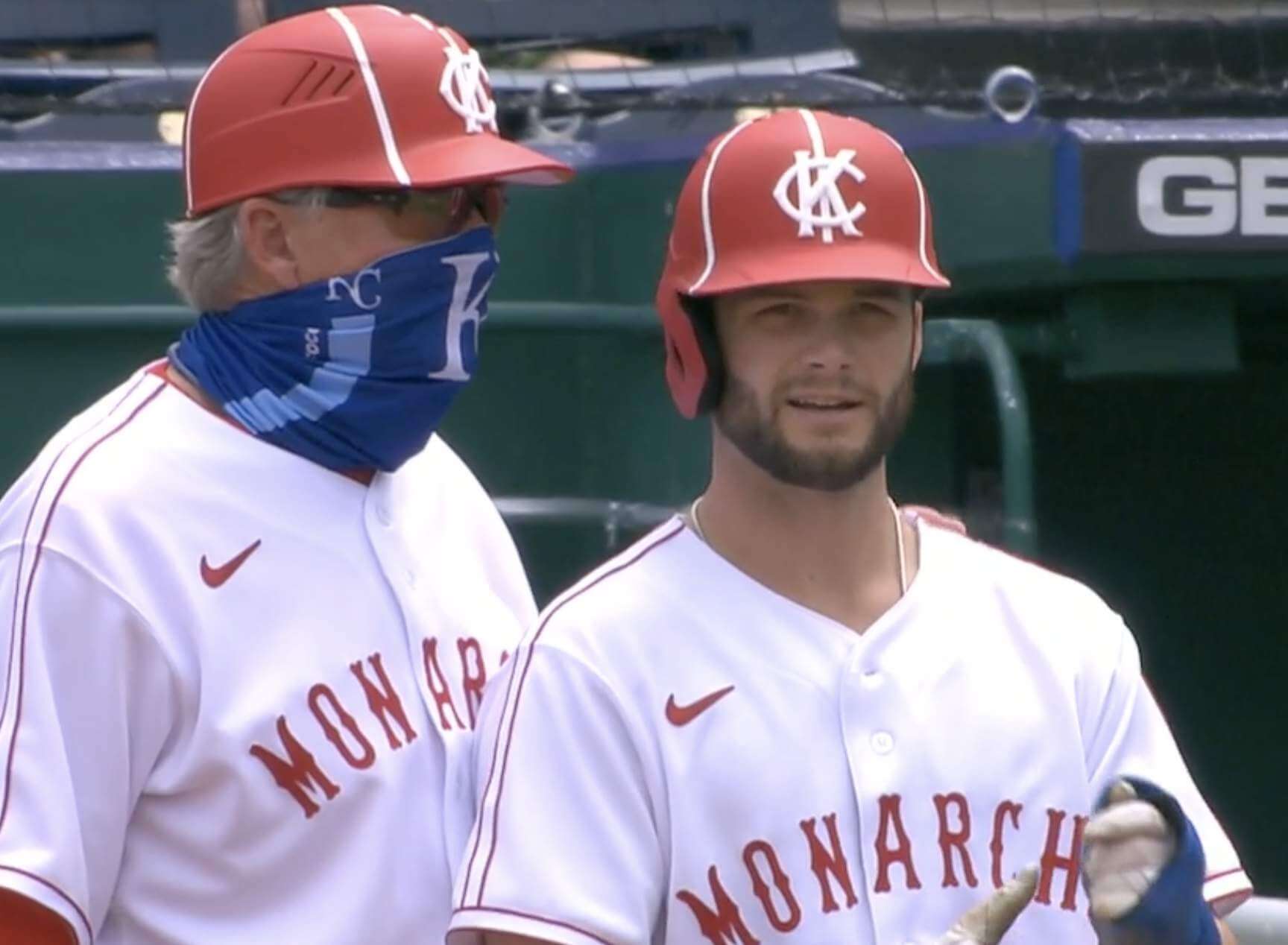
The base coaches got flapless versions of the helmet — but did not get matching masks or gaiters:
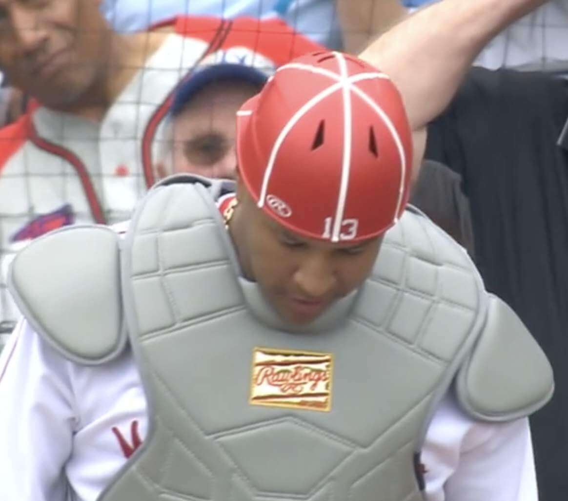
Catcher Salvador Pérez also had a flapless red helmet — but wore his usual blue mask:
Although the jerseys, pants, and caps all had maker’s marks, there was no MLB logo on the back of the jersey or the back belt loop of the pants:
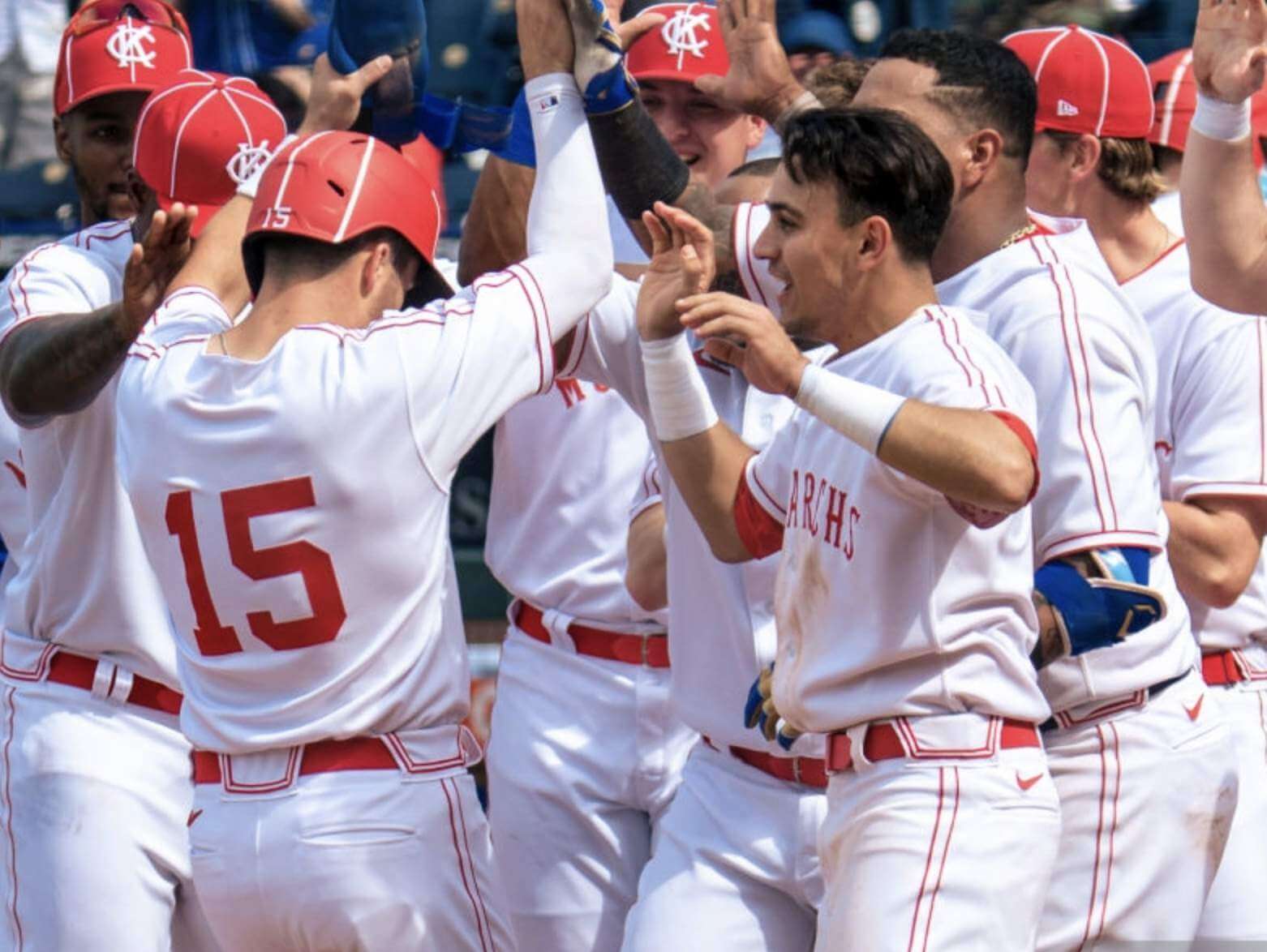
Quite a few KC players went high-cuffed. Most of them wore two-in-ones with a Cardinals-style stripe pattern:
The Tigers
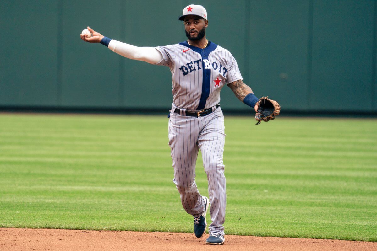
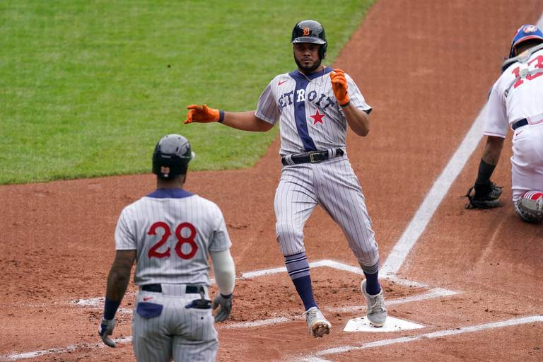
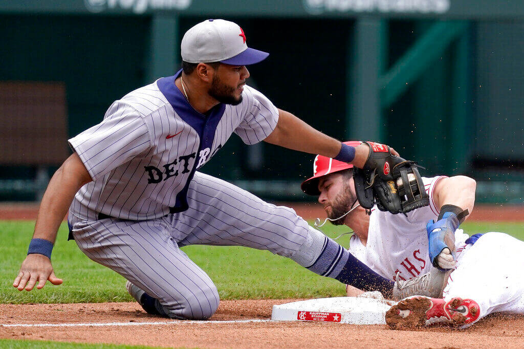
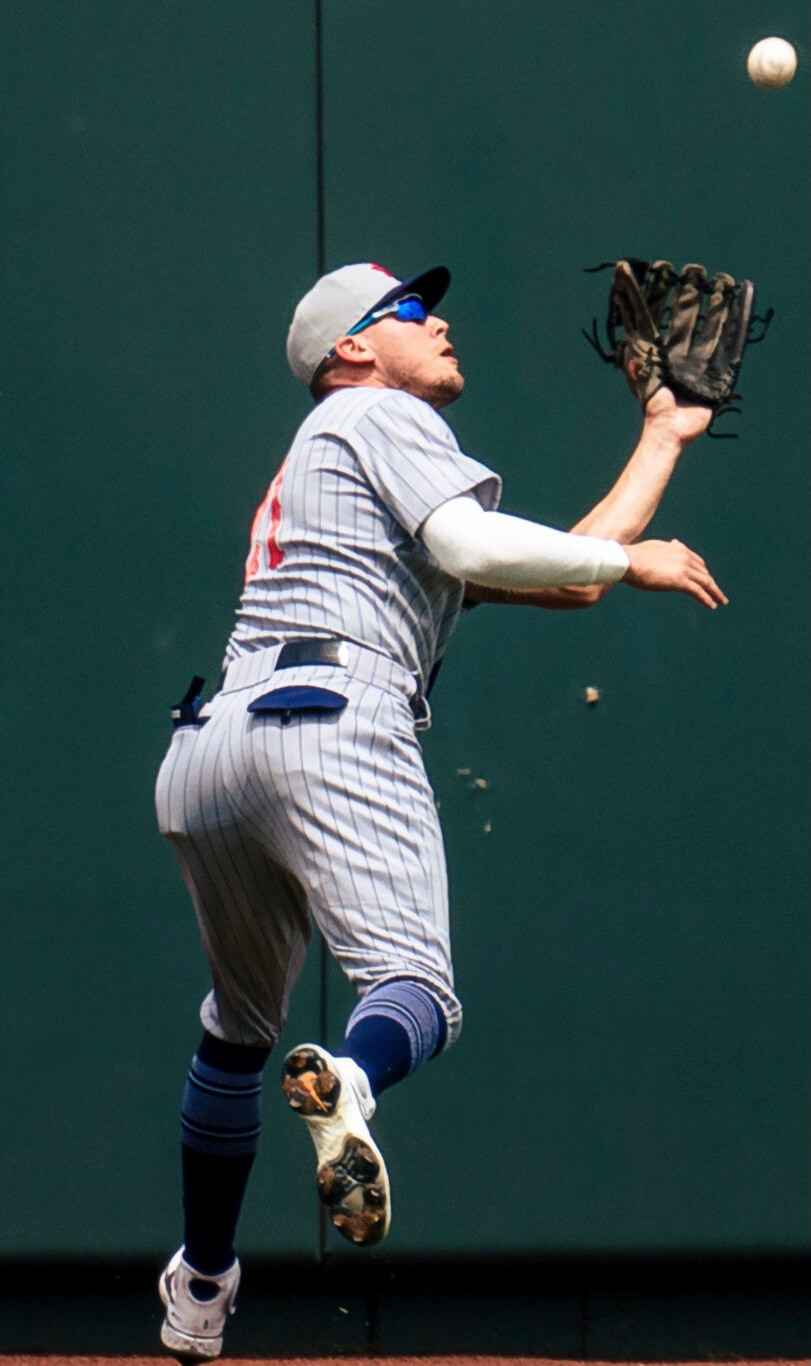
The Tigers dressed up as the 1920 Detroit Stars. According to Bill Henderson’s jersey guide, the Tigers have worn the home version of this uniform 17 times since 1995 (most recently in 2019), but I think yesterday may have been the first time they went with a road grey version. This new version also had thicker, more historically accurate lettering.
Alas, no throwback batting helmets for Detroit:
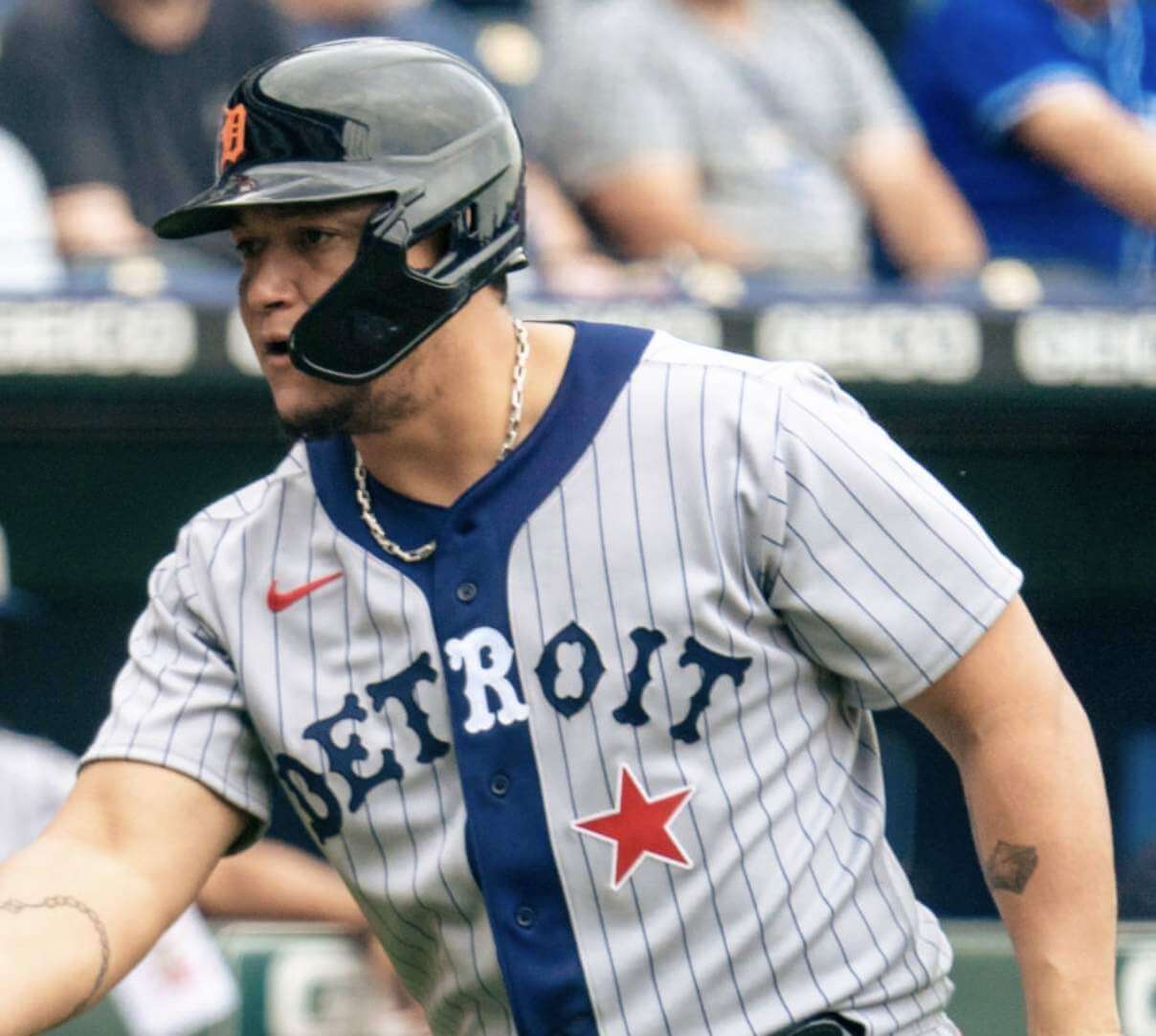
The Tigers’ jerseys and pants, like the Royals’, did not have the MLB logo on the back. And in a nice touch, the pants had period-appropriate contrasting-colored rear-pocket flaps — with functional buttons!
Detroit players who chose to go high-cuffed wore a very nice sock design that paired really well with the rest of the uniform:
The Extras
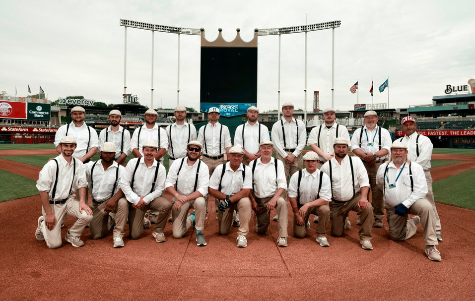
As you can see above, the Kauffman Stadium grounds crew went throwback as well. (I think they always do this for the Negro Leagues games.) Unfortunately, I wasn’t able to find an “action” photo of them.
In addition, the Royals usually invite fans to dress in their period-appropriate “Sunday best” for these games. Here are some folks who obliged:
#DressedToTheNines indeed!#TogetherRoyal pic.twitter.com/WtOrwOImd6
— Kansas City Royals (@Royals) May 23, 2021
All in all: Not bad, except for the miserable swooshes. You can see more photos here and here, and here’s a bit of video so you can see the uniforms in action:
Gray NBA official uniform causing some issues here early in the postseason for Russell Westbrook and the Washington Wizards against Philadelphia.@UniWatch pic.twitter.com/wEKTOWlwjZ
— Wes Brown (@W_Brown21) May 23, 2021
Oops: The Wizards’ grey uniforms, aside from looking awful, are the same color as the referees’ jerseys. That apparently explains why Wiz point guard Russell Westbrook mistakenly passed the ball to a ref during yesterday’s playoff game against the 76ers (who were wearing their black City alternates, making this an unusually bad-looking uni matchup).
(Thanks to Wes Brown and Gordon Blau for this one.)


ITEM! New membership raffle: Reader Cesar Duran recently donated funds for a membership, so we’re going to raffle that off today.
This will be a one-day raffle. No entry restrictions. To enter, send an email to the raffle in-box by 8pm Eastern tonight. I’ll announce the winner tomorrow. Good luck!
The Ticker
By Jamie Rathjen

Baseball News: Part of Dodgers P Phil Bickford’s jersey number was coming off yesterday (from Mandy Lopez). … Here’s an old photo of Dodgers manager Tommy Lasorda wearing a jacket with his last name misspelled. An eagle-eyed commenter in this Uni Watch entry from 2010 tells us that occurred June 15 of that year (from Chris Glover).

Hockey News: The Jets usually do whiteouts for playoff games, but Canadian teams still can’t have fans in attendance, so the team recreated the whiteout effect with towels or seat covers (from Wade Heidt).

Soccer News: The only Premier League club to both reveal and wear a new shirt for the first time yesterday was Leicester City. It marks the first time since the current owners took over in 2010 that the shirt’s front ad isn’t for the company they also own (also from Kary Klismet). … Manchester City turned their ads gold to celebrate winning the Premier League. … Germany’s RB Leipzig also revealed and wore a new second shirt (also from Kary Klismet). … Tottenham Hotspur released their new first shirt this morning. … In Italy, Sampdoria wore a sleeve patch for the 30th anniversary of their 1991 Serie A win. … The UEFA Women’s Champions League is to be structured more like its male counterpart next season, so it got an updated logo. The article also refers to said male counterpart as the UEFA Men’s Champions League, which is an interesting development. … Tottenham Hotspur winger Gareth Bale and Manchester City right-back Lucy Bronze teased an initiative yesterday with variations of the phrase “hope beats hate” and videos of them putting on black shirts seen from the rear. It’s for Hope United, a campaign by the broadcaster BT against abuse of players online. … One more from Kary Klismet: Vélez CF, in the Spanish men’s fourth tier, held a contest for a mascot, with the winner an owl.

Grab Bag: Another Australian Football League Indigenous design, for Brisbane, uses the color scheme and logo of one of Brisbane’s predecessors, Fitzroy, while adding a second white version. Designer Chris Johnson, who played for both teams, called it “the first ever Fitzroy Indigenous guernsey.”
are negro league throwbacks….racist? Seems to glorify segregation…js
These uniforms are not “glorify[ing] segregation” any more than a lecture about the Holocaust is “glorifying” genocide. Throwback games are history lessons — simple.
“glorify segregation”? Quite the opposite. Wearing the Negro League uniforms is a powerful reminder less than 75 years ago blacks were banned from playing in MLB solely because of the color of their skin. It’s also a way to honor these players for their contribution to the game. It’s a valuable visual history lesson on baseball.
In a word: No.
The question is not ridiculous, and it’s worth asking. But the context and framing of MLB’s Negro Leagues throwbacks to date steers well clear of any matters of glorifying or reifying segregation. Rather, Negro Leagues throwback events glorify the Black response to and struggle against segregation, and situate players and fans alike in the point of view of a victim of that segregation. Exactly the opposite of glorifying segregation or enacting past racist practices.
A throwback event that recreates one of the many unofficial games between white teams and Negro League teams, however, would raise Steve’s question for me. It’s one thing if a home team wears Negro Leagues throwbacks and fails to outfit the visiting team. But recreating an actual white-vs-Black game from segregation times, that would put half the players and spectators in the position of rooting for a segregated white team identity versus a segregated Black team, and that would be at least problematic in my eyes.
Also, throwback games to pre-1947 segregated white baseball teams increasingly strikes me as problematic. At least if the event is carried off without any prominent acknowledgement of the fact of segregation and racial exclusion by the teams in question. As much as I’d love to see a throwback game to the 1924 World Series sometime when the Giants play the Nats – as the teams did in Washington in 2012 – such an event would need to front-burner the segregated nature of the event being honored.
Such a throwback to pre-1947 Major League Baseball teams should be identified and marketed as a White Leagues throwback similar to how the Tigers-Royals game was called a Negro Leagues throwback, no?
No. After the demise of the Federal League in 1915, Major League Baseball was composed of The National League and The American League. That composition remains. In the interregnum 1915-1947, there were numerous Negro leagues that almost uniformly identified themselves using the word “Negro.” Now, if you wanted to pick very small nits you could make the pitch that there should only be throwbacks to the Negro Southern League or the American Negro League, I’d be on board. Those throwback games would have very few qualifying MLB cities for participation, however.
My brother is interning with the Royals grounds crew. I’m disappointed he didn’t join the fun this weekend but he was apparently off and wasn’t aware of the fun they had planned.
Could the KC Monarchs uni rerun be related to the new minor league Kansas City Monarchs? The new Monarchs have the blessing from the Negro Leagues to use the name and logo.
Has anyone gotten used to the location of the nike mark yet? The location of it feels so intrusive, especially on those great Negro League uniforms. In comparison to the NBA and college football, in both of those sports you often had various patches or logos in the similar location on the chest. That space in baseball typically isn’t used. You could make the mark two or three times bigger if it was on the sleeve and it wouldn’t feel nearly as intrusive to me.
My eyes go right to the Nike swoosh every time I look at a jersey. I try everything in my power to not look at it, but I do. Every. Single. Time.
I guess from Nike’s point of view, they want their logo to be as “intrusive” as possible.
It’s gotten depressingly normal to my brain, except for those teams where it looks like an accent mark on the front script.
So much stylistic goodness in that game in KC. Three in particular that I’d like to see one or a few MLB teams adopt:
1: Contrast-color placket
2: Cap seam stripes
3: Neck-to-cuff shoulder stripes
…and one which should never resurface full-time again:
Gray Road Caps.
NBA. One team needs to be in white all the time. But more urgently, referees need zebra stripes.
But more urgently, referees need zebra stripes.
YES
I came to say this too about the referees… simply having a zebra stripe jersey on hand would make this a moot point.
Here is a link with more information on the Tommy Lasodra…err…Lasorda jacket.
link
I believe the actual jacket was on eBay a couple of years back. The description then said it was presented by the Giants to Tommy, which seems odd except for the misspelling.
“The Wizards’ grey uniforms, aside from looking awful, are the same color as the referees’ jerseys. That apparently explains why Wiz point guard Russell Westbrook mistakenly passed the ball to a ref during yesterday’s playoff game against the 76ers (who were wearing their black City alternates, making this an unusually bad-looking uni matchup).”
Nah, Russ just made that awful pass because he’s Russ. Happens in red, blue and white unis too. As a Wizards fan, trust me. That happens at least once per game.
I understand the corporate logos on uniforms are not desirable, but why are you inclined to incessantly disparage them? Are not podcast advertisements and site posts with merchandise links serving the same purpose and equally denigrating to the artistic product?
You seem to be suggesting that all forms of advertising are equivalent and thus equally justified, regardless of context or venue.
I happen to disagree, strongly, for reasons I’ve already spelled out countless times on this website.
I’m surprised this argument scans for people — this site has ads, and MLB has ads. There are places in each that where I would/do get bummed out seeing them intrude.
If Paul started putting ads inside of every other sentence, it would be different than putting some banners in the margins. Similarly, I was raised on baseball with commercial breaks in the broadcasts and corporate logos around the stadium…but I’m going to notice, and maybe have a very strong opinion, when that beautiful green field I’ve grown to love and associate with the sport gets drenched in big, pink T-Mobile logos. (Which we hopefully never see, but I can’t pretend I haven’t seen some rugby pitches around the world).
I have to say, I LOVE the elegant thin double piping running off the shoulders and down the arms (pants and belt loops too) on the Monarch throwbacks. I’m little surprised (and a lot disappointed) that no team has gone with that look in modernity. Marvelous.
Those KC batting helmets (and the caps) are magnificent!!
I don’t like raised logos on a helmet.
Except in this case.
If you’re replicating the look of a cap for a team that didn’t have batting helmets, then you have my blessing.
The question I always have about any throwback games is why don’t the umps wear throwbacks? It would be interesting.
I completely agree. The NFL has had officials wear throwback unis for throwback games, but the not the other major pro sports. Disappointing!
NHL had its 75th Anniversary in 1991-92. Refs wore throwback sweater and tie in at least one if not more regular season games featuring original 6 teams that year.
Opening regular season game of 1991-92 season. Toronto vs. Montreal:
link
Thanks for setting me straight, Wade!
That opening night footage is significant for other reasons too: 1) it was a color on color game (Mtl red hosting Tor blue), 2) both teams wore blue helmets (which don’t seem to have created the issues that caused one team to change to white lids mid-game years later when both Mtl and NYR wore blue helmets), 3) with so many refs still going without helmets in 91-92, why did they use Andy van Hellemond who looked so clunky with a black helmet stop that classic outfit…where was Kerry Fraser? and 4) Pat Burns looked fantastic in his throwback sweater behind the Mtl bench while poor Tom Watt might have had his best Leaf memory in his snazzy hat (I kid Watt, a one-time Jack Adams winner, but he won 1 playoff GAME in 7 seasons as head coach and only made playoffs 3x in a league where 16/21 teams qualified). Following this season, he was replaced by…Pat Burns. All in all, tons of quality sartorial and uni-goodness in that clip. Thanks for referencing.