[Editor’s Note: Today we have a very special guest column from none other than Keith Olbermann, sports journalist and commentator, who has written a special piece for Uni Watch detailing one of baseball history’s more elusive pieces of apparel: the 1974 two-tone BoSox cap. Please click any of the images below to enlarge. Enjoy! — PH]
The Famous Disappearing Red Sox Cap of 1974
by Keith Olbermann
When they appeared out of nowhere on Friday, April 19, 1974, they were derided by one Boston Globe sports columnist as part of “the final indication that the world as we’ve known it has gone cartwheeling off toward hell.” One of the players forced to wear them suggested that all they were missing was “a little white propeller on top.” When they disappeared not even three months after their debut, yet another Boston Globe sports columnist provided a stinging epitaph. Invoking the disastrous ’50s car brand on which Ford had lost the equivalent of $2,285,178,000, he wrote they had been “put in the land of the Edsel.”
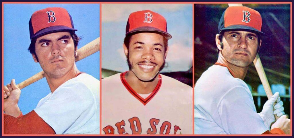
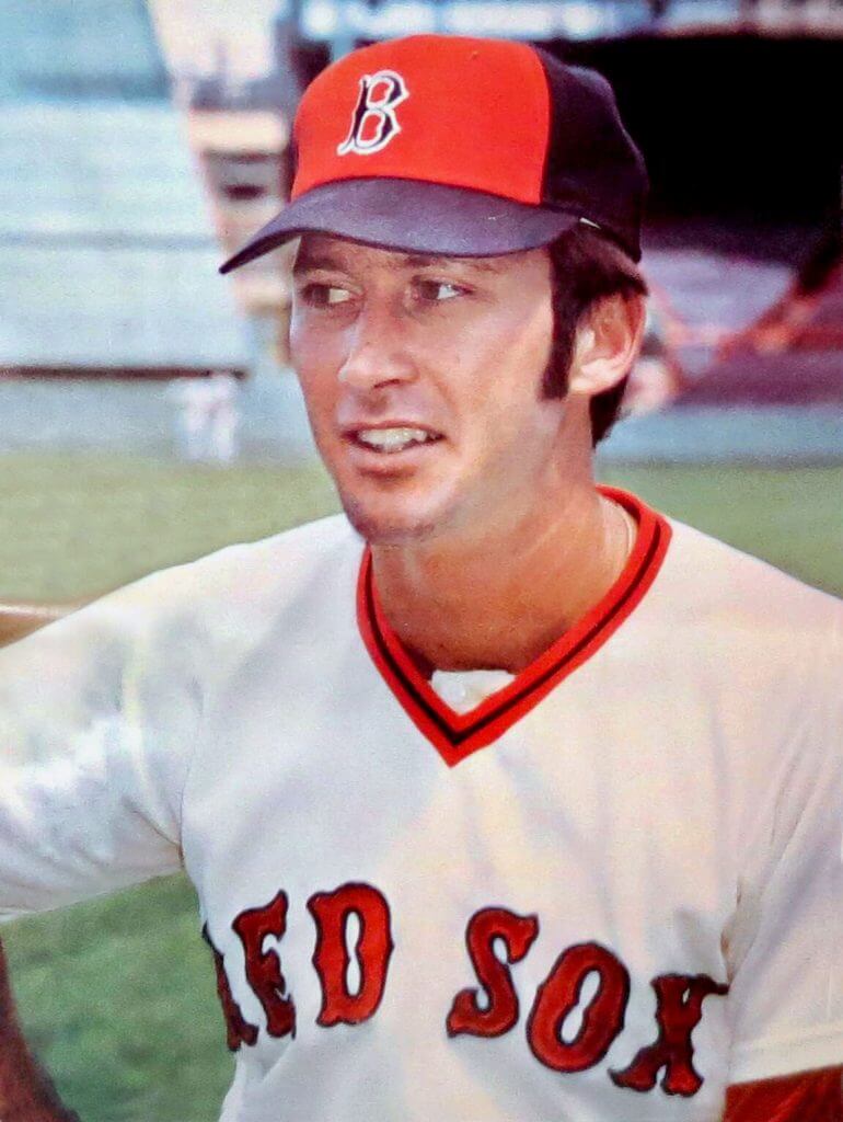
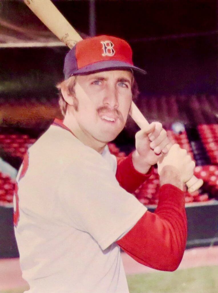
They were the curious multi-paneled 1974 Boston Red Sox caps with a dark blue brim, dark blue sides and front, and most notably, a bright red front panel with the traditional Boston “B” in dark blue outlined in white. Today they are seen as a harbinger of the red caps with black bills that the Red Sox would wear in the ’75 World Series and through the Bucky F. Dent game that ended their 1978 season. They are at worst a curiosity and at best pretty popular throwback gear for which fans of The Olde Towne Team clamor.
But in 1974, they were the worst thing since the sale of Babe Ruth to the Yankees.
From the day Tom Yawkey bought the franchise in 1933, the Red Sox had worn basically the same uniform. The cap was some variant of dark blue, navy, or black with a red “B” on it. The “B” got larger or smaller, wider or narrower, as the years wore on. For the 74th Boston American League home opener – delayed by rain and snow until April 11, 1974 – there was no change and no sign any was coming. The uniforms had gone from flannel to double-knit the year before but there was no practical alteration to the team’s “look,” just as there had been none since “Boston” went from red to dark blue on the road shirts in 1938. The Red Sox played the opener against Baltimore and then four against the Tigers before hopping to New York for their first games at Shea Stadium on April 16, 17, and 18. Then they came home to face the Indians.
That’s when all hell broke loose.
There are no known photos of the Red Sox in the new red-front caps from their first use in a matinee at Fenway in which Reggie Cleveland beat Cleveland, 6-3. Only an Associated Press wire photo made the Globe the next day, and was printed in dozens of newspapers around the country. It showed Boston’s Bernie Carbo sprawling after Dick Tidrow had plunked him with a third-inning pitch (of course he had: Carbo had homered in the first; for the record, on that date Tony LaRussa was playing for the International League team in Charleston, West Virginia). But Carbo was wearing the unchanged bluish-black Boston batting helmet.
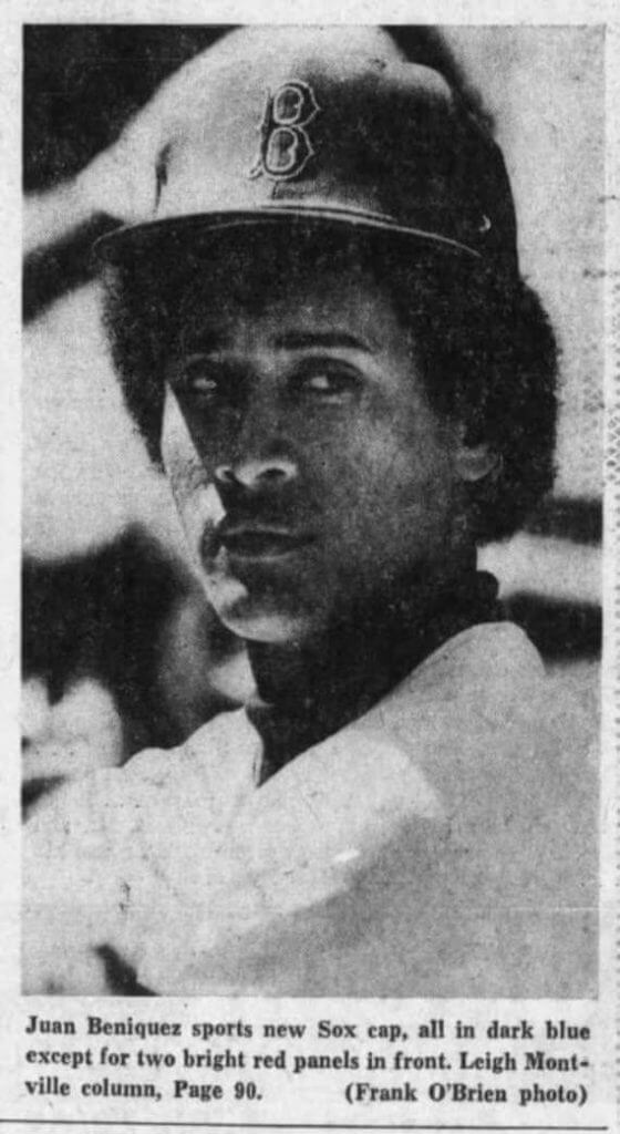
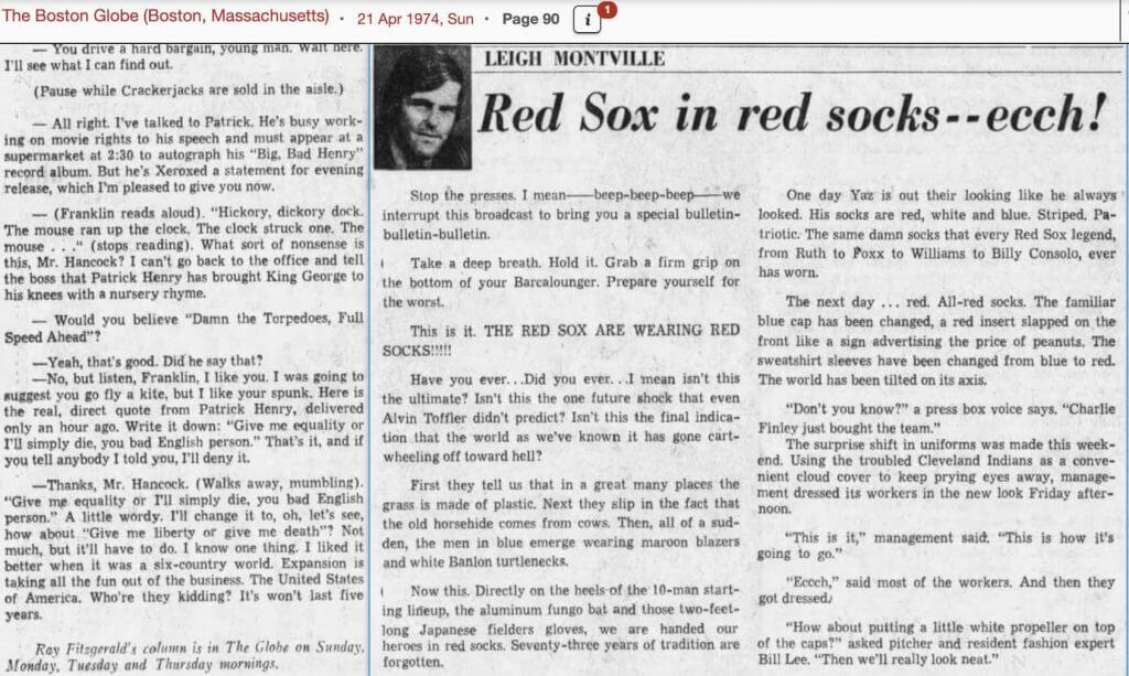
Like a tsunami caused by distant seismic unrest, it actually took two days for the impact of the uniform heresy to fully hit. The front sports page of the Sunday Globe of April 20th showed a close-up photo of a young Red Sox outfielder. “Juan Beniquez sports new Sox cap,” reads the caption, “all in dark blue except for two bright red panels in front. Leigh Montville column, Page 90.”
Leigh Montville’s column! That’s the historical testimony to the immediacy and the virulence of the local reaction to the caps. Page 90 shows a teenaged boy blowing a bubble and is gently captioned “Dark blue Red Sox caps, like this one worn by young fan at Fenway Park for Indians’ game yesterday, are now strictly out of style.” Below it, the then-30-year old novice columnist wrote with the kind of scorn and sense of violation last used when British soldiers shot some locals in 1770.
Remarkably, his first target wasn’t the caps.
“Stop the presses,” Montville began. “I mean – beep-beep-beep – we interrupt this broadcast to bring you a special bulletin-bulletin-bulletin. Take a breath. Hold it. Grab a firm grip on the bottom of your Barcalounger. Prepare yourself for the worst. This is it. THE RED SOX ARE WEARING RED SOCKS!!!!!! Have you ever … Did you ever … Isn’t this the final indication that the world as we’ve known it has gone cart-wheeling off toward hell?”
He went on like this about the all-red socks for several paragraphs, feeding a misconception that Boston’s teams had always worn socks that were a mix of red and white with two prominent horizontal blue bands at the top (they hadn’t; they wore all reds, or mostly reds with some white, from 1908 through 1932 and again in 1935). But Montville’s ire about the socks was mere prelude anyway. In paragraph eight he finally got to what would be the focus of the spring and early summer of discontent:
“The familiar blue cap has been changed, a red insert slapped on the front like a sign advertising the price of peanuts. The sweatshirt sleeves have been changed from blue to red. The world has been tilted on its axis. ‘Don’t you know?,’ a press box voice says. ‘Charlie Finley just bought the team.’ The surprise shift in uniforms was made this weekend. Using the troubled Cleveland Indians as a convenient cloud cover to keep prying eyes away, management dressed its workers in the new look Friday afternoon. ‘This is it,” management said. ‘This is how it’s going to go.’ ‘Eccch,’ said most of the workers. And then they got dressed.”
At this point Montville introduced Bill Lee to his column, and to the legend of player protest against the new caps. It would later be said that to show his displeasure, Lee would go onto the Fenway field wearing a cap with a propeller on top. There is no evidence supporting this, only legend. But now we know where the legend began. “’How about putting a little white propeller on top of the caps?’ asked pitcher and resident fashion expert Bill Lee. ‘Then we’ll really look neat.’ The effect on the viewer is unbelievably upsetting. It is like leaving your wife in the morning as a brunette and finding her upon return as a blonde. It is like being stopped by a policeman in puce, like finding a black sedan with the words ‘Yellow Cab’ on the side.”
It is impossible to overstate how much Montville hated the caps and socks. It is also unnecessary; Montville did it for us. “Who painted the Prudential Tower green? Who paved the Common? Who put the Red Sox in red socks? Something serious has happened here. ‘I’ll bet it’s a TV deal,’ Lee said. ‘They probably thought we looked too drab or something. That’s got to be it.’”
To be fair, Montville and Lee were not being all that hyperbolic. I was 15 at the time and remember hearing anecdotally about how much the Boston fans and players hated the new caps. “My” Yankees visited Fenway on May 8 and May 9 and the caps were the talk of the New York telecasts. The angst was not just about the design; there was also this issue of broken tradition, and not just a tradition limited to Boston. The first modern multi-paneled cap had only happened in 1969 when the National League expanded to Montreal. But the Expos’ tricolore was exotic, just like everything about baseball in another country and often in another language. Not until 1972 did any other team take up the idea, and that was the Atlanta Braves, and besides Hank Aaron nobody knew or cared anything about the Atlanta Braves and what were dismissed as their softball uniforms. The A’s adopted their vast wardrobe of glowing uniforms the same year, but Charlie Finley had been screwing around with his team’s attire since the day he bought the franchise. Overlooked in the equation was the fact that the Red Sox were wearing the multi-paneled caps only at home and continued to wear the all-dark-blue jobs on the road. This was not entirely new in baseball history but again it wasn’t until 1972 that modern fans had seen this, when the Tigers’ “D” stayed white at home but turned red abroad.
Still the primary point was the near-universal agreement: the caps looked like crap.
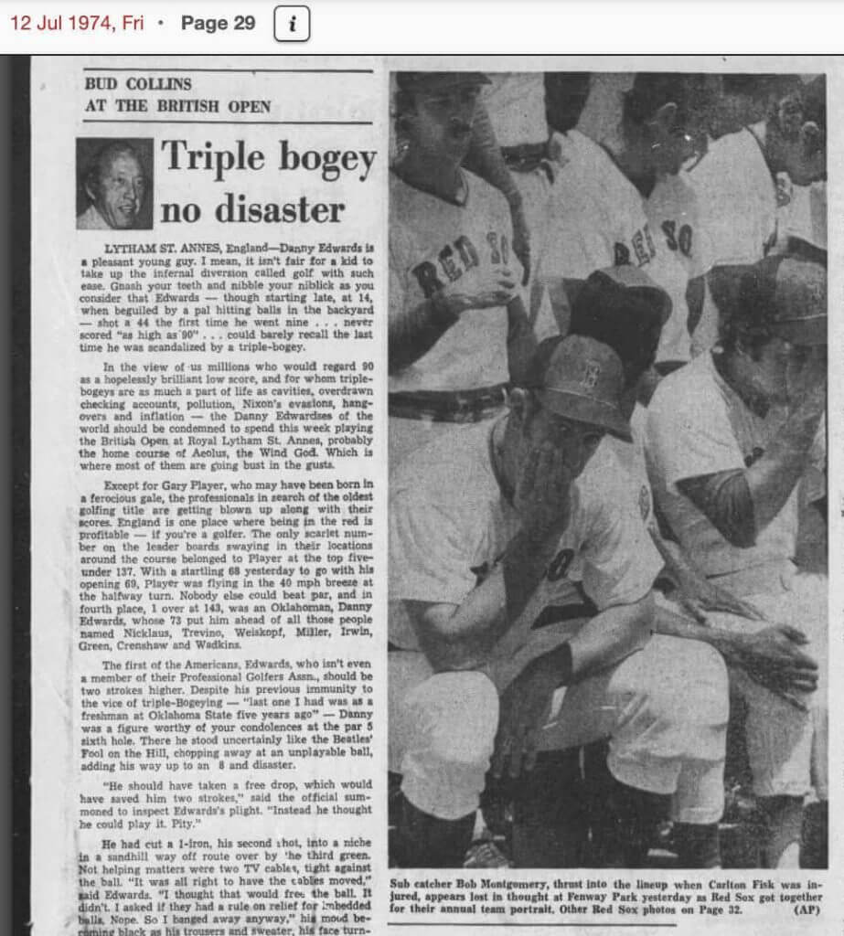
There may be other references to them in the Globe in the next three months of aesthetic agony but I could not find them. There is a non-hysterical reference to them in the May 11th edition of Connecticut’s Meriden Record-Journal, but most of the controversy must be inferred. Two months later, the Red Sox took their annual team photo. The next day, the Globe ran not the traditional shot of the whole squad, but rather a close-up image from the AP in which Bob Montgomery and Rico Petrocelli are literally covering their faces with their hands. A third BoSox player is shown looking behind him instead of toward the camera. The paper’s caption suggested Montgomery was “lost in thought.” The players’ postures actually suggest something closer to suspects trying to avoid being photographed during a perp walk.
Whatever they were really thinking, the July 11 team photo – with the red-paneled caps – has never seen the light of day. Or, at least, I’ve never seen it and have been unable to find it. The “official” team photograph (the one sent to The Sporting News for the 1975 Baseball Guide) shows the Sox in the one-color caps. Rookie catcher Tim Blackwell, called up June 29th to replace the injured Carlton Fisk, is in the team photo available today. And that makes it clear that the Red Sox replaced the first team photo which showed them in the red-paneled caps. It’s only a guess that they wanted to eliminate any evidence of the caps with the red panel “like a sign advertising the price of peanuts,” but that seems a better guess than to believe they re-took the shot just to make sure it included Blackwell.
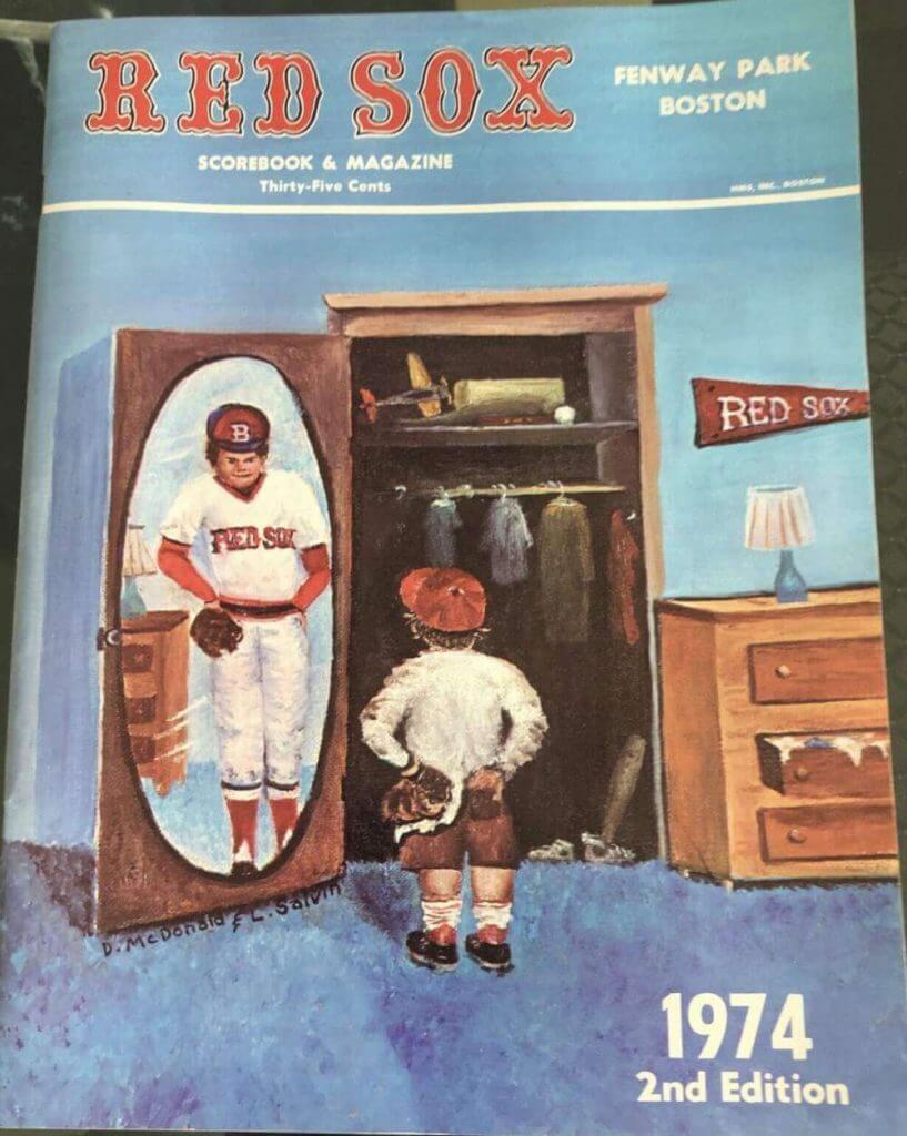
It also seems like too much of a coincidence that there are so few extant color photos of the Boston experiment. The Sox made three versions of their scorecard in 1974. The cover of the first edition is a series of nondescript color photos of the Sox in action at Fenway, and all of the shots were clearly taken in 1973. In the midseason second edition, the cover illustration shows a baseball-crazed boy looking into a full-length mirror. The image he sees beaming back is himself as a Red Sox player — wearing the red-paneled cap.
Not long after, the Sox published their third program of 1974 and the first edition’s cover (and its 1973 all-blue cap photos) has been recycled. The 1975 Red Sox Yearbook, meanwhile, actually shows more than a dozen shots of players in the red-panels. The largest is literally about an inch tall. There are none of the lush full-page color portraits that had marked the Boston yearbooks since 1968.
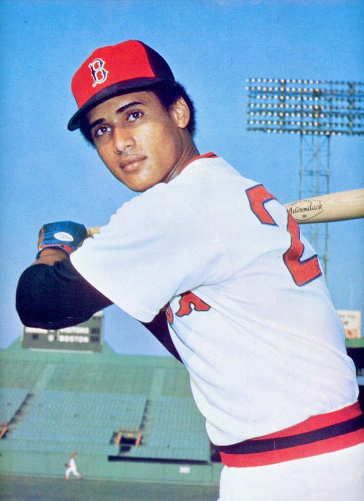
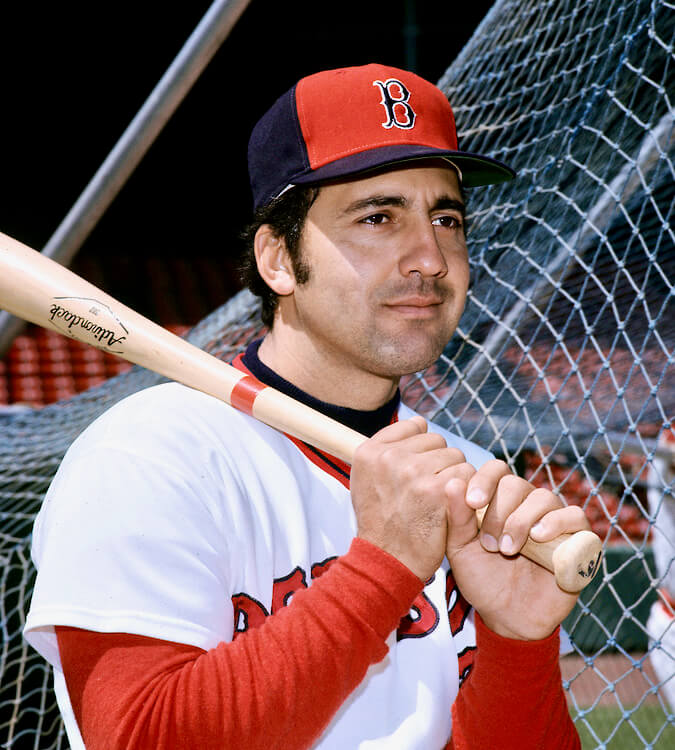
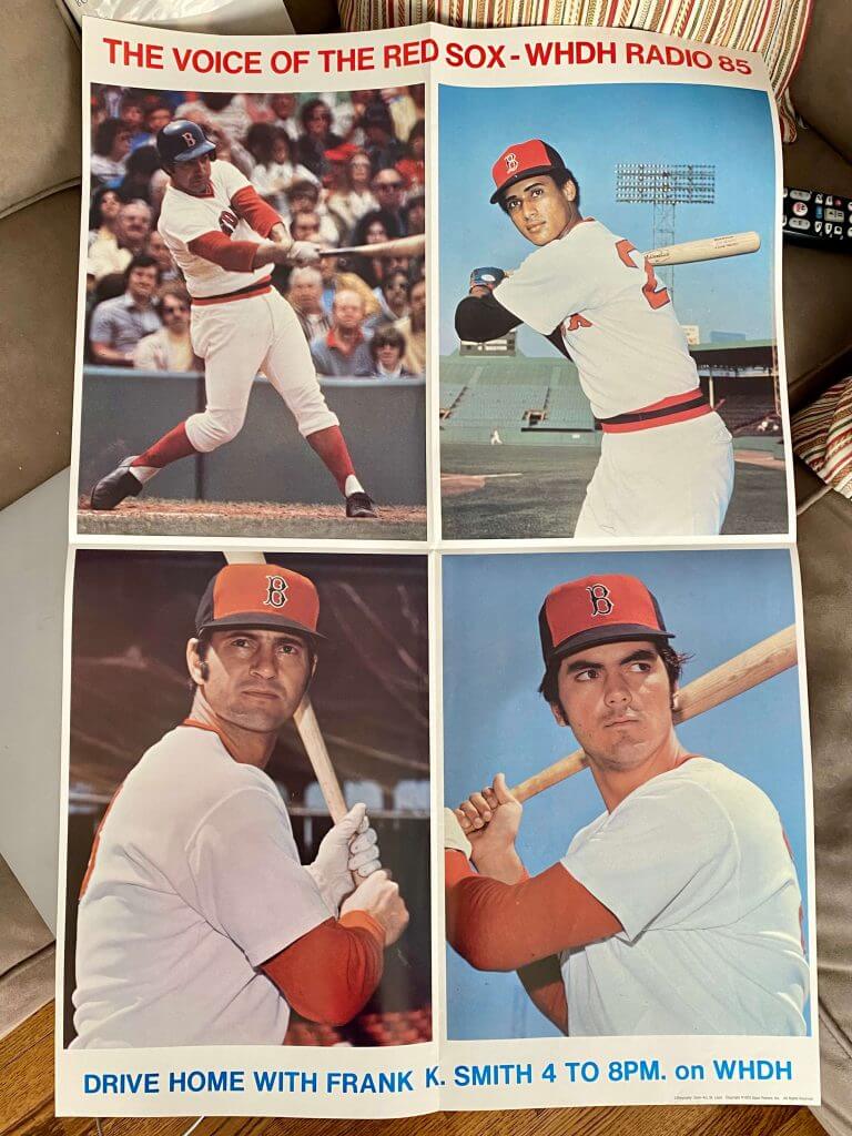
There are no known Topps photos of the red-panels, even though the card company clearly photographed the Sox at Fenway in 1974, as evidenced by the 1975 card of Rick Burleson wearing an all-blue (Burleson did not reach the majors until May ’74). No color photos of the Sox in the experimental caps appear in the exhaustive files of Getty Images. One — of Burleson — pops up in a later promotional photo giveaway by McDonald’s. What photography we do have was unknown to me, and to most others interested in this sort of stuff, until this year. A St. Louis company named Sport Posters did a series of giveaways for the Angels, Indians, Dodgers, Padres, Rangers, and possibly other teams in 1974 and 1975. For the ‘74 Red Sox, they produced four of their huge posters that unfolded to roughly two feet by three feet. Each advertises a different program on the Red Sox flagship radio station, WHDH, and two of them show posed photos of a total of seven Boston players in the ill-fated caps. Some of these photos are shown here.
The photos of the guys and those caps look just fine — now.
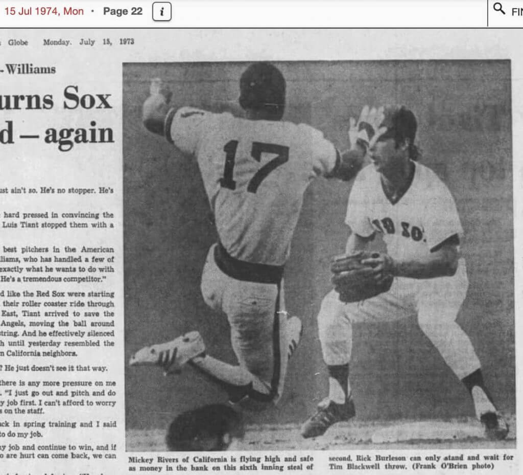
But I can assure you that the day my 15-year old self and my high school friends Dave and George arrived in Boston that summer to see three Yankee-Sox games at Fenway, the caps were still the grumble, if not the talk, of the town. It was Saturday, July 27, 1974, and the Red Sox were just back from a two-week road trip. The last time they and the caps had been seen was in the Globe’s edition of Monday, July 15. Burleson and his cap are shown waiting for Mickey Rivers of the Angels to successfully steal second.
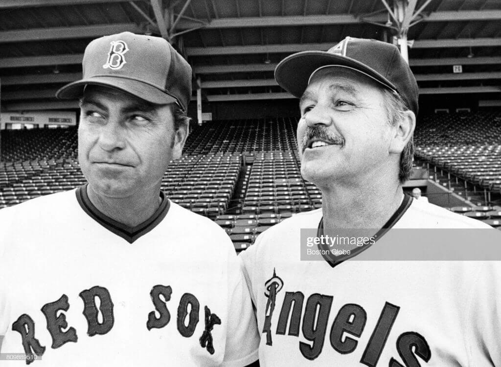
A couple of days earlier, a staged photo of new Angels’ skipper Dick Williams with Boston’s rookie manager Darrell Johnson had gotten nationwide play. Williams is smiling broadly. Johnson – Williams’ pitching coach in 1968 and 1969 – seems to be grinning and bearing his red-paneled cap.
At Fenway on the night of the 27th, to the surprise of me and my friends, the Sox were wearing the same black caps they’d worn at Shea in April. There was no ceremony, no pyre on which the red-paneled caps were burned, and not even an announcement. And it wasn’t even a big topic in the stands. The locals were instead talking about the unexpected presence of Carl Yastrzemski in the Boston line-up. He’d been in the hospital with gastroenteritis the night before and it was a surprise that he wasn’t still there. I recall other adults talking about President Nixon resigning soon or something. I’ve never followed politics.
The three of us teenagers, still smarting at the Yankees’ bottom of the ninth Saturday night implosion courtesy closer Sparky Lyle, finally got the cap answer the next morning in the pages of the Sunday Globe of July 28. No less a figure than my future colleague Peter Gammons came to bury the caps, not to praise them. “Those new Sox hats with the red on the front,” he noted matter-of-factly in his baseball column, “have been put in the land of the Edsel, with the regular caps making their home return last night.”
They had lasted just 39 games, not even half Boston’s home season. There’s no evidence that any of the Fenway souvenir stands or the memorabilia shops around Kenmore Square ever had any available for sale to the public. The Hall of Fame has one, apparently an original, size 6-7/8, which is incredibly small unless you were the batboy. It is not on display; it’s probably in the basement, somewhere near the 1972 Arlington Stadium Beer Vendors’ Tray.
It’s as if the red-paneled Red Sox caps never happened. Which would’ve been exactly what those Red Sox fans of 1974 would’ve wanted.
©2021 Keith Olbermann


Guess The Game…
from the scoreboard
Today’s scoreboard comes from Tyler Nixon.
The premise of the game (GTGFTS) is simple: I’ll post a scoreboard and you guys simply identify the game depicted. In the past, I don’t know if I’ve ever completely stumped you (some are easier than others).
Here’s the Scoreboard. In the comments below, try to identify the game (date & location, as well as final score). If anything noteworthy occurred during the game, please add that in (and if you were AT the game, well bonus points for you!):
Please continue sending these in! You’re welcome to send me any scoreboard photos (with answers please), and I’ll keep running them.

Uni Concepts & Tweaks
Time for more Uni Tweaks from the UW readership.
I hope you guys like this feature and will want to continue to submit your concepts and tweaks to me. If you do, Shoot me an E-mail (Phil (dot) Hecken (at) gmail (dot) com).
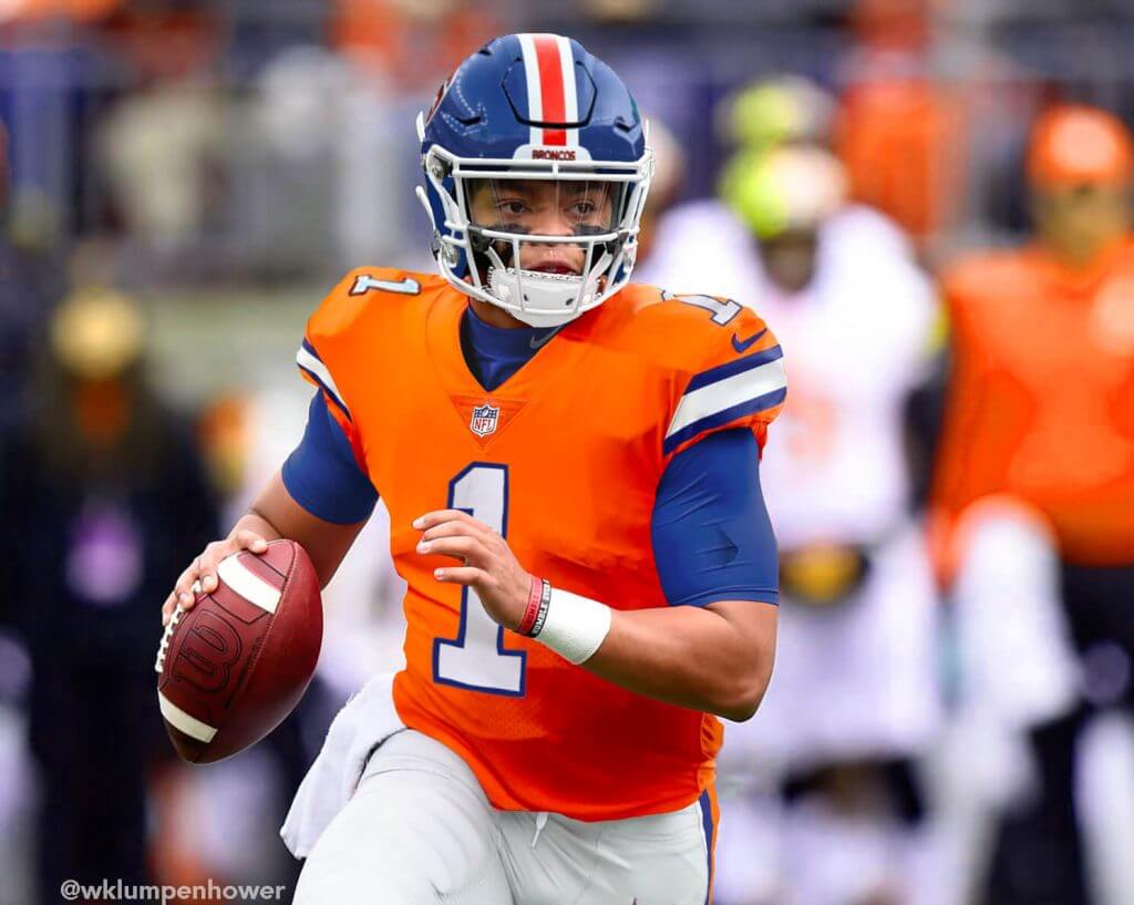
Today’s concepts come from William Klumpenhower:
Hey Phil,
I’m a Broncos fan who is dying for them to return to their uniforms of years past. The thing is, they’ve almost done so! All they need is some minor color changes to their Color Rush unis…
Well, I’ve created my fantasy in Photoshop, with current Bronco star Justin Simmons and (hopefully) future Broncos star Justin Fields. Hope you enjoy!
William Klumpenhower
And here are his concepts:
OK readers (and concepters). If you have some tweaks or concepts, shoot ’em my way with a brief description of your creation and I’ll run ’em here.

Click to enlarge
NBA Power Rankings reminder: Paul here. In case you missed it on Friday, the bar graph above shows how often each NBA team wore each of its uniforms during the 2020-21 regular season (all data from LockerVision). I used that breakdown as the basis for a new set of NBA uni rankings. Instead of ranking each team’s full uni set, I decided to do rankings based on the most-worn uni for each team, which brought some interesting trends and info to light. You can check it out here.
Now back to Phil with the rest of today’s content!
Uni Watch News Ticker
By Phil

Baseball News: As you may be aware, the Fredericksburg Nationals recently wore “Harambe” jerseys (as reported earlier this week). If you wanted to own one, details on how to bid on one can be found in this link (from Minor League Promos). … Check out this beautiful colorization by the great BSmile — according to Bruce, the “New York Yankees star Babe Ruth hits his first HR of the season vs. the St. Louis Browns at the Polo Grounds, NYC. The Babe had recently finished serving a six-week suspension for barnstorming after the ’21 World Series!” … Daniel asks, “Am I weird for thinking there should be more space between the zero and name?” (Cue Mark in Shiga saying they should be NNOB.)

Football News: North Carolina has awarded its players “state championship” rings for beating its in-state ACC rivals and Western Carolina last season (from Kary Klismet). … Also from Kary: The Washington Football Team is planning on opening a new stadium by 2027. … Two more from Kary: The University of Jamestown (N.D.) of the NAIA is building a new football stadium. You can see what it will look like here. … Wisconsin has released renderings of planned upgrades to Camp Randall Stadium, set to be finished by 2022 (thanks, Kary). … The writer of this article states the Buffalo Bills have not worn two possible uni combos (red over white/white over red), but what about blue over red or red over blue? I wasn’t the only one who wondered that (graphic from NHL Uni Tracker). … I think everyone can agree that Frankenjerseys are awful. But this Tom Brady Frankenjersey might be the worst (from Landon). … Here’s some new numbers for Panthers rooks & newcomers.

Hockey News: A hockey fan graphic designer has already mocked up home and away sweater concepts for the new Iowa Heartlanders of the ECHL (from Kary Klismet). … The Kansas City Scouts never played a game in NAHL. They are relocating and are now the Amarillo Wranglers (from Wade Heidt). … Mark Owen writes, “Interesting jersey I’ve never seen before for the Avalanche.”


NBA/College Hoop News: Reader Erick Kriewaldt found it “interesting that the Heat opened up the playoffs wearing their Earned Edition uniform after it being their least worn uniform throughout the regular season.” He adds, “FWIW, the Bucks are also in their Earned uniforms, so this might be what teams are doing to open the playoffs.” (It’s not but when he sent that in, it was the first game of the playoffs.) … During last night’s playoff game against Boston, the Brooklyn Nets James Harden had a jersey tear (from Dan Kennedy). … Did you know: Indiana’s iconic candy stripes didn’t originate in the basketball program (from Jerry Wolper). … Earlier in the week, Paul had the scoop on some leaked NBA unis for next year — here’s a bit more on the Brooklyn Nets uni. … For those into it, here’s Utah Jazz uni tracking info for April & May.

Soccer News: The San Diego Sockers of the Major Arena Soccer League have broken ground on their new arena, scheduled to open in 2023 (from Kary Klismet). You can see renderings here. … Our own Jamie Rathjen writes, “This is the NWSL’s Chicago Red Stars’ new shirt — in my NWSL piece I called it a third shirt as it’s not clear that it’s replacing either of the other two, but they are (wore) it (last) night at home.” … Athletico Madrid are adding their champions patch for next year (from Jeremy Brahm).

Olympics News: Okamoto developed condoms featuring ukiyoe (traditional Japanese print) designs for the Olympic Games. That might be a little more information than we needed, but we aim to please (from Jeremy Brahm). I’m wondering if the traditional Olympic Village *mingling* will be greatly reduced this year due to COVID. Still — better safe than sorry!

Grab Bag: Indycar driver JR Hildebrand will be sporting a throwback livery for AJ Foyt’s racing team during this year’s Indy 500. More info here (from Kary Klismet). … In yesterday’s lax game against North Carolina, #34 for Rutgers was wearing the wrong gloves. The rest of team had white, he is wearing gloves for black alternate uniform (from Steven Woj).
Uni Tweet of the Day
GEORGE: Hey, did you know that the Yankees don’t wear cotton jerseys?
JERRY: Of course, they’re polyester…
Great Moment In Baseball Uniform History: George Costanza talks to New York #Yankees manager Buck Showalter about switching from polyester to cotton uniforms! #MLB #Seinfeld pic.twitter.com/4HUjS8LZzS
— Baseball by BSmile (@BSmile) May 19, 2021
And finally… big…HUGE…thanks to Keith Olbermann for today’s lede. He reached out to me a couple weeks ago about doing this, and after a ton of research, delivered on his offer. What a fantastic job! Please make sure to give him a big round of thanks down in the comments. Keith definitely GetsIt™!
That’s going to do it for me for this weekend. It’s been a couple of hot days here on Long Island (and obviously, the East Coast) which means summer can’t be far off! Not sure if I’ll be opening the family summer place next weekend…but sunset photos are soon to come. Everyone have a great week, a better Sunday, and I’ll catch you here next weekend.
Peace,
PH
This was such a surprise when I opened up Uni-Watch this morning! I loved all of it.
Paul has featured blurry pictures of those Red Sox hats a couple times over the years, and I loved getting more details. Bravo Keith and Phil!
“I’ve never followed politics.”
LOL.
And thanks for the definitive story on those caps.
I L’edOL too when I read that.
Good story. Keep this kid around, Phil. He could go places someday.
That was brilliant.
Our lives all led up to the moment Olbermann wrote that line. A+.
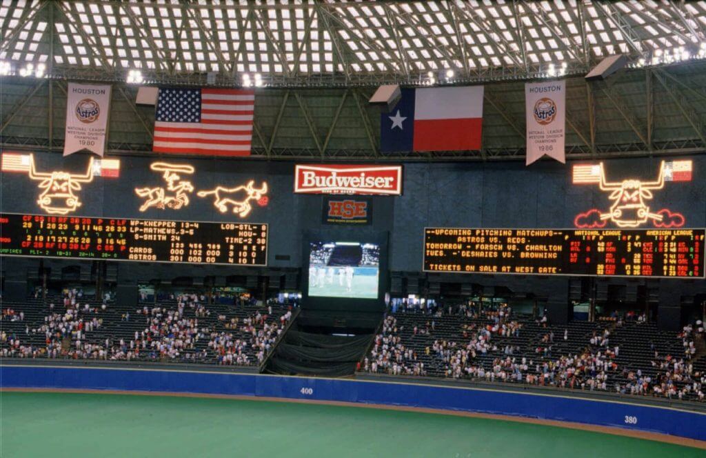
GTGFTS: 9/4/88
Most of the game details are on the board.
One of the last games for the Astrodome home run spectacular – turned off for the last time after the 9/6/88 game to accommodate the Oilers seat expansion.
In all honesty who really cares what game it is I sure miss the Astrodome and that scoreboard!
Great article by KO; however, I never saw the Sox midnight blue as “black” and the Tigers’ road cap featured an orange Old English D, not red. Fine article and stellar research nonetheless.
Yeah maybe on TV back then they appeared black, but their caps were navy blue. And the Tigers orange may have looked red, but were orange. As a kid in the late 60s and early 70s I remember watching the Chicago Bears on TV and thinking their colors were black and red.
But there is ample evidence that the Red Sox never wore black at this time and the Tigers went to an orange cap logo. That’s surprisingly sloppy writing for someone whose work I generally revere.
One of the last games for the Astrodome home run spectacular – turned off for the last time after the 9/6/88 game to accommodate the Oilers seat expansion.
Having watched a lot of ’70s baseball on crummy old TV sets (and never having seen a baseball uniform in the flesh), I can testify to the misconception of seeing navy as black. That’s how they looked to me.
Didn’t realize until now that ‘black’ and ‘navy blue’ were interchangeable terms. Aside from that it’s the type of article I love.
If Boston fans were so hidebound about sock and sweatshirt color, what was their reaction to the pullovers and sansabelt pants in mid-1972? Was that not an equal apostasy?
If you think about it, though, I guess there is a point where navy blue gets so dark that some people’s eyes are going to see it as black and some people will see it as blue. I’ve certainly talked to people who thought that the Yankees wore black, also the Chicago Bears.
Want to add that feeble memory tells I saw the infamous 1974 Sox caps for sale at FR Woods House of Pro-Sports in Cooperstown during the late 70s. The iconic store was the first New Era retailer, and they use to have all caps on display which often rivaled many displays at the nearby HOF. I wonder though if the ‘74 Sox hats were produced by New Era or another firm?
The hats were probably produced by a variety of vendors, such as Roman, Twins Enterprises/Sports Specialties. New Era was not the “exclusive” supplier it is today. Teams could deal with whom ever they desired.
As a lover of obscure hats and a Red Sox fan, I’d love to own either one of these, or one of the 90s Red hats with the white B that they wore for one or two games.
GTGFTS – 9/4/1988, Astros beat the Cardinals 4-3. One of the last games for the classic Astrodome scoreboard spectacular, which was turned off for the last time after the 9/6 game to be removed for the Oilers seat expansion.
The caps were manufactured by The KM Pro Cap company of Boston, which I recall made the caps for a number of big league teams. I actually have one and will try to send pics to UniWatch. Thanks to Keith for the research and article! As a 9-year-old at the time, I had no idea of the outrage and thought the hats were cool. I never knew why the disappeared so quickly.
Who put the Red Sox in red socks?
The question Montville should have asked was, who was the first person to put the Red Sox in something *other* than red socks?
I won’t argue about the cap (it looks fine to me but I can understand the anger). What I just can’t fathom is why either Sox team would wear anything on their feet besides their stated colors. It. Makes. No. Sense.
Would white sanitaries satisfy you in the case of the White Sox, or are you clamoring for white stirrups?
I think white sanitaries don’t count given that most teams wearing them.
If you’re looking for a reason why to White Sox wear black stirrups (and before that blue and red) and the Red Sox wore blue topped stirrups, look at the sleeves.
As jersey sleeves went from wrist length to elbow to t-shirt, the long sleeved undershirt became more prominent. At some point, baseball began discouraging white undersleeves (as they supposedly hide the ball while pitching). If you wear undersleeves that are a different color from the stirrups, it throws the balance of the uniform off.
So when the White Sox started wearing more prominent blue undersleeves in the 1940’s, they made the top of their stirrups blue. The stirrups then became all black when the undersleeves changed in 1949.
I prefer the ‘balanced’ look of dark cap, undershirt and stirrups. White socks on the White Sox don’t work for me, and from the overwhelming evidence, the team feels the same way.
Nestor, generally yes.
That’s why I’d really like to see the White Sox wear socks with white bottoms like the Brewers’ Milwaukee Bears throwbacks from a few years back. Keep the balance while adding enough white to make the moniker stick.
…or the White Sox could wear white sanis with bold enough striping that it accomplishes some balance with the sleeves and cap. I will admit, though, that there are balance concerns, since it was a slight issue to my eye that the Orioles orange-bottomed sanis and the Red Sox’s red-bottomed sanis didn’t carry the same weight as their black / navy sleeves and caps (back when the Sox still wore navy sleeves under their jerseys).
I generally agree with matching sleeves and socks but the team name is “White Sox”, and there should be exceptions to preferences.
White sanitaries are fine for Chicago. Those are socks. Stirrups are
unnecessarysock *coverings*. They don’t need to be white. As others mentioned below, the team looked great in the late 70s/early 80s when they just wore white socks. Forget the stirrups.I don’t know if you guys have noticed, but quite a few high-cuffed Chicagoans aren’t wearing black stirrups…just black socks. As that great sports reporter Joe Piscopo used to say, “Reason? Stupid!”
I understand the whole history of the deadly red sock dye, so I don’t have a problem with Boston’s red stirrups over white socks. In the past. Now, red socks are safe, and for Boston they’re all they need. Forget the stirrups.
Or, change your names the Beaneaters and the Whales. I know Beaneaters was one of the original names for the Braves, but so was Red Stockings. If you borrowed one name from them, why not the other and better one? And I’d rather the Southsiders used Chicago’s Federal League name. Don’t like that one? Pick something else, anything else, as long as it makes sense.
Except the White Sox in the early days did wear white stirrups over their sanitaries. Every other team wore white sanitaries until the A’s broke out yellow. The sanitary color doesn’t count because almost every team wears the same color sanitary sock.
The distinguishing feature is in the majority color of the stirrup. That’s why ideally, you could put the team in white socks with black tops (sort of like a traditional football sock and like the ones worn by the Pale Hose in the last 40’s).
That wasn’t an option because for a long time, players who showed the socks, didn’t show enough calf for different blocks of color to be visible. However, with current players wearing soccer socks up to the knee, there’s plenty of room for multiple toned hosery.
Ideally, you’d want the ChiSox to be wearing their link stirrups (or if stance so chooses, made into plain hose) with white sanis (although I personally prefer a contrasting colored sock under sanis). Yeah, that’s Larry Kurtze, Ben Traxel and my ‘rups at the Minneapolis UW gathering in 2010…
It’s not outside the realm of possibility the White Sox commissioned white socks and came to the realization they didn’t care for the way they looked. If that means they should change their name, Chicago will quickly remind you the tail does not wag the dog.
That’s one of the several reasons I loved the uniforms Bill Veeck put the White Sox in during the late 1970s — with the navy-blue pants, the design really worked well when the team actually wore white socks.
Those 76-81 uniforms are underrated classics for that reason among others.
Not only were they a good example of outside-the-box thinking, the “Richie Zisk” uniforms could be brought back and promoted as “The uniforms Chris Sale wouldn’t let you see.”
Wow, many thanks to Keith for the beautifully researched Red Sox piece. I do vividly remember those caps (seems like they may have made an appearance on an NBC Game of the Week) and remember disliking them myself. To this day, I have trouble with those light-colored front panels, and hate it when the Nationals (one of my favorite teams) wear their caps with the white front panels (almost as much as I hate the Nats’ red and blue “softball tops”). Oddly, I took a liking to the Red Sox red caps with the navy visors they wore through the mid to late ’70s, though I ultimately prefer to see the Sox in their traditional mid 20th century configuration.
“(hopefully) future Broncos star Justin Fields”
*Bear fan cackles maniacally*
Yeah I made that in April
Really great piece by Keith Olbermann on the perplexing ’74 BoSox caps – Loved it!
…and Phil, thanks for the shout-out on my 1922 Babe Ruth colorization & Seinfeld clip!
I enjoyed reading Olbermann’s guest-spot today…thanks for sharing that, Phil!
The caps were not all that terrible, and see no issue with the Red Sox wearing red socks.
The Broncos concept is exactly what they should be wearing at home; I’m sure the road version will not include an orange pants option, right?
No photo of Hildebrand‘s AJ Foyt throwback?
Look forward to the return of the sunset shots!
“No photo of Hildebrand‘s AJ Foyt throwback?”
If you click on the link in that Ticker item that says “More info here,” and scroll down in that story, there are photos of the throwback livery.
Thanks!
It’s good to see that Boston has always had the absolute worst sportswriters.
I only know Leigh Montville from his Sports Illustrated days and his tremendous bio of Ted Williams but, trust me, he is a brilliant writer.
Have to agree. I’m Boston-neutral and definitely not from there but Gammons and Montville are great writers.
The Red Sox at Shea Stadium threw me for a loop, but I figured it out eventually.
I had no idea the Red Sox used to wear black hats!
Around 2002 or 2003 the red-paneled Sox hats were for sale from the Cooperstown collection. As a Sox fan born in ‘74, they were a complete mystery to me.
Very interesting piece by Keith. I hope there’s someone still around who worked with the Red Sox at the time who reaches out with some info that can shed some more light on the team’s decisions.
And I’ll cut him some slack on the colors, because when I was a kid I thought the Yankees’ caps and pinstripes were black because that’s how they appeared on our old RCA set. Same with the Veeck-era White Sox uniforms.
Thanks to Keith for his guest appearance and a tremendous deep dive into a subject I wasn’t at all familiar with.
As a Sox fan, remember well what a departure those beanie hats (and the accompanying all red socks and red sleeves) were in ‘74. The caps were a precursor to the red hats that came in next season and are part of ‘70s lore. However, the writer is mistaken, I believe, when he refers in passing to black bills and black hats on the Sox. Navy blue was the color. Not clear how Mr Olbermann could be so fastidious in his chronicling of Sox sock stripes and uniforms by year and yet refer to black hats. Who is his editor?
What a fun piece on those short-lived Red Sox caps! Very well-researched, and an engaging read. Thanks to Keith for sharing it! Uncovering those images from Sports Posters was a great find.
What a fun piece on those short-lived Red Sox caps! Very well-researched, and an engaging read. Thanks to Keith for sharing it! Uncovering those images from Sports Posters was a great find.
“Well, I’ve created my fantasy in Photoshop, with current Bronco star Justin Simmons and (hopefully) future Broncos star Justin Fields.”
Well, that’s not going to happen now (unless the Bears decide to wear William’s uni concept as throwback, which would just confuse everybody). I’m guessing William must have submitted these before the NFL draft.
All that said, as a Broncos fan, I love this look and would not be sad to see the team return to it. I don’t hate the current look the way some do, but I do prefer the classic look the team wore from the late ’60s through the mid ’90s. Here’s hoping the NFL drops the one shell rule so Denver can at least bring these back as throwbacks and not just pale imitation Color Rush fauxbacks like they currently do.
Thank you, Keith!
I think I may actually have one of those Boston red panel caps. As someone noted above, the Cooperstown Collection produced them in the early 2000’s. I really need to catalog my ball caps!
So…no link to the Hoosiers candy stripe pants?
That Olympic condom sure is…uhhh…a collector’s item.
“So…no link to the Hoosiers candy stripe pants?”
I’m not sure if this was the link that should have been there, but I came across this story on the history of Indiana’s candy-striped warmup pants:
link
Damn. There was some bad coding, and the link should now be working. Here’s the story so you don’t have to scroll back up:
link
I can’t get that image of Olberman wrapped in an American flag (like a straight-jacket) out of my head.
Good article on Red Sox caps, but two minor inaccuracies (maybe reported already above); Tigers wore orange (and it was/is orange, not red) D for a couple of years on the road in the 50s, and Cardinals wore new red hats at home and existing navy on the road in 64; also in 1971, Padres wore yellow topped (brown brim/squatchee and SD) on the road with usual brown cap at home. So while not prevalent, home/road caps had been used before (may be other examples).
“Am I weird for thinking there should be more space between the zero and name?” (Cue Mark in Shiga saying they should be NNOB.)
Well, Mark isn’t wrong…
Indeed, all (or at least most uniforms should be NNOB!
And I think that if you have to have NOBs, the Red Sox positioned Ottavino’s number just right. It looks like there is less space than there really is, because the light borders on the lettering make it look bigger than it is.
That broncos concept is absolute perfection. Our current uniforms are stale to be honest, the orange doesn’t look as good with navy blue as it did in sky blue. The current white jerseys are boring too. I’d love to see the broncos go back to the old uniforms, but keep our current blue uniform as an alternate. Also orange pants with white jerseys!!
Because of their color schemes and contracts with McAuliffe’s Sporting Goods, I always viewed the Angels and Red Sox as fraternal twins. And California definitely got the better of the bargain, as the dominance of navy (and the stripe-ier design of the uniform) made the Angels look more finished than the Bosox. There is a photo circulating of Yaz in a prototype polyester Boston uniform which has the California striping pattern. It’s too bad nobody ever mocked up each team as its opposite number; I would love to see the Angels in Bosox suits, and vice versa!
You should do it, Walter! I know you have the artistic chops to pull it off!
I saw one of those Red Sox caps on Etsy for $100. New Era used to sell them through mail order. From a collectors stand point I’m hoping they might bring it back.
Had no idea these caps had even existed!
Thanks, Keith! I was a huge ESPN Sports Center / Baseball Tonight fan in the ’90s!
That’s a terrific post by Olberman! Enjoyed it very much.
When it comes to commentary on sports history, there’s nobody better.
I own of those red panel BoSox caps. I bought it from Twins Souvenirs (across Yawkey Way from the park in the winter of 1988/89). Back then, they would drag old inventory out of the warehouse and sell it all winter at sale prices. It was one of the gems you hope to find among old hat stock. It’s size 71/4 fitted 100% wool manufactured by New Era with the vintage New Era script logo on the tag that reads “Authentic Major League Pro Model”. I’m happy to share photos of the cap.
That would be great. Can you shoot me those in an e-mail?
phil.hecken@gmail
Hi Phil, just sent you some photos.