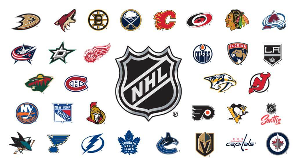
With the NHL playoffs set to start this weekend, my latest piece for InsideHook is a set of NHL uniform rankings. You can check it out here.
I’ll be doing NBA rankings — but with a fun twist — in about a week, just in time for the start of their playoffs.
ITEM! New podcast episode: This week’s edition of Unified is the “Ask Us Anything” episode, as Chris and I answer a bunch of listener-submitted questions. My thanks to everyone who contributed questions for us, and my apologies for not being able to get to all of them — we received way more submissions than we had time to address.
As always, you can listen to us on Apple, Google, Stitcher, TuneIn, and Spotify, or just use the player below:
The show notes for this episode are here, and you can also watch this episode on video here:
Please consider supporting this episode’s advertisers, Homefield Apparel (15% off with checkout code UNIFIED) and Aced Out (20% off with checkout code UNIFIED).
This episode also comes with some news, which is that Chris and I have decided to move to a slower schedule for the summer. Our next episode will be sometime in mid-June, and then we’ll also have one episode per month in July and August. We hope to go back to a weekly or bi-weekly schedule in the fall.

There are lots of reasons for this, but the short version is that doing a podcast turned out to be a lot more work than either of us expected. Like, a lot more work. We’ve been lucky enough to have the great Chris Fraterrigo volunteering as our producer/editor, but even with his help there’s still a ton of preparation, photo research, promotion, creating the show notes, dealing with advertisers and their scripts, more preparation, more research, blah-blah-blah. It’s a way bigger time sink than we anticipated, and it’s left us feeling overextended and running short on personal bandwidth.
Things got particularly dicey when Ontario, where Chris lives, recently reinstituted a hard pandemic lockdown, so Chris’s young kids, who had finally started going to in-person school in February, had to switch back to remote/at-home learning — which, as it turns out, is not a situation conducive to producing a weekly podcast (or much of anything else, I gather). Chris is hoping things will be more settled at home when his kids go back to in-person school in the fall.
As for me, I found that planning and preparing each week’s show was eating up more and more of my weekends. I could sorta/kinda rationalize that when we were still mostly house-bound and it was cold outside. But now that Mary and I are fully vaccinated and the weather is getting warmer, I want to reclaim that part of my life.
Also: I have a new work project brewing that will soon create additional demands on my time (more on that later). That project will inevitably have some initial hiccups and false starts as it gets off the ground this summer, so I’ll likely have to devote a lot of energy to it. But I’m hoping it will be a smooth-running, low-maintenance operation by the time we bring the podcast back to a more frequent schedule in the fall. (Then again, that’s how I thought the podcast itself would be, and it didn’t turn out that way, so we’ll see.)
Also-also: Because the show has been focused largely on breaking or recent news, I’ve often found myself expressing the same ideas and analyses on the podcast that I had written just a few days earlier on the blog (sometimes in the exact same wording!). That doesn’t provide much growth or stimulation for me, and I figure it doesn’t provide much value for you folks either. What’s the point of listening to me say the same thing I just wrote? The slower summer schedule won’t work as well for breaking or recent news, so I’m hoping it will force us to adapt by creating new presentation approaches. (The new “Ask Us Anything” episode is one example of that, although we had already planned on doing that one even before we decided to go to the slower summer schedule.)
I don’t want to make it sound like the show has been a negative experience. On the contrary, I’ve learned a lot, I’ve had fun making something new, and collaborating with Chris has been a blast. But the way we’ve been doing the show so far has turned out to be unsustainable for both of us, so something had to give. Thanks for understanding, and enjoy today’s episode.
The Ticker
By Paul
Indigenous Appropriation News: A local tribe wants Ponaganset High School in Rhode Island to stop calling its teams the Chieftains (from Tim Finnegan). … The teams at Fresno High School in California will still be called the Warriors, but the old Indian-head logo has been retired — a move that has angered some local residents (from Aaron Wiens). … Some schools in Kansas are discovering that doing the right thing — like, say, schools scrapping their inappropriate team identities — sometimes costs money. Might’ve cost a lot less if they’d done it sooner (thanks, Phil). … The Spokane Tribe in Washington State has decided to reject all requests from area schools under the state’s new law that requires permission from local tribes to continue using Native American-themed team names and imagery (from Kary Klismet). … Also from Kary: Wayne Valley (N.J.) High School is soliciting public feedback on whether it should retire its “Indians” team name.

Baseball News: Pretty cool hoodies for the Bowie Baysox groundskeeping crew (from @cdubs271). … Never seen this before: a Rawlings-branded work boot. … Here are the caps that the Yanks and Chisox will be wearing in August for the Field of Dreams Game. … Speaking of the Yanks, yesterday’s Ticker mentioned that C Gary Sanchez had his Whitey Ford memorial patch on the wrong sleeve on Tuesday. It was corrected for last night’s game (from Dave Rakowski). … Fun article about Rangers 1B Nate Lowe’s unusual mid-shin pants (from Gordon Blau). … This article examines what the future may hold for McCoy Stadium in Pawtucket, R.I., now that the Pawsox have decamped for Worcester, Mass. (from Kary Klismet).

Football News: Some new uni numbers for the Eagles (from Timmy Donahue). … Ditto for the Broncos (from Kary Klismet). … Here’s a ranking of Utah’s best uni combos since joining the Pac-12 (thanks to all who shared).

Hockey News: Jeff Jacobs — described by reader John Dankosky as “Connecticut’s best-known sportswriter” — really dislikes the new Bridgeport Islanders logo. … The Federal Prospects Hockey League will have a new team in Binghamton, N.Y., called the Binghamton Black Bears (from Wade Heidt). … Wow: Maple Leafs RW Wayne Simmonds, who is Black, has had to wear his hair longer than he prefers because the team’s quarantine-bubble barber doesn’t know how to cut Black hair (from Kary Klismet). … Speaking of the Leafs, here’s an interesting note from Mike Engle: “In my interactions with fellow collectors of game-worn NHL stuff, I found that Auston Matthews of the Maple Leafs has a smiley-face doodle on his gloves. So does his teammate Mitch Marner. Some photo research shows that for Matthews, it’s not always a smile — I’ve seen a hollow heart, two hearts colored in, a stick figure, and a smile with a tongue sticking out.” Anyone know more about this?

Basketball News: The Lakers finally raised their championship banner last night. … Thanks to the pandemic, several NBA teams now have official team disinfectants (thanks, Brinke). … Seattle Storm F Breanna Stewart has a new shoe deal with Puma. … Here’s the logo for the new WNBA Commissioner’s Cup. “It’s like a soccer-style cup competition,” says Jamie Rathjen, “but instead of being entirely separate, certain regular season games count as cup games with a separate final.” … This is interesting and odd: Players on the 1949 boys’ basketball team at Beulah High School in North Dakota all had numbers in the 80s (from Jason Simpfenderfer).

Soccer News: PSG’s new kit is heavily Jordan/Bulls influenced (from @mikeDfromCT). … Inter Milan wore a “special shirt” in Serie A yesterday. “I thought this design would just be merch when I first saw it, but it rather spectacularly is not,” says our own Jamie Rathjen. … The owners of the Columbus Crew whatever they’re called now, have issued a statement in response to all the fan outrage of the team’s recent rebrand (thanks, Phil).

Grab Bag: Some military personnel listed the dumbest things they’ve ever done in uniform. … New logo and identity for USA Lacrosse. I know the shape on the logo is supposed to look like a lacrosse stick, but to me it looks like a protective cup, or maybe a urinal (from Griffin Smith). … This is so cool: Check out this Twitter thread to see the contraption they use for chalking the track lanes at a track meet. Too bad there’s no video (from @SuitUpVarsity). … New helmets for Maryland lacrosse (from Wes Brown). … New logo for Google Fiber (thanks, Brinke). … The W Series, a women’s auto racing series, is going to have firesuits with a “female-first design” this season. “They must be one of the only sports that doesn’t do that already,” notes Jamie Rathjen.

Special shout-out today to Phil. He knows why. Proud of you, buddy. — Paul
Curious as to Paul’s negative review of the Blue Jackets logo on that ranking. I completely agree and think it is one of the worst logos in the big 4, but I could have sworn I have seen him state his affinity for it in the past.
Yes, there was a time when I liked it (good memory!). But my feelings on it have evolved/changed. That doesn’t happen to me often, but it does occasionally.
As I said on Twitter yesterday, count me in the “why is there a urinal in that logo?” camp.
Sorry, not much of a Twitter guy.
You have me curious, what team/logo are you referring to?
Initially they were going to go with a labia in their logo, but the @akland A’s beat them to it by a week.
I found myself nodding a lot at the NHL Power Ranking. To me, it speaks to the aesthetic quality of the league that I completely agree with Paul ranking the Caps near the bottom of the uni-list, and I say that as a Caps fan who thinks their uniforms are fine. In the well-outfitted NHL, “fine” earns a near-failing grade. The Caps look fine, but they could look so much better.
I was surprised to see Paul rank the Wild so high at number three, the highest spot for any recent expansion team. I agree! But I thought my appreciation of the Wild’s visual identity was pretty idiosyncratic. I’m used to critical assessments of the Wild starting and ending with a reference to “Christmas colors.” Does any city have a greater dichotomy between its league-leading best-uniformed teams (Wild, Vikes, United) and its league-cellar-defining worst-uniformed teams (Wolves, Twins)? As a Minnesotan and a uniform aficionado, Minnesota is killing me with this Jeckyll/Hyde nonsense!
*Jekyll
Agreed, seeing the Minnesota Wild at #3 on this list was the biggest surprise to me, closely followed by seeing the LV Knights at #5. I fully expected to see both toward the bottom.
I have always, *always* loved the Wild’s uniforms.
I liked Vegas’s look fine for the first few years. But the gold alternate really put them over the top for me. It works!
Purple aside (which I don’t mind), there’s no way the current Vikes set should ever be considered as a “league-leading best-uniform.” Yes, the current set is better than what it replaced, but until they get a grown up number font, instead of that ridiculous “sail” font, it can’t even break top 15 in the NFL. Twins simply have too many options (and they need to ditch all gold elements), but take their 61-71 throwbacks and their current powders as their set, and I’d say they’d have a really nice pair of unis. Ditch all the other crap. Agreed the Wild have a great set; I don’t hate the Wolves’ current look, but it could be much much better.
I agree 100% on the Vikings uniforms because of the stupid font. Totally embarrassing.
As a Vikings fan, seeing the schedule this season start with Bengals, Cardinals, Seahawks, Browns, Lions makes me dread September and early October with our terrible uniforms and even worse opponent uniforms.
Sigh.
The Vikes font itself isn’t bad, if both numbers were in sailboat font. The standard font second digit nesting into sailboat font is where you lose me.
“I’m used to critical assessments of the Wild starting and ending with a reference to ‘Christmas colors.'”
I’ve always hated that kind of casual, facile “analysis” from fans on certain color schemes, like unfailingly referring to red and green as “Christmas colors,” or brown and yellow as “poop and pee” (ugh!), or red and yellow as “ketchup and mustard.” It’s intellectually lazy, simply coopting other people’s tropes in place of independent thought and critical reasoning in the formulations of one’s own opinions.
In actuality, all those color schemes can and do look great when accompanied by good uniform and logo design. Red and green is no exception. Just because those colors are used in connection with the Christmas holiday shouldn’t exclude them from the palette available to organized sports teams. We don’t automatically look at the San Francisco Giants and say they’re wearing “Halloween colors,” Michigan State for wearing “St. Patrick’s Day colors,” or the Boston Red Sox for wearing “4th of July colors.” Why should teams in red and green be singled out for holiday-based ridicule?
For what it’s worth, I’ve never thought the Wild’s color scheme invokes a Christmas feel – even with the evergreen trees and what could be interpreted as a Northern winter sky in the logo. I think it’s the inclusion of the yellow and tan (or “wheat,” as I guess they call it) that rounds out the color scheme. It gives it more of a rustic, outdoorsy feel than a “Christmas” feel, at least to me. Thanks, Scott, for mentioning that and providing me a launch point to rant on one of my uni-related pet peeves (and yours, too, from the sound of it)!
And, as a longtime Avs fan who deeply resents the Wild for inflicting a couple of very painful playoff exits on Colorado during the history of the teams’ rivalry, I still readily admit that the Wild have some of the best uniforms and logos in the league. I initially didn’t care for the team name when it was first announced, but that logo of the bear’s head incorporating all those elements of the Minnesota wilderness really ties the theme together and makes the identity work. They’re certainly worthy of a high position in any uniform rankings.
YES
Interesting read for the NHL uniforms rankings.
Agreed a lot of it is in the right place. I can’t put the Bruins in at number 1 if they are not wearing their yellow socks. Black socks just don’t look right for them.
The Wild are a bit high in the ranking than I would put them for various reasons. Same with the Devils due to their lack of waste stripes.
Ducks have the worst uniforms going right now in my books.
Canucks are ranked too low and I would have them ahead of many teams, such as the Blue Jackets and Predators for a couple of examples. If we set the Orca aside, the uniform looks solid with the blue and green colour scheme and traditional-style striping.
As a NJ Devils fan I agree wholeheartedly they took a step back when they did their “update” in ’17-’18. Why change what you won three cups in? I do think it’s time for a tweak though. Maybe a new number font or a shoulder patch.
Cheers to Phil for….whatever! : )
Well done ranking explanations Paul. I never minded the way the flag of Ohio looked, but now whenever I watch the Blue Jackets that bit of their logo will always stick out to me.
You’ve probably have already talked about this, but 35 years ago during the Monday Night Miracle, the Blues announcer, Ken Wilson, referred to the Blues as a lunch bucket, blue collar team. At the 3:00 mark is when it starts
link
I can already sense the next rabbit-hole research project. Who was the first person to refer to a sports team as “blue-collar”?
Pretty cool hoodies for the Bowie Baysox groundskeeping crew
I wouldn’t wear that. Never liked the Homicidal Oriole. As Mr. Rourke used to say, “Smiles, everyone. Smiles!”
The owners of the
Columbus Crewwhatever they’re called now, have issued a statement in response to all the fan outrage of the team’s recent rebrandTwice in that article they refer to “historic Crew Stadium.” I know it has a corporate name now, so I applaud the non-use of it, but I found the addition of “historic” to be a bit over the top…especially since it’s, what, just 20-some years old?
Way to go, Phil…whatever you did.
I believe the Crew stadium was the first soccer-specific stadium in MLS, which earned it “historic” points despite its relative youth.
True. A reminder that historic doesnt always mean old.
“I wouldn’t wear that. Never liked the Homicidal Oriole. As Mr. Rourke used to say, ‘Smiles, everyone. Smiles!'”
I interpret the look on the Oriole’s face as a smile. Bordering on diabolical, perhaps, but a smile nonetheless!
Did ESPN show the Bills logo while discussing the Patriots last night on the schedule reveal show? Anybody else see that, or am I delusional?
The Bruins need to go back to the gold socks. The socks contrasting the jersey was the most unique look in the league.
Ump Watch has gone by the wayside…now the podcast is slowing to a crawl…these are dark times, my friends.
Isn’t “Ponaganset”a more striking example of indigenous appropriation than “Chieftains”?
Yes. I don’t understand why Chieftains should be replaced. I don’t necessarily associate it with Native Americans, it could easily be transitioned to an Irish theme.
Or Viking or Middle Earth.
This is my reason for leaning towards The Cleveland Baseball Team to make “Tribe” the official name (plus that’s what most people here already call them). Could be tribes of Isrealites, could be the 12 Tribes of humanity from Battlestar Galactica (ooo…just pictured the bloodclot uni with the Galactica font…I’d wear that), could be…well, pick any tribe from anywhere.
Lose the indigenous-appropriated imagery, use any standard font and you’re good to go.
I’m afraid I disagree. Naming a school or community after a tribe or Indian hero *is* a tribute. It’s not the behavior of dressing up like, or pretending to be Indians, which I think we all would disparage. Are you *that* anxious to make sure an Indian word never appears on the front of a jersey, even as a place locator?
The new Jordan/Bulls inspired PSG futbol home kit is blowing my mind. My first thought, can’t be real, even had to confirm with other sites.
I know that the Jordan brand is as much (if not more) about Nike than Jordan, and I know that Jordan, and as an extension, his Bulls’ uniforms were cultural icons in the 90’s. I am still very surprised to see the PSG kit reference it so literally. It seems like some strange mash-up concepts, but I dig it. Further confirms that Jordan is the GOAT, but not just as a player, as an influence on the sports world as a whole.
Congrats, Phil! Whatever your success is, I know it’s well-earned!
While reading the Wayne Simmonds article about black men’s hair, the author mentioned that her husband attended a military school in NM. That must be New Mexico Military Institute. He said that he gave haircuts to cadets while there, which is possible but also not allowed. I confiscated numerous sets of clippers from barracks barbers over the years.
“The Kings should go back to purple.”
Yes Paul, YES!! I’m sure you’ve championed purple as often as Brood X cicadas show face :-)
Also, for the Ask Us Anything podcast, how many questions did not make the cut? And what thoughts go into whether a Uni-watcher’s submission makes the cut on the website?
Just for purposes of distinctive uniforms when you have 30+ teams, you need at least one purple team or all the looks end up becoming derivative with black, navy, red, and blue.
That even Paul recognizes it shows that purple and yellow (gold) is a solid combo that should be featured in each sport.
Great article about the NHL sweaters, Paul. I agree that they are the best looking league visually, and have been for a long time. I would put the Rangers higher than at least the Wild, and probably at #1, but to each their own.
Also, I follow your reasoning for the Blackhawks being so low, but from a purely design/color standpoint, it’s one of the better looking combos, and is of course, a “classic”. I can’t exactly say why, but I’ve always thought the Blackhawks’ white unis look great, but there’s something about the reds I don’t love. Too much red perhaps? I can’t quite put my finger on what I don’t like. Anyway, again, great article.
Thanks, Tim. (But it’s *not* a ranking of NHL sweaters — it’s a ranking of NHL *uniforms*!)
;)
I know authors often have little control over headlines, but the subheadline does say “Mirror, mirror on the wall, who dons the finest sweaters of them all?”
HA! Yes, my bad. Full uniforms, not just sweaters.
Unpopular opinion: Blackhawks look better in all black than with their red sweaters. I’ll die on that hill.
Black uniforms overwhelm the red, especially the number trim. Plus, without some sort of outline around the crest and shoulder patches, they get overwhelmed as well. A black version of their uniforms is inferior to the red and the white. A different black uniform, such as their most recent Winter Classic one (evoking the original Art Deco style), is another matter.
Chicago whites are the best in the game. And I can’t stand the blackhawks. The feathers really pop on the blank canvas.
i’m just getting to yesterday. seriously? every nwsl team has white shorts? i’m sure the ladies are thrilled by this pathetic lack of concern for what would be better/comfortable for them.
I was sad to hear about the podcast going to monthly, but totally understandable. I’m not at all surprised at how much work it was taking you to put out the volume of quality content you were putting out – it was obvious how much preparation was going into it, and when you were joking about the number of people who have a podcast today, you can tell which of them are broadcasting without putting the work. I know you’d never put out a substandard product, so I’m disappointed but not surprised. I’m looking forward to the monthly podcasts.
Thanks for that thoughtful note, Mike — appreciated.
Isn’t “Ponaganset” a more egregious appropriation of indigenous culture than “Chieftain”?
Quite possibly. Feel free to start the movement for them to change it.
Just a personal preference from me, I love the power rankings but would prefer going from worst to best in the article. I like to try and think about what teams haven’t been selected yet and who I think is coming up next. This typically means I have to look at the first team to see if it’s ordered worst to best or best to worst, then if it’s ordered best to worst I scroll to the bottom and go through the rest of the list backwards.
Hmm was that Sharks ranking solely off their retro unis, which the picture is of? Their current regular uniforms do indeed include some orange trim (albeit not as much as I would like).
I’m just amused that the first thing I notice on Uni Watch today is an image featuring a few outdated logos – the black-outlined Flames, the 3/4ths-profile Senators, and the Seattle placeholder.
Also, the Red Wings look better in white, with their iconic red sleeves.
Buffalo Sabres logo in navy too.
Paul-
Thank you for listing my Blue Jackets’ unis as highly as you did (I’m actually surprised). I would much rather have them go with their alternate logo (i.e. the cannon) as their primary look.
I’ll have to respectfully disagree with your ranking of #1. I feel as if Edmonton has one of the best logos in sports.
re: NHL unis
Blues should go back to baby blues w/ shoulder yokes (early 70’s).
Kings should go with purple and gold and the Crown logo – you don’t have to spell out name of the team. Remember the mono gold home and mono purple roads from, again, late 60’s early 70’s?
San Jose should pay tribute to the Golden Seals – green and gold complete with white skates.
Penguins should go back to sky blues with the skating penguin.
And the league should go back to white for home and colors on the road.
Still love the look of the first expansion clubs and the original 6 from that time.
I’m not a big fan of the paler blue, but the Blues did look great in yellow shoulder yokes.
The Blues blue uniform really needs to get rid of the navy blue. Their thirds are perfect and should replace those.
I usually find I agree with Paul’s assessments…but the notion that 1-color+white teams are aesthetically ‘disadvantaged’ by their simplicity (Wings, Leafs, etc) is…well, about the craziest thing I’ve ever heard. Certainly, it’s a common criticism from the More-is-More design camp. Meanwhile, the Less-is-More quarter would definitely point to the Leafs and Wings as great examples of delicious, iconic, and unassailable uni-design. IMHO
I won’t say it’s “crazy” given the totally subjective nature of what people like in uniform design, but I do agree with your basic sentiment that “one color” designs are usually refreshing in their cleanness and simplicity. Along with the Red Wings and Maple Leafs, it’s hard to imagine that classic “one-color” uniforms like those worn by the Yankees, Alabama, Penn State, Texas, Colts, Celtics, etc. would benefit from the addition of a second trim color.
Here’s the thing: In hockey, a one-color-plus-white color scheme basically guarantees that you’re mono-color for your colored uniform (because nobody has white pants). To me, that defeats the whole point of a hockey uniform, which is that you can build in blocks of contrasting colors. If your jersey, pants, and socks are all the same color — and if you also don’t have a contrasting shoulder yoke — that’s not an interesting hockey uniform, at least for me.
YMMV and all that. But comparisons to other sports are not relevant — apples/oranges.
As a Flames fan, I LOVE that they went back to the 80s white sweaters – but I still hate the red version of it – I prefer the red with the black trim. And I love the reverse retro unis as well.
I used to love the red with black trim look, but then the stripes got out of control, and the flags just really don’t work for me. It got to the point that this year when they went to the alternate jersey I was actually mad that they were wearing them. I think the classic look is one of the best in the league, so I got mad to see them in the flag jerseys.
I hope that if they decide to keep them, or use them as a basis for the next reverse retro, they actually go back to the look they had when they first debuted in 2003-04, complete with the Blasty shoulder patches.
I do agree with you about the current reverse retros, I think it’s a great look for something they wear 6 or 7 times per season.
The LA Kings change from Forum Blue(aka purple)/Gold to Black/White/Silver oddly (directly?) coincided with the Gretzky’s trade to LA in 1988. I have great memories of watching the great Rogie Vachon, Dave Taylor, Marcel Dionne and others in those wonderfully quirky uniforms.
And then when Bruce McNall (the felon) bought the majority control in the Kings in 1988 from Jerry Buss and traded for Gretzky, he decided to make the Kings look like the LA Raiders instead of the LA Lakers. Bad move.
When Gretzky was traded to LA, he was the owner of the Hull Olympiques of the QMJHL. Luc Robitaille’s old junior team.
Under Gretzky’s ownership, the Olympiques changed from blue and yellow to black and silver.
This footage of the Olympiques from the days when the Kings still wore purple and yellow. Interesting to note how similar the Olympiques look to the black and silver uniforms the Kings would adopt.
link
I don’t understand why the Toronto Maple Leafs are blue? Wouldn’t it make sense to be red?
It’s a TO thing. Until the Raps came along, every (I think) Toronto-based team wore blue and white, as it’s link. The Leafs, Blue Jays and Argos are all blue/white. Even the link, a hoop team predating the NBA had blue and white for their colors.
So, yes, it would make more *sense* to wear red, but it being a TO thing, tis blue and white.
You’re right – Toronto teams have traditionally worn blue and white for a long time, but the Leafs didn’t base their colours on the Toronto flag.
The Leafs’ colours were chosen by Conn Smythe when he took over the team in 1927. Smythe took blue and white from the University of Toronto Varsity Blues team, which was far better known at the time, and which Smythe coached. Amateur hockey was more highly regarded in Ontario until the 1930s, and the pros were seen as a bit seedy. It was the success of the Leafs in the 1930s, including the building of Maple Leaf Gardens and Foster Hewitt’s radio broadcasts, that made pro hockey (ie, the Leafs) more popular. The Leafs later said the blue represented “Canada’s blue skies” and the white represented “Canada’s snow”, but
that was after the fact. The Argonauts have worn blue and white since their founding in the 1870s, as did the baseball International League Maple Leafs, but neither were really an influence on Smythe.
The Leafs did briefly change the letters TORONTO MAPLE LEAFS in their crest to red after World War 2, but it didn’t catch on.
If they loved blue so much, they should have called the team something else. It’s like calling your team the Blue Jays but having your colors be red and white. Or the Orioles being green.