Click to enlarge
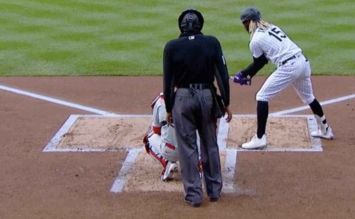
The screen shot above was taken at the very beginning of a recent MLB game in Colorado. As you can see, the foul lines and the lines of the batter’s and catcher’s boxes are all the same width or thickness.
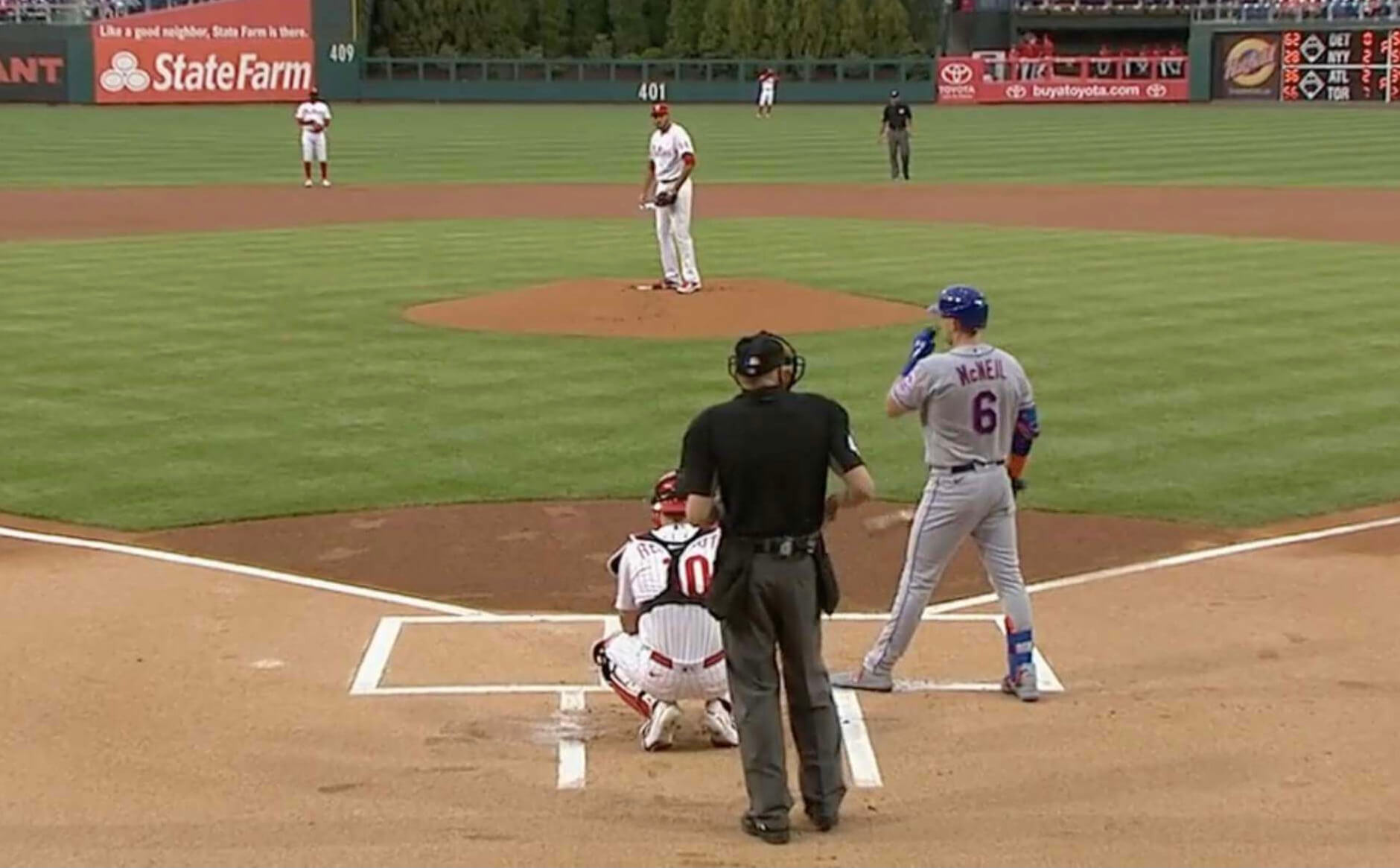
I think of that as the normal state of affairs at any ballpark. And indeed, it is the normal state of affairs at most ballparks! Here’s a similar shot from a recent game in Philadelphia, for example:
But having foul lines and box lines of equal thickness is not the normal state of affairs at Dodger Stadium. Here’s how things looked during the first inning of a recent game there:
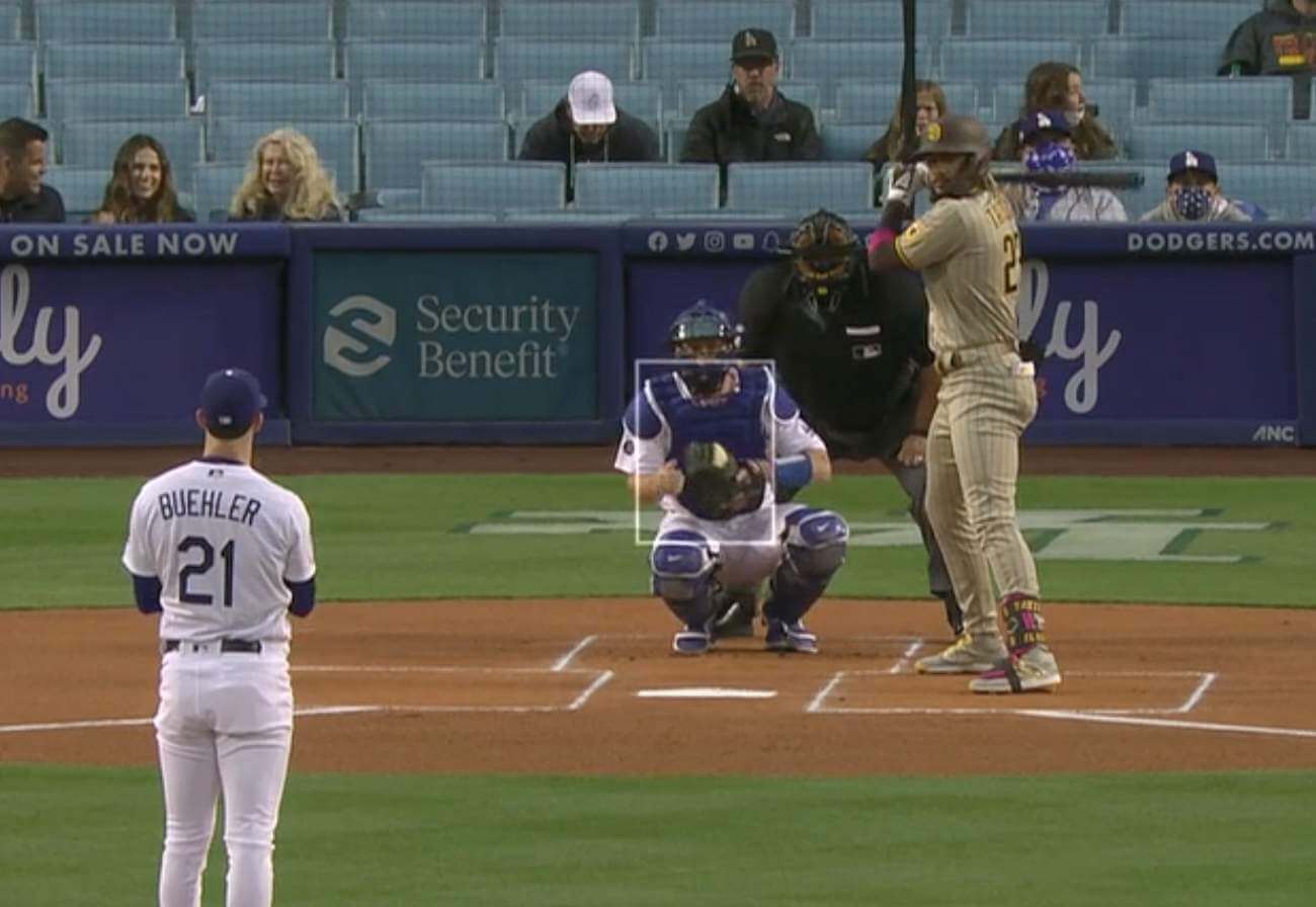
Weird, right? The box lines are so much thinner than the foul lines! I hadn’t been aware of it until Twitter-er Chris Fairchild mentioned it to me a few weeks ago.
This is exactly the type of visual detail I tend to fixate on and obsess over. Since I hadn’t noticed it before, I figured it must be a new thing. But as I looked back at photos and videos from recent seasons, I discovered that the thin box lines had been the norm in L.A. for several years. Some Twitter-ers even joked about it during the 2016 playoffs:
Dodgers skimping on batter's box chalk? These lines look thin to you?LA so imagine conscience the chalk is pressured to be skinny? pic.twitter.com/tw4YckUL3d
— Damon Bruce (@DamonBruce) October 19, 2016
#NLCS batter's box lines looking a little thin at @Dodgers Stadium. Chalk shortage in #LosAngeles? #ChalkDrought #LALovesOctober #FlyTheW pic.twitter.com/XB758W8Hkp
— Evan Schreiber (@SchreiberEvan) October 19, 2016
I couldn’t believe I hadn’t noticed this before. Granted, I don’t watch that many Dodgers games (even when the Mets are playing in L.A., the time difference means I often miss the games), but it still seems like something that would have caught my eye at some point. I’m a bit ashamed not to have spotted it until now!
I wanted to know more, so I contacted Dodgers senior design director Ross Yoshida (as you may recall, he was a recent guest on our Unified podcast). He in turn got me in touch with groundskeeper Jordan Lorenz, who was nice enough to talk with me about this rather esoteric topic. We spoke last Friday afternoon. Here’s an edited transcript:
Uni Watch: Let’s start with some basics about you. What’s your official title with the Dodgers, and how long have you been working for them?
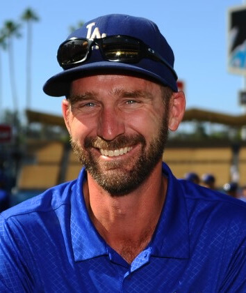
Jordan Lorenz [shown at right]: My official title is director of turf and grounds. I’ve had that title since 2017, and I have been with the team overall since 2005.
UW: I looked up your LinkedIn page and saw that you have a degree in horticulture, which I assume is a handy background to have when you’re working with grass. Is that common for people in your profession?
JL: Yeah, it’s usually some sort of horticulture or agronomy. Most people who get similar kind of degrees are looking at being golf course superintendents, but then there’s also a segment that ends up working at stadiums.
UW: As I think you know, I was interested in talking with you about the thin lines of the batter’s and catcher’s boxes at Dodger Stadium. When did that start, and what is the thinking behind it?
JL: I believe it started in 2009, somewhere around in there. Batter’s boxes have all been the same size forever, but for a long time MLB didn’t really mandate that you needed to paint the whole box, including inside lines.
UW: Right, I remember that — the boxes wouldn’t be closed rectangles. They’d be more like brackets, sort of like the coaches’ boxes, because they wouldn’t include the inside lines closest to the plate, right? And then at some point everyone started adding that last line so you got the entire rectangle.
JL: Exactly. Most teams, including us, were doing it that way. I mean, it’s pretty infrequent that somebody is standing so close to the plate that the inner line would even come into play. But in whatever year it was — 2008 or ’09 — MLB informed all the groundskeepers, “Hey, you need to start painting the whole box.” So we did that. We were using a four-inch line for the boxes, just like the foul lines. And one of our players came to Eric Hansen, our former head groundskeeper, and said, “I just don’t like this big, bright white line. I just kind of see it out of the corner of my eye when I’m trying to concentrate on the pitcher. Can you do something to, like, make it smaller and make it less bright?”
UW: And he was talking about the new inner line of the box, the line that MLB had told you to start including?
JL: Right. So that was really the impetus for it. And there’s really no specific rule that states how wide the lines have to be or anything, so we made them thinner for him. And then we just kept doing it, and we still do it that way now.
UW: You mentioned a four-inch line. So that was the width of the white line?
JL: Yeah. And we still use that for the foul lines.
UW: Is that an MLB-mandated thing? Or could you make that thinner too if you wanted to?
JL: Honestly, I don’t know if it’s mandated, or if it’s in the rulebook or anything. I kind of don’t think so. I think it’s just kind of become industry standard. We use aerosol paint for our for our lines, and that’s how the painters are set up, for the foul line to be four inches wide.
UW: How thick are the lines of the boxes?
JL: About an inch.
UW: You mentioned that a particular player asked for the thinner box lines. Do you recall who that player was?
JL: I don’t, honestly. It’s been a while.
UW: Wow — but whoever he was, he’s left a lasting mark on Dodger Stadium!
JL: Yep. It’s just kind of become, you know, that’s just how we do it now. We think it looks a little bit cleaner. But if there was a current player who wanted us to go back to the thicker lines, or do it a different way, we would have no qualms about doing it. You know, the lines really only matter for the first inning anyway.
UW: I looked up some spring training photos, and I see that the Dodgers’ facility in Arizona has the standard thicker line. So the thin lines aren’t necessarily a Dodgers thing — they’re just the Dodger Stadium thing. Is that right?
JL: Yep, pretty much.
UW: Are you aware of any other ballparks — major league, minor league, college, or whatever — where they do the boxes like you guys do?
JL: Not really, not that I’ve noticed. We do get questions about it, though. Mostly from other groundskeepers who’ve asked us why or how we do it that way. And then I explain it, like I just explained it to you.
UW: When you’re watching a game on TV and the ballpark has the standard thicker lines, does it bug you? Does it look wrong to you?
JL: No, no, no, not at all. I know that we’re the outlier here. We’ve become used to it and we kind of like it. But we know that we’re the odd ones.
UW: Have any players or umpires ever said anything to you about it?
JL: I don’t believe so, no.
UW: I found a few tweets from people who noticed the thin lines and mentioned it on Twitter, and they made jokes about the Dodgers running low on chalk, or the Dodgers trying to save money on chalk, stuff like that. Does it bother you that people see your work and sort of make jokes about it like that?
JL: No, because like I said, we know that we’re the odd one here. And the fact that people are noticing it is kind of surprising, that fans even pay attention to it. But if those people have a little fun at our expense, we’re totally fine with that.
UW: Do you guys have any other little visual details or nuances that you incorporate into the field? Anything else that’s sort of a “Dodger Stadium thing” like the thin lines?
JL: Not really, no. It’s all pretty standard stuff.
UW: You mentioned that you paint the lines, instead of using chalk. What’s the ratio of teams that use paint versus chalk?
JL: I think it’s probably about half and half. Maybe there’s a little bit more that use chalk. I’m not quite sure, honestly. There’s a lot of stuff we take for granted, and we don’t always realize there are people out there who would find some of it interesting. So it’s good to talk to somebody who is, to get the word out there.
———
And there you have it. Much like Monday’s and Tuesday’s episodes about the umpire sleeve patches, geeking out over the width of foul lines and batter’s box lines strikes me as peak Uni Watch. Or to put it another way: I love this topic! Hope you’ve enjoyed it too.
(Big thanks to Jordan for sharing his expertise with us, and to Chris Fairchild and Ross Yoshida for making this entry possible.)
Ballin’: With the Knicks and Nets both playing well and headed for the NBA playoffs — something that hasn’t happened since the 2012-13 season — the cover art for this week’s issue of The New Yorker is a spectacular illustration by Mark Ulriksen, depicting a color-vs.-color game between the two NYC teams. The Instagram embed shown above includes some of Ulriksen’s preliminary sketches and some views of the illo in progress.
One of Ulriksen’s Instagram commenters noted the lack of logo creep on the uniforms and asked if this was due to some sort of trademark issue, to which Ulriksen responded:
I don’t know of any prohibition on using the swoosh but when I have worked for Nike in the past they were very stringent on not allowing the art to be sold or used anywhere else so I don’t paint the swoosh too often.
Interesting! Makes for a much nicer-looking image, too.
(My thanks to Paul Ryan for letting me know about that Instagram exchange.)

Podcast reminder: As I mentioned a few days ago, Chris Creamer and I won’t have a podcast episode this week due to a scheduling conflict. But we have something very cool planned for next week — it’ll be our first “Ask Us Anything” edition, where we’ll spend the entire episode answering listener-submitted questions. It should be a lot like our regular “Question of the Week” segment, but stretched out over the entire episode.
If you’d like to submit a question for us, you can do so here. A few things to keep in mind:
• Most of the questions we get are directed to both of us. But if you have a question specifically for me or for Chris, that’s fine too.
• You can ask us about uniforms and logos, of course, but you can also ask the podcast itself, or about Uni Watch and/or SportsLogos.net, or about our careers, or anything like that.
• Questions that can be answered with a simple yes or no response aren’t all that interesting (for us or for the audience), so try to avoid those.
Thanks in advance for your submissions — we look forward to responding to your queries!
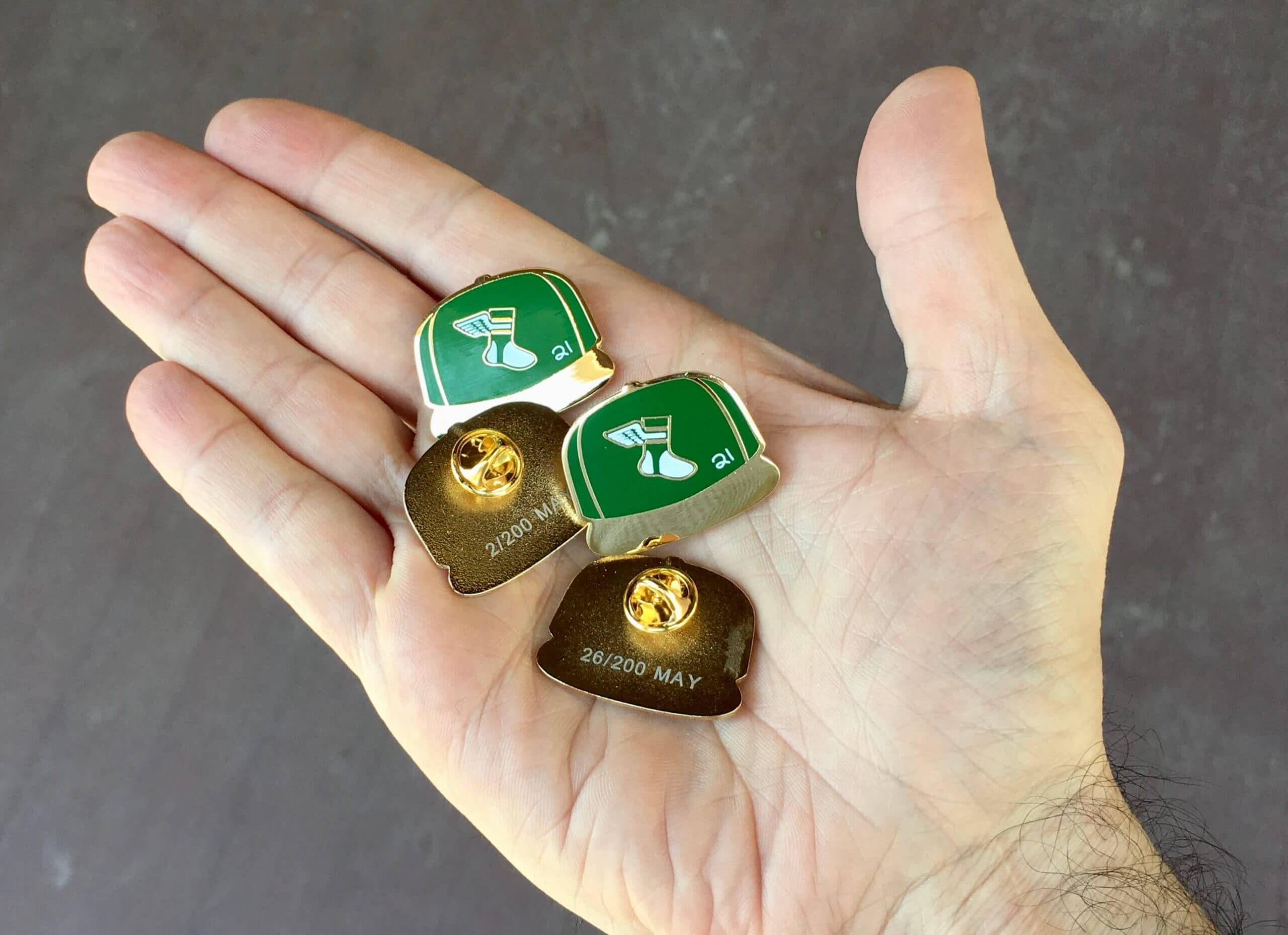
Click to enlarge
May pin reminder: In case you missed it earlier, our the Uni Watch Pin Club’s design for May is a baseball cap design. The little white “21” stands for the year, obviously, and is meant to mimic the little cap inscriptions that MLB players sometimes use as a shout-out to injured or fallen teammates.
This pin was produced in a numbered edition of 200. As of this morning, there are fewer than 70 remaining. You can order yours here. Enjoy!
The Ticker
By Lloyd Alaban

Baseball News: Cubs SS Javier Baez wore his team’s BP cap for the first inning of the first game of yesterday’s doubleheader. He switched to the proper cap after that (from multiple readers). … The Rocket City Trash Pandas, affiliate of the Angels, use their parent club’s font for helmet number decals but don’t use the font anywhere else (from multiple readers). … New rainbow-themed unis for the Saitama Seibu Lions (from Jeremy Brahm).

Football News: 49ers CB Jason Verrett is switching his jersey number from No. 22 to No. 2 (from our own Brinke Guthrie). … The NFL is offering vaccines at 21 stadiums, and people who get vaccines will receive a 25% discount on NFLShop.com and be entered into a drawing for Super Bowl tickets (from James Gilbert).

Hockey News: An Edmonton man has built a table hockey game surrounded by an amazing replica of the Boston Garden (from Ted Arnold). … A website has rendered the Ottawa Senators’ logo with Senate Minority Leader Mitch McConnell’s face (from Phillip Tutor).

Basketball News: For a recent team portrait, Wizards players opted to wear T-shirts with social justice messages instead of their uniforms (from our own Jamie Rathjen). … Etienne Catalan has the latest NBA uni number assignments.

Soccer News: PSG’s new home shirt has leaked (from Michael Zerbib). … Starting in June, MLS clubs will be offering a 30% discount for vaccinated fans for in-stadium merchandise purchases (from James Gilbert). … European football clubs are grappling with selling naming rights to their historic stadiums (from Timmy Donahue).

Grab Bag: Here’s why the U.S. has two different highway sign fonts (from Jon Vieira). … Stroudsburg, Pa., firefighters are getting new uniforms (from Timmy Donahue). … Also from Timmy: New badges for the Surrey Police Service in Surrey, British Columbia. … BYU men’s volleyball coach Shawn Olmstead has a hoodie that has the flags of the home nations and territories of the teams’ players. From top to bottom: U.S., Brazil, Finland, Italy, and Puerto Rico (from Steven Freeman).

The four winners of the “start ’em young” membership raffle are Mike O’Connor (who’ll be getting a membership card for his seven-year-old daughter, Amaleigh), Scott Rothbart (for his daughter, Emily), Scott Durham (for his 12-year-old son, Avery), and Jacob Olson (who’s a fourth grade teacher and says, “I definitely know a couple uni-savvy kids who would love this!”). Big congrats to them, and mega-thanks to Kevin Cearfoss for generously sponsoring this one. — Paul
that made me check our local LAD affiliate (Loons) but yeah they use the standard thick lines.
you can see it on their video from opening last night (barely)
link Loons video from last night
Now that you mentioned the different sized lines I will never be able to unsee them when watching a Dodgers game.
And that is one of those things that will drive me mad from an inconsistent design perspective.
Right, whatever the rationale is for those thin batters-box lines, the end result just looks amateurish.
Fascinating detail and interview! The unanswered question for me – and it’s not a question a Dodgers staffer can answer – is why MLB mandated the inside line be drawn, or indeed why the league bothers with the boxes at all? Not only are they usually physically obscured within a couple of innings, but umpires rarely enforce the box. Batters step in and out at will, contrary to the written rules of the game; this alone accounts for most of the slowness and length of modern games. And even while batting, batters routinely skirt or break the box boundaries without sanction.
Although I had the personal experience as a youth-league coach of encountering opposing coaches trying to game the system on fields without painted boxes by either instructing players to stand outside of where they would otherwise be eligible or by demanding that umpires enforce a too-small box. I learned that if boxes weren’t painted, I needed to have the rule book and a measuring tape on my person during games to prevent this sort of cheating. But still, this was only relevant because the umps in my team’s league cared about enforcing the rules. MLB umps don’t in this instance, so why bother painting the box at all?
“MLB umps don’t in this instance, so why bother painting the box at all?”
Couldn’t agree more about how stepping in and out of the box is one of the major issues with pace of play and “slow” games right now. Though I wonder how much is MLB umpires not caring about enforcing these rules, and how much it is coming down from the league offices to not enforce. As a one time high school umpire we would have certain points of emphasis we were told to be mindful of each year, and those points came down from the state high school athletics governing body.
Maybe a chicken or egg question in this case though. Did umpires just stop really enforcing the rules around the boxes to the point that they don’t really matter now, or did MLB tell the umps to not stress them, perhaps at the request of the players union? Maybe a combo of both?
I can also say during my time as an umpire we strictly enforced any and all rules that involved pace of play, we weren’t getting paid by the hour.
It’s interesting that they would change the line thickness for just one player. And if this player was so anal that this would bother him, I wonder if it drove him nuts when playing on the road? Seems like it would have been better for him to get used the the thicker line, than to be reminded of it every time they played on the road.
The Nats spray all infield lines including the batters box, but use chalk for the foul lines in the outfield warning track.
I think it is obvious the reason the Dodgers have the skinnier line is it makes it easier to get rid of the chalk allowing the hitters to cheat more quickly.
Yeah – I am sure the unnamed player had a problem with seeing it out of the corner of his eye hahaha.
Interesting detail though!
First, you’re calling Jordan a liar, which isn’t cool.
Second, your analysis doesn’t make sense, since any supposed “cheating” benefit would apply to the visiting team as much as the home team.
Third, if it was so “obvious,” as you say, why don’t other teams do it?
Please don’t insult our interviewees or post unsubstantiated assertions. Thanks.
Wow. Wow.
I in no way insinuated Jordan is a liar. I merely said I thought it was possible the unnamed player chose a more palatable reason for asking them to thin the lines. We all know the chalk is gone very quickly in baseball games.
And yes of course it helps both teams, but the Dodgers get to play 81 of them.
I in no way insinuated Jordan is a liar. I merely said I thought it was possible the unnamed player chose a more palatable reason for asking them to thin the lines.
Sigh. Stan, it’s right there in your first comment for anyone to see. I get that you’re now trying to walk it back, but you didn’t say it was “possible”; you said it was obvious and, moreover, you *openly scoffed* at the explanation that Jordan gave. So, yes, that is tantamount to calling him a liar.
And yes of course it helps both teams, but the Dodgers get to play 81 of them.
Um, there’s an opposing team for 81 of them as well.
And again: If it was such an obvious thing, why wouldn’t other teams be doing it?
Again: Instead of making unfounded assertions and random speculations, let’s stick to reality. In this case, the reality is that the head groundskeeper gave us the story. Let’s stick with that until/unless we have good reason to doubt it. Thanks.
Man Paul. I 100% agree, this week has been PEAK Uni Watch content. What a fun, unexpected, and wonderful few days of content!
I second that !!! Great week!
Well, now I’m curious about which fields use paint vs. chalk!
As a roadgeek I am fully aware of the introduction of Clearview nearly 20 years ago. Personally, I’ve never warmed up to it, and it’s just never seemed quite right to me, but maybe that’s because the classic FHWA font (or “Highway Gothic”) is so ingrained in my mind. It even played a role in my learning to read, and that was long before I could even drive!
It’s actually kind of weird to drive around Metro Detroit freeways and see different eras of signs, some dating back to the early 90s (as they still use underlined cardinal directions). What’s particularly notable is that just a few years ago, they put up some brand-new signs using the classic typeface along the Lodge Freeway, M-10 northbound, approaching the Mixing Bowl (I-696 and Telegraph Road/US-24), and they just look so much brighter and better than the nearby Clearview signs that went up probably about a decade earlier (around the time they added exit numbers to the Lodge).
Hey, I’m a metro Detroit road geek too! I’m aware of the two different fonts used but have never paid much attention to the signs. Usually I’m on autopilot as I go from place to place. I’ll definitely have to check out those mixing bowl signs now! One of my favorite road sign quirks is when there is an exit in the left lane. The Lodge southbound at I-94 is a good example. And now back to Uni-Watch…
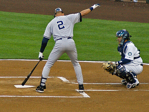
It’s a shame he didn’t remember the players name. I would love to know it he had a substantially higher batting average at home than away where the thicker lines were catching his attention in the batters box.
When I was still coaching high school baseball, I was the last hold-out in our area that still used chalk on the dirt. Most of our opponents couldn’t believe that we still used chalk, because it was so much easier to use paint. To me, that’s what a baseball field is supposed to look like. I also used to use smaller lines for the batter’s boxes (2″ instead of 4″). I didn’t realize until watching a game this year that MLB teams were now painting the dirt. I find that to be a little disappointing.
Just saw an ad for baseball’s Armed Forces hats. Seems like with only five stars on the side, they’re neglecting one of the six branches. But why let understanding the Armed Forces get in the way of “honoring” them.
I have really enjoyed this week’s content. It reminds me of why I was so drawn to this site in the first place. Thank you for the fascinating rabbit holes this week.
The replica Boston Garden table hockey game is just about the greatest thing I have ever seen. The United Way hands on the ice brings me right back to the 70’s and 80’s.
Glorious. Well done!
I have been in the “Gaaaahden” a number of times. It’s a pretty good replica, but I’ll be a little pedantic here. The front row of the lower seats came right up to the ice; there wasn’t a big wide aisle in front of them.
The loge/mezzanine levels are deadly accurate, even the fact that the upper seats were crimson. That was to match the jackets of the ushers for that level.
Any minor issues like the distance from the boards to the first row of seats can be forgiven when you look at the Bruins bench see the bald spot on Wayne Cashman’s head!
Funny the United Way logo was a detail that brought me back as well. I felt like I was seeing it on TV38 & I could hear Cussik’s voice: “Shot, Score!!! Raymond Bourque!”
The model was on point, the colors were an excellent match to the visions/memories I have of the Garden.
Did you see Johnny Peirson just passed away?
link
Yeah, even though I’m neither a hockey guy or Boston fan, that model is pretty awesome.
My only complaint is with the article, I’d love to know more about how “for other components a 3D printer is employed.”
It’s still too bad the White Sox did not move the old fire hoses across the street and use them for foul lines in New I’m Still Calling It Comiskey Park. Alas…
Little quirks like this and the Dodgers batter’s box that make baseball tourism a thing. There are only a handful of NFL,NBA,NHL,MLS stadia that are truly destination “must sees,” but even minor league stadiums are included on travel lists for unique stuff like this.
This article is quite old, but it seems like they did, in fact, move the hoses over to the new park: link
OK, that escaped my notice. I am glad that they kept it, if only for the last bit of foul line.
HI Paul. Do any of the porch walkers-by captured in your photos contact you after seeing themselves here?
That has never happened, no.
Regarding the batter’s box lines: is it really an advantage for any player since as long as you’re within the outside border (on the standard thick lines) your “in the box”. We can even see that in the picture of Jeter digging in, he’s digging on the actual (standard thickness) line. To me that’s the equivalent of a batter digging right under or on the thinner Dodger Stadium line. So I don’t get how it’s an advantage besides maybe visually. Also, what did Jordan mean by, ” the lines really only matter for the first inning anyway”? Is is just that by later in the game the lines are “erased” from being stepped on?
what did Jordan mean by, ” the lines really only matter for the first inning anyway”?
He meant they get erased/smudged/obscured pretty quickly once the game begins.
Had to laugh at Senators Week getting a shout out here. But for real, I’d love to see Paul be a guest contributor to Defector from time to time.