[Editor’s Note: Today we have a guest entry from long-time reader and contributor Jeremy Brahm, who will tell us the story of two designers (and sisters!) you’ve probably never heard of, but in Japan, they’re responsible for an amazing array of uniforms. Enjoy! — PH]
The Koshino Sisters: From the Runway to the Court, the Floor and the Field
by Jeremy Brahm
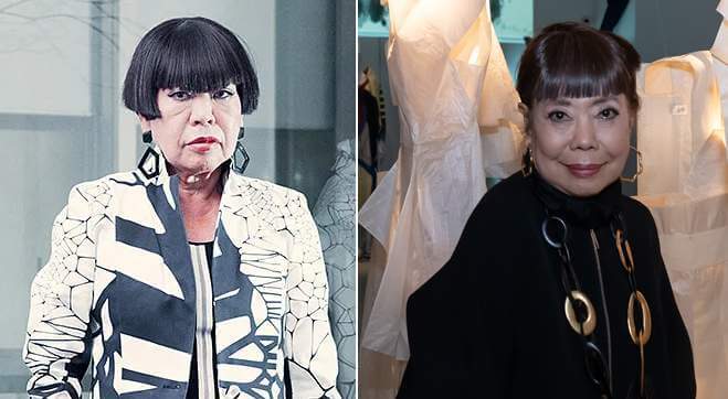
To Uni-Watch readers, we are so accustomed to teams having multiple designs to their uniforms in many different leagues and colleges. However, when you look when teams started to create a “brand,” it was probably the Charlotte Hornets and their work with Alexander Julian to establish the teal and purple. However, to most people of the day, Julian’s regular work would not be considered worthy of the Paris runways, and this is where Japan flipped the script during its economic boom through two sisters Junko and Hiroko Koshino.
Both sisters are from the Osaka area and attended the Bunka Fashion College in Tokyo. During their as college students each sister became known for their work. Hiroko opening her first store in the Shinsaibai district of Osaka. In 1978 Junko held her first show in Paris, while Hiroko would have her first show in Europe in Rome in the same year. From there both sisters work was considered part of the must-see shows during Paris Fashion Week.
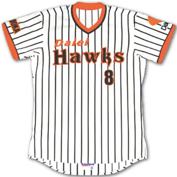
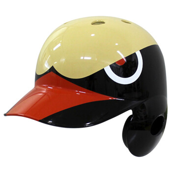
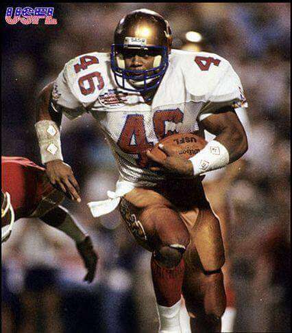
As the Japanese economic boom kept moving on as the sisters were displaying their work in Paris, at the end of the 1988 season Japanese baseball saw the movement of the Osaka based Nankai Hawks to the city of Fukuoka after being purchased the Daiei grocery store chain. Daiei who would have to wait until 1993 to open the Fukuoka Dome, decided that it wanted to make a splash with its new uniforms. The team hired men’s designer Issey Miyake and the orange and brown pin stripes may have been lukewarm, the team hawk’s head helmet was memorable and still loved.
Around this time, the Japanese Volleyball Association approached Asics who then approached Junko Koshino and essentially asked them to update our look for the men’s national team. Here is the look for the team in 1991 in red and blue.
As Japan was one of the participants in the FIVB World League as part of the preparation for the Barcelona Olympics, the designs of Junko Koshino reached the court for the first time. For me as someone who was interested in volleyball, when I saw them for the first time, it was stunning and in a good way. Multiple colors in solid blocks of red and black, with lines splitting the body into sections, including the sleeves and shorts. Let alone the kneepads and socks were a part of the design as well. And Lastly that these colors did also alternate from front and back, or left and right, including the kneepads and socks!
The next day, the Japanese came out with a green and black version. Including the kneepads and socks again.
Still these would not the only works created by Junko Koshino for the volleyball team. As the team traveled to Barcelona for the games, they received two new designs, similar in nature. One was florescent orange with black lettering which would also adopt the alternating colors on the kneepads and socks.
One thing that you can barely see in the last photo is that underneath the number on the shorts is the players name, which can be seen here (so is NOFS?). The Japanese team would also wear a black and florescent yellow version with florescent yellow lettering.

Still four different designs in one year for volleyball was a lot in those days.
In 1993, Junko Koshino continued with her work the volleyball team and she used two different gradation patterns, dark blue to light blue with florescent yellow lettering and purple to light green with white lettering.
Additionally as Junko Koshino’s work was more recognized other Japanese sports groups looked to her for help. In 1993, the Japanese Olympic Committee had her create the 2nd logo for them. In 1994, the Yomiuri Giants had her design their ground jackets.
In 1995, Kawasaki Verdy (now Tokyo Verdy) which was also owned by the Yomiuri Newspaper had her design the uniforms.
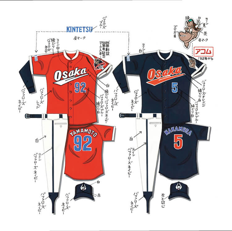
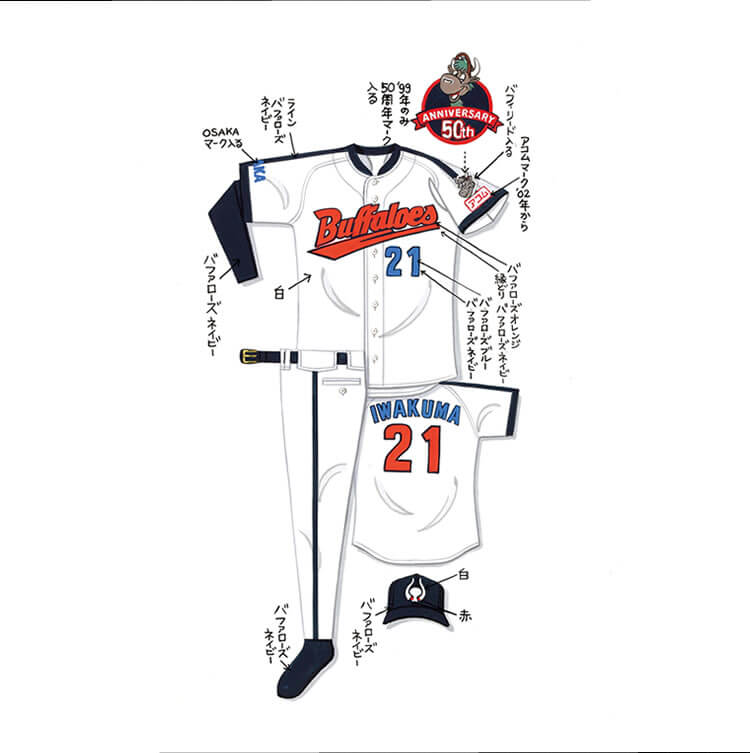
After her sister Junko had gotten recognition for her work in the sport world, Hiroko Koshiko was asked by the Kintetsu Buffaloes to create a new look for the team as the moved into the Osaka Dome. The Buffaloes had used essentially the same design since 1974. Hiroko went bold and modern with her look.


She gave the Buffaloes a five-color scheme, Buffaloes White, Buffaloes Orange, Buffaloes Blue, Buffaloes Navy and Buffaloes Red. Let alone putting Kintetsu in a cursive yet readable script. Plus, with the team moving from the suburbs of Fujiidera actually into the city proper, adding Osaka to the sleeve. One odd quirk for the navy and blue versions of the uniform were different colored numbers on the front and the back, which also swapped the script color for the name on the back of the jersey.
When Osaka was added to the team’s name two years later as the Osaka Kintetsu Buffaloes, Kintetsu moved to the sleeve and Osaka was made in cursive on the red and navy versions.
In 1998, Junko was hired by the Japan Keirin Association to design nine individual uniforms for the 1999 Keirin Grand Prix.


In 1999, she was asked to return to design for the Keirin Grand Prix.
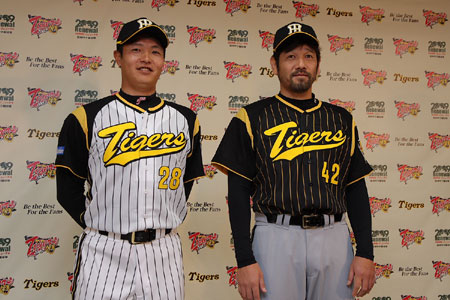
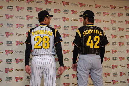
After Hiroko’s experience with the Buffaloes, who had then merged with the Orix Blue Wave to become the Orix Buffaloes, she was then hired by the Hanshin Tigers to create a look for the team’s interleague games in 2007. For the first time in the history of the Tigers, they would use a script for the team’s name. The home whites would have black raglan sleeves to go with their black pinstripes with yellow script and numbers. The road design would have black tops with yellow pinstripes, script and numbers with grey pants. Also, Hiroko added yellow highlights on the cap and brim.
In 2010, the Japanese Gymnastics Assocation, hired Hiroko to create a design for both the men’s and women’s national teams. In June 2010, it was introduced through a press release by Mizuno as a butterfly design. Hiroko stated with the design, that I want you to dance beautifully and brilliantly like a butterfly and fly to the world.
For the Japanese men, it was a successful design with them finishing second in the team event and Kohei Uchimura winning the individual all-around title, plus a silver and bronze in specific apparatus.
Hiroko has been asked back every since when there is a new uniform for the teams.
2011, 2012, 2013 (added Trampoline), 2016 and 2017.
This week, Hiroko revealed her most recent work with the Japanese women’s soccer team INAC Kobe Leonessa. With the creation of the new WE LEAGUE to be a professional women’s soccer league in Japan, Many of the teams in the league are tied to J-League squads, but INAC is not one of them. As three-time champions of the Nadeshiko League 1st division INAC wanted to be bold with their look and asked Hiroko for her time and she delivered a very distinct look.
The design is meant to “Play Around the Music” and has a piano (keys implied) on the left, possibly a cello in the middle and a violin on the right side.
The first uniform is the red base, the second uniform is the white base. For the goalkeepers, the first choice is the blue base, while the second choice is the green base.
@UniWatch @PhilHecken here is the look from the back as well from INAC Kobe https://t.co/DJ46YIg3M0
— Jeremy Brahm (@jeremybrahm) April 15, 2021
One interesting quirk of the numbers is that the colors are not the same on the uniform model. On the red first uniform, the numbers of light blue. On the white second they are red. On the first choice for the goalkeepers’s blue uniform, the numbers are purple and on the second choice of the green uniform, it is yellow.
For nearly 30 years, the Koshino sisters have created memorable designs with these numerous teams and not even to mention their normal work. The question we should ask the sisters, Junko (at 81) and Hiroko (at 84) is what is next on their sports path?
Thanks, Jeremy!

Guess The Game…
from the scoreboard
Today’s scoreboard comes from Charles Miner.
The premise of the game (GTGFTS) is simple: I’ll post a scoreboard and you guys simply identify the game depicted. In the past, I don’t know if I’ve ever completely stumped you (some are easier than others).
Here’s the Scoreboard. In the comments below, try to identify the game (date & location, as well as final score). If anything noteworthy occurred during the game, please add that in (and if you were AT the game, well bonus points for you!):
Please continue sending these in! You’re welcome to send me any scoreboard photos (with answers please), and I’ll keep running them.

Uni Concepts & Tweaks
Time for more Uni Tweaks from the UW readership.
I hope you guys like this feature and will want to continue to submit your concepts and tweaks to me. If you do, Shoot me an E-mail (Phil (dot) Hecken (at) gmail (dot) com).
It’s rare when I get two separate tweaks from two separate individuals that are essentially the same tweak — which either proves great minds think alike, or everyone just hates the current Arizona Cardinals unis…
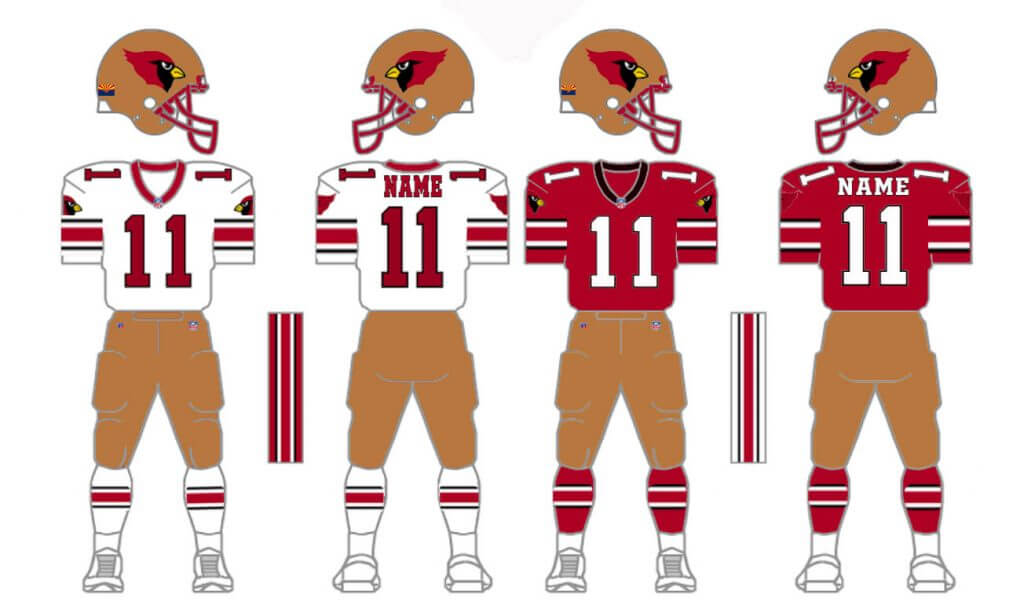
Today’s first set of concepts comes from Morris Belleville:
He writes…
Good morning Phil,
Please find attached a uni concept for the Arizona Cardinals.
A lot of people have said that the Cardinals uniform is too busy and needs to go back to basics. I have tried my hand at this with one notable exception – adding Copper to the color set. I thought the Arozina Wranglers had a great color set in the USFL. However, the Cardinals are not going to change their name any time to the Wranglers, so I thought this would be the next best thing: Adding copper, getting the uniform back to its roots, and adding a red facemask.
Thanks,
—
Morris Belleville
And here are his designs:
And next up is Jay Braiman, who says…
Hey, Phil.
Thought I’d send you this thing I threw together with my severely limited Paint skills (you may have seen it on FB already) to suggest how the Arizona Cardinals should/could adapt and adopt the 1984 Arizona Wranglers (USFL) uniform with just three changes: (1) pre-2005 Cardinal head on the helmet; (2) AZ state flag on the sleeve, and (3) pants stripes instead of flames.
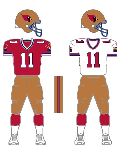
For comparison:
Probably too low-res and low-concept for the blog, but let me know what you think. Hope all is well and hope we can do a Uni Watch get-together later this year.
– JB
OK readers (and concepters). If you have some tweaks or concepts, shoot ’em my way with a brief description of your creation and I’ll run ’em here.
Man(cave) of Steal
Check this out:
Kansas City native Kent Corser has built a Man Cave celebrating Rickey Henderson — aka the “Man Cave of Steal”. As the name implies, his collection celebrates the spectacular career of Hall of Famer Rickey Henderson. He was recently featured on my buddy Shawn Anderson’s HOVG Cribs. If you’re into collecting, you’ll definitely enjoy this 7 minute peek…
Click to enlarge
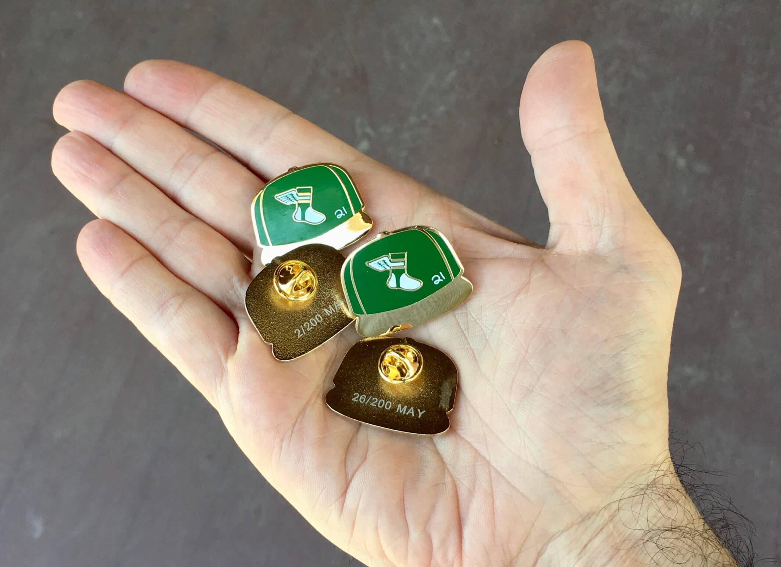
ITEM! New Pin Club launch: Paul here. Now that the calendar has turned to May, it’s time for our latest Uni Watch Pin Club launch. This month we’re keeping it simple and classic with a Uni Watch baseball cap pin, which you can order here.
A few notes:
• This the first Pin Club pin that doesn’t include the words “Uni Watch.” We thought it was better to let the design speak for itself.
• The little white “21” stands for the year, obviously, and is meant to mimic the little cap inscriptions that MLB players sometimes use as a shout-out to injured or fallen teammates.
• Numbered edition of 200 pins.
Again, the pin is available here. Enjoy!
Now back to Phil with the rest of today’s content.
Uni Watch News Ticker
By Phil

Baseball News: The new “rally” helmet in baseball appears to be a hockey helmet (from Multiple readers). That’s Kyle Schwarber donning one, and you can read more about that here. … This article asks, Why aren’t teams giving away branded masks as promo items? (from John Cerone). … Texas-based RSN has begun using wider camera shots behind the pitcher to allow for more on-screen ad space (from Thomas Foote). … The Madison Mallards have a new look for 2021 (from MiLB Promos). You can read more about that here. Their team store also has a pair of hats labeled as the Home Blue and Away Cream game hats. … If you’re interested, here’s Padres uni tracking for April (from Padres Uni Tracker). … Yesterday, Ole Miss was wearing camo hats and batting helmets (and will all weekend) for military appreciation (from Timmy Donahue). … I’m not normally a fan of softball tops (especially when both teams go that route), but I gotta agree with David Payne who felt this A’s vs O’s tilt was an “elite uniform matchup.” … The Mets wore their royal road alternates (and won) yesterday in Philly, but Francisco Lindor took BP in a black alternate jersey (from Tim Kelly). … The Brewers have a bit of a rarity: a new catcher with #0 (from Garrett Van Auken). … Has the Cubs logo…grown? Erez Schatz writes, “to me it seems like the Cubs insignia, both the Cubs and the one with the Bear are humongous to a point the uniform moves differently because of the size and weight at the left hand side. I’ve compared both the sketch and an image, and to me it definitely looks much larger on the actual uniform.” … I pretty much hate PFPS (especially when it’s connected to breast cancer/mother’s day), but for some reason, I absolutely loved Fernando Tatis Jr.’s fucshia cleats yesterday.

Football News: Carroll College, an NAIA school in Montana, has unveiled championship rings for winning the Frontier Conference title (from Kary Klismet). … Also from Kary: Reveille X, Texas A&M’s newest live collie mascot, has officially begun her duties. … ICYMI: here’s a look at many draftees with their new team jerseys (from Nicklaus Wallmeyer). … The Nevada Wolf Pack unveiled new helmets yesterday for the 2021 season. The primary features a proprietary metallic silver-flake painted Riddell shell and a chrome face mask. Like last season, the script logo and player number are on the sides (from Dave Calvert). … Was it destiny? New Dallas Cowboys WR Simi Fehoko shared a childhood photo of himself in a Dallas Cowboys uniform. … Here’s a very interesting potential NOB situation to look for: the Jets took two different guys named Michael Carter (from Walter Young). Not only that, one is from Duke & one from UNC (from James Gilbert). … Here’s a look at the “Top 5 aTm unis” of the past decade. … Aside from becoming the #1 pick, new Jaguars QB Trevor Lawrence set the record for most jersey sales by a rookie on the night of the NFL draft.

Hockey News: In what is perhaps an unusual move, the Columbus Blue Jackets wore blue breezers with their white jerseys last night; they normally wear red pants (from multiple readers). The blue pants are from their reverse retro unis. … Potential big uni news: Trent Guyer writes, “At the Arsenal store at the Golden Knights practice arena in Summerlin, Nev, they’re telling customers the gold alternate sweater is going to become the primary.” Their current primary is, of course, gray. … Here’s a detailed look at a new mask for Panthers G Chris Driedger (from Wade Heidt).

Soccer News: Not too much soccer news these days, but the West Virginia Highlanders FC have introduced their debut uniforms (from Ed Żelaski).
.

Grab Bag: You may not have noticed, but the New York Times thinks Joe Biden has become quite the sharp dresser since his inauguration (from Tom Turner). … But is it? Reader Jeffrey Sak says, “I hate this logo…It’s a right hand.” But if you look closely, it appears to be a deliberate hand print, making it a left hand, no? What say you, Uni Watchers? … Walmart has filed papers opposing a trademark from Kanye West’s Yeezy brand that the retail giant says is too similar to its own “spark” logo and could cause confusion among consumers (from John Cerone). … Also from John (and ICYMI), burger chain White Castle has unveiled its 100th Birthday (not anniversary) logo. … Here’s an interview with the top-ranking enlisted Marine, who discusses the process of designing and creating the Corps’ new workout uniforms (from Kary Klismet). … Also from Kary: Alabama is considering removing the Confederate flag from its coat of arms. … More from Kary: IndyCar driver James Hinchcliffe has added a mustache to his racing helmet as a tribute to his late father. … Here’s a breakdown of the helmets drivers will be wearing for this year’s edition of Formula 1’s Portuguese Grand Prix (from Kary, again). … And one last one from Kary — size apparently is everything: A psychological study has found that men who wear large logos on their clothing are less likely to be committed relationship partners. … David Letterman had dolls made featuring his trademark 3-striped shoes (here’s a look at them on his feet. From James Gilbert).
Uni Tweet of the Day
After seeing this, I really hope the NFL scraps the one-shell rule and allows white helmets…
Here’s a look at JOK in the reported new uniform #Browns (via @TLAartwork) pic.twitter.com/xlpMdCqf90
— Brad Stainbrook (@BrownsByBrad) May 1, 2021
And finally… that’s it for this weekend — big thanks to Jeremy for that really cool look at the design work of the Koshino sisters — fun stuff!
Everyone stay safe and healthy and I’ll catch you back here next Saturday.
Peace,
PH
I noticed the Rangers’ centerfield camera the other day. It’s not clear to me that the ad space is the true reason why it looks so far away. The linked article makes that claim, but says the RSN didn’t respond to requests for comment.
The camera angle in Texas is actually directly from centerfield and right in line with the pitcher and the batter, so the camera needs to be higher to see over the pitcher’s head. That makes it necessarily wider.
The traditional centerfield camera, however, is slightly off to the side, as you can see in the other example in the article. So they don’t need as much vertical space to show the pitcher (slightly to the side) and the batter in the same shot.
ESPN experimented with this angle about 15 years ago and it just looked weird. Eventually they found a better solution (or maybe we just got used to it?)
Of course, the “more ads” explanation is a likely reason, but there really is no way to show the pitcher and batter in the same shot when you are exactly in line with the plate. You automatically end up with more empty space to the left and right.
In the Grab Bag, the Indy Car driver is named JAMES Hinchcliffe, not Jeremy.
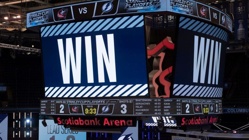
August 11, 2020. Game 1 Tampa Bay vs Columbus…5 OTs.
You forgot to include that it was at the Scotiabank Arena in Toronto.
But yeah, that one was a total softball.
I like Morris’s Cardinals design, showing what a red-black-copper color scheme would look like. The ’84 Wranglers red-blue-copper scheme, though, just screams Arizona; I think the blue from the state flag should replace the black (and they should bring back the state flag on the sleeve). I also think that modern NFL jersey sleeves are too way short to accommodate both the old St. Louis/Northwestern stripes and the cardinal-head logo, and still have TV numerals on the shoulders.
Looks like a combination of the Wranglers and the Tampa Bay Bandits. And that’s not a bad thing.
I like both concepts. They sure beat what the Cards are wearing now.
The Bandits were basically just Ohio State with black-numeraled road jerseys, but yea.
Appreciate the enthusiasm from some fans to add gold helmets and pants but I do not this realistically works well. Cardinals should stick with white helmets and go more back to their traditional look as a long-tenured team rather than a massive overhaul. The design from Morris reminds me of/looks too similar to a 49ers uniform.
I agree. The concept is nice in a vacuum and is much better than their current disaster but teams with long histories should respect that history (I’m looking at you, L.A. Rams).
I think I’m the only one here who really digs the Rams’ new unis, at least in certain combinations. (Don’t care for the bone jerseys with the bone pants, but the shades of blue and yellow they choose look great on the field, especially under the natural lighting of their new stadium).
It’s a nice update that IMO “respects” the team’s history while giving it a modern feel to go along with the ultra-modern new stadium. Certainly an upgrade over the bland St. Louis colors and the mismatched helmet/jersey look of the team’s prior stint in LA.
As for the Cardinals, they should have taken the opportunity when they moved to Arizona a while back to do a complete rebrand with a new nickname and color scheme.
Actually I agree about the white helmets. But copper would be a nice second choice.
“Cardinals should stick with white helmets and go more back to ST.LOUIS”.
Fixed ; )
I get what we’re going for with these, but red/copper looks a lot like their division rivals from San Francisco who wear red/gold.
GTGFTS
2020 NHL Playoffs – Round 1, Game 1
Tampa Bay Lightning vs. Columbus Blue Jackets
TB finally won in the 5th OT! They would go on to win the Stanley Cup
Yep! August 11th, 2020! Final score is in the picture—Lightning 3, Jackets 2. As a CBJ fan who stayed up through the bitter end even when everyone else had gone to bed, that was a gut wrenching game.
No bonus points since fans weren’t allowed in
Good stuff, Jeremy! A lot of those designs are really out there but there are some I’d definitely wear. That Hawks helmet in particular was great.
You may not have noticed, but the New York Times thinks has become quite the sharp dresser since his inauguration
Who?
Indeed. And the link is wrong (it goes to the story about the Carroll College football teams championship rings). My bad on both counts. Here’s the proper link:
link
Whoops! This was supposed to be a response to Mike duet’s post above.
Anyway, Phil, if you don’t mind picking up my slack, the correct link for the Hinchcliffe Ticker item is above. Sorry for the inconvenience!
Should be fixed now (the bad link was probably my fault)
Fascinating deep dive on the Koshino Sisters, Jeremy! I admittedly had never heard of them before your piece today. Thanks for the education!
Definitely an interesting and well-written piece.
However, I will say that IMO the Koshino sisters aren’t all that great at designing uniforms.
Now, I will acknowledge that I don’t know much at all about Japanese sports/uniform culture and traditions so it may not be fair to judge their work by Western standards. And the Hawk helmet was pretty cool. But most of the examples were pretty garish.
Alexander Julian is five time Coty Award winner. In the early 90’s, he was right behind Polo in revenue. Interestedly he was big in menswear and womenswear in Japan.
Checking in again to second this. Alexander Julian was a big enough deal in the fashion world that the Hornets having him doing their inaugural uniforms made them more newsworthy – he was the bigger name at the time. He also put the iconic argyle on UNC’s uniforms in the mid-1980s.
Concerning the Cardinals redos, I just don’t get the appeal of using copper. Reminds me of when the University of Arizona used copper and it just didn’t go with their colors. The Cardinals colors are red, white, and black, with a very little bit of yellow on the beak. The blue with Jay’s makes no sense, since it doesn’t match their logo bird colors. Forget trying to incorporate the state flag. And on Belleville‘s uniform, the small sleeves of current uniforms aren’t going to fit both the Cardinal logo and the stripes. I’d go with the stripes.
Making the Cardinal’s better by making them look like the 49 ers?
I don’t know what the Cardinals’ problem is but it’s not white helmets.
Ownership.
That Hawks helmet is straight fire.Magnificent.
That ‘hawk’ batting helmet is a breath-taking beauty….I mean, wow!
I have an authentic Cubs home jersey and alternate jersey. Bought them about 15 years ago. The chest patches are significantly large. Don’t think they have increased the size. One thing to notice, is on their website, the Authentic jerseys the chest patches ARE larger than the replica jerseys.