Click to enlarge
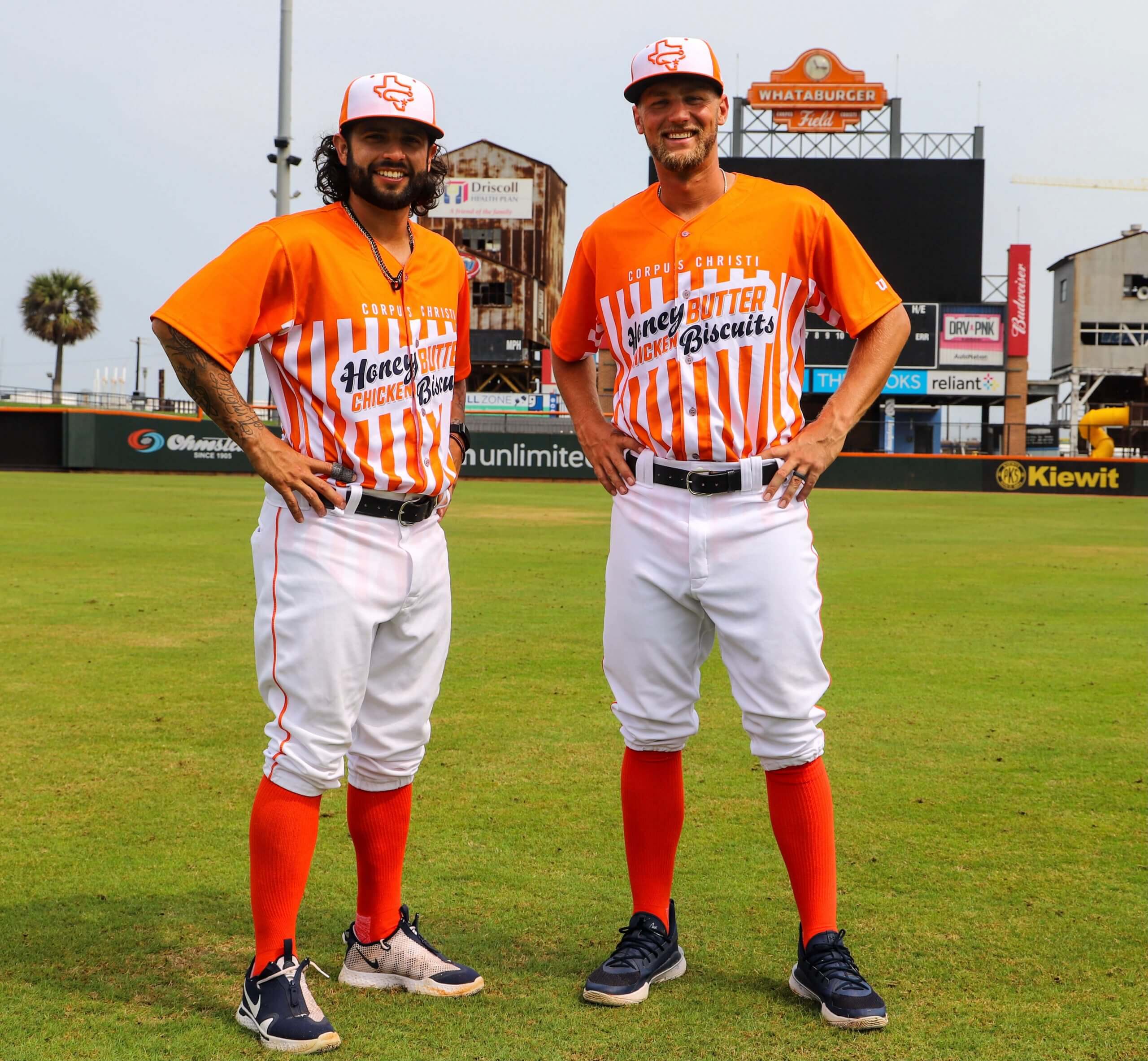
Ready for some eats? The latest food-based minor league makeover comes our way from the Corpus Christi Hooks — the Astros’ Double-A affiliate — who announced yesterday that they will play as the Corpus Christi Honey Butter Chicken Biscuits on Wednesdays this season.
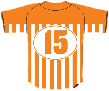
Here’s how the uniforms look from the back:
If you’re a fast food fan and a Southerner, that design probably looks familiar to you, because it’s based on the package and table tent designs of the regional burger chain Whataburger, which was founded in Corpus Christi and holds the naming rights to the Hooks’ stadium.
Why are they going with the Honey Butter Chicken Biscuits, instead of just calling themselves the Corpus Christi Whataburgers? I’m sure they would have preferred that, but MiLB doesn’t allow for that level of corporate hucksterism (at least not yet). It’s the same rule that forced the Syracuse Chiefs to become the Syracuse Devices, instead of the Syracuse Brannock Devices, in 2018.
So yeah, the ad-creep aspect of this is a bit gross. But hey, it’s Double-A ball, whaddaya gonna do. And at least they had some fun with it by choosing an endearingly clunky name. Say it three times fast: Honey Butter Chicken Biscuits, Honey Butter Chicken Biscuits, Honey Butter Chicken Biscuits!
Of course, we all know there’s only one true biscuit-themed team. But I suppose we can let the Hooks put the biscuit in the basket too, as long as it’s just one day a week.
New podcast episode: For this week’s episode, Chris Creamer and I talked about the Bengals’ new uniforms, plus we discussed the possibility of the NHL adding jersey ads, the leak of MLB’s G.I. Joke caps, the WNBA’s Dallas Wings having to scrap their just-revealed uniform due to a major research oversight, our Question of the Week, and more.
As always, you can listen to us on Apple, Google, Stitcher, TuneIn, and Spotify, or just use the player below:
The show notes for this episode, which include photos of many of the things we discussed (including a really sensational photo of Chris’s son having what appears to be a formative logo-related experience), are here. Those photos (and some additional ones) also appear in the video version of the episode, which you can see here:
Please consider supporting this episode’s advertisers, Streaker Sports (get 20% off any order with checkout code UNIFIED) and Homefield Apparel (15% off with checkout code UNIFIED).
Enjoy the episode, and thanks for listening.
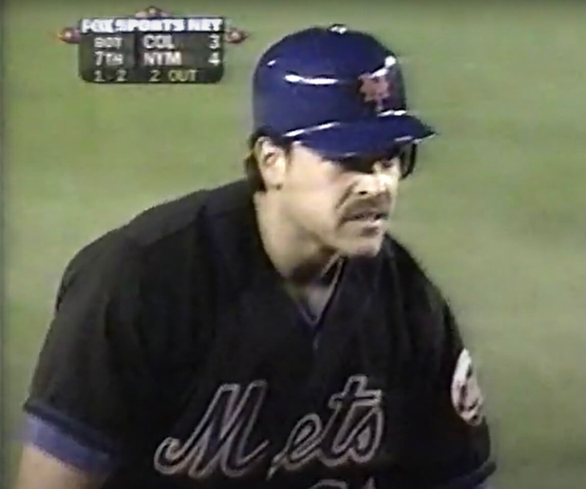
Black and blue: The screenshot above shows Mets catcher Mike Piazza wearing the team’s blue helmet and black jersey. It’s from the second game of a doubleheader on Aug. 18, 1998.
I had no memory of the Mets ever wearing that helmet/jersey combo. And it wasn’t just Piazza — you can see the whole team doing it in this highlight sequence.
This discovery came my way from reader Patrick Lavery. It’s one of a series of things he’s uncovered while researching the 1998 MLB season. We’ll be hearing more from him on that topic shortly — stay tuned.
Meanwhile, as long as we’re talking about Mets helmets, here’s another rare shot:
That’s Mets catcher Todd Hundley with Jackie Robinson’s son Jessie Robinson on April 15, 1997 — the 50th anniversary of Jackie’s MLB debut and the night that No. 42 was retired MLB-wide. The Mets wore their infamous “Good Humor Man” white caps that night — one of only a handful of times that the much-maligned caps were worn (anyone know exactly how many times?). The team never bothered to make matching white batting helmets, but first baseman John Olerud wore a white helmet in the field — and, as we can now see, so did Hundley.
I knew about the Olerud helmet but had forgotten about Hundley until Twitter-er @jjburkeesq shared it with me yesterday. He said he’s not sure if the Mets’ two other catchers that season — Todd Pratt and Alberto Castillo — wore the white helmets (or if they even played in any of the white-capped games).
And as long as we’re talking about the Mets, here are a few notes from last night’s game:
• First baseman Pete Alonso wore an orange base layer (which is technically against the rules, as everyone on the team is required to wear the same color undersleeves, but good luck trying to enforce that one):
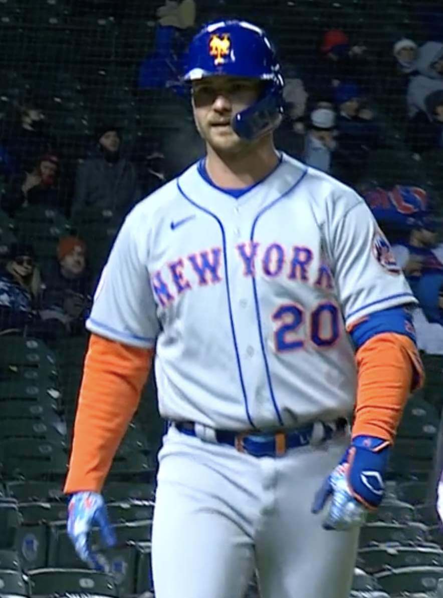
Pretty sure that’s the first time he’s done that. David Wright used to do it routinely, but only with short sleeves that didn’t extend below his jersey sleeves, so all you saw was the orange collar.
• Second baseman Jeff McNeil wore a gaiter with the logo for the Cookie Club, which is a Mets-themed kids’ TV show:

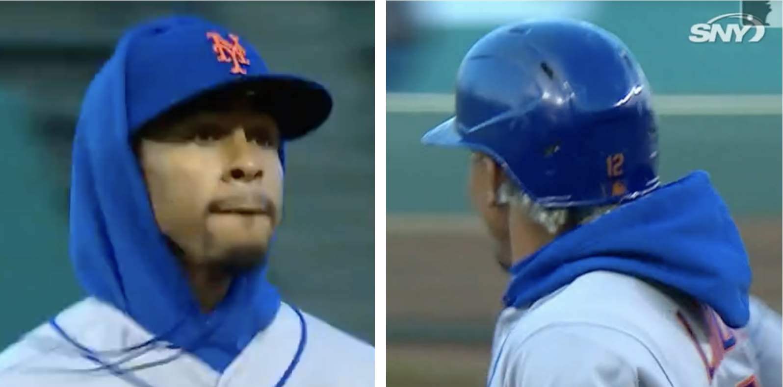
• Shortstop Francisco Lindor wore a hoodie. He had the hood up while playing the field but down while batting and running the bases:
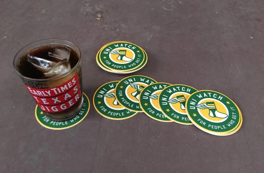
Coasters reminder: I’m down to about seven remaining sets of these great-looking Uni Watch coasters. They’re made in the USA from sturdy pressboard and measure 3.7″ across.
As has been the case in the past, I’m selling these in groups of three coasters for nine bucks, including shipping. USA orders only, sorry.
To order, send me $9 via Venmo (use @Paul-Lukas-2 as the payee), Zelle (plukas64@gmail.com), or Google Pay (plukas64@gmail.com). If you want to use Apple Pay, a paper check, or well-concealed cash, get in touch and I’ll give you the appropriate info.
After paying, email me with your shipping info. Thanks!
If you want to combine a coaster purchase with an order for a Uni Watch koozie, a trading card, a magnet, a seam ripper, or a chain-stitched patch, please email me and I’ll give you a price that includes a combined shipping fee for the whole shebang. (Sorry, these are the only Uni Watch items I can combine into one shipment, because all our other items ship from separate locations.)
For all photos, click to enlarge
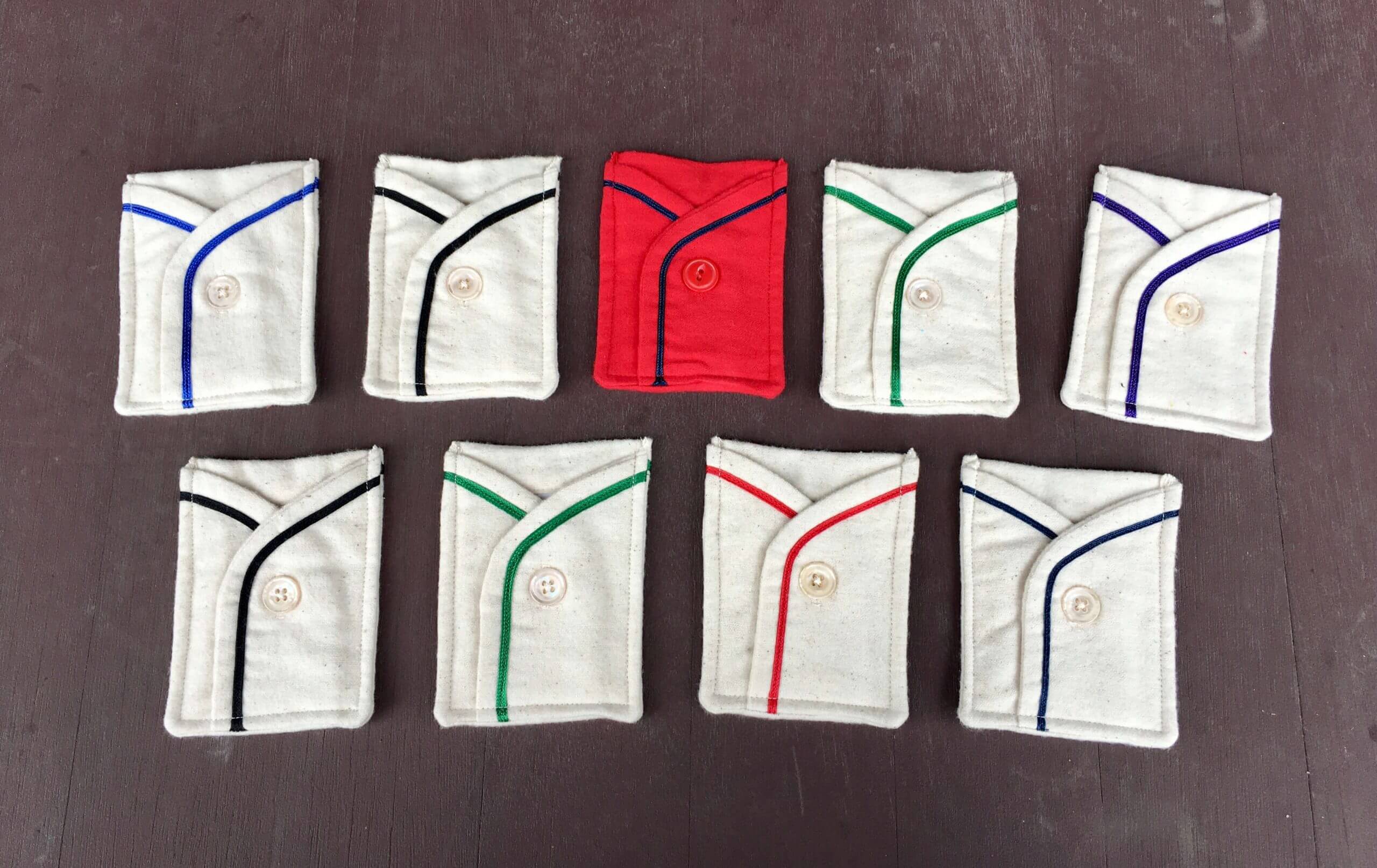
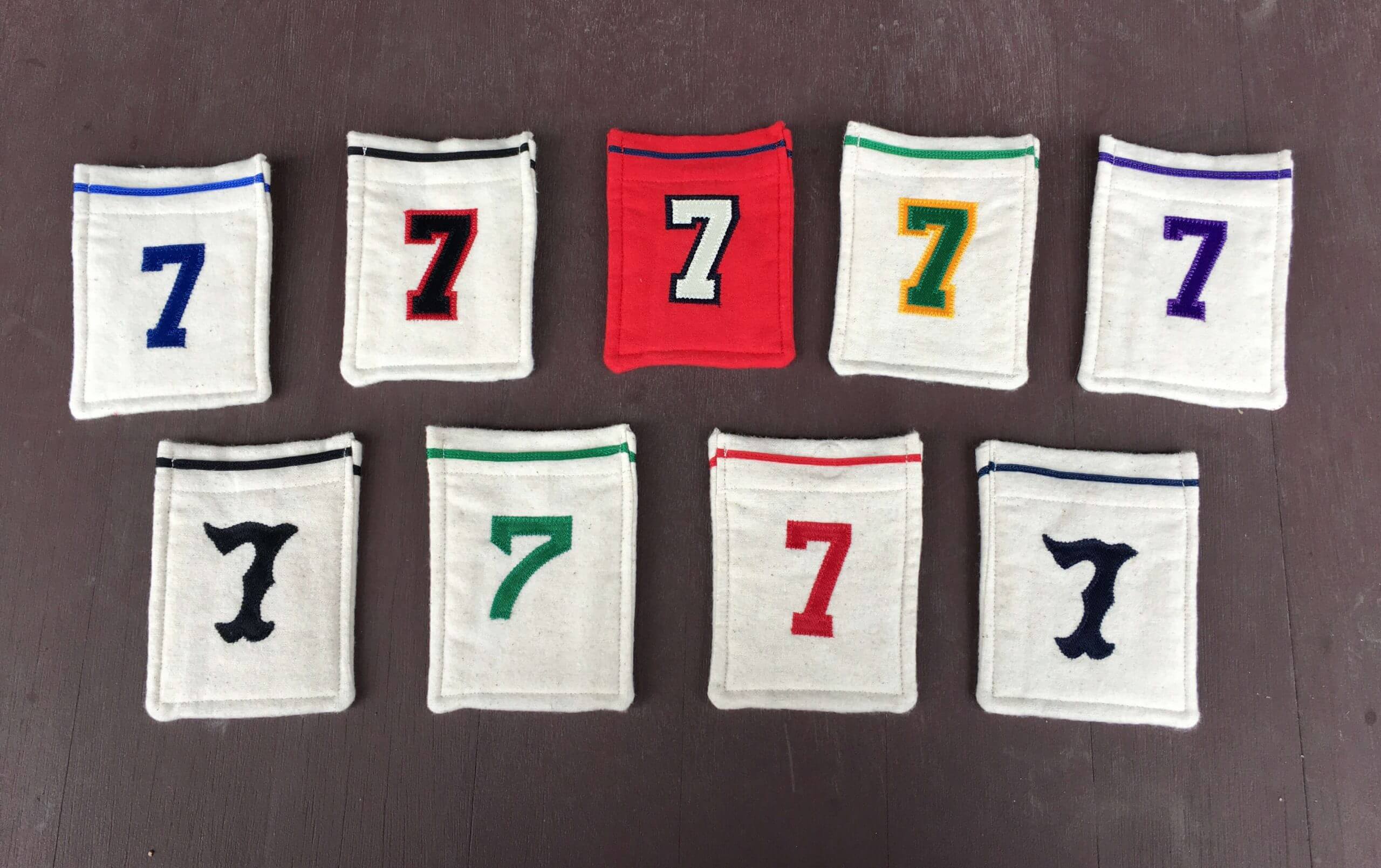
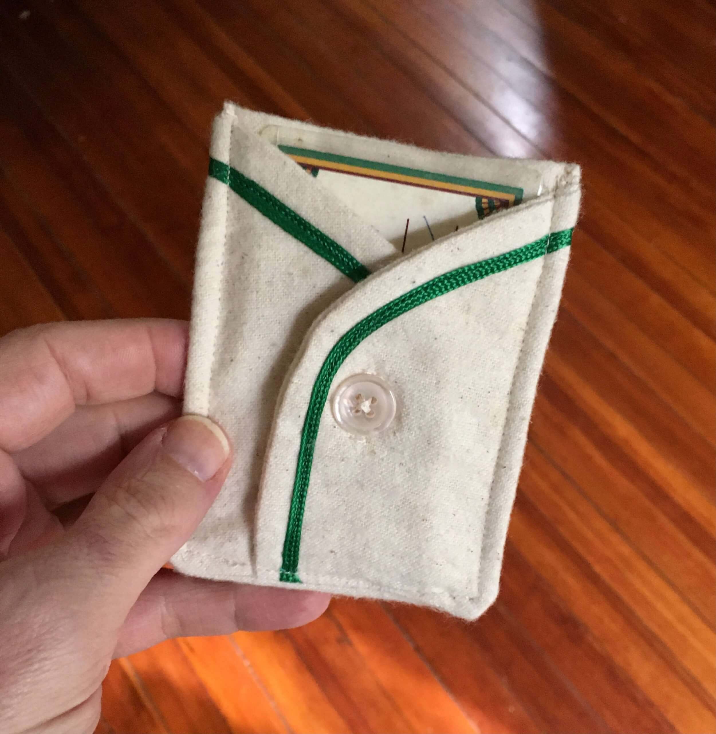
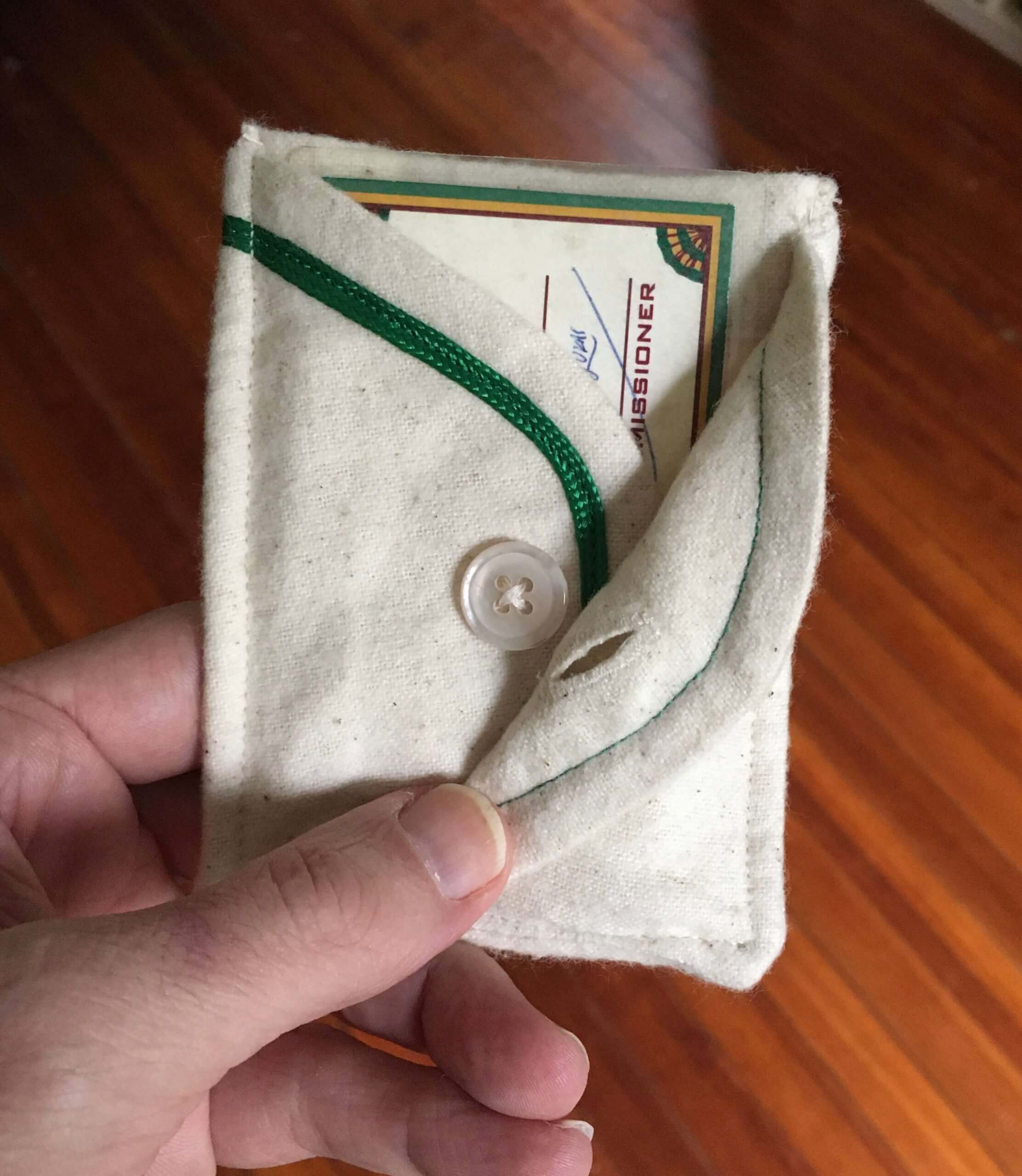
Membership drive reminder: In case you missed it on Monday, our April membership drive is taking place this week. Out of all the people who sign up for a membership card this week, three randomly chosen enrollees will get to choose one of the card pockets shown above (except for the purple one, which I’m saving for Purple Amnesty Day).
The pockets were made by the great Wafflebored. Here are some additional pics:
If you order a membership card this week, go ahead and specify which pocket you’d prefer if you turn out to be one of the winners. I’ll try to accommodate the winners’ preferences.
I’ll announce plans for the remaining pockets later this year. Thanks for your consideration, and of course doubleplusthanks to Wafflebored.
The Ticker
By Paul

’Skins Watch: Next Wednesday, April 28, 10am-noon Eastern, I’ll be participating in an online panel discussion about Native American imagery in Connecticut sports. You can see the other panelists listed here, and you can register to view the event here. … The Southern York County school board in Pennsylvania has voted to retire its Native American iconography but will keep its “Warriors” team name. … A commission has recommended that Algonquin Regional High School in Massachusetts should stop calling its teams the Tomahawks (thanks, Phil). … The rest of these are from Kary Klismet A debate over whether a nearby middle school should keep “Redskins” as its team name has created controversy and heightened tensions among faculty members at Tennessee Tech. … The school board in Atchison, Kan., has voted to discontinue the Native American-themed team names, reversing a 2018 decision to keep them. … Students at Columbia River High School in Vancouver, Wash., have voted to retire their “Chieftains” team name and replace it with “Rapids,” adopting a new logo in the process that appears to have been poached from the Colorado Rapids of the late ’90s. … Susquehannock High School in Pennsylvania has decided to keep its “Warriors” team name but will drop the Native American imagery associated with it.

Baseball News: Here’s something I didn’t know: When Rangers players lined up for pregame introductions at the team’s first-ever home game in 1972, they wore cowboy hats! No word on whether the hats had a maker’s mark on the other side (from Trevor Williams). … Red Sox SS Xander Bogaerts wore a Liverpool soccer jersey during Tuesday’s postgame presser, evidently in solidarity with Liverpool players who oppose the European Super League. “Both the Red Sox and Liverpool are owned by John Henry,” notes our own Anthony Emerson. … Great find by Todd Radom, who discovered a news clipping/photo about Reds skipper Dave Bristol being saddled with a misspelled NOB during spring training of 1967. … Good story about how the Pirates started wearing black and gold (from Kary Klismet). … Also from Kary: The Burlington Sock Puppets want fans to help name the team’s new costumed mascot. … Marlins SS Jazz Chisholm, who wears No. 2, says he asked for No. 0 but the team said no. … MLB players have been wearing uni-numbered belts for a couple of seasons now, but this is the first time I’ve seen an umpire wearing one. That’s Adam Hamari, who was working the plate for yesterday’s Giants/Phils game (good spot by Steven Merrill). … The Rockies’ Twitter page has created an amusing 2021 All-Star logo by modifying the 1998 ASG logo. Note the fine print at far-right. … Speaking of Colorado: What’s better than an orange-vs.-purple game? An orange-vs.-purple game in the snow, which is what the Rox and ’Stros played yesterday (thanks to all who shared). … Weird sequence for the D-backs: They wore their road greys for Tuesday night’s game in Cincinnati, which was suspended due to rain; when the game resumed yesterday afternoon, they’d changed to their red alternates; and then they went back to the greys for last night’s regularly scheduled game (from Josh Pearlman and @coachJS20).

NFL News: As had been expected, NFL owners approved a proposal for more lenient uni-numbering guidelines, so lots of players could have new numbers this season. The ink on the rule change had barely dried when longtime reader/pal Jack Krabbe advised me that Ravens LB Patrick Queen had asked QB Lamar Jackson how much it would take for Jackson to give up No. 8, which is the number Queen wore at LSU and is now eligible to wear in the NFL. According to this ESPN article, players who want to change their numbers this season will have to buy out the league’s existing inventory of their jerseys, although that wouldn’t apply to players who give notice in 2021 that they want to change numbers in 2022.

Hockey News: New jerseys for the Elliott Lake Red Wings, a team in the Northern Ontario Junior Hockey League (from Kary Klismet). … New mask for Manitoba Moose G Cole Kehler (from Wade Heidt).

College Hoops News: Saint Mary-of-the-Woods College in Indiana is naming its court after retired women’s coach Deann Bradley (from Kary Klismet).

Soccer News: Cross-listed from the baseball section: Boston Red Sox SS Xander Bogaerts wore a Liverpool shirt during Tuesday’s postgame presser, evidently in solidarity with Liverpool players who oppose the European Super League. “Both the Red Sox and Liverpool are owned by John Henry,” notes our own Anthony Emerson. … New home shirt for Belarusian side FC Isloch (from Ed Zelaski). … Kansas City NWSL wore “Justice for Daunte Wright” warm-up shirts last night (thanks, Jamie). … At least four Puma-outfitted countries — Italy, Switzerland, Austria, and the Czech Republic — have released new second shirts. “They all have a nonstandard placement of country name, crest, and Puma logo in the center,” says our own Jamie Rathjen. … Here’s a behind-the-scenes look at the logo-design process for Flower City Union, the new team set to debut next year in Rochester, N.Y. (from Mike Weston).

Olympics News: After polling athletes, the IOC has decided that protests and political messages will remain banned at the upcoming Tokyo Games.

Grab Bag: Falmouth High School in Maine is considering dropping its “Yachtsmen” team name and costumed “Yachtie” mascot because of concerns that the identity reflects economic and cultural elitism (from Kary Klismet). … Iowa State’s wrestling team apparently used to have robes, and now they’re bringing them back (from Phil Santos). … The Montana Highway Patrol — perhaps taking inspiration from the 1972 Texas Rangers — has added Western-style cowboy hats as an official headwear option for uniformed officers (from Kary Klismet).

I think the change was inevitable. I asked John Clayton back in 2015 when linebackers started being allowed 40s jersey numbers if the NFL would just do away with the system altogether except for offensive lineman (the only ones who the numbering rules really applied to). He did answer, but kinda didn’t either.
link
Of course there are some caveats. Defensive lineman still have to wear 50-79 & 90-99. Kickers and punters still wear 1-19. Same with quarterbacks, though i can easily see from a marketing perspective why that was left in. (High profile position=lower jersey number.) And no offensive players wear 90-99, though you could make a case for OFFENSIVE lineman to wear them.
And no offensive players wear 90-99
So there won’t be anyone like Mike Ditka, who wore 98 in 1967.
(fast forward two minutes ahead in this short video)
link
Would have loved to have seen kickers get more number options, but overall I’m very fine with this move. I grew up with single-digit and teens running backs and at least one linebacker wearing # 10. Now let’s move the goalposts back to the goal line!
I’m actually surprised Paul made this a Ticker item. The chicken biscuit uniform story probably could’ve waited a day, the uniform number story is a much bigger story. And I didn’t know that about Aliquippa’s finest.
Would have loved to have seen kickers get more number options, but overall I’m very fine with this move.
Also wanted to see the opportunity for another Doug Flutie or John Hadl…or even another Sammy Baugh! Still, I’m fine with this move.
Defensive lineman still have to wear 50-79 & 90-99.
Are there any current DLs wearing 50-59?
I don’t remember the Mets ever wearing the blue caps (let alone helmets) with the black jerseys, although it was something I hoped they’d try. The video doesn’t show the Mets in the field and it’s hard to make out the guys in the dugout for one fleeting second, so it’s not clear if they wore the blue caps in that game or just the helmets.
What I’m trying to figure out from that season is exactly when they started wearing the black two-tone caps with the road greys, and when was the last time they wore the blue caps with the road greys. link a video of them wearing the blue caps with the greys on August 10, which is later than I thought, although now that I think about it it could well have been September when the two-tone cap became the full-time de facto road cap.
Any update on multiple helmets for NFL teams for 2021? Would love to see the Eagles back in Kelly green.
No.
“Economic and cultural elitism.”
Let’s just get rid of team names and be done with it.
-C.
Falmouth FC?
Sportswriters used to create the team names; reinstate this tradition.
Read the “Grab Bag” item about Falmouth High School and you might want to rethink that suggestion ;)
Yes, because one high school is considering whether its team name is a bad look, we must immediately jump to abolishing all team names. Nothing less will stem the creeping tide of consideration.
I don’t care about the Falmouth ME nickname. I do recommend the Gilsland Farm Audubon sanctuary there.
To the broader point of no nicknames, for whatever reason. I’m all for it.
‘The Washington Football Team’ sounds better than any names I’ve seen here or elsewhere. Keep the colors though.
‘The Cleveland Baseball Team’ likewise sounds better than Spiders, Municipals, whatever.
Take the city name and own it. The Mets could take ‘The NYC Team’ and let Yankees fans kvetch and ridicule them about the ‘The’ moniker. But they would be the ‘The’ team in NYC.
Proofreading: there’s a double “of” in the Ticker item about the Yachtsmen team name.
Thanks, Kary. Fixed.
I find it very interesting that Ted Williams was having none of them Cowboy hat nonsense and in typical Teddy Ballgame fashion just stoically started ahead hands in pockets.
Frank Howard seems a bit embarrassed by the whole thing.
Yes, I agree
And Frank Howard would only go so far as to carry his cowboy hat.
I absolutely LOVE that Teddy Ballgame refused to wear the cowboy hat. So in character!
First of all, you’re just jealous that y’all don’t have Whataburger in NYC. I mean, probably not, but still. I dig the jerseys, though. And a Honey Butter Chicken Biscuit sounds like a good plan right about now.
I have to say, I like the look of vertical stripes on a baseball jersey.
This may be an unpopular opinion, but I like those white Mets hats. They’re appropriate for a special occasion. They’re different without being too sacrilege. The Red Sox also had one they wore once or twice, which I also really like:
link
No one seemed to understand that it was an old-timey look; a throwback. I think the people who hated it just saw it as a modern cap devoid of color, and thus, in their minds, stupid.
I loved ’em.
It’s a shame they didn’t catch on! The Reds had a white crowned hat they wore for a few years in the 90’s but otherwise it wasn’t a thing at all.
White with red pinstripes…not a fan (even though they were part of Reds’ history prior to the ’90’s).
A white front-panel cap is my preference over an entire crown of white.
Agreed. The white hats with contrasting brims are excellent. As a former high school baseball coach, I outfitted our team in white hats with a gold brim and a forest green S (school colors, or course). It looked great! We became known in our HS league for our white hats. I got the idea from Texas seeing them in the CWS in the ‘90s and never went back to green hats.
Arizona also had a white crown cap as seen here. I have one in my collection and love it.
link
Oh that’s right! I actually owned one of these as a kid.
Like pullovers, sansabelts, pastel blue road uniforms, vest jerseys, and grey caps for grey uniforms, white hats are ultimately a fad. The only bit of baseball flash that has endured is pinstripes.
I wonder if Ricky Henderson recognized John Olerud in that white helmet.
Rickey wasn’t on the team in ’97.
Noticed there was no mention of a change to the one shell rule from NFL owner’s meeting. Does this mean it’s dead, at least for this year?
Good question.
It’s kind of weird – I’ve read several different stories on the NFL’s new rule changes and the two-shell issue wasn’t brought up at all, even though the articles did mention a couple of proposed rule changes that were voted down.
My guess is that while it’s been reported that the league was “considering” ditching the one-shell requirement, nobody actually put it up as a proposal so it wasn’t voted on either way. I would take it to mean that the possible change has been shelved for this year at least.
Just a small aside, I have been to Whataburger Field in Corpus. It is a nice little stadium. One of the reasons for that was that the advertising was understated and fit in well with the overall design. I guess it was a little too understated, hence the need for the clown suits.
Corpus Christi has had an unusual number of promotional jerseys, including an absolutely gorgeous fauxback as well as at least three versions of the Tequila Sunrise uniform.
link
The Hooks’ fauxback logo (with the hook pointing to Corpus’s location on the map) is one of my all-time favorite logos. I also love the color combo. I’ve never been to Corpus and have no connection to the place or team but I just can’t get enough of that fauxback look.
Is this the one you are talking about: link ??
It’s gorgeous!
Feeling really bothered by the four new international soccer shirts released by Puma (generic, boring, Puma-first template).
At first I thought they had to be warm-up shirts, that there was a mistake, no way could these be the actual in-game away jerseys. Until I see them on the pitch, I’m still holing out hope that this is the case.
*holding*
I can’t say it enough. The NHL selling out their unis to ads is grotesque. Hearing you can Chris talk about it just made me shake my head in disgust. How long will the NFL hold out at this pace? Gross.
FWIW, I have heard *nothing* about the NFL adopting uniform ads.
I’m digging those white Mets caps! I had totally forgotten about those and now I want one.
I wonder if anyone will get a membership card based on those Corpus Christi uniforms.
I dug those white Mets caps at the time too. Perfect for a special cap for weekend day games or other limited purpose.
The blue cap almost makes the black jersey look good. Almost. But such a better look than the black cap.
Out of curiosity, Why, when referencing the “‘Skins Watch” do you use the former WFT logo? If it’s appropriation for WFT to use it, then isn’t it the same when you use it? Not trying to cause a stink, just bringing attention to something that keeps bothering/annoying me.
If I were doing a section on Nazis, I’d probably include a little swastika. If I were doing a section on the KKK, I’d probably include a little figure in a white hood/robe. If I were doing a section on the need for police reform, I’d probably include Derek Chauvin’s mug shot. And so on.
It’s a visual symbol of what the section is about.
As a born and raised Texan I can say that Whataburger is a big cultural staple that everyone loves. It’s a way of life in the Corpus area. While there’s certainly some advertising going on I think the team name and uniforms are awesome and I think everyone involved will be very excited to wear them. In general I’d normally be annoyed if they were the Big Macs or something but I’m so endeared to Whataburger I just think they are awesome.
Also, it’s a giant bummer if the one shell rule wasn’t changed. Not sure if this was the last/only opportunity to do so.
All these years Larry Fitzgerald probably wanted to wear his college number. Now he can, but his quarterback wears it!
Larry has seniority. Let him wear it.
I way dig the fat Trade Gothic numeral font on the Biscuits jerseys.
When you order at Whataburger they give you a number on a little plastic thing. The numbers are made to match that.
link
“Iowa State’s wrestling team apparently used to have robes, and now they’re bringing them back (from Phil Santos)”
I think this is super cool and am thrilled to see it. Although wearing robes as pre- and post-match apparel has become most associated with Iowa State, the practice has a long tradition in wrestling that includes many different teams and dates back over 80 years. Here’s an excellent piece from about five years ago that looks in-depth at the history of robes in wrestling:
link
Not to mention Ric Flair does it too!
Regarding the discussion on the podcast: The 1980 Bengals uniform came the closest to cloning the Browns, and every change since has been to distance the resemblance to Cleveland. Thus, the two-color numbers forsaking the varsity block font.
I’m going to assume that Patrick Queen is joking there, but I wonder whether a player paying for inventory includes both their old jersey and the jerseys of the previous holder of that number. Probably, I guess. That would be a super expensive for Queen.
It would be interesting to know on average how many replica jerseys are produced for NFL players for retail sale. I assume it varies quite a bit depending on the player’s popularity. And if a player decided to change numbers, would he have to pay retail for the jerseys or just the cost of making them? And would he then actually receive hundreds or thousands of said outdated jerseys?
I’d be curious too ~ If you remember, Adrian Peterson wanted to change his jersey # years ago & when he found out the cost he was quite content with his current #
Choosing honey butter chicken biscuit as a team name might actually resonate more with fans than simply calling themselves the Whataburgers. It was the first menu item I was introduced to when I moved to Texas, we always got them on late nights, and I’ve had friends who requested to get some when they visited me. Not a native Texan, and it seemed like that were most peoples’ favorite (the burgers are really awesome though).
I think so many people have gone to Whataburger after having drinks at the watering hole and gotten those biscuits that it’s more of a late night item than a breakfast item!
I like how the NFL player has to buy out the existing inventory of his old jersey number if he wants to change it. What about all the poor folks who paid good money for his now out of date jersey? No consideration for them?
I’ve never understood this complaint. If you buy a player’s jersey, you know he could be traded the next day, or suffer a career-ending injury, or change/modify his surname, or whatever. There are no guarantees. Same with the number.
And if any of that happens, now you own a “classic” jersey. What’s so bad about that? The purchase reflects what his jersey was like at the moment you bought it — no more, no less.
Anyway, there’s always a simple solution: Don’t waste money on overpriced polyester shirts. Boom, problem solved.
I have lived in Texas for 35 years. I have eaten more than my share of Whataburger products. They are indeed a cultural touchstone in this state. Whataburger Field is a lovely little ballpark. Corpus is an fine little town.
And I hate those chicken biscuit outfits.
First of all, Whataburger isn’t a family owned, Corpus Christi-based company anymore. They sold the business to BDT Capital Partners, which is based in Chicago. Announcement of the sale triggered what can only be described as an existential crisis in Texas. People here don’t feel about Whataburger what they felt a decade ago.
Second, the “Corpus Christi Whataburgers” would be sort of an homage to the historical connection between the city and the restaurant (there is a wonderful 1950s photo of a bunch of Little Leaguers sitting at a counter, “WHATABURGER” arched across the backs of their flannel jerseys – it would have been a great starting point for the Hooks). The “Honey Chicken Biscuit Bunch is merely advertising a menu item. It’s distressingly specific and more than a little cynical. Imagine a team renaming itself the Pensacola Jiffy Lube $19 Quick Changes (may not apply to all vehicles), or the Springfield Jet Blue Discount Flights to Cancun (some restrictions apply). This is uniform as billboard writ large.
Finally, Whataburger has a very distinct graphic presence. They use unique typography. Those orange and white vertical stripes are to Texas what the Golden Arches are to the rest of the universe. They had an opportunity to do something really, really distinctive, and they came up with something just sort of blah.
I don’t like it.
Well stated in all regards, Cort. Kudos.
A while back I suggested to a friend that we go to Whataburger. His response, “I’m not going to eat some Yankee burger.” The bitterness of the sale to a Chicago company remains great.
Hey, I live in Pensacola. We don’t have any Jiffy Lubes! Our Blue Wahoos would need to be the Pensacola Americas’ Fast Lube.
In response, I lived in Texas for not as long as you, but a long time. I am from Kerrville. Kerrville is where the first HEB was and the store was founded. The corporation has moved to San Antonio, but HEB means more to Kerrville than it does anywhere, I’d say. Thinks in Kerrville have the Henry E. Butt name (my favorite being the Butt-Holdsworth Memorial Library)
Maybe this is the same in Corpus.
Yes, this does reek of a corporate grab. There is a vintage photo that anyone who’s been in a Whataburger has seen. Using that uniform would have been wonderful, but not allowed per MiLB/MLB rules.
Off topic from today’s subject but what’s with majority of NBA players wearing white tights underneath their uniforms.
I mean if it helps the players performance great but can they not wear tights that match their uniform colors?
Maybe cooperalls will be in the future for the NBA..?
If the Corpus Christi team is smart, they’ll choose “Chicken, Gravy and Biscuits” by Lil’ Ed & The Blues Imperials as a theme song…
-Jet
If they were going to be a breakfast item, I think Taquito’s would have been a better choice.
Whataburger has this old timey Little League photo hanging in many of its restaurants. It’s too bad that they couldn’t have used similar uniforms for the promotion.
link
“The Pittsburgh Pirates, however, started off in red, white, and blue, and it was on this day — April 19 — in 1948 that they officially switched over to the ‘Burgh-centric black and gold (and white) that they use today when they became the first MLB team to exercise a permanent change (and only the second overall) to their uniform configuration.”
Can someone explain this to me? Teams changed colors and looks for many years previous to 1948.
I know. Just looking at DTTN’s arranged by city, I can see the Red Sox started off in the AL in blue, fought with the Braves for red thru the oughts, and became the “Red” Red Sox by 1910 and then brought blue back as a secondary color by 1930. The Braves were red, then all blue in 1911, both for a while, then substituted yellow for blue, became the BEES in blue and yellow in 1936, all navy in 1940…
I only got as far as the “b’s” before deciding the writer was full of shit on that point. Some people don’t question dubious facts.
Check out the Giants’ early history as well…
It’s that “second overall” part that has me scratching my head.
How can a team be the “first” AND “second” to change their uniforms? And what does he mean by “configuration”? Why not say color?
The purpose of such writing is to punish me for knowing things.
I think it’s time to retire the name ‘Skins Watch and definitely stop displaying the logo. The content in the section is important, but I don’t think there is a need to refer to racist team name and show it’s logo each time it is published. I think it is offensive an works contrary to the overall message.
That’s kind of what I was getting at. If using a logo that is offensive, then it’s offensive, whether or not it’s being used to “identify” the section it’s referencing.