Hmmm, what’s going on here? Did the Colts find a way to clone backup quarterback Greg Landry during a 1980 game against the Jets at Shea Stadium? Nope, but it’s still a good story. With the assistance of a somewhat grainy and choppily edited video of the game broadcast, here’s what happened.
The date was Sept. 7, 1980 — the first game of the season for both teams. The game was tied, 14-14, in the fourth quarter as the Colts were driving in Jets territory. On a third down play, Colts quarterback Bert Jones, who wore No. 7, dropped back to pass. Jets defensive lineman Joe Klecko couldn’t quite reach Jones but did manage to grab his jersey. This is the best view of it:
Jones’s pass fell incomplete, setting up a fourth down, so Colts kicker Steve Mike-Mayer came out and kicked a field goal to give the Colts a 17-14 lead. The Jets went three-and-out on their ensuing possession, punting the ball back to the Colts.
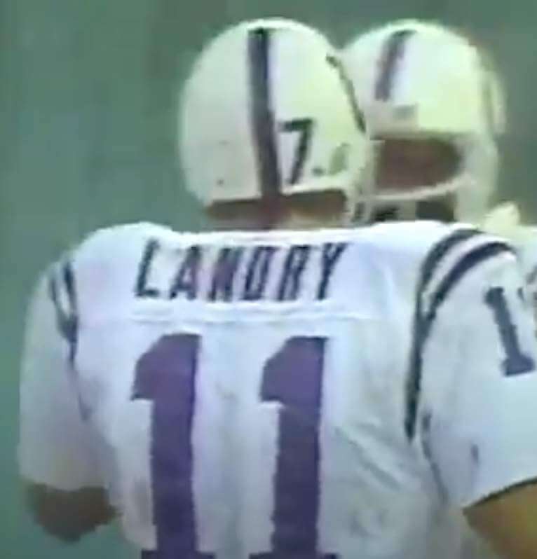
When Jones came back onto the field for the Colts’ next possession, he was wearing a Landry jersey. Because the video has been edited to eliminate most of the chatter in between plays, we can barely hear NBC play-by-play man Charley Jones saying, “The only spare they had was an extra 11, so Bert Jones is wearing a Greg Landry jersey”:
So Jones’s jersey was apparently shredded beyond repair by Klecko, and he had to wear a spare Landry jersey because they didn’t have a spare Jones jersey available.
If you let that last video embed run for about 30 seconds, you get a good view of Jones wearing his own No. 7 helmet with Landry’s No. 11 jersey:
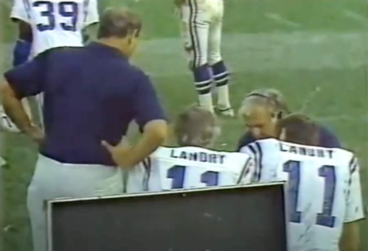
The Colts went three-and-out. Just before the broadcast went to a commercial following the Colts punt, the camera showed Jones and Landry — both wearing Landry jerseys — conferring with a coach on the bench. That’s the image I used at the top of this page.
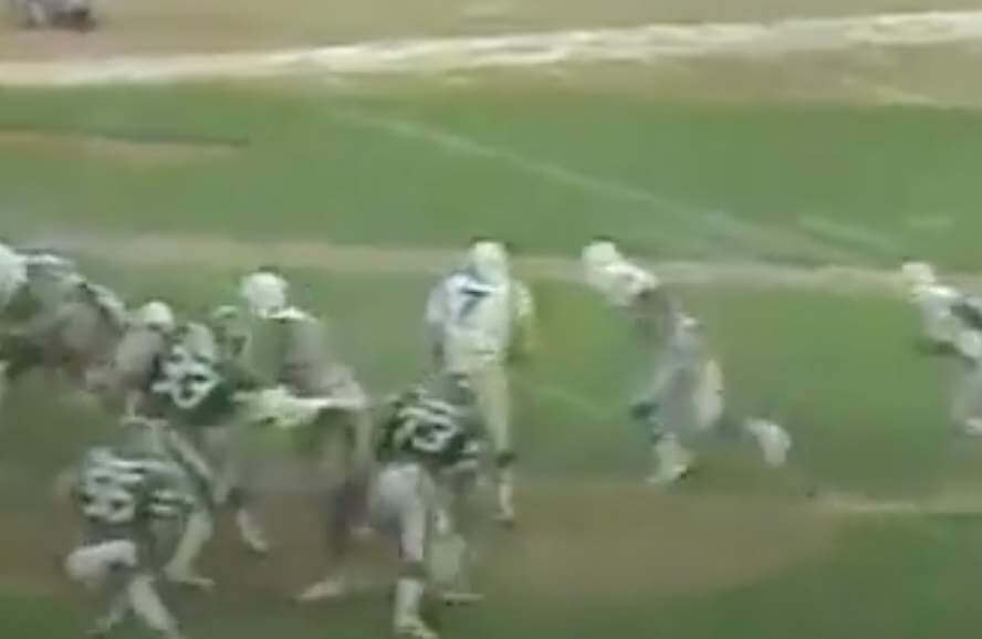
But wait — there’s another wrinkle! The Jets’ next possession ended with a missed field goal attempt, giving the ball back to the Colts with about three minutes remaining. When Jones came back out, he was wearing his proper No. 7 jersey:
There’s no mention of this on the broadcast video, but maybe it got excised in the editing. It’s not clear if someone ran into the locker room to fetch a new jersey for Jones or if they managed to sew up the one that had been torn by Klecko.
The Colts punted yet again (a real barn-burner of a game, eh?), and then Jets quarterback Richard Todd threw an interception, allowing the Colts to run out the clock. Jones was once again wearing No. 7 for those final plays.
You can see this entire sequence, beginning with the play in which Jones’s jersey was torn, here:
———
So Bert Jones had to wear a teammate’s jersey for one possession during a 1980 game. That seems like it would be a famous incident, right? But I’d never heard of it until Twitter-er @darkstarharry recently brought it to my attention.
Or at least I thought I’d never heard of it. Had it ever come up on Uni Watch? A quick search reveals that reader Joseph Gillespie mentioned it in a comment last November, but the comment had nothing to do with that day’s blog post, so I may have missed it or just not gotten around to following up on it — I don’t recall.
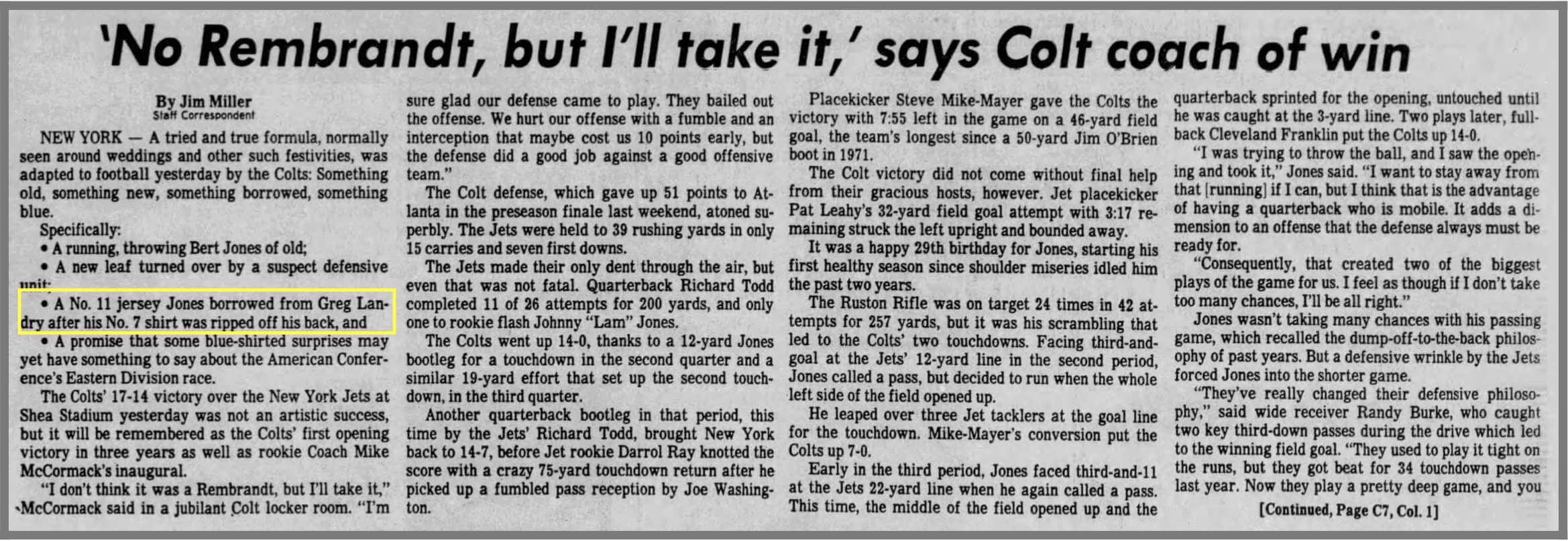
Did the jersey snafu get any media coverage? I found a Baltimore Evening Sun game recap with a brief mention of it early in the article but no deeper explanation later in the article (see highlighted graf in first column; click to enlarge):
If the incident received more in-depth coverage than that, I haven’t yet found it. Fascinating little chapter in NFL uni history!
(Big thanks to @darkstarharry for letting me know about this, and also to reader/commenter Joseph Gillespie for mentioning it in the comments last November, even though I didn’t notice.)
Click to enlarge
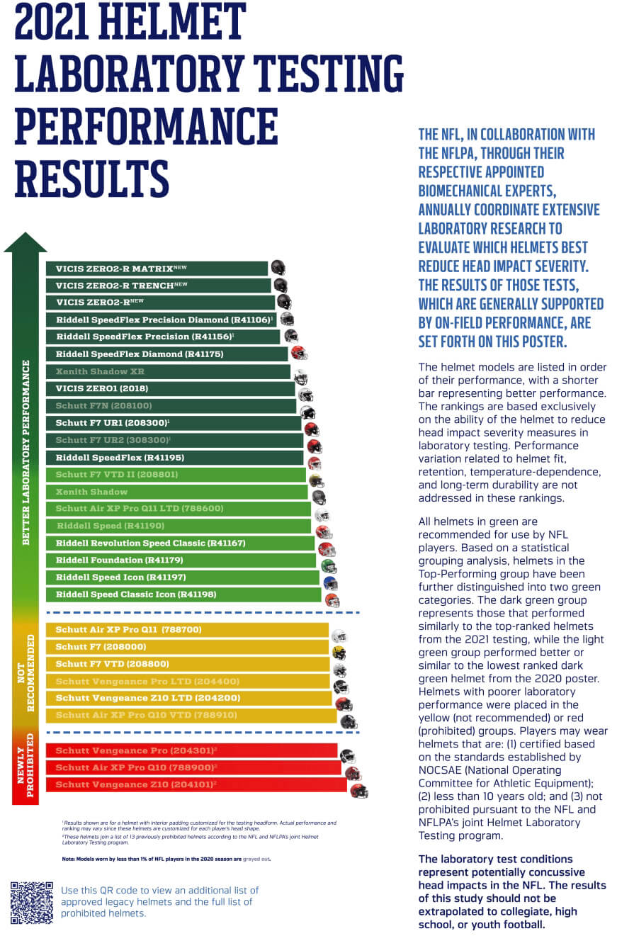
NFL helmet update: Every year around this time, the NFL and the players’ union release their annual safety-ratings graphic for various helmet models. This year’s results, which came out yesterday, are shown above.
As has been the case for several years running, Vicis is the top-rated brand for 2021, nabbing the top three spots. That includes the new Zero2 Trench — designed specifically for linemen, it’s football’s first position specific helmet and has now been approved for on-field use, so we’ll probably start seeing it this fall (which should be interesting, because its shell is not very decal-friendly).
Meanwhile, three helmet models are now prohibited and six more are “Not Recommended.” Somewhat incredibly, all nine of those are made by Schutt (although Schutt also has several helmets that scored fairly well).
There’s additional info on all of this here and here.
Click to enlarge
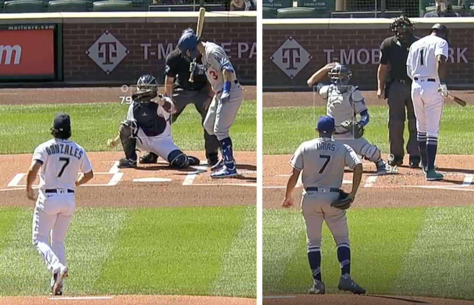
7-up: Unusual mound matchup yesterday in Seattle, as both starting pitchers — Marco Gonzales of the Mariners and Julio Urías of the Dodgers — wore No. 7. I don’t have the resources to determine the last time that happened (or if it’s ever happened, for that matter), but it’s gotta be pretty rare!
(Thanks to all who shared and inquired about this one.)

Click to enlarge
Now that’s a design: This tulip growing in Uni Watch HQ’s front yard is almost impossibly beautiful, right? The red streaks look like they’re painted on, and the photo doesn’t do justice to the way the petals have a nearly glazed, ceramic-like look.
No maker’s mark, either. Nature knows that good aesthetics are their own reward.

For all photos, click to enlarge
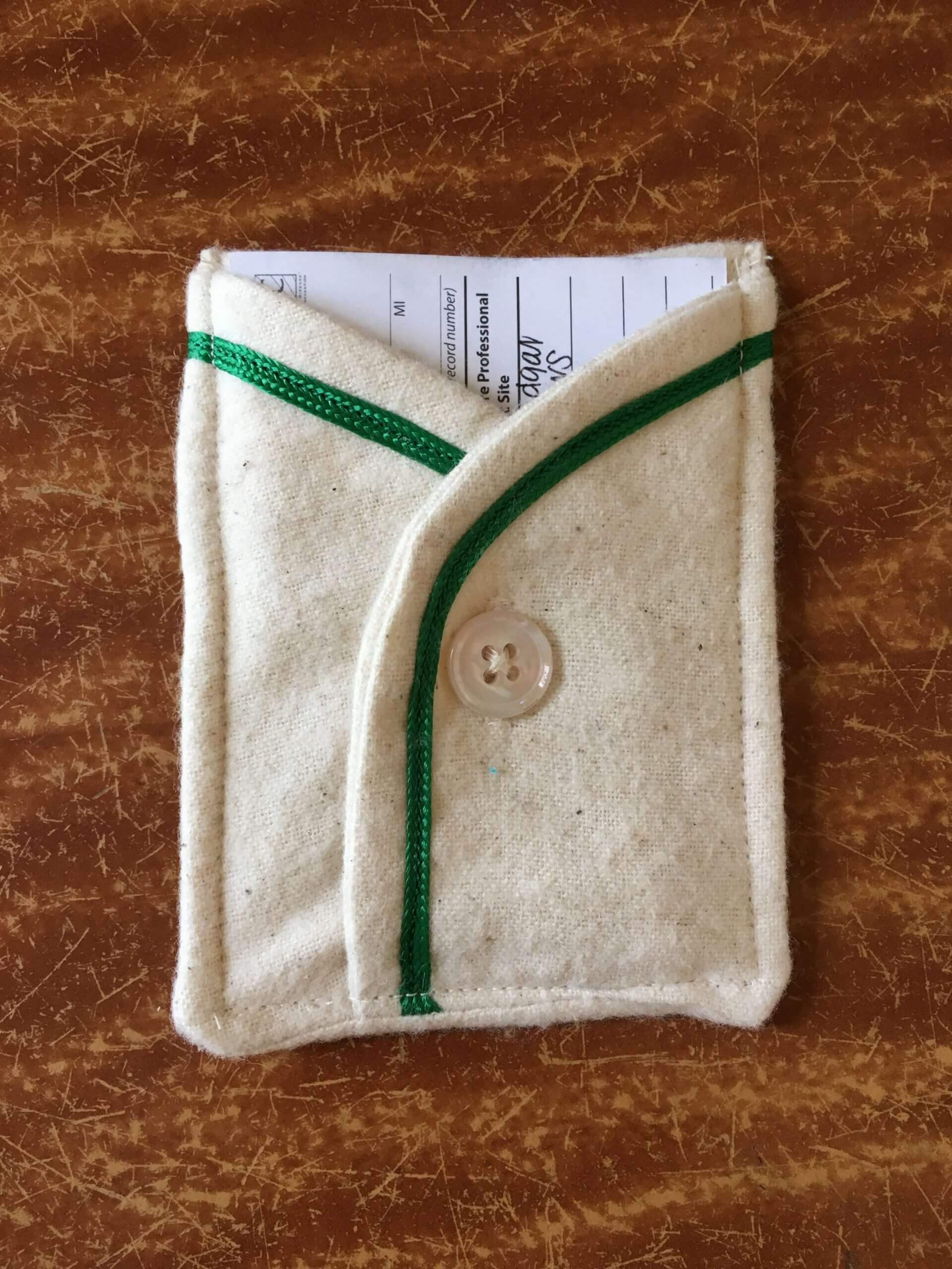
Membership drive update: A few people have asked if the card pockets I’m giving away as part of this week’s membership drive can be used to hold a Covid vaccination card. The pockets’ interior space is about 2-7/8″ wide by 4″ high (they’re all handmade by Wafflebored, so there are some slight variations from pocket to pocket), which as you can see above is just a smidge too narrow for my vaccination card, which is 3″ wide.
But then I thought, “What if I trim the top and bottom edges of the card?” So I got out my trusty X-Acto knife — the same one I use when producing our Uni Watch membership cards — and voila:
I don’t know if the vaccination cards are all the same size. But if yours is about 3″ by 4″, you should be able to trim it down so that it fits into one of these pockets.
Speaking of the pockets, if you haven’t seen the full set, take a gander:
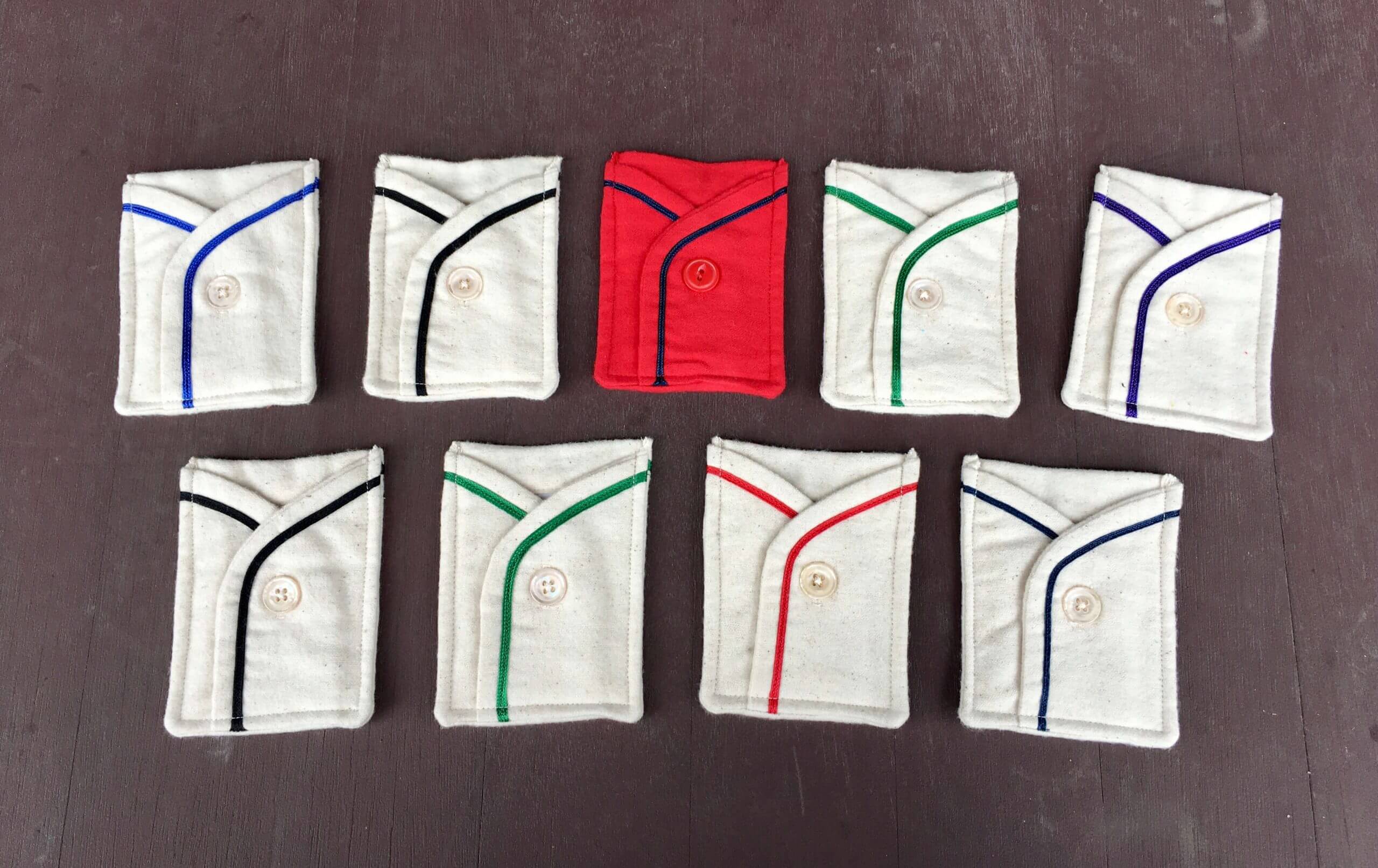
The purple one will have a role on Purple Amnesty Day next month. Three more will be given away to three randomly chosen people out of all the folks
who order a membership card this week (so if you order a membership card this week, go ahead and specify which pocket you’d prefer if you turn out to be one of the winners).
I’ll announce plans for the remaining pockets later this year. Thanks for your consideration, and of course doubleplusthanks to Wafflebored.
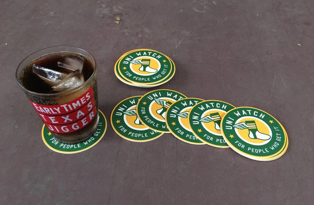
Coasters reminder: I have a few dozen of these great-looking Uni Watch coasters. They’re made in the USA from sturdy pressboard and measure 3.7″ across.
As has been the case in the past, I’m selling these in groups of three coasters for nine bucks, including shipping. USA orders only, sorry.
To order, send me $9 via Venmo (use @Paul-Lukas-2 as the payee), Zelle (plukas64@gmail.com), or Google Pay (plukas64@gmail.com). If you want to use Apple Pay, a paper check, or well-concealed cash, get in touch and I’ll give you the appropriate info.
After paying, email me with your shipping info. Thanks!
If you want to combine a coaster purchase with an order for a Uni Watch koozie, a trading card, a magnet, a seam ripper, or a chain-stitched patch, please email me and I’ll give you a price that includes a combined shipping fee for the whole shebang. (Sorry, these are the only Uni Watch items I can combine into one shipment, because all our other items ship from separate locations.)
The Ticker
By Lloyd Alaban

Baseball News: Stars and stripes unis for Louisville yesterday. … The Mets, after wearing their primary home whites and road greys for their first 11 games, wore their blue road alternate jerseys for the first time last night. … A’s P Jesús Lazardo, who had stopped wearing glasses on the mound, went back to wearing them last night, and also wore new gold cleats. After the game, in which he got the win, he said, “Rocking those new cleats, they’re awesome I like them. I felt good out there, so yeah. I don’t know if the outfit had anything to do with it, maybe the glasses did though” (from James Siddall).

Football News: Here are some new uni numbers for Bengals players. … A sports blogger asks if the Steelers should change their uniforms (from our own Phil Hecken). … Also from Phil: Here are some proposed fixes for the NFL’s worst unis. … NYC’s Moore Catholic High School unveiled a new, all-red field (from Eric Hoey).

Hockey News: The Flames wore No. 17 and “Lucic” NOBs for pregame activities on Monday night. It was Calgary’s first home game since F Milan Lucic played his 1,000th game (from Wade Heidt). … Hockey Fights Cancer-themed pregame sweaters for the Lightning last night (from our own Phil Hecken). … The Penguins wore military-themed pregame sweaters last night. The design included military branch patches, including one for the Space Force — perhaps the first appearance of the new branch’s logo on a professional sports uniform (from our own Alex Hider).

Basketball News: The Hawks responded to yesterday’s Derek Chauvin guilty verdict by posting a message on their videoboard just prior to the start of their game against the Magic. … The Thunder’s home arena will be getting a new name (from multiple readers).

Soccer News: AFC Richmond, which is the fictional team depicted in the TV series Ted Lasso, has a new shirt advertiser (from @NickHannula). … Arminia Bielefeld wore shirts with “Football lives through its fans” on them (from Ed Zelaski). … Orange County SC of the USL Championship released new kits honoring frontline workers. … Forest Green Rovers — a fourth-tier English side — are claiming to be the world’s first carbon-neutral, vegan professional sports team (from our own Phil Hecken). … FC Cincinnati’s new home now has a corporate-advertised name (from @labflyer).

Grab Bag: New kits for Australia’s Super Netball’s Melbourne Vixens (from our own Jamie Rathjen). … Also from Jamie: The CEO of the Indian Premier League’s Kolkata Knight Riders wants to expand the Knight Riders name to other Twenty20 cricket leagues around the world, including Major League Cricket, the future U.S. league. … Just in time for next month’s annual observance of Purple Amnesty Day: iPhone 12 will come in purple starting Apr. 30 (from multiple readers).
Click to enlarge

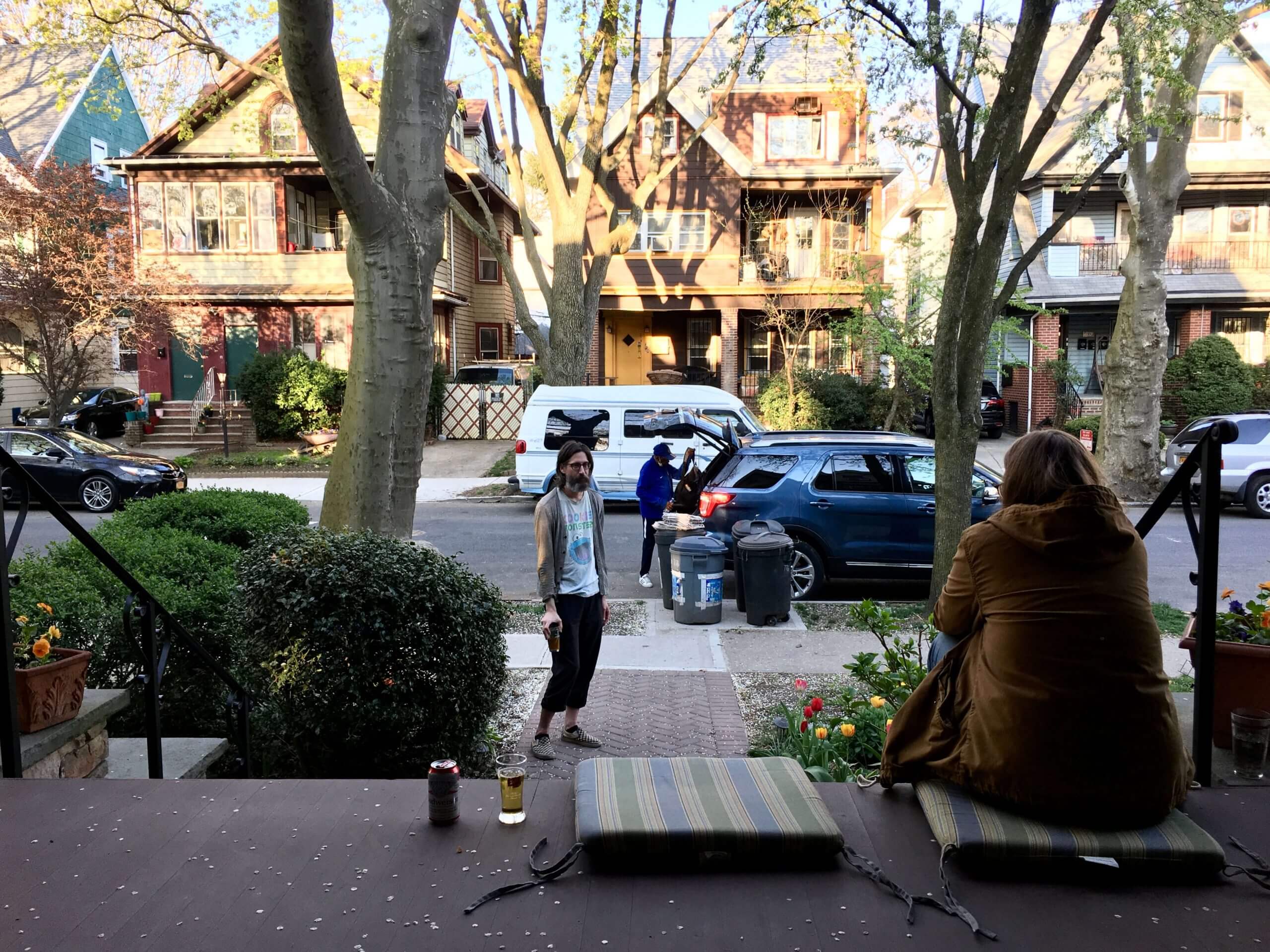
What Paul did last night: Yesterday was the 400th consecutive day that the Tugboat Captain and I convened on our porch for Pandemic Porch Cocktails™.
As I’ve mentioned before, the plan all along has been to maintain this daily ritual until we feel safe and comfortable sitting at the bar of one of our favorite watering holes. We’re not at that point yet, but we’re getting closer. I feel confident that we won’t make it to the 500th day.
As always, you can see the full set of daily Pandemic Porch Cocktails™ photos — now 400 of them — here.
Albert Almora wore an orange belt in a late innings pinch running appearance last night vs. Cubs. Everyone else had blue on. Super strange looking.
Since shoes, socks, undershirts and belts are a free-for-all now, how long will it be before unmatching caps turn up on the field of play?
Sigh. But yes. I’m afraid we are dangerously close. Maybe they will stop calling them “uniforms” :)
Some of the more erudite ballplayers don’t wear a cup when they play. Ask Mitch Haniger (ruptured testicle and out for a season and a half) about it.
What exactly does being “erudite” have to do with wearing or not wearing a cup, Tim?
Probably should block your personal info on the vaccine card. Among other things, someone can use that to get an Excelsior Pass (think NY vaccine passport) with your name on it.
The aesthetics in the flower also serve a purpose. The red lines serve as kind of a runway to direct bees and other insects to the center of the flower to promote pollination.
Form following function.
A little something I found on Reddit: if you add ‘outline.com’ before a url, you can bypass the paywall for certain websites. It doesn’t work for all websites though. It can also be used to remove ad and only show the main text/images of a webpage.
I used it today to read the article about the HS in NY with the new red field. proper placement of the cheat is as follows: link(insert any website name here)
Someone should come up with a logo for the 500th Pandemic Porch Cocktail, and that could be a candidate for Pin of the Month Club..
“The red streaks look like they’re painted on, and the photo doesn’t do justice to the way the petals have a nearly glazed, ceramic-like look.”
Give you photography skills more credit, it most certainly does look like fake flower given the streaks and textures. Absolutely beautiful. Awe inspiring nature.
Re: Ted Lasso.
The original shirt sponsor for AFC Richmond was a reminder of a line from his second NBC promo when he said to his St. Catherine’s Fightin’ Owls team:
“In my mind, you’ve got to have three things to have a Premier League team. One, you’ve got to play physical. Two, you’ve got to play 100 percent till the final whistle. And three, you’ve got to be sponsored by a Middle Eastern airline.”
Apparently, Bantr is a real digital marketing agency. I’ll bet they gave Apple some serious coin to be able to have their logo on those kits.
I’m assuming that the change of advertiser is at least in part a result of getting relegated?
I guess we’ll know when we watch Season 2. Many teams, regardless of level, make changes to kit sponsors like fashion models changing outfits.
I’ve been reading Uni Watch for 15 years and somehow didn’t know that Paul’s most important element in a football uniform is the helmet.
————————————————————–
Paul Lukas | April 20, 2021 at 12:30 pm |
What’s the single most important element to a football uniform?
Answer: the helmet. They haven’t changed that. And I don’t like the helmet. So that’s the first problem.
————————————————————–
I disagree with Paul but I’m not here to argue with or disparage someone having a different opinion than me. I’ve never given much thought to the helmet when evaluating a uniform unless the helmet stands out as being especially awful like the Jags two toned helmets.
But it got me thinking about uniforms. The Cardinals have the 2nd worst uniforms despite having the one of the better looking helmets. If the Rams went back to their old glorious helmet, I’d still rank them as the worst uniform.
Then there’s the Bears who have a top 5 uniform despite a boring non-symmetrical helmet.
My #1 helmet is the Raiders but they already had the #1 uniform in my opinion.
The helmet sets the tone for the rest of the Uni. IMO.
Plenty of teams have great helmets but poor jerseys, pants, and socks. Like AZ. I would add Washington to the mix. Take off those cheap sticker numbers, add back the stripe and have a Browns type look.
Also like the Ravens helmet but the rest is awful! The drop shadow number, the black tights, the Maryland flag. Always thought a TCU style look would suit them much better.
I’d agree with Paul that the helmet is the most important part. I think the reason the helmet is important is because so much marketing and visual representation of a team centers around their helmet; graphics on tv, etc. The helmet is almost a secondary logo for NFL teams, so it is really important to get that right.
But when it comes to which element (helmet, jersey, pants, socks) in a uniform have the greatest sway on if the overall uniform is good? I think jersey and helmet are about equal, but given the first statement, helmet gets the nod simply for its overall branding value.
Which isn’t too say a team with an awful helmet couldn’t have an really solid overall uniform in spite of it, or that a team with a great helmet couldn’t still have a miserable overall uniform.
Although the helmet is not, for me, the key to any uniform’s overall success, I would still call it the most important element. The overall look and feel of a uniform for me is primarily about the sum total of all non-helmet elements, particularly the pants and jersey and how their colors and stripe/trim elements work together. But that’s not an element. The jersey is an element, the pants are an element, but in isolation, neither one is particularly defining for me. If you lay out all the individual elements of a football uniform, from the socks to the helmet, no other individual element is as impactful for me than the helmet.
Like, when I think of a football team, I picture one of two things: Either a player or players in full uniform, or the helmet. I don’t picture just a jersey or just a pair of pants, or even just a team logo. I picture a full uniform, or I picture a helmet.
In the Jones/Landry news article, it’s mentioned that Mick-Mayer’s 46-yard field goal was the longest for the Colts since Jim O’Brien kicked a 50-yarder in 1971.
Seems like every team has a few 50-plus yarders per season now. Nine years with nothing longer than 45 yards seems crazy.
Good point. I guess it illustrates just how much more power kickers can generate using the “soccer style” approach rather than the old straight-ahead method.
Although Jim O’Brien was a straight-on kicker. You could get power that way, but you wouldn’t be as accurate from distance.
At the risk of alienating an already maligned group (soccer style kickers), if the NFL wants to put some suspense back into the kicking game, just mandate straight-on kicking. Just a suggestion…
I would suggest moving the hash marks back out towards the sidelines as they were pre-1972.
YES
My idea for if the NFL wants to put some suspense back into the kicking game, for extra points, whoever scored the TD had to kick the Extra Point. For field goals, it has to be someone who was on offense on 3rd Down.
Now THAT would be fun!
Lee
I think that you could also make them kick from wherever the touchdown was scored, laterally. You got two feet down in the back corner? Cool. Now let’s see your kicker convert from essentially the side line. He can back up as far as he wants, but he has to stay within 3 feet laterally.
How about do what Rugby does. No rushing on the kicks, but your extra point attempt is made from a point on a line drawn from where you cross the goal line. So if you cross at the flag, in order to get a good angle, you’re kicking your extra point from the 30 yard line and right at the sideline.
Interesting story about the Colts and the “two Landrys”.
I think the answer to the question about Jones returning with his proper #7 jersey is that someone managed to quickly sew it up. Check the video at about the 1:21:35 point. Jones turns around to join the huddle and it appears that the number 7 on the back of his jersey is now misshapen, I’m thinking as a result of a quick repair job.
The only other question I had is that you’d assume there would be some penalty for a player entering a game with a different player’s name and number? Or maybe it’s okay as long as the opposing team is informed of the change?
I believe the Shea Stadium PA announcer is describing what happened while the broadcasters are talking. Must have been good enough for the officials.
I didn’t remember the Jets painting their helmet at midfield during baseball season, but there it was in that video. And it was off-centered, at least in this particular game…closer to the camera side of the field.
As the helmet faded in the midfield dirt, it reminded me of the 1970 game between the Bills and the Steelers. Even though Pittsburgh had its midfield logo before and after this game, on this particular day there was just a little bit of it visible on the turf.
link
The Gridiron Uniform Database people even caught that midfield glitch.
link
That is amazing. Not just for the thumbnail logo at midfield, but for one painted and one blank end zone, the year painted in the end zone, and the goal lines marked with ‘G’s.
They had quite a variety of end zones in 1970…
link
I like that hypocycloid end zone! It should be implemented at Heinz Field!
How about the Steelers go back to the all white road uni from 1970?
Go back fiive years.
link
Love that story on the Jets/Colts game re Bert Jones’ uni switcheroo. On the other hand, the recap of the game itself is giving me PSD. So typical of the Jets at that time (i.e., Richard Todd throws a pick). I know I’ve seen many folks say they wished the Jets would go back to the unis they had at that time, but this type of memory is exactly why I hate those uniforms. Beyond the fact that the stupid “Jets” wordmark is so GD boring. Both then and on the current helmets. I remain boggled as to why they can’t come up with something more interesting that just that F’ing word. Makes me crazy.
LOL! J-E-S-T-S!
This also reminded me a weird playing career Greg Landry had…
Some people think the wordmark looks good on the Bengals’ helmet; I don’t. It’s hard to quantify why the Jets’ logo is more appropriate. Perhaps right off the bat it was italicized, denoting speed. Now it would be trite but at the time it was novel.
The current Jets’ motif is a tapering contrail, but at some point they ought to employ a shockwave. The original thing to do would be to take the ends of the oval which graced their helmets from 1998-2018 and make shockwaves from them.
The less original thing to do would be to use the silhouette of a jet airplane (I prefer airliners to fighters).
I don’t know why, but it feels like football teams named the Cardinals can’t get it right. Arizona, Louisville, Ball State all look somewhere from awful to okay at best.
Meanwhile, the Cardinals in St. Louis are about as good looking as any team in sports. Two birds on a bat. They’re not angry or fierce, they are just sitting on a bat.
Anyways, the Cardinal is my favorite bird and I wish football teams would do better.
that’s pretty neat with the pitchers wearing #7 on game day. what’s extra unique: they both are lefties.
The best way to improve the Steelers’ uniforms would be to give them sparkly helmets.
Cool concept: black on one side, shiny steel gray on the other with the Steel logo.
The best way to improve the Steelers’ uniforms would be to get rid of the stupid number font and bring back block numbers.
Watching the Yankees tonight, I noticed one player sporting a full-on mustache. Rougned Odor must be wondering what’s going on!
Mustaches have always been allowed. Just ask Goose Gossage.